Category ArchiveBooks
Books 30 Dec 2007 09:55 am
Steig at the Jewish Museum
 - Yesterday, we went to the Jewish Museum on the upper East Side of Manhattan to see the exhibit of William Steig‘s works. Unfortunately, like most other New York buildings, (pictured on the left) there’s a scaffold surrounding the museum, with some kind of construction going on. On Saturdays, entrance is free, so you’ll note the long line to enter. Within, there’s an overly cautious search of your property to make sure you’re not trying to sneak in with a bomb.
On display were many of his original cartoons as well as original color illustrations for the many children’s books he wrote and illustrated. The exhibit included a lot of roughs as well as dummy copies of several books – including Doctor DeSoto.
They dressed up several rooms with wall-sized images from the books as well as copies of the books to view, and there were people with kids strewn about the floor.
I’m sorry it didn’t occur while Steig was still alive. When I first got out of the Navy in 1970, I came upon a small exhibit of his New Yorker cartoons at a rare-book seller’s shop (no longer there.) I was so taken by the drawings that I used all my money at the time, $75.00, to buy the least expensive (and my favorite) one of the pictures. Years later when I told him about the drawing I’d bought, he knew exactly which one it was. He said that’s the only picture bought at that show.
At the Jewish Museum, I learned early on that I wasn’t allowed to photograph the pictures. I still took a few pictures on the sly and have tried to clean them up for this post.
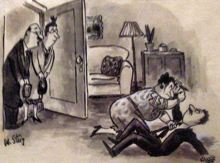
“Are we too early?”
An early New Yorker cartoon drawn before the arrival of
William Shawn as editor of the magazine.
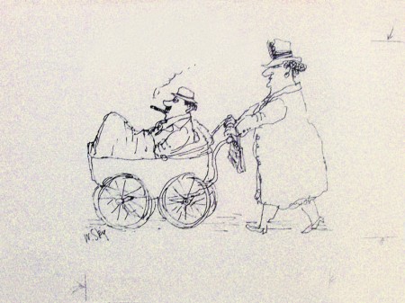
Steig’s cartoons often depicted brutally honest thoughts
on male/female relationships.
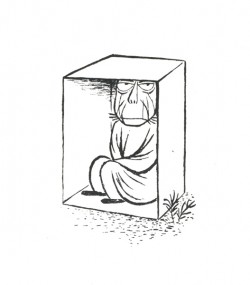
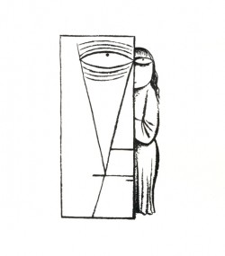
There were a number of Steig’s black & white drawings from his books, The Lonely Ones and Small Fry. These were originally collections of New Yorker cartoons.
The Lonely Ones cartoons reflect the influence of Wilhelm Reich and his unusal psychoterapy. Steig was an ardent follower, and the “Orgone box” appears in many of the illustrations or as subtext to many of the children’s books.
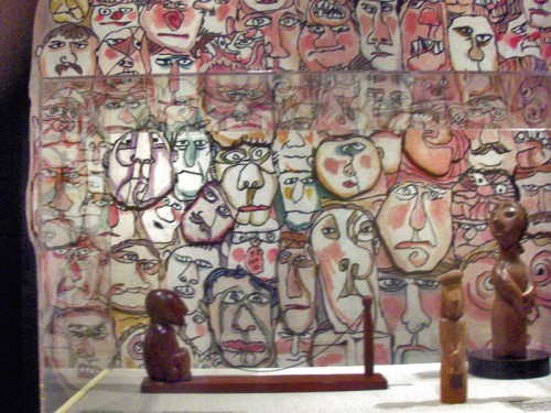
In the first room you entered, there was a beautiful New Yorker image of many faces.
Later in the show, this image was enlarged to wall-size, and several of the faces opened
for kids who wanted to interact with the masks.
 __
__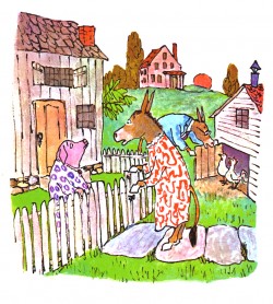
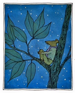
Many of his children’s books were well represented. Abel’s Island, above left, and
Sylvester and the Magic Pebble, above right, were shown. There were some excellent images from The Amazing Bone. (I almost thought I was looking at artwork from my film;
it was the exact same size.)
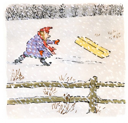
There were a couple of images from the stunningly beautiful book, Brave Irene. This is the one book I wish I could’ve animated.
The final room included a number of images from Steig’s book, Shrek. It isn’t one of my favorites of his books, but the paintings still are excellent. On a wall opposite were drawings and sketches by several of the Dreamworks artists and their versions of the character. A table in the center of the room displayed a couple of sculptures of the ugly character from the films.
It’s bad enough that the beautiful illustrations of Steig are trashed for the ugly repre-
 sentations in those films, but to complete a retrospective of the man’s art with that left a bad taste in my mouth. Obviously, Dreamworks must have helped finance the exhibit. I didn’t take any more pictures in this final room.
The exhibit is attractive and it’s a good way to see Steig as an artist. The art is small, so if there’s a crowd there can be a small wait. However, it’s worth any troubles. There was a book, The Art of William Steig. It was Saturday, and the bookstore was closed, and I wasn’t able to buy one. Perhaps when I do, I’ll post more of the images from this show.
Animation &Books &Daily post 19 Dec 2007 09:35 am
Jack Zander and other thoughts
- Because I was never very involved in the commercial (meaning ads) end of the New York animation world, I didn’t have much contact with Jack Zander. Yet, I do know that he was a significant part of that end of the business in this city. Once you got past the names of Paramount and Terrytoons, Zander’s Animation Parlour was the big studio of my earliest days.
In fact, I probably had more contact with Jack’s son, Mark, over the years. The one interview I had at Zander’s was with Mark. It was one of those interviews where something in the air tells you that you’re never going to work at this place, so why try again. It was nothing Mark did; nothing I did. It just didn’t feel like I was a good fit. I didn’t try again and didn’t have much contact with Jack in the future.
Mark Mayerson let me know, last night, that Jack had passed away Monday at the age of 99. Mark also has one of the best, most succinct bios I’ve seen of Jack’s life on his site this morning. I urge you to check it out.
Tom Sito also has a nice post about Jack on his site today.
AWN has an interview with Jack Zander by Joe Strike.
Jack Zander was a significant figure in New York’s commercial history. He deserves some attention.
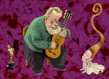 - Michael Barrier had a wonderful post at his website, Dec. 17th; it was on Borge Ring, and excuse to print his letter to Mike. I was a pleasantly surprised to see myself mentioned in the piece. Many people have said nice things about me, but this is the first truly poetic quote I’ve read. Borge is a poet of an animator.
He made a small error though in commenting on my film, Dr. DeSoto. Borge said I made the film for $4000. In fact, it was $3500 per minute. I don’t think I could have gotten it photographed for $4000. I’m sure I miscommunicated, as usual, way back in 1984 when we spoke of that film. I hope he doesn’t like the film less.
If you’d like to see some of Borge’s work, Mark Mayerson wrote about him and led us to several films in 2006.
The illustration, above, is by Patrick Mate. I couldn’t resist swiping it for this post; it’s such a great picture and really captures Borge – in my mind, anyway. Patrick’s blog is worth checking into if you don’t know it.
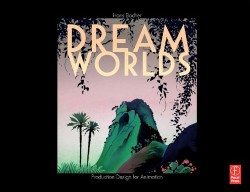 - I just received my issue of Hans Bacher‘s book Dream Worlds. It took a while for Amazon to get it out.
I haven’t read it as yet, but was astonished in carefully thumbing through it. With the same ardent enthusiasm I had for Amid Amidi’s Cartoon Modern and Mike Barrier’s The Animated Man, I encourage you to buy a copy of this book if you’re serious about animation.
It’s stunningly beautiful, filled with excellent art, attractively designed and it looks to be enormously informative. The book shows you what a production designer does in an animated film. I’ve seen no other book like it.
I will have much more to say about this book as I read it.
Books &Illustration &SpornFilms 08 Dec 2007 09:54 am
More Illustrated Blank Maps
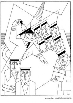
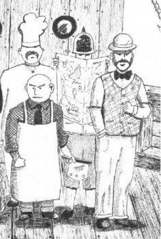
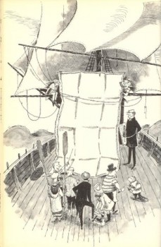
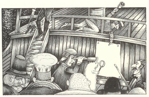
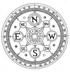
 – Last week, I posted a piece about the “Map they could all understand” from Lewis Carroll’s poem, The Hunting of the Snark. It prompted a number of interesting comments. One in particular from Doug H. in Australia was followed by a delightful email full of other wonderful illustration of the same part of the poem.
- “Other maps are such shapes,
______ with their islands and capes!
But we’ve got our brave Captain to thank:
(So the crew would protest)
______ “that he’s bought us the best–
A perfect and absolute blank!â€
I’d like to post some of these illustrations here, for your amusement, and with many thanks to Doug, I do so here. With respect to all of the illustrators, about half of whom
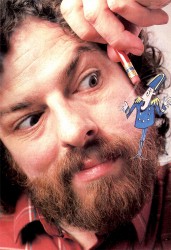
are unfamiliar names to me. They merit a good look,________me discussing the animation
especially for Snark lovers. _____________________________ process for How Magazine.
___ Just scroll down. Click any image to enlarge a bit.)
 1
1 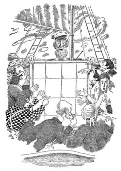 2
2
______1. Frank Hinder (1989)_______________________2. Harold Jones (1975)
______
__ 3.__
3.__ 4.
4.
______3. Michael Capozzola (2005)_________________4. Kelly Oechsli (1966)
 5.
5.5. John Lord (2006)
______
______
6._________________________________7.
______
______6. Max Ernst ((1950) _______________________7. Jonathan Dixon (1992)
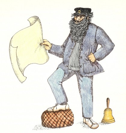 8.
8.8. Helen Oxenbury (1970)
Books &Errol Le Cain 01 Nov 2007 08:13 am
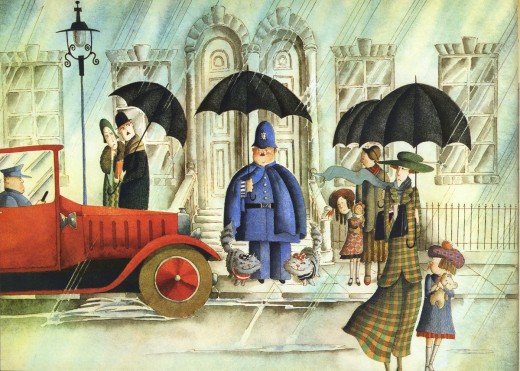
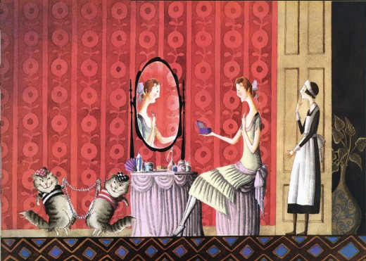
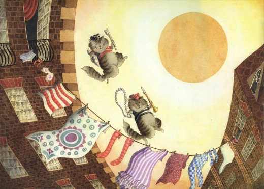
Le Cain’s Mungojerrie and Rumpelteazer
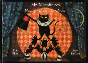 – Recently, I posted artwork from the first half of Errol LeCain‘s book illustrations for Mr. Mistoffelees with Mungojerrie and Rumpeltealzer. These are two of the poems by T.S. Eliot from his Old Possum’s Book of Practical Cats .
Of course, these poems became the source for the Andrew Lloyd Webber musical, CATS. The poems were turned into songs by Lloyd Webber and director, Trevor Nunn.
(Sadly, Universal and Spielberg have tied up the rights to this project which seems to be dead. It was once on the road to becoming an animated feature with a script by esteemed playwright, Tom Stoppard. Lloyd Webber would like to go forward with the film, but it’s held up by the new rights holders.
(Once again, let me point you to some of the preliminary art from that aborted film on Hans Bacher‘s older, yet brilliant Animation Treasure I site. More here.)
Here are the illustrations for Mungojerry and Rumpleteazer by the brilliant Errol Le Cain.
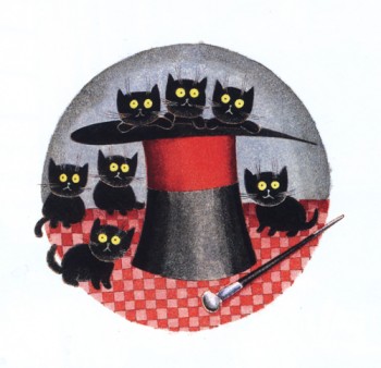
This is the end page which covers both Mungojerry and Rumpelteazer as well as Mr. Mistoffelees.
Other posts I’ve made featuring Le Cain’s artwork:
Go to Mr. Mistoffelees
____Puffin Books
____Funny Thing Happened on the Way to the Forum
____The Snow Queen_______________-____Aladdin
____Growltiger_________________________Thorn Rose
____Pied Piper of Hamelin_______________12 Dancing Princesses
____Have You Seen My Sister____________Hiawatha’s Childhood
Animation Artifacts &Books &Disney &Story & Storyboards 31 Oct 2007 08:17 am
Witches & Apples
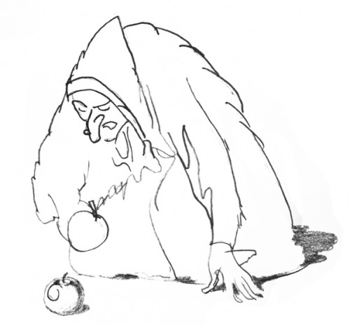
Today’s Ollie Johnston‘s 95th Birthday. Happy Birthday, Ollie. Let’s celebrate with the first feature Ollie worked on.
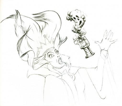
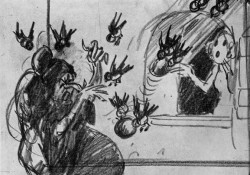
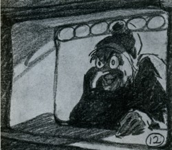
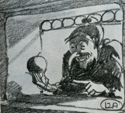
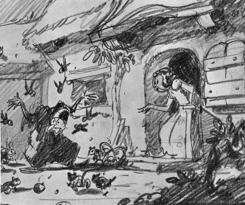
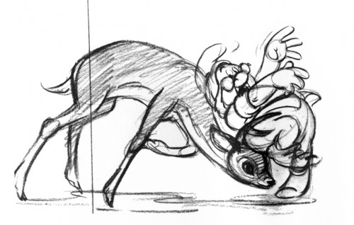
- I’m a Snow White fan. If there’s one feature I look to for that chill of inspiration to hit me, it’s Snow White. There’s something about it that screams out great drawings all done by  hand on paper. There’s something about those incredible watercolor backgrounds, the beautiful animation by the young masters. All the daring, all the pride in their work, all the challenges met by these excellent animators; it’s all on display in every frame of this film. I love it.
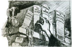
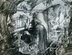
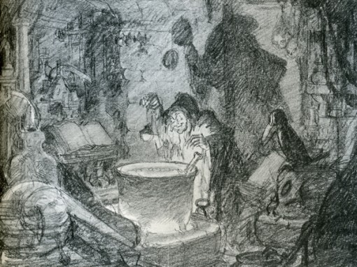
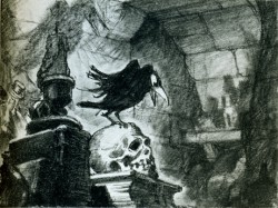
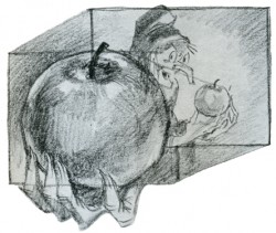
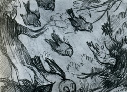
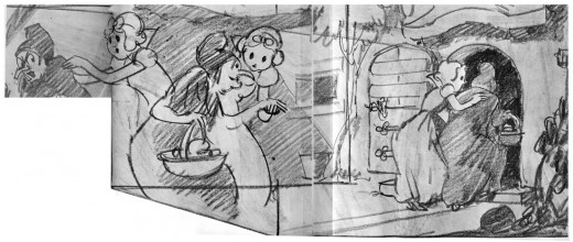
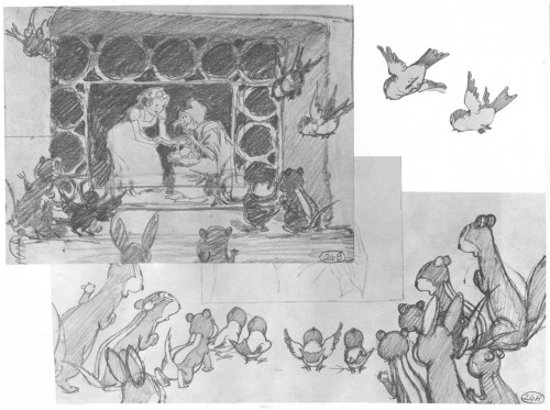
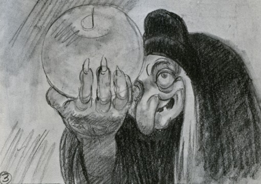
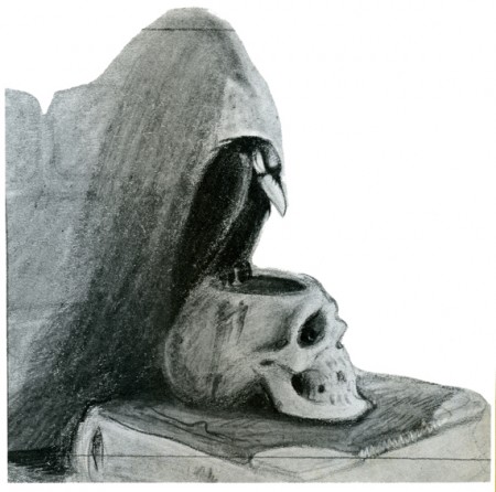
I have an extraordinary book that displays a lot of artwork from this film. It was published for American Express and released by them in a limited edition. To my knowledge it never hit the bookstores. So, because I love the film, because I get a kick out of this book, and because it’s Halloween, I thought it a good time to post some images of the Witch preparing her apple and delivering it.
Most of the images are obviously storyboard drawings, though a few beautiful animation drawings and Layouts slip in there. I’m not sure if any or all of these have made it to the dvd or other books, but it doesn’t quite matter to me.
Here they are.
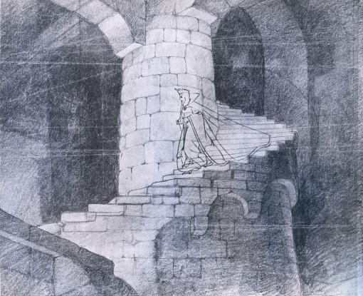
___(Click any image to enlarge.)
Books &Comic Art 17 Oct 2007 07:48 am
Gumps III – On Vacation
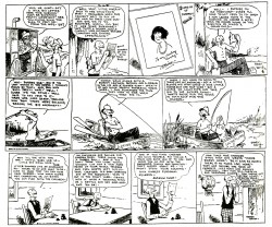
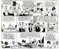
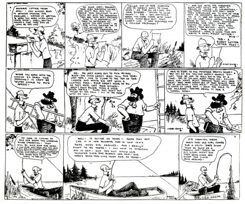
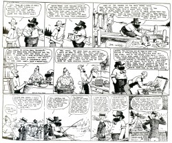
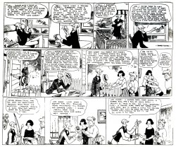
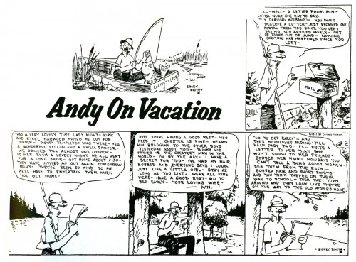
 - Here’s the third cache of comic strips featuring The Gumps.
This is from an excellent book that was edited in 1974 by Herb Gallewitz and published by Scribners called Sidney Smith’s The Gumps.
As I mentioned in the last two posts, The drawing is funky, but the story is brilliant. I’m posting these so that you can get an idea of the rhythm of the strip and the characters. In the next couple of batches I post we’ll start getting into some serious story material.
___(Click on any image to enlarge.)
Animation Artifacts &Books &Disney &Models &Story & Storyboards 15 Oct 2007 07:59 am
Rite of Spring Pics
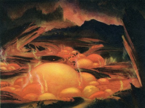
- Continuing my posting of the art in the 1940 book, published by Simon & Schuster, Deems Taylor’s Fantasia, I focus on the Rite of Spring segment from the film. There are some fine images here, and I’m pleased to post them.
If anyone has any idea of who drew any of these stills, I’ll be glad to give appropriate credit to the artists. I know that
_______ William Martin,
_______ Leo Thiele,
_______ Robert Sterner and
_______ John Fraser McLeish were credited for Story Development Research,
and
_______ McLaren Stewart,
_______ Dick Kelsey and
_______ John Hubley were the segment’s Art Directors.
Here, then, are the stills. A number of them are beauties.
Books &Errol Le Cain &Illustration 27 Sep 2007 07:48 am
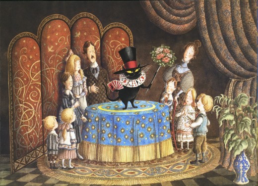
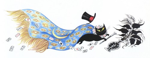
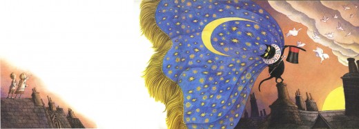
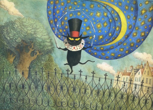
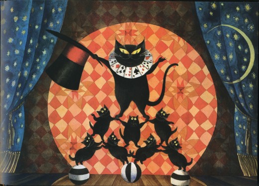
Le Cain’s Mr. Mistoffelees
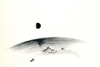
 – Continuing my neverending homage to Errol Le Cain, I present here his illustrations for the first half of the book, Mr. Mistoffelees with Mungojerrie and Rumpelteazer. We’ll save the Mungojerrie and Rumpelteazer part for another time.
This story is part of the Old Possum’s Book of Practical Cats by T.S. Eliot.
That was, of course, the source material on which Webber and Nunn based their show CATS. These images are so attractive and stylish, I was quite curious to know whether Andrew Lloyd Webber had seen the books. Especially when he was about to put CATS onto the screen as an animated film.
(You can see some of the preliminary art from that aborted film on Hans Bacher‘s older, yet brilliant site. More here.)
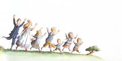
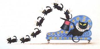
Here are the illustrations by Le Cain:
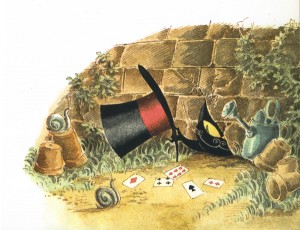
________ (Click any image you’d like to enlarge.)
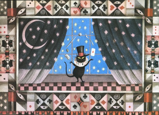
_____________Mr. Mistoffelees
___________You ought to know Mr. Mistoffelees !
___________The Original Conjuring Cat -
___________(There can be no doubt about that).
___________Please listen to me and don’t scoff All his
___________Inventions are off his own bat.
Animation Artifacts &Books &Disney &Models 25 Sep 2007 08:08 am
Pastoral Pics
![]() – The Pastoral sequence from Fantasia is definitely not a favorite of mine. I have a lot of problems with it that it’s best not to start a critique. However, these days – there being so much bad art-in-animation – it’s like saying it’s my least favorite Rembrandt.
– The Pastoral sequence from Fantasia is definitely not a favorite of mine. I have a lot of problems with it that it’s best not to start a critique. However, these days – there being so much bad art-in-animation – it’s like saying it’s my least favorite Rembrandt.
Just the same, I’ll still say the sensibility offers everything I dislike about Disney.
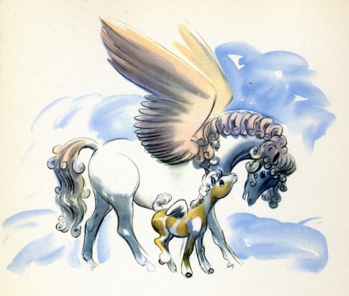
In the past couple of weeks, I’ve been posting artwork from the Deems Taylor book, Fantasia. This is pretty much a storybook for all the sequences from Fantasia. It was published in 1940 by Simon & Schuster.
Here are the illustrations for the sequence featuring the Pastoral by Beethoven.
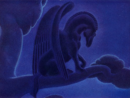
This is probably my favorite drawing in the sequence. There’s a lot of power in it.
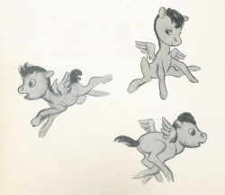
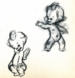
There’s not much to say about drawings like these. They’re very skillful but very sweet.
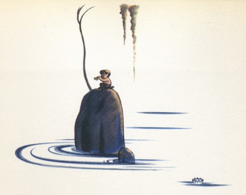
I like this image. There’s a lot of atmosphere in it, and it seems to fit well into the book’s design overall.
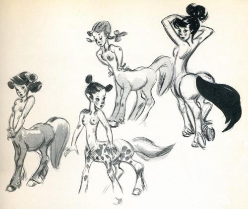
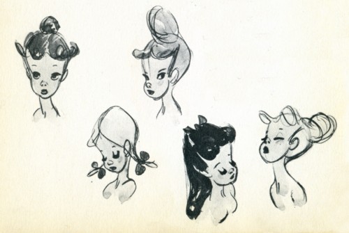
I’m not convinced that these drawings are by Fred Moore, though they’re obviously trying
to emulate what Moore has done.
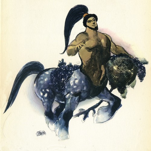
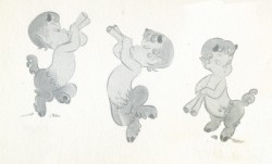
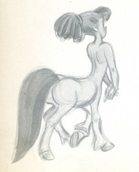
I don’t know how this image made the book. I suppose they needed one of these centaur types. Surely, there must have been a better drawing done for the sequence.
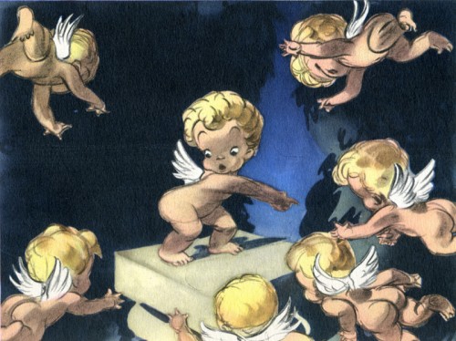
Another drawing of these very cute characters, but I think this one is really
well done, trading in a lot of the cuteness for artistry.
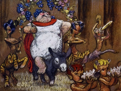
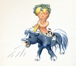
__Bacchus. Ward Kimball animated a lot of this character and did a good job of it.
__I think it’s probably the best animation in the sequence.
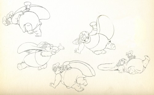
__These look like Kimball’s drawings from the sequence.
__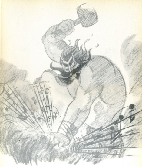
_____Thor. I’m glad the final didn’t look like this.
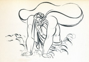
__The animation drawing of Zeus is attractive. The character was nicely done.
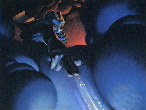
This color sketch of Zeus is quite different though it gives a good sense of what they were looking for in the sequence.
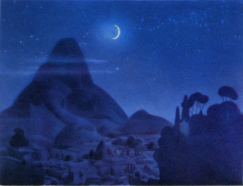
__This image appears in quite a few places representing the sequence.
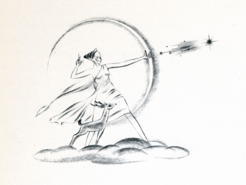
__This, I think, is a nice, rough drawing.
Books &Illustration &Models 13 Sep 2007 07:51 am
Eyvind Earle
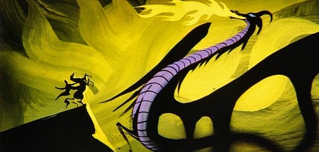
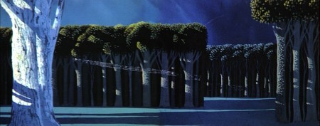
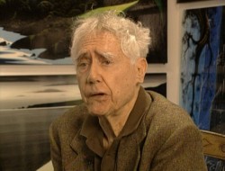 – Let’s talk a little about Eyvind Earle. This is the artist who rose to fame when he was selected by Walt Disney to set the style for the long-in-production feature, Sleeping Beauty. The animators disliked his art direction and openly protested it. Walt remained true in his stance and supported Earle to the end; though it could be said that Walt was more involved in Disneyland’s construction and gave too little attention to the in-fighting at the animation studio.
I remember Frank Thomas, specifically, stating that he had done everything possible to supercede Earle’s style after he, Thomas, had animated the Merryweather scene as she creates Aurora’s dress and cake in honor of her birthday. He felt that the black bodice that Earle had designed took all the lightness out of his character’s delicate dance.
(Click on any image to enlarge.)_________________________________
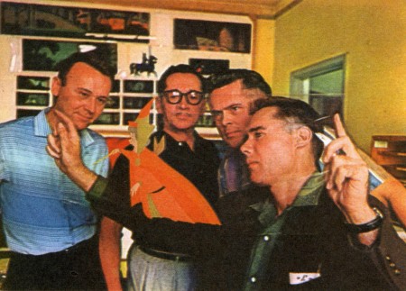
L to R: Al Dempster, Dick Anthony, Ralph Hulett and Eyvind Earle
Thomas publicly attacked Earle at the Lincoln Center celebration of Disney animation back in 1973. I’d already read something similar, and heard it privately. None of the others on stage at Lincoln Center – Woolie Reitherman, Ken Anderson or Ollie Johnston – countered in support of Earle.
 Sleeping Beauty was such a drastic change in look from the other Disney features, that I think it took deep hold in the minds of a lot of Baby Boomers growing up around this feature. Earle became a strong target of interest, and I think his reputation has grown annually.
I have to admit it was odd seeing the backgrounds of Pocohontas trying to emulate Earle’s Sleeping Beauty style, but in some ways it seemed fitting. The studio had been ripping off the films of the past for so long that it was only approopriate that they’d focus on someone who was such a dynamic force.
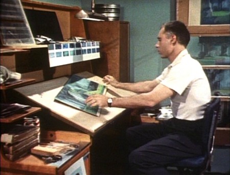
For a short period after he was released by Disney, in the post-Sleeping Beauty layoffs, he worked with John Sutherland Productions where he designed the short, Rhapsody of Steel. Then he formed his own studio, Eyvind Earle Productions, Inc. He did an animated trailer for the film, West Side Story, under the supervision of Saul Bass. He did an animated title for the Kraft Suspense Theater, and he did a Christmas Special for Tennessee Ernie Ford.
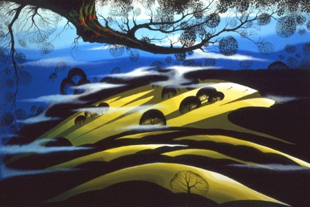
Ultimately, Earle made a success of his own art after leaving animation. He’s been represented by a number of very large galleries and has sold a lot of popular art in a style all his own. Here are a couple of examples found on line:

I’m not always a big fan of the color schemes in his graphics, though he always makes them work, but I have to give credit to Earle for his originality and the dynamic approach in his art.
His autobiography, Horizon Bound on a Bicycle, is a must for all real fans.
This is his animation resume:
- 1951 Started with the Walt Disney Studios as background painter on: FOR WHOM THE
__ BULLS TOIL, MELODY, and the Academy Award winner for “Best Short of the Year”
__TOOT, WHISTLE, PLUNK and BOOM which also received a Cannes Film Festival Award.
__Production Designer, Color Stylist and Background Painter for the DIsney animated __classic SLEEPING BEAUTY, as well as, PIGS IS PIGS, GRAND CANYONSCOPE,
__PAUL BUNYAN, LADY AND THE TRAMP, LONDON BRIDGE, and WORKING FOR PEANUTS.
__He designed 5 murals for Disneyland.
1958 Joined John Sutherland Motion Picture Company in Los Angeles.
1960-1966 Created 24 sheet poster for Hamm’s Beer.
__Started motion picture animation company, Eyvind Earle Productions, Inc.
__Created animated commercials for Chevrolet Motors, Chrysler Corporation, Marlboro
__igarettes, Motorola Television and the Kellogg Cereal Company.
__Created animated trailer for WEST SIDE STORY for United Artists.
1961 Created animated television special THE STORY OF CHRISTMAS starring
__Tennessee Ernie Ford and the Roger Wagner Choral.
1962 Created animated television special THE EASTER SPECIAL.
__Created title for the KRAFT SUSPENSE THEATER.
__Created the logo trademark trailer for Universal Pictures.
__Produced and created the theatrical short DEATH AND SUNRISE
