Category ArchiveBooks
Animation Artifacts &Books &Disney &Story & Storyboards 06 Jan 2009 08:54 am
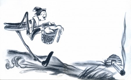
Song of the South
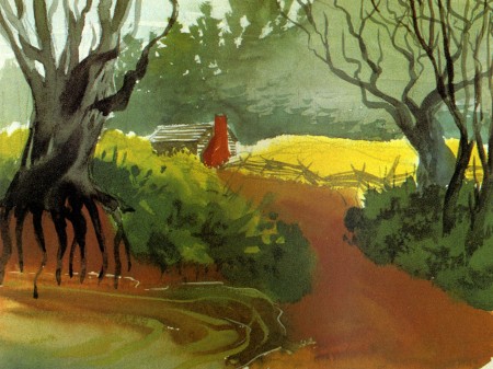
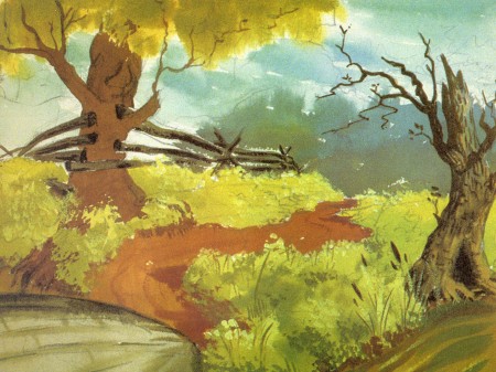
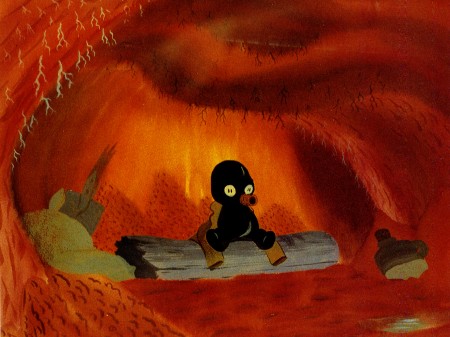
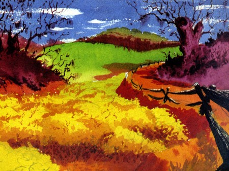
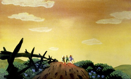
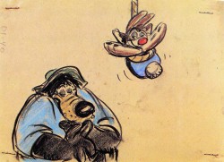
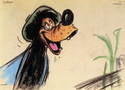
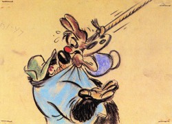
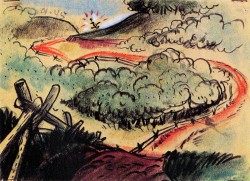
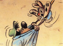
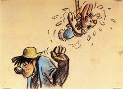
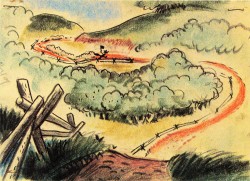
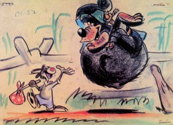
John Canemaker‘s beautiful book, Treasures of Disney Animation Art, is chock-a-block full of stunning artwork and examples of preproduction work for the Disney features. Every one of them worth studying.
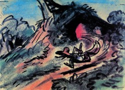
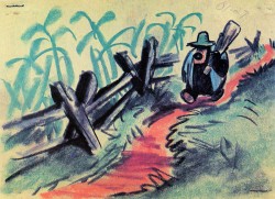
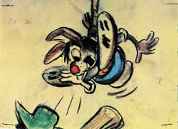
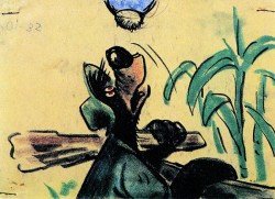
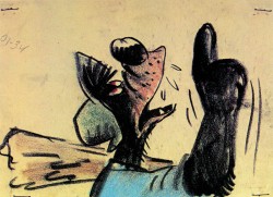
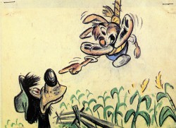
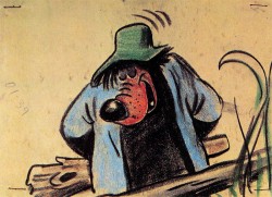
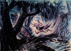
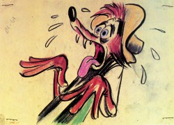
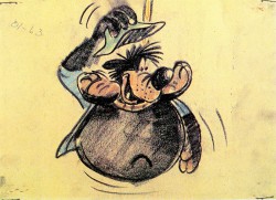
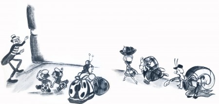
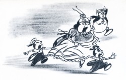
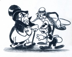
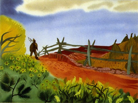
Song of the South is represented by a large selection of art direction sketches and storyboard artwork. All of it beautiful. I’m lifiting these images to showcase some of the great work for this feature. It deserves more attention from the Disney archives, but since they just about disown the film, I’m thankful for these images selected by John.
(Click any image to enlarge.)
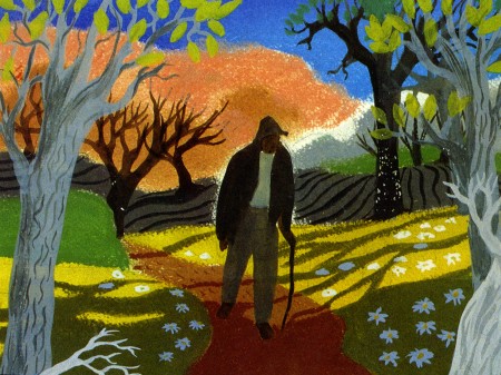
John leaves the artwork as uncredited but they remind me of Art Riley or
Al Dempster‘s style. They could be images from a Little Golden Book, and
Dempster & Bill Justice did books associated with that film.
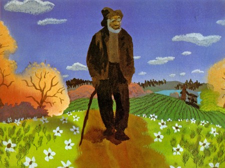
I suppose they’re actually the work of a number of different people.
And here’s the board segment:
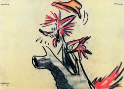
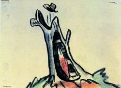
Gorgeous art by Bill Peet.
Books &Fleischer &Illustration 31 Dec 2008 09:01 am
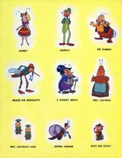
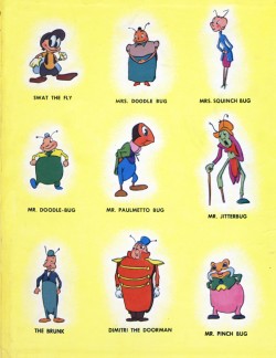
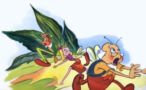
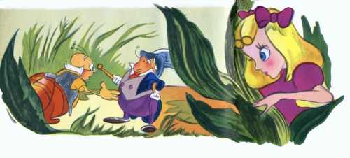
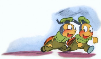
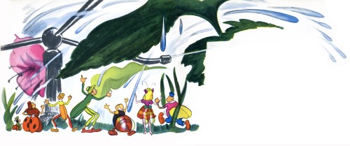
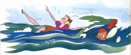
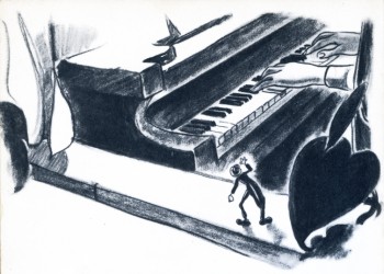
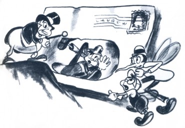
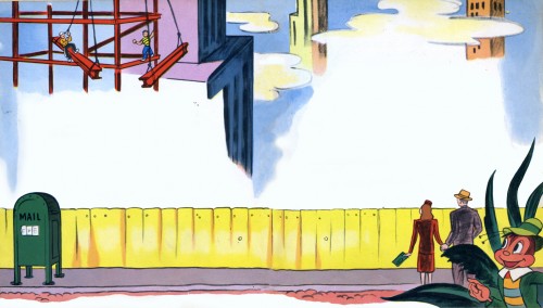
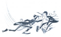
Mr. Bug Book
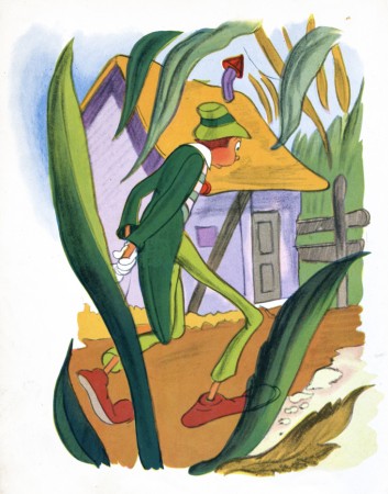
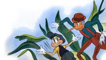
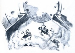
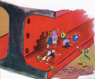
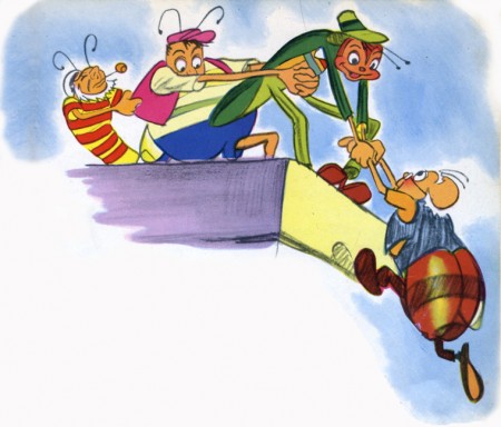
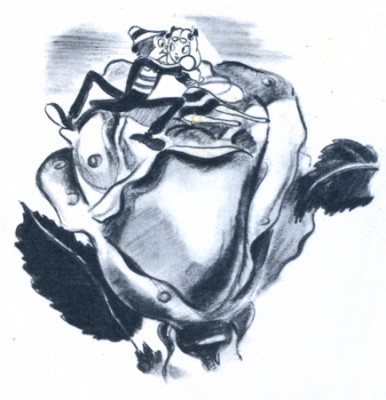
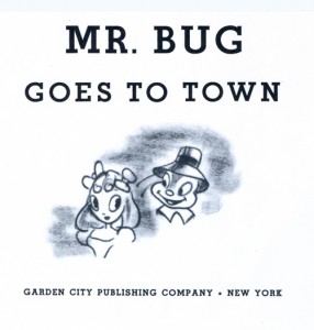 - Back in Feb 2006, I posted a couple of pages from a book I had in my collection, Mr. Bug Goes To Town, published in 1941. The drawings of the book are every bit as gorgeous as the film. The publisher listed is Garden City Publishing Co., but it’s a division of Western Publishing which also published some of the excellent Disney books.
Currently, at NY’s Film Forum (through Thurs. Jan.1) there are 1pm matinees of this film, so it gives me an occasion to post the entire book this time.
I saw a beautiful 35mm print of this film at MOMA last year. I’d been invited to a “press screening” which had only one member of the press in attendance. He, I and Matt Clinton, my animator on staff, were the only ones in the room. It was a private screening, indeed.
Here are the Back and Front covers of the book:
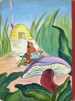
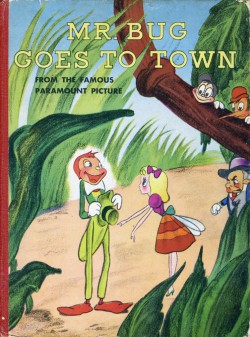
(Click any image to enlarge.)
Animation Artifacts &Books &Disney &Story & Storyboards 09 Dec 2008 09:00 am
“Blblblbl”
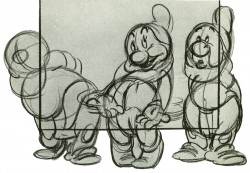
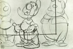
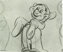
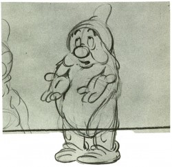
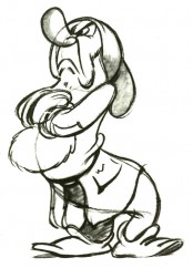
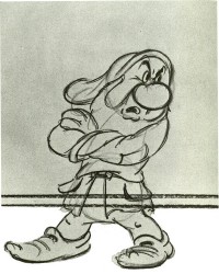
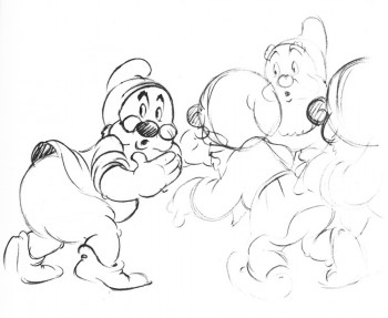
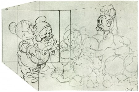
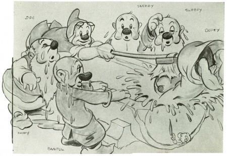
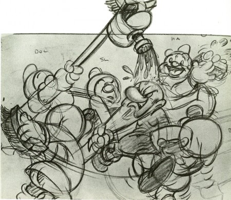
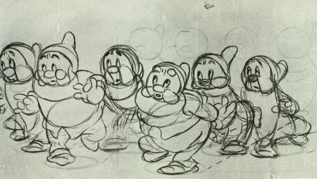
- Bill Tytla‘s animation of the devil from Night on Bald Mountain, featured yesterday, couldn’t be further away from the dwarfs he animated in Snow White. (Fred Moore was his partner in the task of supervising the dwarfs.) In this film, he had seven characters to animate, seven characters to give real characterization in somewhat short screen time. All seven had to have personalities that could be recognized within moments. It helped, of course, that they were defined by their names, but getting that across without cliché was no mean feat.
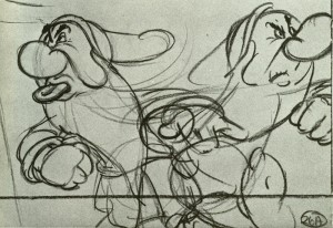
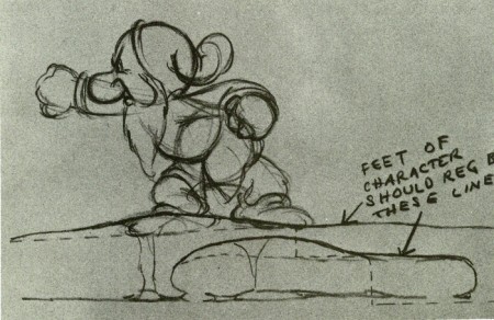
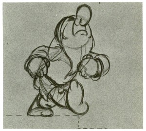
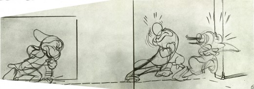
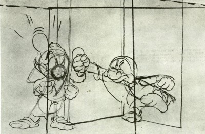
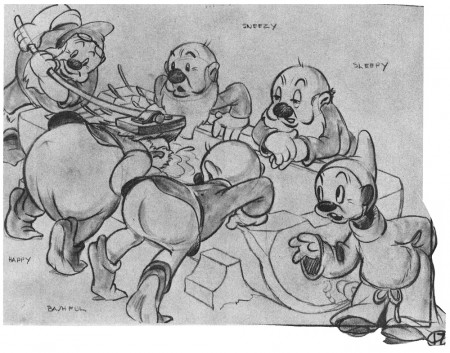
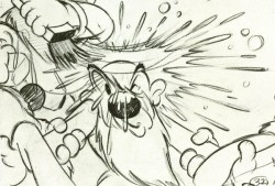
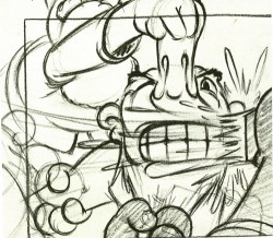
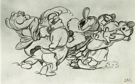
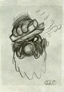
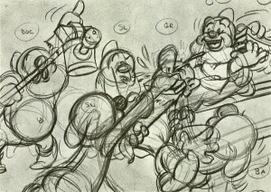
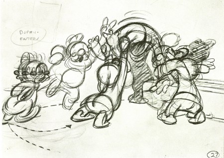
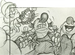
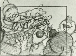
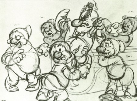
Here are some storyboard drawings, art direction sketches which would have helped lead through the washing song sequence.
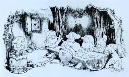
(Click any image to enlarge.)
.
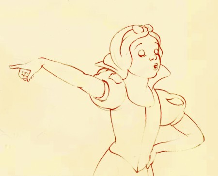
.
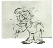
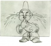
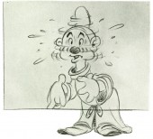
I featured Tytla’s animation for this sequence in another post – here.
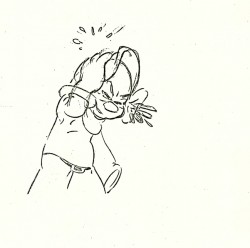
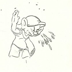
A couple of drawings shown below.
.
.
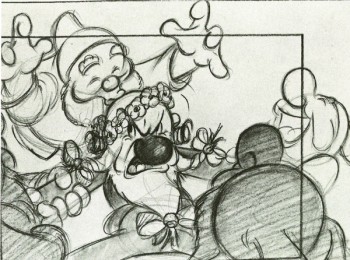
Doc kisses Grumpy. How the times have changed.
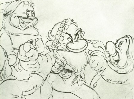
This one looks like it might be a Tytla rough.
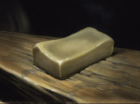
This is a bar of soap that occupies a fly.
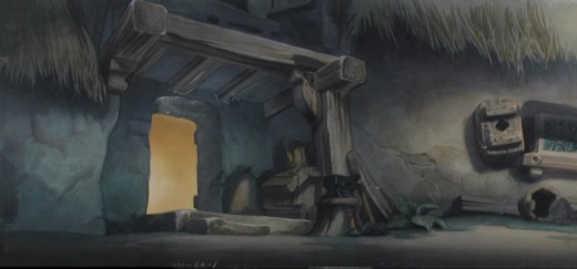
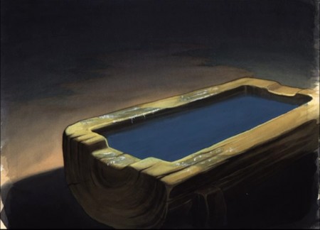
This is the exterior background where the setpiece takes place.
Books &Puppet Animation &Trnka 17 Nov 2008 09:14 am
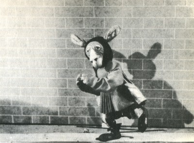
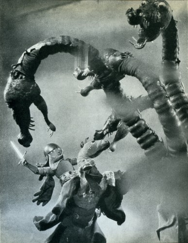
Trnka’s “Bayaya”
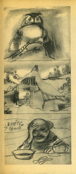
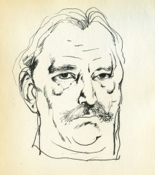 – Early in the history of this blog, I wrote quite a bit about Jiri Trnka. This man’s artwork has long been a source of great inspiration to me. His illustrations for the fairy tales of Grimm and Andersen are stunning and the two books are of inestimable value to me. His puppet films are so brilliantly strong and lyrically beautiful that I was overwhelmed when I first saw them, even though his reputation preceded them. I’d read enough about him and owned a magnificent biographical account of his work, that I was confident I would be a bit disappointed when I finally saw the films. I wasn’t.
The Hand was magnificent and remains one of my favorite films, to this day.
The Archangel Gabriel and Mother Goose is a beautiful animated puppet film about Venice during the late Middle Ages.
The Midsummer Night’s Dream is a feature-length masterwork that has to be seen for any lover of animation – nevermind puppet animation.
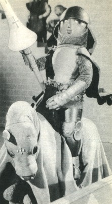 The film, Bayaya was a mystery to me for many years. It was not an easy film to view. Back in the 70s, there was no video, and seeing Trnka’s films meant trips to the NYPublic Library in NY to visit their collection of 16mm films. There you could watch any of the collection or borrow them to watch at home. These films were often littered with many bad splices where the films had broken. The quality of the colors deteriorated over the years. It made for tough viewing, but it also made it possible to see some of the Trnka canon.
Bayaya was not part of this collection. In fact, I’ve only seen part of the film once. John Gati, a NY puppet animator who was a good friend, located a copy of a 20 min excerpt (in Czechoslovakian) for an ASIFA-East screening and showed it to a small audience in a classroom at NYU. The print was black and white, but since I’d only seen B&W illustrations, this made sense.
This film represented a strong change for Trnka. He had previously done a number of cel animated films. These shorts were remarkable in that they were a strong step away from the Disney mold. This was a bold step to take in the animation community in Europe circa 1947.
The film was purely lyrical, and the story accented the folk tales quality of these legends of Prince Bayaya and The Magic Sword. Consolidating the two, he named the film after the hero and made him the embodiment of courage, morality and honor.
Trnka considered Bayaya a turning point in his career. He realized that the puppet film had taken on new strength and he had to follow through with every film thereafter.
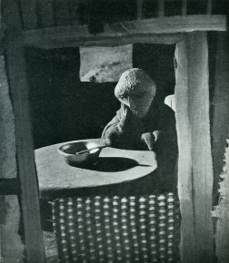
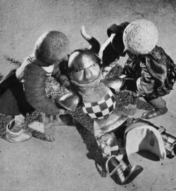
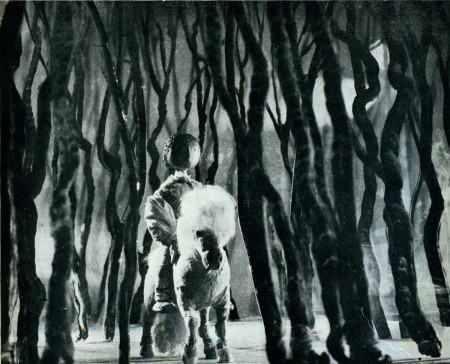
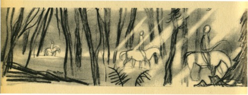
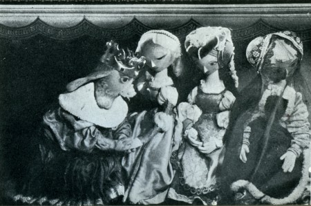
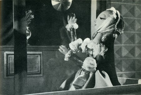
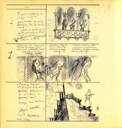
Here are a couple of scenes from the Trnka book I treasure, Jiri Trnka: Artist & Puppet Master.
There are two parts of a documentary on Trnka available via YouTube. They’re worth the watch. Part 1, Part 2.
Animation Artifacts &Books 10 Nov 2008 08:42 am
Fire!
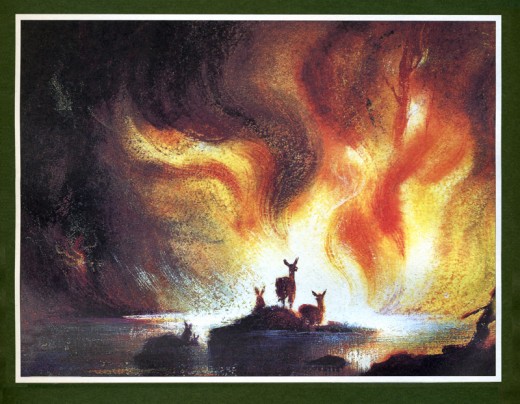
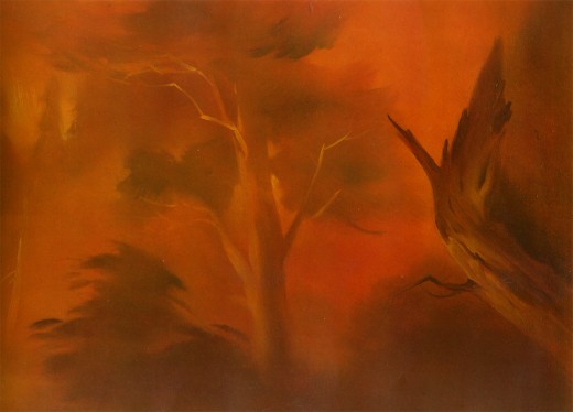
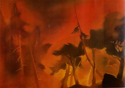
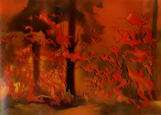
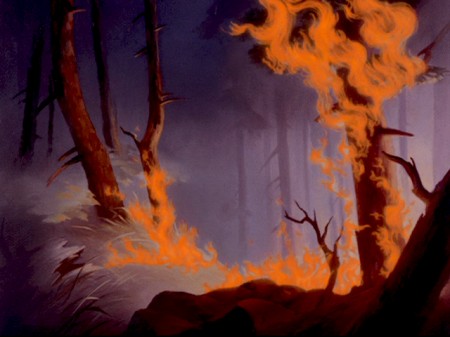
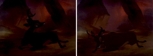
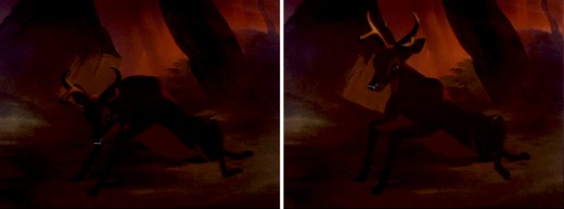
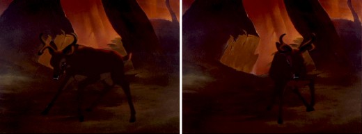
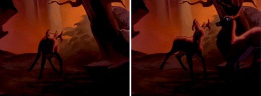
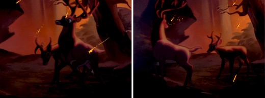
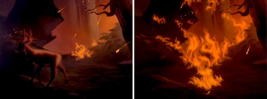
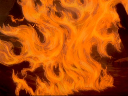
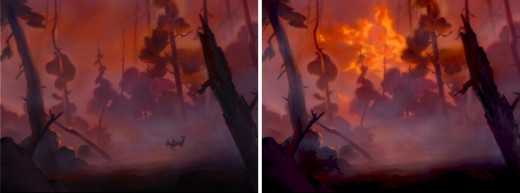
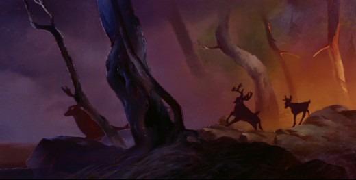
- One of the great sequences in film, nevermind animation, is the forest fire in Bambi.
Here is storyboard sketch for the sequence.
Here are four backgrounds straight from John Canemaker‘s book, Treasures of Disney Animation Art. These four are all accredited to John Hubley.
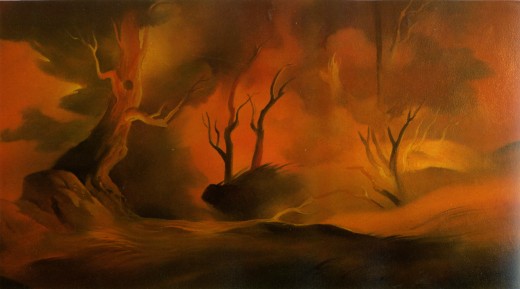
(Click any image to enlarge.)
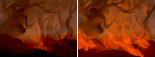
Here are frame grabs from a couple of the scenes:
When the stag comes to save Bambi, lying on the forest floor – “Get up, Bambi. Get up! – the two scenes were made more dynamic by a special shoot wherein a strong light on a dimmer was set behind the background. As Bambi tried to lift himself, the light was slowly turned on lighting up the front of the scene as well.
Check out Hans Bacher‘s incredible sight for background reconstructions from this film. There’s a wealth of art in this movie. Two recent backgrounds shots that he’s posted are relevant to this sequence.
Animation &Books &Disney 15 Oct 2008 08:13 am
Tytla’s Willie
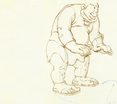
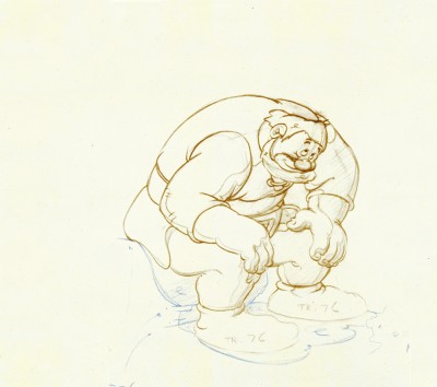
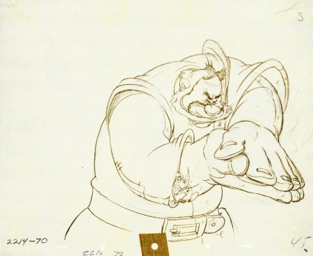
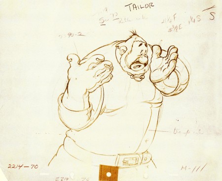
- When I was a kid, I was never a big fan of the “Willie” character, the giant in Mickey & the Beanstalk. It seemed that every fourth or fifth Disneyland tv show would have this character in it (or else Donald and Chip & Dale). As I got older and grew a more educated eye for animation, I came to realize how well the character was drawn and animated.
Willie first appeared in the classic Mickey short, The Brave Little Tailor, and he appeared fully formed. Bill Tytlas was the animator, and he appeared to have fun doing it.
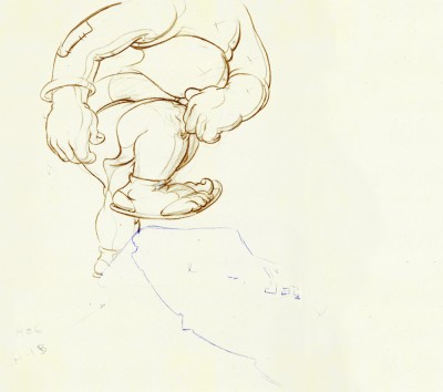
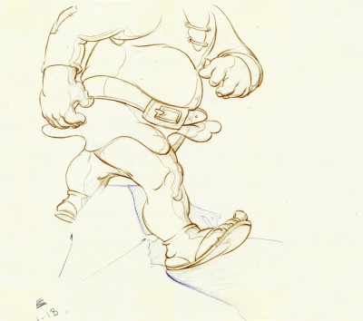
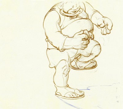
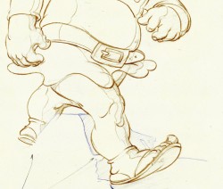
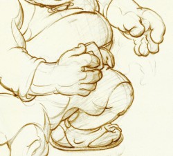
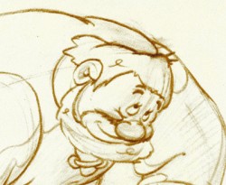
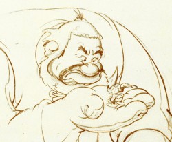
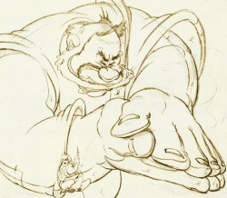
In John Canemaker‘s excellent book, Treasury of Disney Animation Art, there are some beautiful drawings worth looking at. Here they are:
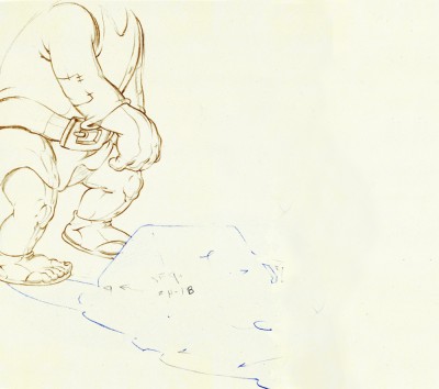 1
1(Click any image to enlarge.)
So let’s take a closer look at some of these drawings.
.
Drawing #3 features this weight shift. As the right foot hits the ground it pronates – twists ever so slightly inward. The hands do just the opposite. The left hand reaches in while the right hand holds back, completely at rest.
It’s a great drawing.
.
.
.
Drawing #4 shows Willie landing on that right foot, and his entire body tilts to the right. The hands twist completely to the left trying to maintain balance. The left foot up in the air is also twisting to the left before it lands twisting to the right.
.
.
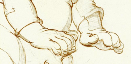
I love how drawing #5 features the two hands flattened out to
make his final stand before sitting down. It’s all about gaining balance.
.
.
.
.
Just take a look at this beautiful head in drawing #6. He’s seated, his head has come forward and tilted forward. The distortion is so beautiful it almost doesn’t look distorted.
What a fabulous artist! This guy just did this naturally.
.
.
.
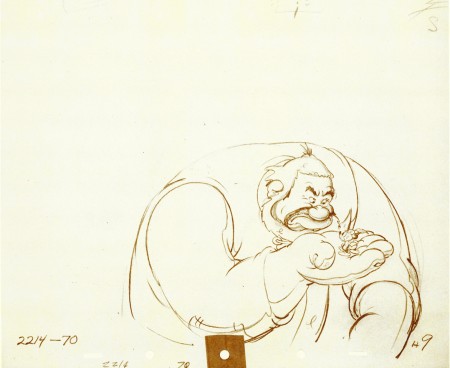
This scene begins with the seated giant eyeing the tiny Mickey Mouse in his hand. The characters are drawn beautifully almost at a rest waiting to get into the scene. The intensity of Willie’s glare is strong, and it’s obvous Mickey is in trouble.
.
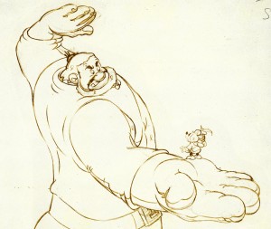 Here’s the drawing of the sequence.
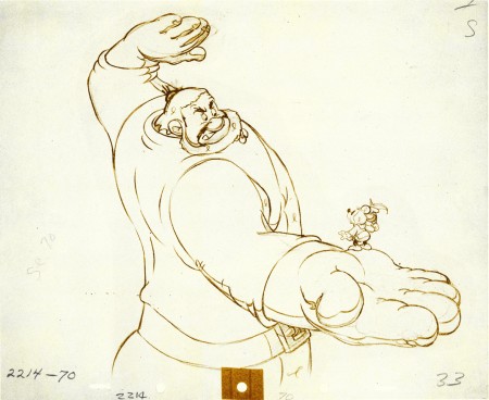
The major problem with drawing a giant is his proportion to all the other characters. The screen is more oblong and vertical than it is square. (Fortunately, when this film was done it was closer to a square but still not one.) Throughout the film, Tytla had to deal with a BIG and Mickey and the landscape are small.
An obvious way of handling it – and one that would be done today, no doubt – would be to force perspective showing it from the ground up – most of the time. In the 30′s and 40′s they stuck to the traditional rule of film and editing, and they would NOT have done this.
Tytla plays with scale as the giant steps over a house and ultimately sits on it.
In this drawing, he does a brilliant drawing forcing the perspective with Mickey in the foreground and Willie’s left hand in the distance. The giant draws into this forceful perspective without calling attention to itself. Today it would be more exaggerated, but Tytla doesn’t want it to be noticed – just felt.
A real bit of art!
Here, Willie moves through that perspective of the last extreme, and he gets larger as he slams his hands to flatten Mickey. To exaggerate that flattening, Willie’s hands flatten for this key drawing. His head flattens as well in grimace.
The giant’s head will move in toward the hands to see the results, and the audience has a front row seat seeing Mickey escape up the giant’s sleeve. There’s a lot going on in this drawing.
.
.
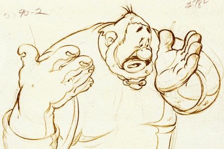
Finally, Willie tries to figure out what’s happened.
The drawing loses most of its distortion and comes to rest.
(Note that there’s still perspective distancing between the two hands.)
Mark Mayerson has done a mosaic breakdown of this cartoon and adds his excellent commentary.
Books &Comic Art &Disney &Illustration 09 Oct 2008 08:23 am
Wise Little Hen – Book
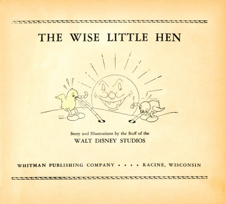
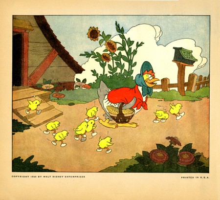
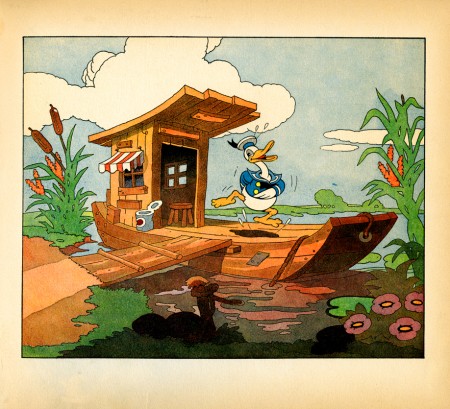
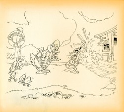
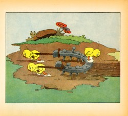
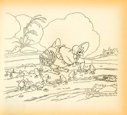
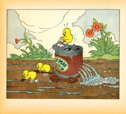
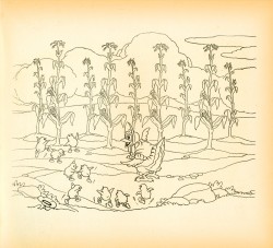
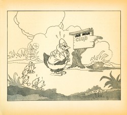
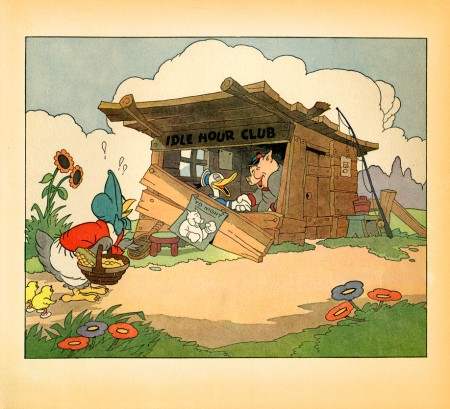
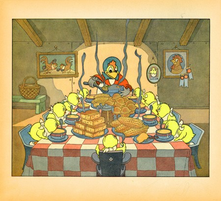
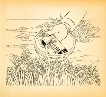
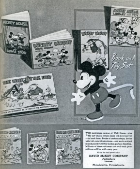 - Another gem from the collection of John Canemaker is this early book published by Whitman in 1935. The Silly Symphony short, The Wise Little Hen, introduced Donald Duck to the world on release of the film in 1934.
The book is a good example of some early merchandising by the Disney brothers. These books started out as Premium give-aways: for example Mickey Mouse, Mail Pilot was given away by the American Oil Company and Mickey Mouse Sails for Treasure Island was a premium for Kolynos Dental Cream.
The success of the books continued for many years, even after Whitman grew into the Western Publishing who released the Little Golden Books and many many comic books featuring Disney characters. _____________________________An early ad for the books.
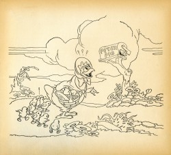
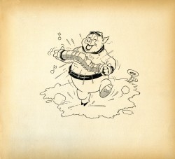
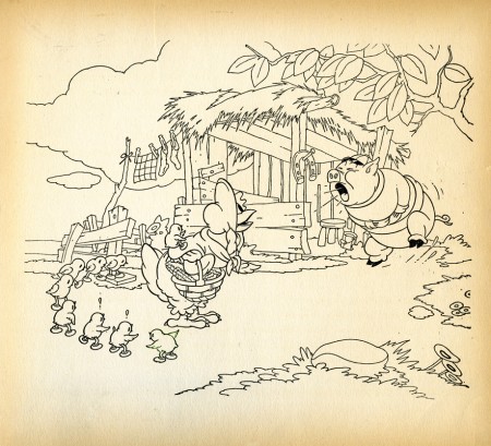
Here are the illustrations for this book:
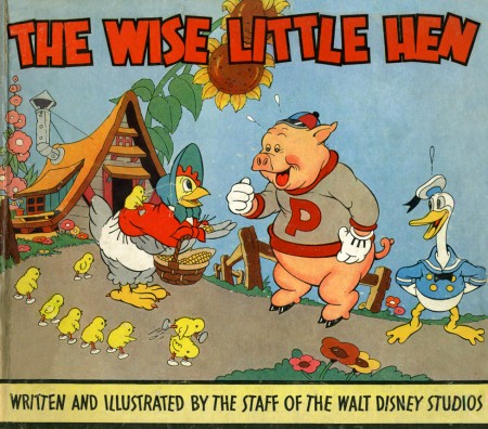
(Click any image to enlarge.)
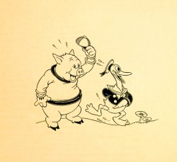
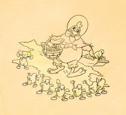
These two images greet you when you open the book.
They’re the inner cover for both the front and back of the book.
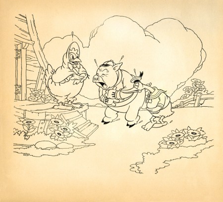
I wish Donald had continued to look like this. I love the way he looks in the film.
Books &Errol Le Cain &Illustration 11 Sep 2008 08:05 am
A School Bewitched – pt.2
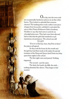
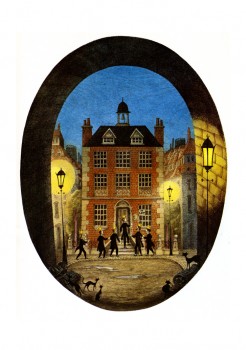
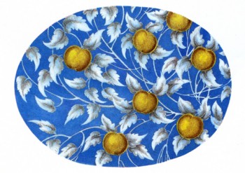
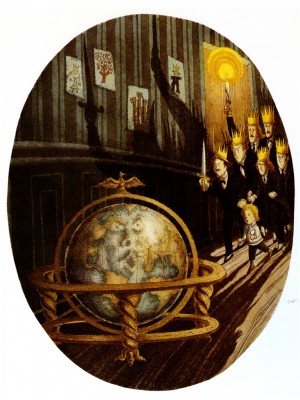
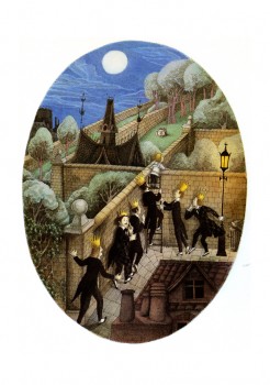
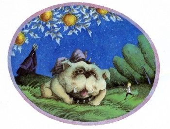
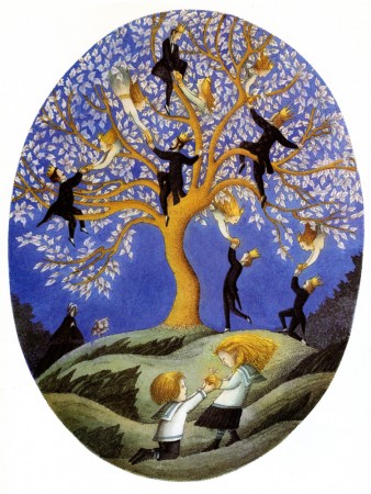
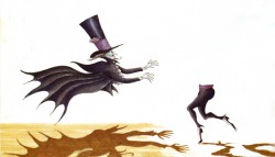
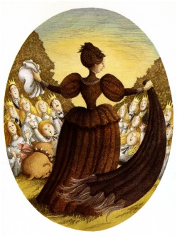
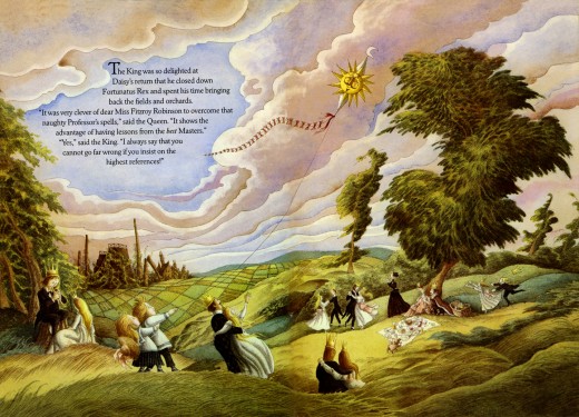
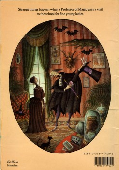
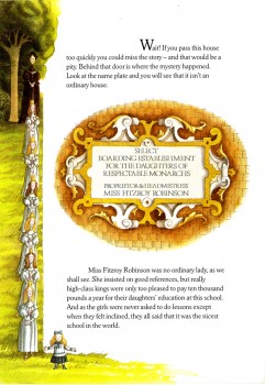
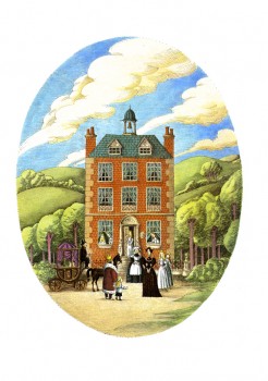
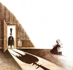
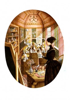
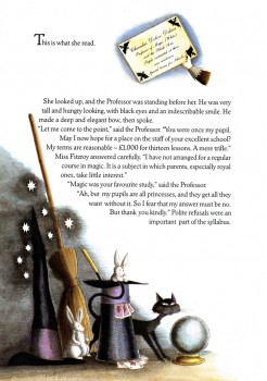
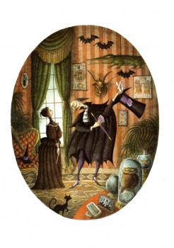
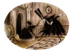
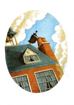
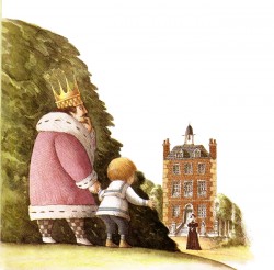
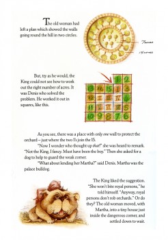
 - Here I continue with the illustrations by Errol Le Cain for the book written by Naomi Lewis from a story by E. Nesbit.
A School Bewitched is a small picture book with a full page illustration on every other page. The remainder have spots which decorate around the type.
Again, my focus here (and yesterday) is to show off the illustrations. I’m not concerned with telling the story. I’d urge you to buy the book if you’re interested in that.
______(Click any image to enlarge.)
 16
16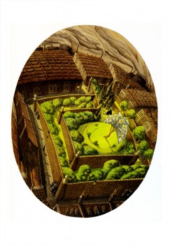 17
17
Books &Errol Le Cain &Illustration 10 Sep 2008 07:36 am
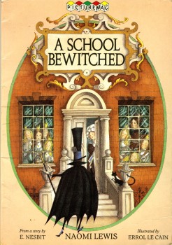
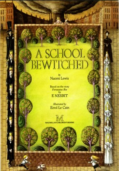
A School Bewitched – pt.1
 - As you know, I am an enormous fan of Errol Le Cain’s work. I’ve been posting quite a few of his illustrations for children’s books. (You can see the past posts, if you’re interested, here.)
Today, I’m showcasing a book written by Naomi Lewis from a story by E. Nesbit.
The book was adapted to a film on the BBC, narrated by Nigel Havers. She also adapted The Snow Queen which Le Cain illustrated.
The book contains 30 pages, and every page includes an illustration. I’ve decided to break this into two parts since I don’t want to post tiny thumbnails of the pictures.
I’m not highlighting the text; you’ll have to buy the book for that. I am posting all the great illustrations and hope you enjoy them as much as I do.
 __
__ 1
1(Click any image to enlarge.)
To be concluded tomorrow
Books &Disney 22 Aug 2008 07:59 am
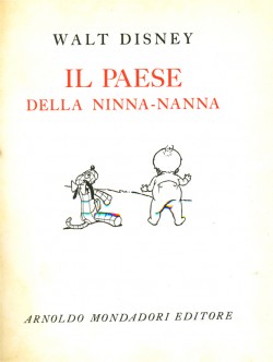
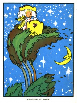
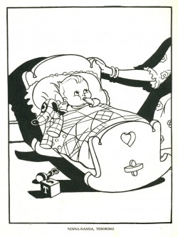
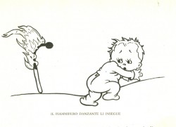
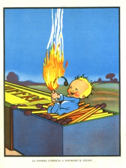
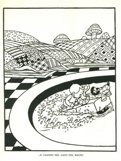
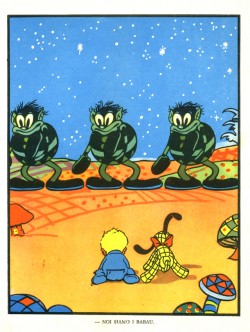
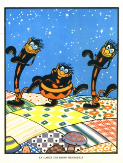
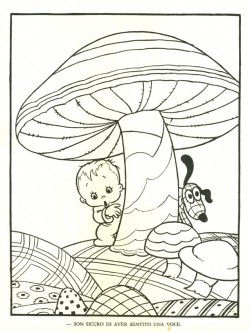
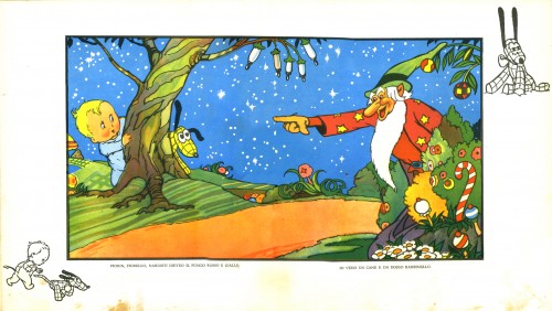
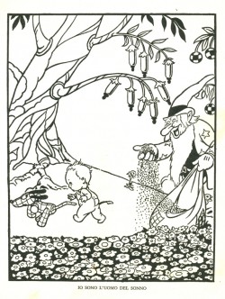
Lullaby Land – the book
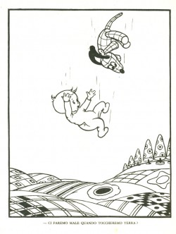
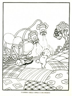
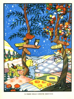
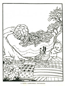
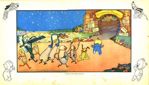
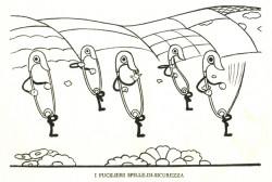
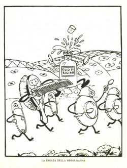
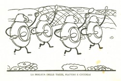
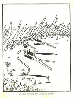
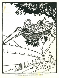
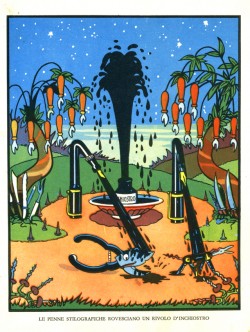
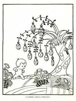
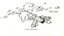
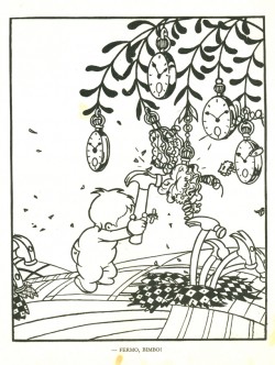
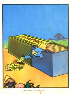
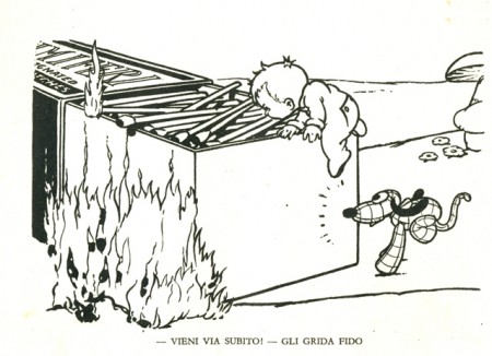
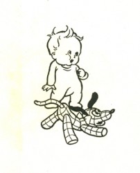
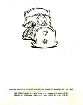
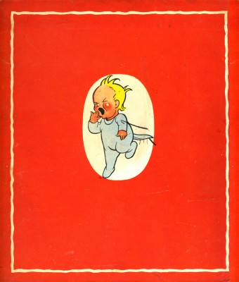
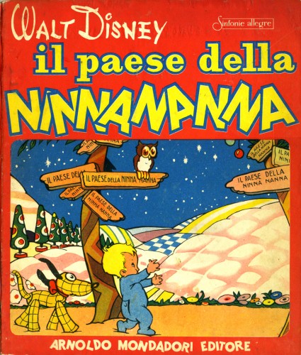
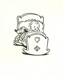 - Lullaby Land was a Disney Silly Symphony made in 1933. It was an early color short directed by the inestimable Wilfred Jackson. The short was an adaptation of the poems by Eugene Field, Love Songs of Childhood published in 1894. John Canemaker had this Italian edition of the film published by Mondadori in 1948.
It took them some 15 years, till they were able to get rid of Mussolini, to catch up, I guess. It’s interesting that the social realists, such as Rosselini, De Sica and Fellini, were taking over the Italian film industry when this book was released. The world was in a very different place from the time that the short had originally been produced. I wonder how well this book was received.
Here are the illustrations from John’s copy of the book:
(Click any image to enlarge.)
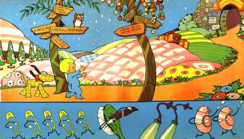
The book’s inner cover spread.
