Category ArchiveBooks
Books &Illustration 08 Apr 2009 07:48 am
Un Drago Troppo Solo
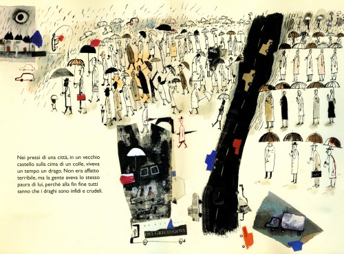
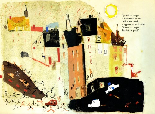
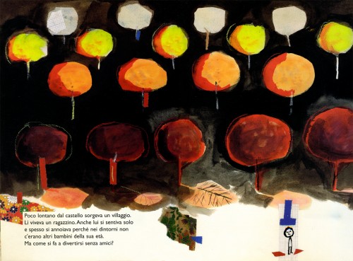
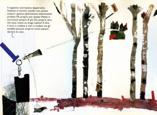
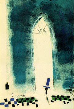
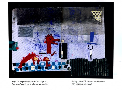
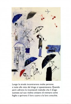
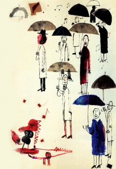
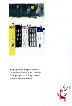
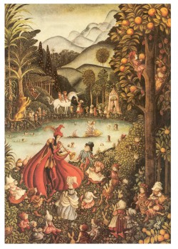
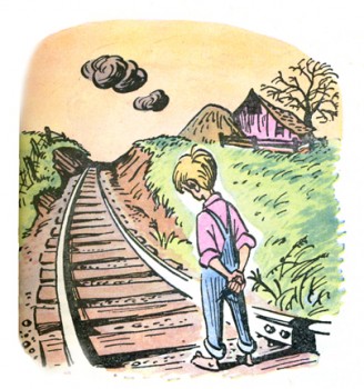
- John Canemaker knows that I love great children’s book art. He’ brought this book to my attention and loaned it to me to post some of its illustrations. Un Drago Troppo Solo (Only a Dragon Too) is a beautiful Italian children’s book written by Doris Diedrich and illustrated by Javier Zabala.
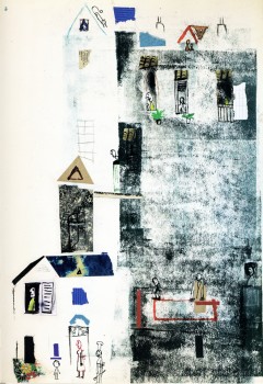
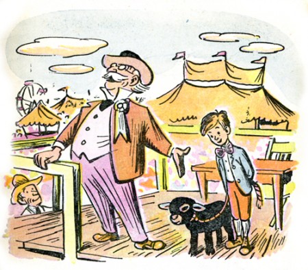
It’s the story of a bored boy who tames a dragon. The illustrations are right out the Abstract Expressionist handbook. Using collage, bits of tape, graph paper, splattered paint and strong expressive painting, the illustrations are distinctive and inspiring.
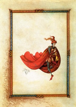
Here are a few of the book’s illustrations:
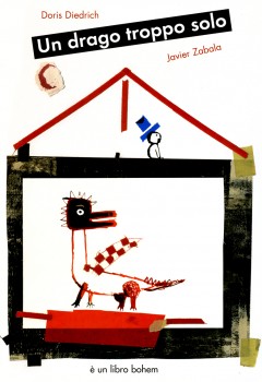
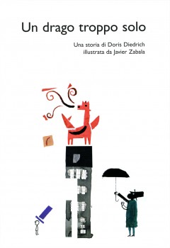
The front cover | the Title Page
Books &Errol Le Cain &Illustration 04 Apr 2009 09:14 am
LeCain’s Pied Piper recap
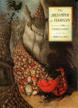 - After learning that Don Bluth et al were planning to do a film called “The Piper” prior to their working on Banjo: the Woodpile Cat, I wondered and assumed that it was probably The Pied Piper of Hamelin.
Many years ago as a child, I received a gift of a viewmaster projector, and it came with one title: The Pied Piper of Hamelin. Those slide shows usually came with a script that you could read along with each projected slide. I remember that this one came with the lengthy Browning poem. Reading it to myself, I loved it. So I memorized it (and still remember now some fifty years later.
I’ve always been attracted to versions of this story and often seek them out.
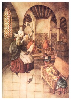
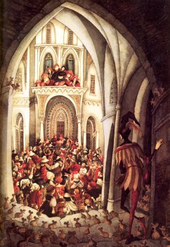
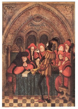
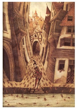
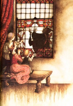
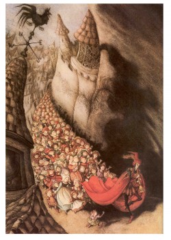
Errol Le Cain‘s illustrated a version of the poem, and here are some images from the book, The Pied Piper of Hamelin. It was first published in 1989 (the year he died). The book is an adaptation of Browning’s poem by Sara and Stephen Corrin.
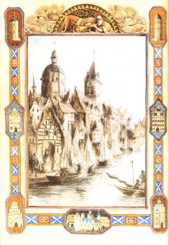
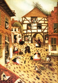
(Click on any image to enlarge.)
Books &Disney &Peet 18 Mar 2009 08:06 am
So Dear #5
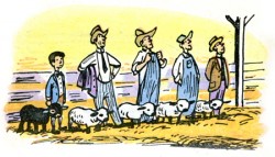
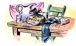
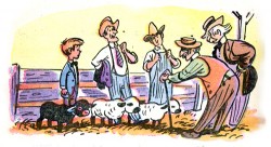
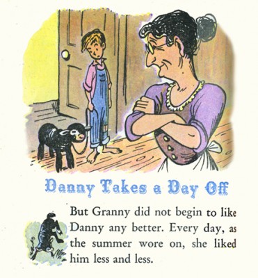
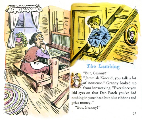
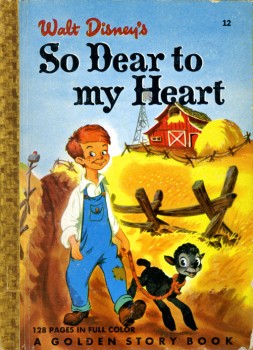 - Here’s the conclusion to the Little Golden StoryBook, So Dear To My Heart. The book is an adaptation, of course, of the movie by Helen Palmer with illustrations by Bill Peet.
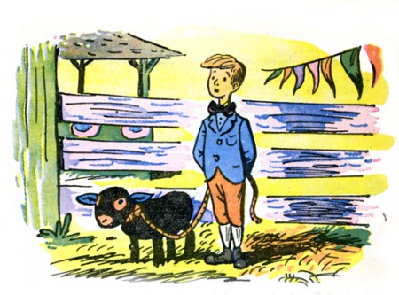
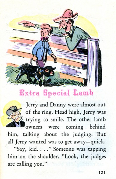
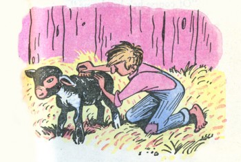
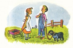
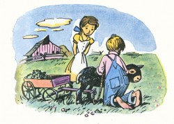
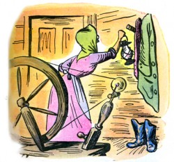
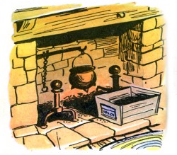
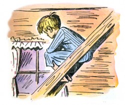
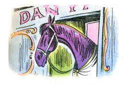
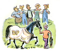
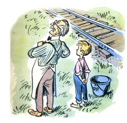
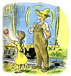
At 128 pages, the book is quite long and chock full of gems by Bill Peet. It’s one of his first publications and shows a lot of the hallmark look he’ll have once he bagan writing and illustrating his own books, although they’re considerably shorter (averaging about 30 pages.) These ink and watercolor illustrations are all spot drawings and fill usually about a third of the page. The colors are limited with an inexpensive printing process used on inexpensive paper. At 5″ x 7″, the book is also a bit smaller than the usual Golden Book.
Here are the last two chapters:
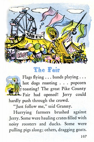
(Click any image to enlarge.)
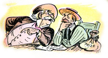
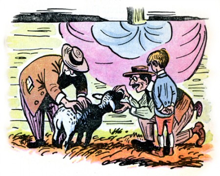
This drawing, alone, is worth the entire book. It’s beautiful and shows
Peet’s brilliance at capturing characters in a specific moment of time.
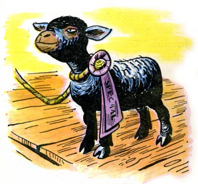
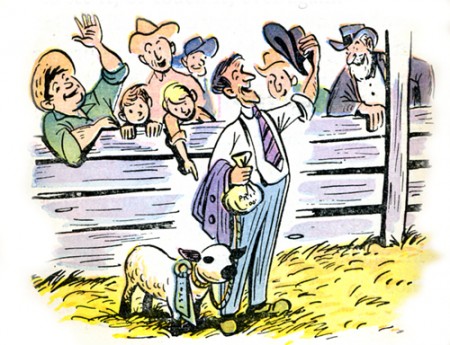
Most illustrators would probably have ended the book on this image of
the grand prize winner – such a temptation, the climax of the book.
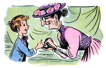
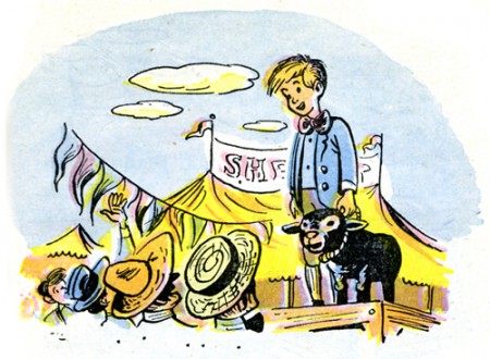
Peet is character driven and knows that the book is about the boy.
The last image has to be a shot (did I say shot? this isn’t a film. I meant
to say) picture of the real hero of the story . . . the boy.
Books &Disney &Illustration &Peet 11 Mar 2009 08:00 am
So Dear #4
 - This is my fourth installment of Bill Peet‘s illustrations for the Little Golden Book adaptation of the Disney feature film, So Dear To My Heart. The book was written by Helen Palmer and is much longer than other Little Golden Books. It’s novella length and includes many short stories built on the film’s original story.
I believe it’s the first book Bill Peet illustrated, and it led the way to a very successful career after he left Disney’s in the 60s. In his autobiography, Peet doesn’t mention this book. He talks about writing Lambert, the Sheepish Lion as his first potential children’s book. Obviously, he sold that to Disney instead of selling it as a book.
All illustrations are drawn with ink and painted with watercolor. THe printing is done on cheap paper, and the inks have obviously saturated the paper.
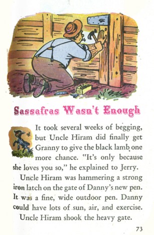
(click any image to enlarge.)
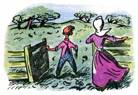
There’s something iconic about this image which
strikes a chord with me.
There are two more chapters to go, so one more post. It’s certainly turned into much more work than I’d expected. It should be complete later this week.
Books &Illustration &Peet 06 Mar 2009 09:01 am
So Dear #3
 - Here is the third installment of Bill Peet‘s illustrations for this wonderful Little Golden Book (it’s not so little) adaptation of the Disney feature film, So Dear To My Heart.
The book, written by Helen Palmer, is quite a bit larger than any other Little Golden Book I’ve seen. It really was a large job for Bill Peet to undertake.
All illustrations are ink with light watercolor. They certainly foreshadow the look of Peet’s children’s books to come some 15 years later.
Looking at the book through the illustrations, alone, one gets the feel of a very innocent, bucolic setting. The problems of the child are front and center, but these aren’t very real problems. This makes for a light series of stories. (To be honest, I haven’t read the text, but there is an overwhelming feeling that comes over you when you spend a bit of time with the images.) The film wasn’t an extraordinary success. I don’t imagine it’d fare better today. In fact, I’d suspect it couldn’t get released by today’s Disney. Maybe if you switched the lamb to a talking chihuahua.
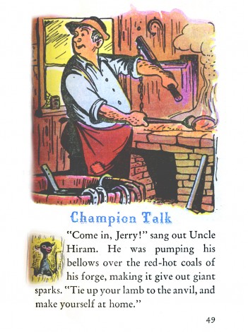
(Click any image to enlarge.)
Thanks to John Canemaker for the loan of the book.
Articles on Animation &Books 04 Mar 2009 08:36 am
Tekenfilm
 - Marten Toonder lived through much of the history of Dutch animation. (Like many other throughout Europe he gained the moniker of the “Walt Disney of Holland.”)
He was born in 1912 and died July, 2005. In 1940, with puppet animator, Joop Geesink, he formed the Geesink-Toonder Studio. The break-up of the two led to his forming the Toonder Studio in 1942.
He left this studio, as tituilar head, to get back to illustration in 1965, and ultimately retired in 1977.
Toonder is probably best remembered for his several successful comic strips. You can visit a sample of these here or here.
He made animated shorts of his comic strip, Tom Puss, which you can see on YouTube.
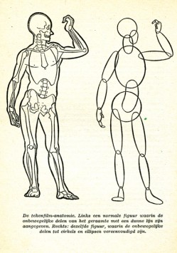
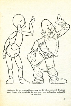
I make Toonder the subject of this post because I have an early book about animation which he wrote. Called Tekenfilm, it seems to have been written in 1946; at least that’s the only date I can find in the smallish publication.
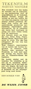
It’s in Dutch, so I’m not able to read the book. However, I thought I’d post a couple of pages of the book . I haven’t been able to find any reference to the publication to date. ___________________The book’s flyleaf – in Dutch
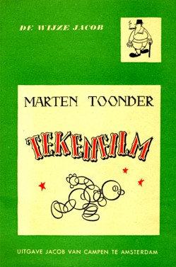
The book’s Front cover & Back cover
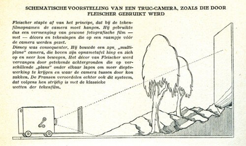
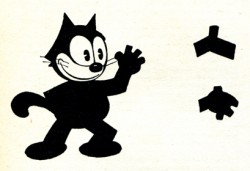
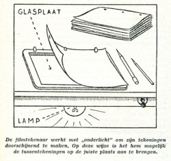
Here the Fleischer studio gets credit for the Multiplane Camera.
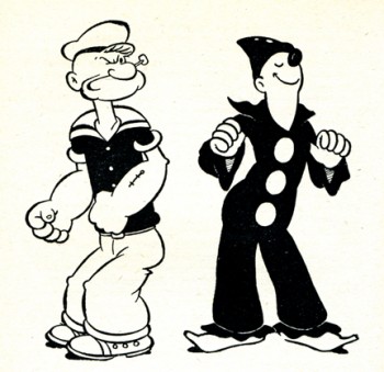
I like the way Popeye is drawn. Koko looks more on model.
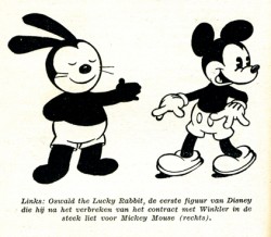
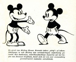
A wierd looking Oswald leads to Mickeys.
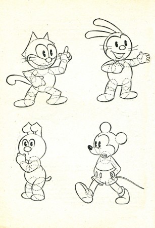
How to try to draw some characters.
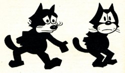
Where’s Bugs?
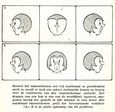
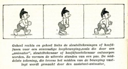
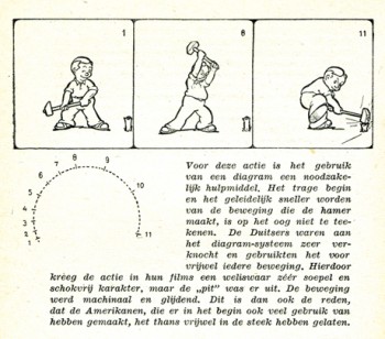
Here’s a lesson you still don’t see in many animation books.
How not to draw the mechanical inbetween.
His solution isn’t the best.
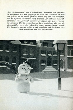
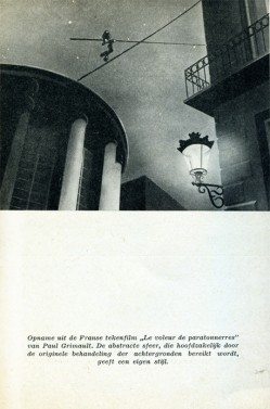
Ending with two European cartoons of merit from 1944:
The Snowman in July by Hans Fischer-Kösen
and Voleur de Paratonnerres by Paul Grimault
Books &Disney &Illustration &Peet 26 Feb 2009 09:08 am
So Dear #2

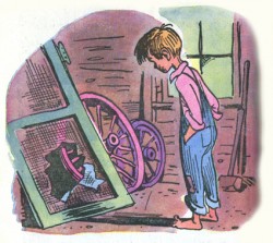
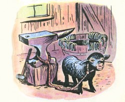
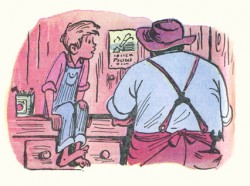
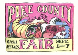
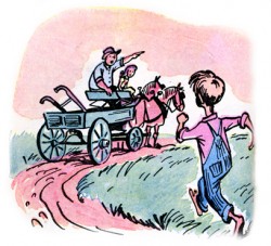
- Yesterday, I offered some illustrations by Bill Peet done for a Little Golden Book – excuse me, Golden Story Book.
There are some 126 pages (almost the size of a novel) and an illustration on most of them. These are all spot illustrations done in ink with confident watercolor coloring.
In some odd ways, these illustrations remind me of those for Mike Mulligan and His Steamshovel. Yes, they’re very different – very different. But the feel of them all adds up to something very homespun and similar. Perhaps it’s the coloring process that’s done it, a very washed out look. Despite the fact that these are four color illustrations and those in Mike mulligan are two color.
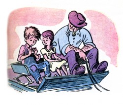
(Click any image to enlarge.)
More to come next week.
Books &Disney &Illustration &Peet 25 Feb 2009 09:03 am
So Dear To My Heart

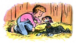
- If the Little Golden Books had ever published a novel, this is it. So Dear To My Heart is an encapsulation of the film by Helen Palmer with illustrations by Bill Peet “adapted from the film.”
This collectible item comes from the amazing John Canemaker collection, and I thank him for the loan.
The pictures are mostly small spot illustrations done in ink and watercolor. They’re very simple and give a good indication of Bill Peet’s future books (though he often used pencil for that and allowed the scumbled pencil to add texture.)
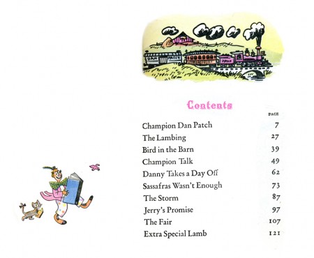
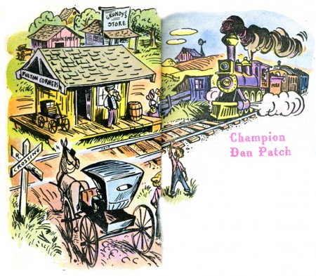
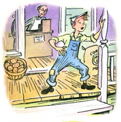
Here are the first 20 illustrations (more to come in a future post); there are many. One illustration per page with 125 pages.
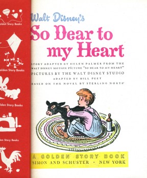
(Click any image to enlarge.)
Books &Commentary 17 Feb 2009 08:48 am
Amid’s Books
 – Let’s talk a bit about a new book by Amid Amidi, The Art of Pixar Short Films. There are two reasons one might want to buy this book: you’re a fan of the Pixar films, including the shorts, or you’re a fan of Amid Amidi’s animation books.
I’d like to cover my interest first; I like Amid’s work very much. This is his third book published by Chronicle books. The first The Art of Robots was a beautiful puff piece for that Blue Sky film, a bit over-filled with fine drawings and paintings and final art
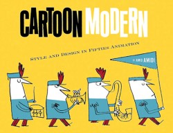
 from the industrious film. The second, Cartoon Modern, is a stunningly attractive, informative and extremely important animation book. It covered a lot of the holes left by other books – the real art that was pioneered by those who made films in the late 40s, 50s and early 60s. A thoroughly researched tome filled with beautiful reproductions, drawings and modern art as made for animation by many many studos and individuals. The book was an arduous task to pull off, and Amid made it look so simple.
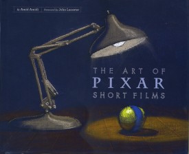 This third book, The Art of Pixar Short Films, resembles both of these past books, in some way. Amid has learned enough from the second book that his writing, his selection of artwork, his choices of design and presentation are important and make the book a beauty.
All type is gray, not black. The type for IDs of photos and artwork is handled as it would be on an architectural sketch or blueprint. Names are delineated, literally. The images are thoughtfully placed for the best composition with plenty of
 white space around them.
The artwork representing the films is well chosen; the development art is better represented than stills from the films, themselves. This is a plus; we can see the actual shorts on the dvds. For the most part, much of this art is excellent and oftentimes better than the films’ final art.
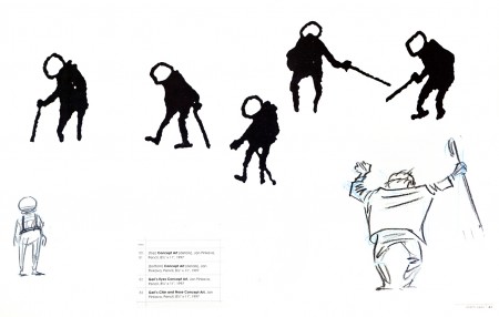
The gesture drawings done for Geri’s Game present an excitement
that seems distant from the final film, pictured below left.
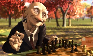 This brings me to my problem with the book, I’m not a big fan of the films. Pixar is a big studio, doing the top of the line work in cg animation. Toy Story, The Incredibles, Ratatouille can’t be beat. The shorts, especially the later ones are just not very good – in my opinion.
When a studio with the enormous abilities of Pixar chooses to do shorts, there has to be a reason. We’ve heard that the reason was to help develop talent so that future directors could stretch and grow. This is a good reason, but the shorts have to either showcase a high quality or a sense of experimentation that isn’t evident. When Disney did shorts back in the 30s so that his animators could learn and grow, the films were made to sell, but they had a level of expertise that we came to expect from Disney. Some of those Silly Symphony shorts have not been topped.
Looking at those beautiful drawings, above, for Geri’s Game, we see the potential for something alive and vibrant. The film is, for me, difficult to watch. It is the antithesis of those drawings. Perhaps they were working out some cg problem, but that’s really irrelevant to audiences.
Pixar’s current film short, Presto, isn’t represented in the book. (The 2D short, Your Friend the Rat is also not included in the book.) It aspires to outdo Tex Avery at his own game. But it doesn’t; t doesn’t come close. There’s no character animation that I can see – both characters move identically. There’s no character development that I see – both are cartoon characters with no personalities; only their motivations are different.. The timing is dreadful; the film moves too fast in its animation and in its cutting. Maybe you’d call that experimentation, but I call it bad film making. Of course, this is just my opininon. Many people love the short, and it may win the Oscar next Sunday.
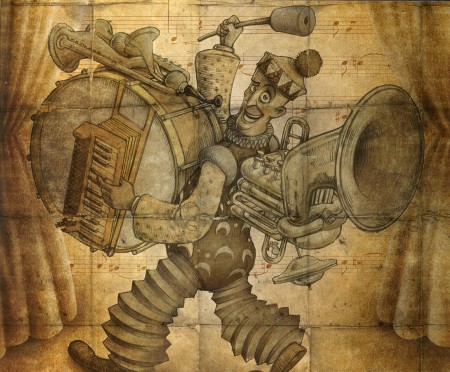
A beautiful drawing from one of the finer shorts by Pixar.
Yes, other shorts are better. One Man Band has delightful animation of the two musicians, but it also has the cloying, clichéd animation of the child which seems to come right out of the most obvious of Bluth. However, the score for this short is incredibly good.
Luxo Jr. is the finest of their shorts. It’s a beauty. Well designed with strong character animation. The fact that cg animation hadn’t been well developed at the time was irrelevant. The short did what it should have; it told a simple story, introduced a strong character and entertained audiences. It hasn’t lost that appeal, but I think Pixar may have.
I don’t have enormous hope for the cg films of Dreamworks unless some strong director can compete with Jeffrey Katzenberg’s insensitivities. I do still have hope for Pixar, and I’d like to see them do something with these short films. The Disney short, Glago’s Guest, though not perfect gave me great hope for the other Disney lot.
So, I’ve come a long way to say I prize this book for the graphics, many of the images chosen, the author, Amid Amidi’s sense of design and strong knowledge of the medium as well as an ability to articulate that information well. My only problem is the subject of the book. I’ll keep looking for everything Amid’s done, and I’ll continue to collect his books. They all have a lot to offer and fill an important part of my collection. They all are beautifully designed and every small detail is carefully watched. I’m ready to buy his next book.
Animation &Books &Puppet Animation 28 Jan 2009 08:52 am
Jason & The Argonauts
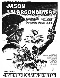
- Currently playing at the New Victory Theatre on 42nd Street (until Feb. 1) is a theatrical presentation of Jason and the Argonauts. Given the quality of the shows that play at the New Vic, I can pretty much guarantee that this is a first rate show.
I also have no doubt that the creators have seen the Ray Harryhausen film, Jason and the Argonauts, and must have been under its spell (however subliminally) in creating the show. It would be hard to believe otherwise given the reputation of the film. The skeleton fight, alone, makes the film famous.
This gives me a good excuse to attend to Mr. Harryhausen’s film and post the chapter from his 1972 book, Film Fantasy Scrapbook, about that film. The book is written in the first person singular and collects B&W images like a scrapbook.
Here it is:
Of the 13 fantasy features I have been connected with I think Jason and the Argonauts pleases me the most. It had certain faults, but they are not worth detailing.
Its subject matter formed a natural storyline for the Dynamation medium and like The Seventh Voyage of Sinbad strayed far from the conventional path of the “dinosaur exploitation film” with which this medium seemed to be identified.
Taking about two years to make, it unfortunately came out on the American market near the end of a cycle of Italian-made dubbed epics based loosely on the Greek-Roman legends, which seldom visualized mythology from the purely fantasy point of view. But the exhibitors and the public seem to form a premature judgment based on the title and on the vogue. Again, like Sinbad, the subject brewed in the back of my rnind for years before it reached the light of day through producer Charles Schneer. It turned out to be one of our most expensive productions to date and probably the most lavish. In Great Britain it was among the top ten big money makers of the year.
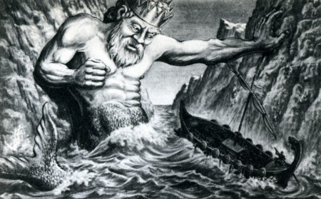
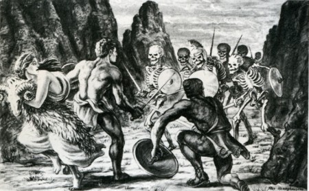
A preproduction drawing (above) compares favorably with a film still (below.)
The drawing is quite a bit more dynamic. (After all, it is Dynamation!)
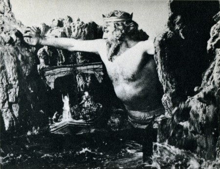
(Click any image to enlarge a bit.)
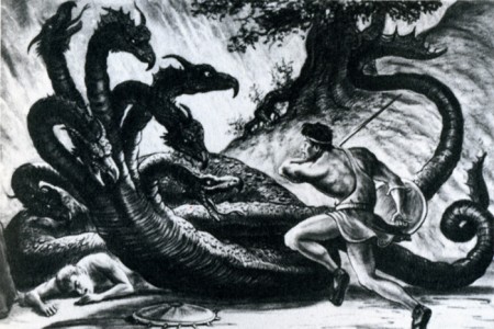
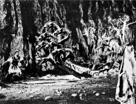
Likewise, a drawing of the hydra (above) film still (below.)
Some of the difference in basic composition between the pre-production sketches I made for Jason and the counterparts frames of the production is the direct result of compromising with available locations.
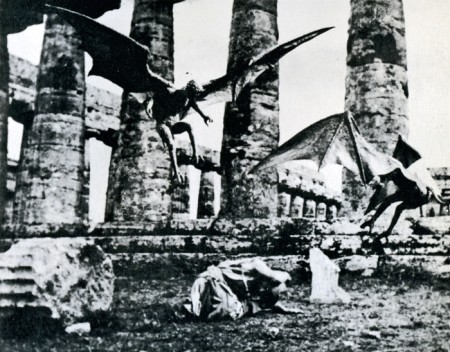
For example, the ancient temples in Paestum, southern Italy, finally served as the background for the “Harpy” sequence. Originally we were going to build the set when the production was scheduled for Yugoslavia. Wherever possible we try to use an actual location to add to the visual realism. To my mind, most overly designed sets one sees in some fantasy subjects can detract from, rather than add to the final presentation.
Again, it depends on the period in which it is made as well as on the basic subject matter. Korda’s The Thief of Bagdad was the most tastefully produced and designed production of any film of this nature but unfortunately the budget that was required would be prohibitive with today’s costs.
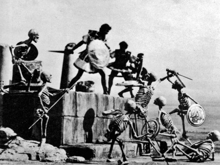
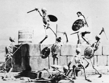
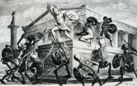
The Skeleton Sequence was the most talked-ahout part of Jason. Technically, it was unprecedented in the sphere of fantasy filming. When one pauses to think that there were seven skeletons fighting three men, with each skeleton having five appendages to move each frame of film, and keeping them all in synchronization with the three actors’ movements, one can readily see why it took four and a half months to record the sequence for the screen.
My one regret is that this section of the picture did not take place at night.
Its effect would have been doubled.
Certain other time-consuming technical “hocus-pocus” adjustments had to be done during shooting to create the illusion of the animated figures in actual contact with the live actors. Bernard Herrmann’s original and suitably fantastic music score wrapped the scenes in an aura of almost nightmarish imagination.
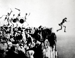
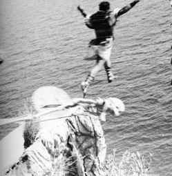
In the story, Jason’s only way of escaping the wild battling sword wielding “children of Hydra’s teeth” is to leap from a cliff into the sea. (Above left) A stuntman, portraying Jason for this shot, leaps from a 90-foot-high platform into the sea closely followed by seven plaster skeletons. It was a dangerous dive and required careful planning and great skill. It becomes an interesting speculation when dealing with skeletons in a film script. How many ways are there of killing off death?
(Above right) Another angle with the real Jason jumping off a wooden platform into a mattress a few feet below. The skeletons and the rocky cliff were put in afterwards while the mattress was blotted out by an overlay of sea.
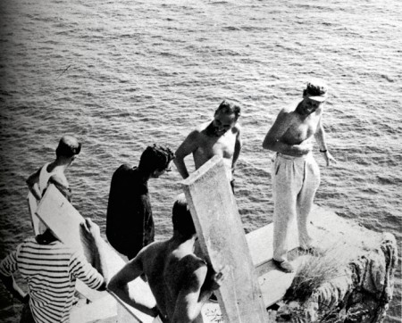
Director Don Chaffey and Ray Harryhausen discuss the leap with Italian stunt director Fernando Poggi.
When transferring published material to the screen it is almost always necessary to take certain liberties in the work in order to present it in the most effective visual terms. Talos, the man of bronze, did exist in Jason legend, although not in the gigantic proportions that we portrayed him in the film. My pattern of thing in designing him on a very large scale stemmed from research on the Colossus of Rhodes.
The actior: his blocking the only entrance to the harbor stimulated many exciting possibilities. Then too, the idea of a gigantic metal statue coming to life has haunted me for years, but without story or situation to bring it to life. It was somewhat ironic when most of my career was spent in trying to perfect smooth and life-like action and in the Talos sequence, the longest animated sequence in the picture, it was necessary to make his movements deliberately stiff and mechanical.
Most of Jason and the Argonauts was shot in and around the little seaside village of Palinuro, just south Naples. The unusual rock formations, the wonderful white sandy beaches, and the natural harbor were within a few miles of each other, making the complete operation convenient and economical. Paestum, w its fine Greek temples, was just a short distance north. All interiors and special sets were photographed in a sm studio in Rome.
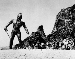
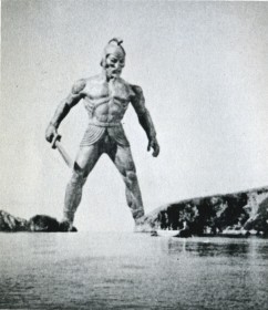 (Above left) Talos, the statue of bronze, pursues Jason’s men.
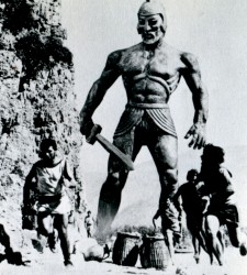
(Above right) Talos blocks the Argo
from the only exit of the bay.
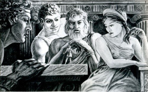
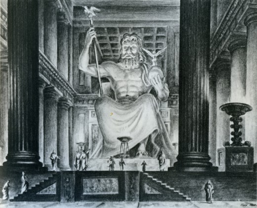
Pre-production drawing of Jason speaking to the Gods of Greece.
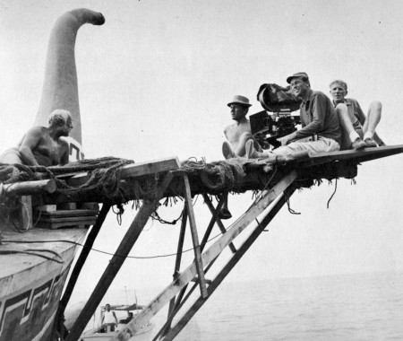
For the second unit operation a special platform had to be fitted to the Argo in order to achieve certain camera angles. Although it looks precarious it was far more convenient than using another boat for the shots.
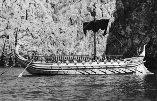
The Argo had to be, above all, practical in the sense that it must be seaworthy as well as impressive. It was specially constructed for the film over the existing framework of a fishing barge. There were twin engines for speed in maneuvering, which also made the ship easily manipulated into proper sunlight for each new set-up.
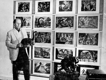
Harryhausen off the book’s back cover
to give an idea of scale of drawing sizes.
