Category ArchiveBooks
Books &Illustration 05 May 2011 06:41 am
Searle’s Female Approach
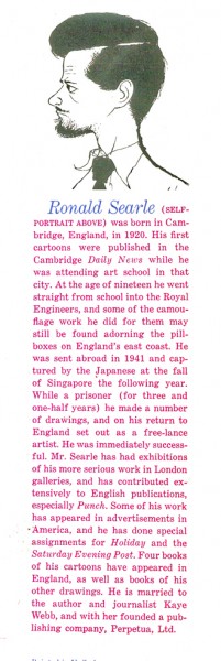
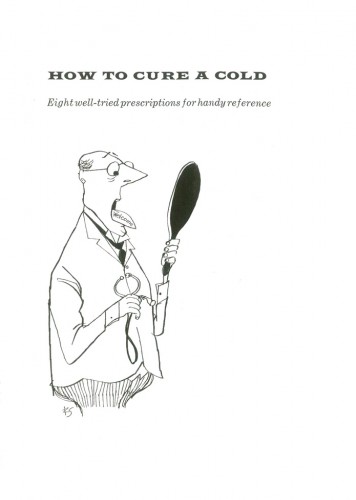
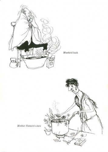
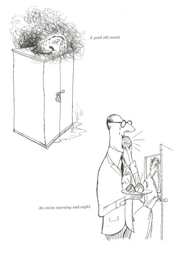
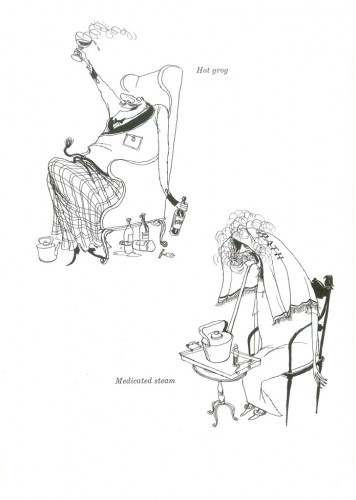
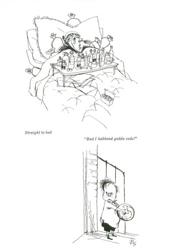
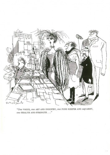
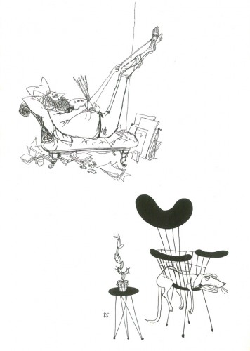
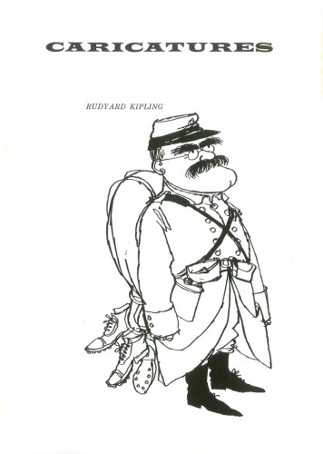
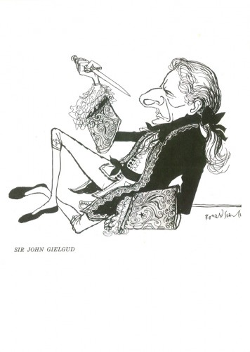
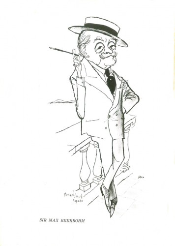
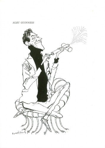
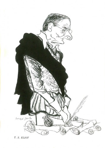
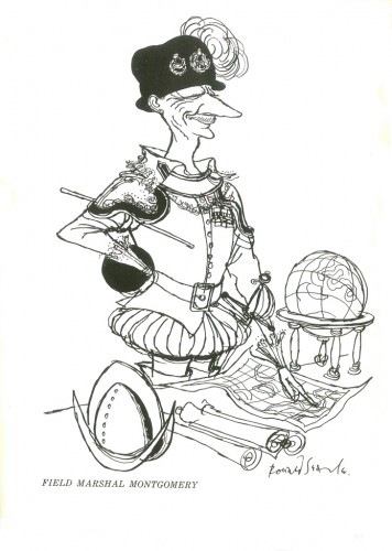
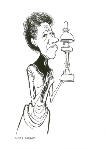
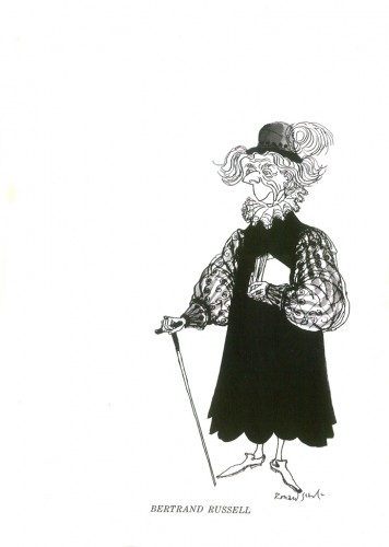
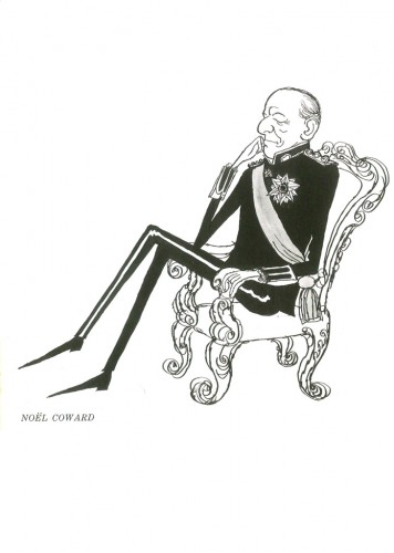
- One of the gems I received for my birthday, a week or so ago, was a beautiful and rare book of Ronald Searle’s cartoons, The Female Approach – which includes the original St. Trinian’s books. This little gem came from John Canemaker. I’d thought I’d post two small chapters from the book. One a group of Caricatures, the second a piece called How To Cure A Cold.
Here are those cartoons:
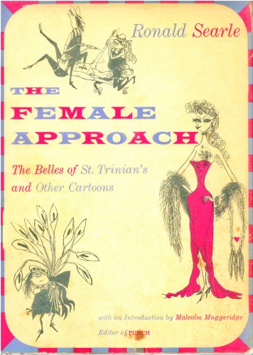
The book’s dust cover
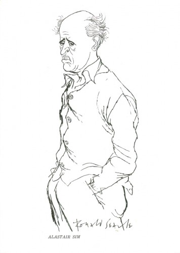 13
13
Ths caricature of Alastair Sim, alone, is worth the price of admission.
 18
18
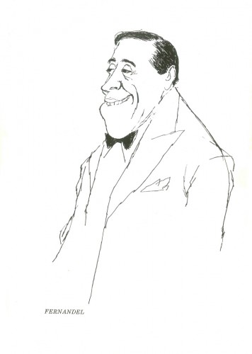
A magnificent cartoon of Fernandel. So simple and perfect.
Bill Peckmann &Books &Comic Art &Illustration 03 May 2011 03:08 am
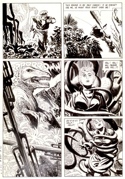
Toth’s Land Unknown
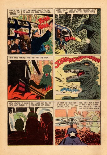
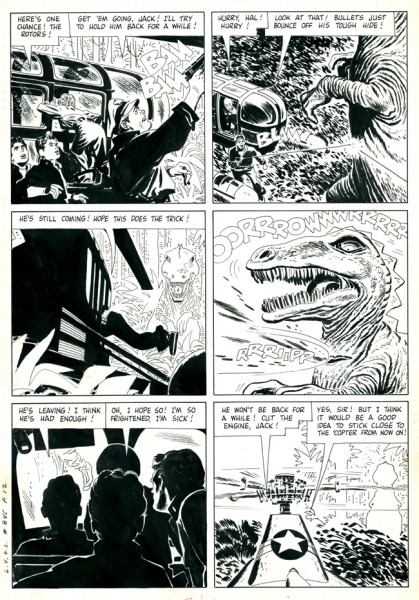
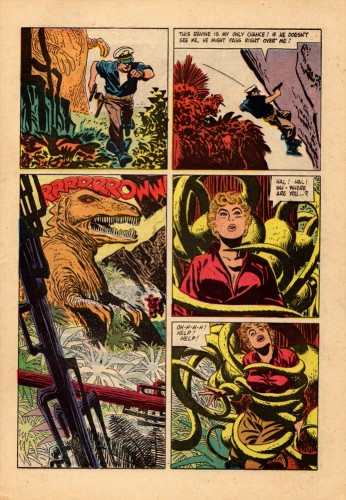
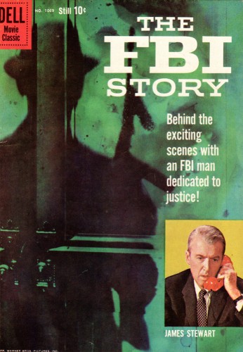
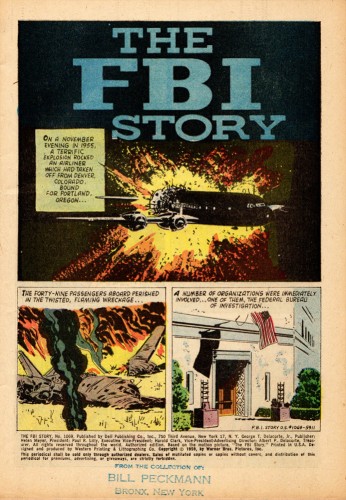
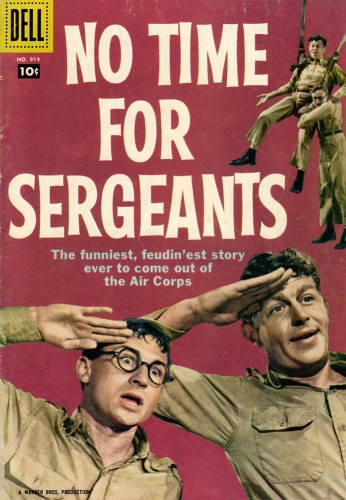
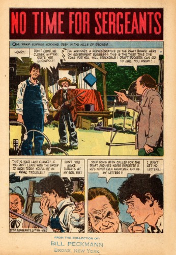
- In celebration of the new book about Alex Toth, Genius Isolated by Dean Mullaney and Bruce Canwell, we’re posting some Toth work for Dell comics in the 60s.
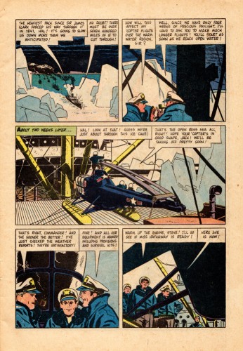
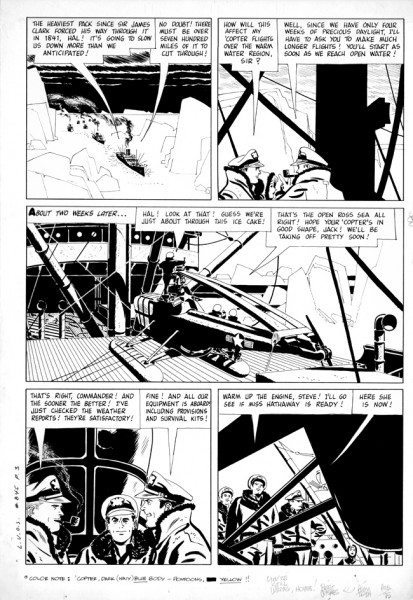
Bill Peckman has an enormous collection of comics by Toth, and with the help of Dean Mullaney, we’d like to show how beautiful Alex Toth’s originals look in comparison with the poor quality printing of the comics. You can see how degraded the lines become in the final magazines when placing them alongside the original art.
Here are three comparisons to make from the comic, The Land Unknown.
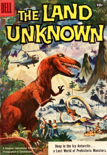
This is the published cover.
 1a
1a
Look at the soft lines printed on the poor quality newsprint.
 1b
1b
This is the original from Alex Toth.
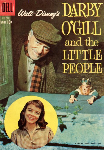
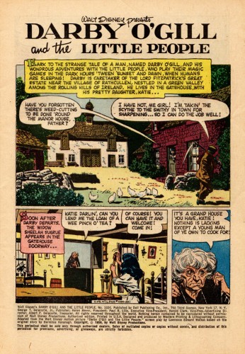
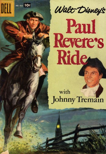
Here are a sampling of other magazines done by Alex Toth.
Alex Toth also did a lot of TV titles such as: 77 Sunset Strip, Sugerfoot, The Real McCoys’, Danny Thomas, The Lennon Sisters… to name a few.
Probably his best remembered title is Zorro from the Disney TV series. This was reprinted not too long ago – the first collaboration between Alex Toth and Dean Mullaney.
Bill Peckmann &Books &Photos 01 May 2011 07:06 am
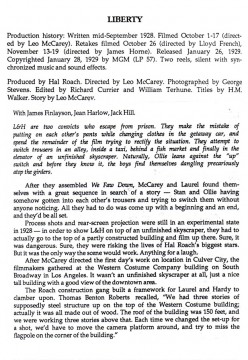
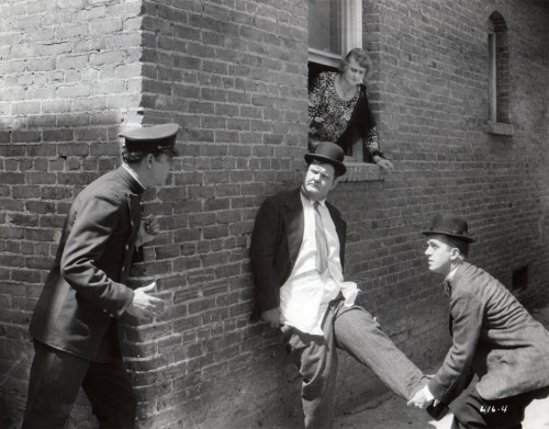
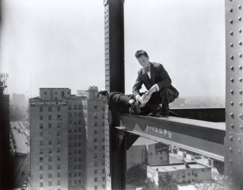
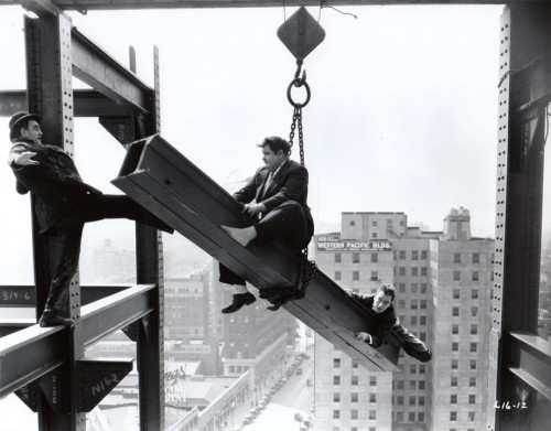
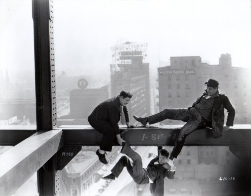
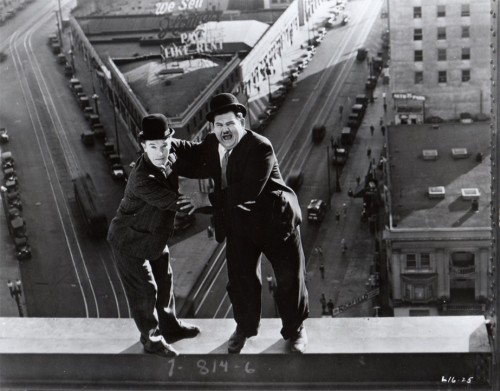
Laurel & Hardy: Liberty
- I’ve long been a Laurel & Hardy fan. I think it’s great for animators to study this pair for their incredible timing and movement. It was kind of a surprise to receive the following material from Bill Peckmann, and it didn’t take much decision to choose to post it.
Let me allow Bill to introduce the material, himself:
- Here’s something that might be a pleasant surprise to your readers who are Laurel & Hardy fans. Attached are the 8 x 10 black and white glossy stills (10 of them) from a L&H silent two reeler titled “Liberty”. It’s considered one of their best silent shorts.(I’ll vouch for that. Back in the late ’60′s we used to run it at lunchtime at work (Focus Design) and it always brought tears to everyone’s eyes who watched it. A side perk was the fact that animator Jack Schnerk, ex LA resident, was able to tell us where all of the outdoor city locations were that they used to film the L&H shorts.)
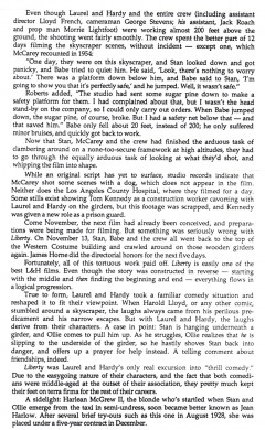
To give some background to “Liberty”, I’ve included an excerpt from Randy Skretvedt’s excellent (my all time favorite) Laurel and Hardy book “The Magic Behind the Movies”. (1987) I believe it’s still available in paperback. (Note: three names connected with the film, Leo McCarey, George Stevens and Jean Harlow.)
Because these marquis/publicity photos are printed from still camera film negatives (no dots), they have a great personal “Family Album” feel to them.
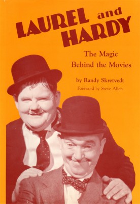
The book’s cover
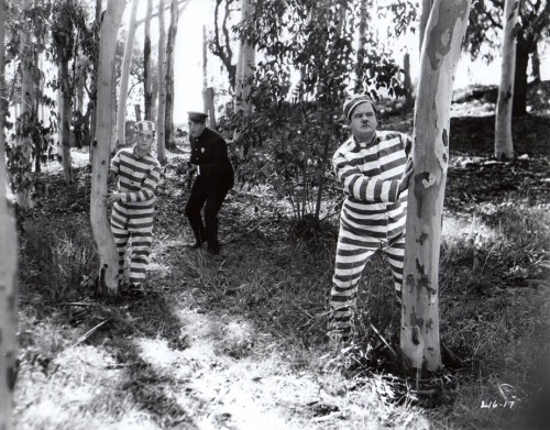
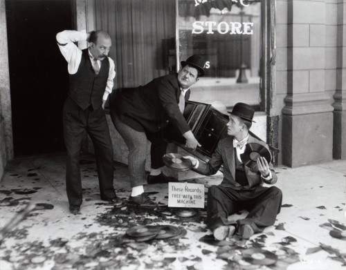
The stills are production stills and don’t come from the book.
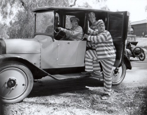 2
2
In escaping from jail, they mistakenly put on each others’ pants in the taxi.
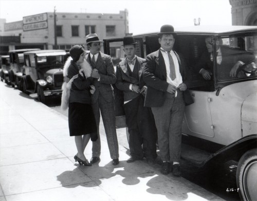 3
3
That’s a young Jean Harlow outside the taxi.
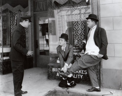 4
4
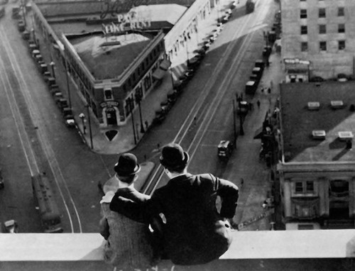
They spend the rest of the film trying to get into their own pants.
 11
11
“BennyZ” left a comment about this still, which I’ve found on-line
and have added to the post just to complete them.
(Thanks to: www.christiankessler.de/laurelhardy.html)
Books &SpornFilms 30 Apr 2011 07:49 am
Zipes’ The Enchanted Screen
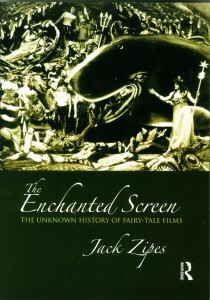 - Author, Jack Zipes, has just released a new book called, The Enchanted Screen. Mr. Zipes is a professor of German and Comparative Literature at the University of Minnesota. He is a scholar whose focus has been children’s literature and culture, and he has written at least seven other books. I’ve been aware of his work since his book, Hans Christian Andersen, the Misunderstood Storyteller. It was in that book that Mr. Zipes gave some attention to the films we’ve done in our studio. Although he felt that Andersen was often misused or misunderstood when translated to other media, he wrote that our films offered excellent adaptations. Of course, I’d be interested in anything Jack Zipes had to write in the future.
This new book, The Enchanted Screen, goes deeper than just Andersen’s tales, taking in all world literature. However, there can be no doubt that Andersen is a primary interest of Mr. Zipes’ studies. There are elaborate analyses of the various productions of The Snow Queen or The Little Mermaid or The Emperor’s New Clothes. Disney is certainly taken to task for sentimentalizing children’s literature. Indeed, there’s a complete chapter entitled, “De-Disneyfying Disney: Notes on the Development of the Fairy-Tale Film.” To be honest, it’s hard to argue with his premise, if you take Grimm and Andersen seriously. When he points out that J.M.Barrie’s Peter Pan becomes Walt Disney’s Peter Pan or Lewis Carroll’s Alice In Wonderland becomes Walt Disney’s Alice, you begin to realize the change in ownership which also recognizes a change in the values imparted in those original tales. (Shrek actually fares well under this scrutiny since it spoofs the Disneyfication of the tales.)
In short, the book is an excellent read if you’re interested in the subject – as I am. It’s especially pleasing when the author has nice things to say about your work, but that is hardly the reason I enjoyed the book. I appreciated the honest and intellectual discussion of the material, and I enjoyed some of the sources he considered at length. Since I make films using this material, I am curious to hear what critics have to say.
As an addendum to these comments, I thought I’d post a page from the book that talks about a couple of my films. Why shouldn’t I spread the news? I’m proud of these films. I’ve added some illustrations from a couple of these films to punch up the post. So over to Mr. Zipes:
- From 1990 to 1992 Michael Sporn, an American animator, adapted three of Andersen’s fairy tales, “The Nightingale,” “The Red Shoes,” and “The Little Match Girl” for Italtoons Corporation, and they are currently distributed by Weston Woods Studios, an educational company. The films, all about twenty-five minutes long and created for children between five and ten, have been shown on HBO, but for the most part they have not received wide public attention, and they can be considered marginal cultural products of the culture industry—all the more reason that they deserve our attention, because Sporn’s films written by Maxine Fisher are profound interpretations of Andersen’s stories that transcend age designation and keep alive Andersen’s legacy. They all use voiceover and colorful still sets as backdrops, and naively ink-drawn characters who come alive because they are so unpretentious and resemble the simple and found art of children.
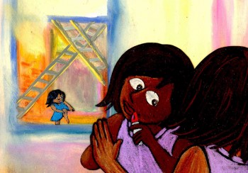 Two of Sporn’s films are particularly important because they transform motifs from Andersen’s tales to deal with contemporary social problems. Both take place in New York City, and the music and dialogue capture the rhythms and atmosphere of present-day urban life. In The Red Shoes, Sporn depicts the warm friendship of two little black girls, Lisa and Jenny, and how they almost drift apart because of a change in their economic situation. The story is narrated by Ozzie Davis as a shoemaker who lives in a poor section of New York. Lisa and Jenny often visit him, and he describes their lives and how both love to dance and play and enjoy each other’s company. One day Lisa’s family wins the lottery, and they move to another part of the city. Now that she is rich, Lisa ignores Jenny until they meet at a ballet about red shoes. The spoiled Lisa ignores Jenny, but later she returns to her own neighborhood and steals some red shoes that the shoemaker had been making for Jenny. Guilt-ridden, Lisa finds that the red shoes have magic and bring her back to the old neighborhood and help her restore her friendship with Jenny.
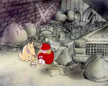 In The Little Match Girl, Sporn depicts a homeless girl, Angela, who sets out to sell matches on New Year’s Eve 1999 to help her family living in an abandoned subway station on Eighteenth Street. She meets a stray dog named Albert who becomes her companion, and together they try to sell matches in vain at Times Square. The night is bitter cold, and they withdraw to a vacant lot where Angela lights three matches. Each time she does this, she has imaginary experiences that reveal how the rich neglect the poor and starving people in New York City. Nothing appears to help her, and when she tries to make her way back to the subway station, she gets caught in a snowstorm, and it seems that she is dead when people find her at U nion Square the next morning. However, she miraculously recovers, thanks to Albert, and the rich people gathered around her (all reminiscent of those in the dream episodes) begin to help her and her family.
Sporn’s films are obviously much more uplifting than Andersen’s original tales. But his optimism does not betray Andersen’s original stories because of his moral and ethical concern in Andersen and his subject matter. In fact, his films enrich the tales with new artistic details that relate to contemporary society, and they critique them ideologically by focusing on the intrepid nature of the little girls rather than on the power of some divine spirit. At the same time, they are social comments on conditions of poverty in New York that have specific meaning and can also be applied to the conditions of impoverished children throughout the world. What distinguishes Sporn’s films from Andersen’s stories is that he envisions hope for change in the present, whereas Andersen promises rewards for suffering children in a heavenly paradise.
Sporn’s films are tendentious in that they purposely pick up tendencies in Andersen’s tales to express some of the same social concerns that Andersen wanted to address. His critical spirit is maintained, and even some of his faults are revealed. Most important, he is taken seriously.
It’s a pleasure to be taken seriously, and I have to thank Jack Zipes for that.
Bill Peckmann &Books &Comic Art &Illustration 29 Apr 2011 06:57 am
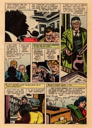
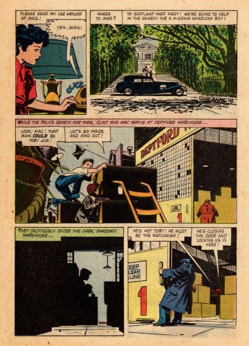
Toth’s Clint and Mac
This material was sent to me by Bill Peckmann. Here’s Bill’s note accompanying it:
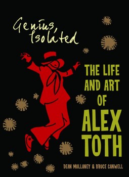 In a couple of days Dean Mullaney and and Bruce Canwell‘s Genius Isolated, a book about the work of Alex Toth, will be hitting the bookstores. This is certainly going to be a GREAT tome given the track record of dedicated work of the authors. (Early reviews bear this out.)
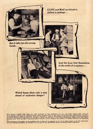
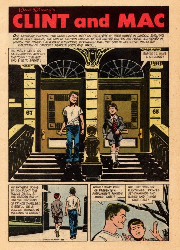
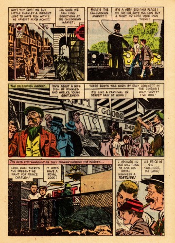
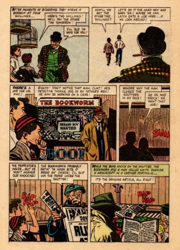
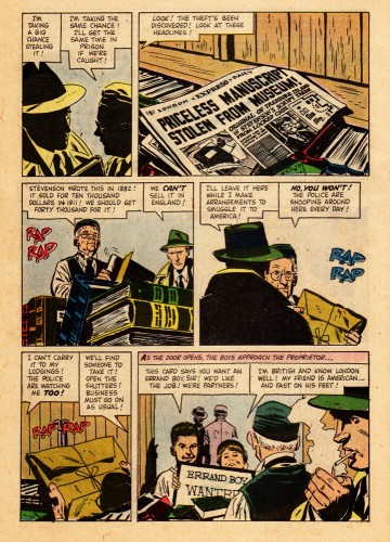
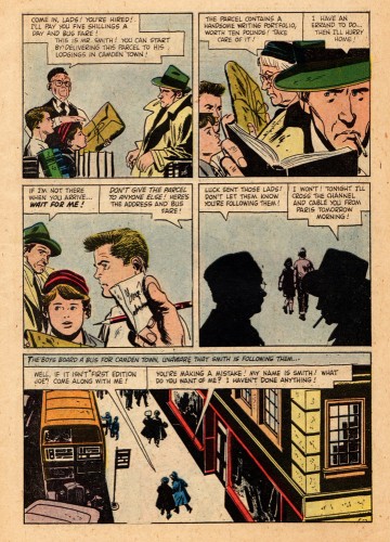
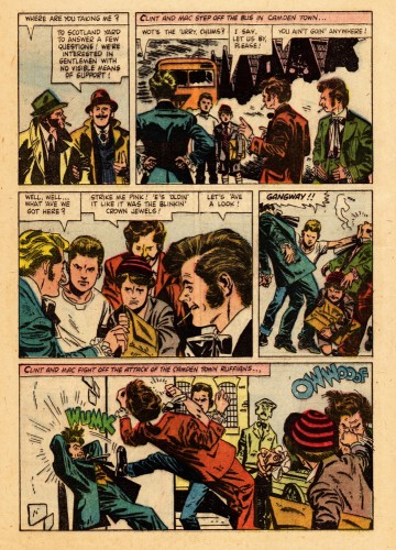
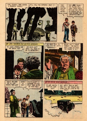
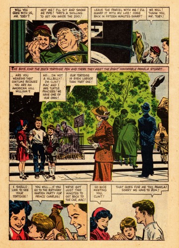
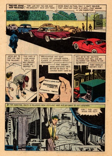
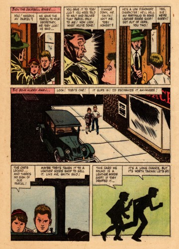
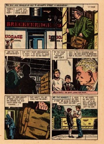
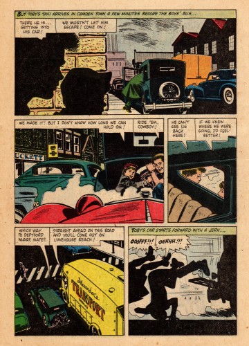
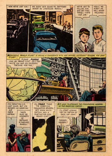
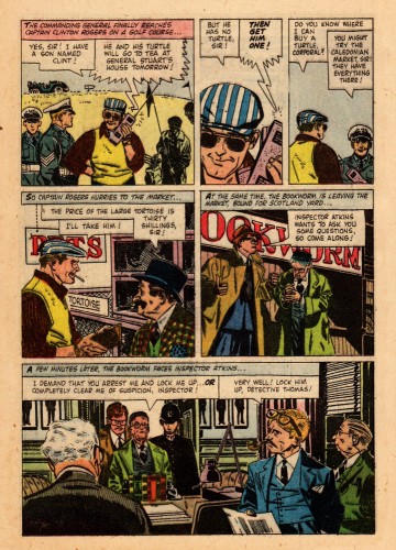
To celebrate the book here’s one of Alex’s Dell/Disney comic books. It’s the 1958 adaptation of the Disney movie Clint and Mac.
Alex was a big Robert Fawcett fan and I believe the 30 year old Toth had Fawcett on his mind when he illustrated this comic. There are so many beautifully designed panels on these pages. Sorry about the slap dash coloring of the book, but that’s the way Dell did it in those days, though the computer screen helps a lot.
One page of this magazine appears in the book. Here, you’ll get to see and read the whole thing. This is the first half of the book
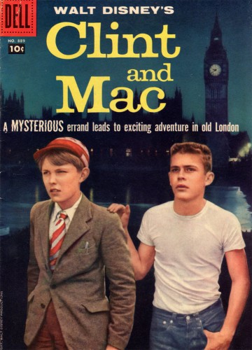
The magazine’s cover
Many thanks to Bill Peckmann for this rare piece of the Alex Toth collection.
Animation &Books &Independent Animation 25 Apr 2011 06:57 am
Plympton Book: Independently Animated
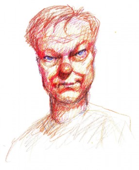 - Back in 1983, I received a call out of the blue from a cartoonist whose strip in the Soho Weekly News was one that I enjoyed. Bill Plympton was interested in making an animated short and asked to meet with me to get some advice. As it turns out, we met several times, always at a pub/bar in NY that I love, The Cedar Tavern (this was the hangout of the Abstract Expressionists back in the 40s/50s). Bill was about to make his first animated short, and I suggested he contact a woman I thought could help him put it together, Connie D’Antuono. Connie was working out of R.O.Blechman’s Ink Tank, and she worked with Bill outside of her 9-5 job.
Here it is some 28 years later, and I’ve received a copy of Bill’s golden artbook, Independently Animated: Bill Plympton, The Life and Art of the King of Indie Animation, for review.
I don’t know why, but this book has taken me by surprise. It’s so much more than the expected bio of an animator. It really smacks of a genuine amalgam of the guy who made all these films and the cartoonist who did the strip in the Soho Weekly News. The book boils over with artwork, not only from the films but from many many cartoons and illustrations done previous to the animation career. It all suipports a strong graphic sense found after the animation has begun. It also becomes obvious that there is a direct connection between those early strips and the animated films. This is a real gem of a book, and I’d encourage everyone to buy a copy to see how it’s done. It’s the best “Art of …..” book of the year, and it’s much more.
The text is quite informative, and despite the fact that it’s written both by Bill Plympton, himself, and David Levy, it has a casual and friendly tone that comes across as genuinely first person singular. It feels as though Bill, himself, were telling the story. We learn where the ideas for some of the films come from (the one for Guard Dog is difficult reading if you’re a dog lover), and this text is matched with plenty of drawn material, both art from the films as well as pre-production material.
It’s a fine book, and I suggest you look into it. It’s an original – a truly Independent animation Art book!
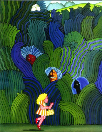 1
1Bill’s early illustration influences are obvious.
He hoped to study under Milton Glaser in attending
the School of Visual Arts. It didn’t happen.
 2
2
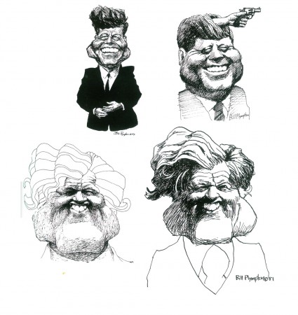
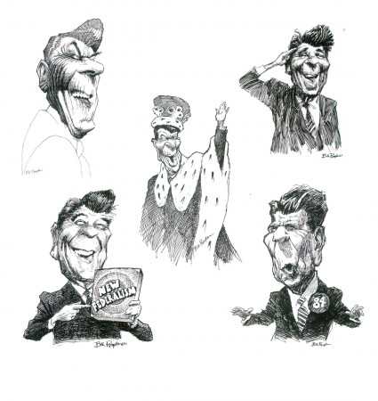
By the time he was doing his strip for the Soho Weekly News
it was obvious that Bill was a brilliant caricaturist.
(Reagan above / some Kennedys below)
 4
4
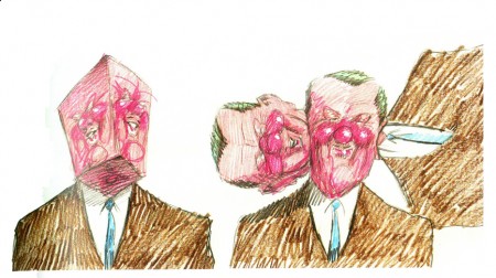
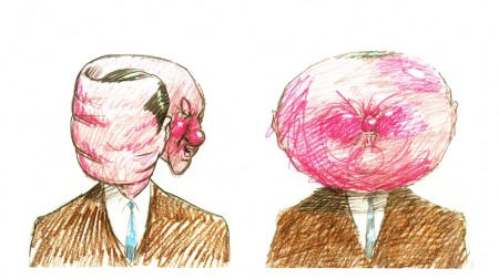
The art of caricature influenced the animation
as evident in these frames from Your Face.
 6
6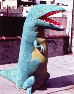 7
7
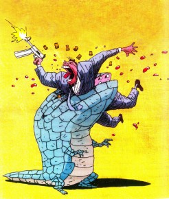
At one point, trying to generate publicity for Mutant Aliens,
Bill constructed a costume someone wore parading in front of the
Cinema Village, in NYC, where the film was playing.
 8
8
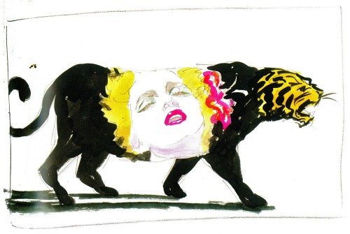
A music video proposal for Madonna’s Who’s That Girl?
 9
9
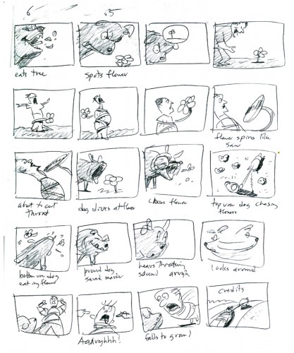
The complete storyboard for Guard Dog is in the book.
Bill Peckmann &Books &Illustration 22 Apr 2011 07:06 am
Robert Fawcett
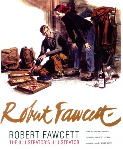 - I have to admit I’ve been a bit remiss. I was handed a copy of a brilliant new book and would have liked to have reviewed it much sooner than now. However, the book is so gorgeous that it’s hard to say much more than that about it. But I will.
The book is titled: Robert Fawcett, The Illustrator’s Illustrator and it couldn’t be more appropriately labelled. Fawcett was
an illustrator who started selling in 1927 and continued on until his death in 1967. He worked for all the major magazines and entertainment groups.
Although Fawcett and Norman Rockwell worked at the same time, they were two sides of the coin. Rockwell illustrated mom, hearth and apple pie; Fawcett illustrated men, war, danger and action. He was the consummate draftsman and an inspiration for many illustrators who followed after him.
The text clearly covers Fawcett’s biography but it also goes into depth about his drawing and painting techniques. It’s thoroughly researched and well written to convey the artist’s process. There’s also a method to the arrangement of images so that you can see a repitition of poses, and some of the themes of the artist. It’s a well thought out book.
I’ve chosen a number of illustrations from the book to give a wide range of examples from his work. I think these will speak plenty for the volume, which is filled to the brim with well framed and positioned images.
Also included in the book is an interview done with Robert Fawcett by Mary Anne Guitar for Famous Artists Magazine, Vol.8, No.4, Summer 1960.
I have to applaud the key people responsible for this book. They include:
David Apatoff who wrote the text.
Manuel Auad who edited the book.
Walt Reed who wrote the Introduction.
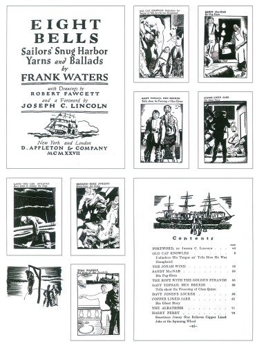
An early commercial assignment for Fawcett.
Illustration for “Eight Bells” by Frank Waters. (1927)
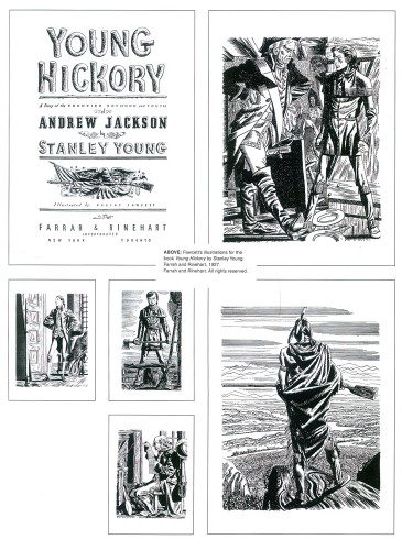
Another early commercial sale, the book illustrations for
“Young Hickory” by Stanley Young. (1927)
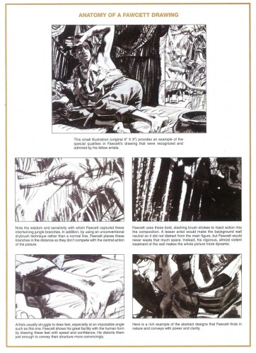
An interesting piece presented by the book’s authors.
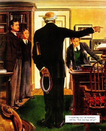
Day of Vengeance by Noel Langley
for Saturday Evening Post, April 10, 1948.
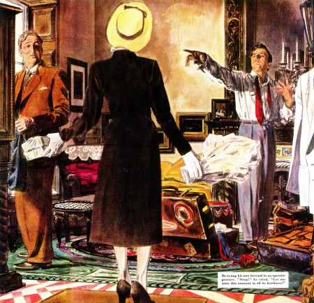
Counterfeit Marriage by George Tabori
for Saturday Evening Post, June 11, 1949
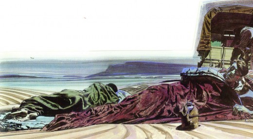
Prisoners of the Plain by Geofrey Household
Saturday Evening Post, October 31, 1947

Dawn Pursuit by Wyatt Blassingame
for Saturday Evening Post, March 1951
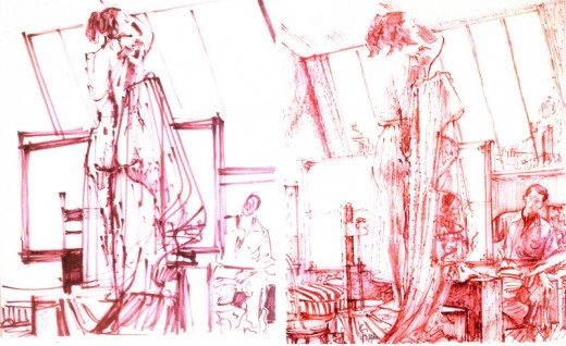
First preliminary sketch and the Final sketch for The Pride of Beauty.
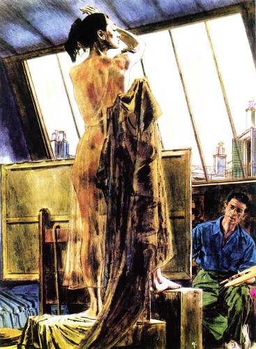
The Priide of Beauty by A.J. Cronin for
Woman’s Home Companion Magazine (1955)
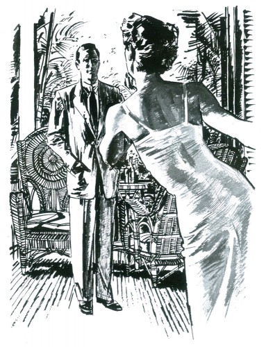
The Myna Birds by james Michener
for Holiday Magazine, (date unknown)
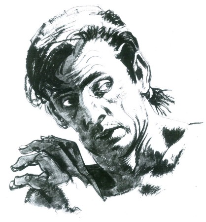
Mutiny In Paradise by James Michener
for This Week Magazine May 5, 1957.
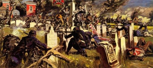
If the South Had Won the Civil War
Look Magazine, November 22, 1960
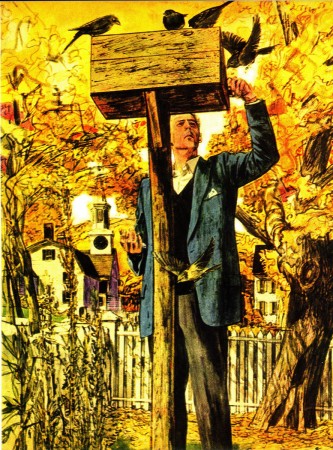
Story illustration, date & title unknown.
This Week Magazine
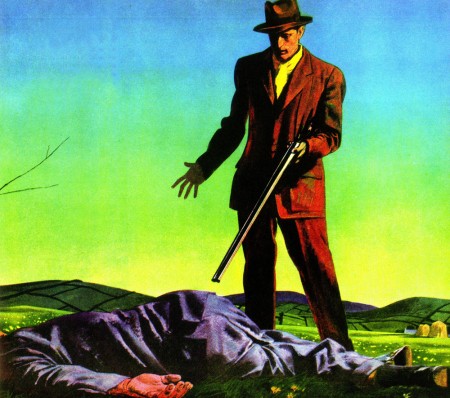
Run From the Hangman by Geofrey Household
Saturday Evening Post, March 10, 1951
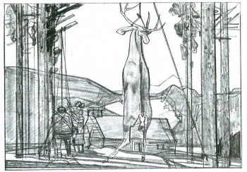
Preliminary sketch for Center Air Conditioning Refrigeration
Date unknown
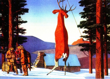
Center Air Conditioning Refrigeration advertisement
Date unknown

Center Air Conditioning Refrigeration advertisement
Date unknown
Many thanks to Bill Peckmann for getting a copy of this beautiful book to me. I wholeheartedly suggest you try to get a copy. It belongs in the hands or on the shelf of every working artist.
Bill Peckmann &Books &Comic Art &Illustration 19 Apr 2011 07:12 am
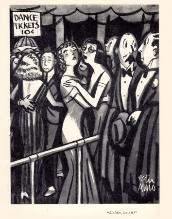
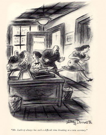
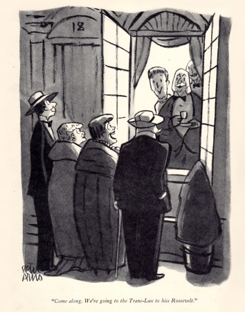
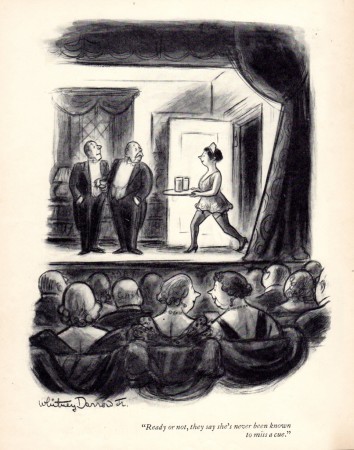
Arno & Darrow Jr. in 1937
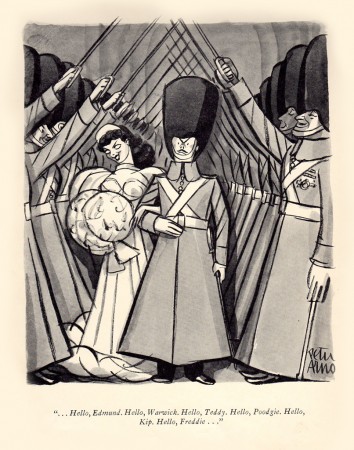
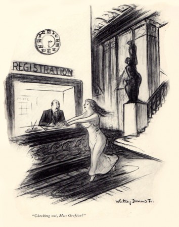
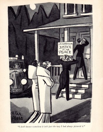
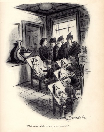
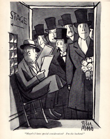
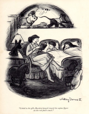
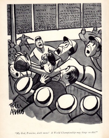
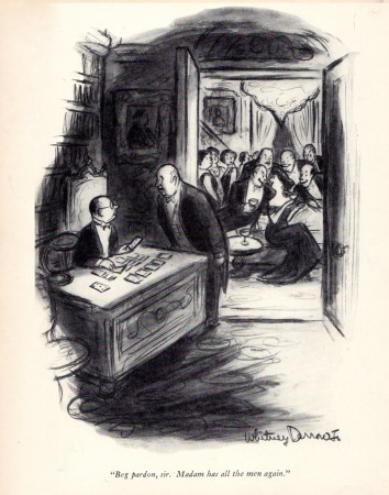
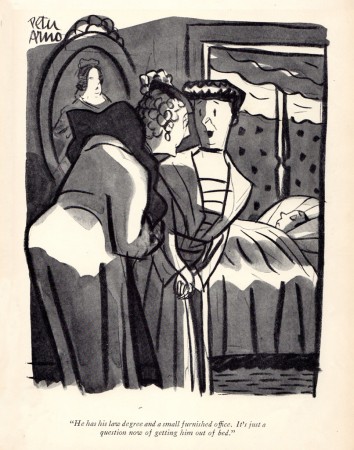
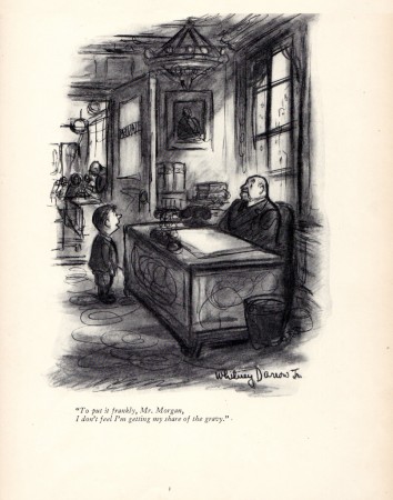
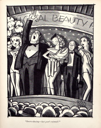
- Bill Peckmann recently came upon a collection of New Yorker cartoons from 1937. Since we’ve been running some artwork by Peter Arno and Whitney Darrow Jr., we thought it’d be interesting to grab the cartoons by these two from that year. To put it in perspective, remember that 1937 was the year that Snow White was released.
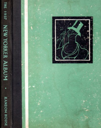 1
1
Animation Artifacts &Books &Disney &Illustration 18 Apr 2011 06:22 am
Catfish Bend
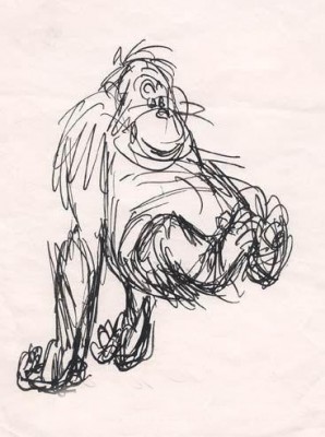
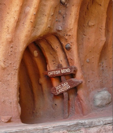
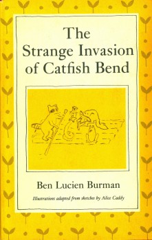 - Back in 1972 there was a celebration of Disney at Lincoln Center. As an offshoot of the main program, there was a series of lectures given by Frank Thomas, Ollie Johnston, Woolie Reitherman and Ken Anderson. For most of those days they talked about Robin Hood, which had just been released, as well as The Rescuers. In the last day, we heard about what was coming up. Anderson suddenly had a fire in his eyes when he talked about Catfish Bend. This was, apparently, going to be a melding of four of the books in the series by Ben Lucien Burman. (You can read a bit about it from Steve Hulett’s POV, here.) Anderson showed some of the drawings (via slide projection) he had done for the film. They were all pen, ink and wash drawings he was doing, similar to ones we’d seen from him on The Jungle Book, done with the Mont Blanc pen he liked using.
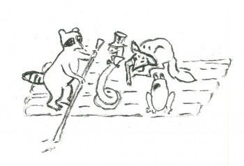
The drawings didn’t excite me very much, but I was curious. They did remind me of The Rescuers sketches he had shown. I suppose the fact that both are set in the Florida Everglades helped the similarities. I bought a copy of the initial book, “The Strange Invasion of Catfish Bend”, and read it. The book contained some charming and tiny illustrations by Alice Caddy throughout its 150 pages. I’ve decided to post some of those here, so you can see the originals that got Ken Anderson excited.
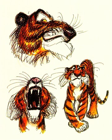
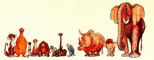
Here are a few of Anderson’s sketches for The Jungle Book:
And these are a couple of Anderson’s sketches for Catfish Bend:
These are the illustrations by Alice Caddy from “The Strange Invasion of Catfish Bend.”
 1
1
Animation Artifacts &Books &Disney &Illustration 12 Apr 2011 06:56 am
Goliath II
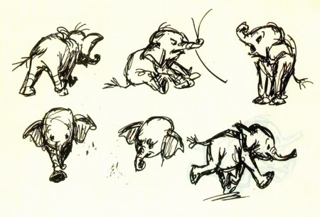
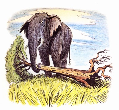
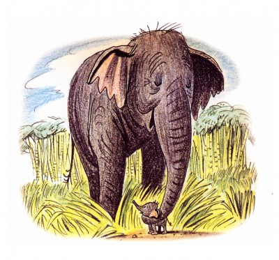
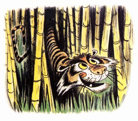
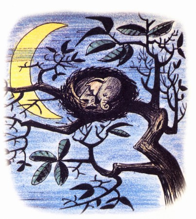
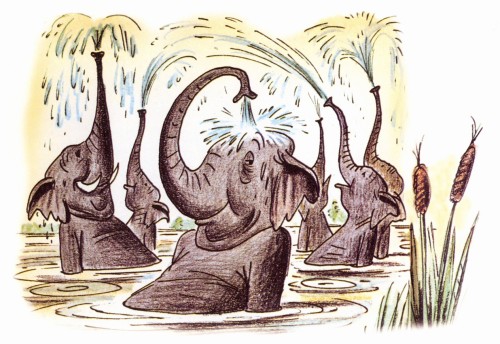
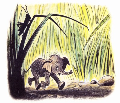
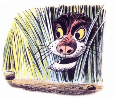
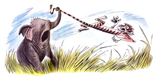
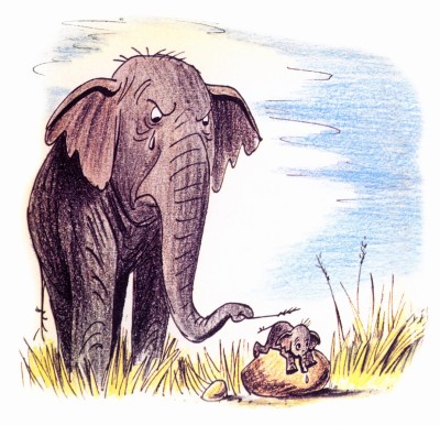
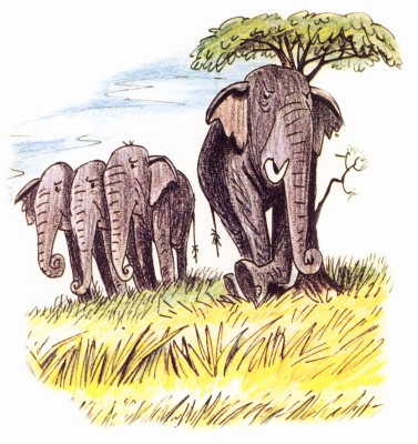
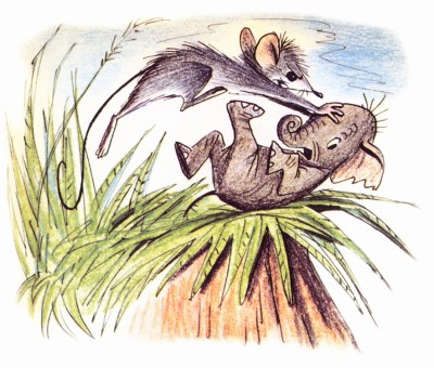
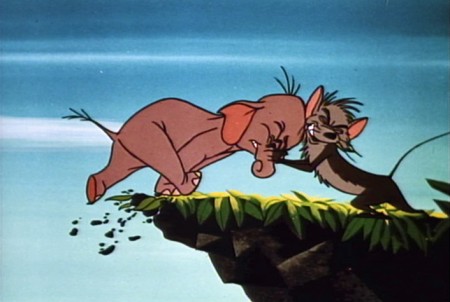
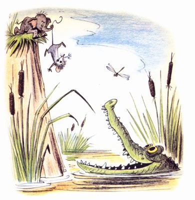
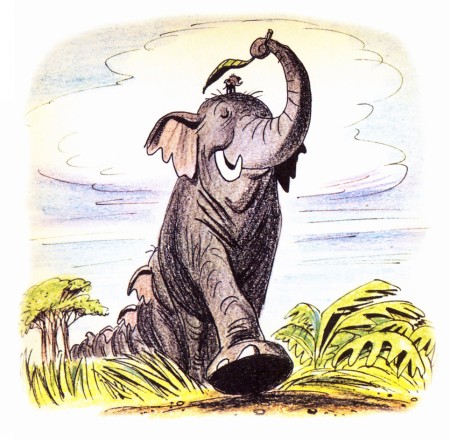
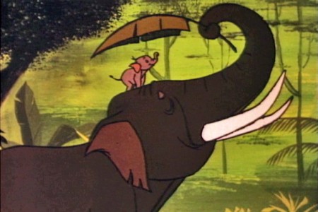
- I feel very fortunate. Jason Hand, following my posts on Bill Peet’s great book illustrations, has sent me the illustrations to the book, Goliath II. This book grew out of the Disney featurette. Peet, in his autobiography, says he pulled the story from one he had written to be made into a book. When he was in the doghouse at Disney, sentenced to working on commercials for the likes of Peter Pan Peanut Butter, he stopped Walt in the hallway and showed him the story outline. Disney put it into production immediately.
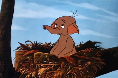
It was an important film in that it was the first to use Xerography to copy the animators’ lines onto the cels. This was an extremely important step before they moved onto 101 Dalmatians.
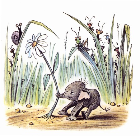
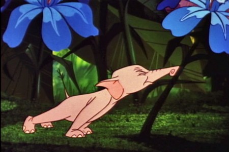
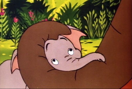
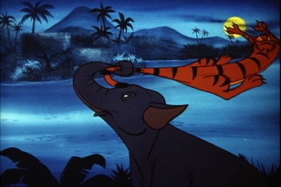
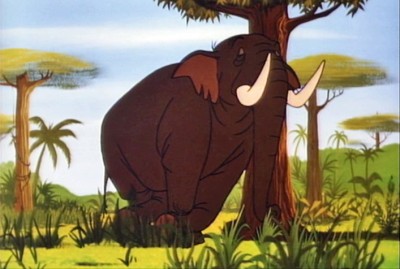
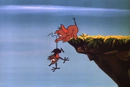
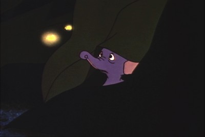
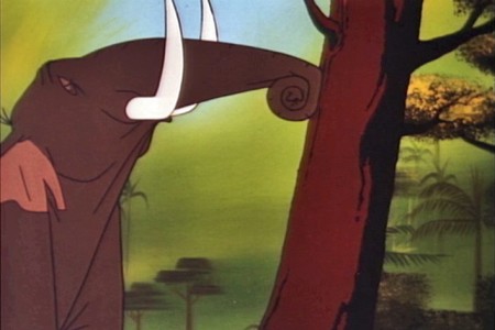
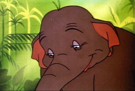
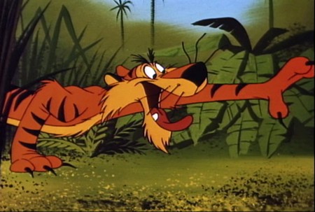
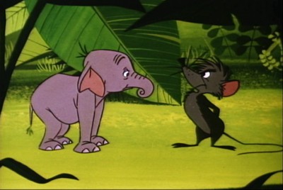
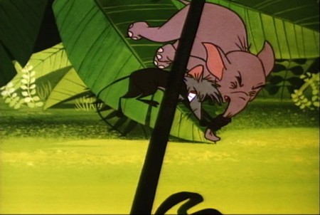
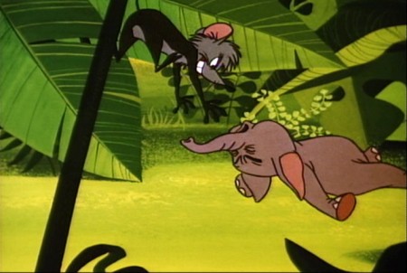
I thought this was a great invitation for me to add some frame grabs from the film which match the illustrations of the book, to see how closely the two matched. After looking at the book, one can see that the film is very two dimensional. Every action happens east – west. None of the action moves in perspective (toward or away from you). This, of course, is a product of the limited budget. The film is also all closeups. Little of the action takes place in Long Shot (the better to keep the budget down.) The film, naturally, is a disappointment when compared to Peet’s illustrations.
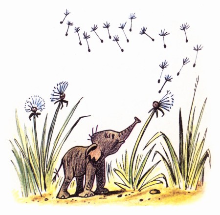
Here are the illustrations followed by the correlative frame grabs:
 1
1A delicate drawing of something that doesn’t appear in the film.
 1
1
The closest thing to floating dandelions is Goliath watching
a couple of fireflies toward the last half of the film.
 3
3
This scene isn’t played well in the film.
It’s perfectly clear in the book.
 4a
4a
They couldn’t handle this scene in a single shot.
They broke it into two closeups. TV direction.
 5
5
This is about as close as I can come to a match.
Peet’s drawing is so full of life.
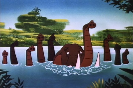 7
7
This scene actually comes later in the film.
There was no bathing scene early on.
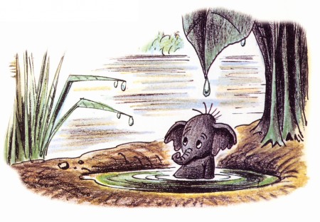 8
8
No relation to this scene is in the film.
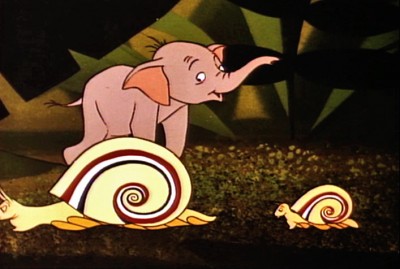 9
9
There’s no real correlative to this illustration in the film.
The closest appears toward the beginning.
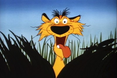 10
10
More John Lounsbery than Bill Peet.
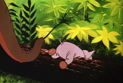 12
12
A very different approach in the film.
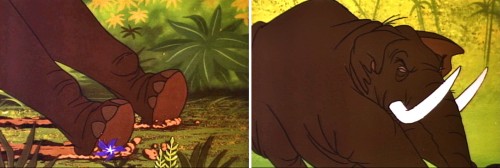 14a
14a
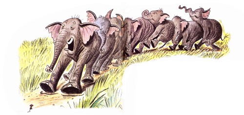
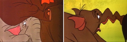
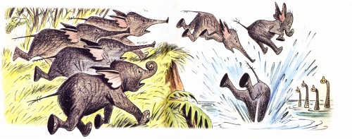
The elephant pile up illustrated by Bill Peet has to be broken
into a number of short scenes cutting back past the elephants.
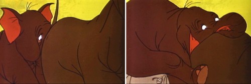 14b
14b
This makes animation easier to do and, consequently, fewer drawings.
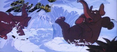 15a
15a
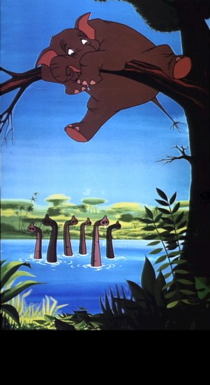
The elephants end up in water, but they jump in
one at a time. Better for the reuse of animation.
 16
16
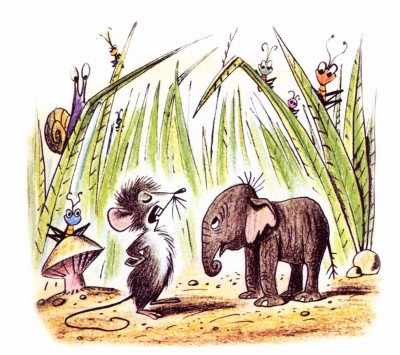
The mouse enters the story.
 17a
17a
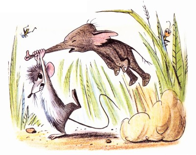
The mouse throws Goliath in a very different way.
 17b
17b
Unfortunately they’ve plotted the entire move
with an overlay that cuts up part of the action.
