Category ArchiveComic Art
Animation Artifacts &Comic Art 22 Jun 2006 07:23 am
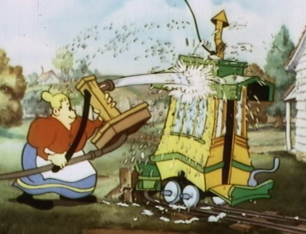
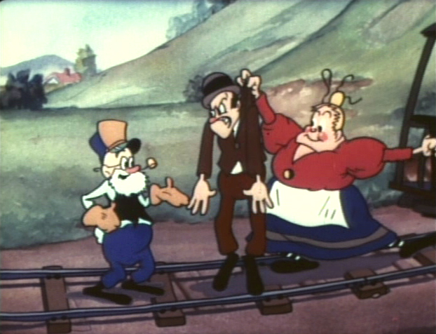
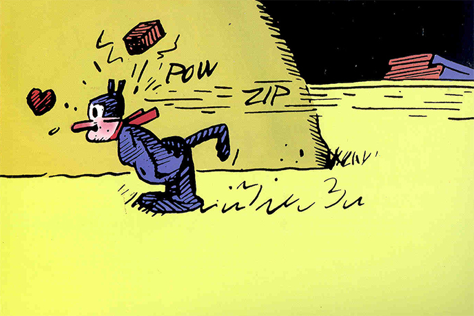
The Toonerville Trolley
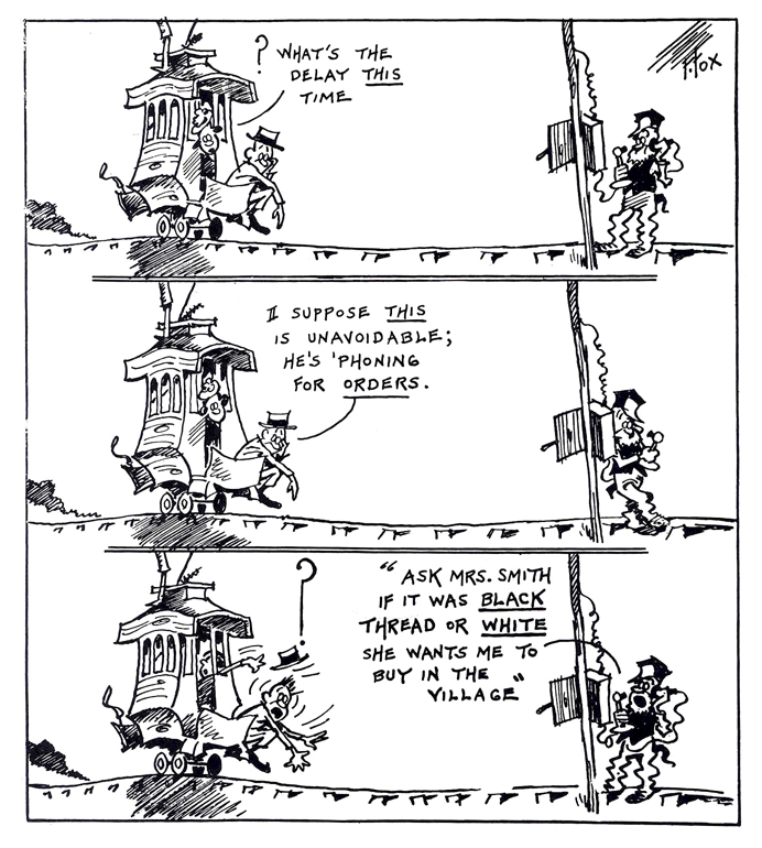
- I’ve been a big fan of the “Toonerville Folks” for a long time. I didn’t find the strip for a while. When I was young, a local TV channel, an ABC subsidiary, ran a lot of old silent Aesop’s Fables. They had classical music backing them up; usually Bizet filled the bill.
One year they upgraded by throwing a number of the Van Buren shorts in betwen the Terry silent films. These Van Buren films, many of them directed by Burt Gillette or Tom Palmer, were odd. There were a number of films with Greek gods as their stars. Then came the shorts with Molly Moo Cow and those with the Toonerville Trolley characters.
(Click on any image to enlarge.)
I liked these and learned from the credits that they were adapted from a comic strip by Fontaine Fox. So, I sought out the comic. Of course, in those days, prior to computers, all you had was the library to research things. My local branch had only one or two examples of the comic strip which ran from 1915 through 1955.
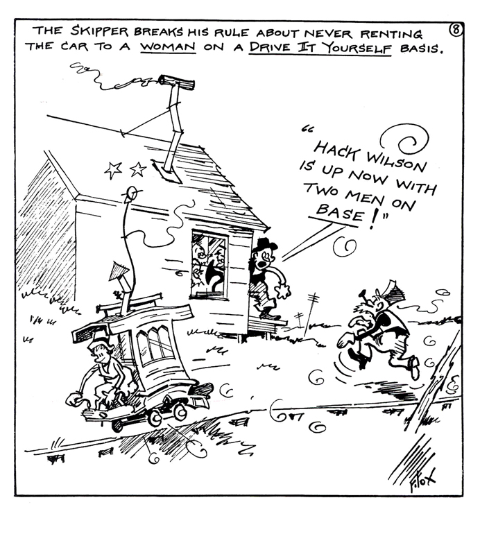
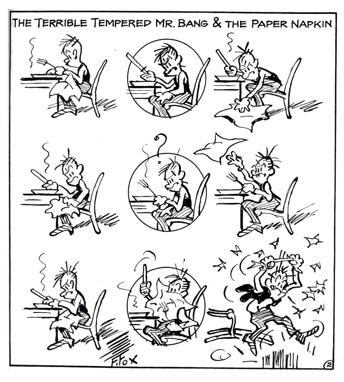
The animated shorts were made in the mid-thirties when Van Buren tried a run to improve their films. Neither sound and color nor the acquisition of the rights to this strip didn’t help; even the “terrible tempered Mr. Bang couldn’t help.” The studio closed before the decade had ended.
In 1978 I worked with R.O. Blechman as his Assistant Director to put together the PBS show, Simple Gifts. This was a packaged of six segments adapted around Christmas with a number of different illustrators designing the segments. One of them, the one I was most attracted to was The Toonerville Trolley. Blechman bought the rights from King Features (at an enormous price) for a four minute film in the middle of the program. I’d worked hard to get the piece to animate. I even did a one minute sample of the film in my off time at night, and I thought it was pretty good. However, Blechman was afraid of losing me in the operation of his studio. (We were doing more commercials than show, and I hated it.) Bill Littlejohn did a nice job of animating the entire piece which was completely subcontracted out to him. That was probably appropriate since Bill worked at Van Buren when they produced these shorts.
Comic Art 12 Jun 2006 07:07 am
Pyongang
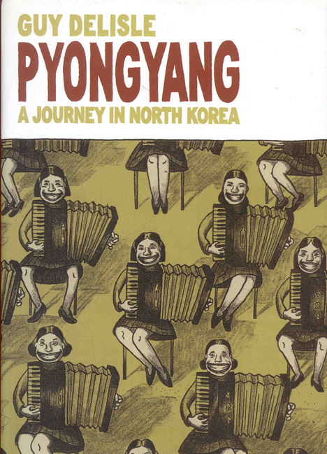
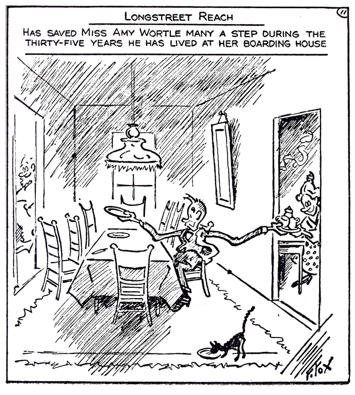
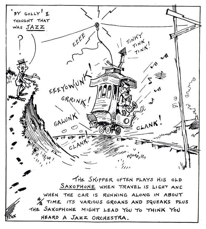
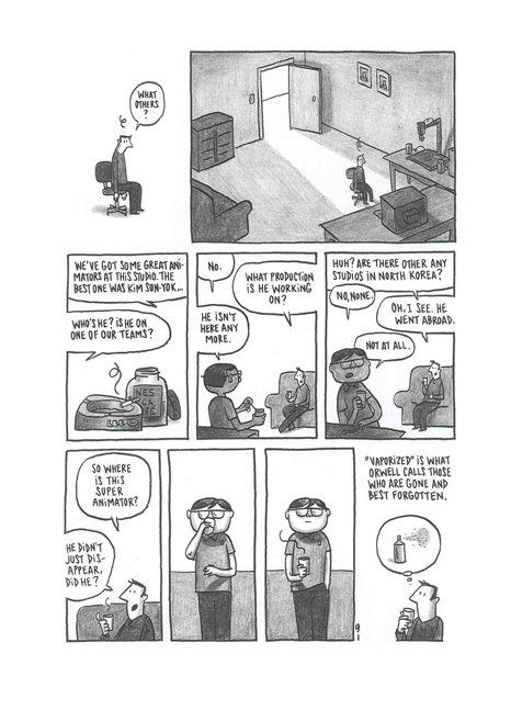
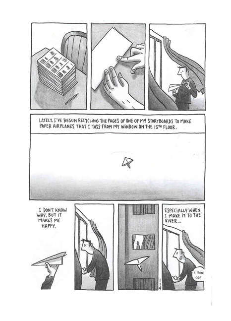
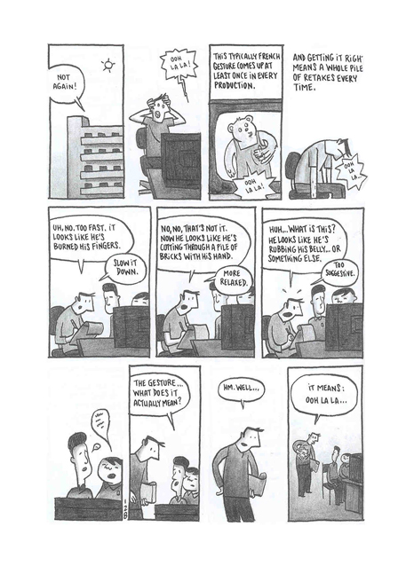
- On my birthday, back in April, my friend Adrian Urquidez (he, who wonderfully constructed this site and connected blog) gave me a copy of this graphic novel, Guy Delisle’s Pyongyang. I’m not a big fan of graphic novels, so it sat on my desk for months. But I did read it yesterday and found it more than compelling. The book is worth searching out.
It’s the story of an American cartoonist working in France who accepts a job in North Korea, Pyongang to be exact, working as a supervisor for a French animation company.
Through his eyes we see what it’s like for a foreigner living in North Korea, and we see what it’s like as an animation supervisor in such a distant/different country. It’s a very interesting read; you’re somehow sure it’s all fact not fiction.
(Click on any image to enlarge.)
Guy Delisle has another book in print, Shenzhen. I’m certain to read that one next.
Here are three samples from this book that have to do with animation:
- Hans Perk is back from Annecy with a few photos of sunny Annecy as well as a small glimpse into the jury’s confused state. This is always the case, in my eye, at this festival. Note that I’ve posted the award winners a couple of days ago.
- Also back writing on his site is Michael Barrier. He gives us a bit of a tease review of CARS. However, I think he leaves no doubt as to which way down his thumb is pointing. I’m looking forward to his review.
My interest has been strong enough to read about two dozen reviews of this film. I’m looking for one to tell me why I should want to see it other than to see what the best cgi studio work looks like and an obligation to a life in animation. From trailers and clips I see everything I expect: something loud and too-fast-for-its-own-story. I’m hoping I’m wrong, but that’s the film they’re selling. I’ll see the movie this coming Saturday (at an Academy screening).
- If anyone has a particularly useful review to point me to, please do.
- The only really interesting one I’ve found so far is this: ‘tooned out By Christopher Kelly of the Fort Worth Star-Telegram. He uses this film as a jumping off point to talk about the difficult task cgi animation has in telling a story. Very insightful, I think – worth reading.
- The new New Yorker magazine comes with a good (though not positive) review by Anthony Lane of Cars. It expresses many of the expectations I had on the subject and handling of the film. Again, I’ll have to see it for myself.
There is also a very good article about Gregg Toland that is not available on line. It doesn’t mention Song of the South.
There’s also a good article by Oliver Sacks about stereo vision. Also not available on line. This is a good issue.
Comic Art 08 Jun 2006 07:08 am
Coconino Classics
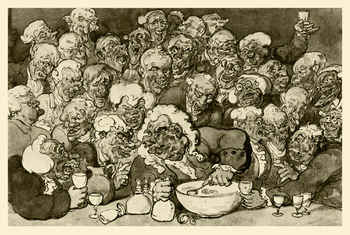
Thomas Rowlandson – “The Ugly Club”
For those who aren’t aware of this site, Coconino-Classics.com is an excellent French website which features galleries of early comic strips and illustrations. There are lots of Herriman (early Krazy Kat strips and lots of them), Cliff Sterrett, Rube Goldberg, George McManus. And lots more.
It’s a good place to spend and hour or two and comeback for more.
I was particularly entertained by William Glackens‘ panel strip, Rabbi Fleizer’s Xmas. It’s certainly an oddity and interesting. There’s something curious to me about seeing the print work of some notable artists like Glackens or Feininger or Kley or Cruikshank.
Comic Art 07 Jun 2006 07:34 am
Patrick McDonnell
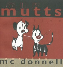 - I love the artwork of Patrick McDonell. His Mutts comic strip is oftentimes as good as many of the brilliant strips of the past. Just look at this watercolor comic on-line, and see how well it compares to any of those beautiful Polly and Her Pals strips I’ve posted in the past. HERE or HERE
There’s a joy in the drawing of McConnell’s strip that just comes across on the printed page. On his site he features Watercolor Sundays on which he posts actual watercolors rather than the airbrushed/Photoshop look most of the published colored strips feature. Somehow the watercolor look is especially becoming in this style.
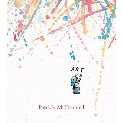 - Patrick also has a new book available. Art was released this year and is a beauty. Take a look at it next time you’re near the children’s book section of your favorite book store, or else just buy it on Amazon.
The selling point the marketers are using is to compare it to Crockett Johnson‘s Harold and The Purple Crayon. The art of this book is much more lively and free than Johnson’s quiet, tight style. Both are distinctive yet wildly different. Thematically, I suppose they’re similar, but Patrick McDonnell’s “Art” is significantly more vibrant.
Comic Art 05 Jun 2006 07:20 am
Barnaby & Mr. O’Malley
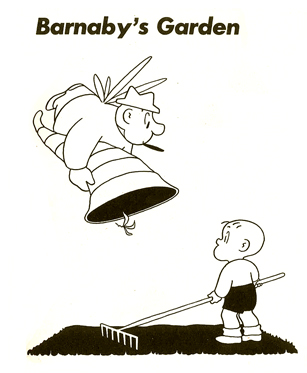 Crockett Johnson, whose most famous books are the Harold and The Purple Crayon series, drew a comic strip from 1942 through 1952 called Barnaby and Mr. O’Malley.
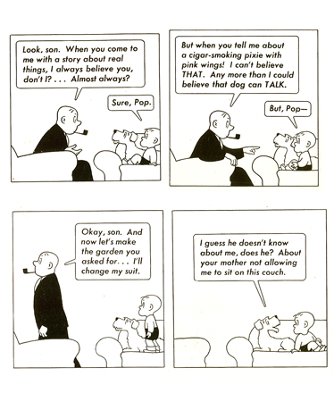
Barnaby was a child, who looked very similar both to Harold and to the child in Johnson’s other hit book, Carrot Seed. Mr. O’Malley was a cigar-smoking guardian angel who often brought more trouble for Barnaby than help.
Barnaby’s parents refused to accept Mr. O’Malley’s presence even when he stood in front of them. It took Barnaby’s growing up to bring an end to O’Malley. After age 6, Barnaby wasn’t allowed to see his friend anymore, thus ending the relationship and the strip.
Crockett Johnson tried updating and revising the stories in the 60′s, but the once successful comic strip wouldn’t ignite again.
This is not a strip for everyone. It’s wordy and seemingly “old fashioned.” There’s a calm to Johnson’s style and a wry sense of humor that I love. I’ve done an animated version of Carrot Seed for HBO and did a small bit of “consulting” work on their series of Harold & The Purple Crayon produced in LA at SONY. There’s a lot of room in his style for adaptation to animation, and I could easily imagine an animated version of this strip.
Here are the first few pages of it.
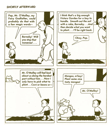
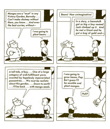
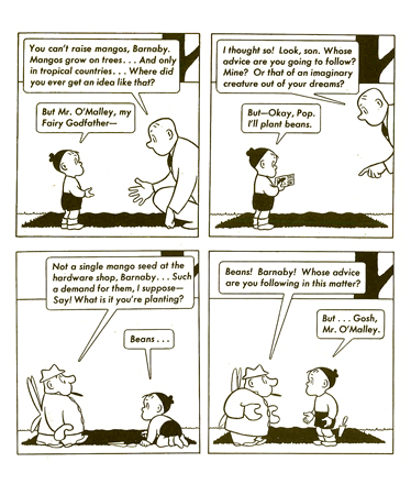
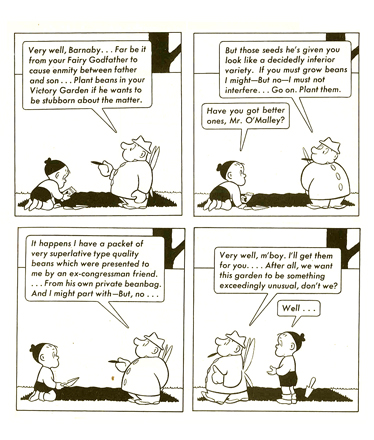
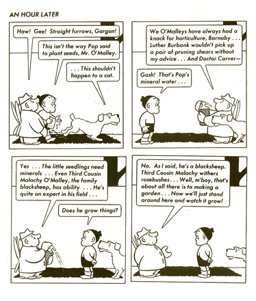
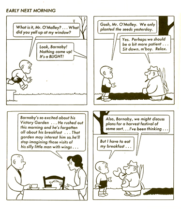
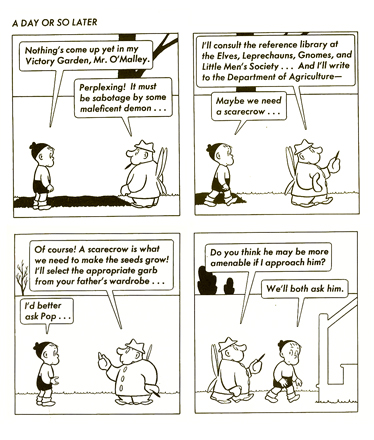
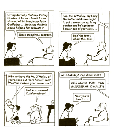
(Click on any image to enlarge.)
Comic Art 15 May 2006 07:52 am
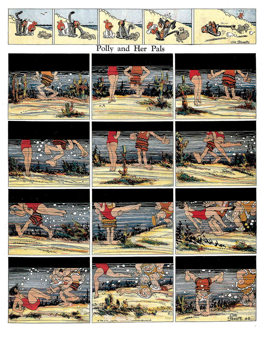
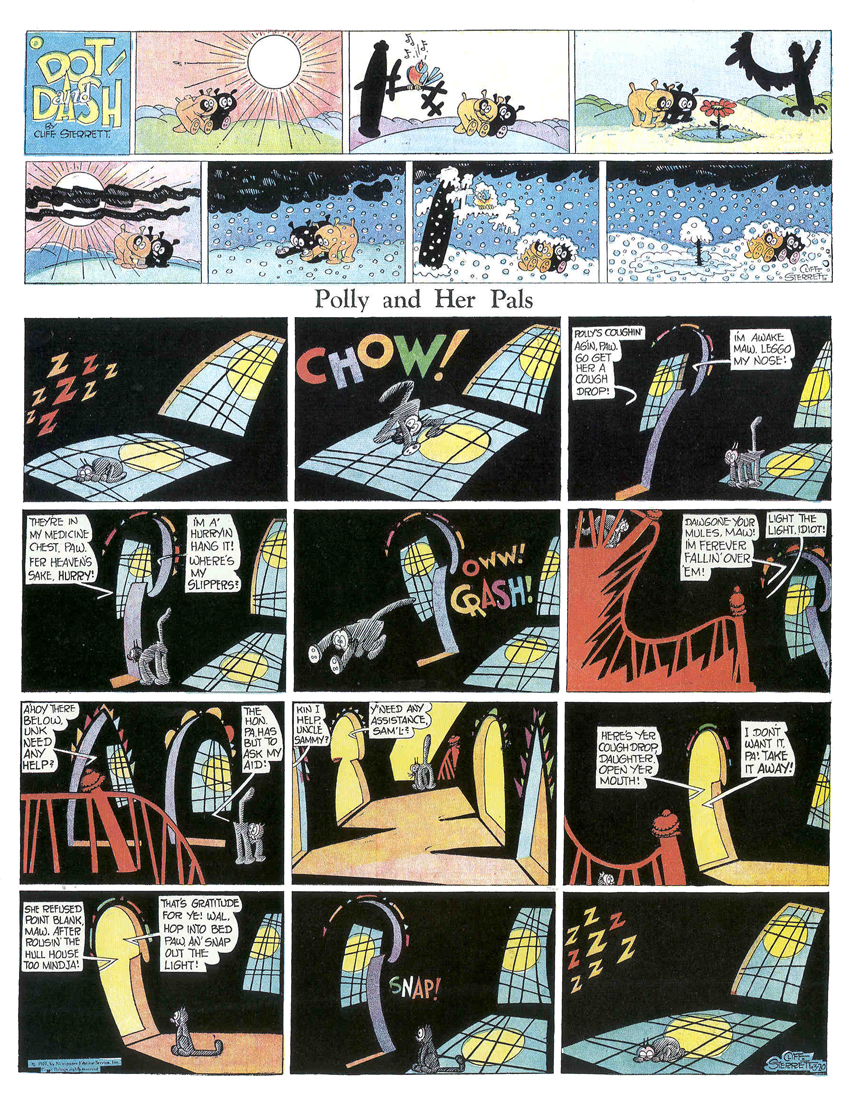
Polly Again
 - Polly & Her Pals is the perfect strip to accompany any thoughts about the Group Theater.
The strip originally followed the adventures of Positive Polly through the Jazz Age on her jaunts about town. The ideal flapper with her bobbed hair, short skirts and devil-may-care attitude.
Like several other strips, the side characters eventually took over as Maw and Paw adjusted to the nouveau riche lifestyle and spent the rest of their existence in a strip following Paw. Polly, like Nancy’s Aunt Fritzi Ritz, calmed down and became a good working girl once they hit the thirties, and the depression changed everything. The days of Jay Gatsby and found money settled into a more suburban world for the family as they moved into the 40′s.
(Click on any image to enlarge.)
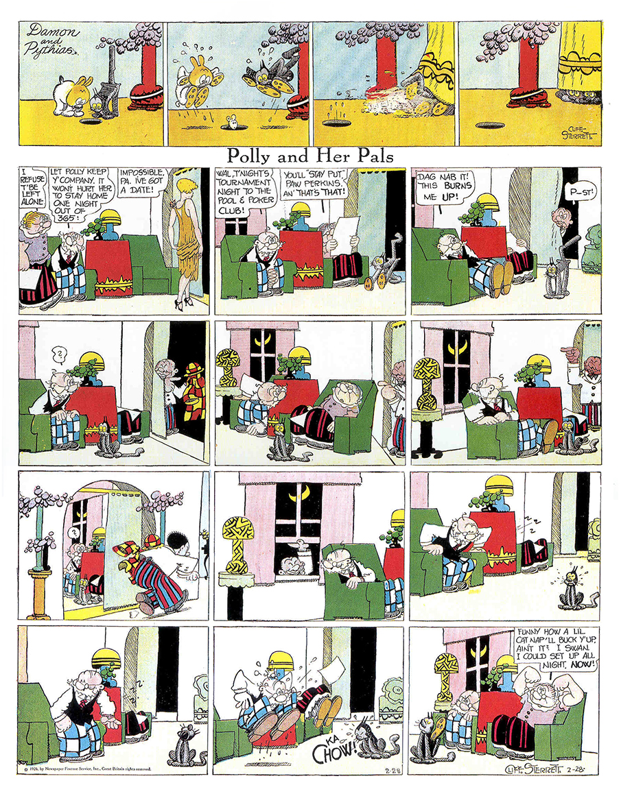
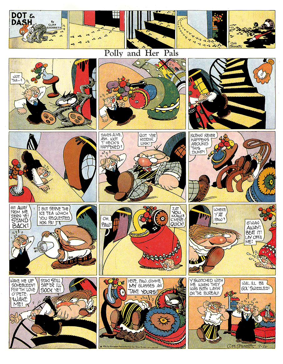
What always separated Polly & Her Pals from other strips, such as Bringin’ Up Father or Nancy, was Cliff Sterrett’s delicious graphic styling. Taking clues from the art world in general, Sterrett morphed the world under the feet of his characters to capture their emotions; it became hilarious to read and delightful to look at.
Like the actors in the Group Theater, comic strips became more popularized; more concerned with the common man, or in the case of Polly, the common gal.
Comic Art 23 Apr 2006 07:58 am
Polly
My favorite comic strip is Polly & Her Pals by Cliff Sterrett. Here’s one republished in “The Complete Color Polly & Her Pals.”
(Click on image to enlarge.)
Animation Artifacts &Comic Art &Hubley 25 Mar 2006 07:41 am
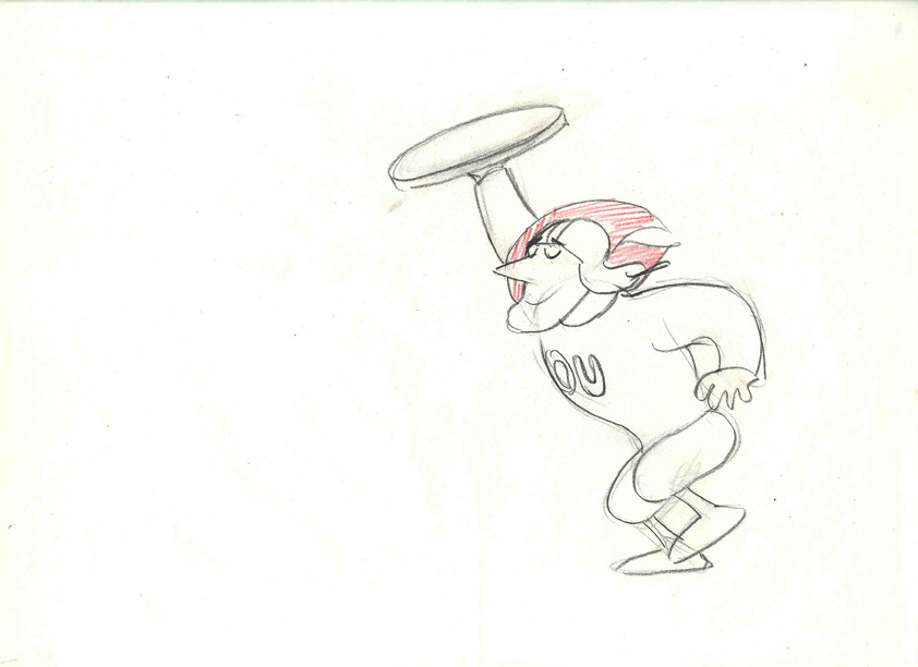
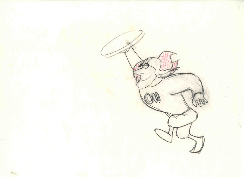
Letterman I, II, & III
Trying to recover some of the highlights from the past two weeks, I’m reposting these items from the Letterman series done for The Electric Company, starting back in 1972.
- These drawings are animation drawings of a run cycle done by Tissa David for the first season of the show.
There were three seasons of Letterman episodes we did at the Hubley Studio. All 60 episodes were 2 1/2 mins. apiece including the reused wrap-around: “It’s a bird! It’s a plan! It’s Letterman!” They were all directed by John Hubley. The first 40 episodes were all done in-house. The last 20 episodes were split with 10 done in the NY studio and 10 farmed out to Fred Wolf‘s studio in LA. The boards and layouts in NY for those sent out. Fred and Chuck Swenson animated all 10. (These are also the only episodes to use cel vinyl.) The audio was done in NY, and editing was done in the studio by Faith Hubley.
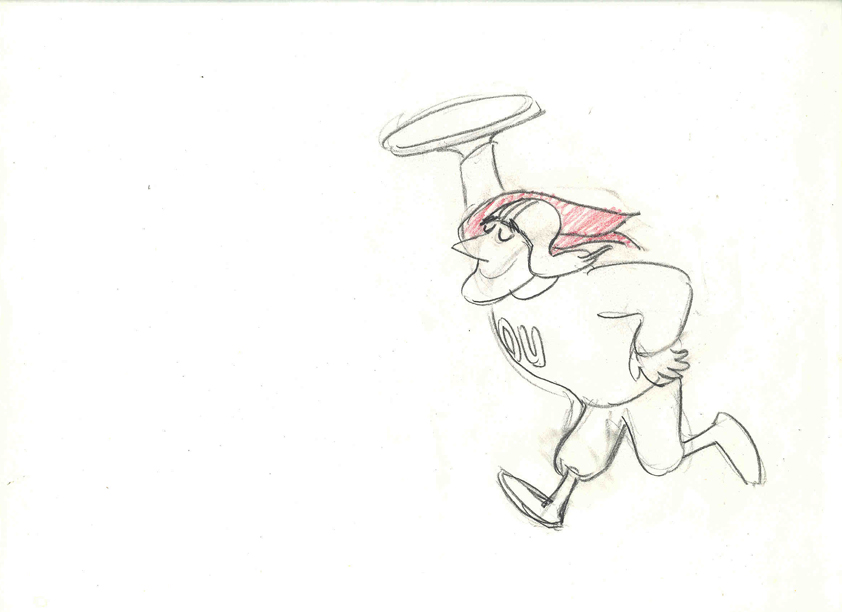
In the first season of the show the primary voices were: Gene Wilder as Letterman, Zero Mostel as Spellbinder, Joan Rivers as the Narrator, and Jack Gilford doing incidental voices. Billy Taylor did the music.
II
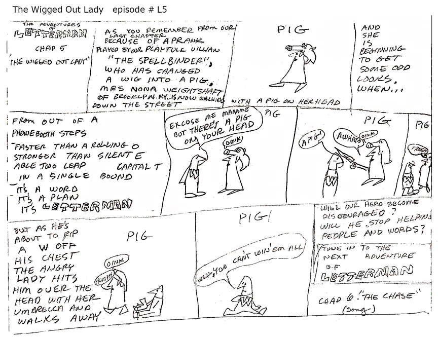 Christopher Cerf wrote all 60 episodes of Letterman, probably in collaboration with John Hubley. The storyboard posted here for episode #5 was by Chris Cerf; that’s pretty much how he did the scripts.
It’s undeniable that the wacky “naive” drawings undoubtedly inspired the models for the characters in the films.
(Click on any image to enlarge to a readable size.)
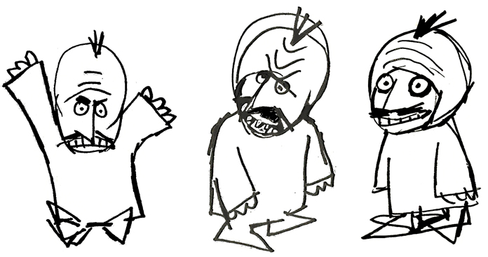
No doubt also affecting the models was an acccident that John Hubley had had at the start of production on this first series. At a dinner party, John tried to stop a falling 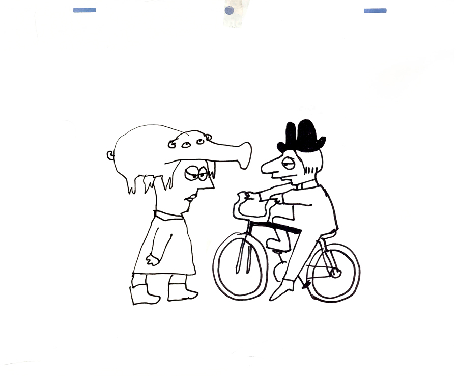 fondue pot filled with melted cheese. Horrible burns over both hands somewhat hampered his artwork. I would make several visits a day to his nearby apartment to have art approved. To have John draw, we’d prop a felt-tip pen into the mass of gauze and cotton and bandages wrapped around both hands. He’d move his wrapped fist around a sheet of paper and end up with a model like the one posted here. This went on for about three weeks (roughly half of the production time.) When he returned, backgrounds were done at a super speed.
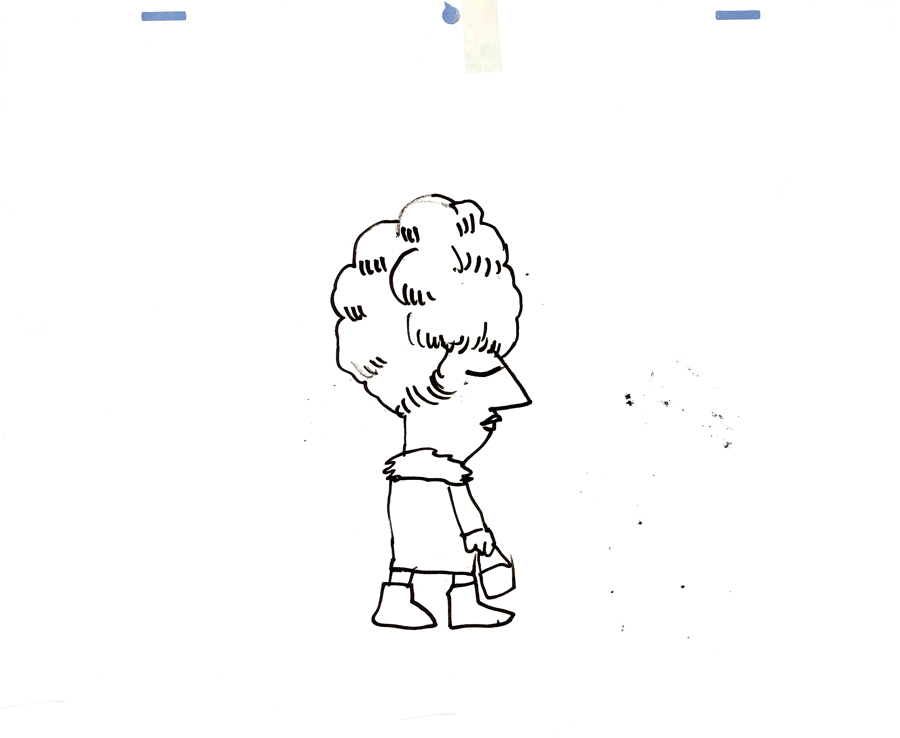
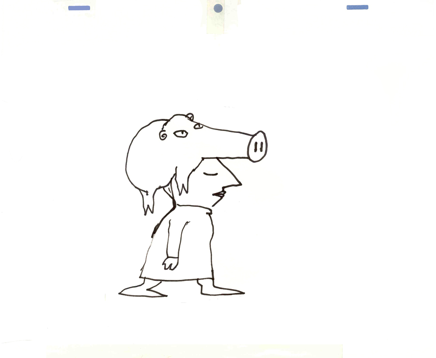 Everything was modeled on Krazy Kat. Lots of white space with sparkling color sprinkled about. The lines were dressed up with a ragged cross-hatching. The characters were colored with magic marker. (John’s favorite color was Eberhard Faber’s “Shock Pink”. Letterman’s skin color took this tone. It showed up in almost everything John did with markers.) The backgrounds were inked with a pentel felt-tip. John would throw a light wash of water over some of these lines to get them to bleed.
We’d race daily to get at least half a dozen scenes ink, painted and colored on paper. Then it’d be packaged and sent out via Fed Ex. (Celine Miles in LA cut & pasted the colored drawwings to cels; the art was shot at Animcam by Jack Buehre.) The FedEx guy arrived daily at 5:30pm, so that was my deadline. I found myself coming in at 7am to add more time to the day. I’d watch the clock which ticked furiously; I averaged 30secs to ink a drawing – any more, and I wouldn’t make Faith’s deadline.
III
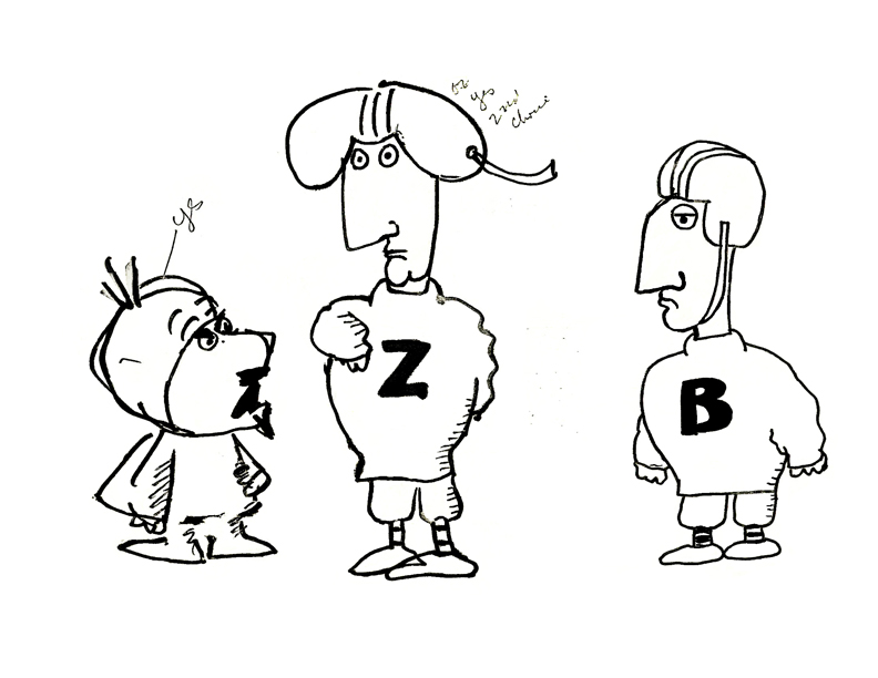 – These scrappy examples are not the best to give an indication of Letterman. But they were the ones I saved, so they’ll have to do. John Hubley drew these very early in the production, and they undoubtedly owe something to Chris Cerf‘s hilarious storyboards.
The animators involved in season one included: Tissa David, Johnny Gentilella, Vinnie Bell, Lu Guarnier and Jack Schnerk.
Helen Komar, a veteran Asst. Animator in NY, was the coordinator of the production and Gen Hirsch also colored. Gen and I got really close over the couple of years we worked together. She was the wife of Joseph Hirsch, the brilliant artist and mother of Paul Hirsch (editor of Star Wars and other incredible films) .
It was my first real job in an animation studio. Probably for this reason, I remember a lot of what happened – it was indelibly etched in my memory. I was the inker, colorist (we used markers, remember), animator of miscellaneous scenes (I think I animated some 40 scenes that first season), hole puncher, and Assistant Animator.
 It was in the capacity as Assistant Animator that I found trouble. I hadn’t done it before, except for myself, so was horribly untrained. Because the schedule was so ridiculously tight, I had to assist in ink (Sharpie pens – the fat ones that dribbled ink and bled through multiple sheets of paper) and correctly put some of the animation – I won’t say on model, but closer to model.
Johnny Gentilella, an absolutely wonderful guy, was the farthest astream. He was THE Popeye animator at Paramount. His characters looked like Paramount characters, and I had to get them closer to John’s style. This meant assisting (in ink), inbetweening and basically redrawing everything he’d done – in a rush – without proper training. The guilt of what I was doing to Johnny’s drawings weighed heavily on me, and I eventually apologized to him for what I’d done. He laughed and told me that he had no problem with it. This was standard for NY production in those days and he was used to it. (As a matter of fact, he hired me for another job he directed months later. So I guess he wasn’t too upset. I was.)
The race against the clock was always on; my career had started, and it couldn’t have been more fun. And I was working for John Hubley.
