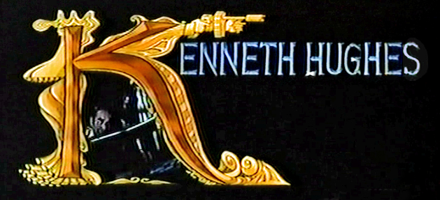
Category ArchiveCommentary
Commentary 30 Mar 2013 04:35 am
Brewing Sqwiglies
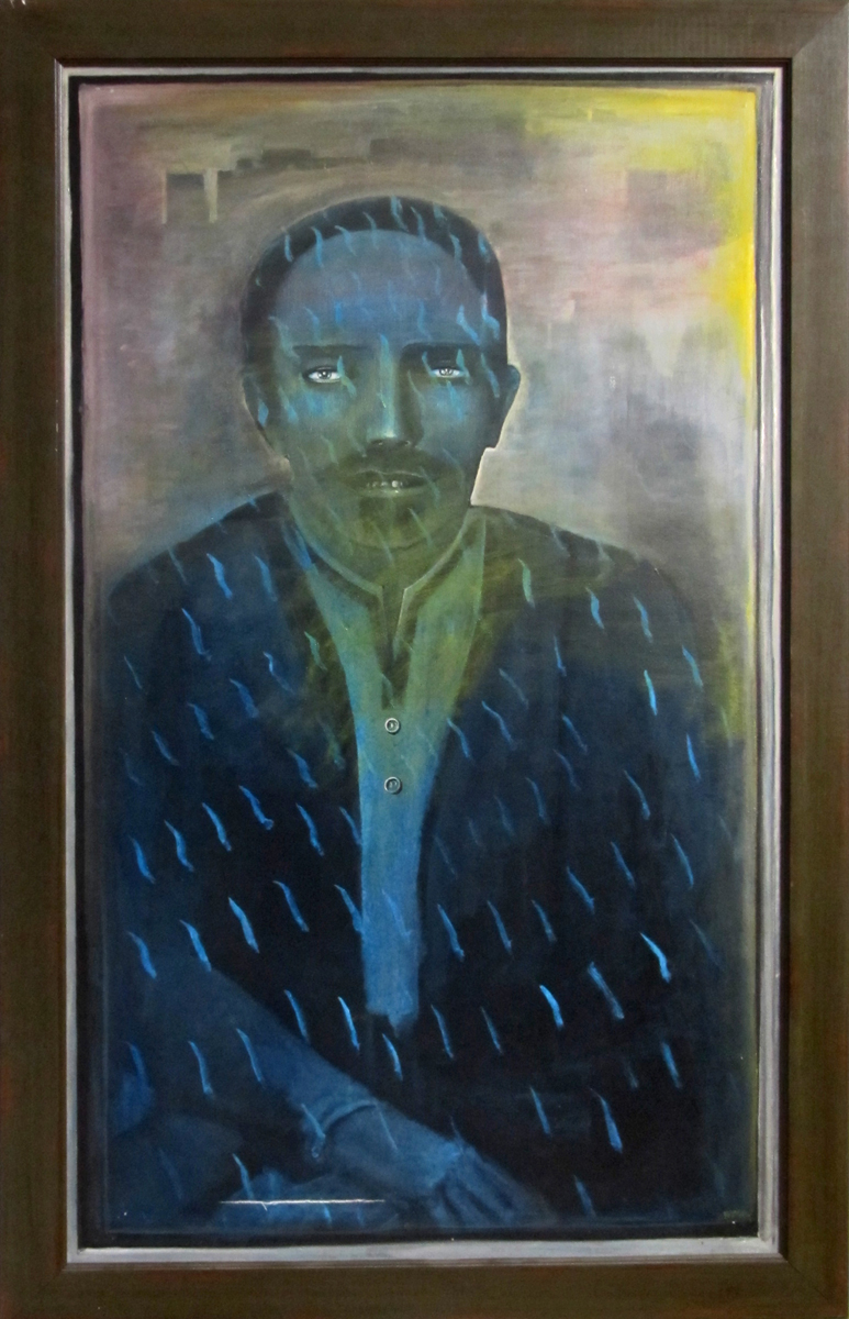
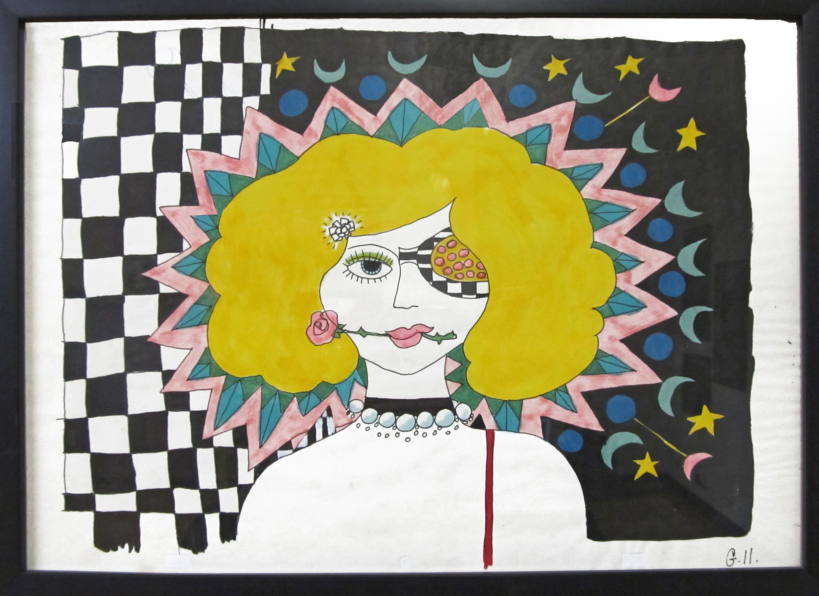
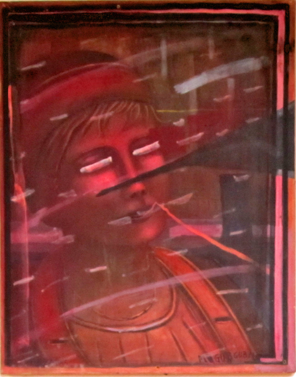
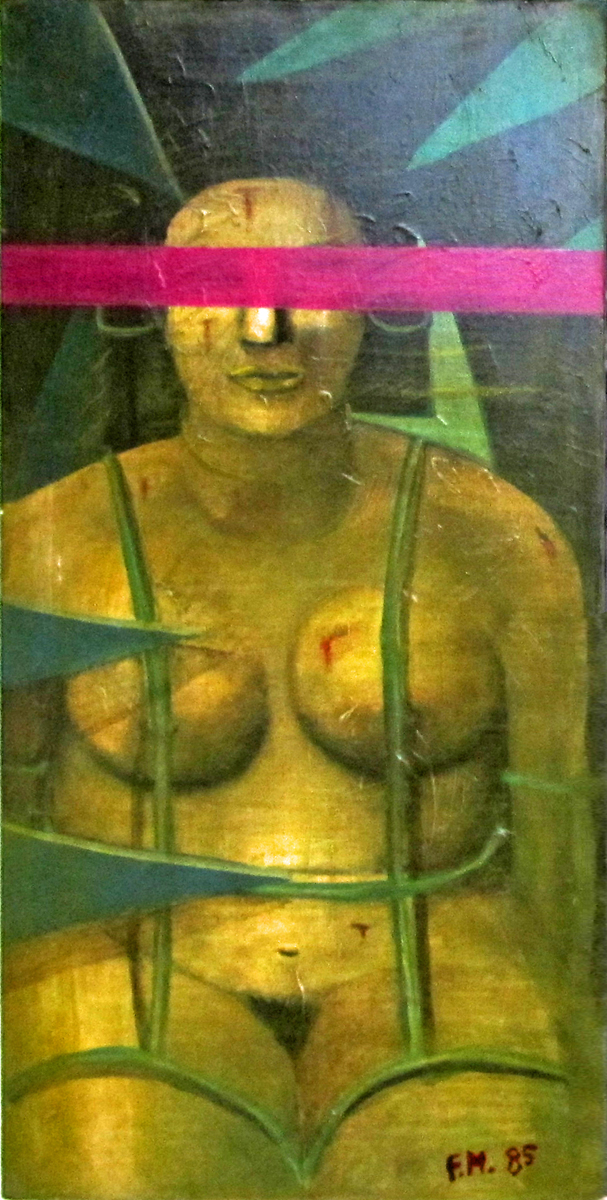
- Richard O’Connor turned his animation studio, Ace and Son into an art gallery this past Thursday night to celebrate the art of Fred Mogubgub. Fred was something of a wildly eccentric genius who rode the animation studios from the forties through the eighties. He was know publicly in animation for Enter Hamlet a short that used the voice of Maurice Evans performing the “To Be or Not To Be” soliloquy from Hamlet, while funny drawings pass in front of the camera.
Fred was an artist, and Richard owns many of his works of art. A large number of oil paintings, watercolors and animation pieces. I’d seen Enter Hamlet in 1965 as a young animation enthusiast, and I knew Fred’s work from The Big Blue Marble which was wildly popular in NY.
The event was a wonderful party where I met up with George Griffin, Liesje Kraai, Lee Corey, Larry Ruppel, and Elliot Cowan among others. Richard went to the trouble of searching out for wine from Lebanon which he felt was appropriate in Fred’s Lebanese honor. As my astute wife, Heidi Stallings, pointed out, it was very much like the old days when people actually socialized with each other. I miss the mingling, too, and it was nice to get out to something other than for a holiday event. And how much better than to toast an extraordinary artist like Fred Mogubgub.
Unfortunately, I didn’t properly mark down the titles of the paintings. I’ll try to fill those in later in the day. Here are the pictures:
 1
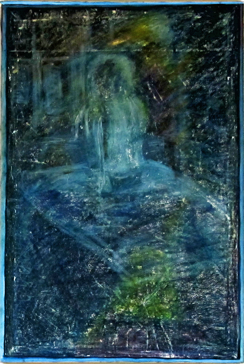
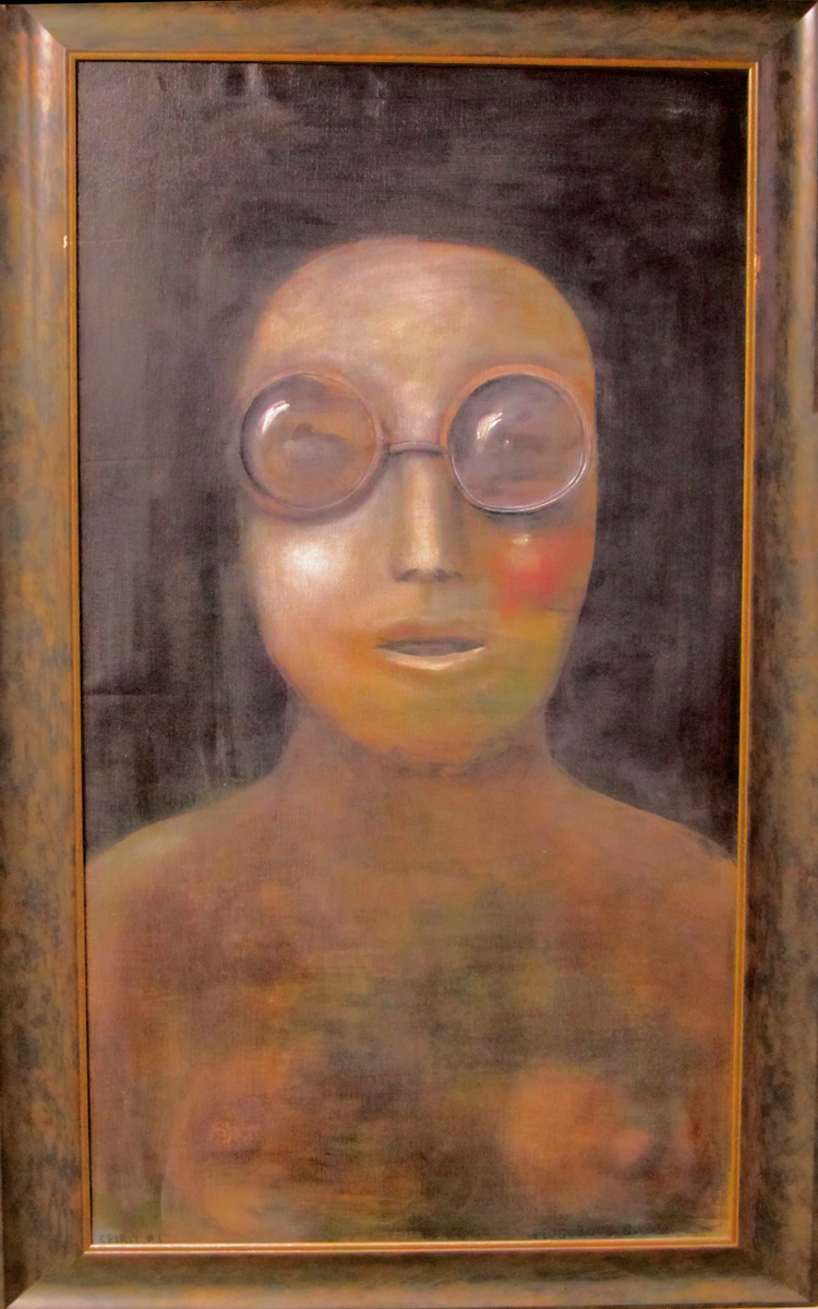
1Spirit #4
 2
2
A cel setup from a BeechNut Gum ad.
 3
3
Who Cares?
 4
4
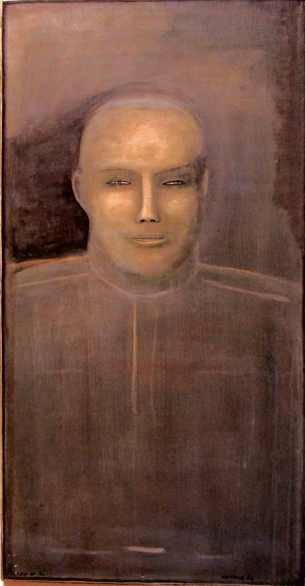
Untitled
 5
5
Jockey Club
 6
6
George and Frédéric Depart to Spain
 7
7
Untitled [possibly unfinished as it's unsigned and undated]
 8
8
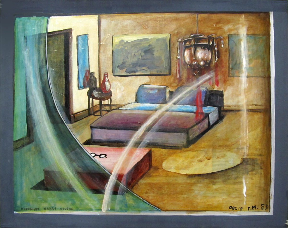
“Goodnight, Harry Houdini”
 9
9
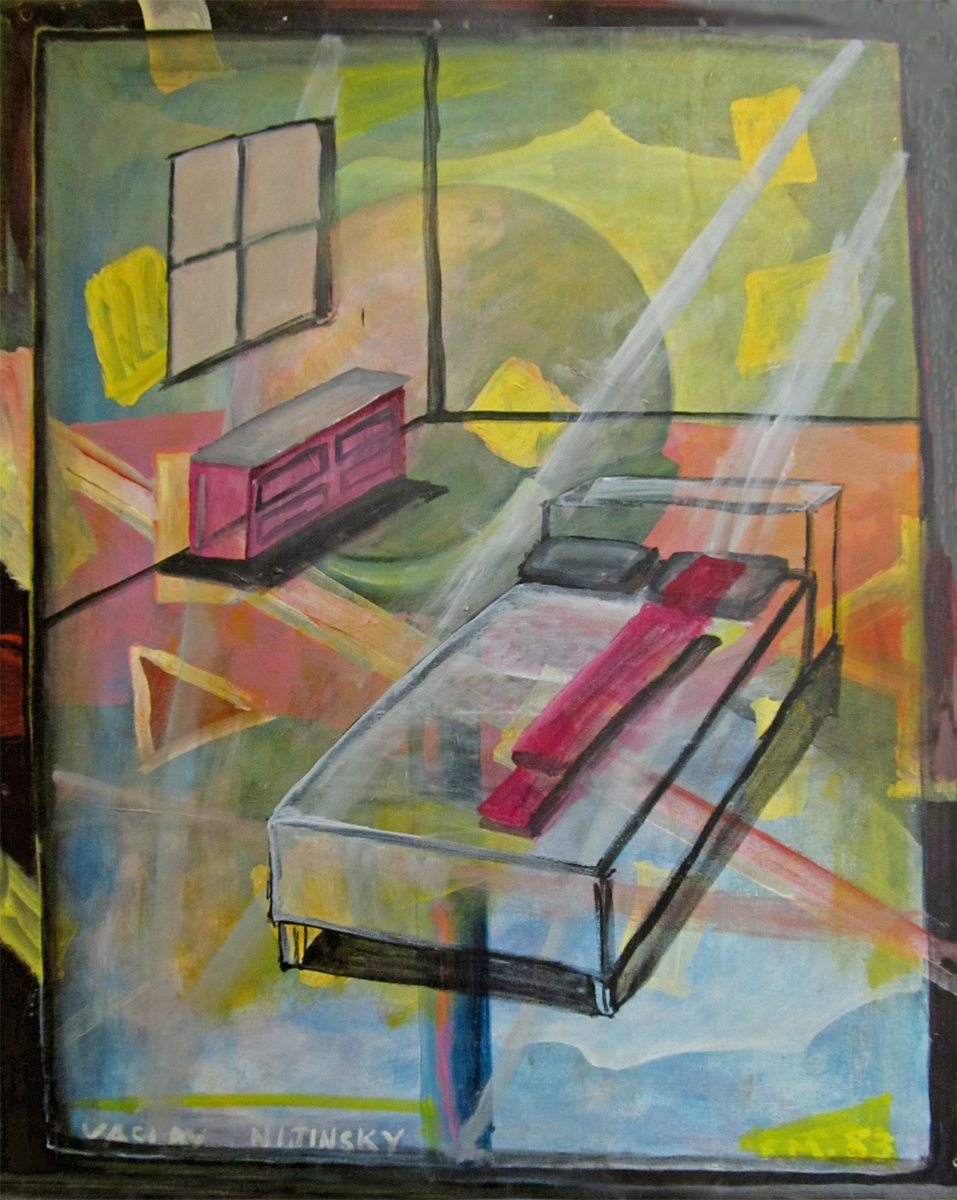
“Vaclav Nijinsky”
 10
10
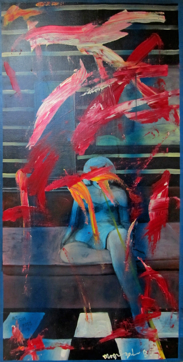
At The Ritz
 11
11
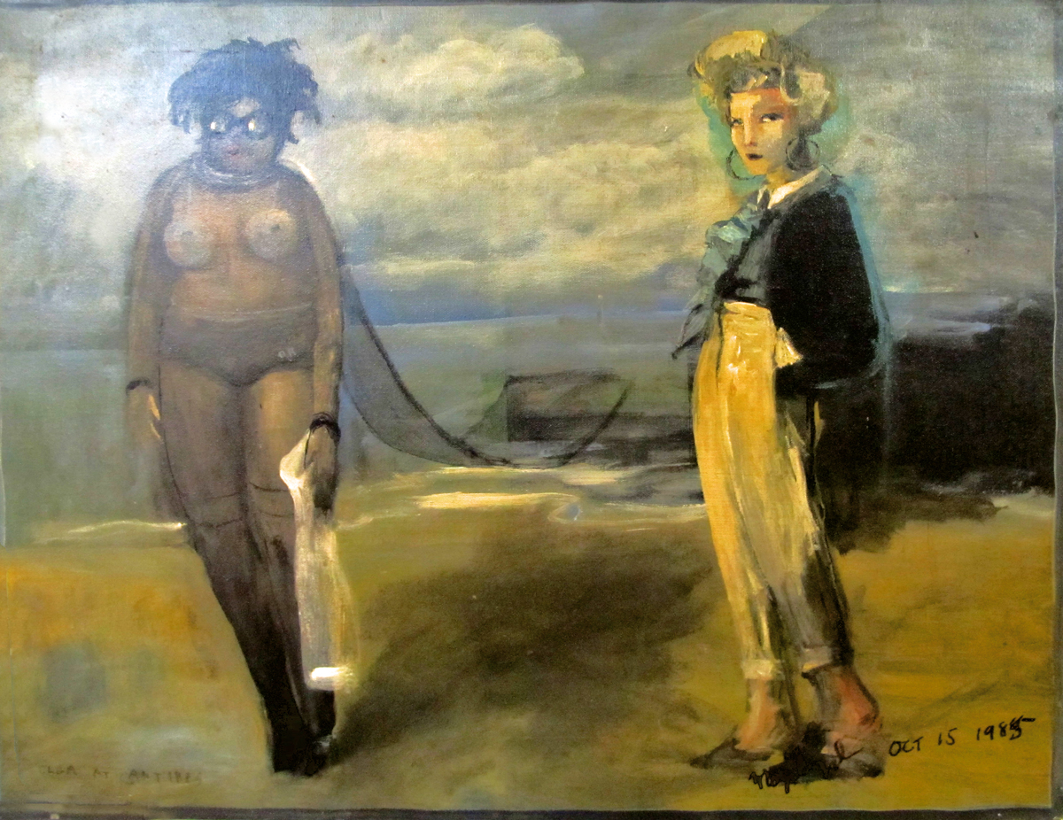
Olga at Antibbes
 12
12
Spirit #1
 13
13
Spirit #2
 14
14
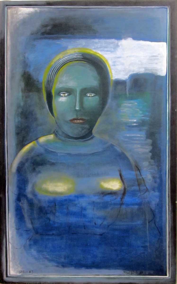
Spirit #3
2 Miyazakis on Poppy Hill
- This week I saw The Croods (and reviewed it here) and From Up on Poppy Hill. I really wanted Poppy Hill to be a small masterpiece, but it wasn’t. It was just a trek. I wanted Goro Miyazaki to have a glimmer of the old man in him; it’ll be hard to let go of Hayao Miyazaki when he retires or decides to end his enormous career. This film was supposedly written by Hayao in collaboration with the son, Goro. I didn’t feel the spirituality of Goro in this movie; That’s what I love about Hayao’s films; there’s a spirituality. All those films (at least since Totoro) are about so much more than what’s on the surface. What’s on the surface is usually good, too. And lately the animation has been getting better. If there’s any spirituality in Goro, it didn’t make it to the big screen, and the animation was first class TV work. No magic there, either.
It’s the second film directed by Goro Miyazaki. Tales from Earthsea should have jump-started a new career. The film was just dull. I assume the artists at Studio Ghibli want things to go on, as well. Poppy Hill had some of the elements of a Ghibli production; it just lacked the magic. First rate styling, fine character design (they all do look a bit like, at times), and a human story.
Although the story had too little in it. It was quite subtle and for a sophomore director to pull it off was too much to ask. The animation rarely had a spark. The characters always did what they were asked to do, but they didn’t really have much of a lifetime within them. The director needed a LOT of experience within him to pull it off, needed a lot of animation experience to be able to pull stronger performances out of his animators and needed a stronger connection to the story to make us care about those characters. Zer0 for three.
Don’t get me wrong; I’d take this over The Croods any day, but I’d prefer to have something good rather than either of these movies.
Crood Surfacing
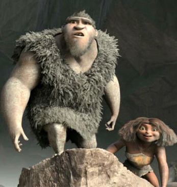
 I saw this interview with “surfacer” Animator T.J. Nabors on line and I thought I’d share it with you. She sought work as a textile designer and taught herself computer art and animation from an Amiga on up. Several design jobs later, from millinery to Laika commercial division, and, before you know it, she is a supervising surface animator for Dreamworks. Her specialty on this film was the creature pictured above.
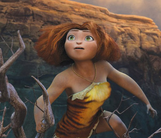
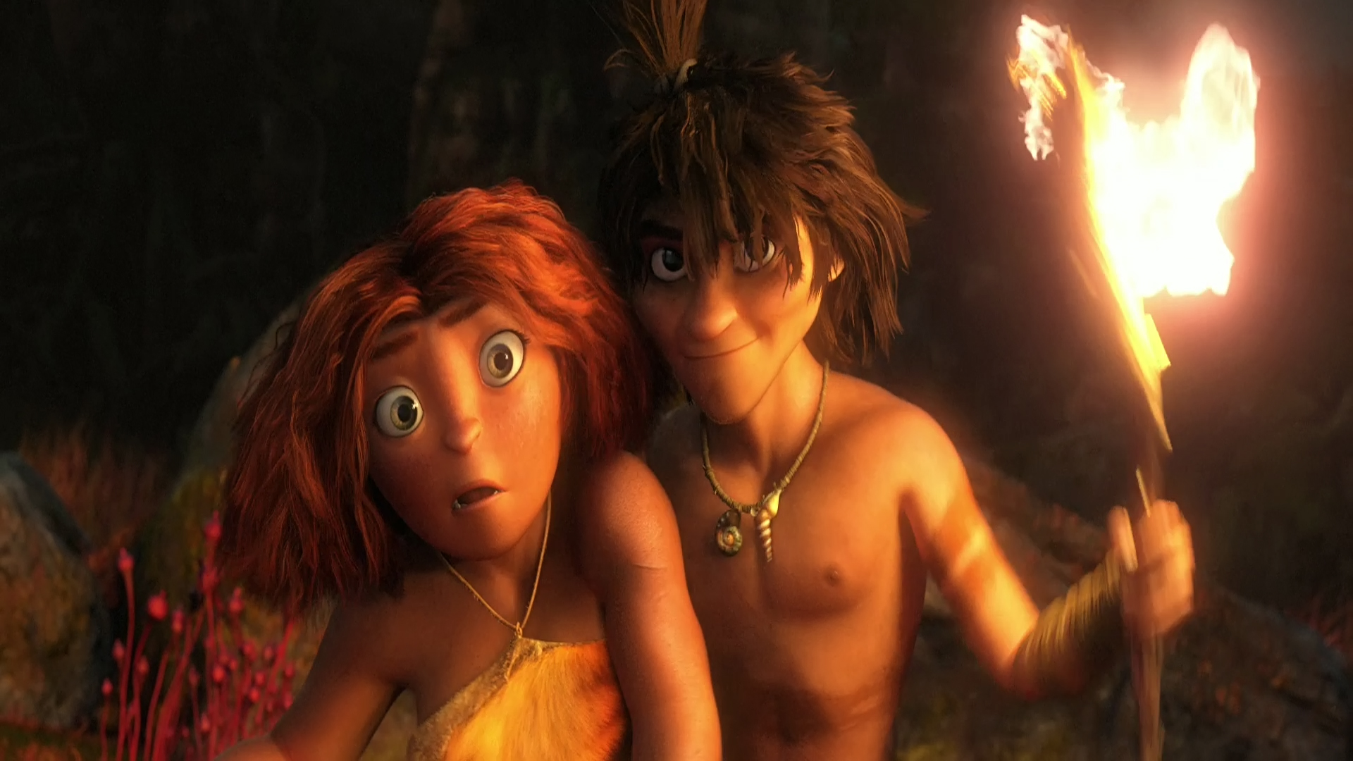
I was attracted to the article about a “surfacer” because that was one aspect of the film that really caught my attention. It does from time to time in these cg films. There was one elf (I don’t know Hobbit or something) in the Hobbit that had lots of hair. But the surface of his skin was, to me, stunning. I looked forward to shots of this guy so that I could look into his cheeks. It was  extraordinary work, in my opinion, and I’m pretty sure it had to have been done with computer enhancing. You can’t get that with latex. In The Croods I was wholly taken by the surface of the girl’s skin. She was most definitely a thick skinned character, slightly darker than other characters. It remained consistent for the entire 90 minute journey of the film. I hated the expressions on her face, most of the time as the penchant for “cute” is too strong for most Dreamworks animators, however the skin of that girl was something to behold. She truly felt like a “cave woman”, and I found that impressive. The same was true of the father, Nicholas Cage’s character. The voice reading kept turning me off, but the character built into the animation wa most impressive. With him, though, it wasn’t the “skin” that I paid attention to, it was the subtle motions that kept him 20% Neanderthal to his 80% human. He was most definitely something else.
This is aside attraction I find with these cgi features. The “animation” means something else again in these films. It’s part of the reason I have to think of that medium more as digital puppetry than as animation, in the same sense that a 2D person (me, for example) would think of it. I don’t think I’m putting anything down; I’m just trying to get past the roots to look more closely at the follicle, itself.
Anyway, never mind my hang up. Enjoy the interview. I’d like to see a lot more like these rather than the generic animation artist interview. As much of a puff piece as this is, I’ve been able to learn something from it.
Actually, Life of Pi gave me new found respect for the work done by these folk. In my mind, the work in that movie is the reason why cgi was invented. There’s the art. It may hae taken a lot of features like Toy Story and Monsters Inc. to get there, but Pi is where the form was finally and properly used.
In Show
Here are a list of the U.S. films that have made it into Annecy or Anifilm competition screenings. Only two US features seem to have made it – Consuming Spirits and It’s Such a Beautiful Day. Congrats to Chris Sulliven AND Don Hertzfeldt.
in competition at ANIFILM
Consuming Spirits | Chris Sullivan | USA
It’s such a beautiful day | Don HERTZFELDT | USA
Feral | Daniel SOUSA | USA
Sidewalk | Celia BULLWINKEL | USA
And/Or | Emily HUBLEY | USA
in competition at ANNECY
Independent films:
Drunker than a Skunk | Bill PLYMPTON | USA
Feral | Daniel Sousa | USA
Fight | Steven SUBOTNICK | USA
Marcel, King of Tervuren | Tom SCHROEDER | USA
Education:
What Makes a Hero? | Kirill YERETSKY | USA
Congratulations to all those who made it. It’s a tough game these days.
(I didn’t include TV series or TV Specials, because that’s just
big business, and I’m not too interested in congratulating some company.)
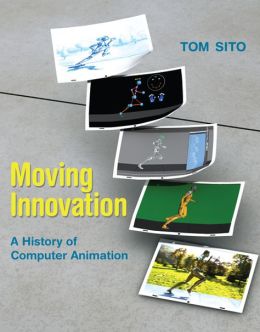
A History of Computer Animation
(Is there a history already?)
Here‘s an interview with my friend Tom Sito on his new book, a history of computer animation. Moving Innovation: A History of Computer Animation.
It should be interesting since Tom has been a fantastic 2D animator. I’m curious as to what he has to say about the machines.
Commentary 28 Mar 2013 05:40 am
Crood
 There can be no denying Chris Sanders‘ extraordinary talent. His character design is unmistakably his own. Slightly wall-eyed creatures who all have an extra dose of . . . I’m not sure what to call it. One wants to say “cuteness”, but that is decidedly the wrong word. It’s in those eyes. There’s an innocence there, and that overrides just about everything else in his creatures.
To house those wide set eyes, you need an extra thick head. Just right for cave dwellers.
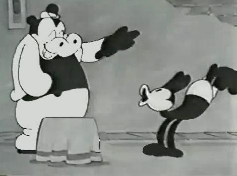
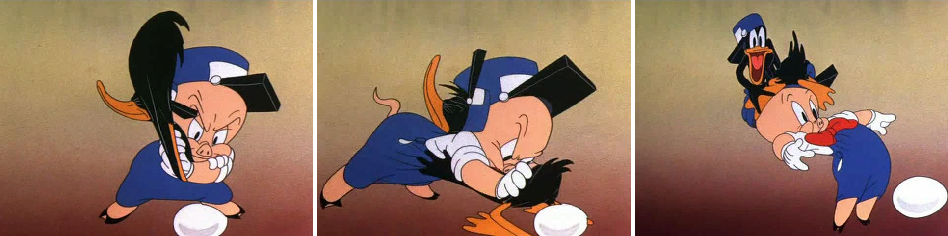
For the first half hour or so of The Croods I spent a lot of time wondering about these characters that were being pushed at me. The direction was harsh, loud, fast and annoying. The tone was equal to that. The Croods is the new Dreamworks feature co-directed by Sanders and Kirk De Micco, the latter fresh off directing Space Chimps, a successful independently produced cgi animated feature released by 20th Century Fox last year. This film, The Croods, is something of a mess. (By the way, what are they trying to say with that title? Obviously, “Crood” is the Neanderthal spelling of “crude”, but even still it doesn’t really make much sense. You can tell yourself it does, but no. Sorry. Unfortunately, that’s a good example of what the film’s jokes are like, and they repeat them often.)
 The story is a cliché; it seems to be the endlessly repeated story of this generation. They keep making the same film. Feisty daughter doesn’t want to be part of the cookie-cutter mold so fights with the father until dad learns the lesson and gives the girl some space. In Brave, at least, it was her mother the girl was fighting. Here, we stick to the formula – tried and true and predictable.
It took about five minutes for me to remember that Nicholas Cage was the big voice. I didn’t remember that he was in it and his “Valley girl” accent was very irritating. In this film everyone except Catherine Keener, as the mom, sounds like they’re ripped from the Valley. The film, about the division and replacement of the earth’s land masses feels as though it’s not about the entire planet but more about Southern California. I felt left out of the movie.
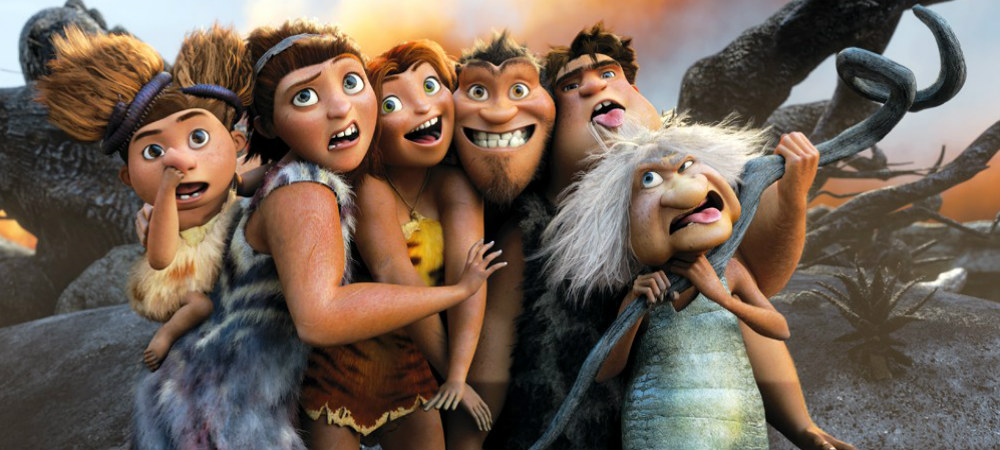
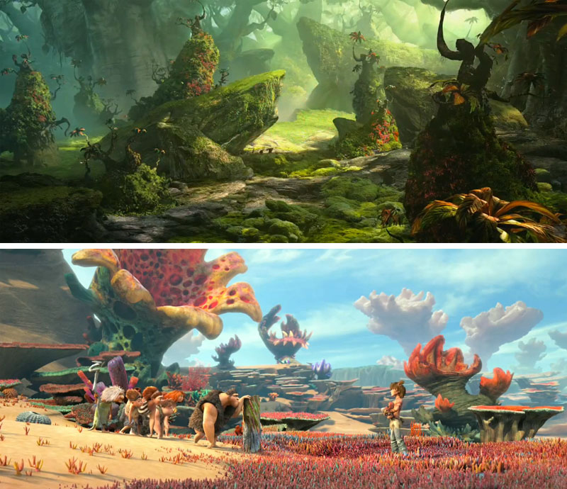
The world of these cave people is populated with few other people although there are a bunch of imaginary animals. The animals are supposed to be real, but they were created by the writer/designers. Obviously all were afraid of being called inaccurate if they included dinosaurs; dinosaurs didn’t coexist with humans. (Sorry, “Creationists” this was the reality of what did happen.) Instead, we get a bunch of creatures that look like oversized stuffed animals, and they threaten the existence of the Croods and other humans.
Actually, I’m not sure if I should call the Croods “human”. I assume they’re supposed to be Neanderthal since they’re not as highly developed as Guy, the young man voiced by Ryan Reynolds, who arrives midway through the film. He is obviously from a different, higher-functioning species than the Croods. Regardless of all this, all of the characters speak with California accents and usage. Undoubtedly it was written for the 21st century and the teens of that period. Again, I felt left out not being a teenage girl from Santa Monica.
Let’s step away from the story (hard to do when you’re watching the film.) Actually, you’re being assaulted by the film as it comes at you and comes at you, loud and violent. This is much different than most of the cgi films these days. Even Brave didn’t have the patience to properly develop all that it had on its mind without just flinging it at you. But Dreamworks keeps going there. No quiet moments for the weary. This film is miles better than Rise of the Guardians, but it has its own share of problems.
The one thing it does have is Chris Sanders with that beautiful drawing style, and his art is oftentimes glorious to watch. Of course, I know he’s not doing all the drawing and painting, but he is directing it. I’m not sure of Kirk De Micco;s contribution; I don’t know his work. I have to assume it has to do with the commercial asp;ects of this film – all the hyper movement, gag setups, short scenes. I do wish the two of them could tone down the energy in the film. Animate the story and let it come to the audience. It doesn’t have to attack the audience to get where it wants to go. If Nick Cage’s character smashed his head into one more rock or chased another stuffed animal I would have walked out. The sad part is there was a genuine character in that father. At the film’s start he was most definitely only 3/4 human with Neanderthal man trying to get out. You get much the same from Emma Stone’s girl. She started out as an original – no doubt related to Meridia from Brave. Her wiry hair even has some movement of its own to prove it. I found Emma Stone’s reading not as strong as I expected, but the animators pulled a real person out of it. Despite all the milked activity that is thrown at you at a zealous pace.
No, the film just wasn’t good enough. Good effects, good 3D (though my eyes kept watering) and some good artwork. All the dialogue was pathetic and the story was trite. My first thought is that we deserve more.
The film opened with $52.9 million coming from the U.S. and another $62.4 million coming from International sales. That means that the film earned more than $115 million in the first weekend. Neanderthals do well at the box office. Take a look at all those Ice Age films from Blue Sky & 20th Fox. The Croods is the first of the films 2th Fox is distributing of the Dreamworks product. They just moved to this distributor from Paramount. Rupert Murdoch ca dance in the streets and make a few more Neanderthal movies. There probably won’t be any Oscars, but they’ll garner the real gold with this material.
Maybe we’re getting exactly what we deserve.
Action Analysis &Animation &Commentary &Frame Grabs &Tytla 25 Mar 2013 06:05 am
Smears, Distortions, Abstractions & Emotions – 2
- I wrote about this stylistic animation device not too long ago. I was leading up to the master, of course, Bill Tytla. He distorted things, alright, and in the way he did it, he changed animation forever, as far as I’m concerned.
But I started that story by writing about traditional animation and where it came from and where it was going; leading to a sort of rebellion as animators started distorting things, generally, in working closely with their unconventional directors. I purposely skipped a step there, and I should go back a tiny bit and talk about a couple of animators from the silent/early sound days. Today I have Bill Nolan in my sights; tomorrow, Grim Natwick. It’s kind of important before going on to Bill Tytla.
 In the animation community in 1927-1930, there were two key animators who were considered the leaders in the business:
Ub Iwerks at Disney (until he left to open his own studio) and
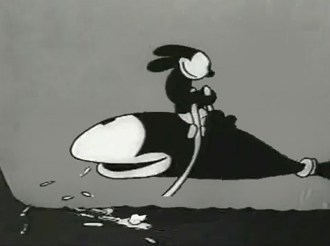
Bill Nolan (at first with Pat Sullivan & Felix the Cat, then with Mintz’ Krazy Kat, and then onto a series of topical gag films called “Newslaffs.”
Both were considered the fastest animators in the country, and it was debatable as to which was quicker, though Iwerks was probably the guy. When Disney learned that Iwerks was leaving, he interviewed Nolan in New York to see if he were interested in replacing Iwerks. Disney offered a high salary of $150 per week for the job. It didn’t work out; Nolan was doing an unusual series, but ultimately went to ________________Nolan’s Krazy Kat looked original.
Oswald the Rabbit after Universal had taken
charge of it. Nolan just about ran the studio under Walter Lantz and allowed them to turn out an enormous amount of footage.
 1
1 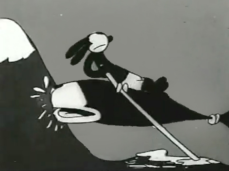 2
2
 3
3 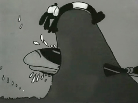 4
4
 5
5 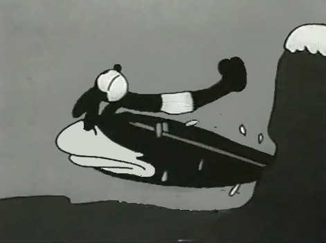 6
6
 7
7 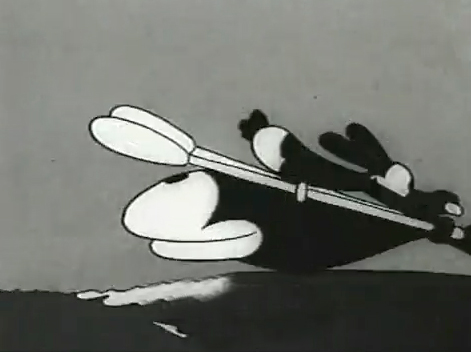 8
8
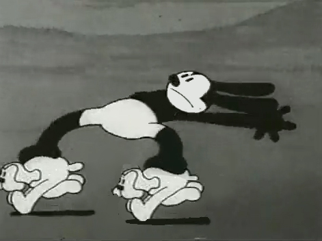
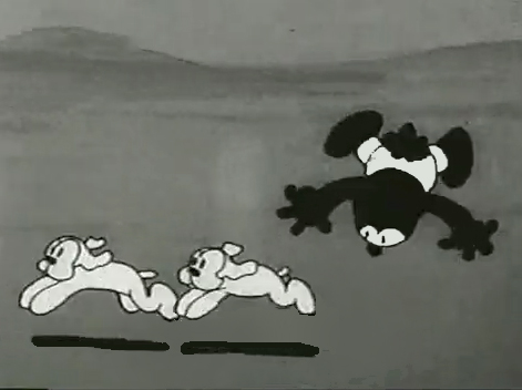
Nolan had developed a style known as the “rubber hose” style in that the limbs of a character were like flexible hoses and joints would be broken wherever the animator wanted. The style also featured very circular drawings. Stylistically, this fought the angularity of some other films that were being made and allowed Nolan to turn out many more drawings than usual. The roundness offered a faster line, and there was also quite a bit of distortion in Nolan’s drawings. Quite often the characters, Oswald, for example, didn’t even look like the character on the model sheet. In fact, you’d have to wonder if there was a model sheet, given the look of the animated character. Both Nolan and Iwerks were straight ahead animators, which meant they could easily go off model. Iwerks was better at holding things than Nolan, who seemed to enjoy being wild. Nolan would go back through his wild drawings and correct a couple of them, but would leave any other changes to lesser artists.
Nolan’s work was somewhat similar to the work of Jim Tyer, but I don’t think Tyer was drawing/animating that way to turn out faster work (though he was a very fast animator.) Nolan had to push the work out, and the rounded, distorted drawings enabled him to animate very quickly. As he went on, the artwork grew more and more wild, and it varied somewhat from the other animators’ work. Tyer tried to get his art to distort, as it does; Nolan just ended up there.
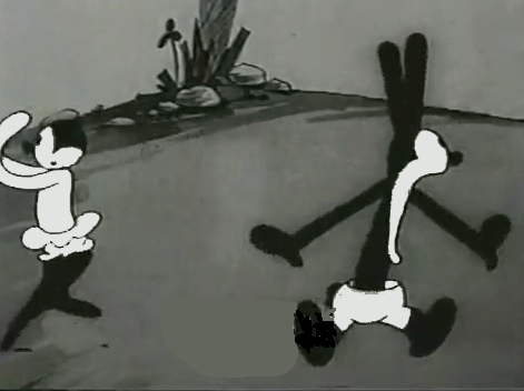 1
1 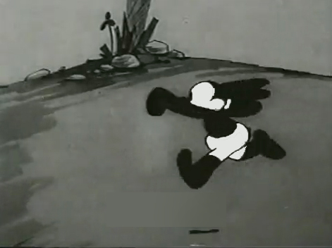 2
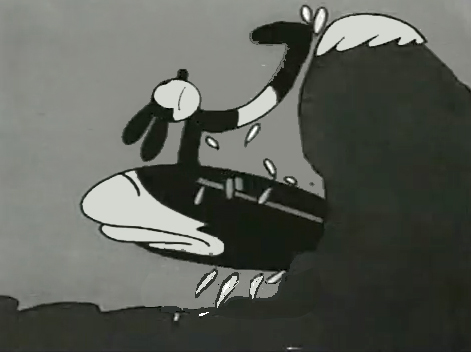
2I’d chosen a lot of stills from several of the
Universal/Lantz Oswald cartoons, animated by Nolan.
 3
3  4
4
But so many of these from the short, “Permanent Wave,”
are good enough to illustrate my point.
 5
5  6
6
 7
7 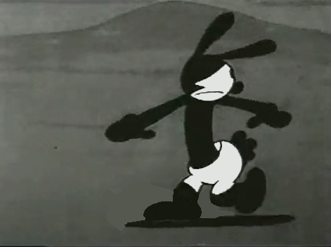 8
8
 9
9 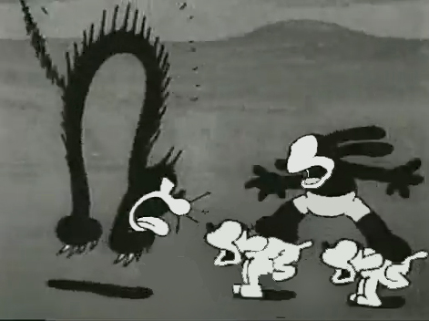 10
10
 11
11
 12
12
 13
13 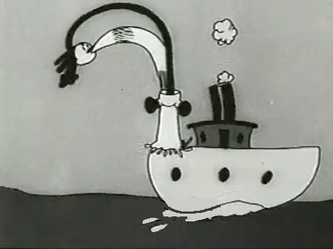 14
14
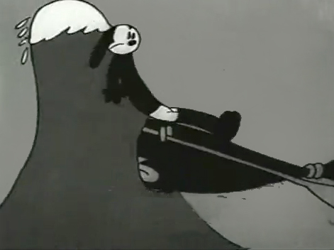
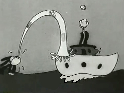
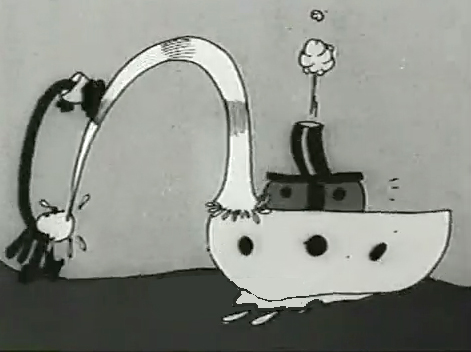
His body moves out in front of his head
as it climbs up the water he’s spitting onto the boat.
 15
15 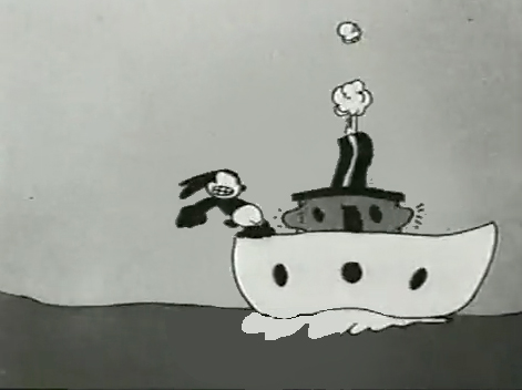 16
16
A logical action!
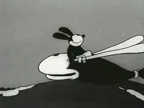
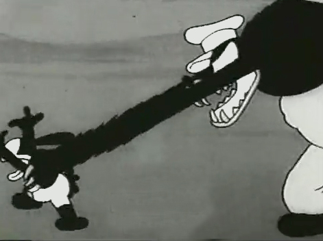
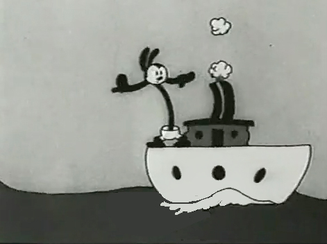
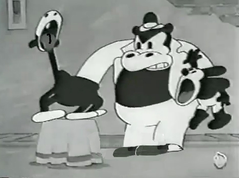
“The Hash Shop” was about as crazy as the animation and the gags went. Here’s one that ends the film.
 1
1 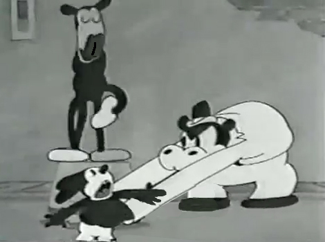 2
2
 3
3 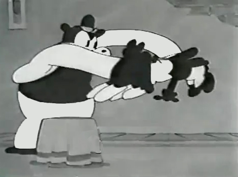 4
4
 5
5 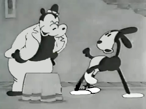 6
6
By 1930, Bill Nolan seems to have settled down a bit. He still abstracts and distorts his animation, but he tries to fit in a bit more with other animators who aren’t drawing their animation quite so abstractly.
After Disney’s “The Three Little Pigs,” other studios tried to catch up with this new type of animation. Nolan and, to a lesser extent, Lantz, didn’t try very hard to change. They liked the way things were going. However, it didn’t take long for Lantz to move for a change in Oswald’s design. They went cuter and whiter on the rabbit.
Here are some frame grabs from “My Pal, Paul.” In it Oswald wants to play music with jazz conductor/musician, Paul Whiteman. As it happens, Whiteman’s car breaks down while he’s driving through the woods, and the two get a bit of a duo as Whiteman plays the steering wheel like a clarinet. (Maybe that’s abstract enough.)
 1
1  2
2
 3
3  4
4
 5
5  6
6
 7
7
Commentary &Frame Grabs &Richard Williams &Title sequences 24 Mar 2013 03:38 am
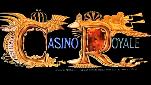
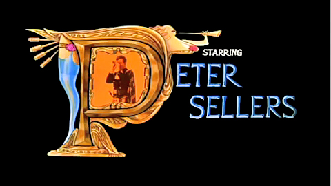
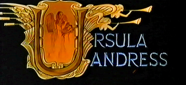
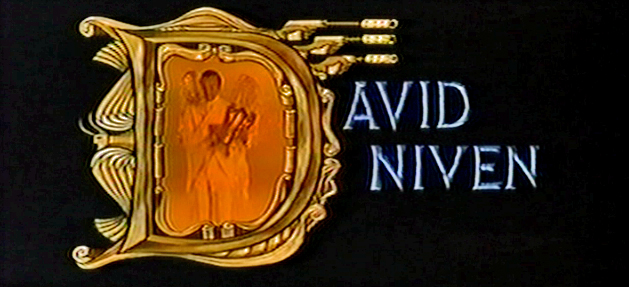
Dick Williams – Casino Royale Titles – recap
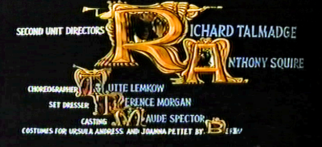
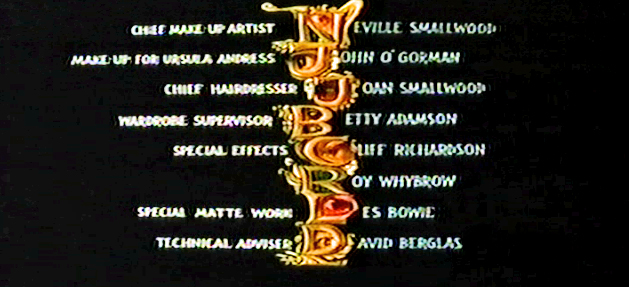
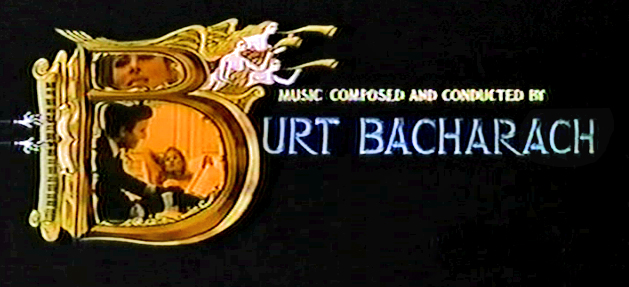
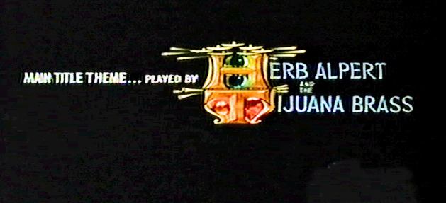
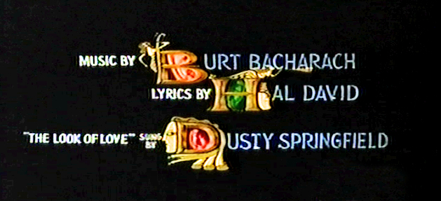
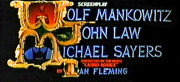
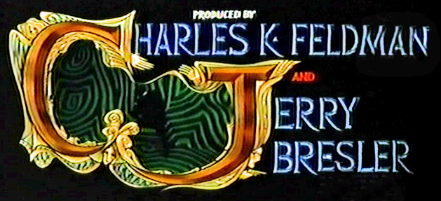
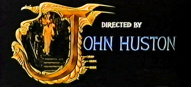
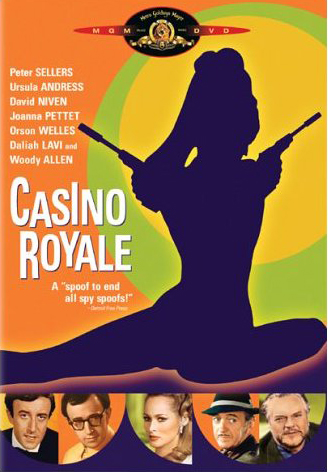 - Casino Royale (the 1967 original) was the fourth credit sequence animated by Richard Williams‘ Soho Square studio. Prior to this he’d directed What’s New Pussycat (1965), A Funny Thing Happened on the Way to the Forum (1966), and The Spy Who Came In From the Cold (1966).
Continuing the presentation I’ve done of other title sequences by Williams, here’s Casino Royale. The other Williams credit sequences of the period are generally rambunctious items with almost too much happening on screen. It often gets hard to read the credits – in a theater, never mind trying to do it on TV. (God bless imdb.)
Theses are all frame grabs off a TV airing. My apologies for the horrendous quality. It aired on one of those cable channels that adds plenty of promos at the bottom of the screen (which I cleaned out of these images) overlapping many of the cards. They might have taken a bit more care to try to eliminate some distortion on the screen. The image skews, and the type gets distorted. I did my best with what I had. If I ever get my hands on a good dvd of the show, I’ll correct these images.
________________________ (Click any image to enlarge.)
 _
_
 _
_
 _
_
 _
_
 _
_
 _
_
 _
_
 _
_
 _
_
 _
_
____Joseph McGrath, Robert Parrish, and Richard Talmadge also directed but I
____eliminated their screen cards as repetitious.

Dick Williams’ version of the opening titles
And for the sake of amusement here are
The credits from the 2006 version of the film
Designed by Daniel Kleinman
Art Art &Commentary 23 Mar 2013 04:23 am
Gawking
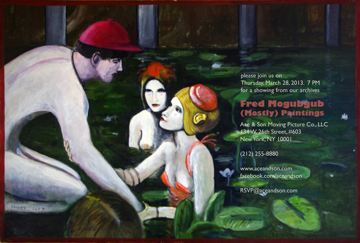
I can’t think of many artists who have supporters as solid as is Richard O’Connor toward the brilliant artist, Fred Mogubgub. Certainly Fred deserved and deserves the attention and support and pleased I am to see it given.
Richard will exhibit some of Fred’s bits of genius in the studio of Ace and Son. This coming Thursday, March 28th at Ace & Son. 7pm. RSVP@aceandson.com
How to Animate the Fleischer Way
Ignacio Carlos Ochoa recently placed this video on his blog. He said he wasn’t familiar with it. I saw the video about a year ago and thought it really nicely done. I’m not sure why I didn’t share it back then, but Ignacio’s comments make me feel like I should post it now, as he has already done. (By the way, his is a good blog and always worth a visit. Keep it in your eyesight; I put it on my sidebar.)
Crood Reviews
I guess Dreamworks’ The Crood opened on Friday, yesterday. The reviews felt so after-the-fact that I almost didn’t notice it in the NYTimes. The reviewer Neil Genzlinger wrote that “The Croods” is “. . . colorful and has an appealing central character and — who knows? — might even give the little ones something more challenging to think about than its tired main plot.”
Not the sort of review one might hope for. It contines that “. . . the movie is at its most interesting and amusing when riffing on how cavemen might have reacted to new experiences and ideas, like fire and shoes.”
 Flintstones . . . meet the Flintstones . . .
How many remember the Fleischer series called Stone Age? 12 shorts that couldn’t keep the Fleischer brothers together.
Great ideas just keep living on. I was a bit surprised a while back when Iwent to a party for How to Train Your Dragon; Chris Sanders said he’d be going on to The Croods, which was having a bit of trouble getting started. I thought his talent will probably not be best exploited there. But I don’t know. I can’t review the movie until I see it; that will be on Tuesday – that I see it. I’ll try to say something shortly thereafter. The film has to be better than Rise of the Guardians – talk about wasted material. I truly hope The Croods will be the bright spot of my coming Tuesday.
The NYTimes has a slide show about the design of the film. A violently colored watercolor toward the end of the slide show piqued my interest.
The review in the NY Daily News: “There’s a peculiar violence in the comedy in this CG-animated family film, similar to watching a loud, slapstick football game played by extraordinarily ugly plastic figures.”
“The film is best when speculating on the origins of human nature. Why, for instance, do we keep pets or love watching the horizon? When it gets past the Stone Age humor, this weird film manages to find some gentle revelations.”
The NY Post writes: Nothing Prehysterical Here – 1 star – “I’d like to take back all those times I said Nicolas Cage was one of the most annoying actors on film. It turns out he’s equally terrible when he’s only on the soundtrack.
And yet Cage is the least of the problems with “The Croods” . . .
63% from Rotten Tomatoes. That’s not too good. But then Oz the Great and Powerful got a 61% and has been the blockbuster these last two weeks.
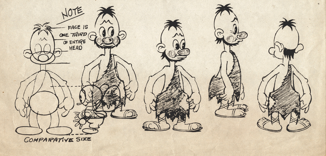
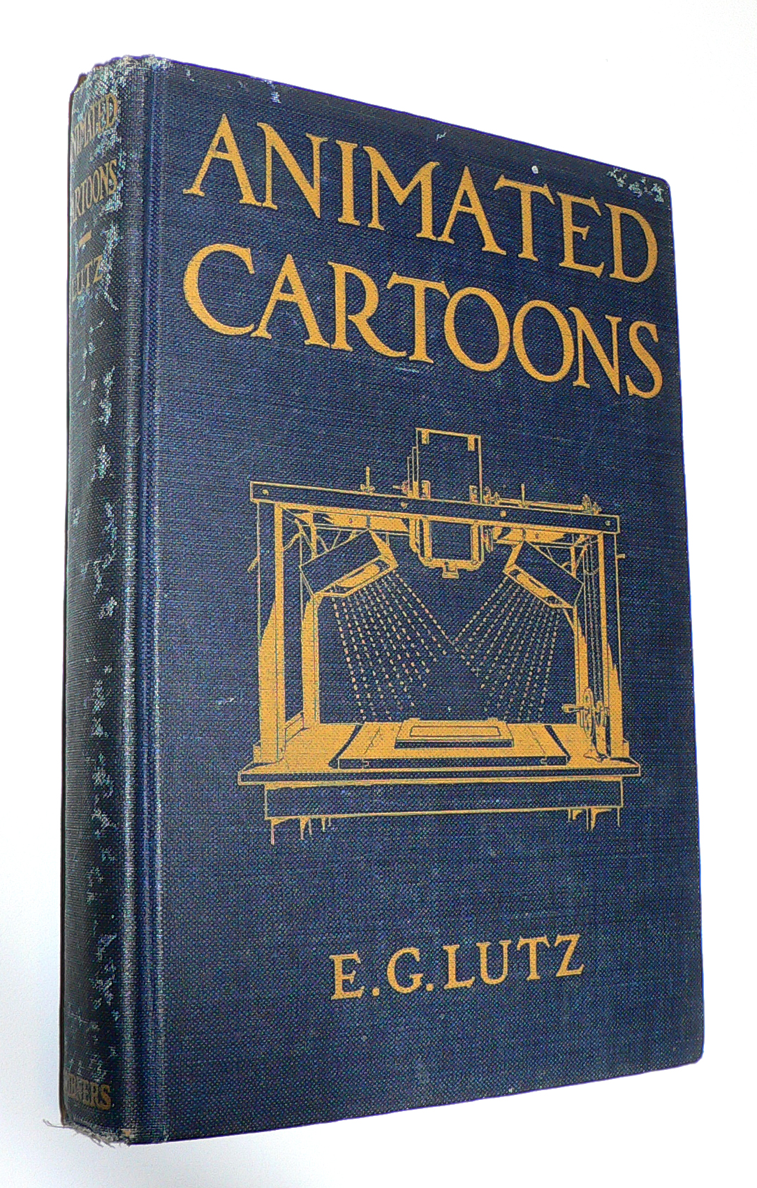 J.J. Sedelmaier has posted everything you want to know about the E.G. Lutz book, Animated Cartoons: How They Are Made (including a scan of the entire book).
The article, actually, is called How Walt Disney Used His Library Card, which is a more appropriate article, because it shows us other books that Disney probably checked out of his local library when growing up in Kansas City.
With some material borrowed from Mike Barrier‘s book, The Animated Man, we get a good picture of the young Mr. Disney staking out the world of the animated cartoon in the early thirties.
A New Face for an Old Effect
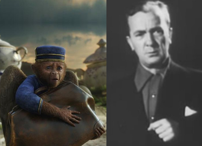
Finley, the flying monkey – Billy Bletcher with natural colored lips
Recently while reading Post Magazine in an article about the Effx for the new Wizard of Oz movie, Oz the Great and Powerful, I stumbled upon something interesting. Actually, it was only interesting because that same day I’d read a small piece in Mike Barrier‘s Hollywood Cartoons, and I found an interesting juxtaposition of the one story to the other.
According to Barrier’s book, back in 1934 Disney had chosen a Silly Symphony to direct, The Golden Touch. It would be the last animated film he’d take credit for directing. Disney had the two best animators of the day, Norm Ferguson and Freddie Moore scheduled to do all the animation in the film. A lot of time was given to every stage of this movie. When it came time to record Billy Bletcher as King Midas, they painted his lips white and filmed him so that Ferguson could use his lips in animating the character. The animation took a particularly long time and didn’t go well. Disney, himself, called the film “a tremendous flop.”
They didn’t paint his lips white, but they did photograph Walt Disney acting as the voice of Mickey Mouse when he did the track for “The Pointer.” The stills were used by Frank Thomas for the one big dialogue scene in the short, and Frank spoke several times, when I knew him, of this tactic.
Jump almost 80 years to shooting the monkey sidekick of the Wizard, James Franco, as he travels down the yellow brick road, seeking to become the Wizard of Oz. The two of them have a long conversation. The film’s visual effects supervisor Scott Stokdyk talks about the flying monkey partner of James Franco‘s wizard.
“Finley is the monkey who becomes Oz’s companion on the journey. He’s played by Zach Braff. The modern way for doing a CG character is to have them on-set, interacting actor to actor, and then paint out the stand-in actor and replace him with CG. We tried to do that whenever we could. But our CG Finley was three-feet-tall and had wings, could fly around, and was very active. So we couldn’t put Zach’s face where the monkey’s was.”
“We came up with this thing called ‘puppet cam.’ We had a puppet with a rod, and a monitor and camera on the end of it. We had Zach in the same booth that Joey was in, and he was interacting. We set up a virtual video conference, but it was executed through a monitor on a stick on-set. James had an ear rig, and he could talk to Zach, but was looking at a video monitor on a stick, put in the place of where the monkey’s head would be. And in the monitor he’d see Zach’s head in the booth. It gave us a proxy for having Zack on-set with his head in the right place.â€
All the time that has passed and not much has changed. They don’t paint Zach Braff’s lips white, but they do paste his video image onto a cardboard puppet on set. It all amounts to the same thing; it just costs a lot more money.
As a matter of fact I also think about the cardboard cutouts that James Baskett dealt with when shooting the live action sequences for Song of the South. It sounds very similar to what they did on the new movie.
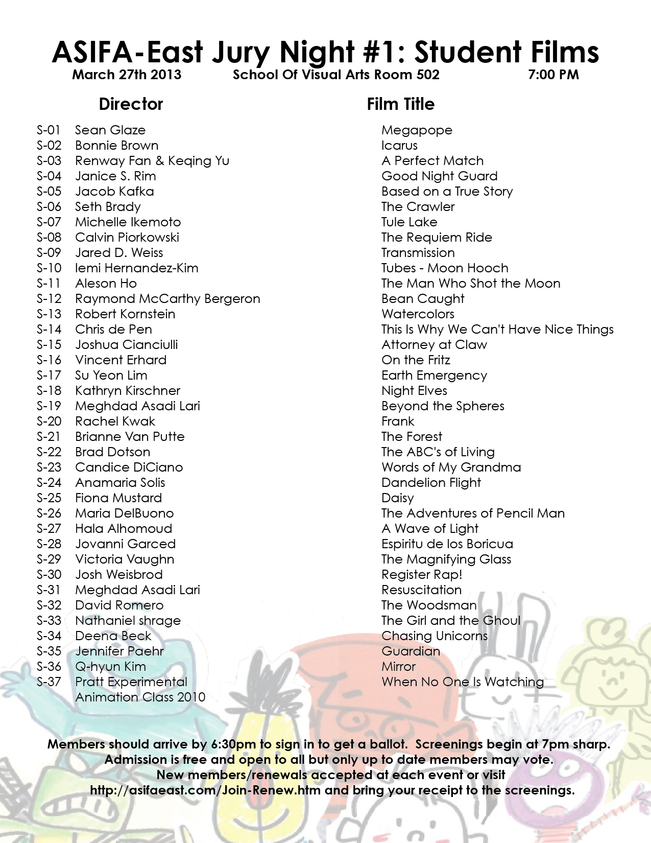
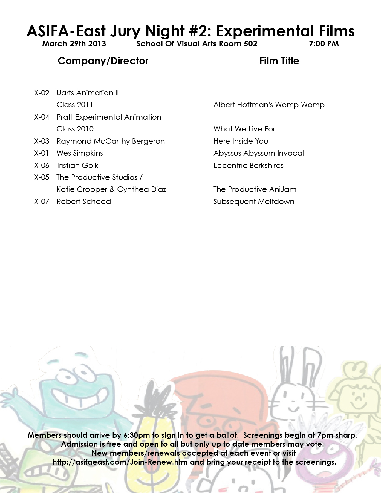
ASIFA East Festival Judging Screenings
This week several nights will be devoted to judging the entries for the ASIFA East Festival. Remember that all members of ASIFA East are eligible to vote for the awards from the films to be screened. Get out the vote.
There will be four screenings:
1. Wed., March 27th – 7pm – Student films
2. Thurs., Mar 28th – 7pm – Commissioned Films
3. Fri., March 29th – 7pm – Experimental Films
4. Tues., April 2nd – 7pm – Independent Films
These are the films competing:
 1
1  2
2
(click on any page to enlarge for legibility.)
 3
3 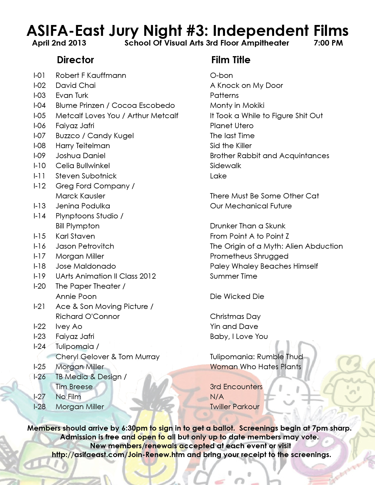 4
4
As an extra added attraction today, here’s a paper that was distributed at the Disney studio in early 1934, which outlines how their productions will move forward through the studio. They’re merely trying to set up some kind of organization, and they start by telling everyone how it will operate.
This document came from someone who would like to remain anonymous, but we thank him, just the same.
 1
1  2
2
 3
3  4
4
Commentary 18 Mar 2013 04:05 am
Smears, Distortions, Abstractions & Emotions – 1
It took a full twenty years for the industrialized animated cartoon to develop into anything approaching a professional, never mind artistic, level. Thanks specifically to Walt Disney‘s efforts, in the twenties and thirties, animation developed as a process with guidelines, rules and specifics designed to create the most consistency. To have those characters moving in anything resembling the elements of real life, it took a real education. And the development continued past the zenith of Snow White so that things grew faster and faster in leaps and bounds. Studios outside of Disney’s were slower on the uptake fighting the inevitable costs that this better animation required. Just as a Paul Terry held off on turning to sound or color, until he had no choice if he wanted to compete in the marketplace, so, too, did he not approve pencil tests to better the animation in his films. The second largest studio at the time, the Fleischer studio, likewise was slow to agree to the new developments. Whereas the Color Classics exploited color film, the successful series, Popeye and Betty Boop stayed B&W. Likewise Fleischer’s animators didn’t get to see pencil tests except on more important product.
However, once we hit the early forties, animators started doing their own variations on differing ways of introducing “quality” to the animation. The artists wanted to explore the “Art” and ways to get there.
A sample of John McGrew’s work on The Arist-o-cat
Maybe they didn’t think they were doing “Art”, but that’s what I’d say they were doing. And god bless the soul that gets in the way of an artist and his dream works.
Chuck Jones was always looking to better his product; so was Bob Clampett. They had different ways of going about it. Jones’ work with John McGrew meant that the filmmaking was pushed beyond the obvious and the artwork got unusual and daring. Check out the insane film cutting from 6:40 on in Conrad the Sailor. The artwork also turned more abstract in the layouts and backgrounds.
With Jones’ film, The Dover Boys, the animation was drafted to be daring as well. The animator, Bobe Cannon introduced smears. To pop a character from one extreme to another, accenting and parodying the 19th Century dramatic style Jones had sought. The character could move from one position to the next by smearing a couple of inbetween drawings and coming to a properly composed “hold.” It brought an unusual comedy bit to the scenes.
Frame by frame Cannon hurriedly smeared the artwork so that the character . . .
. . . could zip from one pose to another. This put the melodramatic action . . .
. . .blatantly into the action in a funny and purposeful way.
It also helped by accenting the peculiar track readings that Jones had caught from his actors. Immediately following The Dover Boys, the Jones team tuned out The Case of the Missing Hare. Smears abound as Bugs Bunny fights a magician against very stylized backgrounds. Cannon, Rudy Larriva and Ken Harris animated. No doubt Cannon’s smears were controlled a bit more as Chuck Jones experimented more with holds and freezes on his characters. John McGrew and Eugene Fleury designed them.
Cannon brought these “smears” into UPA with him, as an animator. He also started experimenting with the rule of “breaking of the joints” which meant that under no circumstances would an arm bend except at a wrist, elbow or shoulder. However, he allowed himself some distortion, flexibility to determine where the elbow was on the arm or how far the bend at the shoulder could be. Let’s just say he exaggerated. This was also an ideal form of animation for the limited animated practices at UPA. Grim Natwick had Nellie Bly corkscrew her arms around each other in Rooty Toot Toot. This was probably a direction Hubley called for in his quest for “modern art”. By this time, Cannon was already an Oscar winning director at UPA; Gerald McBoing Boing had won the previous year.
 It was at the same time Cannon and Jones were developing these smear tactics for their drawings that Bob Clampett was talking with Rod Scribner. Scribner was an enormous fan of newspaper cartoonist, George Lichty. Scribner wanted to pull the designed looseness of Lichty into his animation and allow it to take control. Distortions would represent inner emotions, and Scribner was desperate to try it. Clampett agreed as long as he, as director, was calling the shots. He would tell Scribner when to “Lichty” something. They first tried it in “A Tale of Two Kitties” (the first Tweety & Sylvester cartoon.) They immediately took what they learned into “Coal Black and de Sebben Dwarfs.” Scribner used it wildly in relaying the emotional intensity of the characters. Now, they were not only distorting the characters on the inbetweens, they were visibly distorting the extremes as well. Not only were the characters’ surface emotions visible, but the internal emotions were allowed to run rampant.
Rod Scribner had a different way of distorting.
The character would start off normally and distort by completely shifting . . .
. . . the masses of the character keeping the volume the same within . . .
. . . the body of the character who’d end up somewhat normal again.
The experiments between this animator and director were enormously successful, just as had been Jones’ experiments with Cannon and other animators under him. And these experiments continued to play into other films by both directors. The control was strong and personal and unique. Clampett and Jones were doing similar things for different reasons, however subtle.
 On the East Coast, the animator, Jim Tyer was doing something altogether different. His style was bursting at the seams of control; he had been drawing his distortions more and more forcefully as his directors grew weaker.
I’m sure, at Paramount, he was kept under control. Assistants altered his drawings in their “clean ups” trying to pull Popeye back onto the model sheet. A number of them actually complained to me about it.
 The kindest animator in the world, Johnny Gentilella had a dig as well, “He had difficulty keeping his character on model.” Once Tyer landed at Terrytoons, that was it. All was clear for his graphic distortions. The characters never appeared on model, never mind their ever having been “cleansed” in “clean-up.”
There was a difference with Jim Tyer, though. It would seem to have been more a graphic adjustment rather than an emotional one that Tyer was drawing.
 The characters were not trying to break out of their skins emotionally, as they did under Scribner’s pencil. Here they stood out from everything else and every other animator’s style. There was no attempt by the Terrytoon directors to emotionally cast these graphic outbursts. A Tyer scene, wild as it might flow in its distortions, would be allowed to flow into the work of some very tight animator, then come right back to Tyer. One would expect his scenes to, at least, be the action scenes; but no, they could have been very
 quietly building up to the wild actions of another animator who would try to rein in the stylization.
The Terrytoons cartoons were all over the map, and in many a case they were held hostage by Jim Tyer. As a kid I enjoyed these outbursts, and I looked forward to watching another Mighty Mouse or Terry Bears cartoon to see what that crazy animator did. The problem, of course, was that Tyer’s animation separated from the film as a whole and broke down
 the entire short it came from. Mark Mayerson talked about this at length in his great piece, “Jim Tyer: The Animator Who Broke the Rules” (1990). As he points out, ” Tyer’s work is animation’s equivalent of a train wreck or a freak show. It’s not something you’d necessarily choose to look at, but once it’s caught your eye it’s hard to look away.”
This was unlike the work of Cannon or Scribner. All three are funny and to differing degrees. They,
 all three, have different levels of depth. However, whereas Cannon worked his style with one key director and Scribner did the same, Tyer worked against his directors – at least, one would guess that was the case. I can’t imagine a Connie Rasinski even talking about the style except to chastise Tyer, possibly to his face. I’m sure things got easier for Tyer after UPA and their “wild” stylization made his work more acceptable and possibly even more comprehensible for these directors like Rasinski,
 Eddie Donnelly or a Mannie Davis. Tyer seemed to have an autonomy over anything he was working on.I’m surprised, in a way, that he, himself, wasn’t more concerned about his work fitting more appropriately into the cartoon as a whole. It’s doubtful that he would have mentally dismissed the films he worked on – other than for his own animation.
Even Tyer’s still work shows signs of blowing up at any moment, as can be seen in this storyboard still or this comic strip. Paul Terry, himself, must have accepted, if not supported, this work. Tyer did it for so many years.
There was one other key animator who distorted his characters, but his was a greater example than any other. For a short time, he was producing some of the most important animation of is time. We’ll tackle him (again) in another post.Of course, I’m talking about Bill Tytla.
Commentary 16 Mar 2013 04:22 am
Bunch of Things
 About a year ago I went onto Twitter. I registered and sent out a couple of of Tweets. Nothing earth shattering; I was just in exploratory mode. Then, in the past year or so I’ve sent out a few more notes via Twitter and, actually, I saw little change in my life. I wasn’t even sure who these Tweets went out to nevermind whether they actually went out.
Then for some reason, this week I was there tweeting away and thinking I may have suddenly got the idea. I’m trying. Now I’m posting comments pretty regularly trying hard not to promote my wares. I’m also looking for other people to follow. For some reason I get a million tweets from John Cusack. His stuff is all over the place; he probably has a dozen people writing for him. I’m more interested in real people and real conversations that last a full 140 characters.
This Internet, she is a crazy thing. I’m just trying to harness the material coming out of my computer. I’m at:
- @MichaelSporn, naturally enough.
Danny Boyle Speaks
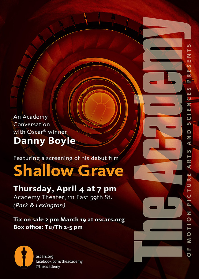
On April 4th, the MPAcademy in NYC will host a chat with film director, Danny Boyle, at the Lighthouse Theater, 111 East 59th Street, off Park Avenue. Boyle’s latest film, Shallow Grave will be screened, and it will be followed by the conversation with the director.
Tickets will go on sale at 2pm on March 19th, will sell to the public so will go quickly. The price is $3.00 for Academy members and students and $5.00 for general public. Reserve your tickets now.
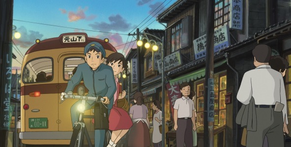
Poppy Hill

The NYTimes interviews Goro Miyazaki in advance of the debut of his feature, From Up On Poppy Hill done in collaboration with his father, Hayao Miyazaki.
The film premieres at the IFC Center in New York as part of this weekend’s Children’s International Film Festival. (Go to the IFC link for the scheduled times.)
A.O.Scott reviewed the film for the NYTimes on Friday. “. . . a lovely example of the strong realist tendency in Japanese animation. Its visual magic lies in painterly compositions of foliage, clouds, architecture and water, and its emotional impact comes from the way everyday life is washed in the colors of memory.”
Go here for another story about the film in the NYTimes.
Adam & Dog Bgs
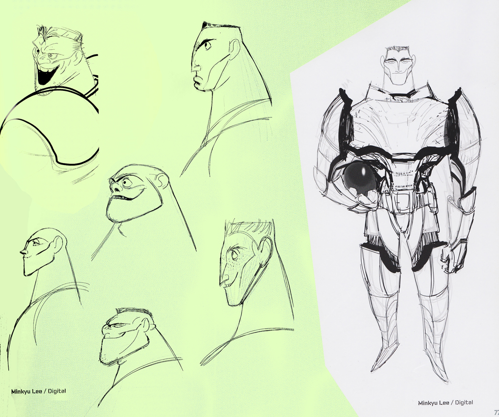
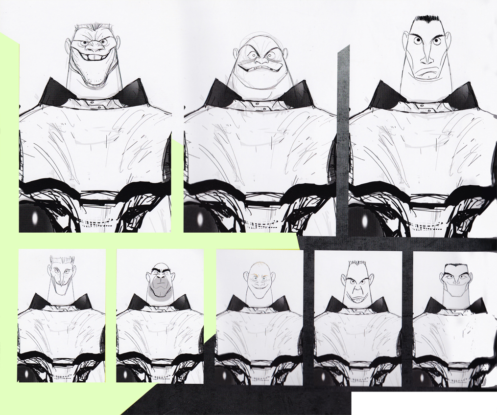
Cartoon Brew directed us to a link that offered a gallery of Bg paintings by Minkyu Lee from his Oscar nominated short, Adam & Dog.
Minkyu, you’ve gotta say that “his Oscar nominated short” sounds pretty great,doesn’t it? It’ll be there for the rest of your life.
Lee worked nights on this short while working days on Winnie the Pooh and Wreck-It Ralph. I don’t remember ANY art in Wreck-It Ralph that was at all comparable.
The day job.
Models for “Wreck-It Ralph.”

After hours work for “Adam & Dog”
Dale Robertson
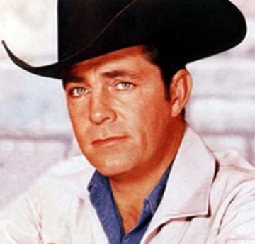 Dale Robertson died Feb 27th. He was a young TV cowboy star of the late fifties. He was starred in TV’s Tales of Wells Fargo and Death Valley Days. One film not on his obituary is the one animated film that he did a VO for and acted as the “presenter”. The Man From Button Willow was produced by Phyllis Bounds Detiege and directed by David Detiege. (Phyllis Bounds Detiege was a painter on Dumbo who eventually married Milt Kahl from 1968-78. She was also the niece of Walt Disney’s wife, Lillian. Apparently she was married to David Detiege during the making of this film.)
It includes some great animation voices like Disney regular, Verna Felton, Edgar Buchanan, Pinto Colvig (Goofy), Clarence Nash (Donald Duck), and Cliff Edwards (Jiminy Cricket).
In honor of Mr. Robertson, I post the entire film here.
FollowUp – Kickstarter Successesss
Something I hate about watching the TV news is that you rarely find out how stories end. A guy gets hit by a car, a dozen people saw the accident as the car took off, if you have any information to add, call this number. Yeah, and you never hear about it again. Or maybe there’s one of those little boxed stories on page 42 of your local newspaper. But the rascal headline has come and gone, and you don’t get the climax to the whole story.
So Kickstarter campaigns have completion dates. We know that Bill Plympton made his money on Kickstarter and can finis his film – Yeah!
We know that Signe Baumane made the money she needed on Kickstarter and can finish her film – loud YAYYY!
I had to return to find out what happened to Ralph Bakshi. He had that campaign trying to raise $165000 for his Last Days of Coney Island campaign. You know what! He did it; Ralph raised $174,195 – YAYAYAAAAA! Oh happy days, now maybe we’ll see some new Ralph Bakshi shorts. I’m going to be looking for them. It really excites me.
The best part is that Ian Miller will be doing
design and artwork for Ralph’s shorts. Boy, will
I be looking for his short films.
Last, but surely not least, is John Kricfalusi. He raised $136723 on Kickstarter with his bid to raise $110000. HOOOOOray! One more time . . . HoooooRAY! More cartoons to be looking for. I love some of the experiments John K. was doing with animation, and I hope he takes those experiments and expands on it. This can only help 2D animation.
Don’t you ust love it.
Classical Animators Left
 Today, I met an old friend who was visiting New York form LA. We exchanged a lt of stories and comments, of course, about what’s going on. He asked an odd question. Who’s left in New York that does “classical animation?” I could only think of Ed Smith in his 90′s. Maybe Doug Compton. There are a couple of older animators, but they’re, for the most part, not working.
That’s about it of the people I know. I could’ve said, me, but that seems a bit desperate to me. The fact of the matter is that there isn’t much call or use for 2D classical animation in New York. There’s the ToonBoom/Flash kind of work, but that is surely not what anyone would consider full, classical animation. As a matter of fact, my friend, realizing the answer was one out of desperation, said that HE did classical animation. I had to point out that he was no longer a New Yorker and that there were undoubtedly plenty of people in LA that did the rich, old-style of animation. This is the style that even Disney rejects. If there is any of it anymore, it can’t be long-lived.
Animation is going through a rough spot. There are probably more puppet animators these days than 2D classical animators. At least that’s the way it seems. There were three puppet films among the 5 nominees for feature animation; there were no 2D films nominated. It’s sad, but isn’t the handwriting on the wall?
Commentary &Layout & Design &repeated posts 14 Mar 2013 04:38 am
Tubby – looking back
Sometimes the bad films we work on leave the greater mark, and it’s good to look back, infrequently, to assess the damages.
- I was reading the 1957 Disney Studio Directory posted on Joe Campana‘s site, Animation – Who & Where. when I came upon the name of Howard Diettrich. This threw me back to 1973 and Tubby The Tuba.
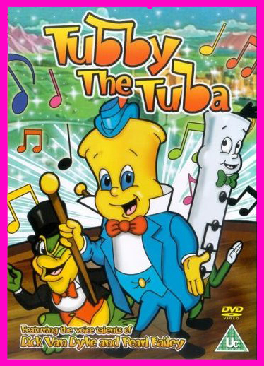 I’d just been layed off at the Hubley Studio, after completing the first 20 (of 60) episodes of Letterman. Officially, I had been categorized as an “inbetweener” in the u-nion. I’d done everything from animate to ink at Hubley’s, but that was my category. I received a call from Johnny Gentilella. We’d met through Hubley, and he was now working for NY Institute of Technology. They were in the early stages of production on their feature, Tubby The Tuba, and I was offered the job of Assistant Animator, a categorical promotion.
NYIT was the school I’d graduated from and received my BFA; it was located in Old Westbury, Long Island – about an hour’s drive from Manhattan. It’d be interesting, returning to my old school just to see how it had changed. By taking the Long Island Rail Road, I was able to cut down that ride by a few minutes and leave the driving to someone else. I was picked up at the station and driven to the animation building, a small cottage on the campus. Everyone was out to lunch except for Johnny Gent(ilella), and he drove me (about a couple hundred yards) to meet Sam Singer, the producer recently hired to do the film.
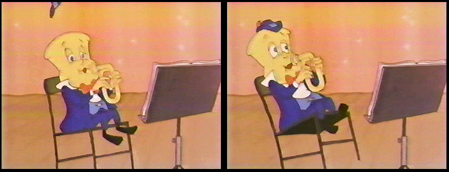
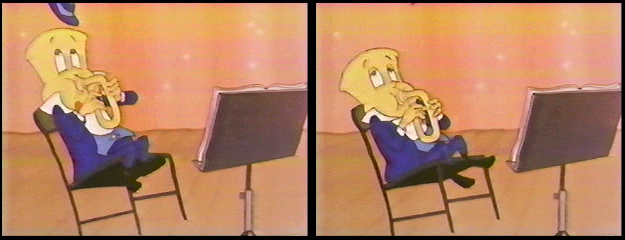
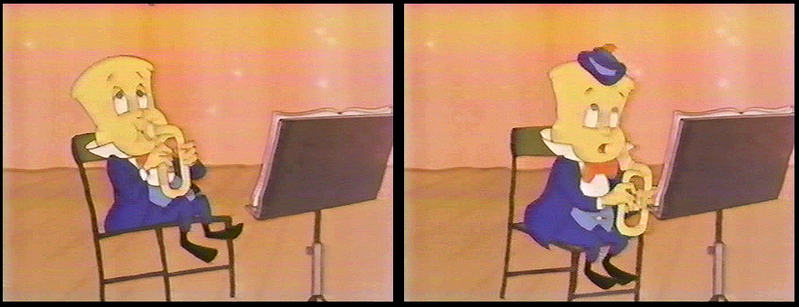
 Singer had done all those Courageous Cat cartoons that had infested children’s programming back in the late 60s/early 70s. Oddly, I enjoyed them; I always was a glutton for bad animation. Love those cel flares, shadows, scratches and cel edges.
I was directed to his office. In there was another producer, Barry Yellin, who had broken his ankle and was on crutches. I got to meet the two of them and listen to them kibbitz around me, virtually ignoring me for a few minutes. Singer was chewing on a cigar, and I couldn’t take my eyes off the spittle that seemed to be moving down the cigar in his mouth. When I finally left to return to the animation building, I saw that Singer was also on crutches. He had a clubbed foot.
I sort of remembered that meeting as an omen of things to come. The entire place, while I was there, felt like it was on crutches.
I liked Johnny Gent a lot; we got along well at Hubley’s; on Letterman I got to mangle quite a few scenes by him as I learned how to inbetween properly.
There were only about 8 others at NYIT at the time. Other people I met included Walt Kubiak, another assistant who I enjoyed talking to; animator, Chuck Harriton, who I’d met at Hubley’s (and never really was crazy about); Lou Marcus who was filming the work on an Oxberry. Lou had gone back in animation for many years and had plenty of stories to tell. (See Andrew Marcus’ comment below.)
The person I most associated with was the editor of the film, Phillip Schopper. He was a young guy who took the LIRR everyday from Brooklyn to Old Westbury. We’d meet daily on the train and laugh over the events of the days out there. I’ve stayed friends with Phillip, who has become a first-rate filmmaker; we rarely talk about those days at NYIT.
It was not a fun place to work. At the time, everyone chatted over their cubicle walls. I was in the front of the studio with full view of the front door. I was constantly getting notes from Chuck Harriton who persistently altered the models of the characters in ways that no one else was drawing. I was forced to work his scenes off-model. Johnny Gent always had a beautiful drawing style and made it easy for assistants to follow and inbetween. He and I spent most of our lunch hours alone together in the studio. We were able to have quite a few conversations; I loved that part.
Everyone seemed to back talk everyone else as they walked out the front door. I couldn’t help wondering what they said about me when I left. Too much swiping makes for an unpleasant working condition.
At one point, Sam Singer brought in a number of his people from California. I’d already been there about four weeks so was glad to see some new blood. Many of the few people were ex-Disney people, so there was a lot for me to learn. Nino Carbe, was a good example of this. He had done some incredible work at Disney’s on Fantasia and other films. He was an artistic force and a nice guy to meet.
Howard Diettrich was a virtuoso assistant who had worked on Sleeping Beauty. Unfortunately, he was an alcoholic who had a big problem. Sam Singer took him under his wing and had decided to cure him. Hypnotherapy came in, and Howard went through the mill for Singer. It made a soap opera of a story for all of us working there, and it was hard for me to watch.
I decided to leave. They wouldn’t allow me to quit without going to Alexander Schure. He was the President of the school – yes, NYIT was still predominantly a school – and he was financing the whole thing. His idea, ultimately, was to introduce computer animation to the world, and he invested heavily there. Some of the brilliant people who grew out of this department moved on to develop Lucas and Pixar.
So I went to Alexander Schure, and he argued with me for about 30 minutes. I told him that the travel time was too much. He didn’t accept that. He liked the fact that I was an art school grad from his school and was working there. He offered to have his son pick me up and drive me.
I knew that there was no solid directorial voice coming from the top, and the film could never be good. My artless tactic was to say as much. He told me that he was going to take over from Sam Singer, and he would be the voice of clarity. Now I knew I really had to get out. He finally surrendered, and I left. Happily.
I was back with Hubley within two weeks. Even better.
I didn’t get to see the film until I borrowed a vhs copy from Dante Barbetta, who eventually joined their staff to animate when it got significantly larger.
That was not a good film, as a matter of fact it was incredibly bad. I’m not sorry I left, though I would have enjoyed more time with Johnny Gent; it was the last time I worked with him. I also still wonder what happened to Howard Diettrich.
Note: Last year, John Celestri wrote about the later period in the making of this film on Mark Mayerson‘s site. Part I and Part 2.
Animation Artifacts &Commentary &commercial animation &Layout & Design &Models 12 Mar 2013 03:43 am
Larry Riley Recap Plus
 In celebration of the new season of baseball I have a couple of model sheets from a Paramount cartoon.
Larry Riley, a story writer, gave me these drawings back in 1972, but he never told me the film’s title. Thanks to Thad Komorowski and Bob Jaques – both left comments when I originally posted hese in 2007 – we know the drawings come from Heap Hep Injuns (1950).
______________(Click images to enlarge.)
Larry Riley was a wild guy. On my first commercial job at Phil Kimmelman & Ass. he and I were the inbetweeners working side-by-side on some of the Multiplication Rock series. Larry had had a long and busy career in animation.
He had been an asst. animator at Fleischer‘s, a story writer at Paramount, an animator at many studios. Like many other older animators, he ended up doing anything – including inbetweening at Kimmelman’s for the salary and the u-nion benefits.
The stories Larry told me kept me laughing from start to finish. There was no doubt he had been a writer for years. In a not very exciting job, it made it a pure pleasure for me to go to work every day to hear those hilarious stories. I can’t see Lucky 7 without thinking of laughing. It wasn’t the stories per se that were funny, it was his take on it.
Larry told me of his years at Fleischer’s in Florida where he was an assistant. He and Ellsworth Barthen shared a room, and, according to Larry, had lined one of the walls of their room with empty vodka bottles. Now, I’ve heard of frats doing this with beer cans, but doing it with vodka bottles requires some serious drinking. One of the many times I got to work with Ellsworth, I asked him about the story, and he reluctantly backed it up telling me what a wild guy Larry was.

Ellsworth was an interesting character in his own right. There were a group of lifetime Assistant Animators in New York when I started out. This is what they did and all that they aspired to do. They liked the steady work and didn’t want heavy pressure. Those I can name, off the top of my head, were: Helen Komar, Jim Logan, Gerry Dvorak, Tony Creazzo, Eddie Cerullo, Joe Gray, and Vincent Barbetta. They all have interestng stories I could tell. Maybe another time.
Ellsworth Barthen was one of these permanent Asst. Animators. He had his work life and he had his play life. Ellsworth lived in New Jersey with his brother and spent much of the time in his garden growing orchids. He had specialty breeds of orchids that he’d grow and enter in flower shows. Ellsworth loved it.
The other thing he loved was performing as Franklin D. Roosevelt. Just about everywhere he went, he took his pince-nez and would pop it on his eyes and go into character. Now I was born after Roosevelt had already died, so I couldn’t tell you if Ellsworth had been doing an accurate impersonation, but I saw him do it pretty often.
Ellsworth appearing on the Joe Franklin Show in NY
as Franklin D. Roosevelt. Joe Franklin is bottom left.
At Grim Natwick’s 100th Birthday Party in LA, Ellsworth came in character and stayed there all night. He was basically a big and shy guy, but this Roosevelt impersonation would bring him out and loud. Very curious character.
Back to Larry Riley:
________Forgive the racist pictures, but I guess they’re a product of their times.
Larry also told of a 3D process he’d developed for Paramount in the 50′s when the movies were all going 3D. I believe there were two Paramount shorts done in this process: Popeye: The Ace of Space and Casper: Boo Man. Larry offered to give me the camera on which he shot these films – he had it stored in his basement. He was afraid it would get thrown out when he died. I didn’t have room for it.
My regret; I still hear the sadness in Larry’s voice.
(When I originally posted this in 2006, Larry’s grandson, John, wrote to tell me that another collector took possession of the camera and kept it from destruction.)
The animator who drew these is Tom Johnson (he signs the second one), and they were approved by the director Isadore (Izzy) Sparber per the first one.
The drawings are deteriorating, obviously. The pan above uses a lot of glue to hold it together, and that’s eating away at the paper.)
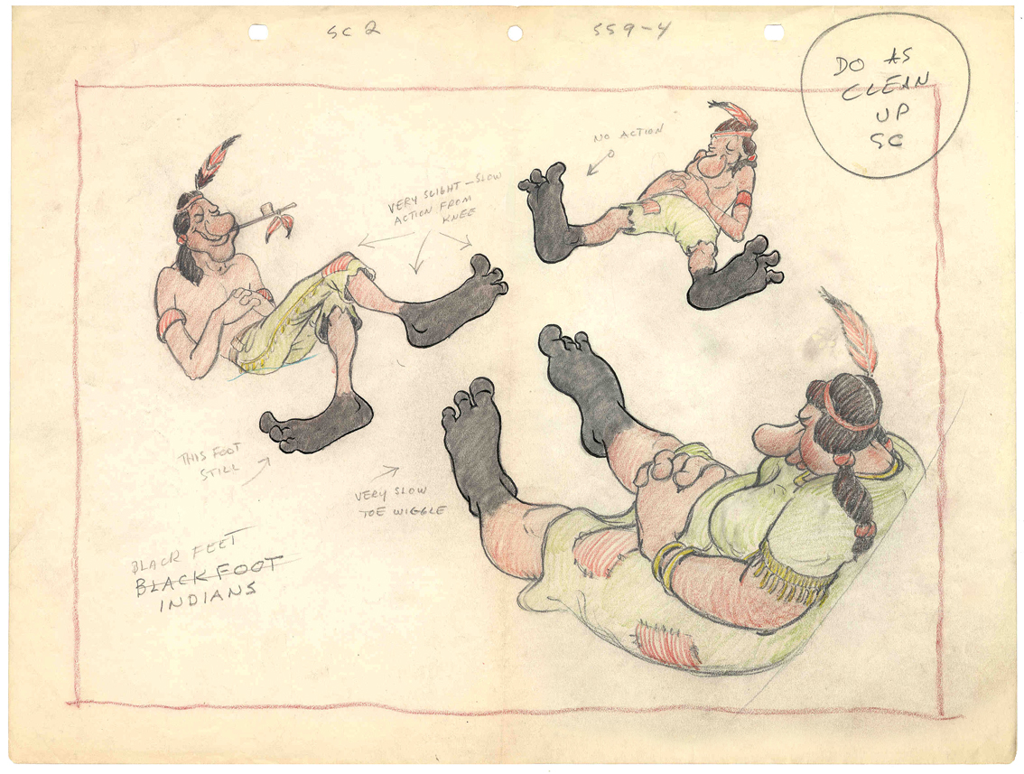 – This is the final model I have from Heap Hep Injuns a 1950 Paramount cartoon. Tom Johnson drew this image, prior to animating it, and Izzy Sparber directed the film. I’d heard some stories about I. Klein regarding this film, though he’s not credited, so I suspect he may have had something to do with model approvals, as well. Actually, he may have been the “Izzy” referred to on the pan posted yesterday.
______________(Click images to enlarge.)
I was never a big fan of the Paramount cartoons. Growing up in New York, we’d always get Paramount or Terrytoons shorts playing with features in the theaters. Only rarely did a Warners cartoon or a Disney short show up. (I don’t think I saw a Tom & Jerry cartoon until I was 17 when they started jamming the local TV kidshows with them.)
Saturdays there was always the placard outside the theater advertising “Ten Color Cartoons”. A haughty child, I naturally wanted to know why they didn’t show B&W cartoons – that’s what we saw on television, and I usually liked them more. I must have been insufferable for my siblings to put up with me.
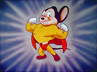
The starburst at the beginning of the Mighty Mouse cartoons always got an enormous cheer in the local theaters. I don’t remember ever hearing that for the Popeye or Harveytoons.
(I love that if you go on a “Google search” for images of Larry Riley, you get dozens of title cards from Paramount cartoons. Go, Larry.)
Commentary 11 Mar 2013 02:09 am
European Animation
I know I’ve written about some of this stuff before (repeatedly), and I hope my take on it here is a bit different. At least I’m leading somewhere different, so please have a bit of patience with the opening.
- When I was a kid, animation was in the dark ages for the general public. By that, I mean there wasn’t a hell of a lot of material available to allow you to know how it was done or learn how to do it. There were maybe a dozen or so books available.
- -
 Of course the 40s Rob’t D. Feild book, The Art of Walt Disney. Some great information but not many illustrations. What are there are GREAT.
- The Preston Blair book, Animation, good and cheap. Very helpful for an amateur like me.
- Halas and Manvell‘s The Technique of Film Animation had more to do with animation as done in Europe, but it is extraordinarily helpful.
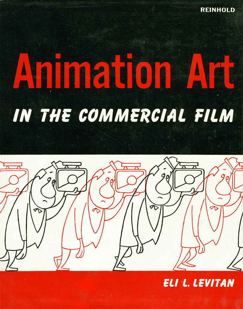
- Eli Levitan, an animation cameraman, had written several books. Animation Art in the Commercial Film is one of the better books.
There were a few others. My local library had them all, and I borrowed them endlessly and just about memorized them all. I owned the Preston Blair book (of course and my parents bought the brand new Bob Thomas Art of Animation for me Christmas 1958.
On ABC you had the Disneyland TV show which became The Wonderful World of Color when it moved to NBC. The Mighty Mouse Show was the staple on Saturday morning. Local channels featured Popeye and B&W Warner Bros cartoons.
I was completely intrigued with some silent cartoons that were run on the local ABC affiliate on early Saturday mornings. Every once in a while a sound Van Buren cartoon would pop up or a Harman-Ising MGM cartoon..
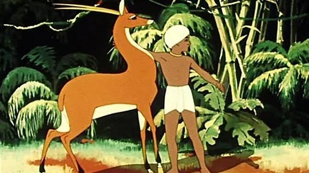 The show that also intrigued me was this horrible “Big Time Circus” starring Claude Kirschner (normally a VO announcer) as a ringmaster who talked to a $5 clown hand-puppet named “Clowny.” They showed cartoons, some B&W Terrytoons with Barker Bill and other early 30s things. They also showed a lot of foreign cartoons badly dubbed into English. They even had Russian features like The Golden Antelope serialized. They had a horrible title on the top of the film and a “The End” title pasted onto the end of the film. I used to tune in to see these B&W European and Russian cartoons. They moved so differently from what I was used to with the cartoons from the US. At 12, I could definitely see the difference and watched closely.
When I started collecting 16mm films I picked up a bunch of these shorts. The timing didn’t get any better.
On my second day at the Hubley Studio, I met the notorious Tissa David who dug into me quickly for my bad inbetweening. She offered to teach me after hours, which I certainly jumped to accept. In that first contact with her, I mentioned that I had a potential job offer from Richard Williams and I might go to England. She immediately said to me, “Oh, please don’t go there. Stay here. Only the Americans know how to animate properly.” After all those years of watching Russian and European cartoons, I understood what she was saying. (I was also working for my real hero, John Hubley, so I had no real plans to go anywhere.) Dick Williams came to me a couple of years later with Raggedy Ann. By then, I was knowledgeable enough to run the Asst. & Inbtwng dept – about 100-150 people.
But then Dick Williams was changing everything. He was teaching his people in England how to animate the way Disney people did it. He brought those people into his studio to teach: Art Babbitt, Ken Harris, John Hubley, Grim Natwick, and others. I believe Williams changed animation throughout Europe. Mind you, the problems of all those years of history is still there, but it’s enormously better.
What do I call “European Animation”? Well, it’s all about the timing. The characters often move at such an even speed that there is no sense of weight or real character movement. Basically, all characters move the same. The Golden Antelope is all rotoscoped, so the movement is on ones and all traced off the live action. You can tell when it’s not; there’s a sameness in the motion. It’s almost like there are no extremes just motion.
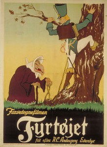 In Europe’s first attempt to imitate the US in a feature, The Tinderbox a 1946 film from Denmark, they were obviously trying to imitate the Fleischers of Gulliver’s Travels. Wild distortions and odd extremes but a lot of the evenly spaced timing. Consequently, with the distorted extremes moving in and out of position at an even pace, it’s doubly peculiar.
Halas and Batchelor‘s Animal Farm is so lethargic in its movement, it’s difficult to watch. However, whenever a Harold Whitaker scene pops up, it’s something to study. The guy was a fine animator. His work definitely sands out. He came from the Anson Dyer Studio, and had somehow learned to animate in the US methodology.
The Disney studio was having its effect , though as animators such as Borge Ring pretty much taught himself to go well beyond the basics of he European mold. He was close with a number of the Disney animators and studied Disney films religiously. His own personal style is definitely constructed from the US mold.
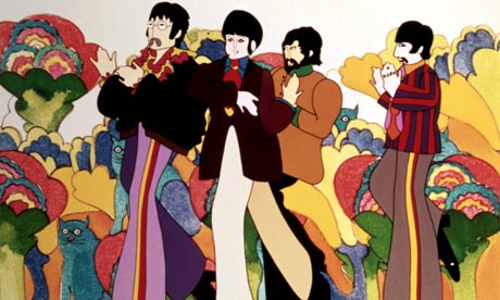 Even through The Yellow Submarine (1968), you see this flat style of animation. Of course, with the more graphic style of George Dunning‘s feature, the even pacing is better hidden in the mood of the piece.There’s also a lot of music that hides the timing problems.
After Dick Williams, began his effort to alter the look of work coming out his studio, there was a big change in the look of work coming from all over Europe. Sure they slipped into and out of the old school of animation, but now they had learned from Art Babbitt and Ken Harris. (I wish they’d had more of Grim Natwick.) Take a look at the marvelous animation done for Bruno Bozzetto in the Ravel Bolero section of his 1977 feature, Allegro Non Troppo. To some extent, now, the best animation worldwide is coming out of England and France, especially from the younger animators.
So let’s take a look at the differences between the two styles..
- The best of the US style can be seen in those dwarfs in Snow White or the Siamese cat song in Lady & the Tramp or Scar in The Lion King. It’s all in the timing.
- The European style is very obvious in Jiri Trnka‘s 2D animation as in The Four Musicians Of Bremen or Spring-heeled Jack. You can see it in about half of Sylvain Chomet‘s The illusionist (the other half was wonderfully done US style), or, as I’ve already written, Animal Farm – the entire movie.
The US tradition came directly from the wonderful work done mostly after hours at Disney’s studio in the 30′s. They learned how to time animation for weight, for mood, for expression and for balance. Bill Tytla, Marc Davis and Frank Thomas were brilliant at it (though they all did it). The word reached outside the Disney studio and others came into the fold: Ken Harris and Bobe Cannon, Grim Natwick and Rod Scribner, Jack Schnerk and Abe Levitow, Hal Ambro and Tissa David. There are another couple of hundred people I could include if we were naming names. These people all mastered their timing. They knew what they were doing and did it as planned. The animation never does what IT wants to do, but it is controlled by the animator and his (her) timing.
 The European style is a very different animal. The timing is flat. It’s usually even paced and moves robotically forward, not always by going in a straight line. The weight is always soft; the emotion is almost nil. The drawings are often beautiful, but there’s no real strength behind that movement.
Things have changed quite a bit since the advent of Richard Williams and his work, but even there I see it at times. In Dick’s work, I mean, I sometimes see it. (Not surprising since I infrequently see it in Art Babbitt‘s animation. – and lest you think I’m biased, I often see it in my own work and have to rework it. (I’m not trying to hurt anyone here, I’m just reporting what I sense and see and feel.) Just talkin’ animation here. It’s basic and can so easily be bypassed. Animation is ALL ABOUT the timing. Norm Ferguson couldn’t draw very well at all, but he was one of the GREAT animators of all time. There was no even-paced timing in his makeup; the same has to be said of Tytla or Grim Natwick. Babbitt did do it. He was one of our great animators, but he infrequently paced his work in a very dull way. I could give you examples, but I won’t look for yourself, because when he’s good, he’s brilliant. Take the scene he did in The Thief and the Cobbler where the evil Vizier, Zig Zag, shuffles the playing cards.
A great example of what I’m talking about has all to do with Tom & Jerry. Take a look at some of those produced by Gene Deitch out of Czecheslovakia in the early 60s. Don’t compare this with the fully-animated shorts produced by Hanna & Barbera at MGM. No, compare it to the films done by Jack Kinney using a pickup studio. Most of the staff was free lance California employees. Turks without a space to work in the studio. Those Kinney films, badly animated though they are, are pure US-styled animation. The Deitch films are equally, poorly animated, but these also are animated with a European staff that animated the way a European would. The timing is rigidly even in its pacing.
You often get that European feel in the cgi work done today.
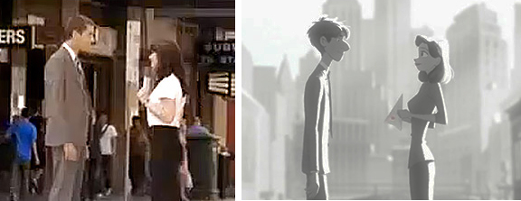
I can’t tell you how many times I’ve seen scenes where things suddenly go slack and move, seemingly, of their own accord in cg films. Perhaps the two arms will complete a motion that was started by an animator, and (s)he will allow the rest of the motion continue on its own to a final rest stop. It’s not animation anymore, it’s just a completion. I do quite dislike this when and if I see it. (Thought, admittedly, too often I’m not paying attention enough.) There’s a scene somewhere in Paperman where the male, standing in profile, has his two arms moving forward to a rest. They move at exactly the same speed, doing exactly the same thing, and it bothers me. Tissa certainly would have scolded me for allowing such a move to happen. I have to hope and believe that that’s what the animator wanted.
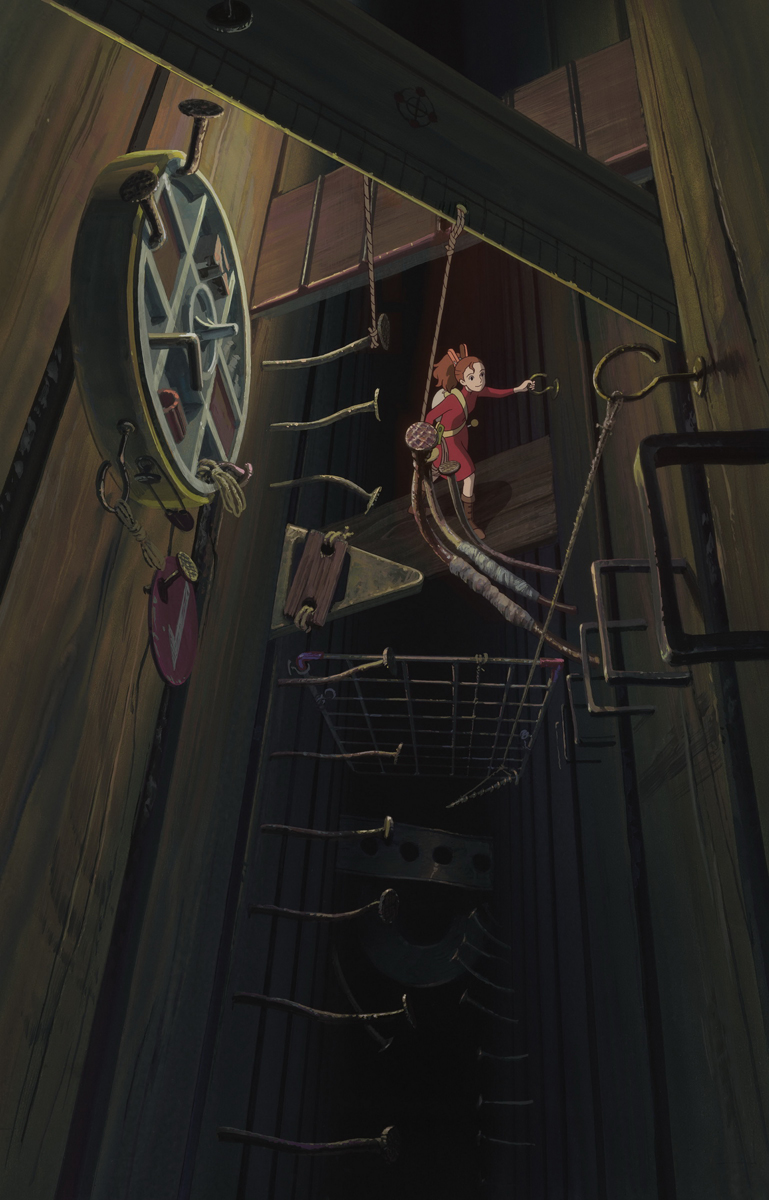 I had actually intended to keep going. One can’t really just say US and European animation styles. After all, there’s also the work out of Asia. The Japanese market, of course, is very different than the rest, and, thanks to what Miyazaki has been doing and his success in doing it, things are changing radically. Where he once blended in with the Anime animation that was all present, things are now changing to more of an emotional, Western appeal. My Neighbor Totoro started something, that changed wildly when he did Spirited Away and Ponyo. When I saw The Secret World of Arrietty, I knew things had changed completely. There was real character animation on the screen. One character was different from the next, and a lot of it had to do with the movement.
I was also fascinated with the work of Satoshi Kon, before his untimely death. His work was growing enormously with each and every film. The movies he made were adult in every sense of the word, and they were beautifully constructed, drawn and animated. I still go back to watch copies of his films. ________“Arrietty”
I was going to write about Katsuhiro Ôtomo, but I realize I’ve taken a sidestep. These are directors, and this article is about animators. In short, there is an Eastern style, and I’m glad to see that because of a couple of directors, they’re doing thier own take on the US version of animation character developement. It’s good to see it happening.
Essentially, the world is becoming smaller. Global animation styles are settling in, and I hope there will be a 2D animation so that the job can be complete in a few more years.
