Category ArchiveCommentary
Animation &Animation Artifacts &Commentary 01 May 2013 06:52 am
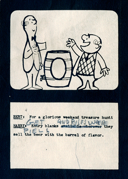
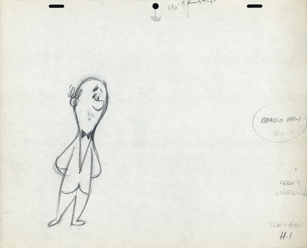
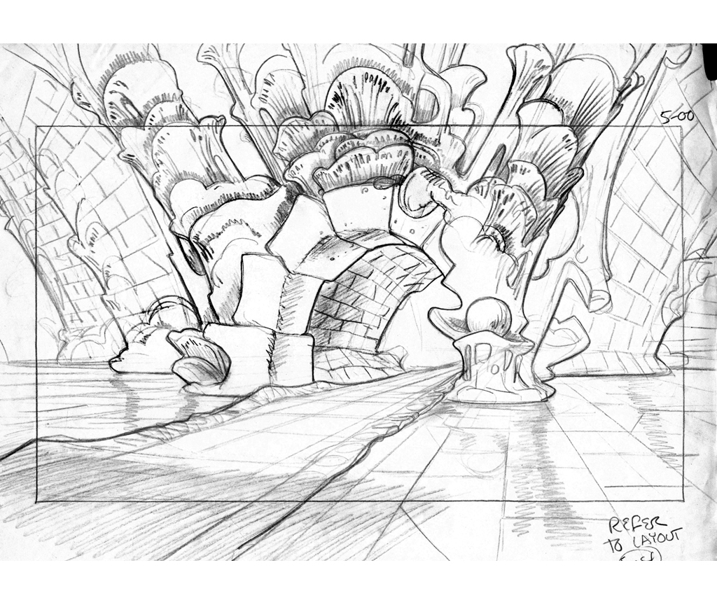
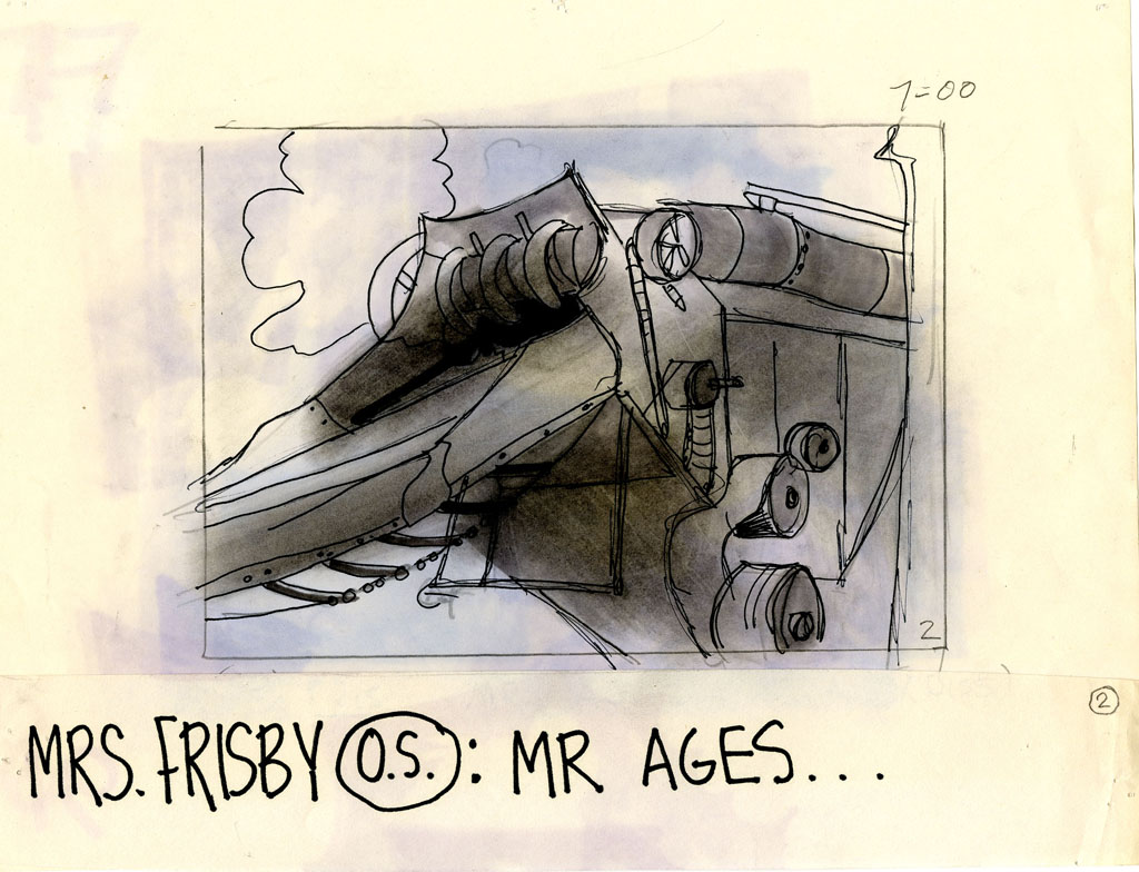
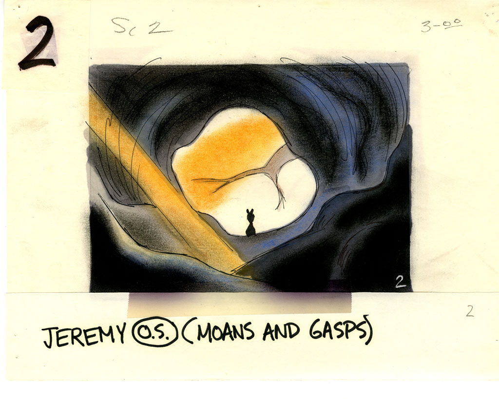
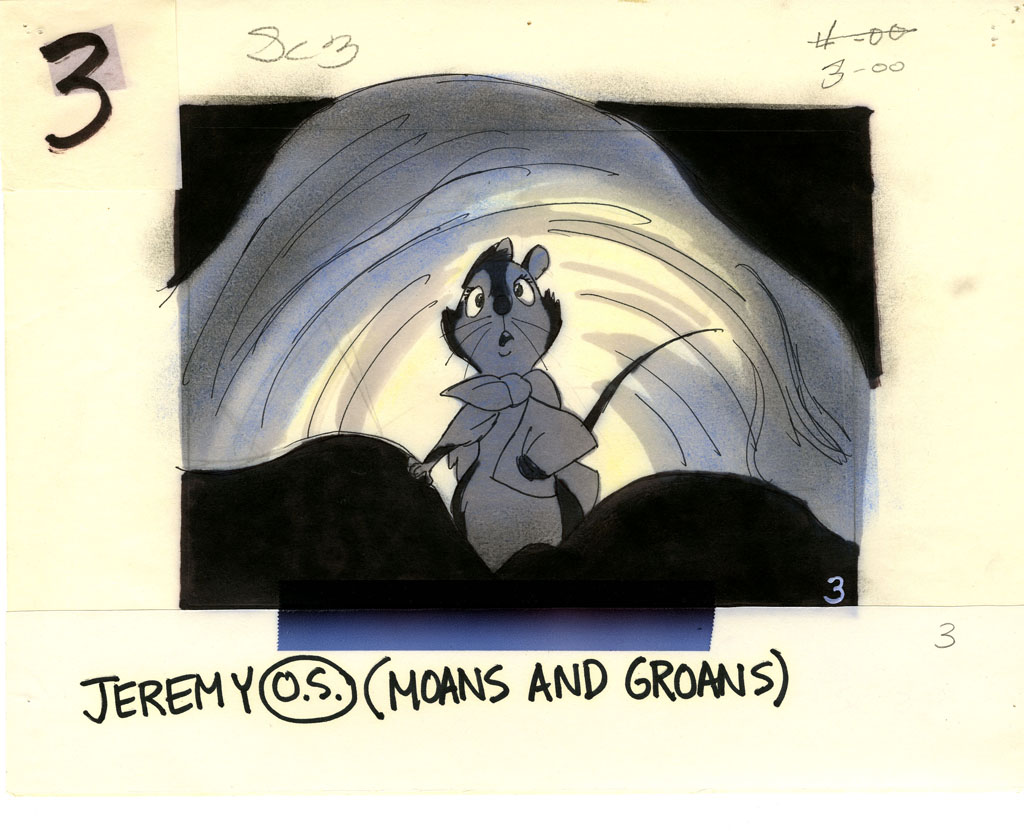
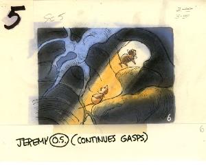
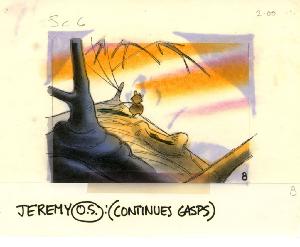
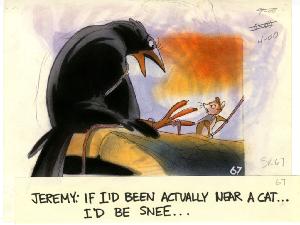
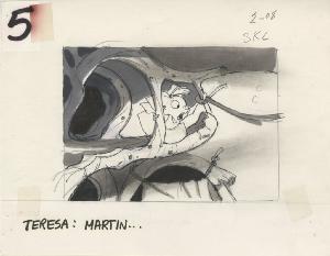
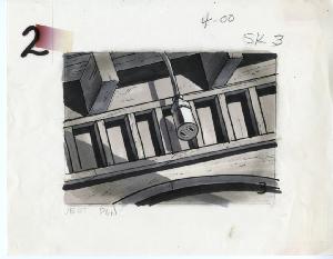
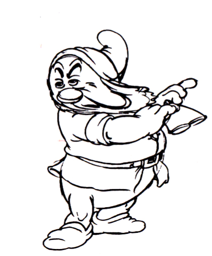
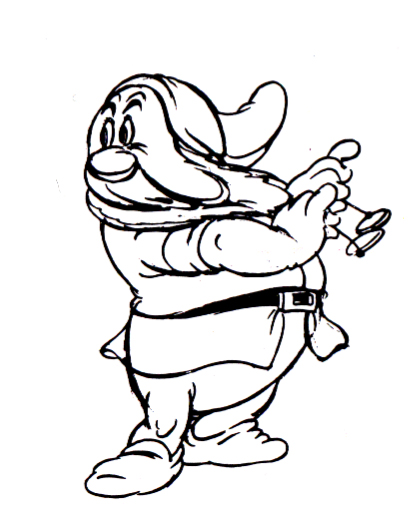
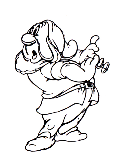
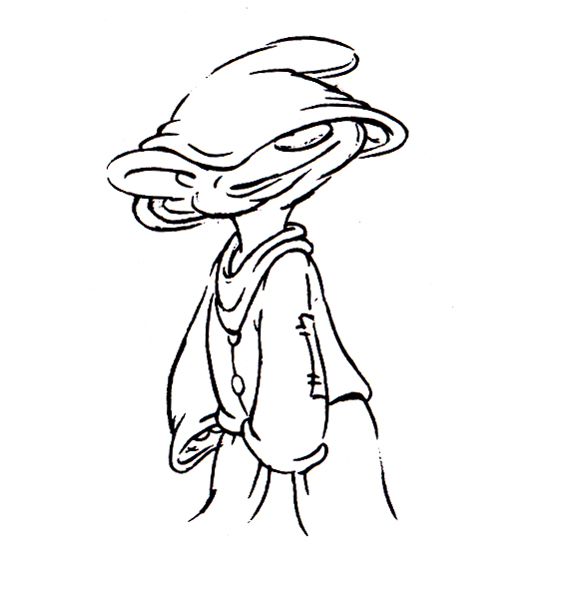
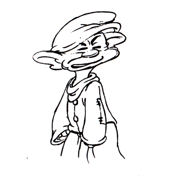
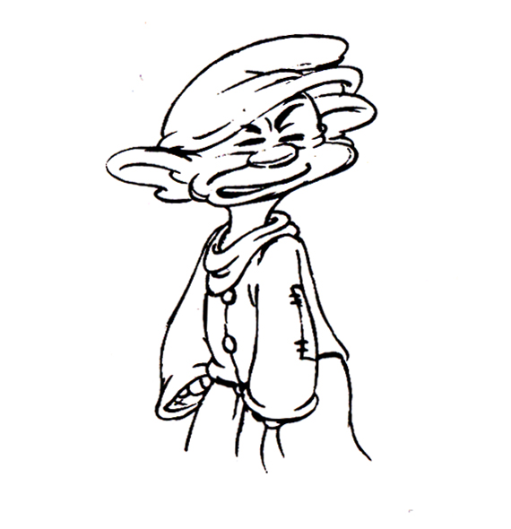
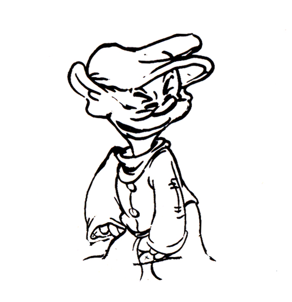
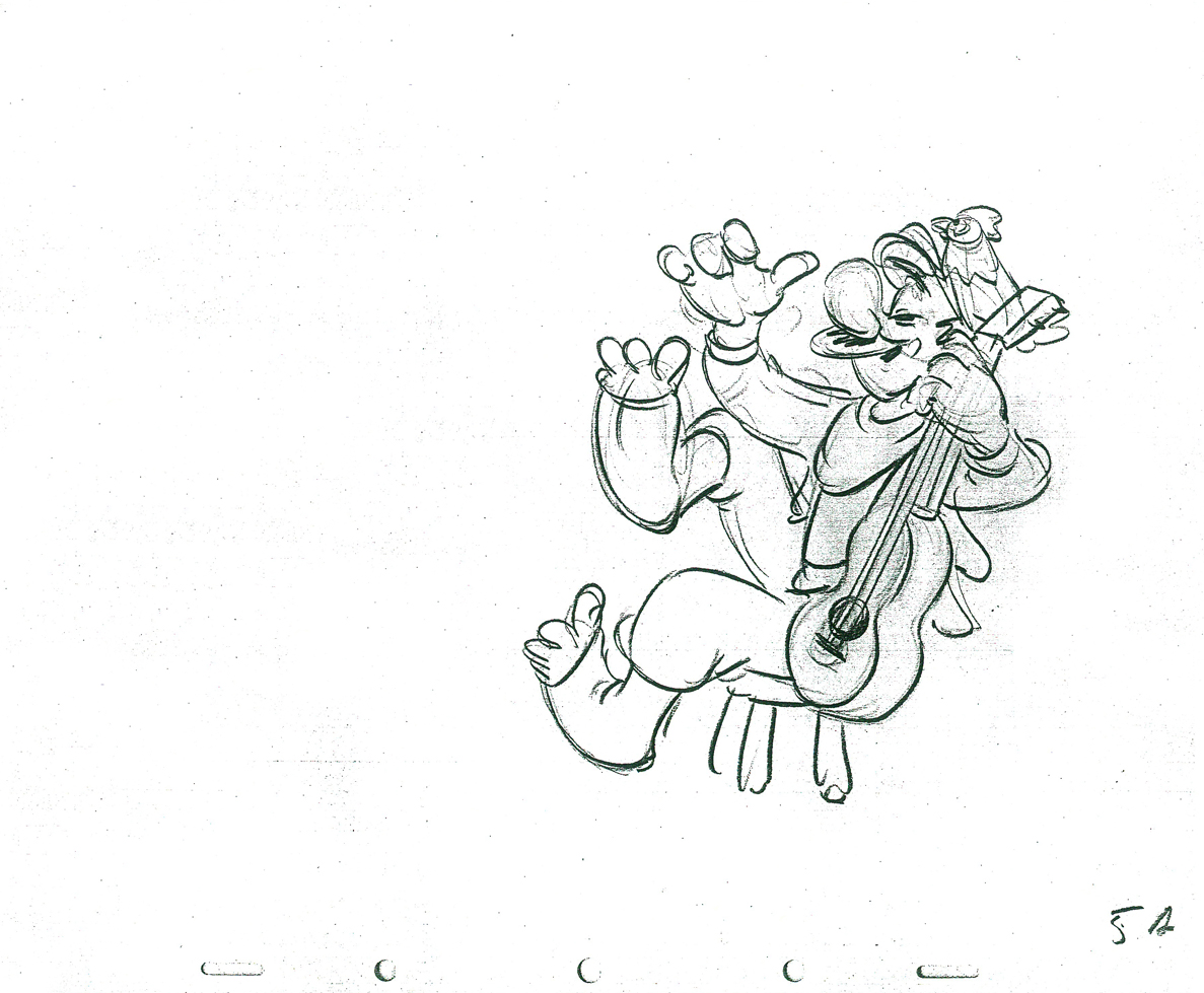
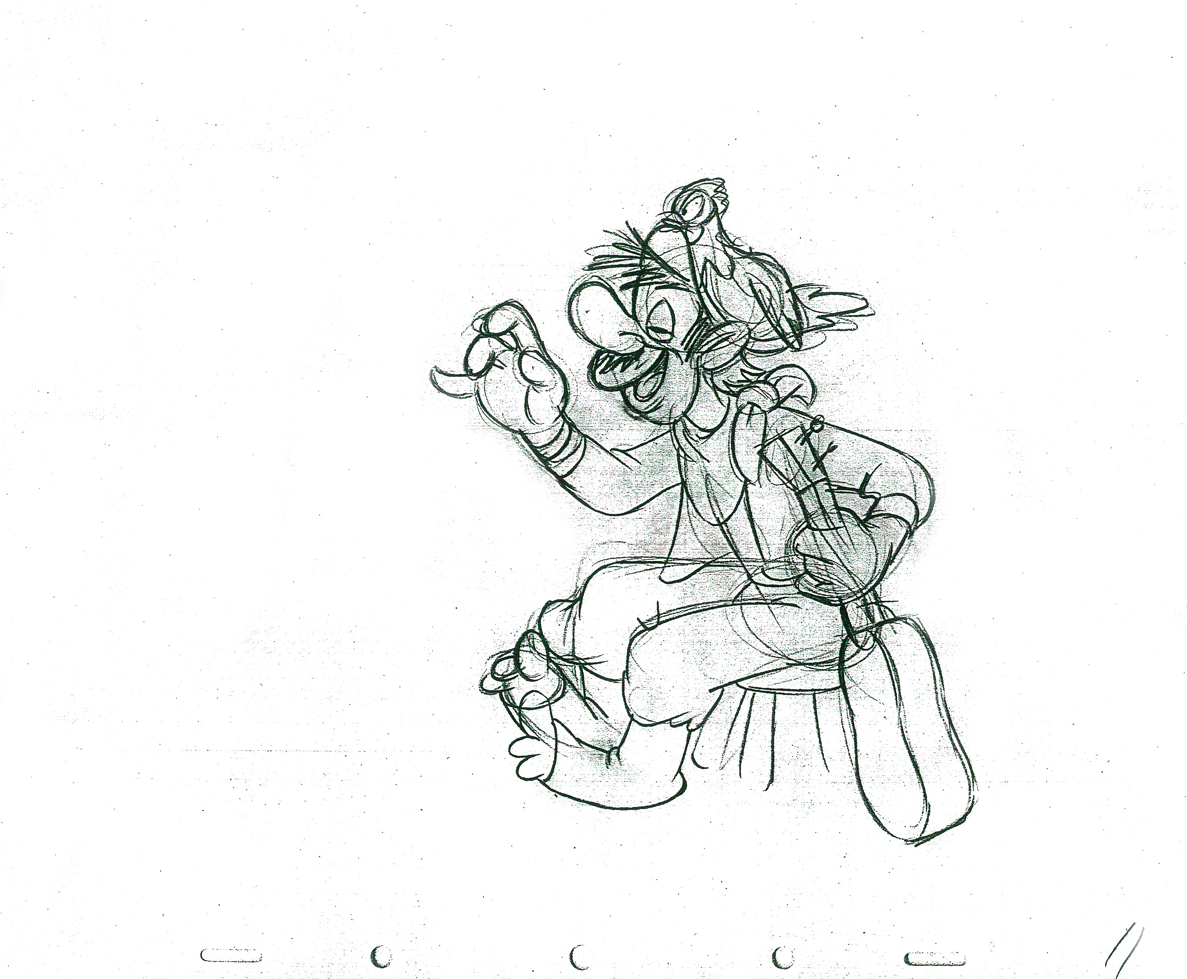
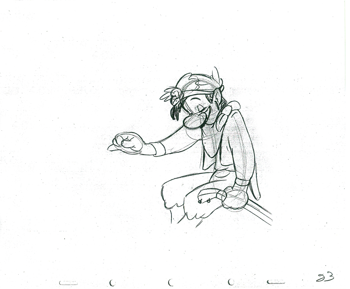
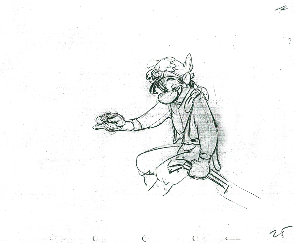
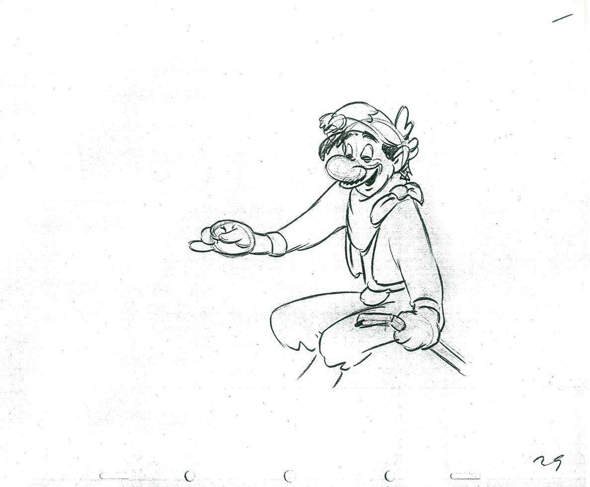
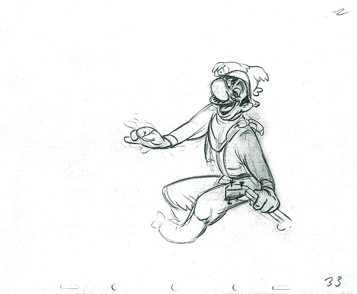
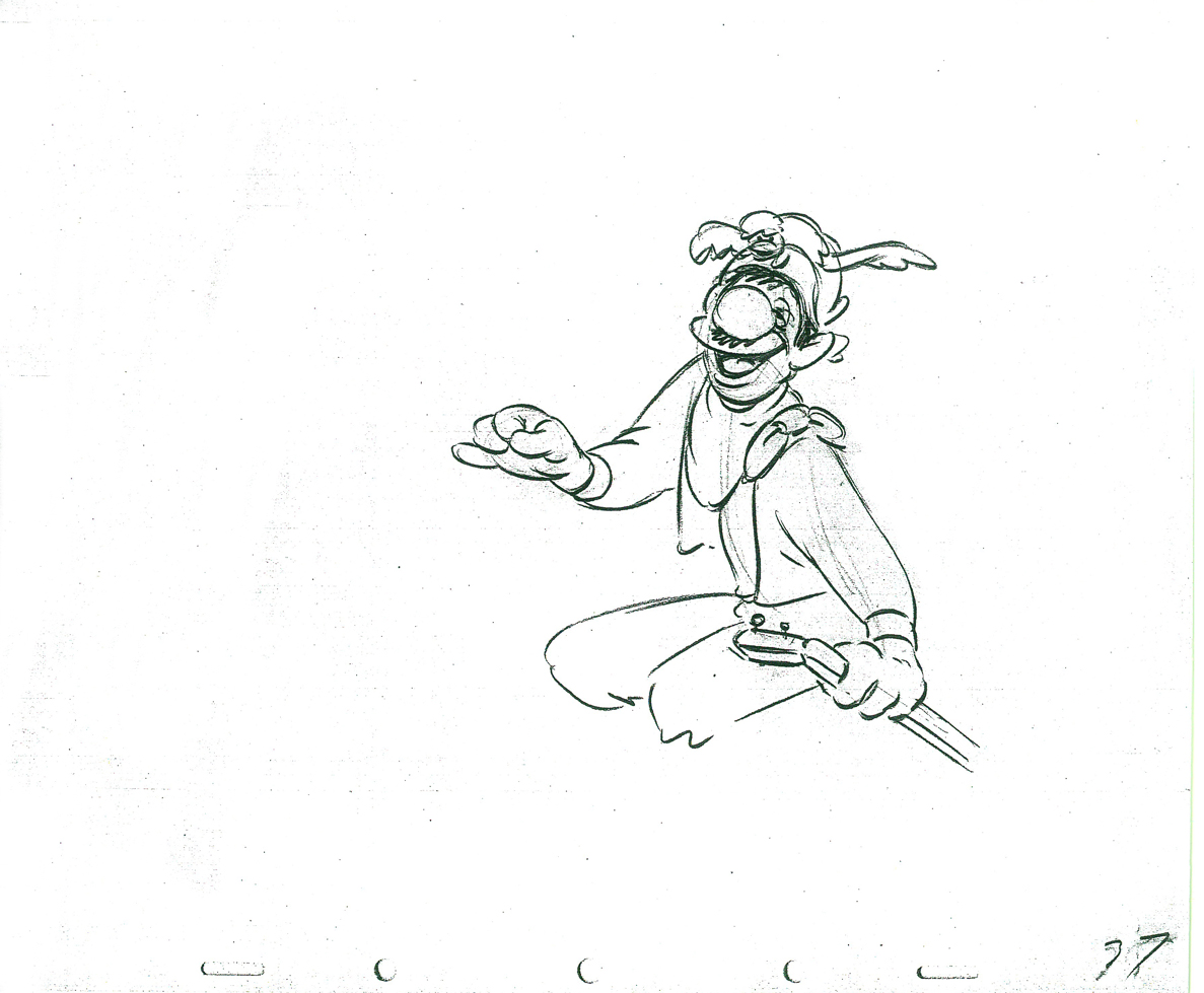
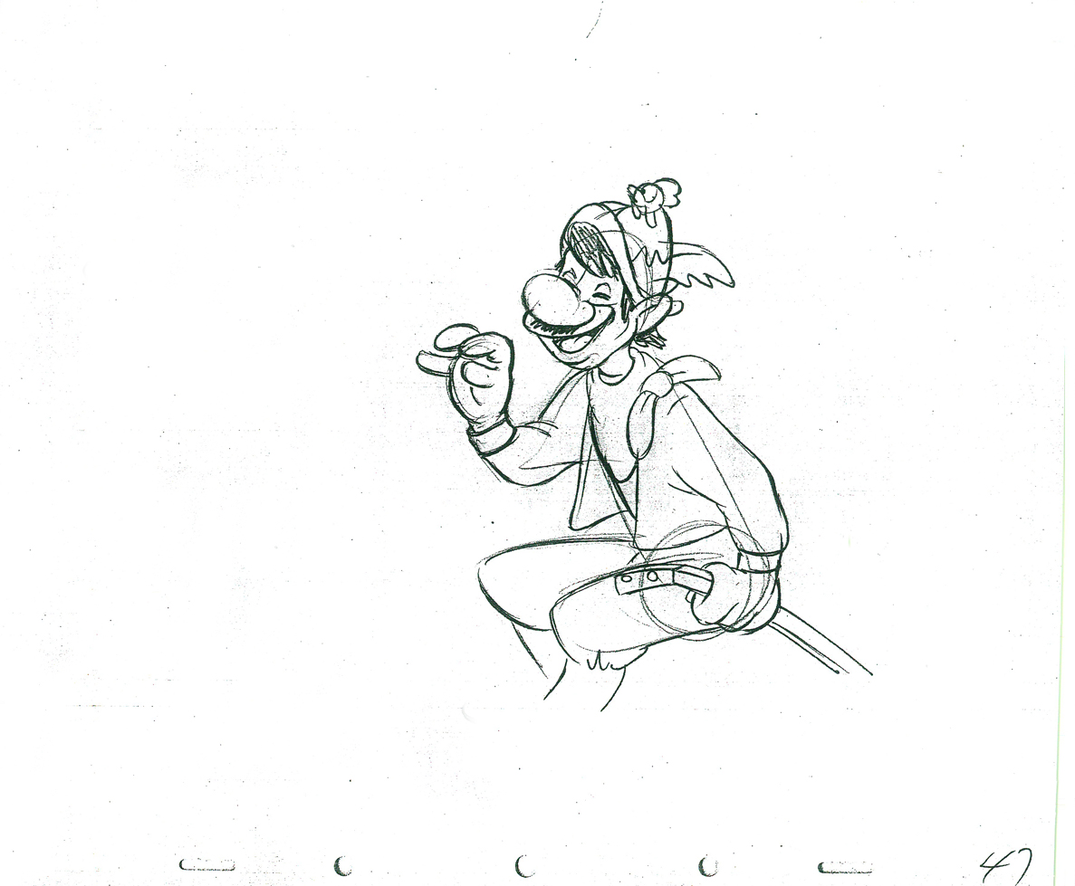
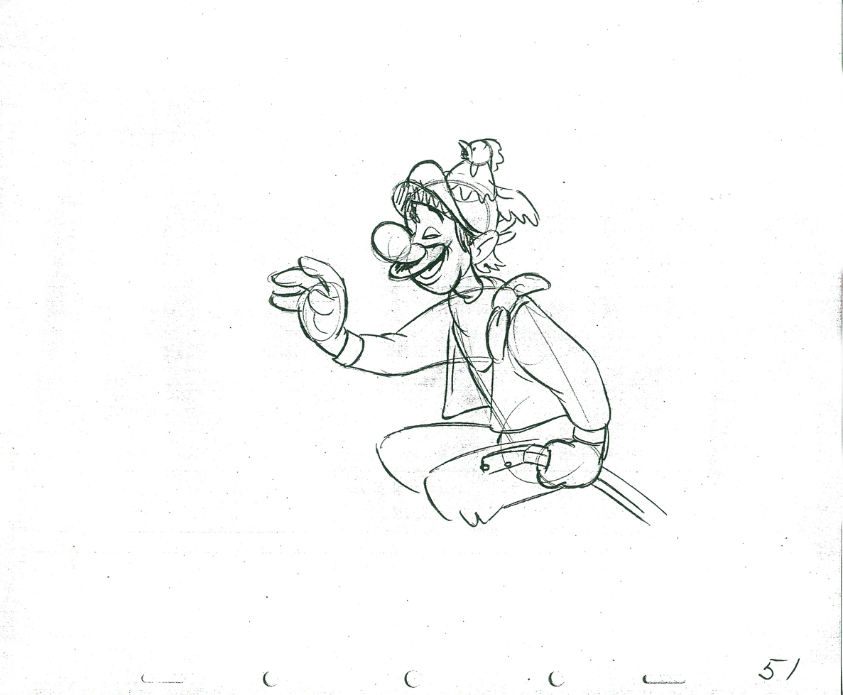
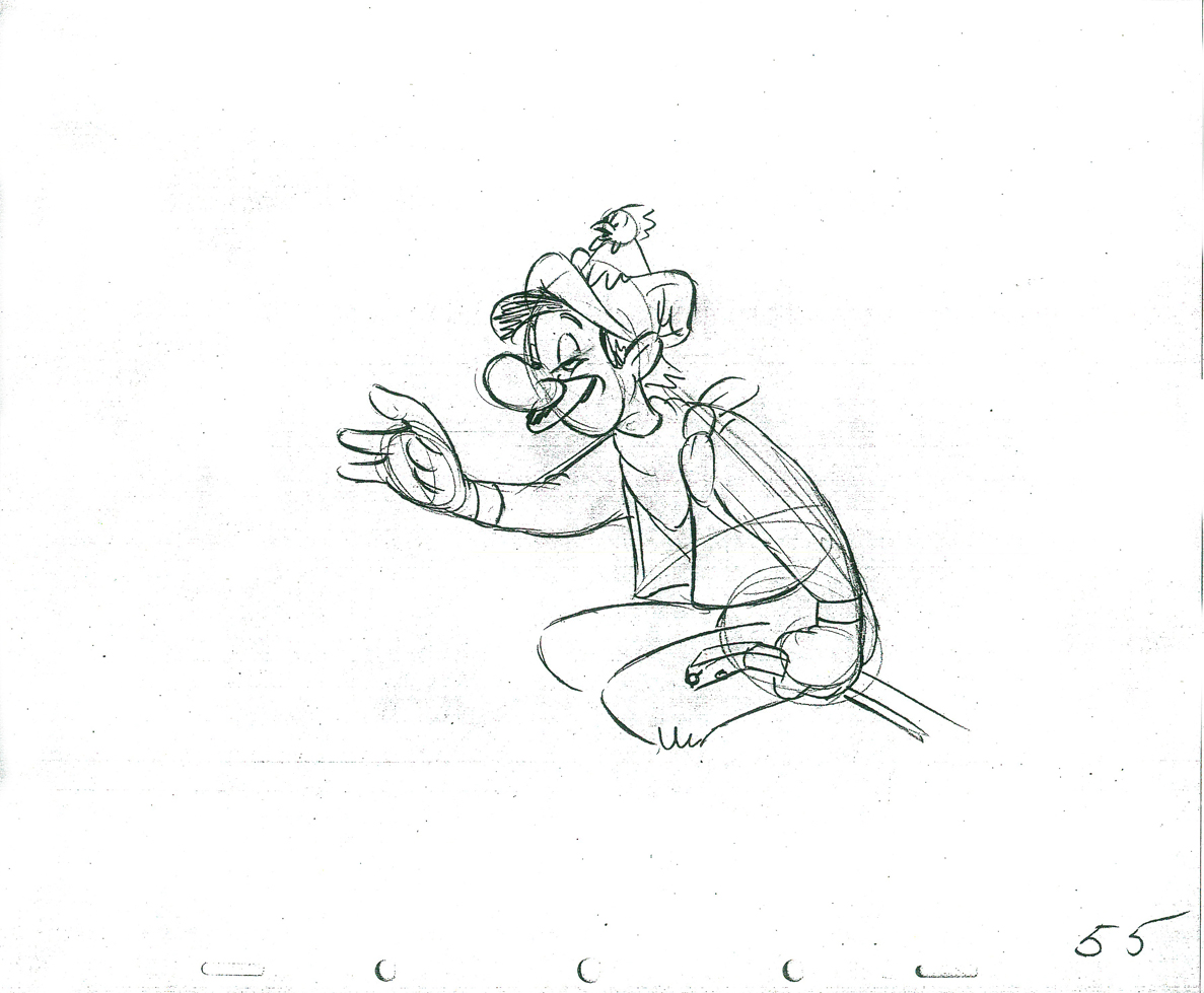
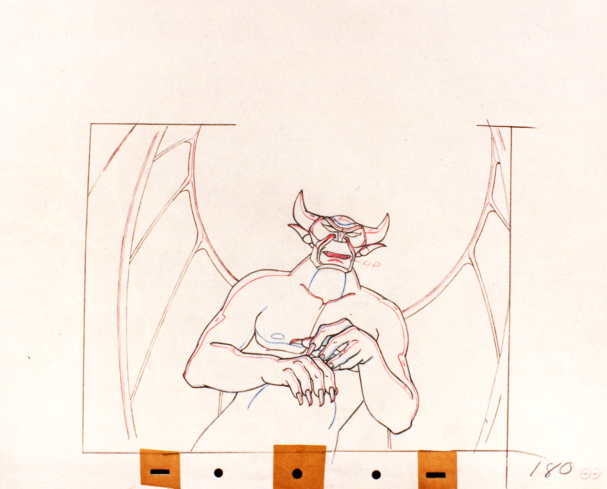
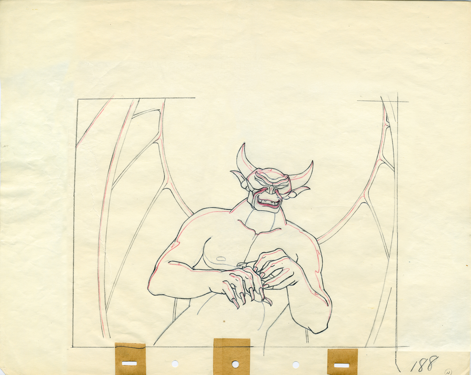
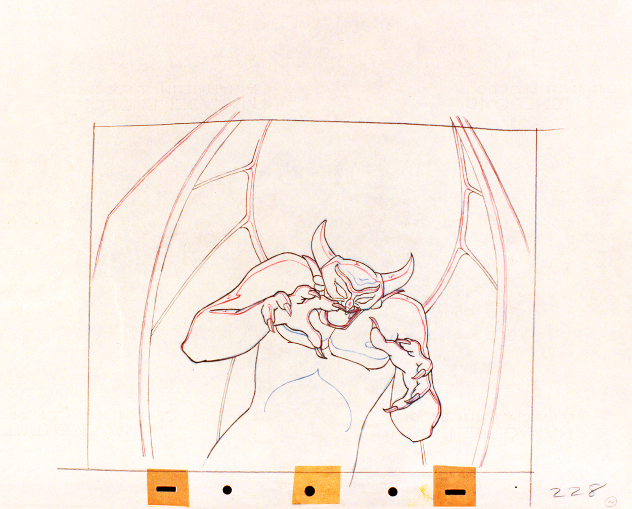
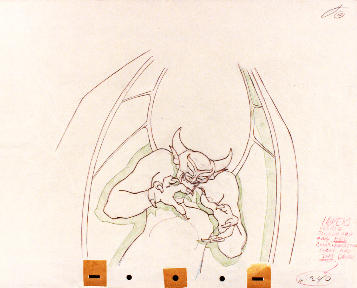
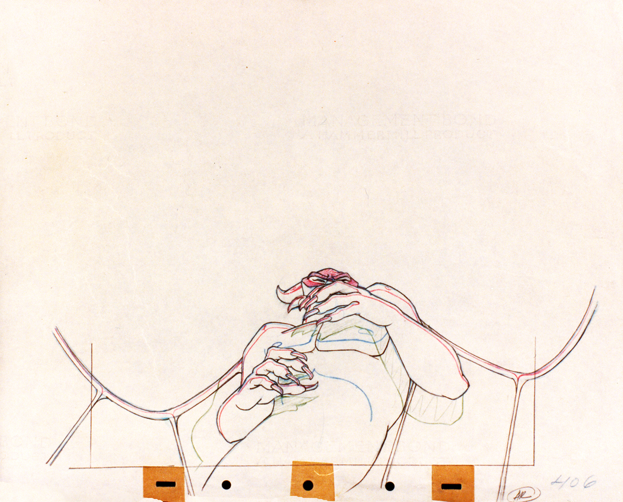
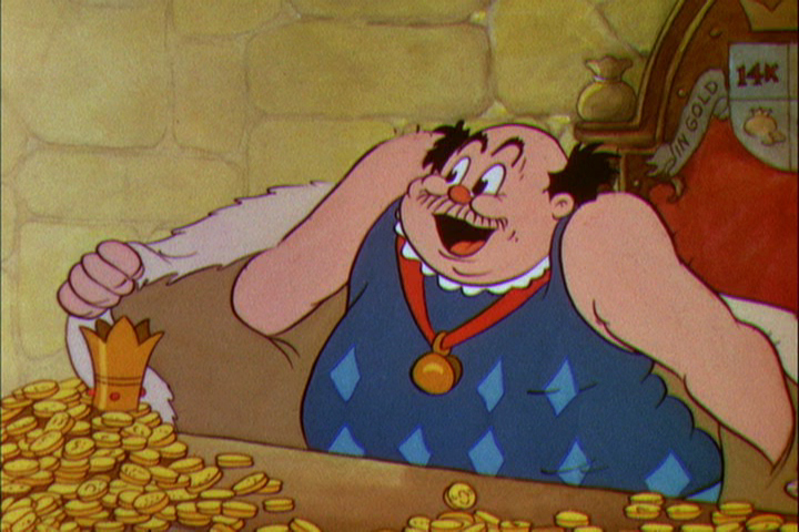
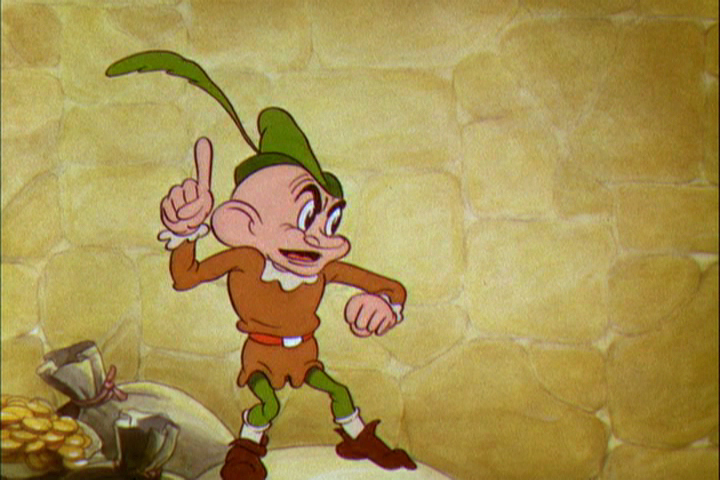
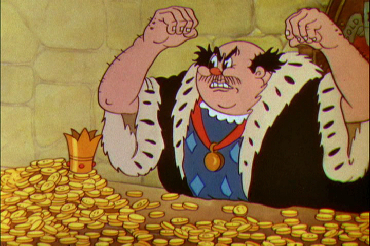
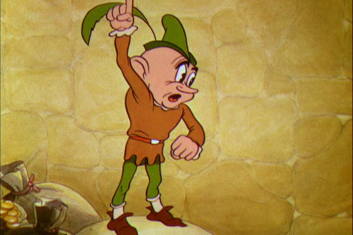
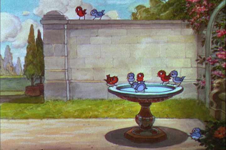
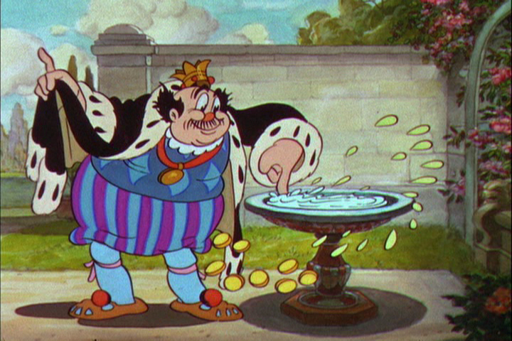
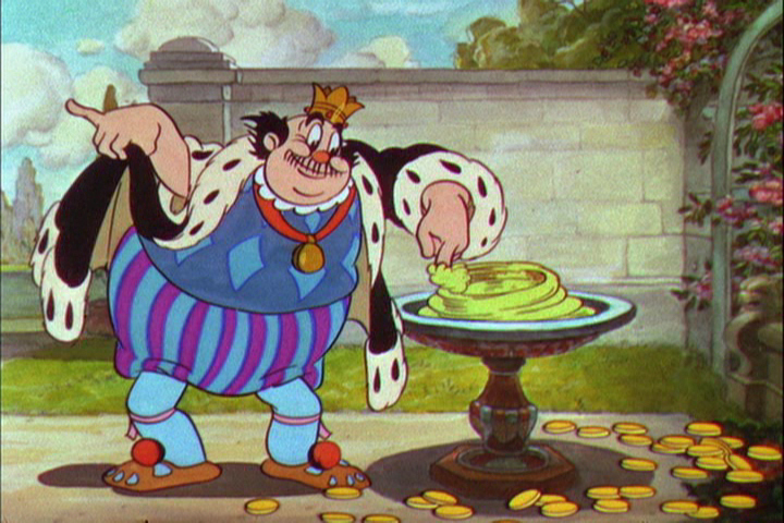
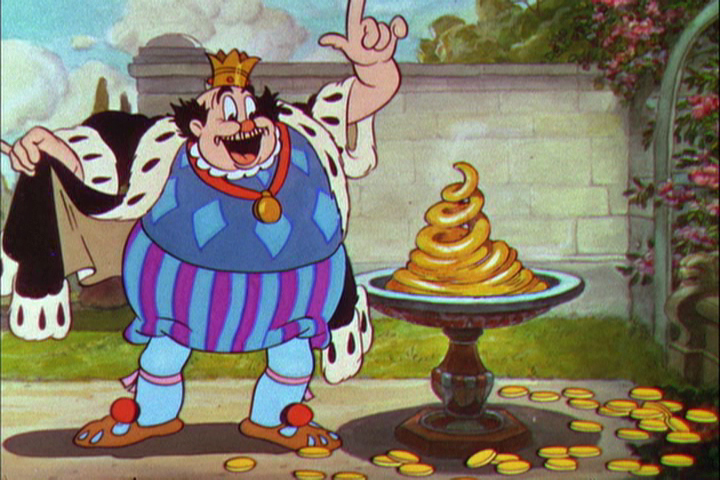
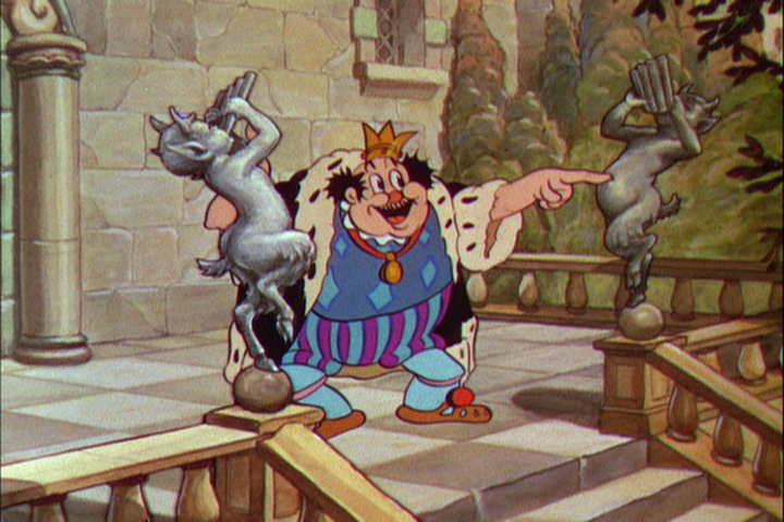
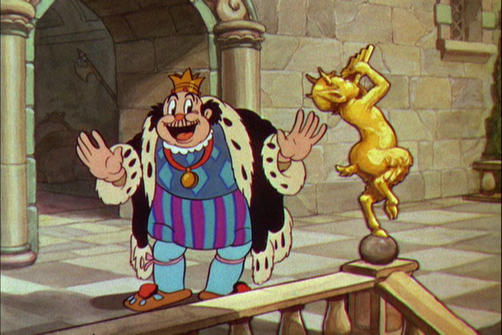
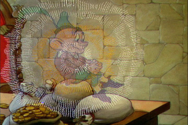
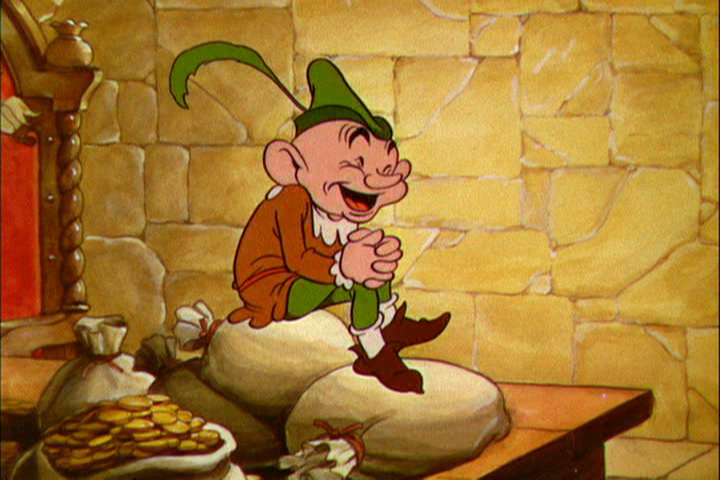
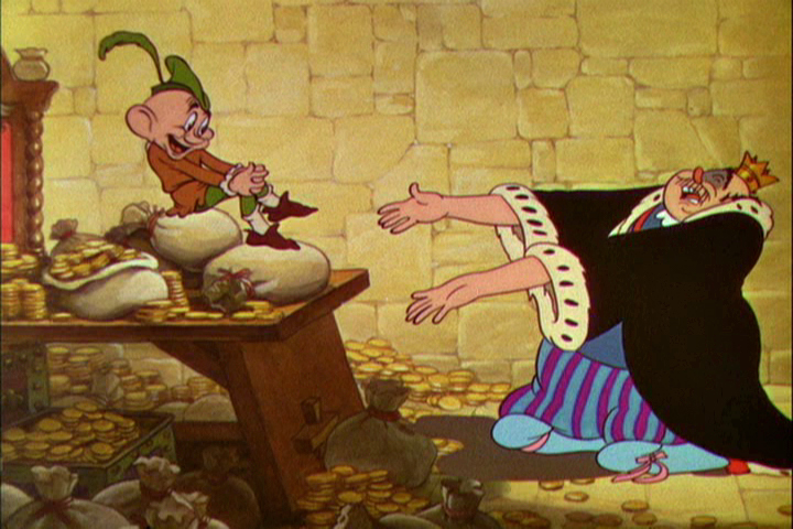
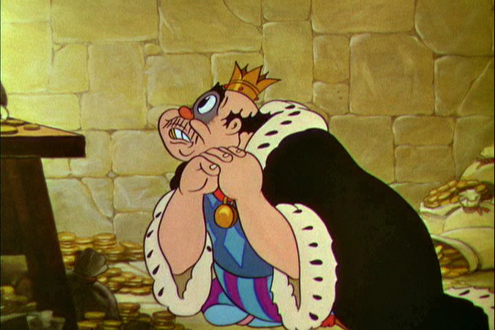
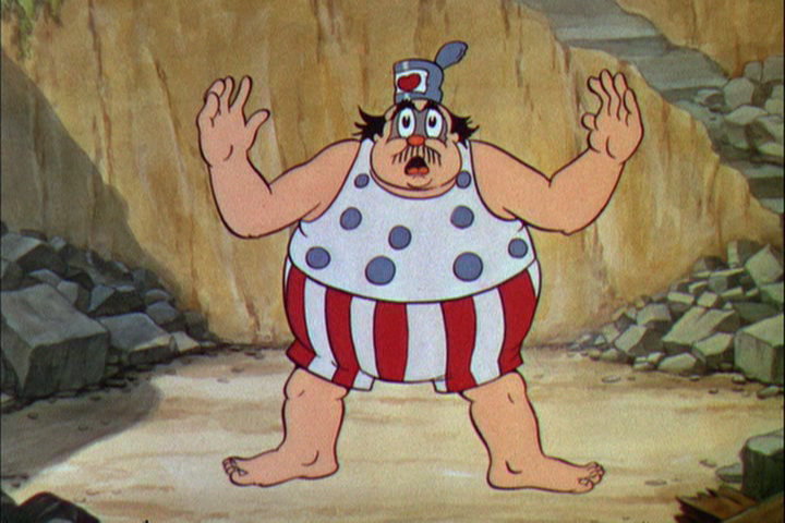
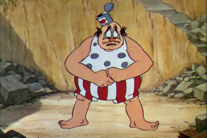
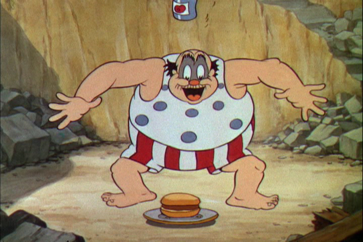
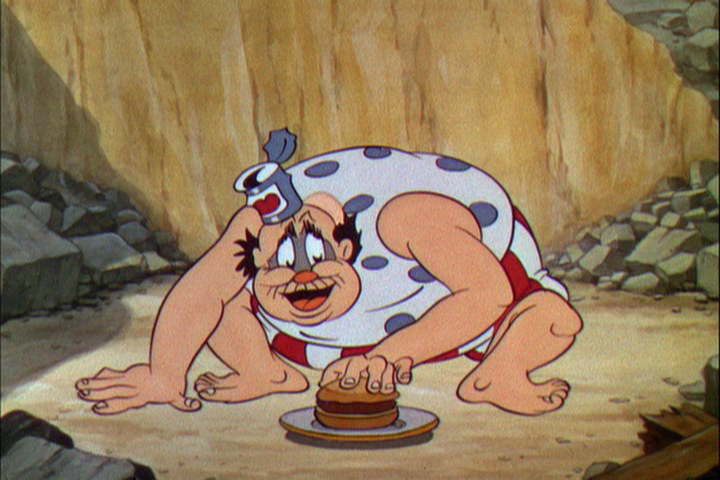
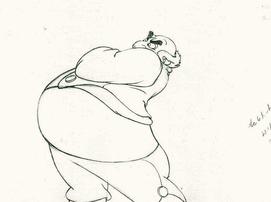
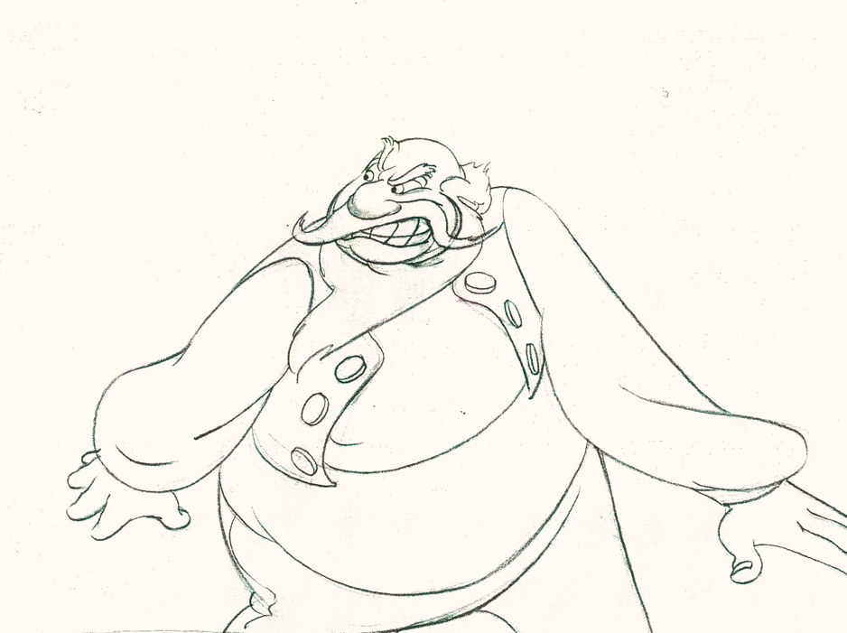
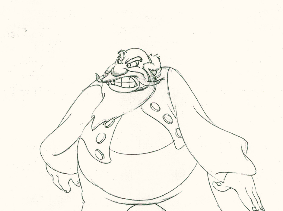
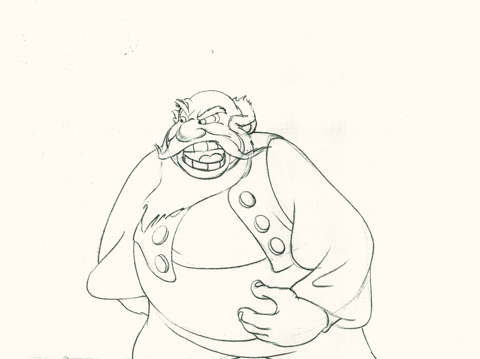
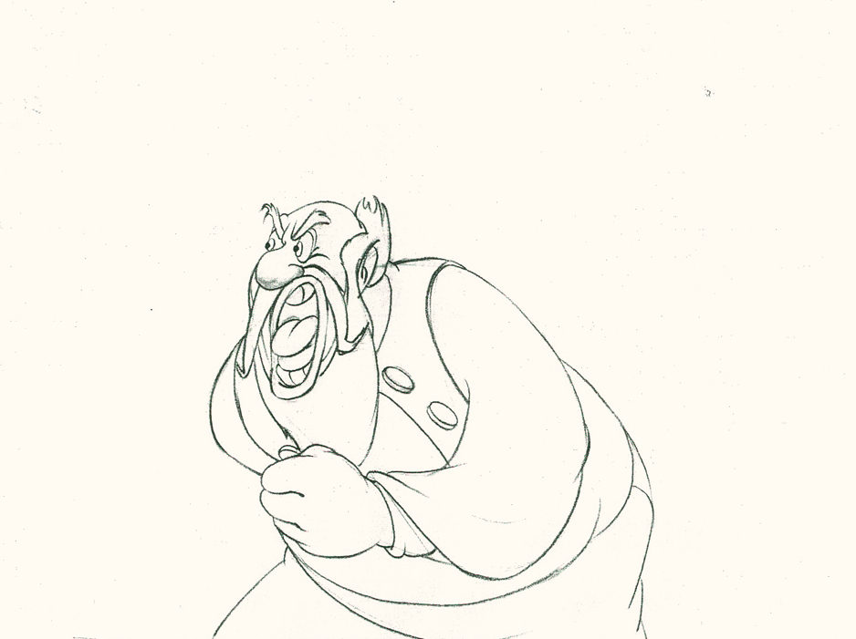
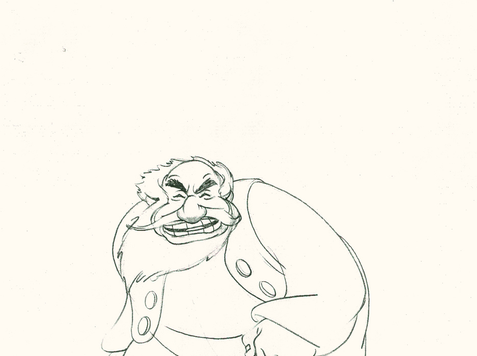
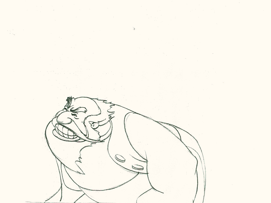
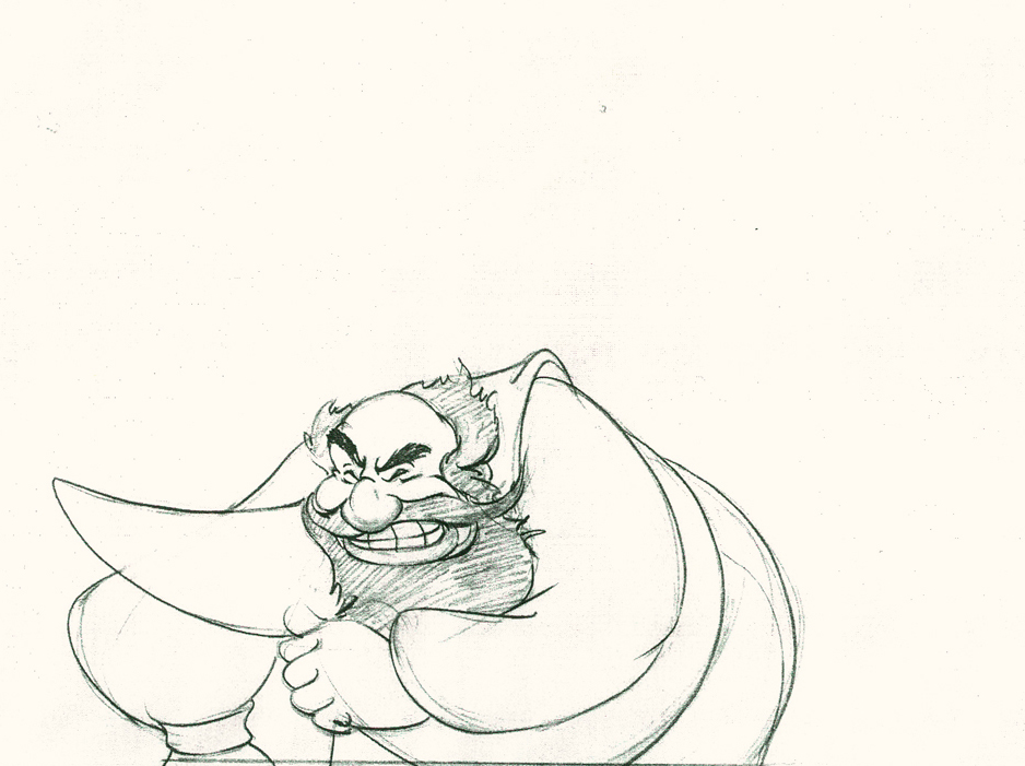
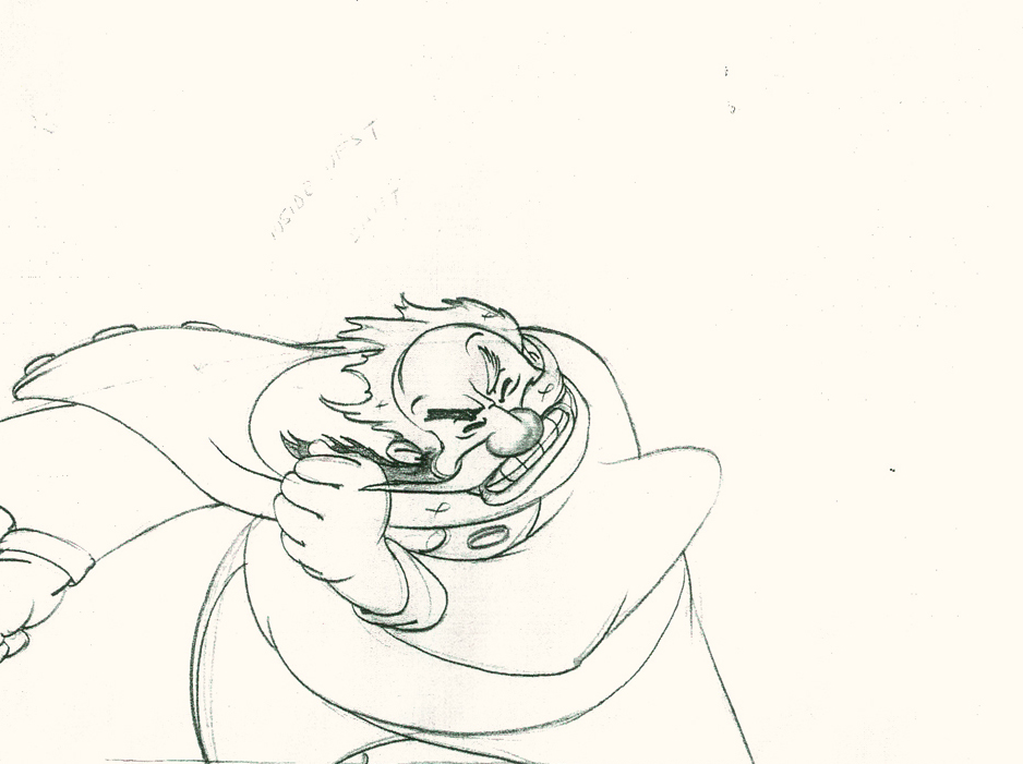
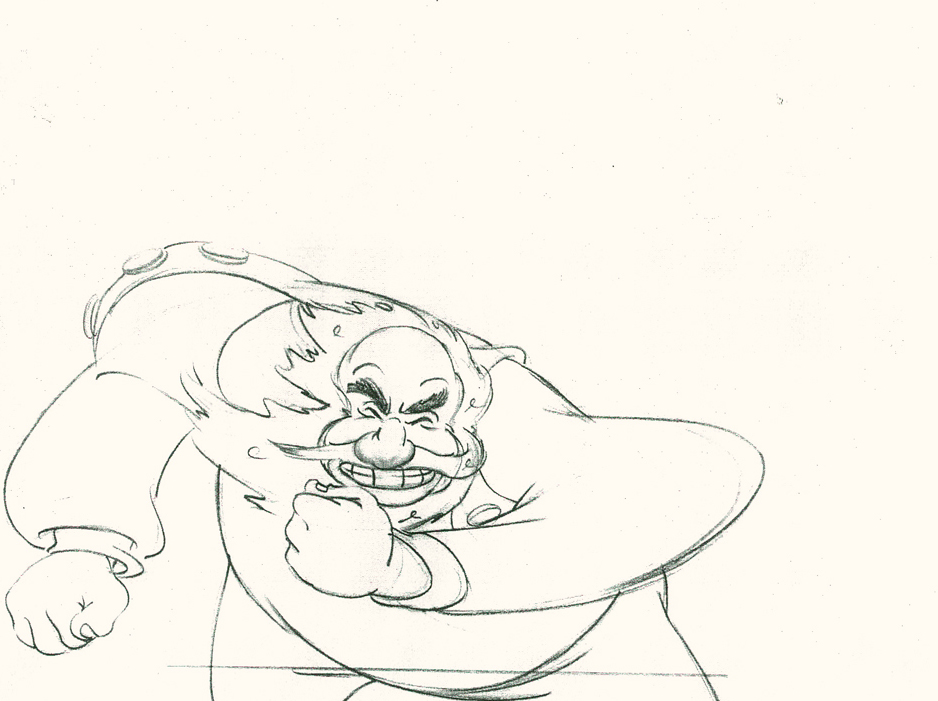
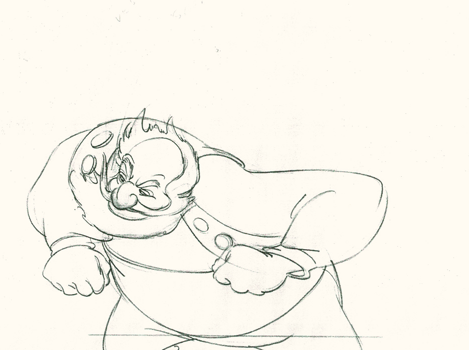
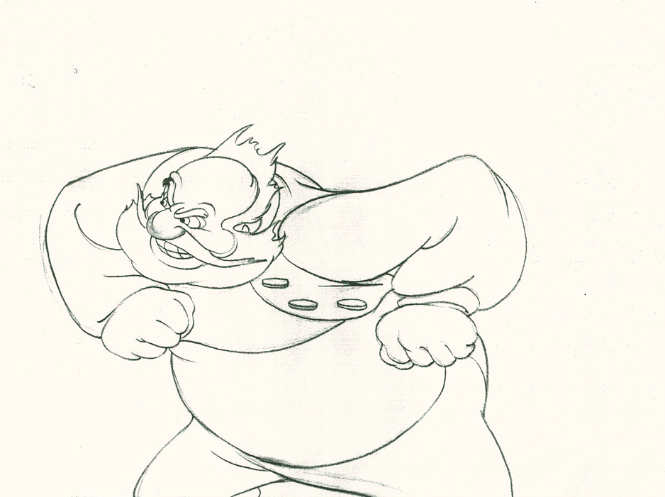
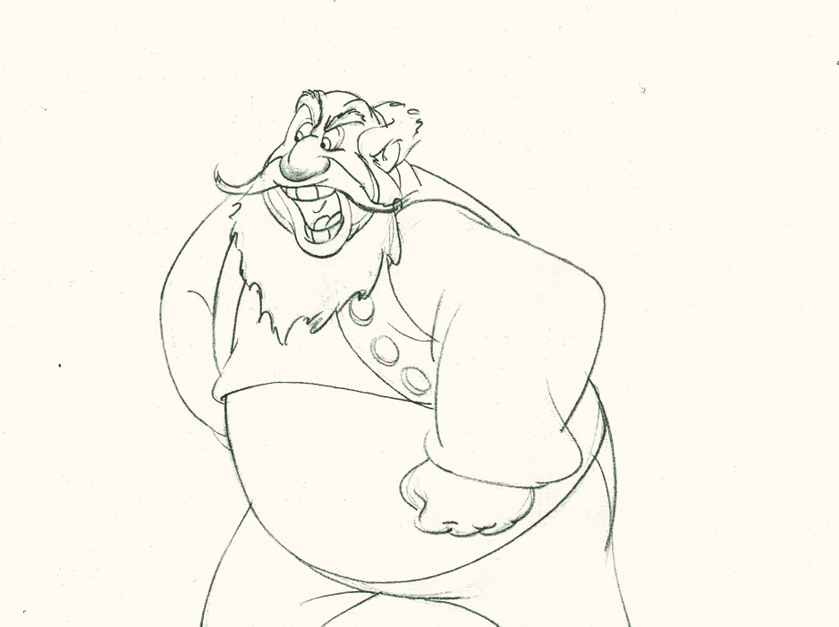
Piels Bros Commercial Animation Dwngs
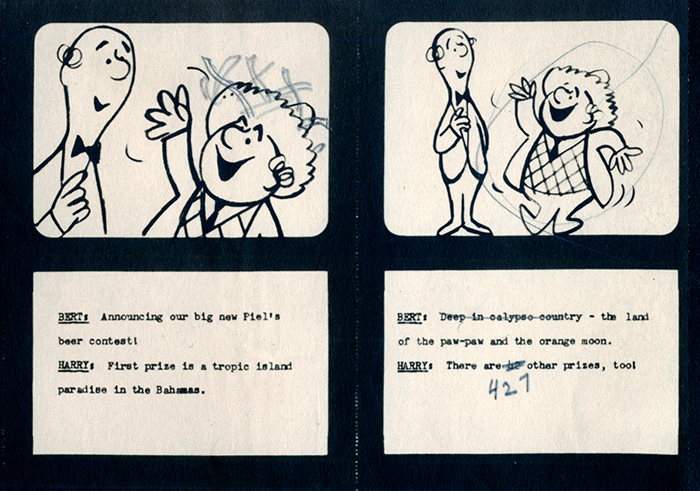
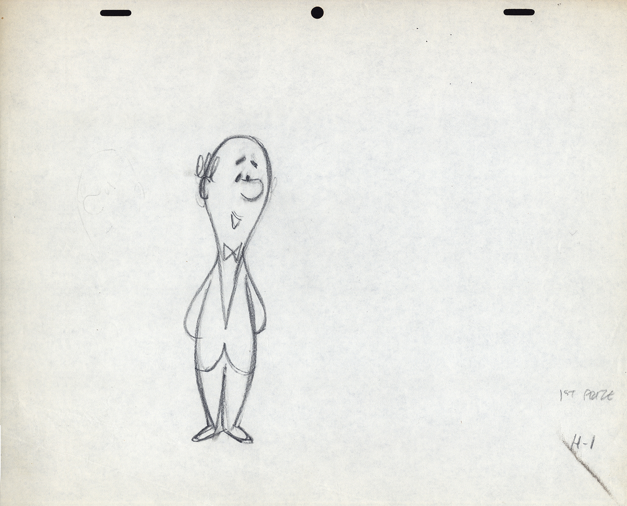
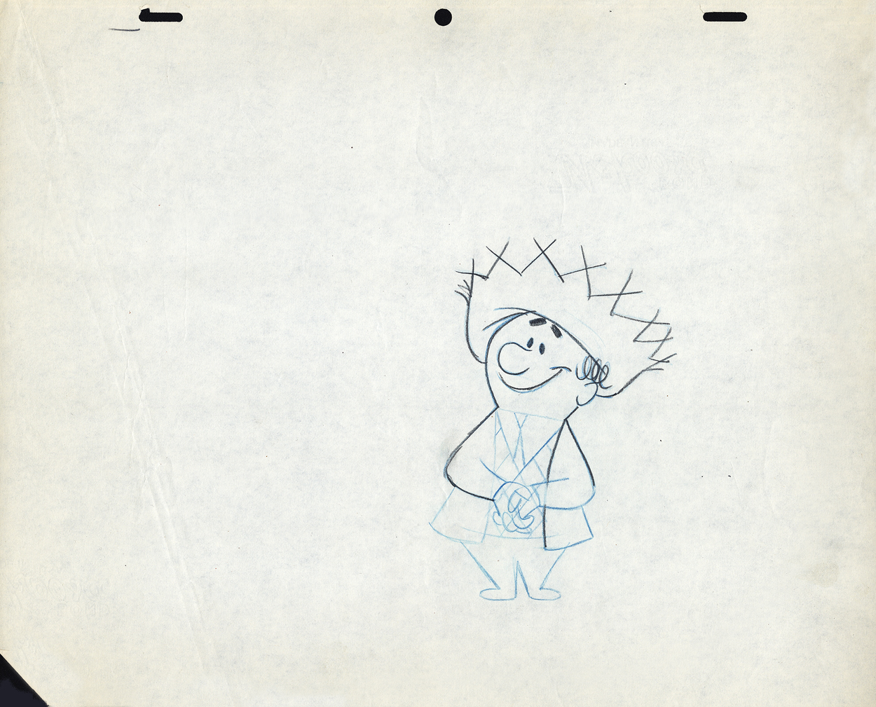
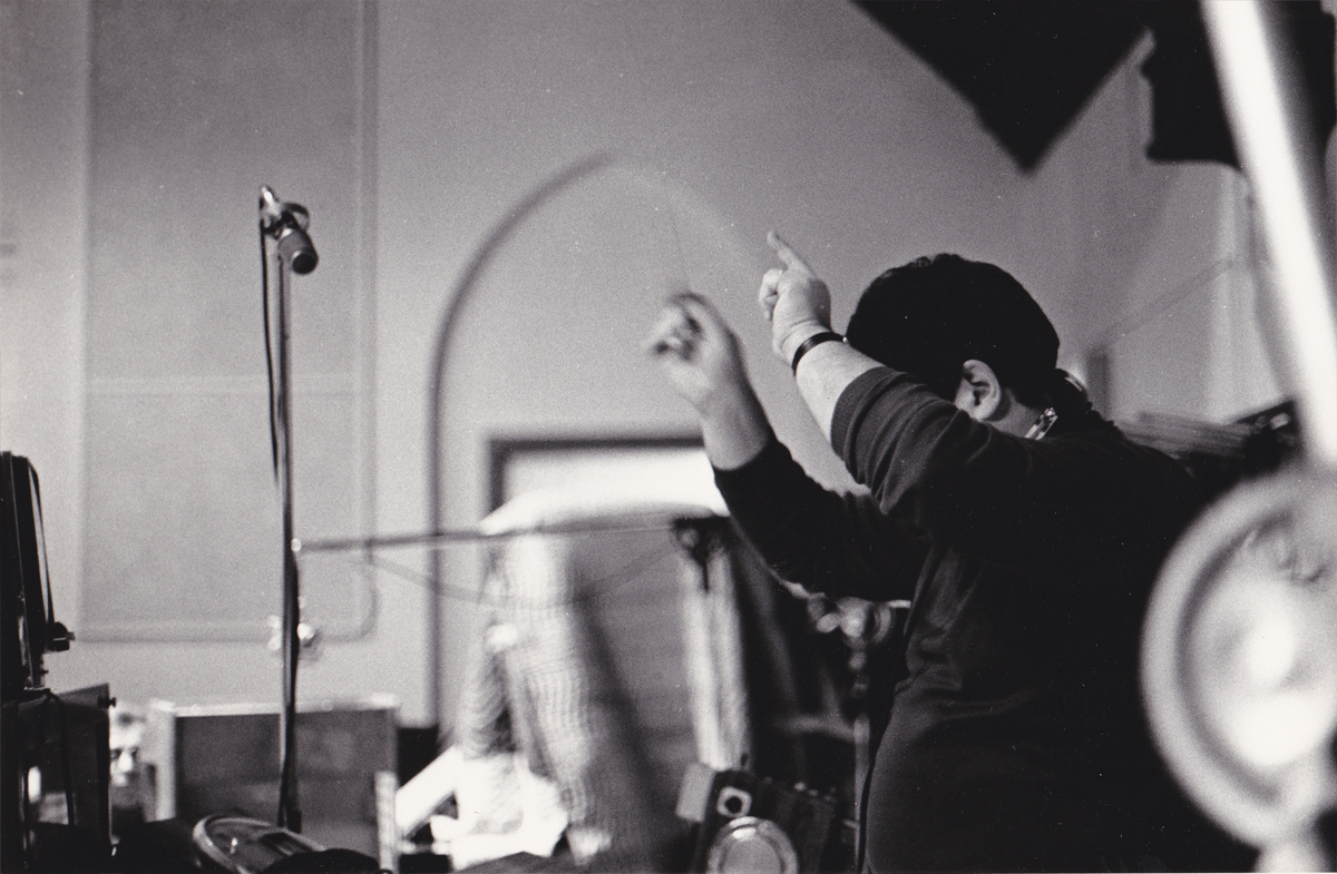
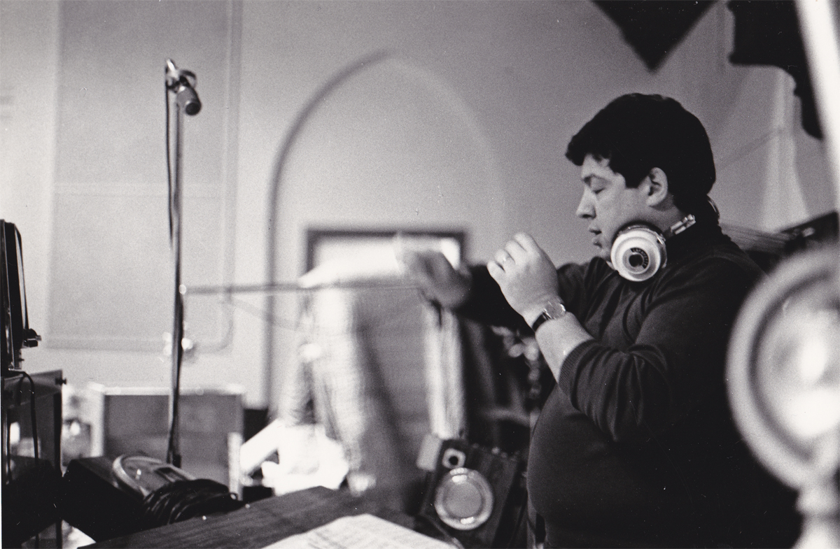
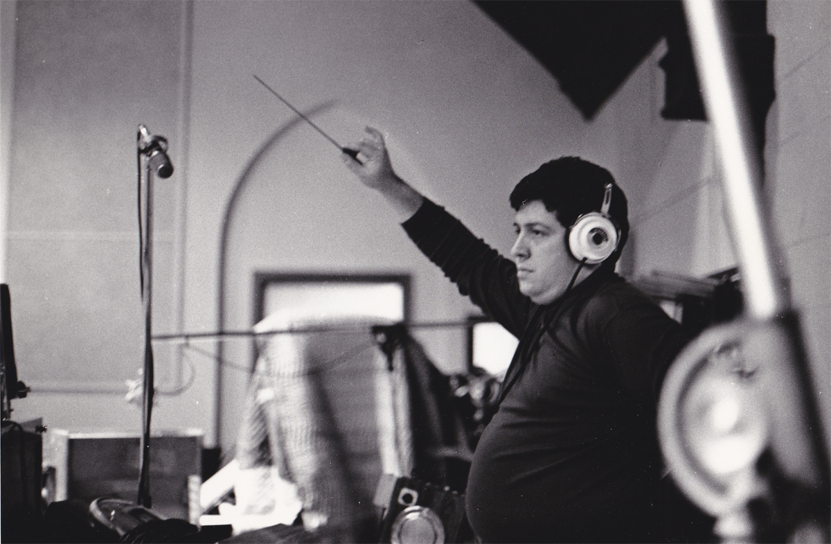
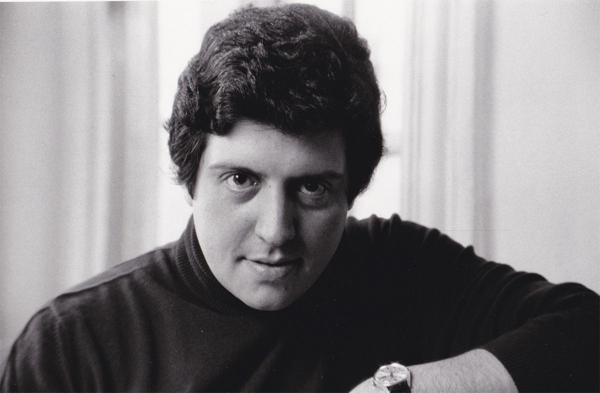
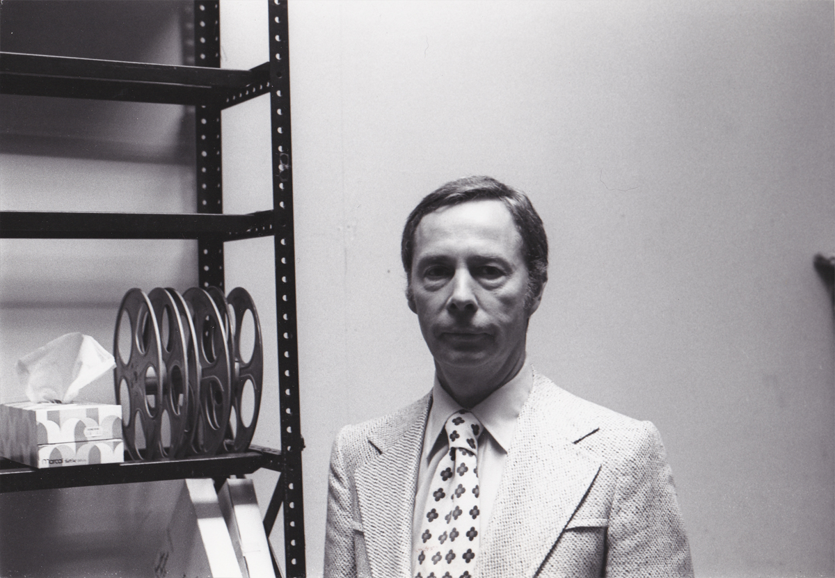
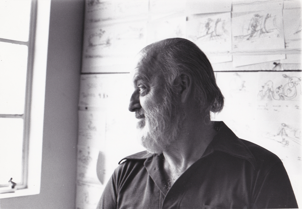
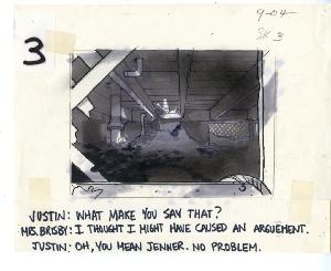
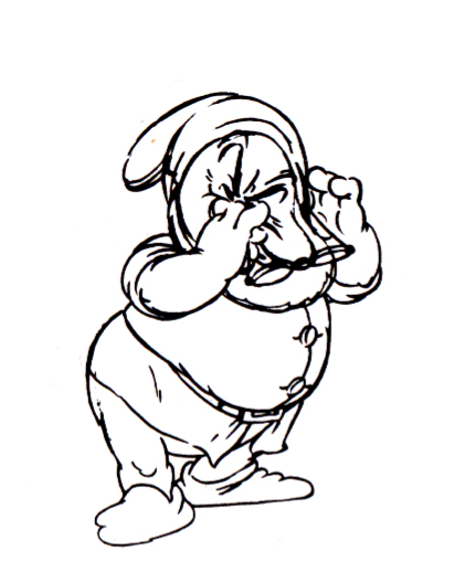
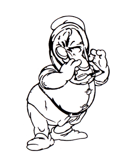
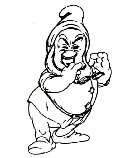
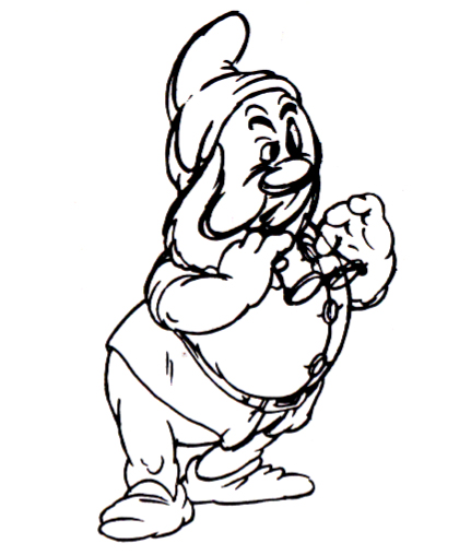
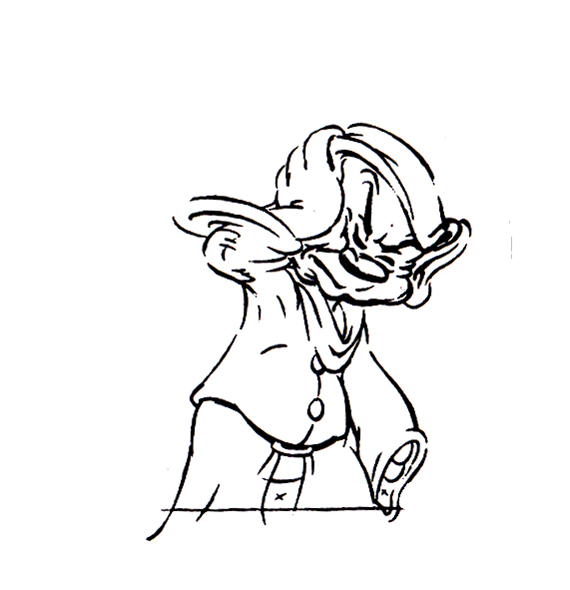
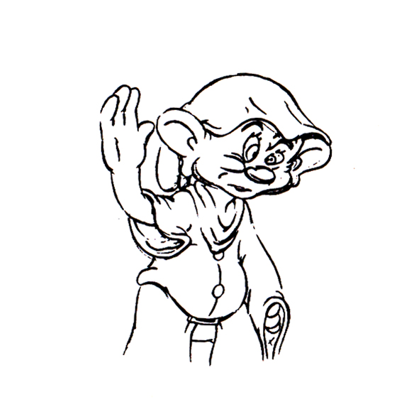
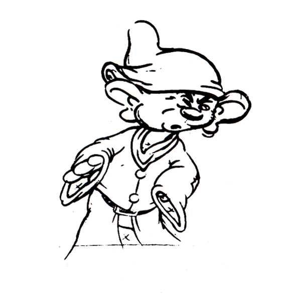
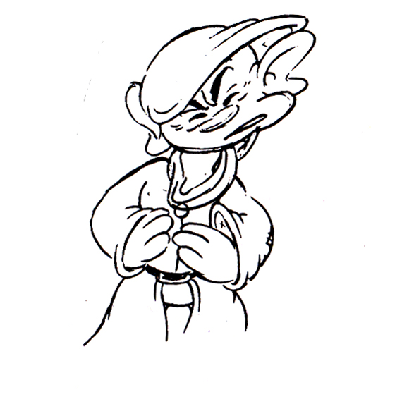
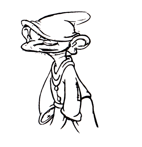
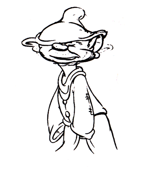
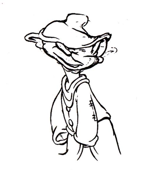
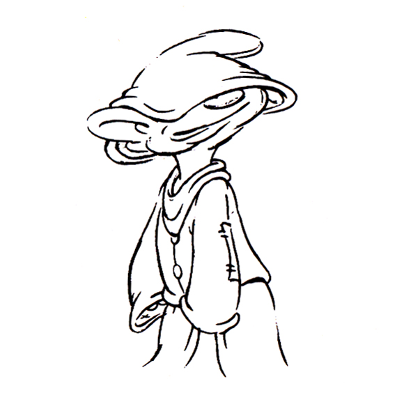
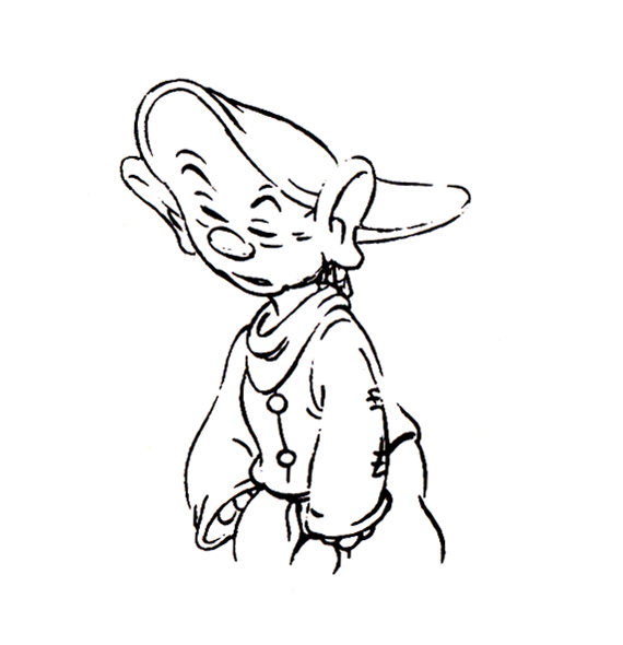
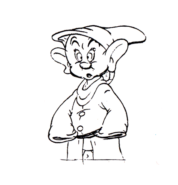
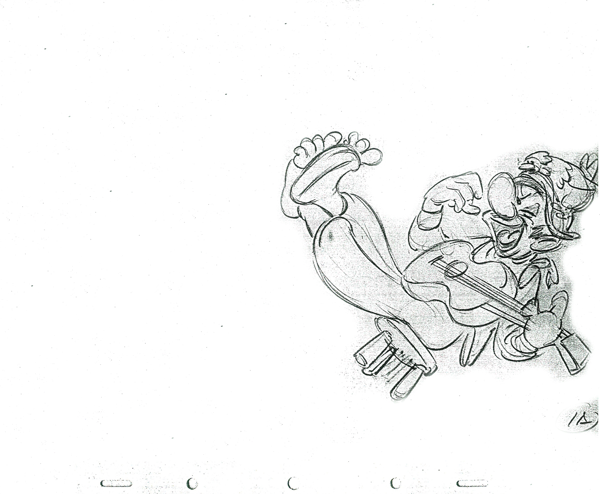
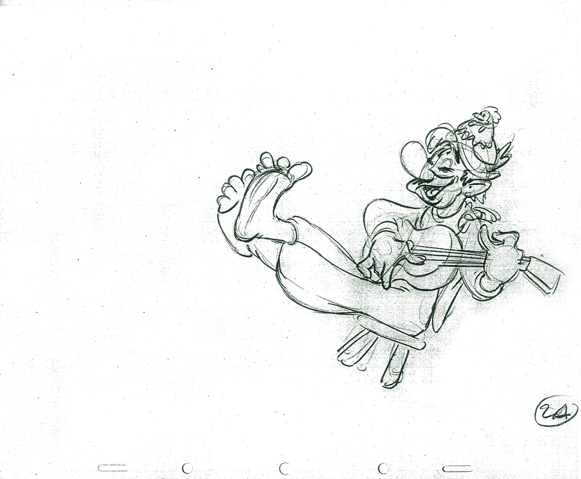
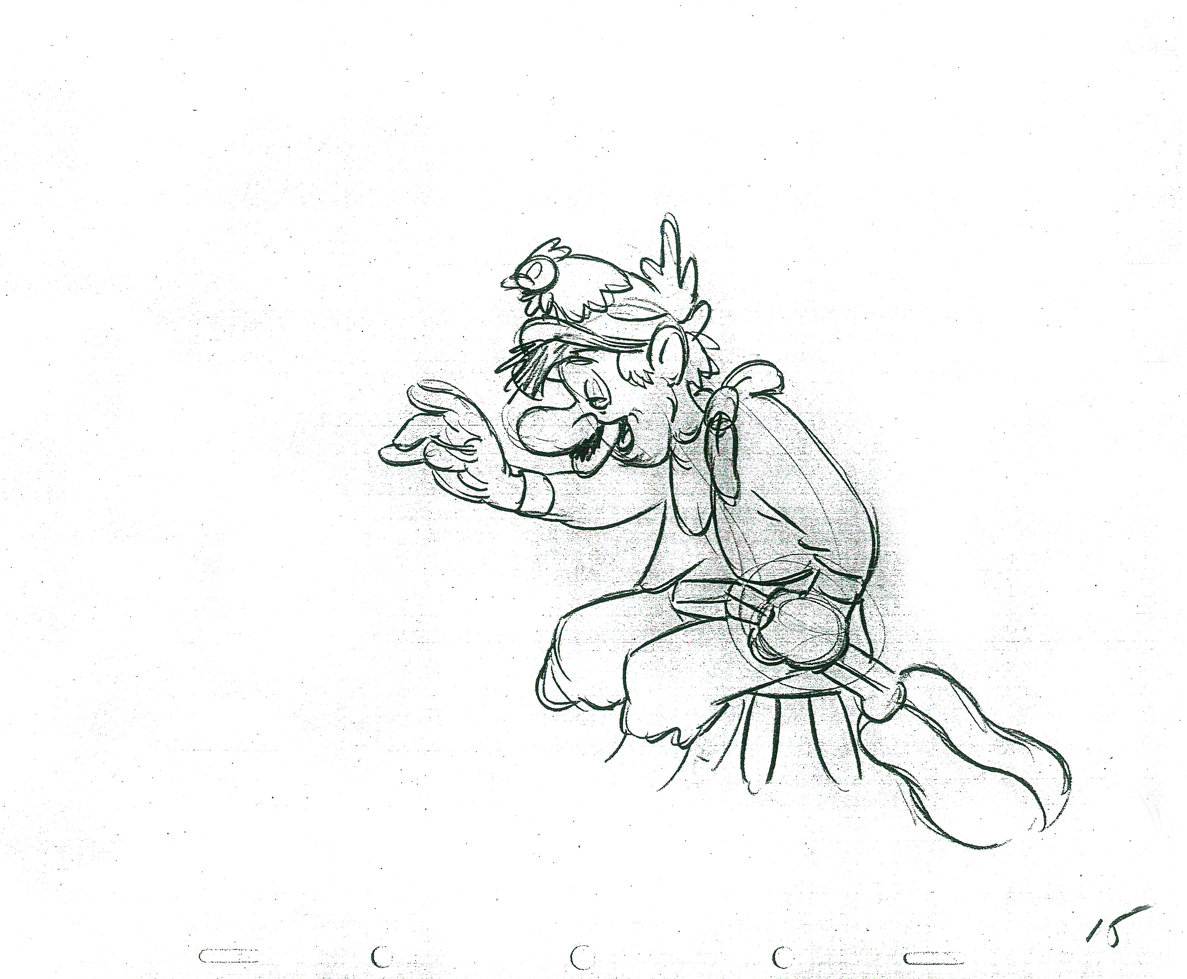
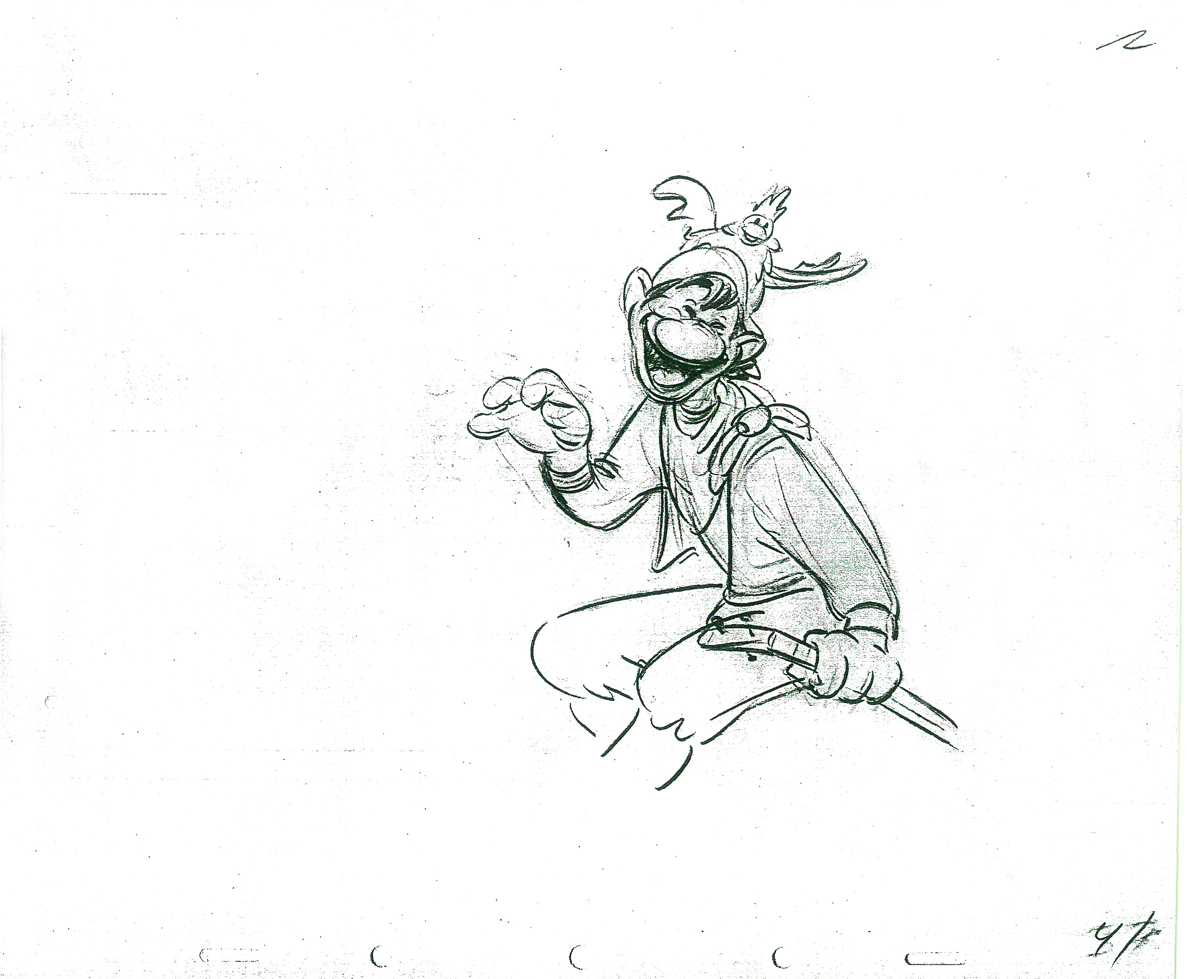
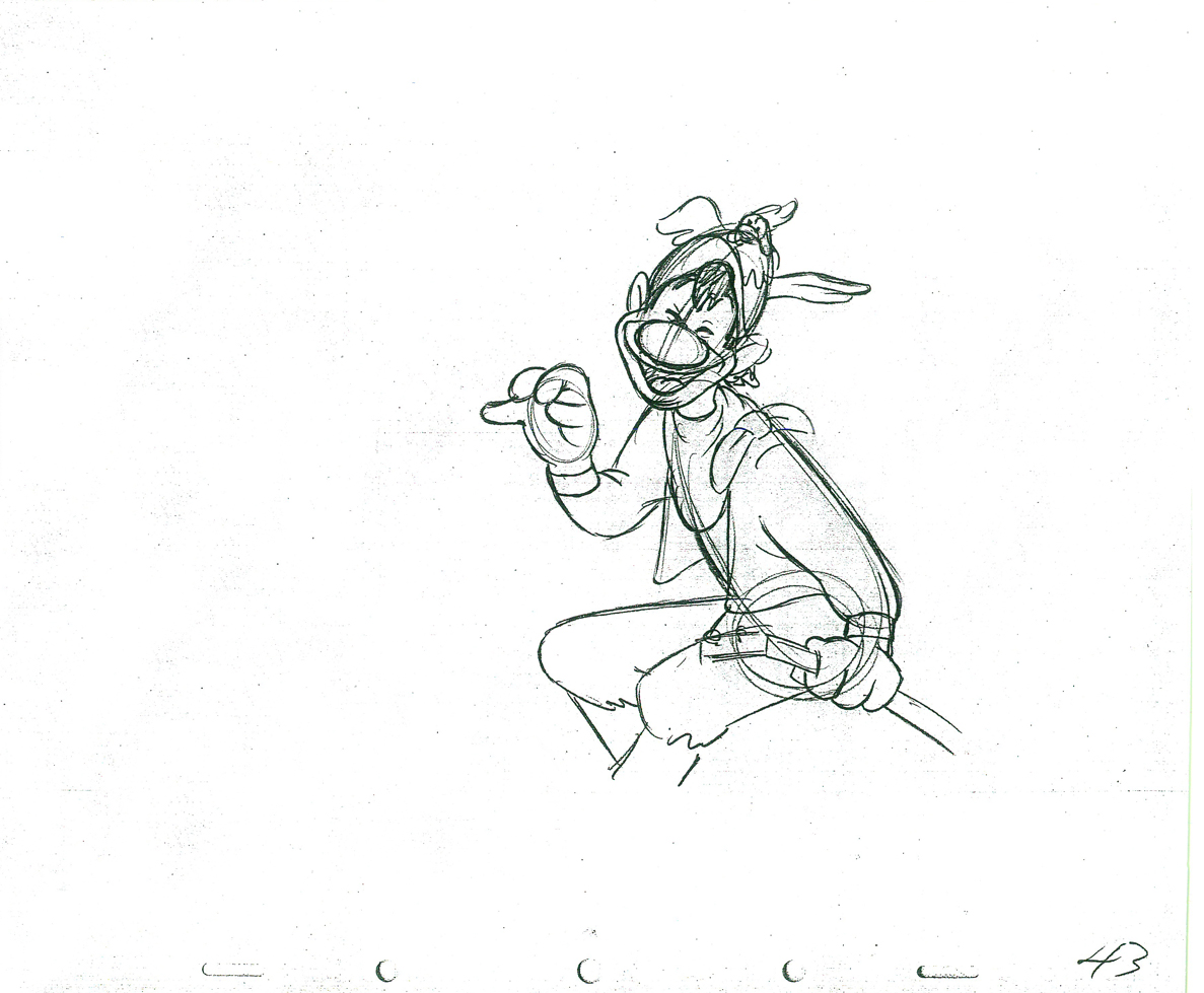
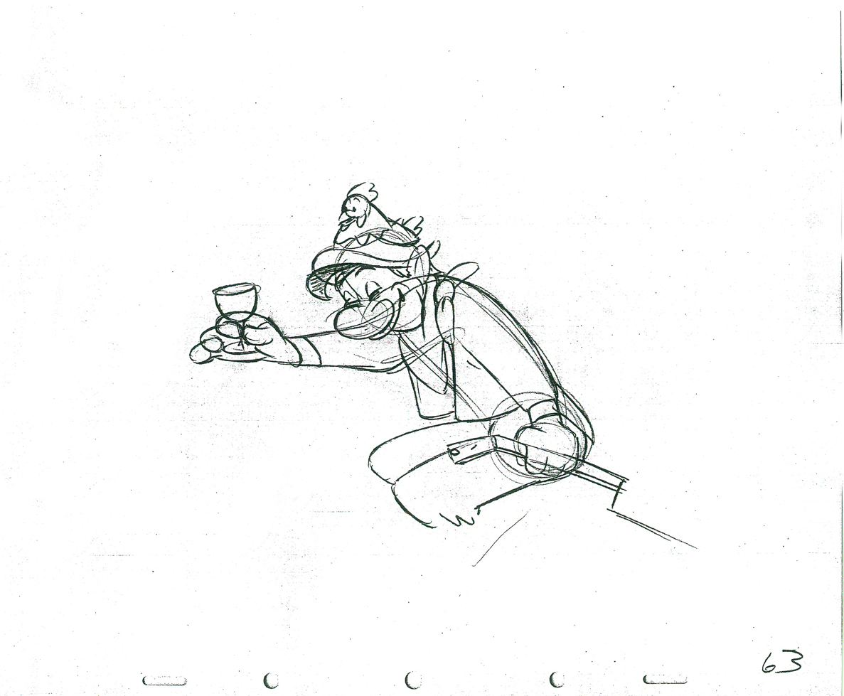
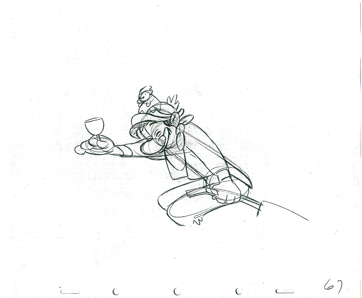
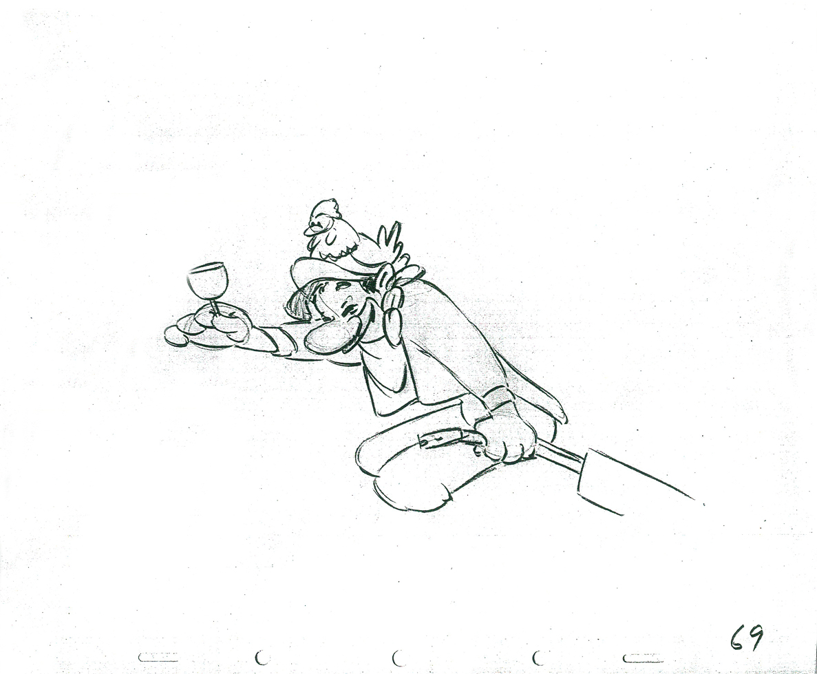
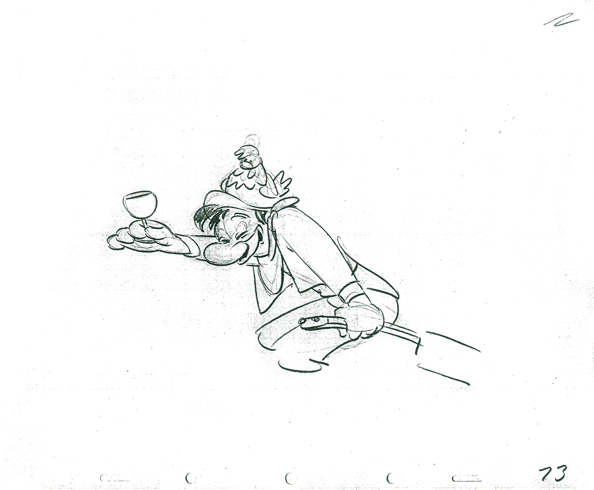
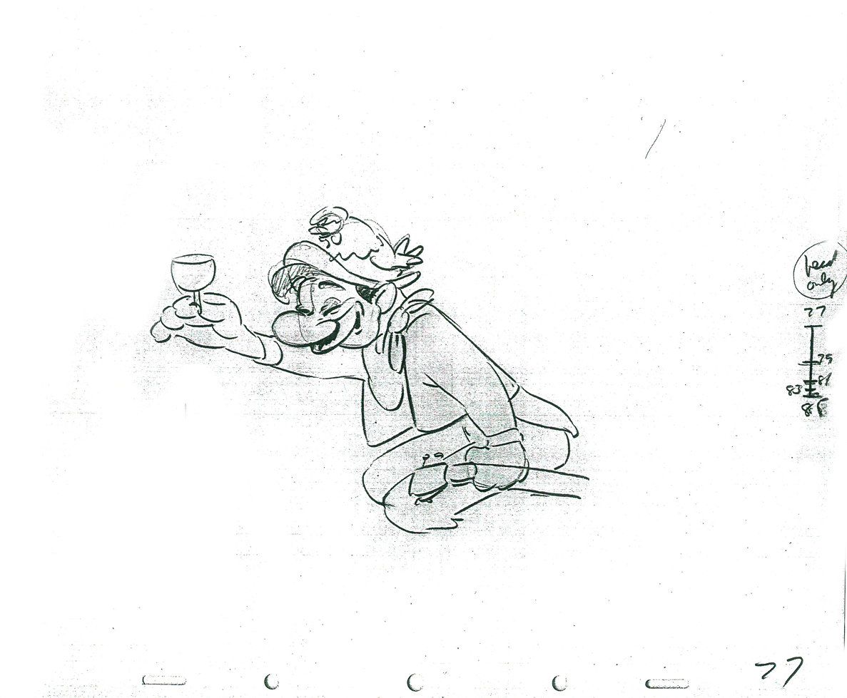
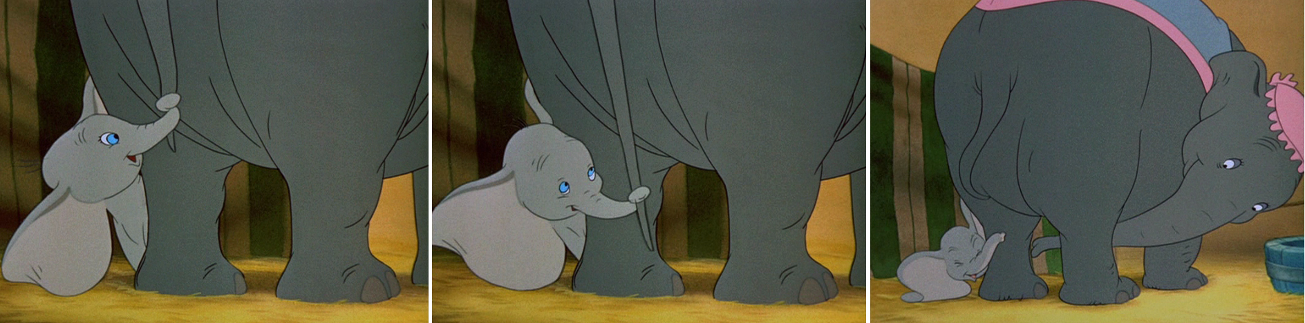
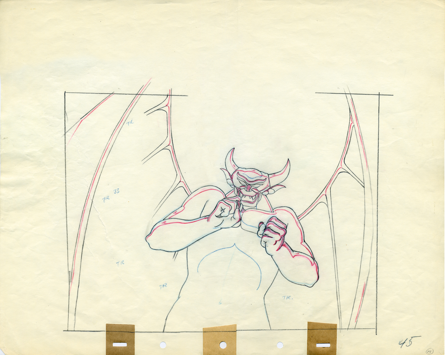
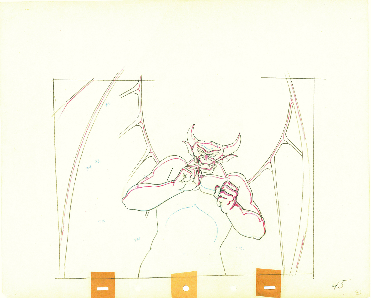
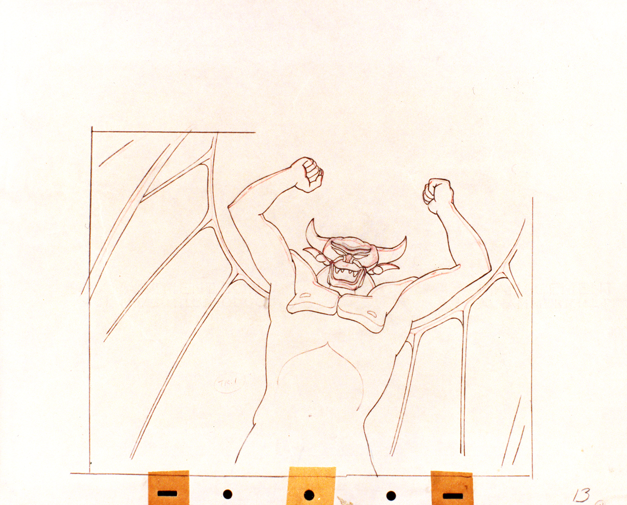
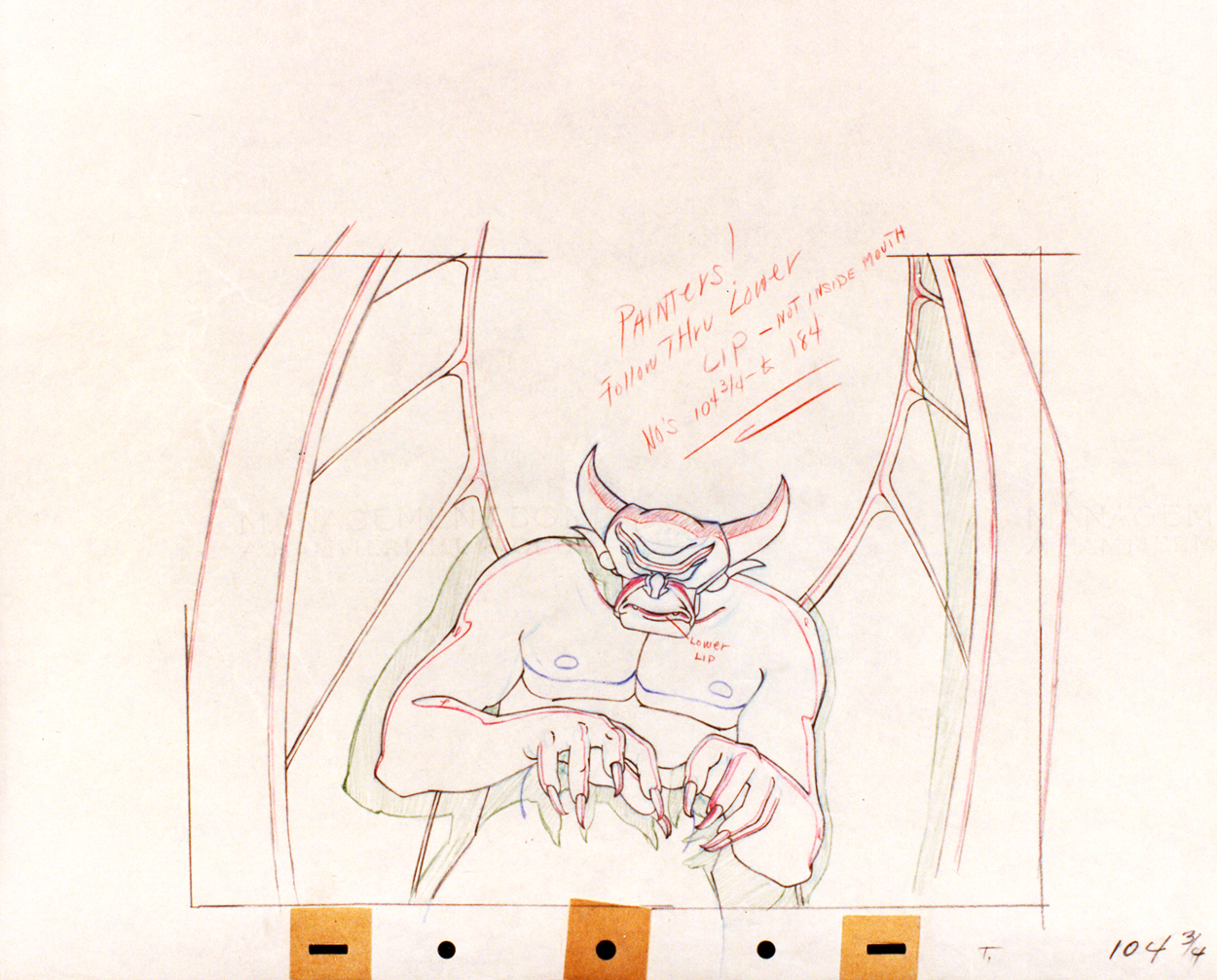
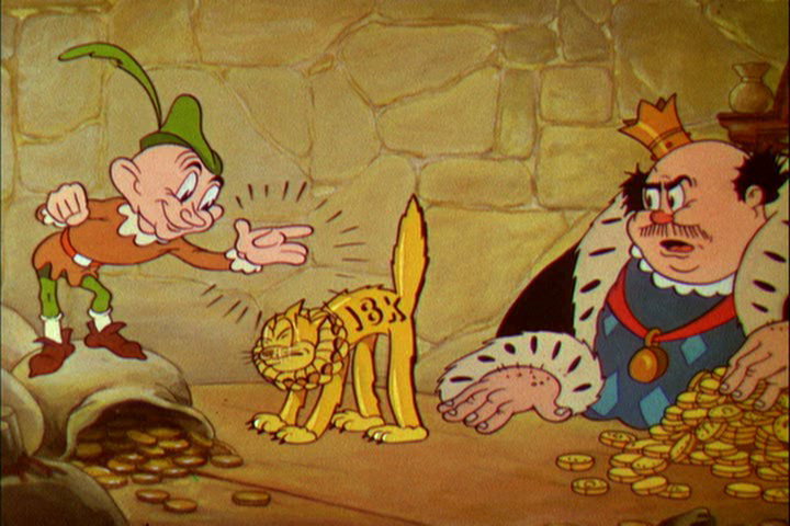
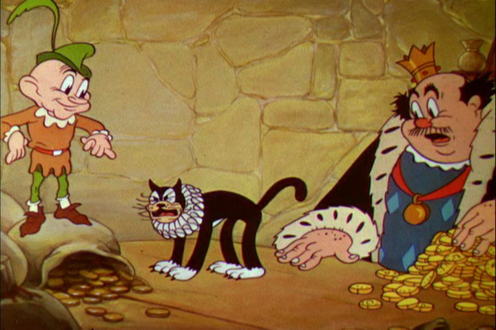
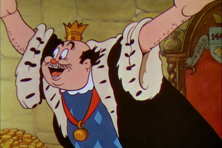
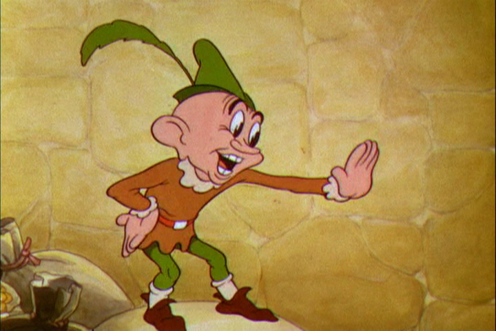
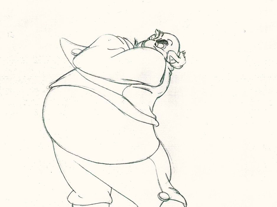
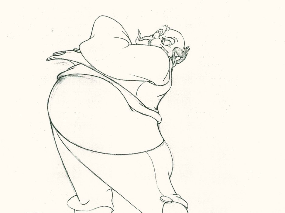
Here’s the last of the three posts I’ve been able to cull from the drawings left behind in Vince Cafarelli‘s things. The 60 second spot was animated by Lu Guarnier and clean-up and assisting was by Vinnie.
Within this post there are drawings from two separate scenes. If you look at the storyboard (I’d posted the entire board in another post, but I’ve pulled the particular frames from the board to show again here), you can see what it is the characters are saying. I don’t have all the drawings for these two scenes; just those I’ve posted.
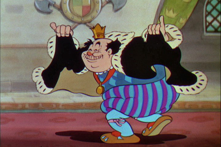
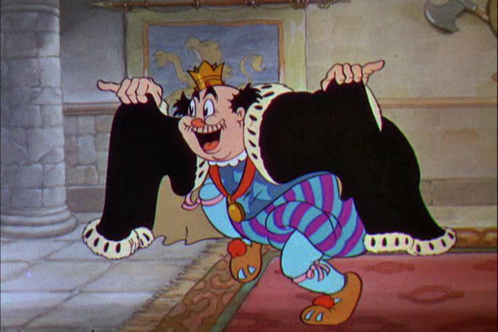
I’m also going to use these drawings of Lu’s to write about his style of animation. I was taught from the start that this was completely done in an incorrect way. I don’t mean to say something negative about a good animator, but it is a lesson that should be learned for those who are going through the journeyman system of animation.
 Right from the get-go I had some difficulty assisting Lu’s scenes. He started in the old days (early-mid Thirties) at Warner Bros, in Clampett’s unit, and moved from there to the Signal Corps (Army); then to New York working at a few studios before landing at UPA’s commercial studio. After that, he free lanced most of his career, as had so many of the other New York animators. They’d work for six months to a year at one studio then would move on to another.
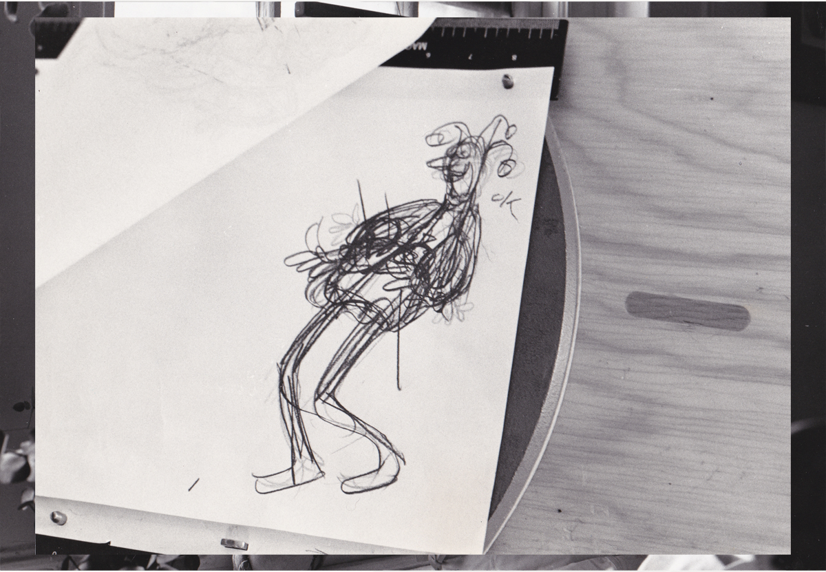
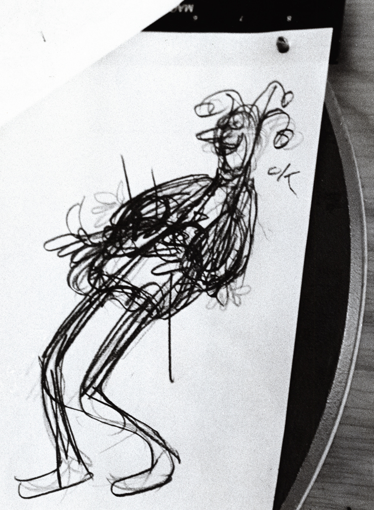
I suspect the problems in Lu’s animation all generated from the training he’d gotten at WB. Lu worked in a very rough style. No problem there. An animator should work rough. These drawings posted aren’t particularly rough, but in his later years (when I knew him) there was hardly a line you could aim for in doing the clean-up. His style was done in small sketchy dashes that molded the character. Rarely was it on model, and always it was done with a dark, soft leaded pencil. There were others who worked rougher, Jack Schnerk was one, but Lu’s drawing was usually harder to clean up.
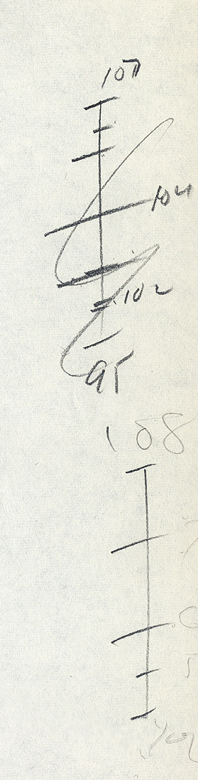
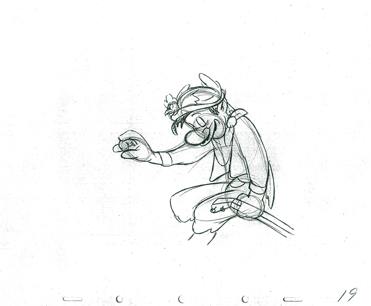
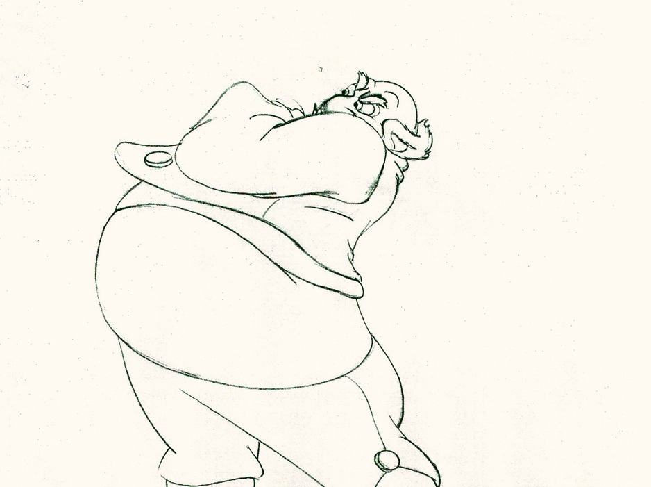
There was a rule that came out of the Disney studio, and, as both an animator and an assistant, I’ve followed it closely. When doing the breakdown charts (those ladders to the right of the drawing) all inbetween positions had to be exactly half way between drawing “A” and drawing “B”. If the animation called for it to be 1/4 of the way, you’d indicate that half-way mark then indicate your 1/4. If a drawing had to be closer or farther away – say 1/3 or 1/5th of the way – the animator should do it himself. This, as I learned it, was the law of the land. However, Lu would rarely adhere to it, and an assistant’s work became more complicated. The work was too easily hurt by a not-great inbetweener. I’ll point out an example of Lu’s breaking this rule as we come to it).
 bd.1
bd.1
 H1
H1
 B7
B7
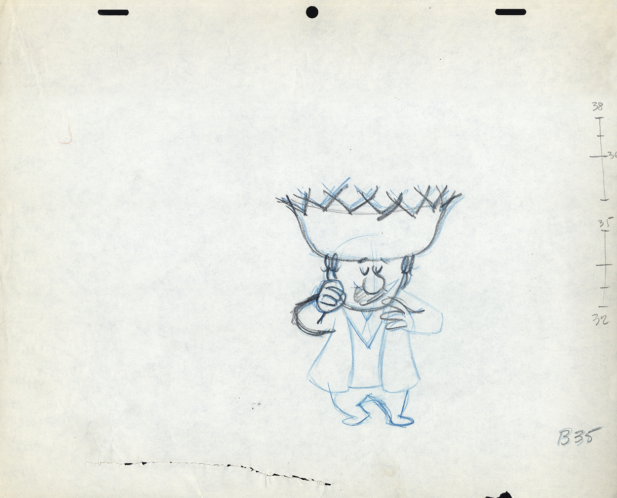 B35
B35
These ladders are done correctly, per the Disney system.
#34 is half way between #32 & #35;
#33 is half way between #32 & #34.
#36 is half way between #35 & #38;
#37 (the 1/4 mark) is half way between #36 & #38.
However, Grim Natwick told me
- demanded of me –
that all ladders should appear on the lower numbered drawing.
The ladder here should be on drawing #32 for all art
going into the upcoming extreme, #38.
Lu never followed this rule, which means the
assistant generally had to search for the chart.
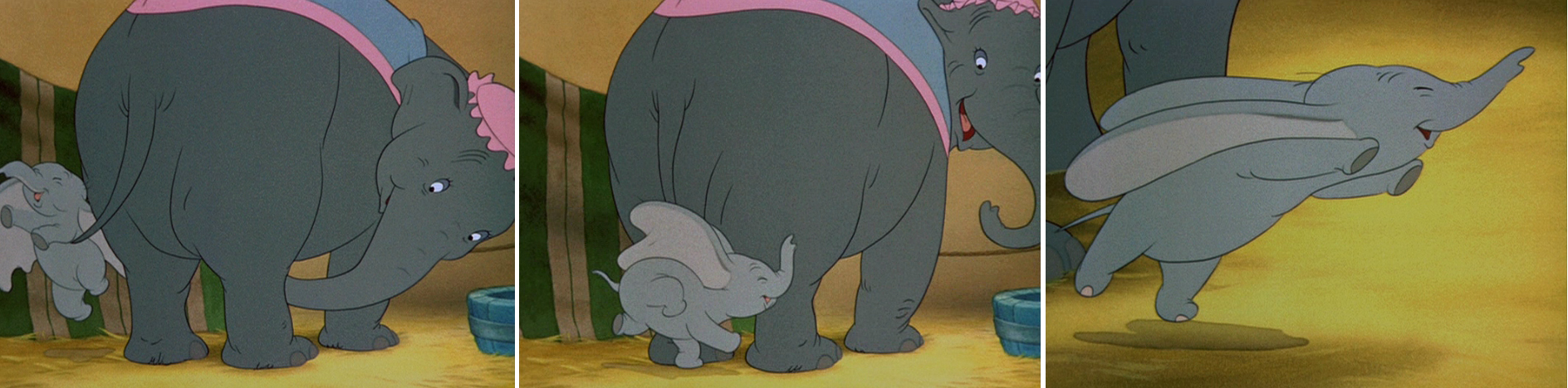
The Second scene
 bd.2
bd.2
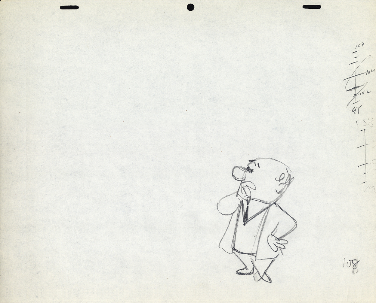 B108
B108
This ladder is typical of Lu’s animation.
It would seem that #106 is 1/3 of the way between #108
and #105 is half way between #106 and #109.
and it also looks like #107 is 2/3 of the way between #108 and #109.
Because the numbers come on the last of the extremes, here,
more confusion is allowed to settle in.
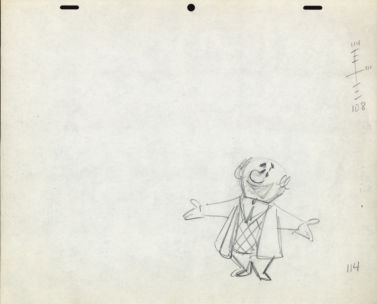 B114
B114
 H1
H1
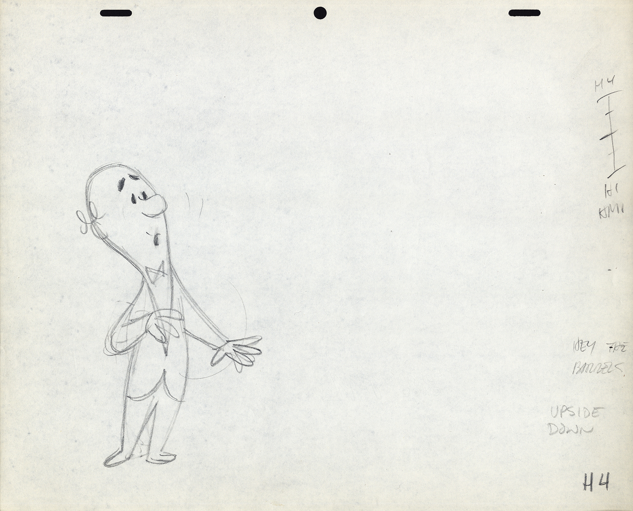 H4
H4
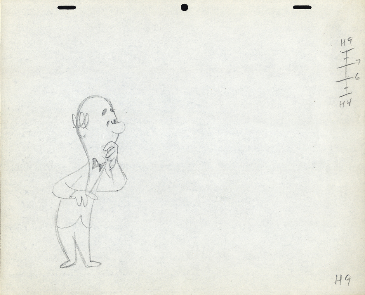 H9
H9
Again, the ladder appears on the later extreme. The assistant
shouldn’t have to go looking for it. The ladder should be on
the first drawing involved in the breakdown.
Again, the breakdown drawings are on 1/3′s, and
the inbetweens are 1/2′s of that. It makes it harder on the
people following up on the clean-up & inbetweens.
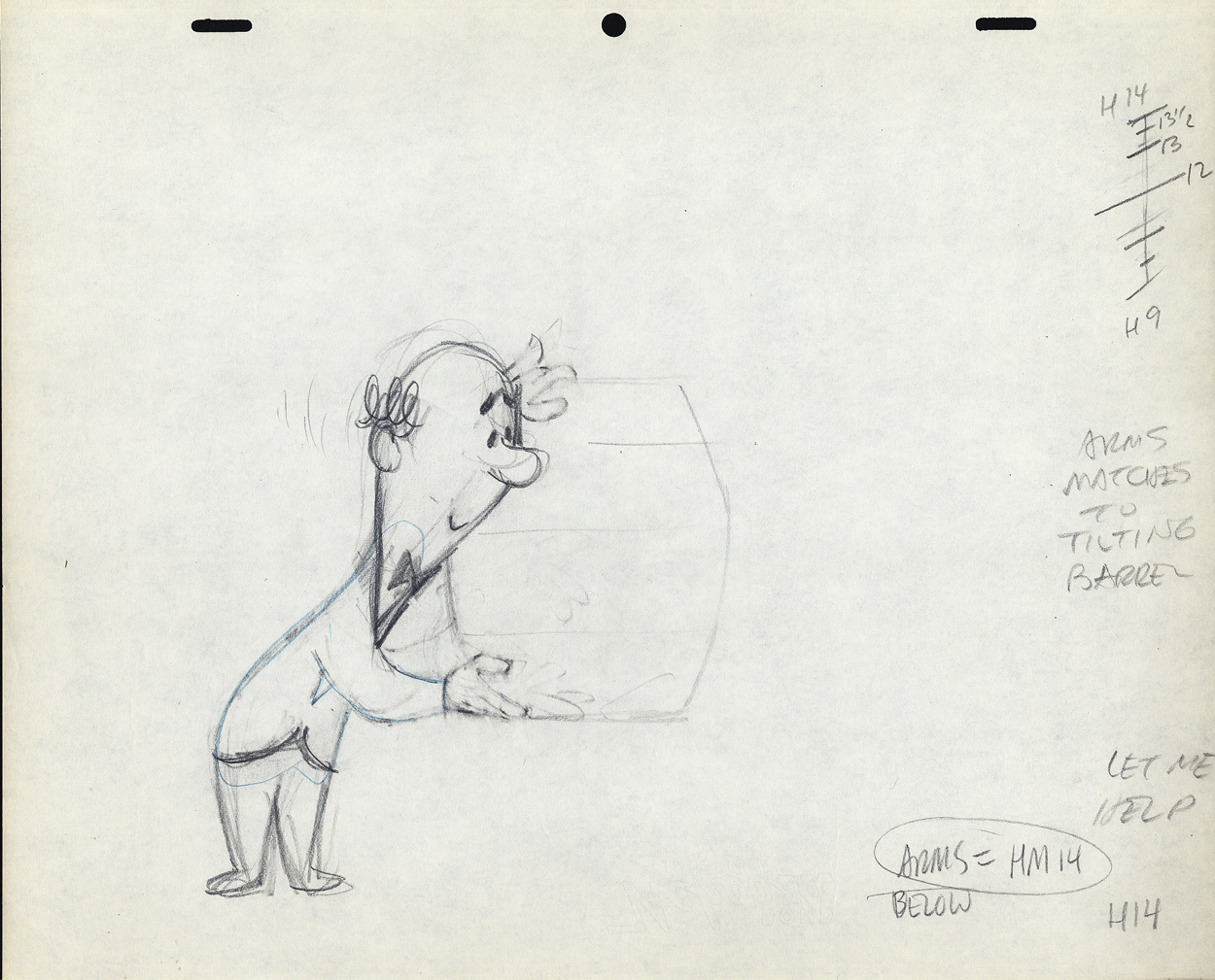 H14
H14
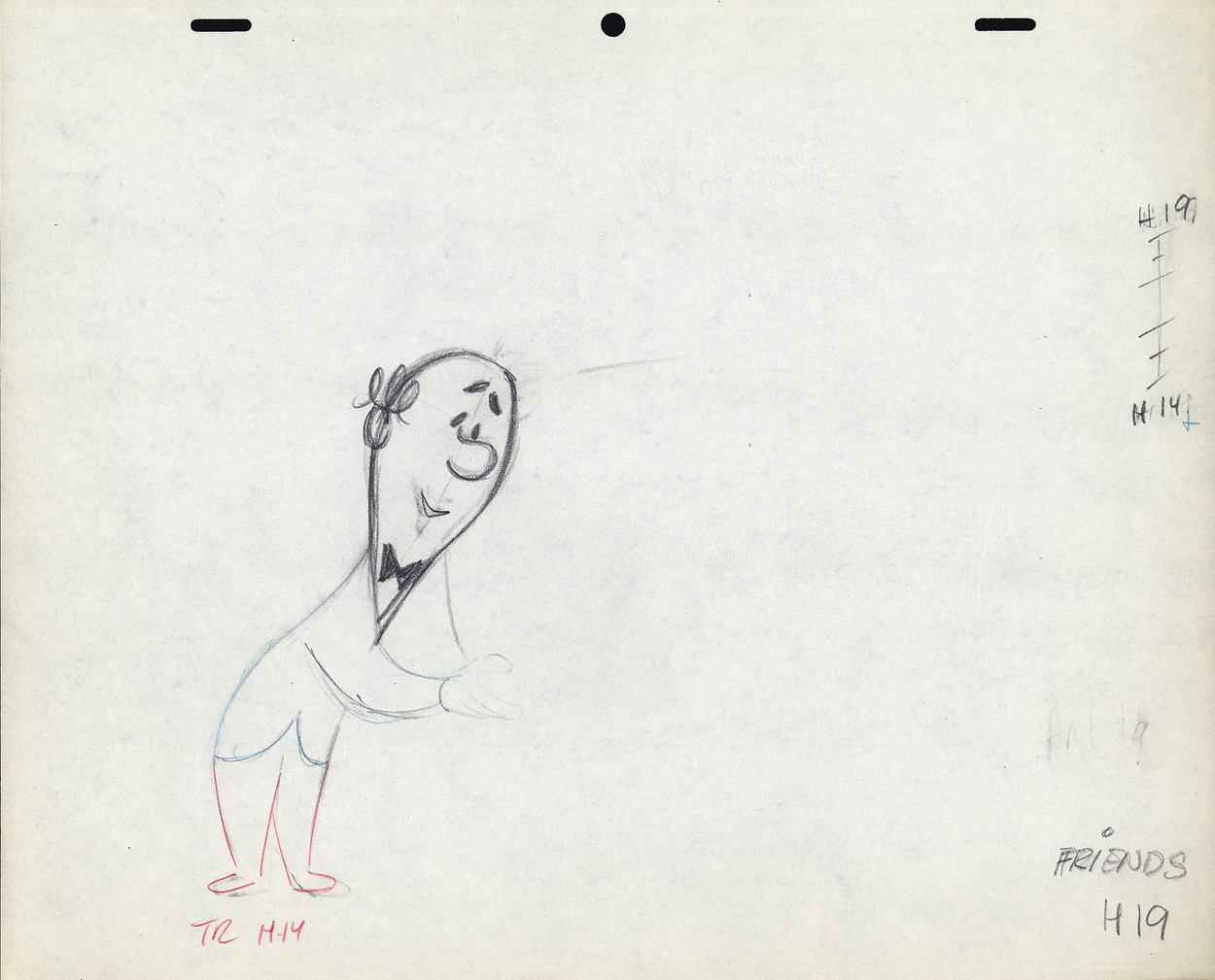 H19
H19
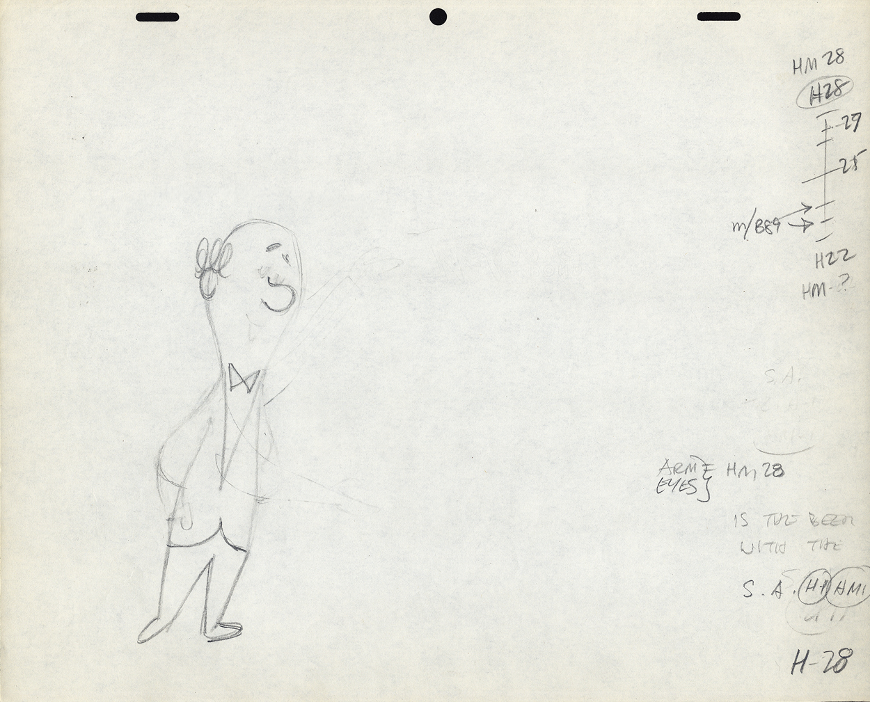 H28
H28
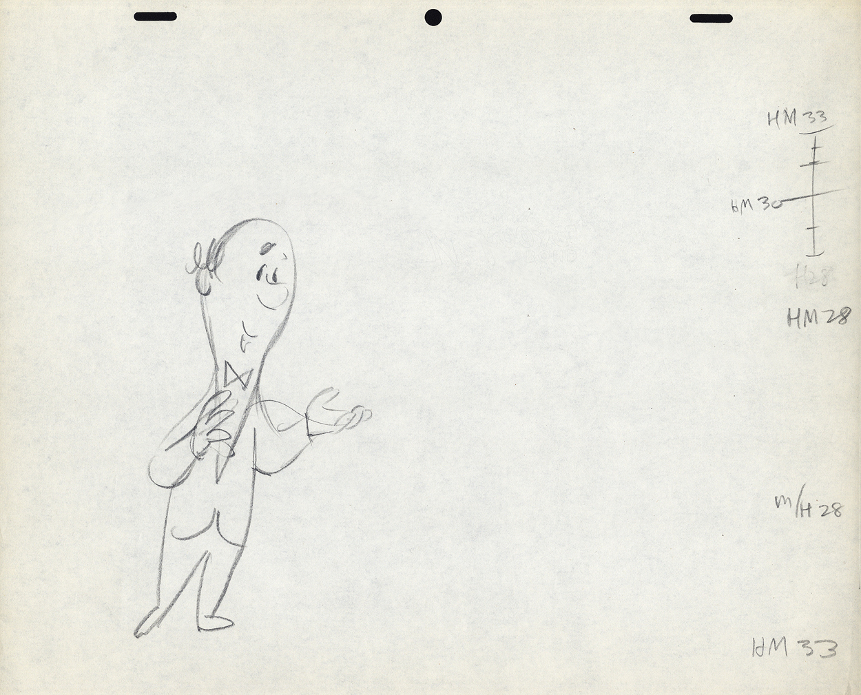 H33
H33
 H34
H34
I don’t know if this style of Lu’s was a product of where he learned to animate or not. Jack Schnerk, a comparable animator – whose work I loved (even though he had a rougher, harder to clean up drawing style) – always broke his timing in halves and halves again. There were times when his animation went to one’s and he did most of all the drawings. I assumed he had an unusual timing, and he didn’t want to burden the Assistant with his schema. He also always carried the breakdown charts on the earlier numbered drawing – per Grim Natwick’s comment. In some way I felt that Lu was rushed to get on with the scene, and whatever method he used would be to get him there more quickly. (It was the assisting that was slowed down.) This may have been a product of his attempts to devise some type of improvisation in the animation. Lu’s work, on screen, was usually excellent, so he didn’t much hurt anything in his method.
It might also have been his method of trying to put SNAP into the animation. This was a WB trait from the mid-late Thirties. It was certainly in Lu’s animation. No doubt a hold-over from Clampett’s early days of directing.
The final thing to note is that Lu usually worked on Top Pegs. Animating on Top Pegs makes it impossible to “roll” the drawings and check on the movement of more than 3 drawings. You can only “flip” the three, checking the one inbetween, but it didn’t give you a good indication of the flow of the animation. This is obviously necessary in animating on paper. It also made it difficult for the cameraman as well as those following behind the animator. If there were a held overlay, this would have to be on bottom pegs since the animation is on top pegs. That requires extra movement of the expensive cameraman to change all the animation cels after lifting the bottom pegged overlay. It also risks the possible jiggling of the overlay as it’s continually moved for the animating cels.
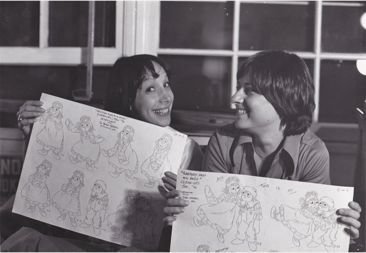
Books &Commentary &John Canemaker &Photos 28 Apr 2013 05:55 am
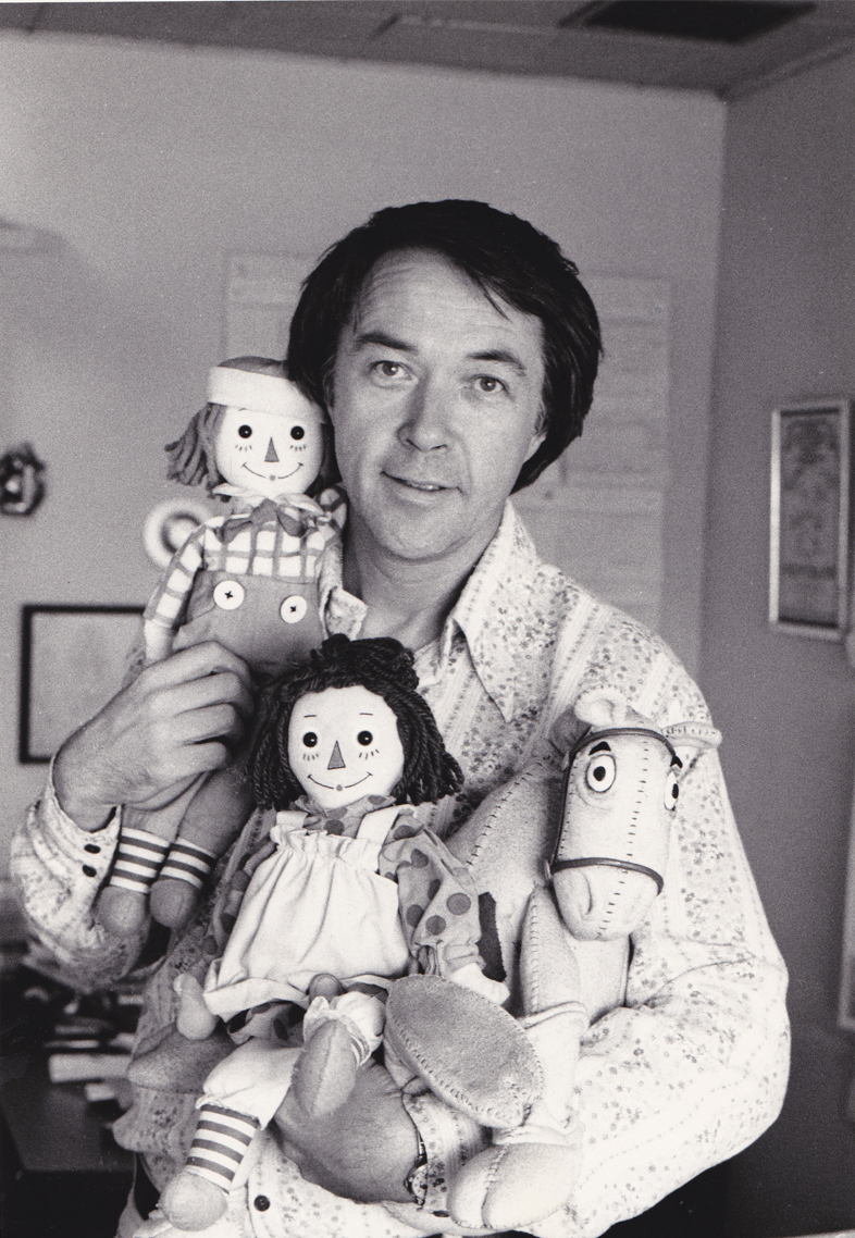
Raggedy Ann Photos
- John Canemaker recently loaned me a stash of photos of the Raggedy Ann crew. These were pictures that were used in his book on the “making of”. It was a better book than movie (as they often are). There are also some photos that didn’t make it to the book. John Canemaker shot all the photos, himself and all copyright belongs to him.
I thought I’d post the pictures and add some comments that pop off the top of my head. Hopefully, a couple of interesting stories will show up in my memories.
There are enough photos that it’ll probably take about three posts to get them all in. The next two Sundays are booked, I’d guess.
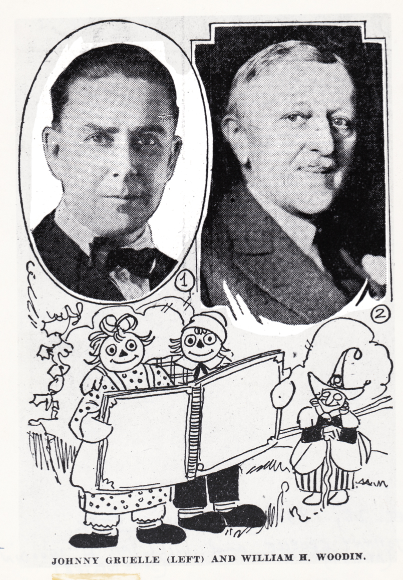 1
1Johnny Gruelle (artist, writer) and William H. Woodin (song writer)
Dec.28, 1930 Indianapolis Star – “Raggedy Ann’s Sunny Songs”
This was apparently a theatrical piece Johnny Gruelle
put together with his very successful characters.
 2
2
It all started with Joe Raposo, the composer of “Bein’ Green”
and many other hit Sesame Street songs. He wrote a musical for “Raggedy Ann
and Andy” and was made to see that it would make a wonderful animated musical.
 3
3
He wrote a lot of songs for the slim script and they prerecorded
the songs for the animation. We lived with a soundtrack of about
a dozen musicians playing this very nice score to the delicate voices
that sang the tuneful pieces.
 4
4
We heard this at least once a week as the animatic/story reel
grew into a full animated feature shot completely in Cinemascope.
 5
5
When the final film was released, that 12 person orchestra
became 101 strings and a big over-polished sound track.
No matter where you went the music was there and in the way.
It was too big, and the movie was too small. It was bad.
The track was incredibly amateurish. The composer had too much control.
 6
6
This was Richard Horner. He was one of the two producers of the film.
Stanley Sills (a Broadway producer and Beverly’s brother) was the
other producer who didn’t know what he was doing.
They represented Bobbs-Merrill who owned the property.
I really liked Mr. Horner. We met again a number of years later
when Raggedy Ann was distantly behind us. I’d offered to take Tissa to church,
one Easter Sunday; Richard Horner and wife were there. He asked to meet with me.
He sought advice on some videos of artists and their work that he was producing,
and hoped I could offer my help in leading him to some distributors.
 7
7
This is one of the dolls in the play room,
Susie Pincushion. She was charming.
 8
8
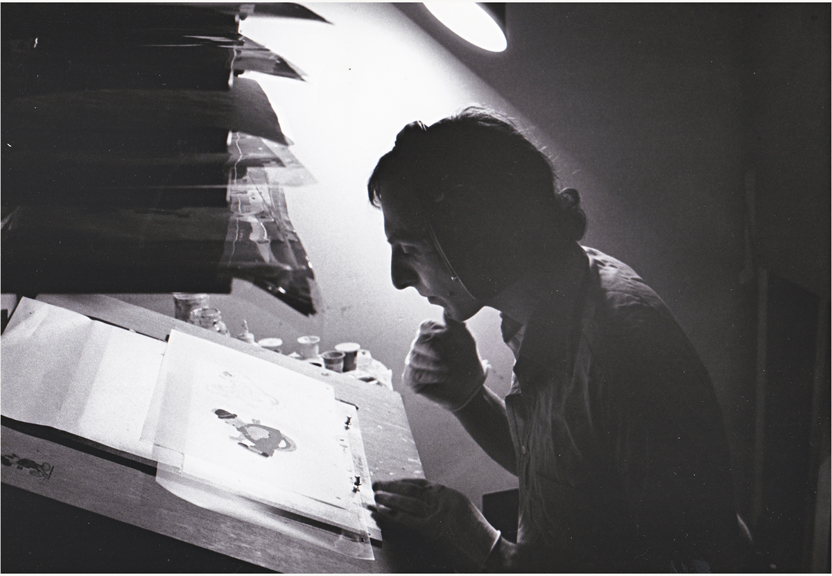
This is Cosmo Pepe; he was one of the leaders of the Xerox department.
It was Bill Kulhanek‘s department, but Cosmo really did great work.
They had this room-sized machine that they converted drawings into cels.
It was all new to NY, and the whole thing was so experimental.
Especially when Dick decided to do the film with grey toner rather than black.
The film always felt out of focus to me (even though it wasn’t.)
In the end when they rushed out the last half of the film, Hanna Barbera
sub-contracted the Xeroxing, and it was done in a sloppy and poor black line.
 9
9
This is Corny Cole. He was the designer of the film, and all the great art
emanated out of his Mont Blanc pen nib. Or maybe it was a BIC pen.
Whatever, it was inspirational.
I wrote more about him here.
 10
10
The gifted and brilliant animator, Hal Ambro. Can you tell that
I admired the man? I wanted badly to meet him during this production,
but that never was to happen. Now, I can only treasure his work.
 11
11
This is a very rough planning drawing that Grim Natwick did on
the Jack-in-the-Box he animated. See the scene here.
 12
12
Here’s a close up of that very same drawing.
 13
13
Mark Baker did the voice of Raggedy Andy.
He’d won the Tony Award as Best Featured Actor in the musical, Candide.
 14
14
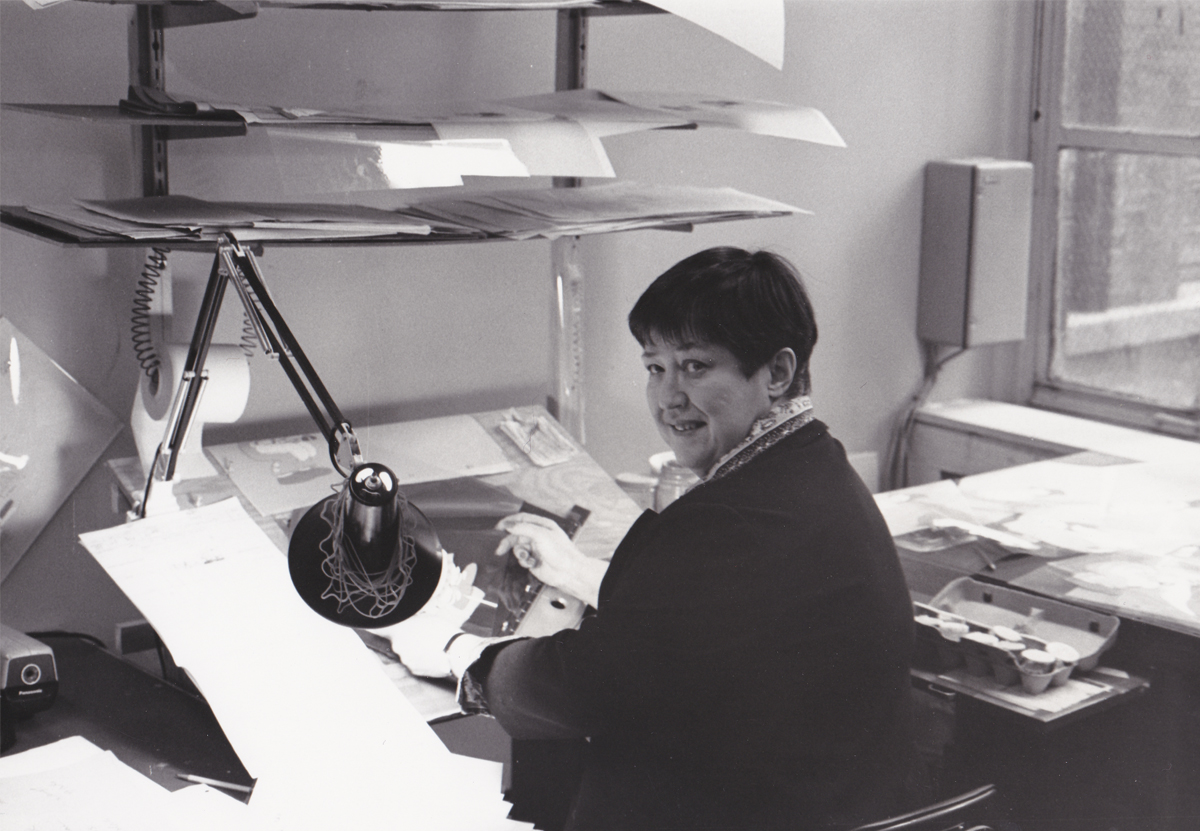
Didi Conn, the voice of Raggedy Ann, with Chrystal Russell, an animator
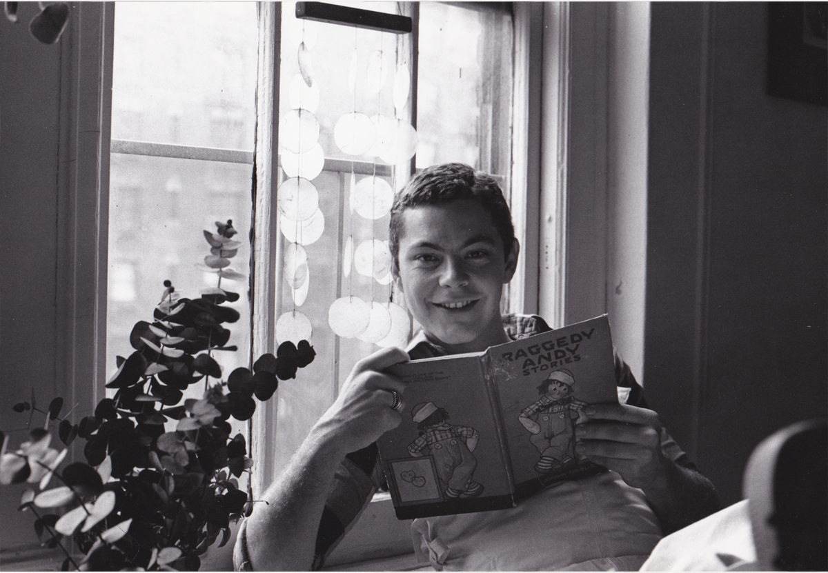
of Raggedy Ann. She backed up Tissa David who was the primary actor for
that character and did most of the film’s first half. Chrystal did many
scenes in the first half and most of the second.
She had a rich identifiable style all her own.
 15
15
Sue Butterworth, head of the BG dept who designed the watercolor style
of the film. Michel Guerin, her assistant, can be seen in the rear.
Bill Frake was the third part of that BG department.
 16
16
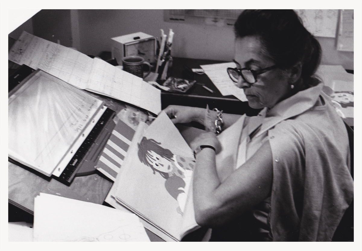
Painter, Nancy Massie. A strong and reg’lar person
in the NY animation industry. She’d been working forever for a reason.
On the average, I spent about an hour a day down in the Ink & Pt dept.
Often they had problems to resolve with some animator’s work. Either the
exposure sheets were confusing or they didn’t match the artwork, or there
was some question that they found confusing. My being available made it
helpful to them, and I did so without hesitation.
 17
17
Checker, Klara Heder. Another solid person
within the NY industry.
Generally, before a scene left my department for the I&Pt dept., I’d
have studied the exposure sheets and felt I knew the scenes before
they were handed out to the Inbetweener or Assistant. It meant taking
a lot of time with the work in studio so that I was not only prepared
to answer questions of a checker but the Inbetweener as well.
 18
18
Sorry I don’t know who this is. If you have info,
please leave it for me. For some reason, I’d thought
he was an inbetweener (which would’ve made it odd for
me not to recognize him by name.) Apparently he’s a painter.
 19
19
Carl Bell was the West Coast Production Coordinator.
We spoke frequently during the making of the show.
When I left the film, I went to LA for a couple of weeks.
Chrystal Russell threw a small party for me, and Carl came.
(I think he might have brought Art Babbitt, who was there.)
The group was small enough that we could have a talk that we all
participated in. We talked for some time (though not about
Raggedy Ann.) It was great for me.
 20
20
Jan Bell, Carl’s wife, was the West Coast Office Manager.
 21
21
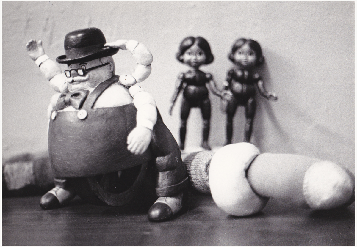
Maxie Fix-it. This was a great doll that wound up to get the legs going.
He rolled around the floor beautifully. The “Twins” in the back were animated
by Dan Haskett. though I’m not sure they gave him credit for it. I was a bit
embarrassed by these characters. They were just a naked bit of racism running
about our cartoon movie for very young children.
 22
22
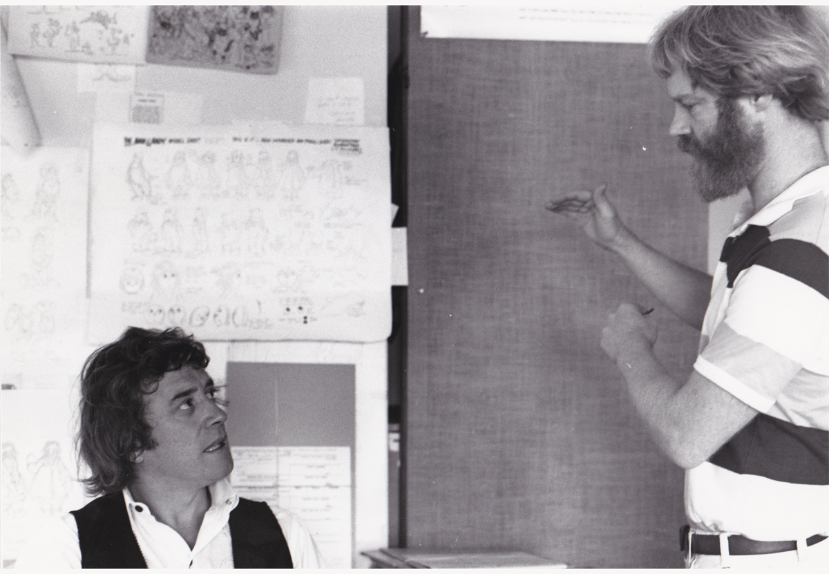
Gerry Potterton (left) and John Kimball (right).
Gerry was one wonderful person. I always enjoyed spending time with him.
He produced/directed a number of intelligent, adult animated films.
This includes an animated Harold Pinter‘s Pinter People.
After Raggedy, I tracked Gerry down to get to see Pinter’s People. It was
rather limited but full of character. Gerry knew how to handle the money
he was given, unlike some other directors.
John Kimball was, at the time, not in the caliber of Babbitt or Ambro or
David or Hawkins or Chiniquy. However, he did some imaginative play
on a few scenes which were lifted whole from strong>McCay’s Little Nemo
in Slumberland. One of these scenes I animated but was pulled
from it before I could finish it. I had too much else to do with the
tardy inbetweens of Raggedy Ann (an average of 12 drawings per day)
and the stasis of the taffy pit (an average of 1 inbetween per day).
Too many polka dots on Ann and too much of everything in the pit.
 23
23
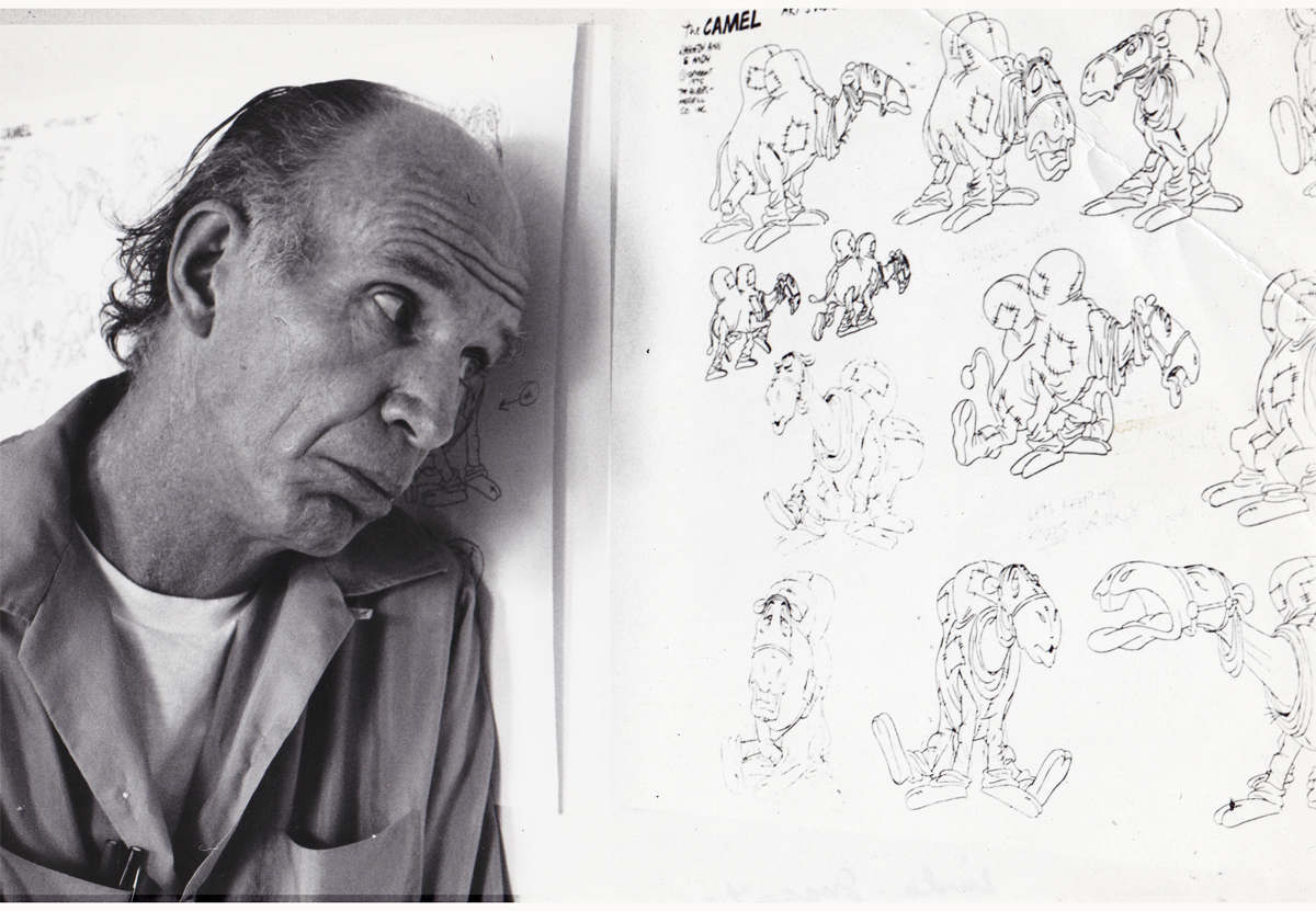
Fred Stuthman, the voice of the camel with the wrinkled knees.
He did add a great voice for the camel, though for some reason
I remember his being a dancer, predominantly.
All photos copyright ©1977 John Canemaker
.
Commentary 27 Apr 2013 05:08 am
Just Inquiring
 R.O. Blechman: The Inquiring Line is an exhibition that will take place at the Norman Rockwell Museum in Massachusetts and will run from May 11 through June 30, 2013.
Joyce K. Schiller, PhD., the curator of the Rockwell Center for American Visual Studies writes: “Quavering and active with telling starts and stops, the marks of the artist’s hand are an essential aspect of (Blechman’s) art. His fine calligraphic strokes are a kind of nervous energy that gives the sense that his drawings could spring from the page.”
There will be an exhibition opening where you can meet the artist. On Saturday, May 11, from 6 to 8:30 p.m. There will be an Artist Commentary at 6:30 p.m. A festive reception will follow, including refreshments and a cash bar. Members free, guests $20. Please RSVP at (413) 931-2221 or rsvp@nrm.org.
Then on Saturday, June 15, 5:30 p.m., there will be “A Conversation with R.O. Blechman and Nicholas Blechman.” Father and son will discuss each other’s work. Bob is the illustrator, designer, film director and producer. Nicholas is the Art Director of the New York Times Book Review. The fee to attend the talk is $10 ($7 for Museum members).
Richie Havens
 – The recent passing of Richie Havens brought back a short memory I have from a number of years ago. I think it was 1984.
I’d received a call out of the blue from Mr. Havens. Now, remember I grew up in the Sixties and was a part of the “Woodstock Generation.” I loved the music of the period and Havens was a big part of that – especially to a New Yorker. This call was a shock. I was asked to come meet with him about an animation project he was assembling. No questions asked, I got the date and time and showed up.
(Thanks to Annulla who photographed the picture to the left for her blog, Blather from Brooklyn)
It was in the very theatrical (albeit seedy at the time) area of 8th Avenue and 56th Street. I arrived to a very large open space. A very wide open, not-overly-furnished space. After a brief greeting, I was directed to the only other seat in the room – easily ten or more feet away in the somewhat dark room. Richie Havens, dressed in dashiki, was graced with some light that offered a halo around his head, and I sat out of the spotlight.
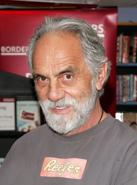 Apparently, Tommy Chong had decided to make an animated feature. He wanted to film a Kung fu style movie in live action and rotoscope this into an animated film. Richie Havens was acting as his representative and was interviewing me for the position of assisting Mr. Chong in any way possible to get this film made. They saw this as a complete breakthrough feature for animation. Nothing had been done like it before.
My alarms went off, and I decided I shouldn’t be too enthusiastic about the project. I didn’t want to turn them down on the spot, but I didn’t want to be involved. Rotoscoping and Kung fu movies were not my – - – interest.
It was a not very long meeting; there weren’t many specifics Mr. Havens could offer at the time. It was the earliest of stages. I left my samples, shook his hand again, and still remember the meeting some twenty years later. I think it was another of those films that never got made.

Perhaps the film would have looked like this.
Gun Violence
A few weeks back, I was chatting with a friend, Peggy Stern. She was the producer for John Canemaker on his Academy Award winning film, The Moon and the Son: An Imagined Conversation. Peggy talked about working with Philip Seymour Hoffman on a PSA. Soon enough, and just in time for the US Senate to vote it down, a video arrived via email to promote the idea of getting Congress to come up with some gun safety legislation. (Fat chance in this country!)
The video is the one Peggy had produced and not only has Philip Seymour Hoffman, but it also works with Julianne Moore narrating. It’s a nicely animated Flash piece, but the message is everything. (I wish I had been involved – it would have had more REAL animation instead of Animatic-like moving imagery. This is an issue I believe in and support, and I’d have done it gratis.)
The press line for the video reads:
- Mayors Against Illegal Guns, recruited dozens of the nation’s best cartoonists for the short film, which encourages citizens and lawmakers to take action to end gun violence in the U.S.
Take a look for yourself.
Lou Bunin at Auction
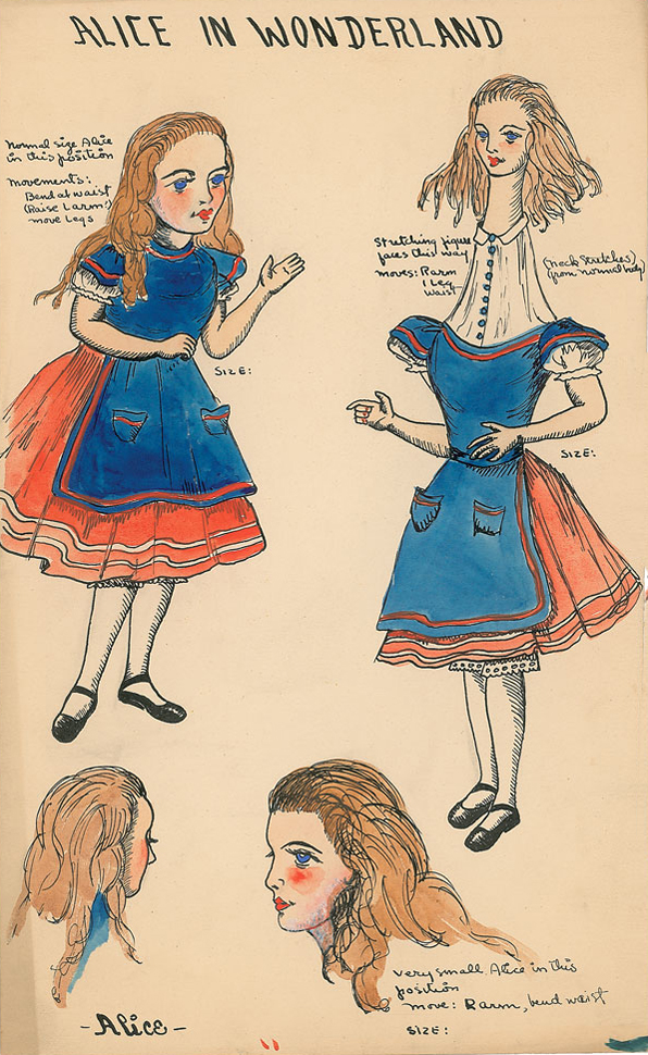
I received word that a portion of the Lou Bunin estate including some of their Alice in Wonderland Collection is currently up for sale at RR Auction. Go here.
You can see some of the items on view; these include puppets, drawings, watercolors and figurines. The prices are workable, and the items include many gems.
Oh, yeah. They’re also auctioning some Disney material. Most of it is later things (Winnie the Pooh cels, etc.) but there are quite a few other collector’s items available and worth a look.
Ginger
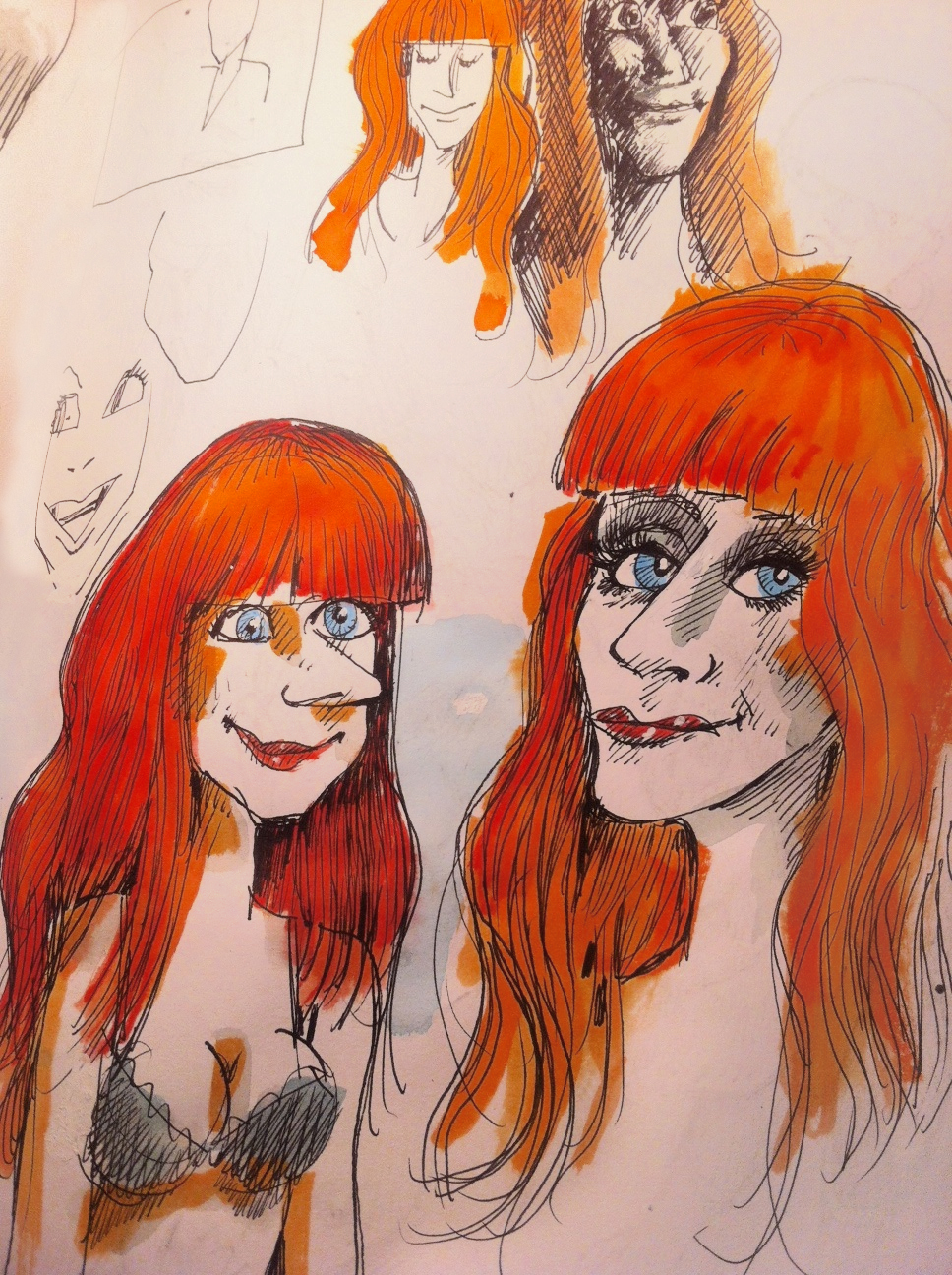
Tom Hachtman continues his series of redheaded women. This is the latest sketch of many he’s sent me.
_____________________
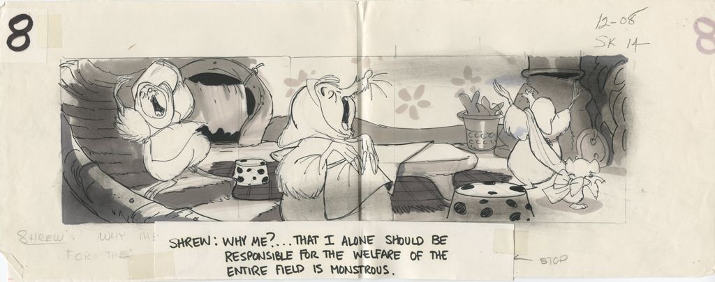
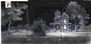
Bluth Art
Mark Sonntag contacted me this last week to let me know that the Don Bluth collection of Animation Art was now located at the Savannah College of Art and Design and could be viewed on line. There, you can find art from Anastasia, Banjo the Woodpile Cat, Dragon’s Lair, Rock-A-Doodle, Secret of Nimh, Space Ace and Thumbelina. These include storyboards, preproduction art, background layouts and cel setups.
Here are some pieces I pulled from The Secret of Nimh, my favorite of the Bluth films (for all its many faults.)
 1
1
 2
2
 3
3
 4
4
 5
5
Storyboard Sketches
A short sequence
 1
1 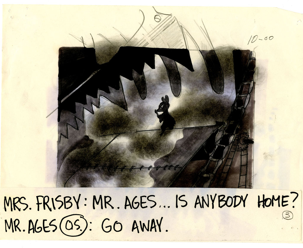 2
2
 3
3 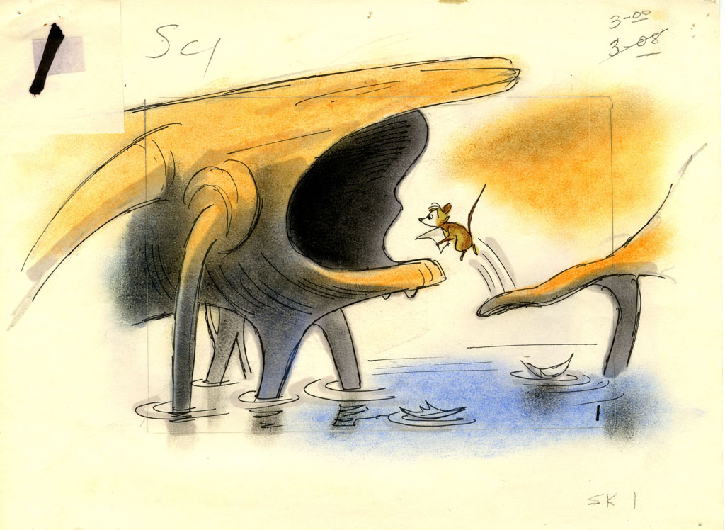 4
4
 5
5 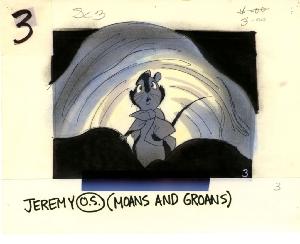 6
6
 7
7 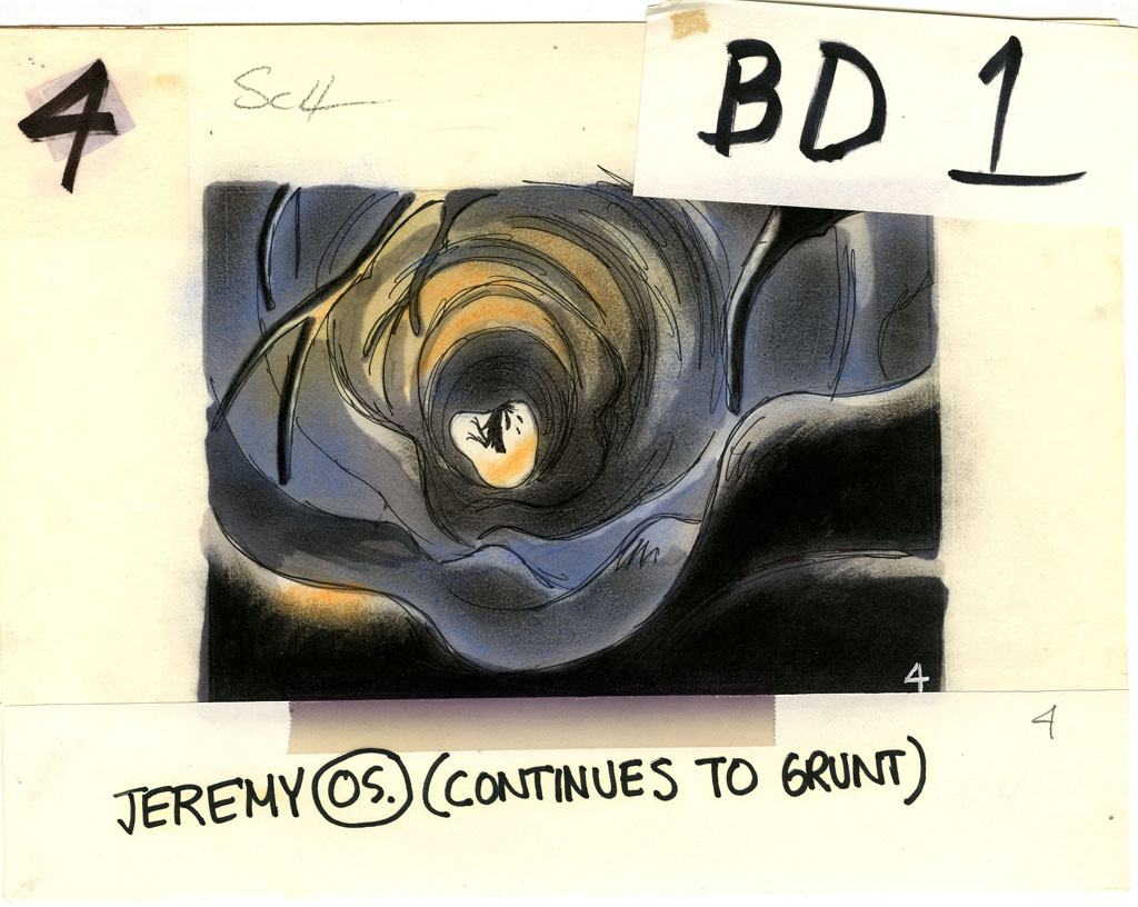 8
8
 9
9 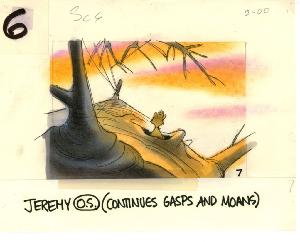 10
10
 11
11 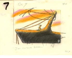 12
12
 13
13  14
14
 15
15  16
16
 17
17 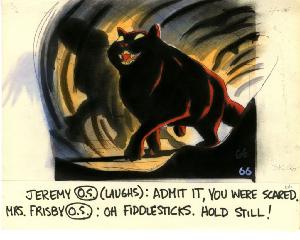 18
18
 19
19 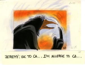 20
20
Random Bd Sketches
 1
1
 2
2
 3
3
 4
4  5
5
 6
6 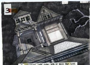 7
7
 8
8 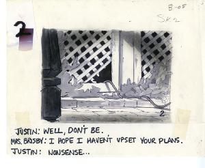 9
9
 10
10 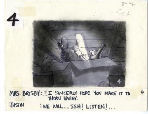 11
11
 12
12
Many more are on display at the site. It’s the entire storyboard for The Secret of NIMH that can be viewed, one sequence at a time. Beautiful artwork, indeed.
Commentary 20 Apr 2013 07:30 am
Selects
Congratulations to Candy Kugel and all the others at Buzzco, including animator Rick Broas and partner Marilyn Kreamer, for the screening of their film, The Last Time, as part of the Tribeca Film Festival. The film premiered this past Wednesday and will play four more times see schedule below) as part of the program, Let There Be Light: The Cycle of Life.
The Last Time is an animated tribute to Candy’s late partner Vincent Cafarelli, after the end of a 38 year partnership.
The remaining screenings will take place as follows:
One Last Time
Tuesday 4/23/2013 at 5:30 PM at Clearview Cinemas Chelsea 4
Friday 4/26/2013 at 6:30 PM at Clearview Cinemas Chelsea 6
Sunday 4/28/2013 at 11:00 AM at Tribeca Cinemas Theater 2
Moving Innovation
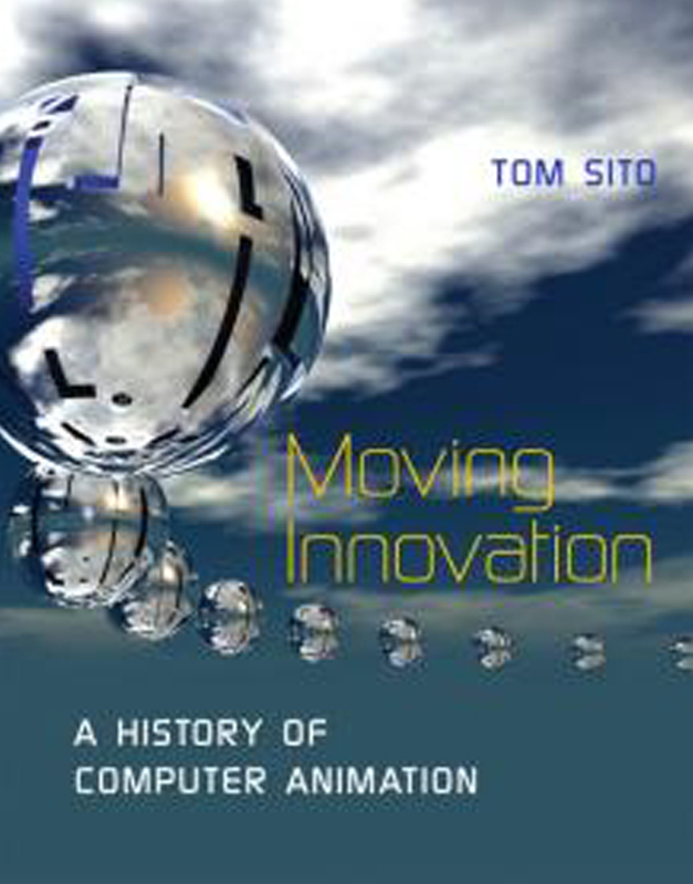 - Tom Sito will be in the USC Cinema School Courtyard on Weds, April 24th from 11;30-1:30 to sign copies of his brand new book, Moving Innovation: A History of Computer Animation. I think this is the first of its kind, a history of computer animation. From my miniscule standing point, it feels like too soon to be writing a history of the medium, but it’s obvious I’m wrong. All that time with NYIT and Robert Abel and LucasFilm.
My knowledge of computer animation is close to nil, so i would like to know something about it. It’s probably my largest gaping hole in my knowledge of animation, and I do feel a bit guilty about that. I keep putting my toe in the water, but I don’t seem to have much of an inclination to learn a lot about the subject.
I’ll definitely read the book once I can get my hands on a copy. After I’ve done so, I’ll tell you what I think of it. Tom’s got a nice amiable writing style, so he should be the perfect one for the subject. Looking forward to it.
A New Animation Company
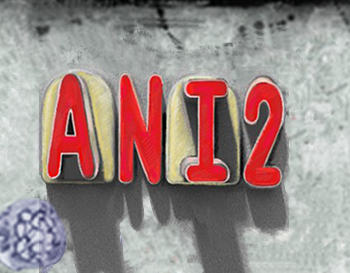
Animators Lee Corey and Frank Rivera have teamed to create the new animation company Ani 2. They write that their “specialty is pre-production and animation offering a mix of hand drawn digital 2d character animation, character design and creation, traditional art, VFX, stop motion, whiteboard, 3d design and backgrounds.”
Their website shows the sample reel, gives an indication of a series they’re developing and has a complete rundown of their bios.
Ani2 Entertainment is located at:
33 West 19th Street, 4th Fl., New York, NY 10011
phone: 917-362-0096
Out There
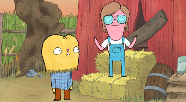 - IFC has been airing new comedy series for the past couple of years. Interestingly enough, they’ve done a couple of animated series, none of which have outlasted their first season. Perhaps the short running series will change with the current show on the cable channel. Out There has been running since February and is a quiet winner, if you ask me. Last night they aired a couple of episodes ending with the series finale at 10pm.
The series was created by Ryan Quincy,who worked with 20th Century Fox, Nickelodeon and Disney amd has wod two Emmy Awards for his work on South Park. The show’s voice overs are by Ryan Quincy, Justin Roiland, Fred Armisen, and Megan Mullally. They’ve also had guest voices. Sarah Silverman and Ellen Page guested on the final episode; Cheech and Chong did another episode. The show is definitely in the voice over readings and the writing. Like most tv animation these days, it’s what Chuck Jones once called “illustrated radio.” The show reminds me a bit of another IFC series, Portlandia. On April 5th Ryan Quincy was selected as “Artist of the Day” by Cartoon Brew. I’m not sure I’d go with the word “Artist” when talking about most of the Cartoon Brew honorees, but “Cartoonist of the Day” definitely works.
IFC has a site for the show at Out There. You can see a souple of the episodes on line at the site. Ryan Quincy has his own site, which I prefer. It doesn’t try to sell the series too hard, though it obviously features it.
I have to admit, I’ve only seen two episodes, both last night, and was impressed. It has a nice playful, minimalist drawing style, and the writing is low key good. It’s basically about a family in the suburbs which includes a teen and a younger boy. The show focuses on these kids.
I expect the show to be renewed. and I’ll look for it.
Action Analysis &Animation &Animation Artifacts &Commentary &Tytla 15 Apr 2013 05:25 am
Tytla Distorts – 5
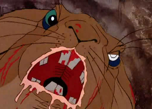
- I thought it’d be a little fun to give a little showing of some of the distortion and stress Bill Tytla did on some of his drawings. He didn’t feel the need in all of his characters to actually distort and stretch the character completely out of shape as he did in a character like Stromboli.
There were times when he could use the limbs of the character and the flexibility of the movement to provide the looseness that he was searching for. Cartoon characters like the seven dwarfs or Stromboli allowed a wildness that another, such as the devil in Night on Bald Mountain offered.
Let’s just jump into it and take a look at some drawings.
Obviously, this first one is Doc from Snow White
as he drains some water from his face:
 1
1
 2
2
 3
3
Immediately we can see a flexibility in the jowls of Doc’s face,
and Tytla has plenty of fun with it.
 4
4
 5
5
 6
6
 7
7
 8
8
 9
9
Tytla can take it very far out.
 10
10
 11
11
 12
12
Now here’s a similar thing with Dopey shaking the water out of his head.
 1
1 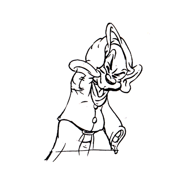 2
2
 3
3 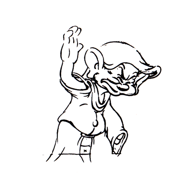 4
4
 5
5 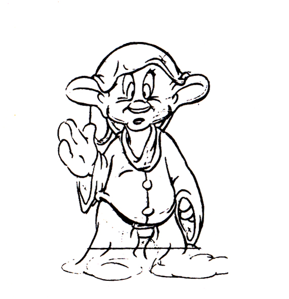 6
6
 7
7 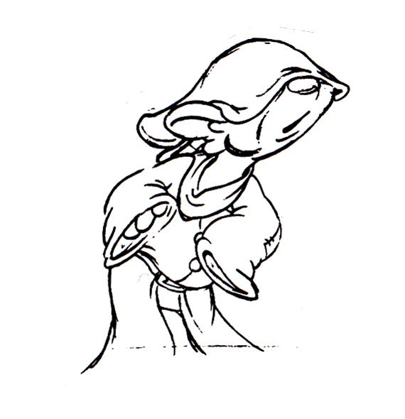 8
8
 9
9 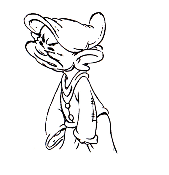 10
10
 11
11 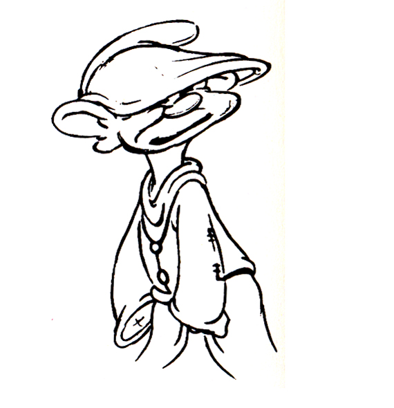 12
12
 13
13 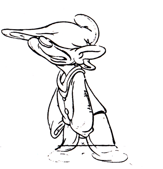 14
14
 15
15 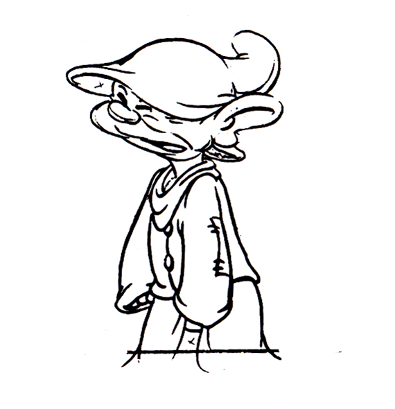 16
16
 17
17 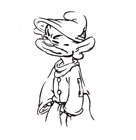 18
18
 19
19 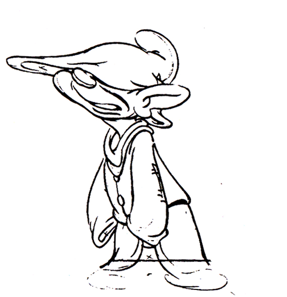 20
20
 21
21 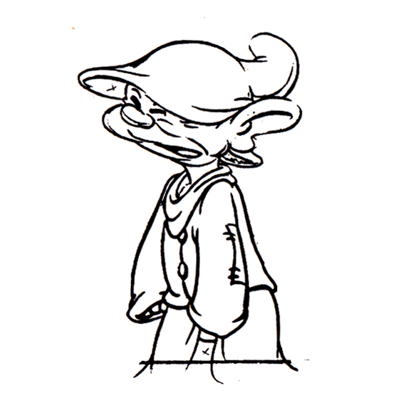 22
22
 23
23 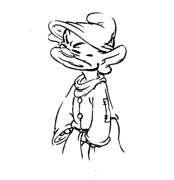 24
24
 25
25 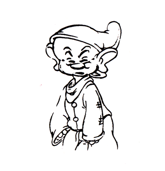 26
26
 27
27 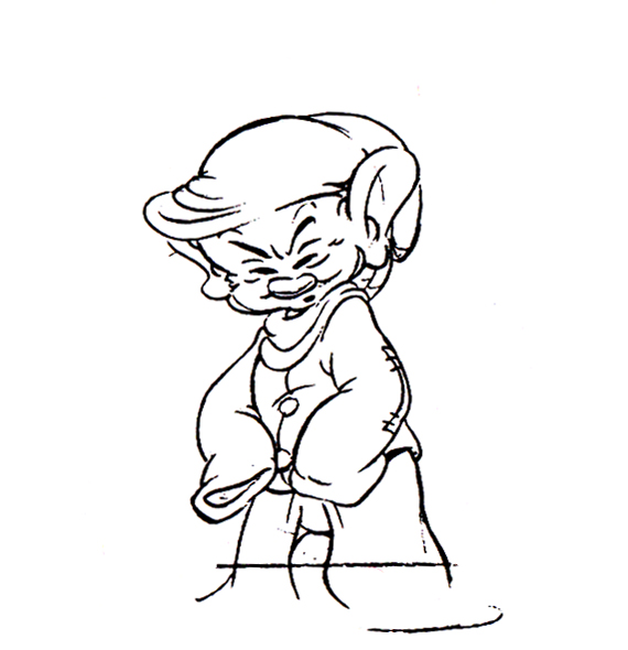 28
28
 29
29  30
30
I also thought I’d pick out a nice frame grab or five of Tytla’s animation for a Mighty Mouse cartoon when he later went to Terrytoons.
 1
1
 2
2
 3
3
 4
4
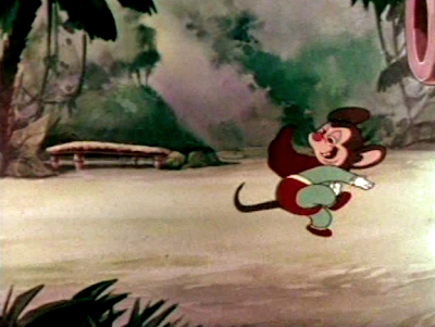 5
5
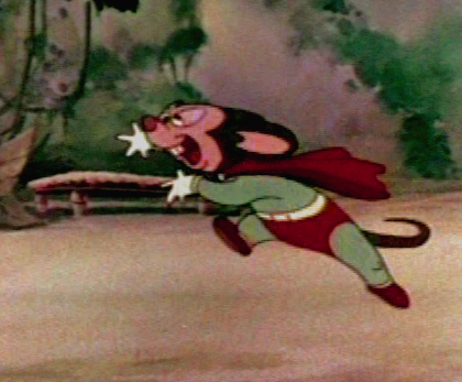 6
6
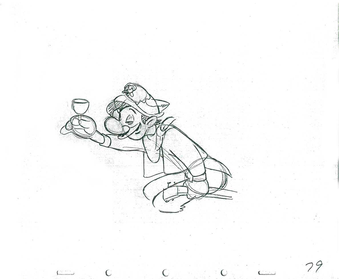
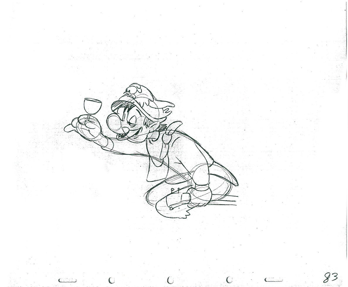
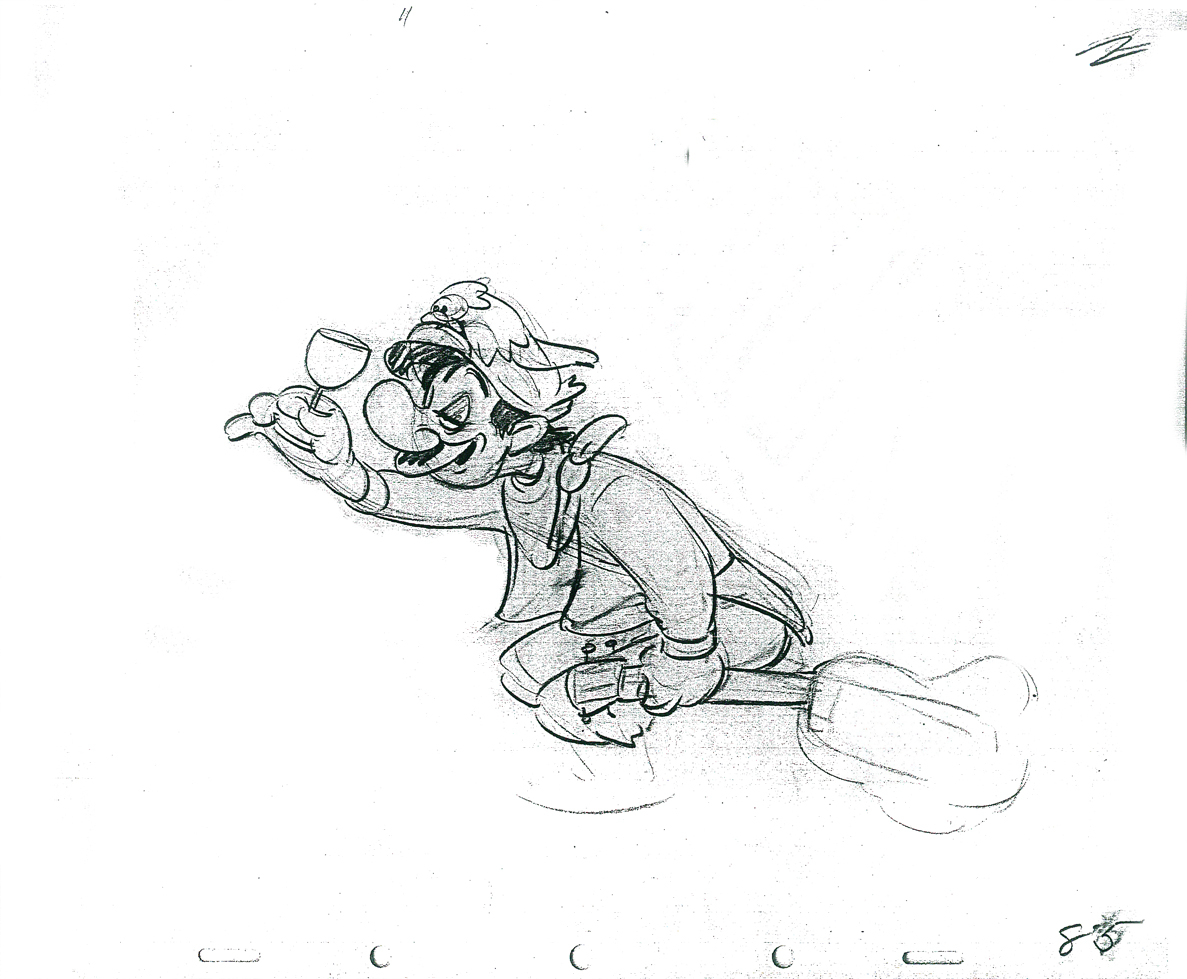
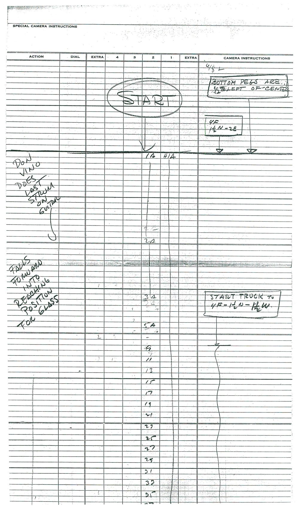
If we’re going to look at Tytla’s play on a drunk character, let’s look at this beauty of a scene. It’s from a film that was never completed, The Laughing Gauchito. This was one of the short pieces being developed during the period when the South American themed films, Saludos Amigos and Three Caballeros, were in production.
For this scene Tytla uses the rubbery feel for the face, but keeps the looseness in the character for the arms and legs. There’s quite a bit of depth he writes into the scene. The character is drinking (and a little tipsy) loses his balance and tries to regain it without spilling his drink. There’s a lot there, and it’s beautifully developed, yet still not a finished scene.
The Background
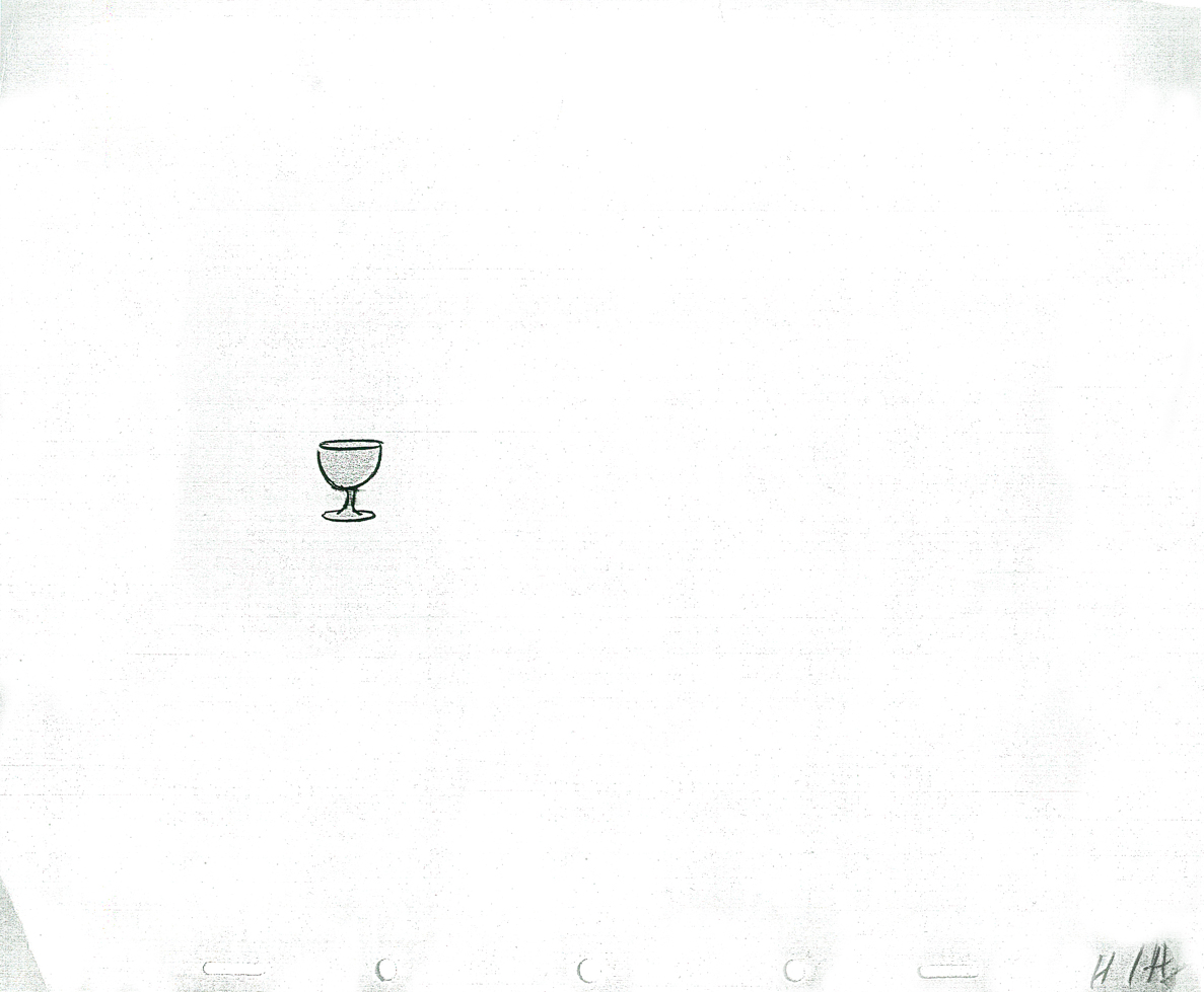
The wine glass overlay
 1A
1A
 2A
2A 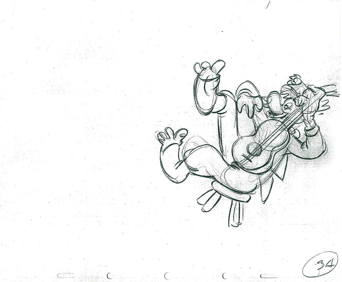 3A
3A
 5A
5A 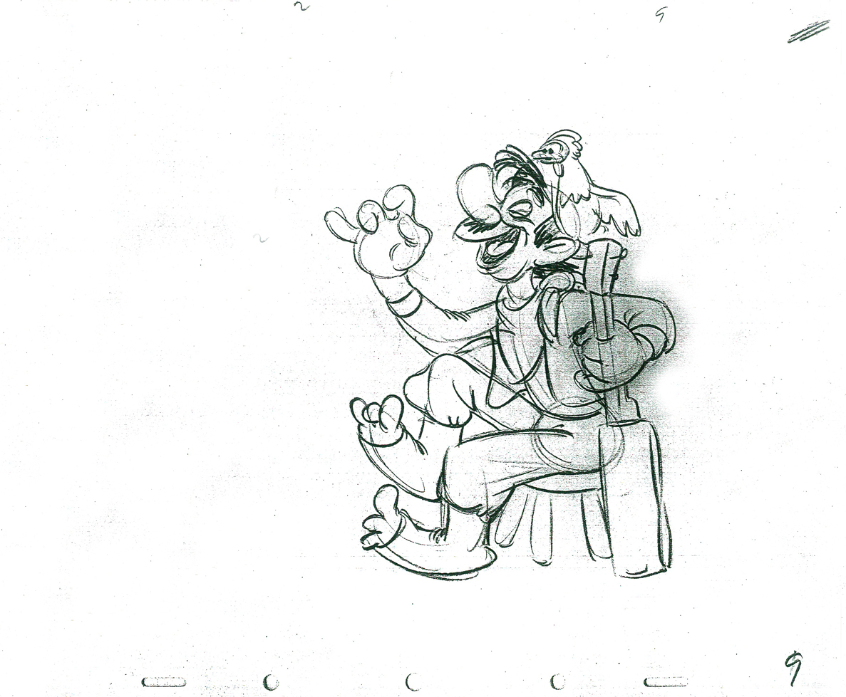 9
9
 11
11 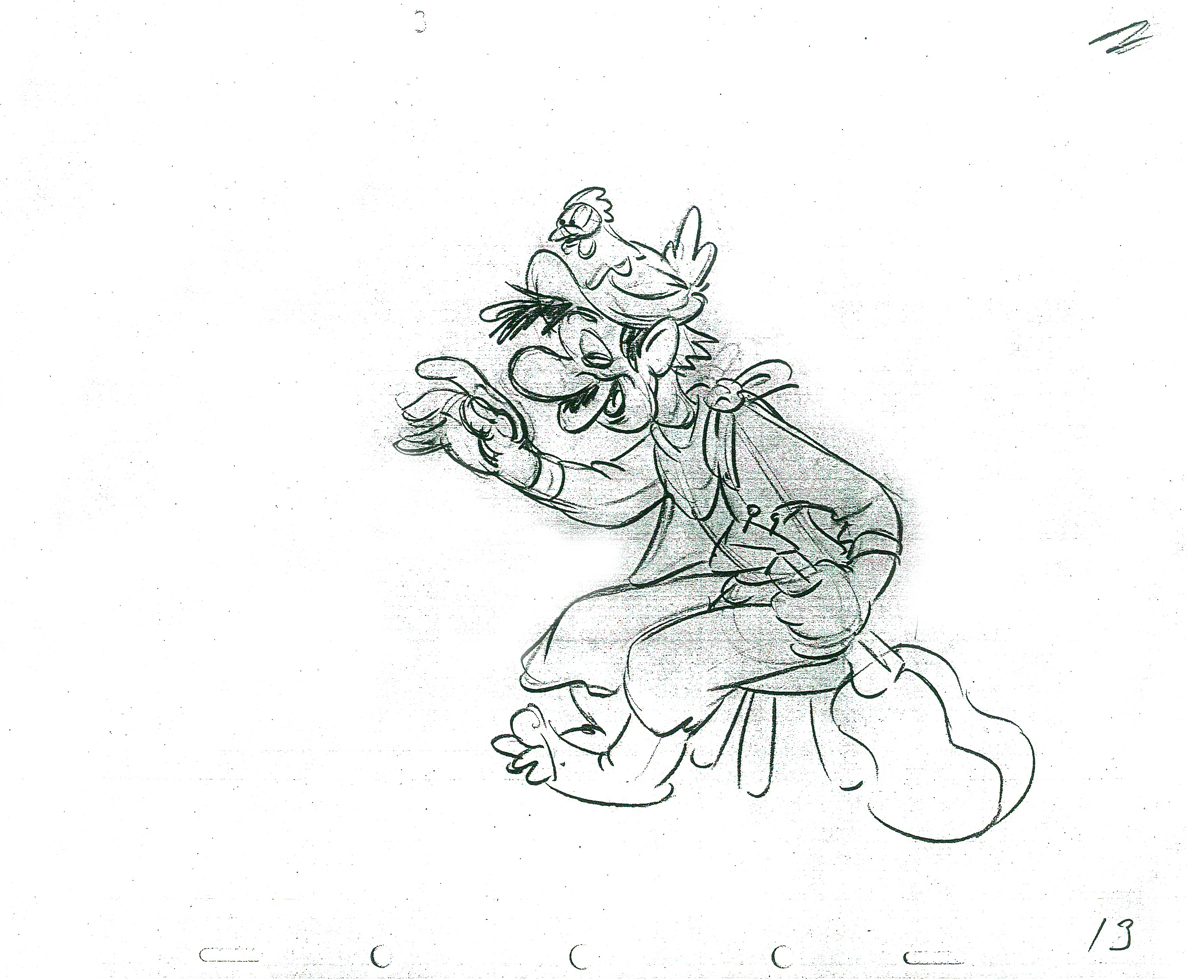 13
13
 15
15 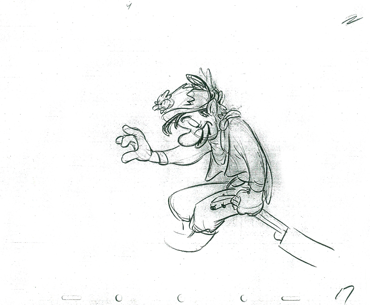 17
17
 19
19 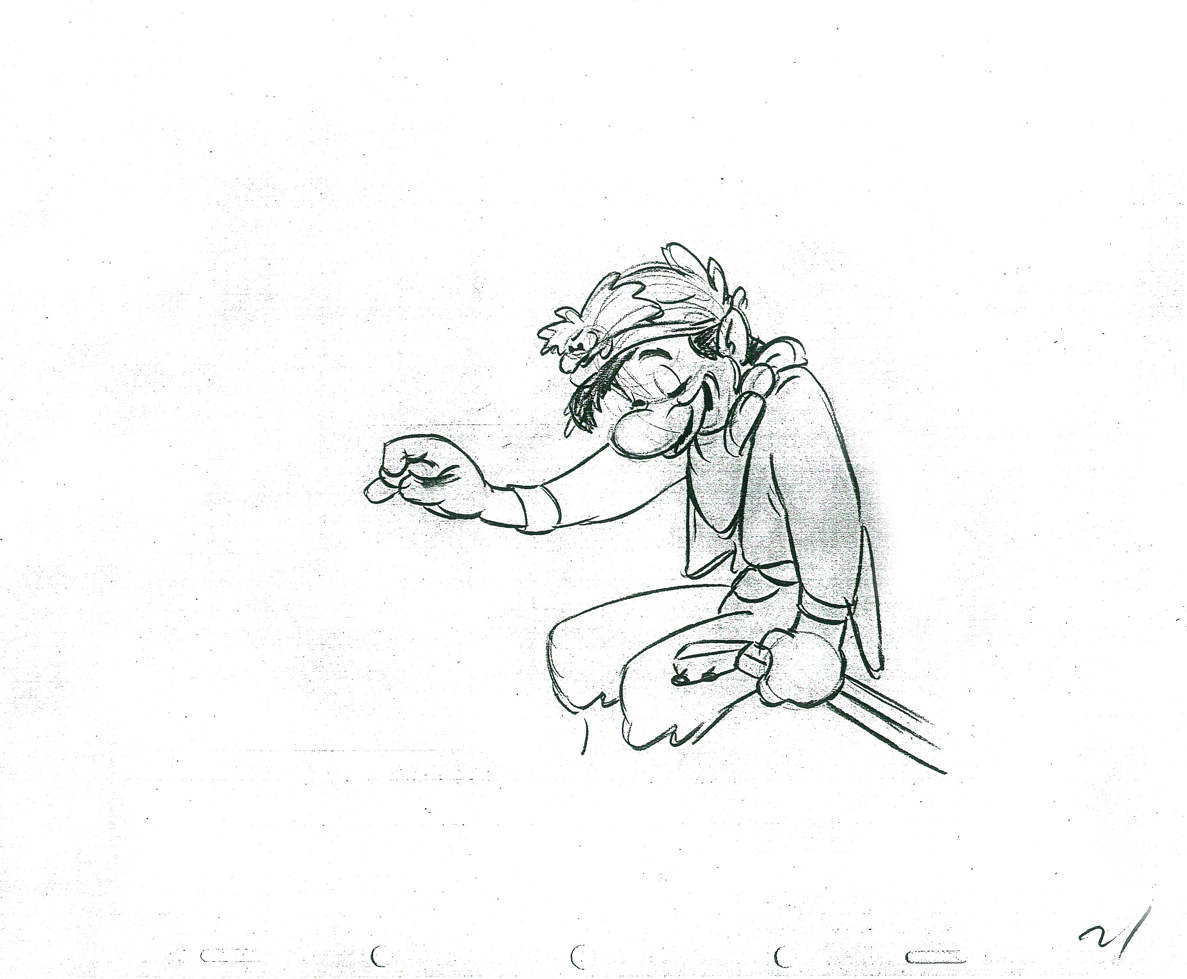 21
21
 23
23
 25
25 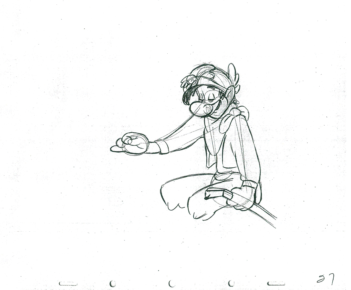 27
27
 29
29 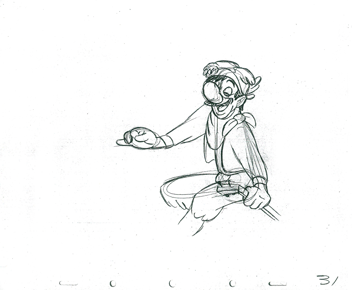 31
31
 33
33 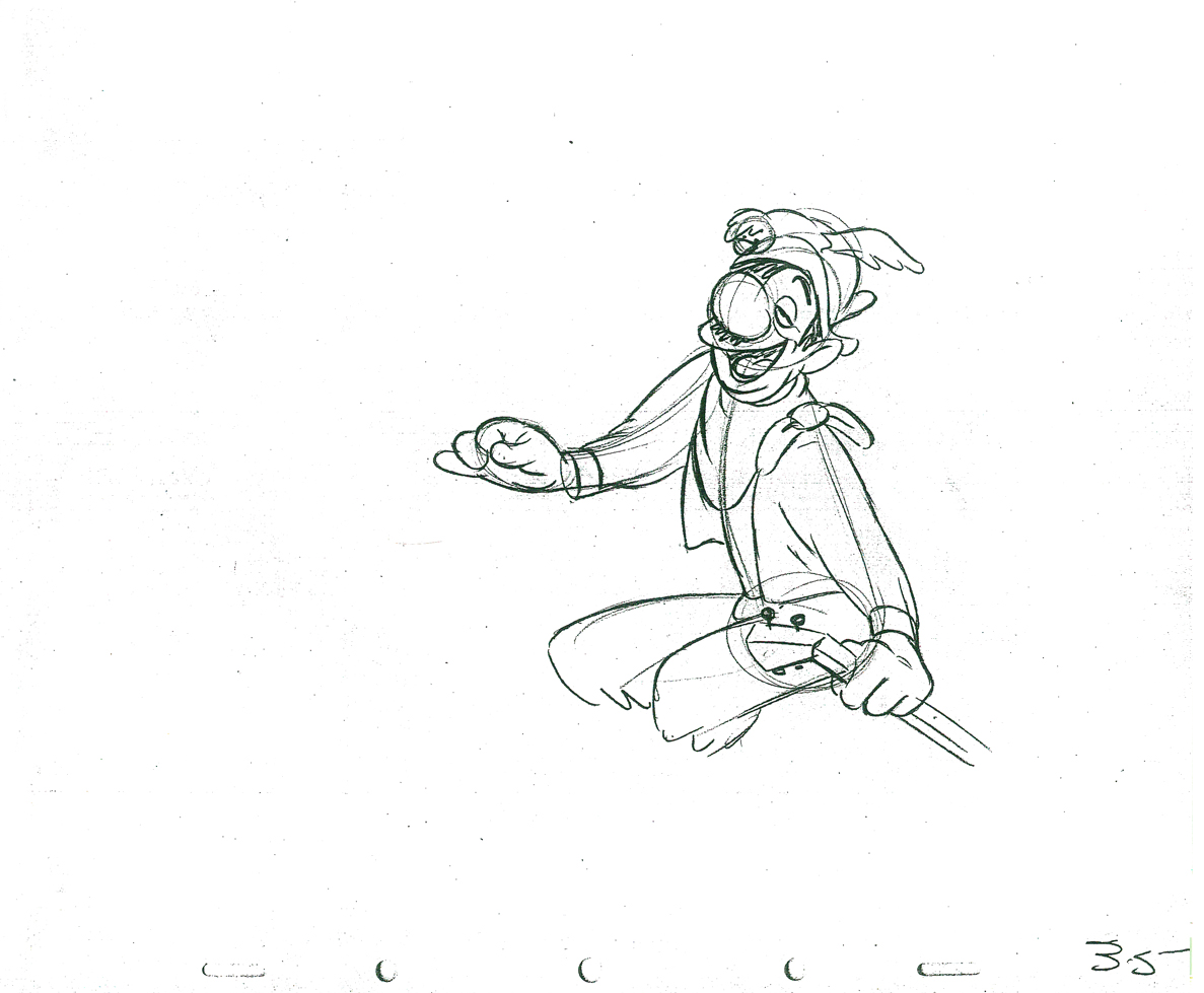 35
35
 37
37 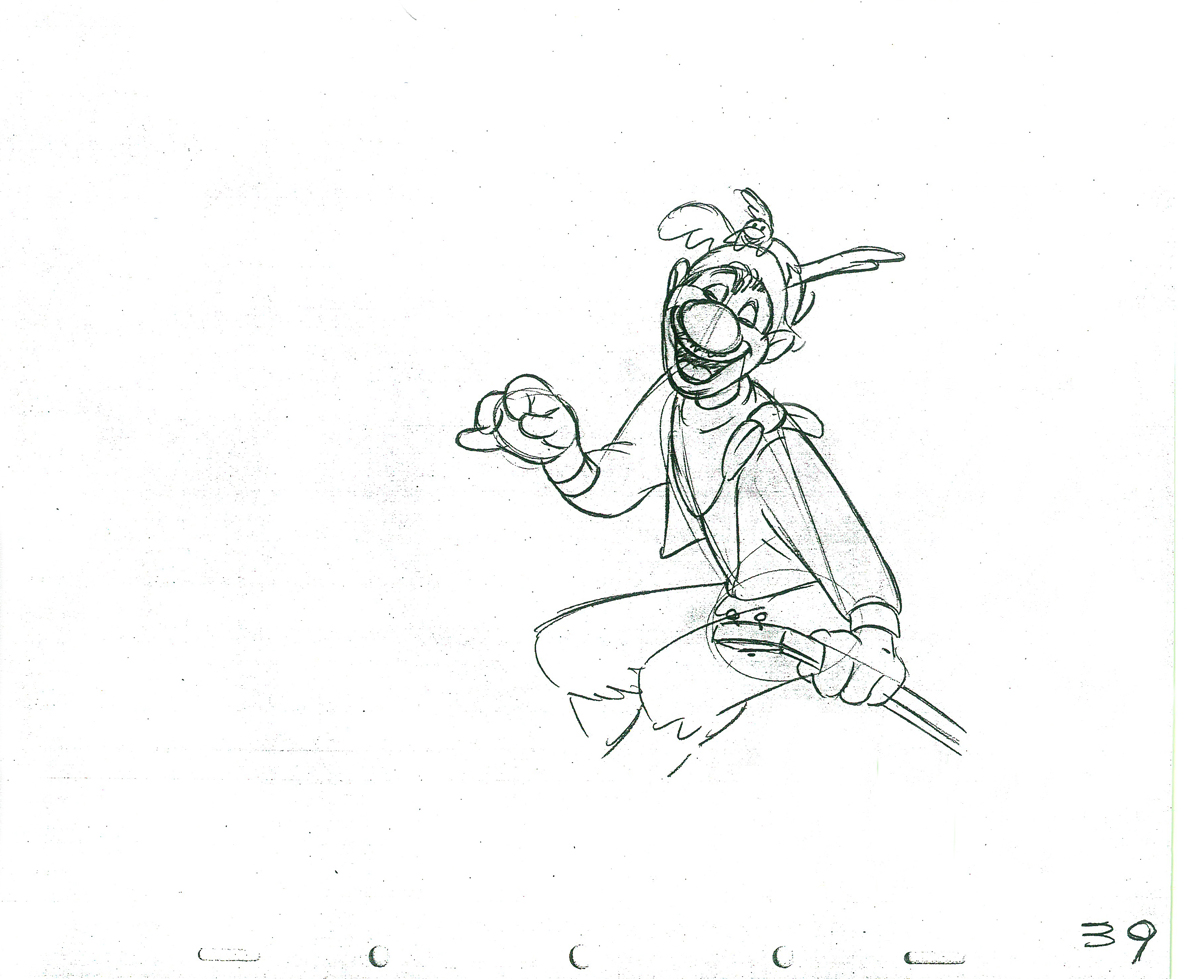 39
39
 41
41
 43
43 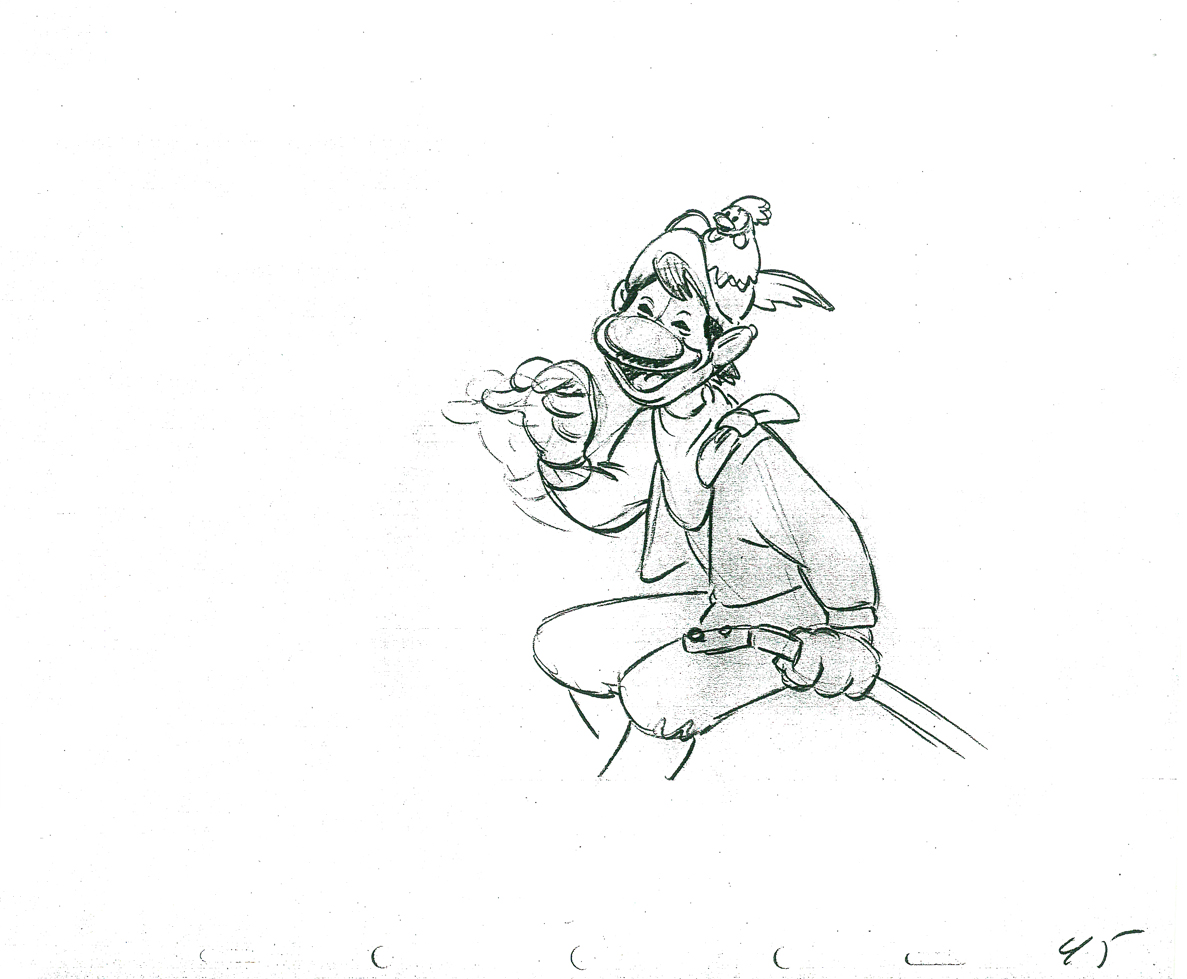 45
45
 47
47 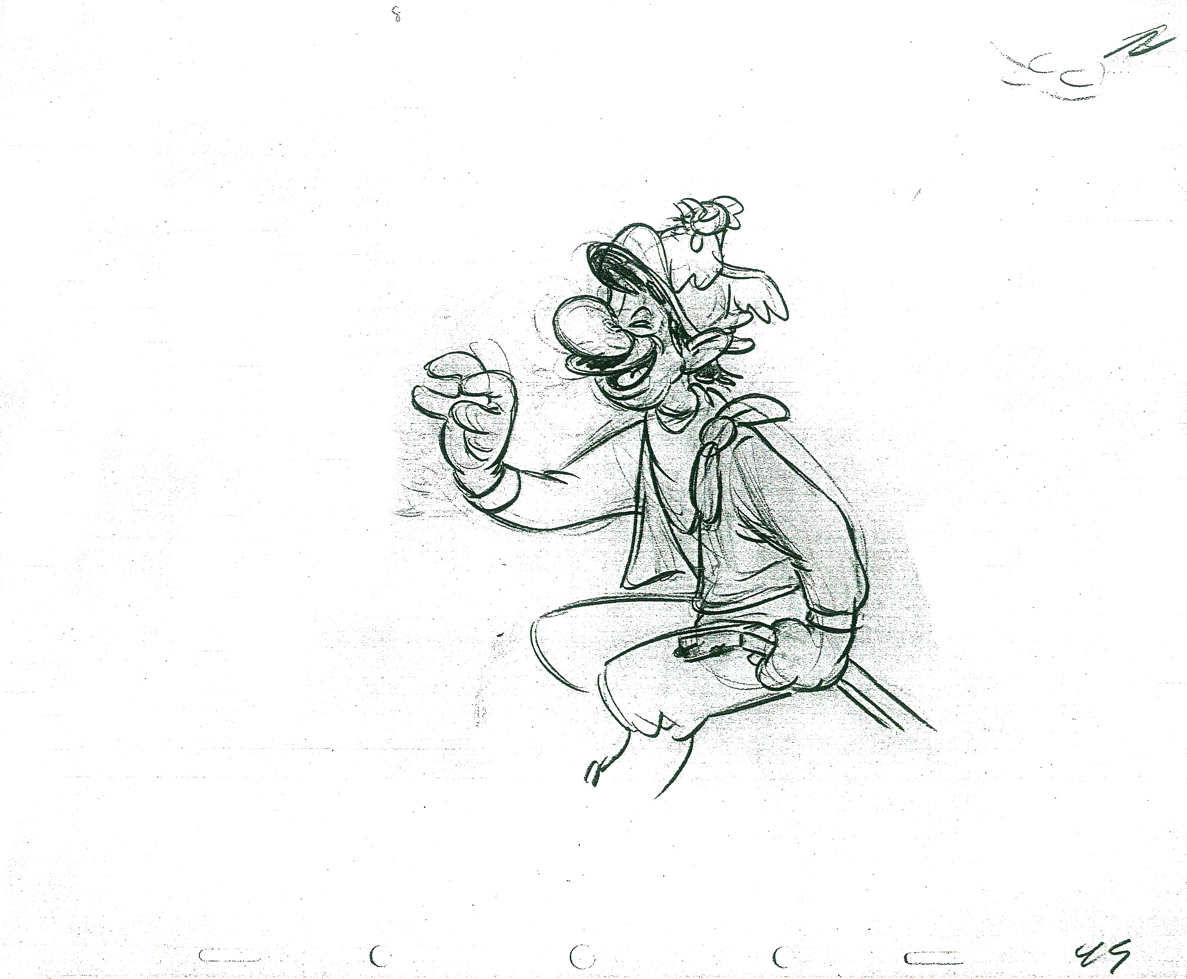 49
49
 51
51 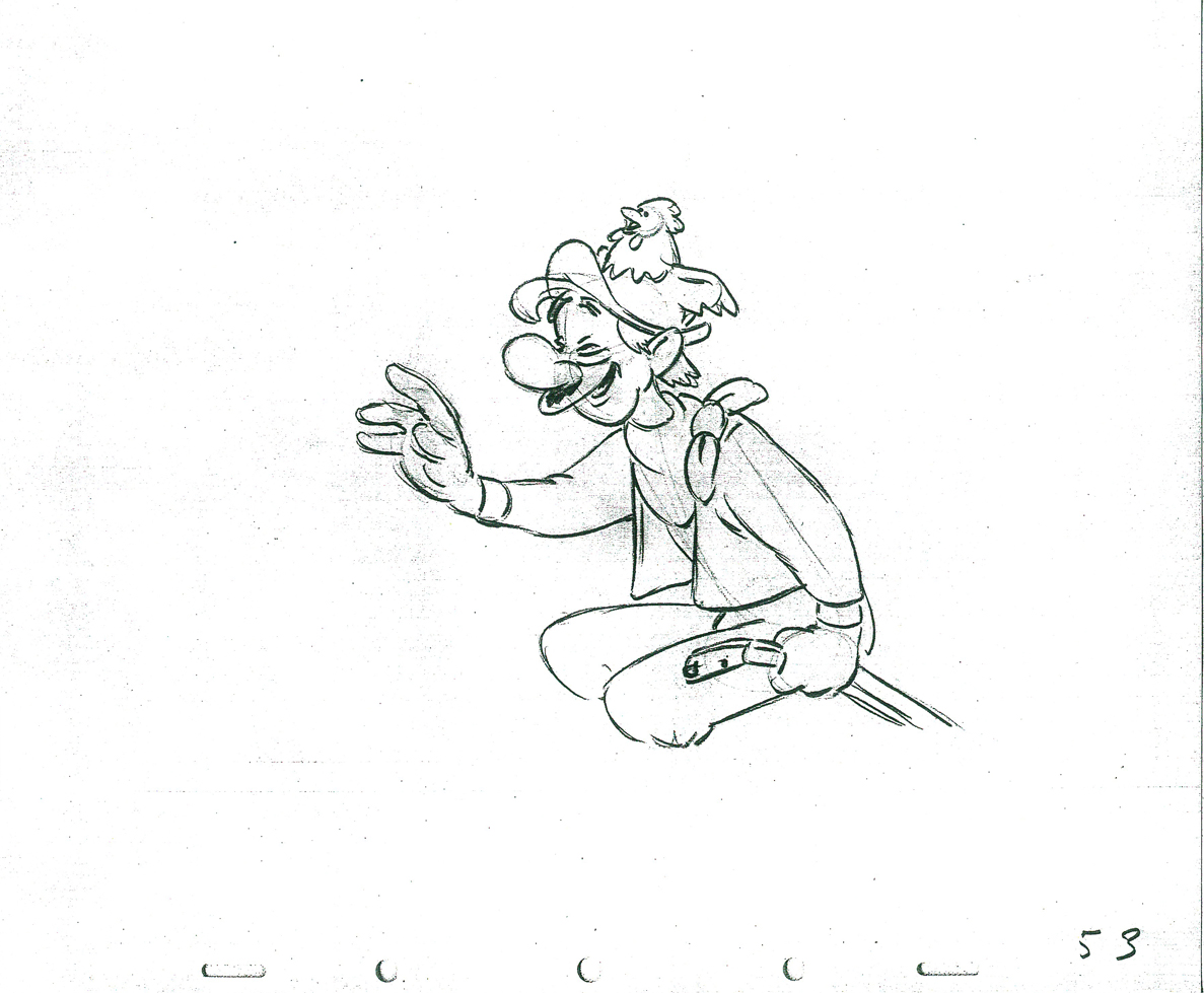 53
53
 55
55 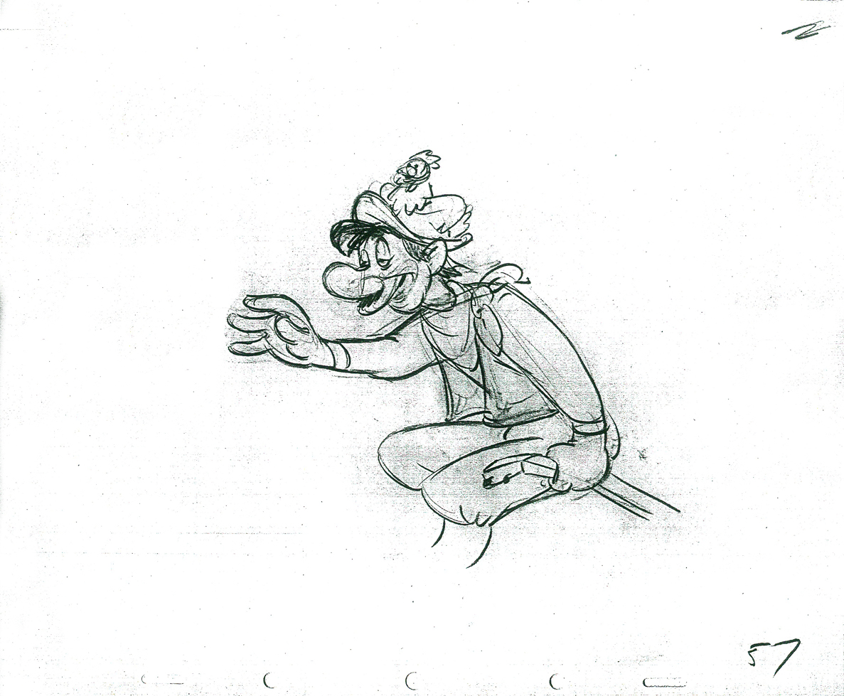 57
57
 59
59 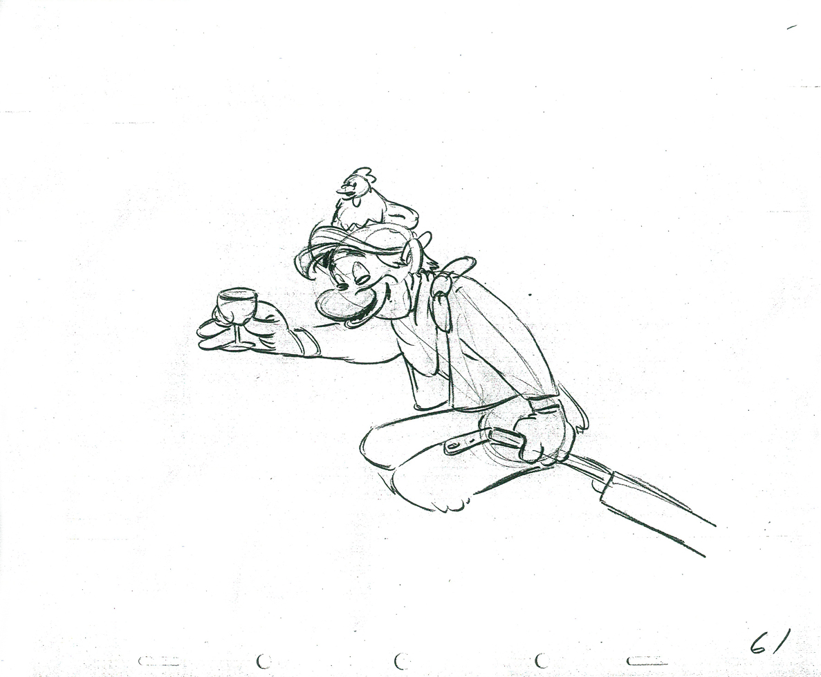 61
61
 63
63 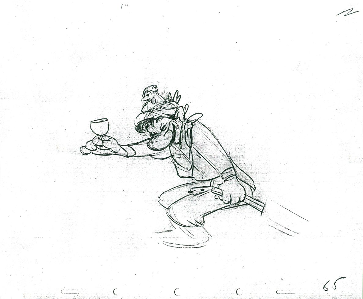 65
65
 67
67
 69
69 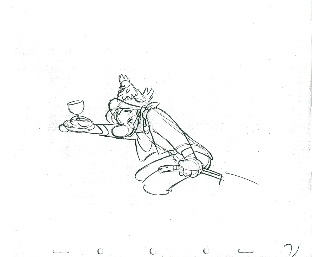 71
71
 73
73 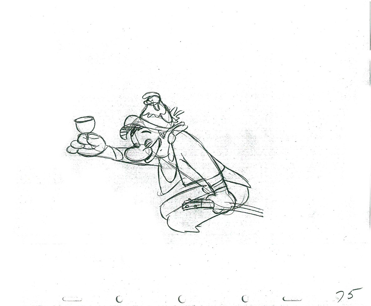 75
75
 77
77
 79
79 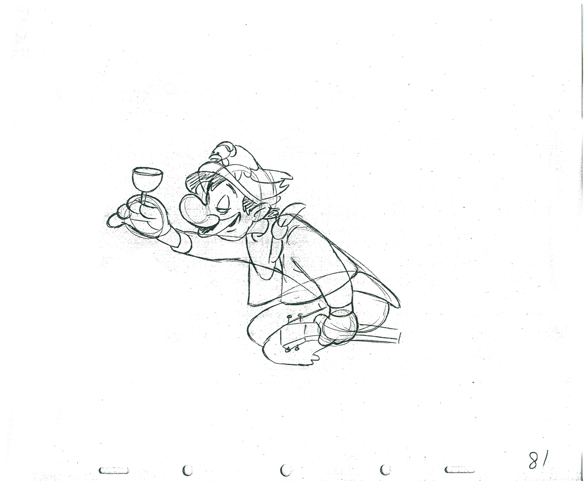 81
81
 83
83
 85
85
 1
1  2
2
These are the X Sheets for the scene.
Here’s a QT of the scene with all the drawings included.
I strongly suggest you take a look into J.B. Kaufman‘s excellent book, South of the Border; it gives a full accounting of this film and Disney’s tour of the South American countries in preparation for the film.
Commentary 13 Apr 2013 05:49 am
Bruising the Squiggle
M’friend, Steve Fisher, sent a really nice little essay (not for posting but just something he wanted to share with friends). Unfortunately, anyone who sends me anything has to be prepared for it to end up in the public’s hands. It’s a quick read:
Once upon a time, far, far away… actually, it was really yesterday, and it was at the nearby Metro Mall in Middle Village.
I found that I was early for a meeting of Weight Watchers because I was confused as to what day it was, but that’s another story. In any case, I decided to walk around the area until the meeting time rather than return on another day for a different meeting. As the correct meeting time neared, I sought the men’s room of the adjoining Kmart.
As I completed using the facilities there, I heard someone enter the room. When I left the stall, I saw a young, black man standing alongside the lavatories. I have to admit that a hint of racial-profiling stirred to a conscious level. In my defense, though, I believe I would have been suspicious of this individual regardless of race because he was just standing there in a men’s room, not using the sink, the urinal, or the second vacant toilet stall; my New Yorker wary mind asked myself, What is this guy up to?
I walked past him in order to use the lavatory and he said, “Good morning.†This seemingly innocent comment raised more red flags, Who chats it up in a men’s room with total strangers? In a tone that did not invite further talk, I grudgingly responded, “Morning.â€
As I began to wash my hands, he said, “Can I ask you a question?†I looked up to face him, trying to judge just what was going on, sensing a dangerous situation developing. I took a closer look at him for the first time; I saw that he was probably not yet twenty years old. He wore a long-sleeve white dress shirt which hung out almost to the knees of his black jeans; a baseball cap was cocked at an angle on his head. I said, with hesitation undoubtedly palpable in my voice, “Okaaay.â€
He pointed to his own shirt and inquired, “Should I tuck this in?†“Do you work here?†I asked. “Interview,†he responded. “Yes,†I said definitely, relieved to finally understand where this fellow was coming from. “Thank you,†he replied, and proceeded into a stall, presumably to tuck his shirt into his pants. Here was not a threatening pervert, but a polite young man concerned to make a good impression at his upcoming appointment. As I left the men’s room I called out to him, “Good luck,†and he rejoined, “Thanks.†I hope he got the job.
The lay Offs
 The reports started flying fast and furious on Thursday late afternoon. “Disney 2D animation had been gutted!” “Sad day for hand drawn animation.” As it turns out, the theatrical division of Disney, which has a small remaining staff of 2D animators finally let go of the majority of their staff. These are people who have not worked on any real projects since Winnie the Pooh. Everything done has been exploratory in the past year. Iger, himself, announced at the Disney board meeting that here was no 2D animation in progress, to his knowledge.
What did people think was going to happen? The studio was not going to continue to finance a division that wasn’t in production. Since Winnie the Pooh, the only real 2D division has been the television production staff.
There were announcements all last week about 150 people being let go at Disney’s studio. No one cried for the marketing people that were let go. I guess letting go the 2D theatrical people became an obvious symbol. A symbol that was too juicy for the likes of the chefs at Cartoon Brew and other internet muckrakers. Yet the obvious was just that. Wasn’t it clear that there was a real reason that Andreas Deja and others left the studio last year? Why is anyone acting surprised?
Sequester anyone?
The Real Effect
 - Kathleen Quaife is an animator working in feature animation in Hollywood. Point of fact is that she’s an EFX animator. She’s done a lot of water in studio films of the 21st Century. She offers a couple of sample reels on her blog. I really enjoy animated effects, especially the hand-drawn kind. Computer animation seems, to me, to be an animation effect, in itself. Drawing all those waves and bubbles and cascading ripples by hand gets my attention.
I suggest you take a look at the extraordinary samples on her blog here (lotsa clips from Disney). While you’re there, if you have the time, there are links to specific effects you can watch (e.g. water, fire, rain etc.).
Her resume is full: Hercules, Tarzan, Pocahonatas and Ferngully. Tummy Trouble, The Runaway Brain, and Pups of Liberty. The Land Before Time, Rockadoodle, Dragon’s Lair and An American Tale. She’s been doing great work for a long time, and she deserves a bit of attention.
She also has this entertaining video showing her drawing an animated splash.
Animating a Splash
Animation Scoop is Real
Yep, it’s real. The new animation site, Animation Scoop, was publicly announced by webmeister, Jerry Beck, and sure enough it was still there the next day. And Thursday, and Friday and today. I guess that means it’s lasted longer than most of the blogs out there, so we’ve got to say it’s a real thing. Let me jump to the front of the line to say I’m glad. I wouldn’t want any of the mass of animation news to pass under our noses, and another blog will certainly help us to keep track of it all. On top of that, it’s from Jerry Beck. You’ve got to love it. All we need now is some real animation. All we seem to have is product that’s been dredged up by a computer somewhere. We need something animated, something with dignity.
But seriously, congratulations Jerry, and more power to you. I love having another stop in the mornings.
Political Animals
I thought of this story while responding to a comment on the Splog:
 There was the day at the Hubley Studio when we knew that John had gotten the position of directing the film version of Watership Down. He’d take off for England in a few months and they’d set him up not too far from the office in an apartment.
At one point during the day he and I were alone in my room. I told him I was glad he was doing it, Watership Down; I enjoyed the book. I went on about it saying it seemed like a more current version of Animal Farm. John said that he thought that Halas had really screwed up that film, and it was too bad. There was a lot of meat there, and he didn’t think they got it all in the film version. John felt that he wouldn’t make the same mistakes with Watership Down. We talked only briefly about Animal Farm.
I made plans to move on to Raggedy Ann & Andy. I had been writing to Dick Williams for years about my possibly working for him. Tissa David (the very first person Dick had hired; she did a 30 second sample Pencil Test which clinched the film for Dick) had broached him about hiring me, and I was offered a job as an inbetweener. (That turned into supervising all of the Assistant Animators and Inbetweeners.)
Several weeks later, after John Hubley had made a few trips to England preparing to start on Watership Down, he called me into his room. John said that he wanted to keep the US office going, at the very least doing a short that he had in mind. Tissa would animate it. (The short was going to be an extension of the section in Everybody Rides the Carousel which Tissa had animated. The piece where the two young lovers argue over her having cut her hair without getting his permission.) John wanted to know what it would take for me to stay on supervising the NY production work. I thought about it overnight and asked for him to match what Raggedy Ann was going to pay me to inbetween. It was about $20 a week more than I’d made working on the “Carousel.” John offered $5 less, and I decided to say, “No.” We parted amicably, and John didn’t keep his studio going for the time he worked on that feature.
I went back to work for him immediately on leaving Raggedy Ann. They were about to start Doonesbury, and I would supervise the production. I started at the same salary I’d made as an inbetweener at Raggedy Ann, including that extra $5.
Unfortunately, John was to have an urgent operation some three weeks after I’d started work on the new film. It was arranged that I’d leave and come back once he’d recovered and we could get back to work. John died on the operating table.
Action Analysis &Animation &Animation Artifacts &Commentary &Disney &Peet &Tytla 08 Apr 2013 05:05 am
Stanislavsky, Boleslavsky and Tytla’s Smears & Distortions – 4
Boleslavski was a great admirer of Stanislavsky and his acting techniques. When he, Boleslavsky, came to the United States, he taught the Stanislavsky technique to his students. These included Lee Strasberg, Stella Adler and Harold Clurman; all were among the founding members of the Group Theater (1931–1940). The Group Theater was the first American acting ensemble to utilize Stanislavski’s techniques, and its members all went off to espouse their own versions of the “method.” American acting had taken some real turns into the creation and development of a true system for getting the best performance out of the actor.
In animation, there was animation technique and styles. These rarely had anything to do with acting. However, there were a number of animators at the Disney studio who wanted to put the focus on their acting and actually studied Stanislavsky and Boleslavsky so that their characters would give a great performance. Tytla was certainly a leader among the animators to do this.
Whereas in Pinocchio, while working with such a flamboyant and
eccentric character, Tytla stretched and distorted Stromboli to
get the necessary and sudden emotional mood shifts desired.
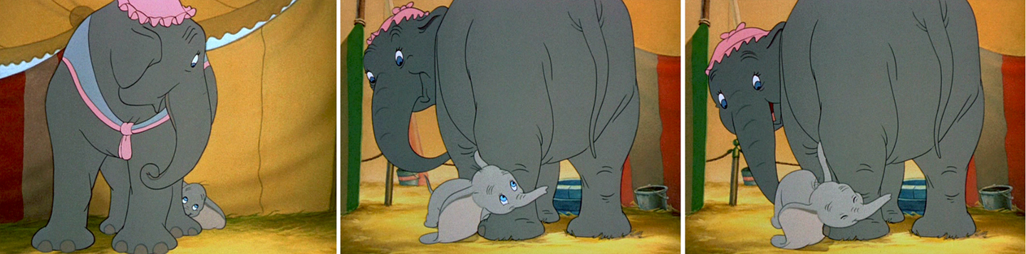
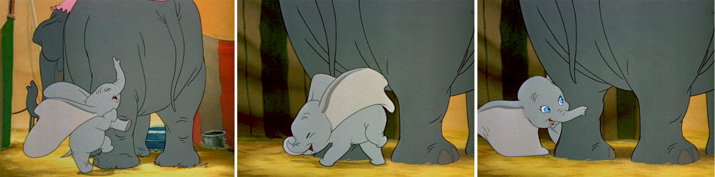
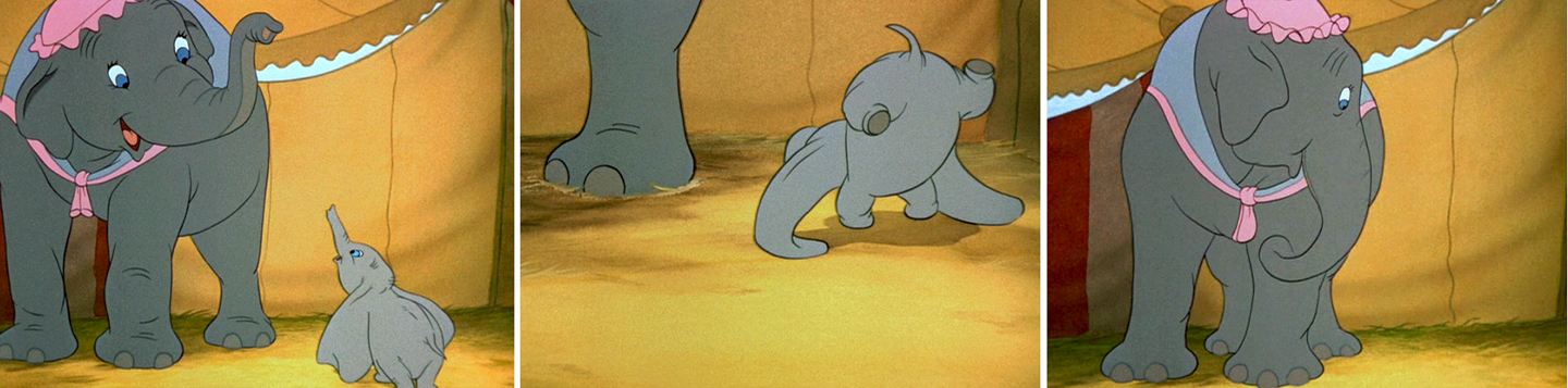
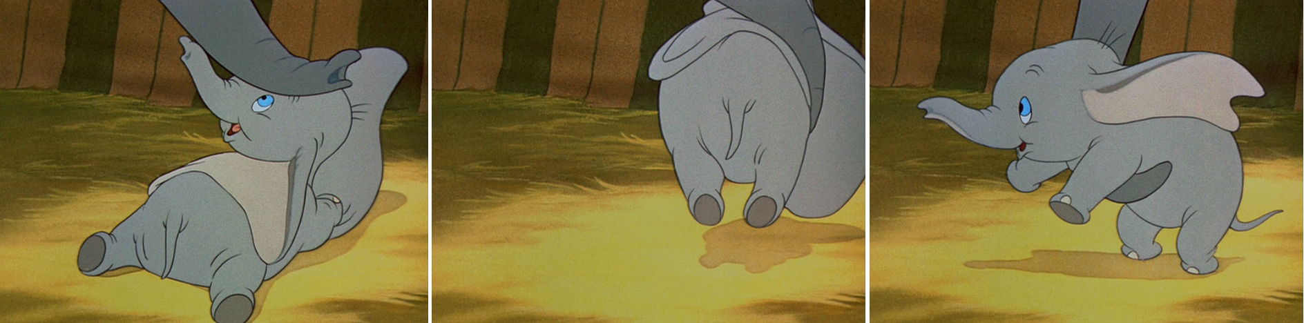
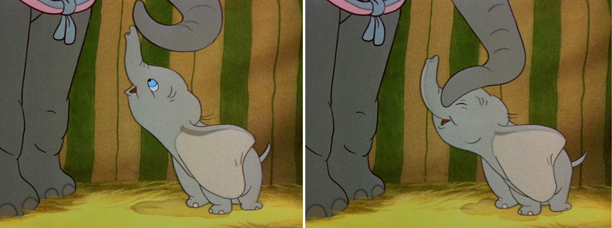
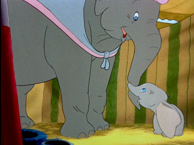
With Dumbo, Tytla modeled the character after his own son,
and he animated this scene wholly on the two characters
given to him on the strong storyboard by Bill Peet.
He didn’t use distortion, because it wasn’t the character he was animating.
Dumbo was gentle, all truth. The honest performance meant keeping everything
above board and on the table. That is undoubtedly the performance Tytla drew.
In my opinion, it has to be one of the greatest animation performances
ever drawn for a film. It’s quite extraordinary and cannot be undercut
in any possible way.
(Click any image to enlarge.)
 .
.
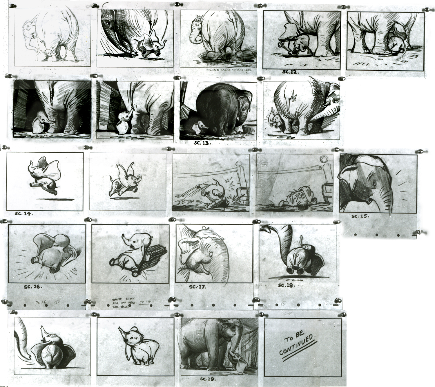
You can see that Bill Peet’s storyboard was certainly an inspiration,
at the least, for Tytla to follow, if not to equal.
Let’s move to another film. Fantasia.
Vladimir Tytla worked on the devil in Mussorgsky’s – Night On Bald Mountain.
Here are some drawings for the scene. They’re part Tytla and part clean up by his assistant.
A good example of a Tytla drawing.
Here’s the clean up of the same drawing.
He shrinks after he hears the teal of the church bell.
They’re pretty damned impressive drawings. If there is any distortion,
it comes from making a body builder’s shape stronger. There’s no violent
flexing of those muscles, just the natural thing on display in the middle
of a dance sequence. Strong and forcefully beautiful drawings. The
distortion is done by the other spooks floating out of their graves on
the way up to their leader.
The devil’s motion throughout this piece is very slow, tightly drawn images of the devil lyrically moving through the musical phases. It’s pure dance. Any distortion is done via the tight editing that Tytla has constructed. Very close images of the hands with the flame shaped dancers moving about in tight close up as Chernobog’s large face with searing eyes closely watching the fallen creatures dancing in his hands. It’s distortion enough.
Tytla has constructed the most romantic sequence imaginable, and the emotion of the dance acts as the climax for all of Fantasia, and it succeeds in spades. All hoisted by the animation, itself. No loud crushing peak, just a dance done in a tightly choreographed number completely controlled by Tytla. It’s the ultimate tour de force of animation, and we’ll never see the likes of it again.
So essentially I’m pointing out that Tytla used distortion in the animation drawings to execute his acting theories, but as he grows, he not only uses his animation (and animation drawings) to “Act”, he uses his abilities as an Animation Director. The cutting and the movement of the scenes is used for the Acting, as well.
Commentary 06 Apr 2013 04:25 am
Brewsing
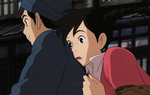 My thoughts keep going back to From Up on Poppy Hill. I really would have liked giving the film a more positive review, and I feel as though I should go back and see the film again. Maybe I didn’t give it enough of a chance; however, I can’t think of any dynamic scene in the movie that is enticing me back.
The entire film is professionally and finely planned and layed-out as would be expected from a Ghibli work. The drawing is excellent, and the backgrounds are quite fine and strongly detailed. But there just isn’t anything that soars.
I think of Ponyo riding those waves of the Tsunami. My heart – my entire body lifted in exuberance with that scene. No matter how many times I’ve seen the film it always does it.
 I think of Spirited Away (so many moments) where Chihiro rides on that ghost train with “No Name” to the dark foreign and silent land of Yubaba, Zeniba’s twin sister. I think of Princess Mononoke when the god of the forest, dressed like a deer stands watching him from across the lake. It’s so glorious a moment. Or one of my all time favorite moments in the movies – standing at the bus stop with Totoro in the rain waiting for the bus to arrive. It doesn’t get better than that in film.
There are so many other Ghibli moments for me, I could keep going. Yet not even a hint of any of these in Poppy Hill. Maybe that’s why I felt I was so negative. I wanted something I shouldn’t have expected from a sophomore director without the proper experience to play out that very complex relationship between him and the girl. It becomes cliché when it should have torn at our hearts.
Who knows. Maybe I’ll go back and see the version of the film in Japanese rather than the English dubbed. Interesting that I have no intentions or plans to see The Croods again. Maybe when the Japanese dubbed version comes out so that I won’t have to hear those Nick Cage Valley Girl accents again.
ITVS Cut Out IDs

The Soup Factory in the UK, the studio owned and supervised by Andy Soup, is rightly taking pride in some IDs they did for ITVS. These pieces are animated cut-outs, models that were designed for 3D table top animation. They are beautiful pieces, and I thought it a good idea to link to them so that you can take them in as well. After all, we in the US don’t get to see the advertisements done for ITVS.
For the 6 IDs, Espen Haslene directed the films. He is the leader of a studio known as Tundra, a partnership of Scandinavian/French/Italian/English filmmakers, animators, graphic and web designers. Tundra worked together with Martin M. Andersen, head of Andersen M. Studio, acting as the stop-motion Animation Director. There’s obviously some computer animation mixed with the stop motion work, and you’ll find a complete list of credits when you go to the Soup Factory‘s page for the films to view the IDs.
Take a look here.
Illusions of Life
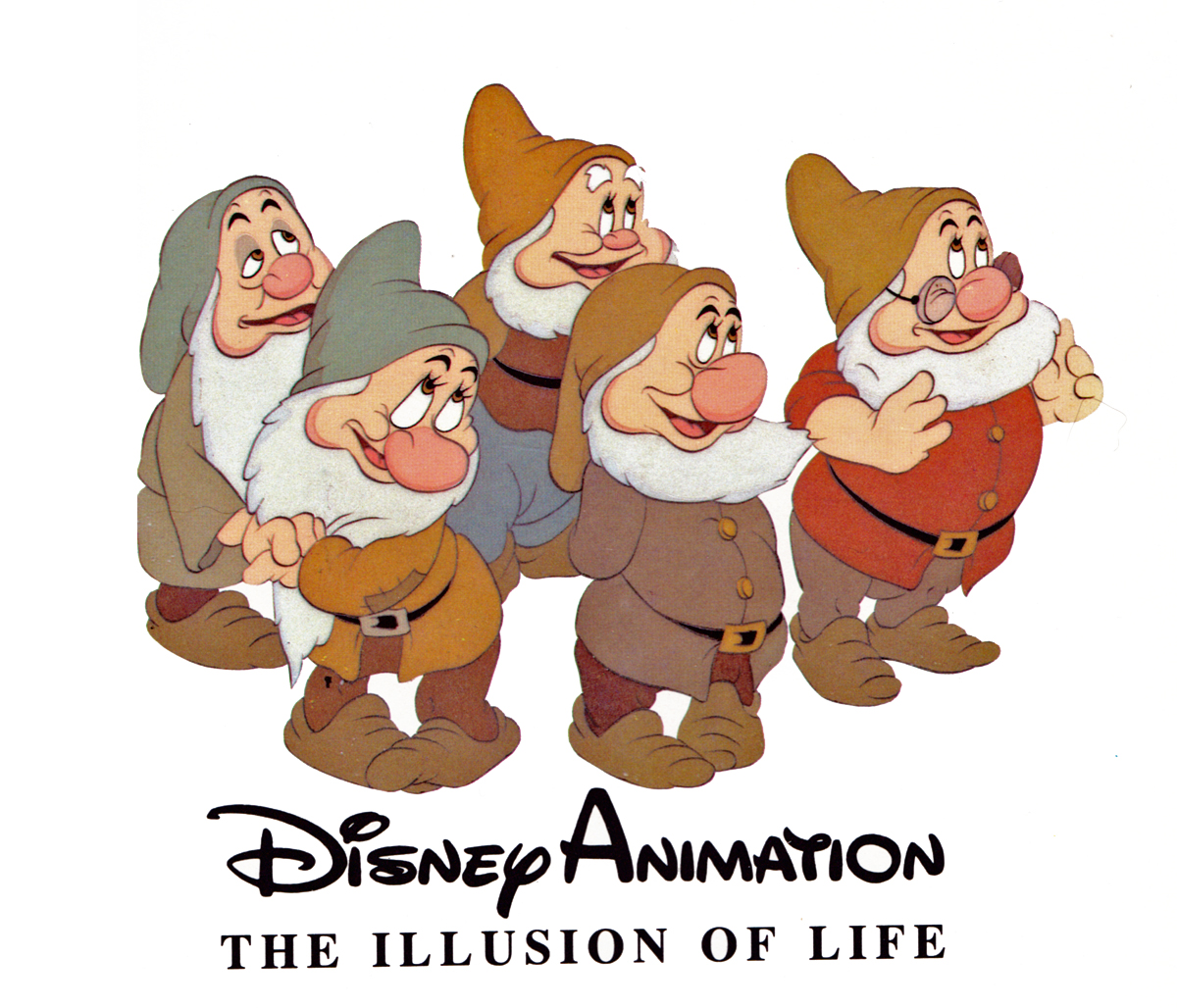
I’ve been going through Frank Thomas and Ollie Johnston‘s first book, Disney Animation: The Illusion of Life. I have to admit that I haven’t been much of a supporter of the book. I remember first getting it and not reading it. I just went through the pictures. Then I read all the captions under the photo/artwork/images. That’s about as far as I got with the book. I don’t really know why; I just wasn’t inclined to really dig my teeth into it, and I never read it. Bt then I’ve often had that problem with large picture books, especially if they’re supposed to be teaching something. The book seems confused. It doesn’t know if it wants to be a glossy art book that teaches you something.
I guess I’ll make up for some lost time and will read it now. But I think in doing it, I’ll take my time with it and will write about it in some detail, trying to get my thoughts out on paper (or on blog). I know that it’s the first of the animation books I can remember where they had some pure gold for illustrations, and they printed it too small to be able to properly get it. The good part about the images on the web is that you can blow them up pretty easily. And I’m going to.
Perhaps I’m inspired by Mike Barrier‘s negative comments about it. His writing, for me, is pretty funny, too. Take a look at this review of Dick Williams‘ book where he necessarily goes to the Thomas-Johnston book.
Time to read it for myself and see what they’re actually saying. I have read others of their books and haven’t been inspired.
Book Reports
 I’ve been reading lately a different sort of book. it’s certainly not a quick read getting through Donald Crafton‘s most recent book, Shadow of a Mouse. I’ve been a fan of Donald Crafton’s work since his first book, Before Mickey: The Animated Film, 1898-1928. It was a study of a little-known part of animation history, and he explored and revealed the difficult period. Certainly, this was a fine feat of research combined with his excellent writing.
Shadow of a Mouse is something else again; it’s a book that employs the author’s extensive knowledge of film history to help consider a number of complex theoretical problems relating to animation, which he poses. The book carefully rethinks animation and all of its properties. Blending 2D, stop-motion, cgi, and more experimental forms, the book challenges the way we think of animated film. It’s a tough and complex read though I’m certainly enjoying it.
 I’ve also been reading Jenny Lerew‘s The Art of Brave. I received apologies from Chronicle books when they’d first published the companion to Pixar’s Brave. They’d gone through their print run quickly and weren’t able to send me a copy. I made myself something of a pest after that and pursued them for a reviewer’s copy. Ultimately, I got my hands on one and am quite enjoying it. The book is something more of a picture-book (and what great pictures), though I am enjoying Jenny’s writing. I hope, also to finish this pretty soon and will write about it – especially now that the film won the Oscar and is available in DVD.
Shadows
Sometimes you have to take the bull by the horns and do something that nobody wants. During the making of Raggedy Ann & Andy I was supervising the Assistant Animators and Inbetweeners for the course of the production. I was made to jump from being an Inbetweener, myself, to suddenly being someone supervising lots of people (it went up to 150 people at one point toward the end of production) and overseeing their work.
In the middle of all this, there was Art Babbitt‘s sequence. I was the one receiving the work in New York when the shipments arrived. But then, that was just the beautifully animated camel and the two rag dolls that looked like the work of no one else. They were wildly off model – Ann & Andy, our two leads. I was told to leave them as is, by Dick. But I did some slight adjusting trying to get them a little looser to match all the other animation in the film. I wasn’t very successful at that. I couldn’t kill the work of Art or his assistant, David Block. Art’s work looked like it was chiseled into the paper, the line was so tight. His arm – and especially David Block’s – had to hurt after drawing that rigidly.
Then we added stars. It was a simple film effect, but there were a lot of problems getting there. Al Schirano, the supervising cameraman, and Al Rezek, who assisted him on this effect, knew what they were doing, but their work was anything but calibrated and planned. I saw a hole and pushed myself into it to make sure that the star fields in the scene worked with the backgrounds and didn’t interfere with the characters’ movement. They were working well after a hard start and Al Schirano was appreciative of my getting Dick off his back.
Finally, there were those damned shadows. They had to be added and animated to make the scenes work. I got that job, and it had to be done within a week. At first I mirrored Art’s animation but it looked horrible. Try after try after try, it all looked like mud. So without telling anyone, I started snapping the shadows. The legs moved very slow and tight, like all the rest of Art’s animation, but the shadows snapped into position. Every time the legs went up or down, it happened in one or two frames. It worked like a gem and no one commented. I expected to hear from Dick, but nothing. At one point he might’ve said, “good job,” or some such thing, but there were no attacks from either him or Art about that violent movement in Art’s sequence. You never know. Sometimes troubles aren’t as bad as you think.
Every scene of this sequence wass shot numerous times. The shadows were painted black, and the entire scene would be shot at 65% exposure. Then it’d be rolled back to “0″ and shot at 35% exposure without the shadows. That meant that the shadows would be transparent – 65%. Then the film would again be rolled back to “0″ and the star field and the animation of the bottom-lit lights would be shot using a star filter. That was done in three passes so that the stars would have different levels of brightness. (I learned all these tricks back at the Hubley studio and was able to suggest things to the Al Schirano who rode with me (and took credit when it worked.)
Commentary &Disney &Frame Grabs 02 Apr 2013 03:29 am
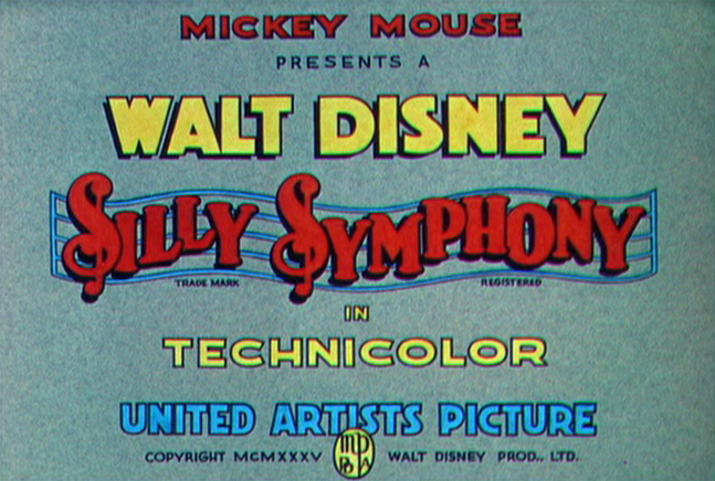
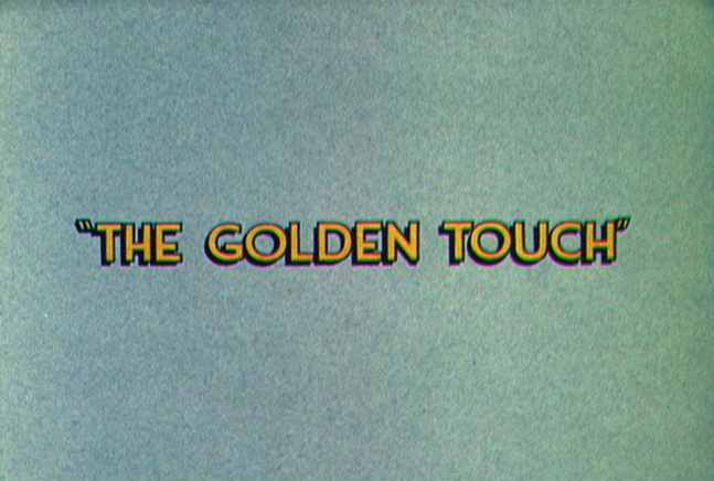
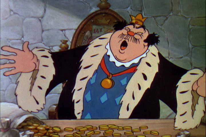
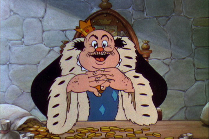
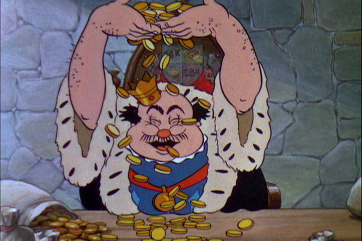
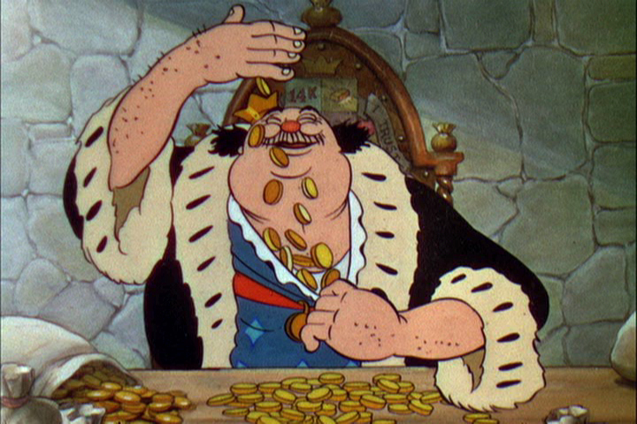
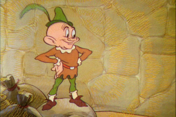
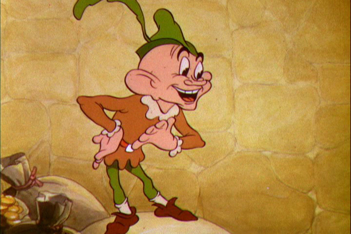
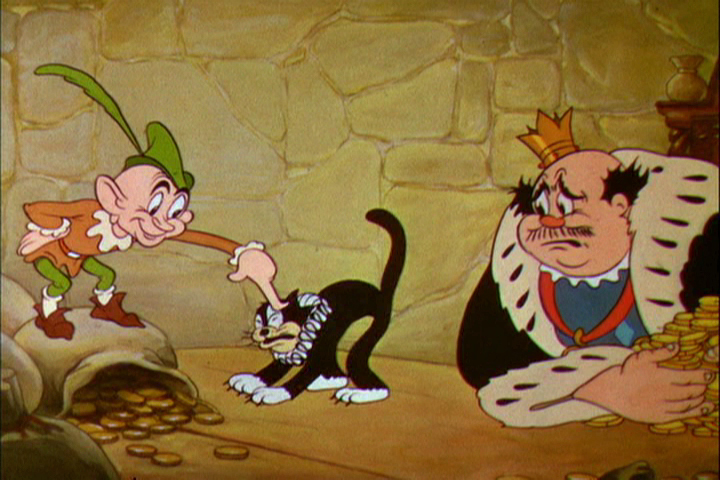
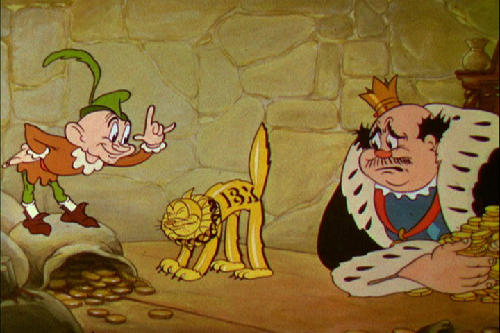
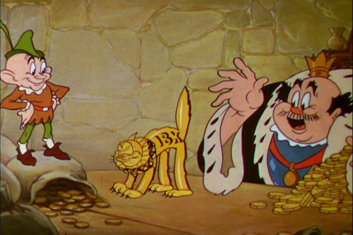
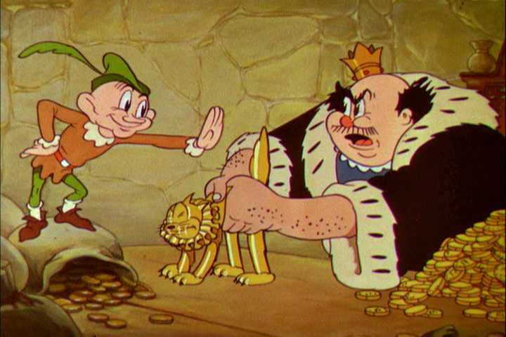
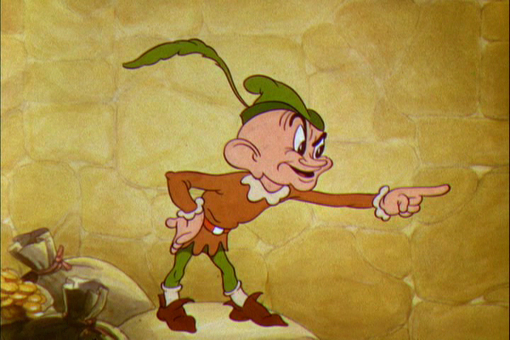
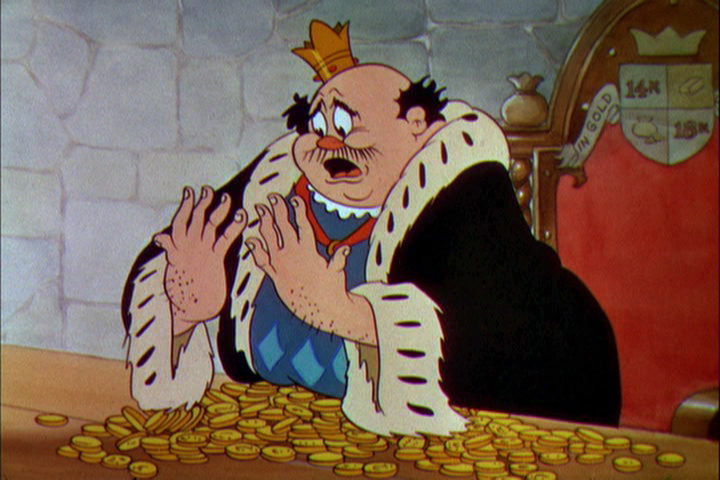
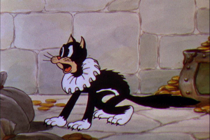
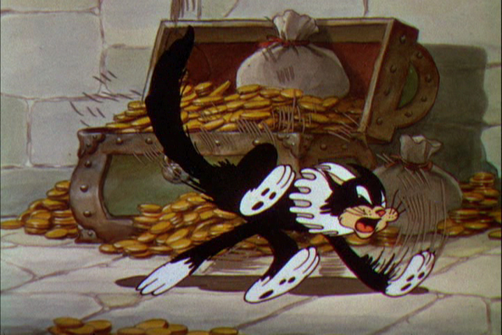
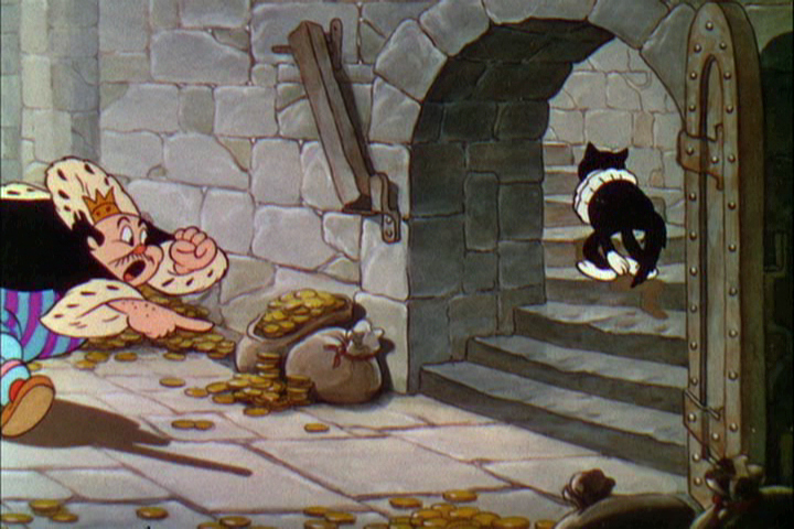
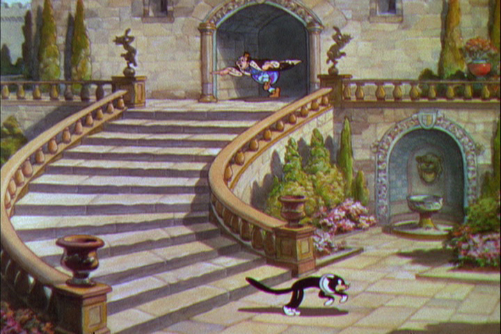
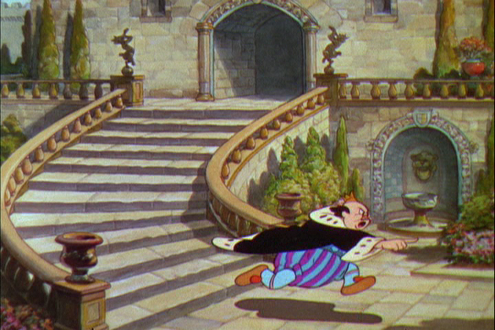
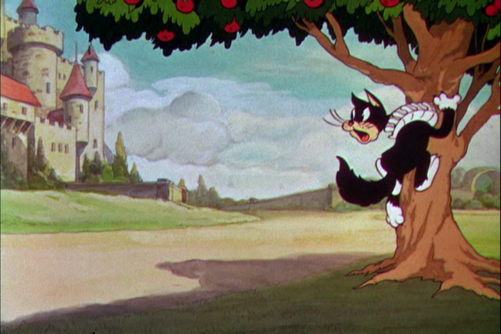
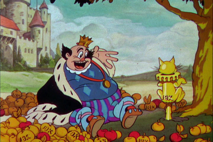
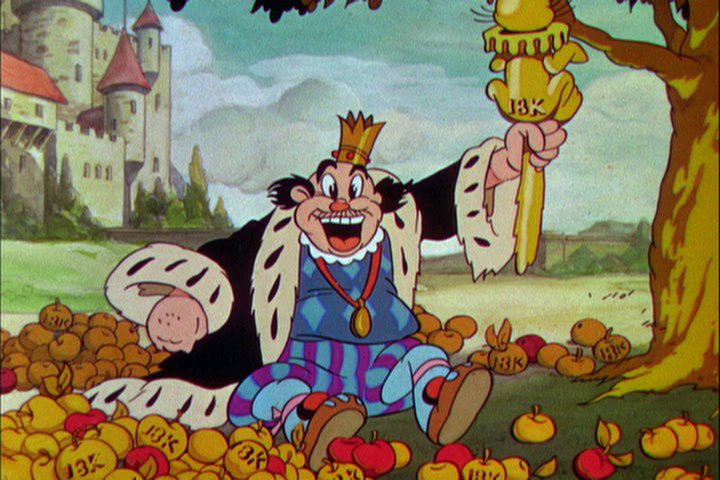
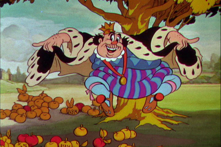
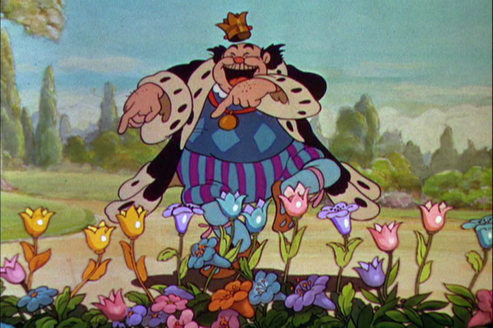
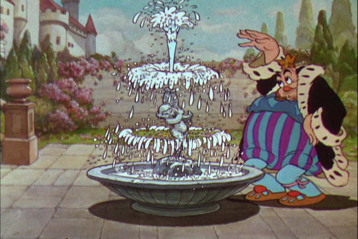
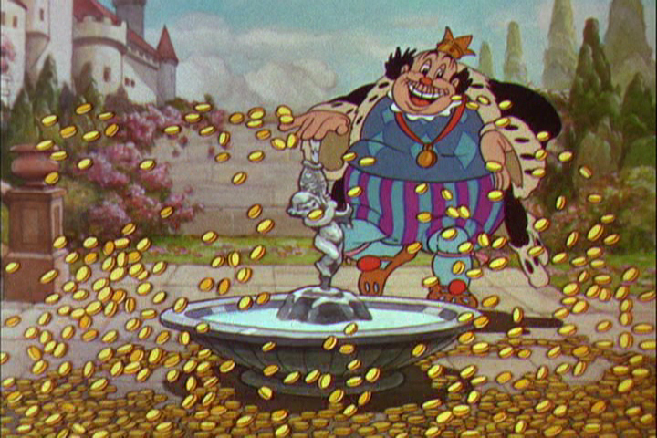
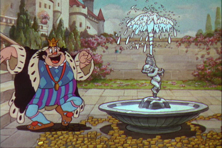
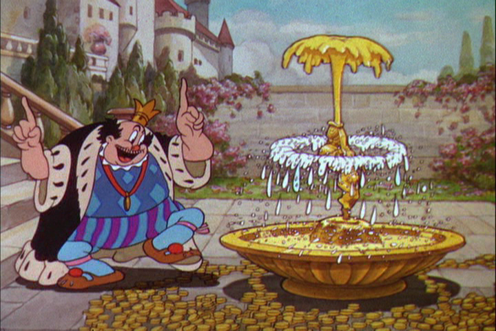
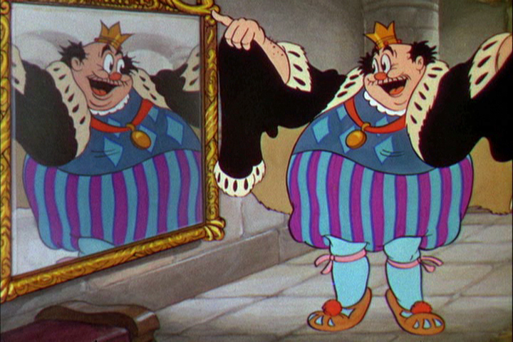
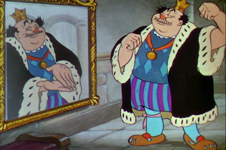
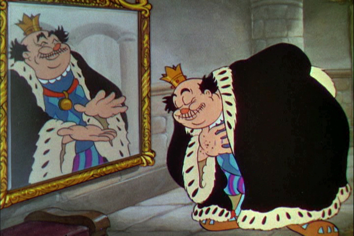
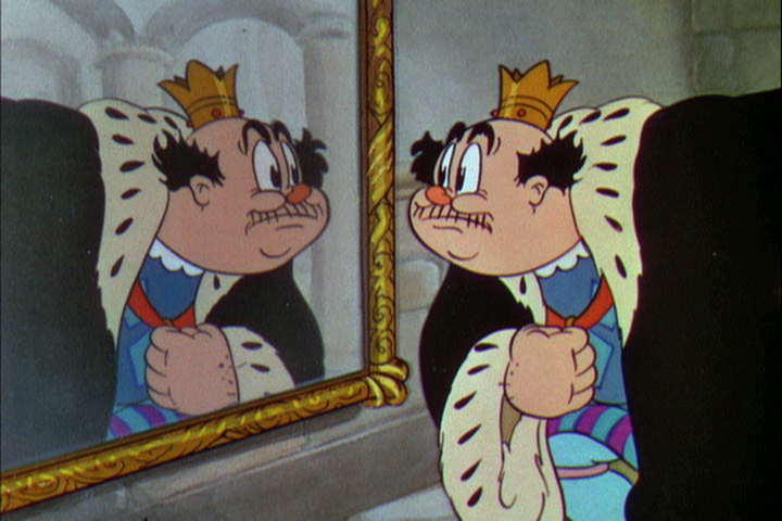
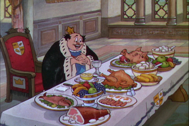
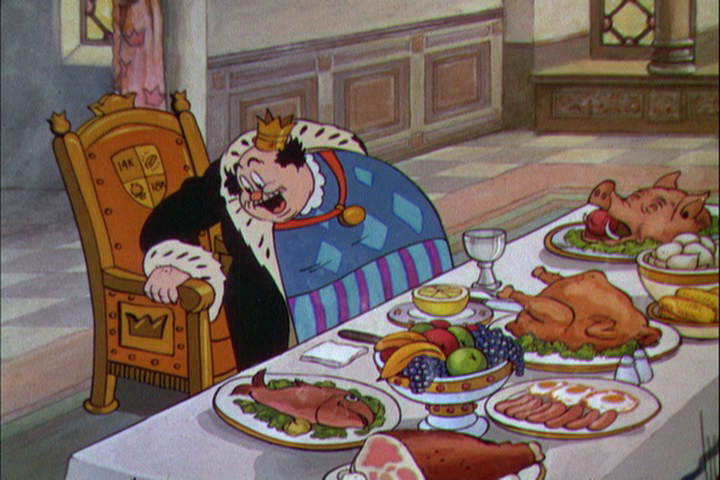
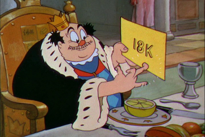
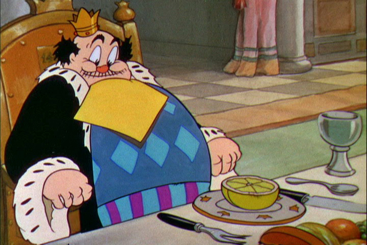
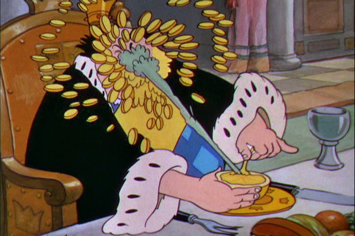
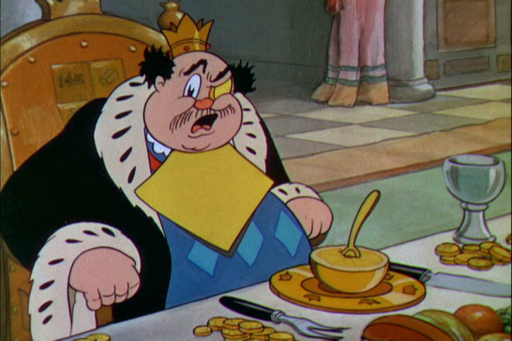
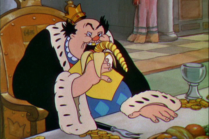
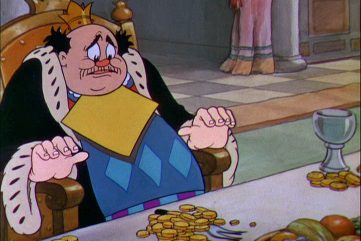
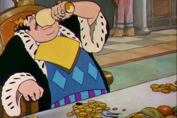
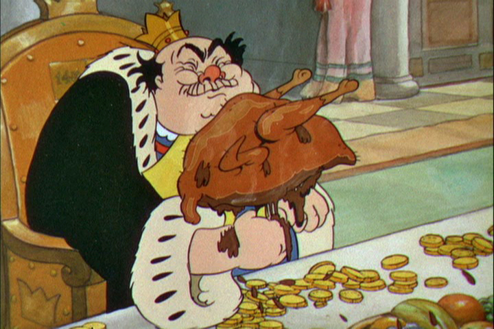
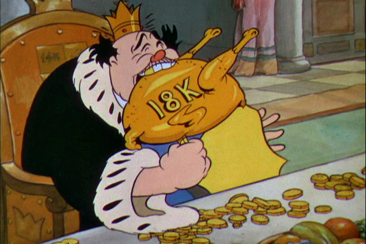
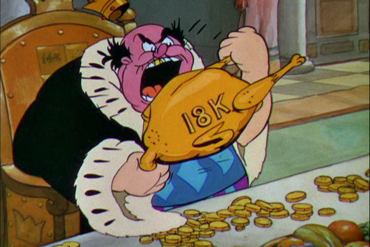
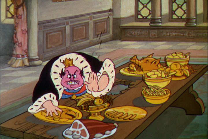
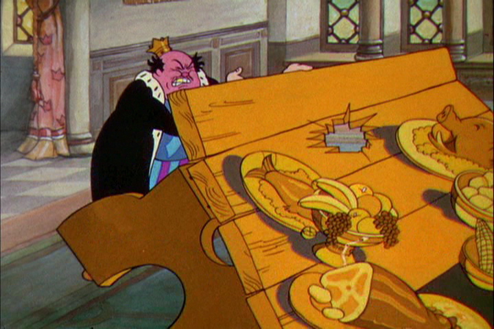
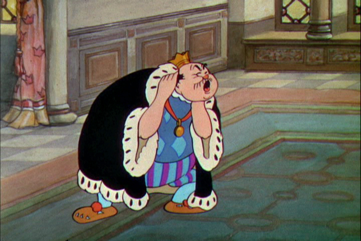
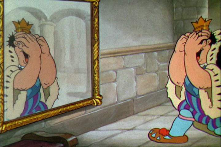
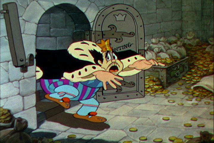
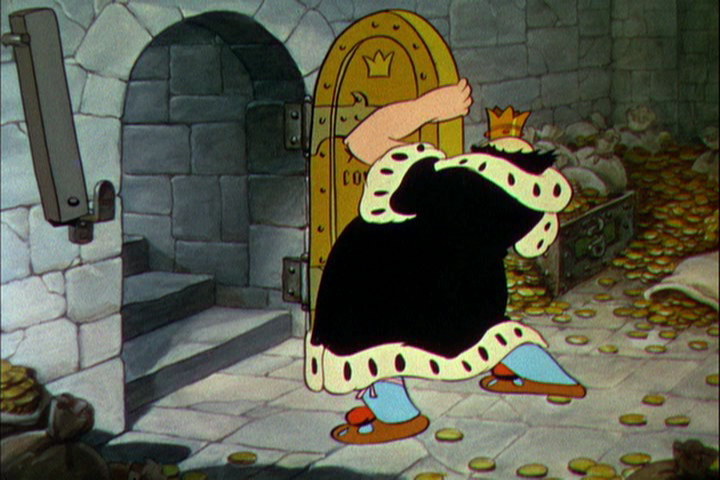
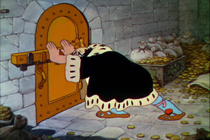
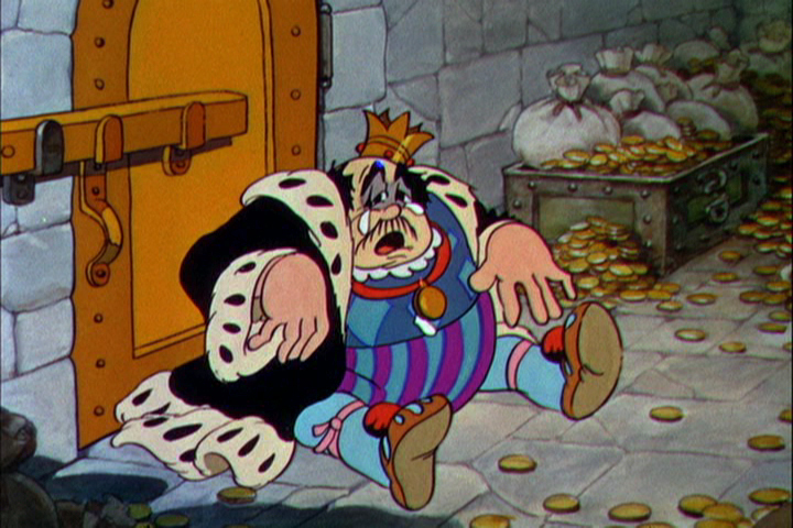
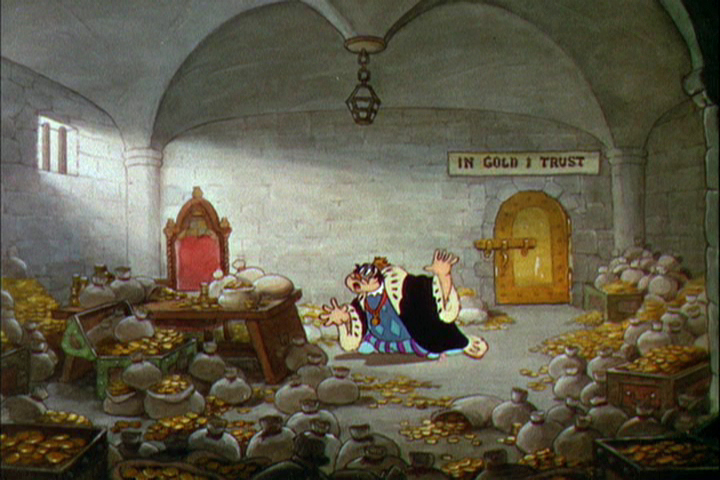
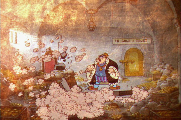
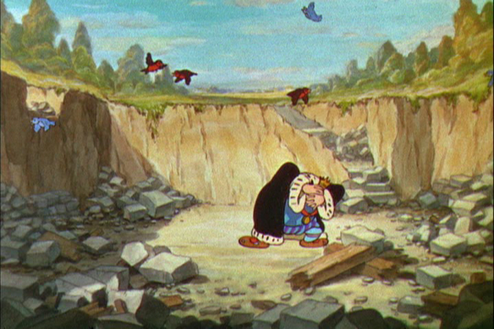
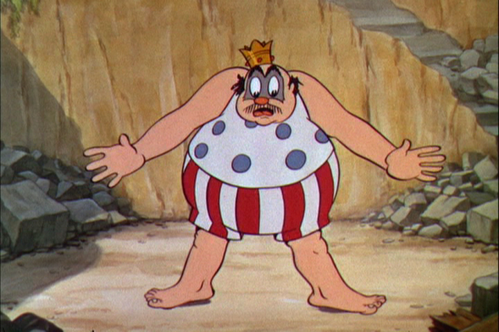
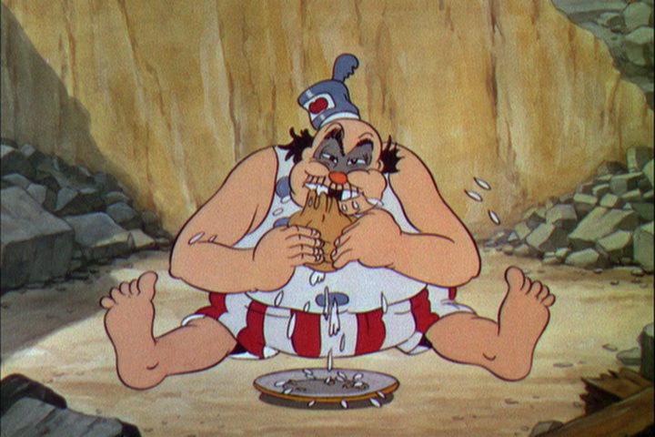
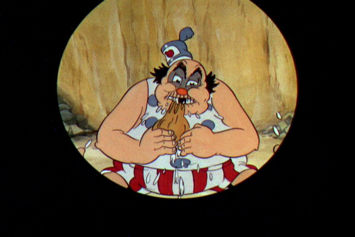
The Golden Touch
 With Snow White in the back of his mind, Walt Disney placed close attention to what was going on at his studio. He had to be completely aware of his artists’ abilities in how they’d be able to handle the task of creating strong emotions in animation, something that wasn’t too risky on a Mickey Mouse cartoon, but might prove difficult when tackling tears for the climactic moments of a feature about a realistic looking princess and her prince.
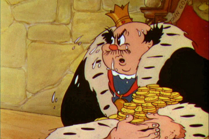
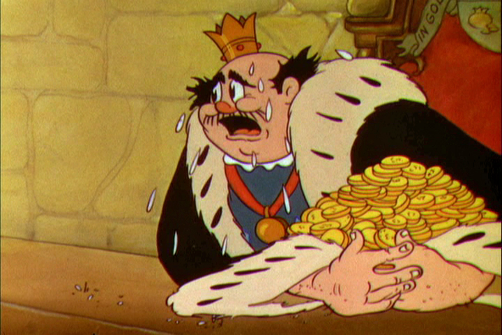
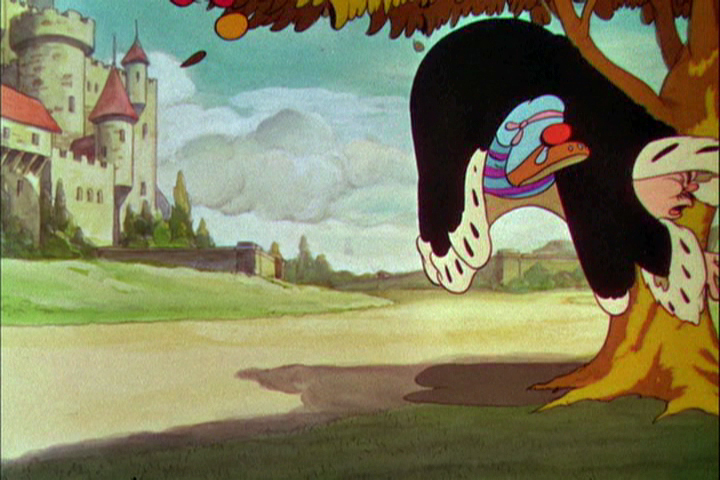
 The Golden Touch was a task given to his two best animators, Fred Moore (who animated all of “Goldy”, the elf who bestowed the magic touch on the king,) and Norm Ferguson (who animated all of the king and his black cat.)
Walt Disney gave himself the task of directing the film. This would be the last screen credit he would ever get for direction. After the film was completed, Walt admitted that the film was “a real stinker.”
This film was the first to use extensive use of dialogue throughout. When Billy Bletcher was recorded as the voice of King Midas they filmed him reading the lines with his lips painted white so that the animator, Ferguson, could easily work with the frame by frame study. The film does get a bit talky.
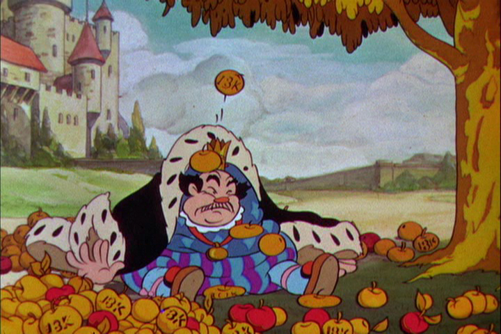
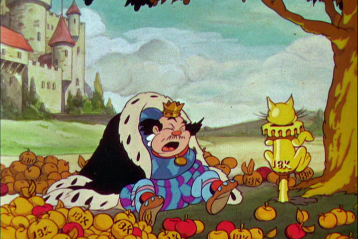
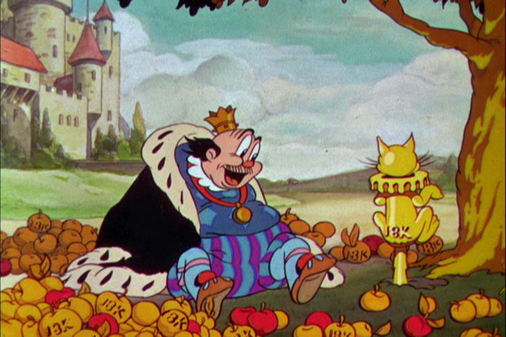
Other critics have given it as negative a review as Disney gave himself. I actually like a lot of it. The animation throughout is interesting. Neither animator has found a positive character, but both bring a peculiar touch to the two protagonists. “Goldy” is one of the creepier characters ever in a Disney film. Fred Moore gave an indication of how odd the seven dwarfs could have been. The king is very similar to “Old King Cole” done only a year earlier in 1933. He looks and acts similar, although the animation is tighter and more experienced.
I think the backgrounds in “The Golden Touch” are spectacular and well designed, color-wise. The art direction is first rate, as might be expected. The watercolors of the castle and its surroundings are beautifully painted. Even though cross cutting between the king and “Goldy” the variation in backgrounds isn’t jarring but firmly appropriate. “Goldy” has a bright gold color behind him, the king remains has gold behind hi until he returns to reality, now with Gold’s magic touch. Then he gets the blueish-gray of the castle as his Bg color.”
Artistically the film is very rich, as might be expected of any “Silly Symphony” of this period. Handsomely produced, of course.
 3
3
 4
4
 5
5
 6
6
 7
7
 8
8
 9
9
 10
10
 11
11
 12
12
 13
13
 14
14
 15
15
 16
16
 17
17
 18
18
 29
29
 20
20
 21
21
 22
22
 23
23
 24
24
 25
25
 26
26
 27
27
 28
28
 29
29
 30
30
 31
31
 32
32
 33
33
 34
34
 35
35
 36
36
 37
37
 38
38
 39
39
 40
40
 41
41
 42
42
 43
43
 44
44
 45
45
 46
46
 47
47
 48
48
 49
49
 50
50
 51
51
 53
53
 53
53
 54
54
 55
55
 56
56
 57
57
 58
58
 59
59
 60
60
 61
61
 62
62
 63
63
 64
64
 65
65
 66
66
 67
67
 68
68
 69
69
 70
70
 71
71
 72
72
 73
73
 74
74
 75
75
 76
76
 77
77
 78
78
 79
79
 80
80
 81
81
 82
82
 83
83
 84
84
 85
85
 86
86
 87
87
 88
88
 89
89
 90
90
 91
91
 92
92
 93
93
 94
94
 95
95
 96
96
 97
97
 98
98
 99
99
 100
100
 101
101
 102
102
 103
103
 104
104
 105
105
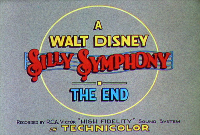
The End
Finally, here is a video representation of the Silly Symphony in motion.
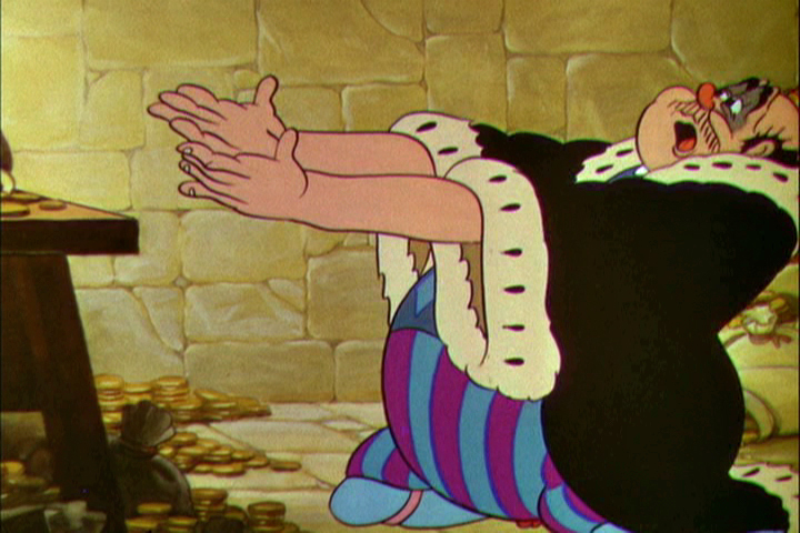
Action Analysis &Animation &Commentary &Tytla 01 Apr 2013 04:55 am
Stanislavsky Boleslavsky and Tytla’s Smears & Distortions – 4
 I would guess an actor, one who was truly devoted to their craft, would try to assume the full personality of the character he or she is playing. For an actor who felt devoted to the craft, they’d veer toward some specific acting school. Stanislavski or Boleslavsky, Actor’s Studio, Meisner, Chekhov or whatever combination thereof, the actor would use these schools of approach trying to fully possess the soul of the character.
Marlon Brando, Julie Harris, Paul Newman, John Garfield, Clifford Odets, Montgomery Clift and Marilyn Monroe all these acting greats had their techniques, and all those methods did start with Stanislavsky.
The question for us is how did this affect animation’s actors – the animators? Or did it? I’ve only seen this discussed in depth in one book, Mike Barrier‘s Hollywood Cartoons. Barrier shows a real understanding of Stanislavsky and Boleslavsky when he discusses the overt course of action taken by one animator, in particular, Bill Tytla.
We know that there were plenty of others that were excited by the newly discovered techniques, though we don’t know how wide spread this influence was. My first realization that it was a strong influence came from a joke John Hubley shared with me. He said that the animators broke into two groups, those that were interested in Stanislavsky and those that couldn’t spell it. Hubley was friends with Tytla. Tytla had been the close roommate to Art Babbitt, and Babbitt was close with Hubley, right to the near end.
But Tytla. Let’s look into what he was doing with his animation. I’m going to make a lot of suppositions to tell you what I think he believed . . . the reasoning and the way he worked.
Now, let me show you something.
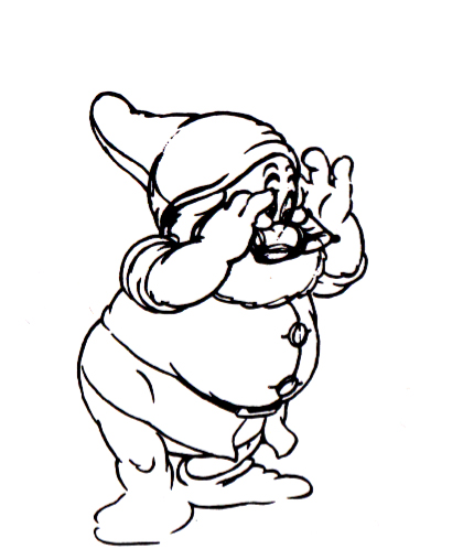
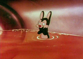
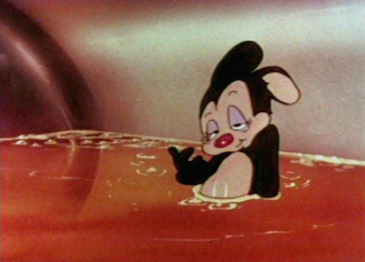
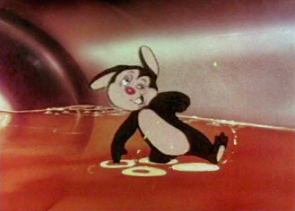
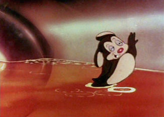
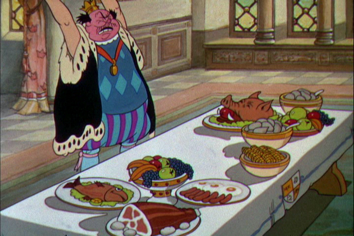
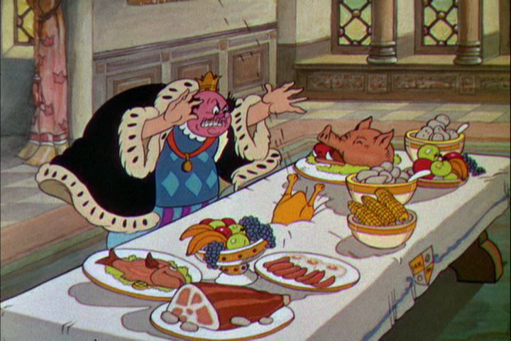
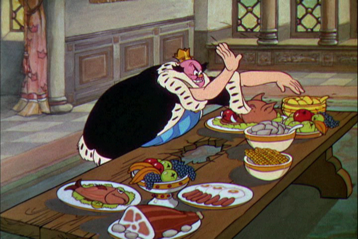
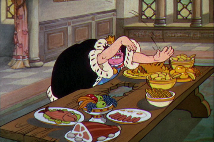
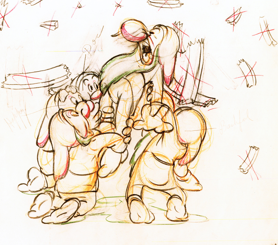
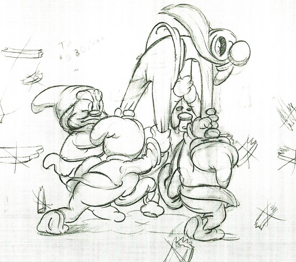
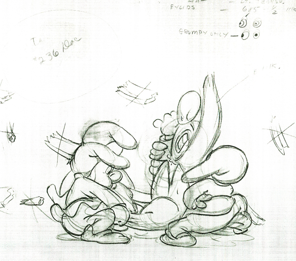
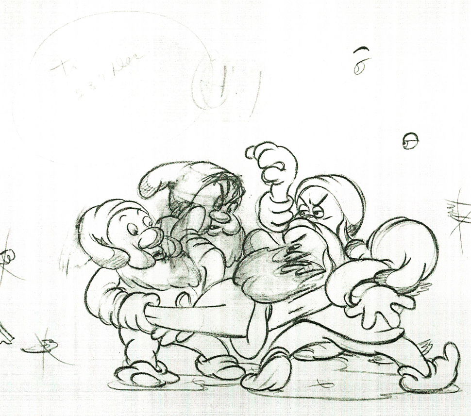
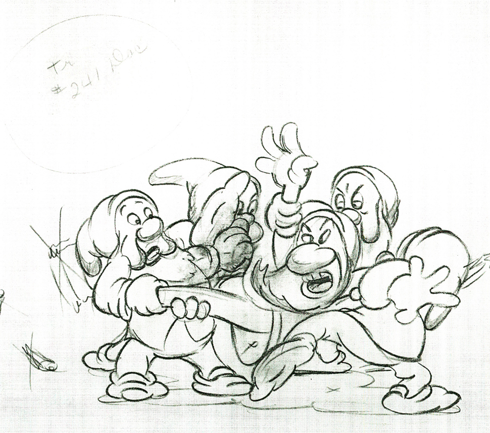
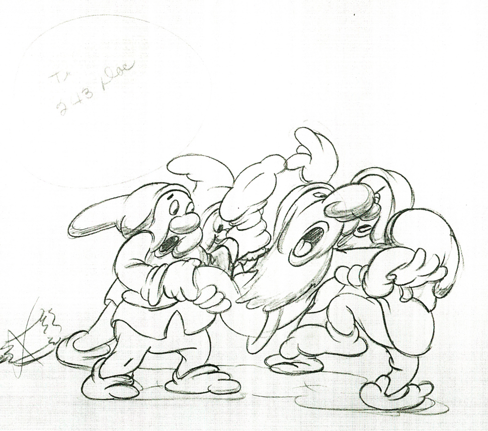
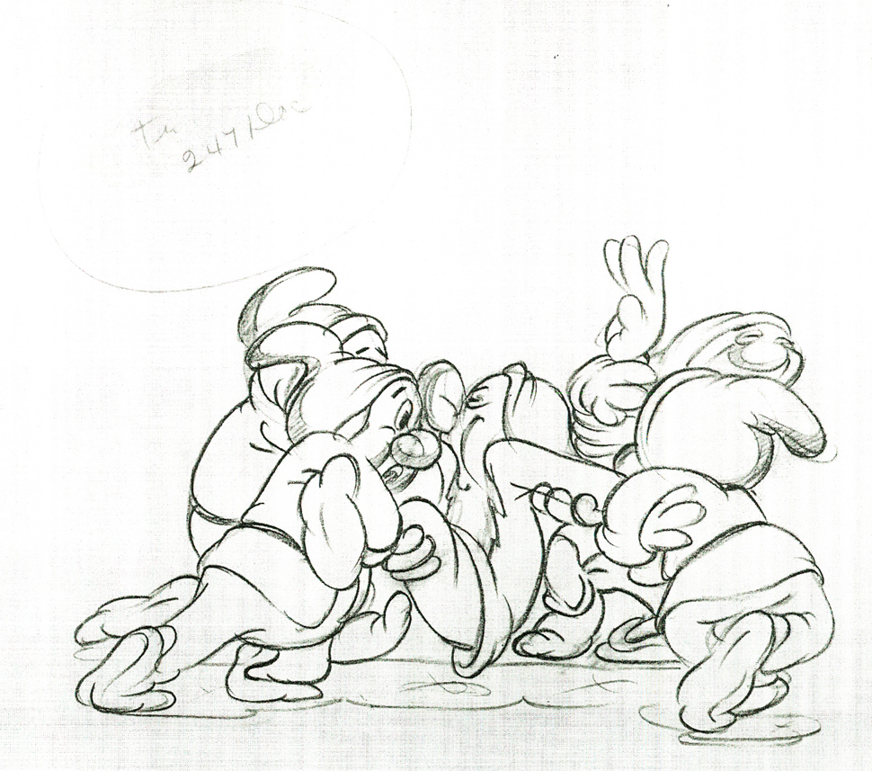
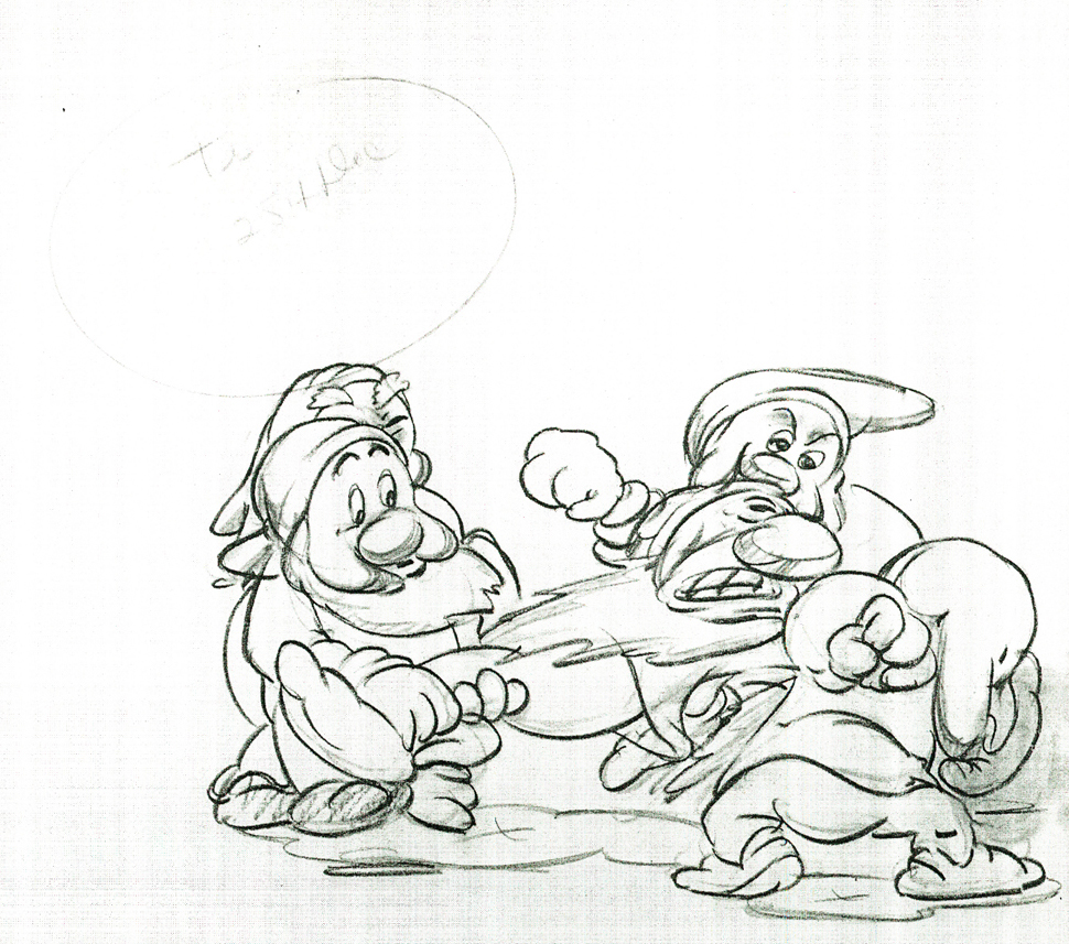
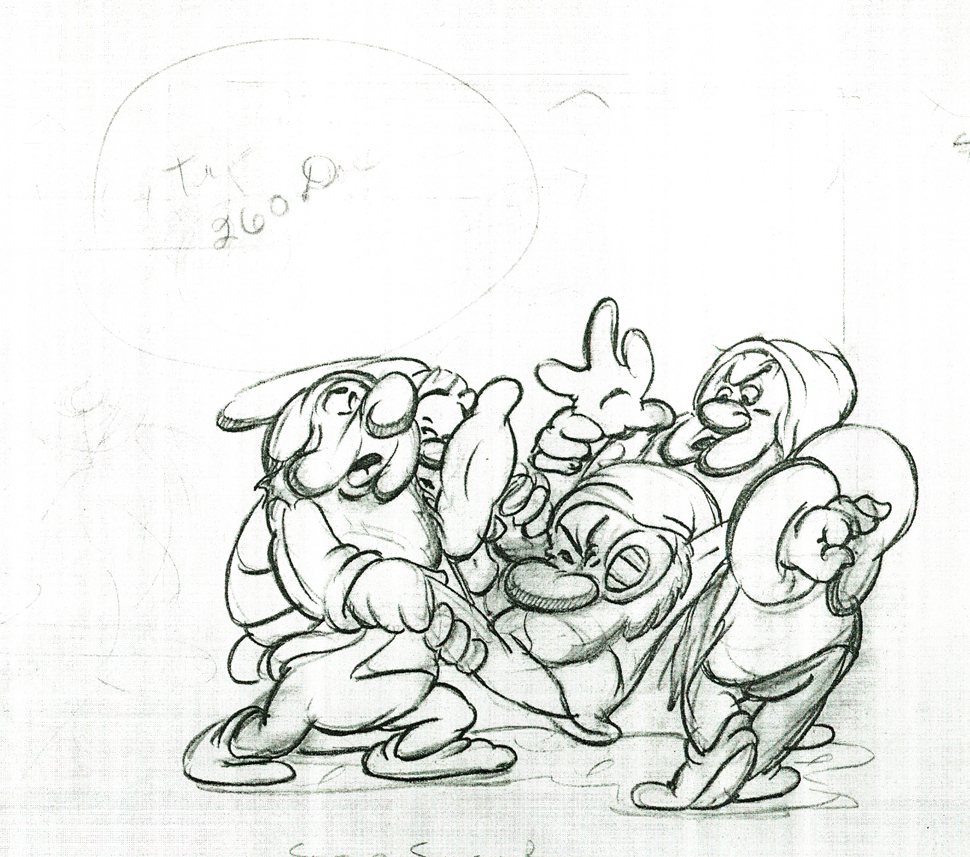
Here are some drawings and a QT movie of the seven dwarfs. Six of them are carrying Grumpy to the wash basin to clean him despite his violent protests.
Note the distortion on many of the drawings. #239 & 241 for example. #254 & 256 as well.
 222
222
 230
230
 236
236
 239
239
 241
241
 243
243
 247
247
 254
254
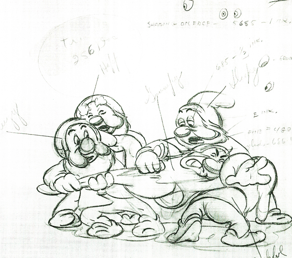 256
256
 260
260
Here’s the QT movie of the full scene:
The P.T. is exposed on ones at 24FPS.
Note the buttons on the bottom far right will allow you to
advance (and reverse) the action one frame at a time. You
should go through this to see the distortion on the inbetweens
and how it works when the animation is in full motion.
There’s a great deal of distortion and smearing in Tytla’s work. I think he uses it to heighten the acting moments that his characters are performing. This particular scene is more action than acting, so other than to show off his distorting the characters, it isn’t a great example of acting, per se. Bt that drawing #239 is a good example of what he’ll do, even to the face of the principal character in the scene, to get his animation to work.
It’s almost as if he’d studied live action frame by frame and represents all those motion blurs in live action by smearing the face. The dwarfs are probably the first time complicated acting is successfully achieved. They’d done it before with many of the characters in the Silly Symphonies, but these are characters who sustain strong personalities over a long period of film. They also go through strong emotional changes which underline and works off their personalities.
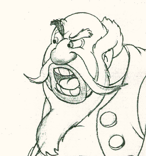
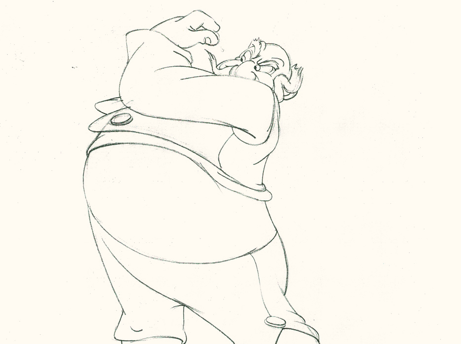
Tytla had a very different character in Stromboli for Pinocchio. He was a theatrical type, very changeable personality with emotions going all over the place – from high to low in the bat of an eye.
Tytla brought beautiful distortion to many of the drawings he did, using it as a way to hammer home some of the emotions in the elasticity he was creating. Yet, the casual observer watching this sequence in motion doesn’t ever notice that distortion yet can feel it in the strength of the motion.
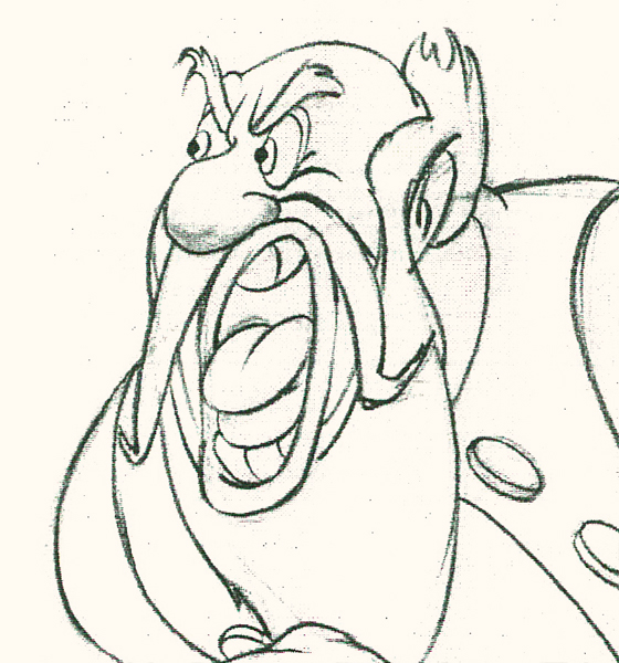
Four drawings (#1, 11, 22, & 48) that shift so enormously but call no attention to itself.
Brilliant draftsmanship and use of the forms.
After I first posted some of these drawings and spoke a bit about the distortion Tytla would use to his advantage – for emotional gestures – I received some comments. I’d written that . . . “It’s part of the “animating forces instead of forms†method that Tytla used. This is found in Stromboli’s face.
This note arrived from Borge Ring after my first post Bill Tytla’s scene featuring Stromboli’s mood swing:
- The Arch devotees of Milt Kahl have tearfull misgivings about Wladimir Tytla’s magnificent language of distortions. ‘”Yes, he IS good. But he has made SO many ugly drawings”
Musicologists will know that Beethoven abhorred the music of Johan Sebastian Bach.
yukyuk
Børge
Note in one of these arms (right) Tytla uses Stromboli’s blouse to make it look like there’s distortion. It barely registers but gives strength to the arm move before it as his blouse follows through in extreme.
 There’s also some beautiful and simple drawing throughout this piece. Stromboli is, basically, a cartoon character that caricatures reality beautifully. A predecessor to Cruella de Vil. In drawings 76 to 80 there’s a simple turn of the hand that is nicely done by some assistant. A little thing among so much bravura animation.
Many people don’t like the exaggerated motion of Stromboli. However, I think it’s perfectly right for the character. He’s Italian – prone to big movements. He’s a performer who, like many actors in real life, goes for the big gesture. In short his character is all there – garlic breath and all.
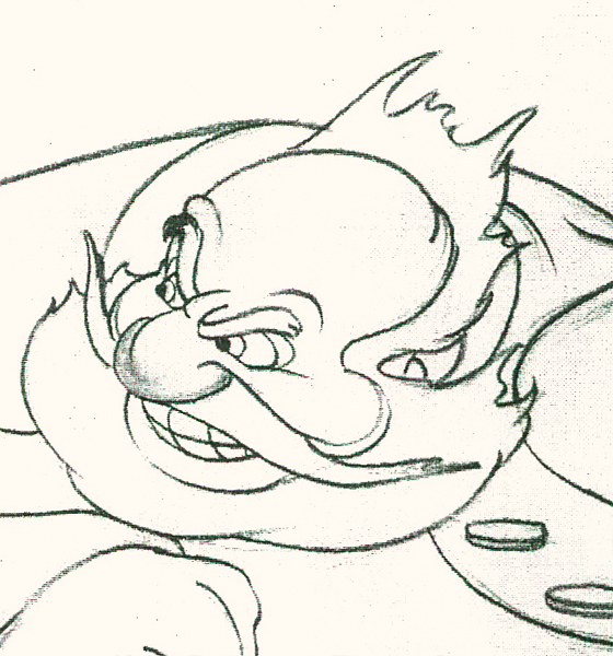
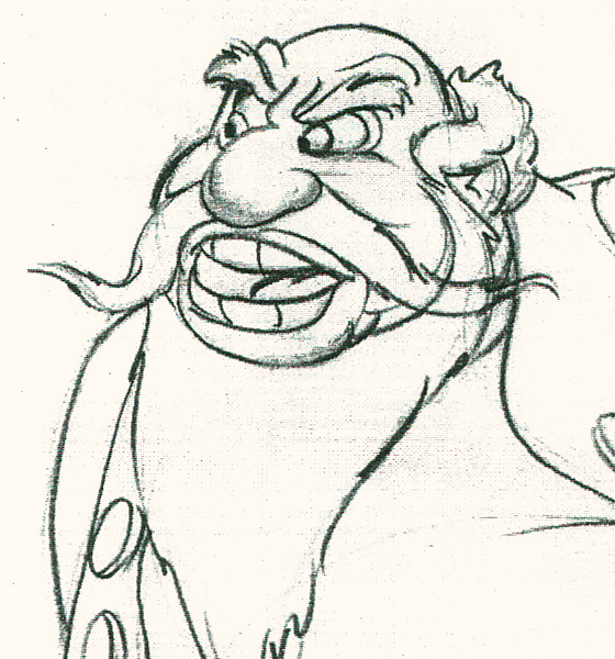
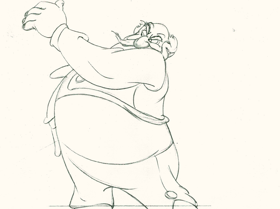
Here’s a short part of another scene. I’ve enlarged the images a little so that the thumbnails are more revealing. Just look at the distortion on the heads and how he stretches the arm to give it a violent emphasis.
 1
1Tytla starts with arm and head all the way back to
the character’s right. It’d be hard for Stromboli to
reach any further back without real distortion.
 3
3
 5
5
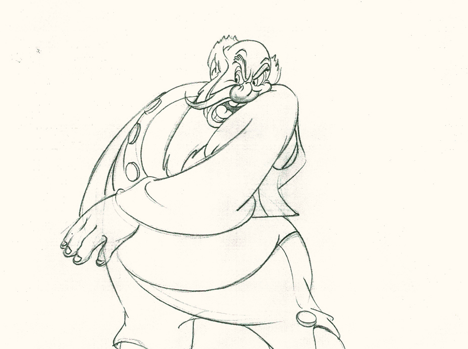
He then slowly advances the head inbetweening slowly.
The arm hasn’t moved very much – maybe what they
call today a “moving hold.”
 7
7
 9
9
 11
11
Now the arm comes out swiping violently.
The head’s almost complete in its turn to the left.
 12
12
 13
13
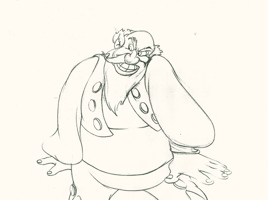
The arm rips across in three drawings.
The head has gone too far.
 14
14
The head goes back to where it should – almost no inbetweens
for Stromboli to get ready for speech. He’s taken 14 drawings
to display his anger.
 16
16
 18
18
 20
20
The arm comes back into a near fist; the expression is violent.
 22
22
The head starts shaking in a “no” gesture.
Violent.
 24
24
 25
25
The head and arm are all the way back.
The vest has been set up to make a violent move.
 26
26
 28
28
Now the arm and fist swipe across in violence.
 30
30
He’s completely pulled his angry head in to his neck.
 32
32
Both arms, moving violently, are suddenly restrained.
 33
33
 34
34
He hits a full stop with his arm.
 36
36
 37
37
He’s made the realization that he has to change his expression
so that he doesn’t lose the frightened kid – completely.
 38
38
A lot going on in only 38 drawings.
Here’s the final QT of the entire scene.This part comes at the very beginning:
Stromboli
Click left side of the black bar to play.
Right side to watch single frame.
David Nethery had taken my drawings posted and synched them up to the sound track here.
It’s not clichéd, and it’s well felt and thought out. Think of the Devil in “Night on Bald Mountain” that would follow, then the simply wonderful and understated Dumbo who would follow that. Tytla was a versatile master.
We’ll continue next time with Dumbo Fantasia and other Tytla gems.
