Category ArchiveCommentary
Commentary &Hubley &Photos 04 Jun 2008 08:14 am
Jazzy Show
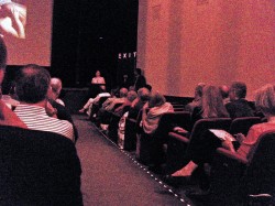 – On Monday night, there was a presentation at the Museum of Modern Art of a number of Hubley short films that highlighted their JAZZ SCORES series. The program was well organized by film curator, Josh Siegel.
Emily Hubley presented the films at the start and had a couple of words about her parents’ work. She was joined in the audience by her sister, Georgia Hubley, and her brother, Ray Hubley. Their families were also present. Only Mark Hubley wasn’t able to make it down for the show. ________________________________Emily talking in front of the auditorium
The films were presented in clusters of composer.
Tender Game, with music by Ella Fitzgerald and the Oscar Peterson trio, led off the program. With a newly constructed print the colors dazzled with depth and beauty. You could see the texture of the paper in the backgrounds and the beautiful brush strokes. The art couldn’t have looked more stunning.
Three Dizzy Gillespie shorts followed:
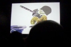 The Hat has an improvised voice track with Dudley Moore and Dizzy Gillespie. They also did the score – Dudley on piano, Dizzy on trumpet.
Date with Dizzy is a live action piece that promotes the “Storyboard” ads. A live action director, “Don Babbitt,” tries to get Dizzy and his group to perform a score to their animated ad. The ad was drawn and animated by R.O. Blechman.
____The Hat played on the big screen______Voyage to Next features Maureen Stapleton
_____________________________________and Dizzy Gillespie. Dizzy did the score with Dee Dee Bridgewater singing. (I did a lot of work on this one. I have a lot of Bill Littlejohn’s drawings, and I’ll show them off sometime soon.)
Following this, Benny Carter‘s widow, Hilma Carter, and Ed Berger, Carter’s biographer, introduced shorts that Carter scored.
Adventures of an * was the featured piece with a newly reconstructed print (I wrote about this here) and an out-of-this-world art exhibit of many backgrounds and cel paintings. (Actually cels weren’t used. The characters were colored on paper with crayon and wax and blackened all around their shape. This was then double-exposed into the backgrounds.)
Finally, Of Men and Demons, finished the night. This film was scored by the brilliant Quincy Jones, and the score is a major strong point. There is no dialogue, hence there are no voices heard. Tissa David animated a lot of this film and re-worked a lot of Art Babbitt‘s scenes in this film. Bill Littlejohn did much of the demons.
Tissa sat to my left along with her close friend Ruth Mane, who was a first class inker and checker in NY’s animation story. We worked closely at Raggedy Ann.

____Emily Hubley, Josh Siegel and Tissa David in the lobby of MOMA.
____I met them there when I arrived.
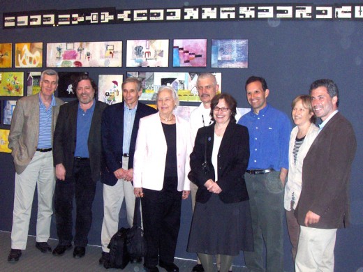
__A crowd after the screening.
__Left to right: John Canemaker, me, Ed Berger, Hilma Carter, Ron Magliozzi (Assistant
__Curator, Research and Collections, MoMA), Emily Hubley, Ray Hubley, Georgia Hubley,
__Josh Siegel (Assistant Curator, Department of Film, MOMA).
The screening was pretty much full, but I wouldn’t say the animation community was well represented. I saw a couple of young animators there including Tim Rauch and Emmett Goodman. Ray Kosarin, just back from viewing some 1700 films at Hiroshima’s prejudging, was also there and seemed charged by the Hubley films.
The museum had a dinner for some of the guests including John and me, Amid Amidi, the Hubleys and their families, as well as Hilma Carter and Ed Berger. Tissa had to leave right after the screening. It was a real treat of an evening.
Animation Artifacts &Articles on Animation &Commentary &Disney &Fleischer &Photos 20 Apr 2008 08:28 am
Howard Frank & Ollie and Creating Betty
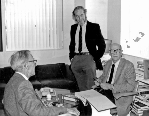
Howard Beckerman sent me this great photo and a short letter attached to it. I can’t help but post both:
___________________________________________(Click any image to enlarge.)
Hi Michael,
Someone suggested that I send you this photo of Ollie signing my review copy of Disney Animation The Illusion of Life. It was taken in 1982 at the publisher’s office. Frank and Ollie were there with their wives. I was doing an interview to accompany a review of the book.
I brought my camera and the book, which in it’s large cardboard box stuck jauntily out of my shoulder bag. After the interview I more or less removed my interviewer’s hat and donned my Frank & Ollie fan hat and asked if they would sign the book. A publicity guy, standing in earshot, responded immediately saying, “Oh, you need a book? I’ll get you one.” I looked around and saw a pile of books about 5 1/2 feet high. “I brought my own I said,” assuming my best George Washington and the cherry tree stance. Ever since, then, I’ve thought that if I had left mine at home I could have had a second copy of this now valuable first edition.
I had met Frank Thomas before, but he introduced me to Ollie Johnston at the initial presentation of their book at the library at Lincoln Center. Ollie’s first statement to me after saying hello was, “Do you want to see my train?” He then pulled a picture of his backyard, full-size railroad rig from his wallet like a doting grandparent with a child’s snapshot.
Howard
- Mike Dobbs has a blog called Made of Pen & Ink. He was once the editor of Animato!  and Animation Planet, two fanzines for animation fans.
This blog is designed for Mike to post chapters of a book he’s writing about the Fleischer brothers entitled: Made of Pen and Ink: The Fleischer Studio and Cartoons.
It’s been a long time between chapters, and he’s just posted the third on this blog. It’s about Betty Boop and her history at the studio. If you haven’t kept up with it, this is a chance to read some heavy duty writing about Max & Dave.
____________An illustration by Michael Paulus.
Mike also has an animation blog wherein he reviews animated films and dvds. This, too, is worth checking out. Animation Review.
With all the nopstalgia in this post, I probably shouldn’t be adding a comment here, but it’s  on my mind. I saw a few minutes of Johnny Bravo last night on cable tv. I never did warm up to this show, though I have to admit that watching it last night it looked a bit more golden.
Compared to all the monstrously poor animation seen in the Flash shows, Johnny Bravo, as limited as it was, seemed richer and fuller. When a head turned it didn’t just pop from one side to another, it turned. When an arm had to move up, it didn’t just pop, it animated.
Have we reached the point where I miss even limited animation?
Commentary &Photos 13 Apr 2008 07:55 am
Buildings In My Sightlines
Ugly
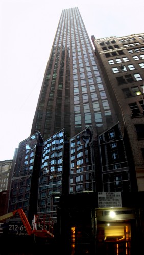
- A year ago I posted some photos of cranes working on buildings in the area not far from my apartment in Manhattan. The one pictured below to the left was there for half a year. The building it was raising is near completion, and I’ve pictured it below, to the right. It’s one of these monsters that goes up to a seeming infiinity and successfully blocks the view of the Empire State Building, a couple of blocks behind it.
 ___
___
Not Ugly
A small grouping of older buildings sits six blocks south of the monster above. These I find interesting and attractive. Starting to the right, (note that I’ve lightened the building farthest right to highlight the four in the center) there’s an interesting building which has, to its left, a smaller building. Then a smaller building, and a smaller one yet. I suspect it’d be interesing to have an apartment in one of these which sit across from the Flatiron building at the intersection of Fifth Avenue and Broadway. At one time, these buildings probably housed photographers’ studios – this had once been the neghborhood for that field.

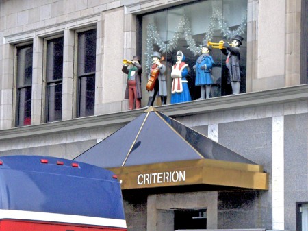
Finally, I couldn’t resist pointing out these carolers who remain on the
ediface of the building above, farthest left.
They probably went up one christmas and have stayed there
singing ever on.
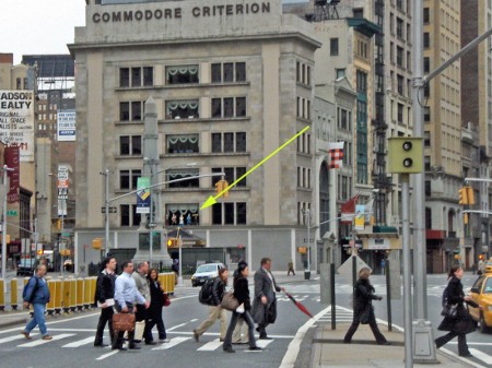
Below is another shot of the same buildings from 23rd Street.
The arrow points to the carolers.
Commentary &Photos 23 Mar 2008 09:06 am
Crane chaos
Last week there was a crane accident in New York. A crane, tied to a building under construction, tore away from its ties and fell over. The crane hit a building and cantilevered onto another building totally demolishing a four story brownstone on 51st Street and Lexington Avenue. At least four were killed, several had to be dug out of the rubble. (Remembrance of Sept. 11th for all New Yorkers.)
All I could think last Saturday, was that you’re sitting in your apartment on a Saturday afternoon, cleaning or watching the tv or just doing nothing. Suddenly, your life is over.
The chaos of it all just hasn’t left me all week.
I was going to photograph a crane to dress the site last Sunday, but couldn’t get up the drive to do it. I’ve decided to post these older pictures from last April (all of which are no longer there; the buildings are just about constructed.)
 There was a woman interviewed on the day of the accident. She had been born in the building that was destroyed, and she spent her entire life living in the building. She left to go out and buy groceries and came home to devestation. She teared up when she mentioned her two cats left in the building and wondered if they would find them in the rubble. It was several hours later when she was being interviewed, and she was still holding two bags of groceries.
The crane to the left can be seen from many blocks away. It stood at 30th Street and Madison Ave for about six months. An enormous piece of equipment, from a block away it virtually looked as tall as the Empire State Building, behind it. The building they eventually built with the crane does block out the view of the Empire State Building for a good many people.
Interestingly enough, there’s a second crane – albeit much shorter – half a block away which is working on another construction site. At times, traffic backs up for blocks. (See both in the image above to the right.)

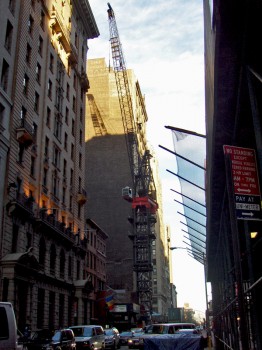
Here are two other views of the same two cranes. The tall one from a block away looking down over a couple of buildings. The image on the right is the short crane as seen from the base of the tall crane.
 If you look up to 42nd St from 14th St, you see a mass of construction going on uptown. Even just out of the frame on both the left and right, there’s more. The crane below is to the left at 18th Street. It’s enormous when standing straight up and down. Here it’s bent to pick up materials.
I like the color of the sky against all the cranes pushing into the sky at the right.


Here’s another shot of the same crane from the other side of a building.
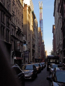

The crane above is on 19th Street just east of Broadway. Traffic seems to have learned how to maneuver around these things as it flows without too much difficulty.
Another person who was interviewed on NPR yesterday was the owner of a bar in the building on the street level. He decided that he wanted to see the Yankee spring training game. They’ve aired so few of them that he decided to stay home and go in a bit later so that he could enjoy the game. When he arrived his bar was no longer there. One of his employees was found in the rubble later. Another tenant of the building, a friend of his, had ridden down with the crash and was buried. He was also found alive and was just homeless. The owner of the bar just worried for all the newly displaced people.
 Here, to the left, is an image of the Empire State Building. Cranes were obviously key to the construction of this building and others equally beautiful. One can only hope that the construction under way will leave behind some glorious piece of architecture, though it always seems more likely that some rectangular box will be built to hide more of the view from the ground.
There always is this feeling of danger, though. One sees these monumentally tall machines and wonders if it fell over would I be in its range?
As usual, they immediately started searching for someone to blame for the incident that happened last week. At first, they told us innumerable times that an inspection had taken place recently so that wasn’t the problem. Now we learn that the inspector hadn’t done his job properly.
To me, it all comes down to deregulation. It started when Ronald Reagan deregulated the airlines, and it came to its zenith when Bill Clinton deregulated the airwaves. At first the airlines began to fold, then Disney bought ABC, Time Warner bought AOL, and it looks like the taxpayers just bought Bears Stearns for Chase. The pharmaceutical industry is pricing us all out of drugs, dog food is poisoned and our toys are covered in lead paint. It might be time for the Federal Government to begin to open its eye again.
Sorry for the rant; we live in chaos, and New York City seems to heighten the reality of that for us.
Happy Easter
Books &Commentary &Illustration 19 Mar 2008 07:58 am
Only God Can Make a Tree
- If you’ve only heard clips of the Obama speech given yesterday, spend the time and watch the whole thing. It’s time to plant apples here. Part 1, Part 2, Part 3, Part 4.
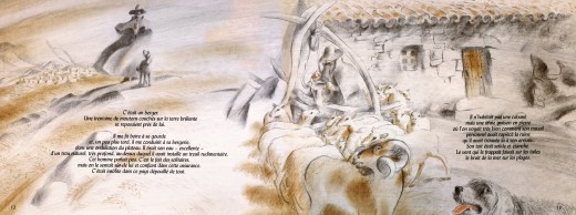
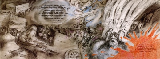
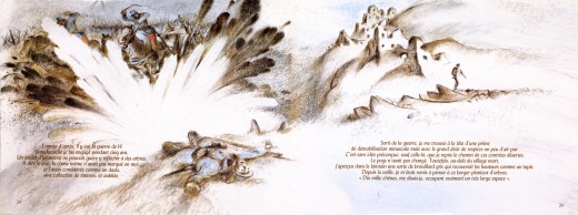
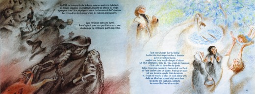
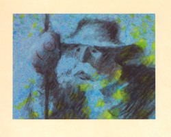 - Mark Mayerson features an article on his blog about Frédéric Back and the news about an exhibit of his artwork. I’m not in Canada, so it’s hard to see the exhibit and the screeenings. However, I thought it might be a good idea to look again at Back’s stunning film, The Man Who Planted Trees. Naturally, I want to share what I’m viewing with you, so I thought to put up some frame grabs. This film, though, is so stunning, I don’t think fuzzy frame grabs will do.
I have a book of the film which was illustrated by Frédéric Back from art for the film. It’s in French, and I haven’t attempted to translate it. I’m posting these images purely for the artwork. Aside from the cover, all six images I’m posting are double-page spreads. The book has about 50 pages, so I may post more some other day, but for now enjoy these.

(Click any image to enlarge.)
Animation &Commentary &Frame Grabs &Hubley 18 Mar 2008 08:16 am
The Hat
- Forgive me, I’ve been in a Hubley frame of mind these past few days, so I’m into reminiscing.
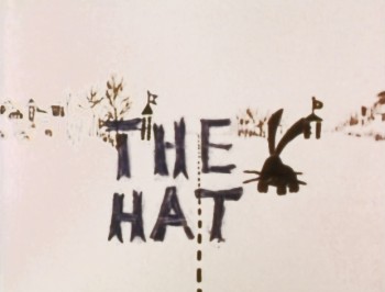 New York’s local PBS station, WNDT – that’s what it was called in the old days – used to have a talk show hosted by film critic, Stanley Kaufman.
(It turns out that this show was produced by the late Edith Zornow, who I once considered my guardian angel at CTW.)
This talk show was quite interesting to me, a young art student. I remember one show featured Elmer Bernstein talking about music for film. He gave as his example the score for The Magnificent Seven. He demonstrated that the primary purpose of the score, he felt, was to keep the action moving, make the audience feel that things were driving forward relentlessly. I still think of that show whenver I see a rerun of the film on tv.
The surprise and exciting program for me came when John and Faith Hubley turned up on the show to demonstrate how animation was done. They were using as an example a film they had currently in production, The Hat. This film was about the siliness of border lines. One of two guards, protecting their individual borders, loses his hat on the other side of the line. Of course, all he needs do is to step over and pick up the hat, but he can’t. The other guard won’t allow him to cross the border illegally – even to pick up his hat.
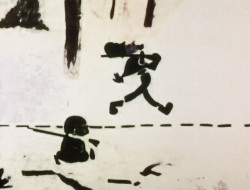
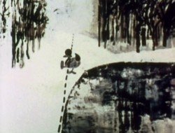
The voices were improvised by Dudley Moore and Dizzy Gillespie (much as the earlier Hubley film, The Hole, had been done.) The two actor/musicians also improvised a brilliant jazz score.
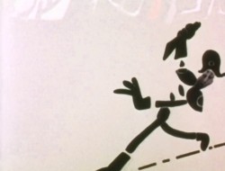
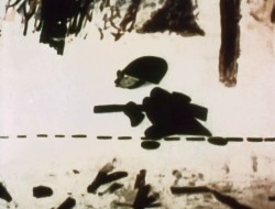
John’s design was quite original. The characters were a mass of shapes that were held to-gether by negative space on the white on white backgrounds.
 The animation of the two soldiers was beautifully done by Shamus Culhane, Bill Littlejohn, Gary Mooney and “the Tower 12 Group“.
Shamus animated on a number of Hubley films during this period, most notably Eggs and a couple of commercials.
Bill Littlejohn animated on many of the Hubley films from Of Stars and Men up to Faith’s last film.
Gary Mooney animated on The Hole and Of Stars and Men. He was an Asst. Animator at Disney, animated for Hubley then moved on to some of the Jay Ward shows before moving to Canada where he continues to animate.
Tower 12 was the company formed by Les Goldman and Chuck Jones at MGM. Apparently they were between jobs when Hubley was finishing this film, and Chuck offered help.
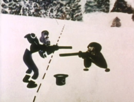
Of course, the colors of the film as represented by the dvd are pathetically poor. It’s hard
to even imagine what the actual film looks like, and it’d be great to see a new transfer of
all the Hubley films.
Commentary 13 Mar 2008 08:15 am
Chicago 10-8=2
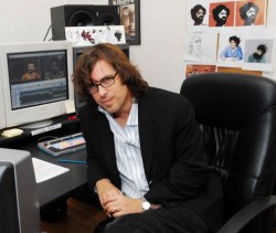 - On Tuesday night I saw the feature length documentary Chicago 10 and have been trying to think what to say about the experience and the film. I have to give great credit to the director, Brett Morgen, for having chosen to tell the meat of the story in animation. However, I also have to give him credit for the absolute confusion and lack of information relayed in that same story.
Todd McCarthy in his review in Variety justifies this lack of information:
____“Chicago 10″ is far less interested in ____offering a fresh, probing look at what
____took place on the streets during the 1968 Democratic National Convention and the
____circus trial that followed than it is in celebrating the stars of the anti-war movement.”
This was a warning almost every critic gave in their mixed to negative reviews, so I went
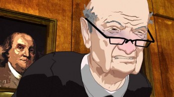 into the film somewhat prepared. However, I found myself even wondering what the trial – told almost completely in animation – was about. This isn’t good for a documentary. One would think relaying information was first and foremost for a doc. Brett Morgen tries boldly to tell a film dramatically without using a narrator or explanatory cards (except at the beginning and end of the film.) Unfortunately, this decision left us in the dark. There’s just a lot of theatrics and in-fighting during the trial, and a lot of cops beating on hippies outside.
The film seems to intercut between the mostly live action doc footage of crowds and Chicago Police and soldiers and beatings to the trial of the Chicago 7. (In this film, others are included adding to the director’s total title count.)
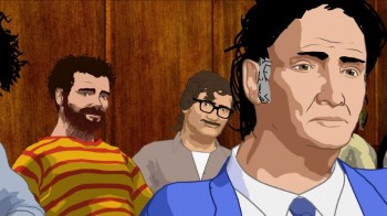 The trial is wholly recreated in MoCap animation. It looks a bit like Waking Life, but whereas the Linklater/Sabiston film has fun with the style and a looseness, this is all hard rock shapes. Areas of the face have that paint-by-numbers type of shading, but the shapes remain hard edged and move like the hair – as a solid shape in 3D. When Abbie Hoffman, with his mounds of curly hair, turns his hair stays solid and is interesting but inaccurate movement-wise. I suspect it stayed locked to the MoCap images without much alteration. It ain’t pretty.
The exterior shots include what, to me, was the best and most daring of the animation. At one point, there’s a bandshell in which a couple of speakers speak to a crowd in the park. The crowd is live action (sometimes color; sometimes B&W), but the speakers are animated. The sequence completely works, and you never question the mix of media but completely take it in. This was a surprise in the film which feels just flat in its loudness (the sound blares throughout) and its constant intent to entertain – without letting us really learn anything.
I’m not sure if any of the Asterisk Pictures work remains in the film, but I didn’t recognize any of the art I saw prior to the film viewing. Curious Pictures gets the big credit at the end of the film.
The Curious Pictures site has a full page about the film with links to a lot of the reviews.
Rotten Tomatoes gives it a 72% on their “Tomatometer.”
Animation &Commentary &Fleischer &Frame Grabs &walk cycle 10 Mar 2008 08:12 am
Betty Walks Backwards
Thad Komorowski posts a Popeye cartoon Popeye Meets William Tell which he surmises that Shamus Culhane is the director (he receives top animation billing under Dave Fleischer’s name.) The only other animator listed is Al Eugster. The cartoon is certainly an oddity, and I’m glad Thad highlighted it for me. It looks like an afterthought from the Gulliver’s Travels team. I don’t remember seeing it before, though I must have. It’s not that great a Popeye short; just an odd one.
There’s a curious thing happening in a walk in the opening of that film, and I hoped I had the film somewhere so that I could take a better look at it frame by frame. I don’t have it so will have to wait until I receive vol.2 of the Popeye dvd.
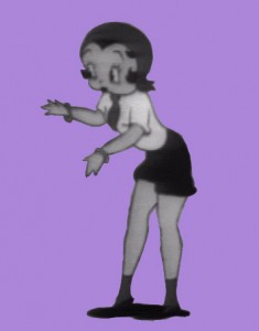
However I started looking a little closer at some Fleischer shorts. There are no end of interesting walks in those films. I found in the last Betty short Rhythm On the Reservation, that Betty walks backwards through about 1/3 of the film. She’s supposed to be conducting a beat for the Native Americans she’s visiting. What comes out is an interesting cycle that was probably animated by Myron Waldman.
I thought I’d share this walk with you.
 1
1  2
2 (Click any image to enlarge.) Betty walks backwards keeping time on three’s.
I can’t help but note that the Fleischer walks always seem to include
a complete turn of the head from left to right.
All animation is exaggeration.
Commentary 08 Mar 2008 09:34 am
Just my Opinion
- I’ve a been bit confused by what is going on at Michael Barrier‘s site.
To begin with he’s posting some absolutely amazing photographs. Many pictures of Disney and his family tavelling around the world. Most of these photos are unidentified, and Mike locates the picture for us and many of the people in them. There are also stunning pictures of some of the WB animators at work and play.
These images are the first rate stuff of animation history. They’re essential to those of us who want to know more about some of these animators who constructed the business in the first place. They’re also fun. (Who ever expected to see a photo of Tex Avery in swim trunks?)
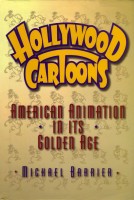
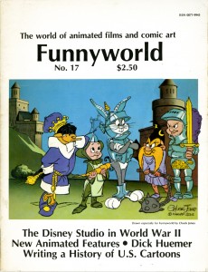 However much I enjoy these photos, I come to MichaelBarrier.com not for visuals; I come for the writing. Way back in the very early 70′s (or maybe it was the ’60s) I discovered this budding animation historian – when no such thing existed – through his magazine, Funnyworld. Immediately, my world began to hinge on this publication. Back in the day. there was no such writing as this; no interviews with animators; no serious reviews of animated films by reviewers who completely understood all aspects of the medium. Yet here it all was, and, what do you know, the writing was first rate.
In those days, I swore by the film criticism of Andrew Sarris, whose American Cinema, taught me worlds about film and the world of the director. Now, I’d found the equivalent of an Andrew Sarris in animation reviewers and historians.
Barrier and I became friends in the ’70s and have remained thus. I contributed a letter or two and was once asked to write a review or a piece about Watership Down. (I had been close to John Hubley who was nastily removed from that film. Perhaps I had some insight to offer.) I took it in stride and all humility when that review wasn’t included. I had no – none – hard feelings. Mike’s review wasn’t as negative as I was, and he offered more insight.
When Funnyworld went through its struggle to stay alive, I watched from the front row of the bleachers, and I was enormously sad when it all ended. Needless to say, I was enthralled when the internet brought it back to me, but I wasn’t prepared for the wealth that would keep coming. The printed magazine came once or twice a year – if we were lucky. The site gets updated frequently, and the material Mike shares with us is enormous.
So, you ask, what causes me confusion? It was this essay posted on March 5th, Accentuating the Negative. Obviously, some of the foul mouthed irritants of the internet misunderstood and internalized some of the comments Mike has posted. They took it personally, for whatever reason, and lashed back in confused, muddled repsonse. Barrier has felt the obligation to defend himself from their comments. It all amazes and confounds me.The world has changed – and not all for the better.
There was a time when criticism was just that. It was necessary for the reviewer to know his(her) business and have a bigger idea of the world to defend. You sidled up to the reviewers you most appreciated.
 If you were into directors, you went to Andrew Sarris or André Bazin and Cahiers du Cinema. If you were into writers, you went to Pauline Kael or Richard Corliss. The point was that there was a big picture. Now you have a choice between thumbs up or thumbs down or one to four stars. In New York it’s one to five apples. All critics today write is Black or White, a description of the story, and I like it or don’t. There is no depth in most reviews, and the language is pedestrian at best. It’s hard to read film reviewers today.
There are a few – just a few – animation critics who’ve earned their salt. Their taste is refined and their opinions are valuable. Michael Barrier leads this group, whether you like it or not. His opinion isn’t for everyone, but that’s irrelevant. I’ve disagreed with him as much as I’ve agreed. No one will ever be able to explain to me how or why he likes Polar Express. That’s my opinion vs his, and it doesn’t mean that I should say he’s an idiot and attack him. It just means I don’t agree with him. The thing is that I respect his writing so much that I paid attention to what he had to say about that film and went back to see the film a second time to try to understand his taste.
However, we’ve always agreed about one thing. Good animation is essential for the continuation of the Art form. The problem is that there’s just so little of it these days. There’s plenty of animation, but there’s just so much chaff for too little wheat.
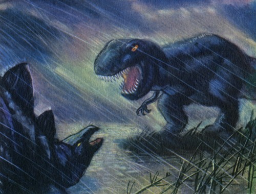 John Canemaker once, many years ago, had a small dinner party around a private screening of Fantasia. John, his companion, me and mine, and Tissa David sat through a projection of that film. John and I still like to joke about Tissa’s response, spoken in heavy Hungarian accent, at the very moment the lights came back on. “That film is HORRIBLE!â€
(Actually, I’m not sure if that’s the exact quote – I’m not sure any of us remember since we’ve joked around it for so long imitating Tissa’s Hungarian accent. She loved the teasing.) We all laughed.
On that day, John was, I think, hurt on some small scale. Fantasia was an important film to him and his development, and it’s germinal to a lot of what inspired his own artwork. Here was this great animator that he respected enormously, and she bluntly tore the film down.
I dredge up this story because it has some small relevance here. A good critic, one who is completely honest with himself and his medium, is obliged to be honest. We have to hear the truth, or we can’t learn anything. Mike Barrier has given me some enormously positive reviews, but he’s also given me some negative ones. I’m convinced that he’s been a bit more sensitive so as not to hurt my feelings, but he has still been honest. I’ve always taken good reviews with pleasure, but I’ve taken the more negative ones more seriously. I can learn from both, but the negatives – if they’re well written and informed – have more to teach me.
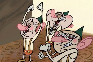 There’s a current healthy exchange going on there between Mike and Nick Cross, a Canadian filmmaker. His film, The Waif of Persphone, was negatively reviewed and Mike admits that he may have been too curt. As a result he’s ordered a dvd copy of the film to look at it again and give his second thoughts. He’s using his own coin to look again at a film he didn’t like; he simply wants to be sure that he gave his open and honest opinion. You couldn’t expect more from an animation reviewer.
I guess my confusion comes when an excellent writer and historian has to bow down to those who are cursorily judging him for not agreeing with them. This is a guy who is respected as the top of the game by ALL of the other animation historians out there. Yes, they all have quibbles at times over Mike’s personality, but the same is true of all of them. The important thing is that the knowledge and the truth gets out there and should not, can not be censored. Mike’s criticism and historical writing, whether we agree with it or not, is part of that truth.
Maybe if Barack Obama gets into office this will all get a bit better.
Commentary &Theater 23 Feb 2008 09:19 am
Sunday
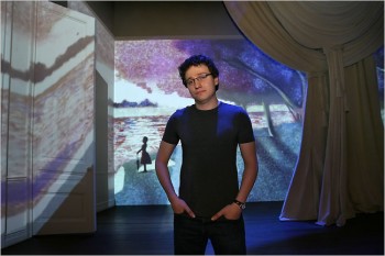 – As mentioned yesterday, last Wednesday, I saw the Roundabout Theater Company‘s production of Stephen Sondheim‘s glorious show, Sunday In The Park With George.
The reviews were universally glowing calling it everything from “Art” to a “Masterpiece.” In one sense, I’m glad of it, but in another I find this completely dispiriting.
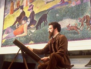
_________________________________Sam Buntrock, the director, on the set.
The show is a restaging of ___________________
Sondheim’s musical, with book by James Lapine, of the magnificent production that premiered in 1985 and won the Pulitzer Prize.
The musical’s first half tells the story of Georges Seurat’s creation of the painting A Sunday Afternoon on the Island of La Grande Jatte. Georges is addicted to his painting and
 ignores his mistress, “Dot,” who moves away from him, to America, with her newly born child, Marie. George’s obsession with art, and this painting in particular, claims his life. He dies at age 31.
The second half of the show finds the elderly Marie at the Chicago Art Institute, where the painting is being celebrated on its 100th anniversary. Marie’s grandson, George, is an artist who is premiering his 7th Chromalume in celebration of his Great Grandfather’s work. After Marie dies, _____Mandy patinkin, the original Georges
he makes a pilgrimage to Paris to visit
the island of la Grand Jatte. He finds artistic inspiration from the ghost of “Dot,” his Great Grandmother.
In short the show is about Art, with a capital “A”.
In its original incarnation, I got it. I saw the show three times on Broadway back then, and I cried fiercely through the performances of Mandy Patinkin and Bernadette Peters.
The show felt perfect, and I was not only moved emotionally but artistically as well. (Actually the third time found Robert Westenberg in the role of Georges.) The show and its soundtrack was and has remained a great source of inspiration for me.
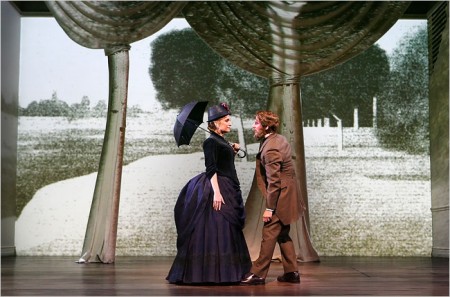
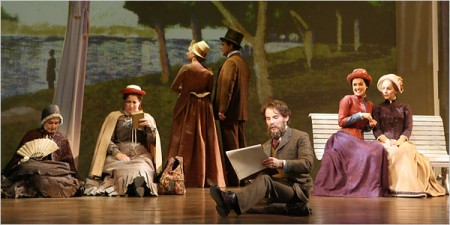
Animation works behind the actors as well as on top of these cut out trees.
The trees throw no shadow, and the animation on them doesn’t overlap
onto the background.
The current production has been imported from England where it was enormously successful. Apparently, judging by the reviews, it will be here as well.
The director is an ex animator who has moved into theatrical direction; this being his first real show. And it’s a big one. His conceit was to use animation for the painting and its creation as well as in other small sections.
This works wonderfully, at times, and horribly at other times. At the very beginning, Georges wallks out to a large, bare room painted white (though the lighting makes it look like a soft gray.) With Georges’ first big gesture a line draws completely across the entire set. Then it animates, on vocal cue, to a blurring of the chalk line. From this the chalk drawing of the painting fills the stage across the forced perspective of the room with its four doors. At this early point in the show, I thought that this might be interesting.
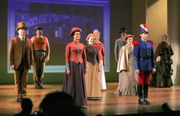 Every so often, on cue to the songs, a character drawn on the background animates. There’s a slight move and then a freeze … then another move … then a freeze. The movement generally is very lifelike, so one assumes it was motion capture and flattened to look like a chalk drawing or painted image. At one point, a soldier looks horribly done. It almost feels like a very early cgi character – plastic and hollow.
This became a problem for me. I began to look for the movement on the background and felt completely distracted from the show. A boat moves on the background. A man leans against a tree. A dog takes three steps and freezes. People wipe on or fade in and/or off. My eyes were often diverted. If wanted to watch the show – the actors and the complex story – I was distracted by irrelevant animation.
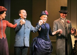 I was mostly impressed with the cast. Jenna Russell as “Dot” and “Marie” was excellent and seemed, at times, to be channeling Bernadette Peters from the original. Daniel Evans didn’t channel Mandy Patinkin, and I had more difficulty with him as “Georges” and found him more appropriate as “George.” I did have a problem with his being bald in the second half. At first I didn’t recognize this as the same actor, and I liked that. However, when he meets up with the ghost of “Dot” in Paris, I wondered how she so easily recognized him without the hair and beard. He no longer looked like her lover, Georges.
I was particularly bothered by the critical scene of Georges Seurat in his studio where he’s obsessed with “painting the hat.” He starts with a canvas (yes, it’s supposed to be a painting but the characters on it are animated, moving), but then he moves to a pad on which I guess he’s drawing the hat. All this movement keeps the eye moving and occupied, but it plays against the scene and its emotion. In the original, he stays at that canvas painting the hat and painting the hat and painting the hat. He only moves away from it to argue with “Dot.” This director isn’t clear in what he’s trying to say. I know he’s trying to “paint the hat” because the lyrics tell us that, but we don’t experience the difficulty of getting that “hat” just right. I understood it because I know the show, but I wonder what someone new to the musical would have gotten.
The projections are stunning in that they don’t seem to be on top of the actors, so I wasn’t sure how they were projected. There were no shadows of the actors thrown on the walls. Surely it couldn’t be rear-screen projection since you can see the walls, and when a door opens the projection moves with the door. Presumably it was multiple projection moving over so large a screen of a set. I didn’t notice any keystoning.
The primary animation stays on the back wall and is deceptive in giving you a false sense of perspective. At one point, when it represents the painting exhibited on the museum’s back wall, the painting and the wall move back in perspective as the room extends enormously. The extension, of course, is just an animated image, but it looks real as the actual room despite moving back. You can’t feel where the set and the movie separate, although you’re watching that rectangular screen of a wall.
These technically magnificent projections were designed and executed by by Timothy Bird and the Knifedge Creative Network.
I started off by saying, I’m glad it’ll be successful. It means that the technical achievement, which is a large leap and done extraordinarily well, would be utilized in other shows. However, I find it dispiriting in that it’s all too distracting. Essentially what’s happening is that a movie on the set is overwhelming the theatrical events in front of the screen. I came to the theater, not a movie. The animation should be absolutely and completely subservient to the show and not get in the way. I found it more moving in the original to view a flat, cut-out soldier than to see the gimmicky animation in this version. Yes, the painting and the corridor moves into the distance, but it’s immediately followed by another copy of the painting dropping close up to us. Why did it move away except, of course, for an effect? That’s the problem with this show, the effect is too big. When Georges is painting a painting, why are the characters he’s painting moving – however slightly? It’s a painting and the movement doesn’t mean anything to what’s going on. It’s just annoying.
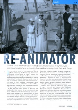
I wish Sam Buntrock would have limited what he was animating. Less is more in my book. One wonders what a more established directed would have asked for. An interview with this animator-turned-director appeared in the Roundabout’s membership magazine, Front & Center. I haven’t found this on line, so I post jpegs of it below.
The NYPost offers a video clip from the show giving a brief idea of the animation here. It also gives a clip of the song where Georges is drawing the “hat” when he should be painting the hat.



 3
3 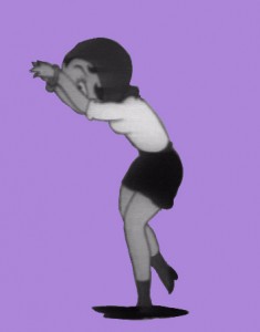 4
4  5
5 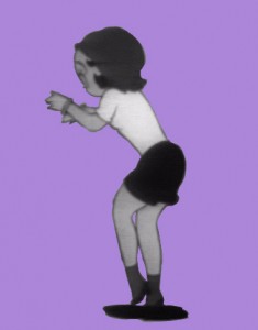 6
6  7
7  8
8 
 1
1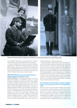 2
2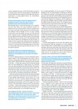 3
3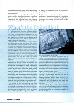 4
4