Category ArchiveCommentary
Commentary 10 Mar 2009 08:09 am
Michel Ocelot, 2 Features & Kirk Douglas
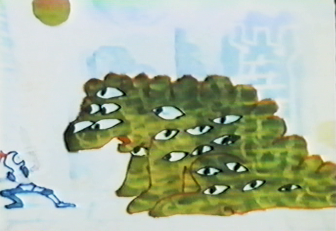
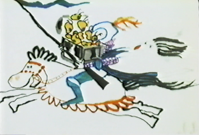
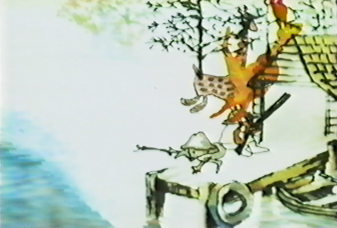
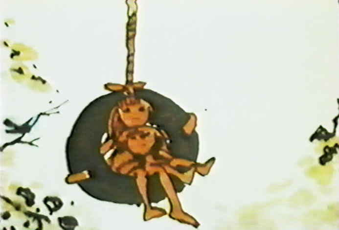
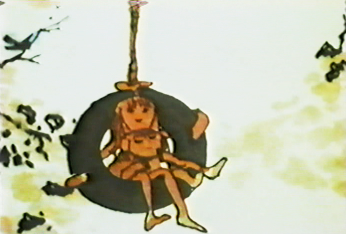
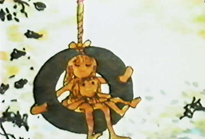
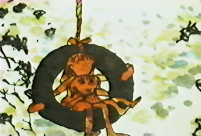
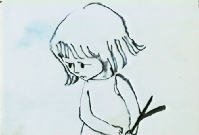
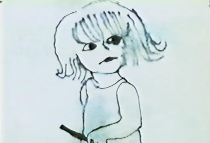
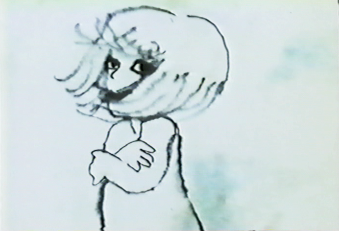
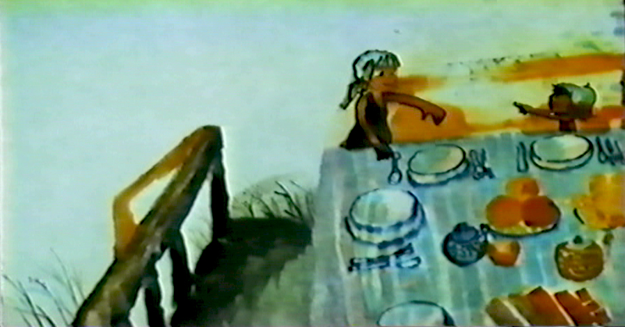
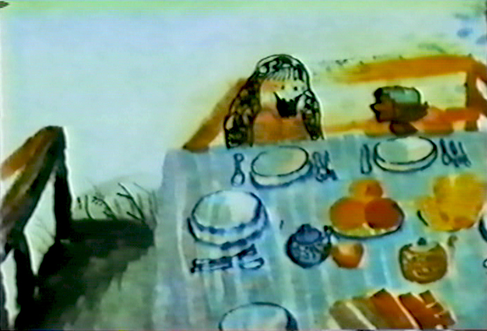
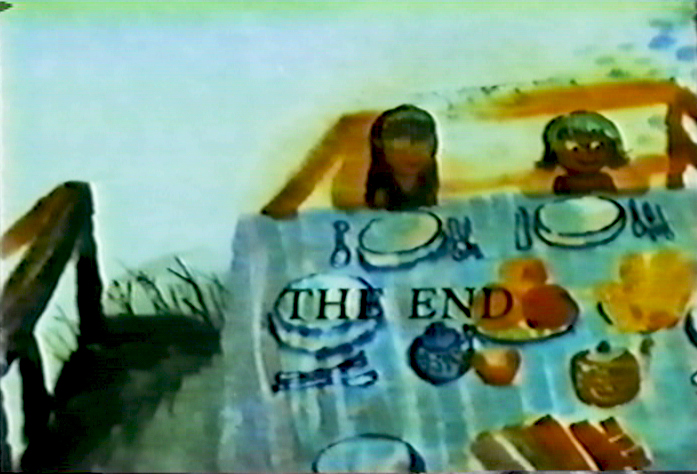
 – This past weekend, Michel Ocelot was in town for the NYInternational Children’s Film Foundation screening of his feature, Azur and Asmar. Candy Kugel had a wonderful Saturday night dinner for Michel, and it was nice to see him. He gave a gift of a DVD just released in Europe. It’s a collection of his short films. He finally was able to gather the rights to make them available. The DVD was region 2 PAL, but played nicely on my computer.
They’re exquisite hand-made gems, as was expected from this brilliant filmmaker.
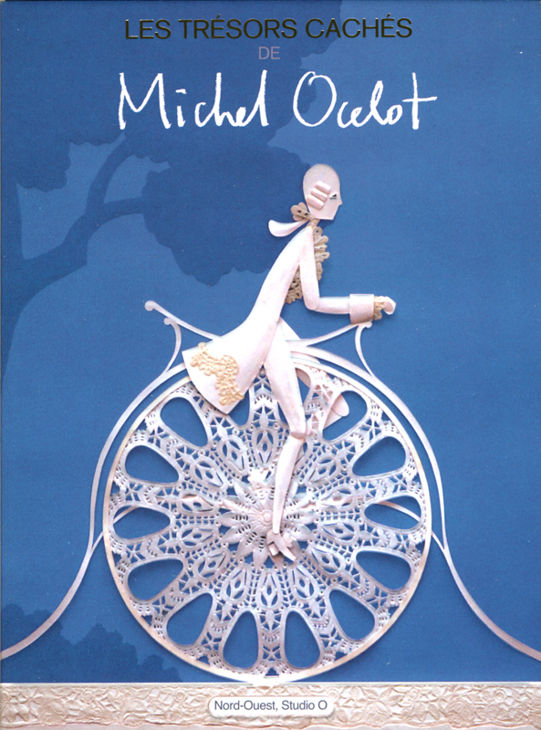
Michel Ocelot: Les Trésors Cachés (Hidden Treasures) comes in an absolutely stunning package and features commentaries (albeit all in French) as well as 11 short films.
I’m not sure if there will be an English release of the DVD, but it’s worth having right now. It’ll give you a chance to practice your French while watching some beautiful animated films.
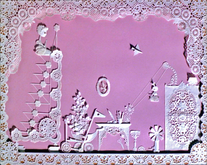
Here are a couple of frame grabs:
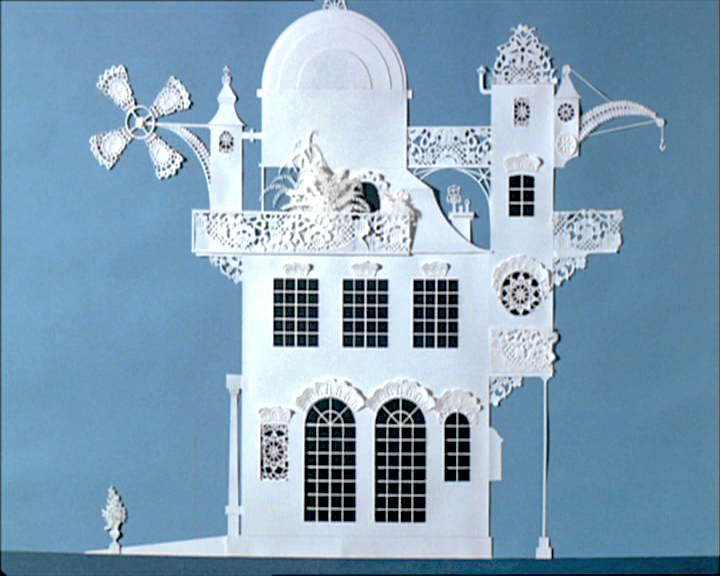
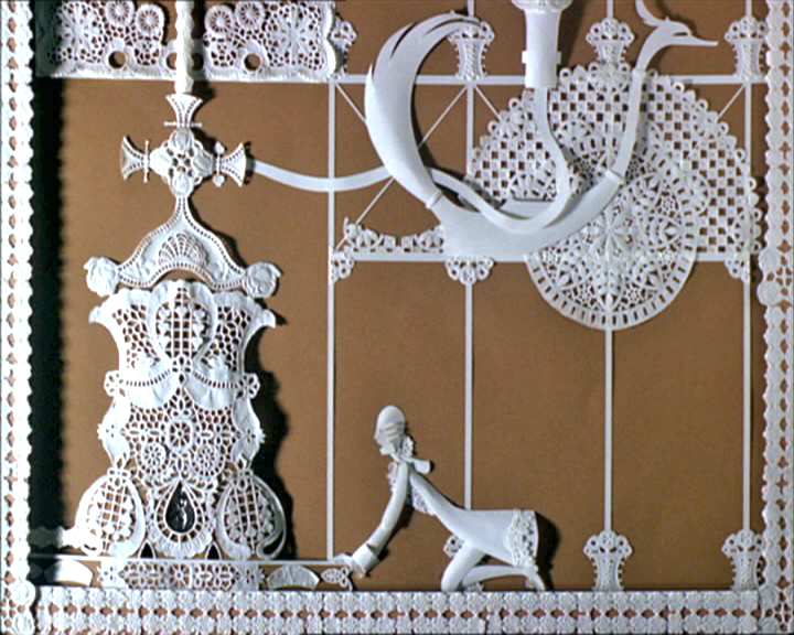
(Click any image to enlarge.)
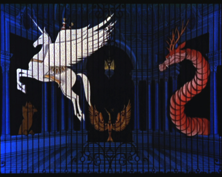
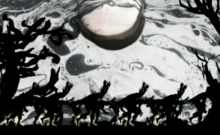
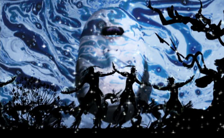
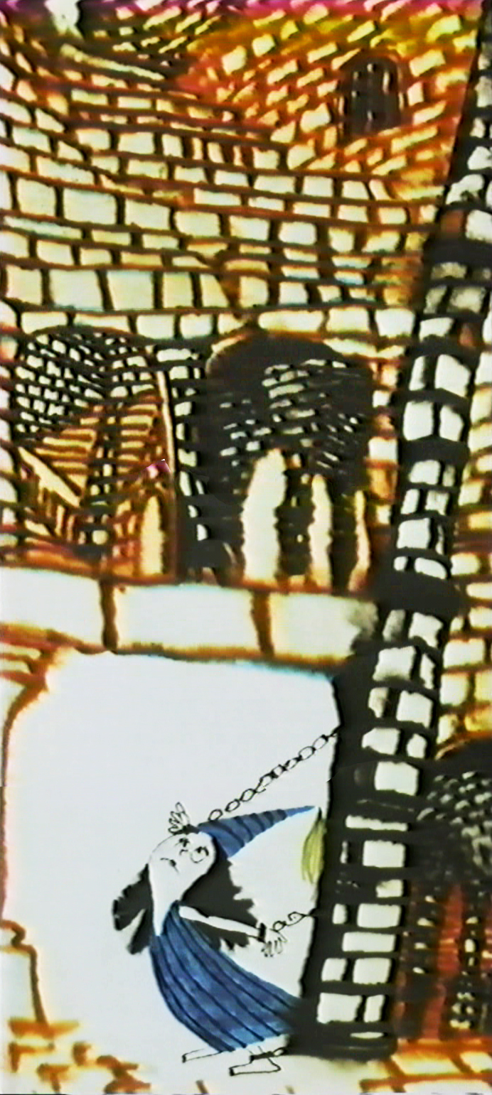
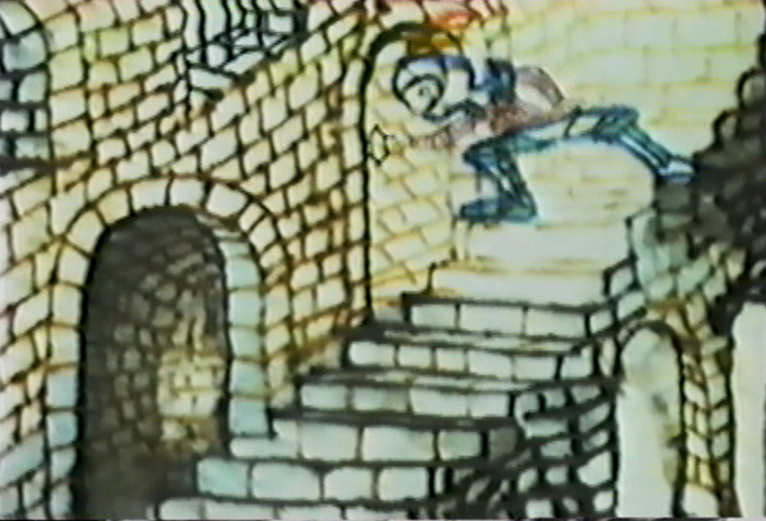
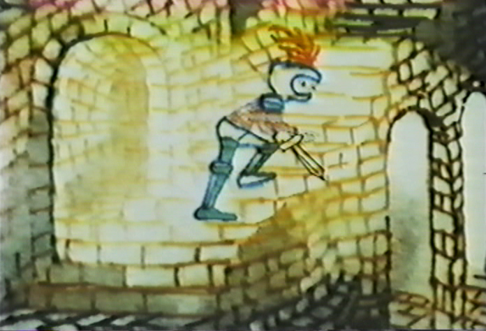
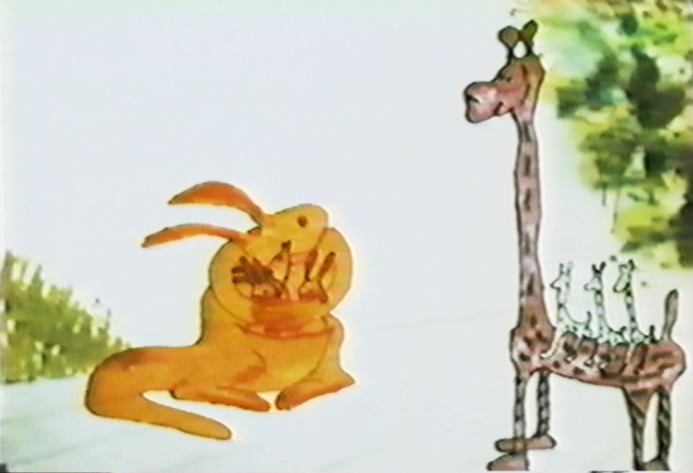
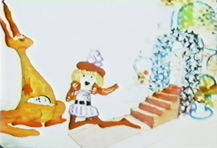
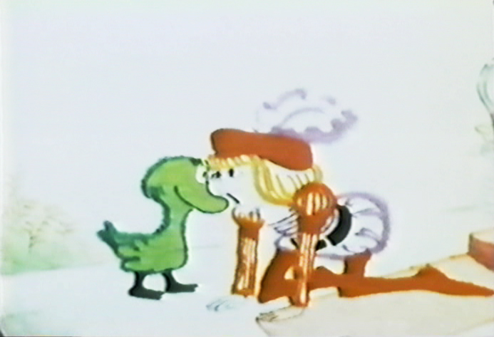
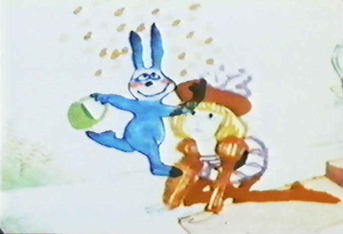
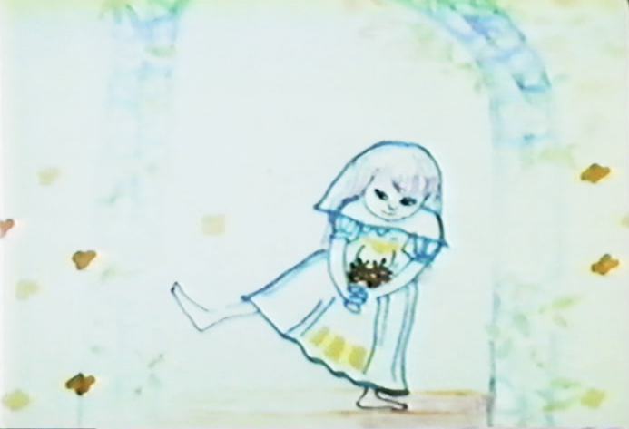
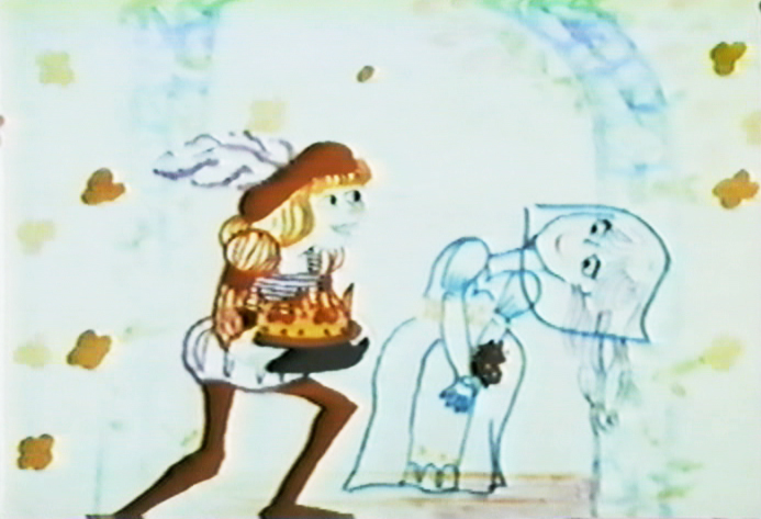
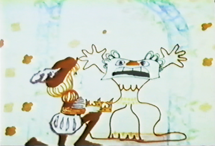
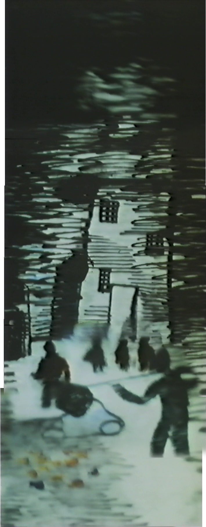
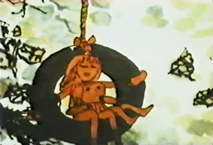
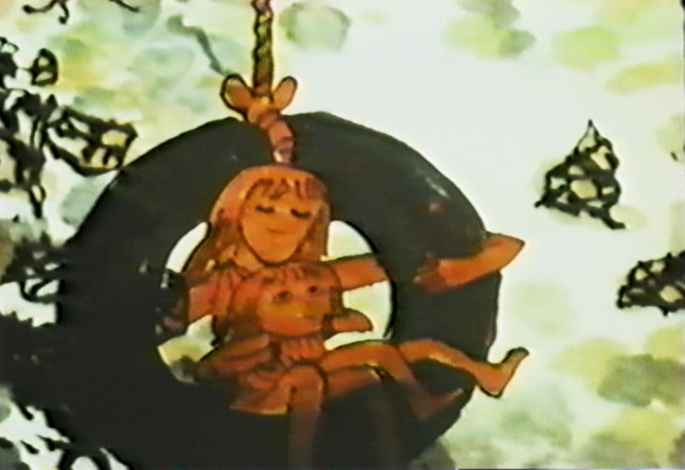
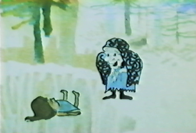
Above left and above that: The 3 Inventors
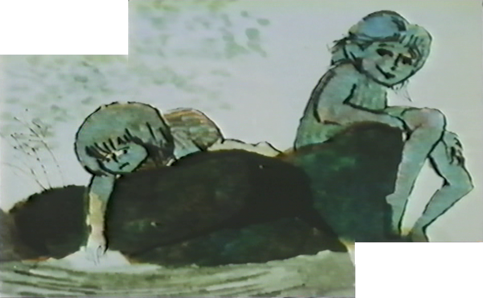
Above right: The Insensitive Princess
Earth Intruders: A music video for Bjork
- It’s 1940 again.
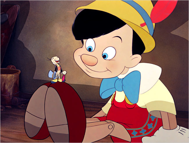
Yesterday’s NYTimes had a good review comparing two newly refurbished features: Pinocchio and Gulliver’s Travels. The Fleischers always seemed on the short end of the stick, and tying Gulliver’s rerelease to the same date as Pinocchio, probably isn’t helpful for sales . . . or reviews.
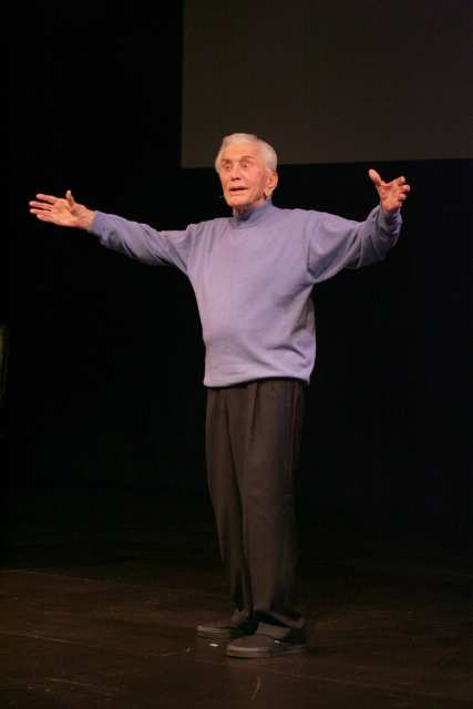 - I noticed in yesterday’s LA Times that there was a review of a one-man show starring Kirk Douglas. “Before I Forget” is a review by Mr. Douglas of his own career in 80 minutes.
Back in the 70s, I was a headstrong young man. I’d just gotten out of the service, immediately found my way into a film company which led to working for my hero, John Hubley. I was happy and full of pep.
One weekend while visiting an exhibit of Chaim Soutine at a larger gallery on 57th Street I was aware that Kirk Douglas was in the room with another gentleman. It filled up the gallery experience, and when I was ready to leave I did. Just before the doors close on the elevator, Kirk Douglas rushed on with his friend. For some reason, he and I locked eyes. A very small staring contest. He broke it. Of course, I could have been a mad man ready to assassinate Spartacus.
I left the experience exhilarated. Without saying a word, I’d communicated with a very real star. One of the fun bits of living in NYC.
Years later I was asked to direct a small filming of Michael Douglas giving a message for the Heartland Film Festival in Indiana. I went to his home, got to actually communicate with him, and wisely kept my story of his father to myself.
If I were living in LA, I’d be down to the Kirk Douglas Theater in Culver City in a NY minute. Only $25, how could you pass it up? One of the last of the REAL stars.
Animation Artifacts &Commentary &Disney 05 Mar 2009 09:07 am
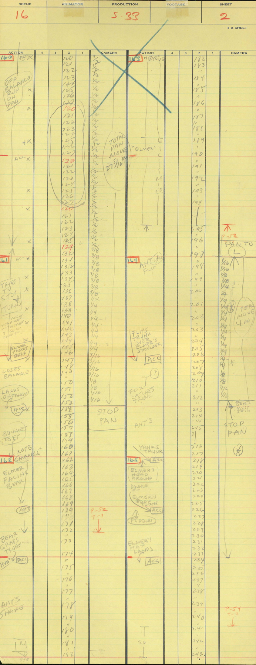
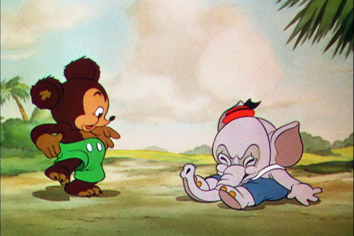
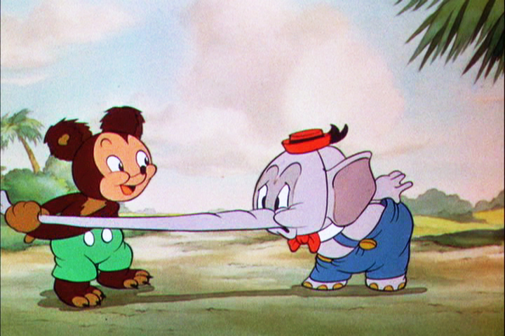
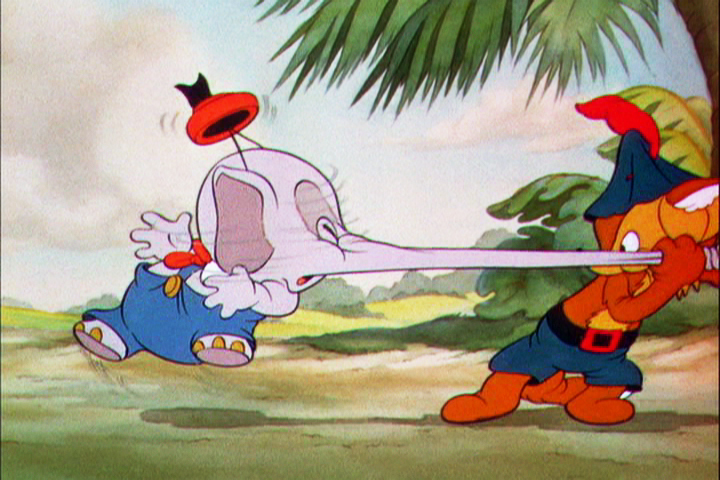
Elmer Elephant
- The post on exposure sheets drew a lot of attention, which is something that pleased me. Perhaps there’s enough interest in the heart of the medium to keep it alive.

Robert Cowan sent me an exposure sheet that was tucked into an envelope in the Ingeborg Willy Scrapbook, which he owns. (Ingeborg Willy was an inker working at Disney’s during the 30′s and made a photographic scrapbook of her stay.)
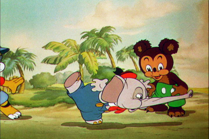
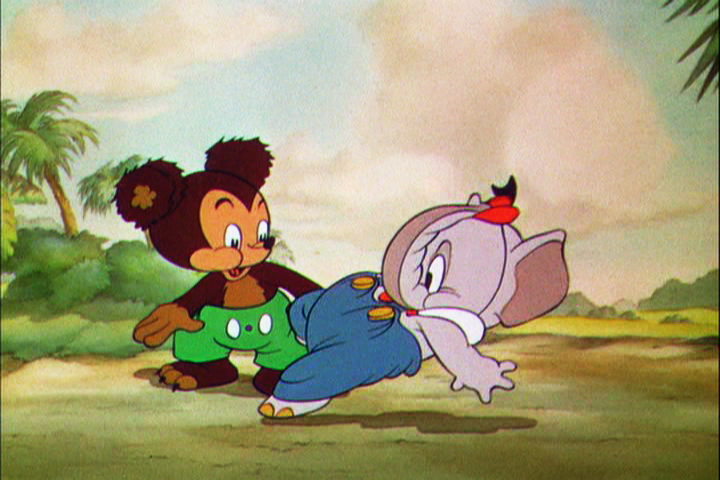
The sheet is from the Silly Symphony, Elmer Elephant (1935).
(Click any image to enlarge.)
The film’s about a bunch of baby animals.
Elmer is the shy kid who gets laughed at by the other kids.
Eventually with the help of an old giraffe he saves the day by putting out a fire …
… and winning the girl.
This exposure sheet is about a sequence wherein Elmer is pushed across a row of animals and is poked and prodded in absolute humiliation.
Let’s review what’s on the sheet for the completely unitiated viewer:
There are several columns: Action, 4,3,2,1 and camera.
These are basic to all X-sheets. Sometimes you get 5 numerals, oftentimes you get a column for Bg. Uusaly there’s also a Track column.
Below these descriptives you have lines. Each light blue line represents one frame of film. If the drawing’s on twos or threes or more it’s indicated as in #149. Other numbers are on ones – one frame per drawing.
In the “Action” column, the director writes notes telling where he wants some action to happen. For example: the director has noted that he wants Elmer to try to stop his turn from frames 32 through 49. The animator will follow this as best as possible.
The numbered columns represent cel levels. #1 is the bottom cel and #4 is the top cel. Most sheets also have a column for the Background so you know what number Bg is called for.
The “Camera” column indicates any special camera movements or effects. There we see a pan. The Bg is moving from screen right to left. The actual amount of the physical movement is indicated on every frame. 1/2 is a half inch, 1/4 is a quarter inch etc. Pans usually slow down as they come to a stop and gear up when they start out. This is why it goes from 1/2 to 3/8 to 1/4 to 3/16 to 1/8 to 1/16 before you reach STOP PAN.
You’ll see the sound track indicated at red marked 163 top line middle of the sheet. A character is saying, “Bye Elmer.” The actual number of frames it takes is broken down for you. The animator would animate the mouth accordingly.
Here are frame grabs for the part exposed.
 1
1 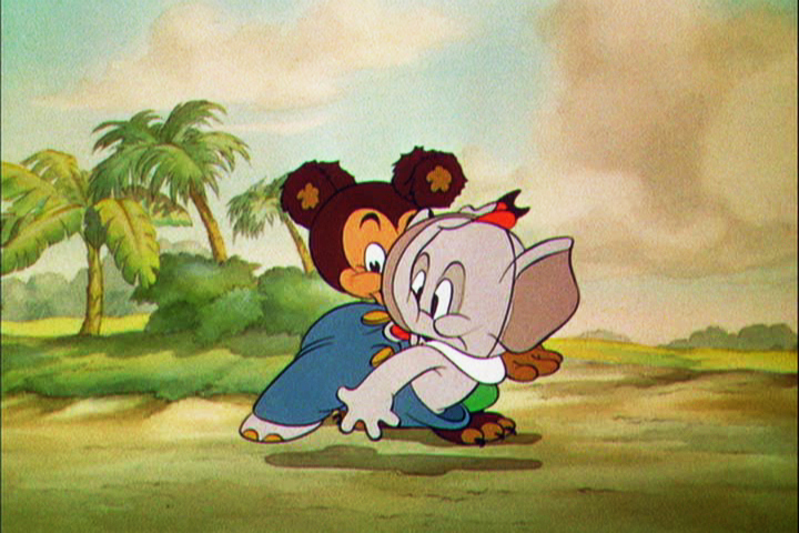 2
2
 3
3 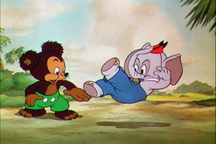 4
4
 5
5 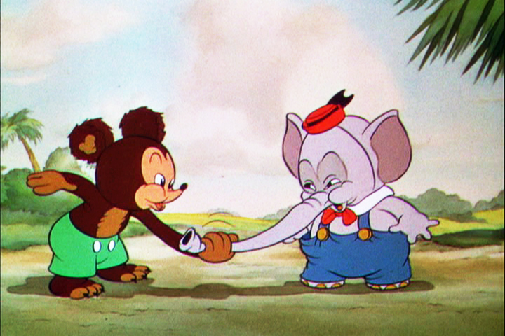 6
6
 7
7 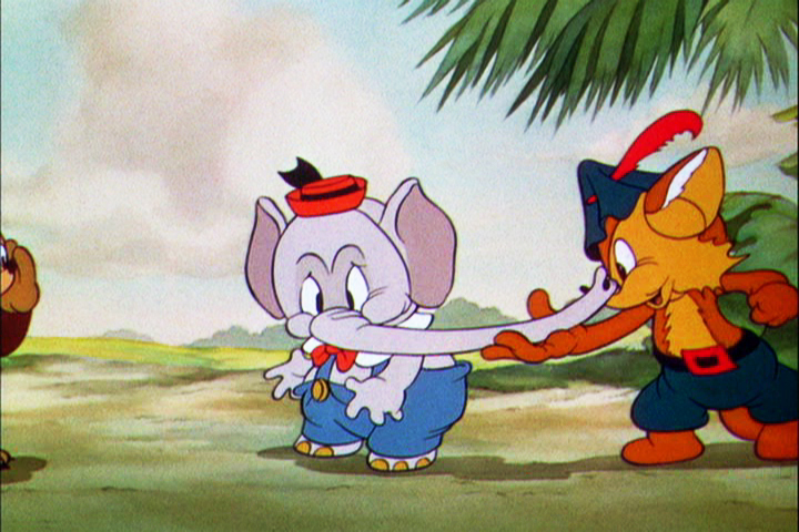 8
8
 9
9 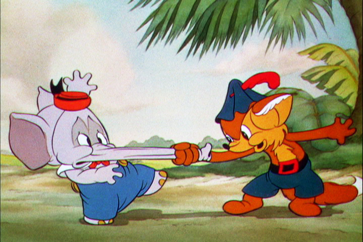 10
10
Let’s analyze the exposure sheet a bit. (For those not familiar with X-sheets, I have more of a breakdown below.)
First off, for me it’s an oddity. There seem to be two sheets combined onto the one. It’s split down the middle into two full sheets – all using only one cel level.
Secondly, there are some highlighted numbers – 160 through 165.
These fall at every 32nd frame. I’m not sure why. It’s not a foot (16 frames) or a second (24 frames). Is it a beat? I notice that the action calls for “ACC” at each of these markings. I assume it stands for “Accent” which would make that part of a musical tempo. Every 16th frame is also marked in red. This would be the only indication that this is what it is.
The pan moves are indicate in FRACTIONS ! I’m not sure why since it created a difficult transposition to decimals for the camera operator. I mean 3/8 of an inch equals what? Quickly now. Time is money. How about 1/16th? I have only met fractions which divided into 20ths. When did the change come in? John Oxberry, anyone?
Of course, some master checker would probably do the math before the scene got to camera.
Some of the drawings are exposed on twos, even for a short bit during the pan. This would be anathema in modern day animation, yet it hasn’t gotten better.
The track reading isn’t the most detailed I’ve seen, yet it does the job, doesn’t it?
The film is directed by Wilfred Jackson. I assume the “Action” column was filled out by him. I think the animation was by Paul Hopkins.
There’s a lot of information that can be pulled out from this one exposure sheet of a film done 73 years ago. Is that enough reason to advocate for continued use of the Exposure Seet?
Animation Artifacts &Commentary 03 Mar 2009 09:39 am
Dope Sheets
Kayvon Darabi-Fard wrote the following letter to me:
 THE DOPE SHEET!!!
I’m a student, of animation in the UK seeking the answer to the neglect of the dope sheet. No matter how hard I try I can’t seem to find a good reason as to why my classmates and production teams refuse to use the things.
It’s not mandatory for us to use the dope sheet, but its seriously being ignored to the extent, some directors think its just time wasting or some kind of magical adventure only the technically minded pursue.
At the college I’m studying at, we’re all broken off into production teams of around 5 people a team to produce a 2 minute short. I went round and had a look at what everyone was doing. Out of 11 teams, only one director was using the dope sheet system defined in Richard Williams Survival Kit, while the other directors and animators were either creating their own systems and methods, or just ‘doing it’.
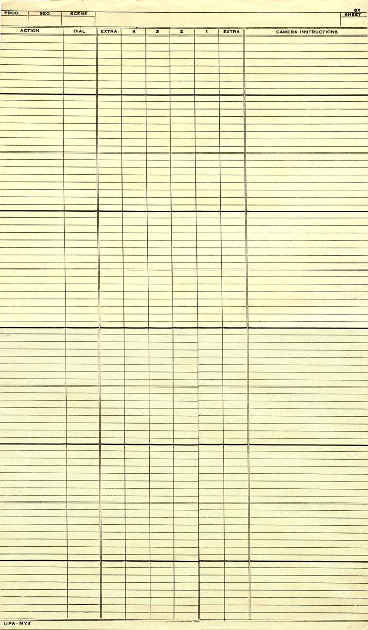
I was looking at the Steamboat Willie dope sheets you posted a few years ago. _____________X-sheet from UPA NY circa 1956
Even with music there’s always a use there. All
I need to do is convince the other 150 animators and directors that it’s not a lost cause.
 After I found the one director who had an actual system (according to RW’s), I found that he was using the dope sheet you use for your studio, tailored with the 400 frames on the one page.
Seriously, Do we change the dope sheet to ‘appeal’ to the new age of animators, or just crack the whip?
How would you go about teaching the dope sheet in education, and in the Sporn studio? What’s the system, and what are your views on the argument in keeping it alive?
I know there’s a war even with it becoming digital in things like Toon Boom and other CG applications, but what’s your opinions when it comes to training and producing the work within 2D traditional animation?
My answer is that, YES, I do believe in “Dope Sheets” (or as they’re known in the US, “Exposure Sheets” or “X Sheets.”)
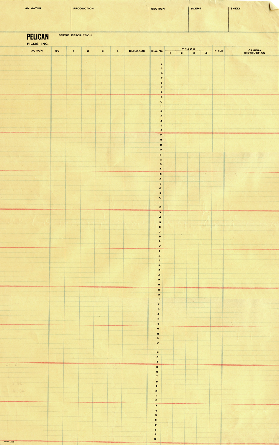
Pelican NY circa 1960
Because I was trained in using the X-sheet and
took a great interest in the differences these forms took from studio to studio, I amassed a collection of about 50 different sheets from varying studios. When I started my own studio, I took every element I thought key or helpful and put them all together on my studio’s sheets.
They were all designed, (I’m talking visually) more for the camera operator than for anyone else, but the usefulness of these sheets is enormous. A large amount of information can be placed on these sheets, and the more sophisticated animator created artpieces out of these sheets.
The 400 fr sheet, you mentioned was a composite I put together from my standard X-sheet. An exposure sheet should have 80 frames per page. The 400 page sheet acted similarly to bar sheets for me, as a director, more than anything else. It gave me an overview of a larger bit of the track so I could plan the cutting of the picture.
You see, when you get used to reading X-sheets, you see them as time. You don’t see the lines, you see seconds and footage, instantaneously. As an animator, you get an overview immediately of the scene; as a director you read the track, how the animator has constructed the scene, and what camera moves are indicated and why.
Of course, the real purpose of these sheets is for communication. If you’re doing a film by yourself and don’t think you need the sheets, then fine. But if you’re working with other people, how else would you communicate what the track is doing or how the scene is constructed?
Certainly, as students, you should be obligated to learn how to use sheets so that you’ll have the knowledge and the experience in your grasp. The more knowledge you’re armed with, the better you’ll make it in the real world.
With the advent of the computer, and as you mention programs such as Toon Boom (which employs its own version of an X-sheet,) studios presumably have reduced their dependence on such charts. Since I know how valuable these sheets are in relaying information, I’ve kept them up in my studio. The sound track is read on the prepared sheets. I don’t demand that anyone fills them out – certainly not when many animators today are developing their animation in the computer – but the sheet gives an excellent way to plan the scene, and the animators can take that information and use it as they like.
In studios of the past, a folder was designed. X-Sheets, when folded in half would sit neatly into the folder (and often be stapled into it) so they would always stay with the scene and not get lost.
I don’t quite know how other studios transfer such info from person to person and keep any oversight on the film as a whole, and your question raises a curiosity that sits in the back of my mind. How does a PIXAR or DREAMWORKS deal with such track readings and director’s notations? Is it all digital or do they actually have a form of X-sheet? If anyone out there knows definitively, I’d be curious.
The UPA NY sheet pictured above, is well designed except for the fact that it
does not include dial numbers. I guess someone can write out all the
numbers, but it doesn’t quite make sense to me.
The Pelican sheet includes the dial numbers, but it’d be nice if they were
also alongside the soundtrack area.
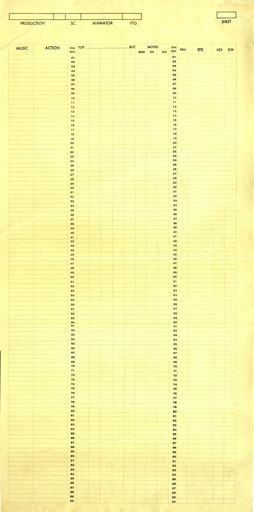
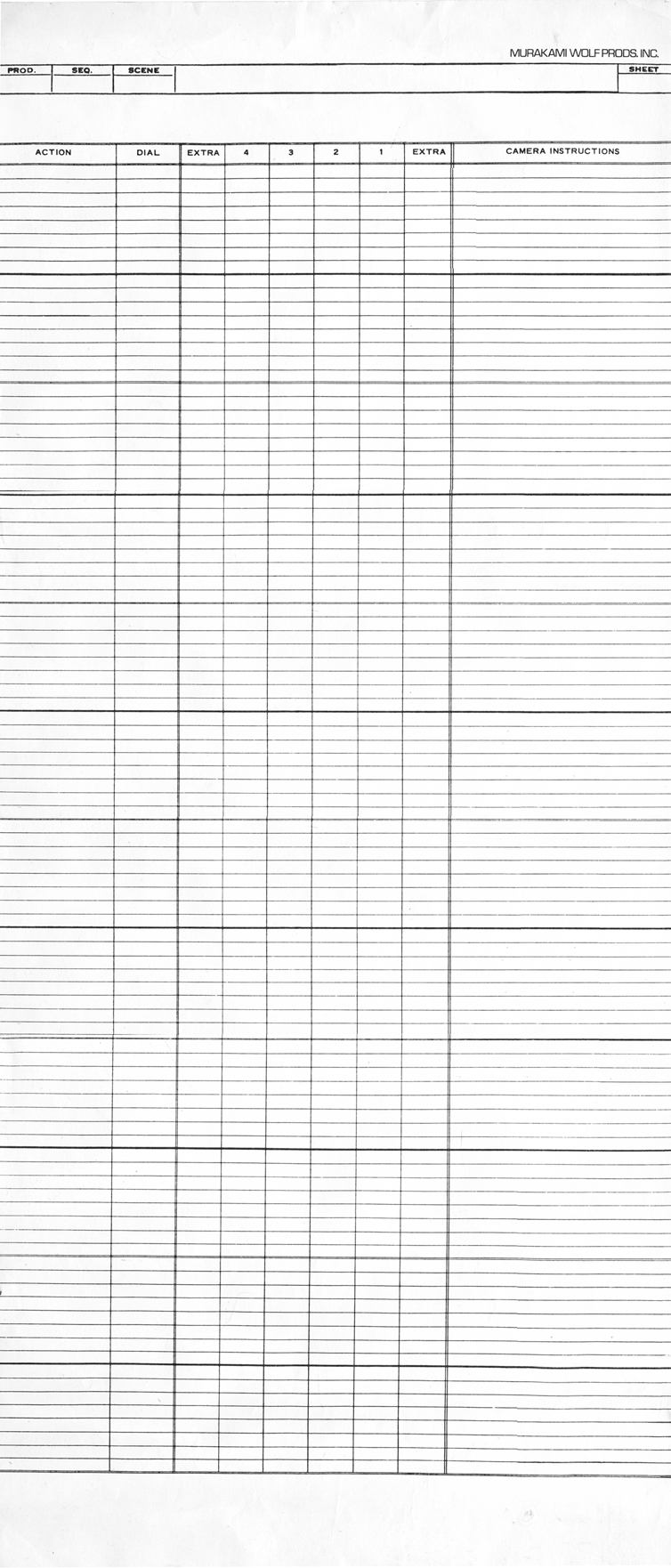
Shamus Culhane Prods circa 1972 | Murakami-Wolf Prods circa 1974
The Culhane sheets are designed for 100 frames per page. I’ve never understood
this calculation. If you do an 80 fr. page, you get five 35mm feet or two 16mm feet.
100 frames gets you nothing but an even number.
There are also no lines on the page making it harder to read.
The Murakami-Wolf sheets include 96 fr. per page or six 35mm feet.
These sheets are also unruly in their length.
 .
. 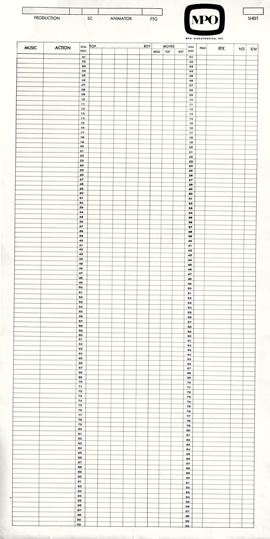
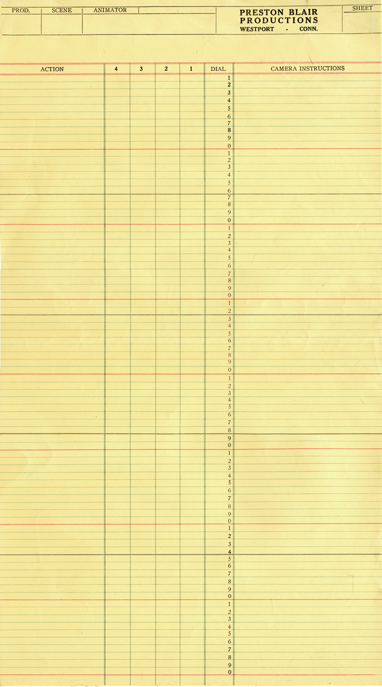
Preston Blair Prods circa 1967 | MPO Prods circa 1970
The Preston Blair sheets are close to perfect except for a red line that was added
at every tenth frame. What use is there for it?
The MPO sheets have no lines and are confusing.
They’re similar to Culhane sheets but a bit more legible.
I have more of these sheets, but I think this may interest only me.
I once spoke to my staff for about 2 hours about exposure sheets. Interestingly enough,
I didn’t have to wake anyone at the end of the chat.
I’ll have a bit more to write about this soon, when I pull it together.
Commentary &Puppet Animation 27 Feb 2009 08:56 am
Puppets
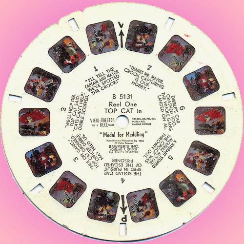 - Brian Sibley has written a quite wonderful piece on Viewmaster slides. He shows people prepping to photograph these little sets and characters for the 3D setups. It’s a chance for many of us to get a quick joyride from the past.
Brian’s post had me do a bit more research, and I came across Brian Butler‘s site, What My Dad Saw which has many posts on the subject and actually posts a number of the slide images recreating the 3D effect.
Likewise, this led me to Brian Hunn’s site Mystery Hoard which had a longer piece on Florence Thomas and Joe Liptak who created many of these scenes.
 .
.
.
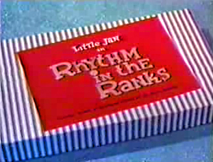
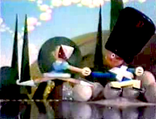
.- For those of you who’d like to see more puppets on parade, Ken Priebe sent me the link to a beautiful copy of a hard-to-see George Pal Puppetoon on YouTube. Rhythm in the Ranks.
The color on this piece, given the format, is exceptional, well preserved.
 . .
. . 
_____________
- For those of you who get excited reading new material about puppets, Wade Sampson has an excellent article about Bob Baker’s puppet productions of Walt Disney’s animated musicals. This is an entertaining read.
- I’ve yet to see Coraline, but I’ll have to get there.
I would prefer not seeing it in 3D (polarized glasses HAVE to grey/green down the image, and I’d prefer seeing actual colors on the screen, despite the 3D effect. However, I don’t believe it’s playing in Manhattan except in 3D. The film seems to be top of the craft, though I’ve read enough semi-negative about the story. I like most of the voice talent and expect that to give the animators something good to work with.
Like Tim Burton’s Corpse Bride, Coraline enhances the 3D stop-motion animation with cgi enhancement. This is a distinct advantage modern animators have. Even 2D animation isn’t solely dependent on the Pencil Tests and computerized compositing; animated 2D films are also filled with cg embellishment. And they should be. All tools are available and should be used (although I’m not sure many cg films use 2D enhancement.) I think that’s why I get such joy out of the old George Pal and Ray Harryhausen films. What they saw was what we got. If they opened the shutter, they were usually committed to that frame. It’s amazing that we still haven’t improved on Pinocchio or Bambi or, in some ways, John Henry and the Inky-Poo
Commentary 24 Feb 2009 08:56 am
Cartoons
- I’m writing this Monday morning having just returned from an interview at Fox Business TV where Amid Amidi and I answered questions about the difference between Disney and Dreamworks. It was a surreal and pointless way to start a week, but it was somehow appropriate after the Oscar telecast last night. I don’t know if I or anyone will ever see it, but I assume the video will show up on YouTube someday. A cartoon in its own right. (You can view the mercifully short video on Cartoon Brew, of course.)
- The Oscars, on Sunday night, were, for me, something of a bust. I was pleased with the animation winners and the documentary winners, but all the Slumdog Millionaire stuff was just a bit too much. I’m not sure Beyoncé or John Legend is going to be singing the winning song, Jai Ho, anytime soon. Not unlike the year that Shaft won for best song. And that tedious musical number that Hugh Jackman led. They weren’t able to settle on any one song, so they did a medley of 200 songs in four minutes. It was ridiculously ludicrous. Actually, Ludicris would have done a better job of it. If they want to go for populist entertainment, they should go for it and stop pretending they’re artists. (Tom Sito offers a nice You Are There feeling on his blog about the Oscars.)
- Cartoons, these days, are ripping through the headlines. Protests and editorials shouted commentaries about these cartoons.
 First we have a Danish cartoonist threatened with Jihads from all of the Muslim world for depicting Muhammed in a cartoon. Mind you, he didn’t make fun of the Prophet, he just drew his image. The Arabic world went berserk. They don’t go crazy for all the killings and ravaging going on in their own lands; it’s the image in a cartoon that upsets them.
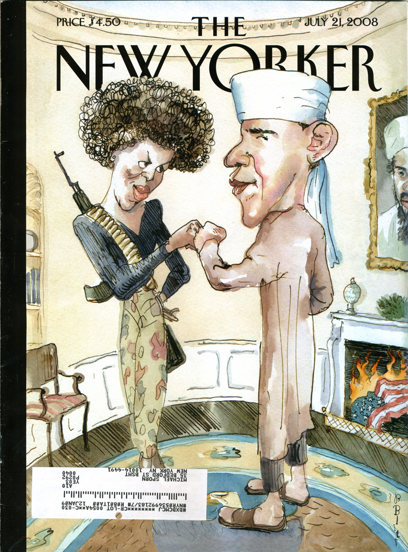
Then The New Yorker, of all places, depicts candidate, Barack Obama and his wife, as terrorists. Cartoonist Barry Blitt didn’t defend himself, it seemed, but the editors of the magazine defended the cartoon as a way to depict all of the fears of people who saw in the next President.
This past week, The New York Post presented an editorial cartoon by Sean Delonas depicting the rabid chimp that maimed a woman in Connecticut dead in the street while cops talk about the author of the stimulus bill. The immediate thought, of course, is that the chimp represents Obama in the cartoonist’s eye. How else could “stimulus bill” connect to a chimpanzee?
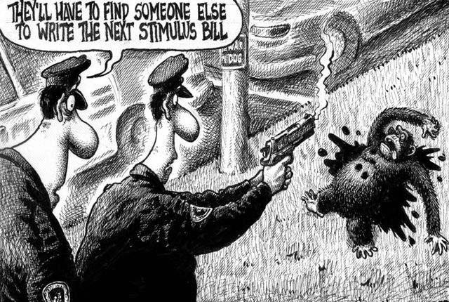
Prostest marches have moved through the streets, Al Sharpton has been in front of many a camera, and there’s been a lot of shouting on cable tv. Editors and writers at The New York Post have announced their displeasure with this cartoon. The NY Post apologized and finally Rupert Murdoch, who owns the Post, has apologized saying in part, “I am ultimately responsible.” (Expect to see a change of editors at the paper – all done quietly.)
I enjoy seeing cartoons take some of the headlines. I wish they were a bit more enlightened, though these seem enormously stupid comments by the cartoonists. Perhaps that’s what makes a cartoon so outrageous and gets readers stirred up. Daumier, of course, led the way with his cartoon “Gargantua” in which the King of France devours the taxes of the people and has grown to obese proportions. This 1831 cartoon followed the riots of 1830, and Daumier was imprisoned for six months for his cartoon.
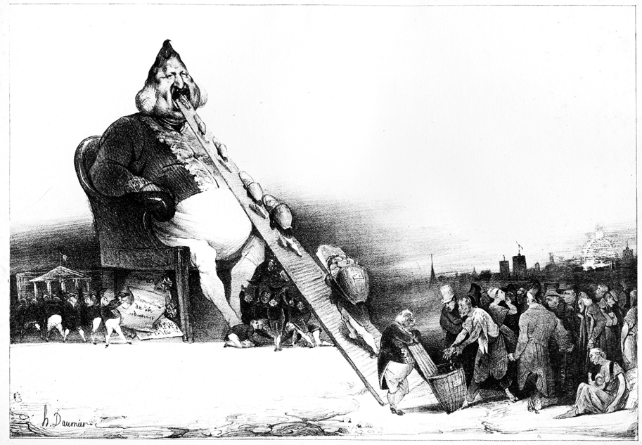
There’s no comparison to what Daumier was doing and the racism (or is it just muddled stupidity) of Delonas, but it’s good to see that cartooning is still alive and that our government isn’t insane enough to imprison cartoonists for attacking the President.
Just a stray thought . . . can you remember the last ANIMATED cartoon that caused a stir?
- JibJab‘s cartoons poke ribs but offer nothing more than mocking entertainment, otherwise they certainly wouldn’t make it to Jay Leno’s show. They actually seem to go out of their way to elbow everyone so as to hurt no one.
- Wall-E‘s political statement is confused enough that it really doesn’t make any points.
- Hugh Harman’s Peace On Earth may have been the last stirring short. It challenged the idea of World War II as America was stepping boldly into it. But that cartoon was nominated for the Oscar; it obviously didn’t create much of a stir.
Actually, there were a few features that did create a small stir.
Bakshi’s Coonskin was attacked for its blatant racism and CORE protested loudly outside the small eastside theater showing the film. Actually, the only thing racist about Coonskin was the title. Those who protested and got the film removed from distribution (only to be reworked and rereleased years later as Bustin’ Out and/or Street Fight) hadn’t seen the film. But with a title like that it had to be racist.
Much the same was true of Disney’s Song of the South. The protests weren’t strong enough to stop the film’s exhibition or to stop it from winning an Oscar for best song and a special oscar for James Baskett, who played Unle Remus.
The other film to get some attention was Bambi. Picketers were out in droves to protest the film for its anti-hunter attitude and editors commented on hunters’ rights. The stir seemed to have been partially used by the studio for publicity and didn’t have much of an effect on its audience.
- Chris Doyle has started a new forum for classically drawn 2D animation. Chris writes,
“It’s a tribute to the Nine Old Men and all those who made those great films during the ‘Golden Age’.”
You know what I think about 2D animation, hence I think it’s a good venture worth joining. Take a look. Here.
- “Thomas Phillip” asked me to point you to this recent short by Reza Dolatabadi, Khoda. A mix of painting, animation and art. It’s worth a look.
 – Jeff Scher has another of his fine, monthly animated pieces in the NYTimes. In Your Dreams is about watching the person you love, while they’re asleep. It’s a poetic and romantic short piece.
- I also found this excellent short, Gary, on line, via Alan Cook‘s site, Cooked Art. I usually figure I’m late to the game in viewing these things. If you haven’t seen it, do. Computer, 2D and character animation. Surprising and excellent.
- The MUST READ today is Mike Barrier’s excellent commentary on acting for animators and Bill Tytla. If you haven’t read it, you should.
Commentary &Daily post 20 Feb 2009 08:52 am
Odds & Ends
- There were a couple of excellent pieces on the blogs this week.
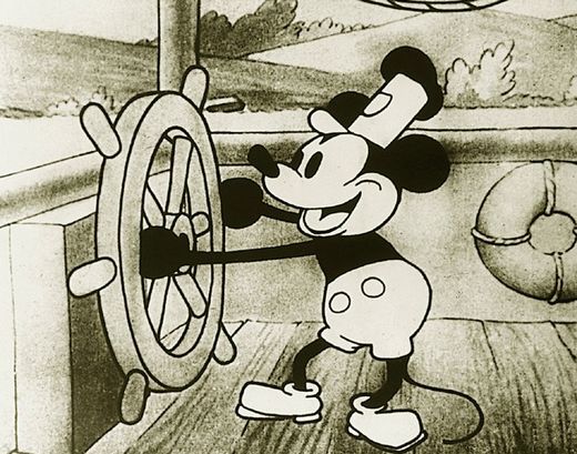 . Hans Perk posted an exposure sheet from Steamboat Willie. It looks to be an amalgam of work by both Ub Iwerks and Walt Disney. It’s quite amazing to view, and I couldn’t be more in awe of the medium. You can see that it all was in place back in 1928; all that was necessary was for the artists to figure out how to use it. Of course, these days all that information has been thrown out the window for a vector version. Presumably, that’ll eventually be better.
Hans’ site, A Film LA, is a treasure for those, like me, who have a modest interest in history. (Here‘s an old post I did on Steamboat Willie & Iwerks.)
. Then there’s a wonderful photo on Didier Ghez‘s great blog, Disney History. The photo celebrates Les Clark’s 50th anniversary of working for the Disney studio. There are plenty of photos of those nine old men, as well as people like Ben Sharpsteen or Wilfred Jackson, but here’s a picture that includes Claude Coats, Bill Justice, John Sibley and Xavier Atencio, among others. It’s a good photo with these key animators in their prime.
By the way, scroll down a little on Didier’s site and you’ll see a curious and wonderful photo of Art Babbitt animating.
- The Oscars are this Sunday and I couldn’t be less interested. Not many of the films were extraordinary this year, and even the animation choices aren’t the best.
The animated feature category is missing a couple of fine films such as Waltz With Bashir, which challenges the medium (ever-so-slightly). Get a three-headed coin and flip.
Wall-E started well and went tedious once we were up in space. Lots of chasing about. I never quite bought the live action humans had turned into cartoon puppet-characters. The film, for the most part, to me, was too much like a Sc-Fi film; its animation tried to equal Jar Jar Blinks as opposed to Pinocchio.
Kung-Fu Panda had some very nice art direction, but much of the animation was too frenetic, lots of pop. Most of the characters moved similarly. If animated cartoons are going to feature a lot of punching and hitting, there’s a good chance they’ll lose me. The audience is the 16 year old boy class.
Bolt started with heightened stupid energy mocking action adventure movies. It settled down, but I never got emotionally invested. There was some nice movement and some nice art direction.
Nothing in any of the three stood out to me as exceptional. Perhaps it’s my bias against the viewmaster style of a lot of these cg film. The first 20 minutes of Wall-E was done well so I’d probably vote for that film.
 I’ve already talked about the animated shorts. My favorite was The House of Small Cubes by Kunio KatÅ (though I wonder why the Japanese short is known in the US as La Maison En Petits Cubes.) I found it the most complex of those nominated and actually felt some emotion the first couple of times I saw it. That’s getting to be a rarity at animation screenings.
I like the film’s art styling which nicely mirrors the subject, and I appreciate the labor that went into the 2D animation and rendering. It’s a well done film and certainly one of my favorite shorts of the year.
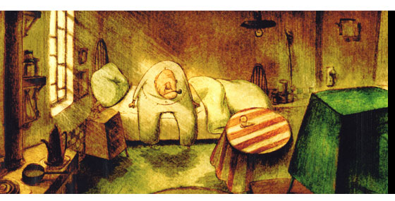
My favorite short of the year was Skhizein by Jeremy Clapin. The film took a complex story into a new approach to cg animation combining 2D and 3D elements into a new style. I was a bit impatient watching it a 6th time, recently, but I still recognize its bold achievement. I wish the Academy had recognized it too, but I guess it wasn’t “cartoon” enough.
- Tonight in LA, Emily Hubley will have two programs.
The first, at 7:30, starts out with her parents’ films Tender Game and Windy Day, then one by her mother and several shorts by Emily. A chat with Jerry Beck will be followed by
a 9pm screening of Emily’s feature, The Toe Tactic.
For a full schedule go here.
There’s also going to be a screening of Hubley shorts on Sunday Feb. 22 at 3PM. It’s part of the Redcat Children’s Film Festival screening at Cal Arts. Included are:
Adventures Of An * (USA, 1957)
Urbanissimo (USA, 1968)
The Hole (USA, 1963)
Date With Dizzy (USA, 1958)
The Hat (USA, 1964)
Tijuana Brass Double Feature (USA, 1966)
Dig – Short Version (USA, 1972)
Tender Game (USA, 1958)
This program will be repeated March 5th at 3PM.
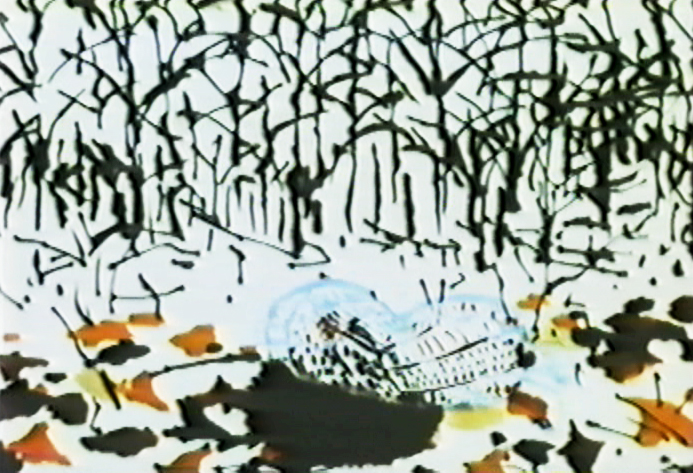
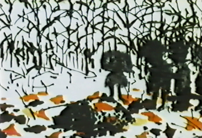
Commentary &Frame Grabs &Hubley 19 Feb 2009 09:01 am
Windy Day 2
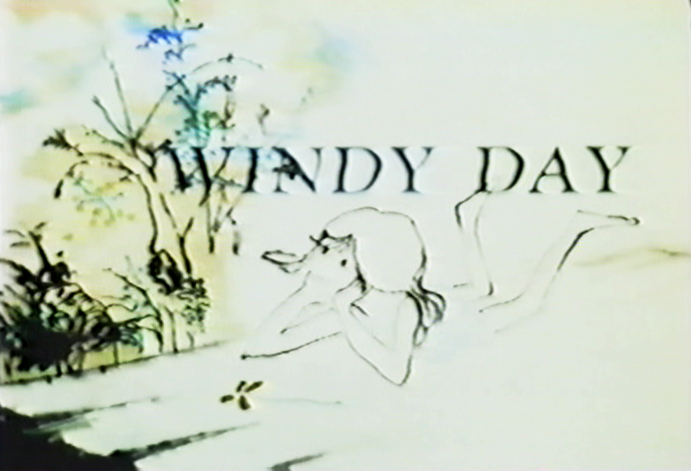 - Here we continue with some frame grabs from the brilliant Hubley short, Windy Day.
I wish there were a good copy of the film available. As a matter of fact, ALL of the Hubley films are in bad versions on the dvds available. They all look soft and dark, they weave and show added scratches. It’s too bad since so many of these films are gems. Wouldn’t it be great to have an extras track or three? Emily and Ray Hubley know everything about these films and could tell us so much. As a matter of fact, Ray helped supervise production of the 35mm print of The Cosmic Eye, and that was a stunningly beautiful print. Yet, the dvd image of it is a paltry and distant relation.
I want to start out here by noting that this film’s technique features bottom lit art (done like a pencil test). The grain of the paper can be seen and was somewhat controlled by the type of paper used for the coloring. It’s architect’s vellum. The paper’s thinner, more transparent and allows some slight watercolor without buckling. Several points in this second half are done with top light and mattes or double expposures. I’ll point those out.
Two other sites that recently featured articulate pieces on this film include Ian Lumsden’s Animation Blog and Richard O’Connor’s Asterisk Pictures blog. Richard gives a lot of deserved attention to Sarah Calogero who did some beautiful rendering on the short. I’d like to give attention to Nina di Gangi who did I&P work for the Hubleys on a number of their key shorts.
Continued from yesterday’s post.
(Click any image to enlarge.)
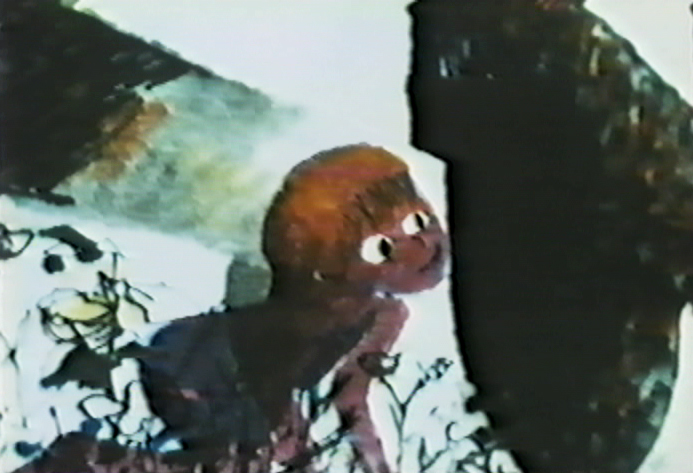
Note that John isn’t afraid to use the bot lit technique despite
the black wheel seen behind and through the character.
This image starts a scene which isn’t bottom lit.
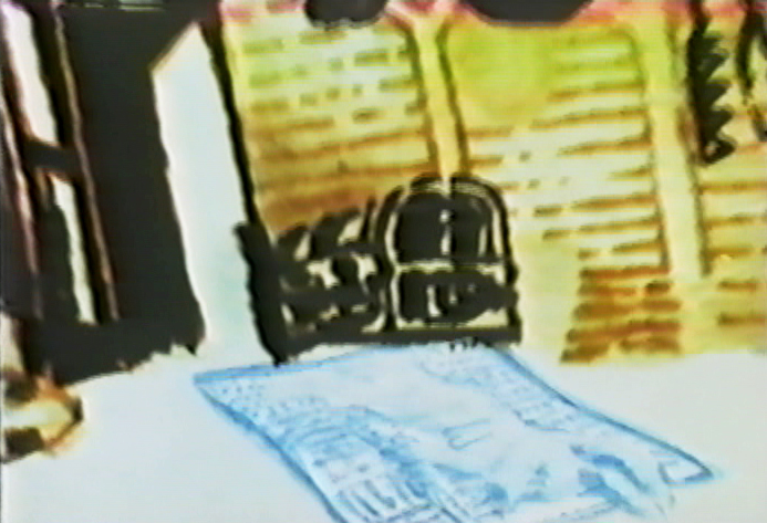
The newspaper/dead rabbit is matted into the picture then . . .
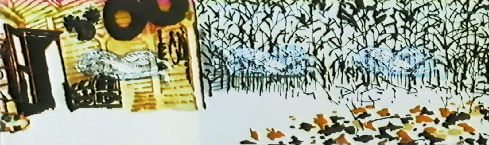
. . . becomes a double exposure as it floats over the pan.
. . . and goes into the grave.
Dissolve on the top lit silhouetted people.
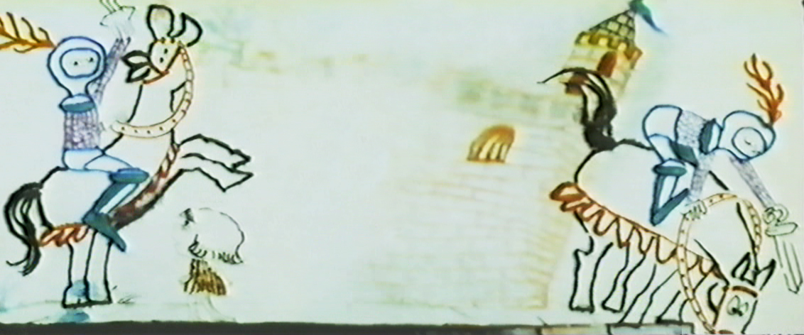
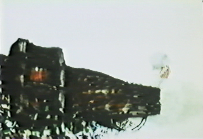
Back to the bottom lit knight riding across the pan.
This is a complicated bottom lit scene.
At the top of the pan, the knight is lit in yellow.
He goes through a portal, and the light moves to the
bottom of the pan as the knight enters a level down.
It took some careful thought and a creative cameraman to pull it off.
A bottom-lit dragon moves across the pan.
This bot-lit BG looks to have stepped out of Adventures of an *.
The effect on the water is matted into a bot-lit BG.
The effect, itself, is top-lit.
The subject of the film slides quickly between marriage, and birth . . .
.. to death and murder.
Yet, the conversatioin is done gently and quietly
without the obvious self-imortance it could have had.
This is one of the more beautiful scenes in the film.
Very complex animation and layout, yet done so simply.
A beautiful N>S then S>N pan while the art animates in and out.
Both sides of the pans N&S&N and both sides of
the zoom in & out ease at perfect speeds.
This is something that could be tested easily on a computer, but in the days before computer you could only film the piece in a Pencil Test.
However, the Hubleys couldn’t afford a PT. They just did it.
A beautiful, bot lit, multiple run pan. This is experimentation at the service of Art.
I can’t think of many such scenes in all the features or shorts I see today.
Again, death enters the picture.
The kids are talking about Life & birth.
These two scenes, to me, are the heart of the film.
Beautiful animation, beautiful rendering, beautiful soundtrack.
A windy day.
top lit
An absolute gem.
Books &Commentary 17 Feb 2009 08:48 am
Amid’s Books
 – Let’s talk a bit about a new book by Amid Amidi, The Art of Pixar Short Films. There are two reasons one might want to buy this book: you’re a fan of the Pixar films, including the shorts, or you’re a fan of Amid Amidi’s animation books.
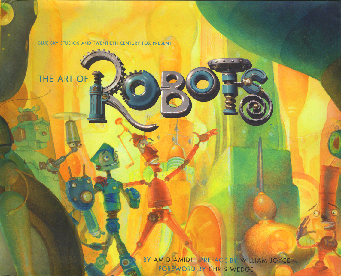
I’d like to cover my interest first; I like Amid’s work very much. This is his third book published by Chronicle books. The first The Art of Robots was a beautiful puff piece for that Blue Sky film, a bit over-filled with fine drawings and paintings and final art
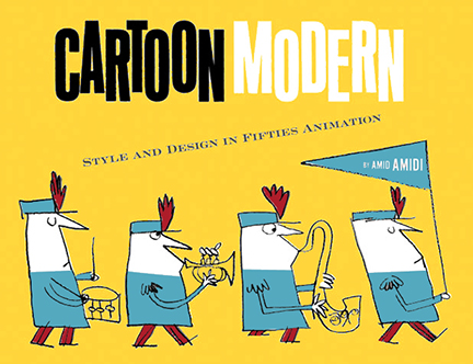
 from the industrious film. The second, Cartoon Modern, is a stunningly attractive, informative and extremely important animation book. It covered a lot of the holes left by other books – the real art that was pioneered by those who made films in the late 40s, 50s and early 60s. A thoroughly researched tome filled with beautiful reproductions, drawings and modern art as made for animation by many many studos and individuals. The book was an arduous task to pull off, and Amid made it look so simple.
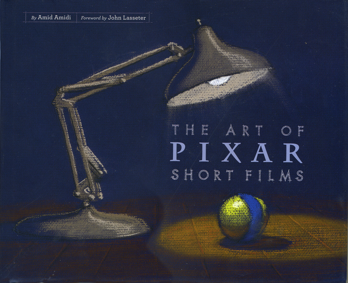 This third book, The Art of Pixar Short Films, resembles both of these past books, in some way. Amid has learned enough from the second book that his writing, his selection of artwork, his choices of design and presentation are important and make the book a beauty.
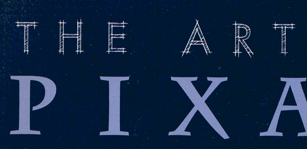
All type is gray, not black. The type for IDs of photos and artwork is handled as it would be on an architectural sketch or blueprint. Names are delineated, literally. The images are thoughtfully placed for the best composition with plenty of
 white space around them.
The artwork representing the films is well chosen; the development art is better represented than stills from the films, themselves. This is a plus; we can see the actual shorts on the dvds. For the most part, much of this art is excellent and oftentimes better than the films’ final art.
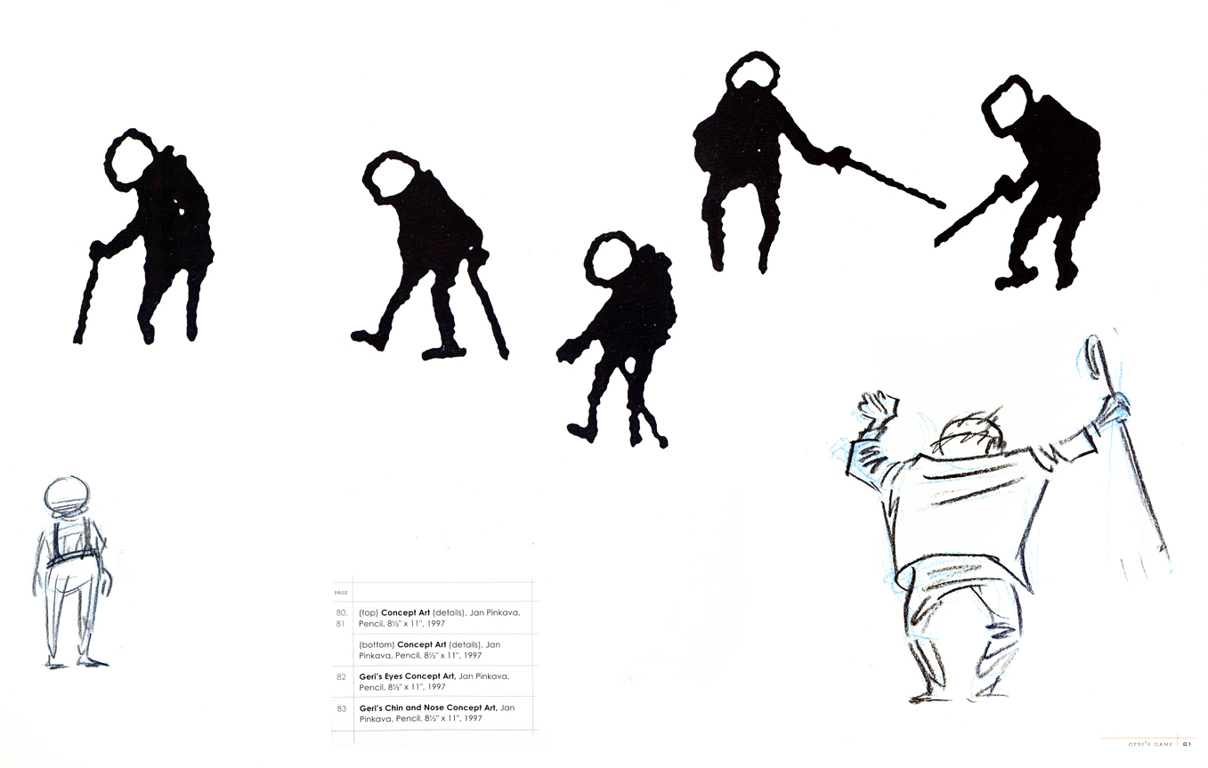
The gesture drawings done for Geri’s Game present an excitement
that seems distant from the final film, pictured below left.
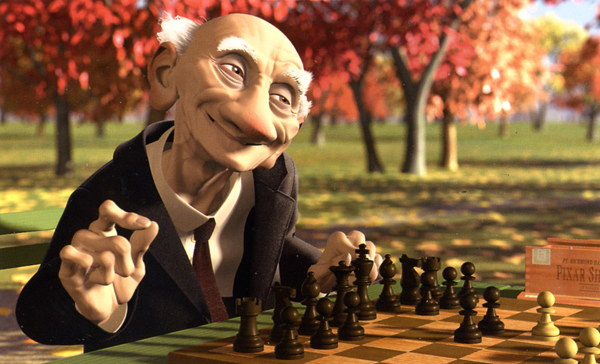 This brings me to my problem with the book, I’m not a big fan of the films. Pixar is a big studio, doing the top of the line work in cg animation. Toy Story, The Incredibles, Ratatouille can’t be beat. The shorts, especially the later ones are just not very good – in my opinion.
When a studio with the enormous abilities of Pixar chooses to do shorts, there has to be a reason. We’ve heard that the reason was to help develop talent so that future directors could stretch and grow. This is a good reason, but the shorts have to either showcase a high quality or a sense of experimentation that isn’t evident. When Disney did shorts back in the 30s so that his animators could learn and grow, the films were made to sell, but they had a level of expertise that we came to expect from Disney. Some of those Silly Symphony shorts have not been topped.
Looking at those beautiful drawings, above, for Geri’s Game, we see the potential for something alive and vibrant. The film is, for me, difficult to watch. It is the antithesis of those drawings. Perhaps they were working out some cg problem, but that’s really irrelevant to audiences.
Pixar’s current film short, Presto, isn’t represented in the book. (The 2D short, Your Friend the Rat is also not included in the book.) It aspires to outdo Tex Avery at his own game. But it doesn’t; t doesn’t come close. There’s no character animation that I can see – both characters move identically. There’s no character development that I see – both are cartoon characters with no personalities; only their motivations are different.. The timing is dreadful; the film moves too fast in its animation and in its cutting. Maybe you’d call that experimentation, but I call it bad film making. Of course, this is just my opininon. Many people love the short, and it may win the Oscar next Sunday.
A beautiful drawing from one of the finer shorts by Pixar.
Yes, other shorts are better. One Man Band has delightful animation of the two musicians, but it also has the cloying, clichéd animation of the child which seems to come right out of the most obvious of Bluth. However, the score for this short is incredibly good.
Luxo Jr. is the finest of their shorts. It’s a beauty. Well designed with strong character animation. The fact that cg animation hadn’t been well developed at the time was irrelevant. The short did what it should have; it told a simple story, introduced a strong character and entertained audiences. It hasn’t lost that appeal, but I think Pixar may have.
I don’t have enormous hope for the cg films of Dreamworks unless some strong director can compete with Jeffrey Katzenberg’s insensitivities. I do still have hope for Pixar, and I’d like to see them do something with these short films. The Disney short, Glago’s Guest, though not perfect gave me great hope for the other Disney lot.
So, I’ve come a long way to say I prize this book for the graphics, many of the images chosen, the author, Amid Amidi’s sense of design and strong knowledge of the medium as well as an ability to articulate that information well. My only problem is the subject of the book. I’ll keep looking for everything Amid’s done, and I’ll continue to collect his books. They all have a lot to offer and fill an important part of my collection. They all are beautifully designed and every small detail is carefully watched. I’m ready to buy his next book.
Commentary 12 Feb 2009 08:55 am
Premio Dardos
- My Sunday comments section was met with this from Brian Sibley: “Thought you’d like to know I’ve awarded you a Premio Dardos Award. Congratulations! And don’t forget to pass it on…”
So I went on to Brian’s brilliant blog to find what this was all about.
“The Dardos Award is given for recognition of cultural, ethical, literary, and personal values transmitted in the form of creative and original writing. These stamps were created with the intention of promoting fraternization between bloggers, a way of showing affection and gratitude for work that adds value to the Web.”
As it turns out, Brian received commendation for the prize and was requested to select five other nominees. Whatta ya know, he chose my site. Well, shucks, I’m honored.
I have, as part of my duties, the obligation to select five more nominees. This I’ve done, and I would have probably chosen Brian Sibley’s site above all others had he not drawn attention to me. So, excepting his blog, I sought out the blogs I most enjoy, though I sought to choose sights that were not exclusively about animation, I can’t say I succeeded. I decided the most important part of it was that it was a site that I enjoyed. That being said, here are my five choices:

Blather From Brooklyn is a photo blog by Annulla. Despite the title, it’s not really about Brooklyn but about New York. There are an endless number of quirky images of events covered, objects found, and passions felt. It’s a wonderful site that I check in on daily hoping to find something new.

Tom Sito‘s unique blog is a source of constant entertainment and education. Daily, he posts events in history that have happened on that particular day. An animation producer/director who once headed the LA union, Tom’s focus might be slightly skewed toward animation but not by much. There’s a daily quiz which is amusing and sometimes challenging, and a list of others sharing their birthday on the particular date. This blog changes almost 365 days a year and is always jam-packed with good reading. I like checking in on my own birthday to see if I’m listed – I have been once or twice!

Lines and Colors is a website about drawing, painting, cartooning, and many of the other visual arts. Hosted by Charley Parker, a cartoonist/artist/animator, the site hails out of the Philadelphia area and treats the visual arts with such joy that it often becomes infectiously inspiring. Regular posts discuss everything from the treat photographing art in museums and Eustace Tilly to Dutch cityscape paintings.

asterisk animation is a blog for a NY animation company called, oddly enough, Asterisk Animation. Hosted by one of the principals, Richard O’Connor, the site takes on his personality – literate, intelligent, thoughtful and artistically interesting. Richard writes with entertaining strokes, as one would expect from a studio site, about their animation and past projects. However, these tales are usually informing and entertaining enough that it makes it a delight to visit the regularly developing blog. I do have to admit, though, it’s tough at times to face the bold yellow of this site in the mornings.

Finally, since I pretty much live for animation, I have to add my favorite animation site, and this is it. Mike Barrier has been dedicated to ACCURATE animation reporting of history, and his site offers that history as well as reviews that are exact and usually dependable. There’s so much information on this site and so much worth looking for that I have to place it in the uppermost category of my favorites. Actually, it’s probably the stop I come to most often on the internet, so how could I resist lauding it.
Even today’s post about the faces of Marceline, MO. (Disney’s home town) is so unusal, enlightening and eccentric, that it’s a joy to check out this site.
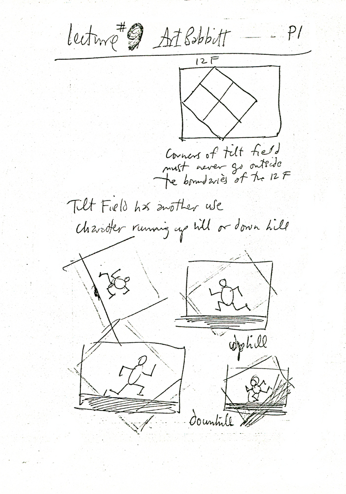
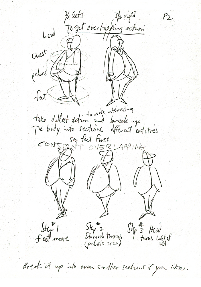
Commentary &Richard Williams 10 Feb 2009 08:52 am
Borge’s Note
I mentioned in my post this past Friday, that I had a copy of Dick Williams’
notes from Art Babbitt’s lectures at the Williams, London studio. Borge Ring wrote the following letter about those notes:
- You own a copy of Dick Williams’ notes from Art Babbit’s lectures at the studio in Soho Square.
Art drew on an overhead projector during the lessons. Dick sat there copying them into his scetchbook all the while.
Years later I asked Carol Hall – Russell’s wife – if they had copies of Art’s own overhead drawings. They did and Carol graciously sent me the lot.
It was WILDLY interesting to compare the two.
Dick’s version is – let us say – “Bobo Cannon as seen by Ronald Searle.”
Art’s personal taste in design were very influenced by UPA. Clear, compact designs almost emblematic. But when he draws a row of “little men” they are jolly in an exuberant Syverson way.
I noticed this preference of his when he corrected my animation. He would change a shoe into a UPA shoe ignoring the client’s modelsheet.
Performing the corrections he desired did not come easy to him. He put a clean sheet on top of your drawing and redrew with a blue pencil.
He did not like the result,and went over his blue drawing with a red pencil.
That wasn’t it either; so he took a black pencil and bored into the blue and red. Watched awhile …. then tore the thing off the board and started the blue pencil on a fresh sheet.
He ended up with a nice clear drawing in black pencil. I kept one, trimmed it to the size of the character and it resides in the drawer where I keep erasers and things,and greets me every time I open the drawer.
Dick’s thrifty business partner had asked me: “Now Borge, what do you think you should be paid for this job? You know, we’ve got Art Babbitt coming.”
I said: “Art Babbitt has been teaching me for 24 years, Carl. Only he doesn’t know it.”
Another gambit was: “You must have an excellent showreel. that can attract clients to us. May we borrow it?”
Now, this is like having your passport confiscated in Teheran, so I said:
“Dont worry, CarI In 3 months time you will have a new, vastly improved showreel of mine, all of it Richard Williams commercials.”
Carl Gover was a thrifty often frustrated man in a difficult Roy Disney position. I got to like him very much, and still do.
I once asked Dick what sort of artist Art Babbitt was “privately.” He said: “I don’t know. He does not consider himself an artist, and he is very shy about such matters. His wife showed me a collection of caricatures from the 20s.”
“What do they look like?”
“Beautiful”.
Art scoured the art galleries in London looking for things that might improve his animation.
Four young animators complained that the client’s (trademark) character was very corny. Babbitt smiled to the paper on his desk and said mildly: “That depends on how charmingly they can animate him. Because if they can, he will not look corny.”
Frank Thomas visited and Dick showed him a funny commercial for dogfood he had drawn in a James Thurber like style. Frank said; “I like that surface-trick-stuff you do, Dick. But I prefer real characters.”
Dick answered:: “You dont think that Captain Cook is a more real character than this dog, just because you use liveaction for reference.”
writes
Borge
 ps: The Dutch art authorities are justly proud of their heritage of Rembrandt and Vermeer etc etc etc and you might expect them to be condescending towards an artbook showing 25 years of The NewYorker frontpages.
Not so.
A review by a top guru in a quality newspaper said. “These are so-called commercial drawings which means that they will never find their way into a museum. But I would gladly exchange all the museums for these drawings. Because they are the best collection of drawings of this century.”
I played hobby jazz with some other oldies. The vibraphone player was a bigshot at the Rijksmuseum in Amsterdam. He got me invited to exhibition openings. “Are you coming sunday for Da Vinci? We have a new sherry.”
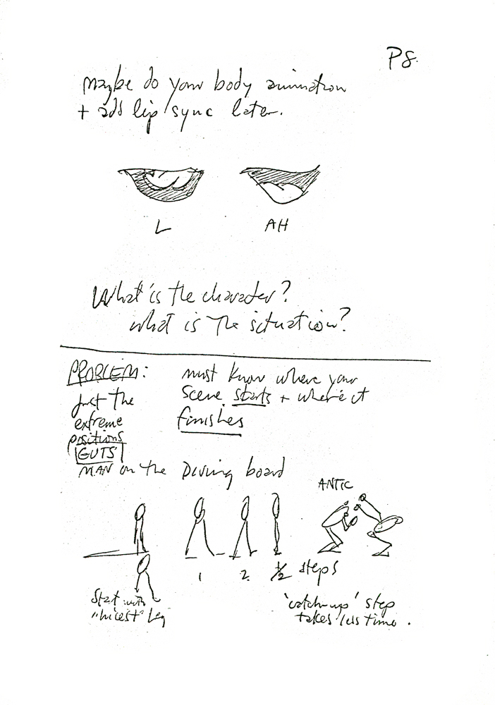
Dick’s notes Chapter 9.
 2
2 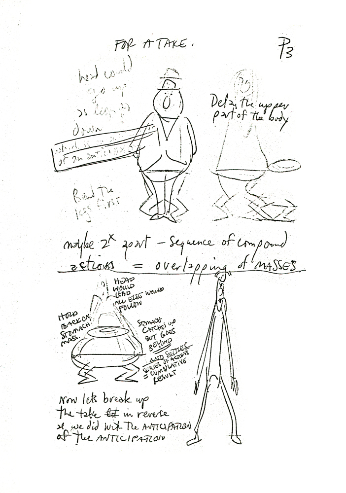 3
3(Click any image to enlarge.)
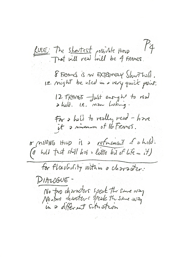 4
4 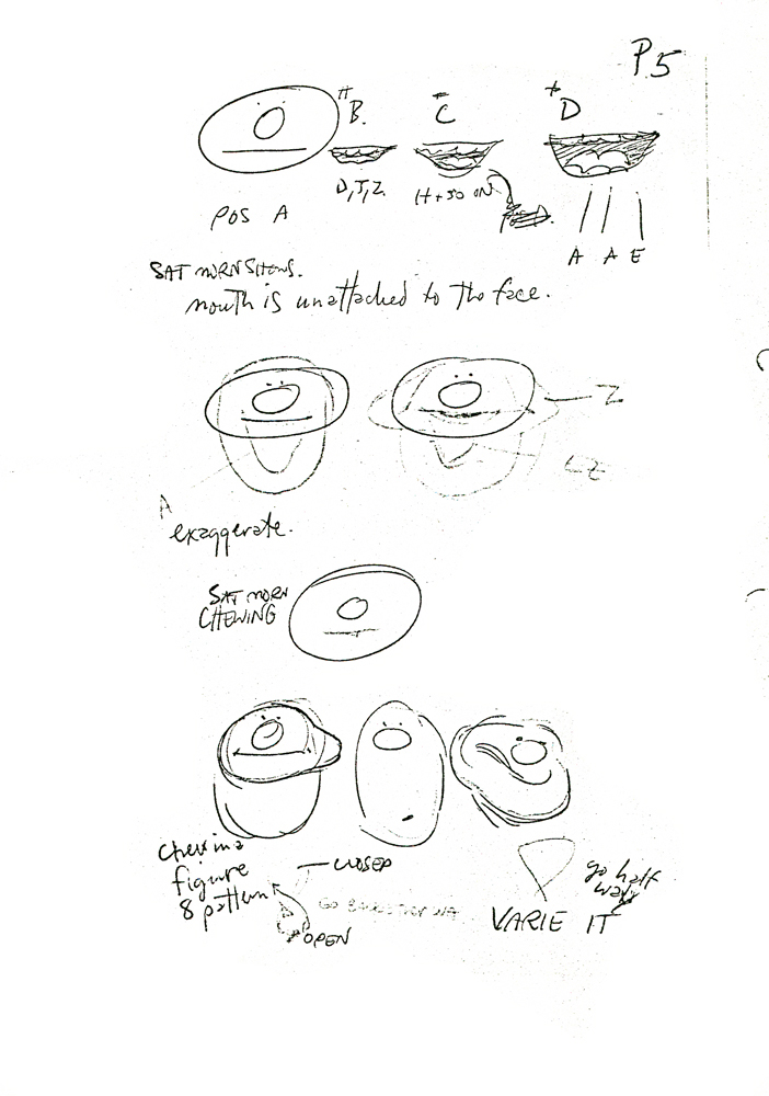 5
5
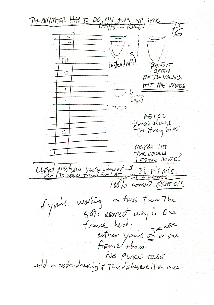 6
6 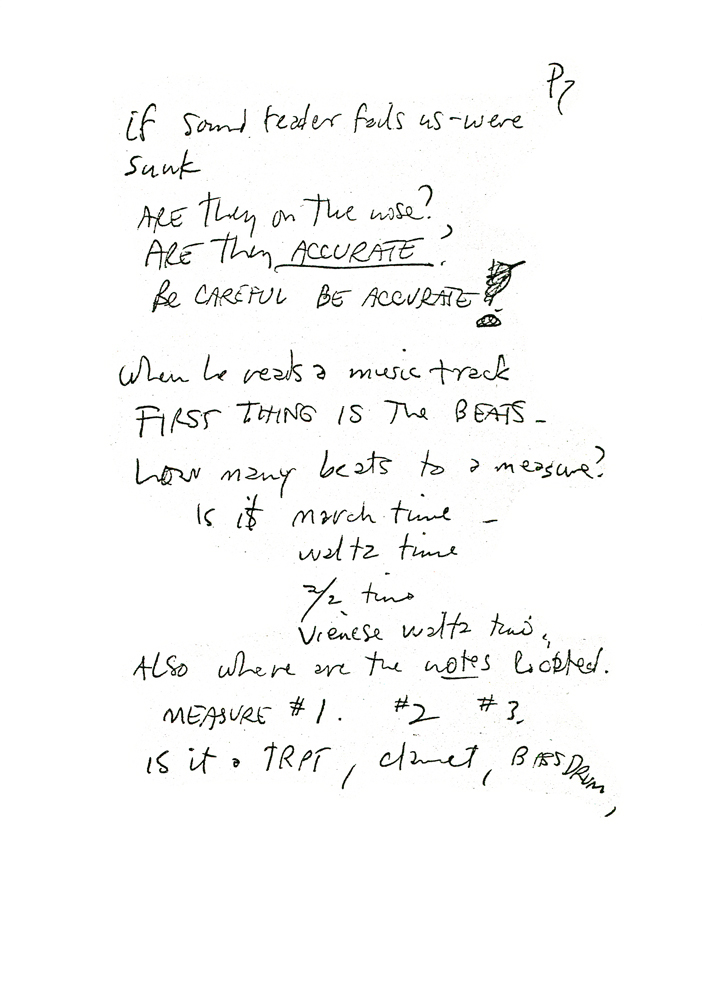 7
7
 8
8 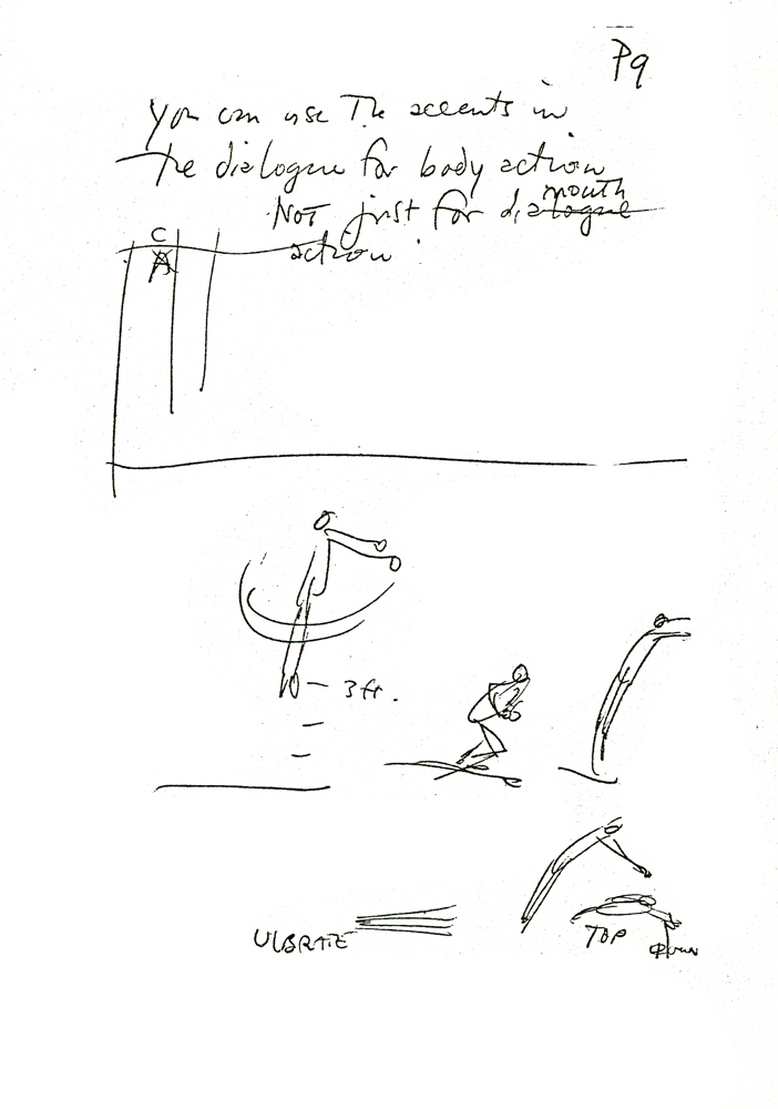 9
9
