Category ArchiveCommentary
Commentary 28 May 2009 07:58 am
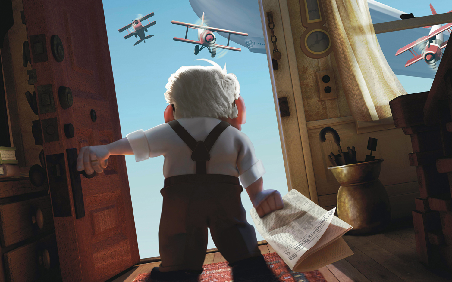
Up and Up
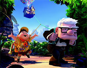 - I’ve read three different reviews for Up, all very positive.
. Tom McCarthy in Variety reviews the film we all expect to see: another feel-good, light and airy cartoon done by those wizards at Pixar. All positive.
. Michael Rechtshaffen in The Hollywood Reporter writes a less specific but much more buoyant review. “Despite the innate sentimentality, director Pete Docter (“Monsters, Inc.”) and co- director-writer Bob Peterson keep the laughs coming at an agreeably ticklish pace.”
. Robert Wilonsky in the Village Voice reviews a film that slyly works more as a film for adults than for children. “Pixar movies have been moving in this direction for years—adult animation sprinkled with just enough shenanigans to entertain the kids while we get our weep on.” All positive.
The best written review was the Village Voice, and it’s also the one that makes me most curious to see it. Two of the reviews suggest that 3D is probably a hindrance more than a help:
 Variety: In fact, the film’s overall loveliness presents a conceivable argument in favor of seeing it in 2-D: Even with the strongest possible projector bulbs, the 3-D glasses reduce the image’s brightness by 20%. At the very least, the incentive for seeing “Up” in 3-D would seem less powerful than it is for other films.
Voice: Do not see Up in 3-D. It’s inessential to the tale and altogether distracting.
The Hollywood Reporter spends much of its review promoting the 3D experience: “… those attending theaters equipped with the Disney Digital 3-D technology will have the added bonus of experiencing a three-dimensional process that is less concerned with the usual “comin’ at ya” razzle-dazzle than it is with creating exquisitely detailed textures and appropriately expansive depths of field.”
The film opens tomorrow, and I’ll look forward to some of the other more mainstream reviews. I’ll see the film at an Academy screening on Saturday. It’ll be shown in 2D at the screening, so I won’t have the option of seeing it in 3D. (Perhaps the Academy should update?) Regardless, I’d like not to see it wearing polarized glasses that dim the design’s colors to offer an unnecessary effect. You pay $5 more for 20% less, in my estimation.
I’m not sold on the character design in the trailers and stills I’ve seen, and the character animation I’ve seen has not won me over. But that all becomes moot if the story is solidly engaging as both of these reviews suggest. I can hope as well as anyone.
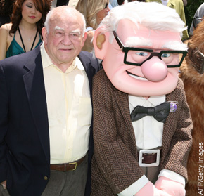
Meanwhile in another story about Up, The NY Post offers a Q&A with Ed Asner, as well as a-not-very-positive article about Pixar’s attempt to do more daring kinds of movies: a “… rodent-driven “Ratatouille” and continuing with last year’s “WALL-E” — an amazing, mostly wordless film about a robot tidying up after an environmental apocalypse.”
 And now a film about a 78 year old man.:
“The movie’s premise is so unusual that Thinkway Toys, Pixar’s partner since 1995, has decided to sit this one out.
‘That really tells you something,’ says David A. Price, author of ‘The Pixar Touch.’ ‘Everybody likes their grandpa, but the consumer product folks don’t think that grandpa is gonna sell as a doll.’
Docter says he and the other creative staff at Pixar don’t think in terms of marketing and merchandising.”
I wonder if Bob Iger would say the same.
But then this has been the story on many of the entertanment blogs (eg: this one) over the past few months. Personally, I don’t think it’s fair to judge a film on its marketablity quotient, but then I’m not sure that a film that costs upward of $150 million shouldn’t concern itself with that factor.
Originally, Toy Story premiered without any dolls on the market. Disney seemed to have been showing their lack of support for that first big Pixar effort. The success of the film caught them unaware, and they weren’t able to truly capitalize on the dolls until after the success. (Making Toy Story 2 all the more important.)
Perhaps children will be craving for rubberized Carls and they’ll have to make Up 2 to encourage them. Of course, that’d have to wait until Toy Story 3 and Cars 2 hit theaters.
Commentary 26 May 2009 07:47 am
Q&A
- I recently spent a few minutes rereading the questions printed at the back of John Halas’ seminal text, The Technique of Film Animation. There’s something formidable to me in a few solid questions posed to a number of smart people. Playing off and comparing them against each other almost gives another answer. I think I first found this book back in 1966, yet in all those years the questions and answers never seem to date. At least not for me.
Anyway, one specific answer struck me this time, and had me thinking about a subject that’s been prominently on my mind lately. Naturally enough, it’s John Hubley’s answer that impresses me. Here’s the question with John’s answer:
 Do you think animation is in a general state of stagnation as regards its style and presentation? How would you like to see it develop artistically?
JOHN HUBLEY: There is a tendency toward cliches of design in a traditional sense, and even the so-called modern style. (The large profile nose, hair line, arms and legs, black dot eyes, etc.) But more disturbing are the cliches of action (stylized flutter-lip action—sandpiper-like leg motion for walks and runs, multiple image jitters for fright, and many others). The trend toward more rapid timing of actions and reactions is reducing the human characteristics portrayed in the animated image. I would like to see the development of animation which is capable of deeper emotional expression; the portrayal of characters that are more profound and human. This will require stories dealing with ideas and relationships beyond the usual cat and mouse chase or “cute” children’s tale.
If anything his answer is more appropriate today. Cliches in design are not the only sins evident, but cliches in animation and movement even more so. There’s the Flash thing – angled characters with thick external lines are the way forward for most animation done today. It’s the most severe design that the mediocre to poor popping animation hides behind. Solid flat colored backgrounds and a total lack of depth in drawing is the signature of most of the Flash pieces I’ve seen. Too few try to overcome the simple problems in Flash – like popping a head from profile to straight on with no inbetween drawings, or popping from any pose to another. They’re not all in homage to Tex Avery. More likely it’s an homage to laziness. After all, it’s just a cartoon.
Occasionally, you’ll come upon a Sita Sings the Blues and realize that Flash isn’t the problem, but it’s the handicap for many another limited animator. How smartly the design is conceived in Nina Paley‘s film, it gives a very fluid action and a busy texture in the very stylized and appropriate backgrounds. But this is defiinitely the exception to the Flash films out there. Nina uses the medium for all it’s got.
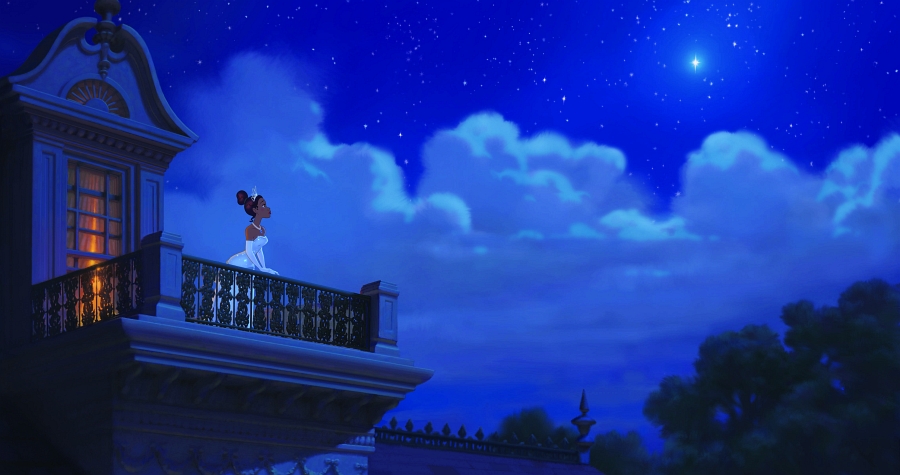 It isn’t just Flash. So many other shorts; so many cg or 2D features are so limited in their choices. The upcoming Disney feature, The Princess and the Frog, cannot fully be critiqued based solely on its trailers, but honestly, it’s doubtful the rest of the film will be designed differently. As it is, the film reminds me a bit of the animated sequences done by James Baxter for Disney’s Enchanted. That was supposed to be a parody of all those Disney fairy tales done recently. I somehow doubt that The Princess and the Frog is parody, but I could be wrong. It just looks retread; well-done retread but just the same.
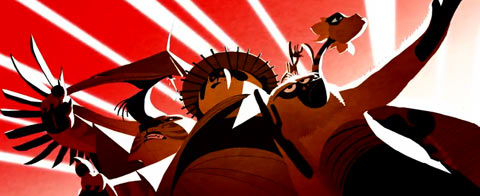 After seeing those credit pieces for Kung Fu Panda (also done by James Baxter Animation & Shine Studio) wouldn’t we expect more of Disney? Maybe not. Actually, the entire Kung Fu Panda was well designed.
Those 2D title sequences were exceptional though, and if I were trying to revitalize the 2D division of Disney, I’d be going for something strong not reworked. However, as I’ve said, I haven’t seen the final version of The Princess and the Frog and will hold any final criticism until I do.
Design shouldn’t exist outside of the film it’s working within. Two fine examples of excellent and daring design that strengthened their films would be Mulan and Lilo and Stitch. The strong, simplicity of Mulan gave that film the backbone it so needed. I wasn’t completely satisfied with the character design; several of the characters (grandmother and dog) seemed to step out of another film. But overall, it was a brilliant effort, and watching it was almost hypnotic. Lilo and Stitch almost seemed retro with the decision to use the water color backgrounds and beautifully rounded characters. There was a softness there that absolutely made that film. Both were examples of daring design that supported the stories and the animation. It didn’t call attention to itself but brought you into the film.
My sole purpose here isn’t to criticize anyone. I’m just calling for some solid and strong design in animation for both settings and characters. Designers and animators have been sleep walking far too long.
Animation Artifacts &Commentary &Luzzati & Gianini &repeated posts 18 May 2009 07:36 am
Giulio Gianini 1927-2009
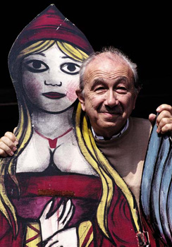 – I’ve been something of a fan of the films of Luzzati and Gianini. I’d met Emanuelle Luzzati at a function thrown at the Italian Embassy in New York, years ago. I bought a book by him, and the artist drew a beautiful pen and ink drawing in the frontispiece of the book.
In 1988, I met Giulio Gianini in Italy during a stay of a couple of pleasant days with an assistant of his at the festival in Treviso, Italy.
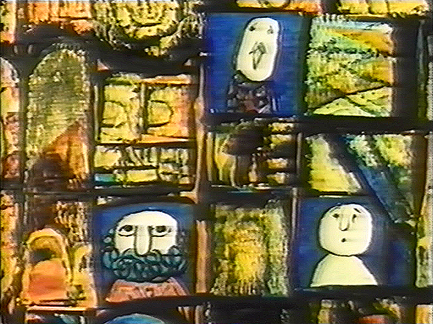
Mr. Gianini died this past Saturday, and I wanted to offer a bit of a memorial. Emanuelle Luzzati died January, 2007 and to memorialize that I posted some illustrations and information about the duo with a lot of frame grabs from a number of the Luzzati/Gianini films. It took a few posts, and I left off without wanting to overplay all of the art at my availability.
Luzzati & friend
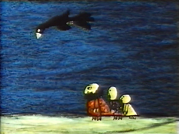
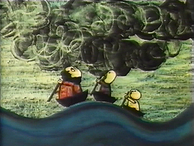
The Thieving Magpie was the first of their films to receive an Oscar nomination, and it was the first of the frame-grab posts I showcased. I’d like to post it again in honor of Mr. Gianini. He was sick for several years and in particularly bad condition. His death wasn’t a surprise, but it is still an enormous loss.
 1
1 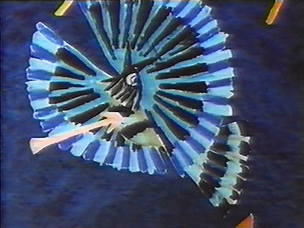 2
2(Click any image to enlarge.)
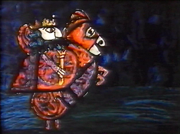
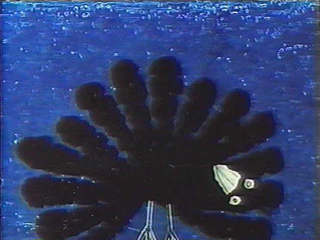
La Gazza Ladra (The Thieving Magpie) is a Rossini opera about a young maidservant who, accused of stealing a silver spoon, is sentenced to death for her crime.
At the eleventh hour, the real culprit is found to be a magpie.
A cartoon, if ever there was one. With great music!
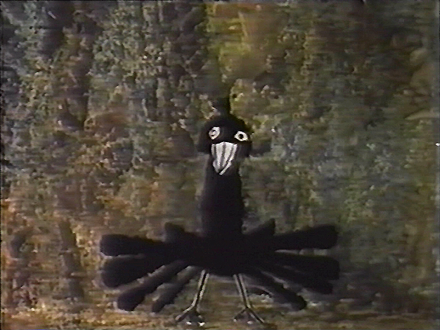
The film tells a tale wherein a king and his hunters, on a bird hunt, are beaten
by a magpie who steals their gems and ultimately destroys their village.
 4
4 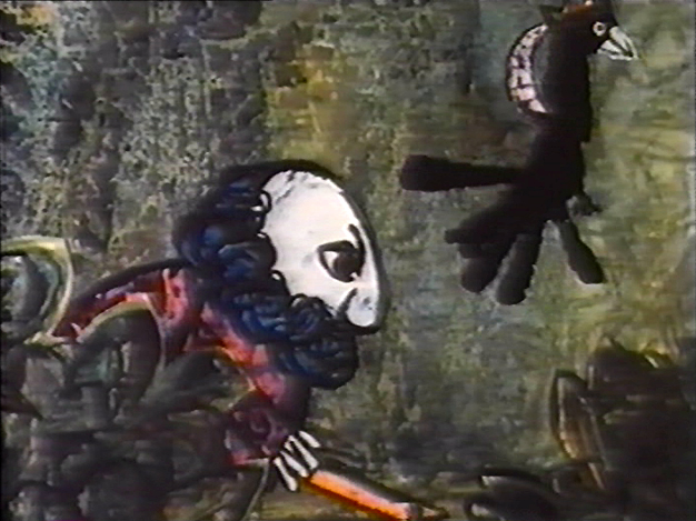 5
5
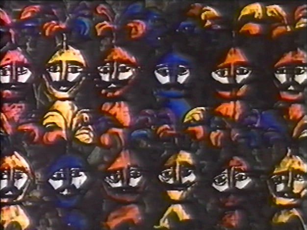
Luzzati who spent many years designing operas and ballets,
brought his knowledge to animation as the pair adapted several operas often utilizing the overtures of the operas they were adapting.
 6
6 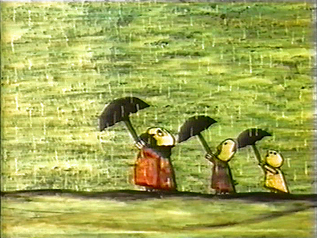 7 The film was nominated in 1964 along with
Clay, and the Origin of the Species by Eliot Noyes
and the winner, Chuck Jones’ Dot and the Line.
The Sound of Music won the Best Picture Oscar, that year.
 8
8 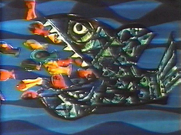 9 The use of cut-out animation wasn’t mainstream at the time.
This is years before Terry Gilliam made it somewhat fashionable. All of the
Luzzati-Gianini films were totally inventive and creative within the form they established.
Gianini’s animation was as dreamlike as Luzzati’s exciting designs. The films
look to be designed somewhere between Chagall, Kirchner and
stained-glass windows; the sensibilities are all Luzzati and Gianini.
 Today we have Flash animation which does just about the same thing as cut-out animation, but the form used today is flat and vulgar and cartoony. It might be useful for practitioners of Flash to take a good look at what these two brilliant designer/animators did with a similar form under more complex and arduous methods. Ulltimately, it’s all related.
You can get a bit more information about Gianini and Luzzati from the website of the Luzzati Museum in Genova.
Commentary &Daily post 15 May 2009 08:04 am
Totally TV – I mean, 3D
- A couple of news events have passed by the Arts pages of the New York Times.
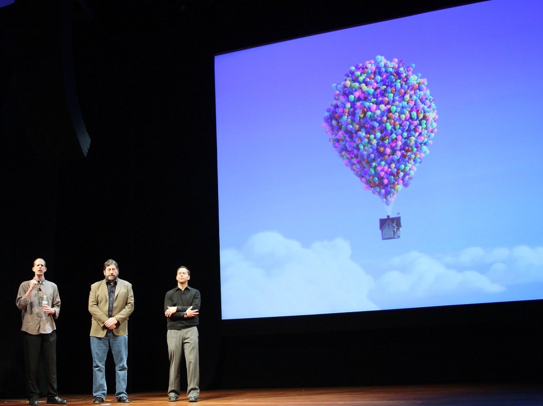
Up had its premiere screening last night as it opened the Cannes Film Festival. It’s the first animated film to have had that honor – of opening the Festival. A lot of critics seem to be guessing that it’s because so many of the films in the competition screenings (Up is not in competition) are severe downers, and they needed something positive to open the Festival.
Lasseter is quoted as saying that he is “looking forward to seeing that great image of all these people tonight in their tuxedos, bow ties and gowns, wearing 3-D glasses in that big theater,” he said. “That’s going to be a good picture.” This according to the NYDaily News
The Sydney Morning Herald featured this review:
THE most opulent film festival in the world showed it was up to the technological minute on Wednesday when it opened with Up, the new 3D animation from Pixar Studios. As an audience studded with stars walked the red carpet, they were invited to accessorise their tuxedos and ball gowns with a pair of polarised plastic glasses.
It was the first time the festival had opened with an animated film, which caused ripples of horror among the faithful when the program was announced. Judging by the sounds of sniffing that preceded fierce applause, however, Up won them over.
“Walt Disney always said for every laugh there should be a tear,” said the creative head of Pixar, John Lasseter, at a press conference during the day. Walt’s formula is still working.
In case you want a few clues about what Toy Story 3 will be about, read this article in the NYTimes.
>
The animated series Sit Down, Shut Up is down and out. According to the NYTimes and Variety, Fox has decided to cancel this animated sitcom which recently made its debut. They’ve chosen even to passing on airing the last episode produced. Apparently, sandwiched between The Simpsons and Family Guy, it was losing audience for both of those shows.
I recently saw Jason Bateman and David Cross together on the subway and wondered if they were recording anything for this show in NY. Of course, that’s ridiculous; it would’ve been done months ago..
>
Finally, the Times had an article about the new show Dreamworks is preparing for Nickelodeon. Kung Fu Panda will now join the Madagascar Penguins on the Nick schedule.
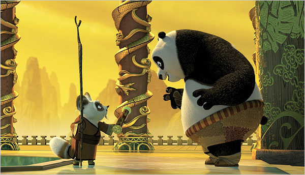
This is probably good news for those working at Dreamworks. Many considered the film the best of the cg films out of that studio, and now it can go on forever. Hopefully, Jack Black will remain involved with it. It might have been nice if they had gone with the 2D style of the credit sequences. At least, do something to keep the movie special.
Animation &Commentary &Frame Grabs 13 May 2009 07:17 am
Random Bluth
- All the anti-Don Bluth vitriol that came out in the comments on my relatively harmless piece on the recently released DVD of Banjo the Woodpile Cat has stuck in my craw. (here and here)
Don Bluth is a veteran animator who busted his butt to make a number of animated features. Some of these were really good; some were not so bad, and others were downright clunkers. Regardless of the quality, they all took a hell of a lot of effort and  struggle to get to the screen, and for that alone,
I have a lot of respect for Bluth and those who were part of his close-knit animation family.
A personality did come through all of those features. You may or may not like that personality, but there is an imprint there that can’t be denied. I give the man and his team a lot of credit.
Yet from the comments that have been generated, one would think he had done a piece of trash like Hoodwinked or Barnyard.
 __
__ 
The major difference is that Bluth desperately tried to make a good film and change the world of animation with his product, the other two producers were just producing product. Make it funny and get as much booty as possible. I guess the latter two were successful. One got a good deal with Miramax (and is now directing a live-action feature). The other, a live-action director, got a deal with Nickelodeon and made a slew of other Barnyard attractions.
Don Bluth? I’m not sure what he’s up to now, but I do wish he’d get back to business and try another animated feature. Perhaps this time he’ll work with a first rate scriptwriter.
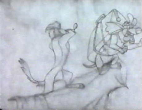
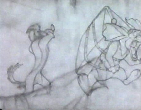
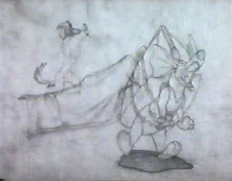
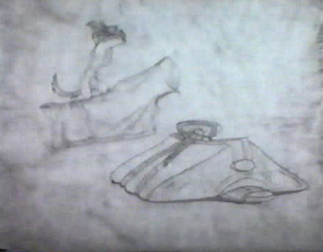
I’ve decided to post some screengrabs of a random scene from the PT of Bluth’s All Dogs Go To Heaven. I didn’t like this film when I first saw it in a theater, but I’ve warmed to it over the years. The folksy charm of Burt Reynolds still bothers me, as does that googly-eyed child typical of many Bluth films. (The children in Troll in Central Park is the crème de la crème of this character type.)
Anyway, here’s a scene. It’s chosen completely at random. I don’t know who animated it (please leave a comment if you know), but it took a lot of work, and I’d like to honor it.
 1
1(Click any image to enlarge.)
 2
2 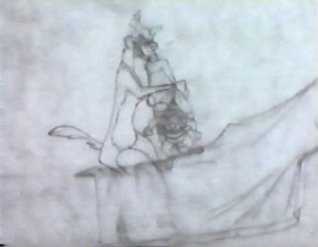 3
3
 4
4 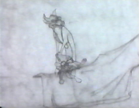 5
5
 6
6 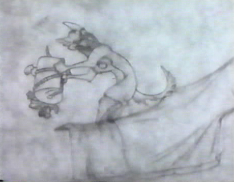 7
7
 8
8 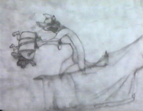 9
9
 10
10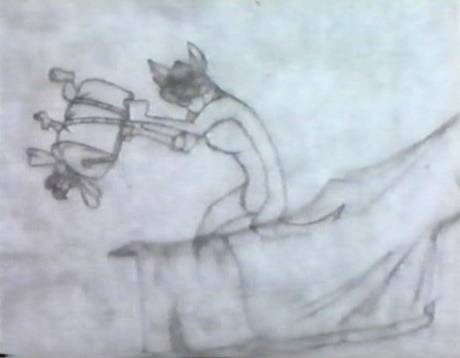 11
11
 12
12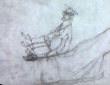 13
13
 14
14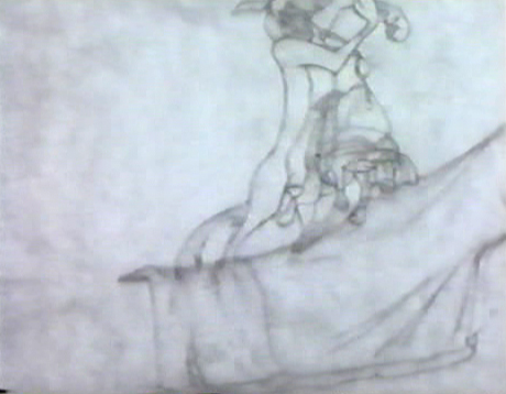 15
15
 16
16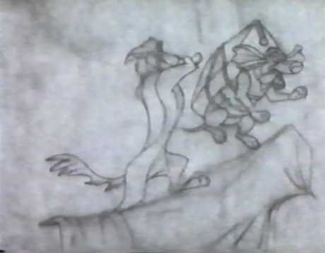 17
17
 18
18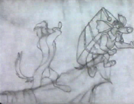 19
19
 20
20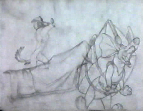 21
21
 22
22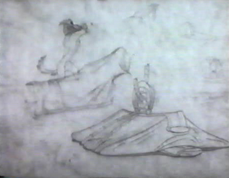 23
23
 24
24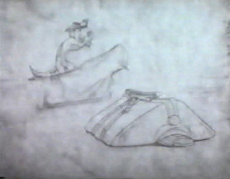 25
25
 26
26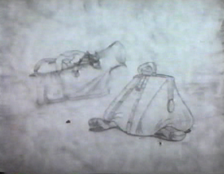 27
27
 28
28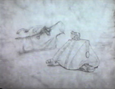 29
29
 30
30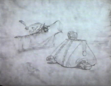 31
31
 32
32
Commentary &Photos 10 May 2009 08:24 am
Cherry Blossom Festival

Photographed by Steven Fisher.
Where do all the cherry blossoms go when Mother Nature is tired of them? You guessed it.
We’ve had about ten days of drenching rain and thuderstorms that has brought New York into a soggy depression. It’s exhausting. The NYYankees had to leave town to be able to play a dry game. Oddly enough, they went to humid Baltimore which was, at least, less damp.
We’re looking forward to a day of sunshine and dryness, as was predicted by the weatherguys for today.
How do you depict the contemptuous disregard for the beauty of cherry blossoms in animation? It sounds like it might be a complicated effect scene. There’s something about animation that doesn’t allow you to have the layers of subtlety that a live, still photo can offer. Perhaps the only way would be to use painting to get the point across, abstract painting. It would probably have to be an expressionist image.
If you wanted to do it in cgi, you’d have to do a photorealistic version which would be pointless and souless. You’d have to find some abstract way to represent things other than with little doll images. Perhaps that could be a challenge that no one would take up.
I know, my vision is biased and limited. It’s all those molting cherry blossoms.

Another great picture by Steven Fisher.
Commentary 30 Apr 2009 07:22 am
In collusion with JULES ENGEL
Borge Ring sent a delightful letter, and here it is:
- In collusion with
JULES ENGEL
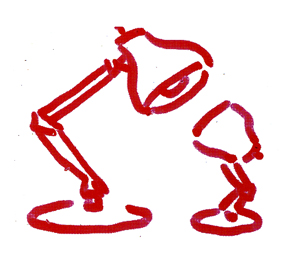
 The Festival Jury is assessing LUXOR John Lasseter’s warm poetical film about an office lamp and its child.. Jury president John Halas clapping his hands proclaims: ”This is the victory of he computer, this is the victory of the computer”
“No, it is not” sayz I.
The head of Halas & Batchelor Brittain is baffled. “What do you mean?”
“It is the victory of John Lasseter’s human warmth.”
Halas retorts demandingly:”You don’t mean to say it could have been DRAWN?”
Now this is a very tricky question that can be answered with YES or NO according to what you deem important: The play on your emotions or the magic of manipulatng numbers into stunning verissimilitude.
 I felt insecure about answering and looked around. Fellow juror Jules Engel whose omniscience in the matter understood the situation, looked intently at me from across the room and nodded a subtle, silent “Yes”.
“Oh Yes, it could certainly have been drawn”, I say. Halas turns to Jules Engel: “” What do YOU say, Jules?” Jules Engel answers in a slow laid back academical manner: “I’d say Yes”
yukyuk
Borge
 ps: John Lasseter is an accomplished Disney trained animator. His mentor was Eric Larson the famous. I saw the film that Lasseter drew to round up his studies. It tells about a small boy who has nightmares. It would be nice to revisit it.
I haven’t seen Nitemare but hope to rectify that problem soon. Conse-quently, it’s tough for me to properly _________________Lasseter’s Nitemare
talk about it.
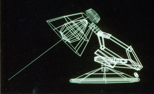
It’s obvious that John Lasseter has enormous respect for 2D animation; certainly his background would dictate that. The experimental piece he did on the Where the Wild Things test, done at Disney, shows a true attempt to combine 3D and 2D animation – at least for the Disney mold.
The piece, however primitive, did work in that you forgot you were watching 3D background animation – in the days when cgi was not so matter of fact. However, back then, the title made me think they were trying to destroy Maurice Sendak’s work by making it look like one of Peter Pan’s lost boys was starring in it. It was hard for me to make the leap (never mind the upcoming live action film by Spike Jonz) from the book to that film test.
We can also see the influence Myazaki has had on Lasseter, and hope for it to be something larger than Toy Story 3 or Cars 2. Perhaps 2012 will bring us something as sensitive as Luxo Jr.
Images of Luxo Jr. from Amid Amidi’s book: The Art of Pixar Short Films.
Animation Artifacts &Commentary &Hubley 24 Apr 2009 07:37 am
Up Up and Away
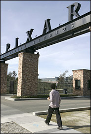 – Yesterday’s NYTimes blog, The Carpetbagger, featured a short piece on the expansion at Pixar. The source of the Times’ information was the Pixar Blog which admits to the construction. The cost of construction, “does not include labour and other associated costs, which will undoubtedly run into the millions of dollars also.”
They then go on to add that the rest of the Disney studio is laying off workers, while they, Pixar, are expanding.
Très generous.
The Times comments: “But it’s hard to argue that Pixar is being in any way excessive with these plans. The studio, acquired by Disney in 2006 for $7.4 billion, has been planning the expansion for years, and desperately needs it: its current space, while opulent by some standards, is crammed far beyond its designed capacity.”
 – Mark Osborne, one of the co-directors of Kung Fu Panda, reminisces on AWN about classes with Jules Engel at CalArts. This is a heartfelt piece that I enjoyed reading. If you haven’t found it yet, you might take a glance. The piece was written to coincide with the celebration of Jules’ work which was held last Sunday; fortunately the words live past that date.
I like the fact that there are groups keeping Jules’ name alive. Aside from the positive comments from past students, there is also the Jules Engel Appreciation Group on Facebook. I wish some of the other important figures in animation’s history had equal attention. Maybe that’s part of my reason for writing on this blog.
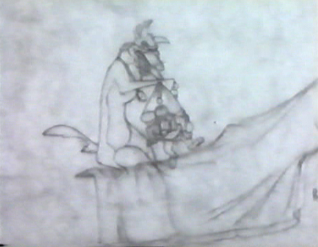
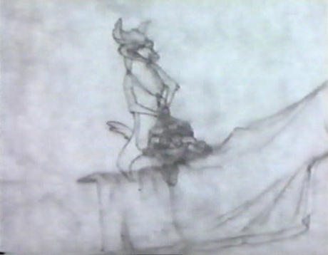
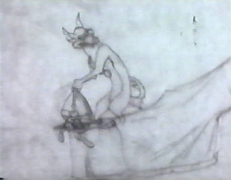
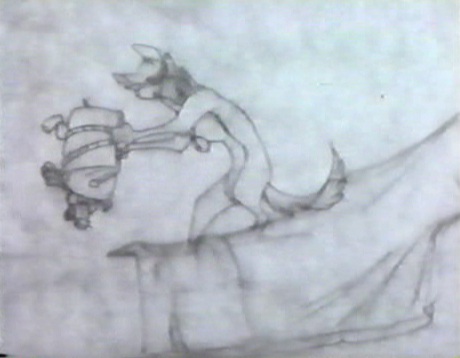
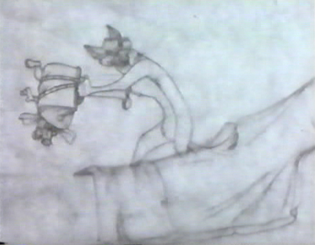
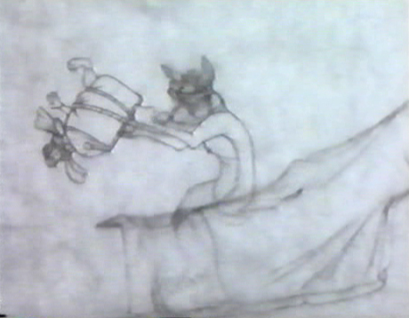
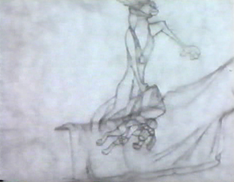
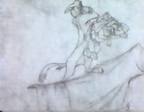
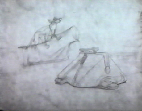
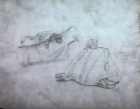
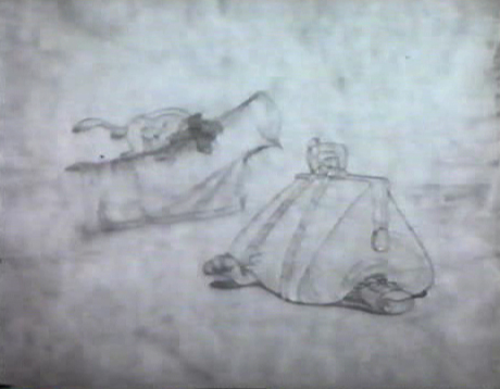
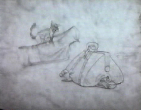
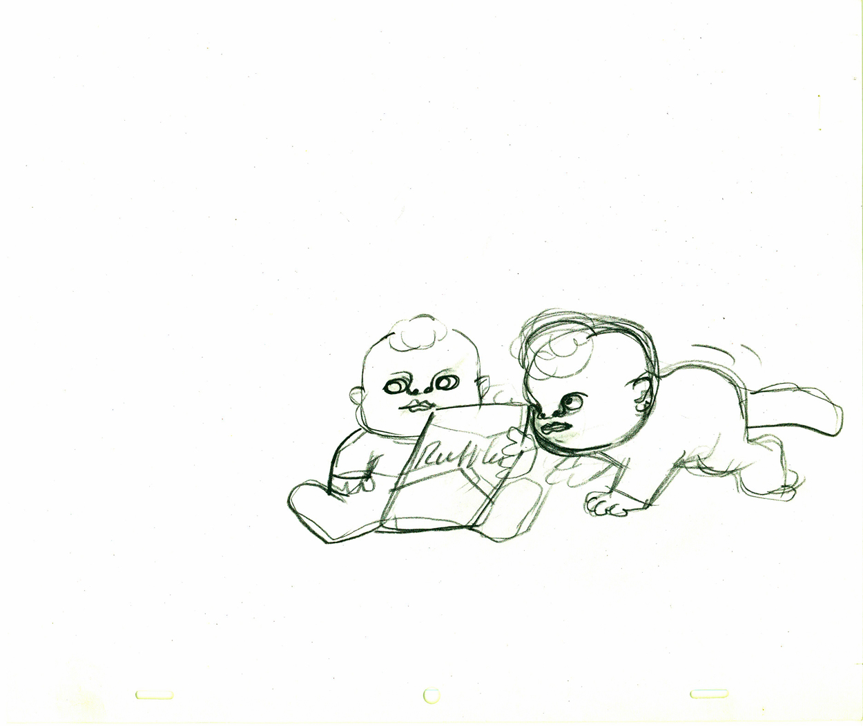
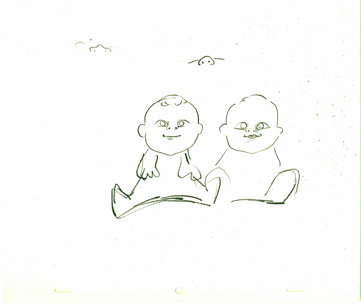
- To that end, let me share these four drawings by John Hubley of a baby for a Ruffles commercial. I haven’t seen the spot, done in the late 60s, but I have seen lots of toddlers drawn by Hubley. It’s amazing how different all of them are. Each child has a real personality and charm that I find extraordinary. How many kids have we seen in the past twenty or so years in Disney/Dreamworks/Pixar/Bluth features that are all so identical. Their feature films like to post the names of all the production babies at the end of their films, but I’m not sure any of the animators actually see their babies, at least based on the characters we’ve seenanimated. (Think of that cloying cliché of a toddler in the otherwise excellent short, One Man Band.)
I haven’t found two such tykes from Hubley’s hand that resemble each other – or other cartoon children.
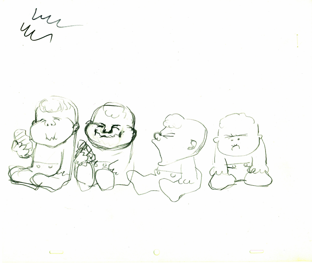
(Click any image to see the full animation drawing page.)
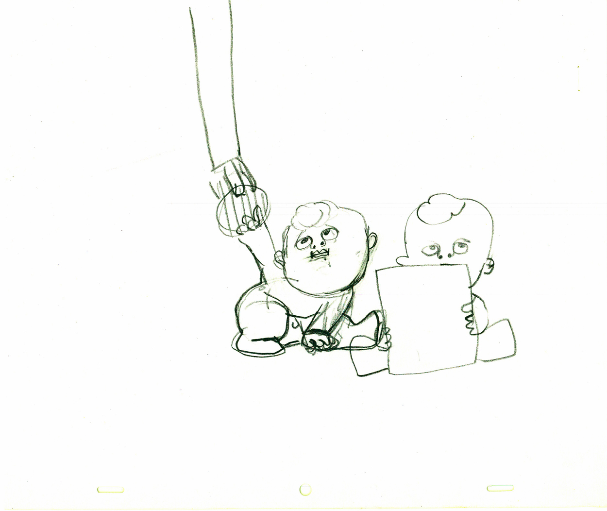
A decent animator can’t help but know what to do with such models.
Commentary &Photos 23 Apr 2009 07:36 am
4/23
God, we were so innocent back then.
I’m not sure if that was better or worse.
Commentary &Photos 11 Apr 2009 07:56 am
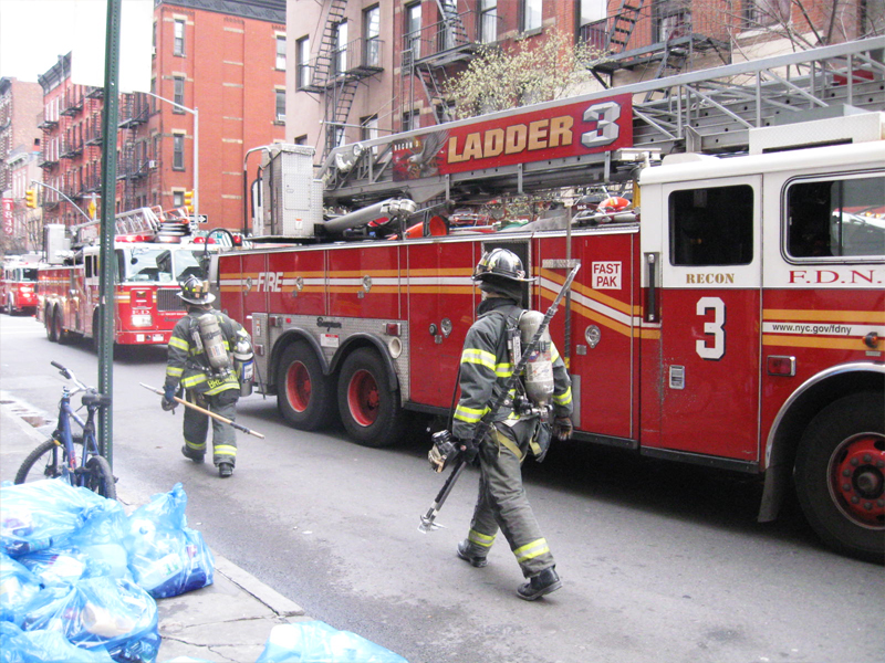
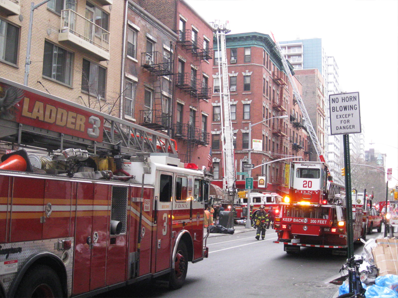
Fire!
- How tenuous everything is.
On Thursday a pitcher for the LAAngels was killed in a hit & run accident.
That night the same thing happened to a non-celebrated woman in Brooklyn.
You never know what you’re going to face when you get out of bed.
When you’re a kid, there’s a strong compulsion to chase after the speeding fire truck, with the loud sirens, the speed, the unique look of the hook & ladder.
When you get older, the fire trucks are just as compelling. However, I think the reason is for the tragedy playing out at the end of their mission.
Walking up Bleecker Street yesterday, early morning, you could see the flashing sirens, the multiple trucks and ambulances, the whirring lights. As I got closer to the scene it was obviously a fire in progress and a lot . . . I mean a lot of fire trucks and firemen.
I walked by on the other side of the street and took a rash of photos. It makes for a good Saturday post, so here are those pics.
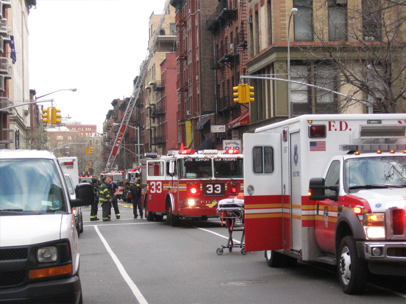
From about half a block away, the buildup of fire trucks was overwhelming.
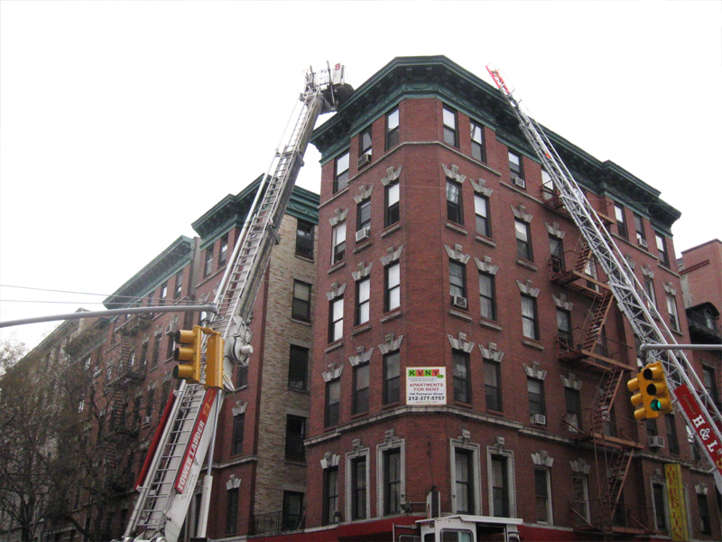
You could see a ladder going up to a building’s roof and
the lightest wisp of gray smoke coming out the top.

(Click any image to enlarge.)
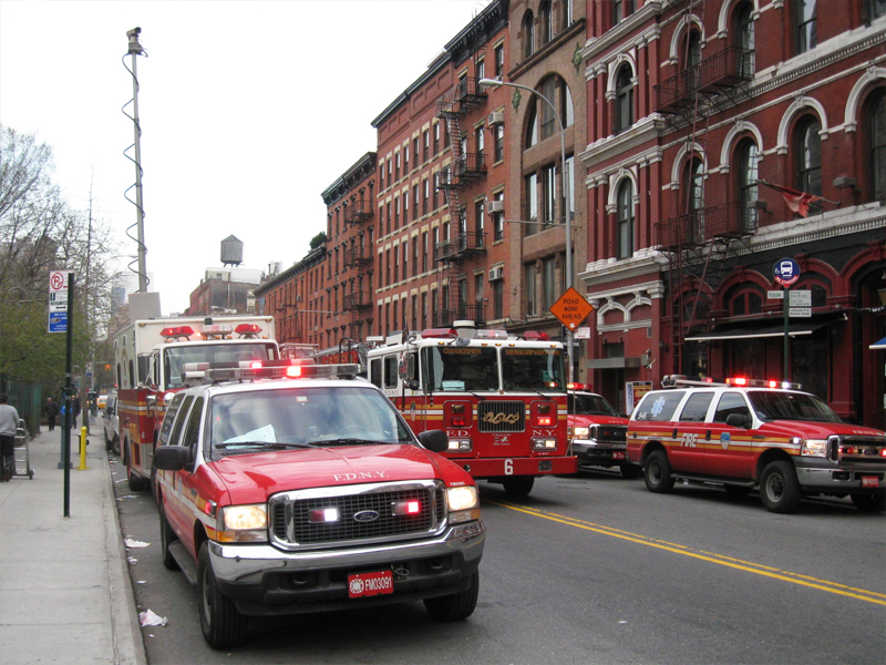
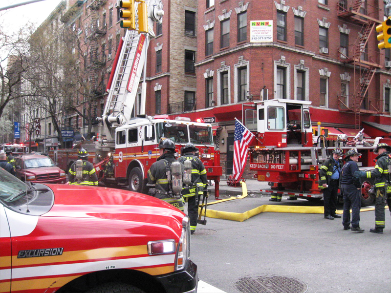
Trucks even filled the neighboring cross streets for two full blocks.
There were a lot of firemen at work here.

The fire hydrant issuing water was a full city block away
from the building on fire.
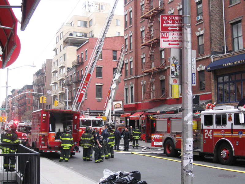
As I got closer, the numbers of firemen increased.
They milled about and watched intently.
Some carried objects back to the trucks.
Two ladders shot up on separate streets to the corner building.
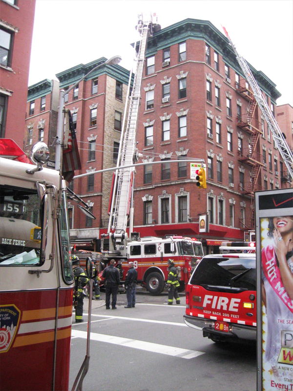
A quiet business continued as I moved past.
I got the sense that all was in order as many of the
fire workers went to their vehicles.

I left to go to work.
Hopefully no one was hurt or actually lost anything in the fire.
