Category ArchiveAnimation
Animation &Animation Artifacts &commercial animation &Hubley &Models &repeated posts 03 Sep 2012 05:11 am
Vlasic Business at the Hubleys
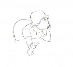
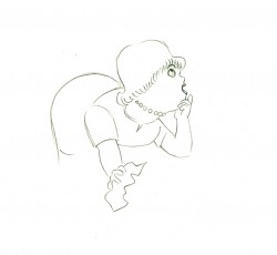
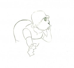
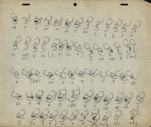
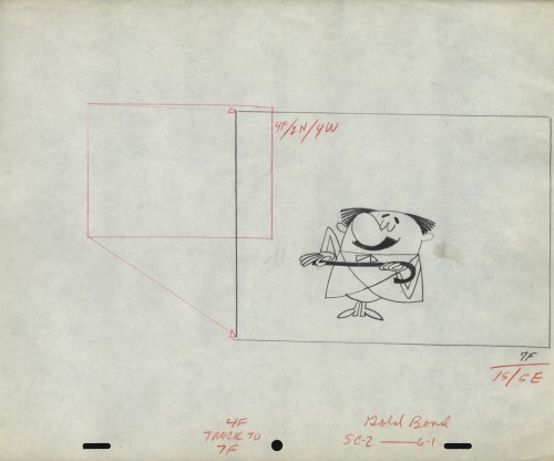
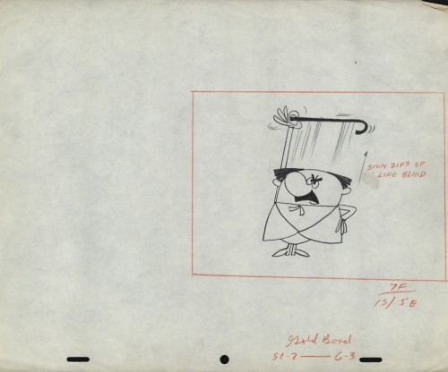
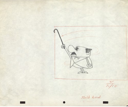
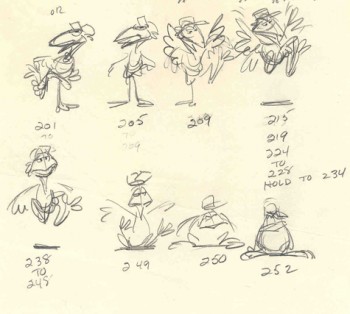 – Years ago I worked at the Hubley studio on a pair of commercials for Vlasic pickles. One of the two spots made it to the air.
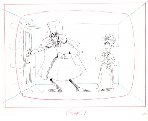
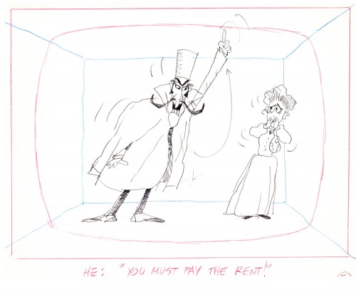
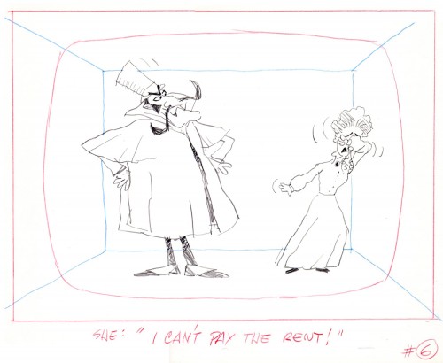
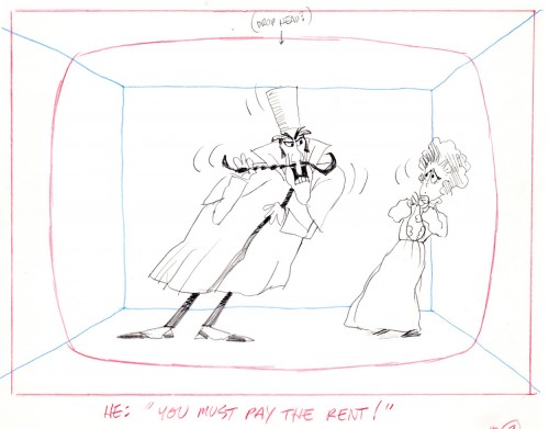
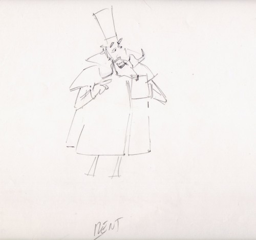
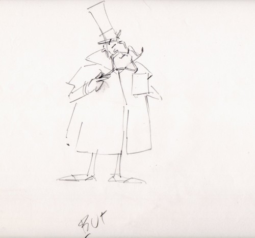
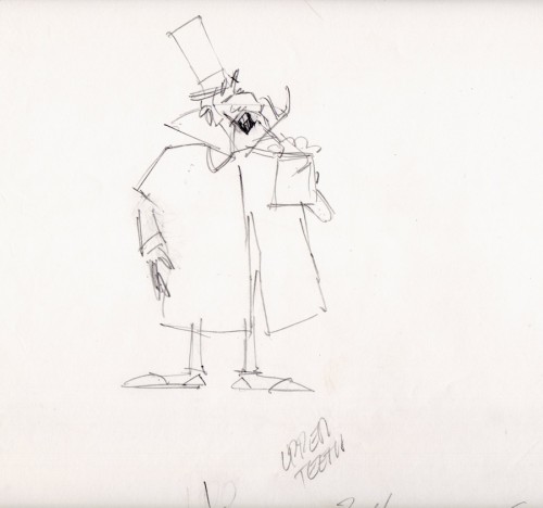
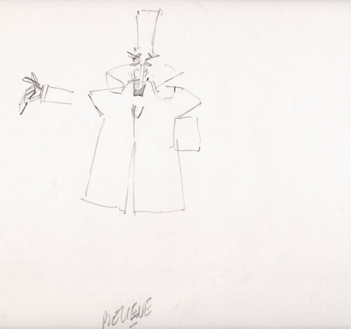
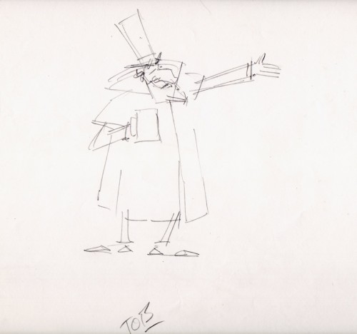
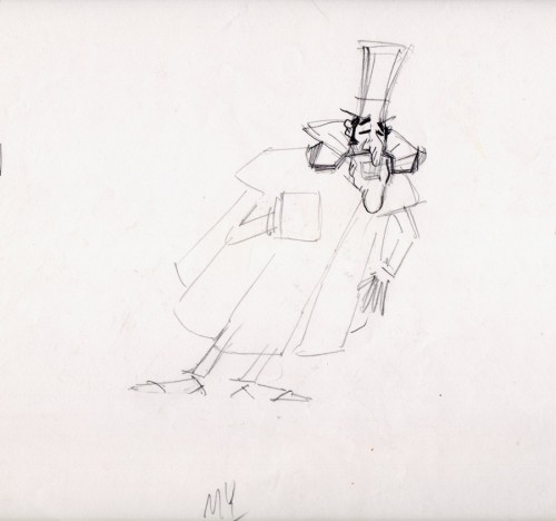
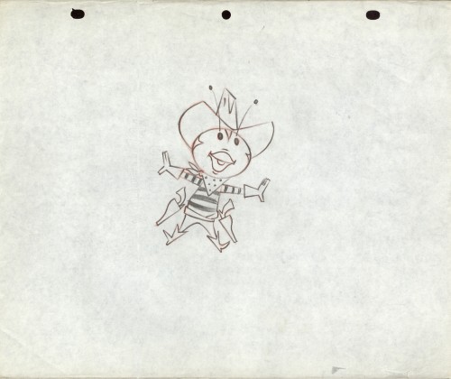
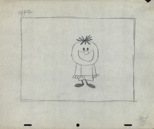
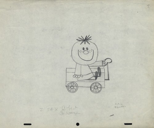
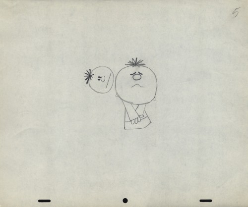
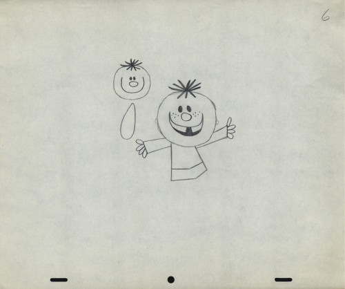
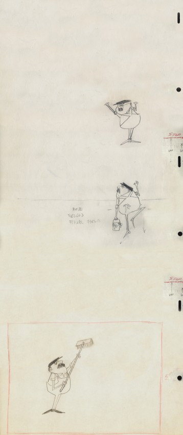
This is from the spot that never made it.
Vlasic had a commercial they wanted, and because of the agency’s long time relationship with the Hubleys, they came to him to try to develop the character. (The agency was W.B. Doner, the agency that had done so well with Hubley’s Maypo commercials.)
The agency came with two already-recorded voices: one was a Groucho Marx impersonator (Pat Harrington was the Groucho impersonator ultimately used for the stork’s voice.*) The other voice was character actor, Edgar Buchanan, a man with a gruff voice who appeared in a million westerns. John Hubley wanted Edgar Buchanan – it was a much richer voice, lots of cowboy appeal.
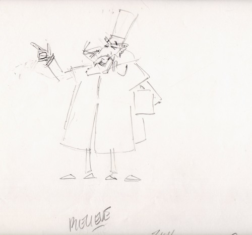
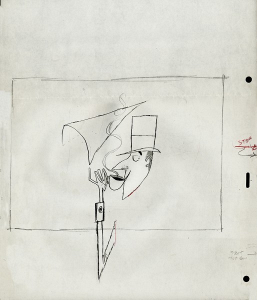
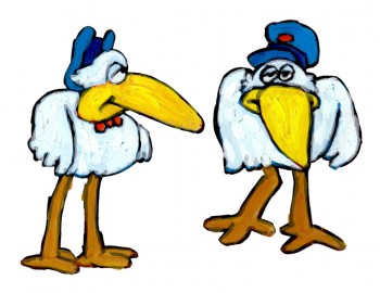
John designed the character to look like one of those stationmasters in cowboy films. The guy who gives out tickets and does morse code when he has to. The stork had a vest and a blue, boxy, stationmaster-type cap cocked off to the side. It was a great character.
Phil Duncan was the animator. A brilliant character guy who had done everything from Thumper to George of the Jungle. I loved cleaning up and inbetweening his work. It was all fun and vibrating with life.
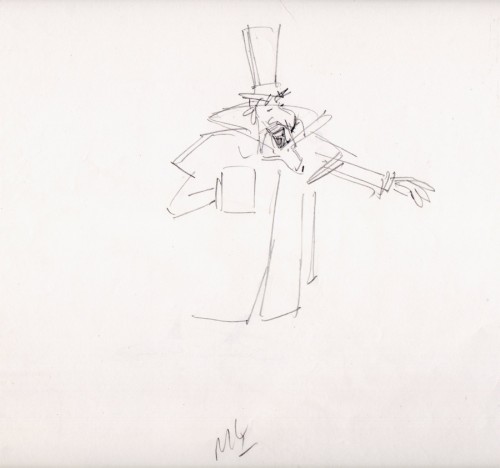
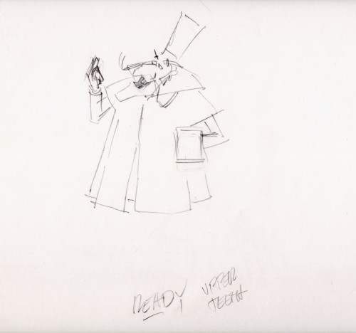
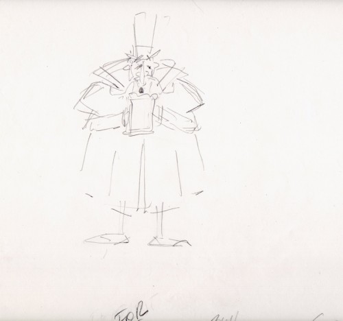
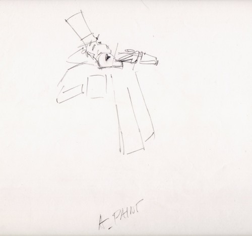
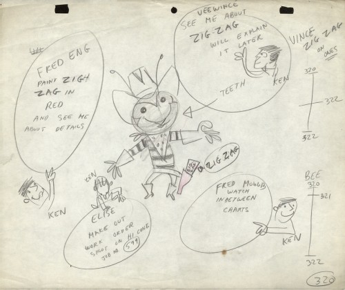
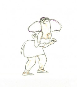
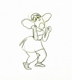
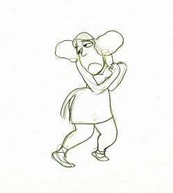
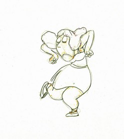
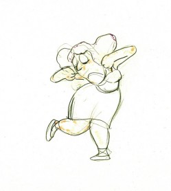
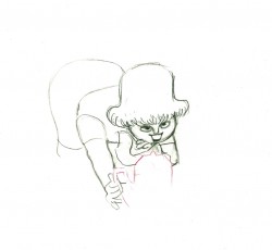
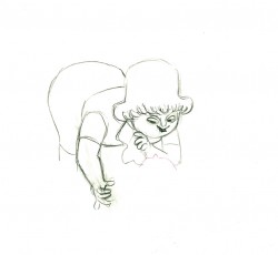
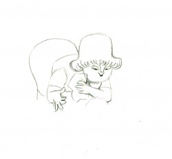
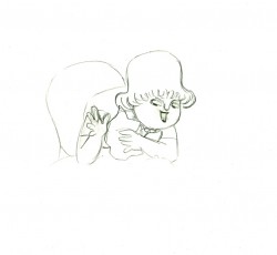
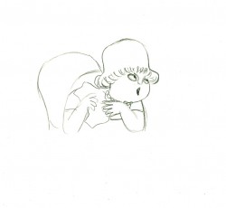
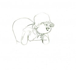
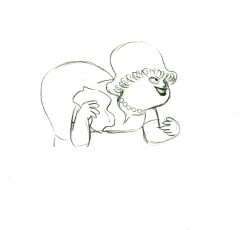
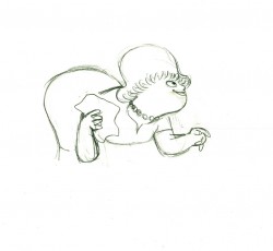
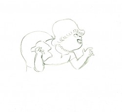
The rough thumbnail drawing (above) fell out of one of Phil’s packages. It was a thumbnail plan of the action. Phil would do these things which usually stretched around the edges of his final drawings. In a nutshell, you could see the scene and how he worked it out. Lovely stuff.
I felt this drawing was as beautiful as the original animation drawings.
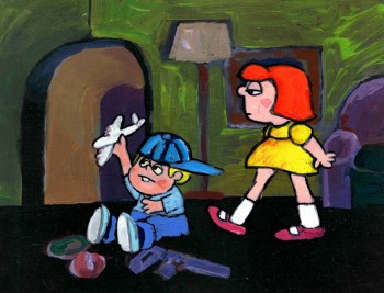 The agency approved the stork, Edgar Buchanan and the plan of action.
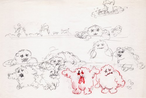
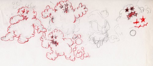
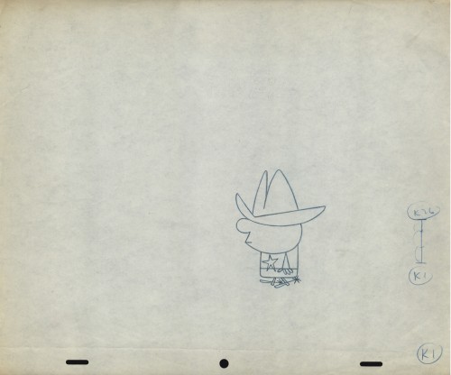
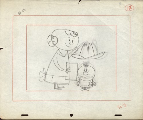
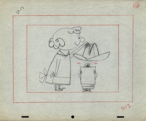
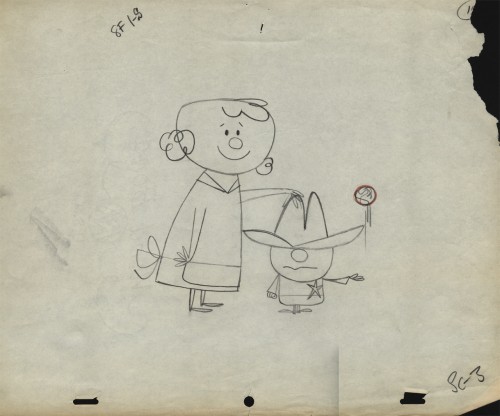
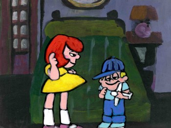
We’d already finished the first commercial which was on the air. (Represented by the two set-ups posted here.) The style was done with acrylic paints – out of a tube – on top of the cel. Ink with Sharpie on cel; paint dark colors – ON TOP of cel
- up to and over ink line; after drying we painted it again with lighter tones, and we pained it again after it dried using even lighter tones with a translucent color. Imagine kids & a gun in a spot today!)
Phil Duncan did a great job of animating it. I inbetweened, and the Agency loved it and approved it to color.
All this time, John and Faith were busy preparing the start of Everybody Rides the Carousel. It was to be three half-hour shows (Eventually CBS changed their mind and asked the shows, still in production, to be reconfigured to make a 90 min film) and was in preproduction. I did the spots on my own with John checking in. Faith wanted nothing to do with a commercial and was somewhat furious that a commercial was ongoing. She daily spoke out against this spot with many shouting matches. I never quite understood the problem. The spots didn’t hold up any other studio work; I was making it as easy as possible for John to not have to do much work on the spots, and they were getting necessary money to help finance some of the preliminary work for the Carousel. (Of course, the Hubley name was involved, but even Michelangelo did commercial work – like the Sistine Chapel to pay for the art. Not that Vlasic was the Sisine Chapel, of course.)
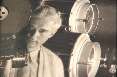
 Within weeks the spot was in color and two junior exec. agency guys, John and I stood around the Hubley moviola. (It was a great machine with four sound heads and a picture head that was the size of a sheet of animation paper. Pegs were actually attached to enable rotoscoping!)
The two agency guys were buttoned up with good suits and briefcases. They stood behind John and me, and I operated the moviola.
We screened the spot the first time. I turned around and these two guys had come undone. Their ties were loose and astray; they were visibly sweating. I swear this all happened within the course of 30 secs.
 John smiled and optimistically asked how they liked it. They looked at each other, and couldn’t answer. I don’t think they were able to form a decision or say what they actually thought. Eventually, they left with the spot in their briefcase and would get back. It wasn’t good.
They did get back. I was asked to pack up all the elements and ship them back to W.B. Doner. The spot was thrown out of the studio by John who refused to change it. (Hubley’s stork.)
He liked what was done, and apparently had
a rider in his contract which covered him – somehow.
The spot showed up at Jack Zander‘s studio, Zander’s Animation Parlour. They used the Groucho impersonation and slicked it up a lot. Vlasic is still using that stork, and that was John’s last commercial endeavor. The character is still showing up in a cg version, just as bad as the 2D version.
* Thanks to Mark Mayerson for this information.
Animation &Animation Artifacts &Disney &Hubley &John Canemaker &repeated posts 20 Aug 2012 05:53 am
Fantasia FX – Schultheis – recap
John Canemaker recently completed his latest book about Herman Schultheis and the effects department at Disney’s during the early 40s. It, hopefully, will be published in late 2014. This encouraged me to pull up this piece I posted in Sept/2009. It’s amazing how much information I was able to cull from the photos I found on the DVD.
I’m pleased with this post and am glad to repeat it for those who might not have seen it. John’s book, by the way, is one I’m looking forward to reading. He’s written a bit about it on his website.
- Herman Schultheis was an effects animator who worked on Fantasia. He kept a tight record of the effects they were creating from 1938-1941 and a photo display of how they were done. Schultheis disappeared in 1954 while trekking through Central America, and the notebook was forgotten until his wife’s death in the early 1990s, after which it was discovered by Howard Lowery behind the couple’s bedroom wall.
(Click any image to enlarge.)
Herman Schultheis created the book of charts and photos
which gives us a link to the many creative effects in the film.
The book is on display at the The Walt Disney Family Museum. It’s also been digitized so that visitors are able to go through the book, enlarge photos and view it page by page. An interactive display.
Prior to the discovery of the book we were able to figure out a few of the effects. One Disneyland show, in fact, recreated the bubbling lava scene from the Rite of Spring sequence.
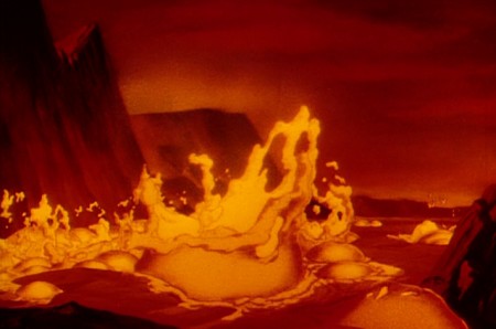
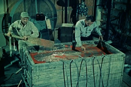
Josh Meador recreated the slow motion shoot of the
boiling concoction used to develop the bubbling lava.
However, the book revealed so much more than we’d understood
about how the superb effects had been crafted.
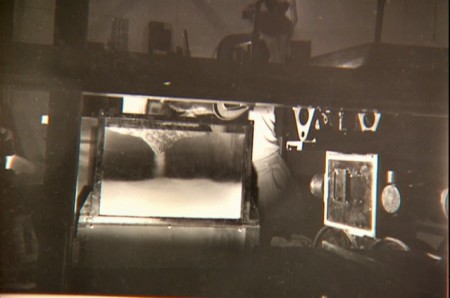
Using a vat of water, they were able to
drop ink into the liquid and film it in slow motion.
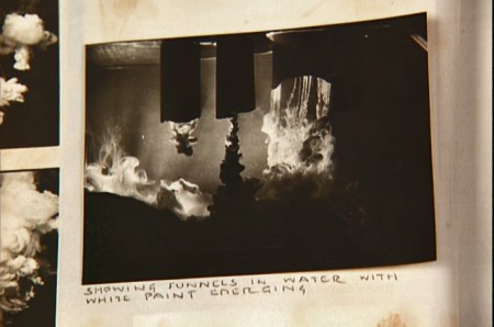
A photo of the ink spilling into the water behind built-in mattes.
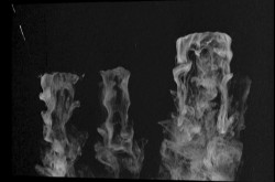
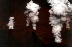
Taking the shot of the ink, they then turned it upside-down.
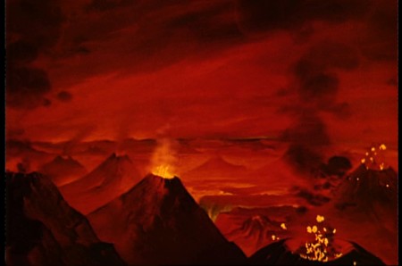
They then superimpose the “smoke” (or ink) over the volcanoes.
This same effect was used in Close Encounters of the Third Kind
to create clouds when the alien ships were moving in on the
farmhouse where the boy and mother lived.
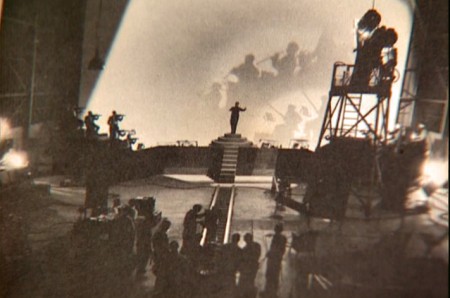
The orchestra was shot on a set with strong, planned shadows.
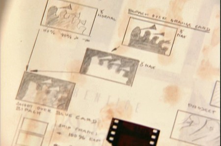
All these shots were orchestrated and planned for color effects.
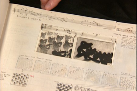
They were also catalogued by Schultheis who kept close
track of the music, as well, in his book. You can see a
page by page breakdown of the score at the top of the page.
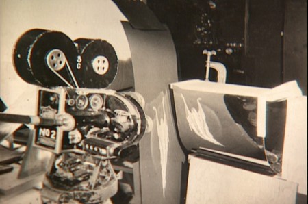
You can see the highly polished sheet of metal (middle left) which reflected
and distorted the animation drawings. This is what the camera photographed
in some of the scenes during the Night on Bald Mountain sequence.
It was also used for the fire in Bambi.
 1
1 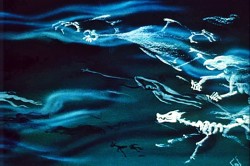 2
2
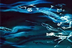
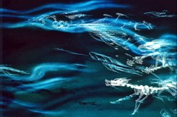
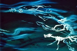
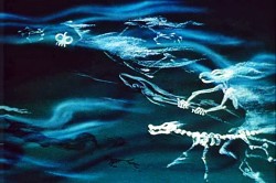
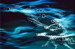
This scene’s ghosts were shot using that distorted metal reflection.
 2a
2a 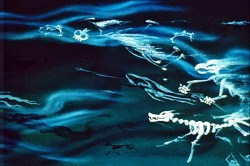 3
3
The ghosts also used a form of cross dissolve.
John Hubley explained to me how that was done, and
we used the technique in Everybody Rides the Carousel.
 4
4 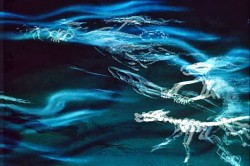 4a
4a
They shot the entire scene at 50% exposure. Then they went back
to the beginning and reshot the entire scene again at 50% exposure.
 5
5 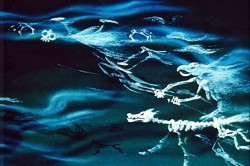 6
6
However on the second shoot, they started by shooting a black frame.
This made #1 fall where #2 should have been, #2 for #3 etc.
This creates a ghostly dissolve effect.
 6a
6a 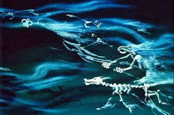 7
7
All of the drawings labelled with an “a” are the double exposures:
2a, 4a, 6a
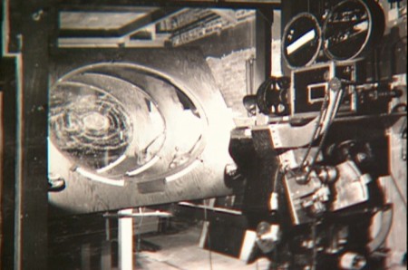
A make-shift circular multiplane camera was built.
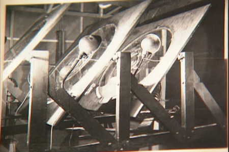
Created out of wooden sheets with holes cut out,
placed so they could shift angles, they were designed to
allow revolving artwork in the circular cut outs.
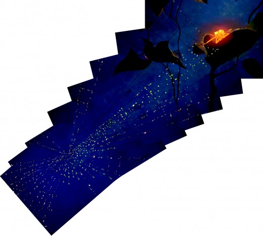
This allowed shooting scenes such as this shot of
a spider web as the camera moved around it
while dew glistened off of it.
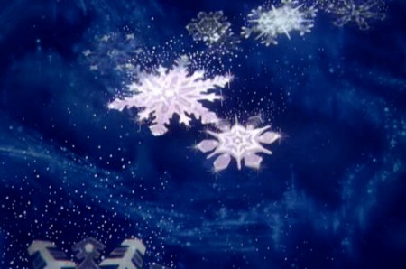
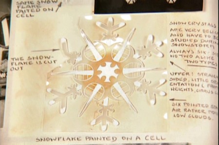
The spinning snowflakes are well explained in Schultheis’ book.
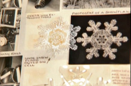
The snowflakes had a detailed construction.
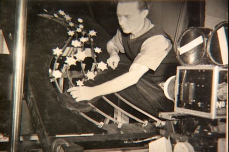
The path of action was intricately defined.
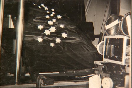
The snowflakes were shot against a sheet of
black velvet hiding the wire guides.
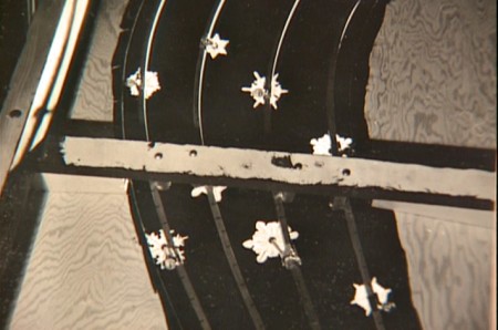
They were shot in tight closeup. From below you can
see the turning gears they were constructed on.
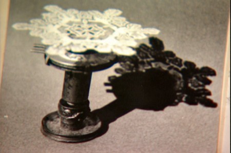
Each snowflake was built on a turning gear
so that they could revolve in their path of action.
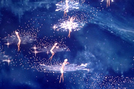
Burn these snowflakes over the multiplane background
and add matching 2D animated fairies within each snowflake,
and you have the finished scene.
Animation &Animation Artifacts &Bill Peckmann &commercial animation &Layout & Design &Models 17 Aug 2012 06:23 am
Peckmann & Schnerk’s Utica Club
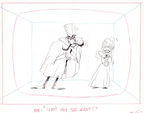
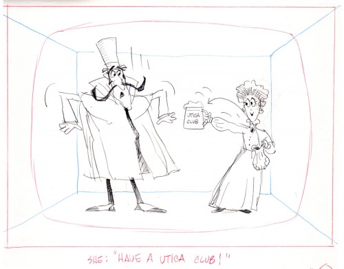
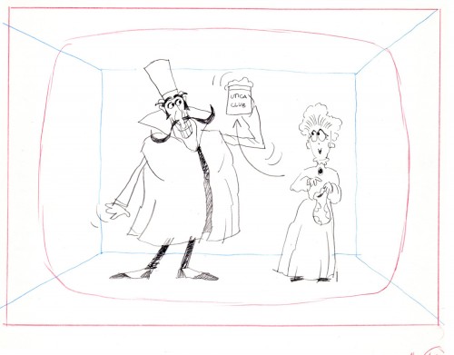
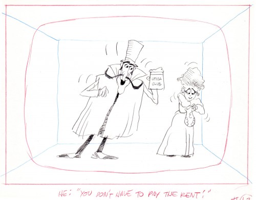
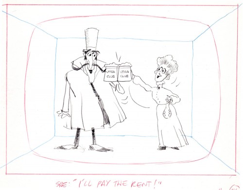
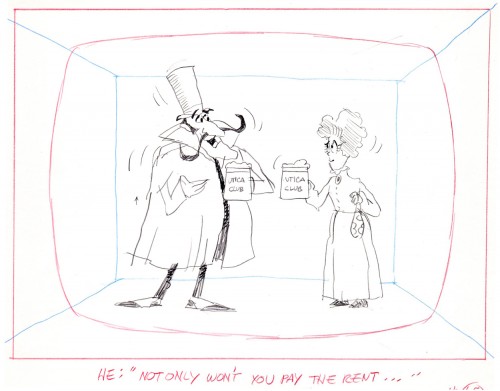
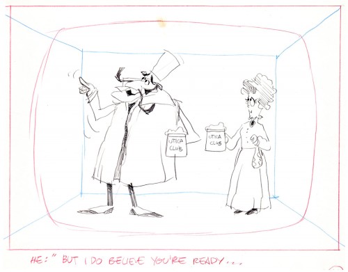
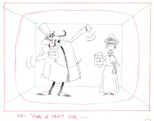
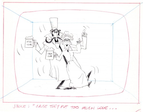
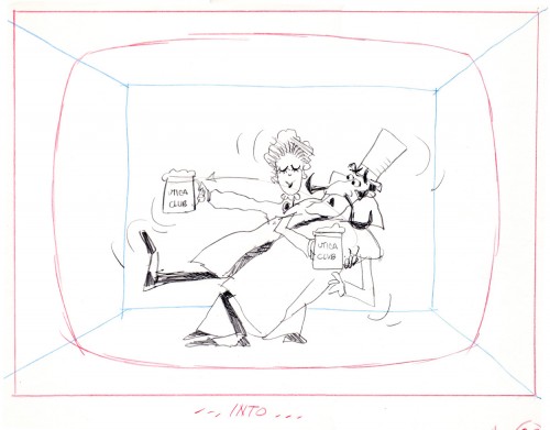
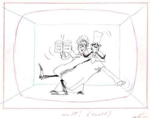
Another spot on Jack Schnerk‘s reel was Utica Club’s ‘Landlord’. Here with the little bit of art that I have from that commercial, I will try to illustrate some of the steps that went into making the film.
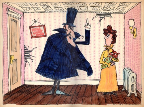
Here is the ad agency’s concept art.
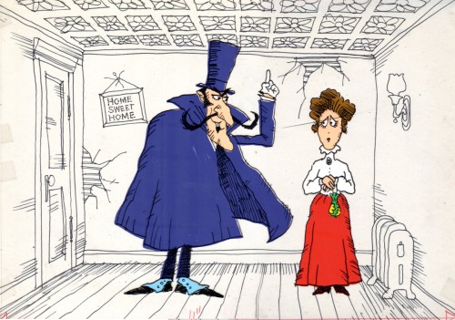
Here’s my tweaking of the agency art design.
This is a cel color model against a line version of the bg.
Next will be my first six rough layout drawings of the spot.
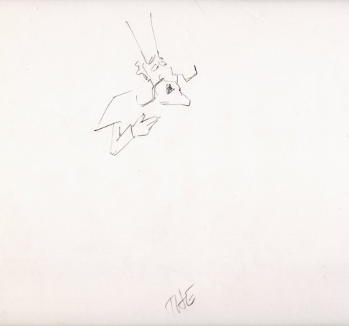
The following are animation key drawings by Jack Schnerk.
 1
1
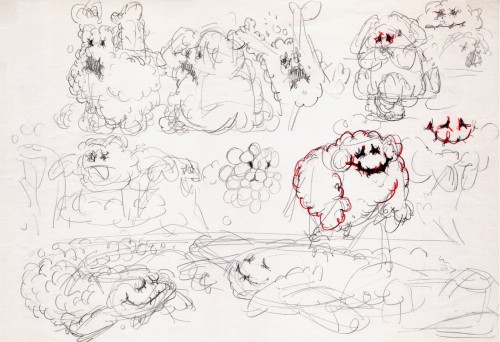
Once when we were doing designs for a soap bubble character, Jack took a break from animating to do these quick sketches. They are full of life, like all of Jack’s work.
 1
1
I hope for those who were fortunate enough to work with Jack, his drawings will bring back some good and happy memories, they do for me!
You can watch this spot on Jack Schnerk Sample Reel 2 starting at 3’01″.
Animation &commercial animation &Frame Grabs &Hubley 13 Aug 2012 05:28 am
Hubley Bumper – recap
- Last week, Emily Hubley told me that some people up at WNET (previously WNDT), the local PBS chapter, saw this piece on my blog. They were hoping to get copies of the Hubley spots to show in celebration of their upcoming 50th anniversary. It’ll be great to see these films alive again.
Here’s my post on a couple of the films.
 - One of my all time favorite pieces of Hubley animation was a station ID for WNDT-TV, New York’s public service station back in the 60′s. I thought of this spot last week when I posted the piece about Stanley Kaufman’s Art of Film for that station. It ultimately became WNET, NY’s PBS channel 13.
This spot was undoubtedly animated by Bill Littlejohn, and I think it’s one of his finest pieces. The timing is excellent. He obviously animated straight ahead; the characters distort and morph to the needs of the animation. It’s a full 2mins: 40 secs, so it would qualify as a short film these days,
The piece ran in B&W. It employed the multiple exposure technique. The characters had black paint filling everything but the animation drawing. This was double exposed over the BG, hence a see-through quality to the characters. This technique was used on Moonbird, The Hole, Of Stars and Men and several other Hubley shorts.
Here are some frame grabs of the spot.
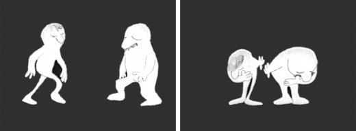
The two guys come out on to the stage and take a bow.
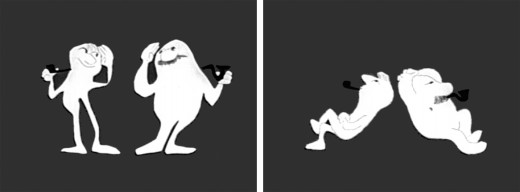
They greet each other, light up and sit down.
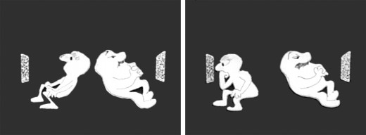
A little bored, they both turn on TV’s. The little guy gets involved.
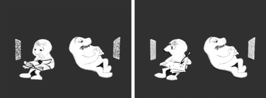
He takes out a book and takes notes comparing it with what’s going on his TV.
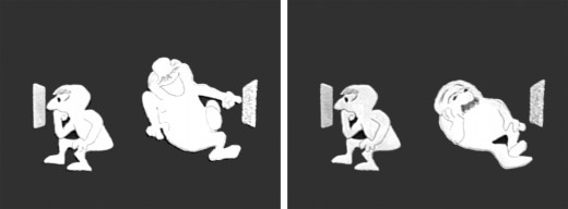
He goes back to watching. The big guy laughs at something until he gets bored again.
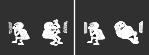
The big guy practices some wrestling moves until that gets dull.
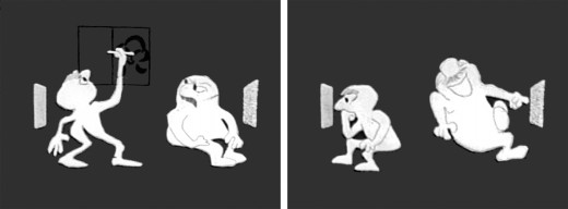
Little guy does some brush painting. Big guy laughs again.
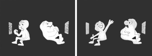
Little guy practices Russian. The big guy gets annoyed.
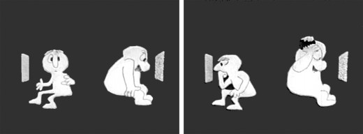
The big guy takes out a comb and starts combing until . . .
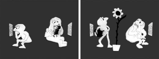
.. he has grease all over his head. The little guy grows a plant.
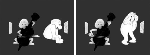
The little guy takes out a cello and starts to play. This annoys the big guy.
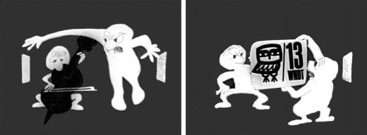
He pulls up the little guys screen. Public Television !
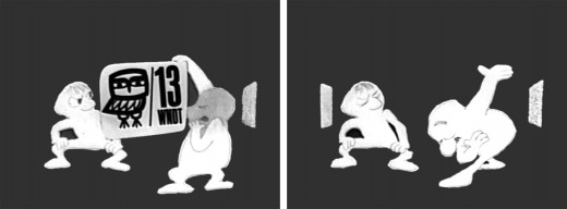
Embarrassed, he bows to the “Arts” station.
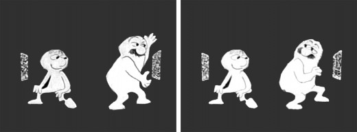
He turns to it on his own TV. He’s planning for something great.
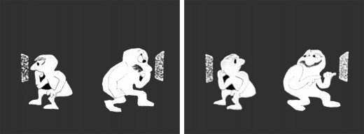
They watch intently until the big guy makes sure little guy knows he’s still watching.
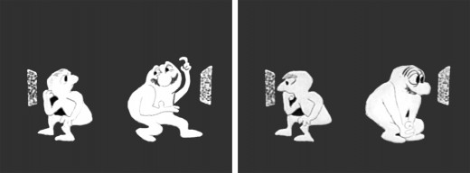
“Brain food” They watch intently.
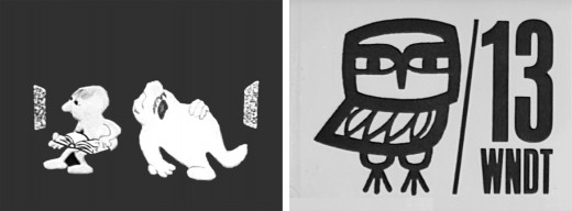
The big guy falls asleep while the little guy goes back to his book. Dissolve to station card.
I love how the shapes of the characters shift and distort and change throughout the piece always coming back to the original models. This is a sure sign of straight ahead animation, and it almost makes the acting feel like an improvisation exercise by two actors. It supercedes animation and becomes acting.
The obviously loose time of the piece shows that the animator was probably given a lot of leeway with his timing, and he took it. As I said, I have no proof that Bill Littlejohn animated it, but I’ve never doubted it for a moment. It’s certainly as much his style as it is Hubley’s.
That is the odd thing about working for a director with a strong personality. I remember the day that I looked at one of my drawings and realized that it looked like one of my drawings, but there was no doubt it was a Hubley. Something happens, and you just end up drawing in their style.
Animation &Animation Artifacts &commercial animation &Layout & Design &Models &Story & Storyboards 08 Aug 2012 07:00 am
Vince Cafarelli Grabbag
- Today we have a mix of odds and ends from Vince Cafarelli’s collection of animation artwork. We start with some artwork from the commercial studio in NY in the 1950s-60s.
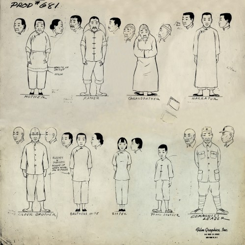 1
1This is a model sheet for something done
at Film Graphics. No doubt it’s not a commercial
but probably some kind of Educational film.
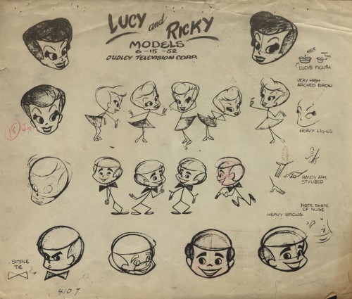 2
2
This is a model sheet for the opening titles to
the “I Love Lucy” show. My guess is that
this also comes from Film Graphics.
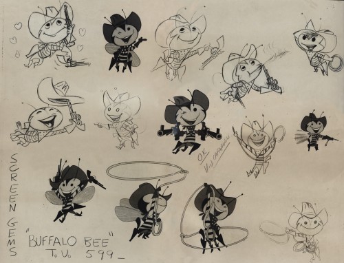 3
3
The Buffalo Bee model sheet for the Nabisco
Wheat Honeys commercials. Mae Questel was the voice.
This was probably done for the Gifford Studio.
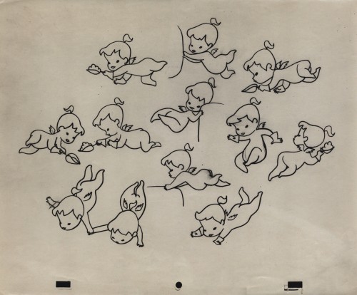 6
6
A model for a little angel. I assume this is for a
paper product commercial. Again, I think it’s the Gifford Studio
 7
7
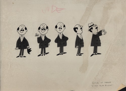
A turn-around model for a Mutual of Omaha commercial.
Again, since it’s with other Gifford Studio material I’d guess the same.
 8
8
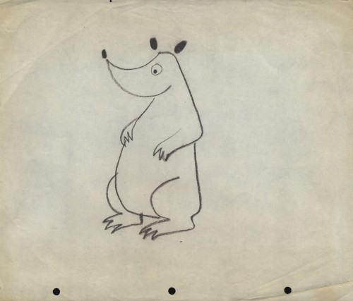
Here are two bear drawings from some commercial.
It looks like Dick Williams’ Cresta Bear (only this was
done years before that.)
 9
9
The three round peg holes is certainly unique.
Fleischer used a similar system for a wile as did
Krantz Studio on Fritz the Cat.
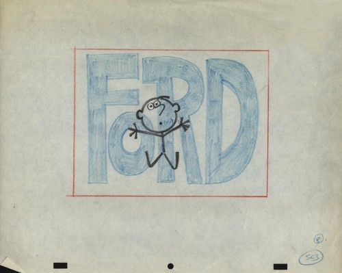
I don’t know where these are from.
 10
10
I’m sure this comes from the Gifford Studio.
 11
11
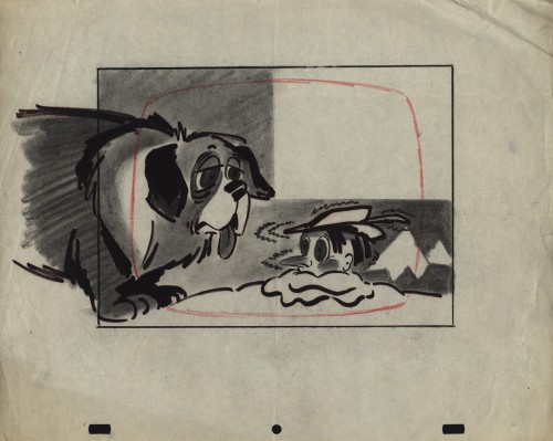
An interesting design. I assume it’s from a spot.
Peg holes look like the Gifford Studio.
 12
12
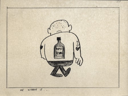
A storyboard drawing for a Pepto Bismol commercial.
UPA had this account for a long time.
The following three drawings are two animator’s drawings (#106 & 108) and one Inbetween (#107). I believe the animator is Frank Endres; the inbetweener is Vince Cafarelli. For some reason I think this is from a Little Lulu cartoon directed by Bill Tytla, but I can’t vouch for that. I’m sure one of you visitors will let me know how wrong I am, and I welcome it.
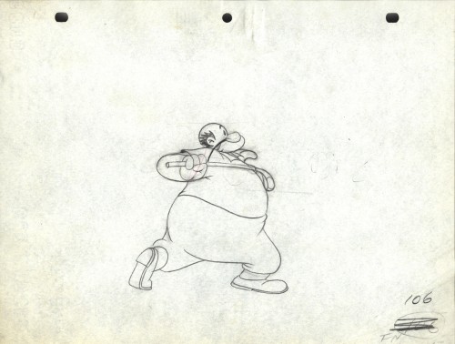
Drawing # 106 – animator’s drawing
I’m surprised at how small the paper is; not quite 8½ x 11.
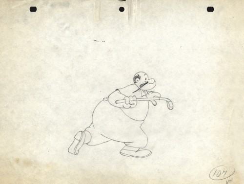
Drawing # 107 – inbetweener’s drawing
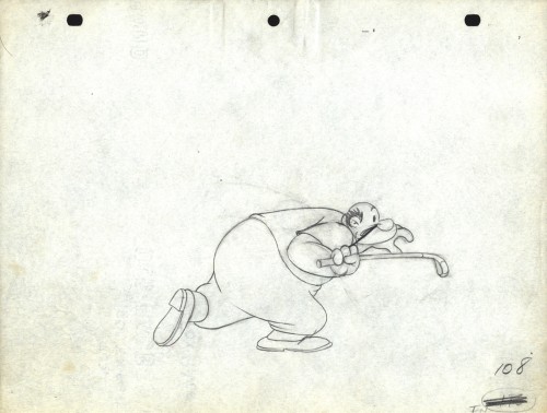
Drawing # 108 – animator’s drawing
The peg holes are Signal Corps.
Animation &Commentary 07 Aug 2012 06:20 am
Jack Schnerk, again
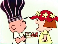 - Jack Schnerk‘s daughter, Mary Schnerk Lincoln, has put three of her father’s commercial sample reels onto YouTube .
Just last week I found myself using one of those reels to showcase a Rowland Wilson designed commercial done for Phil Kimmelman & Ass. Seeing that reel again, brought me back to the other two reels on YouTube, and the great work animated by Jack. There are a number of well-known and collector’s item commercials in these reels. Included are spots designed by the likes of Gahan Wilson, Tomi Ungerer, Charles Saxon and, of course, Rowland Wilson.
Jack Schnerk was a great animator who deserves considerably more attention. He was a strong influence on me in the first eight years of my career and taught me quite a few large principles about the business. He also told me a few stories of his work as an assistant at Disney’s on Bambi and Dumbo as well as the great times animating at UPA and the difficulties of animating at Shamus Culhane’s studio. Actually, he didn’t tell me about his problems with Shamus; another animator did. Jack complained about the business, but never about how he was treated.
He did have an exercise which he thought was important for an animator to pass. He suggested you animate a character walking in a 360° circle away from and back toward the camera. This is a tough test of mechanical ability, and Jack is right; it’s tough and can prove your mettel. (Milt Gray does just that with his somewhat vulgar character, Viagri, but the animation is impeccable. Milt’s a first rate animator.)
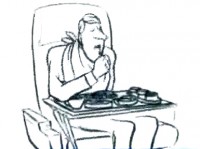 I wish I had more samples of the many scenes Jack animated that I assisted. He worked in a very distinct style – I don’t think I’ve seen anyone else ever draw that way. Somehow, the very rough drawings weren’t hard to clean up, and, though he worked very rough, he didn’t leave the bulk of the work for the people following him. He was concerned about the timing and did every drawing he needed to make sure that timing worked. Most of the time we worked together, he had no chance to see pencil tests. Only on Raggedy Ann did he have that luxury, yet he was always taking a chance on the scene, pushing to some new way of doing it. I think of all those Hubley scenes that went to color art, yet Jack had done some daring moves that could have made some of the scenes go bust. None ever did.
I met Jack at the Hubley studio, then again when I worked for Phil Kimmelman. At Raggedy Ann, I dropped Jack’s name as often as I could until Dick Williams finally saw him, and brought him on board. There was no doubt he would, Jack was that gifted. At least once a week at Raggedy Ann, Jack would give me some original piece of advice, and the more I followed it, the better my work grew. Something as simple as draw rough. I’d been an assistant too long, and my clean line would assure that my animation would never move out of those lines.
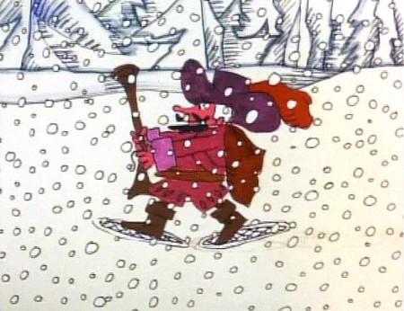
Jack Schnerk animated the French trapper sequence. There was such a rush
on the scene that I remember Jack bringing it in saying he hoped it would work.
Jack had a dark side, that I appreciated, but he also brought a lightness and individual sensibility to the work he did. He took chances in his animation and timing and sometimes failed but usually succeeded with them. That’s more than I’ll say for most of the animators I’ve met in the business.
See
Though not always the best quality, you can also watch a few of the longer, famous short films Jack animated on:
- Gerald McBoing Boing by Bobe Cannon. Jack told me that this includes the first scene he ever animated, even though he didn’t get credit. He did Gerald running alongside the train (starts at 4:41)
Tender Game by John & Faith Hubley
Really Rosie directed by Maurice Sendak
A Nose by Mordi Gerstein
The Violinist by Ernie Pintoff
Give Me Liberty by Ralph Bakshi is one of many bad shorts done for Terrrytoons at the end when Bakshi was in charge.
After reading this post today, Bill Peckmann sent the following note:
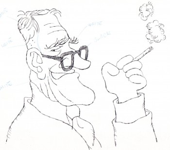 Hi Michael,
Your post today on Jack was just wonderful!
When I broke into the business in 1962 at Elektra Films, Jack’s room was the one they put me into. It was pure heaven! As a super, wet behind the ears novice, to be in the same room with someone that had ACTUALLY worked at Disney and UPA, you gotta be kiddin’!
My luck held out further because I assisted/followed up Jack (at Focus and PK&A) on all of the print cartoonist/designer spots you mentioned today. I would have done that work without pay! The combination of Rowland and Jack on a job, I still need smelling salts.
As when we all worked on Rowland’s spots, where I did those caricatures of Jack, ‘Sounds of Focusville’ and ‘Kimmelman of the Klondike’, I also did this caricature (attached) in Gahan’s style of Jack when we worked on ‘Carter Hall, Pipe Tobacco’ together.
I will pull together Xerox copies, pencils and stats of the art of Gahan, Bob Weber, who ever I can lay my hands on, etc. of the spots that Jack animated plus a JS rough or two.
We can look forward to more of Jack Schnerk next week, thanks to Bill’s collection.
Animation &Animation Artifacts &Chuck Jones &Frame Grabs &Layout & Design &repeated posts 06 Aug 2012 06:38 am
Conrad – again
I repeat this post for good reason. This is one of the prime films John McGrew planned for Chuck Jones, and the work is just dazzling. However, to our eyes it hardly looks unusual. Many of the tricks here were done for the first time, and others are so seamlessly done that we hardly notice them. It just looks like another War cartoon from WB. It ain’t.
It’s special.
 - Regulars to my blog know that I’m a big fan of the work of John McGrew. He was a designer/Layout Artist working in Chuck Jones’ crew at Warner Bros. in the late Thirties/early Forties. His work was daring beyond compare, and, I think, with support from Jones, he changed the look of modern animation backgrounds.
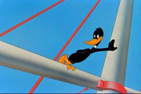
He designed the seminal film The Dover Boys as well as amazing pieces like Aristo-Cat, Inki and the Lion and Conrad the Sailor.
In an interview conducted by Greg Ford and RIchard Thompson, Chuck Jones was asked about McGrew’s style: 
- Q: What about John McGrew’s style and approach, as compared with Noble’s?
A: John McGrew didn’t really have a style; he was experimenting all the time. Maurice does have a style. John McGrew, you might say, was more of an intellectual. You could be intellectual, and get away with it— but if you’re solely intellectual as a director, you weren’t going to get away with it. The result was, however, that he goosed me into thinking that it might be worthwhile to try some different things with backgrounds and so forth. And later on, I would find this kind of thing very useful, in that often it would make your gag work, and sometimes you wouldn’t even know why. Like that little abstract background at the end of Duck Amuck, with the sharply angled lines going off.
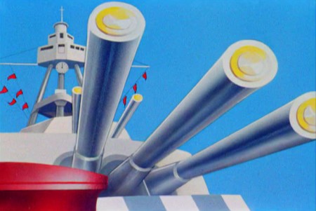
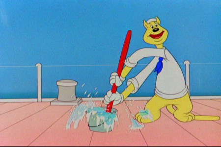
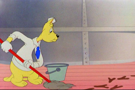
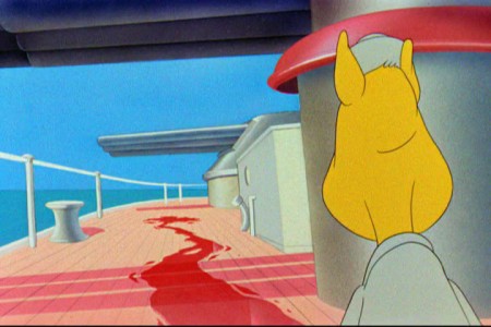
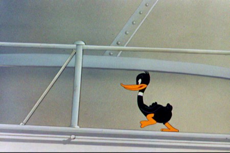
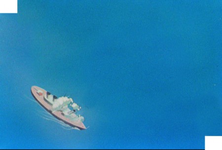
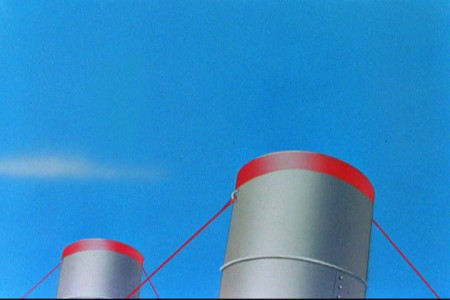
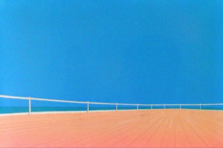
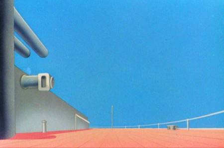
Today I’d like to feature some frame grabs from Conrad the Sailor. Where I could, I separated the characters from the backgrounds to just feature the Bgs. My guess is that the Bgs were painted by Paul Julian, but they were planned by McGrew.
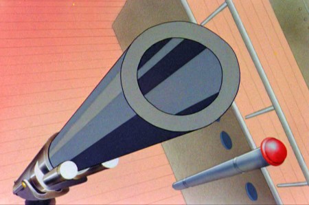
The one scene I don’t illustrate is the most original in the film. Daffy is shot into the air with a bullet. (illus #18) The camera does a 360° turn to head back to the ship. The Bgs don’t hold up on their own. Lots of blue sky and wisps of cloud. It works in motion.
Of this short & McGrew, Jones says:
- . . . we used a lot of overlapping graphics on that particular cartoon so that one scene would have the same graphic shape as an earlier scene, even though it would be a different object: first we’d show a gun pointing up in the air, then in the next shot, there’d be a cloud in exactly the same shape. It gave a certain stability which we used in many of the cartoons after that. John McGrew was the artist responsible for that sort of thing. Conrad was also the one where we used the first complete 360° turn, when the characters went up through the air.
For more information read Mike Barrier’s excellent interview with John McGrew.
 1
1(Click any image to enlarge.)
The following BG pan can be seen in full to the left. I’ve broken it into three parts for a closer look.

 12a
12a .
.
———-(Continue scrolling down.)
.
.
.
.
.
.
.
.
.
.
 13
13
 15
15
A bicycle pan that keeps moving to the left.
 16
16
Continue moving right to left.
And here’s the cartoon.
Pay attention to the Layout in the sky from 6’25″ to the end.
It’s amazing.
Animation &Animation Artifacts &Hubley &repeated posts 30 Jul 2012 04:55 am
Tissa’s Glad Gladys – revisited
-Tissa David animated a lot of the Electric Company pieces for John Hubley. Hubley would design and write the spots, and he would get some real pros to do the tracks. In the case of this film, I believe it was the jazz legend, Billy Taylor, who wrote the music and did so for a number of Hubley’s Electric Co. films.
I’d like to post John Hubley’s LO drawings and follow it up with a few of Tissa’s animation drawings. John would usually do the loosest of layout drawings – usually in the presence of the animator as part of a discussion – and then hand it off to this person he trusted. Of course, the more he trusted the animator, the less he had to do in the LO.
In the case of this spot, Tissa received the following drawing. (That’s right ONE drawing.)
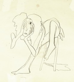
(If you click any the image, you’ll
reveal the full sized animation drawing.)
Enlarge the image, and you’ll notice tape marks and pin holes where Tissa attached it to her wall.
Here’s a short sequence of drawings done by Tissa. The missing mouths are on a separate level. This piece is built on reuse done artfully.
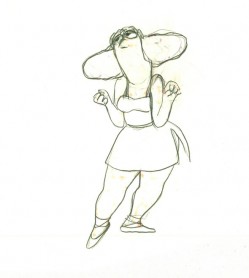 48
48 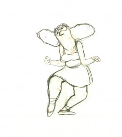 49
49
Here’s how the drawings looked when they were colored. They were colored on heavier paper. Sharpie outlines and marker coloring. The white background was all they used for the final. The animation carried the piece.
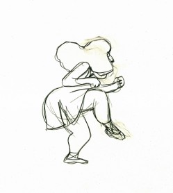 73
73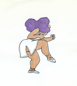 73
73Finally, here’s a copy of the film found on YouTube:
Action Analysis &Animation &Animation Artifacts &commercial animation &Hubley &Tissa David 26 Jul 2012 07:22 am
A Simple Move – recap
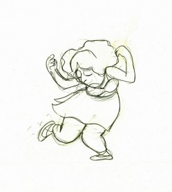
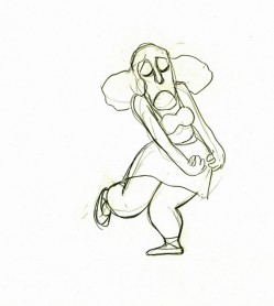
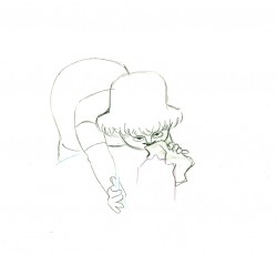
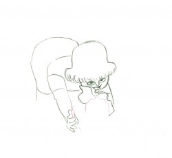
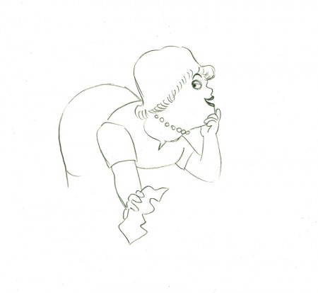
- Here’s what looks like a simple move done by Tissa David when she animated this Viva, paper towel commercial. It was produced, directed and designed by John Hubley. A very simple and beautiful character.
The character’s move in this scene is a complicated one done simply. She has been bent over, cleaning with her paper towel, and she moves up. You can follow the overlapping action as her eyes pull her up, head turn, and body follows.
The stripes will come and go. Tissa depends on someone else to concentrate on this material when she’s working on a commercial.
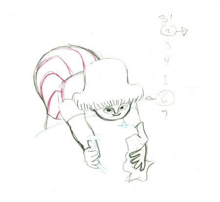 e37
e37(Click any image to enlarge.)
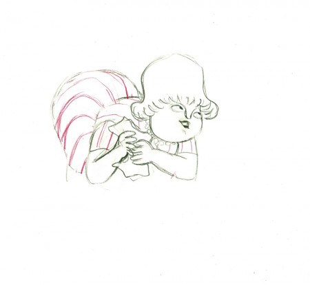 e44
e44
Her eyes point in the direction she wants to go,
and the rest of the scene moves her up and into profile.
This key move is hidden under the exchange of the
paper towel from one hand to the other.
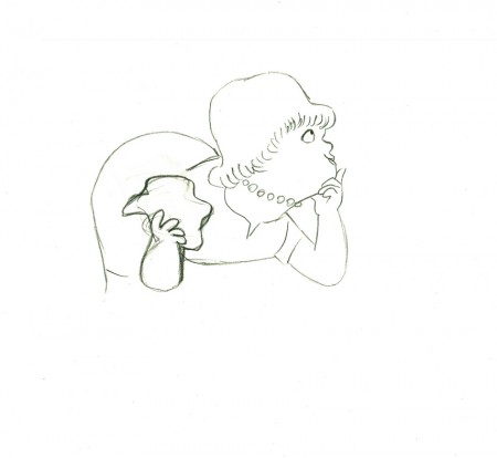 e51
e51
She stops to think (accenting her monologue.)
 e58
e58
And she slyly looks back to camera to respond with her thought.
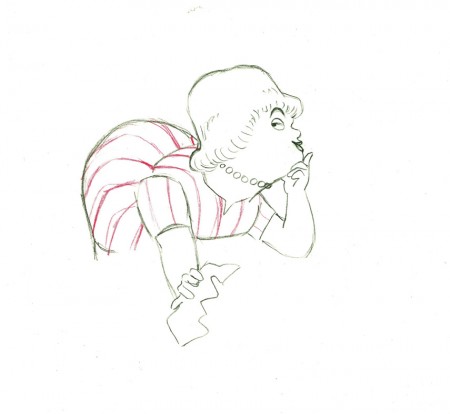 e59
e59
She continues, all through this move, talking.
She’s pitching the product.
Here’s a QT of the piece:
Cleaning for VivaClick left side of the black bar to play.
Right side to watch single frame.
Animation &Animation Artifacts &commercial animation &Layout & Design &Models &UPA 18 Jul 2012 07:05 am
More UPA Spots
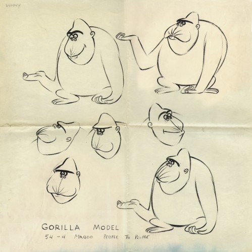
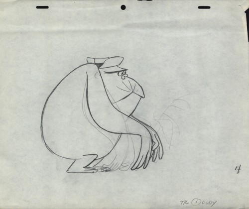
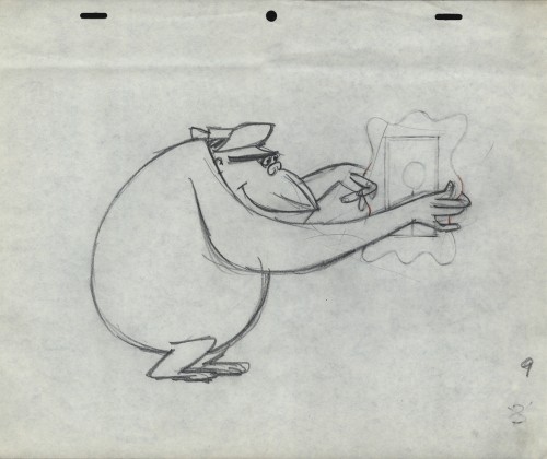
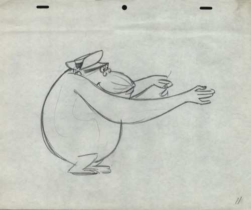
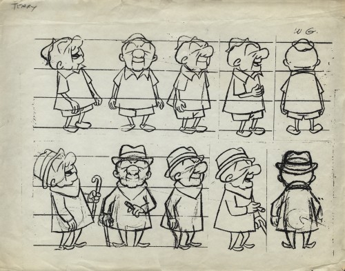
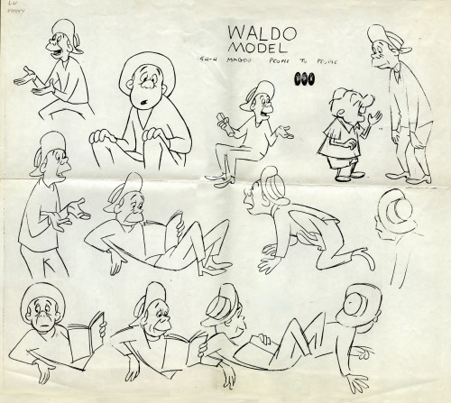
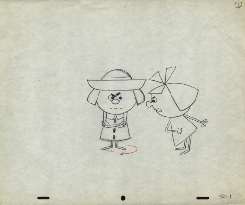
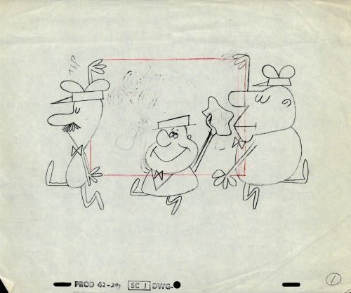
- Out of the Vincent Cafarelli collection, we’ve found another burst of UPA drawings. We know they’re UPA because there are models and animation drawings from a Mr. magoo short: “People to People.” The accompanying drawings from commercial spots and segments of the Gerald McBoing Boing Show all come on the same paper stock. The peg system is Acme not Signal Corps (which leads me to believe that some of those I called UPA in a past post are really from the Gifford Studio.)
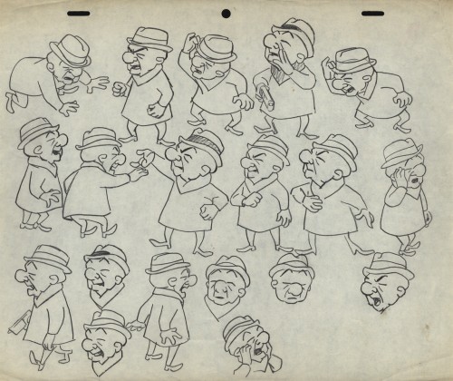 1
1This model and the other Magoo pieces here are from
the short “People to People” which features a gorilla.
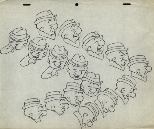 2
2
Per Mark Mayerson, in the comments section, the film was retitled
Terror Faces Magoo and was directed by Chris Ishii and Jack Goodford.
 3
3
See the film here.
 5
5
This model comes with the names “Lu” and “Vinny” indicated.
Obviously Vinny Cafarelli was Lu Guarnier’s assistant.
The following three drawings are key animation poses of the Gorilla.
 16
16
This is obviously a drawing of the Tworlinger Twins, a
series done for the McBoing Boing show. The NY office
seems to have done a number of pieces for the show.
 17
17
These guys look similar to the three who open
the McBoing Boing Show carrying their logo.
 18
18
A vertical pan for a Savarin Coffee spot. A sign painter
pastes a placard of the product on a billboard.
