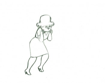
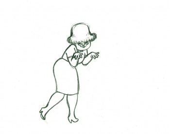
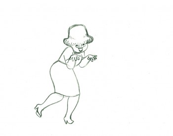
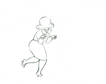
Category ArchiveAnimation
Animation &Articles on Animation &Luzzati & Gianini &repeated posts 02 Oct 2012 04:59 am
Luzzati & Gianini
- I spent some time rereading some material about Emanuele Luzzati and Giulio Gianini. I went back into my archives and found a lot of frame grabs and a bit of info about them at the time of their individual deaths. Ive put three of those posts together and am posting that today as sort of a retrospective piece.
Luzzati
Jan. 26th, 2007
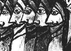 Emanuele Luzzati has died. He was the brilliant Italian designer, who worked with Giulio Gianini in creating some wonderful animated cut-out films.
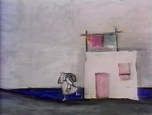
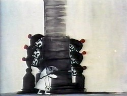
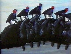
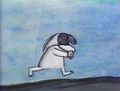
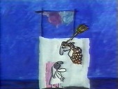
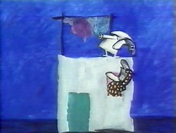
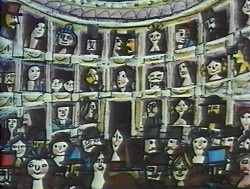
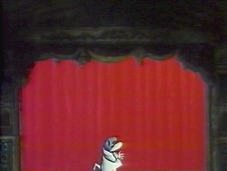
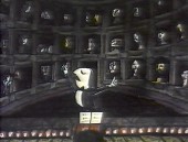
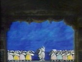
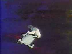
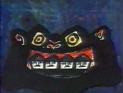
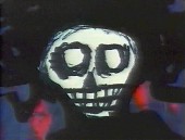
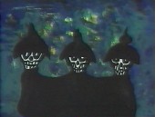
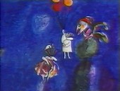
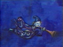
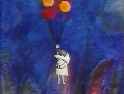
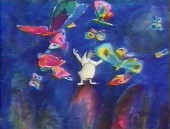
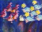
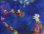
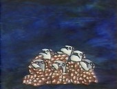
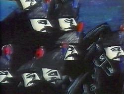
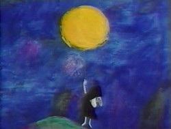
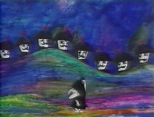
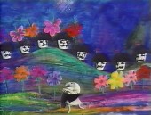
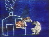
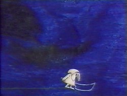
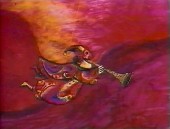
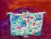
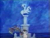
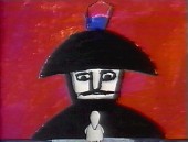
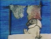
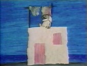
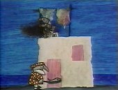
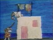
Their films adapted operatic overtures in reworking the operas themselves. The two were nominated for the Oscar for “The Thieving Magpie,” done in 1965 an interpretation of Rossini’s opera and again in 1973 for “Pulcinella.”
Luzzati died Jan. 26th, 2007 on the way home from work. He collapsed just outside his home. He hadn’t been ill prior to this. He spoke on the phone with Giulio Gianini, who has been very ill for some time, that very morning.
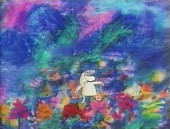
 Luzzati designed sets and costumes for stage productions and operas, including the 1963 production he designed for Mozart’s “The Magic Flute.” Fifteen years later he turned the opera into an animated feature that remains one of his most famous works.
He’s illustrated and written quite a few books. See this list on Amazon.
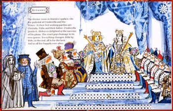
(Above: an image from his children’s book, Cinderella.)
The only Obituary I’ve seen for him was this one for the AP. It does give rather complete details of his life and work. AP Obituary.
 – I received a call from The Guardian in London. The newspaper was doing an obituary for Emanele Luzzati, and they couldn’t find any illustrations to color their report. They’d found some on my blog and wanted to know if they could use them.
(Go here to see all Luzzati/Gianini posts.)
Of course, I directed them to Luzzati‘s distributor who could give the clearances they needed.
But I found it all depressing.
This was one of the world’s greatest designers of Operas and Animation. His brilliant animated version of The Magic Flute is a feature that should be in theaters now. Unfortunately, it never made it to theaters (at least, not in the US), and his designs for the opera are equally as stunning.
Years of amazing art he’s produced, and there’s so little – even on-line – that could be readily found for his obituary. I find it confusing. This was the original reason I had for putting so much attention on his work, and the call from the paper pushes me back to do another post. Unfortunately, all I have are frame grabs.
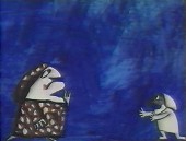
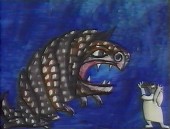
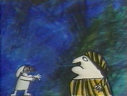
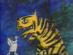
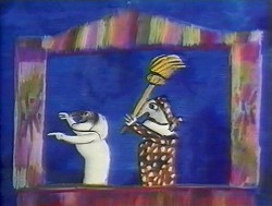
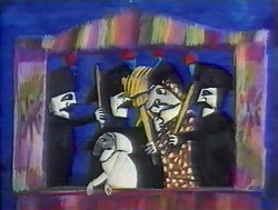
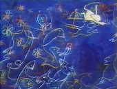
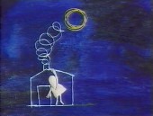
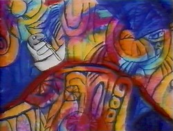
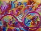
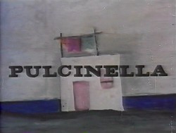
Here is Pulcinella. It is a short that was nominated for the Oscar in 1973. Another cut-out animated film, Frank Film by Frank and Caroline Mouris won the award. The Legend of John Henry by Sam Weiss, produced by Nick Busustow was also nominated.
Like other Luzzati/Gianini films, the score is taken from an opera overture, Rossini’s The Turk in Italy.
The animated film is an abbreviated, caricatured version of the opera. 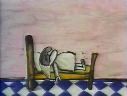
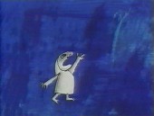
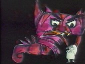
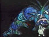
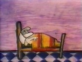
Pulcinella (Punch, as in Punch & Judy) is the principal character who dreams himself into a wild nightmare of a dream that leads us through an abstract world. It’s nice to see how the animators/designers play off the puppet character as well as the opera.
I’m just going to post the images without detailing the story. I like it better that way.
There are some 90 images, so it takes some attention to graphics.
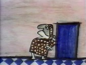
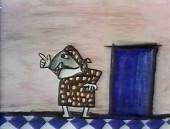
(Click any image on the page to enlarge.)
Gianini
May 18th, 2009
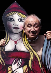 – I’ve been something of a fan of the films of Luzzati and Gianini. I’d met Emanuelle Luzzati at a function thrown at the Italian Embassy in New York, years ago. I bought a book by him, and the artist drew a beautiful pen and ink drawing in the frontispiece of the book.
In 1988, I met Giulio Gianini in Italy during a stay of a couple of pleasant days with an assistant of his at the festival in Treviso, Italy.
Mr. Gianini died this past Saturday, and I wanted to offer a bit of a memorial. Emanuelle Luzzati died January, 2007 and to memorialize that I posted some illustrations and information about the duo with a lot of frame grabs from a number of the Luzzati/Gianini films. It took a few posts, and I left off without wanting to overplay all of the art at my availability.
Luzzati & friend
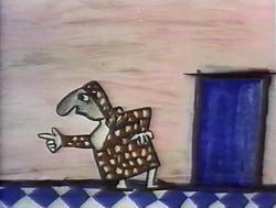
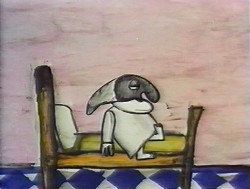
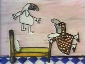
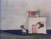
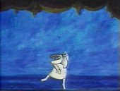
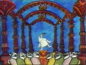
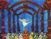
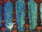
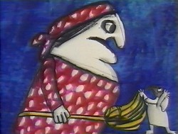
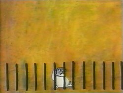
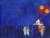
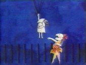
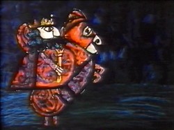
The Thieving Magpie was the first of their films to receive an Oscar nomination, and it was the first of the frame-grab posts I showcased. I’d like to post it again in honor of Mr. Gianini. He was sick for several years and in particularly bad condition. His death wasn’t a surprise, but it is still an enormous loss.
 1
1 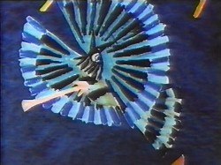 2
2(Click any image to enlarge.)
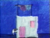
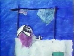
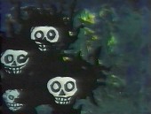
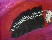
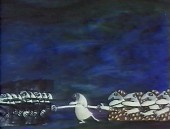
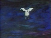
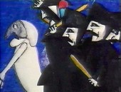
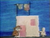
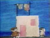
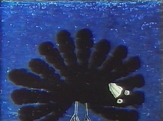
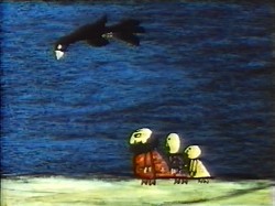
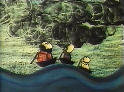
La Gazza Ladra (The Thieving Magpie) is a Rossini opera about a young maidservant who, accused of stealing a silver spoon, is sentenced to death for her crime.
At the eleventh hour, the real culprit is found to be a magpie.
A cartoon, if ever there was one. With great music!
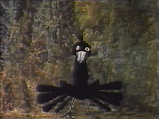
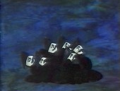
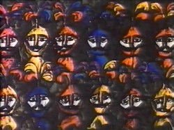
The film tells a tale wherein a king and his hunters, on a bird hunt, are beaten
by a magpie who steals their gems and ultimately destroys their village.
 4
4 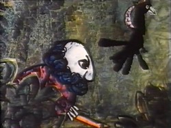 5
5
Luzzati who spent many years designing operas and ballets,
brought his knowledge to animation as the pair adapted several operas often utilizing the overtures of the operas they were adapting.
 6
6 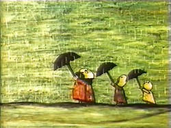 7 The film was nominated in 1964 along with
Clay, and the Origin of the Species by Eliot Noyes
and the winner, Chuck Jones’ Dot and the Line.
The Sound of Music won the Best Picture Oscar, that year.
 8
8 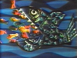 9 The use of cut-out animation wasn’t mainstream at the time.
This is years before Terry Gilliam made it somewhat fashionable. All of the
Luzzati-Gianini films were totally inventive and creative within the form they established.
Gianini’s animation was as dreamlike as Luzzati’s exciting designs. The films
look to be designed somewhere between Chagall, Kirchner and
stained-glass windows; the sensibilities are all Luzzati and Gianini.
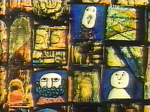 Today we have Flash animation which does just about the same thing as cut-out animation, but the form used today is flat and vulgar and cartoony. It might be useful for practitioners of Flash to take a good look at what these two brilliant designer/animators did with a similar form under more complex and arduous methods. Ulltimately, it’s all related.
You can get a bit more information about Gianini and Luzzati from the website of the Luzzati Museum in Genova.
Action Analysis &Animation &Animation Artifacts &Tissa David 27 Sep 2012 06:57 am
Tissa’s Class
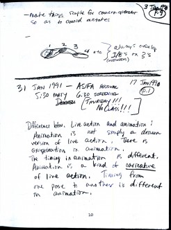
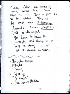
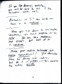
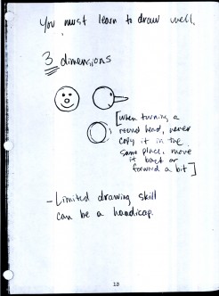
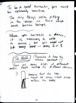
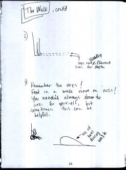
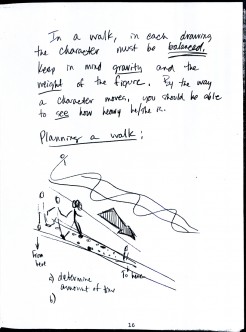
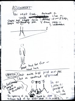
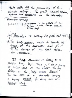
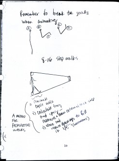
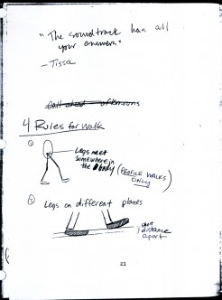
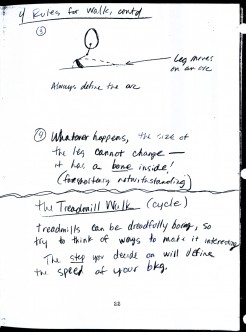
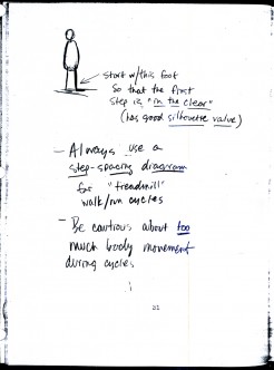
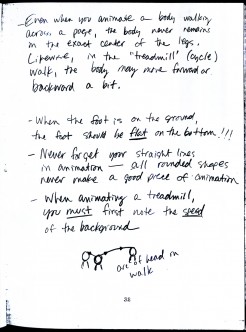
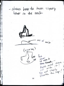
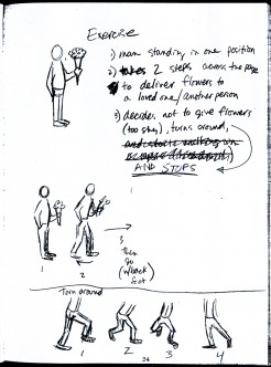
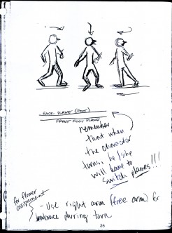
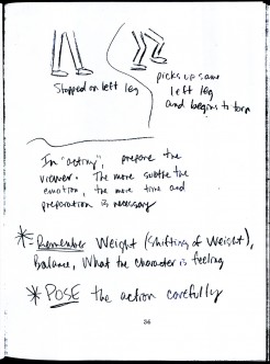
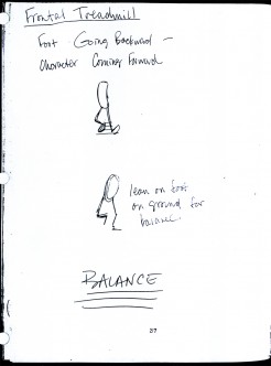
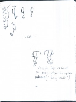
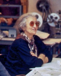 – There was a time in New York when Tissa David taught a class in animation for free, open to anyone who wanted to attend. This was sponsored by R.O. Blechman out of his studio, the Ink Tank. It was held after hours, so that those who worked in the business could attend.
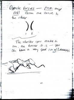
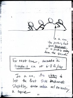
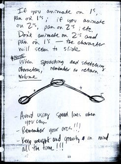
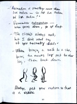
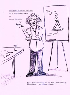
There were several sets of notes I’ve seen taken from Tissa’s talks, kind of a poor man’s version of Dick Williams‘ famous Art Babbit notes. A copy of Dick’s notes circulated within the business and quite a few people studied from them. Recently, John Canemaker loaned me a copy of Eugene Salandra‘s notes from Tissa’s class. Eugene had graduated from John’s class at NYU and had become a professional in New York, before he moved to California to work for Disney. As a professional, he was able to cut to the quick to synthesize Tissa’s basic lessons. I was impressed, and I contacted Eugene to see if he minded my posting some of the pages. He was supportive of the idea and hoped that he would help get the information out to others.
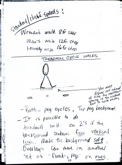
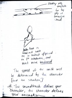
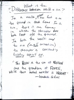
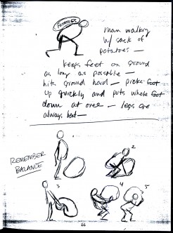
So, here I’m posting the first batch of these notes, which I think are very readable. (You’ll have to click on any of the images to enlarge so that you can read them.) If the reaction is good, I’ll offer more. This group is predominantly about walk and run cycles. But if you look close enough, you’ll see that they cover a lot more.
 1
1 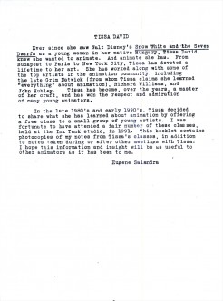 2
2
Animation &Animation Artifacts &commercial animation &Layout & Design 26 Sep 2012 05:15 am
Vince Cafarelli’s Millbrook Bread – 2
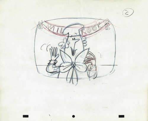
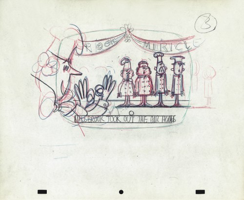
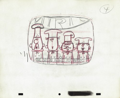
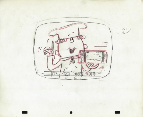
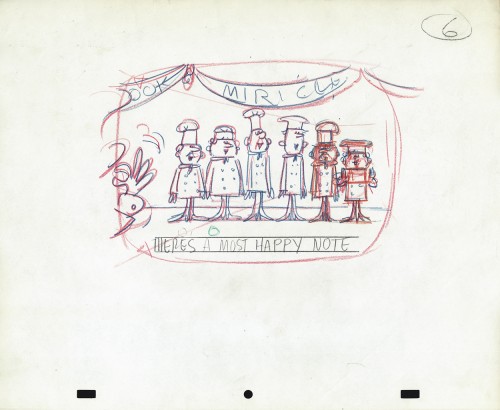
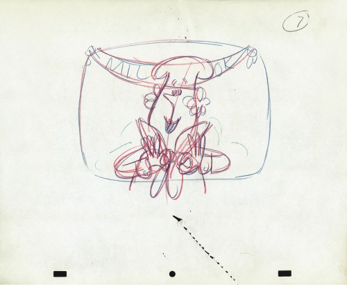
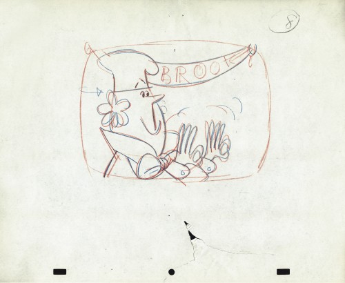
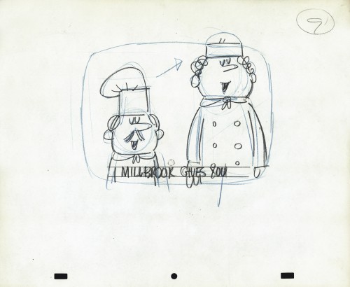
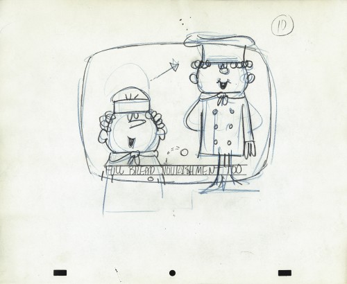
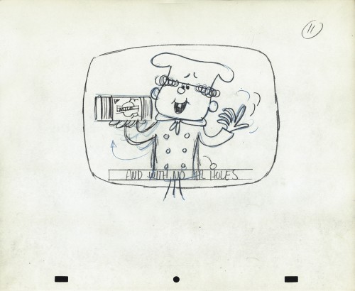
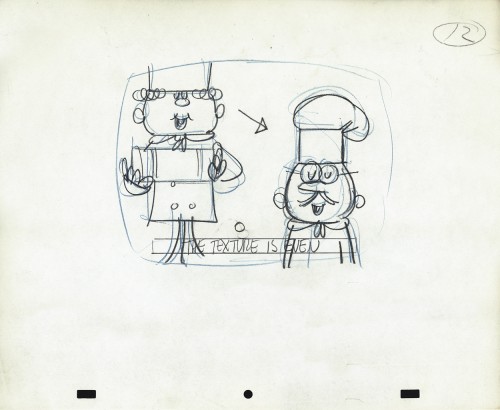
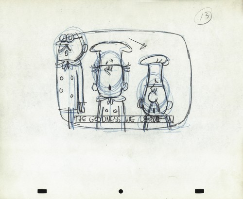
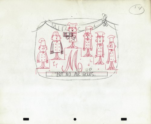
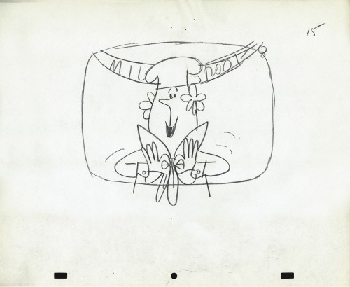
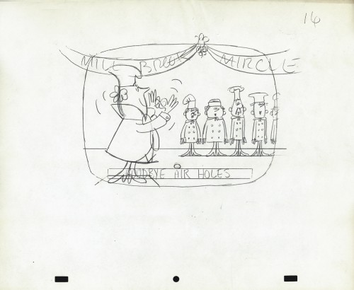
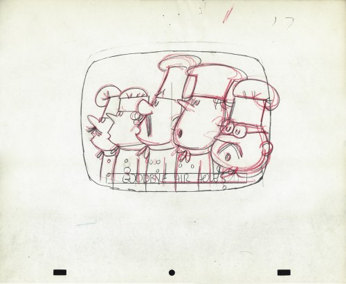
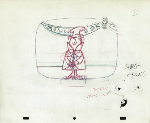
- Last week we saw the first of these two spots Vince Cafarelli did while working for Goulding-Elliot-Graham Prods., Inc. Millbrook Bread was the client and the Piels Bros. voices, Bob Elliott & Ray Goulding, owned the studio with Ed Graham. They also did the voices for these bread spots. This particular one must have been pretty big; the video survived these many years later, and I’ve attached it to the end of this post.
But first, here are the Layout drawings which I believe were done by Vinnie Cafarelli.
 1
1
Action Analysis &Animation &Animation Artifacts &Hubley &Independent Animation &Tissa David 24 Sep 2012 05:41 am
Viva à la Tissa
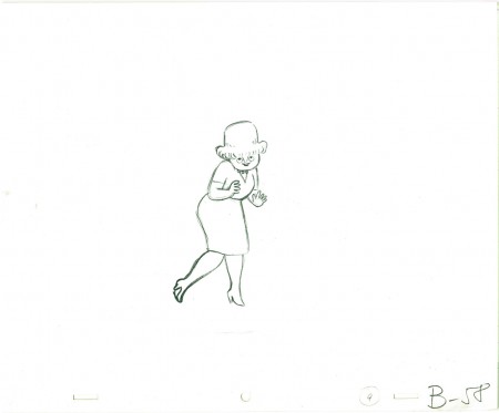
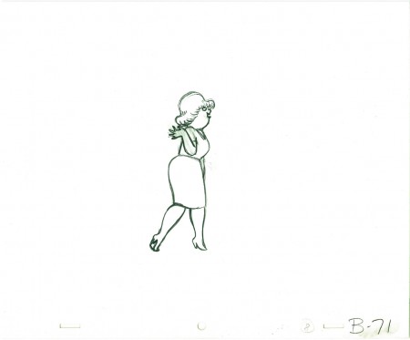
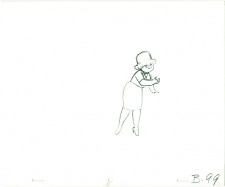
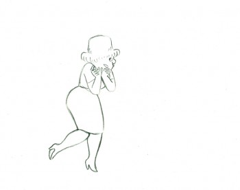
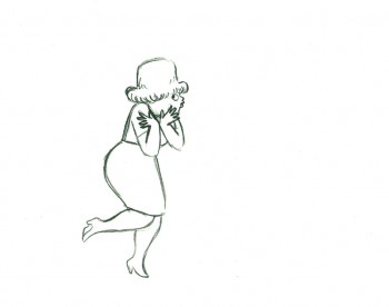
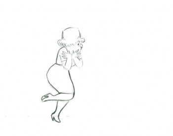
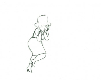
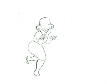
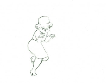
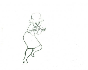
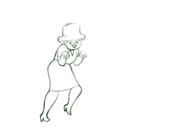
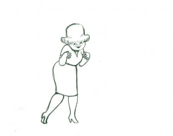
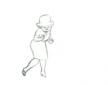
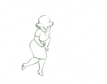
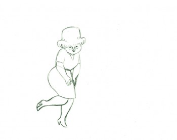
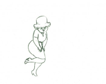
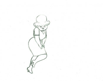
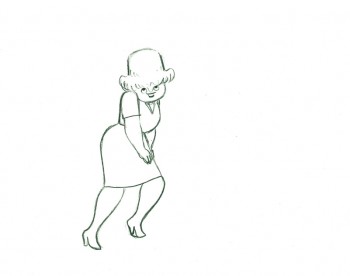
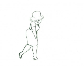
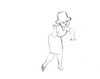
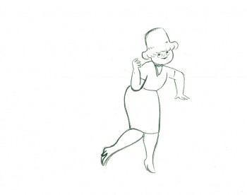
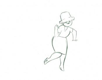
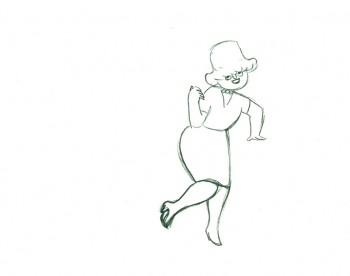
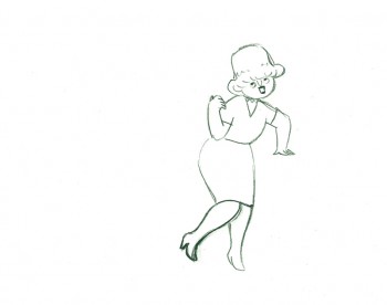
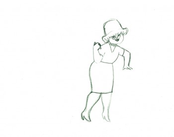
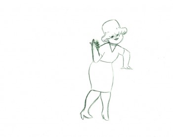
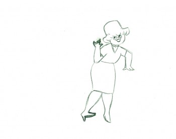
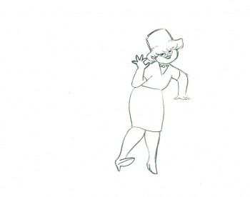
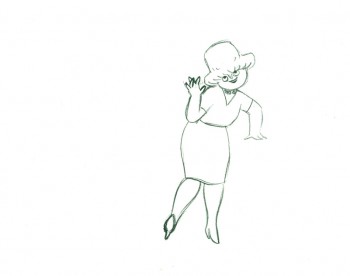
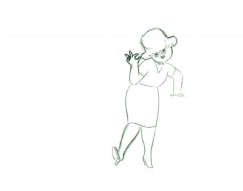
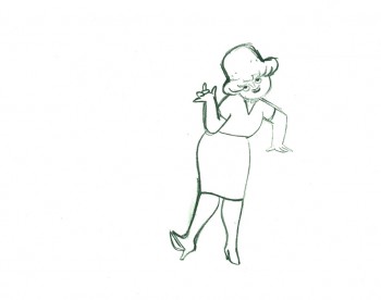
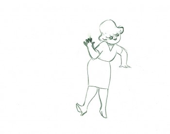
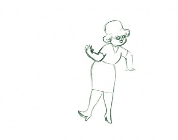
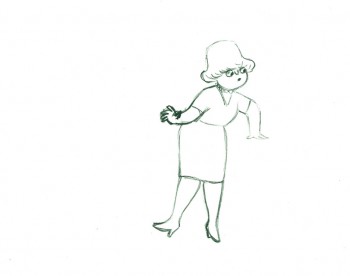
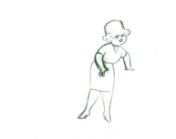
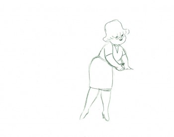
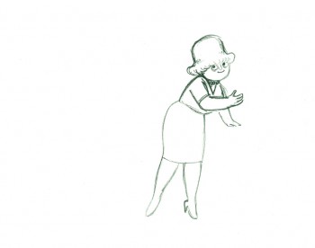
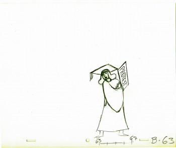
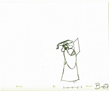
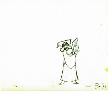
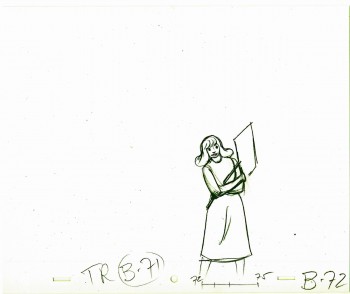
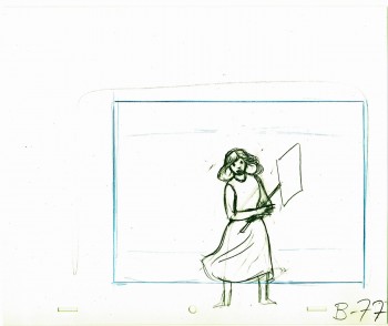
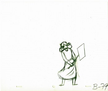
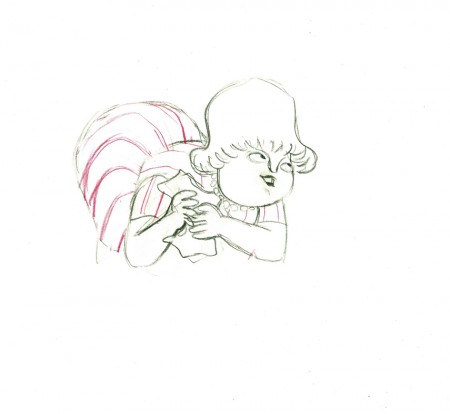
- Tissa David animated a VIVA paper towel spot for John Hubley. Here’s a scene wherein the lead, a woman, walks through (Bg pans behind her at .25 per drawing) toward the kitchen, where she stops.
Instead of giving you the entire page of animation paper, I’ve trimmed it down to just include the character and her walk. Here are four examples of what the entire drawing looks like, untrimmed.
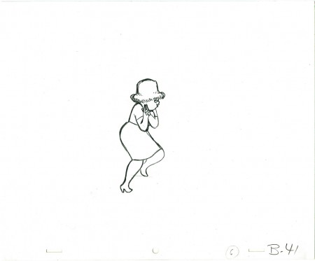 B41
B41
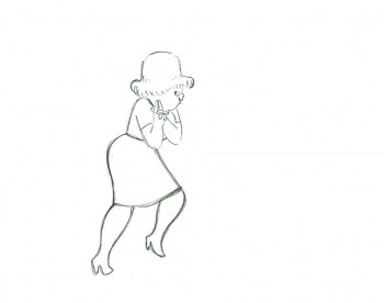
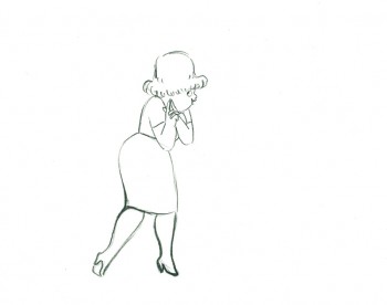
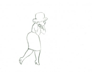
And here are all the drawings for the scene cropped:
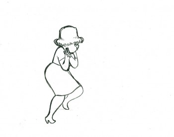 41
41
________________________
.
The following is a QT of the entire scene with all the drawings included.
Since I didn’t have exposure sheets, I put everything on two’s straight ahead.
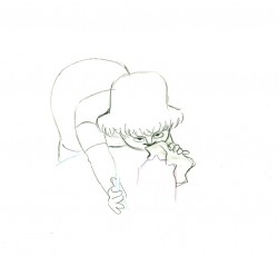
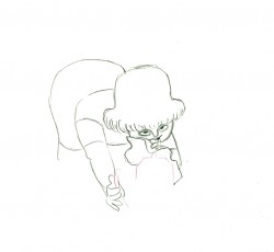
- Here’s what looks like a simple move done by Tissa David when she animated this Viva, paper towel commercial.
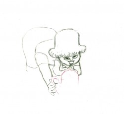
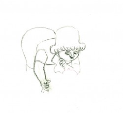
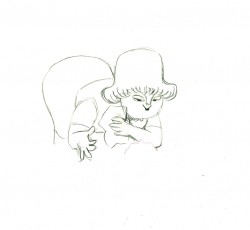
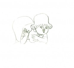
The character’s move in this scene is a complicated one done simply. She has been bent over, cleaning with her paper towel, and she moves up. You can follow the overlapping action as her eyes pull her up, head turn, and body follows.
The stripes will come and go. Tissa depends on someone else to concentrate on this material when she’s working on a commercial.
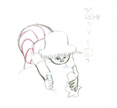 e37
e37(Click any image to enlarge.)
 e44
e44
Her eyes point in the direction she wants to go,
and the rest of the scene moves her up and into profile.
This key move is hidden under the exchange of the
paper towel from one hand to the other.
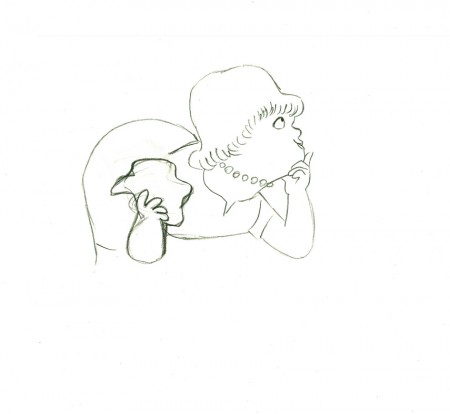 e51
e51
She stops to think (accenting her monologue.)
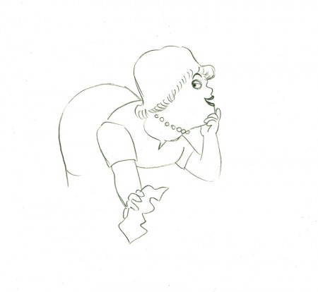 e58
e58
And she slyly looks back to camera to respond with her thought.
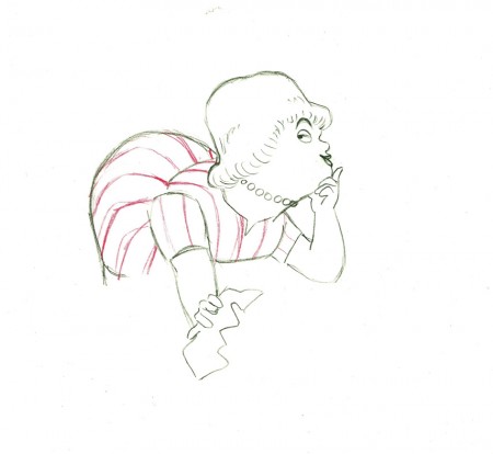 e59
e59
She continues, all through this move, talking.
She’s pitching the product.
Here’s a QT of the piece:
Cleaning for VivaClick left side of the black bar to play.
Right side to watch single frame.
Animation &Animation Artifacts &SpornFilms &Tissa David 17 Sep 2012 06:20 am
Garbo Talks thru Tissa’s Animation
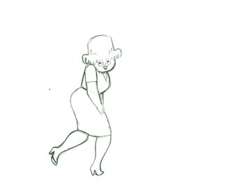
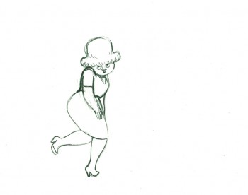
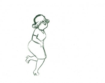
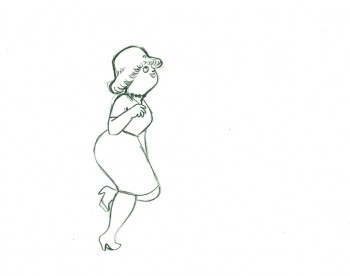
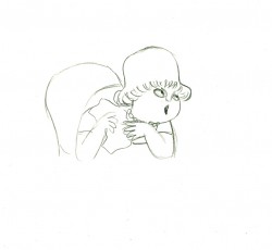
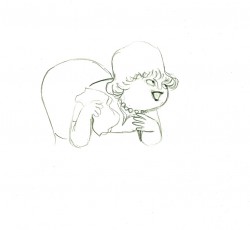
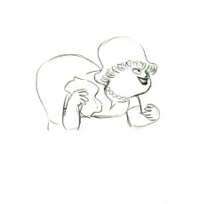
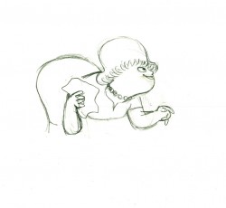
The initial rough/cut screening for Garbo Talks was a bit peculiar. I sat down and a woman sat next to me; I sort of recognized her. We said hello when she sat down. Somewhere midway during the film I realized who the woman was – Betty Comden, that half of the Comden & Green writing team. I realized she was playing the part of the older Greta Garbo in the film, without receiving credit. It was brilliant casting, but you could say that about all of Sidney Lumet’s movies.
When I left the screening room there was a tense meeting going on with four people. I caught Sidney’s eye and waved goodbye. Going down in the elevator Burtt Harris, the producer, rushed in as the doors were closing. He asked what I thought of the film. Before I answered he said it wasn’t working, and Elliott Kastner and MGM weren’t very happy. A rough conversation in an elevator.
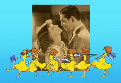
The next day, Sidney asked what I thought of the film, I said that I felt we didn’t know enough of the back story of the Ann Bancroft character in the film. I suggested that I try to offer this in the opening credit sequence. Sidney loved the idea. He just made me promise that it wouldn’t feel like the credits to “I Love Lucy” or “I Dream of Jeannie.”
During the mix, we were talking about the music for Garbo Talks when we slipped off into discussing the music for some of Sidney’s other films. I told him that the music by Richard Rodney Bennet for Murder on the Orient Express was one of the most brilliant film scores ever done. Sidney hesitated in responding finally saying he didn’t get it at first, and it took a while for him to appreciate the music for that film. Sidney wasn’t always perfect in selecting a composer for his films, although I do think that Johnny Mandel was a great choice for him on Deathtrap and The Verdict (or any film, actually).
Bob James had scored Garbo Talks. (He is an eminent jazz pianist, whose most famous piece is probably the theme to the tv show, Taxi.) Bob and I had to work together very closely. He wrote the score to the animatic I’d given him and would build the rest of the film’s score from that. He hit many of the actions in that opening title, and Tissa David‘s animation hit them all. There was a very tight sync between music and title animation.
The preview screening was held on Long Island. I drove there and met the group of Sidney, editors and MGM execs, including Elliott Kastner. He was the leading producer on the film. They weren’t happy at the end of the screening, and I was sure my titles were going to go. It took a week to hear that the titles were staying, but the score by Bob James was dropped. The composer took the hit, unfairly. A new score was being written by Cy Coleman. All that tight sync work!
Coleman wrote a lovely melody for the film, but just swept across the animation not hitting any points in particular. It’s taken me a long time, but I’ve come to like the music he wrote. Tissa wouldn’t watch the piece again with the new music.
In the film, the character played by Ann Bancroft has had a life that, in some small way, was shaped by Greta Garbo’s feature films. This is a small bit of backstory in the live action film, until the end.
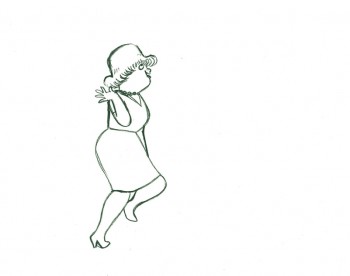
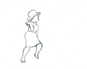
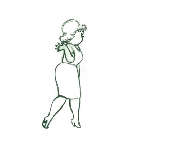
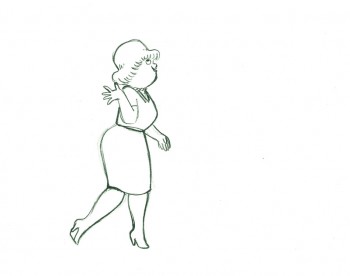
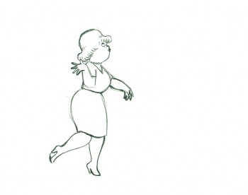
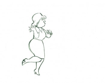
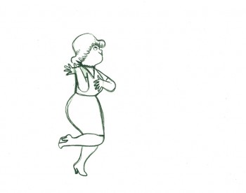
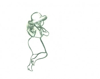
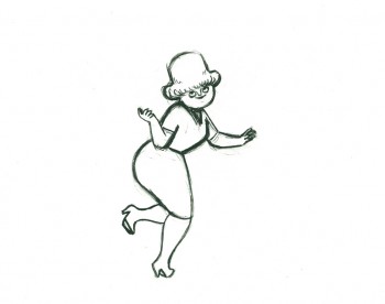
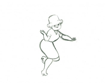
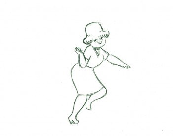
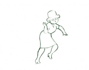
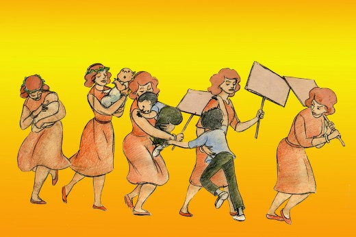
For the credits, I chose to develop this aspect of her story, and Sidney agreed on the approach. We told her life in a caricature of Ann Bancroft‘s character, growing up. The sequence ends with her at her current age, an elderly woman, and the live action begins. Hence, we were giving the life story of the film’s lead character before the film started.
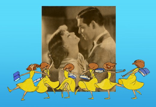
The idea was to use the device that had been developed for TV in the 50′s & 60′s of the caricatured characters whisking through the sitcom titles. (See Bewitched or The Carol Burnett Show.) However, it was our intent to treat it in a serious way.
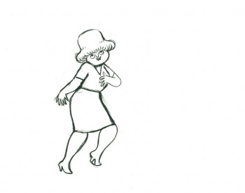
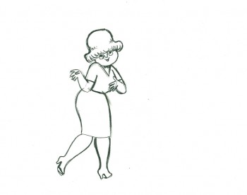
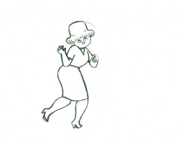
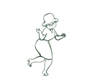
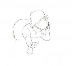
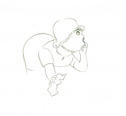
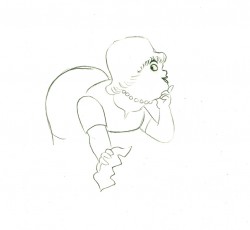
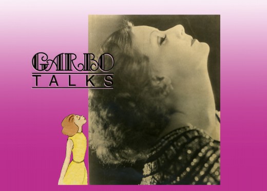
Tissa David did a stunning, tour de force of a brilliant piece of animation. It was a dance that the character went through, and the credits played off the animation, which played off stills of Greta Garbo’s films.
There was a small crew on the piece, which ran about 2 ½ minutes. Tissa animated, I did whatever clean up was left. Robert Marianetti single-handedly colored everything; Janet Benn and Christine O’Neill did additional I&P. Gary Becker filmed it, and Edith Hustead edited.
.
.
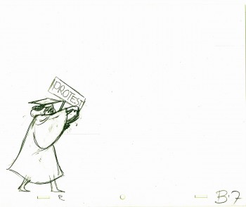
Tissa had about two weeks to animate about 2½ mins. of animation. I begged her to leave inbetweens for me, which she did, though only on close positions. I inked on paper, and Robert Marianetti colored directly from these rough-ish drawings. It was done with prismacolor pencils on paper. The paper drawings were then cut out and pasted to cels.
.
 7
7
(Click any image to enlarge.)
Below is a rough PT of the piece with its staccato rhythm since it’s missing inbetweens.
Garbo Talks ruff PT On twos at 24FPS
Click left side of the black bar to play.
Right side to watch single frame.
The entire title sequence.
Thanks to Roger79 for uploading it.
Thanks to Stephen MacQuignon for finding it.
Action Analysis &Animation &Animation Artifacts &Disney &Tytla 13 Sep 2012 05:48 am
Tytla’s Terry-Disney Style
- Bill Tytla is probably the finest animator who has graced the history of the medium. He was a brilliant actor who dominates most of the classic early films of Disney work. Snow White, Pinocchio, Dumbo, and Fantasia are all appreciably greater films because of his work. In studying this master’s work frame by frame you can see a real elasticity to the character, one that is not apparent in the motion of those same characters. There’s true emotion in the acting of these characters, and it’s apparent that he uses that elasticity to get the performances he seeks.
There’s something else there: Tytla’s roots were in Terrytoons: I have no doubt you can take the guy out of Terrytoons, but it seems you can’t take the Terrytoons out of the guy.
Let’s look at some of the drawings from some of the scenes I posted here in the past.
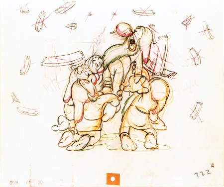
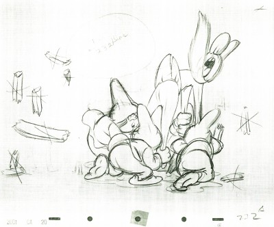
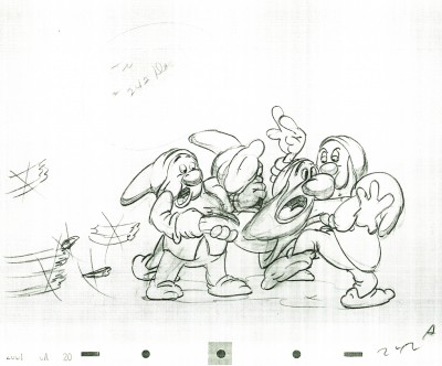
Where better to start than with those gorgeous dwarfs from Snow White. Here’s a scene I posted where all seven are animated on the same level as they carry Grumpy to the wash basin. If he won’t clean himself, then the other six will do the job for him. Take a look at some of the distorted characters in this scene, then run the QT movie. Look for the distortion in the motion.
As for the drawing, like all other Tytla’s scenes it’s beautiful. But tell me you can’t find the Terrytoons hidden behind that beautiful Connie Rasinski-like line.
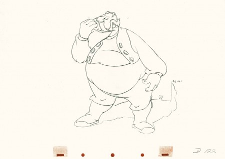
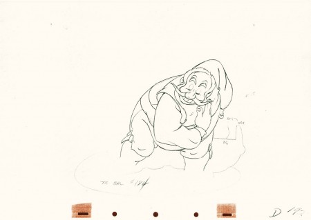
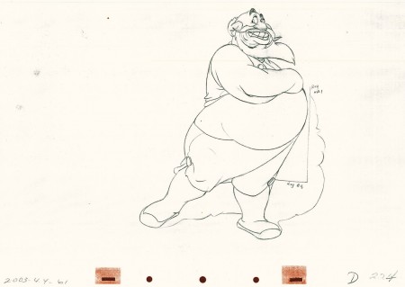
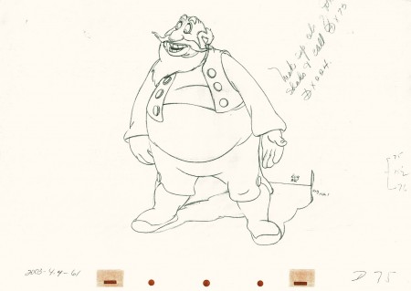
Flipping over to Stromboli, from Pinocchio, we find animation almost as broad as many Terrytoons, the difference is that Tytla’s drawing that roundness and those enormous gestures on purpose. He knows what he’s doing and is looking to capture the broad immigrant gestures of those Southern European countries. Stromboli goes in and out of distorted drawings, as I made clear in a past post.
 75
75
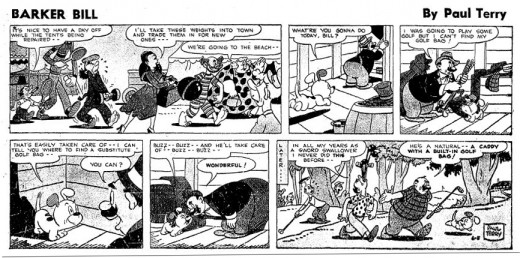
A strip by “Paul Terry”as starring his 1930s character, Barker Bill.
Borrowed from Mark Kausler’s blog It’s the Cat.
The Laughing Gauchito was a short that was, no doubt, going to be part of The Three Caballeros. Tytla, Frank Thomas and Ollie Johnston had all animated for the short before Disney, himself, cancelled the production.
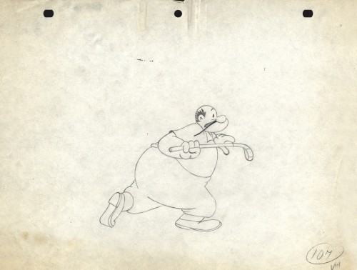
Here are three drawings from the film, and they are all beautiful extremes from the scene. (Tytla marked his extremes with an “A” to the right of the number, or at other times with an “X” in the upper right.) The beautiful roundness does not come at the expense of his drawings. Below the Laughing Gauchito we see a cartoon drawing by Carlo Vinci from a 1930′s Terrytoons short.
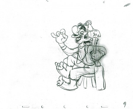 9
9
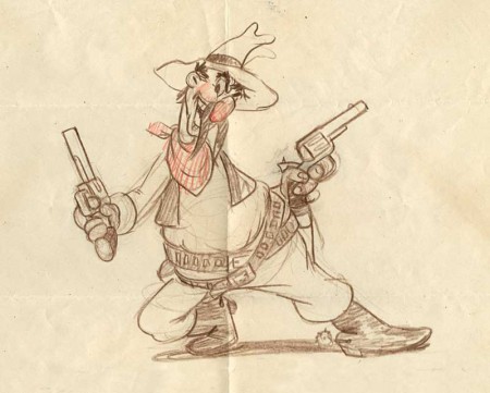
A Terrytoons drawing by Terry artist Carlo Vinci from a mid ’30s short.
borrowed from Animation Resources
Here’s a scene Bill Tytla did for a Harman-Ising cartoon. He was the supervising animator, and the lack of Disney becomes evident in the drawings. The animation is closer to a Terry short than what he did at Disney’s. The movement feels muddy in that actual cartoon. I’m sure it was his own animation trying to blend with the style of Harman’s work.
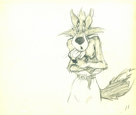 11
11
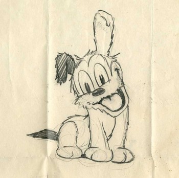
Another beautiful Carlo Vinci drawing from a 30′s Terry short.
borrowed from Animation Resources
And here’s a drawing out of a Little Lulu cartoon. I’s not a film directed by Tytla, and is not a good drawing. But Tytla’s influence on all the Lulu shorts at Paramount at the time can’t be denied. It certainly looks more Terrytoon than Paramount. This is not even a good Terry drawing – though its for a Paramount cartoon.
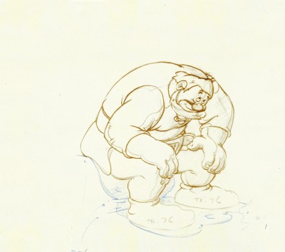
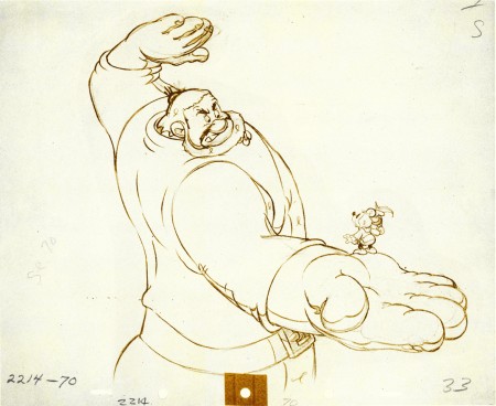
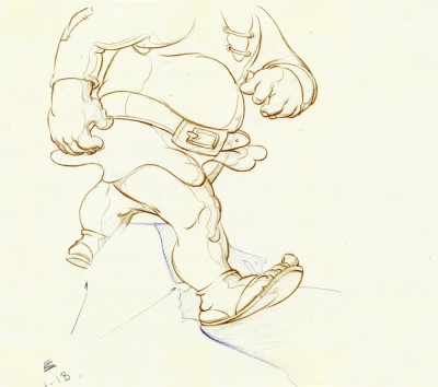
Back at Disney, Tytla animated Willie the Giant from the Mickey short, The Brave Little Tailor. This character, like Stromboli, owes a lot to Terrytoons. I felt this when I first saw the short as a child, and I still think it true. The same, I think, is also true of the same Giant character when he appears in Mickey and the Beanstalk, which Tytla obviously didn’t animate but would have handled if he’d stayed at the studio.
 3
3
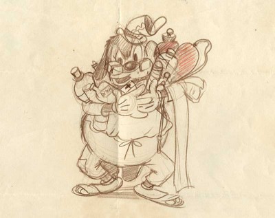
Another Carlo Vinci sketch.
borrowed from Animation Resources
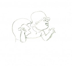
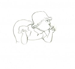
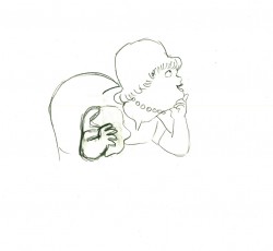
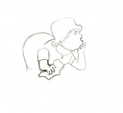
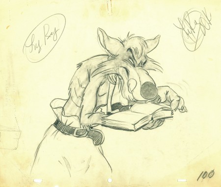
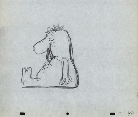
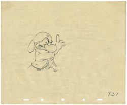
This following, last drawing is a Tytla drawing I own. I know Tytla did it. He gave it to Grim Natwick who gave it to Tissa David who gave it to me. It’s a gem.
Animation &Animation Artifacts &commercial animation &Models &Story & Storyboards 12 Sep 2012 07:00 am
Sleeper – Vince Cafarelli collection
- Today I stumbled upon an odd spot in the collection of artwork saved by Vince Cafarelli. This is the storyboard and rough animation for a piece that Vince animated to a storyboard by Hal Silvermintz. The two worked on this when they were employed at Stars & Stripes Productions Forever, Inc.. It was something that the two were obviously doing for themselves – (an Independent film?). In any case it never seemed to have gone farther than this animation. . . at least, not in this form.
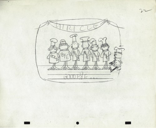
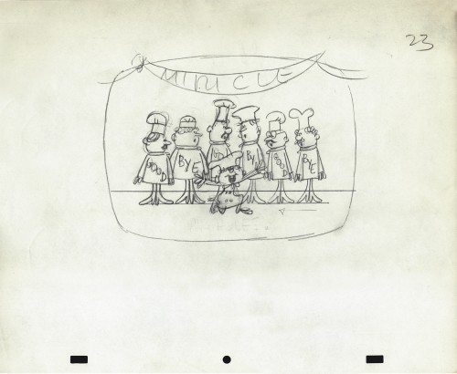
“Weekend” was a weekly news show that included a short animated piece. Perpetual Motion Studio did these weekly animation pieces for the NBC show airing on late night Saturday night. (This was before Saturday Night Live aired.) The budget was almost nil, so the material had to be not too expensive and the work had to be fun.
During the run of this series of shorts, Hal Silvermintz pulled out the storyboard, and it moved ahead in a new version. Candy Kugel animated the “Weekend” version and finished it for Ink & Pt. The final color spot aired in 1973-74.
Here’s the storyboard and a model sheet:
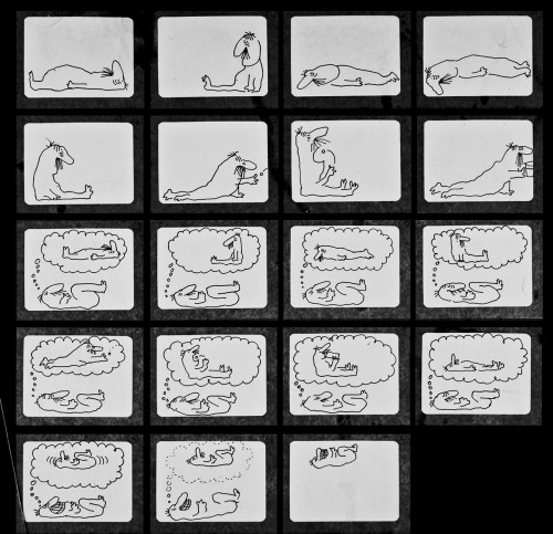
The original storyboard.
Here are drawings from about half of the first scene. For four key positions, I’m posting the entire page, pegs and all. For the remainder of the drawings, I just have the character for you.
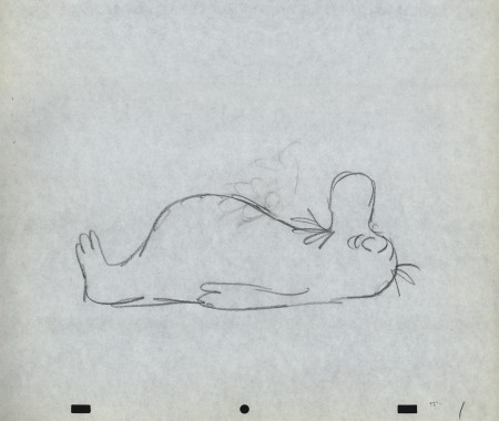 1
1
Here’s a QT movie of the drawings posted above.
There were no X-sheets to offer timings, so I had to
guess at the timings that might have been used.
Animation &Disney &Peet &Tytla 10 Sep 2012 05:10 am
Dumbo Takes a Bath
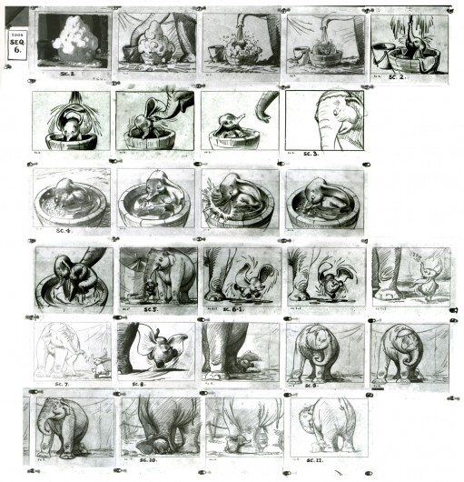
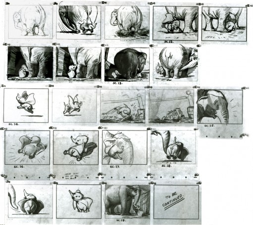
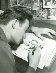 - Bill Peet was a masterful and brilliant storyboard artist. Every panel he drew gave so much inspiration and information to the animators, directors and artists who’ll follow up on his work.
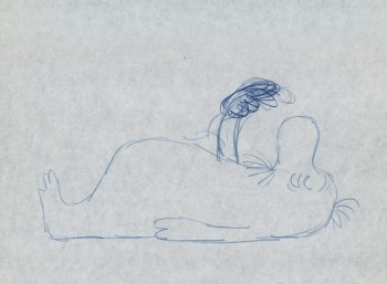
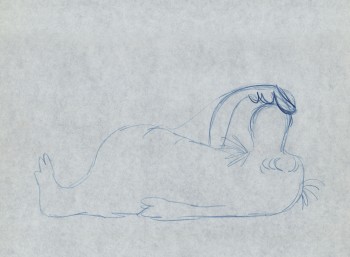
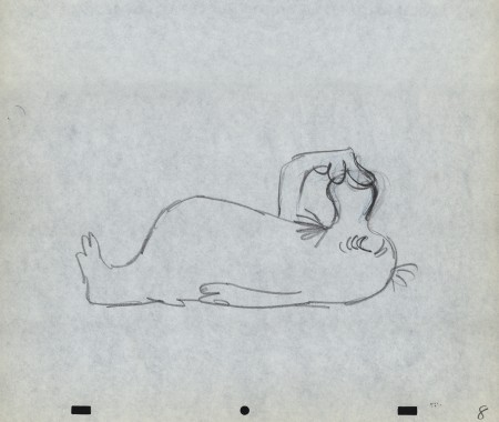
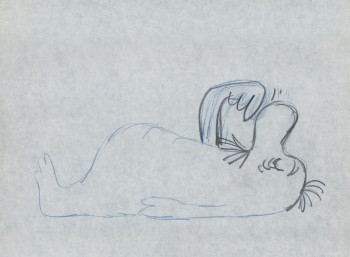
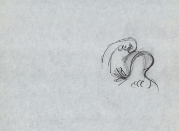
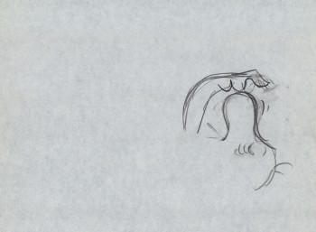
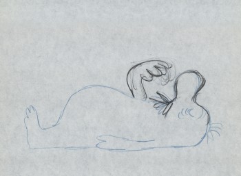
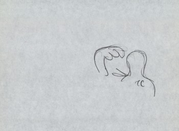
This is the sequence from Dumbo wherein baby Dumbo plays around the feet of his mother. Brilliantly animated by Bill Tytla, this sequence is one of the greatest ever animated. No rotoscoping, no MoCap. Just brilliant artists collaborating with perfect timing, perfect structure, perfect everything.
Tytla said he watched his young son at home to learn how to animate Dumbo. Bill Peet told Mike Barrier that he was a big fan of circuses, so he was delighted to be working on this piece. Both used their excitement and enthusiasm to bring something brilliant to the screen, and it stands as a masterpiece of the medium.
Of this sequence and Tytla’s animation, Mike Barrier says in Hollywood Cartoons: What might otherwise be mere cuteness acquires poignance because it is always shaded by a parent’s knowledge of pain and risk. If Dumbo “acted” more, he would almost certainly be a less successful character—”cuter,” probably, in the cookie-cutter manner of so many other animated characters, but far more superficial.
I had to take the one very long photstat, on loan from John Canemaker, and reconfigure it in photoshop so that you could enlarge these frames to see them well. I tried to keep the feel of these drawings pinned to that board in tact.
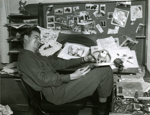
Bill Peet at his desk on Dumbo.
_______________________________________________
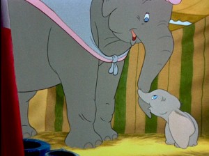 I think this sequence where Dumbo gets washed by his mother and plays around her legs is one of the greatest ever animated. There’s a sweet tenderness and an obviously close relationship between baby Dumbo and his mother which is built on the back of this sequence. It not only establishes both characters solidly, without words, but it sets up the mood of everything that will soon happen to the pair during the remaining 45 minutes of the film. Without that established bond, the audience wouldn’t feel so deeply for the pair during the “Baby Mine” song or care so much about Dumbo’s predicament.
Tytla has said that he based the animation of the baby elephant on his young son who he could study at home. Peet has said that Tytla had difficulty drawing the elephants and asked for some help via his assistant. There’s no doubt that both were proud of the sequence and tried to take full credit for it. No doubt both deserve enormous credit for a wonderful sequence. Regardless of how it got to the screen, everyone involved deserves kudos.
Here are a lot of frame grabs of the sequence. I put them up just so that they can be compared to the extraordinary board posted yesterday. Both match each other closely. Whereas the board has all the meat, the timing of the animation gives it the delicacy that would have been lost in a lesser animator’s hands, or, for that matter, in a less-caring animator’s hands. The scene is an emotional one.
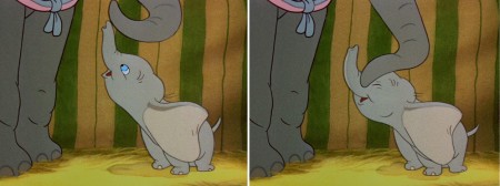
(Click any image to enlarge.)

Animation &Commentary &Puppet Animation 06 Sep 2012 06:30 am
Toys in the Attic – review
- This is my idea of heaven. This week in politics can only get better tonight. The Democratic convention is full of intelligent, smart speakers who are performing at their height. I spend my days waiting for the nights. Those speeches are just too delicious. How can my politics NOT slip over into this Splog!
.
.
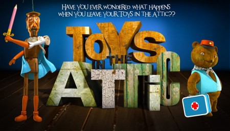
- The animated feature, Toys in the Attic, opens in theaters tomorrow, Sept. 7th.
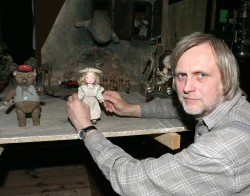 I’ve received a number of emails from the producers of this animated feature. It was done in the czech Republic and has been adapted for English Speaking audiences. The voices inlude Joan Cusack, Cary Elwes and Forest Whitaker in the English language version. The film was directed by Jiřà Bárta, who has done a number of other films which, like Toys in the Attic, are mixed media: 3D stop-motion mixes with 2D animation which mixes with pixillation and live action. It’s an attractive and exciting film which depends less on technology than on knowledge of the medium from filmmaking to animation.__________________Director, Jiřà Bárta
The stop-motion puppets are not of the Laica variety. There is no heavy financing behind them that they can create millions of facial movements that are replaceable so that any emotion can animate into another one. The animation is not quite as slick and, consequently, looks more hands-on.It’s very effectve, just the same. I think of Ray Harryhausen’s work which strobes and is awfully clunky in many parts, but it’s still grabbing in its emotional simplicity.
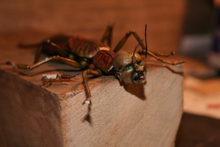
Weird bugs
The sets and costumes, the puppets and the mixed-in 2D animation all sing hand-made and very human. There’s an enormous attractiveness to this, and it’s all so creatively done. A character wals in front of a mirror; his reflection is a 2D version of himself. Trains pull in and out of stations and travel all across the attic. The smoke out of the train, the billowing steam from the engine. It’s all a linear 2D animation. Water floodsan area. The water is done using sheets of blue fabric moving forever forward animated as water even though it’s obviously made of cloth. Oh yes, 2D animated drops of water bounce around the cloth water. (It reminded me of Fellini’s Casanova (1976) when he went to the sea. The sea was made of large sheets of billowing black baggies. It’s obvious that it isn’t water, but somehow you bought the theatricality of it. Here, I bought the cloth running water, but I wonder if children will not be puzzled, or will their minds go with the flow of the director? I’d really like to know.)
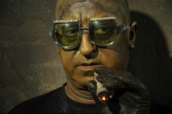 The story is a simple one:Buttercup , a little doll with a penchant for housekeeping, is kidnapped. Lots of mechanical insects do the job for a living breathing statue/bust the color of a dark patina (a greenish-gray which includes his live action teeth). The bust seems to move in live-action (though it also appears to be animated in some odd way); maybe just part of it is live action, the rest pixillated. Buttercup’s friends, led by a wooden Don Quixote marionette (without strings), a teddy bear, and a mouse doll set out to save her.
The film is like a Svankmajer film for children. It’s more Eastern-European than the Quay Brothers and almost as surreal. Oddly, you sit there with your eyes glued to the screen as oddity after oddity moves forward. Desie the celebrity voices, I didn’t recognize one of them. They all wheeze and grunt and have accents. All their lines are partial sentences and short bursts. It’s quite original. I have to say that I never got emotionally invested in any of the characters. Sweet Buttercup is an old-time children’s doll who keeps house for others.
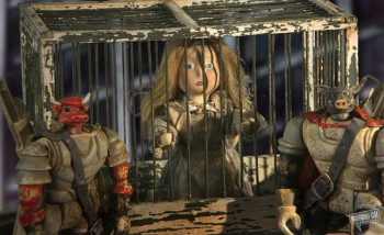 When she’s kidnapped, she’s thrown in a cell where she continues to sweep. Every once in a while, the captors pour ashes in on her from overhead. She’s covered with ashes and left in the pitch-black dark. Yet she continues to sweep. What else is there for her to do?
I probably felt more sympathy for the wooden Don Quixote. There seems to be a vulnerability in the old puppet event though the animation of the character isn’t overtly invested with any real character traits that I’d look for as an animator. It moves well but not with any
This film is certainly like nothing that would ever be made in Hollywood. William Joyce wants to do this but is too clean, airbrushed and slick; totally lacking in textured personality. The distributor calls Jiřà Bárta a Czech Tim Burton, but I can’t agree. Burton works in a style that pops out in your mind – you’d recognize the style that everyone tries to steal. Bárta’s style is much more surreal; it’s a play on reality not a stylization of it.
This is one curious movie that I enjoyed, but I’m not sure it’s for everyone’s taste. I wasn’t kidding when I dropped the Svankmajer name. There’s no doubt that Bárta has seen his work.
If you’ve seen the film please let me know what you thought.
I’d be curious to read your review.
Animation &Animation Artifacts &Hubley 04 Sep 2012 06:12 am
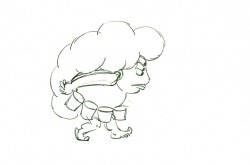
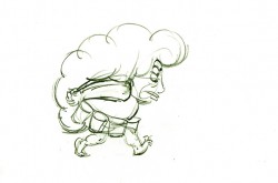
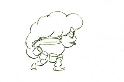
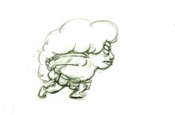
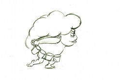
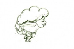
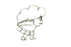
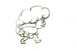
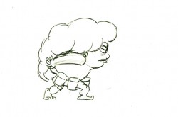
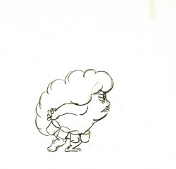
Phil Duncan’s Walk Cycle – recap
 - Phil Duncan was a mainstay of the Hubley animators in all the time I was there. That was my good fortune. What a learning experience for a young animation student.
You could tell who Hubley’s favorite animators by the frequency in which he doled out sequences to them. Whereas Tissa David or Bill Littlejohn or Barrie Nelson would have been asked to animate entire shorts by themselves, someone like Phil Duncan would get whole sequences to animate. At the same time, John so depended on Phil and trusted what he did.
There were never pencil tests at the Hubley studio. Only one instance of it do I remember, and that was on the Art Babbitt mime scenes from Carousel. As I said once before, I remember John running out to get me asking if I’d like to see animation as good as I’d ever see. We then watched the PT over and over together. Ultimately John took Art’s animation on twos and had me put it on four frame dissolves to get more screen time out of it. A budget was a budget and you had to make the most out of the excellence you had in your hand.
But as I mentioned yesterday, Phil would animate on odd numbers expecting the even numbers to be inbetweened. Most times, John asked me to reexpose the scene on fours and not do the inbetweens. Of course, Phil was aware this would happen and had planned on it.
.
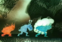
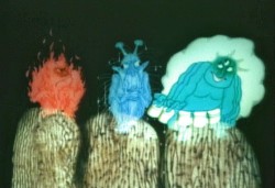
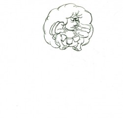
Here is a walk cycle (and more) by Phil Duncan from Of Men and Demons, which was nominated for the Oscar in 1969. The full scene includes the three demons walking and then flying up to their cave.
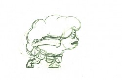 1
1 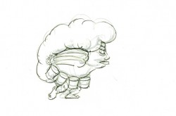 2
2
(Click any image to enlarge to full animation paper view.)
The rest of the scene breaks out of the walk cycle. I
enlarged the frames to accomodate the remainder of the action.
 23
23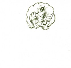 24
24
On threes at 24FPS
Click left side of the black bar to play.
Right side to watch single frame.
