Category ArchiveAnimation
Animation &Articles on Animation &Books &commercial animation &Illustration 03 Dec 2012 07:55 am
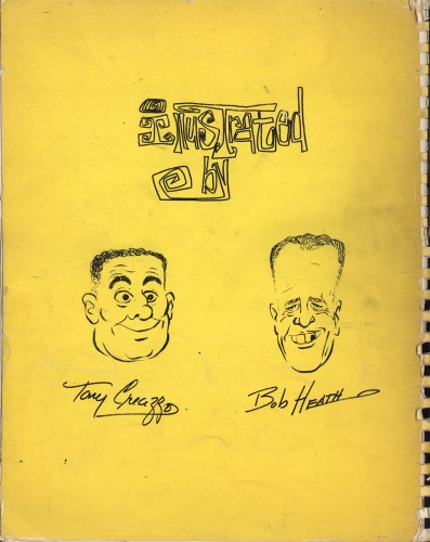
Heath Book – 1
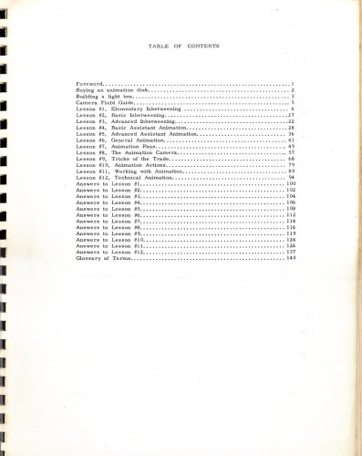
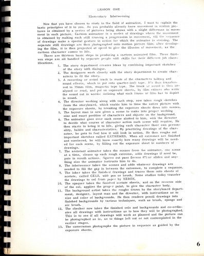
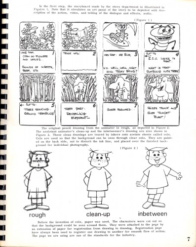
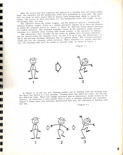
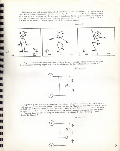
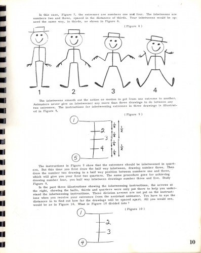
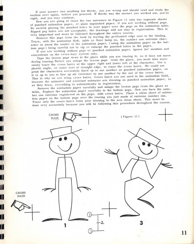
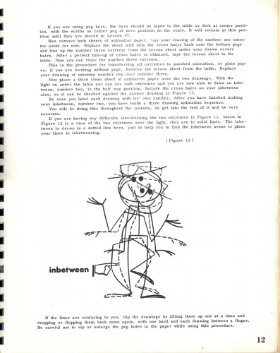
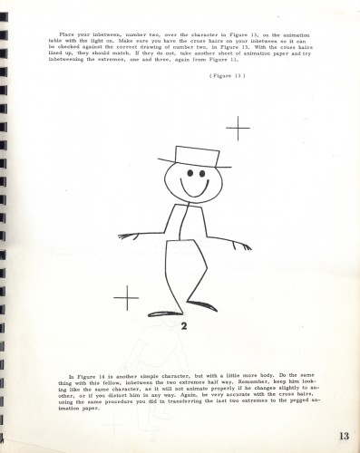
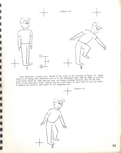
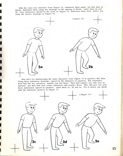
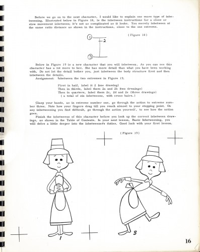
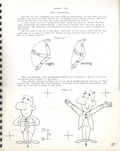
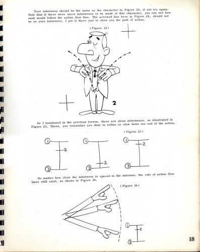
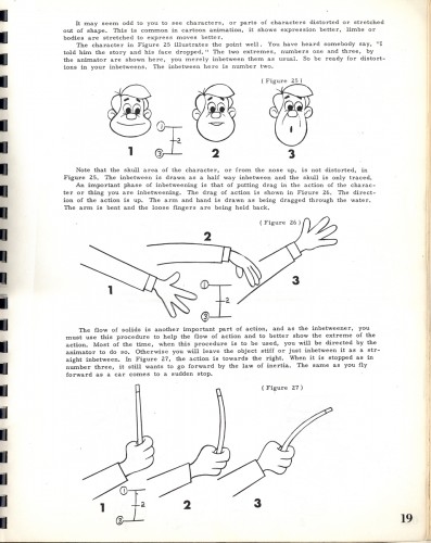
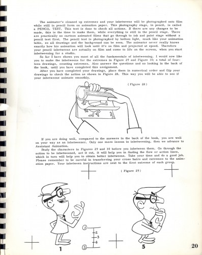
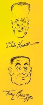 - Back in the days when animation books were a rarity and actual lessons in books were few and far between, there were Heath Books and equipment. This was a company, if I can remember correctly, which was situated in Florida. They had several books for sale, the most well known was “Animation In Twelve Hard Lessons”. It was spiral bound book and over-sized like the Preston Blair book, it contained detailed instruction on the mechanics of animation.
Bob Heath, I believe, was a former cameraman in animation, and his partner in writing was Tony Creazzo, a former Assistant Animator. If I remember correctly, he was closely aligned with Vinnie Bell in New York. The two were always connected; if you wanted Vinnie to animate, you also hired Tony to assist.
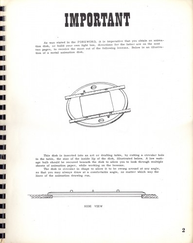
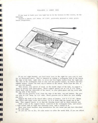
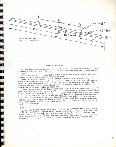
Well, not only did Bob Heath sell How-to books on animation, but he also sold equipment. Paper, pencils, hole punches, even an Oxberry Jr. camera stand could be bought from the company. They had an original design of a light box for sale. Lots of things that could help you set up in the animation business if you had no idea who “Cartoon Colour” was.
I’ve decidded to post this relic of a book, Here in the first chapter is Bob Heath’s “How to Animate in 12 Hard Lessons.”
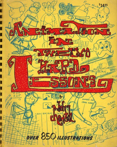
Front Cover
Animation &commercial animation &UPA &walk cycle 29 Nov 2012 08:08 am
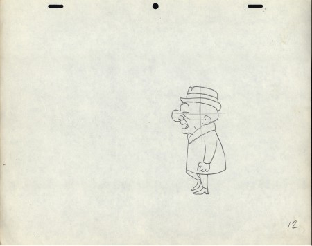
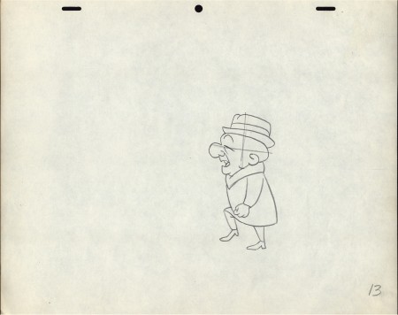
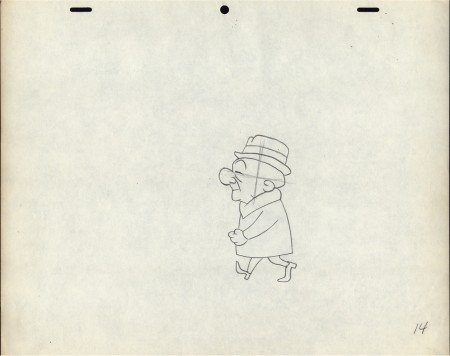
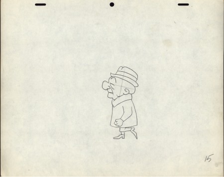
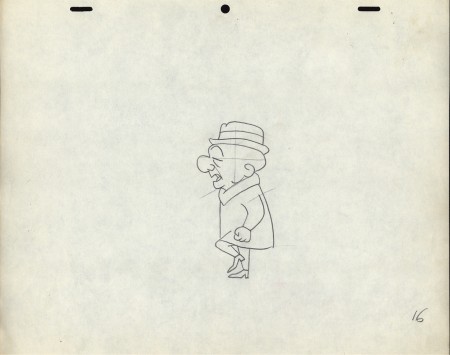
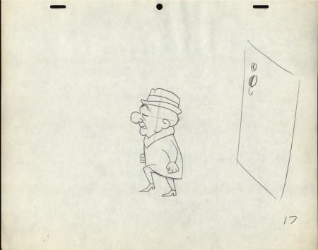
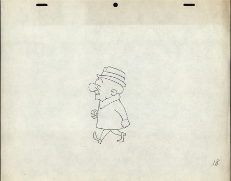
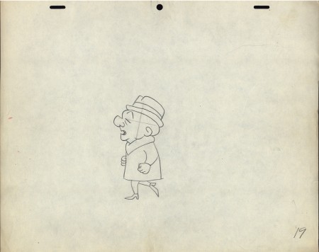
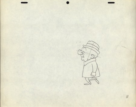
Magoo Walk Cycle
- There’s no way to know who animated this walk cycle. Perhaps it’s a commercial by Lu Guarnier. Vince Cafarelli was Lu’s assistant; so if I had to guess, I’d say that Lu animated it and Vince did the cleanup.
For the QT movie of it, I moved the character into place so that we could run it on a cycle.
 11
____________________
11
____________________The following QT movie was made reworking the positioning
of the character on the pages. This enables us to see a repeated
cycle without Magoo bouncing back to the starting position.
It’s certainly a fast walk.
You figure a natural walk is 12 frames per foot hit / 24 frames for both.
This cycle takes just 18 frames. Presumably it’s part of the overall timing.
Animation &Animation Artifacts &Commentary &Guest writer &Tissa David 15 Nov 2012 08:05 am
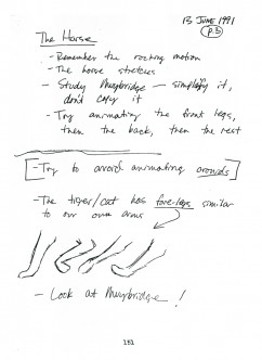
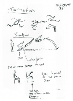
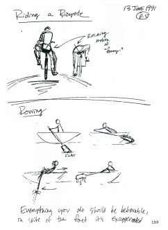
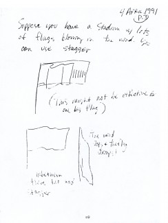
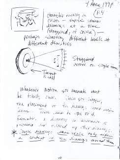
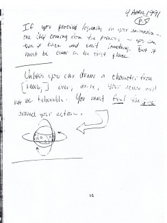
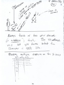
Tissa’s Class – part 6
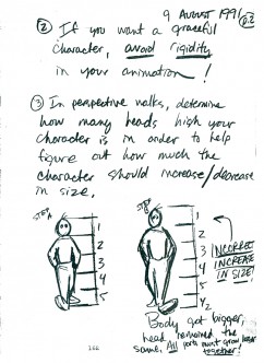
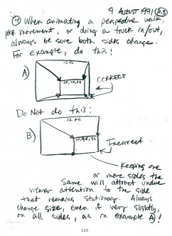
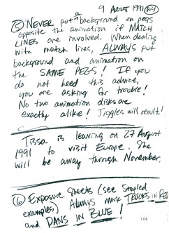
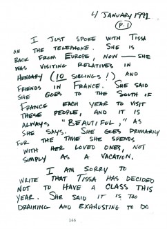
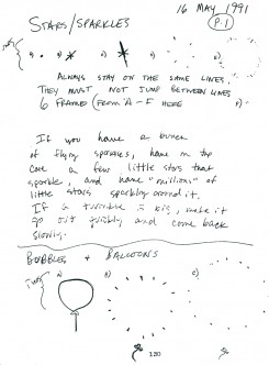
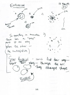
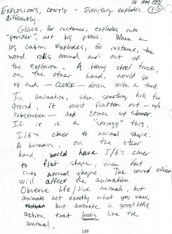
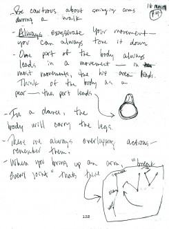
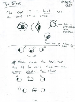
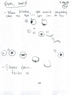
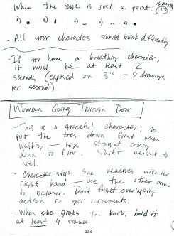
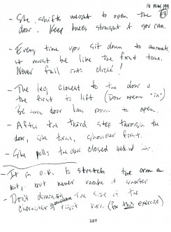
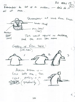
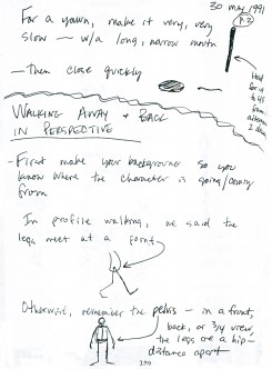
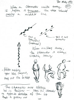
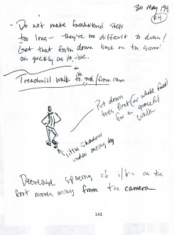
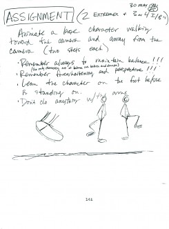
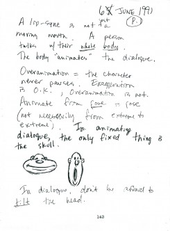
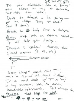
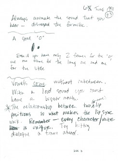
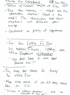
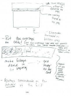
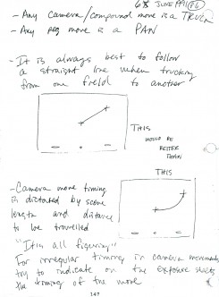
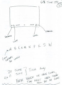
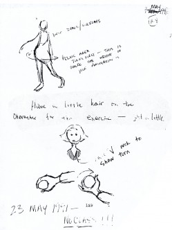
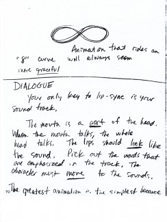
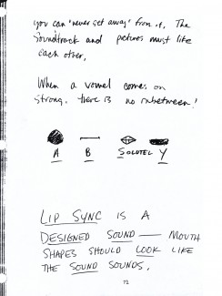
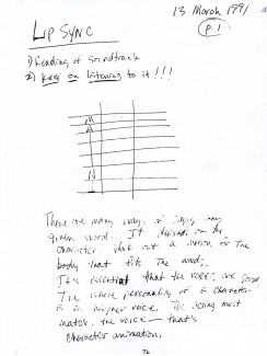
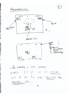
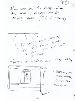
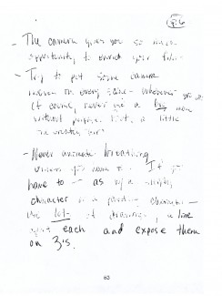
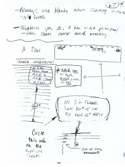
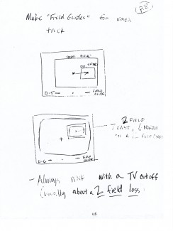
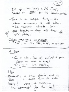
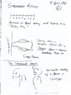
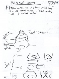
 - From 1991-1992, Tissa David, taught a class in animation which was open to anyone who wanted to attend. R.O. Blechman offered his studio, The Ink Tank for a loction where the classes were held after hours. Those who worked in the day could attend the evening sessions..
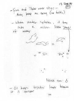
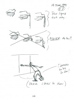
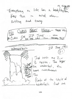
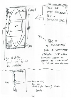
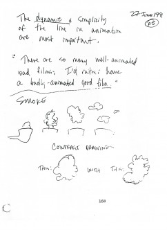
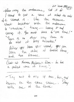
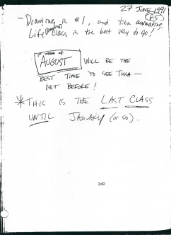
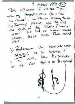
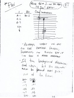
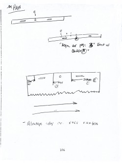
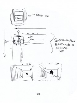
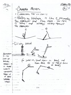
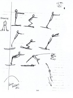
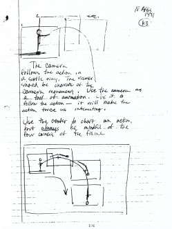
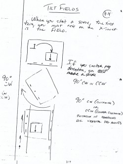
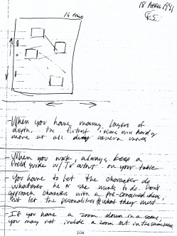
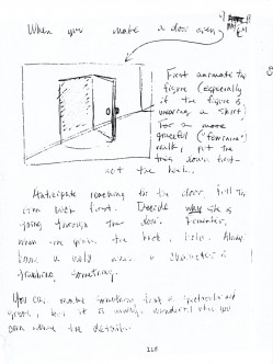
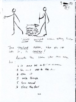
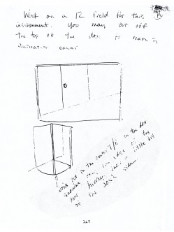
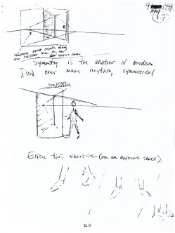
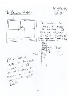
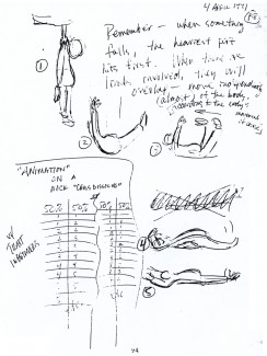
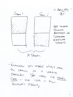
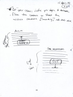
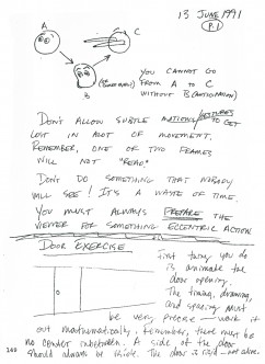
Eugene Salandra, a talented young animator, took notes in the classes, and recently I’ve been posting those notes here, with his permission. Some of the lessons seem a bit dated since they were done for 2D animation which was shot under a camera. However, all of the notes are important since learning the information will help you understand the proper use of the “camera” even if the camera is a computer.
Unfortunately, this is the last of the notes. Eugene also did tighter notes which were more cleaned up, and I may post those as well. I have to read them all before I decide one way or the other.
You can see the earlier parts by going to these links:
____________________________________part 1, part 2, part 3. part 4, and part 5
Here is part 6:
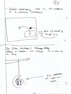
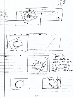
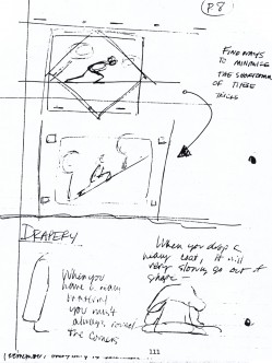
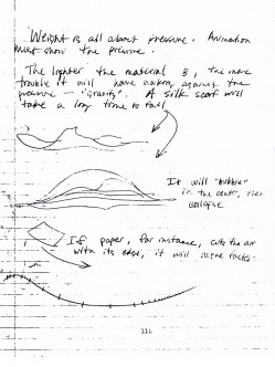
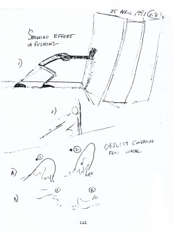
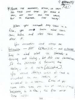
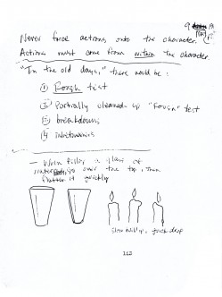
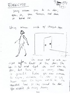
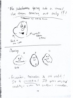
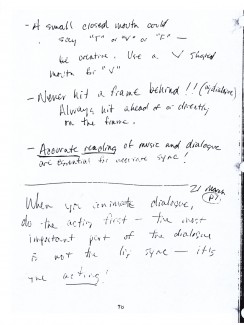
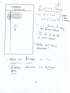
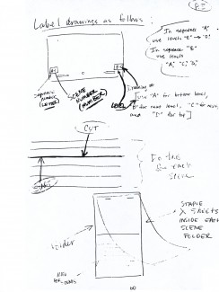
 49
49 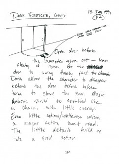 50
50(Click any image to enlarge so as to be legible.)
Animation &Commentary &Guest writer &Tissa David 08 Nov 2012 07:24 am
Tissa’s Class – Part 5
 - In 1991, Tissa David taught a class in animation for free, open to anyone who wanted to attend. This was sponsored by R.O. Blechman out of his studio, The Ink Tank. It was held after hours, so that those who worked in the business could attend.
The talented animator, Eugene Salandra, kept key notes of the classes, and with his permission, I’ve been posting those notes here. Some of them seem a bit dated these days since they were done for 2D animation that was shot under a camera. However, all of the notes are completely relevant since learning the information will help you understand the proper use of the “camera” even if the camera is a computer.
You can see the earlier parts by going to these links:
_____________
____________________________________part 1, part 2, part 3. and part 4
And, here’s part 5:
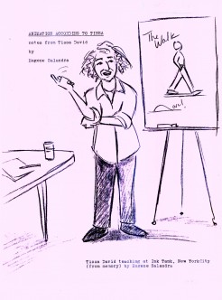 1
1 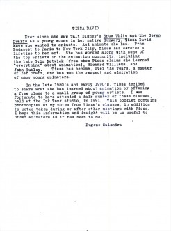 2
2I repeat these first two pages.
(Click any image to enlarge.)
To be concluded next Thursday
Many thanks to Eugene Salandra
Animation &Commentary &Models &Story & Storyboards &Tissa David 22 Oct 2012 05:19 am
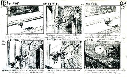
The Marzipan Pig Extras
When we completed The Marzipan Pig, the author of the origianl book, Russell Hoban, came to NY from his home in London. He had originally come from Philadelphia to be an art director at an agency in NYC. He eventually moved to England where he became one of our most famous children’s book authors. We arranged a theatrical screening for him of The Marzipan Pig after which Tissa David, he and I went to lunch. In his very dry way, he told me that he was pleased with the film. As I do with all authors, I asked for criticism not compliments, and he told me there was only one complaint. We didn’t get the bridge quite right at the end of the film. Of course he was right, and it’s hard for me to watch those final scenes, now, without thinking about that damned bridge. But he did say he loved the movie, so I held onto that memory as well.
I’ve read every book of Hoban’s I could, including at least 60 of the children’s books and all of his adult novels. In film, I know only of the work we’ve done and The Mouse and His Child. Unfortunately, that feature film stopped midway through the book’s story. It’s a brilliant book and what they did of the story carries whatever is happening on the screen.
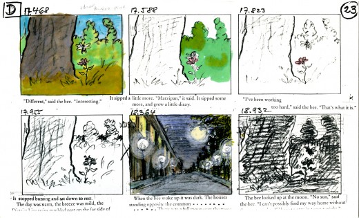
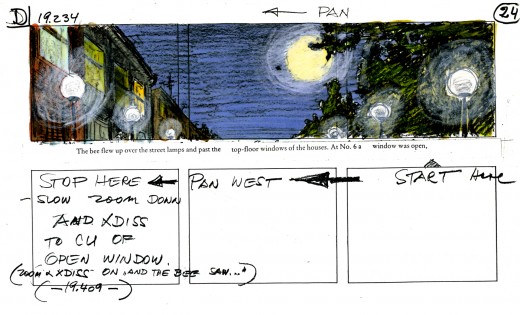
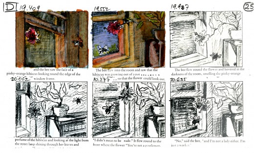
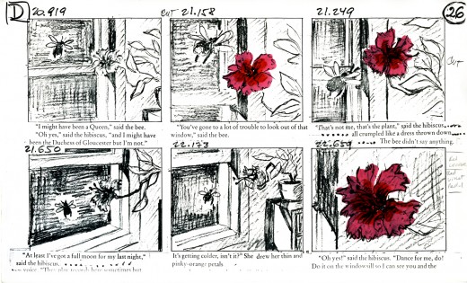
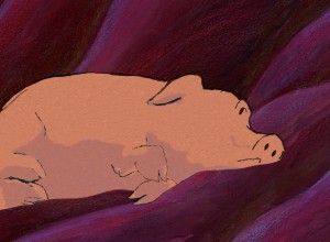 For The Marzipan Pig DVD we included a copy of a section of the animatic. This includes the actual film superimposed over the stills so you can make a comparison as the film runs. Film in film. I like this format; you can really take in the animation and layout of the piece when both are on the split screen.
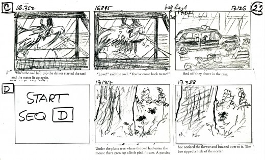
I thought I’d post here some of the storyboards and the animatic for that section. Of course, this is in a low res version; more can be discovered in the dvd version.
Tissa David did the storyboard and animated the entire film by herself. This film is a beauty, if I do say so myself. It’s a truly adult film, though it was sold as a family film. It deals with love in all its forms, albeit, obviously, through metaphor. It was adapted from a brilliant children’s book; one of Russell Hoban‘s finest.
Quentin Blake illustrated the original book, and we didn’t purchase the illustrations. Hoban told us that it wasn’t how he’d imagined the pig to look, so he drew it for us. He was once an art director in an ad agency, so he was able to draw. This is the pig we used.
Hoban had hated what was done with his book, The Mouse and His Child, so demanded that all the spoken dialogue in the film be found among his words. We wrote a script; Maxine Fisher went to London to work with him in revising it. Finally, when it came to recording the actor Tim Curry, I threw out the script and had him read the book – with the exception of one line. It was a good decision, and it made for a great performance from a great actor.
_____________(Click any image to enlarge.)
You’ll notice that some changes were made
in scenes and scene cuts as the animation progressed.
This is typical.
Here are two films we did for a home video of children’s poems. The first is a poem by Russell Hoban. The animation is by Mark Mayerson, and the design is by Jason McDonald. The music is by Caleb Sampson. I think all of these artists did brilliant work, but then Hoban’s thoughts and words always pull out the best.
Russell Hoban’s The Tin Frog
This second poem of Hoban’s also brought out the best in the artists, Jason McDonald who designed and storyboarded the whole piece. The excellent animation was by Sue Perrotto..
Russell Hoban’s Jigsaw Puzzle
Click left side of the black bar to play.
Right side to watch single frame.
Animation &Bill Peckmann &Books &Comic Art &Disney &Illustration 19 Oct 2012 06:38 am
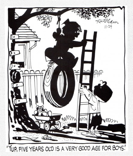
Hank Ketcham @ Disney – 2
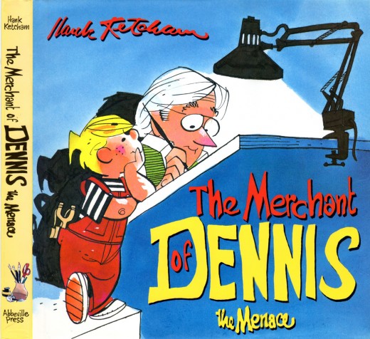
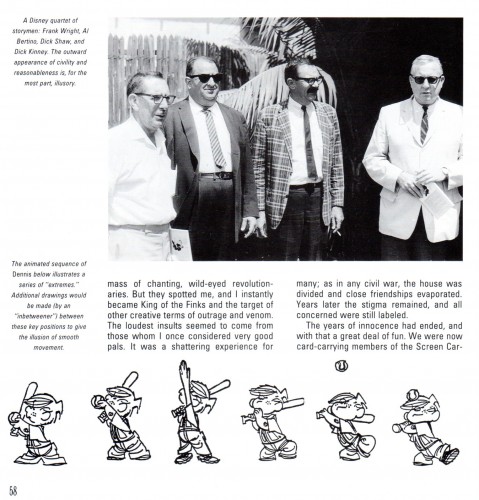
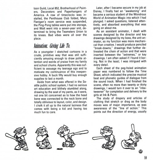
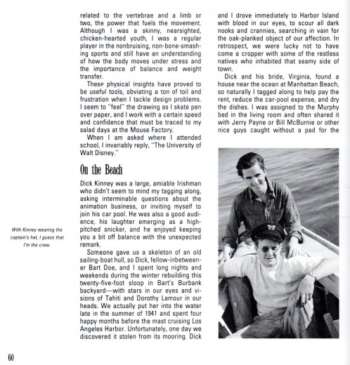
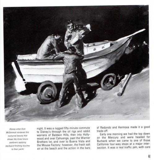
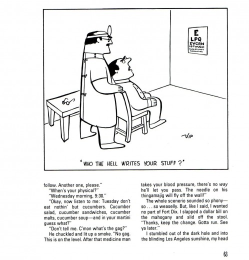
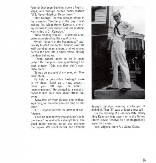
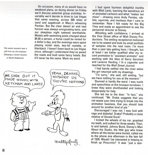
- On Monday I started posting this chapter from Hank Ketcham’s autobiography, The Merchant of Dennis the Menace: The Autobiography of Hank Ketcham. Bill Peckmann introduced me to this book, and the chapter I’m posting here. Many thanks to him for the scans.
This is the second half.
 18
18
Animation &Articles on Animation &Books &Tissa David 18 Oct 2012 05:44 am
Tissa’s Class – part 4
 - Tissa David taught a class in animation for free, open to anyone who wanted to attend. This was sponsored by R.O. Blechman out of his studio, The Ink Tank, from 1991 through 1993.. It was held after hours, so that those who worked in the business could attend.
One of Tissa’s students, the talented animator, Eugene Salandra, kept exceptional notes of the classes. With his permission, I’ve been posting those notes here. Some of those notes seem a bit dated these days. They were done for 2D animation that was shot under a camera. Consequently, many of the layout lessons which appear in the beginning of today’s post might seem irrelevant to computer drawn and scanned artwork. In fact, they are completely relevant, and learning the information will help you understand the proper use of the “camera” even if the camera is a computer.
You can see the earlier parts by going to these links:
_____________part 1 _______ part 2 _______ part 3
And, here’s part 4:
 1
1  2
2I repeat these first two pages.
(Click any image to enlarge.)
_______
Still more to come, next Thursday.
_______
Animation &Books &Tissa David 11 Oct 2012 04:56 am
Tissa’s Class – part 3
- Tissa David taught a class in animation out of R.O.Blechman‘s studio, the Ink tank, back in 1991. Eugene Salandra attended the class and kept wonderful notes on the sessions/ With his permission I’m posting the notes from that class. As I scan them, I’ve been reading them. They’re enormously informative and act as a wonderful reminder of many of the basics that sometimes slip through the cracks. So even though we’ve been using these rules forever, it’s good to just read them again.
Anyway, here’s part 3:
 1
1  2
2I repeat these first two pages.
(Click any image to enlarge.)
This section also includes a number of bits about animation points for the past’s generosity. There’s a section on Exosure sheets. Another on timing charts. Both are richly informative to the youngsters of today who might not want to know this for the future especially when it’s so obviously part of the past.If you end up knowing that material, believe me, you’re so much the better for it, and your rules will develop into the certifiably strong. He didn’t hold onto those drawings for theft; I think they know it.
Animation &Animation Artifacts &Fleischer &Layout & Design &Models 10 Oct 2012 05:54 am
More Fleischer Models & Things
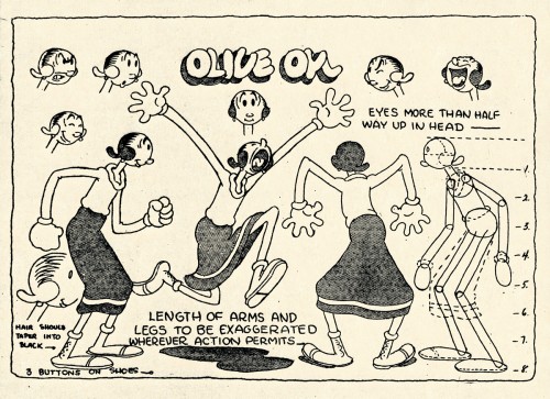
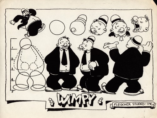
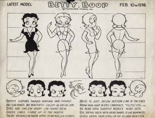
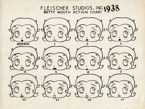
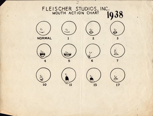
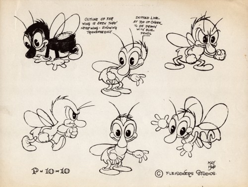
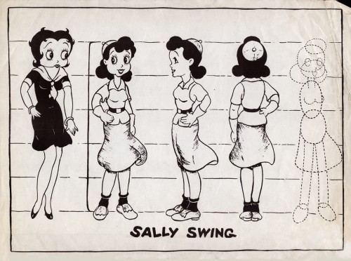
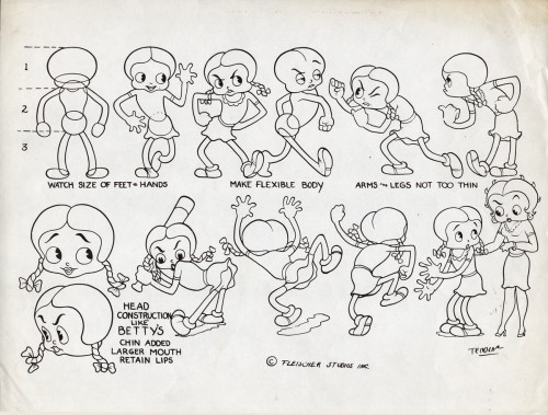
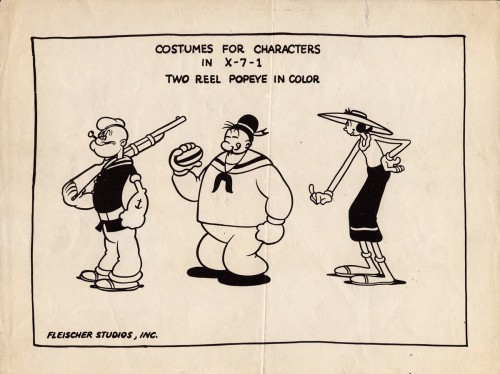
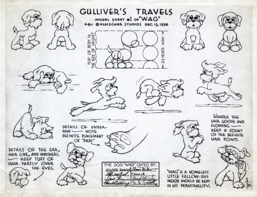
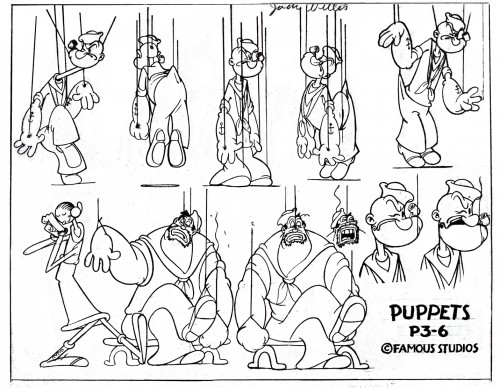
- Continuing on with the Vincent Cafarelli collection of artwork, I ran across some more Fleischer/Paramount models. One piece among them, I think, is something of a rarity. Here they are:
 1
1
 10
10
This seems to be a rarely seen model. “Wags” the dog from Gulliver’s Travels.
I think this was cut from the film, at least I’ve never noticed him.
 11
11
This, of course, is not Fleischer but a later Famous short.
 12
12
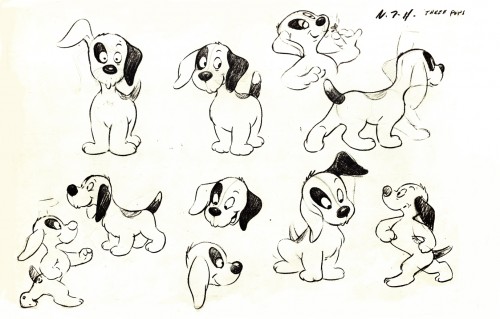
This appears to be from a later Paramount cartoon.
(Thad Komorowski identifies this as Bill Tytla’s
HECTOR’S HECTIC LIFE in the comment section of this post.)
________________________
- Here is something even rarer than that Gulliver “Wags” model sheet.
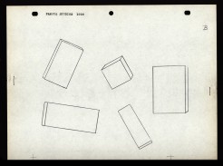
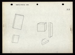
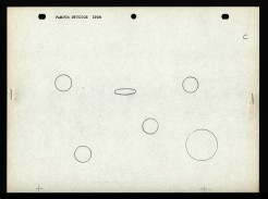
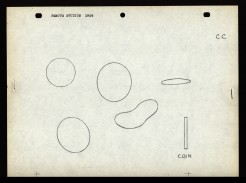
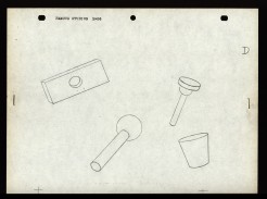
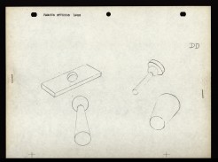
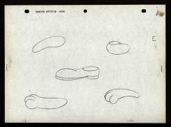
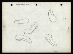
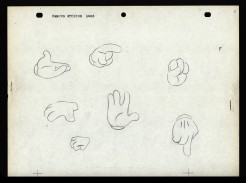
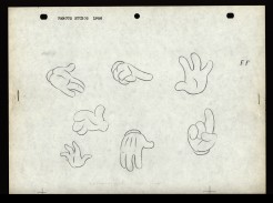
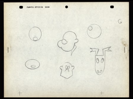
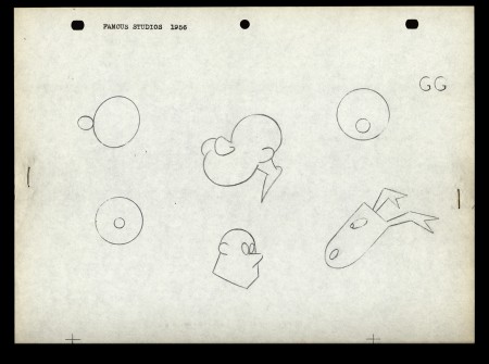
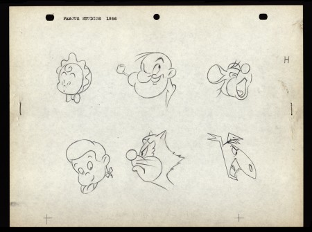
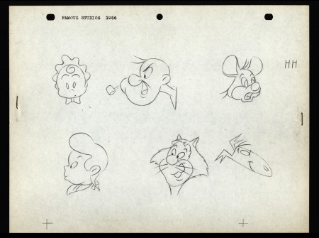
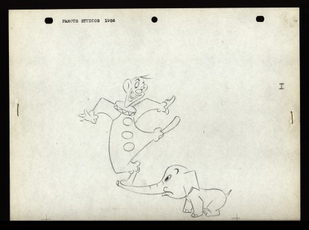
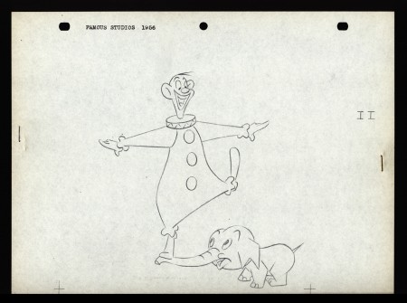
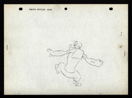
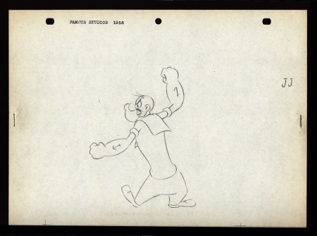
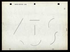
Apparently, new hirees at Famous Studios (at least in 1956) would go to an art school, of sorts. The following drawings are on reduced animation paper (although they’re the actual pencil drawings, not copies) and stapled – with two staples, one on either side – to black illustration board. Each has additional registration marks drawn at the bottom. Each is one of two drawings that are slightly different from one another. Presumably, they were designed to teach inbetweening. The pencil drawing line work is particularly thin, so I suspect these were projected with an overhead projector. I’d guess that the art student, new employee, would copy the projected drawings and then have to inbetween the pair of drawings.
The drawings start with simple lines and get progressively more difficult until it’s a full sized image of Popeye ready to throw a punch. For the sake of space, and since the first drawings aren’t very interesting, I’ve enlarged only the last half of them. The thumbnails for the first group are small, so you can see them and enlarge them, if you like. If you’re new to the field, try copying and inbetweening at least the last five pairs. It’s amazing that Vincent Cafarelli saved these, and fortuitous for us to be able to see them. Have a look:
 A
A 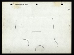 AA
AA
Animation &Animation Artifacts &Richard Williams 08 Oct 2012 07:24 am
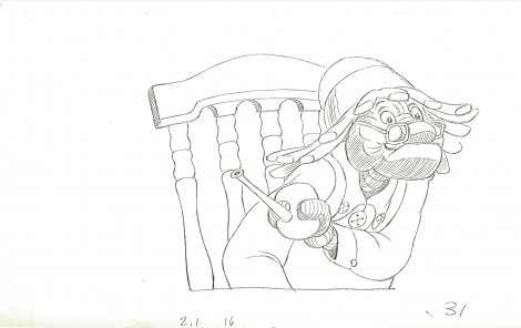
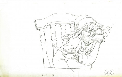
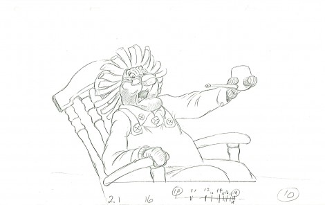
Gramps – anew
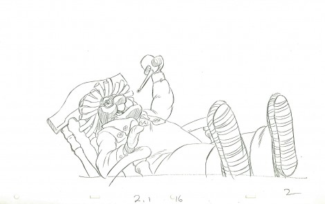
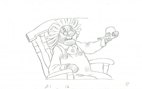
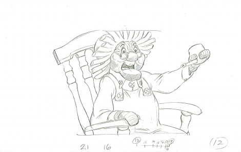
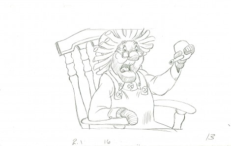
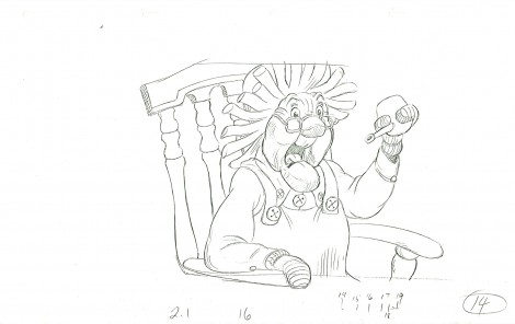
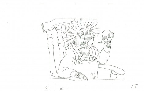
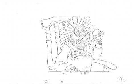
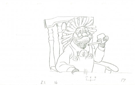
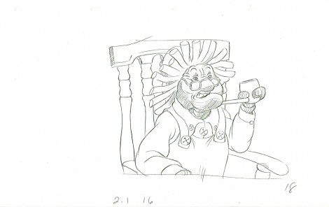
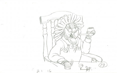
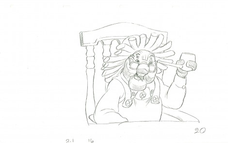
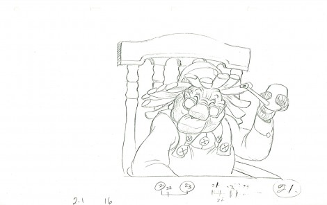
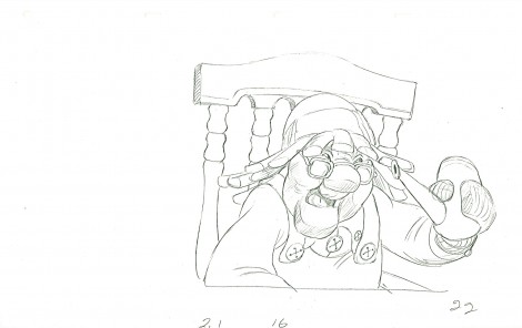
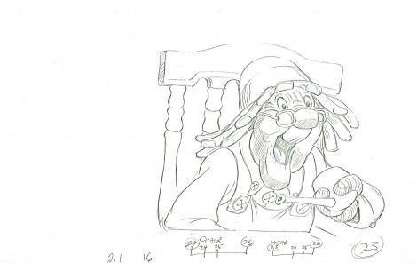
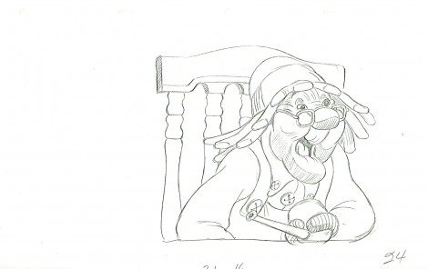
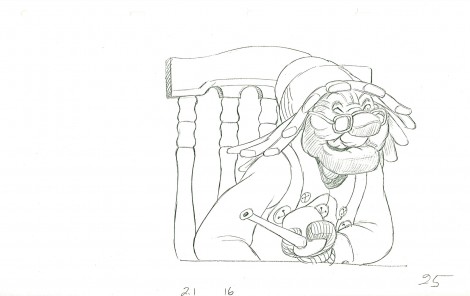
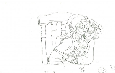
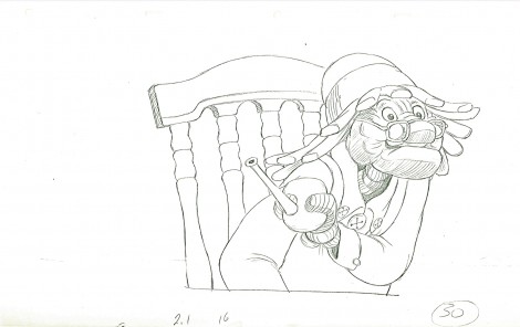
- I have the CU drawings done by Richard Williams for a small scene from Raggedy Ann & Andy. I had thought the original animation was done by Spencer Peel, though I’m not sure. The drafts seem to credit Gerry Chiniquy.
For the first half of the film, Dick spent much of the film holed up while assisting and inbetweening many of the animators at the film’s start. In doing this, he was also able to rework and retime the animation and, thus, have control over it all. Once Dick became involved in a scene, it’s hard to say who animated it.
The problem was that the director has bigger things to do that affect the big picture.
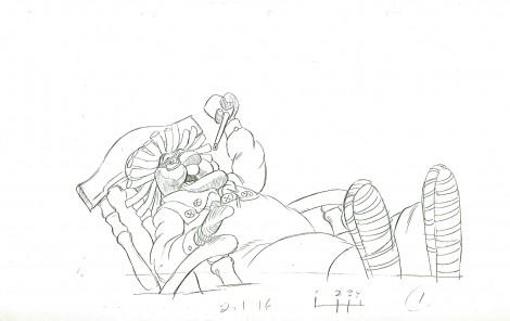
This scene, beautifully cleaned up, is typical of these playroom scenes. And yet, as far as I can tell this was eliminated from the final film. I don’t have time to check the actual film, but the drafts indicate that scene 2.1 / 16 was taken out of the movie. I’ll look at the film just to make sure, but it looks pretty certain to me.
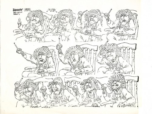
This is a model sheet taken from a similar scene in Raggedy Ann.
It’s obvious that his POV has shifted from left to right, and that may be
the reason for eliminating the scene pictured below.
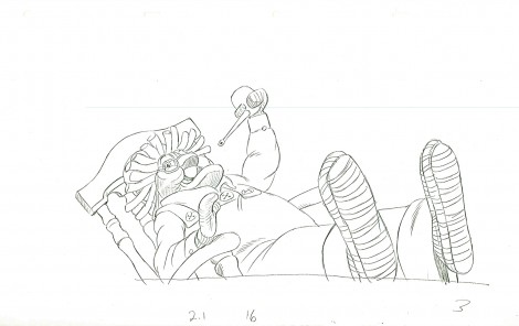
The scene started out with 32 drawings, but it seems that Dick eliminated three of them (27-29) to hit an accent a bit harder than was done in the original animation.
 1
1
 3
3
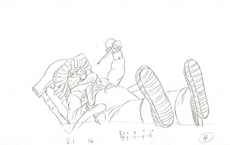
Dick had a unique animation and cleanup style. He would draw
his drawings incredibly light going quickly through the entire scene.
 4
4
The pencil line of that first round was almost invisible.
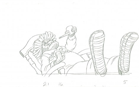 5
5
Then he’d go back and work over those lines
just as lightly and just as quickly.
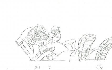 6
6
then he’d do it again, and again, and again.
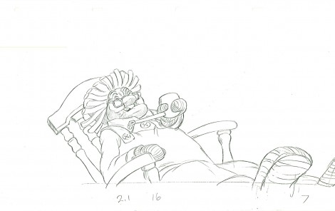 7
7
This gave him the opportunity of changing and adjusting as he went along.
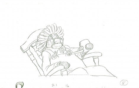 8
8
It also is a method somewhat similar to the one
that Tytla and Ferguson used in the 1930s. They’d
go for the “forces” and then go back and build up from there.
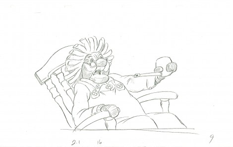 9
9
Williams used his light pencil lines to build up around his forces.
 10
10
Oddly the animation style is unlike Tytla and Ferguson and
more like the tight constructed, planned style of Babbitt.
________________________
Here’s a QT of the cycle with a mix of one’s and two’s.
