Category ArchiveAnimation
Animation &Books &Commentary 26 Jan 2013 08:53 am
George and Friends w/Books
- I admit it; I am getting older, and I have completely different thoughts on what animation is than most people half my age. I have no intention of apologizing for that, because that’s what I believe and cherish and enjoy.
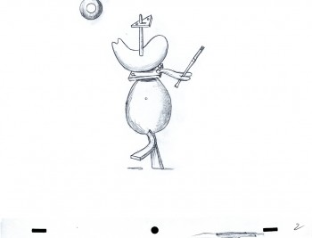
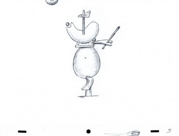
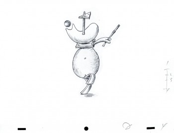
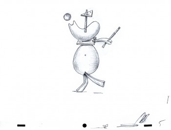
 This past week there was a program of animated work by George Griffin. He ran the show in achronological order starting with the most recent material and ending with the oldest. That show was animation. Everything in every frame (though there are no more frames) or bit of particle of George’s work and being is animation. He not only loves animation, but he is animation. It was a wonderful show to attend.
George enjoys showing the hardware and the techniques, the guts of the animated creature and the sprockets of the projector, if in fact there is a projector. His first “films” were bits and pieces live and animated. His very first piece was a filmic trick that Méliès and Blackton probably did in their first movies. George took the crumpled piece of paper in his hands and unfolded it to a crisp, new sheet of clean paper – he played the film backwards, of course, and with that, he started the show.
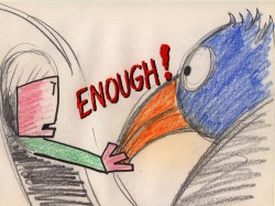 All of the films shown utilized such tricks and bits, punching and stabbing with animated games, study and punctuation. Even taking his film, Flying Fur, in which he originally took a great Scott Bradley score for an MGM cartoon and put his own visual accompaniment. Not leaving well enough alone he remade his own film with Flying Fur Fragments. This has George, himself, go into his basement and rummage through odds and ends and artwork from the original short and we see these pieces come to life in his hand with a reconstructed, rehashed version of the great Bradley score. Skips and hops, walks and chases are pulled from the original to accent the accents in the music . It’s just pure joy in early 21st Century seeing what feels like be bop animation to a wildly modern musical score written in 1944.
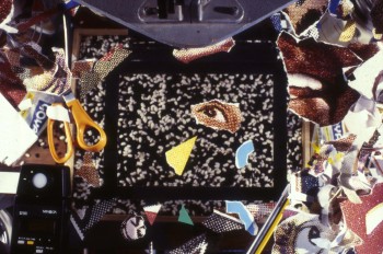 Speaking of be bop, George did just that when he animated a short homage to Charlie Parker in the film, Ko Ko. Taking a piece of music performed by ther great Parker in 1945, George visualizes every note and muscle of that great piece of music. The animator has found the heart of the music and given us all the fun in it with his very singular view of that score. This film’s a treat that can be watched over and over.
George shared a commercial he did in the style of Keith Haring, and though the animator apologized for the “bad animation” in the film, I didn’t see a bad bit in it. As a matter of fact I’ve seen about a half dozen Harings animated, and I can’t think of a better match for that graffiti artist than George and his own style.
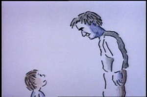 The one film that was very representational was a film he did with his daughter, Nora. It’s a very sweet movie called A Little Routine. It’s a wonderful little piece that illustrates the daily routine with the father putting the daughter to bed. George uses lots of imagery in a semi-abstract way as something so simple as escorting his daughter from the bathroom to the bedroom involves trekking over countryside terrain bringing the little girl to the safe part of the woods where she will have no worries or fears. When she wakes in the night desperate for a glass of water, we hear daad shouting miles away that he’ll bring the water and we see him making that routine trip to the bedroom to protect his little girl. It all happens in a flash, of course, something that can be done so easily in animation. The film seemed to touch many in the audience that wanted the more representational world for the break of it, and they didn’t seem in any way disappointed when we were back to sterner stuff.
George Griffin understands animation; it’s in his lifeblood and he offers it to us an any way he can: flipbooks, mutoscope, dgital refilming of 16mm, movie files or purly digital sections. He feels that there is no need for the apparatus as long as we want to get out the animated bits.
The evening was an inspiration. Thank you, George.
- Some friends and past employee/friends have been busy writing and illustrating children’s books. I thought I’d show off three of them and write a few words about them. (If you can’t promote your friends’ work, who can you promote?)
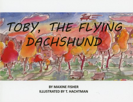
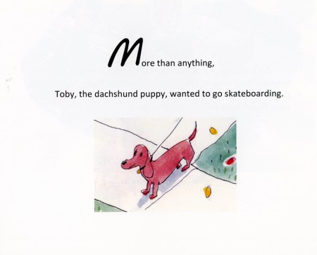
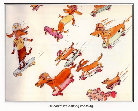
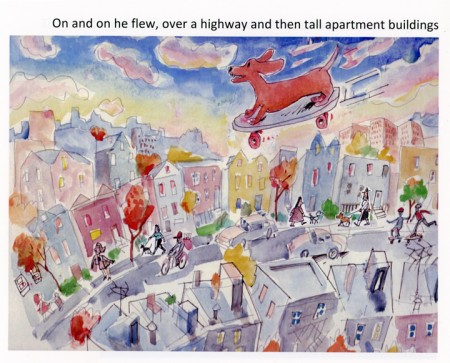
Three long-time very close friends have joined together to do a children’s book. Maxine Fisher has written most of my scripts (including POE) and she and Tom Hachtman put together a book about a dachshund. Max loves her pet, of course, and has now immortalized her in this book. Tom did the illustrations and Max’s brother, Steve (who does all those brilliant Sunday photos for me) put the book together and they self published on Lulu. That means you can buy it directly from Lulu, and I think it’s worth it. They’re still looking into Amazon, so maybe soon.
But I thought I’d post a few of the pics from the book and let you see how great it turned out. Tom wrote that he was finishing the last illustration as his yard (and eentually house) was being flooded by Hurricane Sandy.
Go to Lulu to find out more about the book.
___________________________
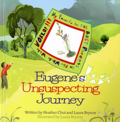
- Laura Bryson worked with me for years doing backgrounds for a number of the half hour shows (like The Red Shoes and The Marzipan Pig). Now she’s out freelancing and painting and has recently turned out her second children’s book which she co-authored and illustrated.
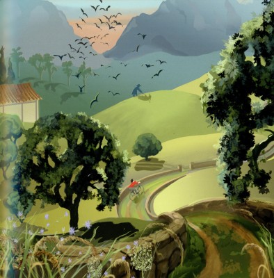
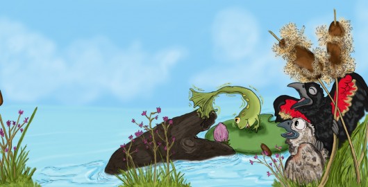
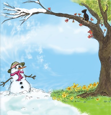
The book uses the Chinese Zodiac within the theme of the book offering Laura plenty of opportunity to paint nature and animals. The color palette is quite controlled as is the quiet story. The book can be found on Bestboypublishing.com.
Here are a few other samples from the book:
 1
1
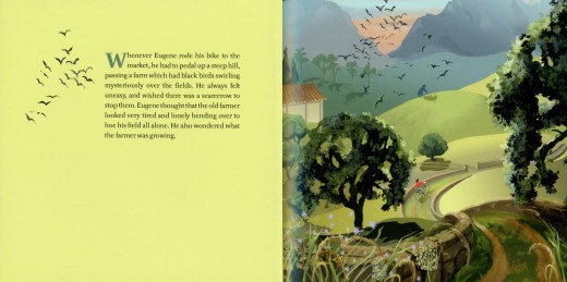
Illustrations on every other page give plenty of opportunity
of using flat colors to set up the next page.
 3
3
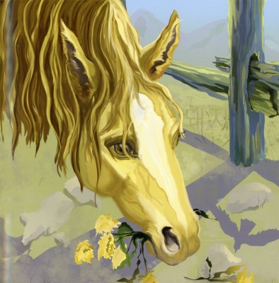
And, of course, Laura who loves her horses
makes sure to include one to illustrate.
___________________________
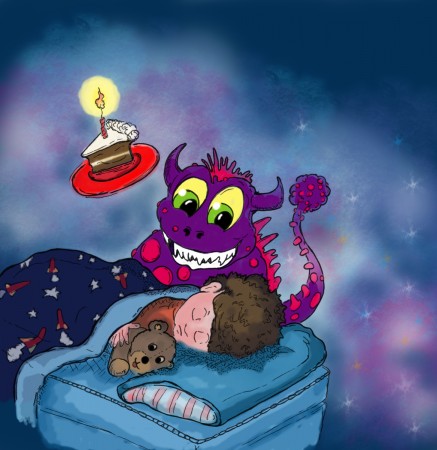
- Finally, we have Stephen Maquignon. Steve’s illustrated many books since he left animation, and each one gets more sophisticated than the last. I asked him to send me some art from a couple of books he wanted to highlight, and he did. I’ve chosen the following pieces from both books.
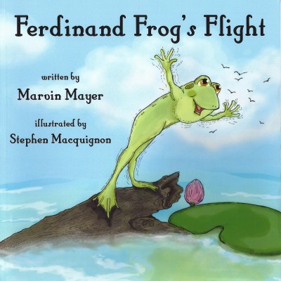 1
1
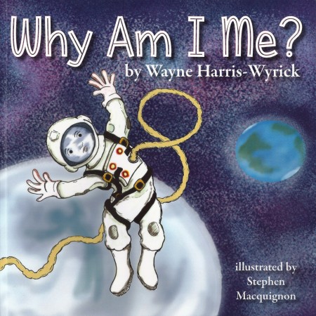 3
3
This second book, Why Am I Me? seems very clever. Steve wrote the following about the book:
When I read this one I could not see one main character in it, a big question, and
I thought it deserved many voices so each time the question why am i me pops up
I put in a different kid in a different situation.
Kind like the ride at Disney world “It’s a small world after all”
Stephen has a number of sites on which you can see more of his artwork and order copies of his books if you’d like to:
This is a link to his bio page on amazon it shows all the books he illustrated.
likewise Barnes & Noble
This is his primary personal site as a Children’s Book Illustrator
Animation &Books 21 Jan 2013 08:37 am
Heath Book – 6
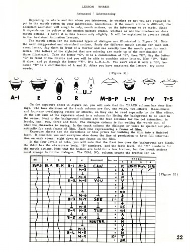
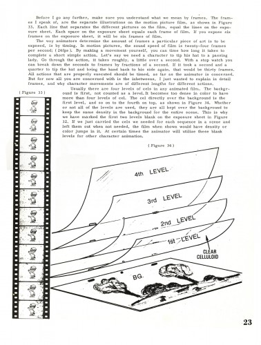
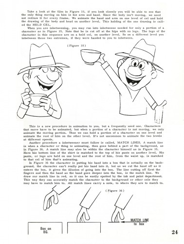
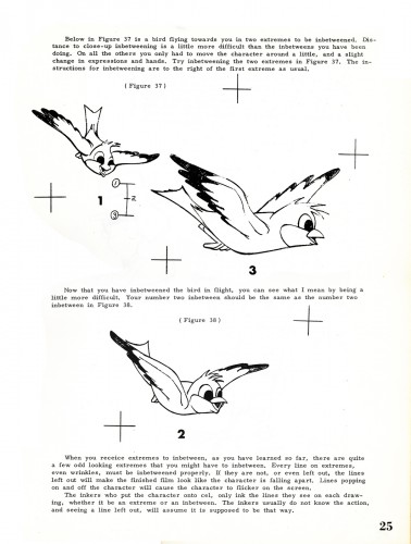
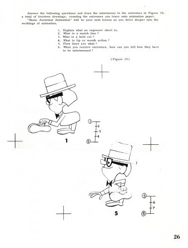
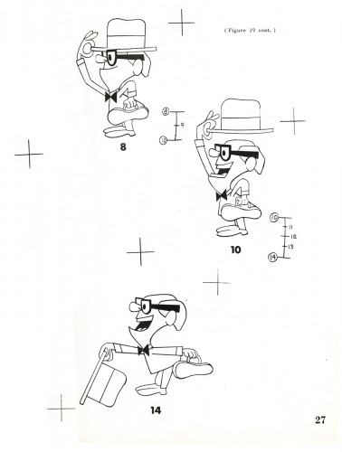
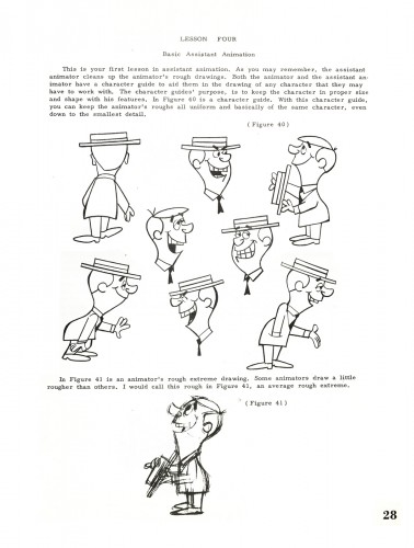
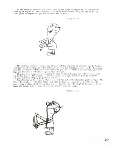
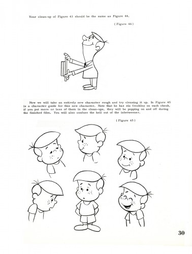
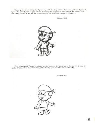
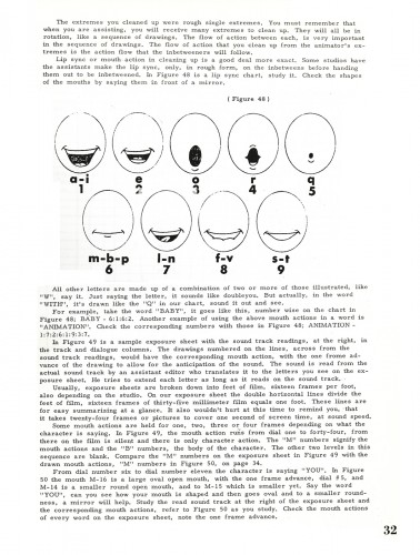
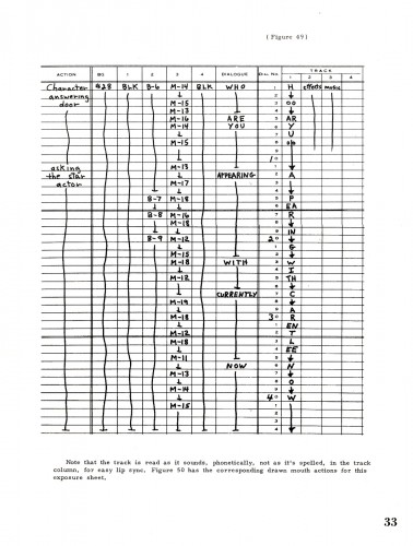
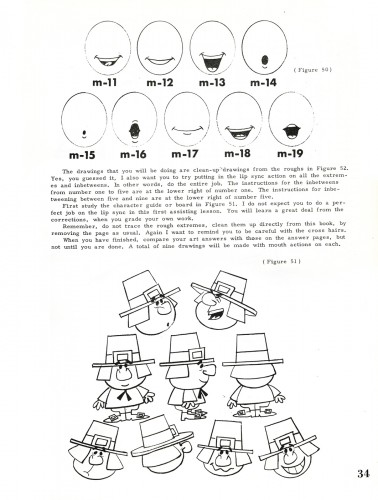
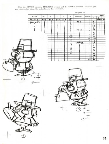
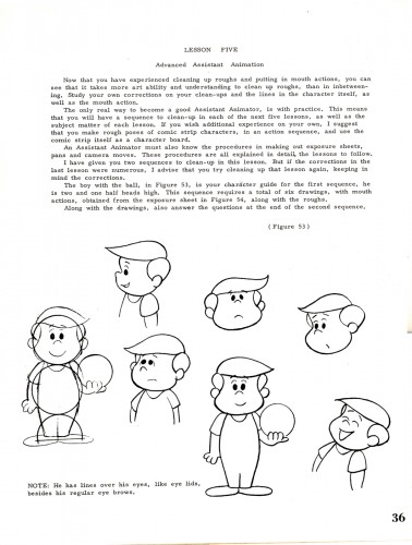
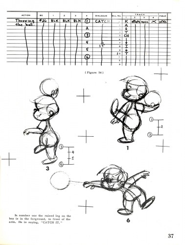
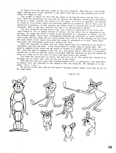
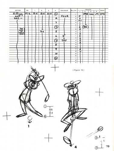
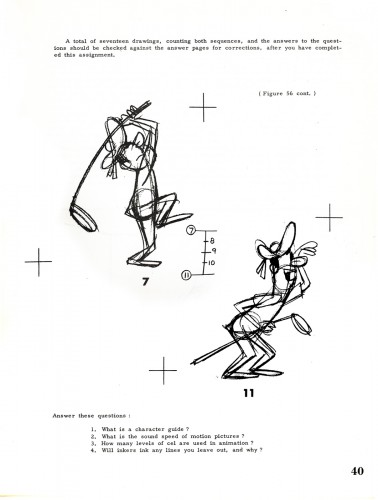
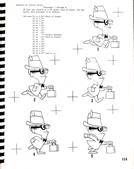
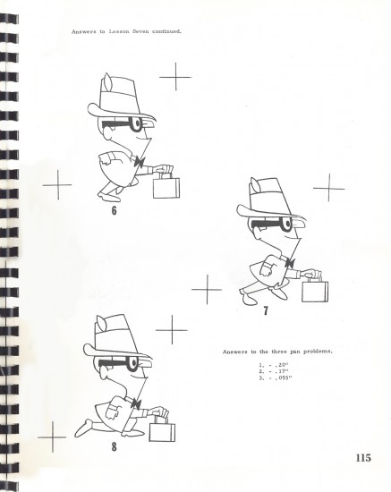
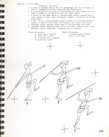
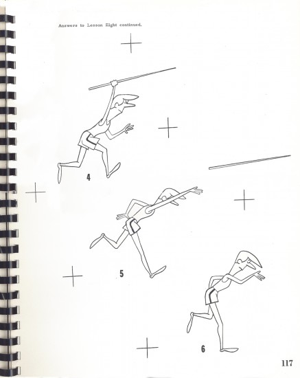
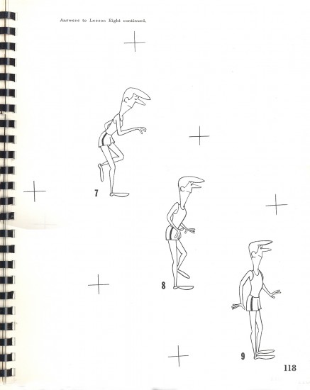
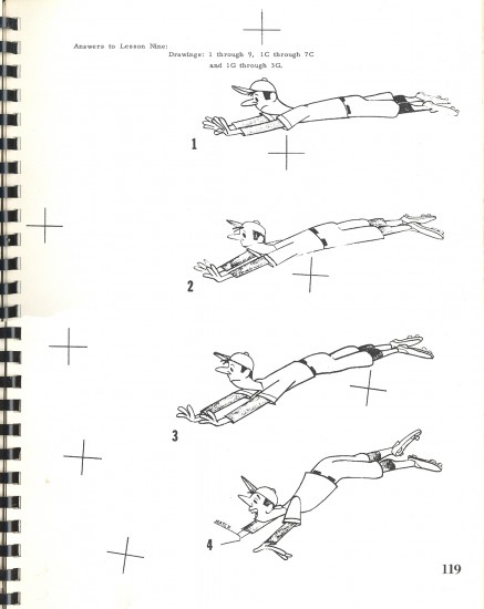
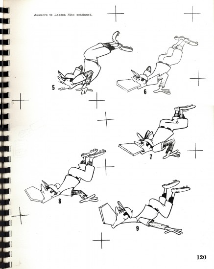
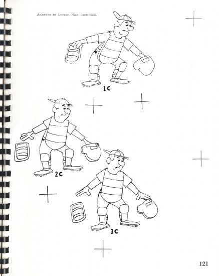
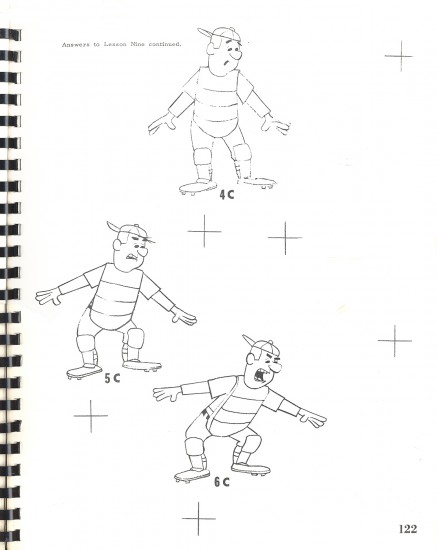
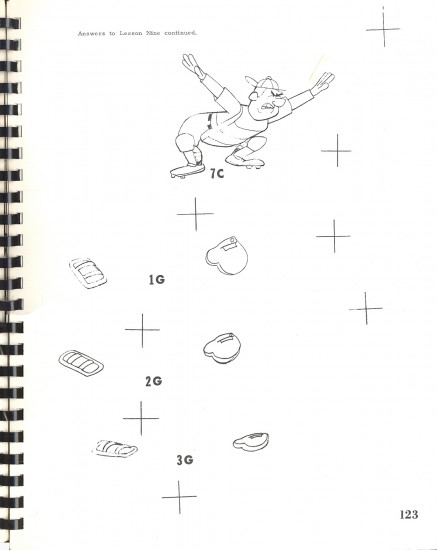
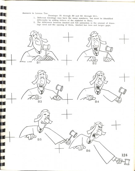
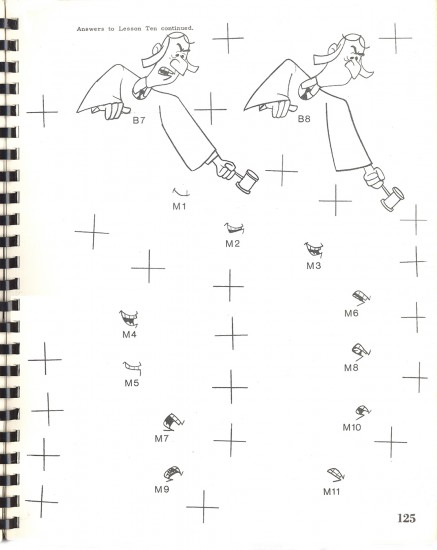
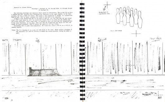
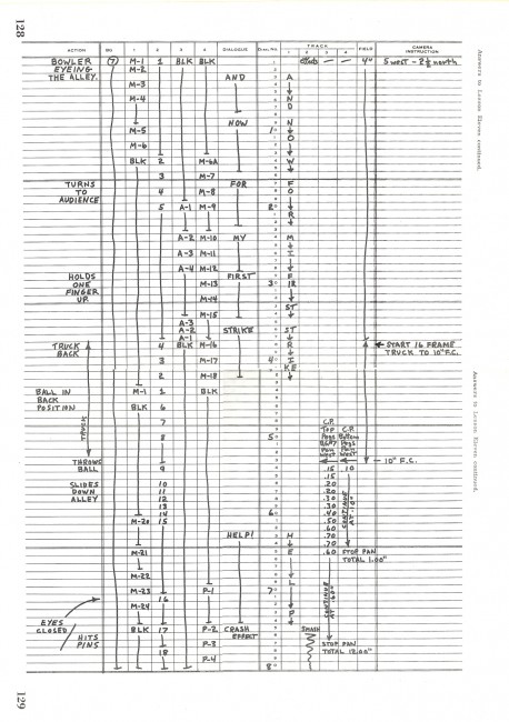
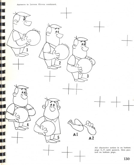
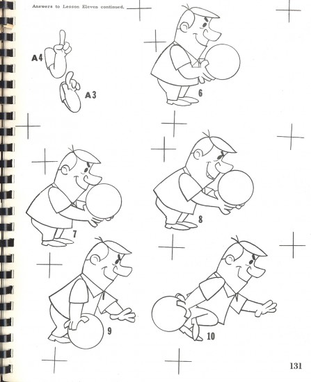
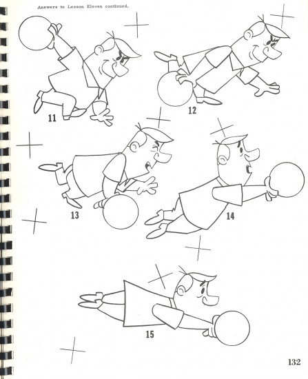
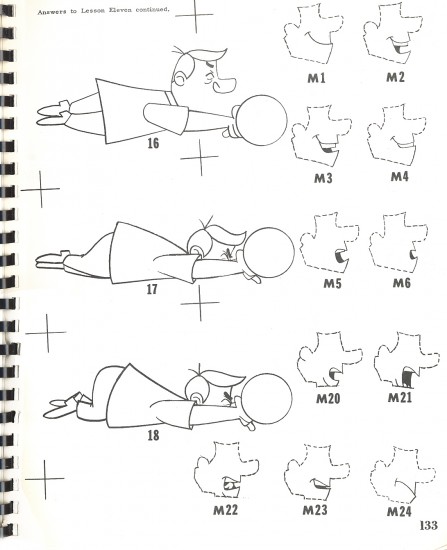
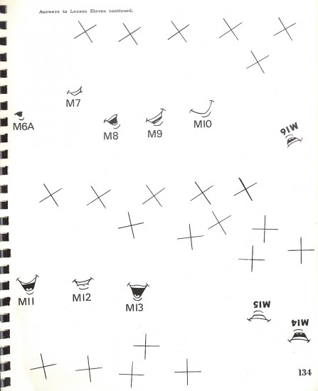
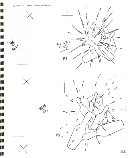
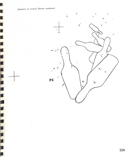
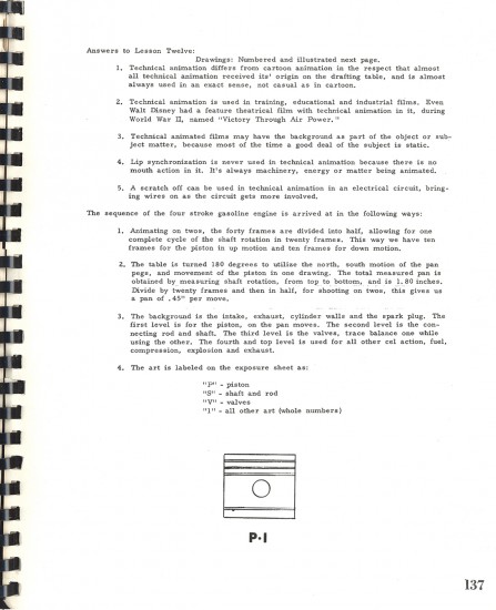
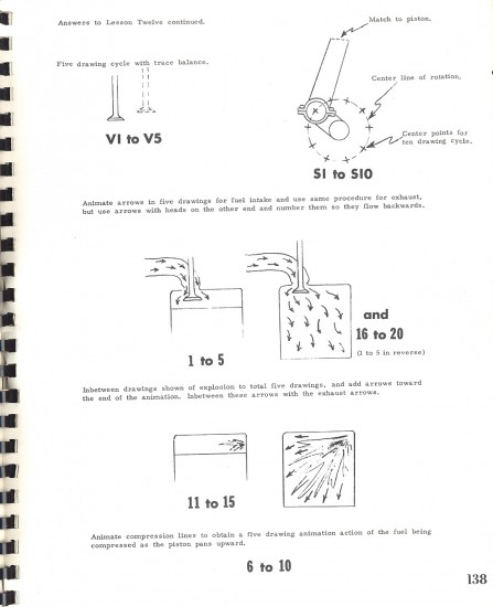
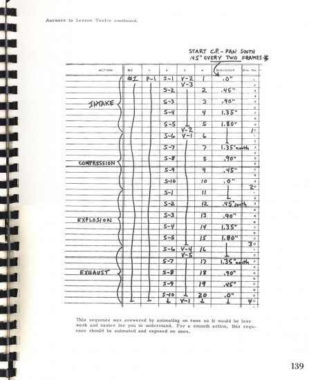
- Here is the remainder of the Heath Book. This is a book that was written by Tony Creazzo, one of New York’s finer Assistant Animators and Bob Heath, a cameraman. Together they made an odd couple to author such a book. Yet, there’s no doubt that this material is first rate and there’s a lot to learn from the book they’ve given us. Originally, I thought the book looked too basic to be of interest, but the more I got into it, the more I realized how solidly constructed it is.
There are a few more pages of “Glossary and Terms” used in animation and for this book. It’s a lot of work scanning this oversized book and reconstructing it in photoshop. Since I don’t have the patience, I’m skipping these final few pages.
I learned that you can still buy the book on Amazon, which is quite amazing to me, but I’m glad to see it available if you look hard enough. I’d suggest buying a copy to include in your library, if you don’t already own it, before it’s completely out of print and very expensive.
If you want to see the remainder of the book you can go to these posts go here for: part 1, part 2, part 3, 4, 5.
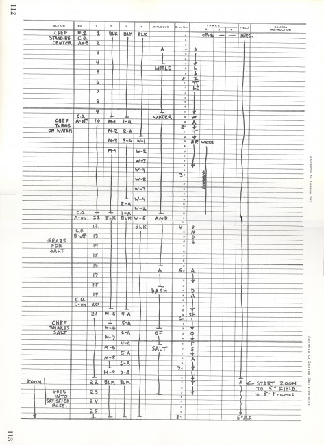 112-113
Animation &Animation Artifacts &Disney &Layout & Design &Models 20 Jan 2013 08:58 am
Whopee – recap
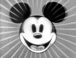
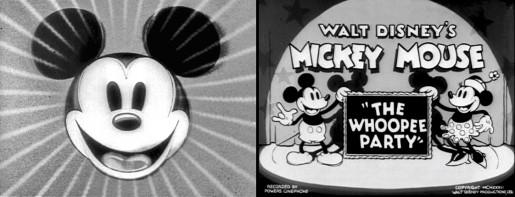
- Before there was video tape (which means before there were dvds), there was only 16mm film that you could project in your own home. I had (and still have) a nice collection of decaying movies and used to show these often. One of the regulars to show and watch and laugh at was the great Mickey short, The Whoopee Party. Everyone loved this short, no matter how many times we watched it. It’s a great film!
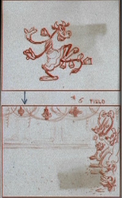
This encouraged me to watch it again on the B&W Mickey dvd I have. So I couldn’t help but jump for joy over the story sketches they include in the extras. Why not post them? So here they are – sketches from the limited storyboard they produced. I’ve also interspersed frame grabs from the film so you can compare images.
________________________(Click any image to enlarge.)
 13
13
Animation &Art Art 13 Jan 2013 06:58 am
Ken Brown’s TekServe
- Two of my favorite friends in the NY animation community are Lisa Crafts and Ken Brown. These two guys spend a lifetime making art and making art of animation (among other media). They both have different ways of doing it and they both have an simpatico art that supports the other. It’s a treasure just to visit them.
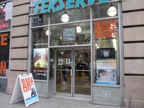
Ken, this weekend, opened an art exhibit. It was at your typical gallery; it was at a Mac service center. A big sales shop of a place with monitors, printers, laptops and other hardware all about the art. I went yesterday to this opening and brought my camera to give you an idea of what was going on.
 1
1This is TekServe. It’s a hardware store that’s focused on all things Apple.
Everyone who’s into Apple and mac and computers knows TekServe on 23rd St.
 2
2
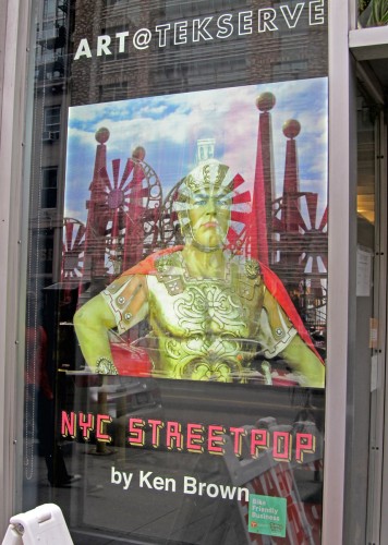
Get closer to the window and see the poster promoting a new
art exhibit of the work of genius/friend, Ken Brown.
 3
3
When you’re in the store, it is just a store.
It took me a while to be convinced that the art was everywhere.
I had to open my eyes and take a couple of good looks.
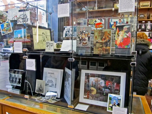 4
4
Right inside the front door are some plastic cubes full of stuff pulsing
from the mind of Mr. Brown. Great to peer through these miniature things.
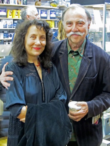 5
5
Here they are, Lisa and Ken, the dynamic duo.
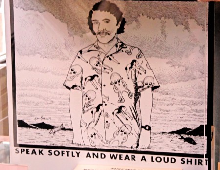 6
6
This is a very old post card of Ken’s sitting in those cubes up front.
I used to own a bunch of them, but mailed them out to get my friends to smile.
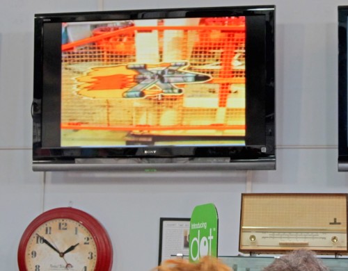 7
7
Throughout the store tere were plenty of video monitors playing Brown films.
 8
8
From live action to video cartoons. Lots of variety plays for you.
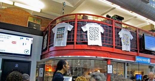
Meanwhile, T-shirts hang frm the rafters and float all about you.
Lots of these are collector’s items and are no longer available.
Bt you can look.
 10
10
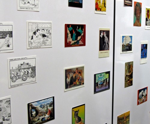
There were walls of pixpop post cards.
A good way to pull a smile in the middle of the afternoon.
 12
12
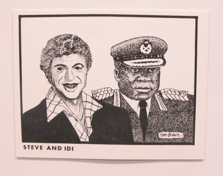
No, it’s not Steve and Edie but Chuck and Candy.
That’s Candy Kugel and Chuck Hunnewell, her husband.
 13
13
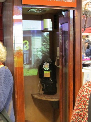
One of the hits of the exhibit was the phone booth. Projections
were going on within, and they got attention from the crowds.
 14
14
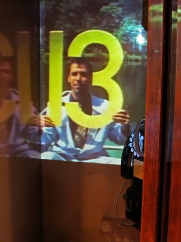
Another shot of the same.
He’s not live; he’s memorex.
The phone booth is live.
 15
15
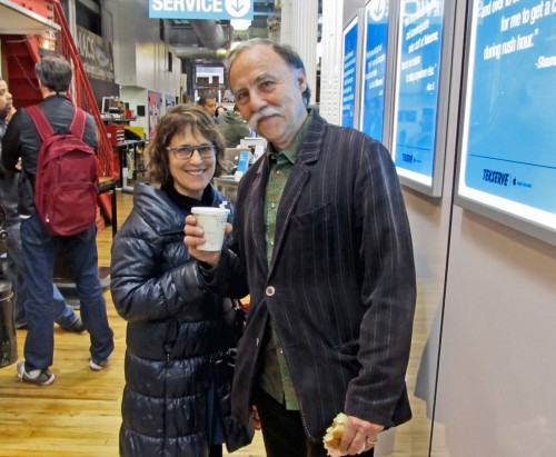
That’s animator, Debra Solomon with
artist of the day, Ken Brown.
 16
16
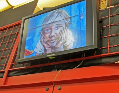
Video projections were at all levels and moods.
 17
17
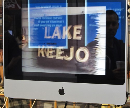
And they were everywhere you looked.
Truly MULTI – media.
 18
18
and A-OK T-shirts that are now collector’s items.
 19
19
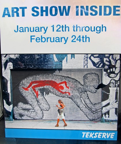
The poster for the exhibit,
in the store window,
said it all.
TekServe is at 119 West 23rd Street
The exhibit runs Saturday, January 12th through Sunday, February 24th
hours: Mon – Fri 9am to 8pm; Sat & Sun noon to 6pm
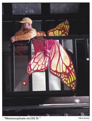
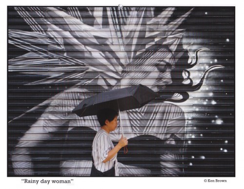
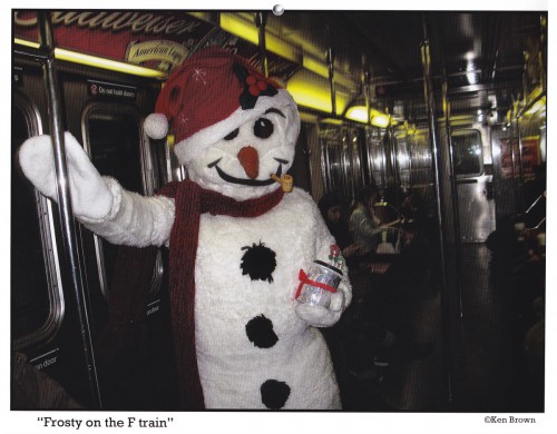
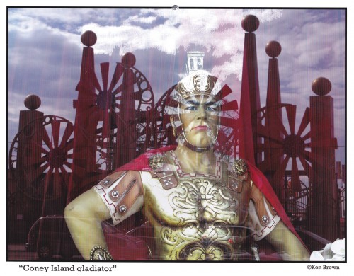
At the door, TekServe passed out a free calandar of Ken Brown’s pictures.
Here are a couple of the images from that publication:
July
Animation &Animation Artifacts &Independent Animation &walk cycle 03 Jan 2013 07:58 am
Picasso
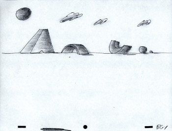
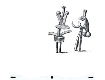
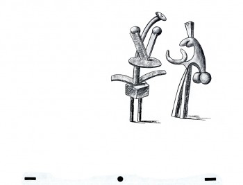
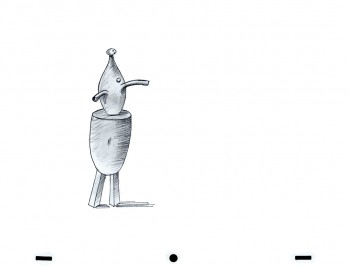
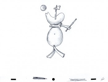
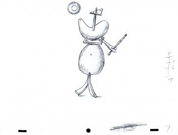
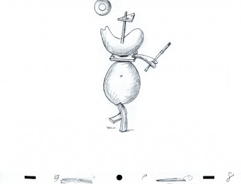
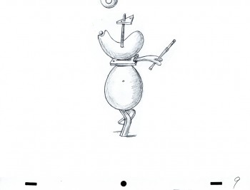
- When you run a studio in New York, and you’re an animator, there’s a good likelihood that at the quiet moments when work is slow, you’ll be working on your own bit of animation. Whether it’s a short film or a test of something you’ve always imagined animating, it’s hard not to keep pencil to paper (or stylus from the Cintiq.) Vinnie Cafarelli was just such a creature. After seeing a show of Picasso’s works he took the flier and started animating the image Picasso had done. It never got to completion; those were the days of the expensive cameraman and laborious cel process. But I can take Vinnie’s work and finish it in AfterEffects and Photoshop. Here’s my exosure of his basic animation. No X-Sheets were left behind. Here’s the art; here’s the QT movie.
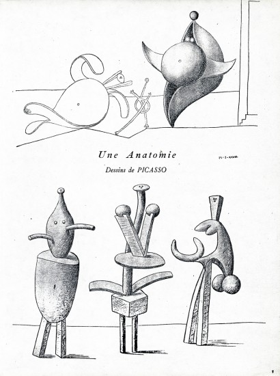
This is the original flyer that got Vinnie going.
He built all his animation up from this printed piece.
The “character” drawings follow:
The following QT movie was made of the
drawings above. Since there were no X-Sheets
For better or worse, I came up with the timing, myself.
Animation &Animation Artifacts &commercial animation &Independent Animation 26 Dec 2012 07:57 am
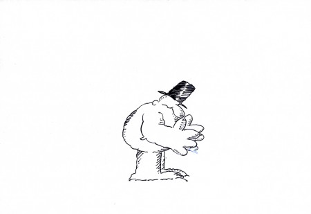
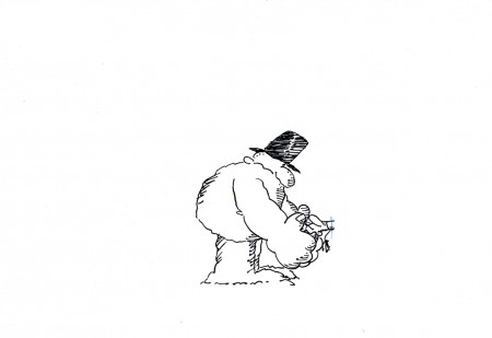
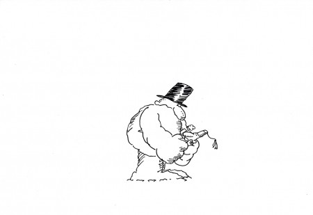
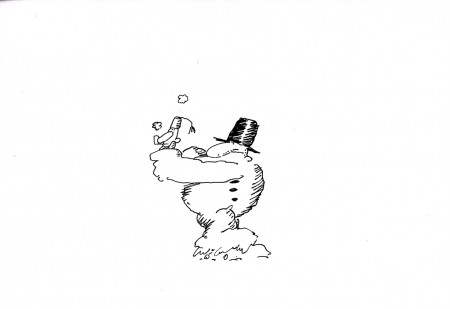
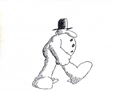
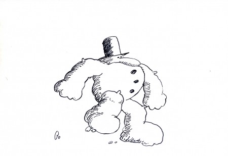
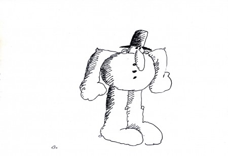
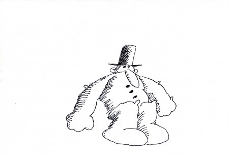
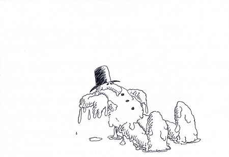
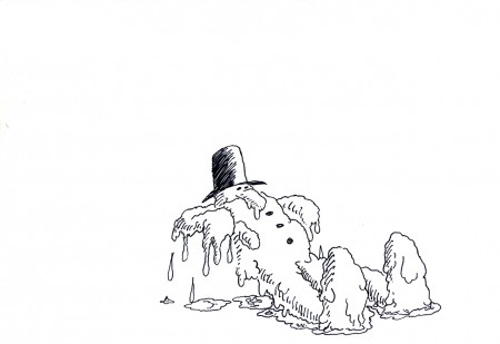
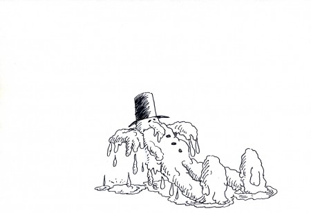
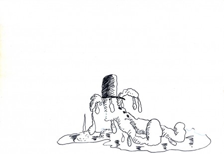
Len Glasser’s – “Snowman”
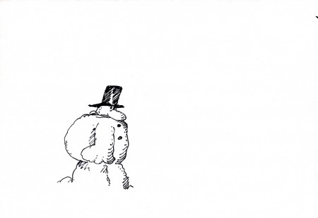
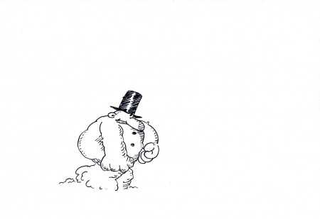
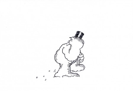
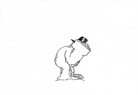
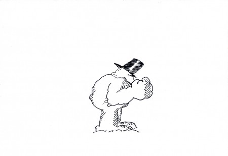
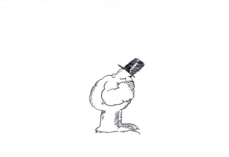
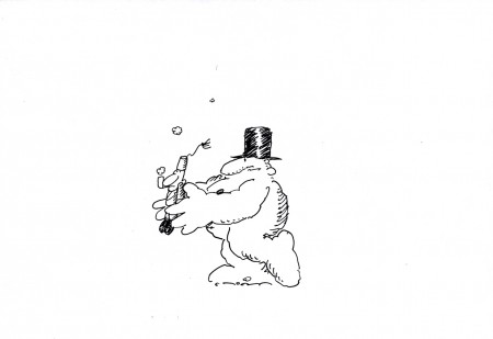
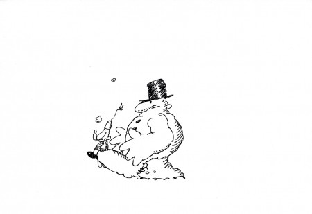
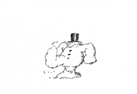
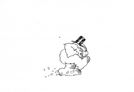
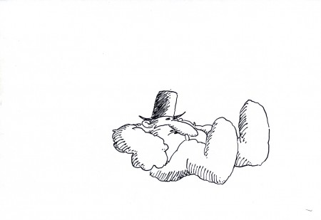
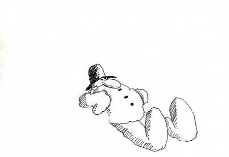
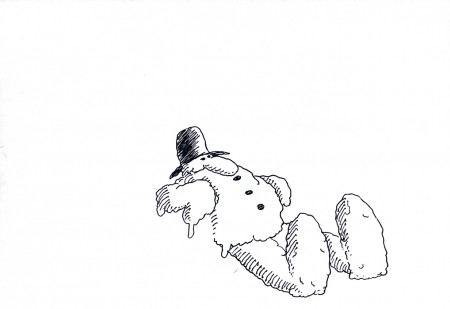
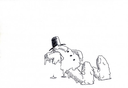
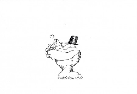
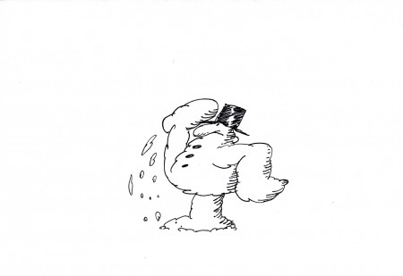
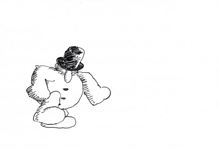
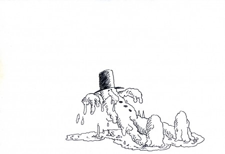
- Len Glasser had designed a number of pieces for Perpetual Motion Pictures. I wrote last week about two pieces that were designed and work was done on a job for CBS and their weather division. Ed Smith animated the originals which were killed and never aired. At some point a couple of years back, Vince Cafarelli built a miini-film out of what they had done. He animated anything they needed to complete this one flm. It’s built on a snowman that comes to life; the film was taken to its conclusion, but nothing was done with it beyond that. (I’ve suggested that they make an animated Christmas card out of it and send it out to everyone. It’s certainly entertaining enough.)
I’ll post every other one of the animated drawings here so you can see the animation and accompany them with the final QT movie of the piece. It should make a nice little post.
Here are the drawings predominantly animated by Ed Smith directly in pen onto paper. The drawings were xeroxed and/or inked onto cel, colored and shot traditionally. Here are the paper drawings with one or two odd comments added. Rick Broas helped Vince complete it.
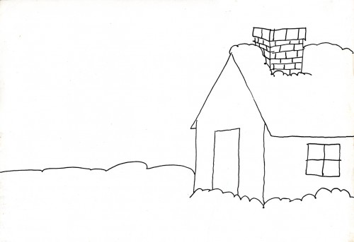
The Background to scene 1
 19
19
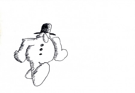
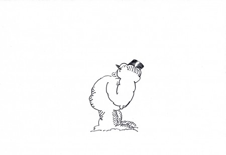
This is part of a cycle of the snowman banging
on the door of the house. (see the QT movie)
 29
29
This is the best look we get (on this animation level)
of the character the Snowman terrorizes.
 37
37
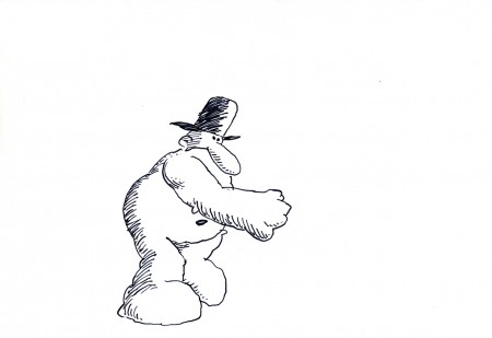
Wth this drawing the kicked guy moves
to another level as he fles into the distance.
 44
44
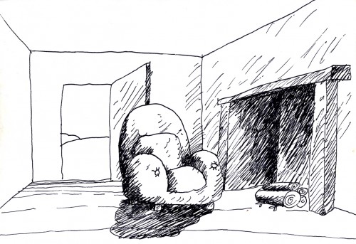
This even-numbered drawing is where the second scene,
the interior, begins. So I included it to the group.
 69
69
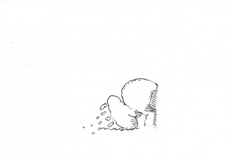
I like how the snowman, having fallen in front of
the fireplace begins to melt on the floor.
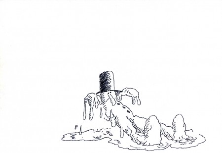 71
71
He falls back, naturally, and then comes up toward us as he
starts to melt. This little accent by Vince, in animating him . . .
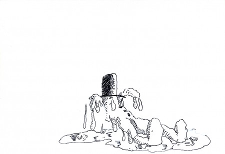 73
73
. . . seems to signal that, for the first time, the snowman
has found a release and can now be happy.
The End
_________________________
The final mini-movie
(I looped it. It could have used a hold at the end before starting over.)
Animation &Animation Artifacts &commercial animation &Layout & Design &Models 19 Dec 2012 07:48 am
Len Glasser’s “Rainman”
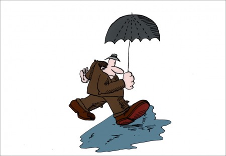
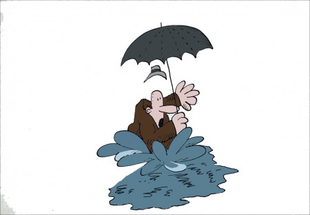
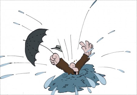
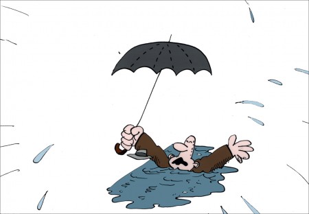
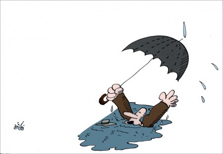
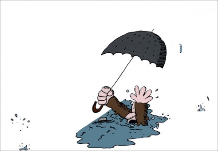
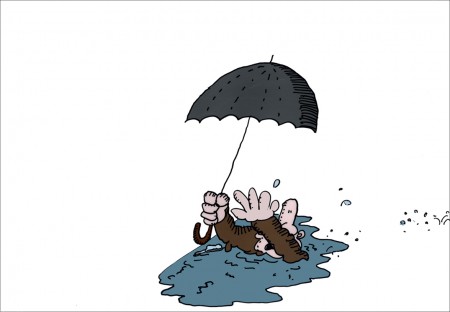
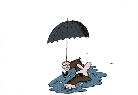
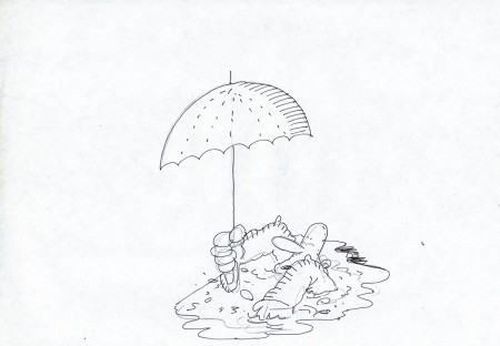
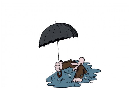
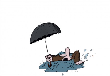
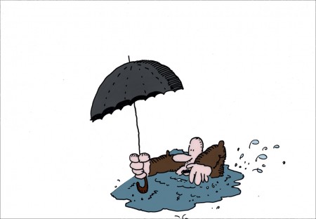
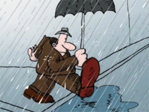 - In 1976 at Perpetual Motion Pictures, Len Glasser designed a series of spots for CBS and their weather service. Models and animation was done (Ed Smith did the original animation.) These short spots were obviously funny, but they were killed, just the same. Never completed and never aired. Two segments of these have remained. One, the “Snowman” spot was picked up by Vince Cafarelli a couple of years back and, reworked with Rick Broas assisting him. They extended the piece a bit and made a short short film. The film was colored on cels and a quick soundtrack was put together. There was also another film which didn’t make it quite as far; it dealt with rain. I’ve finished up the art that exists for that one as best I could and have run it through the AfterEffects mill.
This week features that second spot, the one I’ve been calling “Rainman” – really it’s just a short gag that was never completed. Most of it is on cel, though I had to force a Bg out of a layout that I discovered, and I colored it. I’m sure this is not how Mr. Glasser would have seen the color, but I just wanted to highlight the limited bit of animation that is there. The same is true of the rain which he probably would have left black line with black, inked drops. I put some white into the rain to give a bit less of a focus on it.
Two of the animation cels weren’t painted, so I took the drawings that were there, they look like Ed Smith’s drawings, done in ink on animation bond. I painted them for the final QT I produced. As I say this is just an animation fragment with barely a beginning and no end. It’s all middle. However, I thought it interesting.
Even more interesting and very much more complete, is the “Snowman” spot which I will feature next week.
Here are the “Rainman” cels & drawings:
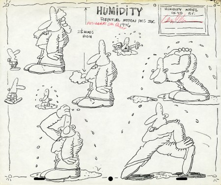
Early model sheet by Len Glasser ____________________
The following QT movie was made reworking the art a bit,
coloring some of the artwork that wasn’t completed and
exposing it as I saw fit. There was nothing to go by.
This is just a fragment of a scene.
The rain colors and the BG colors are my choices.
I can’t say Len Glasser would approve. My only
concern was getting all the animation to read – rain & guy.
Next week’s spot is better. It has a laugh to it.
Animation &Books &Daily post 10 Dec 2012 06:58 am
Heath Book – 2
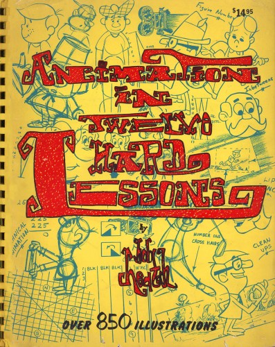 - Last week I posted the first twenty pages of the Heath book, Animation in 12 Hard Lessons.
As I mentioned back then, this book was always for sale in the back of animation magazines and film articles about animation. Not only did they sell the book by Bob Heath and Tony Creazzo, but they offered a lot of equipment, somewhat similar to Cartoon Colour. Paper, cel vinyl and portable drawing tables were all available through Heath.
I never really had the chance top go through the book, though I always had a curiosity about it. I had come across Tony Crazzo’s work. He was the assistant to Vinnie Bell, one of my favorite animators on the East Coast. I have to say, I loved his work on the Letterman series that I coordinated for the Hubley studio. I never did get to meet, or even speak with him though. Vinnie used to bring in his own work, already beautifully assisted in a strong and juicy line.
So here at Buzzco is a copy of the book. I can’t help but share the piece with you, knowing that it’s not for sale on the market anymore. At least I haven’t seen it out there in quite some time.
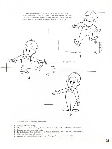
Here’s part 2:
 21
21
Animation &John Canemaker &SpornFilms 09 Dec 2012 06:04 am
WOTY recap
- Back in Jan 2007, I posted these photos from the animation production of Woman of the Year. I recently was talking about choreography, and I thought that there was one whole style of choreography wrapped up in the work of Tony Charmoli. It made me want to look back on the work I did with him, and I think these pictures are interesting enough that they’re worth revisiting. So here, again, is that post:
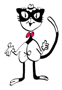 – To recap:
Woman of the Year was a project that came to me in the very start of my studio’s life – 1981.
Tony Walton, the enormously talented and fine designer, had gone to Richard Williams in search of a potential animator for WOTY (as we got to call the name of the show.) Dick recommended me. But before doing WOTY, there were some title segments needed for Prince of the City, a Sidney Lumet film. (I discussed that film in this post.)
Tony Walton designed the character, Katz, which would be the alter-ego of the show’s cartoonist hero, played by Harry Guardino. Through Katz, we’d learn about the problems of a relationship with a media star, played by Lauren Bacall.
It turned out to be a very intense production. Three minutes of animation turned into twelve as each segment was more successful than the last.
______________________________________________(All images enlarge by clicking.)
There was no time for pencil tests. I had to run
to Boston weekly, where the show was in try-outs, to project different segments; 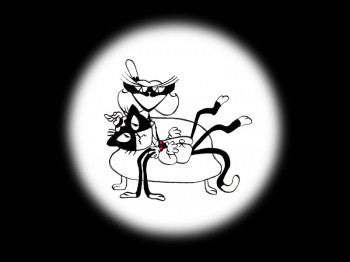 these went into the show that night – usually Wednesdays. I’d rush to the lab to get the dailies, speed to the editor, Sy Fried, to synch them up to a click track that was pre-recorded, then race to the airport to fly to the show for my first screening. Any animation blips would have to be corrected on Thursdays.
There was a small crew working out of a tiny east 32nd Street apartment. This was Dick Williams’ apartment in NY. He was rarely here, and when he did stay in NY, he didn’t stay at the apartment. He asked me to use it as my studio and to make sure the rent was paid on time and the mail was collected. Since we had to work crazy hours, it was a surprise one Saturday morning to find that I’d awakened elderly Jazz great, Max Kaminsky, who Dick had also loaned the apartment. Embarrassed, I ultimately moved to a larger studio – my own – shortly thereafter.
Here are a couple of photos of some of us working:
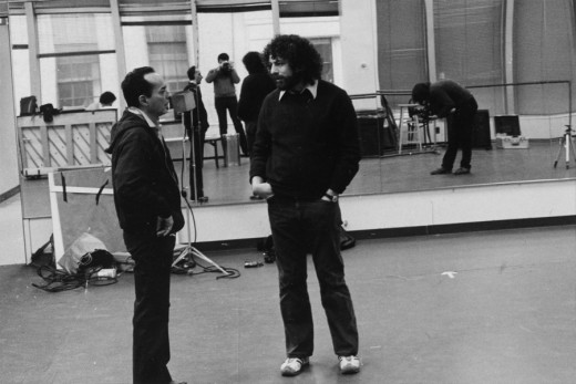
Tony Charmoli was the show’s choreographer. He worked with me in plotting out the big dance number – a duet between Harry Guardino and our cartoon character. I think this is the only time on Broadway that a cartoon character spoke and sang with a live actor on stage. John Canemaker is taking this photograph and Phillip Schopper is setting up the 16mm camera.
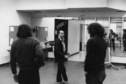
Here Tony Charmoli shows us how to do a dance step. Phillip Schopper, who is filming Tony, figures out how to set up his camera. We used Tony’s dancing as reference, but our animation moves were too broad for anyone to have thought they might have been rotoscoped.
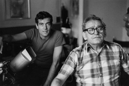
John Canemaker is working with Sy Fried, our editor. John did principal animation with me on the big number in the big ke segment. Here they’re working with the click track and the live footage of Tony Charmoli to plot out the moves.
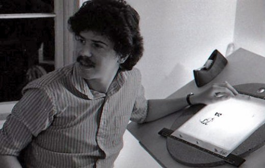
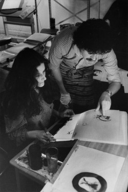
Steve Parton supervised the ink and paint. To get the sharpest lines, we inked on cels and didn’t color the drawings. It was B&W with a bright red bowtie. A spotlight matte over the character, bottom-lit on camera by Gary Becker.
 5
5 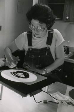 6
6
5. Steve Parton works with painter Barbara Samuels
6. Joey Epstein paints with fire in her eyes.
 8
8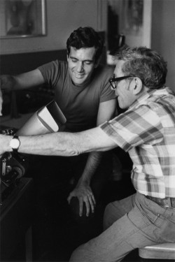 9
9
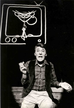
8. Harry Guardino on stage with the creation of “Tessie Kat” developing on screen behind him. This was Harry’s first big solo.
9. John Canemaker gets to see some of his animation with Sy Fried, editor.
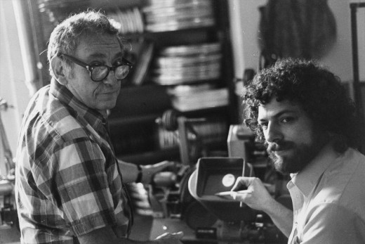
One of my quick stops from the lab on the way to Boston? No, I think this is a posed photo.
The success of the animation (including good reviews) posed a small problem for me. The rest of the show was ripped over the coals. When I started using some quotes about me in industrial ads, the producers came down on me for gloating over the others who’d gotten negative reviews.
All the same, it was a real learning experience in a big Broadway kinda way.
Action Analysis &Animation &Books &Commentary 06 Dec 2012 07:03 am
The McKimson Brothers
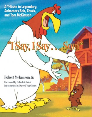 I Say, I Say . . . Son! This is the title of a book by Robert McKimson Jr. Any ideas what it might be about?
Sound anything like Foghorn Leghorn?
Yes, it’s a tribute to Bob McKimson with a big nod to Chuck and Tom McKimson, as well. This, to me, is something of a feat in its own right. The book is a workhorse of a picture book with lots of valuable images that you haven’t seen before. It’s not like the big glamour picture books that come out of Disney or Dreamworks. The Art of Whatever. It’s not one of those heavyweight oversized books that cause coffee table legs to bowl outward under their weight. No, this is a go to book on good paper; it’s solid. There are lots of drawings and photographs, frame grabs, newspaper clippings, and posters. Just looking at the pictures will give you a pretty good idea of the story the book is telling.
And it’s a valuable story – the part of the jigsaw puzzle that’s been left missing.
There have been about a half dozen books by and about Chuck Jones, one enormously expensive tome on Friz Freleng with lots of key references to him in most animation histories. Bob Clampett did a lot to promote himself; he gave us films and videos, not books. There are at least three Tex Avery books. This is the first on Robert McKimson – the other Warner’s director. And it was written by his son.
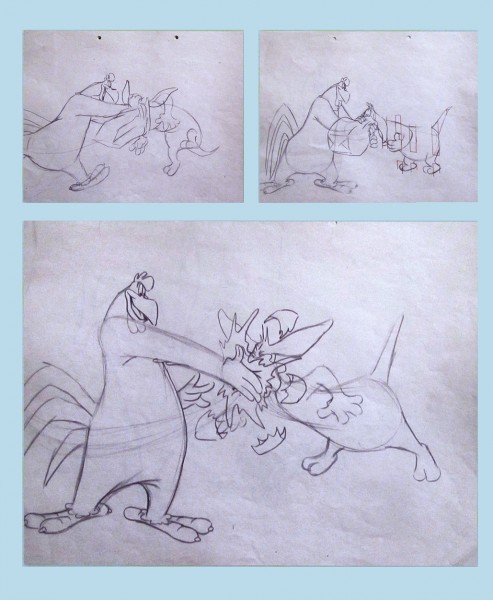
McKimson was loved by Leon Schlesinger who tried to make him a director early on. Yet, Bob didn’t feel that he was ready. He became the head of all animators in the studio, responsible for solidifying the style of all the different variations of the characters. He helped tie Jones’ Bugs Bunny to Freleng’s or Clampett’s Porky Pig to Tashlin’s. When Schlesinger sold the studio in 1944 and Eddie Selzer took charge, McKimson pushed himself into the directorial position, and he gave us meat and potatoes films with characters that were all his: Foghorn Leghorn, the Tasmanian Devil, Sylvester Jr., and some of the Speedy Gonzales work.
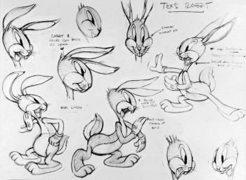 Before reading this book I was certainly well aware of Bob McKimson‘s work, and I was not quite as familiar with the other McKimson brothers. I’m not sure much has changed about that. As an animator Bob McKimson was brilliant, but as a director I never quite saw the lyricism that we saw in some of his best animation. McKimson was the Milt Kahl of the WB studios. He could draw like dynamite and knew every trick in the
 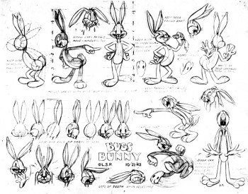 service of giving the tightest, sharpest animation possible. When you look at his scenes you’ll see beautifully drawn animation with solid timing and a muscular approach. Go to an extreme and take the pose as far as you can, and then go farther still, and then go even farther still. Bob not only did that, but his brilliant draftsmanship held the characters together in those unrelenting poses. It was near miraculous how _____2 of many Bugs model sheets drawn by Bob McKimson
he pulled that off. Animators
like Rod Scribner or Jim Tyer would go as far as he did, but their drawings blew up into funny. Bob’s artwork just got more solid. Bobe Cannon was probably the only other person at WB that could match him for drawing ability. Even still Cannon would purposefully distort his drawings more than McKimson would. Bobe was interested in the 20th Century Art, Bob was interested in the artistry.
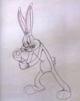 As may be obvious, I’m not the greatest enthusiast when it comes to Bob’s direction. It all shows so little panache that I must say I’ve easily dismissed it. The work is just that, a solid bit of work. The backgrounds are cartoon realistic. No flair the way you’d find in Maurice Noble‘s art, no personality as in Paul Julian‘s paintings. Dick Thomas, Cornett Wood and Robert Gribbroek did most of the design and background painting. All of the effort was put into the animation and little concentration seemed to focus on the design of the films. I can remember Mike Barrier talking about McKimson’s work. His layouts and the stacks of animation drawings that came from his cartoons far outweighed the piles of art from work by the other directors. Jones’ impeccable poses, Freleng’s exquisite timing. McKimson worked the funny into his cartoons and he got the same from his animators. He used drawings and more drawings. The style came from good, hard solid work, not timing or poetry.
There are all those stories about Rod Scribner and his wildly artistic period under Clampett. He was a different guy under McKimson. It’s hard to see the same animator in the two different phases. There’s pure delight in the animation under Clampett and solid workmanlike craft under McKimson. No doubt this was also because Clampett probably was off leaving Scribner on his own to do what he wanted. McKimson kept Scribner under his thumb and, in my opinion, didn’t get that great and wild personality that had been available. As a matter of fact, I suspect this was true of all the artists McKimson controlled. It probably worked well with the two brothers, Chuck working under Bob’s direction, but I’m not convinced it was the best way for most artists to work.
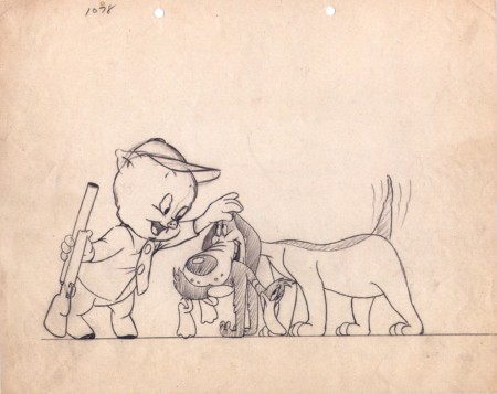
A Bob McKimson Layout for “daffy Duck Hunt” (1949)
For this book, there can be no doubt that a major source of information had to have been Mike Barrier‘s excellent interview with McKimson. (Go here if you want to read that – and you should have already read it.***) I’m afraid there is no interview with Tom or Chuck McKimson readily available. I would have liked to see more of them in this book. Toward the end of the book, we see roughs and stills from the illustration work the two have done for comics and coloring books. Robert McKimson certainly dominates the bulk of this volume.
It is the visual materials available here that shows the real value of the book and makes it important to own. For anyone who recognizes the importance of WB cartoons and wants the whole picture recognized this is the reason for this book. The artwork. There are some beautiful early drawings printed, especially, the pages of clean-roughs done by Bob that were animated by Tom. Excellent poses once again from Bob with no sign of Chuck’s drawing. Again, it’s only toward the end, when we get into the comic books and other print material, that we see some of Chuck and Tom’s artwork. These are definitely not up to that of Bob’s drawing, but if the focus is to be on all three, we need to see all three on display.
I appreciated the photos throughout as well as a reprint of the few articles about any and all of the brothers. Perhaps more of an analsis from the author about the variance from one artist to another. Despite their being brothers, they do have very different talents and we can see, despite the limited amount of art from Tom & Chuck, that Bob was the obviously the strongest draftsman of the three, but there for the lack of drawings goes this book.
Regardless, I’m glad to have what I do have. The excellent WB art of Bob McKimson and the familiar comic book covers of Tom. Both broght back memories of differing kinds. Chuck, he was the animator, he worked within his brother’s unit at WB, and there isn’t much sign of his drawing. But the films are there, and we can enjoy those films and the talent that went onto their making. I wonder if ever there were a conversation or a statement by Bob about his brothers’ work. Perhaps someday, that curtain will be opened a bit more. Until then, I’m grateful for this book.
*** Actually if you want to go the heart of animation history just go through Mike Barrier‘s archives and interviews, and you’ll have a good solid base. Take a tour of MichaelBarrier.com. Spend a lot of time there.} Perhaps someday we’ll get Mike Barrier’s article about the three brothers. Maybe a review of this book will bring him out on the subject.
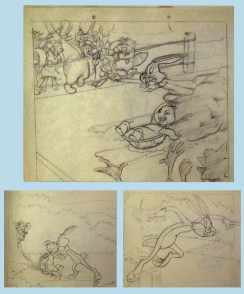
Bugs Bunny and the Tortoise
Some roughs for a 1948 book by Bob McKimson.
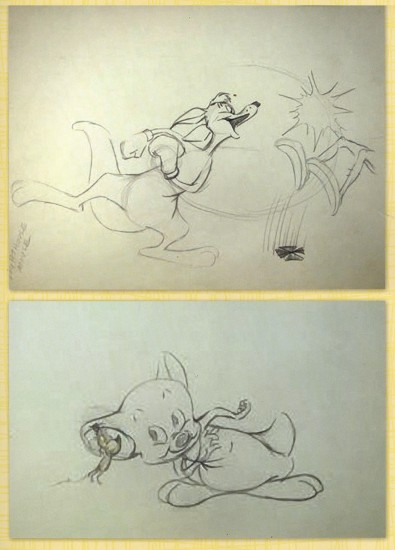
Top – Layout for “Hippity Hopper” (1949) Bob McKimson
Bot – Layout for “Lighthouse Mouse” (1955) Bob McKimson
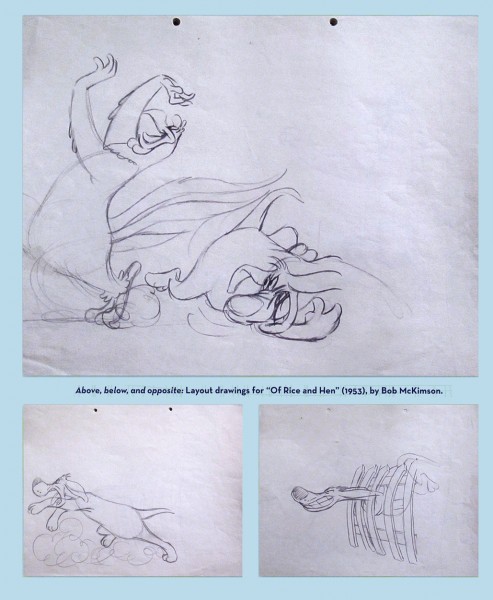
Some beautiful roughs for Layouts by Bob McKimson
for “Of Rice and Hen” (1953) directed by him.
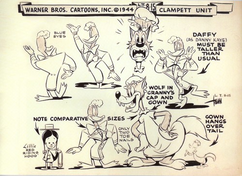
A model sheet by Tom McKimson. One of a few in the book.
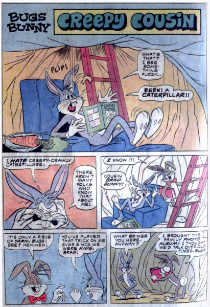
A comic book page by Tom McKimson
A very different model than Bob would have drawn.
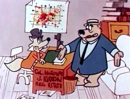
A setup from “Calvin and the Colonel” directed by Chuck McKimson (1962)

 1
1

 2
2
 3
3
 4
4
 5
5

 6
6
 7
7
 8
8
 9
9
 10
10
 11
11
 12
12

 14
14
 15
15
 16
16
 17
17

