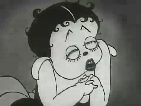
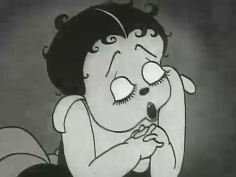
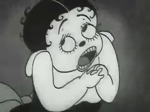
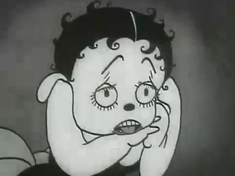
Category ArchiveAnimation
Action Analysis &Animation &Animation Artifacts &Commentary &Disney &Peet &Tytla 08 Apr 2013 05:05 am
Stanislavsky, Boleslavsky and Tytla’s Smears & Distortions – 4
Boleslavski was a great admirer of Stanislavsky and his acting techniques. When he, Boleslavsky, came to the United States, he taught the Stanislavsky technique to his students. These included Lee Strasberg, Stella Adler and Harold Clurman; all were among the founding members of the Group Theater (1931–1940). The Group Theater was the first American acting ensemble to utilize Stanislavski’s techniques, and its members all went off to espouse their own versions of the “method.” American acting had taken some real turns into the creation and development of a true system for getting the best performance out of the actor.
In animation, there was animation technique and styles. These rarely had anything to do with acting. However, there were a number of animators at the Disney studio who wanted to put the focus on their acting and actually studied Stanislavsky and Boleslavsky so that their characters would give a great performance. Tytla was certainly a leader among the animators to do this.

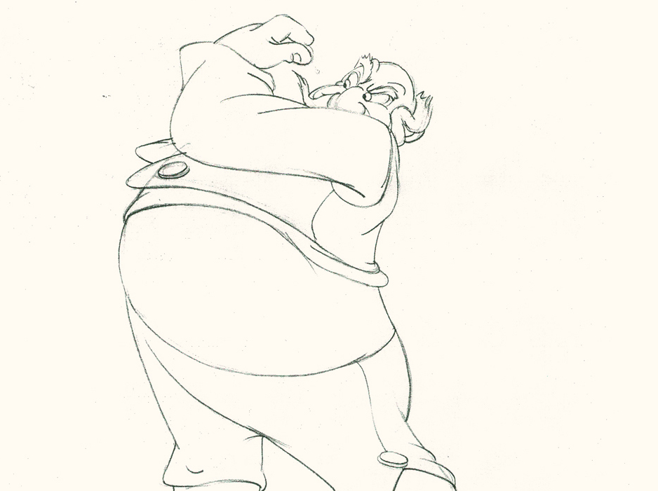
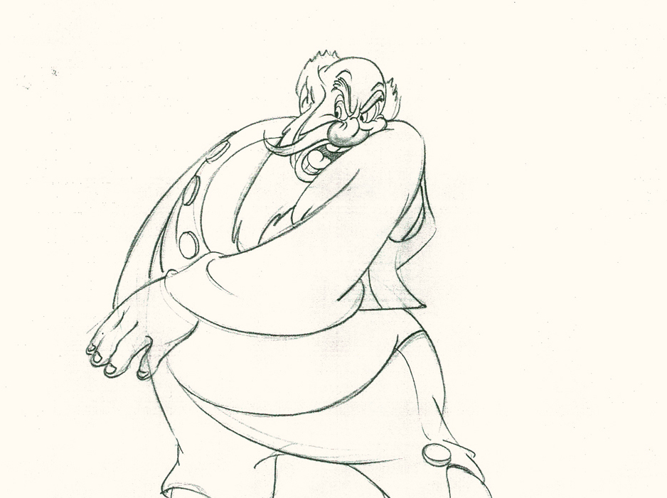
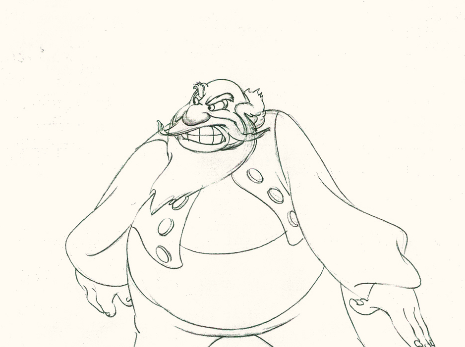
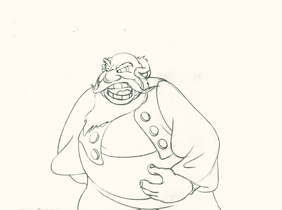
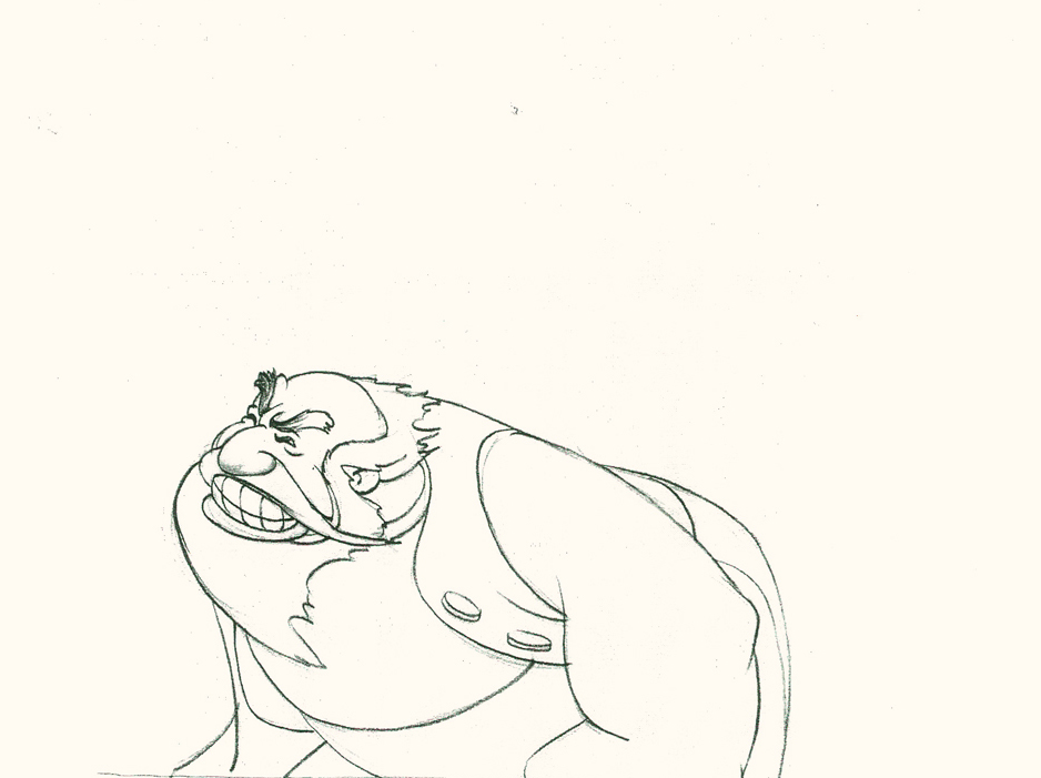
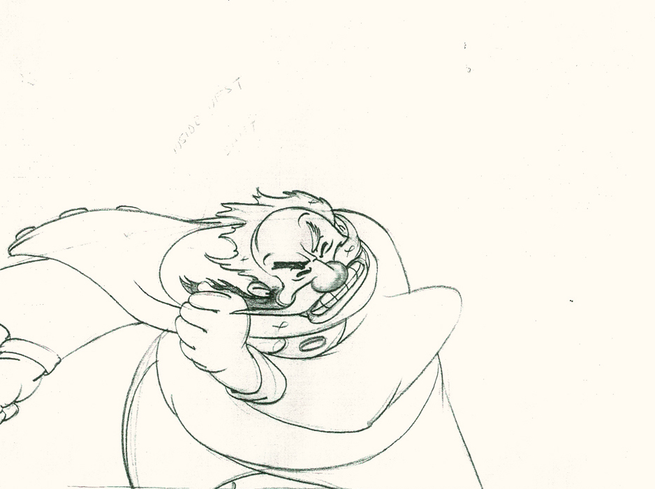
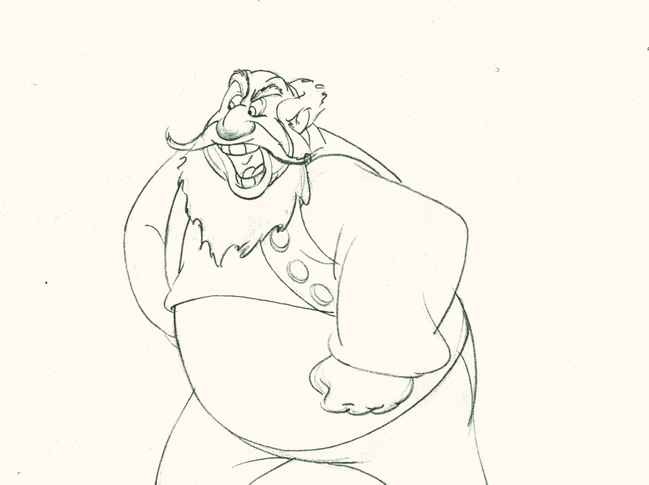
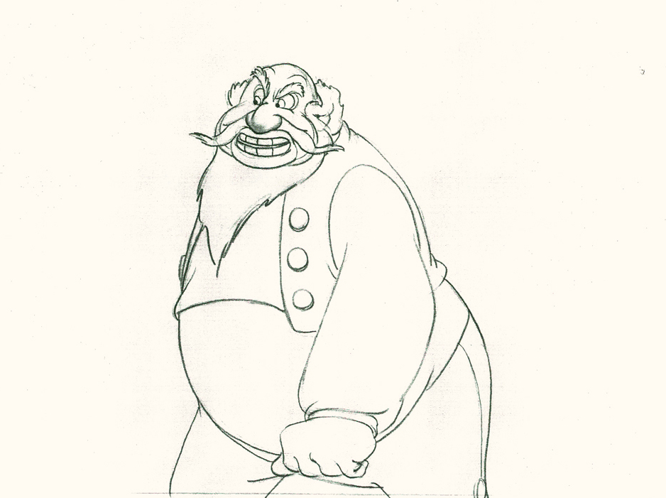
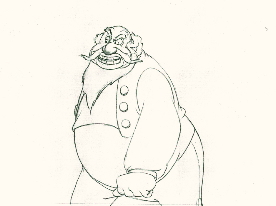
Whereas in Pinocchio, while working with such a flamboyant and
eccentric character, Tytla stretched and distorted Stromboli to
get the necessary and sudden emotional mood shifts desired.

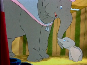
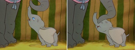
With Dumbo, Tytla modeled the character after his own son,
and he animated this scene wholly on the two characters
given to him on the strong storyboard by Bill Peet.

He didn’t use distortion, because it wasn’t the character he was animating.
Dumbo was gentle, all truth. The honest performance meant keeping everything
above board and on the table. That is undoubtedly the performance Tytla drew.

In my opinion, it has to be one of the greatest animation performances
ever drawn for a film. It’s quite extraordinary and cannot be undercut
in any possible way.
(Click any image to enlarge.)
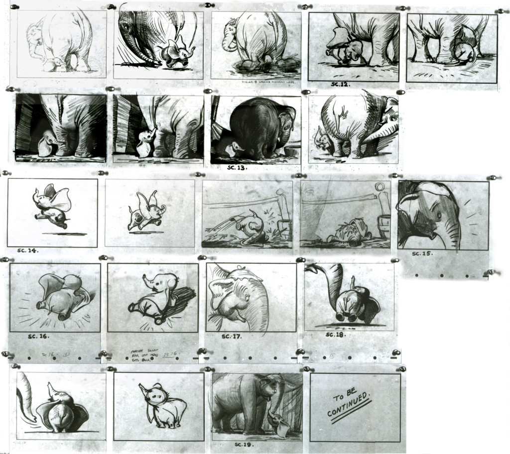
You can see that Bill Peet’s storyboard was certainly an inspiration,
at the least, for Tytla to follow, if not to equal.
Let’s move to another film. Fantasia.
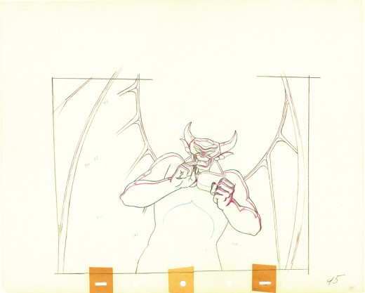
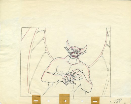
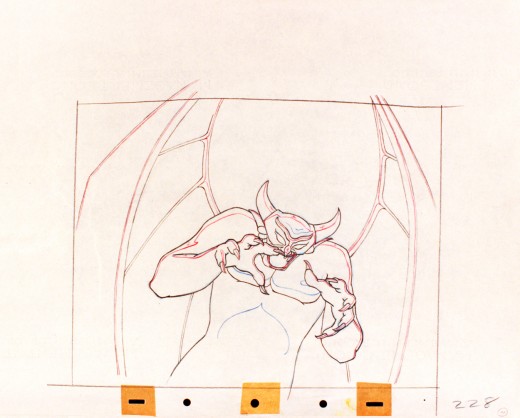
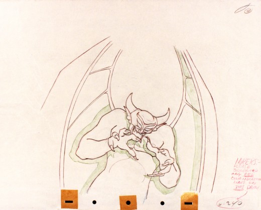
Vladimir Tytla worked on the devil in Mussorgsky’s – Night On Bald Mountain.
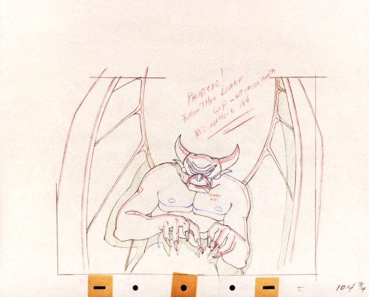
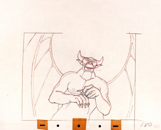
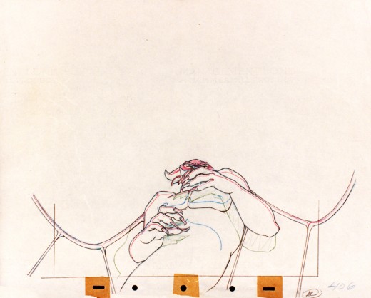
Here are some drawings for the scene. They’re part Tytla and part clean up by his assistant.
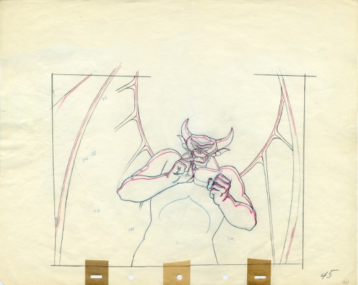
A good example of a Tytla drawing.
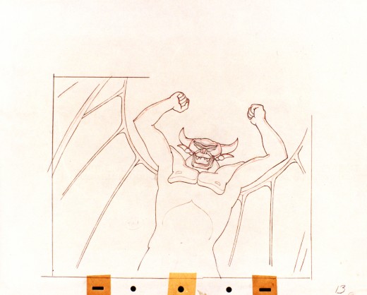
They’re pretty damned impressive drawings. If there is any distortion,
it comes from making a body builder’s shape stronger. There’s no violent
flexing of those muscles, just the natural thing on display in the middle
of a dance sequence. Strong and forcefully beautiful drawings. The
distortion is done by the other spooks floating out of their graves on
the way up to their leader.
The devil’s motion throughout this piece is very slow, tightly drawn images of the devil lyrically moving through the musical phases. It’s pure dance. Any distortion is done via the tight editing that Tytla has constructed. Very close images of the hands with the flame shaped dancers moving about in tight close up as Chernobog’s large face with searing eyes closely watching the fallen creatures dancing in his hands. It’s distortion enough.
Tytla has constructed the most romantic sequence imaginable, and the emotion of the dance acts as the climax for all of Fantasia, and it succeeds in spades. All hoisted by the animation, itself. No loud crushing peak, just a dance done in a tightly choreographed number completely controlled by Tytla. It’s the ultimate tour de force of animation, and we’ll never see the likes of it again.
So essentially I’m pointing out that Tytla used distortion in the animation drawings to execute his acting theories, but as he grows, he not only uses his animation (and animation drawings) to “Act”, he uses his abilities as an Animation Director. The cutting and the movement of the scenes is used for the Acting, as well.
Action Analysis &Animation &Commentary &Tytla 01 Apr 2013 04:55 am
Stanislavsky Boleslavsky and Tytla’s Smears & Distortions – 4
 I would guess an actor, one who was truly devoted to their craft, would try to assume the full personality of the character he or she is playing. For an actor who felt devoted to the craft, they’d veer toward some specific acting school. Stanislavski or Boleslavsky, Actor’s Studio, Meisner, Chekhov or whatever combination thereof, the actor would use these schools of approach trying to fully possess the soul of the character.
Marlon Brando, Julie Harris, Paul Newman, John Garfield, Clifford Odets, Montgomery Clift and Marilyn Monroe all these acting greats had their techniques, and all those methods did start with Stanislavsky.
The question for us is how did this affect animation’s actors – the animators? Or did it? I’ve only seen this discussed in depth in one book, Mike Barrier‘s Hollywood Cartoons. Barrier shows a real understanding of Stanislavsky and Boleslavsky when he discusses the overt course of action taken by one animator, in particular, Bill Tytla.
We know that there were plenty of others that were excited by the newly discovered techniques, though we don’t know how wide spread this influence was. My first realization that it was a strong influence came from a joke John Hubley shared with me. He said that the animators broke into two groups, those that were interested in Stanislavsky and those that couldn’t spell it. Hubley was friends with Tytla. Tytla had been the close roommate to Art Babbitt, and Babbitt was close with Hubley, right to the near end.
But Tytla. Let’s look into what he was doing with his animation. I’m going to make a lot of suppositions to tell you what I think he believed . . . the reasoning and the way he worked.
Now, let me show you something.
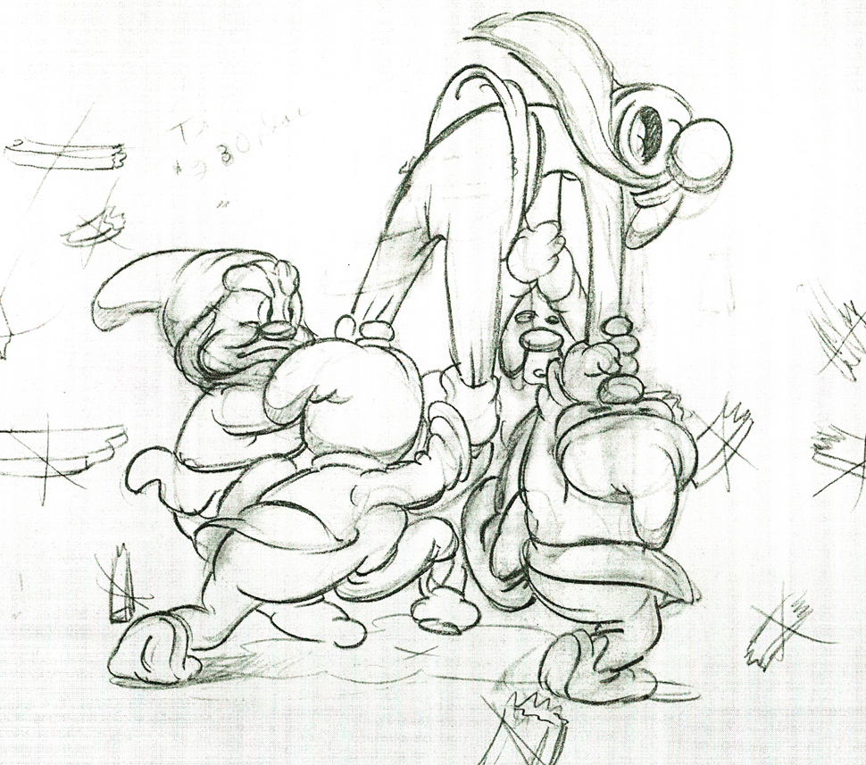
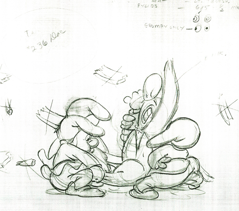
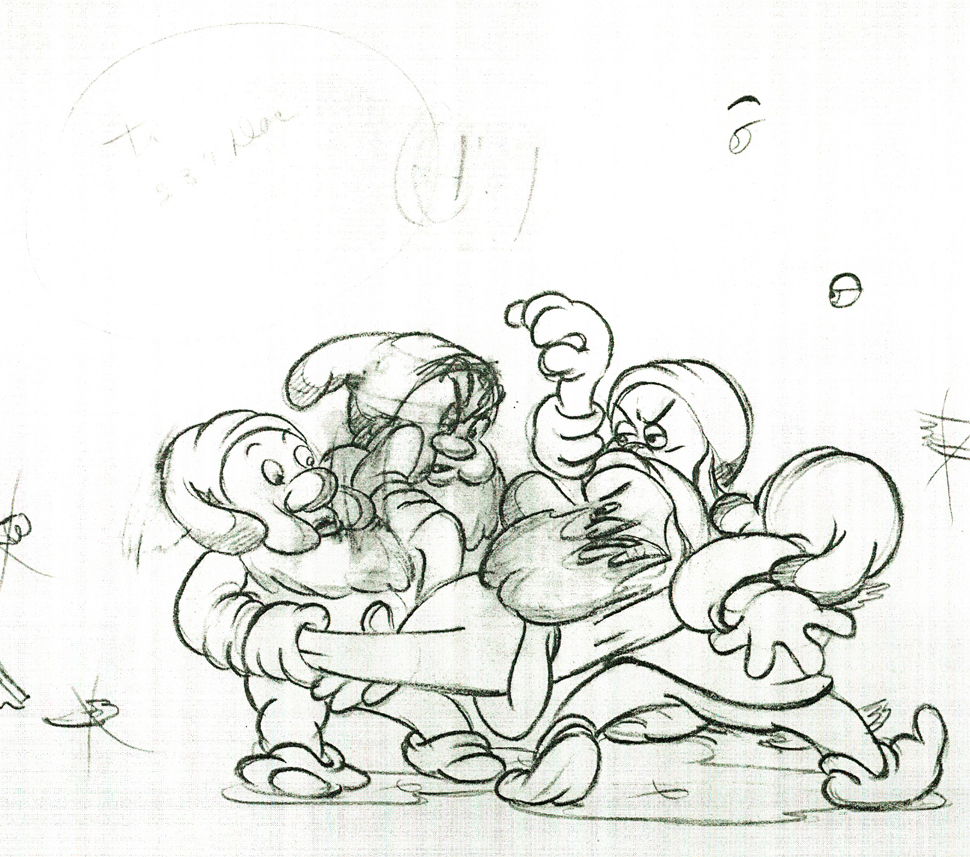
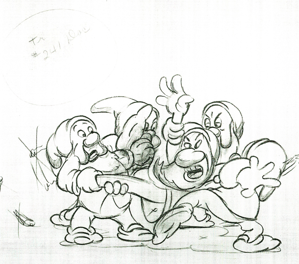
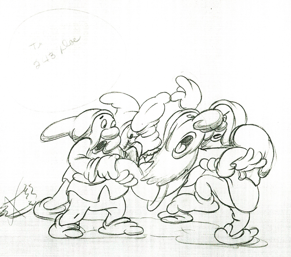
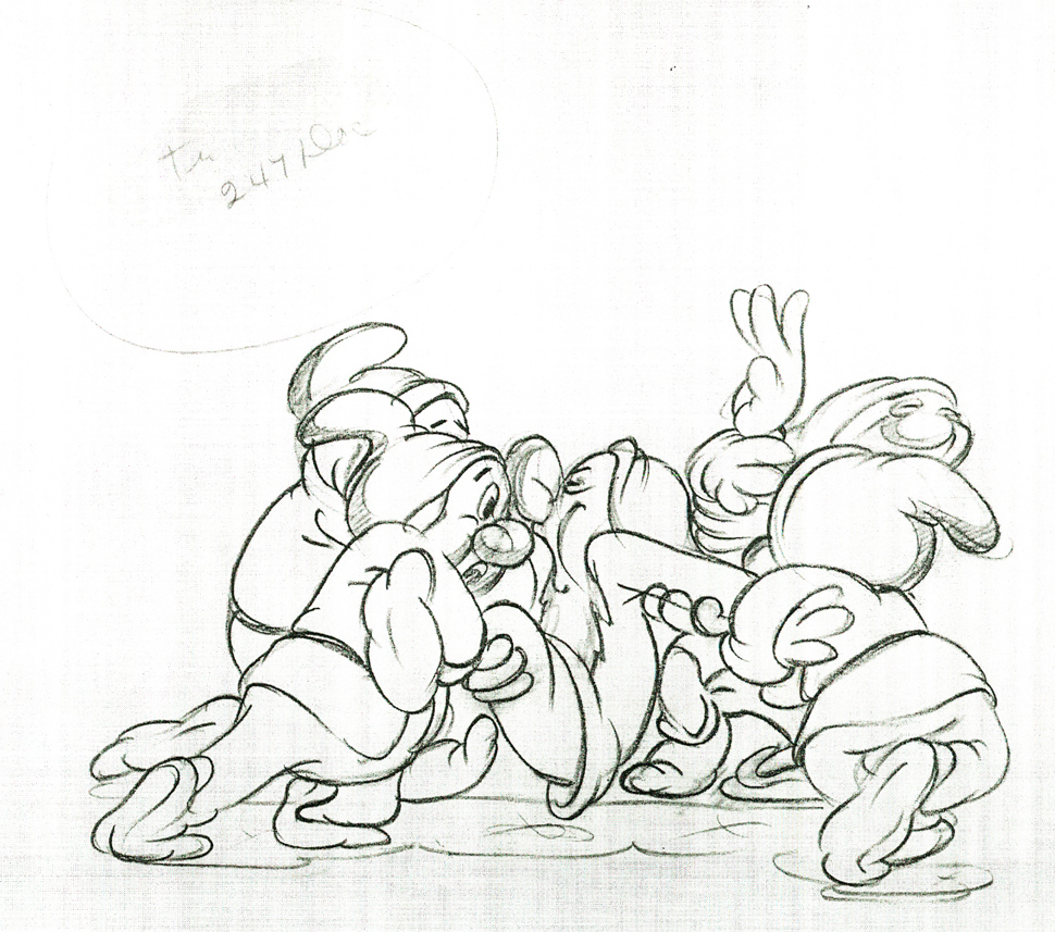
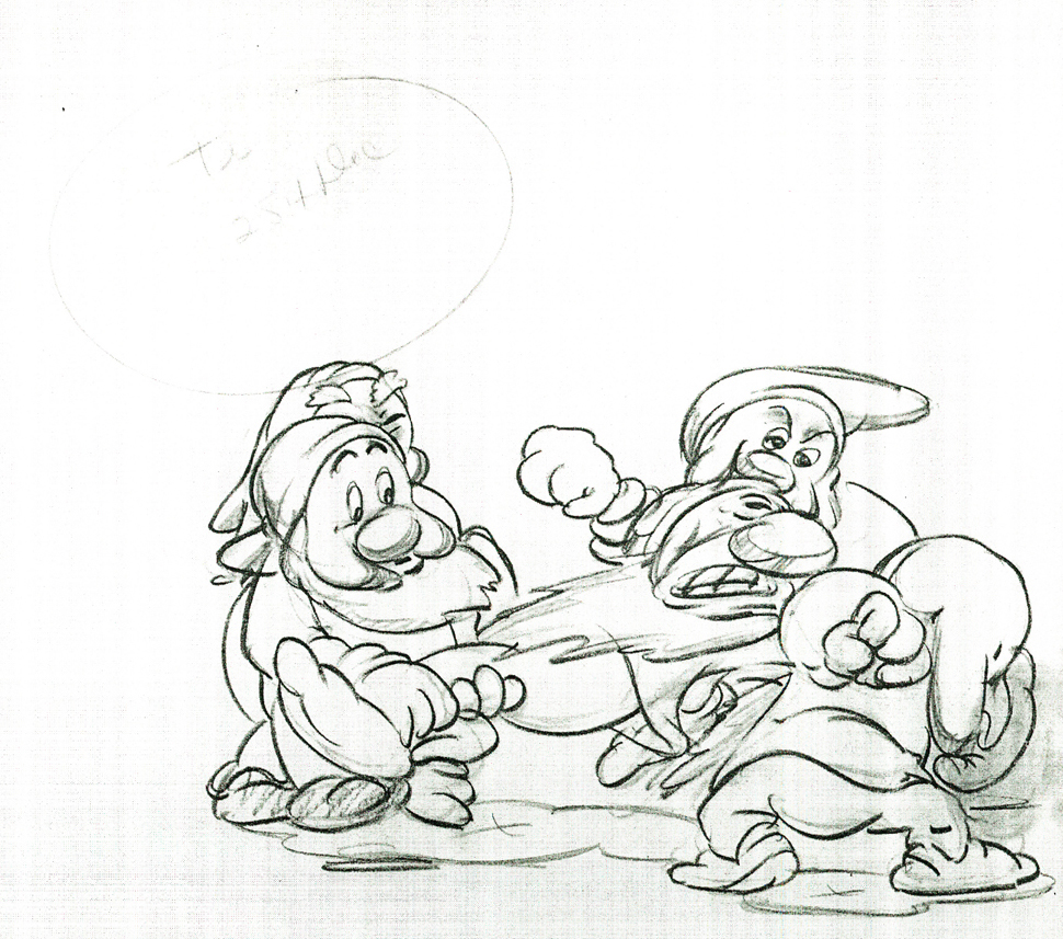
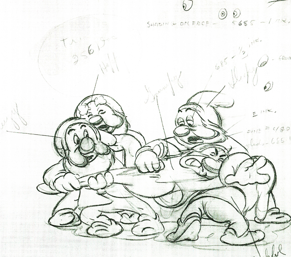
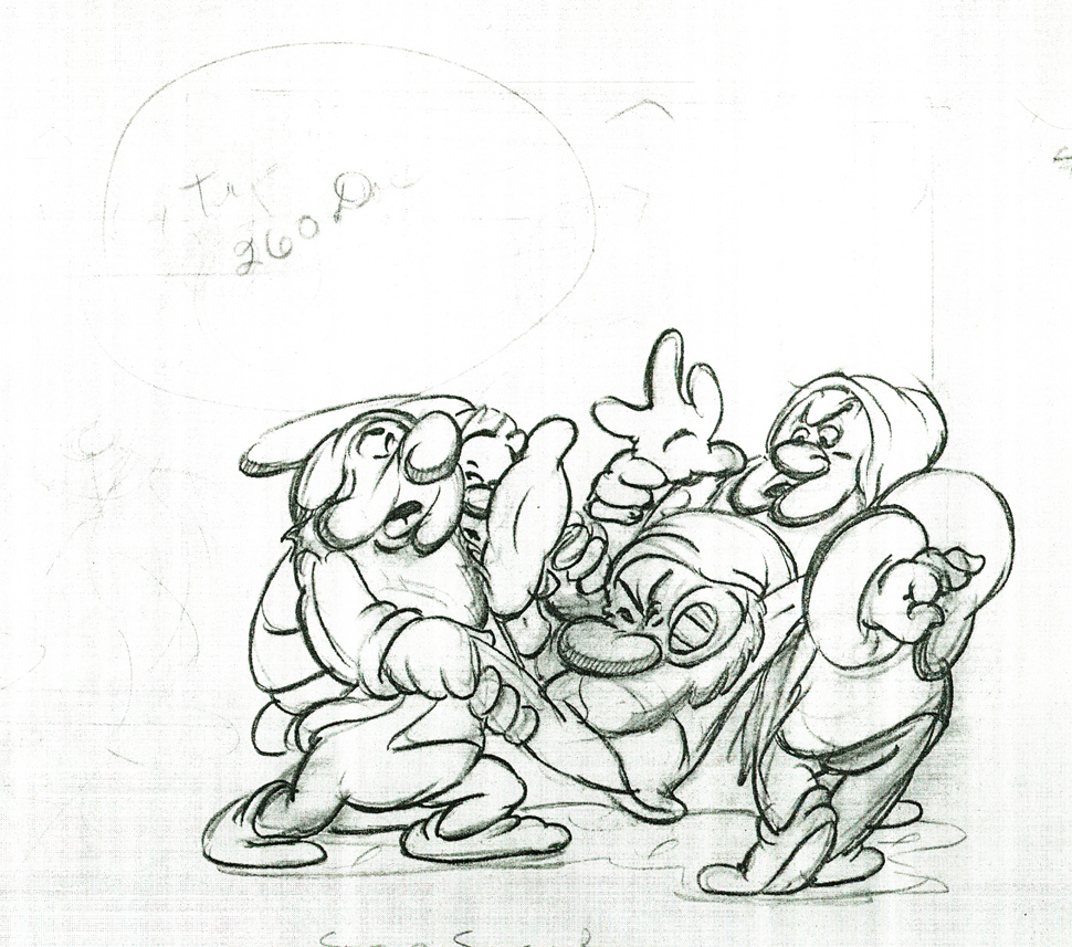
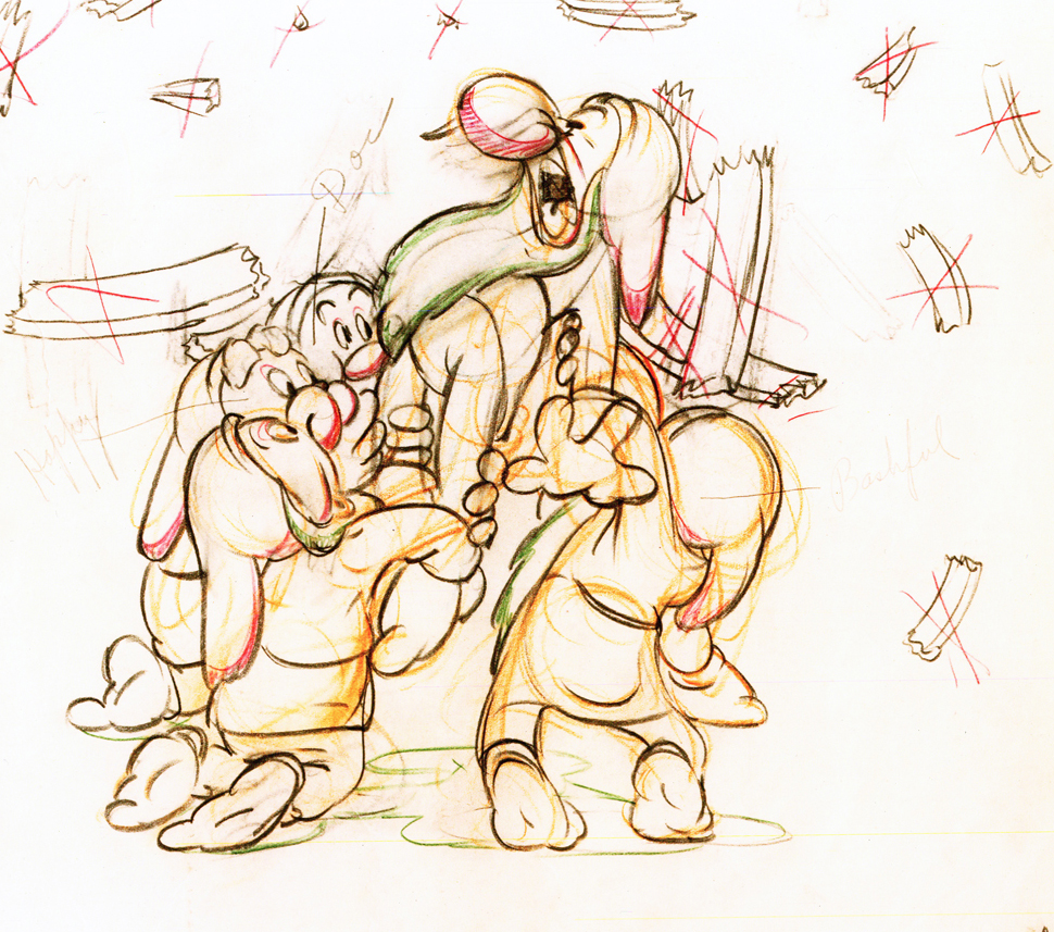
Here are some drawings and a QT movie of the seven dwarfs. Six of them are carrying Grumpy to the wash basin to clean him despite his violent protests.
Note the distortion on many of the drawings. #239 & 241 for example. #254 & 256 as well.
 222
222
Here’s the QT movie of the full scene:
The P.T. is exposed on ones at 24FPS.
Note the buttons on the bottom far right will allow you to
advance (and reverse) the action one frame at a time. You
should go through this to see the distortion on the inbetweens
and how it works when the animation is in full motion.
There’s a great deal of distortion and smearing in Tytla’s work. I think he uses it to heighten the acting moments that his characters are performing. This particular scene is more action than acting, so other than to show off his distorting the characters, it isn’t a great example of acting, per se. Bt that drawing #239 is a good example of what he’ll do, even to the face of the principal character in the scene, to get his animation to work.
It’s almost as if he’d studied live action frame by frame and represents all those motion blurs in live action by smearing the face. The dwarfs are probably the first time complicated acting is successfully achieved. They’d done it before with many of the characters in the Silly Symphonies, but these are characters who sustain strong personalities over a long period of film. They also go through strong emotional changes which underline and works off their personalities.
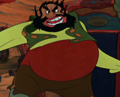
Tytla had a very different character in Stromboli for Pinocchio. He was a theatrical type, very changeable personality with emotions going all over the place – from high to low in the bat of an eye.
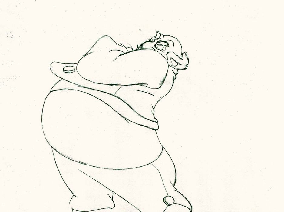
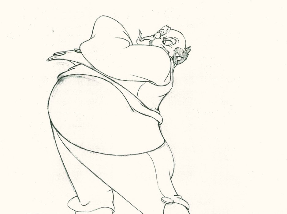
Tytla brought beautiful distortion to many of the drawings he did, using it as a way to hammer home some of the emotions in the elasticity he was creating. Yet, the casual observer watching this sequence in motion doesn’t ever notice that distortion yet can feel it in the strength of the motion.
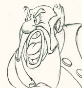
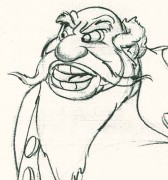
Four drawings (#1, 11, 22, & 48) that shift so enormously but call no attention to itself.
Brilliant draftsmanship and use of the forms.
After I first posted some of these drawings and spoke a bit about the distortion Tytla would use to his advantage – for emotional gestures – I received some comments. I’d written that . . . “It’s part of the “animating forces instead of forms†method that Tytla used. This is found in Stromboli’s face.
This note arrived from Borge Ring after my first post Bill Tytla’s scene featuring Stromboli’s mood swing:
- The Arch devotees of Milt Kahl have tearfull misgivings about Wladimir Tytla’s magnificent language of distortions. ‘”Yes, he IS good. But he has made SO many ugly drawings”
Musicologists will know that Beethoven abhorred the music of Johan Sebastian Bach.
yukyuk
Børge
Note in one of these arms (right) Tytla uses Stromboli’s blouse to make it look like there’s distortion. It barely registers but gives strength to the arm move before it as his blouse follows through in extreme.
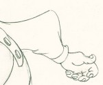
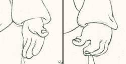 There’s also some beautiful and simple drawing throughout this piece. Stromboli is, basically, a cartoon character that caricatures reality beautifully. A predecessor to Cruella de Vil. In drawings 76 to 80 there’s a simple turn of the hand that is nicely done by some assistant. A little thing among so much bravura animation.
Many people don’t like the exaggerated motion of Stromboli. However, I think it’s perfectly right for the character. He’s Italian – prone to big movements. He’s a performer who, like many actors in real life, goes for the big gesture. In short his character is all there – garlic breath and all.
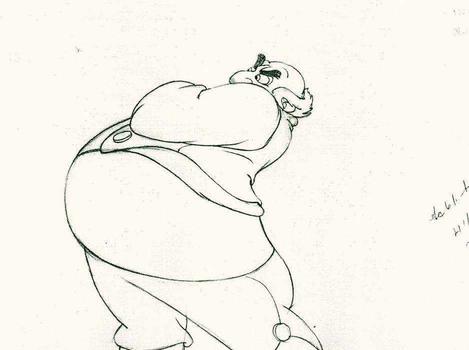
Here’s a short part of another scene. I’ve enlarged the images a little so that the thumbnails are more revealing. Just look at the distortion on the heads and how he stretches the arm to give it a violent emphasis.
 1
1Tytla starts with arm and head all the way back to
the character’s right. It’d be hard for Stromboli to
reach any further back without real distortion.
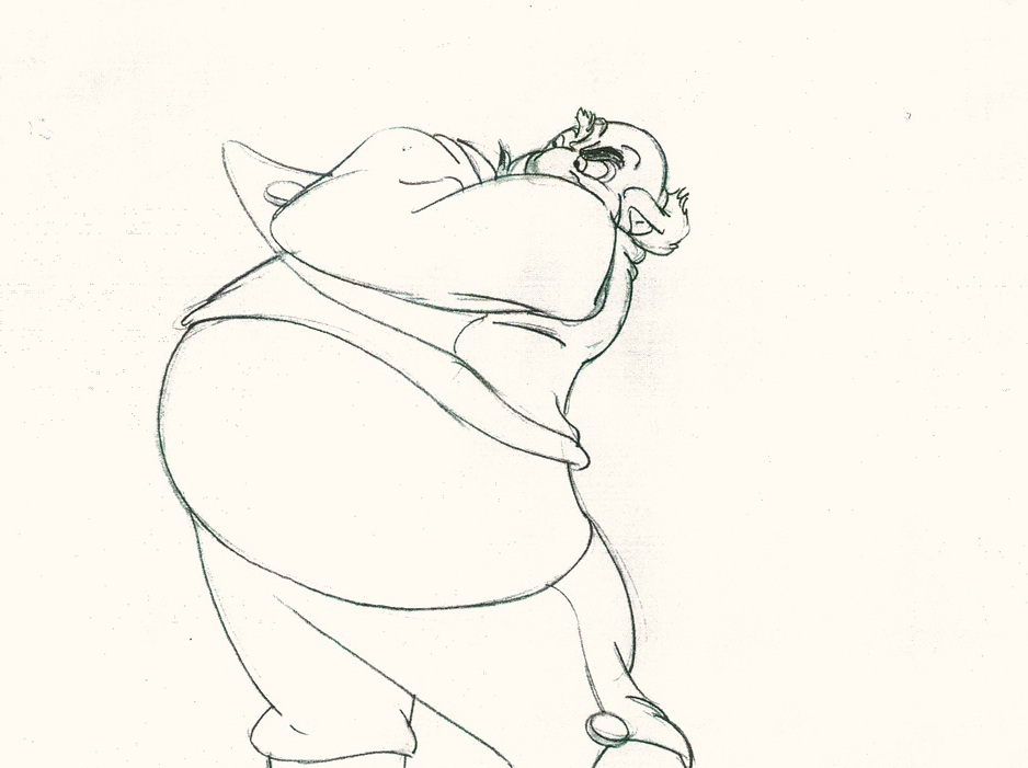 5
5
He then slowly advances the head inbetweening slowly.
The arm hasn’t moved very much – maybe what they
call today a “moving hold.”
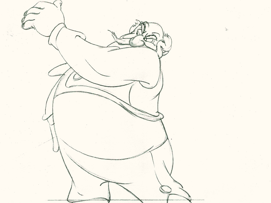 11
11
Now the arm comes out swiping violently.
The head’s almost complete in its turn to the left.
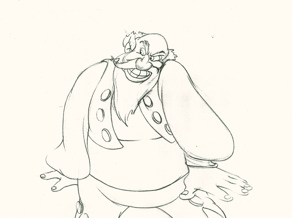 13
13
The arm rips across in three drawings.
The head has gone too far.
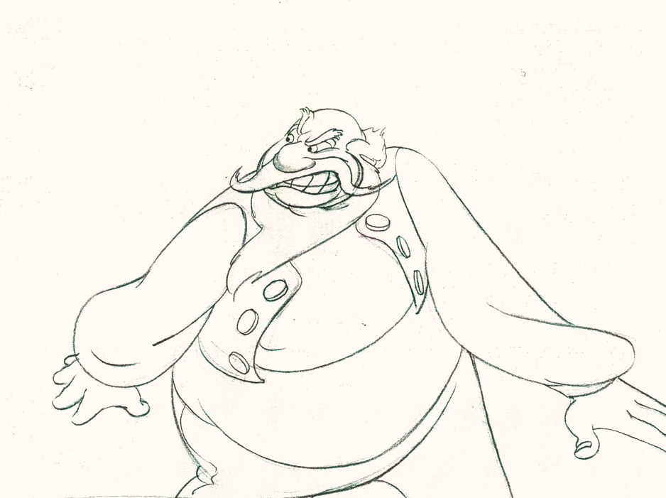 14
14
The head goes back to where it should – almost no inbetweens
for Stromboli to get ready for speech. He’s taken 14 drawings
to display his anger.
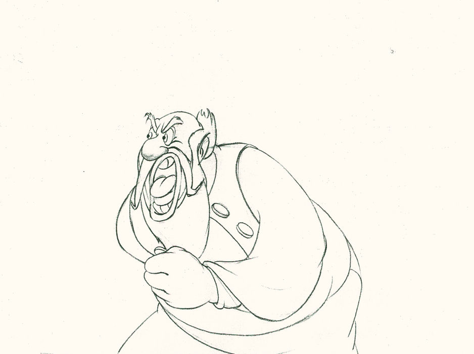 20
20
The arm comes back into a near fist; the expression is violent.
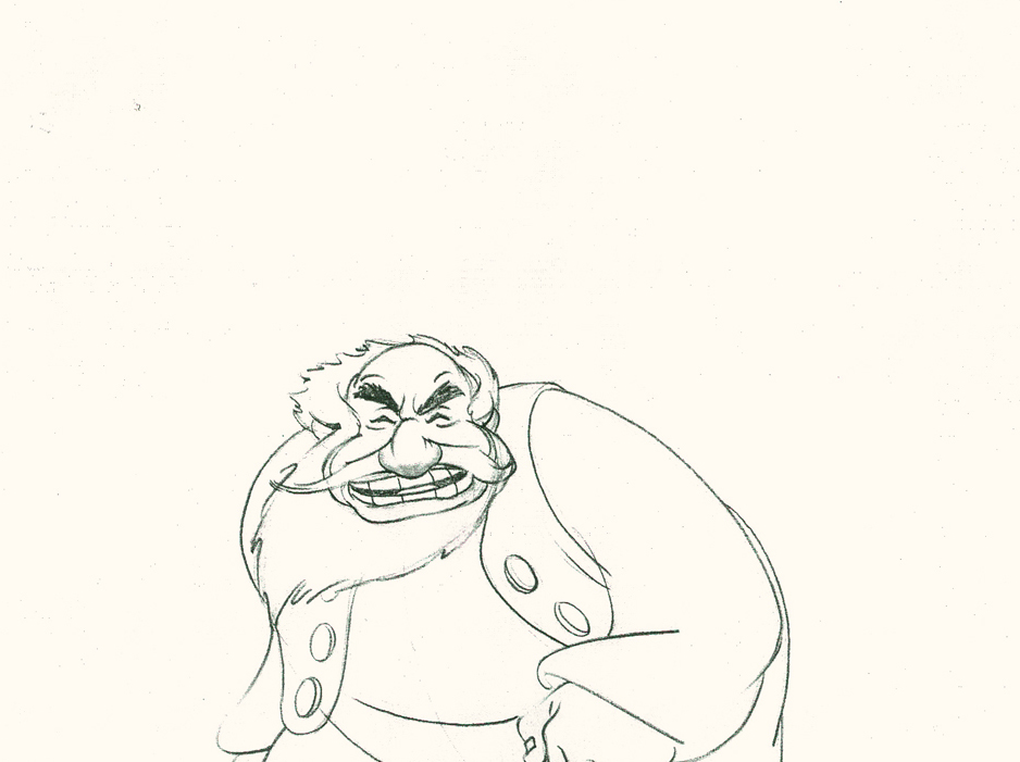 22
22
The head starts shaking in a “no” gesture.
Violent.
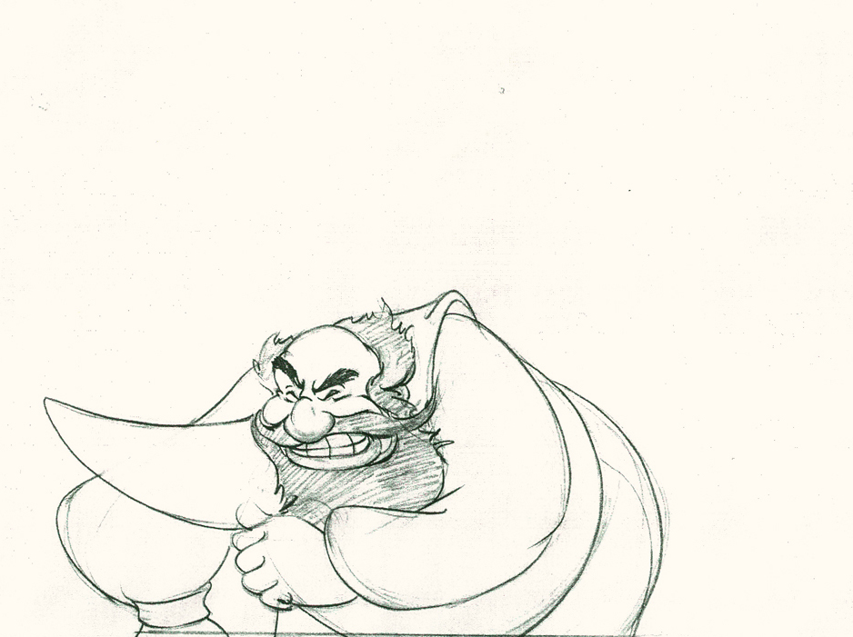 25
25
The head and arm are all the way back.
The vest has been set up to make a violent move.
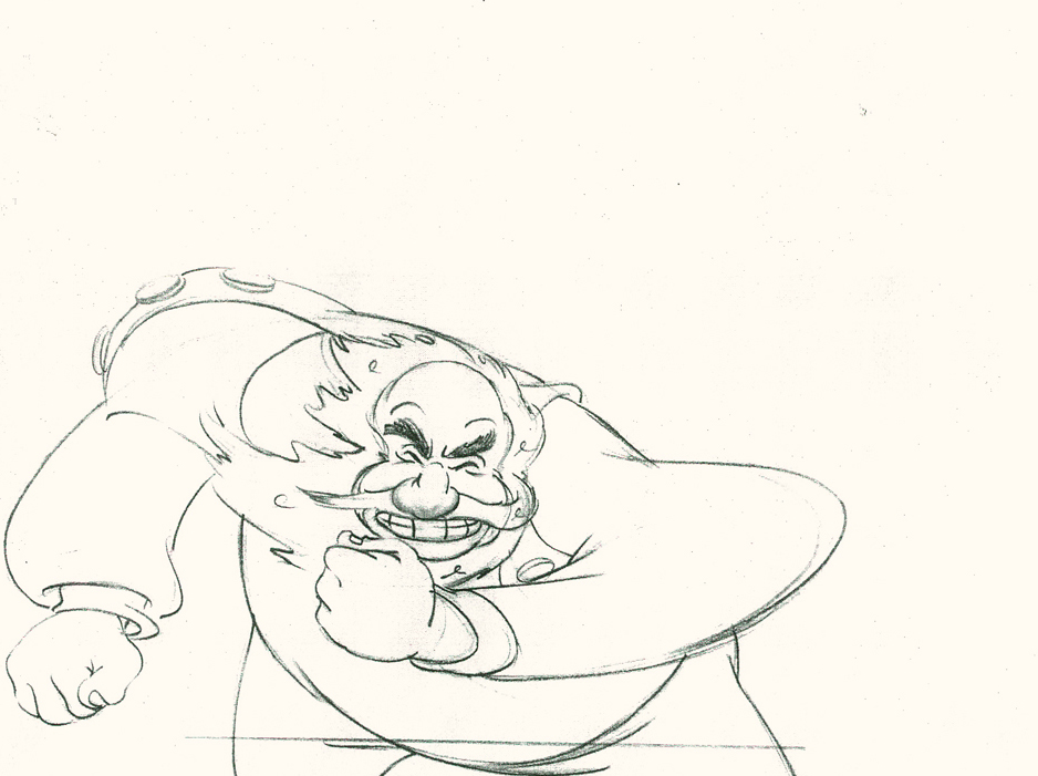 28
28
Now the arm and fist swipe across in violence.
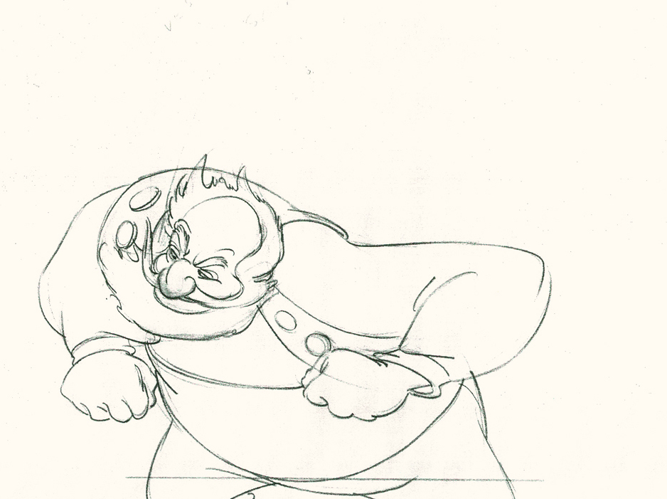 30
30
He’s completely pulled his angry head in to his neck.
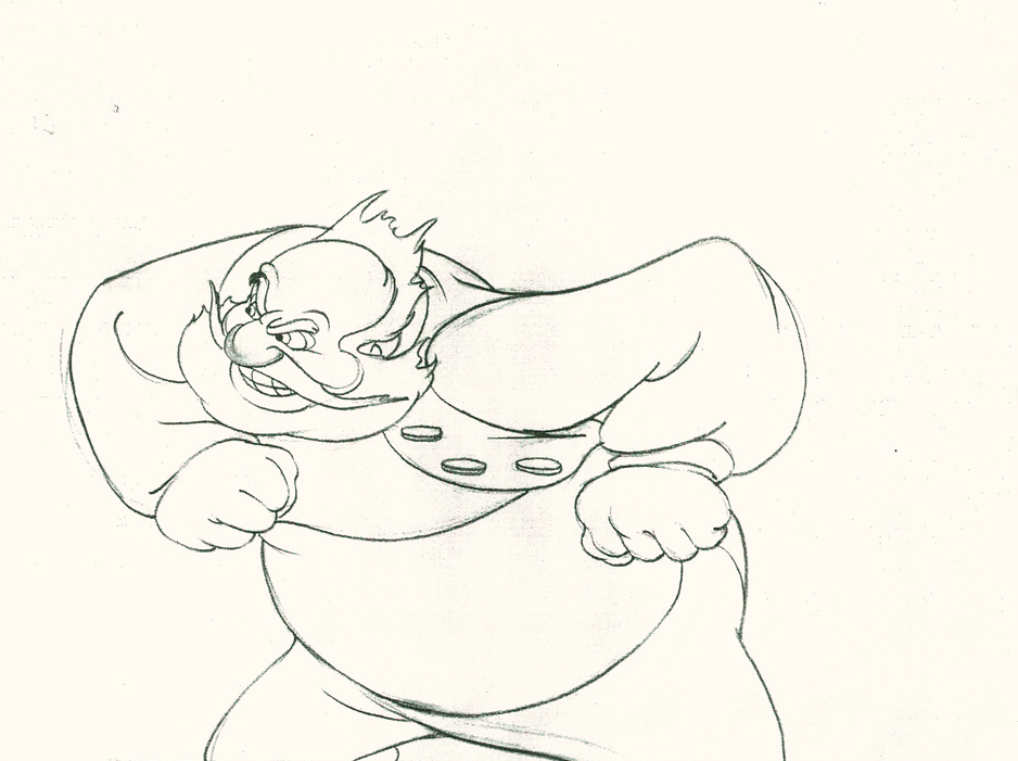 32
32
Both arms, moving violently, are suddenly restrained.
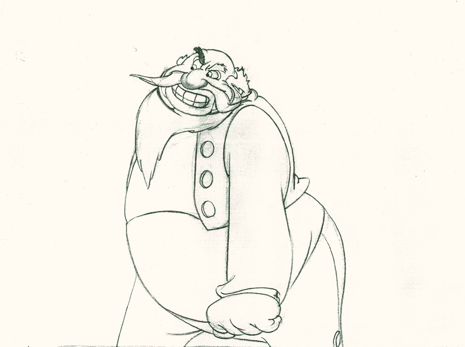 34
34
He hits a full stop with his arm.
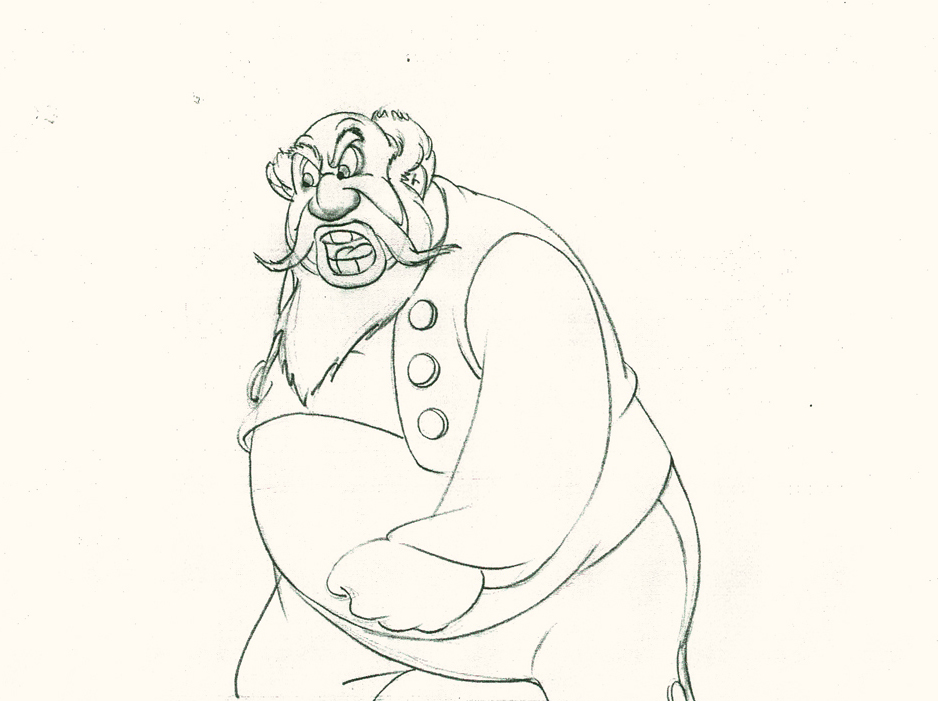 37
37
He’s made the realization that he has to change his expression
so that he doesn’t lose the frightened kid – completely.
Here’s the final QT of the entire scene.This part comes at the very beginning:
Stromboli
Click left side of the black bar to play.
Right side to watch single frame.
David Nethery had taken my drawings posted and synched them up to the sound track here.
It’s not clichéd, and it’s well felt and thought out. Think of the Devil in “Night on Bald Mountain” that would follow, then the simply wonderful and understated Dumbo who would follow that. Tytla was a versatile master.
We’ll continue next time with Dumbo Fantasia and other Tytla gems.
Action Analysis &Animation &Animation Artifacts &repeated posts &Richard Williams &Tissa David 27 Mar 2013 04:26 am
Grim’s Jester – recap
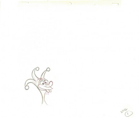
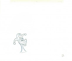
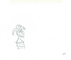
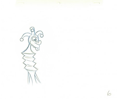
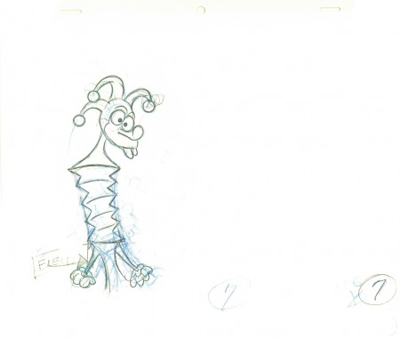
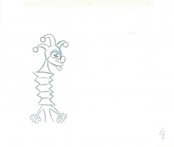
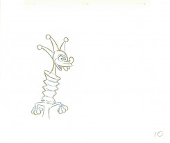
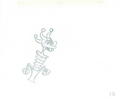
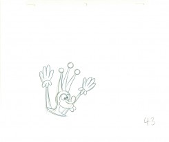
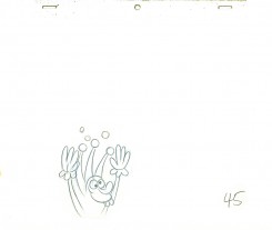
- Yesterday I focused on a couple of scenes Grim Natwick animated in his early days at the Fleischer studio. He was obviously experimenting with distortions, breaking of the joints, the visibility of inbetween drawings and how much he could get away with in “Rough drawings.”
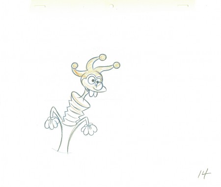
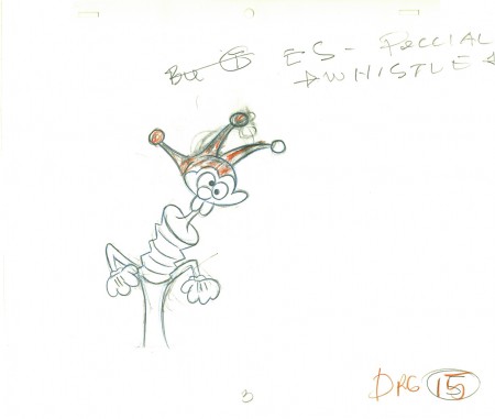
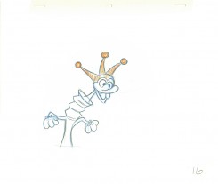
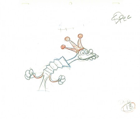
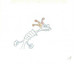
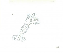
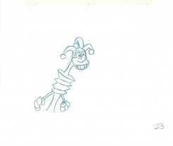
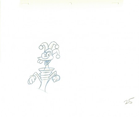
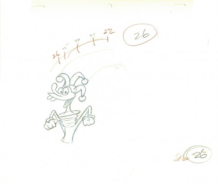
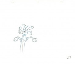
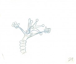
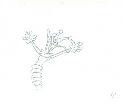
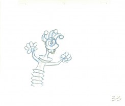
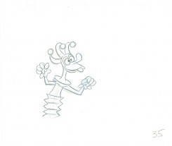
This, of course, isn’t the animator that Grim became, but gives us some light to understand what did make up that animator. The scene here today is something I’d posted on my blog once before, in 2010. It features a lot of Grim’s ruffs as well as the clean ups by Richard Williams, himself.`
You can see Grim’s drawings erased and cleaned up. (The semi-erased semblance of Grim’s very large numbers remain on many of the drawings, as do Grim’s notes. The inbetweens were all done by Dick. (It’s Dick’s writing in the lower right corner, and I remember him doing this overnight.)
The scene is all on twos. There are two holds which Dick changed to a trace back cycle of drawings for a moving hold. It actually looks better on ones, but there was a lip-synch that Grim had to follow. It is interesting that both Tissa David, one of the five key animators on this film, and Grim Natwick, who Tissa had assisted for at least 20 years, both shared the one assistant on key scenes in this film – Richard Williams. Eric Goldberg assisted on many of Tissa’s other scenes.
 1
1.
 2
2 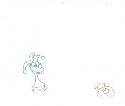 3
3.
 4
4 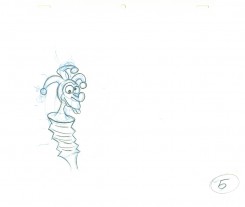 5
5.
 6
6An inbetween by Dick Williams.
.
 7
7A cleaned-up extreme by Grim Natwick.
.
 8
8 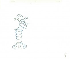 9
9.
 10
10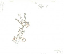 11
11.
 12
12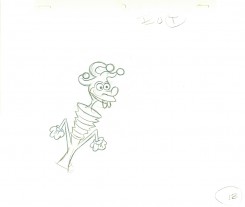 13
13.
 14
14Dick Williams clean-up.
.
 15
15Grim Natwick (sorta) cleaned-up rough.
.
 16
16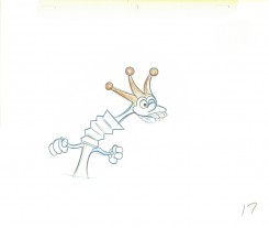 17
17.
 18
18Grim Natwick rough.
.
 19
19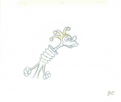 20
20.
 21
21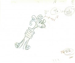 22
22.
 23
23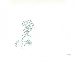 24
24.
 25
25Williams inbetween.
.
 26
26Natwick ruff, cleaned up.
.
 27
27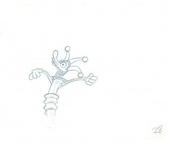 28
28.
 29
29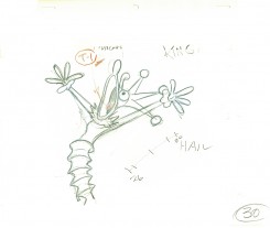 30
30.
 31
31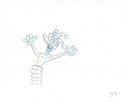 32
32.
 33
33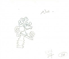 34
34.
 35
35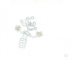 36
36.
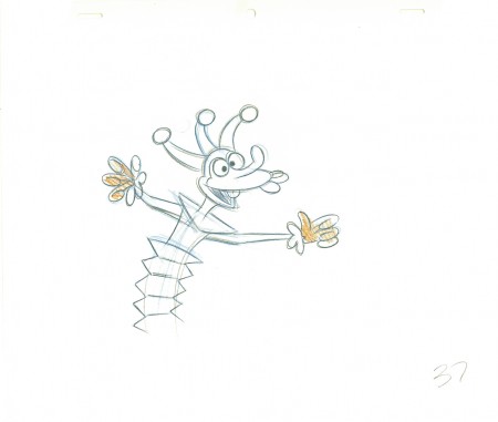 37
37Dick’s clean-up inbetween.
.
 39
39Definitely a Grim Natwick drawing – cleaned up by Dick (his handwriting).
.
 39
39 40
40.
 41
41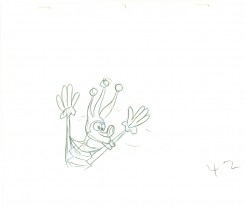 42
42.
 43
43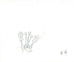 44
44.
 45
45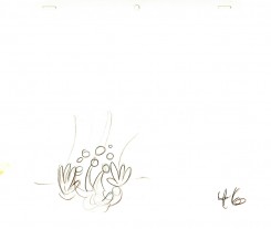 46
46.
 47
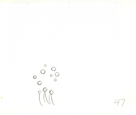
47Drawings 44-47 are all Grim’s roughs with minor CU.
.
_____________________________
Here’s a QT movie of the complete action from the scene.
The scene is exposed on twos per exposure sheets.
_____________________________
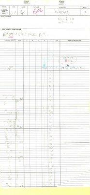
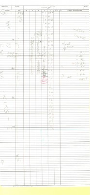
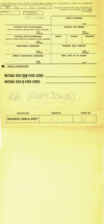
Here are the folder in which the two exposure sheets
are stapled (so they don’t get separated.)
Action Analysis &Animation &Fleischer &Frame Grabs 26 Mar 2013 05:45 am
Grim – Distortions Smears, Abstractions & Emotions – 3
- In 1930, the animation in the Fleischer studio (as evidenced by Michael Barrier in his great book, Hollywood Cartoons) was pretty much controlled by the timing department. They supported a very even sense of timing and would expose everyone’s animation in the house meter. This virtually destroyed the timing within the studio. Their idea was that every drawing had to overlap the drawing before and after. It was done to such an extreme that it caused the even timing throughout their films.
There was at least one animator free of the timing department. Grim Natwick was the key guy in the studio, at the time. His animation was built, back then, on a distortion, a freedom of expression, that very much resembled what Bill Nolan was doing in Hollywood. The difference was that Natwick could draw, so his artwork was planned, designed to look that way. It wasn’t just a matter of straight ahead animation causing distortion. It allowed distortion with scenes going back to square one every so often to hold off the appearance of distortion. The inbetweens distorted and, in a way, smeared always to come back to a nice, tight pose of an extreme.
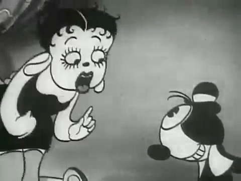
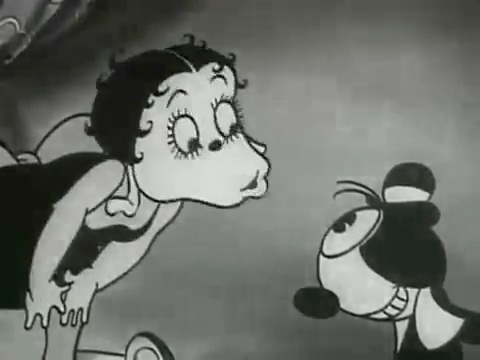
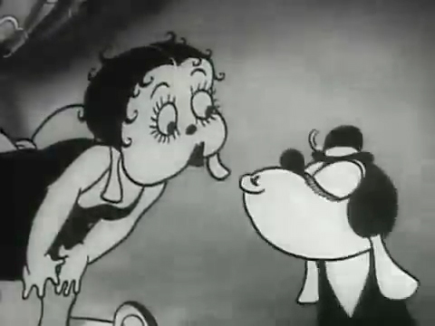
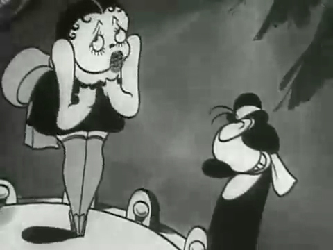
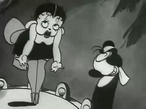
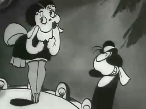
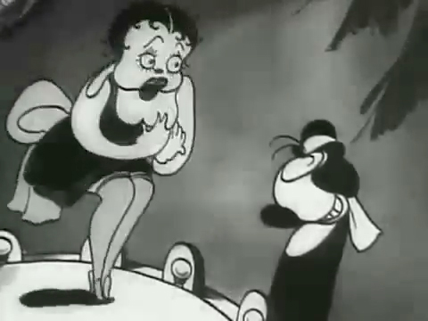
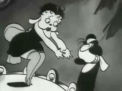
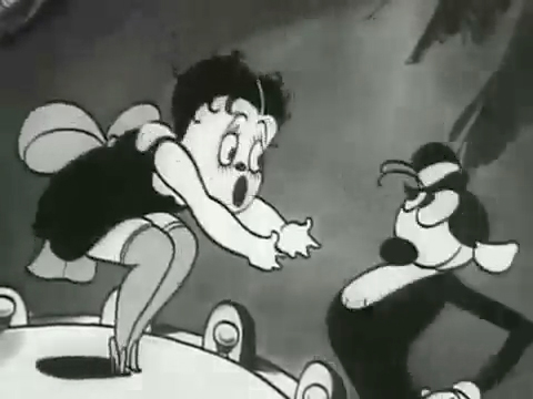
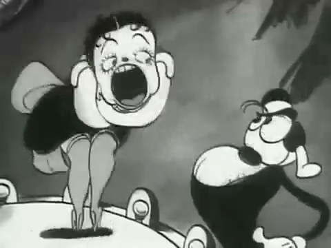
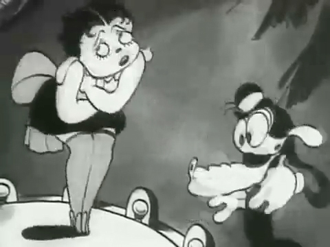
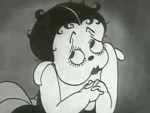
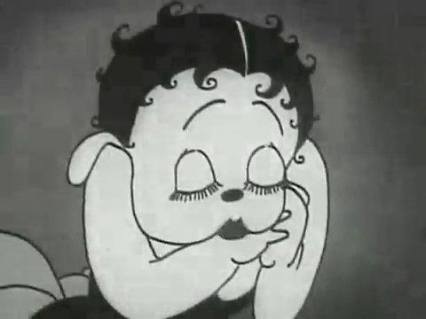
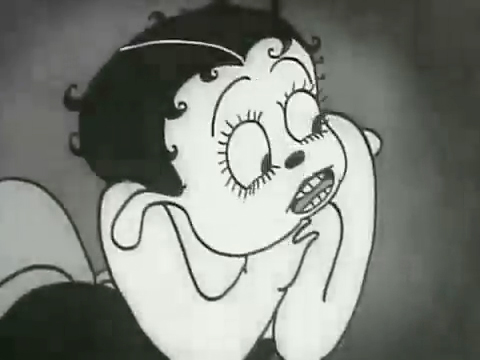
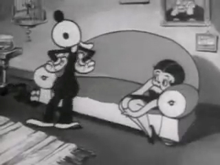
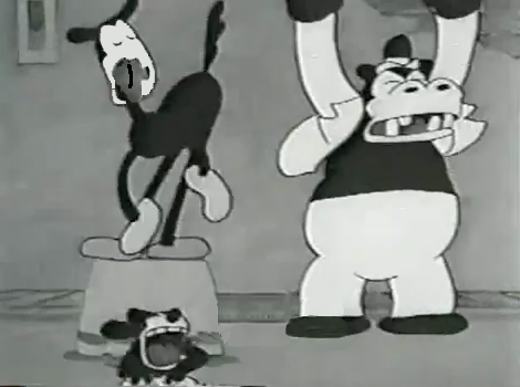
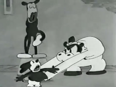
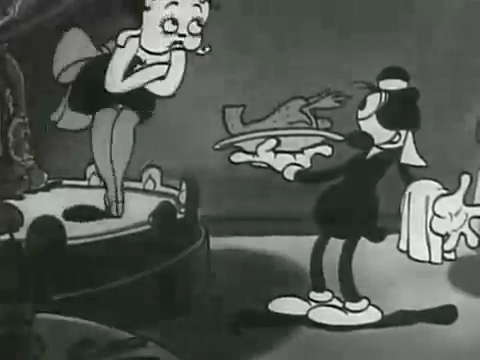
The film “Dizzy Dishes” is the perfect example of this style. This was actually the first Betty Boop cartoon, and Betty, a plump dog sings broadly. She really goes wild as she sings a song on top of a table à la Marlene Dietrich!. Here are some frame grabs from a couple of connected scenes to give you an idea of what was going on.
 1
1
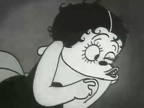
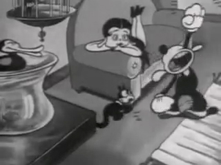
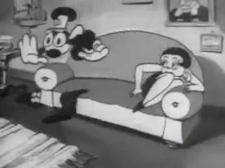
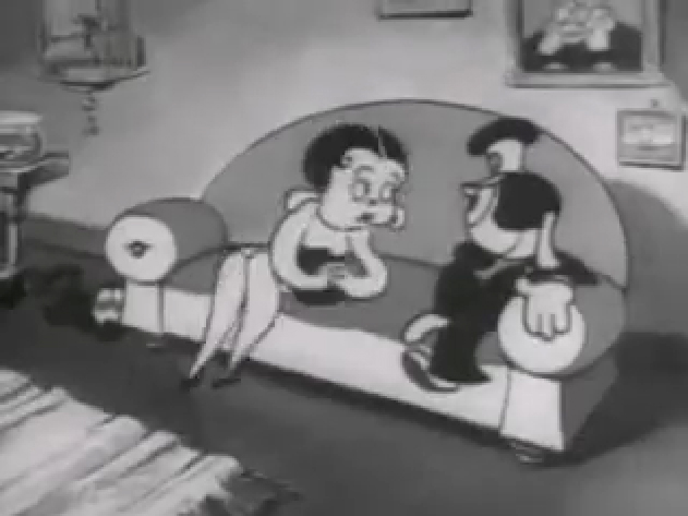
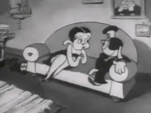
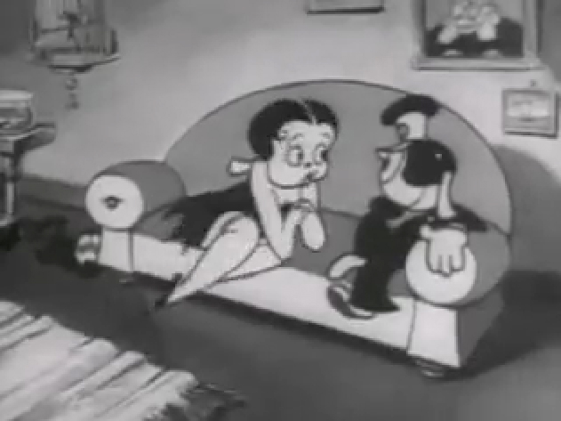
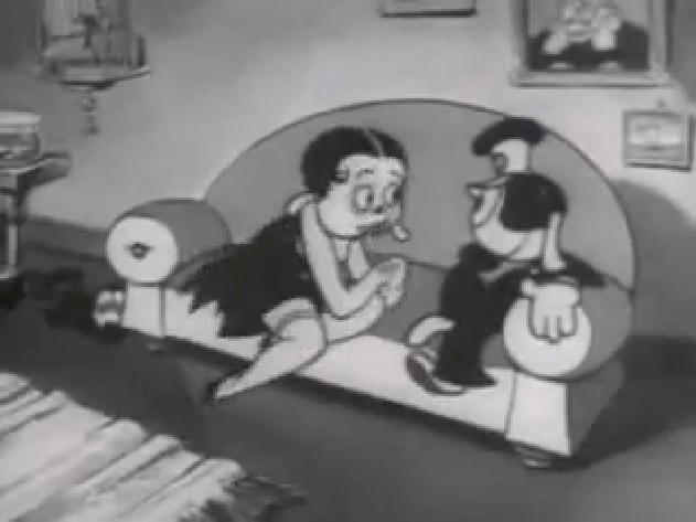
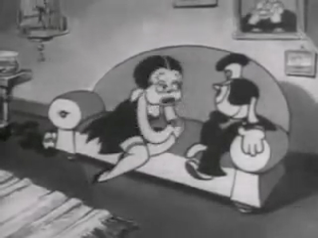
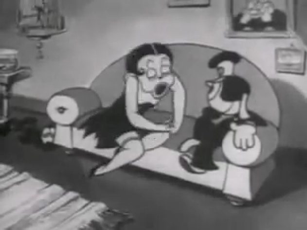
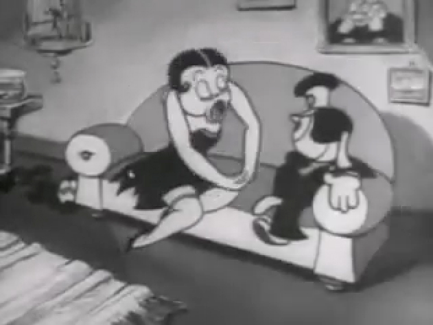
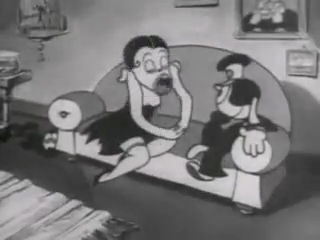
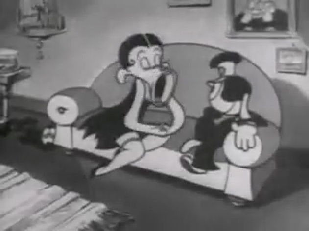
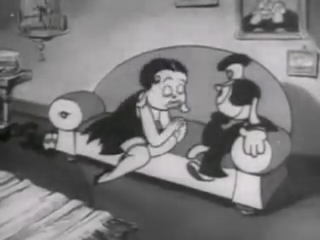
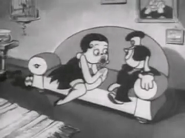
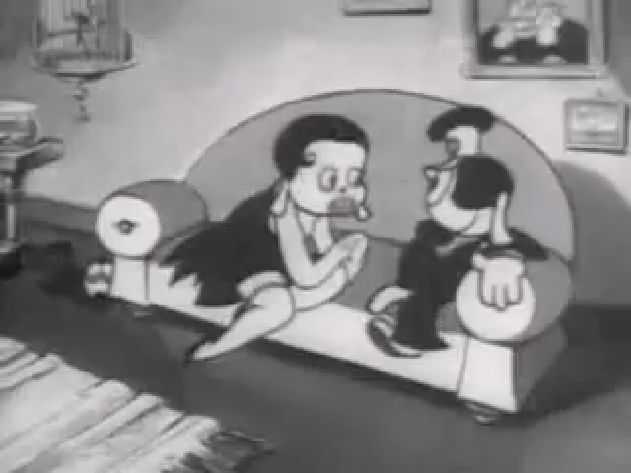
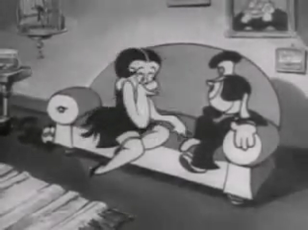
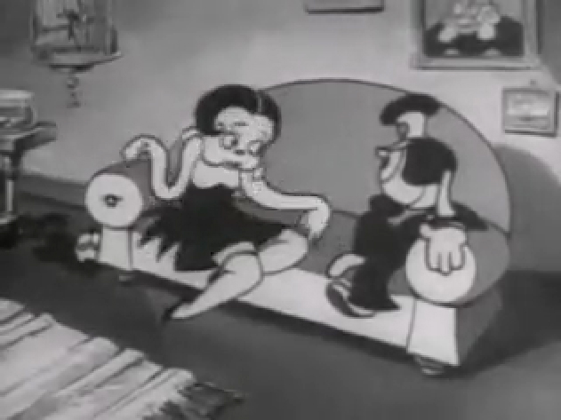
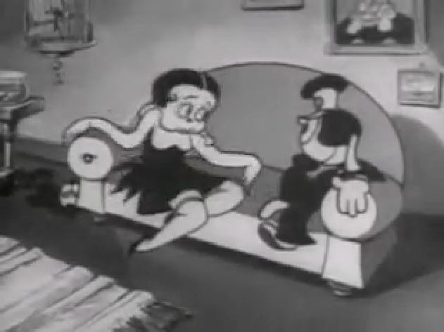
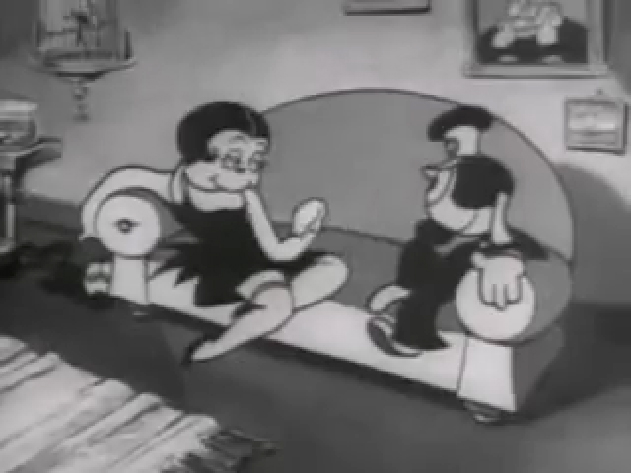
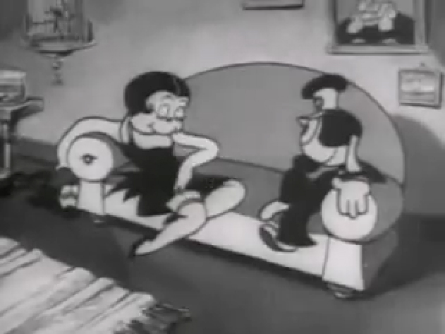
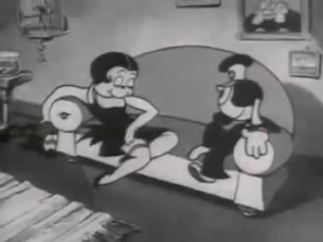
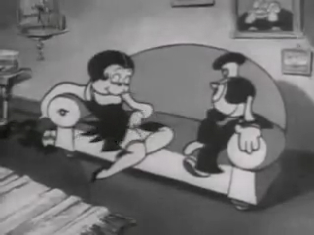
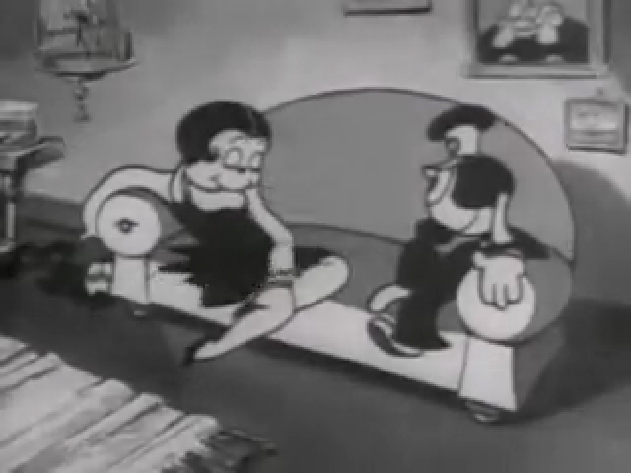
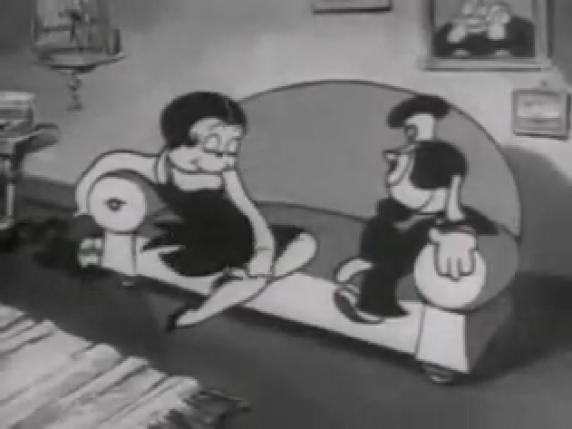
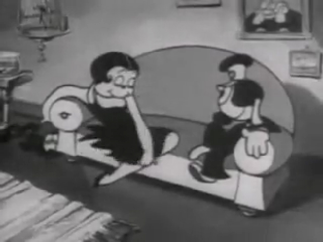
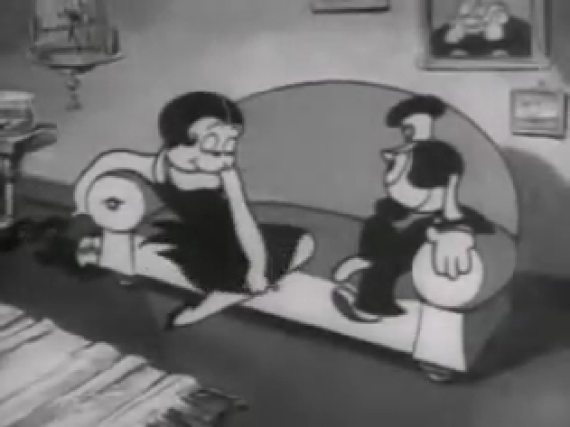
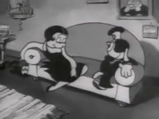
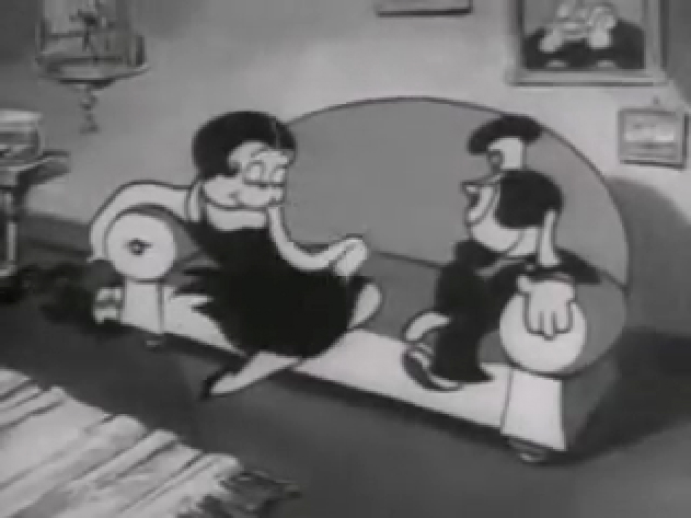
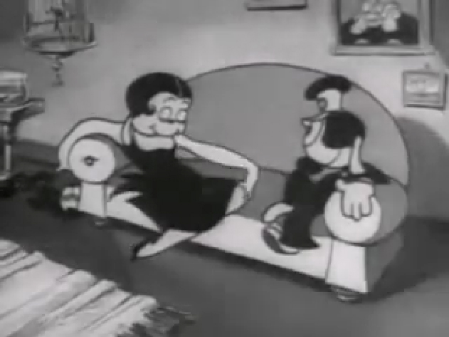
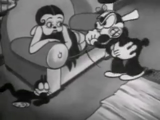
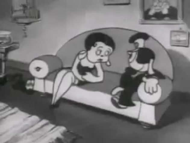
If you jump ahead to Fleischer’s “Barnacle Bill”, also from 1930, you’ll find this wild scene where Betty is seducing Bill, you’ll see all sorts of distortion in the inbetweens which Grim has maneuvered for Betty’s movements on the couch. Note how well posed his extreme positions are drawn despite the distorted inbetweens, when she is moving.
 1
1
Look at the beautiful drawings (above) of this character in some of these extremes from this film. The character of Betty isn’t moving whereas Bimbo – I mean Barnacle Bill is all over the place. Yet your eyes are on Betty in that held position.
Now, let’s look at what the inbetweens are doing as Betty gets from one pose to the next. It’s really funny. Grim has found a way to create a sympathetic, adult and female character, yet he keeps her funny with the surface of the animation.
 1
1
At times in the animation, Betty’s hand may turn into a claw, but that might be that Grim delivered a rough which was poorly cleaned up by an assistant. Or perhaps the inker just inked from a rougher drawing, perhaps a Grim “clean up” if there ever were such a thing. He worked ROUGH. In fact, that distorted claw of a hand doesn’t matter. It’s the extremes that counted for Grim, and he was experimenting with this animation to see if that really were true.
I’ve remembered over many years an interview with Dick Huemer,* who worked alongside Grim on some of these films. Huemer gets credit for inventing the inbetweener to use in the animation process. It allowed him to turn out more animation and not worry about the many drawings that would paste the scenes together. In that interview, Huemer said that it didn’t really matter what the inbetweens looked like. You could draw a “brick” and it would still work. They actually may have believed this, at that time. Grim is using the inbetweens to get somewhere else in putting the scenes together.
(Tomorrow, I’ll post, again, a scene Grim did for Raggedy Ann with Dick Williams’ clean ups alongside so you can see the variance.)
* In Recollections of Richard Huemer interviewed by Joe Adamson, [1968 and 1969] Huemer said:
- And i decided that I would save all that work of inbetweening by just having a bunch of lines or smudges, just scrabble, from, position to position, When something moved fast. To prove it, I had an alarm clock flying through the air, and right in the middle of the action I put a brick. And vhen they ran the finished
film you didn’t see the brickl It proved that you didn’t really see what was in the middle. But I overdid it.
Action Analysis &Animation &Commentary &Frame Grabs &Tytla 25 Mar 2013 06:05 am
Smears, Distortions, Abstractions & Emotions – 2
- I wrote about this stylistic animation device not too long ago. I was leading up to the master, of course, Bill Tytla. He distorted things, alright, and in the way he did it, he changed animation forever, as far as I’m concerned.
But I started that story by writing about traditional animation and where it came from and where it was going; leading to a sort of rebellion as animators started distorting things, generally, in working closely with their unconventional directors. I purposely skipped a step there, and I should go back a tiny bit and talk about a couple of animators from the silent/early sound days. Today I have Bill Nolan in my sights; tomorrow, Grim Natwick. It’s kind of important before going on to Bill Tytla.
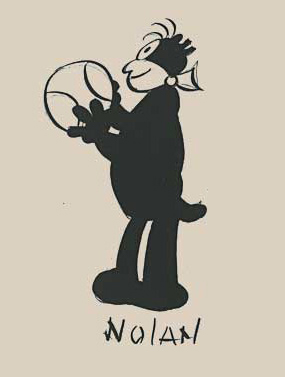 In the animation community in 1927-1930, there were two key animators who were considered the leaders in the business:
Ub Iwerks at Disney (until he left to open his own studio) and
Bill Nolan (at first with Pat Sullivan & Felix the Cat, then with Mintz’ Krazy Kat, and then onto a series of topical gag films called “Newslaffs.”
Both were considered the fastest animators in the country, and it was debatable as to which was quicker, though Iwerks was probably the guy. When Disney learned that Iwerks was leaving, he interviewed Nolan in New York to see if he were interested in replacing Iwerks. Disney offered a high salary of $150 per week for the job. It didn’t work out; Nolan was doing an unusual series, but ultimately went to ________________Nolan’s Krazy Kat looked original.
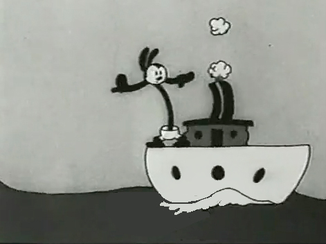
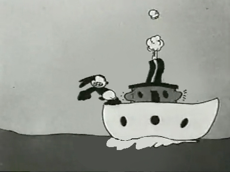
Oswald the Rabbit after Universal had taken
charge of it. Nolan just about ran the studio under Walter Lantz and allowed them to turn out an enormous amount of footage.
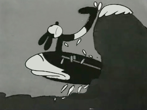
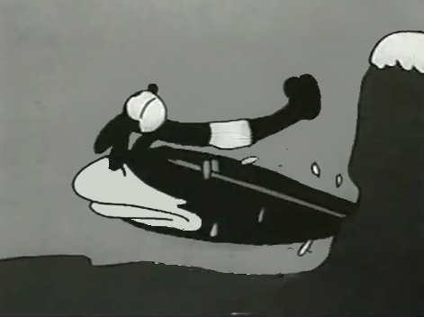
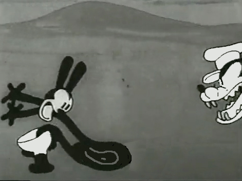
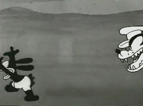
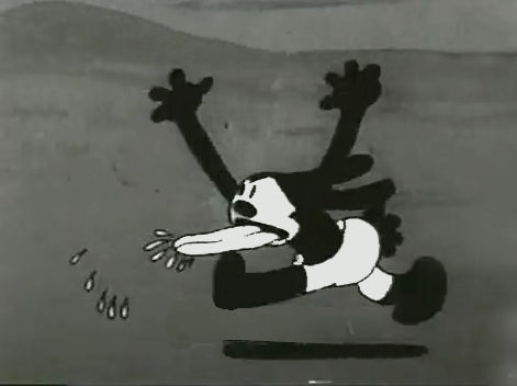
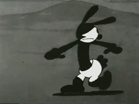
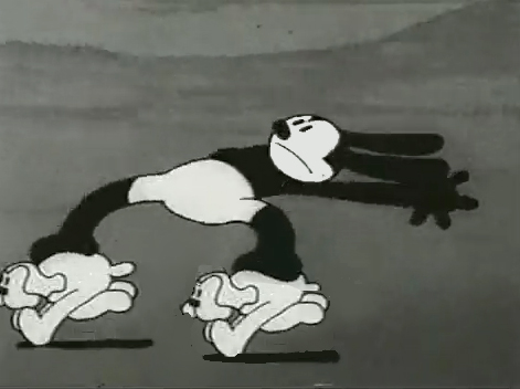
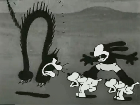
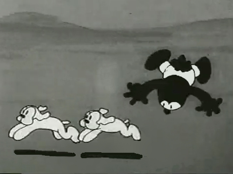
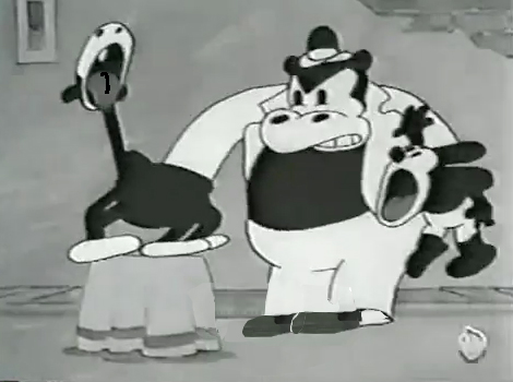
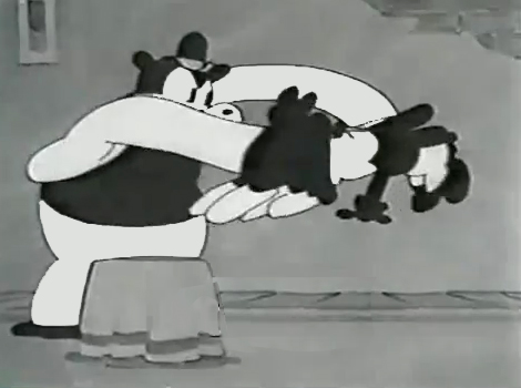
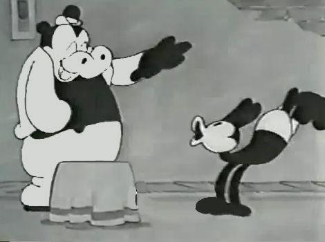
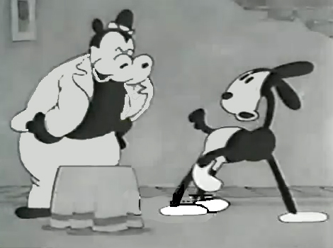
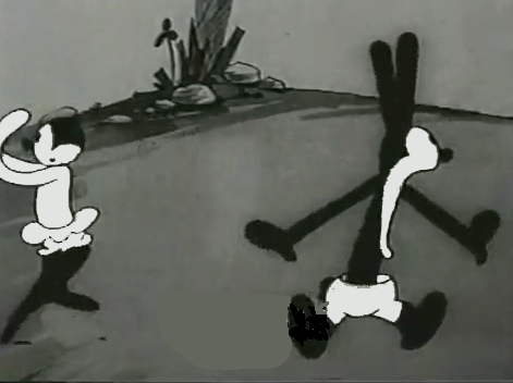
Nolan had developed a style known as the “rubber hose” style in that the limbs of a character were like flexible hoses and joints would be broken wherever the animator wanted. The style also featured very circular drawings. Stylistically, this fought the angularity of some other films that were being made and allowed Nolan to turn out many more drawings than usual. The roundness offered a faster line, and there was also quite a bit of distortion in Nolan’s drawings. Quite often the characters, Oswald, for example, didn’t even look like the character on the model sheet. In fact, you’d have to wonder if there was a model sheet, given the look of the animated character. Both Nolan and Iwerks were straight ahead animators, which meant they could easily go off model. Iwerks was better at holding things than Nolan, who seemed to enjoy being wild. Nolan would go back through his wild drawings and correct a couple of them, but would leave any other changes to lesser artists.
Nolan’s work was somewhat similar to the work of Jim Tyer, but I don’t think Tyer was drawing/animating that way to turn out faster work (though he was a very fast animator.) Nolan had to push the work out, and the rounded, distorted drawings enabled him to animate very quickly. As he went on, the artwork grew more and more wild, and it varied somewhat from the other animators’ work. Tyer tried to get his art to distort, as it does; Nolan just ended up there.
 1
1 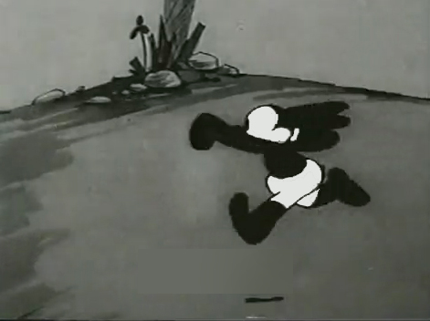 2
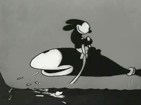
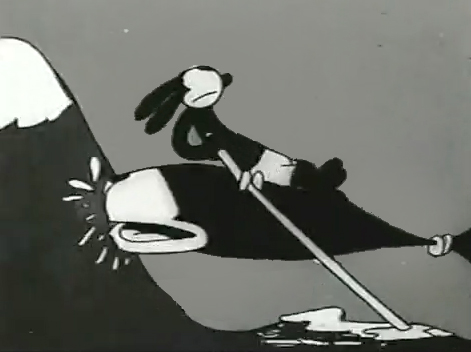
2I’d chosen a lot of stills from several of the
Universal/Lantz Oswald cartoons, animated by Nolan.
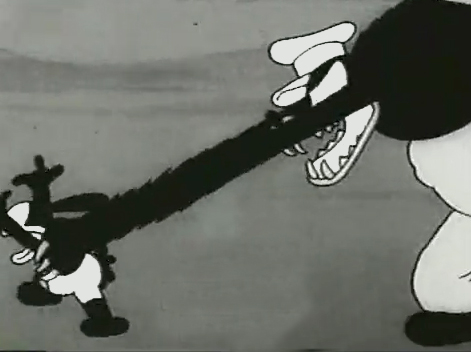 3
3 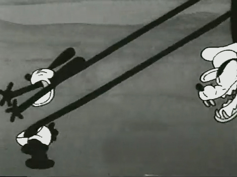 4
4
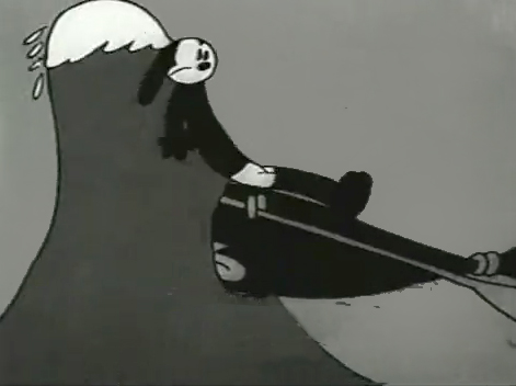
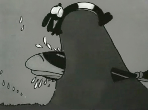
But so many of these from the short, “Permanent Wave,”
are good enough to illustrate my point.
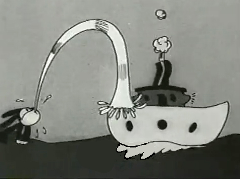
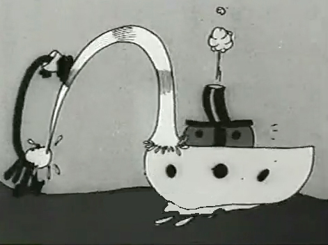 13
13 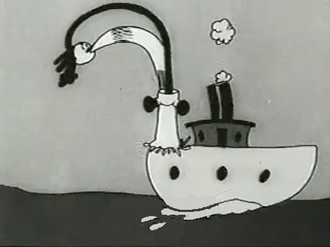 14
14
His body moves out in front of his head
as it climbs up the water he’s spitting onto the boat.
“The Hash Shop” was about as crazy as the animation and the gags went. Here’s one that ends the film.
By 1930, Bill Nolan seems to have settled down a bit. He still abstracts and distorts his animation, but he tries to fit in a bit more with other animators who aren’t drawing their animation quite so abstractly.
After Disney’s “The Three Little Pigs,” other studios tried to catch up with this new type of animation. Nolan and, to a lesser extent, Lantz, didn’t try very hard to change. They liked the way things were going. However, it didn’t take long for Lantz to move for a change in Oswald’s design. They went cuter and whiter on the rabbit.
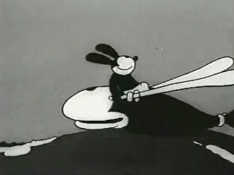
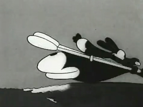
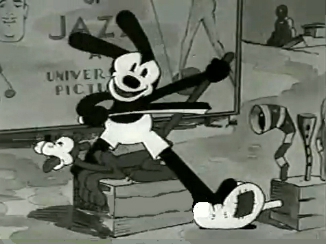
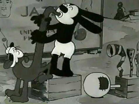
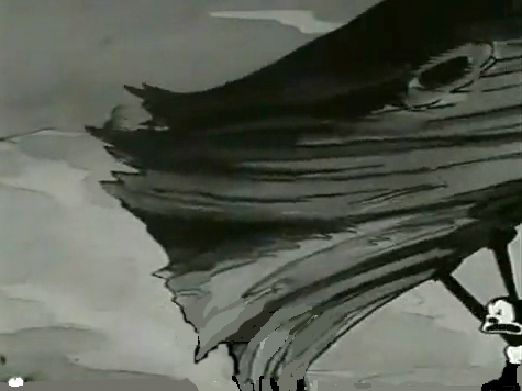
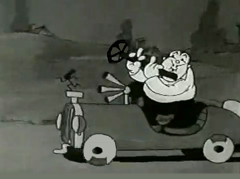
Here are some frame grabs from “My Pal, Paul.” In it Oswald wants to play music with jazz conductor/musician, Paul Whiteman. As it happens, Whiteman’s car breaks down while he’s driving through the woods, and the two get a bit of a duo as Whiteman plays the steering wheel like a clarinet. (Maybe that’s abstract enough.)
Animation &Animation Artifacts &Articles on Animation &Richard Williams 20 Mar 2013 05:29 am
Dick Williams’ Notes
- One of the better pluses of working on Raggedy Ann, back in 1977, was the information available to us. There was circulated, there, a book of notes Richard Williams had kept during the lectures Art Babbitt had given at is studio in Soho Square. These still act as a unique bible I have on my shelf. (Unfortunately, these days it’s on a shelf in storage.)
There was also another set of notes. These weren’t 8½ x 11, they were 14 x 17 sheets of paper, and only a few had access. As one of the bosses there, I had access. (Basically, we couldn’t have everyone copying 14 x 17 sheets of paper; that got expensive.)
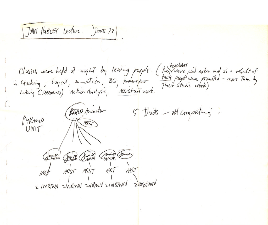
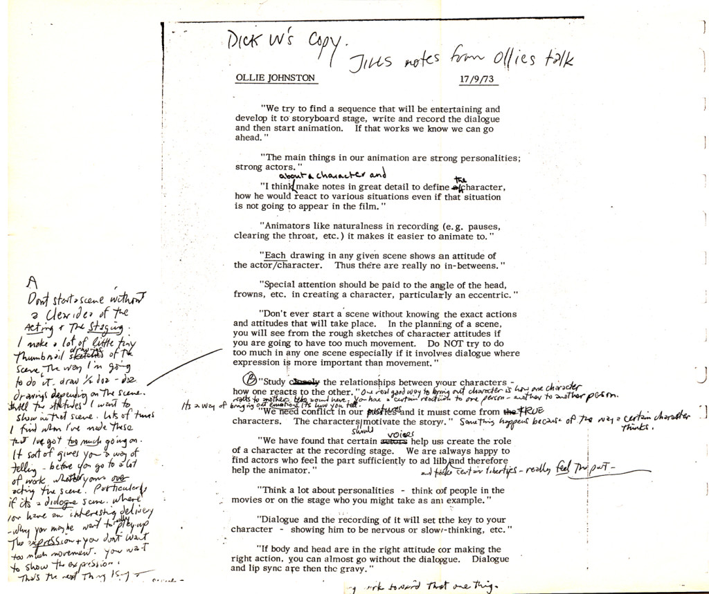
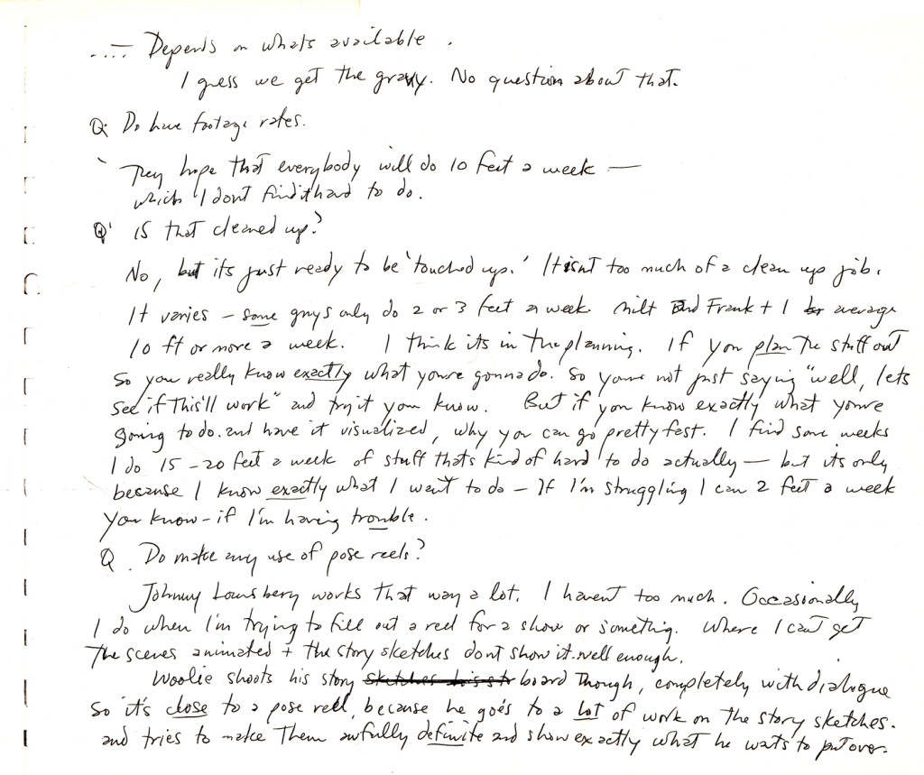
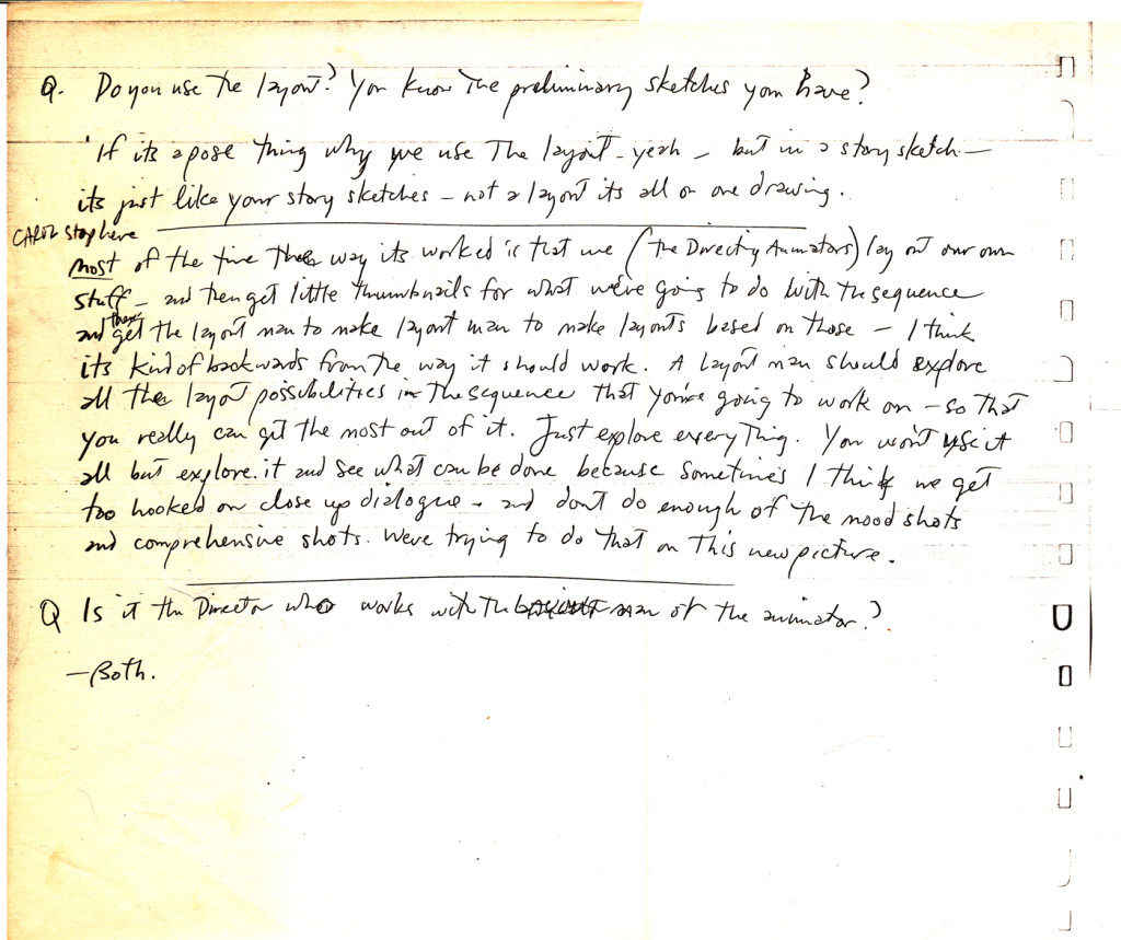
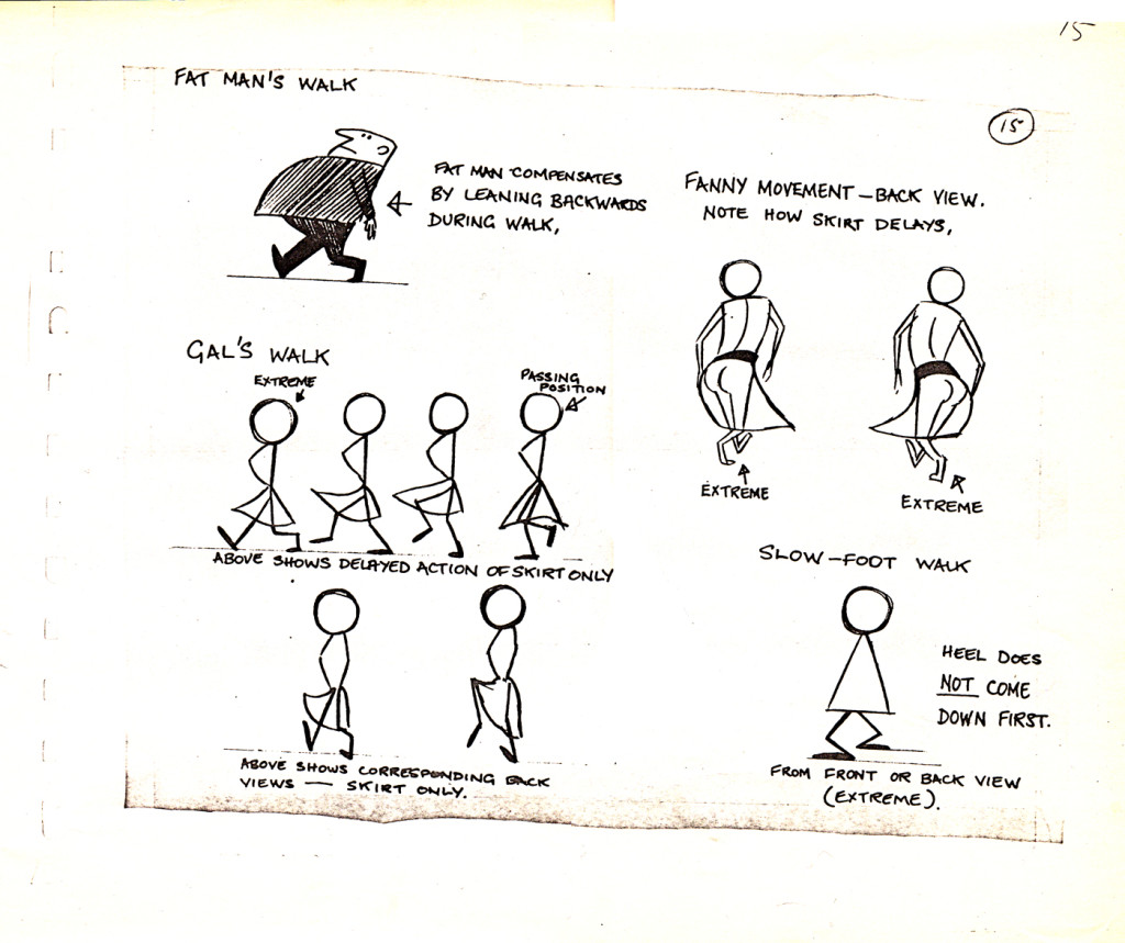
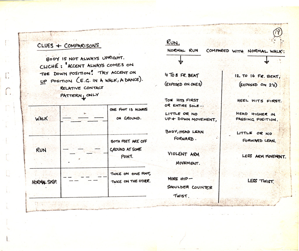
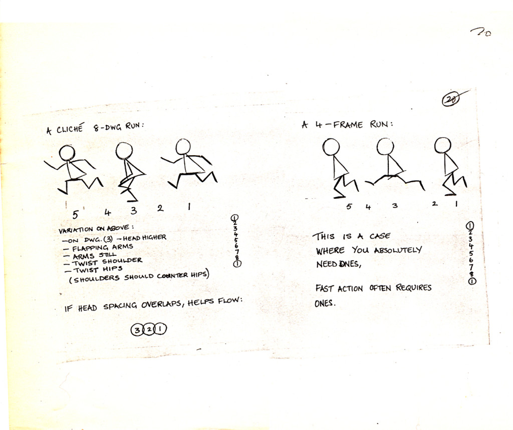
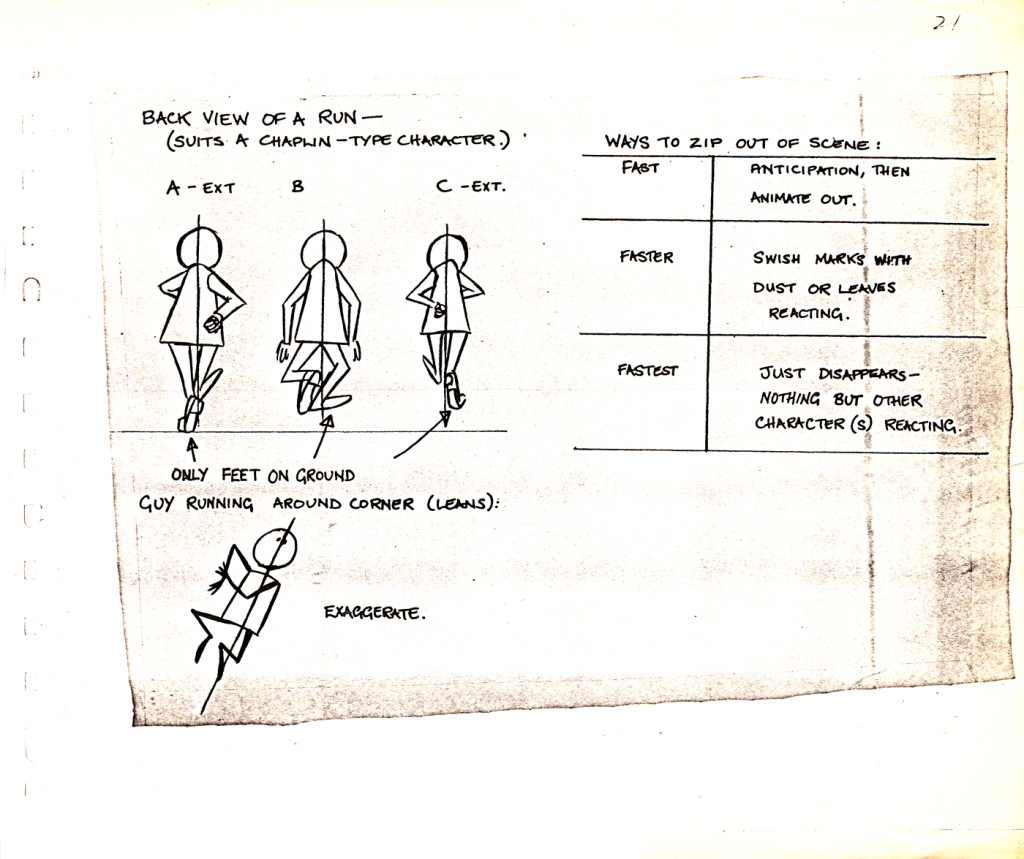
I think these were notes Dick was keeping for a potential book he’d write. They pulled from everywhere, whether it was Preston Blair‘s book or the Disney after-hours studio lecture notes. There were also notes Dick kept from other pros that had given lectures at his studio. Here’s a good sampler of some of these pages. There’s a Milt Kahl talk, a John Hubley talk, notes on an Ollie Johnston talk (typed by Jill, Dick’s assistant as well as notes of different walks from Dick, himself.
I won’t interpret them for you, but will just dump them on you. So here they are. Make sense of them, as you will:
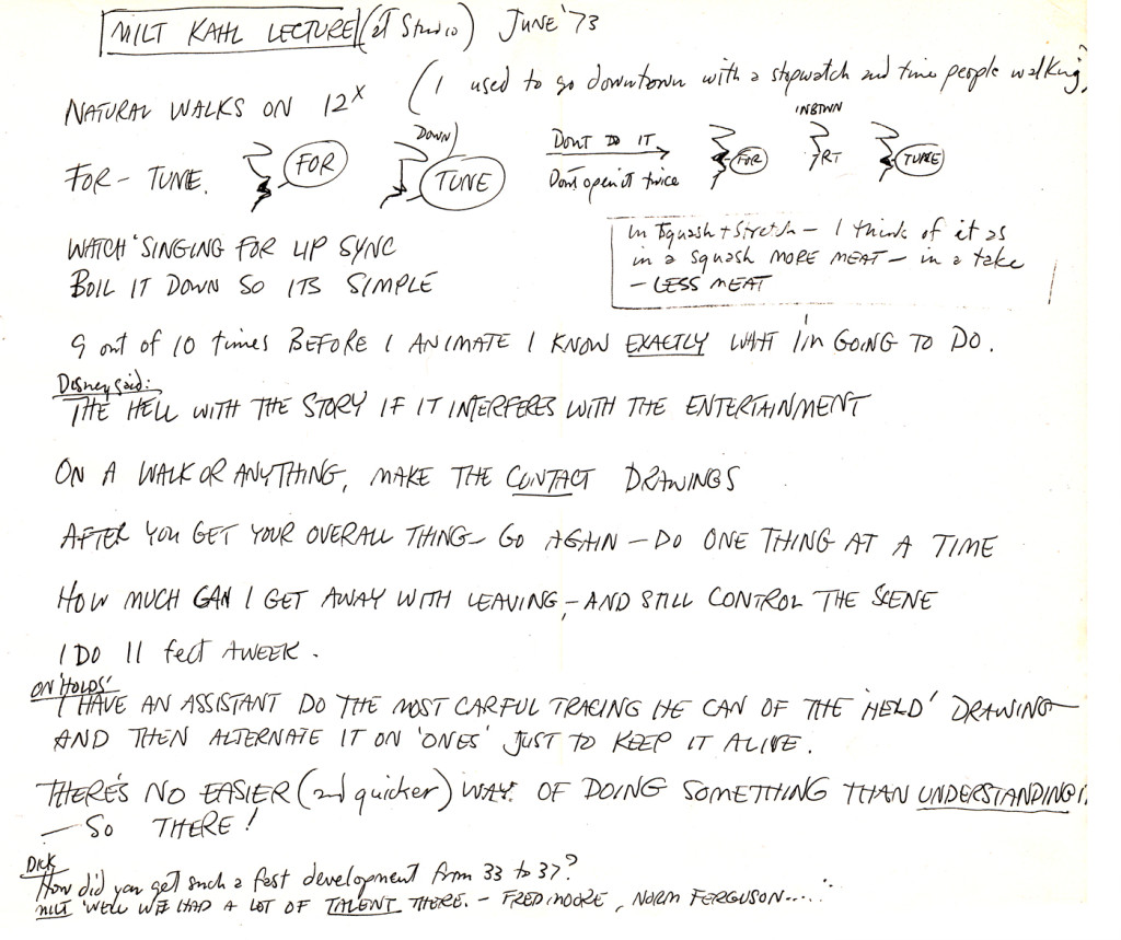 1
1
Animation &Bill Peckmann &Disney &Models 26 Feb 2013 05:54 am
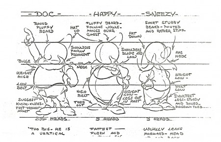
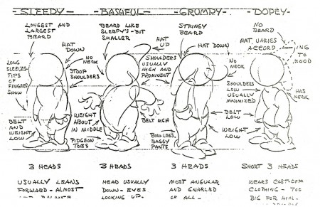
Snow White models – redux
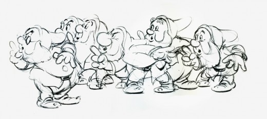
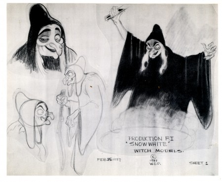
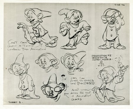
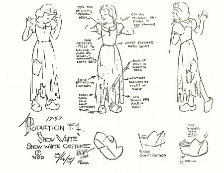
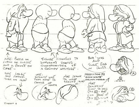
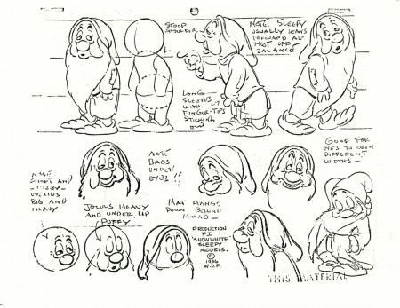
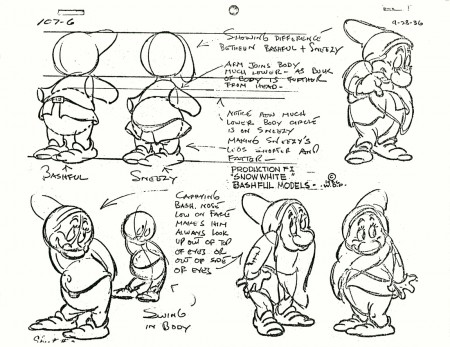
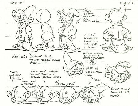
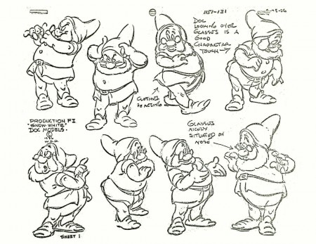
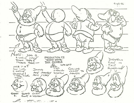
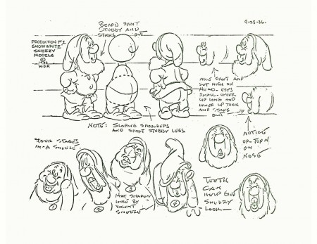
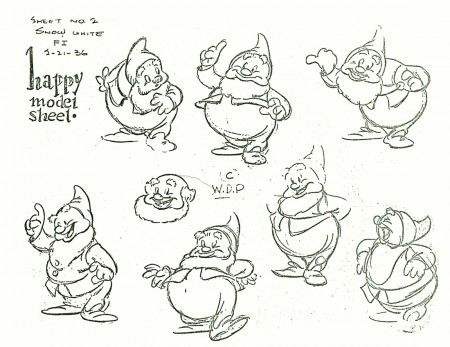
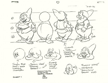
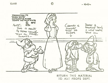
- Here, I continue with the recent outburst of model sheets. The following is a collection of Snow White and all seven dwarfs. I assume some of these can be found in print in one of the many collections of art from the film. I found two of the models in an old, expensive book I have which came via American Express.
The first two beautiful, original models come courtesy of Bill Peckmann‘s collection. The remainder of the group were Xerox copies I made years back. I’ve tried to clean them up a bit (lots of old grit from the ancient copies on glossy paper.)
Animation &Commentary &Daily post &Errol Le Cain &Richard Williams 25 Feb 2013 05:28 am
POV
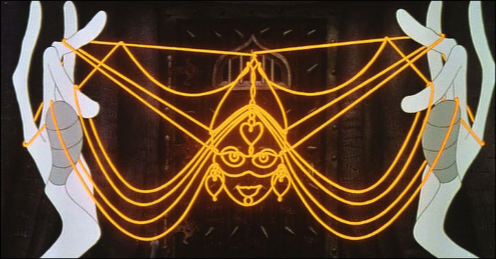
Next Friday, at the invitation of filmmaker-editor-director, Kevin Schreck, I’ll have the pleasure of seeing his recently completed documentary, Persistence of Vision. This is the story of the making of Richard Williams‘ many-years-in-the -making animated feature, The Cobbler and the Thief. I’m not sure of the film maker’s POV, but I somehow expect it to be wholly supportive of the insistent vision of Richard Williams in the making of this Escher-like version of an animated feature. A work of obsession.
It’s the tale of an “artist”, someone who sees himself as an artist, and continually pushes through the world with what would seem to be evident proof of such. After all, this man had single-handedly altered the face of 2D animation in a world that was about to throw it away with all its rich history and artistry and strengths. A medium that had developed through the years of Disney with giant, filmed classics such as Snow White, Pinocchio, Fantasia and even Sleeping Beauty. A medium that had drastically changed to 20th century graphics under the hands of people like John Hubley, Chuck Jones, George Dunning and many others and had just about reached a zenith where it was moving toward something wholly new, something adult.
Instead the medium took a turn in the wrong direction. The economics of television brought us back almost 100 years as films became more and more simplistic and simpleminded in the rush to be cheap. Even the Disney studio went for the poorest subject matter using cost-saving devices to sell their films. Films became shoddier and shoddier, and the economics ruled. The closest the medium would come to art was Ralph Bakshi‘s Fritz the Cat and Heavy Traffic, low budget movies that traded on racy material in exchange for an attempt at something adult, stories barely held together with editing tape. Animation was getting a bad name from every corner whether it was the sped-up graphics of Hanna-Barbera, the reach to the lowest common denominator with poor animation from Disney, or the shock and tell of Ralph Bakshi‘s filmed attempts at what he saw as art.
Williams took a different turn. He went back to the height of animation’s golden era, inviting artists such as Grim Natwick, John Hubley, Ken Harris and Art Babbitt to his London studio to lecture on the rules and backbone of the animation. He brought some of these people to work on a feature that he’d decided to create within his studio on the profits of commercials. These very same commercials financed the training of Dick and his young staff.
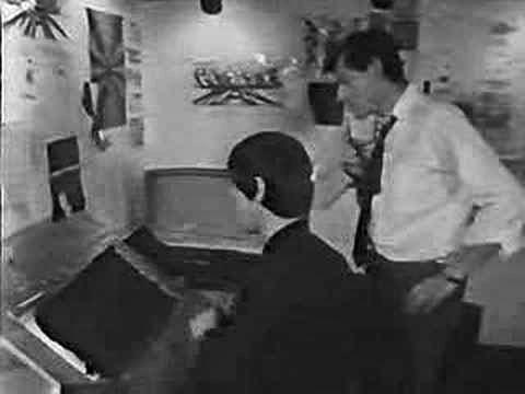 A documentary done in 1966, called The Creative Person: Richard Williams offers an excellent view of his studio. We see snippets of shorts Dick made with his own coin: Love Me Love Me Love Me (1962) or The Sailor and the Devil (1967) wherein we see the training of a young and brilliant illustrator named Errol le Cain. (Le Cain became known for his magnificent, glimmering children’s book illustrations. He was doing most of the backgrounds for The Cobbler and the Thief, and had certainly had a large part in its design.)
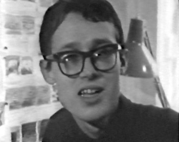 We see in this documentary the first hint of The Cobbler when it was called Nasruddin. It was based on a book of middle eastern tales of a wise fool whose every short story tells a new and positive anecdote. Dick had illustrated several books of these tales with many funny line drawings. The book was written by the Idres Shah who had undertaken a role within the Willams studio finding funds for the feature. Eventually, the two had a falling out, and Idres Shah left with his property. Williams took the work he had done as Nasruddin and reworked it into The Cobbler and the Thief. ________________________________Errol le Cain
Meanwhile the work within his studio continued to develop, growing more and more mature. The commercials became the highlight of the world’s animation. Doing many feature film titles such as What’s New Pussycat (1965), A Funny Thing Happened on the Way to the Forum (1966), The Charge of the Light Brigade (1968) led to Dick’s directing a half-hour adaptation of The Christmas Carol (1971). Chuck Jones produced the ABC program, and it led to an Oscar as Best Animated Short.
Through all this The Cobbler and the Thief continued. Many screenplays changed the story and the stunning graphics that were being produced for that film were often shifted about to accommodate the new story.
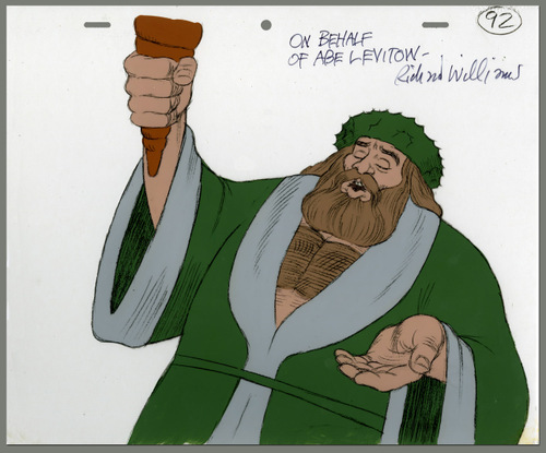 By this time, Williams had developed something of a name within the world of animation. Strong and important animation figures went to his studio to work for periods of time. Someone like Abe Levitow taught and animated for the studio. (His scenes for The Christmas Carol are among the most powerful.) Many of the Brits that worked in the studio and then left to start their own companies were now among the world’s best animators.
Williams had the opportunity of doing a theatrical feature adaptation of the children’s books The Adventures of Raggedy Ann and Andy and took it. A large staff of classically trained animation leaders such as Art Babbitt, Grim Natwick, Tissa David, Hal Ambro, Emery Hawkins and many others worked out of New York or LA as the company set up two studios to produce this film. Working for over two years, Dick’s attention was diverted to work away from his London studio, where commercials and some small devotion was given to The Thief by a few of the key personnel working there. Dick spent a good amount of his time in the air flying from NY to LA to NY to London and back again and again. He concentrated his animation efforts on cleaning up animation by some of the masters, rather than allow proper assistants to do these tasks. By doing this he was able to reanimate some of the work he didn’t wholly approve of. Entire song numbers were reworked by Dick as the film flew well behind its budget and schedule.
Eventually, the film finished in confusion and mismanagement, and Dick moved to his LA studio where he continued commercials and began Ziggy’s Gift, a Christmas Special for ABC.
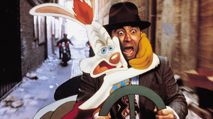 From this he went back to his London studio and did the animation for Who Framed Roger Rabbit for producer/director Robert Zemeckis. He hoped that work on this feature, which won three Academy Awards, including a special one for the animation, would be the triumph he needed to help him raise the funds for The Thief and the Cobbler. Now that he was safely back in his own studio in Soho Square he felt more focused.
A contract came from Warner Bros., and the work began in earnest.
Dick’s history wasn’t the best working on these long form films. Chuck Jones replaced him on The Christmas Carol to get it finished when work went overbudget and schedule. Dick was putting too much into it. Gerry Potterton finished Raggedy Ann when the budget went millions over with less than a third completed. Eric Goldberg took over Ziggy’s Gift, the Christmas Special for ABC, to get it done on time. On Roger Rabbit, the live action director stayed intimately involved in the animation after his shoot was complete. When it became obvious that things weren’t going well, he stepped in to complete that film.
In all cases of all of these films, Dick never left. He stayed on working separately on animation or assisting to try to keep a positive hand in the quality of the work that was done.
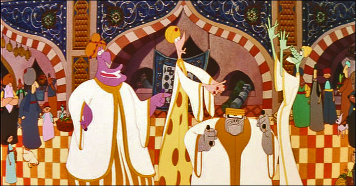 When The Cobbler and the Thief ran into very serious trouble, there was no secondary Director or Producer to come in and complete the work. Instead that job fell to the money men. The completion bond company, essentially an insurance company for Warner Bros. to make sure they wouldn’t lose their money if things didn’t go well, stepped in. They closed Dick’s studio and removed Dick from the premises. The boxed up and carted off all animation work done or in progress. It was all moved back to Los Angeles.
The Weinsteins, through their company, Miramax bought the film at auction and completed it with a poor excuse of an animation outfit they set up in LA. Work was also sent to Taiwan. The script was reworked trying to capitalize on the success of Disney’s Aladdin that had recently opened in the US. If Robin Williams‘ ad libbing could be such a success, imagine how well Jonathan Winters could do repeating that for a character who, in Dick’s original version, had no voice. Now he didn’t stop talking.
The new film failed miserably and deserved to do so. The primary audience, I would suspect, was the entire world animation community coming to look down on the artificially breathing corpse.
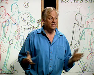 Richard Williams, himself, retired and moved far from the mainstream. He continues to work on small animation bits, but his primary work has been in making a series of DVD lectures revealing how animation should be done. This accompanies a well-received book he wrote and illustrated. Meanwhile, the animation community still hopes that something will emerge from that corner.
Dick turns 80 years old on March 19th. He’s still an amazing forceful and exciting personality. I wish I had more access to him (as does most of those who knew him back then.) He’s had probably the greatest effect on the animation industry of anyone since the late sixties. There are still studios thriving today on information they learned from Dick and his teaching.
If you’re unfamiliar with the blog, The Thief, I suggest you take a look.
Animation &Animation Artifacts &Commentary &Layout & Design 12 Feb 2013 07:16 am
MGM Hounds – redux
- Cable TV has changed and not for the better, just toward the more corporate. In the old days you could turn on the Disney channel and catch some Disney animated shorts – the classic kind, not the Flash kind. You could see some of the 60s Paramount cartoons on Nickelodeon. You could tune into TNT and see early MGM cartoons. Today, if you’re lucky, you might see one of the more popular Harman-Ising shorts sandwiched in between two late-Droopy cartoons on Boomerang’s MGM show.
(Click any image to enlarge.)
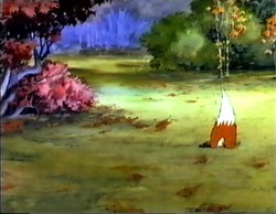 I was a big fan of those Harman-Ising MGM cartoons. The sheer opulence of the productions was staggering to watch. For over a year, I taped an early morning program on TNT trying to grab all of the Harman-Ising shorts they aired. I was able to capture about 90% of them. It’s unfortunate that no DVD has been released of these gems so that collectors like me can feel satisfied. The Turner transfers were pretty good, and a simple DVD release of these would be worth a lot to me.
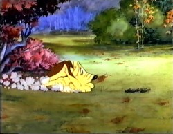 Not too long ago, I was able to buy a couple of drawings on ebay from the Harman-Ising shorts. There wasn’t much competition for them, and I was able to afford them.
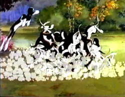
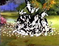
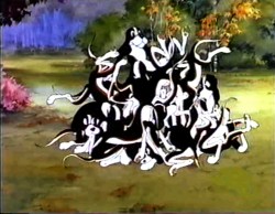
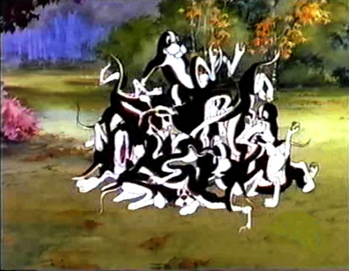
One drawing is from the odd series featuring the “two curious pups.” I had an old Blackhawk 8mm copy of this short (in an edited version) and would run it back and forth still frame. I’ve captured some stills of this very scene to give you an idea of what’s happening.
The Pups’ Picnic (1936)
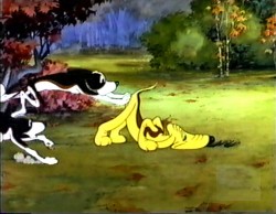
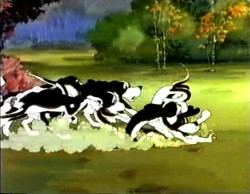
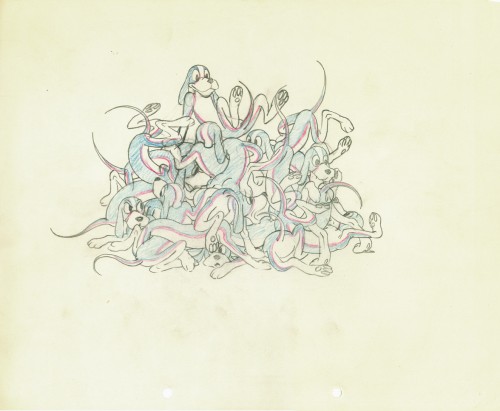
I don’t know who animated this scene,
but the drawing is a beauty, as far as I’m concerned.
The paper siize is 9¾ x 12 w/two round holes.
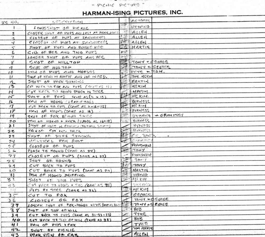
Mike Barrier just contributed the draft (below) to this film. It indicates that Pete Burness animated this scene. (I did buy the drawing from the Burness estate.)
Animation &Animation Artifacts &Bill Peckmann &commercial animation &Illustration &Models &Story & Storyboards 30 Jan 2013 08:26 am
More Misc Commercial Art
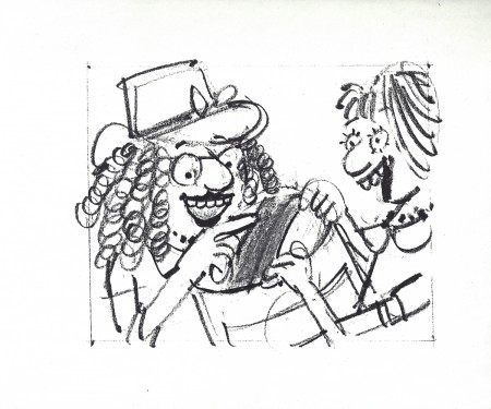
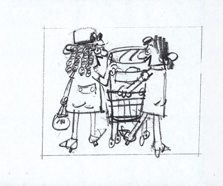
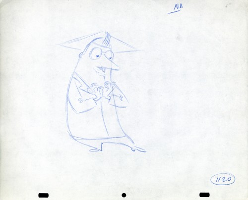
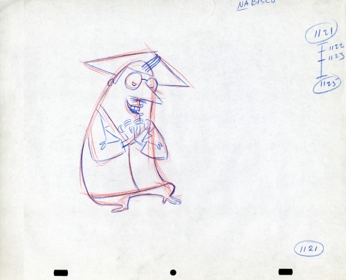
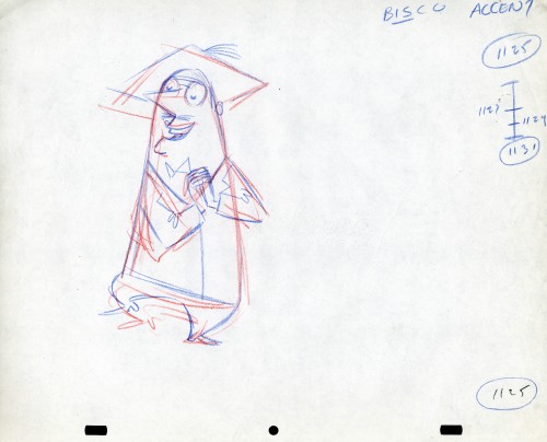
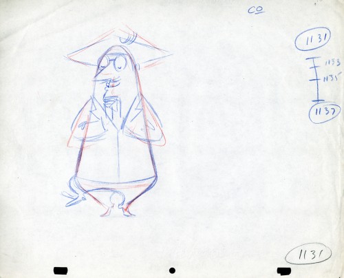
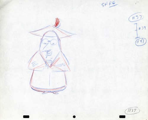
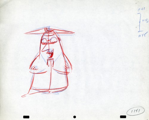
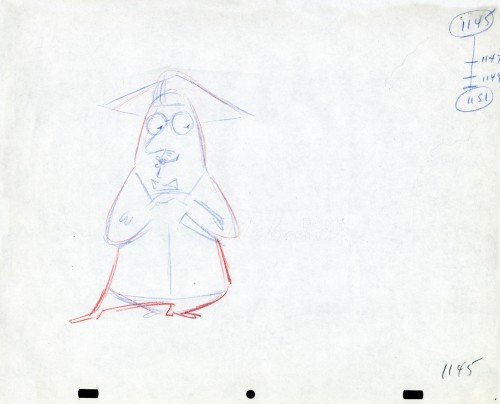
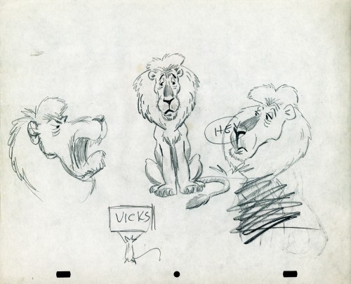
- Still left in the Vince Cafarelli collection of drawings from commercials he did, most probably, at Goulding-Elliott-Graham (for the moa part) are the drawings below. We know through some small bits and pieces of information what a couple of the sponsors were. (The wording of dialogue the professor speaks that the sponsor is Nabisco Shredded Wheat; the lion and the mouse ad is obviously for Vicks – drops or vap-o-rub.) However, too many other bits leave us empty handed. I can recognize cartoonist, Lou Myers‘ work anywhere, but no clue what they’re for. Candy Kugel and I were also able to delineate Lu Guarnier‘s drawing style (Vinnie was his assistant for years), and I know Jack Schnerk‘s great work. I recognize the brilliant and great hand of George Cannata from similar work that Bill Peckmann had recognized (see here) in a past post. So it is great to learn as much as we can, even though there’s a lot of guesswork in it.
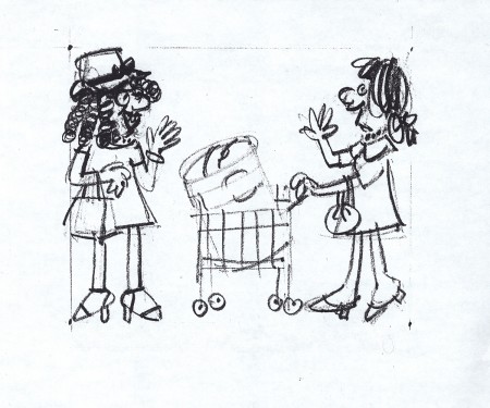
The following are three storyboard drawings by cartoonist Lou Myers for some spot:
 1
1
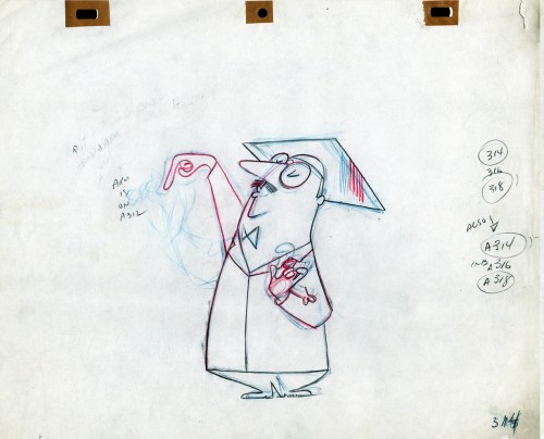
The following drawings are for Nabisco Shredded Wheat. They’re animation drawings/ruffs by Lu Guarnier. The delicate pencil lines of these years turned into dark rougher ones in his later years. The timing charts were always the same right out early wB years. You’ll notice a lot of quarters and thirds in the breakdowns. This is something you’d never see from Disney. There, everything is broken into halves and halves again and again.
 1A
1A
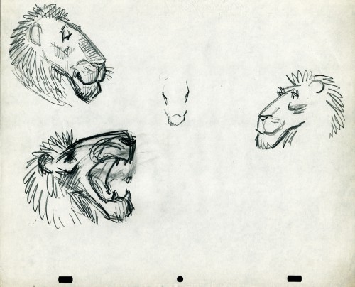
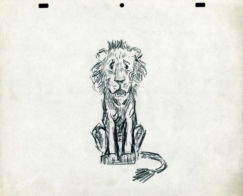
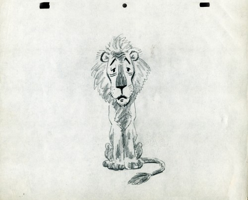
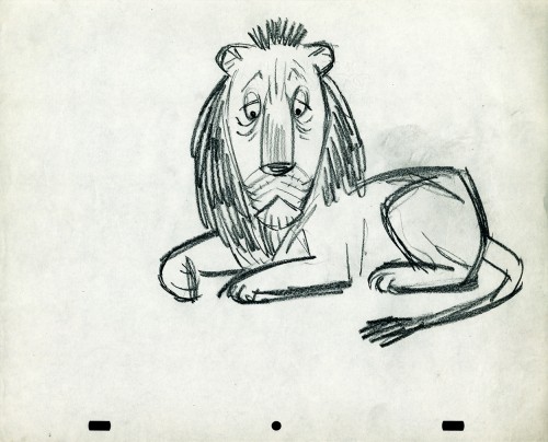
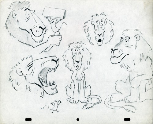
- The following lion is designed and animated for a Vick’s commercial. (Note the second model sheet.) There were quite a few commercials during the period that reworked this great Aesop tale for the sponsor’s use. The lion obviously has a cold. Rather than pulling out the thorn, the mouse introduces him to Vicks’ cough drops and the lion feels a whole lot better.
What has been left behind of this ad includes a couple of model sheets of the lion as well as a couple of animation drawings. I don’t know who the designer is, but the animation drawings are most definitely the work of Jack Schnerk. I suspect all the drawings here are by Jack. He probably kept reworking the model sheet until he got the character in his hand. I can remember him lecturing me on the quality of my drawings. Unless my drawings became roughs, rather than tight clean ups, he was convinced I couldn’t get good animation in my pencil. Jack’s work was rough. and it became much more rough than this, certainly by the time I knew him and was assisting him. He also had a peculiar style of roughness; very choppy angular lines chiseling out the fine drawings. You can get a good example of that with drawing labeled “2D”.
The last four drawings are all animation drawings. “2D” is a rough, “2E” is a clean-up by Jack. The last drawing is a beauty and probably the final look he hit upon.
 2A
2A
Here we have some drawings by a designer. I suspect that it’s the work of George Cannata. I did a couple of posts on a designer at Robert Lawrence Studio a few weeks back. Bill Peckmann identified the primary designer whose work screamed out to me. Since then, I’d recognize that line anywhere, and it’s most definitely below.
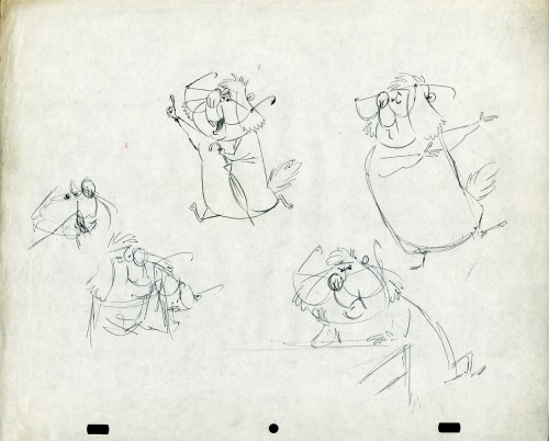
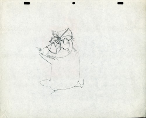
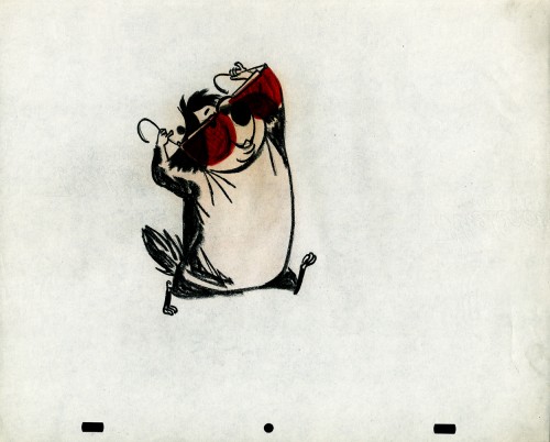
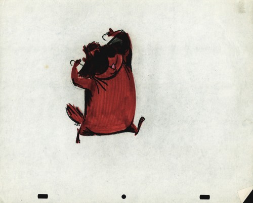
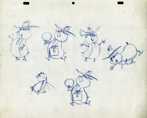
The Groundhog below is obviously a character with a southern drawl. The first step was to try the obvious making him a cowboy (“3A”). But that soon changed. and the character got plenty more sophisticated (“3B & C”). After that the line got juicy and the color got bold. There’s really so much to a character like this who just about animates himself.
 3A
3A
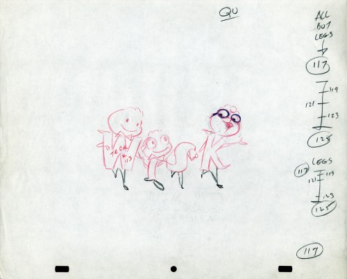
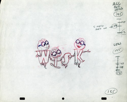
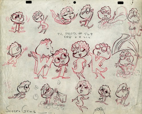
The following five drawings are for a WISK commercial. There are two model drawings and three animation ruffs. The primary model indicates that the spot is done for Screen Gems which was a viable studio in the early 60s and 70s. However, I don’t know who the animator was. Neither Lu Guarnier nor Jack Schnerk fill the bill.I know that Irv Dressler was at Screen gems for many years, but am not sure about this time especially since IMDB has him free lancing for King Features and other entertainment studios. The drawswing style of these animation drawings is right out of the Paramount/Terrytoons mold. Many animators’ work looked like these. People such as Johnny Gentilella, Marty Taras et alworked in a very similar style, though these are a little harder lines than either of those two.
 A
AThis is the primary model for the entire family. It’s a
beautiful drawing, and the characters have a lot of play
in them despite being connected so obviously.
Just look at the father’s hair. Beautifully done
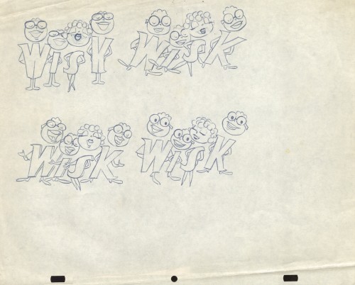 B
B
Here’s a secondary model. I suspect this is the animator
tracing off the characters and seeing what he can do with them.
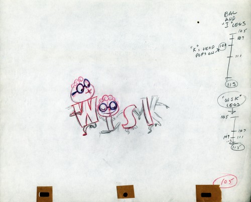 C
C
Animation drawing #105. Those breakdown charts are something.
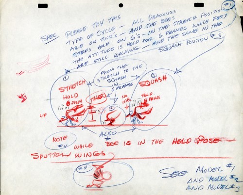
The Buffalo Bee for Honey Nut Oats is also a model sheet from Screen Gems. With it come an animation model sheet for the walk cycle of the character. These drawings look like Lu Guarnier’s to me, but there’s no official way I could confirm that, of course.
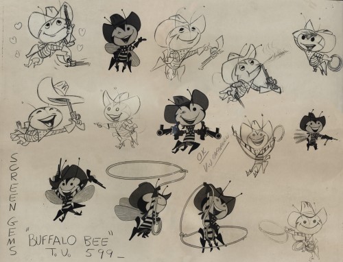
Model sheet


