Category ArchiveAnimation
Animation &Music &SpornFilms 08 May 2007 07:32 am
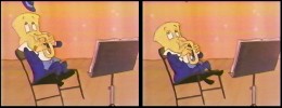
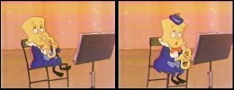
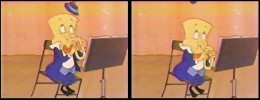
Ernest Does DeSoto
- I think music is as important to animation as any of the drawing. (Even the lack of music, to me, is a musical choice in film.)
I’ve been very lucky to have worked with some incredibly fine composers in the films I’ve done. To that end I’ve come back to work again and again with the same few composers.
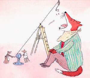 The first of those who seemed indispensible to the films we did together was Ernest Troost. We met way back on my first short film for Weston Woods. Ernest was on staff there, and we quickly became good friends.
That first score he did for me was the delicate Rosemary Wells Morris’ Disappearing Bag. This quiet little film was successful, but it wasn’t until our second collaboration that things took off – Doctor DeSoto.
Doctor DeSoto was an Oscar nominee in 1984, and I think it was as much for the music as it was the William Steig story, or Ian Thompson’s droll reading, or any of our artwork. The film was a hit and won a lot of awards and, to this day, still gets a lot of exposure.
As we were about to go into this film, Ernest had to write a score for an slide version of the book which Weston Woods was going to distribute. I suggested he listen to Stephen Sondheim‘s score for the film, Stavisky. It was built around an infectious waltz and had a peculiar arrangement.
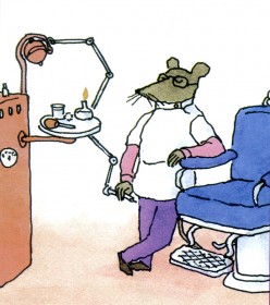 Ernest came up with something that took me by surprise. It was built off Stavisky but was so totally original in its sound that I had the first little shock that I’ve always gotten when music I didn’t expect but was excited and challenged with comes into my hands. This moment is always a great surprise and one of the pure delights, for me, of filmmaking. The only other experience it resembles is when an actor gives you a line reading that is totally unexpected, one you never would hear in your own head when reading the line. This is usually the best possible reading because it indicates pure character.
Ernest’s orchestral arrangements for this music reminded me of some small cartoon cabaret in Vienna in the early 1920′s. It worked perfectly for the cartoon Brooklyn in my mind for the film’s setting.
This is the pure character of a good composer scoring your piece.
Having the luxury of this original score prior ot the animation isn’t always a luxury an Independent filmmaker is given. It costs too much. But Weston had their score for the slide film, and I saw that this was going to be a great score for my animation. I worked with that waltz tempo.
When the fox was off screen, the camera moved in time with the waltz tempo and the limited animation also hit those beats. When the villain was onscreen, there was little to no camera movement cutting the picture to the tempos. Paul Gagne, editing, certainly helped out here.
The music not only was allowed to dominate the overall film, it was enhanced by this decision.
To hear the opening theme to Dr. DeSoto click here.
Ernest Troost also wrote about a dozen Sesame Street spots for me. Many of them were songs which he wrote with Maxine Fisher who did the lyrics. Two of these spots are featured on YouTube. I like the Crocodile Smiles spot which played at Annecy and is in the MOMA collection. Pirate Plan is a good song but my graphics don’t quite work.
Here’s another spot that is built around the music. For the very low budget, it was a big track for us, but Ernest pulled it off brilliantly. Obviously, he was parodying the John Williams’ scores for Indiana Jones.
Animation &Commentary 30 Apr 2007 08:02 am
Blum Commentary
- I read an editorial in an April 10th issue of The NYSun, and thought I’d put all of the attention of today’s blog into it. Normally, I wouldn’t put up an entire piece like this, but what the hell? I like it, and I don’t want it go completely unnoticed.
The commentary is by David Blum and is called
. . . . . . . . . . . . . . . . . . . . . “Who’s Laughing Now?”
- Is it genuinely funny to see an animated, overweight, middle-aged dude on a living room couch, waiting for the chorus of the “Maude” theme song to kick in? To me it’s mildly amusing, but I don’t think I’m supposed to be the target audience for Fox’s “The Family Guy,” where that reference turned up on a recent episode. Very few 12-year-olds have a working knowledge of theme songs from 1970s sitcoms, and those who do need to get into something more useful, like stamp collecting. But this is what happens when you entrust the writing of prime-time cartoons to adults. They write what they know. And if you’ve ever met a Hollywood television comedy writer, you know that most of them grew up with baby sitters named Sony and Panavision.
 It’s not fair that so many jokes on television’s most popular cartoons don’t work for people who don’t shave. That’s the target audience, and who Hollywood hopes to attract by turning these cartoons into movies themselves — “The Simpsons” movie opens in July, and the Cartoon Network’s “Aqua Teen Hunger Force” full-length version arrives in theaters this Friday. Maybe a few smart kids will get these shows’ highbrow allusions to movies like “The Natural” and “2001: A Space Odyssey,” but most preteens don’t get these nods to the past, and their parents don’t do much more than note them and nod off.
Okay, so I was home as a kid watching memorable movies and sitcoms, too, and I get the gags on “Family Guy” — most of them, anyway. But they’re more likely to make me wince at my vast, unnecessary knowledge of trivia than laugh at the repetition. A single episode contains so much material culled from television that it’s impossible to keep track of it all; one random episode included mentions of “dingo and the baby” (an homage to the 1988 Meryl Streep movie, “A Cry in the Dark), “Masturbator & Commander” (after the Russell Crowe movie “Master & Commander”), and an ice-cream-and-punishment sequence lifted directly from the 1980 Academy Award-winning movie, “Kramer vs. Kramer.”
There’s so much material in “Family Guy” taken from elsewhere that it inspired ridicule on an episode of “South Park,” in which the show’s writers were portrayed as manatees getting their joke notions from “idea balls” spinning freely in a giant bin.
 The writers at “The Simpsons” aim higher than “Family Guy,” but sometimes end up in the same place — with lines that resonate more with memory than humor. “As God is my witness,” Homer Simpson declares in one episode as he begins a new diet, “I’ll always be hungry again!” Is that funny, or is it just familiar? I don’t think there’s all that much entertainment value in a television version of Trivial Pursuit, and that’s what television cartoons have largely become — a catalog of lines from old movies, theme songs from 1960s sitcoms, and mentions of actors like David Hasselhoff. I’m probably the only person in my ZIP code to catch the “Simpsons” reference to Fox’s 1991 sitcom trainwreck “Herman’s Head,” and that’s not a proud moment.
The cannibalizing of the actual classics will result in another, more pernicious effect in the years to come — taking away the pleasure for kids of seeing the original source material from which great lines and memorable scenes are taken. When the latest generation of preteen cartoon-watchers grows up and sees the horse’s head sequence from “The Godfather,” they’ll have the implanted memory of the “Simpsons” episode in which Bart found the head of the Jebediah Springfield statue in his bed. Won’t that reduce the shock value, later in life, of seeing John Marley wake up to the sight of his silk bedsheets drenched in blood? The entire “Treehouse of Horror V” episode functions as a parody of “The Shining,” a movie most “Simpsons” fans won’t see for years. All references and no jokes make “The Simpsons” a dull show.
 This isn’t meant as a broadside against “The Simpsons,” which even at its weakest spins its thievery with wit and remains one of television’s finest achievements. And “Family Guy,” for all its dependence on cultural references and quotations, manages to be funny much of the time. It’s just that when the references become as tired as they’ve grown lately — “Family Guy” has, most recently, been borrowing from the comedy stylings of Carol Burnett, who has reciprocated by suing — you start to wonder about the point. Even more troubling than the trend itself may be the prospects for the future of cartoons. What will be left for the animated-comedy writers of tomorrow to borrow? At least this generation had some good material to use. Given the current scarcity of classic movies, it’s not implausible to imagine cartoons of the future stealing from Stewie Griffin of “Family Guy” or channeling Homer Simpson for their scripts. Will our children’s children find that funny? I seriously doubt it.
– Don’t miss Mark Kennedy‘s blog, Temple of the Seven Golden Camels. Today, it features Ken Anderson‘s African sketchbooks.
Anderson was a Disney artist/designer most of his life. He was one of the old-time animation guys who used real life for his inspiration, not other cartoons or television shows. He was something of a Renaissance man for Disney.
Animation &Daily post 24 Apr 2007 07:44 am
NFB ET AL
Before I point you in the direction of the NFB, take a look at Mark Mayerson‘s continuation of his “Mosaic” of Pinocchio. Does it get any better than this? It’s like looking at a grand version of the director’s workbook. You get to see the cutting so front and center. It’s just beautiful. Thanks and great work, Mark! You’re a treasure.

- The National Film Board of Canada has a program/project that’s designed to encourage new talent. It’s called Hothouse, and this is the program’s fourth year. Eight emerging filmmakers are spending twelve weeks at the NFB Animation studios in Montreal to create a 30-second film on the theme “A Chance Encounter.”
 Torill Kove, whose NFB/Norway co-produced The Danish Poet received this year’s Oscar for Best Animated Short, is this year’s mentoring director. You can view the films in progress from this year’s Hothouse, and you can also view past years’ productions.
In case you didn’t know, you can also view quite a few of the Film Board’s greatest films on-line, for free. There are 50 films available here.
If you haven’t seen The Street or Two Sisters by Caroline Leaf, what are you waiting for?
There’s an interesting article in today’s NYTimes about Ratatouille and Pixar’s work with Disney. It’s all about the marketing. (Especially with a title that’s confusing to pronounce for the “Freedom Fries” half of America.) I expect we’ll see quite a few more articles like this in coming weeks.
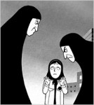 Speaking of French, congratulations to Persepolis now in competition at the Cannes Film Festival. It’s not often an animated film gets into competition there, and this one is 2D. Marjane Satrapi should be flying about now, and my kudos to her and her codirector, Vincent Paronnaud.
Finally, my congratulations to Tom Sito for his film Adventures in the National Palace Museum getting into the Cannes Film Festival.
That’s a coup!
Animation &Commentary 05 Apr 2007 07:58 am
Tubby
- I was reading the 1957 Disney Studio Directory posted on Joe Campana‘s site, Animation – Who & Where. when I came upon the name of Howard Diettrich. This threw me back to 1973 and Tubby The Tuba.
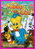 I’d just been layed off at the Hubley Studio, after completing the first 20 (of 60) episodes of Letterman. Officially, I had been categorized as an “inbetweener” in the Union. I’d done everything from animate to ink at Hubley’s, but that was my category. I received a call from Johnny Gentilella. We’d met through Hubley, and he was now working for NY Institute of Technology. They were in the early stages of production on their feature, Tubby The Tuba, and I was offered the job of Assistant Animator, a categorical promotion.
NYIT was the school I’d graduated from and received my BFA; it was located in Old Westbury, Long Island – about an hour’s drive from Manhattan. It’d be interesting, returning to my old school just to see how it had changed. By taking the Long Island Rail Road, I was able to cut down that ride by a few minutes and leave the driving to someone else. I was picked up at the station and driven to the animation building, a small cottage on the campus. Everyone was out to lunch except for Johnny Gent, and he drove me (about a couple hundred yards) to meet Sam Singer, the producer recently hired to do the film.
 Singer had done all those Courageous Cat cartoons that had infested children’s programming back in the late 60s/early 70s. Oddly, I enjoyed them; I always was a glutton for bad animation. Love those cel flares, shadows, scratches and cel edges.
I was directed to his office. In there was another producer (I’ll hold back his name) who had broken his ankle and was on crutches. I got to meet the two of them and listen to them kibbitz around me, virtually ignoring me for a few minutes. Singer was chewing on a cigar, and I couldn’t take my eyes off the spittle that seemed to be moving down the cigar in his mouth. When I finally left to return to the animation building, I saw that Singer was also on crutches. He had a clubbed foot.
I sort of remembered that meeting as an omen of things to come. The entire place, while I was there, felt like it was on crutches.
I liked Johnny Gent a lot; we got along well at Hubley’s; on Letterman I got to mangle quite a few scenes by him as I learned how to inbetween properly.
There were only about 8 others at NYIT at the time. Other people I met included Walt Kubiak, another assistant who I enjoyed talking to; animator, Chuck Harriton, who I’d met at Hubley’s (and never really was crazy about); Lou Marcus who was filming the work on an Oxberry. Lou had gone back in animation for many years and had plenty of stories to tell. (See Andrew Marcus’ comment below.)
The person I most associated with was the editor of the film, Phillip Schopper. He was a young guy who took the LIRR everyday from Brooklyn to Old Westbury. We’d meet daily on the train and laugh over the events of the days out there. I’ve stayed friends with Phillip, who has become a first-rate filmmaker; we rarely talk about those days at NYIT.
It was not a fun place to work. At the time, everyone chatted over their cubicle walls. I was in the front of the studio with full view of the front door. I was constantly getting notes from Chuck Harriton who persistently altered the models of the characters in ways that no one else was drawing. I was forced to work his scenes off-model. Johnny Gent always had a beautiful drawing style and made it easy for assistants to follow and inbetween. He and I spent most of our lunch hours alone together in the studio. We were able to have quite a few conversations; I loved that part.
Everyone seemed to back talk everyone else as they walked out the front door. I couldn’t help wondering what they said about me when I left. Too much swiping makes for an unpleasant working condition.
At one point, Sam Singer brought in a number of his people from California. I’d already been there about four weeks so was glad to see some new blood. Many of the few people were ex-Disney people, so there was a lot for me to learn. Nino Carbe, was a good example of this. He had done some incredible work at Disney’s on Fantasia and other films. He was an artistic force and a nice guy to meet.
Howard Diettrich was a virtuoso assistant who had worked on Sleeping Beauty. Unfortunately, he was an alcoholic who had a big problem. Sam Singer took him under his wing and had decided to cure him. Hypnotherapy came in, and Howard went through the mill for Singer. It made a soap opera of a story for all of us working there, and it was hard for me to watch.
I decided to leave. They wouldn’t allow me to quit without going to Alexander Schure. He was the President of the school – yes, NYIT was still predominantly a school – and he was financing the whole thing. His idea, ultimately, was to introduce computer animation to the world, and he invested heavily there. Some of the brilliant people who grew out of this department moved on to develop Lucas and Pixar.
So I went to Alexander Schure, and he argued with me for about 30 minutes. I told him that the travel time was too much. He didn’t accept that. He liked the fact that I was an art school grad from his school and was working there. He offered to have his son pick me up and drive me.
I knew that there was no solid directorial voice coming from the top, and the film could never be good. My artless tactic was to say as much. He told me that he was going to take over from Sam Singer, and he would be the voice of clarity. Now I knew I really had to get out. He finally surrendered, and I left. Happily.
I was back with Hubley within two weeks. Even better.
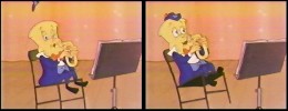 I didn’t get to see the film until I borrowed a vhs copy from Dante Barbetta, who eventually joined their staff to animate when it got significantly larger.
That was not a good film, as a matter of fact it was incredibly bad. I’m not sorry I left, though I would have enjoyed more time with Johnny Gent; it was the last time I worked with him. I also still wonder what happened to Howard Diettrich.
Note: Last year, John Celestri wrote about the later period in the making of this film on Mark Mayerson‘s site. Part I and Part 2.
Animation &Animation Artifacts &walk cycle 01 Mar 2007 08:13 am
Max Hare
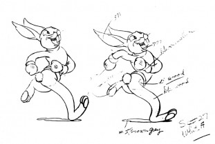
- Just to catch a breath of fresh air, I’ve decided to post this great run cycle of Max Hare from Disney’s 1935 Silly Symphony, The Tortoise and the Hare. I think it was Ham Luske who animated him; he did the bulk of the Hare in this film.
All drawings move from left to right. ![]()
(All drawings enlarge by clicking.)
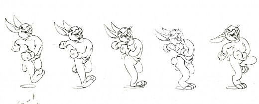
There’s a graceful beauty in this cycle. He saunters, more than runs. The tempo for it seems to be a basic 120, your average everyday walk cycle. I’d have to go back to the actual film to be sure.
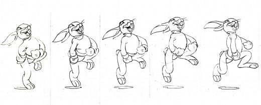
It’s interesting that he’s off the ground for 5 out of every 12 drawings. It helps create a delicate buoyancy overall. This is feasibly impossible, but it makes the run richer.
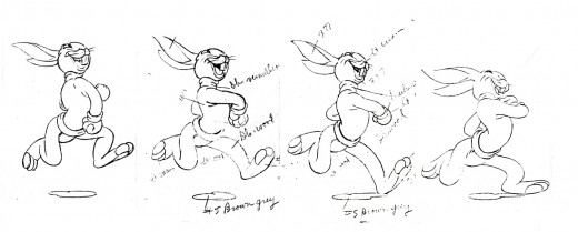
The arm movements tell you a lot about the character. He’s full of himself and moves his entire upper torso with the arm movements. He’s definitely showing off.
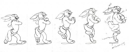
Mike Barrier has a good piece in his book, Hollywood Cartoons: American Animation in Its Golden Age, on Ham Luske’s animation of Max Hare. It’s reprinted on line here.
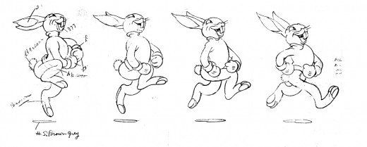
A number of the drawings have been marked up for color inking, and others have been marked for color painting.
Animation &Commentary &UPA 25 Feb 2007 09:54 am
There’s So Much Out There
- Mike Barrier had something interesting to say on his site, and this was compounded by Hans Perk‘s response on his site. I’ve thought about it all yesterday into this morning.
Mike pointed out the Hans was posting the Drafts for Pinocchio on his site, A Film LA. Of course, Barrier was pleased about this but wondered how much it was appreciated. He said that he found the response to some Song of the South drafts he’d posted last September
(pg 1, pg 2, pg 3, pg 4, pg 5, pg 6, pg 7, pg 8, pg 9, pg 10) brought little response to it.
The amount of work that goes into scanning and posting these things is enormous, I can assure you, and it’s disappointing when there doesn’t seem to be much of reaction in the community.
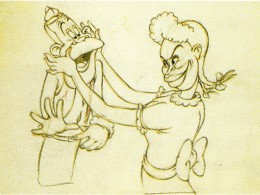 I immediately jumped to Hans’ site to see his response. Hans has been posting many of the Disney Drafts. Everything from Mother Goose Goes Hollywood to The Band Concert to . . . well, Pinocchio.
Hans pointed out that not only was he disappointed at some of the reaction of these drafts but even more so when he places some of the notes for the Action Analysis classes from the 30′s Disney studio. The silence gets to be deafening. He questioned whether there’s a lack of interest in how to best improve the quality of animation – even in the 3D business – without the knowledge of those who came before us.
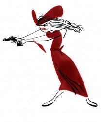 I had an amazing advantage coming along at the time I did and receiving some of the breaks I had. Of course, I wasn’t just searching for a job. This was always going to be my life. Getting a job working for and with my hero, John Hubley, at that developmental stage of my career, allowed me to ask questions and get a significant response. I knew not to bother him about history. (Disney and UPA were sore spots for John, and I stayed clear of the subject. The one time I mentioned it was after seeing Rooty Toot Toot for the first time, and, having been blown away by the film, mentioned it the next morning telling John what an amazing work it was. His response was to say, “Do you think so?” and leave the room. He wanted no conversation about it.)
(Thanks to Cartoon Modern for this model.)
.
So, I would gather several questions and rework them so that in asking one good question, it would solve several for me. John always gave good answers to every question about the work, and I learned a hell of a lot.
But most people didn’t have access to John Hubley (or, in my career, Tissa David, Dick Williams, Art Babbitt or a dozen other brilliant people.) But there are these lecture notes from the Disney studio. And there are the Drafts where we can study the films, analyze who did what, and really get to know the significant difference between animators.
Mark Mayerson uses Hans’ Drafts to create these brilliant Mosaics on his site. He makes the work easier for us; we don’t even have to look at the film – it’s all layed out for us.
And then these scenes show up on YouTube somewhere else. You don’t even have to buy the films to see many of them. The Drafts Mike Barrier posted for Song of the South immediately turned up on Thad Komorowski‘s Animation ID site. (Disney, of course, removed it for copyright infringement, but it was there as was the opportunity to see it for a short bit.)
Basically, what all this rambling comes down to is that there’s so much out there. There’s so much to learn, and there’s so much opportunity to learn it. I love Tissa David, who I like to call my mentor. She is one of the great animators, trust me, and in her mid eighties she’s still animating. She says that she still has a lot to learn. If she feels that, imagine how I feel. Imagine how we all should feel.
Yet, there’s this incredible new tool out there – the internet. It gives us so much material and with sites like Mike’s and Hans’ and Mark’s and others (like most of those listed to the right of this post) we just have no excuse for all the bad animation out there. Get to work people; we’re all watching.
Hans points out in his commentary, that not publishing pictures probably gets less attention. Hence there are some pictures here.
The Oscars are tonight. I don’t like most of the animation choices.
For animated feature I see only one nominee that’s been animated, Cars. And I wasn’t crazy about that film. The animation was excellent in places, but conceptually the film’s a wreck.
For animated short, I didn’t think most of the films were good, never mind great. I voted for The Danish Poet since it was the only one that really told an adult story. It was a cheap gag or a sophmoric attempt at filmmaking. (Really, students have told many of these same stories without spending the wads of cash on them.) You all know my favorite was Joanna Quinn‘s film. That got my Oscar.
Animation &Mary Blair 25 Nov 2006 08:37 am
Mastercard Sherbet
 – An animated commercial, Mastercard – Full House was introduced last year during the holiday season. It’s making it back this year in a slightly larger way. I noticed this spot had been revived when it first started airing before Thanksgiving.
The ad was produced in England for McCann Erickson by the production house, Sherbet, a company set up in 1996 by producer, Jonathan Barstow, and director, Jonathan Hodgson. The company has won many international film awards including a BAFTA for best animation in 2000 for Hodgson’s short film, The Man With The Beautiful Eyes. Billy Crudup does the VO for the spot which AdWeek awarded with a “Spot of the Month.”
Go here to see the animated ad.
 The spot originally caught my eye last year because it feels so much like the Disney short, The Little House, very much a product of Mary Blair’s design.
Amid Amidi wrote about it on his Cartoon Brew site and that led to the Sherbet site.
To me, the color design of this commercial doesn’t feel at all like Mary Blair’s work, although the film obviously was an influence. The charm of the spot is in the very modern approach taken while giving a retro nod to the classic short.
The director and designer of the spot was Sarah Roper, and the Animation Director was Robin Shaw. The Sherbet site gives only this information about Ms. Roper:
Sarah’s work is characterized by her elegant use of collage. She creates charming and appealing characters and has a great feeling for shape, texture and color. Her short film The Apartment Cat and her United Airlines commercial Legs use body language and facial expression to tell warm and witty stories.
She studied animation at the Royal College of Art. There, she worked with a personal technique using rubber stamps. In 1993, she won the MTV Free Your Mind competition. She did other shorts including Chicken Wire and animated for Astley Baker Davies on  Peppa Pig and on Mark Baker’s The Jolly Roger, prior to joining Sherbet.
The commercial has made a comeback of sorts. It’s not only on television, but the campaign has grown to signage about town. Posters featuring an image from the ad are in the NYC subway system (it’s hard to find one that doesn’t have graffiti or a sticker pasted onto it.) I have to assume that they’re not only advertising in NYC, but that posters appear elsewhere. High honors for an animated spot.
(Click on any image to enlarge.)
Animation &Animation Artifacts 08 Nov 2006 09:14 am
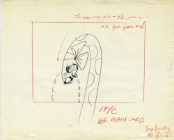
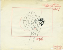
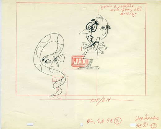
Jax “Snake” LO’s
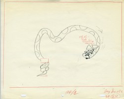
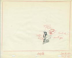
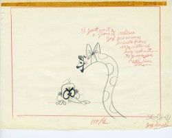
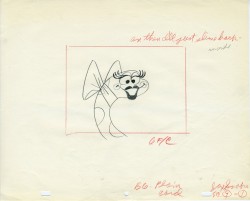
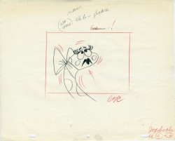
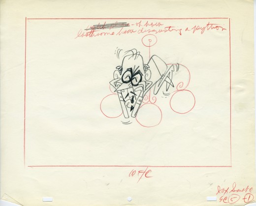
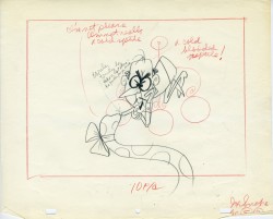
 - Continuing with yesterday’s posted Jax Beer commercial, as promised, I am putting up some of the film’s layouts. This represents about 2/3 of them.
The art was done by Mordi (Mordicai) Gerstein, who also directed the spot. Grim Natwick animated the spot and Tissa David assisted him. Of course, this was in the days before auido tapes could be handed out, so the animator would get a phonograph of the soundtrack. They could mark it with a white pencil to indicate key spots.
I thought that this in conjunction with yesterday’s prep material gave a good indication of the preproduction that went into making a commercial back in 1962.
That said, here are the layouts:
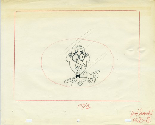
(Click on any image to enlarge.)
Animation 30 Oct 2006 09:12 am
More Fierlinger
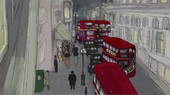 - Since visiting with Paul & Sandra Fierlinger last Thursday, I’ve been obsessed with their films. I can’t stop thinking about them.
Almost immediately upon meeting him, I was given a DVD copy of the most recent work he’d done on his feature, My Dog Tulip.
(Click any image to enlarge.)
.
I had planned to look at it immediately on my return, but I held off a bit. It was like getting a gift you wanted and were slow on opening the package. The thrill comes, really, only once. So it took until Friday night before I put it into the player.
The film starts out as most Fierlinger films do, placing you right into the story. His introductions to the characters is always so painless. There they are, find out what you can.
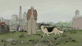 Tulip is a German Shepherd belonging to an elderly British man, living alone.
In some ways, it seems to be the doppelganger for the voice on Paul’s other dog film, Still Life With Animated Dogs. That voice was, of course, Paul’s in what was one of his autobiographical films.
In Tulip, the narrator is voiced by Christopher Plummer. Paul was upset at the way these recording sessions went, but I find the voice extraordinarily beautiful – it just pulls you into the film with a vulnerability and an intimacy that would have been hard to get with most actors.
Sandra Fierlinger is painting some very atmospheric background paintings. They’re taking the style to new extremes in a very very finished and lush style. They’ve always used muted coloring to good effect; here there’s a rich look which goes beyond the wash/watercolors used in the past. (The buses above look almost as though they’ve been painte with acrylics.)
There’s no doubt that this is going to be a masterwork.
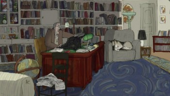 I was interested in how the Bauhaus/Mirage system has affected the animation Paul is doing.
After watching the clips from My Dog Tulip several times, I went back to Still Life With Animated Dogs. That film was done on cel and photographed.
There seems to be more of a looseness and more sophisticated coloring done on the paperless system. I’m sure this is a choice they’ve made in exploiting the system.
Paul gave me bits of pencil test and animatic on Tulip, and the look of that PT is definitely digital – as I think all line tests done digitally are, but it loses that feel when it’s painted and cleaned up. I’ve been convinced that I have to try the software again.
Paul’s the best salesman for the product – not through the high praise he gives the software, but through his films. I’m taken.
(In NY, Still Life With Animated Dogs will air at 3AM on Nov. 30th on WNET. Go to the ITVS link to find out about your area’s screenings.)
Animation 28 Oct 2006 08:29 am
Svankmajer in Person
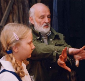 – The BAMcinématek is presenting a special treat for fans of Jan Svankmajer. The director will be in attendance for a Q&A on November 3 at 7pm following the screening of his most recent feature, Lunacy (SÃlenÃ) (2005).
Their press release reads:
In Lunacy Svankmajer mixes elements of Edgar Allan Poe and the Marquis de Sade for a combination of live action and animation that explores how society deals with power and insanity.
Variety remarks, “what could be more natural than cult helmer Jan Svankmajer pairing the poetic twins of decadence, Edgar Allan Poe and the Marquis de Sade,” while Premiere Magazine says “Lunacy is exactly what it’s called, raucously inventive and completely out of its mind.”
The Q&A with Jan Svankmajer will be moderated by Mike Maggiore, Film Forum programmer.
BAM Rose Cinemas (30 Lafayette Ave.)
Tickets: $10 per screening for adults $7 for students 25 and under (with valid I.D. Monday-Thursday, except holidays), seniors, children under twelve, and BAM Cinema Club members
Tickets available by phone at 718.777.FILM (order by “name of movie” option)
Call 718.636.4100 or visit www.BAM.org
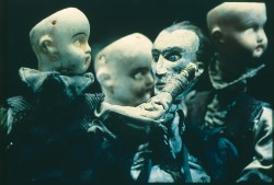 - While down in Philadelphia signs were posted everywhere for the appearance of the Quay Brothers. They will be visiting the University of Pennsylvania School of Design next week, Wednesday Nov 1st and 2nd. Many of their films will be screened.
Paul Fierlinger said that he’d heard of someone who questioned Svankmajer as to whether he’d seen their films and noticed the influence. According to the story, Svankmajer said he’d not been able to notice the relationship. This is might be an interesting question to ask of Svankmajer.

