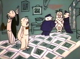
Category ArchiveAnimation
Animation &Commentary 20 Sep 2007 09:29 am
Really Rosie minutes
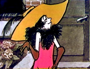 - Really Rosie was produced in NY back in 1975. It was an uncom-fortable fusion of Maurice Sendak‘s artwork, Carole King‘s songs and performing, and some real story and design problems. Somehow this trifling show has had very positive reviews and a good reputation, but I was never able to get through the whole thing in one sitting. I do have some of the animation drawings from it, and at another time I’ll post a bit of it.
It was supposedly directed by Maurice Sendak, but in reality the artwork was supervised by Ron Fritz and Dan Hunn who received the credit of “Animation Director.” It was done out of their studio, D&R Productions, for CBS television.
The animation was good, but the composition always seemed off, to me. I remember back in 1975 (I was still in college at the time) thinking that the show looked like it was done in one long shot on 12 fld artwork. Then they seemed to move the camera in tight for all the poorly executed camera moves. The line work got unpleasantly large in close ups and the detail wasn’t good. The film just isn’t smooth.
Animation for the show is credited to:
Lu Guarnier, Marty Taras, Willis Pyle, Doug Crane, Jack Schnerk, Cosmo Anzilotti, and John Svochak.
Asst animators included:
Jim Logan, Gerry Dvorak, Helen Komar, and Joe Gray
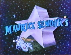
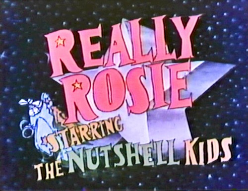
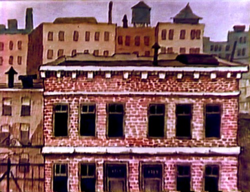
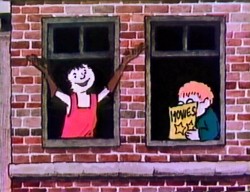
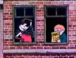
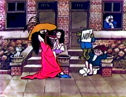
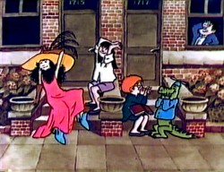
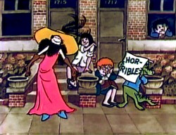
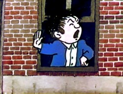
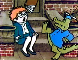
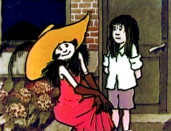
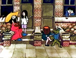
Here are some frame grabs from the first few minutes of the show.
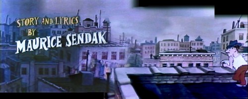
The Maurice Sendak credit fades off and the image gets lighter, then pans across to
the guy leaning over the rooftop.

After a bit, the camera pans across the other windows visually introducing some of the
other cameras. After it hits the end, the camera moves down to a lower window where . . .
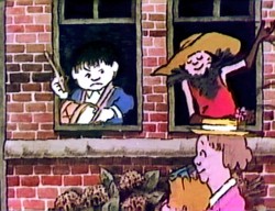
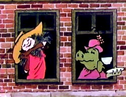
. . . Rosie appears again and continues to sing.
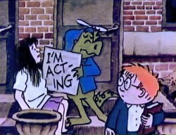
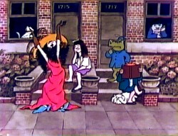
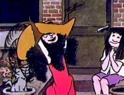
They soon move the cast to the front stoop to sing endlessly. Unfortunately, Carole King – as talented as she is – sings and speaks for “Rosie.” It’s hard to accept her as a child when she has a woman’s voice.
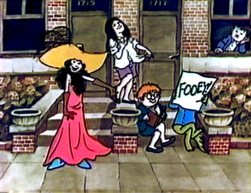
Lots and lots of back and forth and back and forth. It couldn’t be less creative or less interesting to watch. Very flat despite the hard working animation. It all gets to look the same.
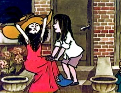
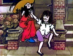
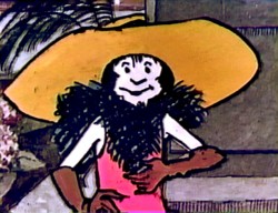
Look at the framing of the image on the right. How can you cut off the head of the lead character? Maybe Maurice Sendak did direct it.
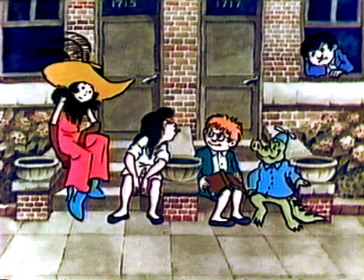
Sendak is a brilliant illustrator who loves animation. There are times when you have to assume you’re not all-knowing and look for help from professionals you respect. Either he didn’t get good help on this show or his ego got in the way.
___________________________I’ll return to this film again. There’s a lot to look at here.
Animation &Articles on Animation &Hubley 30 Aug 2007 07:49 am
Littlejohn & Tyer
- Bill Littlejohn is an animation “God” who doesn’t get the attention he deserves. Let me call your attention to an excellent and extensive interview Tom Sito conducted with Bill which is posted on AWN.
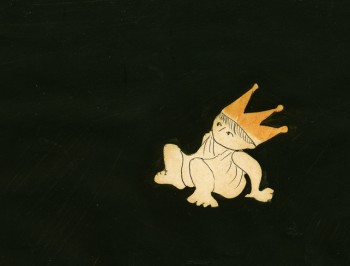 Bill was one of the first animators whose work I could identify opn screen. I studied the Hubley films in my early years, and I watched The Hole and Of Stars and Men every chance I could in the days before vhs tapes when you had to go to a theater to see these films.
Bill’s work on Of Stars and Men has completely entered my vocabulary of great animation. The walk cycles for the many animals are just so magestic and regal that I watch them over and over.
That film employed the Hubley technique in which the animation drawings were painted black (using oil paint so that the paper wouldn’t buckle) all about the exterior of the character and were then double-exposed over the backgrounds. A lot of hit and miss was part of the process as characters had to avoid each other or create a multiple exposure; you could see through each of the levels. With each run through the camera, the density of the image kept thinning out, as well. It’s amazing how stunning this film is given the inherent problems in the technique. And it was made for a budget of $90,000 – a feature film!
I have a lot of Bill’s animation drawings I saved while working at Hubley’s. I’ll try to scan some soon.
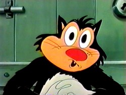 - There’s an enormous Jim Tyer post which celebrated his brithday back in February. there’s not much new information here, just a lot – and I mean lots – of links to videos and other writings. If you’ve a mania for Jim Tyer, this is the first stop.
There are quite a few sites which break down Tyer films in a frame by frame analysis. His animation is good for this; the distortions are so entertaining. However, I sometimes wish there were more of a critical analysis by someone who is truly knowledgeable about animation. It’d be fun to see an informative comparison between some of Rod Scribner and Jim Tyer, but truly discuss their work in relation to animation technique. Less show-and-tell and more commentary with illustrations supporting the thesis. Maybe someday when I’m in a ponderous state, I’ll offer my thoughts. However, until then, it’s still fun to look at the wacky drawings.
A couple of these sites are:
Animation I.D. Tyer-How Does It Work
Classic Cartoons “How To Relax”
Classic Cartoons “Foiling the Fox”
Inspiration GrabBag More Jim Tyer
Animation &Animation Artifacts &Models &Richard Williams 21 Aug 2007 07:22 am
Raggedy Models
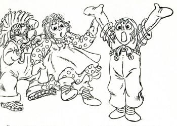 – As I posted last Friday, to celebrate the 30th Anniversary of Raggedy Ann & Andy: the Musical, I’m going to post a bunch of artwork from this film. I’m not even sure much of this material is of interest to anyone but those who worked on the movie, but since I worked on it, I’m interested.
Here are a bunch of model sheets of the secondary characters. The film opens in a playroom, and lots of toys inhabit these first few minutes. They all suffer from the same problem – too much. There are too many lines, there were too many colors, there was too much flailing-about animation. It would have been better to keep it a bit quieter, but that was never the Dick Williams way.
Here they are, right off Xeroxed copies:
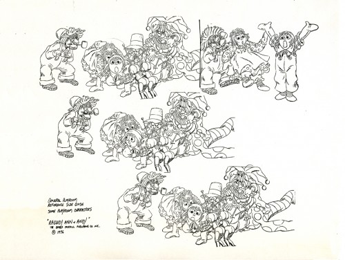
Most of these model sheets were pulled from completed animation. In the case of this
group shot, Dick Williams did these drawings in reworking Fred Helmich’s animation in
the “No Girl’s Toy” musical number.
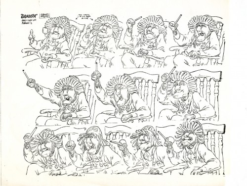
I really have to encourage you to click these images to enlarge. Gramps is the
perfect example of the brilliant detail that Dick Williams put into his animation.
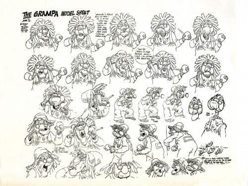
Both these Gramps model sheets represent separate scenes. Most of the key drawings
from the scenes were placed on these models.
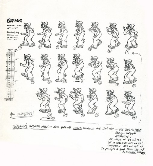
Here’s the walk cycle of Gramps done by Spencer Peel and approved by Dick Williams.
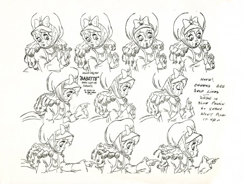
Hal Ambro did the animation on the Babette character, at least in the opening of the film where it was good. Dick Williams did the clean-up and inbetweens, himself.
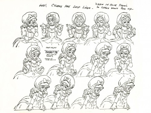
Dick’s clean-up did a stunningly brilliant job of locking in this character. I’m not quite sure we had anyone else on staff who could have done this character as well. Dick Williams is
an enormous talent, but it was too bad he was limited to inbetweening.
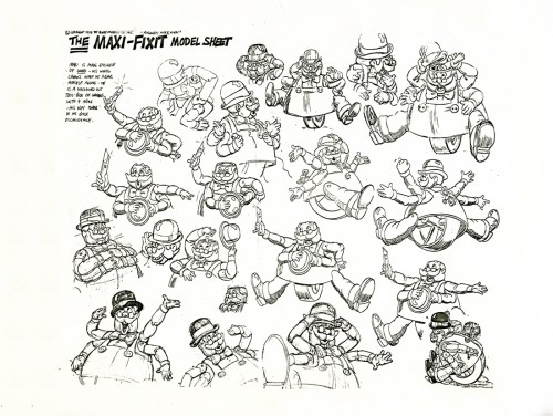
Maxi Fix-it was a nothing of a character, yet he involved endless energy in animation and clean-up. No wonder the film’s budget quadrupled during production, and it wasn’t enough.
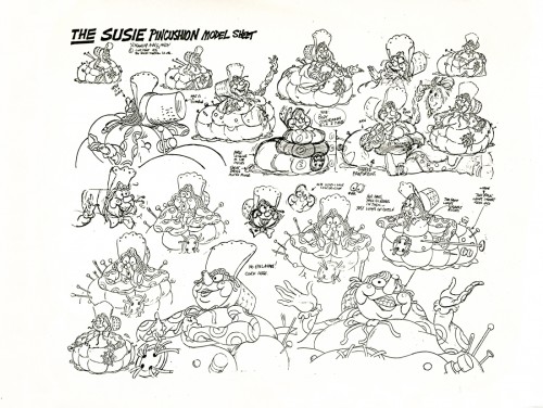
Susie Pincushion was just another character who had 22 colors on her.
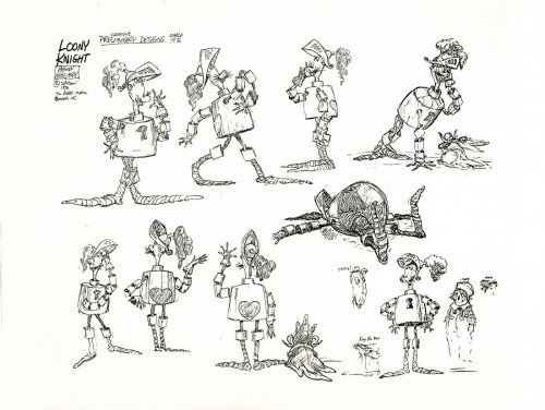
The drawings that were used for this preliminary model sheet were by designer, Corny Cole. What a talent! The character looks as though it could have fallen out of the oriiginal books by Johnny Gruelle. The life in each and every one of these drawings was solid gold. Too bad it ended up such a lifeless and annoying character when it finally hit the screen.
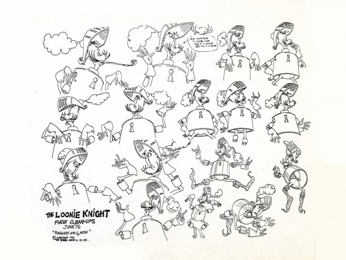
The clean up guide for the knight shows you what’s been lost.
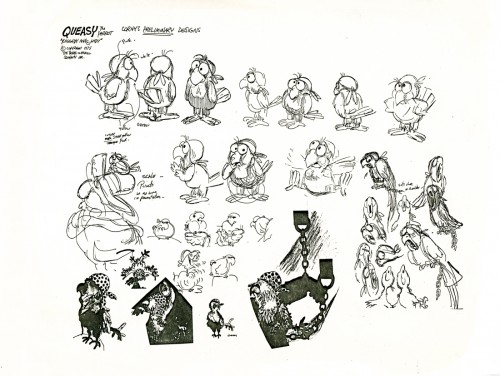
Queasy was the parrot that sat on the Pirate’s shoulder. Arnold Stang did his voice.
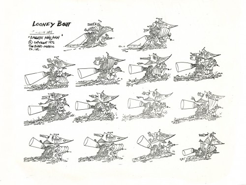
The animation of the pirate ship was split between Corny Cole and Doug Crane. I have
a couple of scenes done by Corny with his Bic pen animation. Someday I’ll post some of these drawings, but it’ll be a big chore to do it. Each drawing is so large that it’ll take three scans for each one and will require photoshop reconsrtuction. Lotsa work.
But they’re beautiful drawings, so it’ll probably be worth it if I can find the time.
Animation &Art Art 16 Aug 2007 07:14 am
Gianluigi Toccafondo
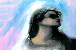 – I thnk I may have been asleep at the wheel.
While going through my regular routine of blog reading Hans Bacher introduced me to Gianluigi Toccafondo on the Animation Treasures site. How could I have not noticed Toccafondo‘s work before?
Hans guided me to the Ottawa Animation Festival site as I started my search to find out who he is. I didn’t make it to Ottawa in 2004, but apparently there was a retro-spective there for Toccafondo. Obviously, the Italian filmmaker had done enough work to merit a retrospective, and I hadn’t heard of him before yesterday! How astute of Chris Robinson to have scheduled a retrospective – 3 years ago.
I was soon led to the AWN/Acme Filmworks site. He’s part of their group of directors and has a small showreel posted there. For the record, I learned that he was born in San Marino, Italy, on March 6, 1965. He studied at the Istituto d’Arte di Urbino: film animation department, graduating in 1985. He lives and works in Milan. He’s had various exhibitions in Milan and Paris.
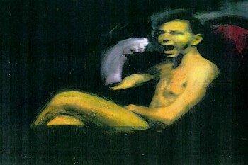 Elwood Smith‘s site, Greenmonkey, brought me to a 16 minute short by Toccafondo called La Piccola Russia. This can be found on line at the Arte TV site.
Continuing the search, on line, I found
La Pista and
La Coda.
I’ve linked to them both and hope you’ll take the time to view them.
Not only are they beautiful films, but the use of music within all is excellent. The composer, Mario Mariano, has his own home page.
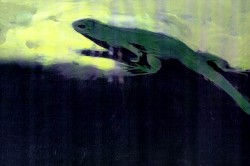 The work looks as though it uses live-action film as a jumping off point to distort, reconstruct and recreate the images depicted. The blend of film and music is tight and exciting. Every frame I’ve seen looks like a oil-painted masterwork. Lucian Freud meets Francis Bacon. As Hans Bacher stated on his site, I haven’t located a dvd of Gianluigi Toccafondo‘s work, but I’ll keep looking.
Gianluigi Toccafondo is an artist who happens to use animation as his medium, and I’m thankful to Hans Bacher for waking me up to this work. Isn’t that what great sites do? They link you to great art.
Animation &Animation Artifacts &Hubley &Tissa David &walk cycle 14 Aug 2007 07:56 am
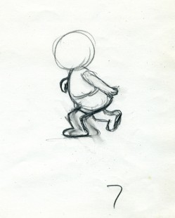
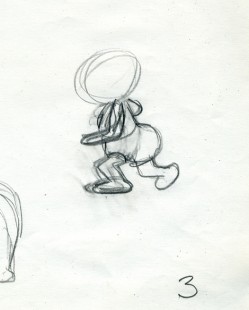
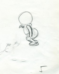
Georgia walk
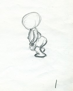
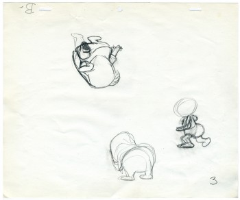 – Finishing up posts featuring artwork from John & Faith Hubley’s Cockaboody, I have this walk cycle from Tissa David.
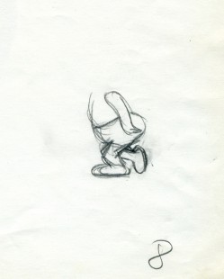
Tissa is careful not to use too much paper. Hence she reuses old paper for her very rough preliminaries as she figures out her animation.
It’s frequent, when visiting her work space, to see lots of pages featuring char-acters on both sides of the paper upside down as well as sideways. She doesn’t often let these rough roughs out of her hands before she throws them out. I guess I was there at the right time and talked her into giving me these drawings.
She animates the walk, here, on top pegs bacause that’s all she has left of space. Tissa nomally works on bottom pegs. Actually, since this is going to be a sliding cel, it would have been done top pegs anyway.
Georgia, the younger girl, leaves the bathroom and moves to the floor to play with a doll (whose head she accidentally pulls off).
 1
1 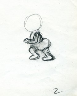 2
2
(click any image to enlarge.)
 3
3 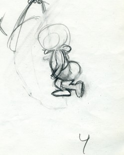 4
4
The walk is heavy and a bit flatfooted. She doesn’t come down on her toes but plants the entire foot.
 5
5 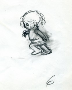 6
6
Her arms are high because, a baby, she’s still a bit off balance.
Animation &Independent Animation &Story & Storyboards 11 Aug 2007 07:43 am
Uncle
 – After seeing Ray Kosarin‘s film Uncle, a couple of years ago, I could only say that I was ecstatic that finally someone had made a REAL political cartoon that stated a REAL opinion. (It also helped that I agreed with the opinion.)
It wasn’t like the JibJab let’s-laugh-at-everyone’s-expense-without-stomping-on-any-feet kinda film. Ray had something to say; he said it with humor, but he pointedly told what he saw. A political cartoon in the best sense. Jay Leno isn’t going to show his film.
Ray Kosarin has worked within the New York Industry for years. He started out in my studio and animated brilliantly on many of my half hour films. He directed on MTV’s Daria, Beavis & Butthead and spent a bit of time at the Mutant Ninja Turtles. It’s exceptional that he did this political film in his nights and weekends, and you can see the high cost of production on the screen as this short plays. It’s not a second-rate Flash piece but a REAL animated film, and it employed many key animation people in town.
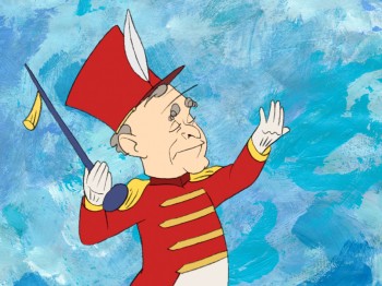 Now that Uncle has been picked up by local PBS outlet Thirteen’s ReelNY series which highlights independent filmmaking, it means that you can watch a clip on line as well as view an interview with Ray. Here’s a working animator who put a lot of his own money on the table to make a serious and dark political commentary. He hired a lot of friends to help, and made a first rate film. You should check it out, if only to support this type of filmmaking. The political statement is also high reason to see the film. If you have access to ReelNY on the East coast, keep your eye out for it. (I’ll definitely give a heads up when it’s about to air. It’s a work well done.
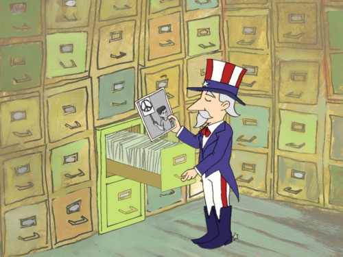
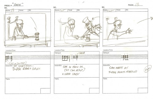
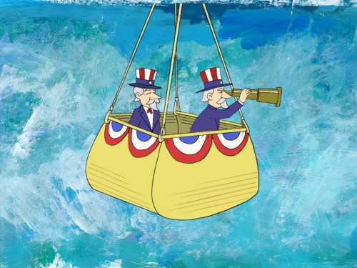
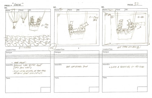
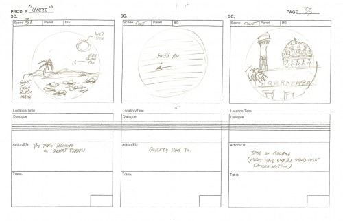
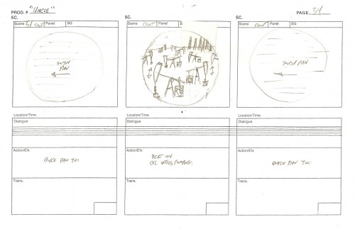
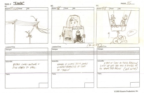
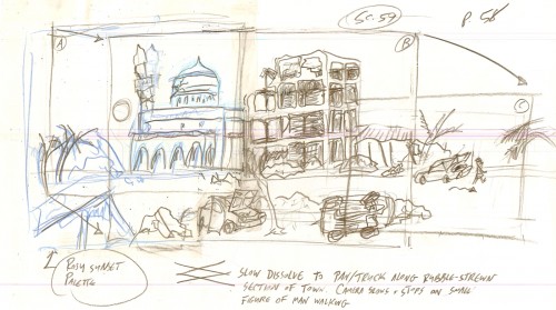
I’ve asked Ray to share some of the art from the film, and he sent me these stills and storyboard drawings. He deserves as much attention as he can get.
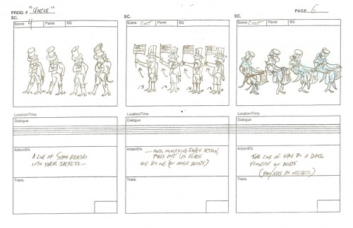
(Click any image on screen to enlarge.)
_Still(s) from UNCLE, animated film by Ray Kosarin, © 2004 Kosarin Productions, Inc.
Animation &Animation Artifacts &Hubley &Story & Storyboards &Tissa David 10 Aug 2007 07:21 am
Cockaboody Layouts
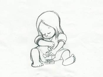 – To hook up with the Cockaboody storyboard I’ve posted in three parts (Part 1, Part 2, Part 3)
I thought I’d post some of the key drawings done by Tissa David.
To make them a bit more meaningful, to see what a really sensitive animator adds to a film, with the help from her director, I’m also posting the storyboard drawings that relate to these animation keys.
(Click any image to enlarge in a different view.)
If you watch the film with the storyboard in front of you, you’ll find a lot of discrepancies. The film grew as the animation began.
While working for Phil Kimmelman & Ass. for a short period (which just so happens to have been the exact time the Hubleys were making Cockaboody – I came back to their studio and joined their film in the very last stages) I learned an interesting saying that was the credo at Kimmelman’s. At every stage the film should get bigger. By this, they meant that the animator should take the storyboard and build on it. The Assistants should add whatever they could to the animator’s work, etc. I liked the sound of that and remind myself of it often and try to plan my films so that will be likely to happen.
I certainly think that Cockaboody does this.
If you want to see the film, it’s currently on YouTube.
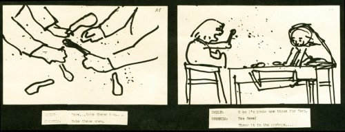
Tissa takes this play with the blocks and places it on the floor. This keeps all of the action down at the girls’ level and allows the blocks to be used throughout the film. They show up
a bit later as part of the background art.
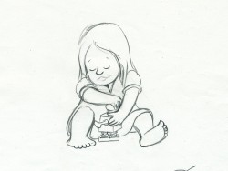
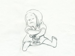
The blocking also puts more attention onto the character of the girls instead of having to have them climb up the chairs to get in place at the table.
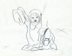
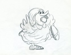
The storyboard drawing above left (with the “goosey”) is the only representation of the girl wearing her father’s shoes. Tissa took this small bit and ran with it.
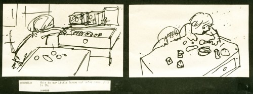
Obviously the action in the boards has nothing to do with the action in the film.
Tissa moved the girl to the closet quietly getting us into the next sequence with this girl
still in grownup shoes.
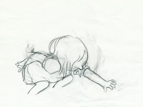
Both of these drawings (above and below) use the father’s shoes on another level.
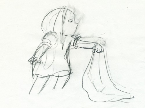
It forces the girl to bend far to pick up the “blankey.”
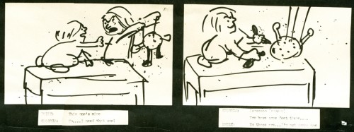
Again we’re off the table on the floor, and this sequence now builds out of what came
in the past. There’s a lot of definition in the two kids at this point.
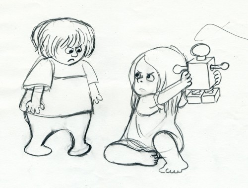
Even the toy has more definition in Tissa’s hands. I’m sure there was some discussion
of this with John. The film takes a solid shape, built on the storyboard drawings and developed with another voice.
Animation &Animation Artifacts 14 Jul 2007 08:27 am
Tangy Popeye
 – AWN currently has on its site an excellent Joe Strike interview with Jack Zander about his career.
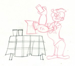
Since the Popeye dvd is ready to hit the market (check out the beautiful frame grabs Jerry Beck has posted on Cartoon Brew), I thought this might be a good time for me to post some of the drawings I have from what is probably the last piece of animation Jack did professtionally.
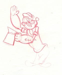
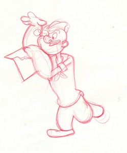
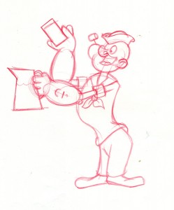
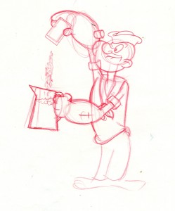
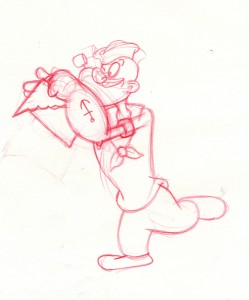
This is from a Tang commercial done at Zander’s Animation Parlour. Instead of doling out the animation, Jack was intrigued with the idea of animating the character. He hadn’t animated Popeye before. (Note, Zander’s Animation Parlour had co-produced The Man Who Hated Laughter for Hal Seeger and King Feature‘s, but Jack hadn’t animated on that Special. So he gave himself the job. Jim Logan, the assistant on the job, gave me the extremes. Here are some from one of the scenes. I’ll post Olive (also in this scene) at another time.
 61
61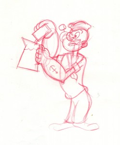 65
65
(Click any image to enlarge.)
 71
71 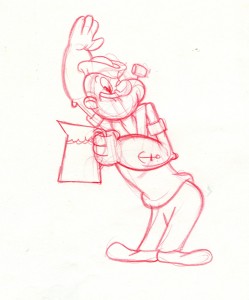 74
74
Do you think the assistant asked for a straight on model of Popeye’s face to do the inbetweens?
 85
85 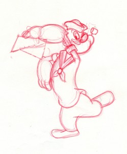 91
91
I think Jack might have been a bit out of practice when he did this spot. It looks a bit stiff.
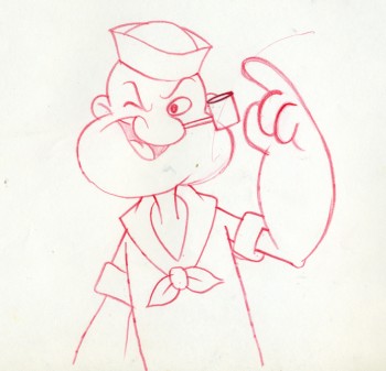
By the way, this drawing is an example of how Jack drew
Popeye, straight on. I’m not sure anyone else used this pose.
Animation &Commentary &UPA 06 Jun 2007 07:55 am
Unicorns In The Garden
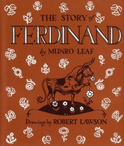
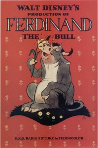
If you think back to how children’s books were adapted in animation prior to the 1950′s, you might think of Ferdinand the Bull by Munro Leaf with illustrations by Robert Lawson. Disney’s oscar winning short followed the story closely but ignored the book’s sensitive illustrations. Disney’s short went so far as to caricature Disney and a number of his animators in the cartoon style of the film.
Or you might think of E.H. Shepard‘s delicate watercolors for Kenneth Grahame‘s book, The Wind In The Willows. This delicacy was completely lost when the Disney artists revised the characters, in a somewhat brash cartoon way, for their film. The same was true of Disney’s adaptation of Shepard’s Reluctant Dragon. Shepard didn’t fare well even into the ’60s when Disney artists adapted his Winnie the Pooh to animation.

There are many other variations on this theme wherein animators completely rework beautiful illustrations of children’s book illustrators and rework stories of the book authors. (For one of the vilest variations look at William Steig’s stunning book, Shrek and compare.)
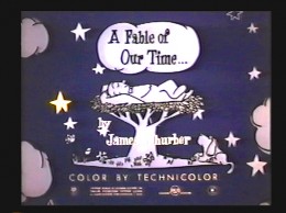
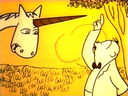
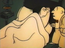
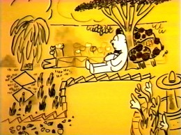
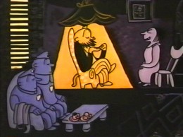
In 1952, UPA successfully and faithfull adapted Ludwig Bemelman’s book and style of painting to animation. Their film Madeline was a very successful short which was nominated for the Oscar. Almost a year later, UPA decided to adapt James Thurber’s whimsical story, The Unicorn In The Garden, to animation.
Thurber was a New Yorker cartoonist and doodler cum cartoonist. He was enormously successful at his trade, and the book which included “Unicorn In The Garden” was The Thurber Carnival. We know that UPA was considering the entire book of short stories as an animated feature and were calling it Men, Women and Dogs. The feature was scripted. For whatever reason (I’m sure someone out there knows, and I assume it has something to do with Joseph McCarthy), the feature was abandoned, and the short was completed.
They remained absolutely faithful to Thurber’s story and drawing style even though the very short story had only one drawing (and not one of Thurber’s best.) I’ve placed both the story and animated film at the end of this post if you want to compare.
Off the top of my head, I can only think of two other occasions that Thurber’s style was adapted to animation. Both the Jack Lemmon vehicle, The War Between Men and Women, and the tv show, My World and Welcome To It, which starred William Windom, adapted Thurber to animation as an aside to the “cartoonists” featured in the live action. Both were produced by Melville Shavelson and had similar setups – daydreaming cartoonist bumbles through his life with his alter ego being represented by the animation.
The original UPA short, to me, is beautifully animated, designed (around Thurber’s B&W drawing style hence the limited and delicate colors of the film), and sensitive to the original intentions of the author/illustrator. The film story is told with an absolute minimum of dialogue, the animation virtually carries the tale.
I remember seeing this for the first time when I was young and enjoying the seemingly innocent (or is he?) husband as he tries to share his discovery of the Unicorn in their garden with his cynical and sarcastic wife. This wasn’t something I’d seen in animated cartoons before. It wasn’t for children; it was for adults, and I felt like an adult watching it. The film offered a sophistication that Deputy Dawg didn’t. My feelings haven’t changed for the film. I love the psychiatrist who virtually sits his way through the film. Yes, I still absolutely enjoy this film.
The short also set the stage for children’s book adaptations in the future. This is a type work I’ve done often, and I like to think that I’m carrying on the tradition of this film as well as the original Madeline. It’s also something I enjoy doing. I honestly think there’s something that enlarges your own abilities when you can master another’s style and incorporate your own personality into it.
But, of course, that’s all my own opinion.
Here‘s the original story by James Thurber:
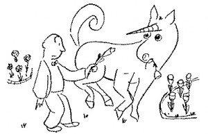 Once upon a sunny morning a man who sat in a breakfast nook looked up from his scrambled eggs to see a white unicorn with a golden horn quietly cropping the roses in the garden. The man went up to the bedroom where his wife was still asleep and woke her. “There’s a unicorn in the garden,” he said. “Eating roses.” She opened one unfriendly eye and looked at him.
The original Thurber illustration .
“The unicorn is a mythical beast,” she said, and
turned her back on him. The man walked slowly downstairs and out into the garden. The unicorn was still there; now he was browsing among the tulips. “Here, unicorn,” said the man, and he pulled up a lily and gave it to him. The unicorn ate it gravely. With a high heart, because there was a unicorn in his garden, the man went upstairs and roused his wife again. “The unicorn,” he said,”ate a lily.” His wife sat up in bed and looked at him coldly. “You are a booby,” she said, “and I am going to have you put in the booby-hatch.”
The man, who had never liked the words “booby” and “booby-hatch,” and who liked them even less on a shining morning when there was a unicorn in the garden, thought for a moment. “We’ll see about that,” he said. He walked over to the door. “He has a golden horn in the middle of his forehead,” he told her. Then he went back to the garden to watch the unicorn; but the unicorn had gone away. The man sat down among the roses and went to sleep.
As soon as the husband had gone out of the house, the wife got up and dressed as fast as she could. She was very excited and there was a gloat in her eye. She telephoned the police and she telephoned a psychiatrist; she told them to hurry to her house and bring a strait-jacket. When the police and the psychiatrist arrived they sat down in chairs and looked at her, with great interest.
“My husband,” she said, “saw a unicorn this morning.” The police looked at the psychiatrist and the psychiatrist looked at the police. “He told me it ate a lilly,” she said. The psychiatrist looked at the police and the police looked at the psychiatrist. “He told me it had a golden horn in the middle of its forehead,” she said. At a solemn signal from the psychiatrist, the police leaped from their chairs and seized the wife. They had a hard time subduing her, for she put up a terrific struggle, but they finally subdued her. Just as they got her into the strait-jacket, the husband came back into the house.
“Did you tell your wife you saw a unicorn?” asked the police. “Of course not,” said the husband. “The unicorn is a mythical beast.” “That’s all I wanted to know,” said the psychiatrist. “Take her away. I’m sorry, sir, but your wife is as crazy as a jaybird.”
So they took her away, cursing and screaming, and shut her up in an institution. The husband lived happily ever after.
Moral: Don’t count your boobies until they are hatched.
__________________Now check out the film below if you haven’t seen it recently.
Directed by Bill Hurtz
Story by James Thurber
Animation by Phil Monroe, Rudy Larriva, Tom McDonald
Design & Color by Robert Dranko
Music by David Raksin
Production Manager Herb Klynn
Produced by Stephen Bosustow
Animation &Commentary 27 May 2007 08:21 am
Aaargh!
- I tend to stay away from John Krisfalusi‘s site because I often come away angry. John is one of the most knowledgeable, articulate and intelligent animation writers out there. His “course” in animation, built on the back of the Preston Blair primer, is priceless. I’ve followed that myself knowing full well that I still have a lot to learn about the medium.
However, John likes to taunt the world beyond his little box of fans and followers.
As promoted by Stephen Worth‘s AHAA blog (the link that led me to 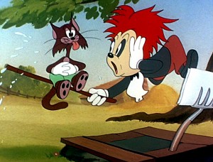 John K), a recent post had John espousing the positive “creative freedom” in 1940′s studios such as Terrytoons and Walter Lantz.
. . . . S p i t. . t a k e !. . (WHAT!!!)
As if that weren’t enough, he then posts UPA’s Unicorn In The Garden and calls it: “depressing downbeat dreary, creatively stifled drizzle.” I repeat, he’s just compared the UPA classic negatively to Terrytoons and Walter Lantz’ cartoons. (A better place, I think, to look for “dreary drizzle”.)(Dick Lundy’s creative freedom!)
. .
In later postings, atop a rough sketch from UPA he writes: “If it’s bland and sterile, it’s design.” Or he says “… and the other UPA guys decided to abandon animation, fun and lush movement and instead focus on ‘design’.” Then he praises Bill Tytla’s insipid animation and direction at Terrytoons in an ugly little short that has its own immature charm – but little else praiseworthy. There’s no lush movement or fun anywhere to be found in that short. There’s only a boxed-in, brillliant artist, Tytla, unable to work at the top of his game.
Of course all this derisive goading prompts his sycophantic fans to comment of Unicorn In The Garden:
“It’s painful to look at.”
“Upa did destroy the cartoon world.”
“… it was just a big “fuck you” to the audience.”
“Even with the better examples, there’s no denying that most of their flat designs are quite ugly. UPA sorta made it okay to do ugly animation.”
 The problem is that John Krisfalusi knows full well how important the UPA break was to animation.
He knows that unless a group of artists broke from the 19th Century style of illustration animation would have remained a world of cute kittens and fairies, princesses and witches. History exists and we have to look at all of the influences to understand why it changed as it did.
(Beware: designers exercising creative freedom at the Lantz studio.).
Without UPA, 101 Dalmatians, Heavy Traffic, and Ward Kimball’s late success wouldn’t have existed. Without UPA, Maurice Noble’s brilliant work for Chuck Jones, Ralph Bakshi’s classic early films or Ren and Stimpy wouldn’t have existed. There had to be a break with the past – design wise – to enable other talents to take it to another level.
Milt Gross‘ style was squeezed at pre-UPA MGM, and good as his shorts were, they don’t equal the insanity of his strips. Today that can be done thanks to UPA.
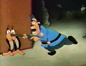 John goes into some detail about the art of Jim Tyer (but doesn’t really say why his work is great.)
Mind you I think Jim Tyer was brilliantly well ahead of his time, and I’ve studied his work endlessly.
I also recognize that his animation was a GRAPHIC (read: DESIGN) distortion of his characters to pull out any inner spirit. You feel as though his pencil rushed to get out these drawings. The result is endlessly hilarious, but it also works in a larger, more subconscious way.
(Jim Tyer, free from Paul Terry’s low budgets.). . . . . .
Without the graphic changes brought about by UPA, Tyer’s work would not have been accepted by even the cheap producers at Terry’s or Famous. Tyer was endlessly put down by the animators around him at those studios, but he continued to do what he did.
Johnny Gent told me, “Jim could never hold a character.” Two of Terry’s best known assistants told me that he “couldn’t stay on model.” Thank god Bakshi appreciated Tyer’s work. Baksi also appreciated Hubley’s work. He stole from him in putting together his first feature.
Artists like Jules Engel, Bill Hurtz and Paul Julian; animators like Bobe Cannon, Grim Natwick and Art Babbitt had real creative freedom at UPA, and changed the world of animation for the better.
You don’t have to like The Yellow Submarine to recognize that it was a breakthrough, and you don’t have to like UPA’s films to recognize that it was a breakthrough. You don’t have to attack one of the great animation shorts, Rooty Toot Toot, to make your point. Especially when you’re aware of the brilliant animation and design – yes, design – in that film. It all comes together perfectly.
My gosh! Isn’t it time to have to stop defending Picasso as an artist. Michelangelo was great, but so was Pablo in his own way.
You do have to be honest, John K. You want to make a point, and you go so far over the edge thinking it’ll help your case, but it doesn’t. You’re speaking to new generations of animators, and perhaps they don’t fully understand or appreciate the history as you do. Take smaller steps in your criticism, please. And keep writing but don’t think you have to incite the world to get your point across. It’s just annoying and dishonest.

