Category ArchiveAnimation
Animation &Animation Artifacts &Fleischer &Richard Williams 02 Nov 2007 08:17 am
One Eye
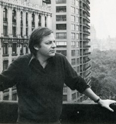 - While working on Raggedy Ann and being somewhat close with Richard Williams when he was in town, I was amused by something that happened early on.
Dick was in and out often recording and editing the voice track. A lot of time was spent in the rehearsal studios in the Broadway/theatrical of town. (That was about three blocks away from the studio.) In an elevator ride up to the rehearsal space, Dick overheard a large black man in the elevator. I believe he was a delivery guy, maybe a messenger.
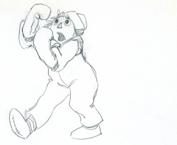
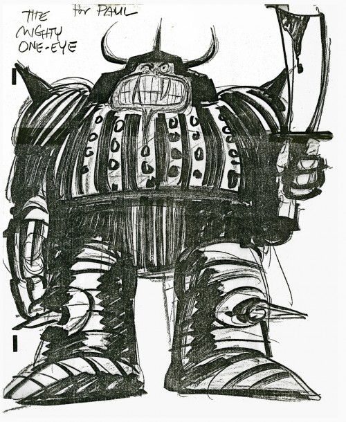
Dick popped up in a flash. He immediately asked the guy if he had ever done any acting. No? Well, Dick hired him on the spot to be the voice of the leader of the One Eyes. His voice was incredibly deep and dark.
Within the week, Dick had rerecorded the lines. (Another actor had done him in England, and Dick was looking for something better.) To be honest, I’m not sure if this was actually the final voice used in the film (it could be), but the story was so entertaining to some fly-on-the-wall like me, that I remember it well.
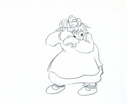
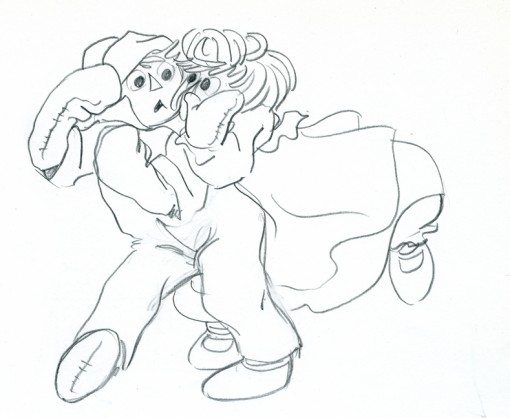
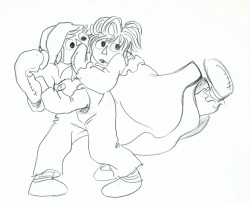
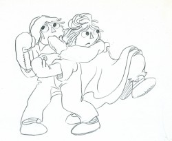
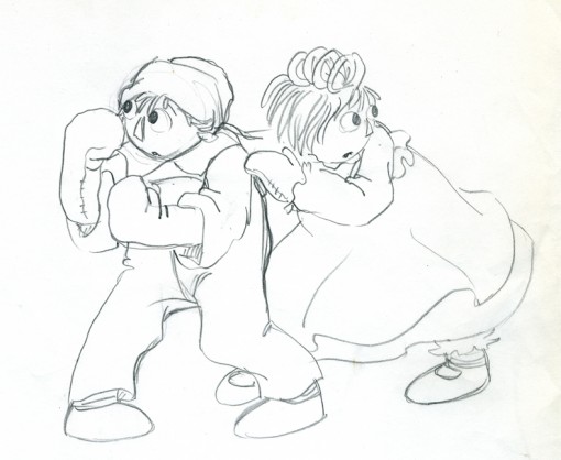
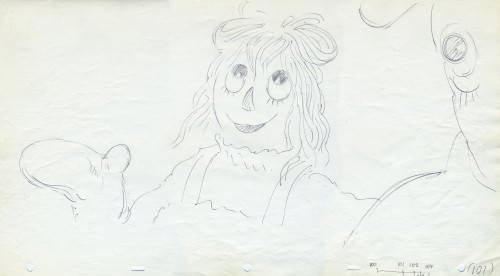
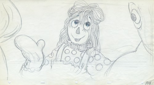
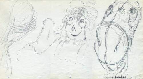
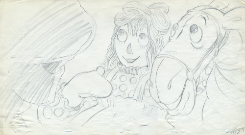
After recording the piece, Dick did a thank you drawing for the guy. I made a xerox. This is that copy done with drying magic markers.
___________(Click image to enlarge.)
Sites to point to:
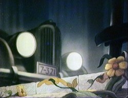 - Hans Bacher has created a new addition to his Animation Treasures. We now have Animation Treasures III. Look forward to more of Hans’ beautiful background reconstructions taken from the films themselves. He’s opened a wonder in his displays. I still go back often to view the many of the backgrounds (specifically Mr. Bug) that he’s revealed to us.
- Once again, Rob Richards continues similar work on a variety of films on his site, Animation Backgrounds. The many Alice In Wonderland backgrounds are enormously attractive on their own.
- As if you haven’t already heard about it, let me point you in the direction of Bob Jaques‘ new site Popeye Animator ID. Bob is enlightening us on the world of a lot of unfamilair animators. We know their names from the many credits we’ve read, but Bob is analyzing and detailing scenes that these artists have created. Names like Frank Endres, George Germanetti and Lillian Friedman become real as Bob gives us a lot of information that doesn’t seem to be located anywhere else. I’m also looking forward to Bob’s writing about Johnny Gentilella. This was the first real animator I met in the business and someone who helped me along the way. I’m always ready to hear more about Johnny Gent.
For this post alone (take a real good look at the tree) I’m grateful to Bob and his new site.
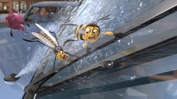 – Bee Movie opened today, and received mixed reviews in New York. The reviews I’ve read paint a brash, colorful, jokey sort of film, which makes it sound not unlike many animated films we’ve seen in the recent past. Who would have expected otherwise? The film gets a 50% rating on Rotten Tomatoes. I guess I’d call that mixed reviews. The feature in this film, I guess, is Jerry Seinfeld’s sardonic sense of humor. Perfect for the child in all of us.
Jack Mathews of the NYDaily News said:
- If the movie proves anything, it’s that computers have gone past the ability to simply reproduce hues and tints and can now give the entire spectrum previously unperceived depth.
Kids are going to adore looking at this movie, living in it, flying through and above its brilliant landscape. It’s an animated joyride over a relief map of Manhattan.
I just wish the script was as good as the paint.
A.O.Scott in the NY Times writes a generally positive review with these few lines I’d like to point out:
- The DreamWorks Animation formula, exemplified in the mighty “Shrek†franchise (and imitated by would-be rivals at Sony and Fox), is to charm the children with cute creatures and slapstick action while jabbing at the grown-ups with soft, pseudosophisticated pop- cultural satire. “Bee Movie,†directed by Simon J. Smith and Steve Hickner and animated by several hundred industrious drones, pushes this strategy almost to the point of dispensing with the kid stuff altogether.
There are a few splendid cartoon set pieces … that show off the latest computer animation techniques. But most of the film’s creative energy is verbal rather than visual, and semimature rather than strictly juvenile.
There was an ASIFA East screening of this film on Tuesday. However, I chose to see another mediocre movie, American Gangster, on that date. I won’t get to see Bee Movie until next Tuesday, and maybe I’ll comment on it on Wednesday next.
Animation &Animation Artifacts &Fleischer 30 Oct 2007 08:19 am
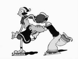
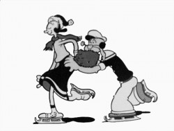
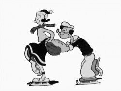
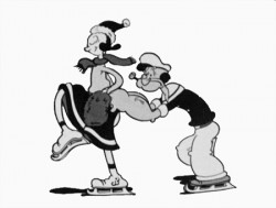
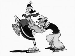
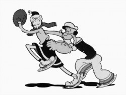
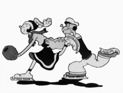
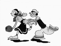
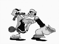
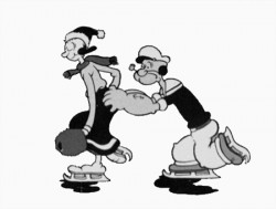
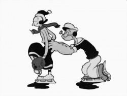
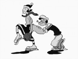
Popeye cycle
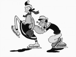
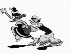
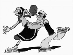
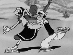 – Here’s a good example of something you won’t see animated in cgi. This is an ice skating cycle out of a Popeye cartoon, Seasin’s Greetinks!. It’s, of course, on the Popeye dvd just out, and is animated by Roland Crandall and Seymour Kneitel.
These Fleischer cartoons are so original in their jokes that there’s always a surprise or ten in every scene. The twists and turns are designed only to get laughs; I can give you a dozen examples from this short alone, but I’ll just recommend you watch the film.
It’s not just the stories that take odd spins, it’s the animation as well. There are bits that move in their own idiosyncratic way that are designed purely for laughs. Eccentric movements that would rarely show up in a Disney film dominate these Fleischer shorts.
Check out this cycle. Every eighth drawing is completely off the book. It gives the cycle a hilarious turn and completely dominates the move. It’s probably not the best way to build 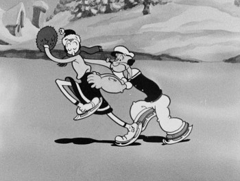 character (unless, perhaps, only one character moves like this), but it sure makes for some funny animation.
The thing about these Fleischer films is that it moves this way all the time. There’s always something about to take you for an odd turn, and while you’re looking for the big move, you’re just buying these small ones. The effect is cumulative, and the animation in these Fleischer films is just plain wacky.
A cgi animator doesn’t look for the odd twist in every frame. They can, but it wouldn’t make sense to be doing it that way, especially when the goal is to make the animation fluid in the final. The animation is too based on real life, and the individual frames don’t exist in the same way they do in 2D paper animation. There’s more risk in the 2D mode, but the reward can also be more ingenious and gratifying.
But what do I know? I don’t animate with cgi, and I’m just making a supposition based on what I’ve seen so far. Everything’s possible, but it sure doesn’t seem probable from my seat.
Having said that, let me also say that there aren’t too many animators doing 2D animation like this anymore. Maybe that’s the complaint I really have. Invention and daring in our medium seems to be a thing of the past.
 1
1 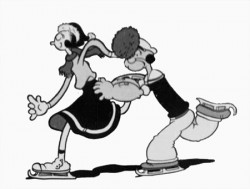 2
2
(Click any image to enlarge.)
Animation &Animation Artifacts &Fleischer 27 Oct 2007 08:27 am
Betty Drawings
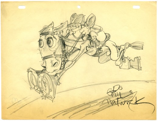
- I promised to post all the Grim Natwick drawings of Betty Boop I have in my collection. A number of them aren’t specifically Bettys, but they’re pretty interesting just the same. Here’s a rough drawing of a jockey jumping done in 1931, signed by Grim. You can tell it was done in 1931 because he’s printed the date on the back (and you can see it bleeding through the paper on the lower left.)
Can anyone identify this cartoon?
As I said in the past, I’m very impressed by the holes punched in the paper. Whereas every other studio at this time was using a 2-hole punch for their paper, Fleischer was using this more sophisticated peg system. I don’t think Disney switched over to their 5 hole paper until 1934, and I’ve seen WB art still on 2-hole paper from 1938.
The other interesting item, noted by David Nethery on my last posting, is that they were using 8½ x 11 paper. Disney’s paper on Plane Crazy, two years earlier, was 9½ x 12. It’s amusing to note that many studios are back to drawing on 8½ x 11 paper today(unless they’re doing feature work) that is, if they’re still using paper.
Animation &Daily post 26 Oct 2007 08:18 am
Zagreb on the B i g Screen
- The Film Society of Lincoln Center is hosting a series called,
Beyond Boundaries: The Emergence of Croatian Cinema (Oct 26-Nov 13).
Included in this program is a selection of some of the best films from the Zagreb School of Animation, which quickly became the cutting edge following its unveiling at the Cannes Film Festival in 1958. I wrote about Zagreb and one specific film, Tup Tup, back in March and I posted this magazine article about the studio.
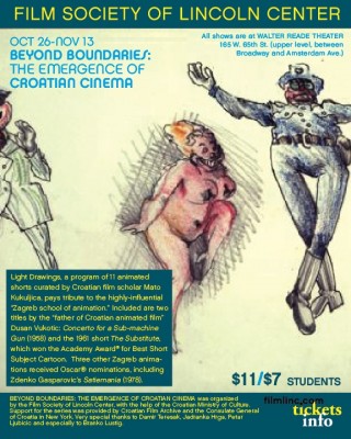 The animated films slated to screen include:
__The Loner Vatroslav Mimica, 1958
__Concerto for a Submachine Gun ____Dusan Vukotic, 1958
__The Inspector Is Back! ____Vatroslav Mimica, 1959
__The Piece of Shagreen Leather ____Vlado Kristl, 1960
__Don Quixote Vlado Kristl, 1961
__The Substitute Dusan Vukotic, 1961
__The Wall Ante Zaninovic, 1965
__Curiosity Borivoj Dovnikovic-Bordo, ____1966
__Revelry Zlatko Bourek, 1966
__Passing Days Nedeljko Dragic, 1969
__Satiemania Zdenko Gasparovic, 1978
These films will screen at the following dates and times:
__Sat Oct 27: 2pm, Thu Nov 8: 3:45pm, __Fri Nov 9: 9:15pm, Wed Nov 14: 2pm
For more information and tickets, go here.
In honor of this program, here are some frame grabs from Nedeljko Dragic‘s excellent film done in 1974, Diary. It was an animated diary he did in the style of Saul Steinberg.

_____(Click any image to enlarge.)
Animation &Animation Artifacts &Disney 24 Oct 2007 08:04 am
Tytla’s Stromboli
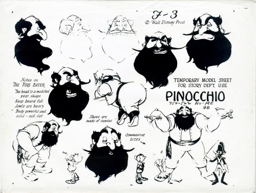
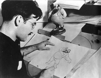 - Mark Mayerson has just completed his final mosaic of Pinocchio. This has been an extraordinary effort on his part, and I can’t say how much I’ve enjoyed it. This film was possibly the pinnacle of traditional animation, and we can’t study it or honor it enough. Mark’s efforts have only elucidated this point more than ever. There’s so much there; the film is an animation treasure.
One of the gems of the film was Bill Tytla’s animation of Stromboli. A minor character takes on an enormous personality and a major threat to Pinocchio under Tytla’s hands.
The Frank Thomas/Ollie Johnston book, The Illusion of Life, contains a flip book in the upper corner – a short bit of Stromboli flying off the handle. The images are quite small and it’s hard to really see them. I have a slightly larger version of them, so thought I post them as my small tribute to the film.
 1
1
_
 2
2
_
 3
3
_
 4
4
(Click any image to enlarge.)
Animation &Animation Artifacts &Disney 12 Oct 2007 08:13 am
Kahl’s Jungle Book
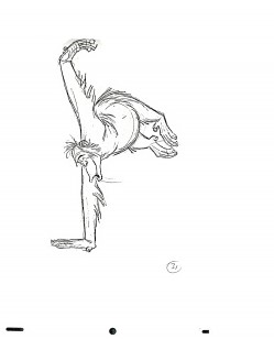
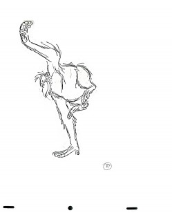
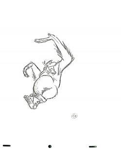
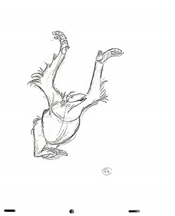
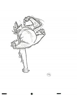
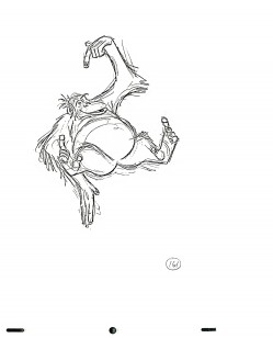
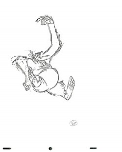
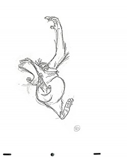
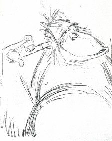 – Since there was such popularity with the post I had put up earlier this week about The Jungle Book, and since the new DVD is being celebrated everywhere, I thought I’d post some more bits I have from that film.
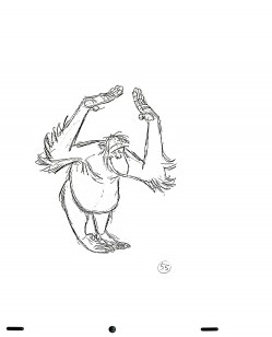
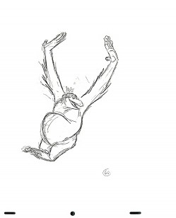
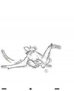
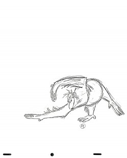
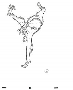
These are some of the drawings by Milt Kahl from a sequence featuring King Louie doing a dance. It’s interesting that I think immediately of Shere Kahn as Milt Kahl’s work, and I don’t think of Louie. Yet I’ve had these copies for the past 25 years.
Somewhere – I have to find it – I remember Walt Disney being quoted as having said the one thing you should never animate is a monkey. They’re funny enough in real life; animation can’t improve on them. I remember thinking of that quote the day I first saw this film. I also wondered how Louis Prima felt knowing that they were representing him as an orangutan. I suppose that’s not a monkey.
The copies of these drawings I have are xeroxes. I’m posting them for the magnificent drawing alone; I don’t have timing sheets to be able to work out the movement. Honestly, with Milt Kahl’s work, looking at the images alone should be enough. I apologize if these are at all fuzzy or grey; that’s the quality of the images I have. They’re also not full sheets of animation paper. I copied only the peg holes and drawings.
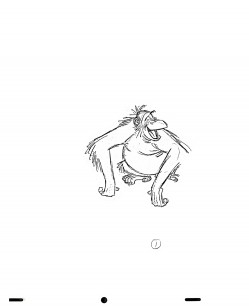 01
01 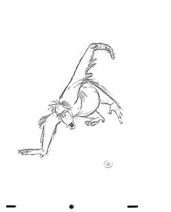 21
21
(Click any image you’d like to enlarge.)
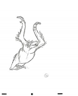 66
66 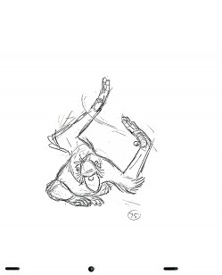 75
75
Talk about breaking of joints,
_______________this scene couldn’t be a greater lesson in animation for you.
 00
00 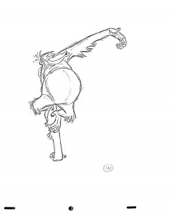 21
21
I know I don’t have to say, but I will; these drawings are extraordinary.
#100, here on the left, is a masterpiece in weight, balance, forshortening and sheer brilliance. And it’s only one frame from a scene.
By the way, Michael Barrier is back (Oct.11th), and he opens with some comments about The Jungle Book as well as a reprint of his 1978 Funnyworld review.
Animation &Animation Artifacts &Richard Williams &Tissa David 09 Oct 2007 08:09 am
Raggedy Tissa
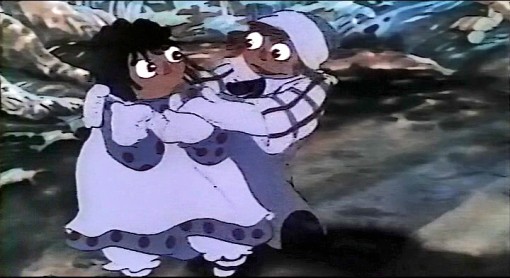
- Tissa David did some of her most elaborate and fluid animation in Raggedy Ann and Andy. Her first scene to animate (after the pilot) was the introduction to her song number. This scene was a whopping long one and was particularly elaborate. It was also the first whole scene put into production.
The cameraman Al Rezek constructed a makeshift multiplane setup for it. This was a bit difficult to do in Panavision, but he did it. There had to be an ominous shadow of a bush overlapping the pair of dolls as they entered the deep dark woods. The scene must have been shot a dozen or more times until we were happy with it.
I have all the drawings to this scene, rough and clean up. There are a lot of them. I’ll post a couple of Tissa’s roughs here to give you an idea of the scene. Dick Williams cleaned it up, himself, and it took him a while. In a future posting, when I have more energy I’ll post more of the roughs against Dick’s clean ups.
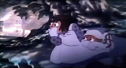
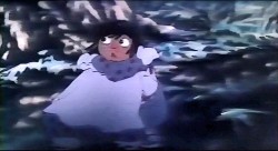
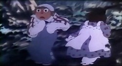
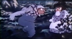
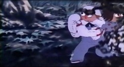
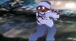
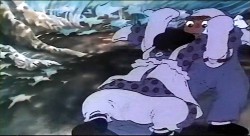
I’m also posting some frame grabs from a bad pirated dvd version I have of the film.
Animation &Animation Artifacts &Disney &Models 08 Oct 2007 07:46 am
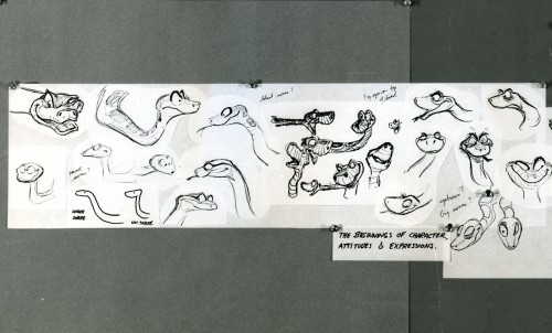
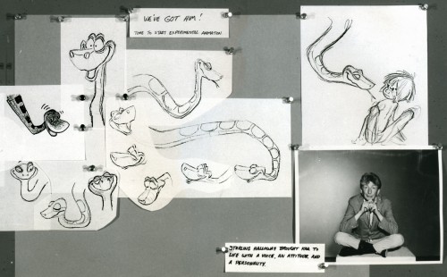
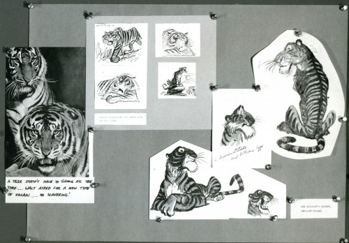
Jungle Book Stats
- With the release of The Jungle Book dvd, I thought I’d post something for it.
To me this film represents the first in the big decline of Disney Animation. The reliance on star voices started here, and the result was not good. They got good voices, but they relied on the voices for the animated character, and too few characters had original animated styling to overcome the actors that did them.
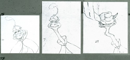
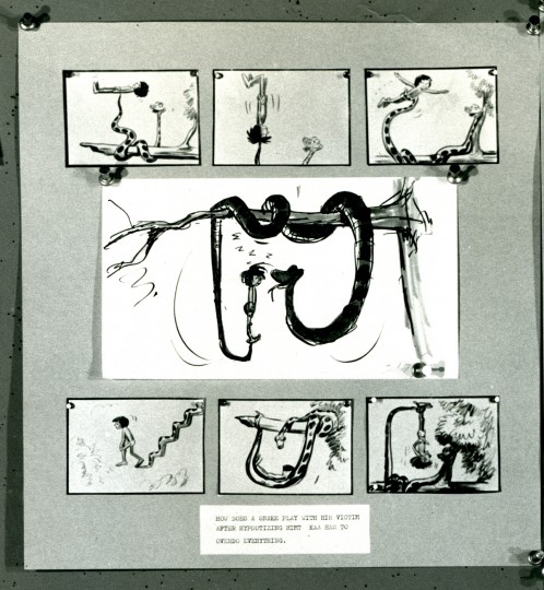
The singers killed it. By that I mean, the character of Baloo became more Phil Harris and less Baloo the bear. Louie Prima‘s King Louie was more Louis Prima than anything you’d find in the African setting. George Sanders was more of an actor than a personality, and he offered Shere Khan a character that Milt Kahl was able to build on. Sterling Holloway as Kaa was also more an actor than a personality, and he played what was asked of him. Ollie Johston was able to develop on it.

(click any image you’d like to enlarge.)
Animated features try to continue in the same vein. Voices like Robin Williams or David Spade or Eva Gabor are not going to make the animated character better. It’d be more interesting to have unknown voices that are well cast. Peter Pan, Snow White, Bambi and Cinderella. Lady & The Tramp, Alice, Pinocchio are all brilliantly cast features.
The Jungle Book, to me, gets incredibly dull. I’ve sat through projections of it at least a dozen times, and each and every time was exhausting. Lots of set pieces, but I don’t think it really adds up to a whole. Except for the Shere Khan scenes, there’s virtually no conflict and even less tension. Sorry to say anything bad, but it’s hard for me not to.
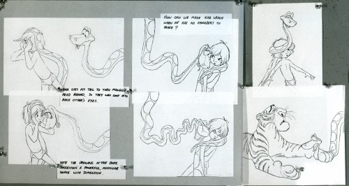
The material I have here came from stats that were prepared to make Thomas & Johnston’s The Illusion of Life. The little attachments became the captions for that book where the images were printed small.
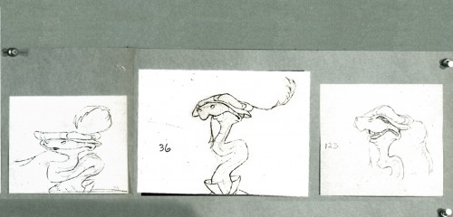
These images are pretty light, so I had to soup them up a bit so that you can read the lines.
Animation &Animation Artifacts &Fleischer 06 Oct 2007 08:03 am
Grim’s Betty – Dangerous Nan
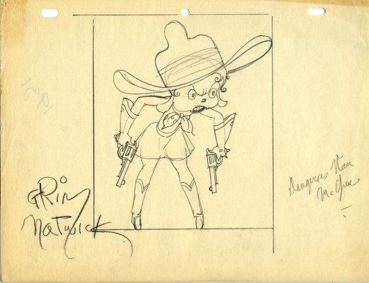
- The Bum Bandit was a FLeischer cartoon starring Bimbo produced in 1931. It marks the fourth appearance of Betty Boop – who doesn’t get billing in the credits. As a matter of fact, she introduces herself with a different name during her song in the film, “I’m Dangerous Nan, the sister of Dan McGrew.” She’s so tough she spits bullets through a cactus.
Grim Natwick did the drawing, posted here. It’s dated 1931, the year of the film. The drawn Betty looks better than the film’s Betty. A lot was lost in the inking – including her scarf and guns. (I wonder if it was cleaned up for our delicate times?)
I like seeing the peg holes which are certainly more sophisticated than the two round holes used in other studios at the time.
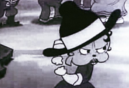
You can watch this film in an OK version on YouTube
(for however long they allow it to continue there.)
Animation &Animation Artifacts &Richard Williams 05 Oct 2007 09:32 am
Raggedy Celebration
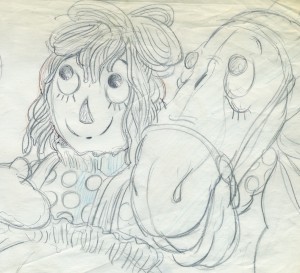 - As I mentioned a few weeks back, ASIFA/Hollywood is planning a reunion of the crew of Raggedy Ann to celebrate the 30th Anniversary of that film’s production. This ASIFA event will be at the American Film Institute in Hollywood on November 17th. It’s hoped that a simultaneous reunion can happen in New York City, but I still wonder about that coming together.
Regardless, this is good reason to post art from the film and keep posting it until the event.
Sooooooo . . .
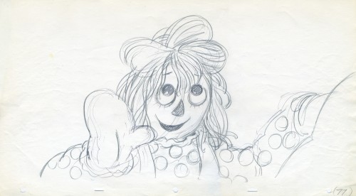
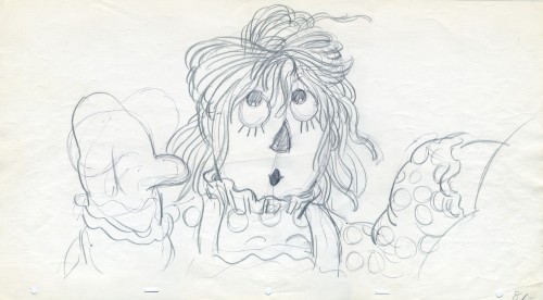
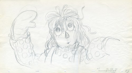
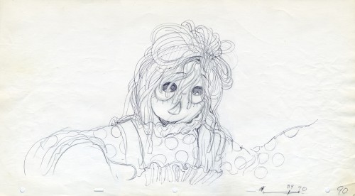
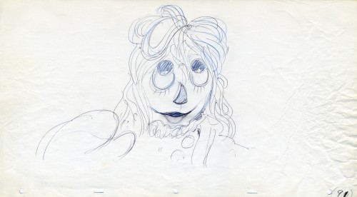
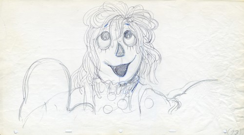
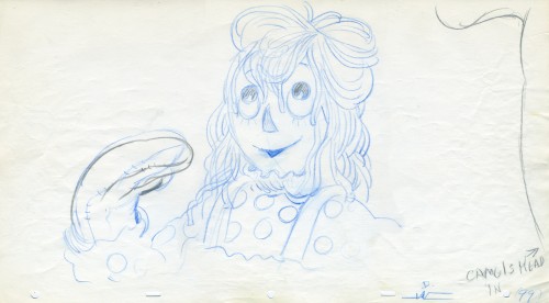
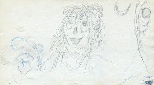
Here are some animation drawings/ roughs by Corny Cole. His artwork is close to Johnny Gruelle’s originals. He, of course, was the film’s origninal designer, though I’m not sure how his designs related to the final screen picture.
Corny did every drawing (partial inbetweens) though I’m only posting extremes. All this art was done on paper 19″ x 10.5″ for Panavision proportions. (And this was the small paper we used.) Of course, there’s an animated zoom in the scene. It wouldn’t be a Corny Cole scene without it. Here are Corny’s extremes:
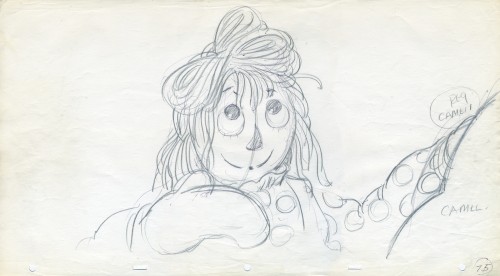 75
75
(Click any image to enlarge.)
