Category ArchiveAnimation
Animation &Tissa David &walk cycle 12 Dec 2007 08:37 am
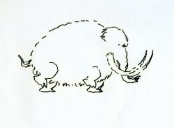
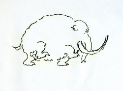
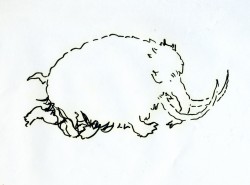
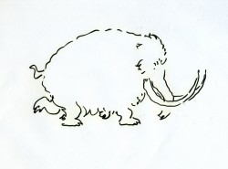
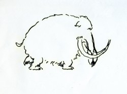
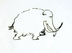
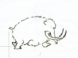
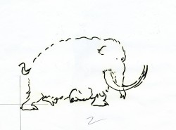
Tissa Elephant
- Before I get into the post for today, I wanted to call attention to a brand new site dedicated to Richard Williams‘ film The Cobbler and the Thief.
The site, called The Thief, is a collaboration of four artists who worked on the film, but they’re encouraging conversation from others who were involved. It looks to be a promising site.

Thanks to Matt Jones for directing me to it. (By the way, check out Matt’s site if you aren’t familiar with it.)
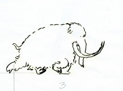
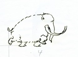
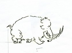
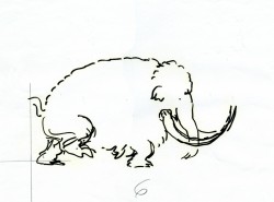
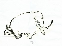
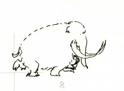
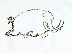
- Here are the drawings for a walk cycle Tissa David animated for an elephant walking in a well-played Perrier commercial from the 80′s. It was a spot done for the Ink Tank in R.O. Blechman ‘s style. These are rough drawings.
Tissa did two versions of the walk in ruff. I’m posting both here so you can see the difference she got in the walks. The second one, which is the final, is subtlety. It’s a quieter walk and is more apporpriate to the tone of the spot. (That’s back when animation didn’t have to jump from pose to pose and could actually move properly.) I’ve added a QT version of each of the walks to view the movement.
The first RUFF version follows:
 1
1 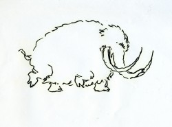 2
2
Click on the drawings to enlarge.
The version used for the final follows.
You’ll note the crosses on each drawing. One might assume this is for re-registering the drawings, but that’s not the case. (You’d need at least three crosses for a fair registration.)
Tissa usually draws a horizon line for each foot of the walker. In the case of these drawings, she drew only the line for the back two legs.
When teaching people how to draw a walk, she starts by drawing two parallel lines and informing you that each line is for one of the feet of the character. The two feet (four in an animal) should NOT be on the same line. It helps to give a slight feeling of depth to the body.
I can’t tell you how many walks I’ve seen lately that don’t even follow this simple and basic rule.
If you go here, you’ll see another spot Tissa and Blechman did for Perrier from the same campaign.
Animation &UPA 30 Nov 2007 08:56 am
Our Mr. Sun
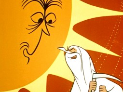
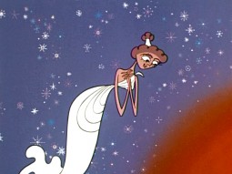
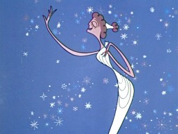
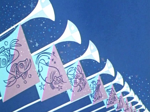
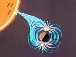
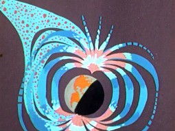
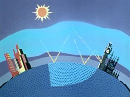
 - Back in the 50′s the film director, Frank Capra, produced, directed and wrote four specials for TV which were sponsored by Bell. Our Mr. Sun (1956), Hemo the Magnificent (1957), Unchained Goddess (1958) and The Strange Case of the Cosmic Rays (1957) were devoted to explaining basic science to family home audiences. Capra was educated as an engineer, so he had a lifelong interest in science and he initiated these prorams.
Capra also had a long time interest in animation. He was responsible for securing a distribution contract for Disney with Columbia back in the early 30′s. Animation became a large part of these four programs, and Capra found different animation houses to do them. UPA, Disney, Shamus Culhane‘s studio and WB all were involved.
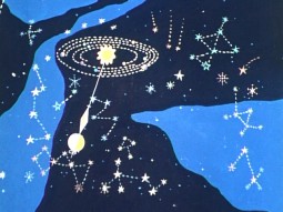
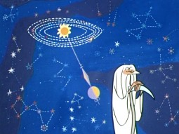
UPA did the artwork for Our Mr. Sun, the first of these programs. (You can watch it here.) I have a copy of the script marked up by Grim Natwick, so I know he animated on it out of the NY studio of UPA.
The shows play a bit like Ward Kimball‘s “Tomorrowland” episodes of the Disneyland television show. Perhaps these are a bit less joke oriented. The animation is just as limited and design oriented. This format has forever affected many who grew up watching them. Check out the new Pixar 2D piece, You’re The Rat, currently on YouTube (it’ll probably be removed soon.) There’s an obvious link.
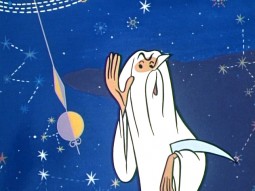
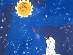
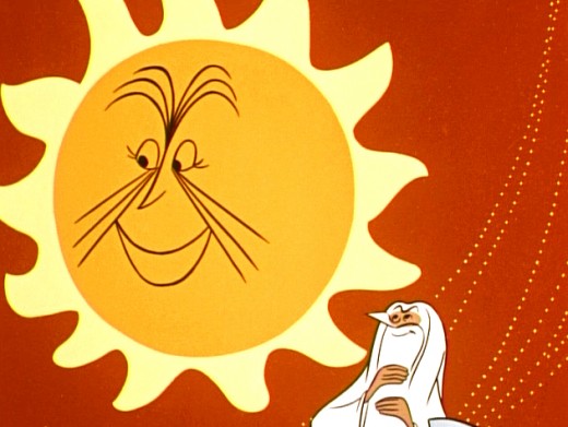
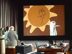
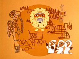
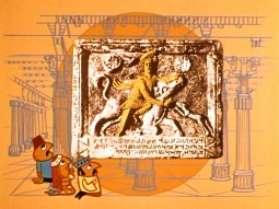
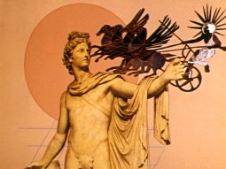
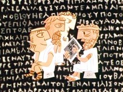
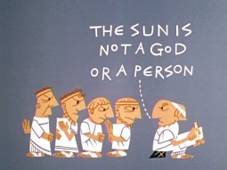
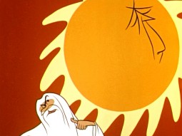
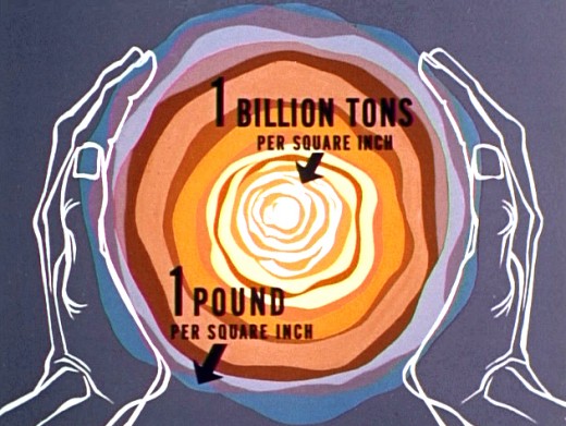
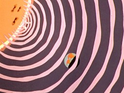
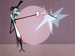
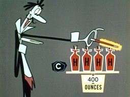
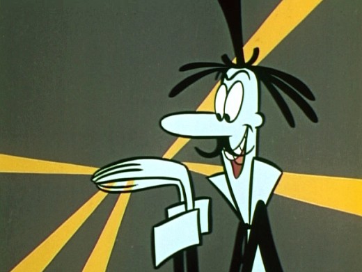
Here are some frame grabs from this first show of the Bell Science Series: Our Mr. Sun.
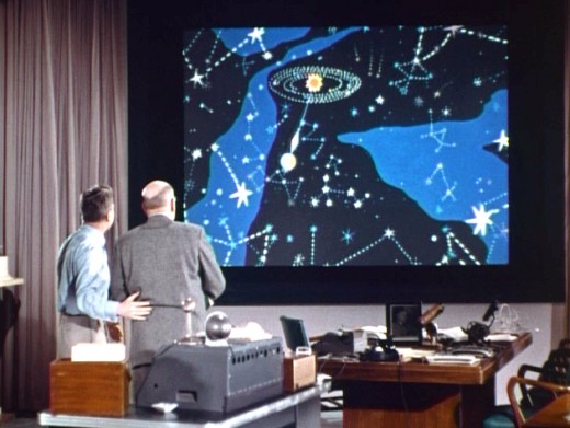
(Cllick any image to enlarge.)
Animation &Rowland B. Wilson 29 Nov 2007 09:05 am
Jack Schnerk
- I apologize for the server problems we had yesterday. Our site was down for most of the day. If you haven’t seen yesterday’s post, just scroll down.
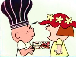 - Jack Schnerk‘s daughter, Mary Schnerk Lincoln, has put three of her father’s commercial sample reels onto YouTube . This gives me a good excuse to call attention to his work, once again. There are a number of well-known and collector’s item commercials in these reels. Included are spots designed by the likes of Gahan Wilson, Tomi Ungerer, Charles Saxon and Rowland Wilson.
Jack Schnerk was a great animator who deserves considerably more attention. He was a strong influence on me in the first eight years of my career and taught me quite a few large principles about the business. He also told me a few stories of his work as an assistant at Disney’s on Bambi and Dumbo as well as the great times animating at UPA and the difficulties of animating at Shamus Culhane’s studio. Actually, he didn’t tell me about his problems with Shamus; another animator did. Jack complained about the business, but never about how he was treated.
I wish I had more samples of the many scenes of his that I assisted. He worked in a very distinct style – I don’t think I’ve seen anyone elseever draw that way. Somehow, the very rough drawings weren’t hard to clean up, and he didn’t leave the bulk of the work for the people following him. He was concerned about the timing and did every drawing he needed 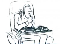 to make sure that timing worked. Most of the time we worked together, he had no chance to see pencil tests. Only on Raggedy Ann did he have that luxury.
Jack had a dark side, that I appreciated, but he also brought a lightness and individual sensibility to the work he did. He took chances in his animation and timing and sometimes failed but usually succeeded with them. That’s more than I’ll say for most of the animators I’ve met in the business.
See Jack Schnerk sample reel 1.
Animation &Animation Artifacts &Disney &Story & Storyboards 28 Nov 2007 08:45 am
Bill Tytla’s Dumbo sequence
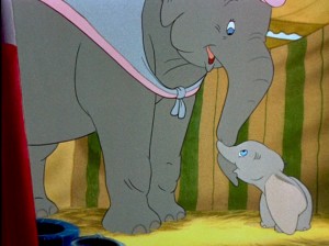 - Yesterday, I posted John Canemaker‘s archival copy of the storyboard for Dumbo; the sequence where he gets washed by his mother and plays around her legs.
I think this sequence, on film, is one of the greatest ever animated. There’s a sweet tenderness and an obviously close relationship between baby Dumbo and his mother which is built on the back of this sequence. It not only establishes both characters solidly, without words, but it sets up the mood of everything that will soon happen to the pair during the remaining 45 minutes of the film. Without that established bond, the audience wouldn’t feel so deeply for the pair during the “Baby Mine” song or care so much about Dumbo’s predicament.
Tytla has said that he based the animation of the baby elephant on his young son who he could study at home. Peet has said that Tytla had difficulty drawing the elephants and asked for some help via his assistant. There’s no doubt that both were proud of the sequence and tried to take full credit for it. No doubt both deserve enormous credit for a wonderful sequence. Regardless of how it got to the screen, everyone involved deserves kudos.
Here are a lot of frame grabs of the sequence. I put them up just so that they can be compared to the extraordinary board posted yesterday. Both match each other closely. Whereas the board has all the meat, the timing of the animation gives it the delicacy that would have been lost in a lesser animator’s hands, or, for that matter, in a less-caring animator’s hands. The scene is an emotional one.
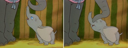
(Click any image to enlarge.)

Animation 24 Nov 2007 09:08 am
Intvw – JRDilworth
John R. Dilworth is a good friend. He’s currently in Europe putting together some interesting animation projects. He sent me a copy of this interview which was conducted by Andrew La Punta from the School of Visual Arts. Since I was thinking of writing about John, myself, I’ll post this interview for now to give John some due attention.
 When did you first realize you wanted to pursue animation as your career?
The moment appeared in the form of a sudden shock to my psyche experimenting with children book illustrations. I was reviewing a few illustrations I had done for an unpublished author on spec; this was before my study at SVA, and I thought to myself, quite unexpectedly, I would love to see this move. That was it.
How did you first start out in the animation field?
I began my animation career during study at SVA. I would go to the jobs board and apply for the listings that appealed to me. Among my favorite was animating a greeting card flip book. It was produced and distributed and brought me satisfaction, including a life friend of the producer. When I was not doing homework, or “freelance” as a student, I would make animated films. I made 3 during SVA. One of them, my graduation film, Pierre 1985, I used to show producers in the industry. I simply called all the studios I could and made appointments for portfolio review. This was a difficult period. I worked in advertising until I was able to earn enough to work in animation full time. It took me nearly two years. My first jobs in animation were in production. I accepted any job offered me. I hand painted cels, worked in production, interned for Howard Beckerman. I joined animation groups like ASIFA. I volunteered with these groups. I made an effort to meet artists and producers. I traveled to take “tests” in Los Angeles and Florida. I made phone calls in these cities to producers and artists and introduced myself.  This was a very tough process as I am a modest and shy individual by nature. I had forced myself to “break on through to the other side” of this to give myself a better chance. Eventually, I was given assisting and inbetween work. Then animation. I was reading and studying motion and the fundamentals of movement. I liked attending dance performances. The kinetic energy of dance stimulated my impulses to “dance” on paper. And throughout this process of development, I made my own animation art. When I produced the Dirdy Birdy in 1994, I was moving into the next level of making animation and earning a living solely based on my work.
What are some difficulties you face as an animator?
Currrently, the biggest difficulties are finding the most complimentary relationships with producers and distributors, raising the funding to make animation, back-end participation and technology’s influence on hand drawn animation in the market.
What methods do you use to look for inspiration?
In the past, I was in a kind of undeclared art therapy. I used semi-autobiographical material 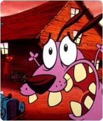 such as my relationship with family and society ( Smart Talk with Raisin ), lovers ( When Lily Laney Moved In, The Limited Bird, N&N, Catch of the Day), my own dysfunctional behavior ( The Dirdy Birdy, The Mousochist, Courage the Cowardly Dog ) or personal collisions ( Life in Transition ). These themes tend to be my current sources of influence today as well, now that I think it over. My method of inspiration is introspection, self-inquirery and a pursuit to understand the universe. Only once did an illustration I admired in a catalog of erotic art inspire a short film, and of course I cannot discount the method of sitting back and watching great films and cartoons. I would often make notes on those aspects of this “viewing” that inspired something in me.
In the past, animators would have to paint cels and shoot frames on a camera. Today, 2d animation is mostly digital. What are your thoughts about the direction 2d animation has taken?
My last hand painted film on cels was The Dirdy Birdy (1994). I embraced the new technology to paint and compose hand drawn animation in the computer, I believed that I could manage my films better than having to delegate. On my next film, The Chicken from Outer Space (1995 ), I out-sourced the Ink & Paint to the Animo software system and later transfered to film directly from digital files. Currently, I do not have a personal relationship of expression using FLASH, for instance. I do not “feel” the human uniqueness of spontaneity and sudden and impetuous diversion in line and motion that characterized, in part, the struggle of traditional animation. However, I freelance the duties of AFX. FLASH or Photoshop to artists who have the facility and I continue to enjoy hand drawing. I am aware 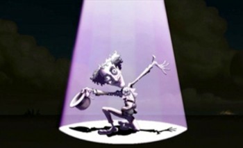 that the substance of a project should be awarded the medium in which to best express it. I would not have enjoyed watching Tex Avery or Bob Clampett cartoons in FLASH. However, the “look” of the creative stuff coming out of these softwares are itself a unique thing and the current market appears to demand it. That is itself a validation of direction the overall medium is taking. What I do wish would return is the mentor/protege model of experience. The new softwares tend to isolate the individual from the intra-personal group experience. Talent do not even read the manuals. I’ve noticed that they go solo and learn the vocabulary built in the software.
What are your thoughts about the future of 2d animation? Will it eventually fade away, be replaced with 3d animation, or stay forever?
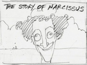 The market is king. Currently, the market is investing heavily in computer animation and 3-D without glasses. These are advances in a visual medium that rival the technological revolution upon the release of “Snow White”. That’s the commercial consideration and human necessity for invention and “progress”. The future for me will always include hand drawn animation. I continue to offer the market my talent and continue to make my art by hand. If I can no longer afford to make animated films by hand, for instance, I will probably do something else. The most important thing to remember is simply do what you enjoy the most and what brings you the most satisfaction, like masturbation. And I am a master at pleasing myself!
At the end of the day, do you have any regrets with your decision on becoming an animator?
No, I have no regrets becoming an animator. I do have regrets over my attitude as an animator towards certain producers and network executives. I would have liked to react to the outrage I had to endure with more gallantry. I regret that I allowed my pride to reign over civility. I regret that I allowed myself to be truculent in attitude, aggressive in opinion and arrogant to ideas and perceived ignorance of others, even to the deliberate greed and megalomanic insecurities of these characters. These incredulous acts of my self-defeatism 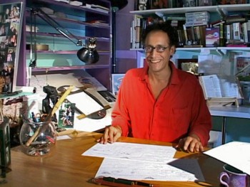 contributed to a diminished reward, the reward of enjoying the moment of conflict and creation. No, I have no regrets becoming an animator, only the regret that I did not make a better effort to be a gentleman animator. However, I must accept that the chemistry of deep passion for my art will contrive with my irrational reactions yielding something beyond my control, like one of my favorite militants in cartoons, Daffy Duck.
Animation &Animation Artifacts &Disney &Story & Storyboards 23 Nov 2007 08:59 am
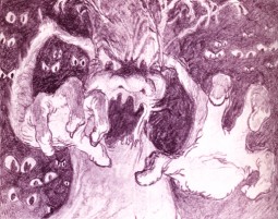
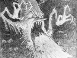
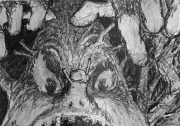
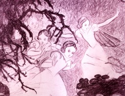
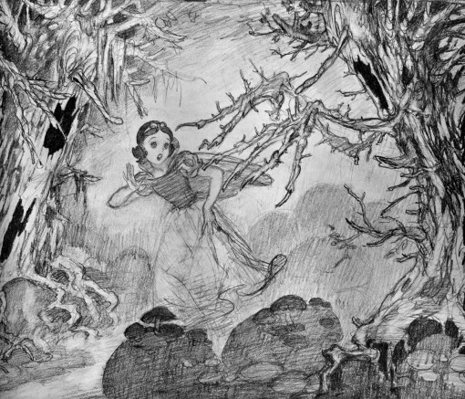
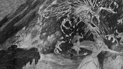
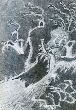
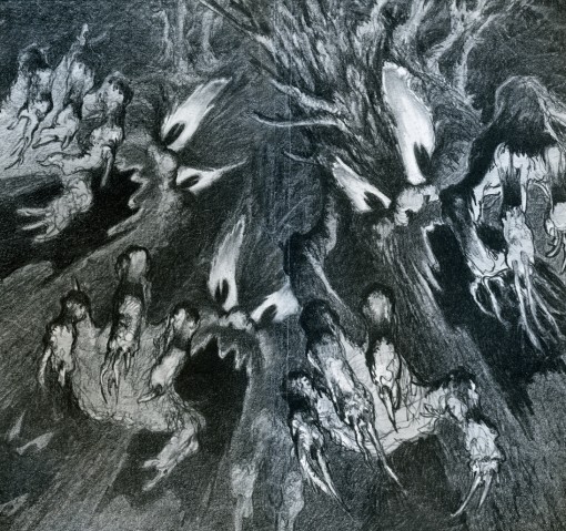
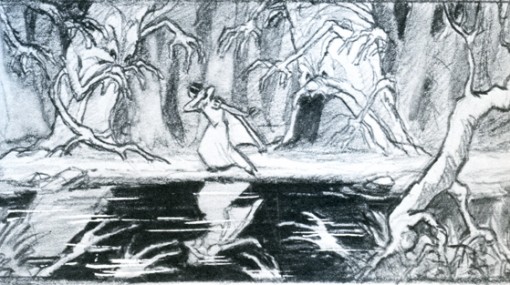
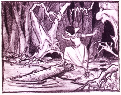
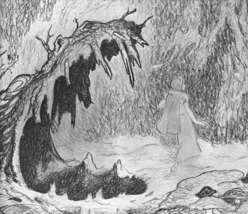
Fear of Trees
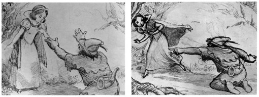
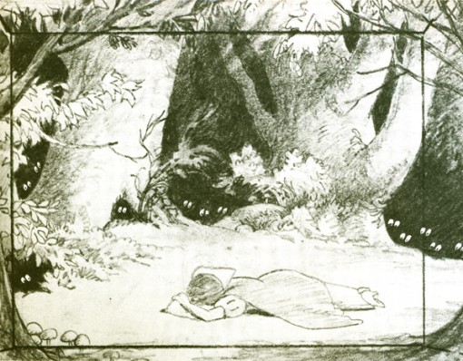
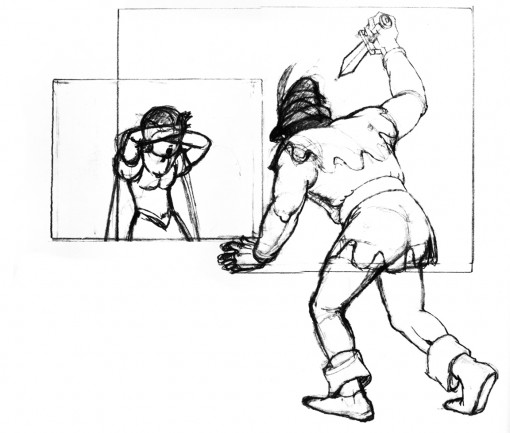
 – Once again I dip into the oversied Snow White book bought years ago. It’s filled with storyoard/layout drawings and illustrates the story of Snow White using only such drawings. There are plenty of beautiful images in this book, and I can’t help but pull them out to post.
There’s no indication of who drew what, so you have only the B&W images to look at with no other references to go by. This film is a true source of inspiration for me, so these drawings are always great to study, and this
odd book is jam packed. Unfortunately, the only text within the book is the story of Snow White.
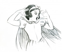
This is Snow White’s run from the hunter – really from the Queen – into the deep, dark woods. Her fears get the better of her, and the trees turn into creepy creatures,
frightening her to tears.
(Click any image to enlarge.)
_
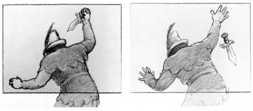
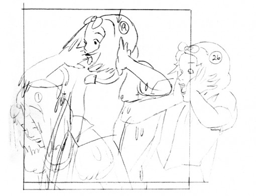
This looks to me like a rotoscope drawing traced off the live action.
Animation &Fleischer &walk cycle 21 Nov 2007 09:13 am
Betty Walks
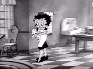 – Back when I wanted to become an animator, there was always the same statement by the hardened professionals: it takes ten years to become a decent animator. I always wondered what happened in that ninth year. I wondered if you could do it sooner. Ward Kimball and Myron Waldman were considered boy wonders who quickly rose to the top of their respective studios. Not only did they become animators; the became directing animators.
Nowadays, all you have to do is register with Flash, and you’re an animator.
As I entered the business, it became obvious that the walk cycle was the make or break point for an animator. You had to be able to master the walk cycle and be able to do something interesting with it – something interesting that helped define the character. (Although, Adam Elliot did boast that he’d never done a walk cycle in all of his films including the half-hour Harvie Krumpet which won the Oscar.)
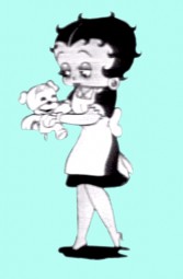
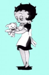
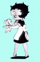
However, even in Flash you often have to make characters walk. That’s why I’ve put a lot of focus on walk cycles, lately. The Fleischer films seem to have created cycles that are more manageable, so it’s easy to focus on them. Here’s a cycle of Betty from the short, A Little Soap and Water (1935). I’m pretty sure it’s Myron Waldman‘s work. It’s not really a cycle, but I’ve maneuvered into one for viewing.
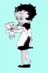 1
1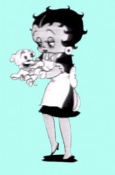 2
2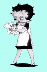 3
3
____(Click any image to enlarge.)
Animation &Commentary 19 Nov 2007 08:46 am
More On My Love
 - Yesterday, I felt like I’d committed heresy when I wrote about Aleksandr Petrov‘s film My Love and my feelings about this filmmaker’s work. (Go here to see a short clip.)
I have a definite problem with Petrov’s painting style. It’s a semi-realistic, style, remniscent of some of the megre Russian impressionists like Chegodar. V.P. Krants or Krokholev. Though I respect the form, it doesn’t move me. The same is true of Petrov‘s work.
He’s a talented draftsman who has taken Caroline Leaf‘s painterly style, created for The Street, and developed it to a new level of meticulousness. He manipulates the wet paint on glass in a dissolve style and ties the transitions of scenes together with animated pans and zooms. It’s all rather fluid and impressionist almost to the point of muddy. One can’t help but admire the technique and give him countless awards for it.
The beautiful and expressive animation of Caroline Leaf, in my opinion, enormously surpasses the feeling of the literal and live-action bound animation of Petrov. Many people admire him, and I can understand that. I just feel differently.
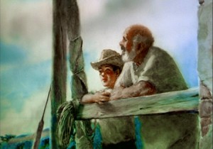 However, if I do have to select one of his films as a favorite, I would have to choose The Cow, his first. You can watch it on YouTube. My least favorite is the Oscar winner, The Old Man and The Sea.
Though, actually, my real favorite is the work he did for United Airlines. I think his style is enormously commercial, and the George Gershwin music really works with it to give the film a 20th Century feel.
Since seeing My Love, I’ve been searching for a short bit I’d seen wherein Yurij Norstein gives his thoughts on the film. With some searching I was able to locate the video interview. Go here to see it. (Thanks to Animatsiya In English for posting it.)
Anyway, here’s the segment of the Norstein interview about Petrov:
- Question: … well, let’s begin with Petrov’s film ["My Love"]. Unfortunately the name “Petrov”, I think, the rest of the world probably knows better than we do? The winner of…
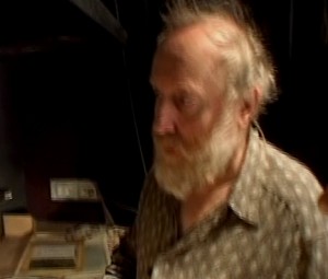 Norstein: No, he’s also known over here, of course.
…winner of the Cannes festival…
..No, not Cannes, he received an Oscar for the film “The Old Man and the Sea”. Which incidentally was made in Canada, not here.
There’s an unusual technique, as I understand.
The technique is something. He has an unusual technique – I can’t say that he invented it, animating with paint on glass, I think it was invented by Caroline Leaf. She made the first film, in 1978. It was called “The Street”, and it was a wonderful film in its time. Some story by a Jewish writer [Mordecai Richler], I don’t remember now, I don’t know… this was an event then. Sasha was certainly aware of this film. He wonderfully… I think that in animated filmmaking today few draw like him, and maybe nobody does. He’s a complete virtuoso in this respect. And his first film “The Cow” was an immediate phenomenon. It was a diploma work and a full-fledged film at the same time, and incidentally was nominated for an Oscar. What’s surprising is that it DIDN’T win. Now that was one film which should have won, because it was in all respects a NEW film. Of a new psychology. Well, it’s sufficient to say that it was an adaptation of Platonov, you see? This already speaks of the quality of the animation. The film which he has just made – it received the Grand Prix, and I think won another two categories… but… I should really speak with Sasha about it, because the virtuosity is the same. The same glamour. But I think there are things in cinema more important than certain moments, than a simple showcase of mastery…
So basically… you wished for depth?
I wished for depth. I wished for… economy. I wished for, on some occasions, humility, when virtuosity gives way to something more deep, psychologically more important.
Those last lines are the key to everything I believe in animation. Let me repeat them:
I wished for depth. I wished for… economy. I wished for, on some occasions, humility, when virtuosity gives way to something more deep, psychologically more important.
Is this the difference between Art and Illustration?
Animation 08 Nov 2007 08:39 am
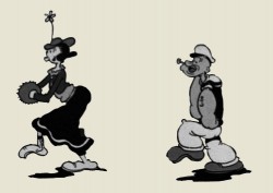
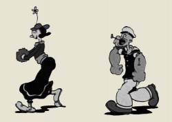
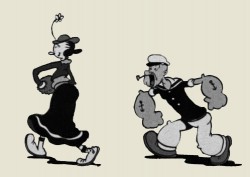
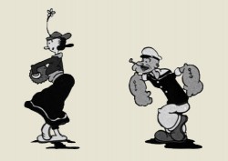
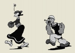
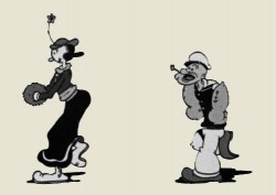
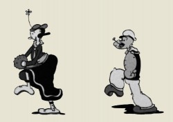
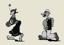
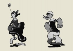
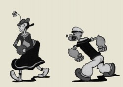
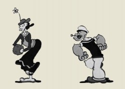
Lillian Friedman walks Popeye & Olive
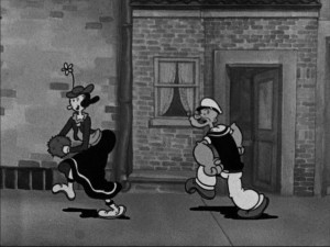 - Bob Jaques‘ excellent new site gives overdue attention to some lesser-known animators who worked on the Popeye shorts.
His recent post placed focus on Lillian Friedman‘s work. She apparently is the first female animator to have worked in a major studio.
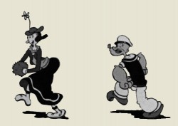
Her first animation, as reported by Bob, is the only Popeye film she worked on, Can You Take It (1934). As John Kricfalusi points out, there are a wealth of entertaining walks in this film. This is the very first walk (not really a cycle, though I’ve made it one) in the film, and it’s a great one that we can attribute to Lillian Friedman.
The cycle is hilarious, with the bottom half of the body – the legs – moving at twice the speed. To quote Mark Mayerson, “Note that she uses Popeye’s head to hit the first accent in the 1-2-3 beat structure and then uses the feet to hit beats 2 and 3. So on one step, the head comes forward with the right foot and the next time it comes forward it’s with the left foot. That’s pretty sophisticated for a beginning animator.”
It’s an original walk, and it’s also a very good one. With all the digital assistance available today, how infrequent is it to see something so original. And this was Lillian Friedman’s first credited walk cycle.
 1
1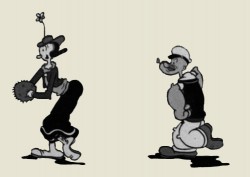 2
2
(click any image to enlarge.)
Animation &Commentary &Daily post 07 Nov 2007 09:12 am
In Your Face
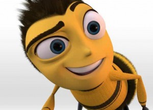 – Last night, I saw the Dreamworks/Seinfeld concoction of an animated feature. Bee movie. The title is meant as a pun on “B” movie; unfortunately, that’s what this really is – a second rate film.
I should keep my opinion to myself, but I can’t. I have no intention of putting down any of the excellent artists, designers, or animators that worked on this film. They did what they could given the circumstances.
Let’s talk about what I see as “the circumstances” given the fact that I know NOTHING about the making of this film other than what Jerry Seinfeld said on Charlie Rose or that I was able to guess from the movie, itself.
The story is pathetic. If it had been just a mass of uproarious, funny jokes, I’d have been happy. In fact, I didn’t hear too much laughter in the theater, and I wasn’t brought to smile even once. It wasn’t funny. In fact, about midway through the film, I felt that I was watching some kind of bastardized Industrial or Educational film about bee pollination. The only problem was that the information was so simple that I knew that wasn’t the case. Jerry Seinfeld should be ashamed of his role in this product, and I believe that was probably the problem.
Now, the problem with the “craft” of the film. It was all at the top.
For some reason, the actors were directed to push their performances way – I mean WAY over the top. Renee Zellwegger has given many fine performances during her career – including King of the Hill and Shark Tale. Her acting in Miss Potter was extraordinarily subtle and nuanced. However in Bee Movie, she shouts her lines, overperforms every word and telegraphs every simple sentence. Yet, alongside John Goodman, she’s the maestro. His performance as a prosecuting attorney allows him to don a Southern accent and pretend he’s doing Inherit The Wind in some regional dinner theater where he’s trying to shout over the clinking tableware and devour all of the scenery. It’s an embarrassing performance. Even Patrick Warburton, not the greatest actor is fine in many other animated films including The Emperor’s New Groove, yet here he’s required to scream his every line. I don’t get it; it’s as if they were all forced to give heightened performances to try to make the poor writing funnier. It didn’t work.
 The poor animators, saddled with these readings, animated what they got. Hence, the shouted lines were overanimated – that’s the only way they could work – with an aggression that I haven’t seen in quite some time.
The film was dreadful. I’m sorry, I don’t mean to offend anyone out there who’s worked on it, but I did not enjoy the experience. Of course, it’s only my take on the thing, and my opinion is just that.
By the way, why is it that these animated features consistently rob the insects of two of their appendages? Bug’s Life and Bee Movie choose to illustrate bugs as having two arms and two legs, unlike real insects which have six. At one time, the Jerry Seinfeld character comments on the eight legs of spiders, making us even more aware of the shortchanged bees in this movie. For Pete’s sake, even the ugly Nasonex bee has six legs, though for some reason he has an hispanic accent. Who’s making these choices?
 - Now let’s talk about ART in animation.
The ASIFA Hollywood Animation Archives is currently displaying an exhibit of early Grim Natwick art. There are photos of the exhibit at their site and a couple of excellent scans of Grim’s early animation drawings. If you haven’t seen these, you ought to visit their site – or the archive, itself.
GRIM NATWICK’S SCRAPBOOK
An Exhibit Presented By The ASIFA-Hollywood Animation Archive
2114 W Burbank Blvd
Burbank, CA 91506
Tuesday through Friday 1pm to 9pm
- This month, Jeff Scher reworks a 1945 musical film, Yours, for the NYTimes. Kudos to Jeff for another fine piece. One a month for The NY Times. Would that other newspapers would take it on to support a bit of animated art. Support it by adding your hit to their post.
Today’s NYTimes also includes a review of a number of animated DVDs including: “Ratatouille,†“Pixar Short Films Collection: Volume 1,†“Looney Tunes Golden Collection: Volume 5,†“Chuck Jones Collection,†and “Fantastic Planet.â€
If they’re animated, they must be connected.
