Category ArchiveAnimation
Animation &Disney &Frame Grabs &walk cycle 03 Apr 2008 08:23 am
Art Student walking
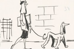 - When I was young, as I’ve pointed out many times, there were few books available about animation and as few illustrations and photos which ellicited the art of animation. Hence, it was always a treat when a Disney feature was released. The adjoining publicity would provide a trove of publicity material, some worth saving. An encyclopedia my parents bought at about the time of release of 101 Dalmations included several key images of Pongo running. One of those photos of many cels overlayed to detail the cycle. I loved that picture and frequently looked at that encyclopedia under “Cartoons, Animated” to study the photo of the cels.
At the very beginning of 101 Dalmatians, Pongo looks out onto the street to search for a good mate for both himself and Roger, his owner. At this point we’re treated to a number of walk cycles that I think are brilliant. A number of women are perfectly matched to the dogs that they walk.
Now with DVDs available to us, we can see that the characters originated in the storyboard drawings, and we can study these walk cycles. I’m determined to take these animated bits apart to watch them a bit closer.
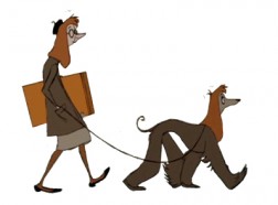
The first of these is the “girl art student” as described in the drafts (which can be found on Hans Perks’ excellent site A Film LA.) Oddly, from my very first viewing of this film back in 1961, I identified her as a “beatnick,” which was the fashionable joke back then. Now I find out she was an “art student.” I guess that makes sense.
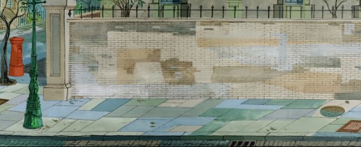
Here’s the pan BG that this scene employs.
________________(Click any image to enlarge.)
And here is the walk cycle animated by Frank Thomas and Blaine Gibson.
Gibson handled the following scene which pans across the bodies of the pair as they walk.
Animation note: The two separate feet are divided by a short space. The left foot is on one plane, and the right foot is on another. This is a BASIC precept for animators to follow, and it’s something that is not appearing in a lot of the recent walk cycles I’ve been seeing. It’s annoying.
Animation &Animation Artifacts &Hubley &Tissa David 01 Apr 2008 08:34 am
Letterman Flips the Ball
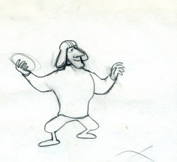
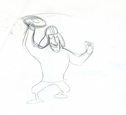
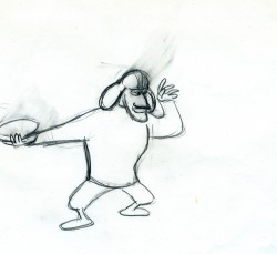
- Here’s an interesting short cycle that Tissa David animated for Letterman. Letterman, himself, plays with a football.
Tissa often animated on more limited shows this way. The drawings B1-B6 can work as a short cycle; drawings B1-D25 work as another cycle. She’ll move out of this and come back to it again later. It hides the cycles yet allows you to reuse drawings cleverly. It’s not just a constantly repeating 1-25 as appears here.
 1
1 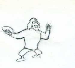 2
2
____________(Cick any image to enlarge to see full frame drawing.)
 25
25Letterman flips the ball on threes.
Animation &Frame Grabs &Hubley 26 Mar 2008 08:23 am
Hubley Bumper
 - One of my all time favorite pieces of Hubley animation was a station ID for WNDT-TV, New York’s public service station back in the 60′s. I thought of this spot last week when I posted the piece about Stanley Kaufman’s Art of Film for that station. It ultimately became WNET, NY’s PBS channel 13.
This spot was undoubtedly animated by Bill Littlejohn, and I think it’s one of his finest pieces. The timing is excellent. He obviously animated straight ahead; the characters distort and morph to the needs of the animation. It’s a full 2mins: 40 secs, so it would qualify as a short film these days,
The piece ran in B&W. It employed the multiple exposure technique. The characters had black paint filling everything bu the animation drawing. This was double exposed over the BG, hence a see-through quality to the characters. This techniques was used on Moonbird, The Hole, Of Stars and Men and several other Hubley shorts.
Here are some frame grabs of the spot.
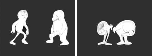
The two guys come out on to the stage and take a bow.
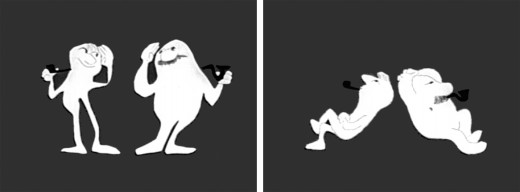
They greet each other, light up and sit down.
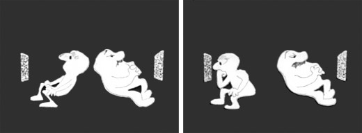
A little bored, they both turn on TV’s. The little guy gets involved.
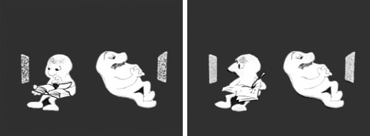
He takes out a book and takes notes comparing it with what’s going on his TV.
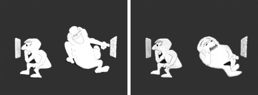
He goes back to watching. The big guy laughs at something until he gets bored again.
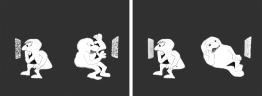
The big guy practices some wrestling moves until that gets dull.
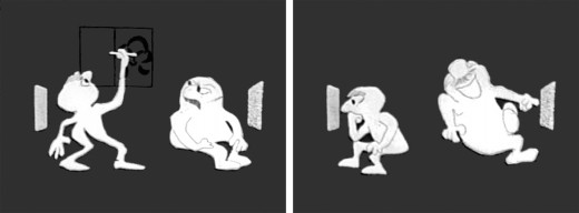
Little guy does some brush painting. Big guy laughs again.
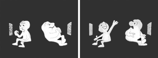
Little guy practices Russian. The big guy gets annoyed.
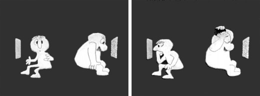
The big guy takes out a comb and starts combing until . . .
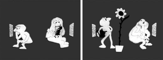
.. he has grease all over his head. The little guy grows a plant.
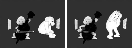
The little guy takes out a cello and starts to play. This annoys the big guy.
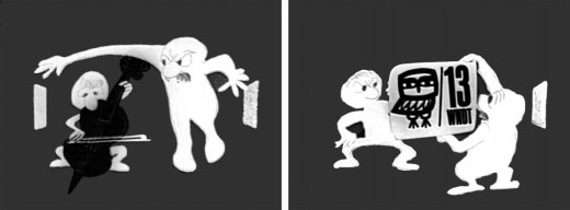
He pulls up the little guys screen. Public Television !
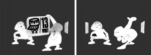
Embarrassed, he bows to the “Arts” station.
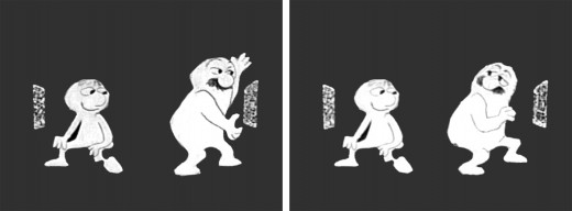
He turns to it on his own TV. He’s planning for something great.
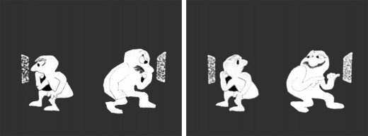
They watch intently until the big guy makes sure little guy knows he’s still watching.
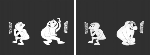
“Brain food” They watch intently.
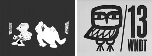
The big guy falls asleep while the little guy goes back to his book. Dissolve to station card.
I love how the shapes of the characters shift and distort and change throughout the piece always coming back to the original models. This is a sure sign of straight ahead animation, and it almost makes the acting feel like an improvisation exercise by two actors. It supercedes animation and becomes acting.
The obviously loose time of the piece shows that the animator was probably given a lot of leeway with his timing, and he took it. As I said, I have no proof that Bill Littlejohn animated it, but I’ve never doubted it for a moment. It’s certainly as much his style as it is Hubley’s.
That is the odd thing about working for a director with a strong personality. I remember the day that I looked at one of my drawings and realized that it looked like one of my drawings, but there was no doubt it was a Hubley. Something happens, and you just end up drawing in their style.
Animation &Animation Artifacts 20 Mar 2008 08:07 am
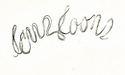
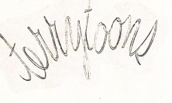
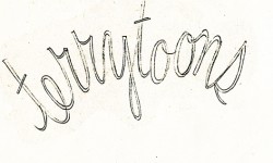
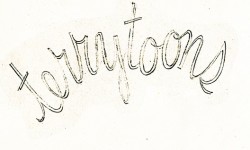
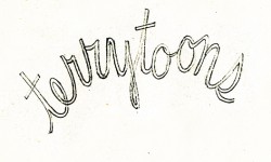
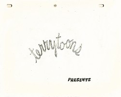
Terry’s Logo
I was looking at an older piece of animation I had posted about two years ago. I’ve always loved these drawings and felt that they truly represented an era at Terrytoons and, more specifically, New York animation. I thought I’d like to post them again (adding a QT movie
of the motion.)
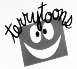 – Since first seeing them in the 50′s, I’ve been a fan of the films from the Gene Deitch period at Terrytoons. You know, Clint Clobber, Sidney the Elephant, Gaston Le Crayon and Tom Terrific. Call this a guilty pleasure.
The animated logo included a linear face which had some scribbled hair that animated to read “Terrytoons” when a door closed on it. It was a short bit that seemed different and more lively than other logos of the day, though I think things started to change with Gene Deitch’s approach.
The UPA films had a tighter animation style. There was some looseness in the opening credits of the Gerald McBoing Boing Show, but generally there was a less freestyle animation in the limited UPA approach. The Dick Tracy show was airtight.
Perhaps the full credit should go to Deitch or perhapts it was Jim Tyer’s influence at Terrytoons that really changed things. I don’t know who actually animated this logo, but there’s plenty of life in it.
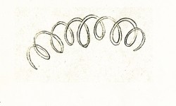 1
1 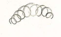 2
2
(Click any image to enlarge to its full size.)
Terrytoons Logo, animated.
Animation &Commentary &Frame Grabs &Hubley 18 Mar 2008 08:16 am
The Hat
- Forgive me, I’ve been in a Hubley frame of mind these past few days, so I’m into reminiscing.
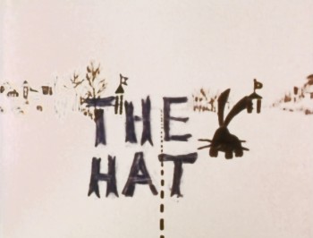 New York’s local PBS station, WNDT – that’s what it was called in the old days – used to have a talk show hosted by film critic, Stanley Kaufman.
(It turns out that this show was produced by the late Edith Zornow, who I once considered my guardian angel at CTW.)
This talk show was quite interesting to me, a young art student. I remember one show featured Elmer Bernstein talking about music for film. He gave as his example the score for The Magnificent Seven. He demonstrated that the primary purpose of the score, he felt, was to keep the action moving, make the audience feel that things were driving forward relentlessly. I still think of that show whenver I see a rerun of the film on tv.
The surprise and exciting program for me came when John and Faith Hubley turned up on the show to demonstrate how animation was done. They were using as an example a film they had currently in production, The Hat. This film was about the siliness of border lines. One of two guards, protecting their individual borders, loses his hat on the other side of the line. Of course, all he needs do is to step over and pick up the hat, but he can’t. The other guard won’t allow him to cross the border illegally – even to pick up his hat.
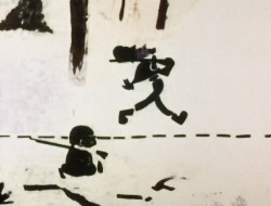
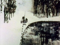
The voices were improvised by Dudley Moore and Dizzy Gillespie (much as the earlier Hubley film, The Hole, had been done.) The two actor/musicians also improvised a brilliant jazz score.
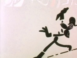
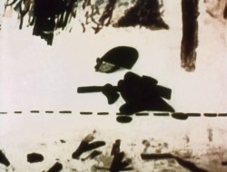
John’s design was quite original. The characters were a mass of shapes that were held to-gether by negative space on the white on white backgrounds.
 The animation of the two soldiers was beautifully done by Shamus Culhane, Bill Littlejohn, Gary Mooney and “the Tower 12 Group“.
Shamus animated on a number of Hubley films during this period, most notably Eggs and a couple of commercials.
Bill Littlejohn animated on many of the Hubley films from Of Stars and Men up to Faith’s last film.
Gary Mooney animated on The Hole and Of Stars and Men. He was an Asst. Animator at Disney, animated for Hubley then moved on to some of the Jay Ward shows before moving to Canada where he continues to animate.
Tower 12 was the company formed by Les Goldman and Chuck Jones at MGM. Apparently they were between jobs when Hubley was finishing this film, and Chuck offered help.
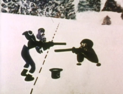
Of course, the colors of the film as represented by the dvd are pathetically poor. It’s hard
to even imagine what the actual film looks like, and it’d be great to see a new transfer of
all the Hubley films.
Animation &Animation Artifacts &Hubley &Story & Storyboards &Tissa David 17 Mar 2008 07:46 am
Upkeep Board
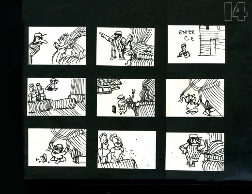
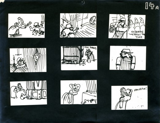
 - I spoke a little too quickly last week when I promised to post the storyboard for UPKEEP, Hubley’s short film for IBM. I seem only to have three pages of the board, and I’m posting them here.
The story tells the history of the maintenance guy, for this client, IBM. When the first stone-wheeled cart breaks down (square wheels don’t work), the mainenance man comes in and cuts off the edges to give the world the first round wheel. When the loom goes crazy, the maintenance guy enters to fix the macinery, making it easier and smoother to weave. (Love blossoms in this sequence.)
The entire film is told without dialogue. Its soundtrack is a score by jazz great Benny Carter, and it was prerecorded. The film was animated to
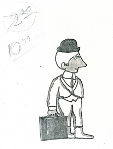
___Xerox Model of lead character_______ it and the animation was edited by Faith Hubley.
___drawn by John Hubley______________The animation was done by Phil Duncan, Tissa
___________________________________David, Jack Schnerk and Lu Guarnier.
Again, I have only these three pages. They’re photostats made from the storyboard drawings pasted to black flint paper and reduced to 9×12 size. Originally, John did the drawings on pads of paper (4×5) cut to size. The drawings he chose to include were tacked to the wall in his room. This is where he’d present the board to his client.
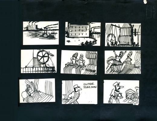
_________________(Click any image to enlarge.)
Here are a couple of the Layouts for this sequence.
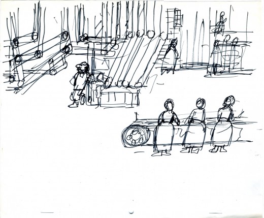
_________A drawing by John Hubley of the assembly line BG.
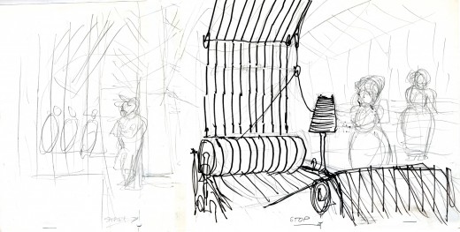
_________Tissa turned this shot into a pan so that we’d end on the lead girl.
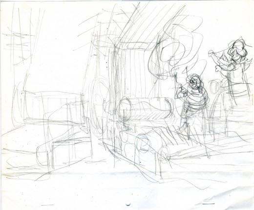
_________The loom goes haywire as Tissa blocks out the scene.
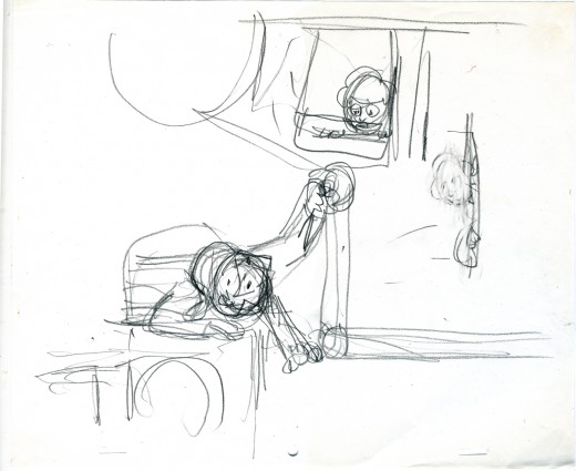
_________Tissa shows the girl watching the guy at work.
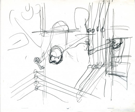
_________John’s drawing of the serviceman repairing the loom with Tissa’s touchups.
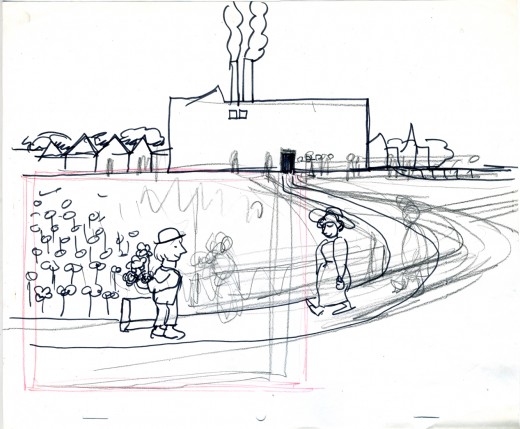
__John draws the serviceman waiting for the girl at the end of the day – with flowers.
Animation &Hubley &repeated posts &walk cycle 14 Mar 2008 08:33 am
Recap Friday – Upkeep Cycles
- Back in October 2006, I posted this piece about John & Faith Hubley‘s short film Upkeep which includes an excellent walk cycle by Tissa David. I’ll try to post the storyboard for this film next week, if I can locate it.
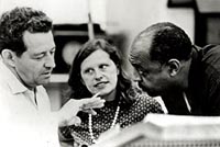 – Back in 1973, the Hubleys produced Upkeep, a short film for IBM. It chronicled the history of the service repairman in a light hearted way. Actually an industrial, it was treated like a personal film. (There’s a thin line between some of their industrials and their personal films.) Of Men and Demons was done for IBM though they considered it a personal film; it instructed in the positive aspects of the binary code and was nominated for an Oscar.
___ (John & Faith Hubley with
___composer, Benny Carter)
Tissa David did the lion’s share of the animation for Upkeep. Phil Duncan, Lu Guarnier and Jack Schnerk were the other key animators on it. Helen Komar and I assisted all of them, and I inked the whole film. Gen Hirsch and I colored it. John did all the Bg’s.
The initial animation on the service man was done by Phil Duncan. Tissa had to pick up the character, and she found the walk Phil had done so funny that she kept it throughout the film adding shades and tones to it as she thought appropriate.
The art was inked with a sharpie, bled with thinner, then colored with magic markers. Each drawing was then cut out and pasted to cels. Hubley’s Bg’s followed the same style: sharpie on board, washed & bled with thinner, added watercolor washes.
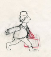
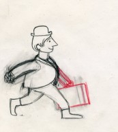
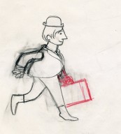
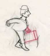
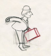
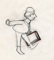
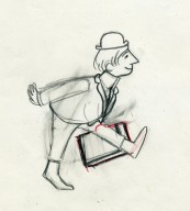
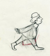
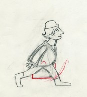
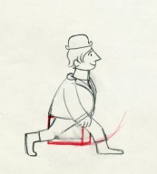
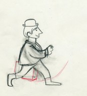
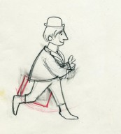
Posted below are the drawings for that 18 drawing walk cycle.
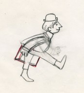
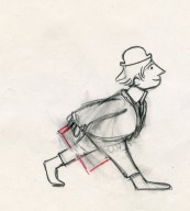
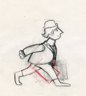
___(Click any image to enlarge them.)
Walk cycle on twos.
Animation &Commentary &Fleischer &Frame Grabs &walk cycle 10 Mar 2008 08:12 am
Betty Walks Backwards
Thad Komorowski posts a Popeye cartoon Popeye Meets William Tell which he surmises that Shamus Culhane is the director (he receives top animation billing under Dave Fleischer’s name.) The only other animator listed is Al Eugster. The cartoon is certainly an oddity, and I’m glad Thad highlighted it for me. It looks like an afterthought from the Gulliver’s Travels team. I don’t remember seeing it before, though I must have. It’s not that great a Popeye short; just an odd one.
There’s a curious thing happening in a walk in the opening of that film, and I hoped I had the film somewhere so that I could take a better look at it frame by frame. I don’t have it so will have to wait until I receive vol.2 of the Popeye dvd.
However I started looking a little closer at some Fleischer shorts. There are no end of interesting walks in those films. I found in the last Betty short Rhythm On the Reservation, that Betty walks backwards through about 1/3 of the film. She’s supposed to be conducting a beat for the Native Americans she’s visiting. What comes out is an interesting cycle that was probably animated by Myron Waldman.
I thought I’d share this walk with you.
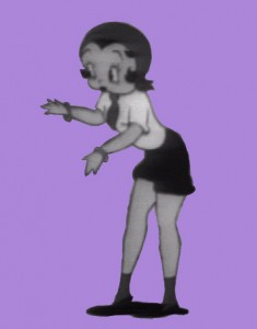 1
1 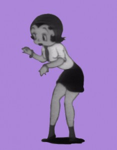 2
2 (Click any image to enlarge.) Betty walks backwards keeping time on three’s.
I can’t help but note that the Fleischer walks always seem to include
a complete turn of the head from left to right.
All animation is exaggeration.
Animation &Animation Artifacts &Disney &Frame Grabs 21 Feb 2008 09:51 am
Dragons
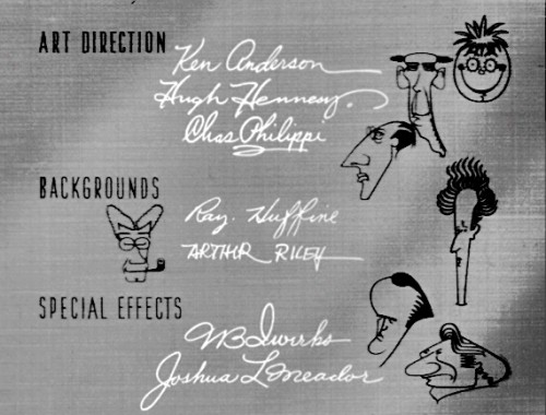
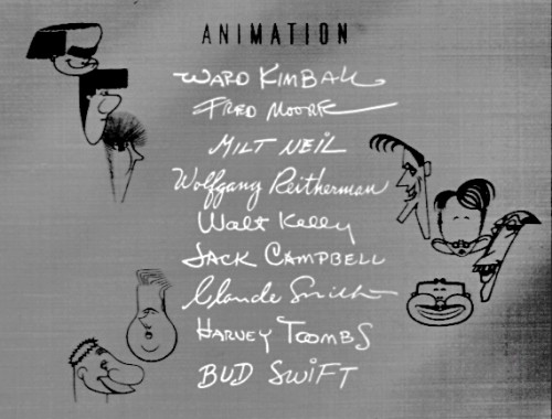
- I watched bits of The Reluctant Dragon dvd yesterday, and was impressed with the title sequence for the “Behind the Scenes” portion of the film. For the animation credits, they’ve caricatured all the artists involved. (I wonder if the live action folk felt left out.)
The drawings are by T.Hee, but one wonders who did the writing of each name. I have to assume that each artist got to sign his* own name.
____*Note: no women got to sign their names
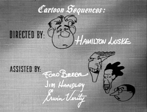
_____(Click any image to enlarge.)
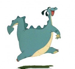
After watching these credits I had to take a short look at some of the animation from The Reluctant Dragon, itself. I decided to take this little skip and study the images. I’ve put it together as if it were a cycle, but it really wasn’t as it appears in the film. Hence, it doesn’t quite work as one.
However, I’m sharing the stills via frame grabs.
Finally, heres a small QT movie of the piece on two’s.
Anyone know the name of the animator of this scene? It’s just after the boy meets the dragon.
Animation &Disney &Frame Grabs 12 Feb 2008 09:14 am
More Whoopee !
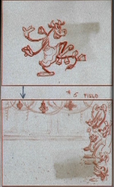
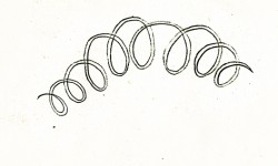
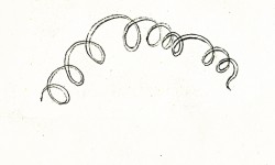
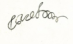
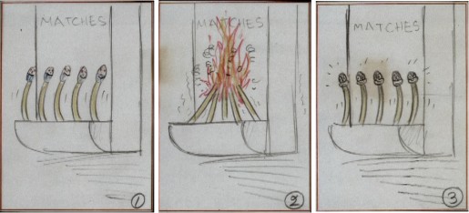
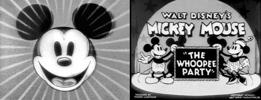 - This completes my visual breakdown of the Mickey Mouse short, The Whoopee Party. I’ve taken the art off the dvd Mickey Mouse in B&W, and have interspersed matching frame grabs from the film, itself.
Having seen the film many times, it’s certainly interesting to go through the artwork. For some reason, this film, to me, is one of those that somehow supercedes its animation. What I mean by that, is that for some reason I’ve never looked at it as animation – the technical aspect. I’ve always been dragged into it as an audience member loving the anthropo-morphism and the musical dance the animators concocted. It was never about studying the frames or the artwork. Someday, I’ll have to talk more about this aspect of the work.
So it’s entertaining to look at it on this level, now.
THe Animation Art Gallery is selling a number of drawings from this film, and it’s worth taking a look.

____________(Click any image to enlarge.)
 13
13
 1
1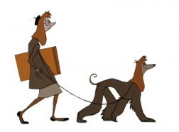 2
2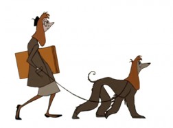 3
3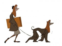 4
4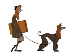 5
5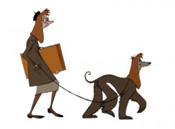 6
6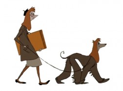 7
7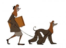 8
8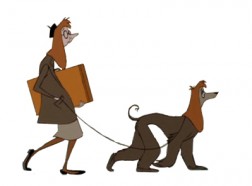 9
9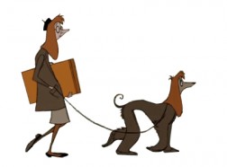 10
10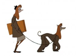 11
11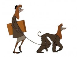 12
12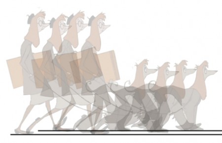
 3
3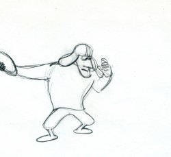 4
4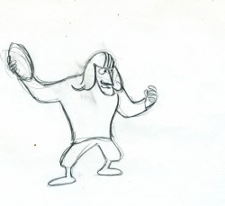 5
5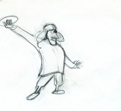 6
6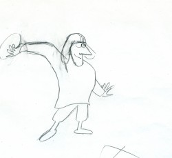 7
7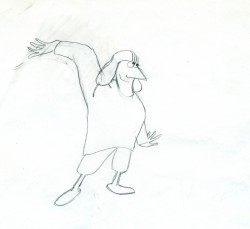 8
8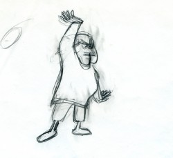 9
9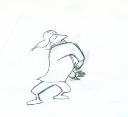 10
10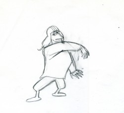 11
11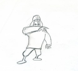 12
12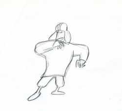 13
13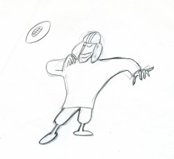 14
14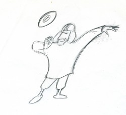 15
15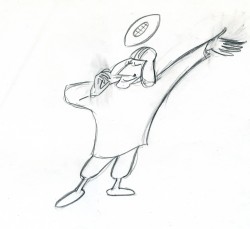 16
16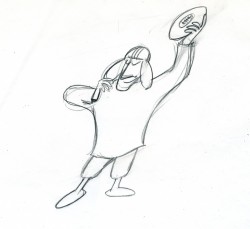 17
17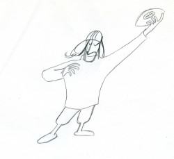 18
18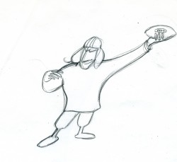 19
19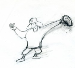 20
20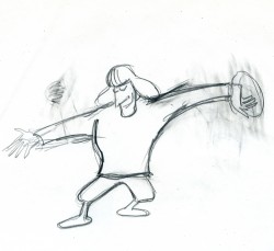 21
21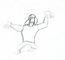 22
22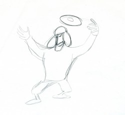 23
23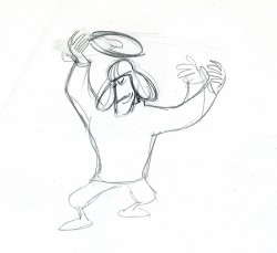 24
24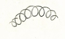
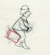
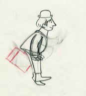
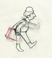
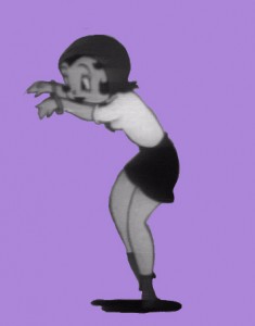 3
3 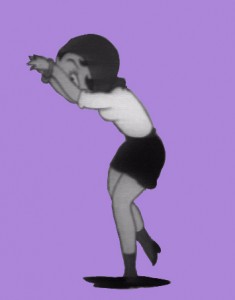 4
4 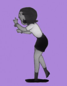 5
5 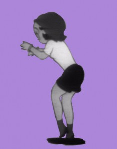 6
6 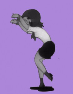 7
7 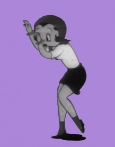 8
8 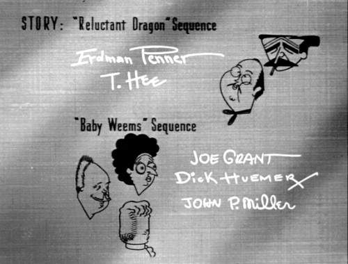
 1
1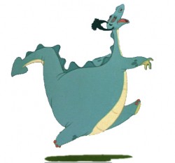 2
2 3
3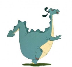 4
4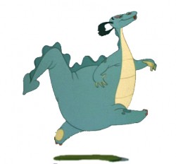 5
5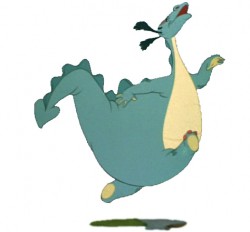 6
6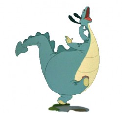 7
7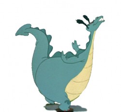 8
8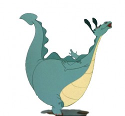 9
9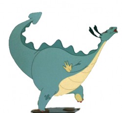 10
10 8
8 9
9
 10
10
 11
11
 12
12

 14
14
 15
15
 16
16
 17
17

