Category ArchiveAnimation
Animation &Animation Artifacts &Disney 25 Aug 2008 07:38 am
Pinocchio moments
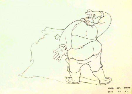
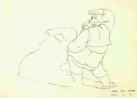
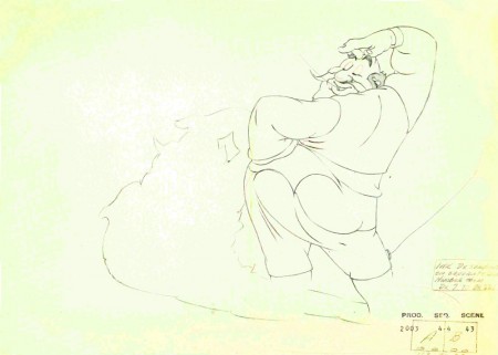
Bill Tytla was an amazing character in animation history. I think, far and away, he was onto something that few other animators ever tried to face. He used the drawing, including all aspects: volume, dynamic tension, weight and graphic distortion, at the service of the character’s acting.
I intend, in another post, to draw a comparison with him to Jim Tyer and Rod Scribner.
For the moment, let me show off these great drawings lifted from John Canemaker‘s wonderful book, The Treasures of Disney Animation Art.
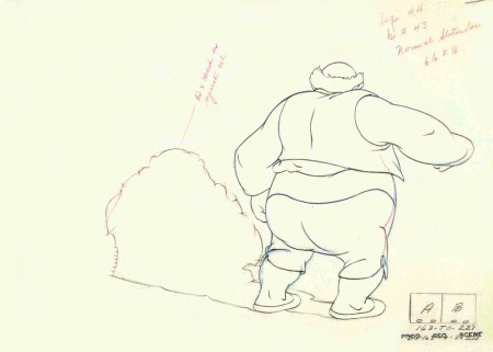
(Click any image to enlarge.)
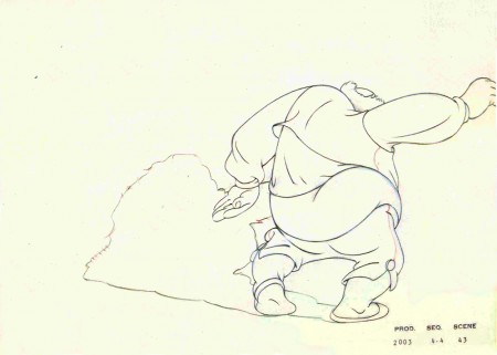
Look at the distortion in these two drawings – 2 & 3
Talk about breaking of joints, talk about stretch and squash,
talk about every possible animation rule and see those rules
stretched to the brink in these great drawings.
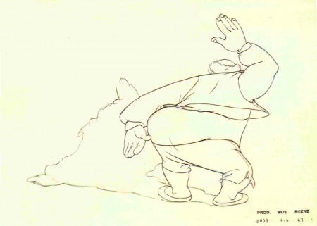
This guy was the master of all masters.
Tytla not only knew the rules but used them to create an acting style
that was on a par with the best of the Method actors of his day.
His kind was never equalled, and I don’t expect to see
anything comparable in cgi. I suppose I can hope.
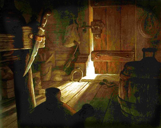
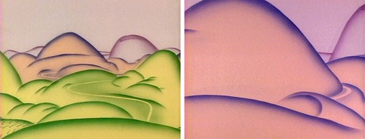
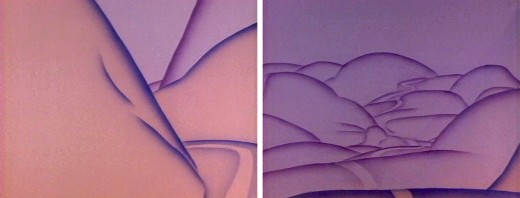
Of course, this is Stromboli’s wagon interior. It’s a beauty.
What a magnificent film!
Animation &Frame Grabs 19 Aug 2008 07:19 am
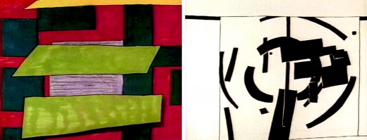
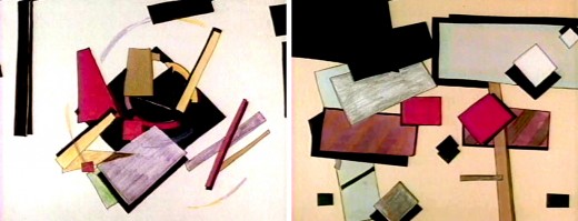
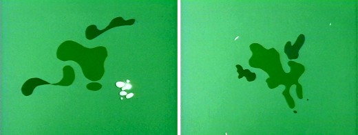
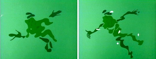
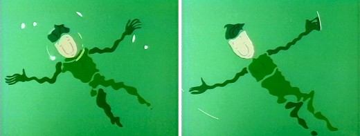
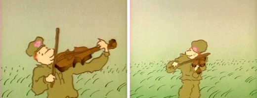
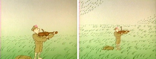
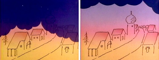
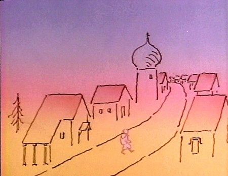
Fred Burns/Mogubgub’s Soldier
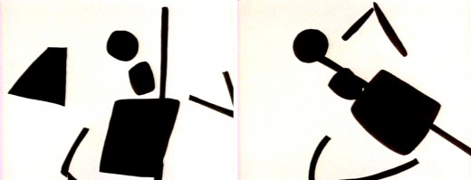
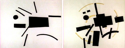
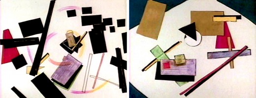
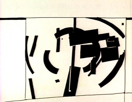
- A Soldier’s Tale was a film adaptation of Stravinsky’s ballet by R.O.Blechman. It was done in 1979, aired on PBS’ Great Performances and won the Emmy. Within the film were numerous sequences designed off of the constructivist Russian painters.
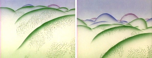
These sequences were quite daring. Fred Burns and Fred Mogubgub, both unusually strong animation filmmakers, were responsible for many of these. Last week I talked about Fred Burns’ work for Hubley with Everybody Rides the Carousel; here, I’d like to show off two of his opening segments of Blechman’s show.
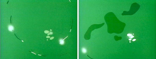
In the show, a soldier is marching home from war. Fred Mogubgub takes him during this journey through the Urals and turns it into a constructivist head trip.
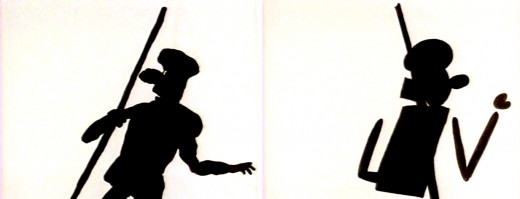
(Click any image to enlarge.)
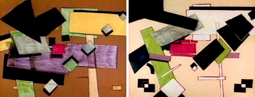
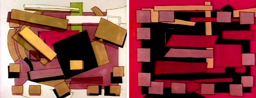
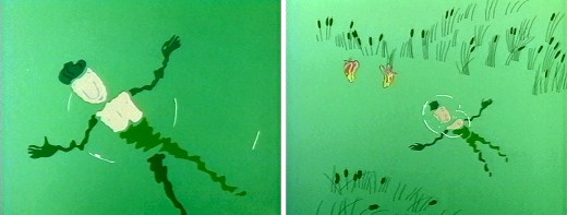
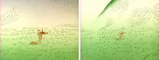
It was at this point that Fred Burns picked up the sequence and brought things back to reality – sort of.
Here, Tissa David steps in to do some character animation wherein the soldier gets dressed, looks at pictures of his mother and his love. He then begins to play the violin in the field, and Fred Burns picks up the next sequence. It’s all animated by hand and painted on cel.
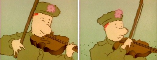
The film begins from here. A Faustian competition with the devil.
Animation &Frame Grabs &Hubley 30 Jul 2008 08:08 am
Everybody Rides – 1
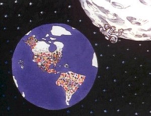 - Back in 1976, I was working on John Hubley’s Bicentennial flm, PEOPLE PEOPLE PEOPLE. This was a short film, about four minutes long, that had about a million scenes. It told the history of the US (from the standpoint of populating and overpopulating) beginning 17760 BC and ending in 1976 AD.
It started with some lengthy scenes. As the film moved on, the cuts came faster, until they hit about 6 frames apiece toward the film’s end. The final scene, from space, was the longest in the film.
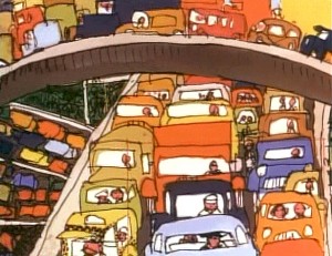
There were no characters that appeared in any more than one scene. That meant that with each scene, there were new setups, new characters, new colors, new everything. As a result, it took much longer than other films and was a difficult one to pull off. But like all other Hubley efforts, it was fun. Tissa David, Jack Schnerk, Lu Guarnier, Phil Duncan and Bill Littlejohn animated it. I colored about 2/3 of the film and animated at least a dozen or two scenes (some really were only 6 frames – like that auto shot posted). I also assisted/inbetweened all of the animators.
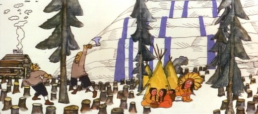
Swedes cut down all the trees in PEOPLE PEOPLE PEOPLE.
The studio, at the time, was buzzing because John and Faith had just sold a dream project to CBS. Everybody Rides the Carousel was an adaptation of Erik Erikson‘ 1956 book, Eight Stages of Development. Erikson was a psychologist who theorized that man goes through eight stages of development from birth to death, and he proceeds to break them down. The Hubleys took this book and broke these eight stages into horses on a carousel.
 The three half hour Special shows for CBS would be about these carousel horses and the ride.
Each of the stages would be broken into two different subsets, and these would be depicted through stories which were roughly developed visually by John and Faith. Once the funding started to tricle in (about $450,000 for all three shows) they would cast their many actors and have them improvise in the recording studios to the storyboarded set pieces.
While those recordings progressed, the small studio staff was busied in completing animation, artwork and rendering of PEOPLE PEOPLE PEOPLE.
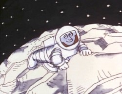
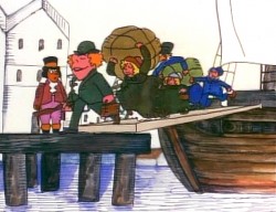
The man on the moon and the Irish immigrants.
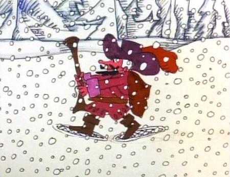
Jack Schnerk animated the French trapper sequence. There was such a rush
on the scene that I remember Jack bringing it in saying he hoped it would work.
He’d done two drawings of snow for the blizzard. Both wildly different from each other.
He asked me to ink them, then flop the drawings and ink them again.
He’d exposed the four drawings on fours. He also had the trapper with
snowshoes walking on fours. He felt it would help us feel a struggle in his
walking through the snowstorm. He felt the fours might add weight.
The scene worked beautifully, and was excellent the first time out.
Not quite the way they’d have done it at Disney. Tricks of the trade.
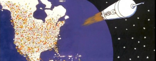
Tissa animated a majority of the film. The ending, the man going to the moon to escape
the overpopulated earth was hers. I have the drawings somewhere and will post some of them soon.
Animation &Fleischer &Frame Grabs 26 Jul 2008 08:16 am
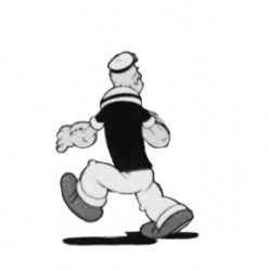
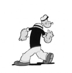
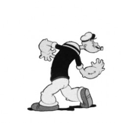
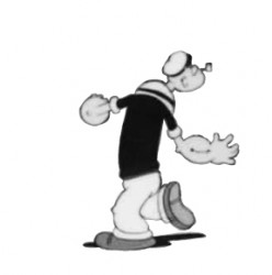
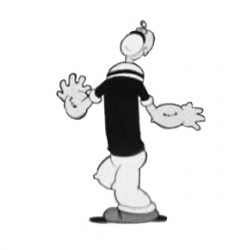
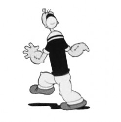
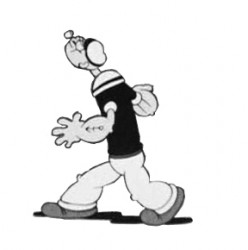
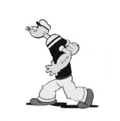
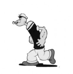
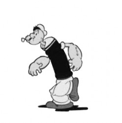
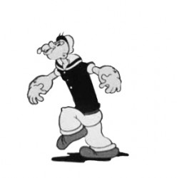
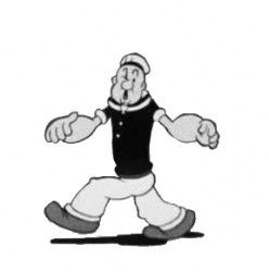
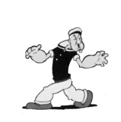
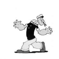
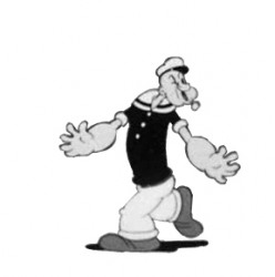
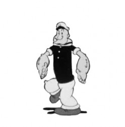
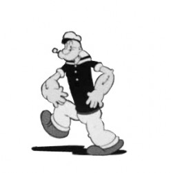
Popeye Goonland Walk
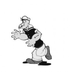
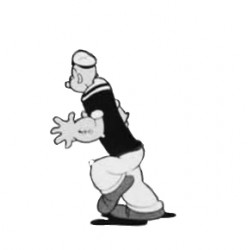
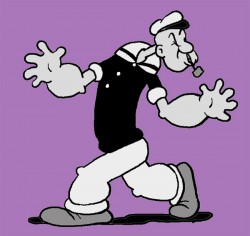 - Here’s a walk I thought funny in the 1938 Popeye cartoon, Goonland. It’s part of Vol. 2 of the Popeye collection.
Drawing for drawing the animation in this film is hilarious. Everything seems to change sizes from frame to frame – just watch Popeye’s feet. They grow, then go back to size. Just the same, the cycle on the legs is very tight and feels as though it has some weight. This is a bit of an animation style that’s lost to CGI.
I’ve forced the drawings into a cycle – they aren’t meant to be. In the actual film, Popeye keeps perusing in other directions as the scene goes on. However, splitting it up like this gives us a chance to look a little closer.
Here are frame grabs followed by a QT movie of the cycle.
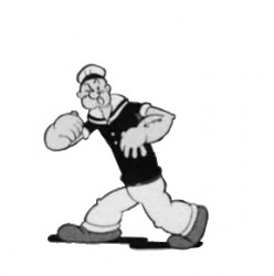 1
1 2
2(Click any image to enlarge.) __________________________________________
_______________________ _________-______________Popeye scours Goonland withe very expressive arms.
Animation &Animation Artifacts &Disney 16 Jul 2008 08:02 am
Skumps Dwngs
- This will be the last Sleeping Beauty post of the week. (Having lately seen a number of negative posts about this film, I’m sure some of you will be glad about that.) I promised to post a couple of drawings I have for the “Skumps” sequence once Hans Perk had completed posting the drafts for this sequence so that I could I.D. the animators. (I have to say I guessed correctly in three out of four shots, so I’m pleased with myself.)
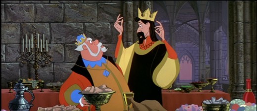
I’m posting closeups of the drawings. By clicking on any of them you’ll see the full sized animation paper. I’m also posting frame grabs beneath the drawings so you can see how they looked in the film.
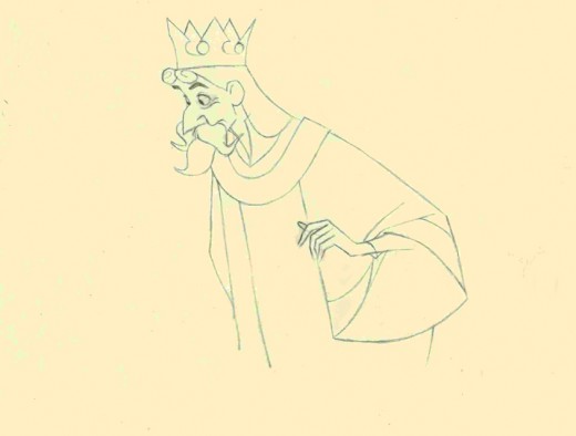
This is a Milt Kahl scene, seq 13 sc 8. This drawing is undoubtedly a clean up,
so it’s not one of Kahl’s drawings – just his pose. It’s an extreme.
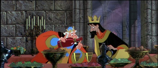
It is interesting that Kahl animated both characters.
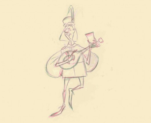
This is a John Sibley ruff. Seq 13 sc 17.
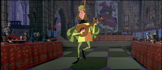
It’s a very odd, uncoordinated dance number by the drunk lackey.
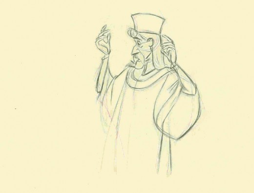
This is my favorite of these four. It’s a John Lounsbery ruff of King Stefan.
Another extreme from seq 13 sc 26.
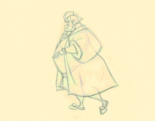
This is also another beautiful ruff by John Lounsbery. It’s King Hubert in the
very last scene of seq 13, sc 57.
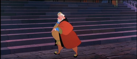
it comes just prior to Hubert’s turning and sitting on the palace steps.
And now for something completely different:
Bruce Knapp, who has worked with many of us in the New York industry, has a film competing in WNET/ch 13′s On Air competition. Every Saturday night they air two features and a short film. However, the public selects the short films from three on line contestants.
Bruce’s film Keep This Coupon, which won an ASIFA East award last year, is in the running for an airing this coming Saturday. Can I urge you all to go on line and vote for his film (prior to Thursday at 5pm)? Let’s get an animated film in the mix. Go here to vote, and/or see the films and VOTE.
Thanks to Masako Kanayama for letting me know about this.
Animation &Commentary &Independent Animation 11 Jul 2008 08:03 am
John Schnall
- I’d like to talk about a film, but actually it’s not the film but the filmmaker that I’m interested in.
A couple of weeks ago, Mark Mayerson wrote a piece on his blog about Animation and Theater. Mark has become something of an authority on acting and animation. This piece was, in ways, an extension of past comments he’d made about the subject. Having attended a one-man show about Theodore Roosevelt, which was entitled “Bully,” Mark discussed the possibility or the likelihood of animation pulling off such a subject with as much success.
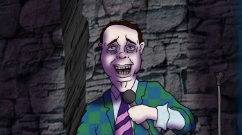 This made me think about the subject that has fascinated me for years. Animating long monologues with any such success. A year or so ago, I’d gone through a number of theatrical monologues thinking I’d have an actor record the piece (or pieces) and try getting them to work. Using animation as a medium to delve beyond the surface to understand character and characterization. One thing leading into another, I never got to complete that project – though I haven’t given up on it.
Now I find, thanks to a correspondence with John Schnall that he has done this.
John is one of the more daring animators/animation directors out there. He has for years chosen difficult subjects and difficult projects to animate. They all have a strong sense of the bizarre, but they’re all breaking molds that I don’t see others even trying to break.
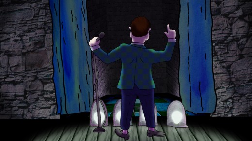
His most recent film, Dead Comic, is as difficult as it gets. The film is a monologue by a dead comedian, and it offers a gruesome exploration of the afteryears of someone married, eternally to his job. The film could have been called Dead Animator, in my case, but it wouldn’t have been as funny. John has animated a monologue – a difficult monologue.
The film is so difficult that audiences seem to be afraid of it. (Is the subject of death that difficult?) The recent ASIFA-East festival didn’t have the patience even to sit through it, though, in my opinion, it’s better than most of those that won prizes. It’s just more challenging, and the audience wanted more of the expected rather than something complex and difficult.
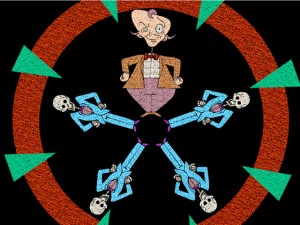 I don’t think it’s the greatest film of all time, but I do think it’s brilliant. You should watch it and understand that the staging is incredibly complex, the timing is very sharp and the design and writing are wholly original and unafraid. it took hard effort, knowledge and ability to make it work.
In any case, I am always eager to see what John is up to. He’s one of the few artists working in New York and in Independent animation.
Go to John Schnall‘s website here.
See Dead Comic here.
Buy a 40 min. compilation of John’s films here.
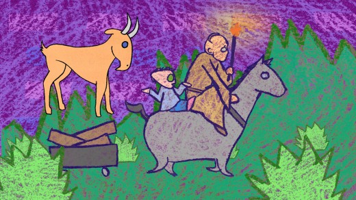
The last two illustrations are from Ha Ha Ha and The Binding of Isaac.
Animation &Animation Artifacts &Disney &Models 07 Jul 2008 07:49 am
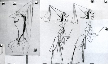
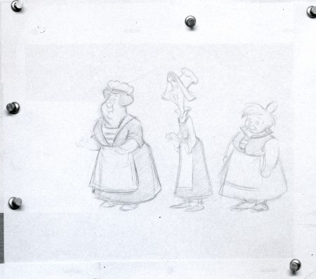
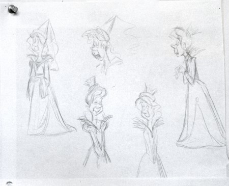
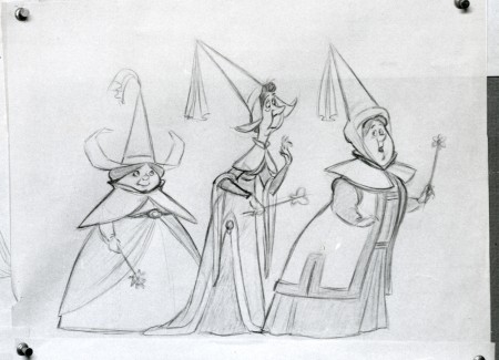
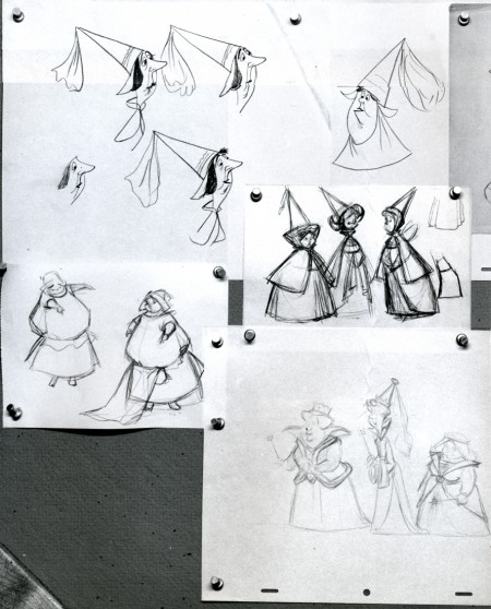
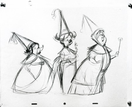
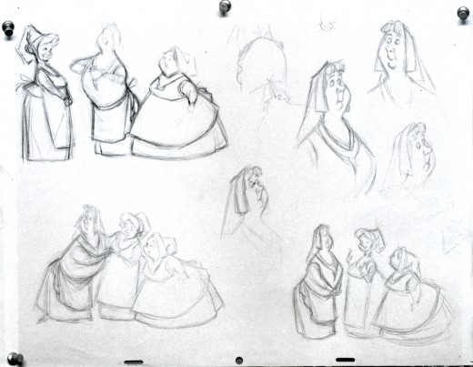
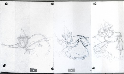
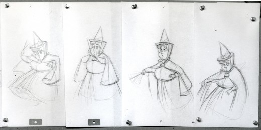
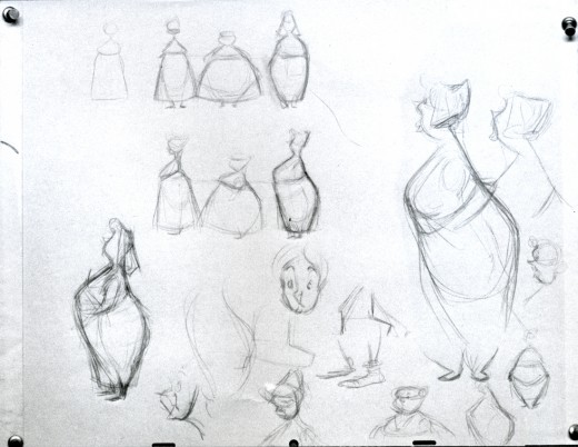
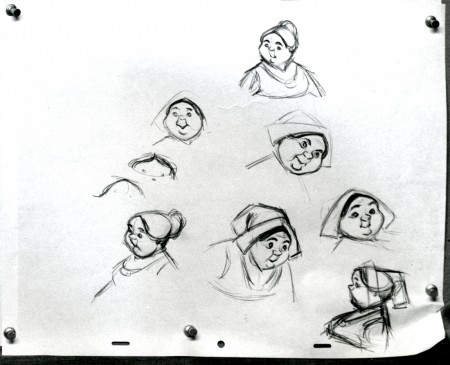
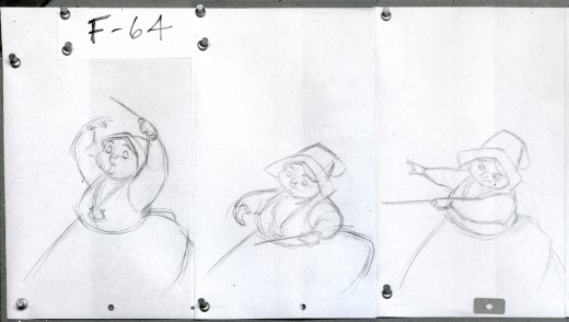
Fairies
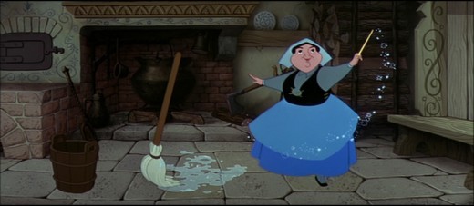 - I’m trying to coordinate with Hans Perk‘s posting of the drafts to Sleeping Beauty by offering as much material as I can locate on the film. It’s leading to some odd discoveries. (Just today, Hans offers the drafts to the cake baking sequence.)
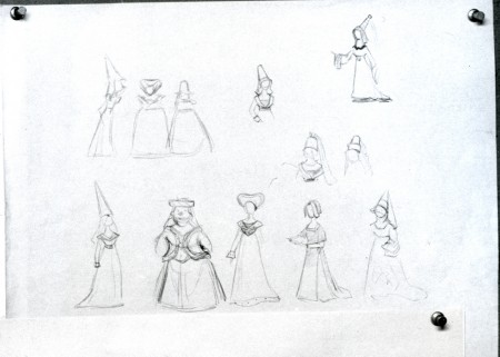
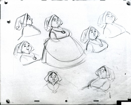
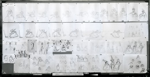
Here’s one of those galleys given me many years ago by John Canemaker. It was a way of showing off material available. Perhaps some of it has been published in some book or other. I don’t think it all has gone out, though.
This is the development of the three fairies, Fauna, Flora and Merryweather. You’ll see they took some wacky turns on the way to the end. I believe these were drawn by Tom Oreb, Bill Peet, Ward kimball, Frank Thomas and Ollie Johnston.
This is the full photo which comes in at 24×40 inches.
(Click any image to enlarge.)
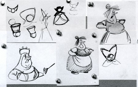
Probably Bill Peet’s storyboard characters.
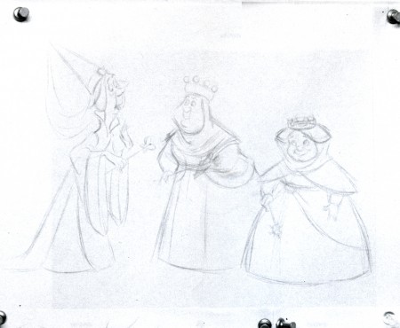
This looks a bit like Frank Thomas’ line, though the characters don’t look like his.
I have a couple of animation drawings from this film from the “Skumps” sequence. I’ll post those when Hans hits that part of the film with his drafts. This movie is a great one.
If you’re in LA, go see it in Technirama on July 16th. Academy Screening.
Animation &Disney &Frame Grabs 02 Jul 2008 07:45 am
Dark Shadows
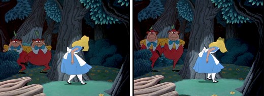
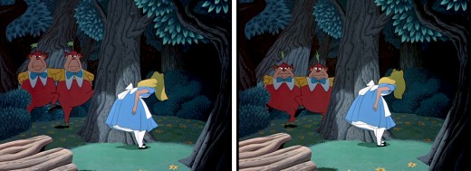
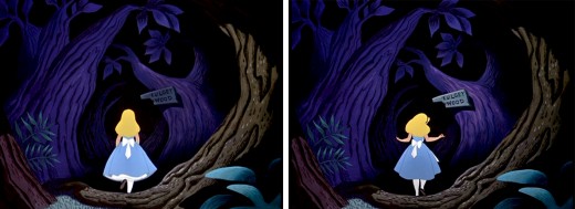
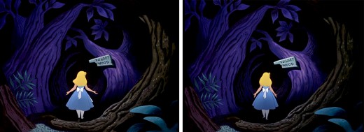
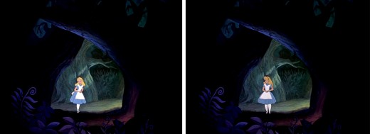
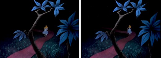
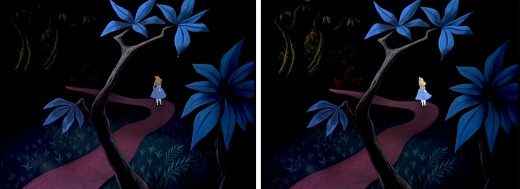
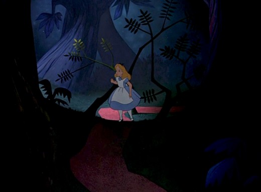
- An interesting aspect of Disney’s Alice In Wonderland, deserves some attention, and I don’t think I’ve ever seen anyone write about it.
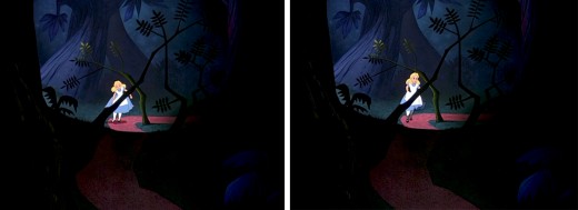
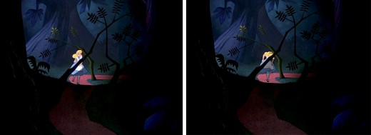
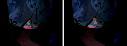
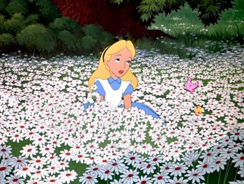 Once Alice is in Wonderland, she immediately comes upon the woods, and from there she steps in and out of the woods to meet up with new crazies and her peculiar adventures. The effects department was used to signal this move in and out of the dark world of wonderland. She constantly steps in and out of shadows.
This, as anyone who did animation in the pre-computer age, knows that it was a complication to add shadows. Not only the shadows under the characters but the shadows over and around the characters. It meant filming the scenes twice, just for the shadows. Since the camera, during the filming of Alice, was not computerized this double shooting had to be done by hand VERY CAREFULLY. Every frame had to exactly match.
Hence, this was an important part of the design. The directors and Disney took these shadows seriously; after all they cost twice as much – just to photograph. Never mind animating them, coloring them or planning them.
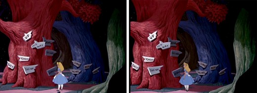
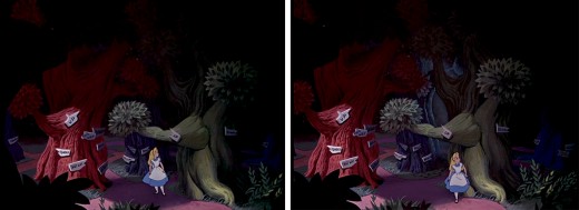
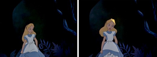
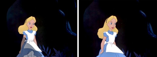
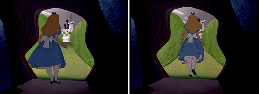
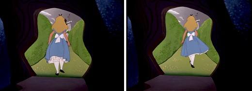
I’ve put together a number of frame grabs which illustrate the move into or out of shadows, and I’d like to share them.
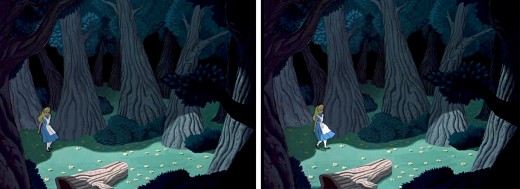
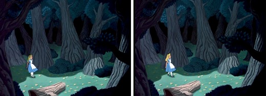
Here, Alice steps out of a shadow for the first time, and meets up with
Tweedle Dee and Tweedle Dum. They’re partially covered, themselves, by shadow.
This variant of the shadow is a hard line of darkness that moves over her.
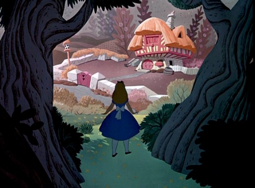
Soon, Alice moves toward the Duchess’ house. We cut from her
standing dark in shadow, to her walking in a brighter light.
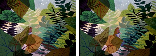
As she moves toward the Caterpillar, Alice is covered with shrubbery and shadow.
She is next seen struggling through the foliage to talk to the Caterpillar, in full light.
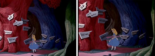
This variant of the shadow is a total shift in color as her entire body moves into darkness.
It was done by dissolving one Alice into another – meaning the cels were painted twice.
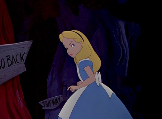
In the woods, Alice walks into and out of and into shadows.
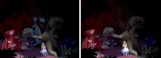
She slowly moves toward the Cheshire Cat who directs her to the tea party.
As she does she moves from shadow and cuts into light as she appears at the gate.
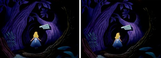
This is a particularly nice effect wherein the entire area gets spotlighted -
led by the character. The area outside of the spot darkens slowly and beautifully.
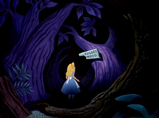
Once leaving the tea party, she wanders around the Tulgey Wood trying to find any direction. Shadows aplenty as she moves endlessly through the woods.
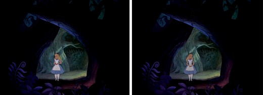
Alice moves into and out of shadow via dissolves.
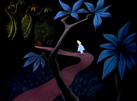
Alice passes by many crazy characters, going in and out of darkness.
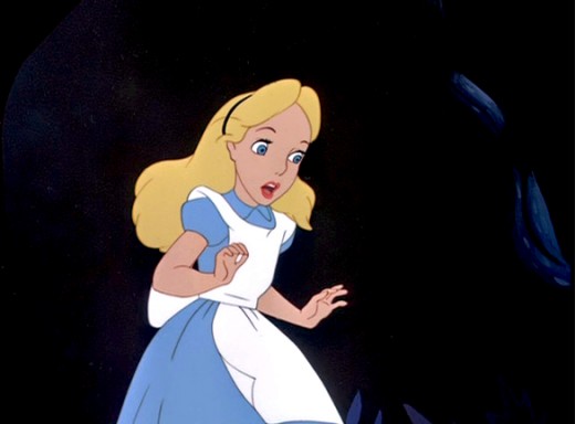
Just prior to meeting up with the Cheshire Cat, and has an extended conversation
which just about ends her stay in the woods.
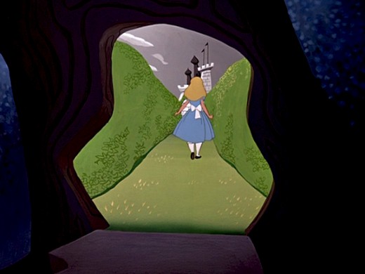
Finally, Alice steps into the Cheshire Cat’s tree and
into the light of the maze of cards to meet the Red Queen.
Animation &Animation Artifacts &Disney 30 Jun 2008 07:54 am
RecapMonday – Merryweather’s Dance
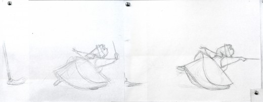
- Hans Perk has chosen to post the drafts to Sleeping Beauty in response to the upcoming Academy screening (in LA) of the feature film which is in response to the reissue of the video with new special additions. I thought this a good excuse to bring back these older posts:
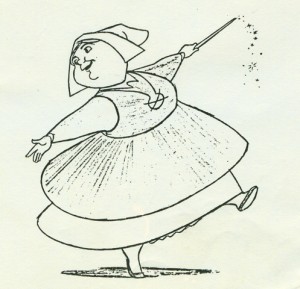 – I’ve enjoyed sharing some of the animation drawings I own via this site, and I hope to keep doing it. The drawings, to me, are so valuable in that they reveal the personality of the animators, even more than the finished films.
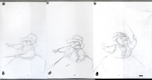
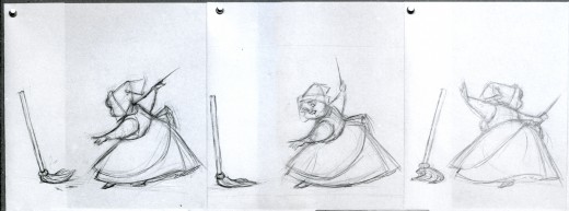
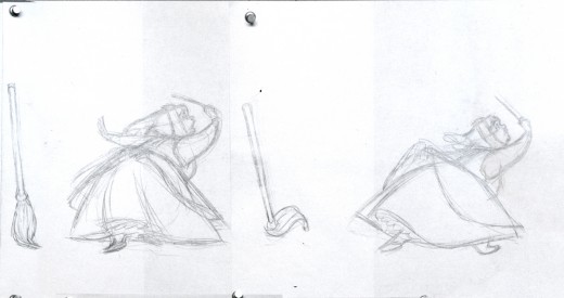
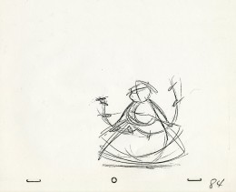
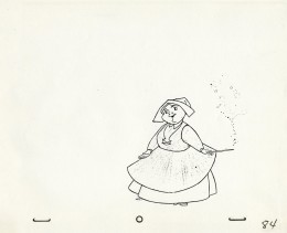
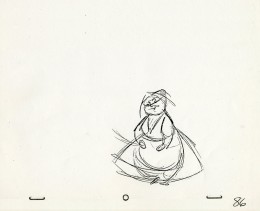
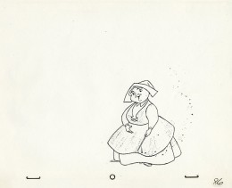
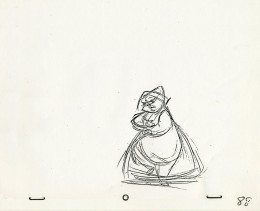
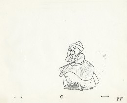
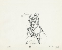
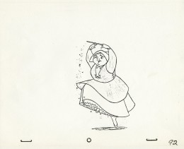
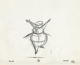
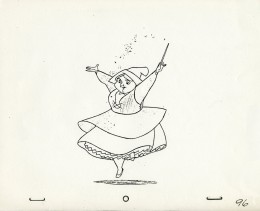
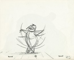
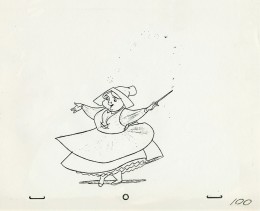
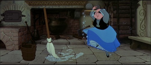
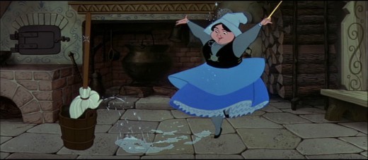
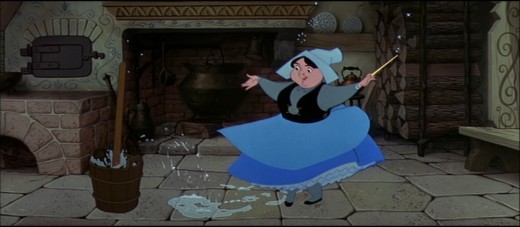
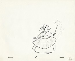
I have a bunch of copies of drawings by Frank Thomas from Sleeping Beauty. It’s the sequence in which the three fairies, within the hidden cabin in the forest, use magic to create a dress for Aurora.
Below, on the right, are some of the roughs from this scene. On the left are the final cleanups.
_
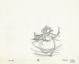
_____________(Click on any image to enlarge.)
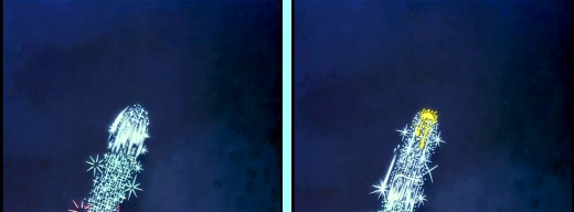
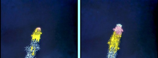
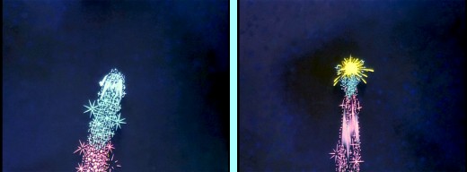
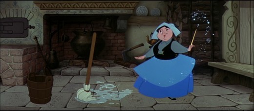
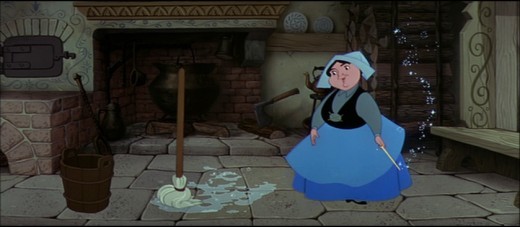
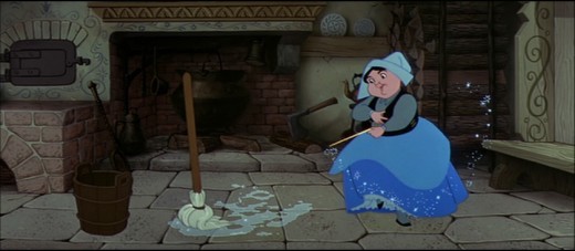
- These are frame grabs from the very same scene in the cottage featuring the Frank Thomas drawings posted above.
Frank Thomas often complained about Eyvind Earle‘s color design. He disliked the fact that Merryweather had a black bodice. He was especially peeved over this sequence, and I heard him talk about it at least three times. He felt this anchored her too much to the ground and weighed her down. I’m not sure I agree with him; I think the character moves beautifully and retains the weightlessness he sought.
There rwas quite a bit of friction between Eyvind Earle, who seemed to be Disney’s star on that film, and the animators who felt ignored.
