Category ArchiveAnimation
Animation &Disney 23 Oct 2008 08:11 am
Thomas’ Mim
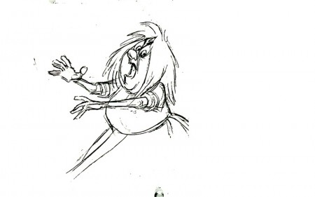
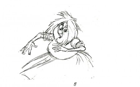
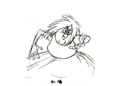
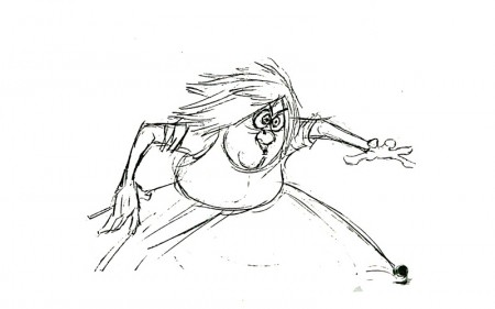
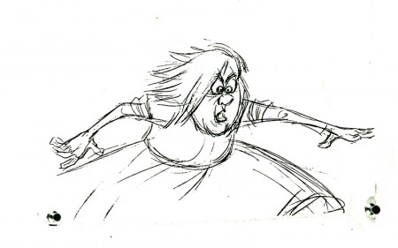
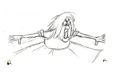
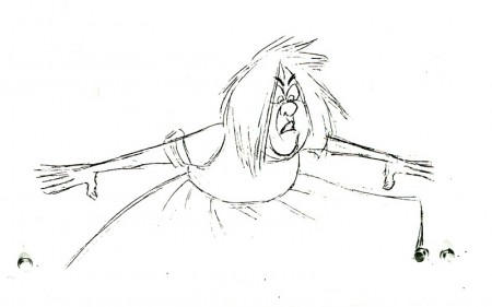
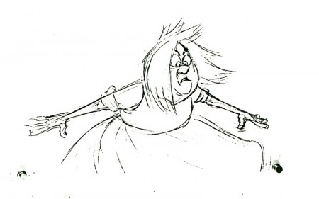
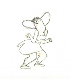
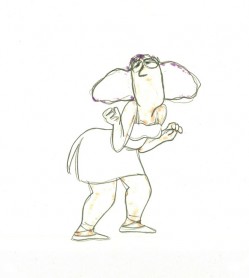
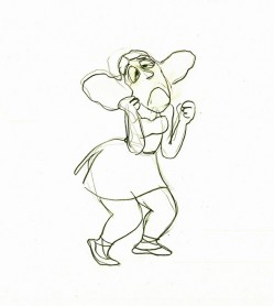
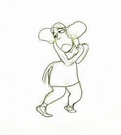
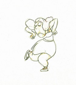
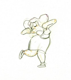
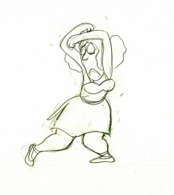
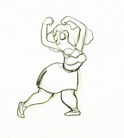
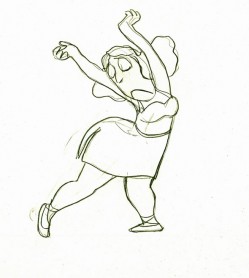
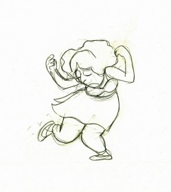
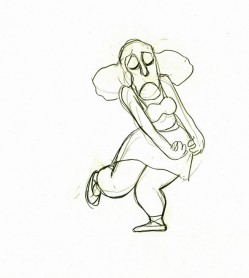
- Here’s a small bit of the Mad Madame Mim as animated by Frank Thomas. It’s not particularly enlightening, but I still enjoy looking at the drawings. I believe these drawings might have appeared in some publication or other but haven’t been able to locate them. (There are some other drawings in the Thomas/Johnston book, The Illusion of Life (pg 180-181), but I think that’s from another part of this scene.)
the most interesting part about these drawings is the breaking of joints as she turns her arms around with her body. (There’s a bit of odd foreshortening in her right arm on drawings 1 & 2.)
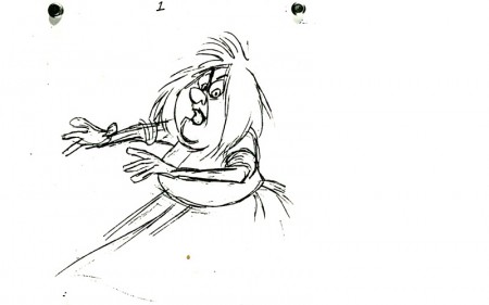 1
1(Click any image to enlarge.) Madame Mim turns.
Animation &Hubley &Tissa David 22 Oct 2008 08:12 am
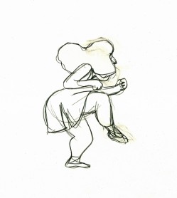
Tissa’s Glad Gladys
-Tissa David animated a lot of the Electric Company pieces for John Hubley. Hubley would design and write the spots, and he would get some real pros to do the tracks. In the case of this film, I believe it was the jazz legend, Billy Taylor, who wrote the music and did so for a number of Hubley’s Electric Co. films.
I’d like to post John Hubley’s LO drawings and follow it up with a few of Tissa’s animation drawings. John would usually do the loosest of layout drawings – usually in the presence of the animator as part of a discussion – and then hand it off to this person he trusted. Of course, the less he trusted the animator, the more he had to do in the LO.
In the case of this spot, Tissa received the following drawing. (That’s right ONE drawing.)
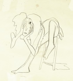
(If you click any of the images, they’ll
reveal the full animation drawing.)
If you enlarge the image, you’ll notice tape marks and pin holes where Tissa attached it to her wall.
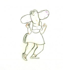
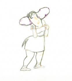
Here’s a short sequence of drawings done by Tissa. The missing mouths are on a separate level. This piece is built on reuse done artfully.
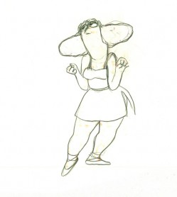 48
48 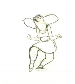 49
49
Here’s how the drawings looked when they were colored. They were colored on heavier paper. Sharpie outlines and marker coloring. The white background was all they used for the final. The animation carried the piece.
 73
73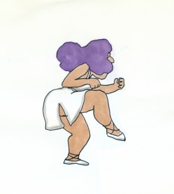 73
73Finally, here’s a copy of the film found on YouTube:
Animation &Articles on Animation &Tissa David 21 Oct 2008 08:03 am
Tissa – 1975
- The 1975 issue of Millimeter Magazine is an animation issue. There are a number of enormously informative articles. I was rereading the copy of the magazine, this past weekend, when I came across the Close Up section, wherein a couple of bios appear.
I’d like to show one for Tissa David that was included. I assumed John Canemaker authored the piece; there is no byline. When I asked him, he responded thus: “I wrote the article on Tissa. The quotes are from my first formal interview with her.It was for Millimeter when I was the animation editor and put together special animation issues.”
Tissa looks so young in that photo.
-
“I am a frustrated comedienne, for sure,” Tissa David will tell you, only if you ask. “I am a clown. If I weren’t shy, I’d probably be on the stage.” Instead she is an animator, one of the world’s best and busiest, and one of the few women to have reached the top in the traditionally male-dominated animated cartoon field.
She joyfully toils in her East-Side New York apartment, a warm, plant-filled place that often smells of baked apples. Classical music swirls quietly from a radio and the glow cast from the light under her animation board gives her the look of a sorceress.
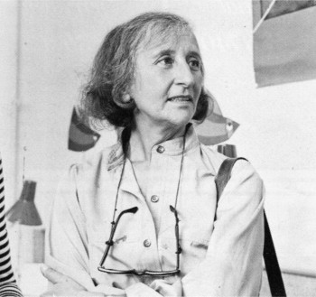 The lady has class—a fact one gathers upon first meeting, but a fact that is reaffirmed by catching a look at the creatures she is conjuring to life on her drawing board. The graphic line is strong and free, yet elegant (as is the artist); and when the drawings are flipped, the creatures move through their paces with a deliciously droll humor, a wit that is uniquely Tissa David’s.
As a child in her native Hungary, Tissa saw Disney’s SNOW WHITE and thought (as so many others have thought after experiencing that film masterpiece), “Now this is something I want to do.” After graduating from art school, she became an assistant animator at Magyar Film Iroda in Budapest; a little more than a year later, in 1945, she was a co-owner of the Studio Mackassy and Trsi supervising all phases of production including story and camera and was sole animator of the puppet and cartoon films.
She left Hungary in 1950 during the height of the Stalin regime, and finally landed in Paris.
Jean Image Productions hired her in September 1951 and for two years she read sound tracks, planned layouts, animated, and did the entire editing of the feature-length, BONJOUR PARIS (1953). That studio closed and Tissa animated at La Comete next, a studio that had been Paul Grimault’s.
“I had absolutely no relatives outside of Hungary except in the United States. So I asked for a visa in 1950. It took at that time five years to get a visa, that was still the quota system. So I came to New York…I loved the U.P.A. cartoons. I decided I wanted to work in that studio.” In 1956, the United Productions of America’s New York Studio was the last tenant in a brownstone on Fifth Avenue and 53rd Street slated to be torn down for the construction of the 666 Tishman Building. There was a French girl in the UPA studio and so she introduced me,” Tissa recalls. “I had no sample reel. I went in once to make a sort of tryout. I was scared; I didn’t speak English, so I was just waiting, waiting, and Grim came by…Grim Natwick is the history of animation and I can rave about him. He created Betty Boop and animated the character of Snow White all the way through. UPA had an awful lot of work and they needed an assistant to Grim.”
At that initial meeting, Natwick boomed, “Now, you know what animation is!” Tissa quietly answered, “Animation is—animation.” Natwick laughed, “You can’t argue with that!” and thus began a professional partnership that lasted twelve years. “Isn’t it strange,” says Tissa today, “that SNOW WHITE got me into animation and I really learned my animation from Grim. I know a great deal about animation, I know I know, because even today I don’t do one line without something in my brain Grim told me.”
After UPA closed in 1958, Tissa and Grim freelanced as a team on countless TV commercials, and since Grim’s retirement, Tissa has soloed successfully and most notably on several John Hubley projects, i.s.: Of Demons and Men (1970), Eggs (1970), Children’s Television Workshop segments Cool Pool Fool, True Blue Sue, Truth Ruth and others, and Cockaboody (1973). Her latest animations include three CTW Letterman episodes, a scene in Shamus Culhane’s Noah’s Ark production, and over 110 feet of Hubley’s Bicentennial film, People, People, People. She has just completed some experimental animation fora Dick Williams project and is now starting, also for Hubley, a TV special based on Erik Erikson’s writings.
A description of Tissa David’s style of animation is difficult; for while it is a distillation of the Disney influence in timing, the UPA sense of humor-through-graphic-design, and the strong, poetic John Hubley mode, it also contains a different character, unique to Tissa David, that she calls the “female difference…If the same scene is animated by a man and by me, there will be a great difference, not in quality but in interpretation. John Hubley told me I have a fine sense for detail, not in the drawing itself because I make very loose drawings, but in a scene, in expressing feelings. I am a very intuitive animator—I never know when I sit down to work what will happen.”
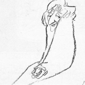 For all her gentleness, Tissa also contains an inner core of strength exhibited in her single-minded devotion to her art. Her opinions about that art, herself and other topics, is disarmingly to-the-point: “I believe very strongly that one must know how to draw,” she will offer on the subject of how-to-animate. “Even if you just animate objects, you must have a knowledge of drawing.” As for her struggles securing her place in animation, Tissa will admit, “…its very hard. Women can find work in animation if they have enough will to follow through and really do it. Even today, I’m always saying if I keep busy long enough, I will become a good animator.”
At the time this piece was written, Tissa was completing work on a pilot for Dick Williams’ film, Raggedy Ann & Andy; this one minute piece got Dick the film over Joe Oriolo and Shamus Culhane. She would thereafter work on John Hubley’s Doonsebury Special (just as he died mid film); and she was to animate for R.O.Blechman’s Simple Gifts.
Animation &Frame Grabs 17 Oct 2008 07:59 am
Corny’s Mouse & Child
- Thanks to Nancy Beiman who left this Paypal link in the comments section of yesterday’s post. It’s a place where you can donate some money to a fund being raised for Corny Cole after his house fire.
 - After thinking about Corny Cole yesterday, I couldn’t help but think about The Mouse and His Child, a feature he worked on immediately following his work on Raggedy Ann.
The Mouse and His Child was directed by Fred Wolf and Chuck Swenson and has some real charm. However, it created a small problem for me.
When I’d begun work on The Marzipan Pig, I had to guarantee the brilliant writer, Russell Hoban, who authored both books – The Marzipan Pig and The Mouse and His Child – that no spoken dialogue would be created by me or Maxine Fisher, who was writing the script. Hoban was annoyed by the script for The Mouse and His Child. He felt they had butchered his story.
In fact, the film ends 3/4 of the way into the story. Elements of the last quarter of the book are rushed through the film in one last scene before the end titles. (I have to admit it’s a bit confusing.) This is a scene Corny animated. It’s all one scene; no cuts; an animated BG.
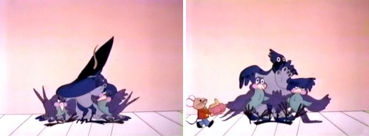
(Click any image to enlarge.)
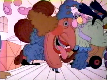
The Jack In The Box looks very different from the guy in Raggedy Ann.
You can watch this film on YouTube.
Animation &Books &Disney 15 Oct 2008 08:13 am
Tytla’s Willie
- When I was a kid, I was never a big fan of the “Willie” character, the giant in Mickey & the Beanstalk. It seemed that every fourth or fifth Disneyland tv show would have this character in it (or else Donald and Chip & Dale). As I got older and grew a more educated eye for animation, I came to realize how well the character was drawn and animated.
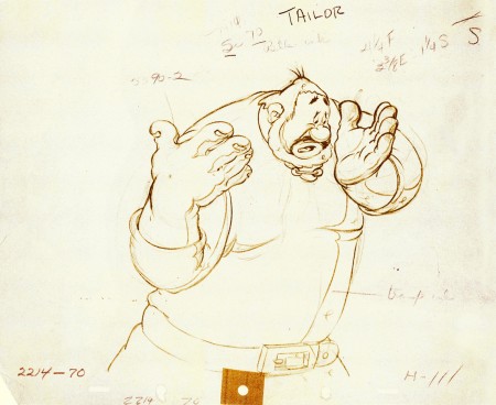
Willie first appeared in the classic Mickey short, The Brave Little Tailor, and he appeared fully formed. Bill Tytlas was the animator, and he appeared to have fun doing it.
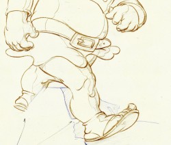
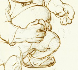
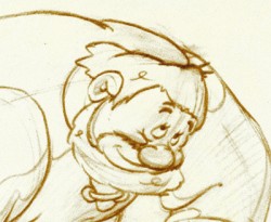
In John Canemaker‘s excellent book, Treasury of Disney Animation Art, there are some beautiful drawings worth looking at. Here they are:
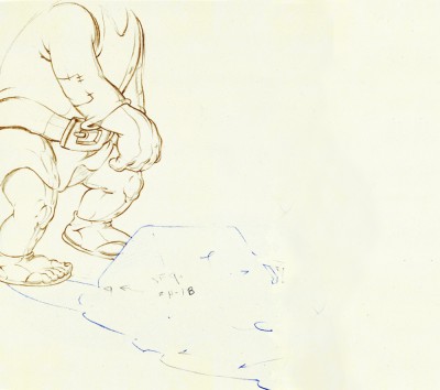 1
1(Click any image to enlarge.)
So let’s take a closer look at some of these drawings.
.
Drawing #3 features this weight shift. As the right foot hits the ground it pronates – twists ever so slightly inward. The hands do just the opposite. The left hand reaches in while the right hand holds back, completely at rest.
It’s a great drawing.
.
.
.
Drawing #4 shows Willie landing on that right foot, and his entire body tilts to the right. The hands twist completely to the left trying to maintain balance. The left foot up in the air is also twisting to the left before it lands twisting to the right.
.
.
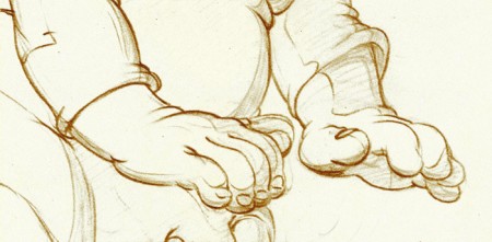
I love how drawing #5 features the two hands flattened out to
make his final stand before sitting down. It’s all about gaining balance.
.
.
.
.
Just take a look at this beautiful head in drawing #6. He’s seated, his head has come forward and tilted forward. The distortion is so beautiful it almost doesn’t look distorted.
What a fabulous artist! This guy just did this naturally.
.
.
.
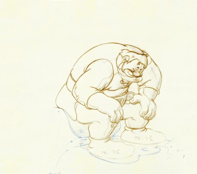
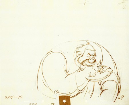
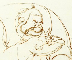
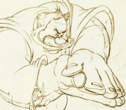
This scene begins with the seated giant eyeing the tiny Mickey Mouse in his hand. The characters are drawn beautifully almost at a rest waiting to get into the scene. The intensity of Willie’s glare is strong, and it’s obvous Mickey is in trouble.
.
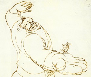 Here’s the drawing of the sequence.
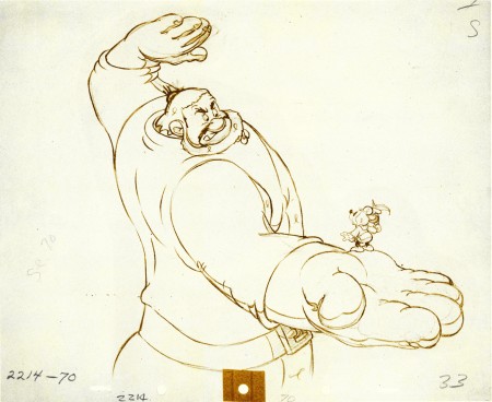
The major problem with drawing a giant is his proportion to all the other characters. The screen is more oblong and vertical than it is square. (Fortunately, when this film was done it was closer to a square but still not one.) Throughout the film, Tytla had to deal with a BIG and Mickey and the landscape are small.
An obvious way of handling it – and one that would be done today, no doubt – would be to force perspective showing it from the ground up – most of the time. In the 30′s and 40′s they stuck to the traditional rule of film and editing, and they would NOT have done this.
Tytla plays with scale as the giant steps over a house and ultimately sits on it.
In this drawing, he does a brilliant drawing forcing the perspective with Mickey in the foreground and Willie’s left hand in the distance. The giant draws into this forceful perspective without calling attention to itself. Today it would be more exaggerated, but Tytla doesn’t want it to be noticed – just felt.
A real bit of art!
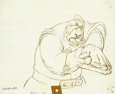
Here, Willie moves through that perspective of the last extreme, and he gets larger as he slams his hands to flatten Mickey. To exaggerate that flattening, Willie’s hands flatten for this key drawing. His head flattens as well in grimace.
The giant’s head will move in toward the hands to see the results, and the audience has a front row seat seeing Mickey escape up the giant’s sleeve. There’s a lot going on in this drawing.
.
.
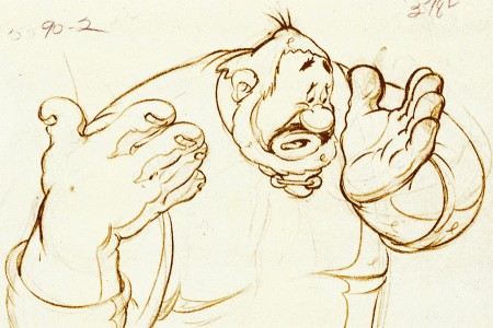
Finally, Willie tries to figure out what’s happened.
The drawing loses most of its distortion and comes to rest.
(Note that there’s still perspective distancing between the two hands.)
Mark Mayerson has done a mosaic breakdown of this cartoon and adds his excellent commentary.
Animation &Disney &repeated posts 04 Oct 2008 09:12 am
Rotocapture revisited
Rotoscoping got some attention back in January 2007 after a number of Motion Capture films were released. Here’s a post I did back then.
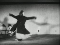 – A lot has been discussed in the past week about the validity of Motion Capture as a form of “Animation.” This conversation was instigated by the Oscar nominations. Two of the three nominations for the Best Animated Feature were created using MoCap.
Mark Mayerson questioned if we shouldn’t be deciding whether we’re officially going to call Motion Capture animation. And if we shouldn’t, then is Cars the only officially nominated animated feature?
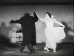 Now, of course, Motion Capture animators feel slighted. But they would have to agree that the soul, the impetus behind the movement does not come from them, but rather from the live action actor that was originally “captured”?
The comparison has been made that
traditional animation has often used Roto- scoping in creating animation. In fact, Disney’s Cinderella became the first feature that was wholly filmed in live action prior to 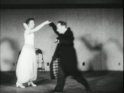
animation.
However, I’d like to make the point that the two methods are unrelated except in that live actors are involved. The difference to me, is that one is inspiration and the other is the heart of the animation.
When an animator is given live action reference material – the rotoscoped/traced drawings from the live action acting – he/she refers to it but animates to what is necessary for the scene. the animator is the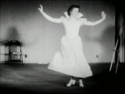 actor using the prerecorded voice, the physical rotoscoped reference, and anything available to help give the character a “soul.”
Even in Bakshi’s use of Rotoscoping in Lord of the Rings, the animators were allowed to push the drawings beyond the live action, alter the drawings to get them on character, and essentially produce the action.
When an “animator” gets the MoCap filmed live action, the actions are set. The actors have done the movement. What remains is 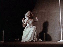 the proper positioning of the characters within the created scene, cleaning up the characters and constructing the scene. There’s no real animation, as we’ve come to know it.
For years now, I’ve called this electronic puppetry, but that’s not really accurate. The site Digital Puppetry seems to have labelled it correctly.
Younger animators seem to have less a problem with all of this labelling and irritation accrued by older veterans. In fact, the 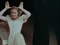 problem really is a threat to the “animator.” Last week, I hyperbolically suggested that the days of the animator were a dead as the dodo. You see, animation has turned into a computer effect. Live Action directors are now directing “animated films” in greater numbers. Peter Jackson had his “Gollum,” Robert Zemeckis had his “Polar Express” (and produced “Monster House”), Ang Lee had (and in fact acted) The Hulk. The “animators” have become interchangeable and almost irrelevant.
You aren’t able to define anyone’s animation style behind any of Tom Hanks’ characters in Polar Express. You can only see Tom Hanks or Savion Glover in Happy Feet.
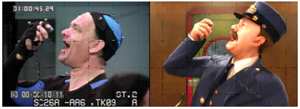
(All images except this one enlarge by clicking them.)
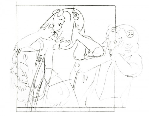
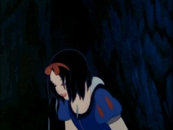
In Snow White, you can tell which scenes Grim Natwick animated; his style of animation comes across. It doesn’t matter how many rotoscoped drawings were given to him as reference. Grim animated the scenes.
In the big picture what really does all this quibbling matter? I enjoyed Happy Feet more than I did Cars. Cars was a better constructed film, both were riddled with cliches. I was entertained by all that dance. I like Savion Glover (though I would have preferred watching Savion Glover.) The film also seemed to have some sort of misguided representation of a message. I appreciated that. Cars, to me, had only a lot of loud noisy reverberation. From the first frame, the film came screaming. The artistry behind the imagery was astounding, as expected from Lasseter, but the film was boring.
Of course, this is only my opinion based on my biases. You have your opinions based on your biases. However, as an Academy voter, I’ll probably vote for Cars because I think technically it was a better “Animated” film. Isn’t that the category?
If you haven’t read Mark Mayerson on this subject, you should.
Ward Jenkins reminded me that he had two interesting posts about Polar Express on his site. It gives an interesting look at how to correct the “Zombie Eyes” on the characters. #1 and #2. Check them out, if you haven’t seen them.
Animation &Hubley &repeated posts 18 Sep 2008 08:20 am
Moonbird revisited
In September 2006 I posted a couple of Bobe Cannon drawings from Hubley’s Moonbird. Let’s take another look:
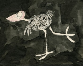 – Moonbird is one of the seminal films of 20th Century animation.
After John Hubley left UPA, where he helped explore the use of 20th Century graphics in animation, he formed a commercial animation company in Los Angeles. Apparently, with this new entity, John did less drawing and more producing. Trying to correct this problem, he closed the LA office and set up in NYC with Faith.
The studio in New York did commercials on a smaller scale. With a Guggenheim Fellowship of $8000, the couple produced a short film, Adventures of an * in 1957 and committed to doing one film a year for themselves. With this film, Hubley picked up where he’d left off at UPA. Exploration of modern art now took on the wildly successful Abstract Expressionists and told a non-verbal story using expressionist art.
The film Tender Game, done in 1958, told another non-verbal story using the song “Tenderly” to illustrate a romance, again, in expressionist art. This film, in some ways, feels like an outgrowth of Hubley’s work on the feature, Finian’s Rainbow.
In 1959, Moonbird took a giant leap forward. The art style borrowed from the expressionists, but used a method of double exposures to layer the characters into the backgrounds. Each animation drawing was painted black outside the border of its lines. Moonbird, the character, was colored with clear wax crayon and painted with black ink. The black resisted where the wax stood and gave a loose scribbled coloring. All of these painted drawings were photographed as double exposures, shot at less than 100%, to combine characters with Bgs.
The soundtrack involved an improvised track of two children, Mark and Ray Hubley, playing. These were recorded in sessions within a recording studio and massively edited down to create the final tracks.
Bobe Cannon animated the film with Ed Smith assisting. Ed inbetweened Bobe’s scenes and animated many others.
A variation of this became the Hubley method. There was usually someone working in the studio who did all inbetweens and animated some lesser scenes. A great way to break into the medium in a big way.
Some extremes by Bobe Cannon are posted below.
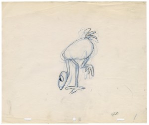
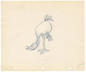
(Click on any image to enlarge.)
Here’s a link to a YouTube version of the film.
Animation &Fleischer &Frame Grabs &walk cycle 13 Sep 2008 07:53 am
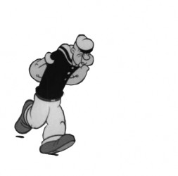
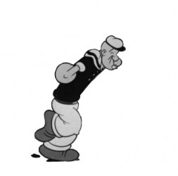
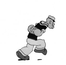
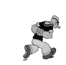
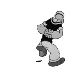
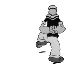
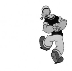
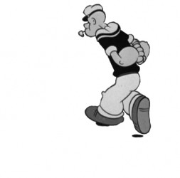
Popeye Circle
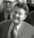 – One of the best exercises I ever received, when I was starting out in animation, came from someone I respected and whose work I truly admired. Jack Schnerk advised me to animate a character walking in a circle.
He felt that a walk cycle was one of the hardest things to learn, and by animating that character in a circle it meant keeping the character solid while moving it 360º. Try it; it isn’t easy (unless, presumably, your working in cgi.)
Note: the photo of Jack Schnerk comes from Amid Amidi’s Cartoon Modern site; it’s part of a UPA group photo.
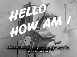
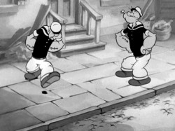
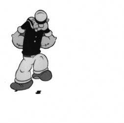
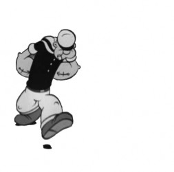
After posting all that material about Max Fleischer yesterday, what better example of a character moving in a circle can I find than Popeye. This is from the film Hello, How Am I? where we get two Popeyes for the price of one.
Here’s the title card and a frame grab from the actual scene.
 __
__
(Click any image to enlarge.)
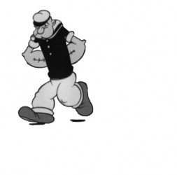
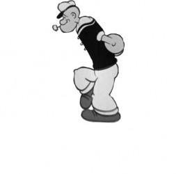
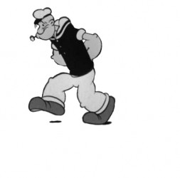
Here are frame grabs of the actual walk.
 1
1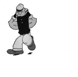 2
Popeye walks in a circle.
Animation &Commentary &Disney 08 Sep 2008 08:01 am
Dopey Distortion
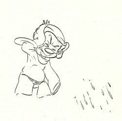
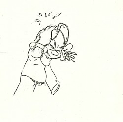
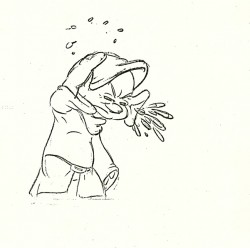
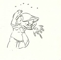
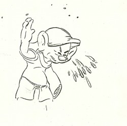
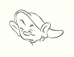
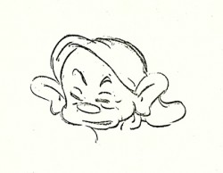
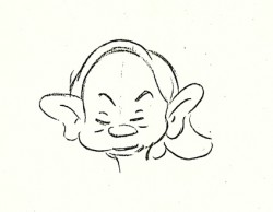
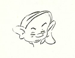
- Here’s some Bill Tytla distortion that you should take a good look at. Dopey has water in his ears and shakes his head (like a dog) to get the water out.
Take a look at the final heads as the shape of Dopey’s face and head changes. It’s a beautiful piece of animation. The volume remains completely intact as everything else about the head shifts. Yet, the whole feels as though it retains its form. Using graphic distortion, the scene becomes funny and strong and is wholly Dopey in a three dimensional way.
I’d like to know what an Assistant got to do.
I have to admit I was amazed in doing this simple little exercise of taking the drawings – despite the fact that some are missing – and put them on one’s and simply run them one after the other to make the QT film at the end. Yet, once I put the drawings into motion, they became something else. It’s quite the heart and soul of what animation really is.
 3
3 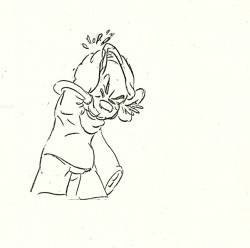 4
Dopey drains.
Animation &Animation Artifacts &Disney 26 Aug 2008 08:17 am
Tytla Grumpy
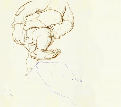
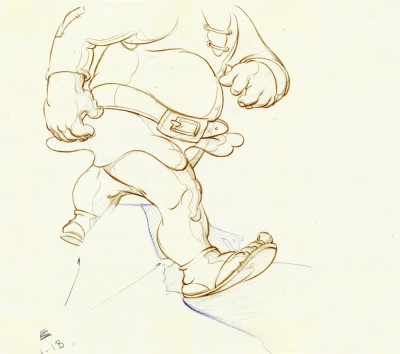
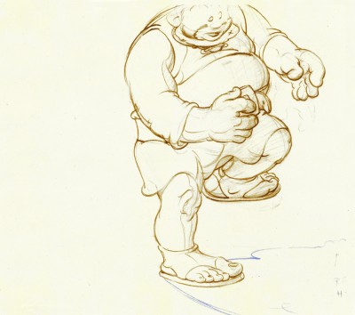
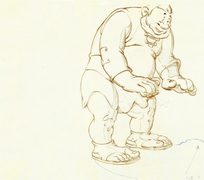
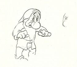
- Following yesterday’s display of a couple of drawings by Bill Tytla, I thought I’d post a couple of other xeroxed animation drawings I have from his work.
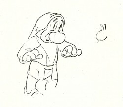
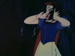
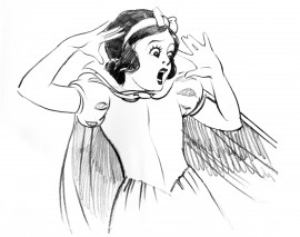
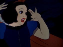
I wish I owned the exposure sheets. Drawings #67½, 68½, 69½, and 70½ all follow drawing #70 in its path of action. These are possibly an add on to the turn. They also may be part of a stutter he’s set up: #67½ follows 67, 68½ follows 68, 69½ follows 69, and 70½ follow 70. This would give a peculair effect, and I don’t think that’s it. (Grim Natwick taught me that if you want that stutter effect do the full move, numbering the drawings sequenctially. Then you can throw them out of order on the X-sheets.)
I don’t know, I’ve been trying to find the move in the final film.
Here’s Grumpy turning.
 63
63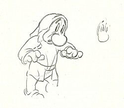 64
64(Click any image to enlarge.) Grumpy turns.
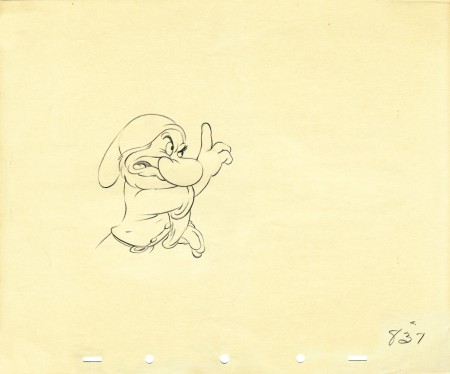
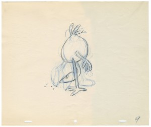
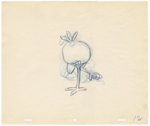
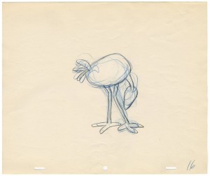
This is an actual animation drawing by Tytla that I own.
It’s obviously from another scene. The size is a small 10×12.
If you click on the drawing it should enlarge to actual size.
 65
65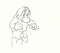 66
66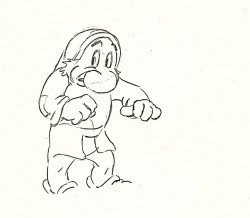 67
67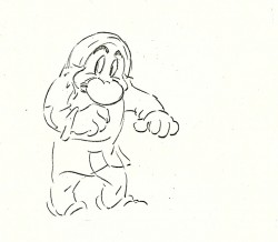 68
68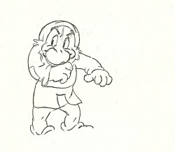 69
69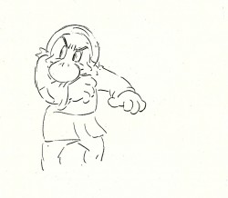 70
70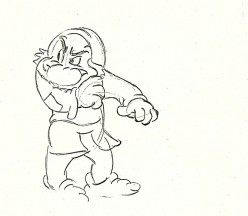 71
71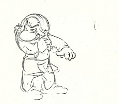 66½
66½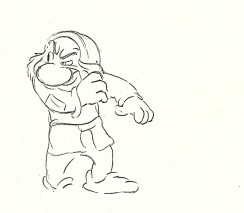 67½
67½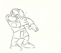 69½
69½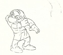 70½
70½