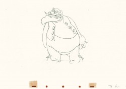
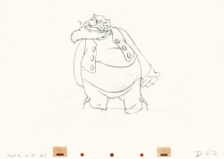
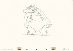
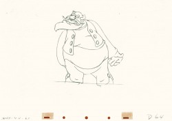
Category ArchiveAnimation
Animation &Animation Artifacts &Models 15 Jun 2009 07:27 am
Steig’s Delco
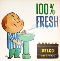
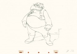
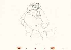
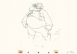
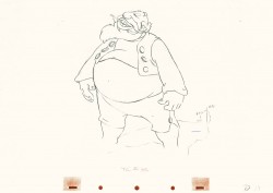
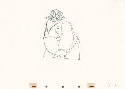
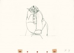
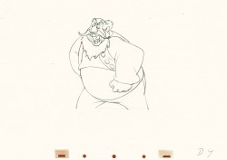
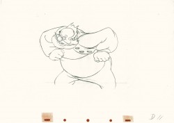
- In 1959 Delco Remy batteries featured a spokesman of a character who was everywhere, that year. William Steig designed the tough-kid for the campaign, and he did ads for all the magazines – Look, Life, Saturday Evening Post. This was an obvious offshoot of Steig’s very successful book of cartoons, Small Fry, which was originally published in 1944 but had had quite a bit of success for the cartoonist.
This was years before Steig would write and illustrate his first children’s book.
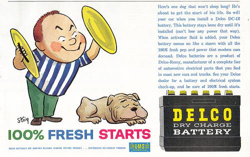
Naturally enough, there were animated ads done as well.
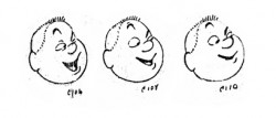
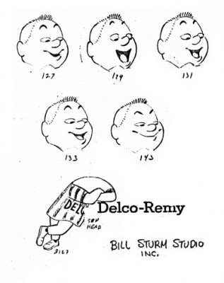
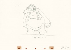
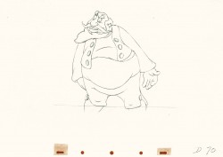
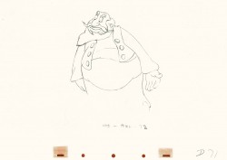
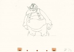
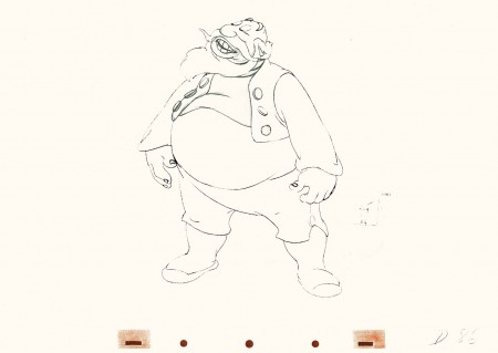
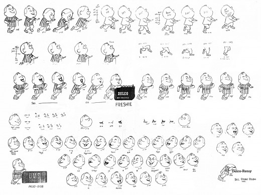
Here’s a model sheet made for a Delco battery spot for the Bill Sturm studio in 1959. Sturm was an ex-Fleischer animator who moved into the Fletcher-Smith studio and advertising animation in 1947. He had his onw studio as early as 1956.
This model sheet was created, as many feature models are made, by taking clippings of some completed animation. The character was by William Steig, and I’m not sure who did the animation, but Jim Logan did the assisting.
(Click any image to enlarge,)
Too large to take in all at once, let’s break the animation down to its parts:

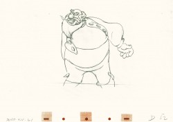
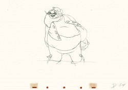
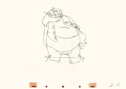
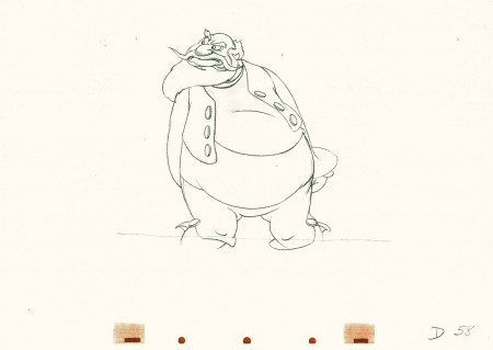
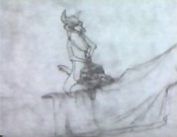
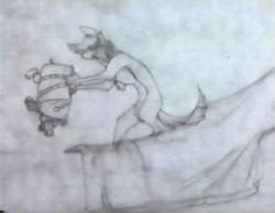
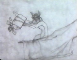
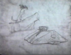
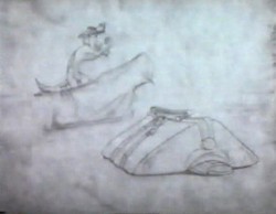
“Freshie” leans on the battery talking.

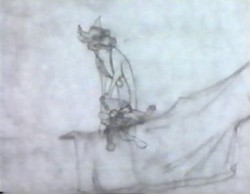
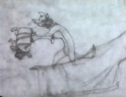
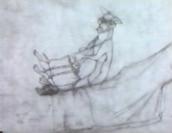
Then he starts to push the battery (which is on its own level.)

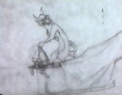
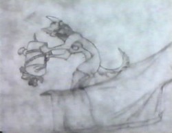
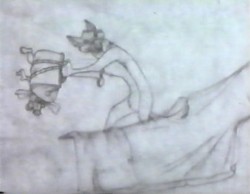
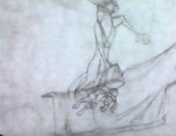
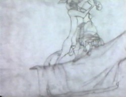
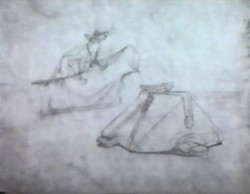
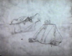
The skip is broken into levels with the upper half on one . . .

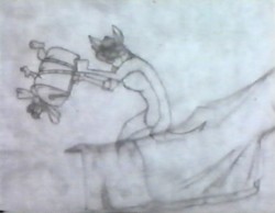
. . . and the lower half on another.
I’m not sure what this chart was used for, unless this was a series of spots, and the art from the first was what they were shooting for in subsequent spots.
Regardless, a lot of work went into this one minute spot. I’m not sure how much Steig gave them to match his models, but I would assume it was substantial (based on other spots he’d done.)
Animation &Animation Artifacts &Hubley 12 Jun 2009 08:10 am
Johnny Gent’s Spellbinder
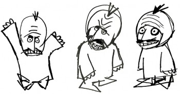 Johnny (Gentilella) Gent had the hardest time on the Letterman series done for the original Electric Company. He could never get the characters and kept trying to add 3D form to the 2D characters that John Hubley had created.
It was my first job, and I was in awe of every animator that walked through ________A very early John Hubley model of Spellbinder.
the door. We had 2½ months to do
all the artwork on the 20 spots that were 2½ mins each. A total of 50 mins in 10 weeks. (That’s about right these days for a 30 second spot!)
I did all the assisting, inking and inbetweening and had to do it quickly. (I estimated about 18 secs. per drawing. The game I played with myself to keep up was to keep one eye on the drawing and another on the clock.)
As I said, it was my first animation job. What did I know! I had to take Johnny’s drawings and reshape them into Hubley’s characters, and I had to do it in ink. No pencil tests. Just do it. Whatever came out, was the final artwork (and I use that word loosely.) I felt, even while I was doing it, that I was killing Johnny’s work, and I ultimately apologized for it. No one else complained, so it went as it did.
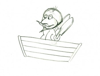
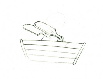
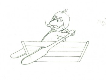
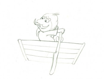
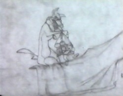
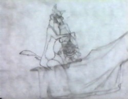
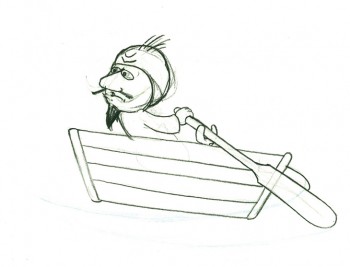
Here’s a cycle of Johnny Gent’s Spellbinder rowing a boat.
 1
1(If you click on any drawing it’ll show you the full animation page.
Johnny Gent’s Spellbinder rows a boat
on two’s per drawing indicated
Click left side of the black bar to play.
Right side to watch single frame.
Animation &Animation Artifacts &Disney 10 Jun 2009 07:34 am
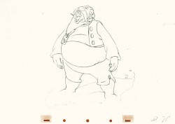
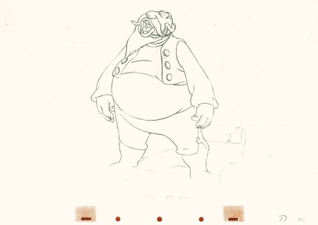
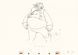
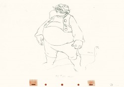
Tytla’s Stromboli 2
This note arrived from Borge Ring after my first post Bill Tytla’s scene featuring Stromboli’s mood swing:
- The Arch devotees of Milt Kahl have tearfull misgivings about Wladimir Tytla’s magnificent language of distortions. ‘”Yes, he IS good. But he has made SO many ugly drawings”
Musicologists will know that Beethoven abhorred the music of Johan Sebastian Bach.
yukyuk
Børge
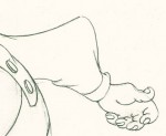
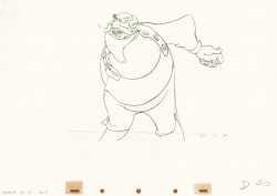
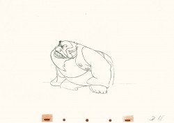
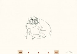
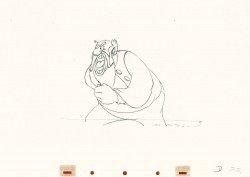
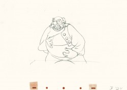
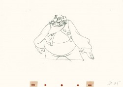
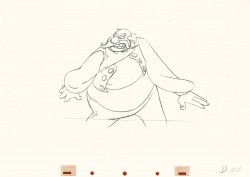
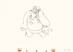
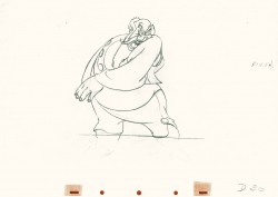
My first post spoke a bit about the distortion Tytla would use to his advantage to get an emotional gesture across. It’s part of the “animating forces instead of forms†method that Tytla used. This is found in Stromboli’s face in the first post. In this one look for this arm in drawing #50. It barely registers but gives strength to the arm move before it as his blouse follows through in extreme.
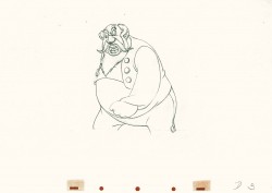
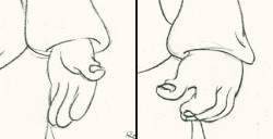 There’s also some beautiful and simple drawing throughout this piece. Stromboli is, basically, a cartoon character that caricatures reality beautifully. A predecessor to Cruella de Vil. In drawings 76 to 80 there’s a simple turn of the hand that is nicely done by some assistant. A little thing among so much bravura animation.
Many people don’t like the exaggerated motion of Stromboli. However, I think it’s perfectly right for the character. He’s Italian – prone to big movements. He’s a performer who, like many actors in real life, goes for the big gesture. In short his character is all there – garlic breath and all. It’s not cliched and it’s well felt and thought out. Think of the Devil in “Night on Bald Mountain” that would follow, then the simply wonderful and understated Dumbo who would follow that. Tytla was a versatile master.
Here’s part 2 of the scene:
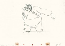 48
48 49
49(Click any image to enlarge.) The full scene with all drawings.
Click left side of the black bar to play.
Right side to watch single frame.
Animation &Fleischer &Frame Grabs &walk cycle 08 Jun 2009 08:12 am
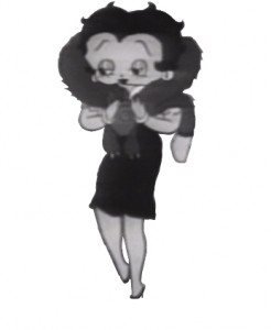
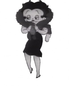
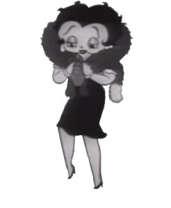
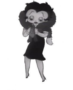
Betty with Fur walk
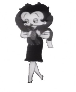
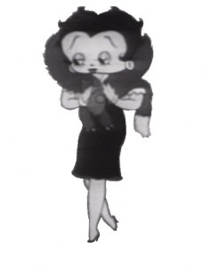
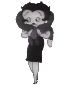
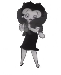
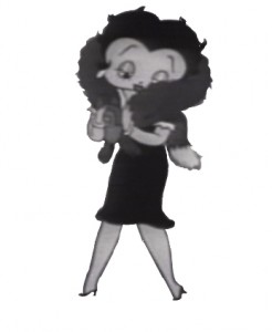
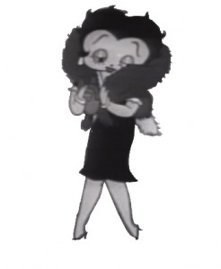
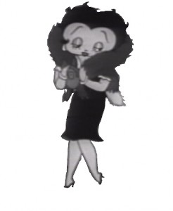
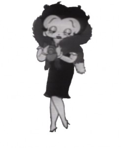
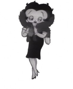
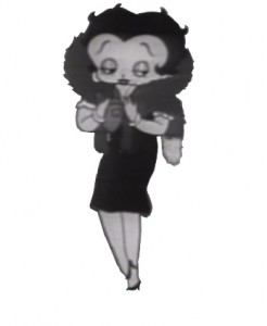
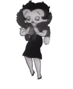
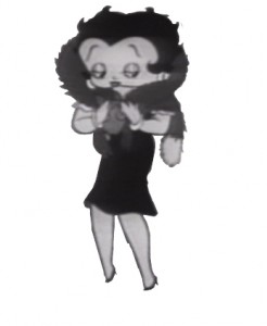
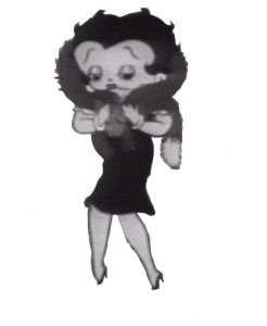
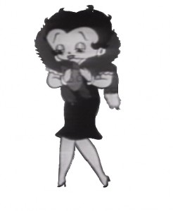
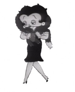
- I haven’t posted a Betty Boop walk cycle in some time, so I thought I’d pick on this one. Betty’s walking with a new fur stole, caressing it as she walks. Sweetly animated by Myron Waldman for the film Pudgy Picks a Fight in 1937.
 1
1 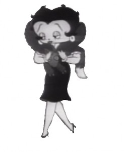 2
2(Click any image to enlarge.)
Betty wears her new fur.
on ones
Click left side of the black bar to play.
Right side to watch single frame.
Animation &Animation Artifacts &Disney 03 Jun 2009 07:25 am
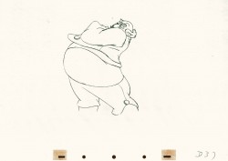
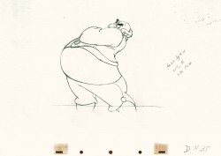
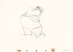
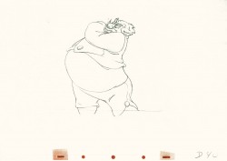
Tytla’s Stromboli
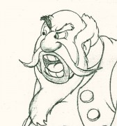 - Bill Tytla‘s work has to be studied and studied and studied for any student of animation. He was the best, and it’s pretty doubtful his work will be superceded. He brought beautiful distortion to many of the drawings he did, using it as a way to hammer home some of the emotions in the elasticity he was creating. Yet, the casual observer watching this sequence in motion doesn’t ever notice that distortion yet can feel it in the strength of the motion.
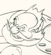
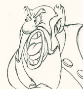
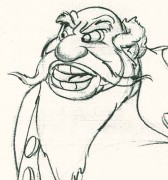
Four drawings (#1, 11, 22, & 48) that shift so enormously but call no attention to itself.
Brilliant draftsmanship and use of the forms.
Here we have the beginning: drawings 1-48. More will come in the future.
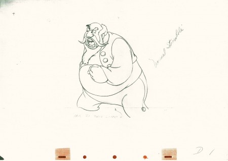 1
1(Click any image to enlarge.) The full scene with all drawings.
Click left side of the black bar to play.
Right side to watch single frame.
Animation &Art Art &Independent Animation 22 May 2009 08:34 am
Quinn & Schnall
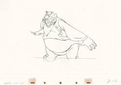
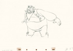
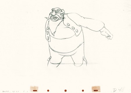
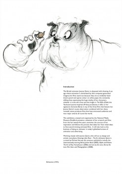
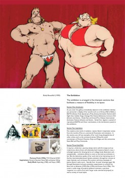
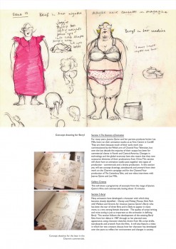
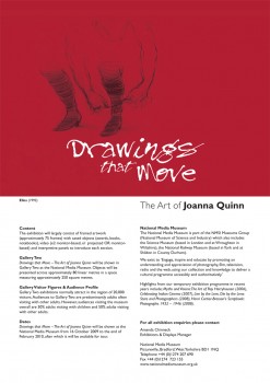
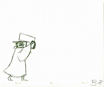
- Here’s a booklet that Karl Cohen sent me, the catalogue of an exhibition of Joanna Quinn‘s stunningly beautiful drawings for the National Media Museum in Bradford, West Yorkshire. This show will be held from October 16, 2009 – February 21, 2010. The catalogue has me watering at the mouth and gets me wondering if I can visit this show.
Perhaps there’s some venue in the US that would be interested in proogramming something so attractive and valuable.
Take a look at this catalogue:
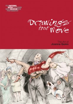
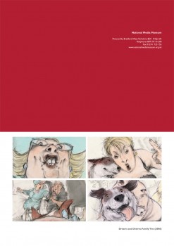
(Click any image to enlarge.)
________________________
- The ever-creative John Schnall sent me a video of a recent piece he did. As a film, it’s pure promo but as a creative endeavor it’s pretty sensational. I thought I’d like to share, so here it is: Glympse.
Animation &SpornFilms &Tissa David 21 May 2009 08:00 am
Tissa’s Garbo Talks
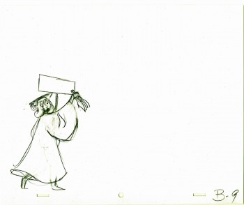
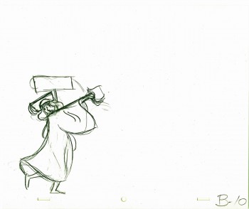
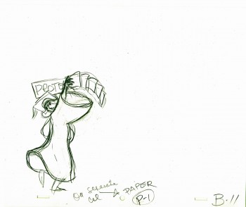
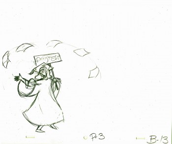
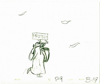
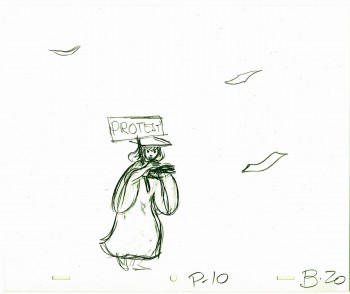
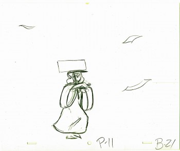
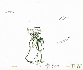
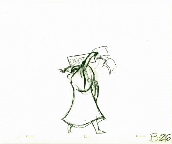
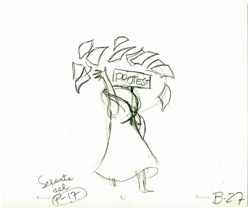
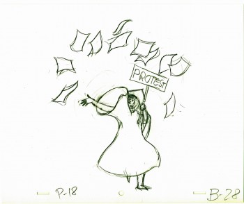
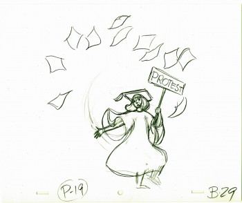
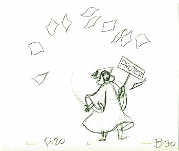
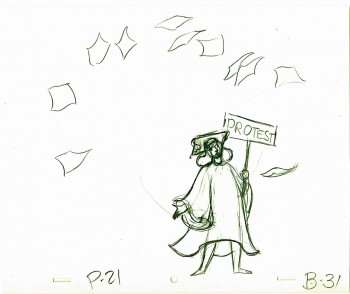
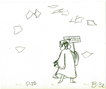
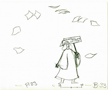
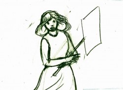 – I posted some images from the title sequence I did for Sidney Lumet’s overlooked feature film, Garbo Talks.
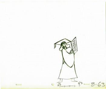
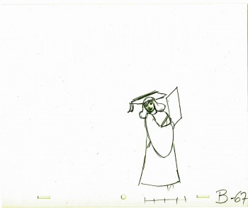
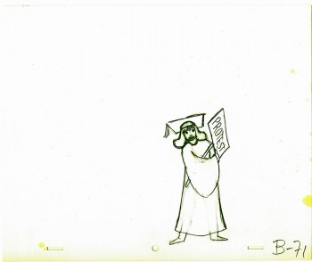
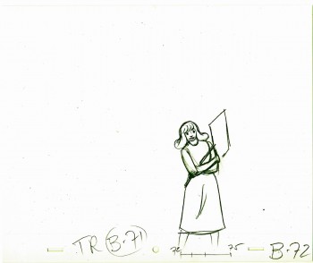
Tissa had about two weeks to animate about 3½ mins. of animation. I begged her to leave inbetweens for me, which she did, though only on close positions. I inked on paper, and Robert Marianetti colored directly from these rough-ish drawings. It was done with prismacolor pencils on paper. The paper drawings were then cut out and pasted to cels.
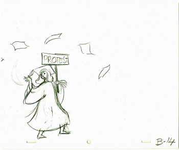
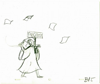
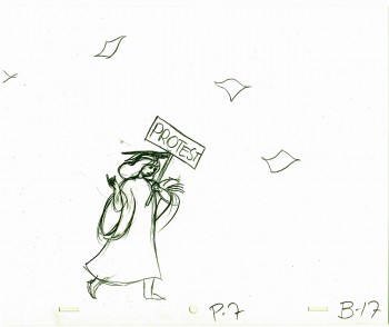
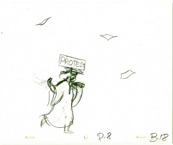
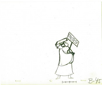
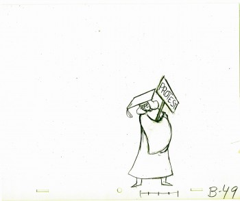
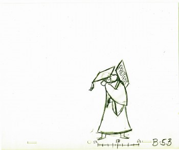
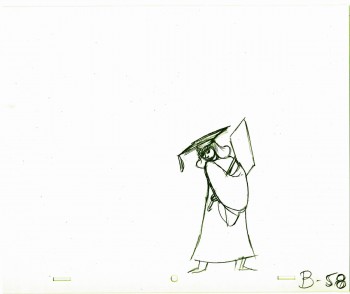
Since it’s graduation season, I chose this sequence of extremes:
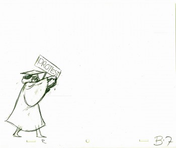 7
7(Click any image to enlarge.)
Below is a rough PT of the piece with its staccato rhythm since it’s missing inbetweens.
Garbo Talks ruff PT On twos at 24FPS
Click left side of the black bar to play.
Right side to watch single frame.
Animation &Commentary &Frame Grabs 13 May 2009 07:17 am
Random Bluth
- All the anti-Don Bluth vitriol that came out in the comments on my relatively harmless piece on the recently released DVD of Banjo the Woodpile Cat has stuck in my craw. (here and here)
Don Bluth is a veteran animator who busted his butt to make a number of animated features. Some of these were really good; some were not so bad, and others were downright clunkers. Regardless of the quality, they all took a hell of a lot of effort and  struggle to get to the screen, and for that alone,
I have a lot of respect for Bluth and those who were part of his close-knit animation family.
A personality did come through all of those features. You may or may not like that personality, but there is an imprint there that can’t be denied. I give the man and his team a lot of credit.
Yet from the comments that have been generated, one would think he had done a piece of trash like Hoodwinked or Barnyard.
 __
__ 
The major difference is that Bluth desperately tried to make a good film and change the world of animation with his product, the other two producers were just producing product. Make it funny and get as much booty as possible. I guess the latter two were successful. One got a good deal with Miramax (and is now directing a live-action feature). The other, a live-action director, got a deal with Nickelodeon and made a slew of other Barnyard attractions.
Don Bluth? I’m not sure what he’s up to now, but I do wish he’d get back to business and try another animated feature. Perhaps this time he’ll work with a first rate scriptwriter.
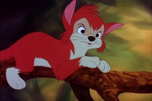
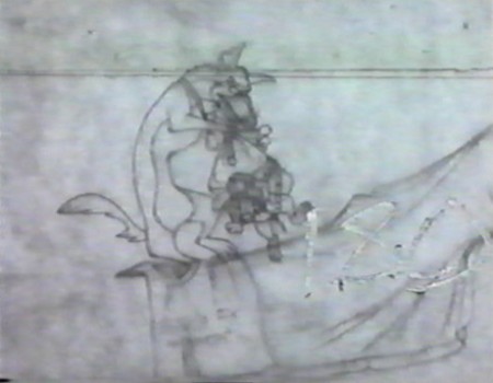
I’ve decided to post some screengrabs of a random scene from the PT of Bluth’s All Dogs Go To Heaven. I didn’t like this film when I first saw it in a theater, but I’ve warmed to it over the years. The folksy charm of Burt Reynolds still bothers me, as does that googly-eyed child typical of many Bluth films. (The children in Troll in Central Park is the crème de la crème of this character type.)
Anyway, here’s a scene. It’s chosen completely at random. I don’t know who animated it (please leave a comment if you know), but it took a lot of work, and I’d like to honor it.
 1
1(Click any image to enlarge.)
Animation &Animation Artifacts &Richard Williams 11 May 2009 08:01 am
Corny’s Raggedy Andy
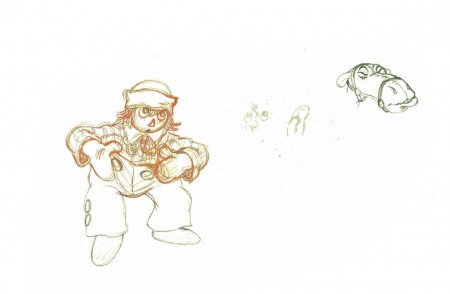
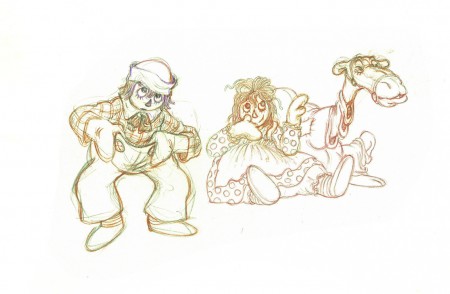
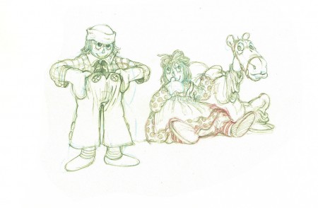
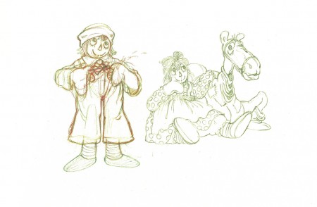
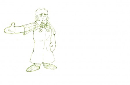
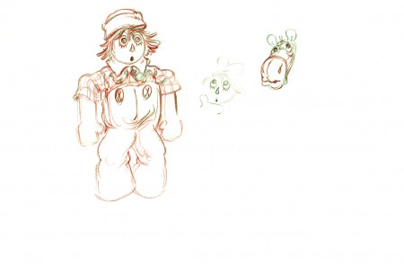
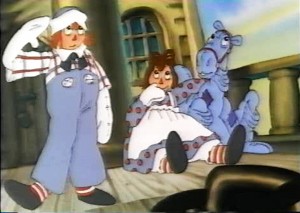 - Every once in a while it pays for me to go back to 1976 and look at Corny Cole‘s magnificent work on Raggedy Ann & Andy.
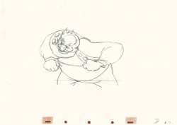
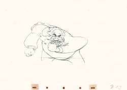
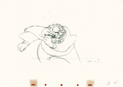
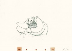
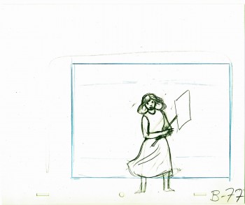
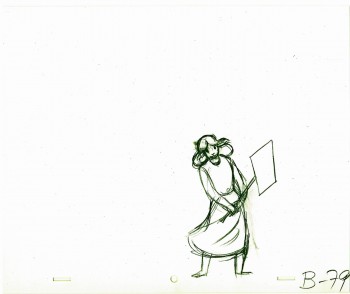
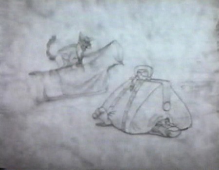
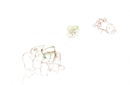
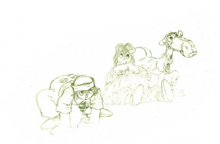
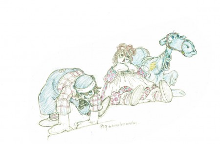
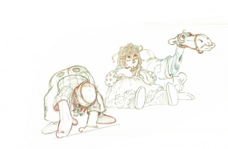
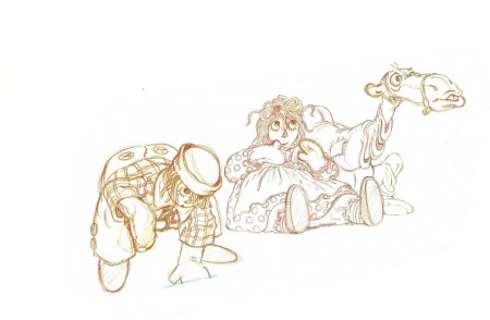
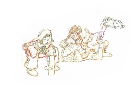
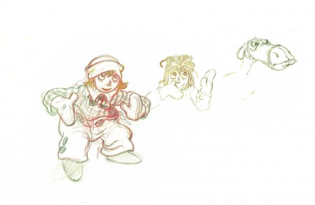
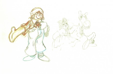
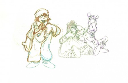
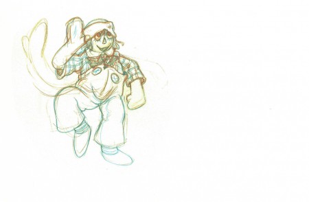
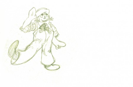
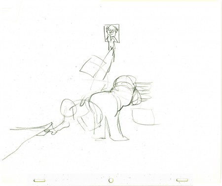
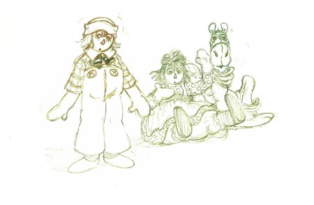
Here’s one of the scenes I have – or at least the first half of the scene – in which Corny animated Andy standing and saluting. Ann and the Camel with the wrinkled knees sort of mull about in the background.
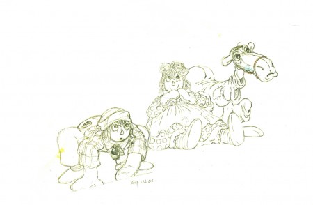
The drawings are incredibly light. I darkened them a bit in photoshop so that they’d be legible. They’re also done in a number of colored pencils. To top that off the paper is oversized (20×10.5) and difficult to flip. Since the art’s all the way to one side, I eliminated some of the blank side in the scans,
But the drawings are beautiful. Too bad the film, which was shot in Scope with Panavision lenses, was put on video in a cropped TV format with no regard to what was being cut off on the edges. (Not even pan & scan.) There’s been no DVD release of the film.
Here are most of the extremes all done by Corny Cole.
 1
1(Click any drawing to enlarge it to the original size.)
 53
53
Corny Cole is certainly a one-of-a-kind in the animation community.
It was my pure good fortune to have worked with him this once.
Perhaps next time, I’ll put up some of his elaborate drawings.
On twos at 24FPS
Click left side of the black bar to play.
Right side to watch single frame.
Animation &Animation Artifacts &Hubley &Layout & Design &Models 05 May 2009 07:36 am
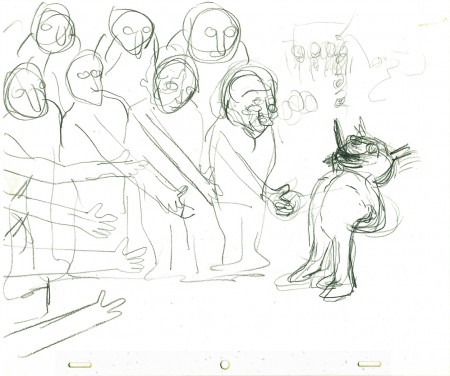
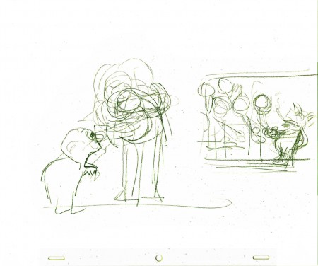
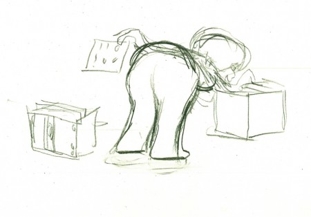
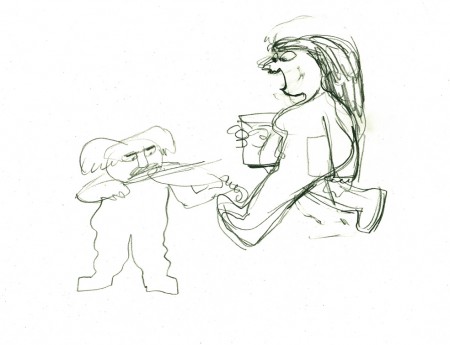
More EGGS
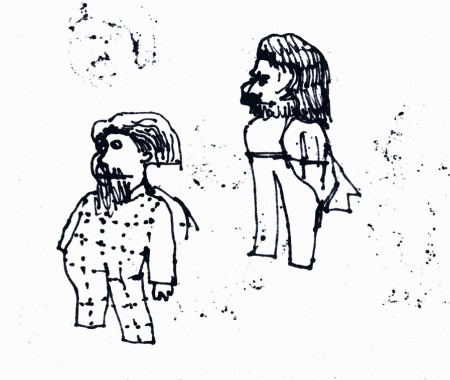
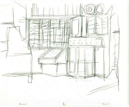
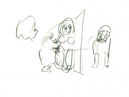
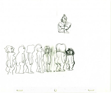
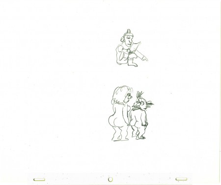
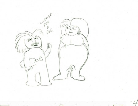
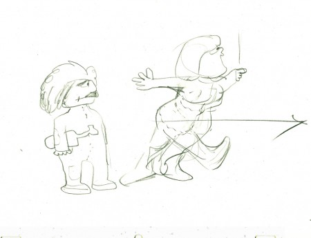
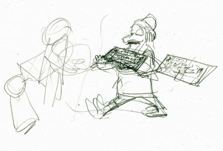
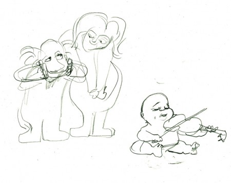
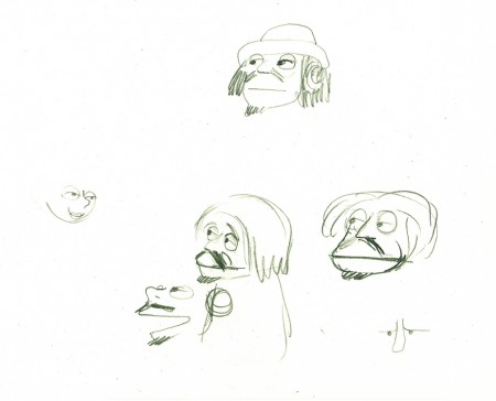
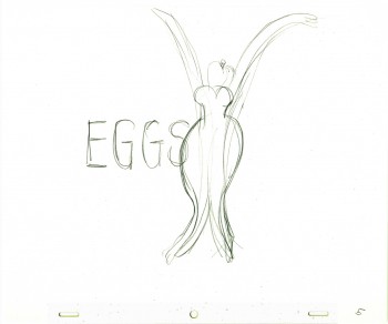 - In the past, I’ve posted some of John Hubley and Tissa David‘s preliminary drawings for the picture, Eggs. I’ve got plenty of this artwork and I love it, so here’s some more.
Eggs was a short film which was rushed out at a low budget for a PBS show called The Great American Dream Machine, which was produced by designer, Elinor Bunin.
The film follows the political thoughts of John and Faith; they were concerned about overpopulation (there are at least four shorts they made about the subject) and were able to blatantly make a political short for this TV series.
Past posts of my can be seen here, and here.
There’s currently a copy of this short on YouTube.
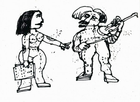
These three drawings are character Layouts by John Hubley.
(Click any image to enlarge to animation-sized artwork.
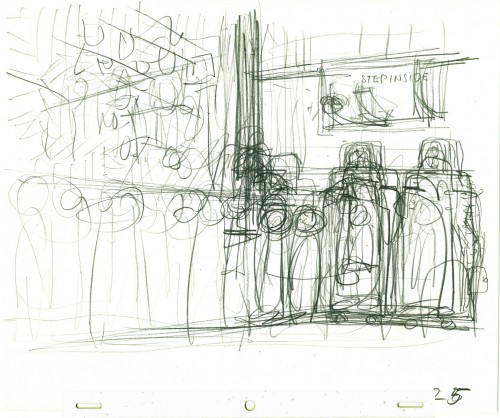
This is a BG Layout John gave Tissa.
This drawing and all the remaining are Tissa David’s drawings.
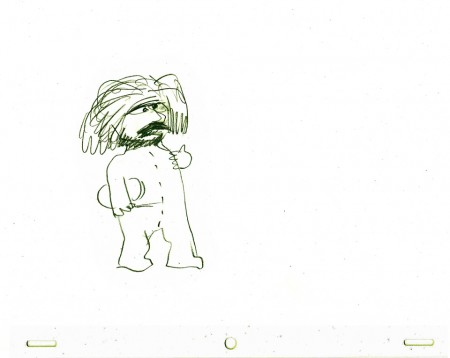
She would block out her own rough Layout
before jumping in in to animate.
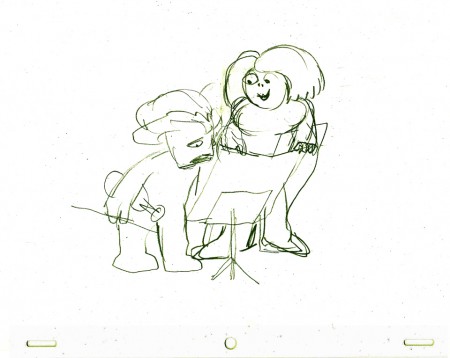
It gave her the chance to thoroughly think out what
little information John had given her. Usually just a
conversation with some very rough sketches.
