Category ArchiveAnimation
Animation &Layout & Design 27 Jul 2009 07:26 am
Piper spot
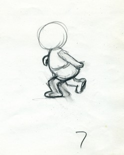
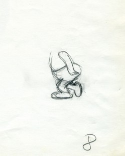
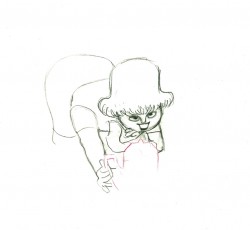
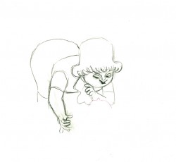
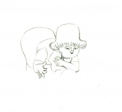
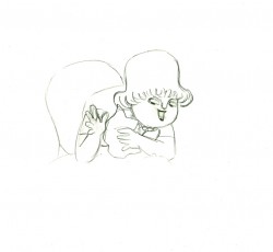
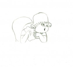
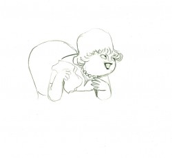
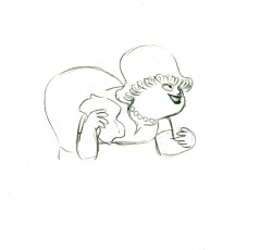
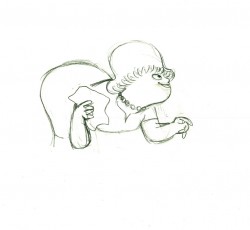
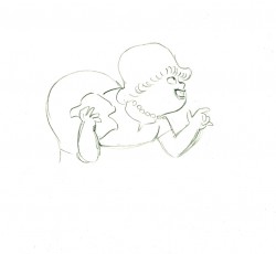
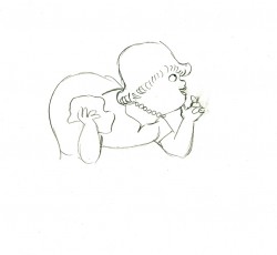
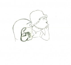
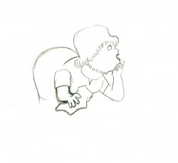
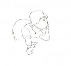
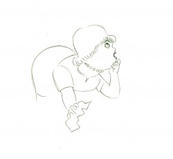
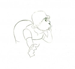
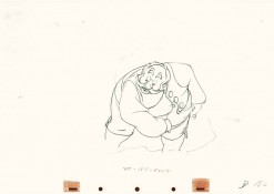
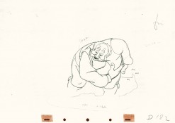
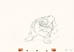
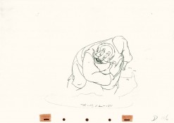
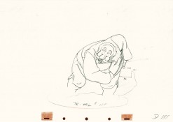
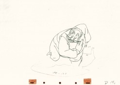
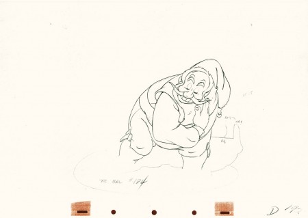
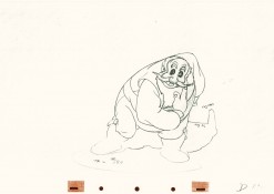
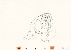
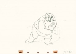
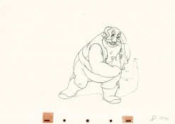
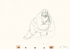
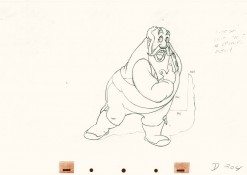
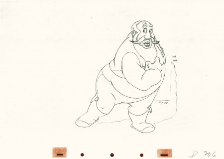
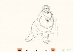
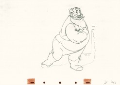
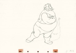
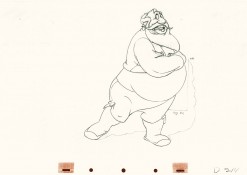
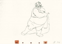
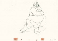
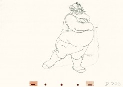
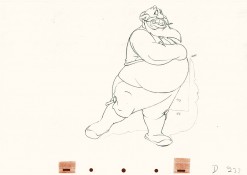
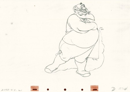
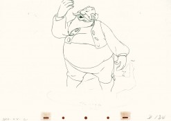
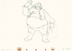
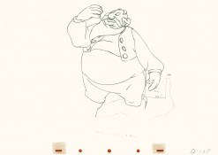
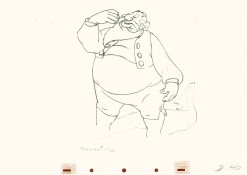
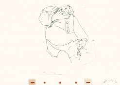
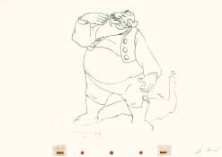
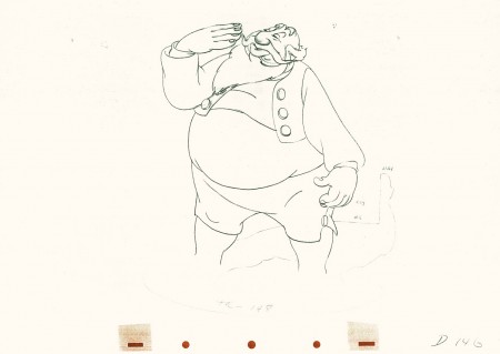
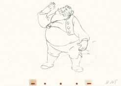
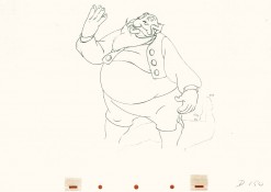
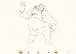
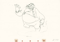
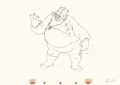
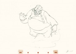
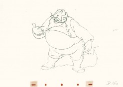
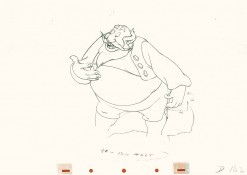
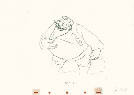
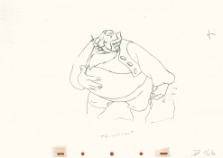
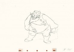
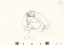
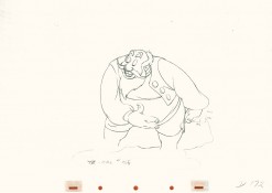
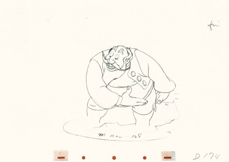
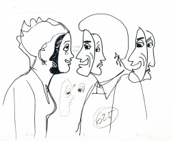
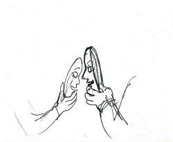
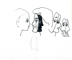
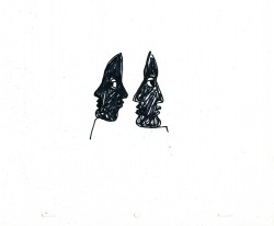
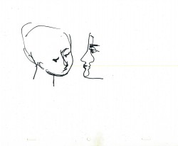
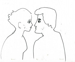
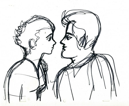
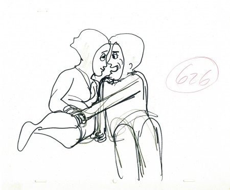
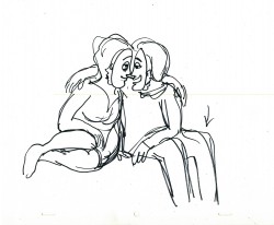
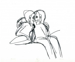
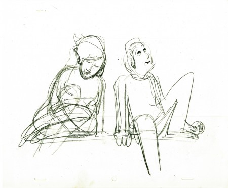
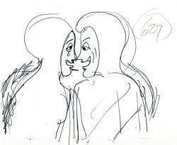
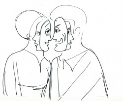
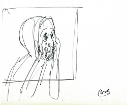
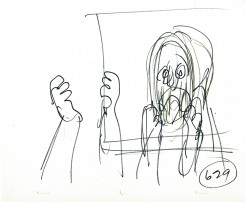
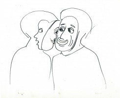
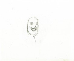
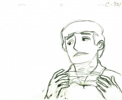
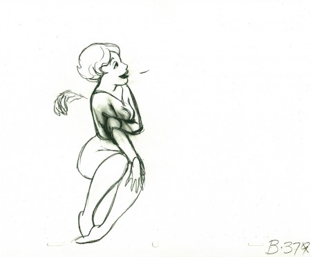
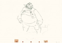
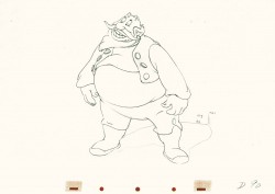
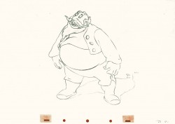
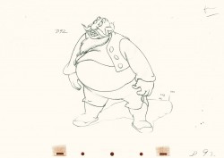
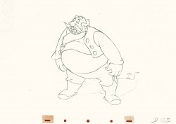
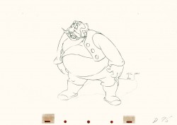
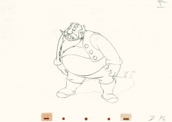
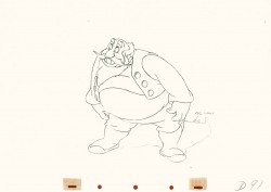
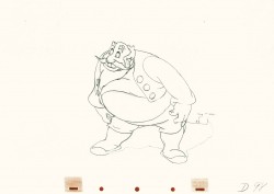
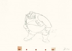
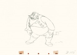
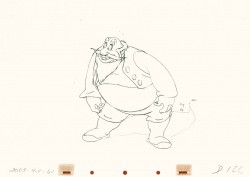
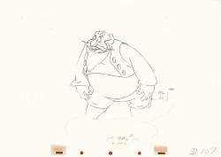
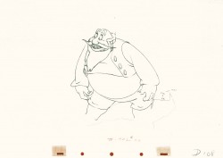
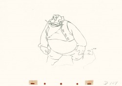
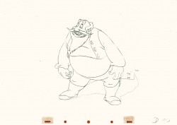
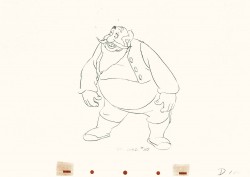
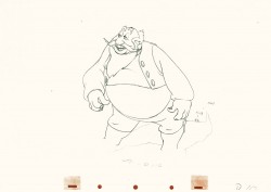
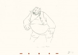
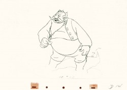
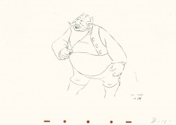
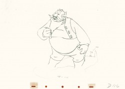
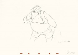
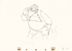
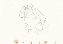
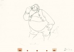
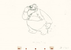
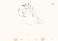
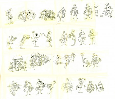
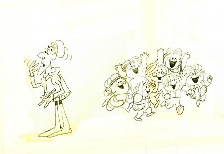
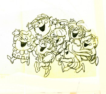
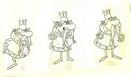
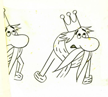
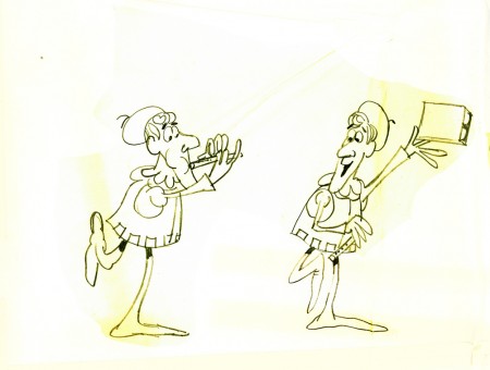
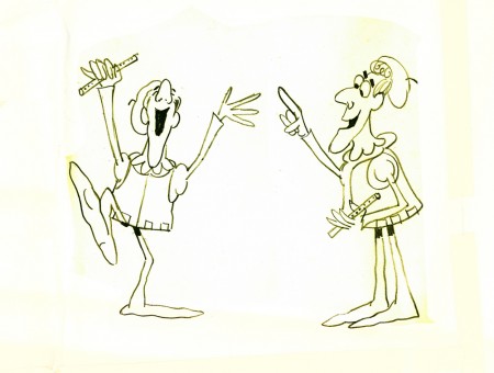
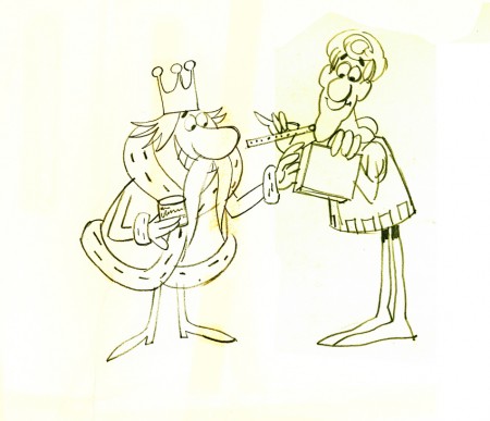
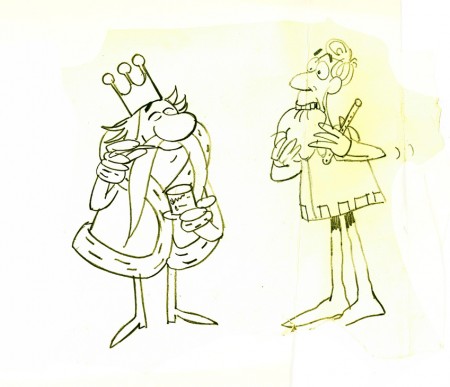
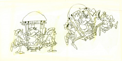
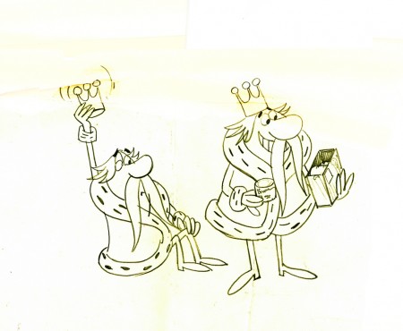
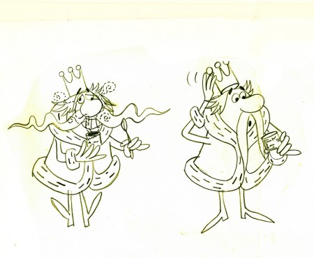
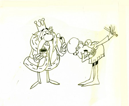
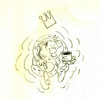
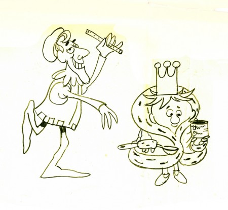
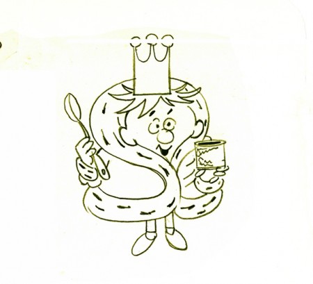
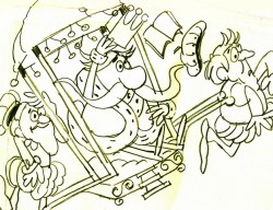 - Here’s some LO drawings for a commercial. It’s a riff on the Pied Piper. The Piper talks with a King character, who in the end gets young, after using the product.
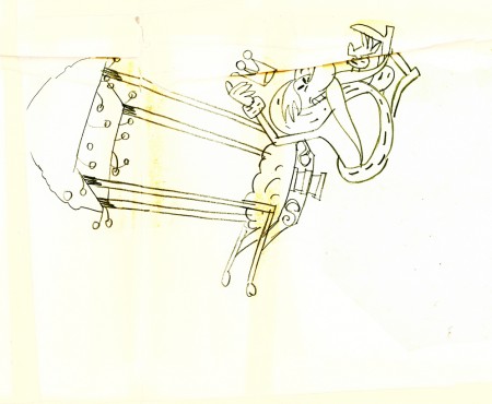
The art was obviously taped together and kept over the desk of the animator. The LOs were cut to fit into a large square and some of the drawing was done atop the tape.
This is a standard commercial done in New York during the 60′s. It has the look of almost any studio in town. I think this one was done at Pelican. I don’t know who the animator was nor what the product was that they were selling. Still, I thought the images worth sharing. It’s not a style that I particularly love, but it was sure a mainstay around NY back then. It looks like an offshoot of the work Paul Cloker was doing for Rankin Bass at about the same time.
As I said, it comes in a large taped-together mass. I give you the whole sheet, and then I’ve broken the drawings apart.
(Click any image to enlarge.)
Animation &Animation Artifacts &Articles on Animation &Disney &Models 13 Jul 2009 07:31 am
Donald Models
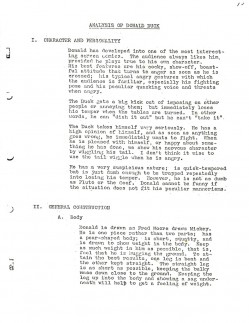
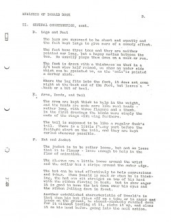
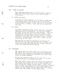
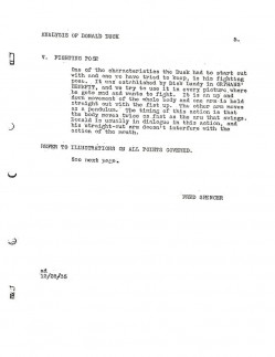
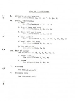
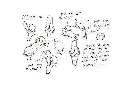
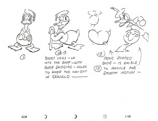
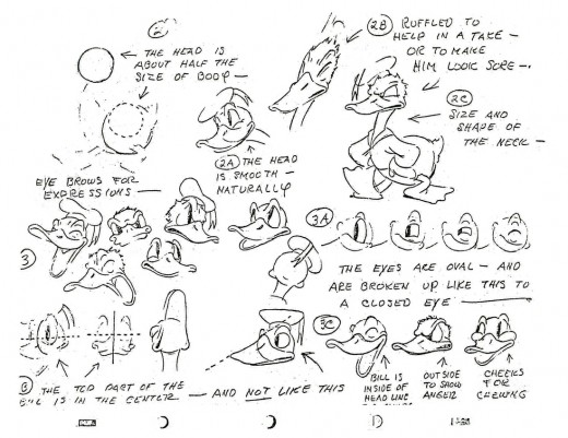
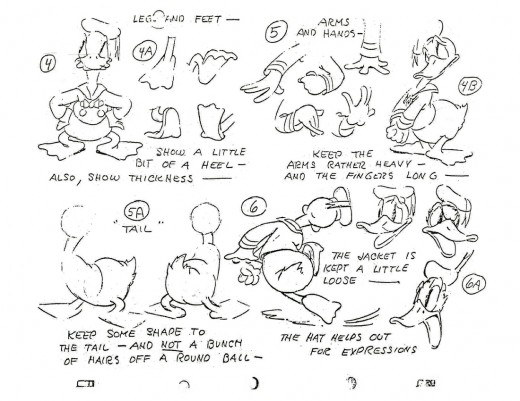
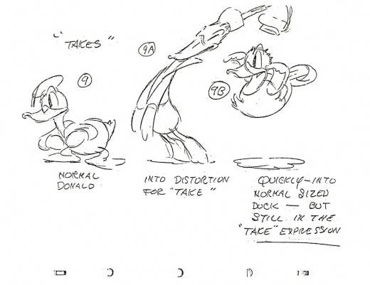
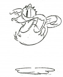 - A few weeks ago I posted the handout sheets that were given at Disney’s in 1938 to advise people on how to draw Mickey. The same was done for Donald, Goofy and Pluto.
Here are the notes from the Fred Spencer class analyzing Donald Duck. There’s a lot here that even the Disney studio sees to have forgotten about the Duck. He’s a brilliant and unique character, and he hasn’t been done as well as he was drawn in the 30s.
These same notes appeared in a synthesized and cleaned-up form in Frank Thomas Ollie Johnston’s Illusions of Life. Somehow I prefer the slightly browning mimeo sheets from the studio. (Although mine are just a xerox of same.) These are all worth it for the incredible drawings on the last page.
 1
1 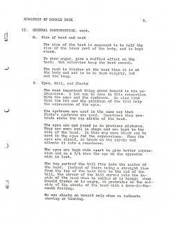 2
2(Click any image to enlarge.)
You can see what the actual pieces look like at Didier Ghez’ Disney History site. He posts two pages courtesy of Gunnar Andreassen.
Animation &Disney &Frame Grabs 11 Jul 2009 08:40 am
Whoopee w/names
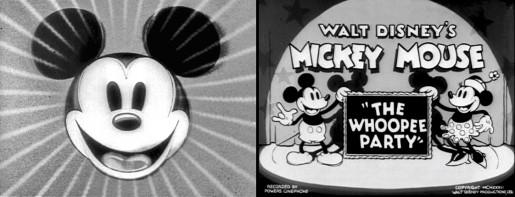
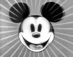 - Before there was video tape (which means before there were dvds), there was only 16mm film that you could project in your own home. I had (and still have) a nice collection of decaying movies and used to show these often. One of the regulars to show and watch and laugh at was the great Mickey short, The Whoopee Party. Everyone loved this short, no matter how many times we watched it. It’s a great film!
Hans Perk recently posted the drafts for this gem of a film on his amazing resource of a site, A Film LA. (Interesting that they spell the title “Whoopie” in the drafts, but use “Whoopee” on the title card.) Having produced a couple of posts full of frame grabs from this short, I decided to go back and add the animators’ names as sort of a mosaic, similar to what Mark Mayerson has invented in the blogosphere.

1.Hardie Gramatky | 2.Eddie Donnelly | 3.Les Clark

28. SA1 Hardie Gramatky | 28A. SA4 Les Clark | 29. SA1 Hardie Greamatky
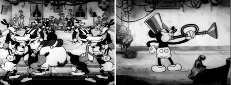
32. SA 1. Hardie Gramatky | 33. SA 31 Dave Hand

39. Johnny Cannon | 40. Hardcie Gramatky | 41. Norm Ferguson

41. (cont.) Norm Ferguson | 42. “Frenchy” de Trémaudan

43. Norm Ferguson | 44. “Frenchy” de Trémaudan | 45. Ben Sharpsteen

46. (cont.) 47. 48. Ben Sharpsteen

49. Ben Sharpsteen | 50. Tom Palmer | 51. Norm Ferguson

57. Ben Sharpsteen | 58. “Frenchy” de Trémaudan | 59. Tom Palmer

64. Tom Palmer | 65. “Frenchy” de Trémaudan | 66. Jack King
Animation &Hubley &repeated posts &walk cycle 09 Jul 2009 08:12 am
Recap – Georgia walk
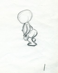
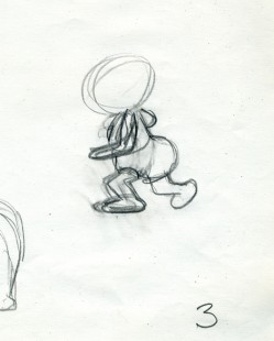
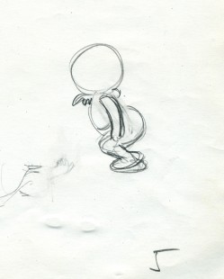
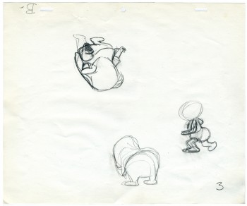 – Having posted a piece about John and Faith Hubley‘s Cockaboody yesterday, I thought I’d take the opportunity of showing off another older piece from Aug ’07. This walk cycle was animated by Tissa David. The drawings are partic-ularly rough – her first shot at the walk designed for her eyes only.
Tissa is careful not to use too much paper. Hence she reuses old paper for her very rough preliminaries as she figures out her animation.
It’s frequent, when visiting her work space, to see lots of pages featuring characters on both sides of the paper upside down as well as sideways. She doesn’t often let these rough roughs out of her hands before she throws them out. I guess I was there at the right time and talked her into giving me these drawings.
She animates the walk, here, on top pegs bacause that’s all she has left of space. Tissa nomally works on bottom pegs. Actually, since this is going to be a sliding cel, it would have been done top pegs anyway.
Georgia, the younger girl, leaves the bathroom and moves to the floor to play with a doll (whose head she accidentally pulls off).
 1
1 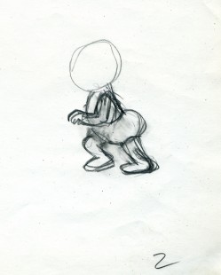 2
2
(click any image to enlarge.)
 3
3 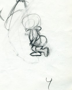 4
4
The walk is heavy and a bit flatfooted. She doesn’t come down on her toes but plants the entire foot.
 5
5 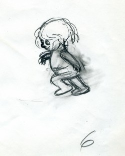 6
6
Her arms are high because, a baby, she’s still a bit off balance.
Click the very lower left to put the QT into motion.
Click the lower right to watch it a frame at a time.
Animation &Animation Artifacts &Tissa David 06 Jul 2009 07:29 am
A Simple Move
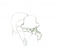
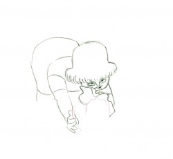
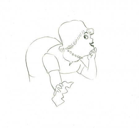
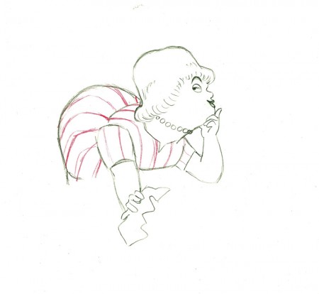
- Here’s what looks like a simple move done by Tissa David when she animated this Viva, paper towel commercial.
The character’s move in this scene is a complicated one done simply. She has been bent over, cleaning with her paper towel, and she moves up. You can follow the overlapping action as her eyes pull her up, head turn, and body follows.
The stripes will come and go. Tissa depends on someone else to concentrate on this material when she’s working on a commercial.
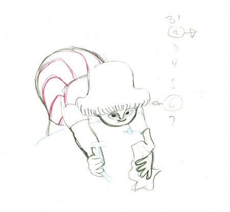 e37
e37(Click any image to enlarge.)
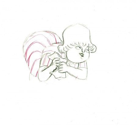 e44
e44
Her eyes point in the direction she wants to go,
and the rest of the scene moves her up and into profile.
This key move is hidden under the exchange of the
paper towel from one hand to the other.
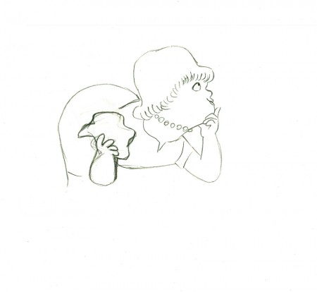 e51
e51
She stops to think (accenting her monologue.)
 e58
e58
And she slyly looks back to camera to respond with her thought.
 e59
e59
She continues, all through this move, talking.
She’s pitching the product.
Here’s a QT of the piece:
Cleaning for VivaClick left side of the black bar to play.
Right side to watch single frame.
Animation &Animation Artifacts &Chuck Jones &UPA 02 Jul 2009 08:01 am
Gay Purr-ee
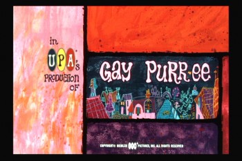 - I remember in 1962 going to the movies to see Gay Purr-ee, the very first showing – a late morning matinee. It was a bus ride away, but I was a fan big fan of UPA at the time. A 15 year old child who knew a bit about the impressionists and had read a lot about the early incarnation of this animation studio. The only shorts I’d seen were on the original Gerald McBoing Boing show, back in the fifties (when I was much younger.)
1001 Arabian Nights with Mr. Magoo had impressed me in some of its parts, but the notion of animating in impressionist art was more exciting to me.
I remember being impressed with the voice cast and soundtrack (which I quickly bought), some of the imagery and some bits of the animation. I loved the thick/thin outlines of the characters. I went back the next day to see the film again at a closer theater. This time I went late afternoon, which was a mistake. The kiddee matinee had brought a glob of ice cream melting down the center of the theater’s screen. It was hard to enjoy the beautiful painting with this dark, moving scar gracing the middle of the screen.
Despite seeing the film another half dozen times, since then, I didn’t really know much about the film’s production other than the credits I was able to view on screen. The Abe Levitow site offers a number of background paintings by the original designer, Victor Haboush, as well as Corny Cole and Bob Inman.
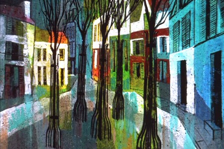
Here are two by bg’s Victor Haboush that are featured on the Levitow site.
I just earned from Tom Sito‘s blog that Mr. Haboush died on May 24th at 85.
He was a gifted designer and artist.
.

.The paragraph written on that site tells about the layoffs at Disney after Sleeping Beauty and how this brought an influx of talent to UPA. Many had worked on the Dick Tracy and Mr. Magoo tv cartoons that were produced but the feature better utilized their talents.
This isn’t much different than the story Jack Kinney tells in his book, Walt Disney and Other Assorted Characters. After he was pushed out of Disney, he ended up directing Magoo’s Arabian Nights. (He talks so little of it that he gives the impression he didn’t enjoy the experience.)
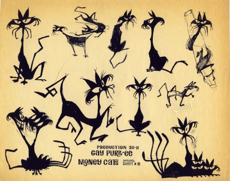
This is a Corny Cole model of the “Money Cats” from the film.
.
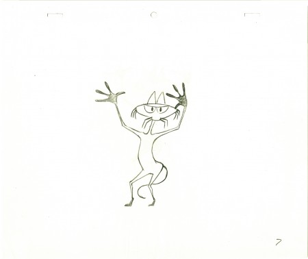
This is an animation drawing I have of one of them.
It’s not as angular or graceful as Corny’s drawing, but I still like it.
.
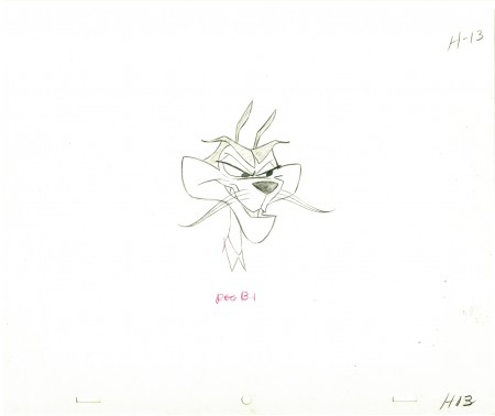
And this is an animation drawing I have of
Meowrice, the film’s villain.
.
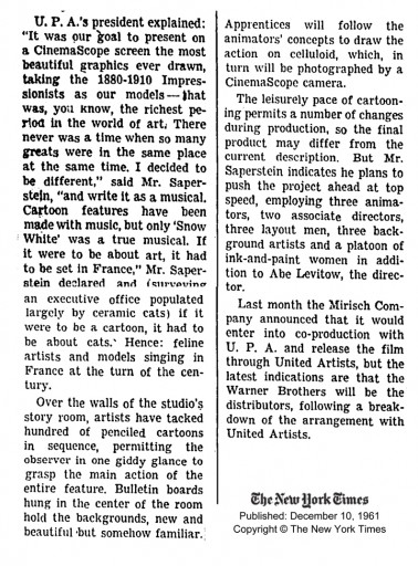
I have lots of the press material from the period stuffed into a scrapbook I have in storage. Not much of this is available on line, but I did find these two pieces in the NYTimes:
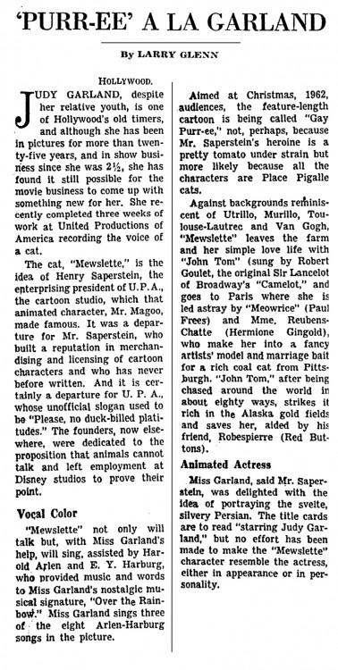
(Click any image to enlarge.)
Here’s the review that was published in the NYTIMES
- GAY PURR-EE
By BOSLEY CROWTHER
December 6, 1962
MOVING (for the second time) into the animated feature domain created by Walt Disney, U.P.A. Productions has contributed a pretty, pleasant, seasonal package for family audiences called “Gay Purr-ee.” The contents of this Warner release, which opened yesterday in neighborhood theaters, should make anybody’s mouth water, including Mr. Disney’s.
Consider: Judy Garland, no less, and Robert Goulet providing the singing and speaking voice tracks for the leading cartoon roles in a cute fable about a little country cat who goes to Paris. Add a battery of technical wizards who create a fetching color canvas that blends some truly lovely pastels with classical works by art masters. Add also eight new tunes by Harold Arlen, including one knockout. But the picture, hélas, is not.
At the risk of sounding like Scrooge, one U.P.A. fan feels that the film has everything but real wit. And what an opportunity, especially with Mewsette, the dainty little fugitive from Provence (Miss Garland), naïvely involved with some purring city slickers before being rescued by hel stalwart country swain, a champion mouser named Juane-Tom (Mr. Goulet).
Now, with all due respect to the film’s good-natured tone and diverting backgrounds, the first half is rather studied and even familiar, as directed by Abe Levitow and written by Dorothy and Chuck Jones. In contrast to the pictorial wizardry—rearranged Von Gogh landscapes and a tilted, spangled City of Light flavored with Toulouse-Lautrec, Modigliani, Matisse, Cézanne and others—the characters almost pale by contrast.
Mewsette, a nice enough little lady cat, is most interesting when Miss Garland is warbling — superbly — such ballads as “Roses Red” and “Take My Hand, Paree.” The same goes for the villainous Meowrice (Paul Frees), a fairly standard menace with a fine, jazzy theme song, “The Money Cat.” Furthermore, the snug, simple plot is needlessly stretched. Even with little Mewsette pining away in Paris, her would-be rescuer and his sassy, furry sidekick Robespierre (Red Buttons) are way off in Alaska.
The nearest thing to spice is the heroine’s jowly, pink “chaperone,” a shady lady named Mme. Rubens-Chatte (drolly spoken by Hermione Gingold). Even with the songs and the brilliantly stylized backgrounds, one can’t help wondering what a Disney crew would have concocted in earthy slyness and spontaneity.
In the final reel, though, things hit high gear in an old-fashioned chase scramble, against a superbly imaginative panorama of Paris, while the cats prowl the quays and the Notre Dame gargoyles toward a final, funny free-for-all. This portion also contains the film’s visual highlight, as Miss Garland sings one of Mr. Arlen’s great blues numbers written for the screen, “Paris Is a Lonely Town.”
So who needs eggnog for Christmas? “Gay Purr-ee” is a nice, soft drink for all the family.
‘Gay Purr-ee’ Cartoon , screenplay by Dorothy and Chuck Jones; directed by Abe Levitow; produced by Henry G. Saperstein for U. P. A. Productions; presented by Warner Brothers.
At neighborhood theaters. Running time: 86 minutes.
Voice of:
Mewsette . . . . . . . . . . . Judy Garland
Juane-Tom . . . . . . . . . . Robert Goulet
Meowrice . . . . . . . . . . . Paul Frees
Robespierre . . . . . . . . . Red Buttons
Mme. Ruben-Chatte . . . . Hermione Gingold
Animation &Animation Artifacts &Disney 01 Jul 2009 07:55 am
Stromboli – Part 5
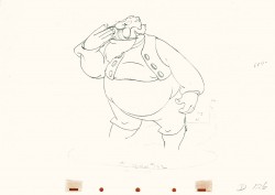
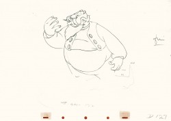
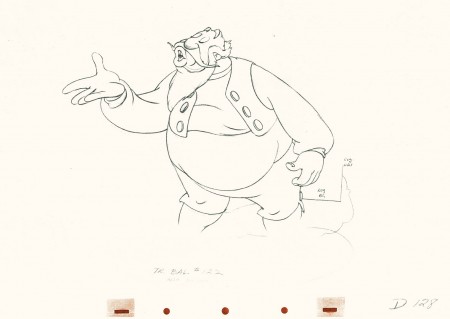
- This is Part 4 of this large scene by Bill Tytla of Stromboli.
Part 1 saw a frenetic anger from Stromboli;
Part 2 he caught himself to get a hold on his emotions.
Part 3 he slowed down and prepared for the kiss (a break)
and the bow featured in Part 4.
This final part is on twos, as he slowly slowly moves across in the bow and gets up to salute.
It’s obviously beautiful work and a gem of scene.
There’s no doubt the key Assistant had a lot to do with the final scene as displayed here. Tytla had enormous respect for his clean up assistants and gave such credit. (You can read it in the Action Analysis class, posted on Hans Perk’s A Film LA site.)
-
“The first assistant must know as much as possible about animation. I think first assistant’s experience is the most practical way to get animation – you have everything that the animator has been working on – his exposure sheets, drawings, etc., and you know what he is trying to do.”
David Nethery has added the soundtrack from the final film and synced it up to this Pencil Test here.
We pick up the rest of the scene with the very next drawing.
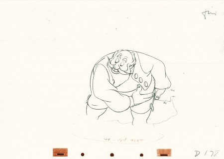 178
178(Click any image to enlarge.)
Here’s the final QT of it all together:
Stromboli
Click left side of the black bar to play.
Right side to watch single frame.
Animation &Animation Artifacts &Disney 24 Jun 2009 08:19 am
Tytla’s Stromboli – 4
- This is Part 4 of this large scene by Bill Tytla of Stromboli.
Part 1 saw a frenetic anger from Stromboli; Part 2 he caught himself to get a hold on his emotions. Part 3 he slowed down and prepared for the kiss (a break) and the bow upcoming in this, Part 4. Much of this part is on twos, as opposed to part 3 all on ones.
This is animation tour de force and there’s one part left to go next week.
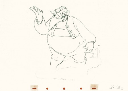 130
130(Click any image to enlarge.) The full scene with all drawings.
Click left side of the black bar to play.
Right side to watch single frame.
Animation &Animation Artifacts &Hubley &Models 19 Jun 2009 07:19 am
Carousel’s Lovers
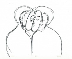
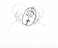
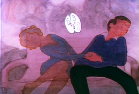
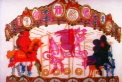 - Let’s take a look at the scene in Hubley’s Everybody Rides the Carousel
wherein the young lovers have had a spat and push on to have a romantic scene despite the fact that neither of them wants to do that.
They’ve argued over the girl having cut her hair without telling the boy. He’s annoyed and she laughs at him. They push on to a frothy conversation. Both put on masks to continue the conversation while the inner characters
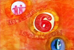 are annoyed and have an inner monologue. They get to the point where they can’t take the masks off and end plling away from each other.
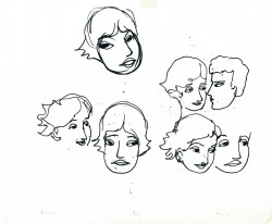
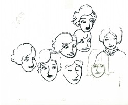
I’ve gathered John Hubley’s layouts for this sequence. Tissa David animated them. You’ll note that the pencil numbers are a scene breakdown done in Tissa’s handwriting. The very loose drawings were done with a sharpie or pencil. The pencils would have been done while in handing it to Tissa during the conversation. They’re to delineate some point in greater detail for her.
I’ve also pulled some frame grabs so you can see how it was finally rendered. The coloring was done on vellum and shot bottom light. No more than 3 levels were used (including the background.) Tissa, aside from concerning herself with the dramatics of the scene, had to watch that the characters didn’t overlap. More complication for her.
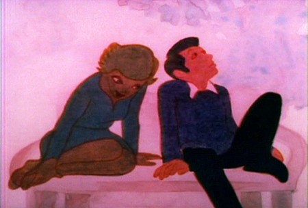
(Click any image to enlarge.)
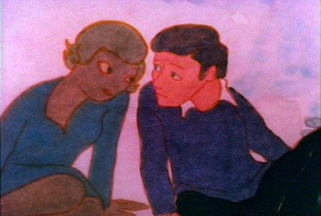
By the way, this was Meryl Streep’s first screen performance.
Charles Levin, another NY character actor, played the boy.
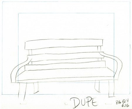
Here’s the park bench.
A quick rough copy by me to Tissa of John’s Bg LO.
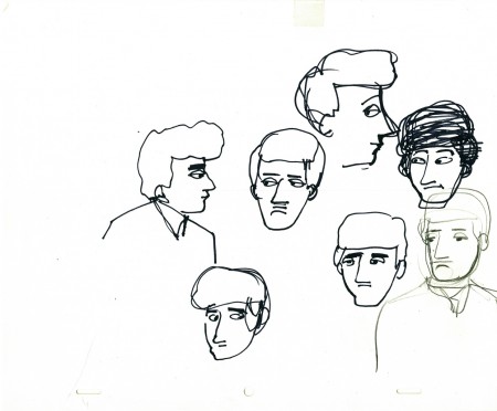
John’s model of the boy’s head for Tissa.
Animation &Animation Artifacts &Disney 17 Jun 2009 07:39 am
Tytla’s Stromboli 3
- This is part 3 of this large scene by Bill Tytla of Stromboli. The scene started in Part 1 with thoroughly frenetic anger from Stromboli. In Part 2 he tries to catch himself and get a grip on his emotions. Here in Part 3 he moves slowly and takes a 180° turn from where he started. The line against the curve. All this while playing out the lines from the scene. The drawing is stunning, the motion is brilliant, and the acting is the best animation has to offer. Those hands are just great; look at 126.
I pick up with the last drawing from Part 2.
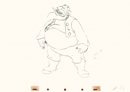 86
86(Click any image to enlarge.)
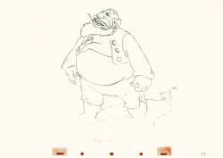 87
87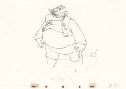 88
88
Tytla made sure he firmly planted Stromboli’s feet (in part 2)
before he attempted this firm bow.
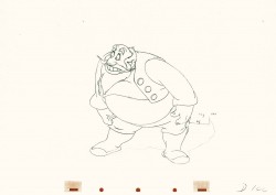
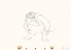 101
101
He’s made a solid line of the back, the strength of this move,
by using the left arm held firmly in place.
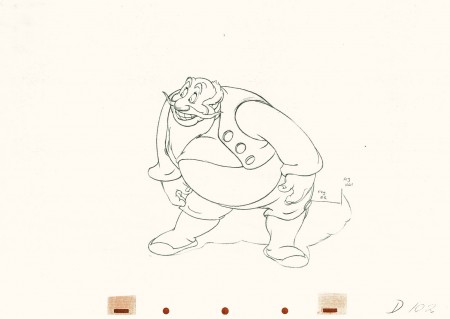 102
102
This is the bottom of the bow, now he goes back up.
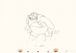
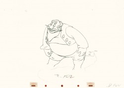 104
104
All of the shapes change naturally in the bow, though it looks
as if it remains a solid. No noticeable change. Solid weight.
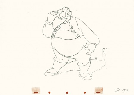 122
122
Watch the timing on the hand from here to #128
as Stromboli blows a kiss.
Many an animator today would pop it and call it animation.
Click left side of the black bar to play.
Right side to watch single frame.
 1
1
 2
2
 3
3
 4
4
 5
5
 6
6 7
7 8
8 9
9 10
10
 11
11
 12
12
 13
13 14
14
 15
15
 16
16 17
17


