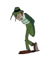
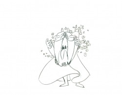
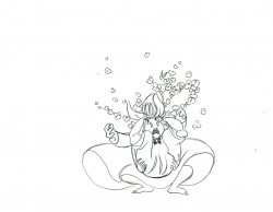
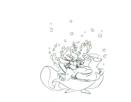
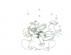
Category ArchiveAnimation
Animation &Animation Artifacts &Articles on Animation &SpornFilms 09 Dec 2009 08:09 am
Interviewing Bridget
- For a short while I produced a quarterly publication, called Sporn-O-Graphics, that promoted the work and the workers at Michael Sporn Animation, Inc. It was mailed free to about 1000 people on a list we’d put together. The idea was to talk about our films and the people who had made them. There were a total of six issues of this paper. I’ve posted a couple of the issues or more interesting bits in them on this blog, (here and here) and today I’d like to post an interview that was in one of the last issues. Bridget Thorne was as important to me as anyone who’s ever worked here. Denise Gonzalez also worked for me – at the time she edited and put together Sporn-O-Graphics.
Behind the Scenes with
Bridget Thorne
Interview by Denise Gonzalez
Bridget Thorne is a background designer who has been an important part of Michael Spom Animation for more than fifteen years. In that time she has enhanced the look of MSA films with beautiful backgrounds that are, in a way, part of the characters rather than just a scenic backdrop.
 DG: How long have you been working with Michael Sporn?
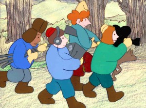
BT: I first started working for Michael in 1979 on Byron Blackbear And The Scientific Method, a fifteen minute short for the Learning Corporation of America. It is actually one of my favorites. I started out as a scenic painter for plays. I worked with a designer and basically dressed the set. We’d paint the exteriors, lay in wallpaper, marbleizing floors, etc. I started at Williamstown and at Playwright’s Variety in New York, I did a lot of off Broadway and off-off Broadway.
DG: Do you see background painting as a complete picture or as a supplement to animated artwork?
BT: It’s a supplement.
 DG: How do you take that into consideration when you start the backgrounds?
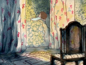
BT: Ideally, I take into consideration how the characters are designed. I like the characters to be part of the picture, not stand out like they do in Saturday morning cartoons. It all fits into a stylistic sensibility or pace more than anything else. I’m not a cartoon snob, I’m more of a two dimensional artist than a filmmaker. I design my backgrounds and line style according to the way the characters are designed. What I used to try and do was color the backgrounds, to match the colors of the characters. You work out of your home rather than at the studio. What are the benefits or drawbacks of working this way? I’ve just started doing this and yes, there are benefits. I can get into my own head, and I take off more with ideas because I’m not interrupted as much. But I like being in the studio and staying with the rest of the production as it goes along.
DG: Do you prefer working on original stories or from an existing book?
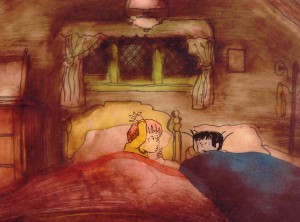 BT: It depends on the story. Let’s say IRA SLEEPS OVER, it was great working out here on that because with an existing story you have a style to imitate, and it is easy for a whole bunch of people to follow that when they’re all working in different places. So as far as production goes, that makes it easier. The great thing about original scripts is that they allow for an incredible amount of individual input. What do you take into consideration when designing the look of a film and what preparation is involved? It depends on the story. I tend to have a knee jerk reaction at first or an impulse. I have a Fine Arts background, and I tend to rely on painters. I find fine artists are more in tune stylistically with Michael’s films than the more hard-edged graphic cartoons. (Though I will look at Disney inspirational drawings.)
Then I look at the layouts and the character design, so I sort of work on intuition and impulse. Then I look at the existing elements and put those all together and come up with a design. As far as preparation goes, what I consistently do is make 5×4 sketches of design ideas. For ABEL’S ISLAND I did lots and lots of little paintings of winter and fall and spring.
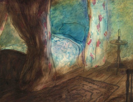
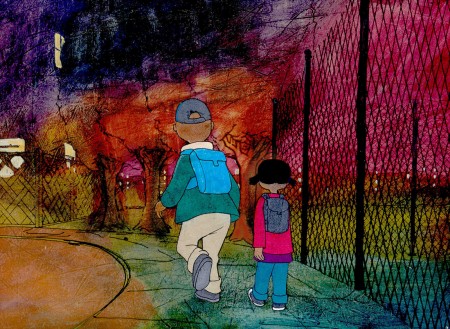
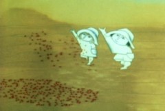
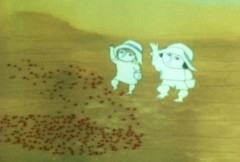
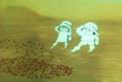
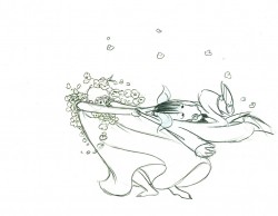
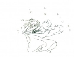
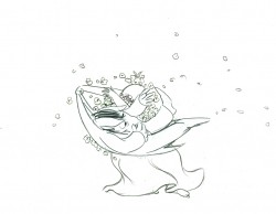
First three illustrations pictured above:
1. BYRON BLACKBEAR AND THE SCIENTIFIC METHOD.
2. A CHILD’S GARDEN OF VERSES.
3. IRA SLEEPS OVER
DG: When designing the film do you take into consideration that this will be seen by a child?
BT: I’m not a cartoony person so I don’t think about that. I tend to think more — sometimes I run into trouble this way — I think of it in a frame and ideally what I really want is a balanced look on the screen. A lot of times that’s hard because what I see in front of me is so different when it is filmed.
DG: What do you consider to be the best example of your work thus far?
BT: I guess ABEL’S ISLAND. I was able to abstract a little. I wasn’t confined to chairs and bureaus. I was able to match the mood of the movie to the backgrounds. If Abel was in trouble, I could put colors that indicated that, or I could abstract it. If something was calm I could paint it calmly. Abstraction, or looseness, is more my personal style. This is true of Michael’s style, as well.
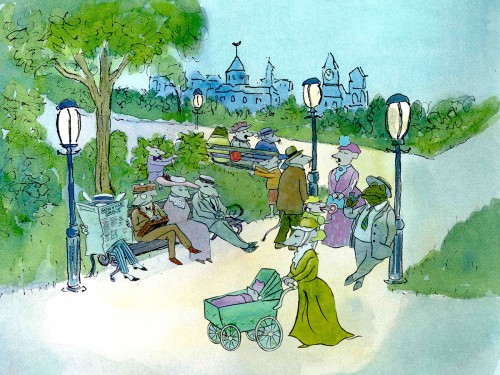
A scene toward the end of ABEL’S ISLAND.
DG: Have you ever worked on a film you couldn’t connect with?
BT: I’d say yes. It’s a hard question to answer off the top of my head. I sort of think of movies like they were kids; they are either noisy or funny or quiet or sad. They all have their own characteristics, and it is really the process of making the movie that attracts me to animation. I tend to have different feelings about each movie. But yes, sometimes a story irritates me or something comes in and it doesn’t suit my style or what I imagined. It can be very difficult. That’s an interesting thing about animation; there is really a sense of compromise; you are compromising all the time.
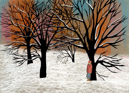
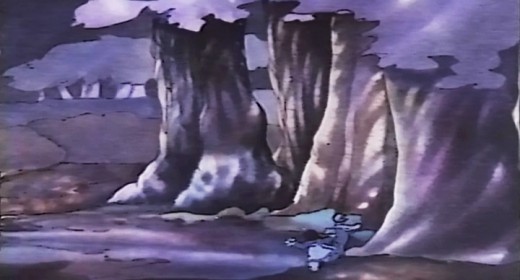
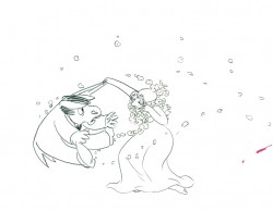
A scene of the narrator at the end of THE TALKING EGGS.
Animation &Animation Artifacts &Commentary &Events 08 Dec 2009 09:02 am
Dilworth/Mr. Fox/Thomas ruffs
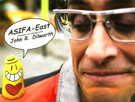
Tonight, ASIFA-East is presenting an evening with John R. Dilworth. This means that John will be there with a number of surprise guests from his past and present, including Howard Beckerman, who taught him; me, who hired him; and Courage the Cowardly Dog, who was drawn by him. Given John’s affinity for the unexpected, it’s doubtful that it’ll be the typical Q&A.
Some of his shorts will be shown as well as several of his films. I could tell you which ones they are, but that would spoil the surprise.
The festivities begin at 7pm at the School of Visual Arts, 209 East 23rd St, 3rd floor amphitheatre. The admission price is free and worth every bit of it.
Of course, if you insist on buying some things, ASIFA calanders will be sold as will John Dilworth goodies.
.
 - Once again, let me promote The Fantastic Mr. Fox, an animated feature that I just love. There was a good interview with director, Wes Anderson, on Charlie Rose 11/30/09. There’s no direct link from here, but you can see this clip by going to Charlie Rose ‘s website, then typing in Wes Anderson on the search box. You can see the whole interview (about 30 mins) there.
.
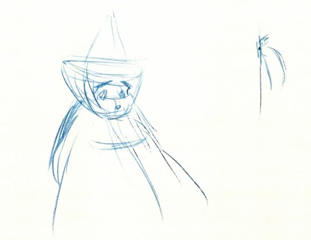
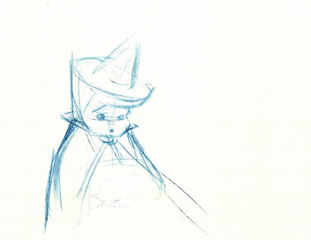
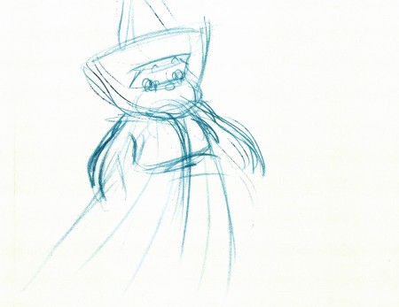
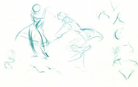
- Now for something different. Just for the opportunity of showing off some beautiful blue-pencilled ruffs by Frank Thomas, loaned to me by John Canemaker, I’m going to post them here. They’re from Sleeping Beauty, of course.
 1
1
 4
4
This last one is from Ichabod and Mr. Toad –
The Legend of Sleepy Hollow. Ichabod and Katrina.
_______________
- The most peculiar news story of the week was the headline at the top of Sunday’s NYTimes. It talked about a Taiwanese company that was creating their own videos of the news using cgi animation. The Times reports that the “. . . Taiwanese newspaper, Apple Daily, has dozens of programmers, designers, animators, even actors on its staff . . . responsible for scripting the videos.” We were shown a poorly created video of Tiger Woods (they admit that it didn’t really look like him, but they were happy over the color of his skin and his hair.) Maybe Robert Zemeckis could help out.
The question is how long it’ll take for ALL newcasts to include animated stories because they’re too lazy to do the actual reporting. Get rid of newspapers and make up your own videos. Apparently, MSNBC’s Keith Olberman made some sly comments about it. When he needs to make up the stories, he uses his “finger puppet theater.” In Taiwan they use cgi.
The world’s gone berserk, but now there’s a whole new line of work for animators of the future.
Here’s the YouTube presentation of that newscast.
Animation &Animation Artifacts &Disney 07 Dec 2009 08:43 am
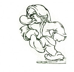
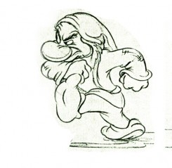
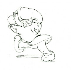
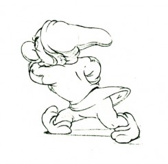
Dwarf walk
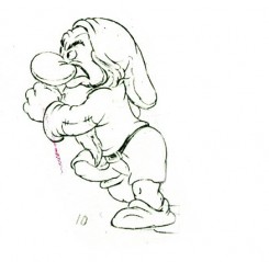
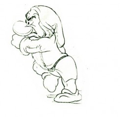
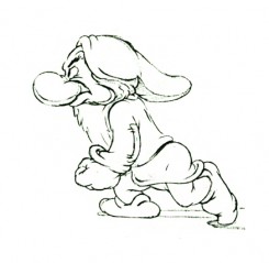
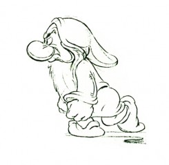
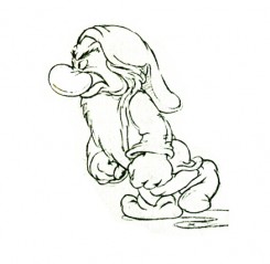
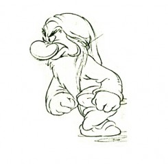
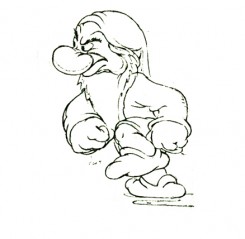
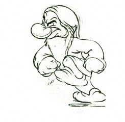
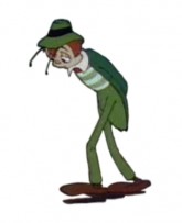
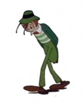
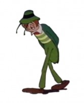
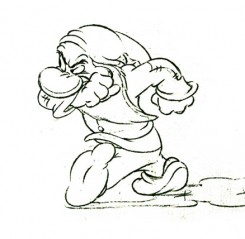
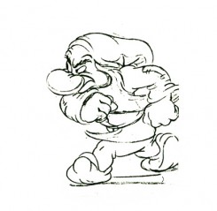
- Here are the drawings of Grumpy walking in a huff. Bill Tytla was the animator. The images come from a photostat which prepared the material for publication. A couple of these drawings appeared in the Thomas-Johnston book, Illusion of Life. The sequence, here, is missing drawing numbers 6,7 and 8.)
 1
1 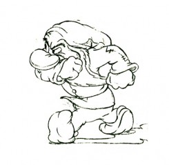 2
2Note how he starts with his shoulders high.
 3
3 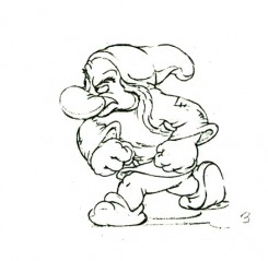 4
4
His bent leg, at this point, takes the weight of his body.
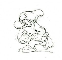 5
5 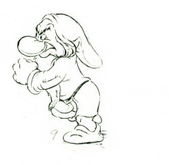 9
9
He moves his body up, high . . .
(Note that we’re missing drawings 6, 7, and 8.)
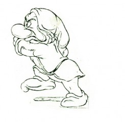 12
12 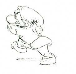 13
13
. . . then twists his entire torso.
 14
14 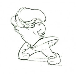 15
15
The straightened leg makes contact.
 16
16 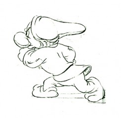 17
17
Again the shoulders go high as the pattern repeats on the other leg.
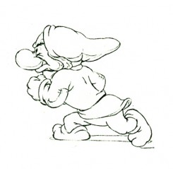 18
18 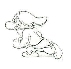 19
19
Note the detailed attention to the flow of the clothing throughout.
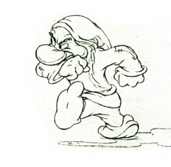 28
28
(Click any of the above images to enlarge.)
The following QT movie is on one’s with
the exception of dwngs #5, 9, & 11 on twos
to make up for the three missing drawings.
Right side to watch single frame.
Animation &walk cycle 30 Nov 2009 08:58 am
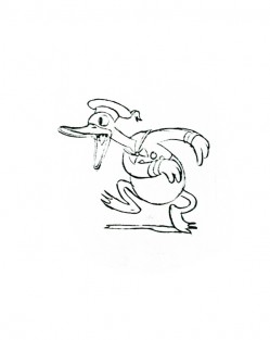
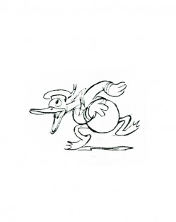
Donald Dance Flipbook
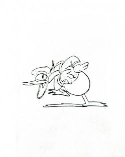
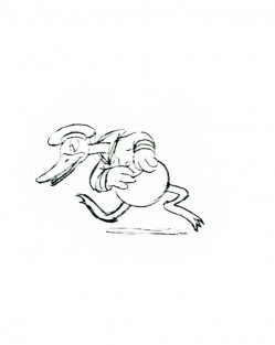
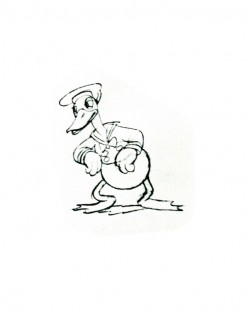
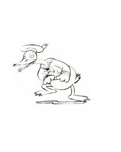
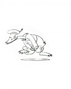
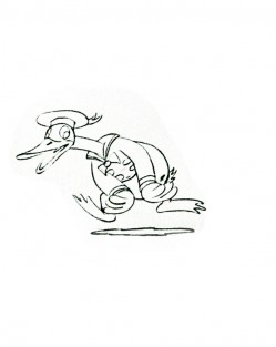
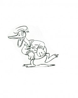
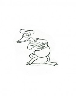
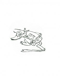
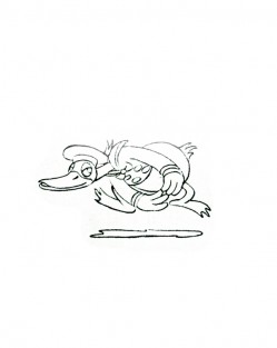
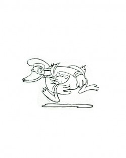
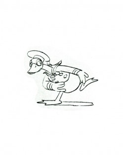
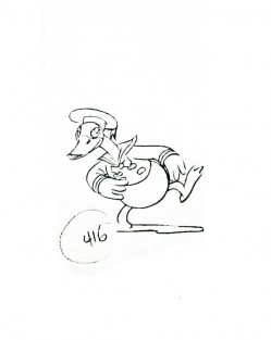
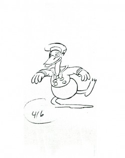
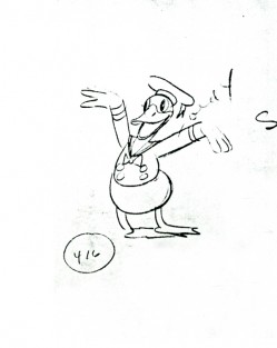
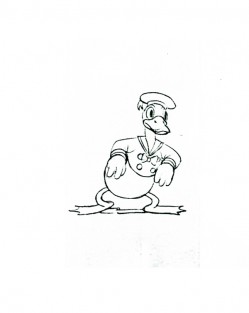
- Here is a small bit of Donald Duck animated by Les Clark for Mickey’s Grand Opera. I’ve taken the bits I have and ran them through AfterEffects just because I like the drawings and wanted to see how they played out. I just love this Donald.
 1
1 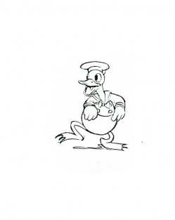 2
2(Click any image to enlarge.)
Donald’s Dance
Right side to watch single frame.
Animation &Books &Commentary 25 Nov 2009 09:07 am
Conflicts
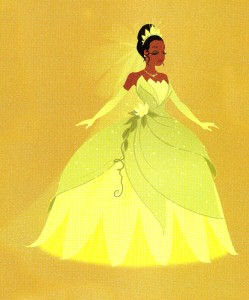 - Today’s the day that The Princess and the Frog opens in two million theaters. It’s being called 2D animation’s last best chance of survival. Of course, that’s ridiculous; I don’t accept it for a minute. Just as I didn’t accept it when Eisner at Disney or Katzenberg at Dreamworks proclaimed 2D animation dead, several years ago.
But I’m conflicted.
Certainly, I want it to do well – extremely well; I’d like it to make the road easier for the next non-Winnie-the-Pooh feature at Disney. But I don’t think that this is going to be the best of the recent features – cgi, stop-motion OR hand drawn. I’m sure there’ll be a couple of tour de force animation sequences. Yet, there’s not much pulling me to any of those 2 million theaters.** I just don’t have the highest of expectations. Looking at the “Art” in the book, The Art of The Princess and the Frog didn’t warm me toward the film, either. There aren’t many pictures in the book that remotely represent “Art” to me.
Yet, I am looking forward to seeing it. Because it IS 2D animation drawn by some of the most acclaimed animators in the industry. I am anxious for them and want it to supersede my trepidations and be a positive for animation. The truth is that I don’t know what I’m going to see, and I want it to be better than the trailers and books promoting this film.
When I saw all the advance bits and pieces of The Fantastic Mr. Fox, I hated what I saw. I could imagine only negatives. The more I saw, however, the more I was being won over by the voice cast. When I saw the film, I loved it. I mean, I LOVED it. I’m looking forward to seeing it again . . . and again. Wes Anderson pulled together a brilliant film full of charm and wit and intelligence. It not only was one of my favorite animated films of the year, it was one of my favorite films . . . period.
Perhaps, that’s what’s in store for me with The Princess and the Frog. Perhaps the animators will overwhelm me, the directors will have a new vision, the artists will get to me. Perhaps, I’ll see everything I hope for. But I’ll have to wait.
I was set to see a screening on Dec 1st. But I can’t. There’s another more important event that evening. (Anytime live people are involved it wins hands-down over a filmed event.)
There’s the celebration at the Paley center of Mr. Magoo’s Christmas Carol, complete with a panel consisting of Darrell Van Citters, Animator and Author of Mister Magoo’s Christmas Carol: The Making of the First Animated Christmas Special, Judy Levitow, Daughter of Magoo Director Abe Levitow and Marie Matthews, Voice of “Young Scroogeâ€. I’ll be at the Paley Center.
I’ve arranged to see The Princess and the Frog on Dec. 5th. That’s Walt’s birthday, so it seemed appropriate. It’s two weeks after the opening, but I’ll manage. Or if not, I’ll do like everyone else and pay to see the film. The problem is that I’ve been seeing about five films a week (it’s Academy screening time), and sticking another one in there is difficult. We’ll see. Consequently, if I do give honest comments on this film (not that anyone is waiting) it’ll have to hold until then.
** Jerry Beck in the comment section wrote: that the film opens in “one or two theatres today in NY and LA. It opens in “two million theatres†on December 11th.” My mistake.
Regardless, the film got reviewed today. The race issue presented problems for some:
- Manohla Dargis’ NYTimes: Not quite glowing, she says the “. . . finale, like the story itself, represents progress of a kind, I suppose, even if this princess spends an uncommonly long time splashing around as a frog. A frog whose green hue suggests that, if nothing else, Disney finally recognizes that every little girl, no matter her color, represents a new marketing opportunity.”
The NYDaily News: (3 stars)”The good news is that “P&F” quickly cruises past the fact that Tiana is Disney’s first African-American heroine. Unfortunately, the story that surrounds her often finds itself stuck in the swamp.”
The NYPost
The Village Voice: A not enthusiastic review: “Much ballyhooed as Disney’s return to its tradition of 2-D “cel” animation after a five-year hiatus, The Princess and the Frog is pleasantly, if unmemorably, drawn. But the movie as a whole never approaches the wit, cleverness, and storytelling brio of the studio’s early-1990s animation renaissance . . .”
- Today’s also the day that The Fantastic Mr. Fox opens wide. Prior to this it played only four theaters in the US: two in NY and two in LA. It did exceptionally well at those four theaters; let’s hope it continues at a couple of thousand.
Go see it. That’s all I can say. This is a great film. Go see it.
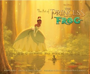 - Let’s back up a bit and talk about that book – The Art of The Princess and the Frog. This is only one of about 16 books Disney’s releasing on the film. I’ve read that they’ve been very successful with any merchandise featuring Princess Tiana. Everything from the Little Golden Book to a cookbook. The one that intrigues me most is the Learn to Draw The Princess and the Frog. (In the past, they would have called it “How to draw . . .”)
But back to the one Chronicle sent me hoping for a review. I’ve been a fan of Chronicle’s animation books. Amid Amidi‘s exceptionally well designed book, Cartoon Modern, was the first book of theirs that grabbed my attention. It did what other Art/Animation books should have imitated. Amid’s follow-up, The Art of Pixar Short Films was equally attractive, though I didn’t have much interest in the subject.
The book, The Art of the Princess and the Frog is also well designed, graphically, but the material is, for me, less than thrilling. I’m not sure I am in tune with writer, Jeff Kurtti‘s approach to structuring the book.
The book, itself, seems less about animation than about how to display the artwork offered. It breaks chapters into characters or settings and gives lots of models, storyboards and Bg examples. It makes for a very different format in the book and makes for a new way of organizing the material.

There are plenty of storyboard selections to view.
This sequence by Jeremy Spears.
There are a lot of quotes from many of the principal artists and animators involved, and the book plays out from those quotes. There are a lot of characters analyzed in the book, so I’m curious to see how they play in the film and how much screen time any of them get.
The end result, for me, is that there doesn’t seem to be a strong focus in the book. I’m not sure what I should be looking for. Is it just a big scrapbook of artwork promoting the film? Or is there a larger focus that I missed? But then I get the feeling that the film is a mish-mash of styles, itself. The book doesn’t help in this regard, but, of course, it’s a gathering of a lot of preliminary art, so it’s hard to tell.
Given the large number of art books on the subject of various animated films, I suppose there have to be other models for the “Artwork of . . .” series, but I’m not sure this is it.
There are some interesting bits about the film that were stated. For example, the chapter on Background design illustrates how the artists looked closely at Lady and the Tramp for “inspiration”. Here’s a breakdown in two illustrations that the book uses to discuss this inspiration.
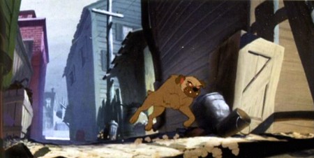
“. . . We looked at Lady and the Tramp not so much for the “application
of paint,” but definitely the caricature of shapes, and the compositional
elements. Large foreground elements utilizing the screen shape, and then
space of depth, and pattern, and a nice balance and rhythm of light shapes.”
.
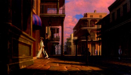
I wonder what Disney film the Art Directors of Lady and the Tramp
studied when they were preparing to design their film?
.

The Lady and the Tramp Bg as it appears in
Bob Thomas’ The Art of Animation.
.

Bg for The Princess and the Frog by James Aaron Finch..
Should this be an inspiration for me or for future animation artists? The Thomas book was a model for me; for years I studied, memorized and pored over every picture of that book. I wonder how I would react to this if I were young and looking for something to keep me enthralled with the medium.
We need to redefine the art of “The Art of . . .” books. They have to be more than a promotional device> Throw enough pretty pictures at the audience and you’ll make enough sales to cover cost and bring people to the theaters. Some creativity might be required.
Here are a few of them.
.

Two illustrations by James Aaron Finch. .”
.

Something lost. Something gained?.”
.
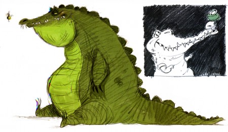
Bill Schwab on the left | Rik Maki on the right
.
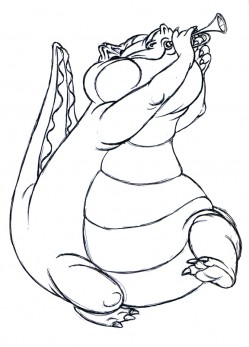
Eric Goldberg on the left | Bill Schwab on the right
.
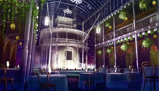
Bg by Doug Reggers. There are a lot of steamships in the book.
Animation &Animation Artifacts &Hubley &Tissa David &walk cycle 23 Nov 2009 08:52 am
Tissa Seeding
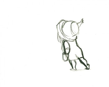
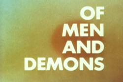 - Of Men and Demons, to me, has some of the finest artwork in any of the Hubley shorts. As I pointed out, once before, Tissa David told stories of reworking some animation by Art Babbitt, which was done on 12-15 levels and had to be reworked to come down to four levels. It was a monster of a puzzle for her and included reanimating some of the bits that were too complex to work properly in their reduced form. She then had to take over the sequence and complete the animation of it.
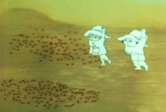
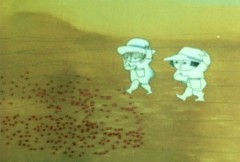
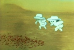
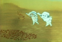
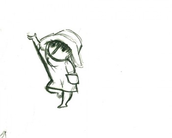
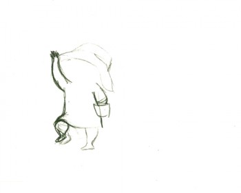
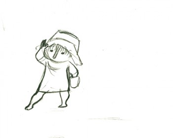
Here is a short piece that Tissa did of the little woman character seeding her front yard. There’s so much grace in every one of these drawings and enormous information in the walk, itself.
 G47
G47(Click any image to enlarge to full animation sheet.)
.
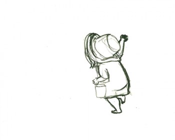 G49
G49.
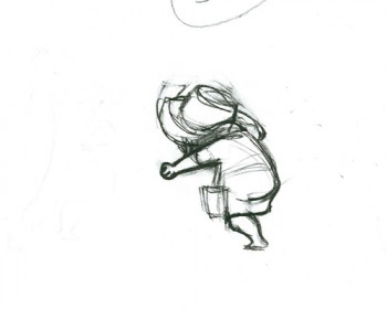 G51
G51.
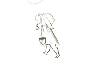 G53
G53.
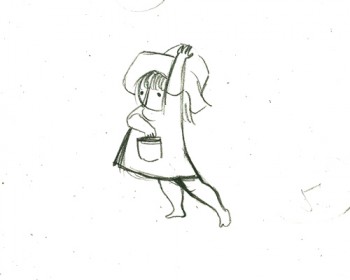 G55
G55.
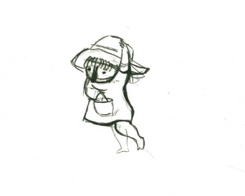 G57
G57.
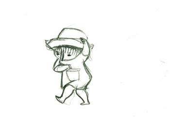 G59
G59.
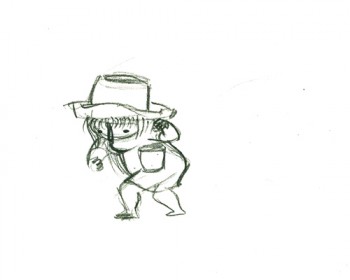 G61
G61.
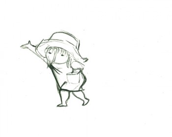 G63
G63.
 G65
G65.
 G67
G67.
 G69
G69
And here are the matching frame grabs from the film.
Seeding crops PT & Final Color
Click left side of the black bar to play.
Right side to watch single frame.
Animation &Animation Artifacts &walk cycle 12 Nov 2009 08:31 am
Tissa’s Ann Run
- Here’s a run Tissa David did for Raggedy Ann. The character is tiny in the frame. The entire scene is more than 45 secs long (no cuts); this run comes toward the end of it.
Tissa had the character run across two fields of paper, and animated a slight move of the background underneath her. Consequently, it feels as if she’s slipping in place a bit. However, if you see it in the film, you’ll see that she looks anchored to the BG.
 455
455If you click any drawing the actual animation sized paper will pop up.
 456
456
You’ll note that Tissa worked on standard animation paper – 10½ x 12½.
When Ann runs off the edge of one field, she pops to the other edge
of the next field. It saved having to work on 2 field paper.
Click left side of the black bar to play.
Right side to watch single frame.
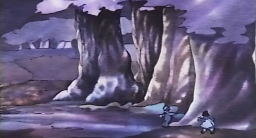
These are the first and last frames of this walk taken from the actual film.
It’ll give you an idea of how tiny they are in the frame, yet how large they were drawn.
David Nethery, in the comments section, left a link to a QT movie of this scene. You should read David’s excellent comment and check out the scene in motion.
Animation &Fleischer &Frame Grabs &walk cycle 04 Nov 2009 08:27 am
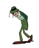
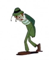
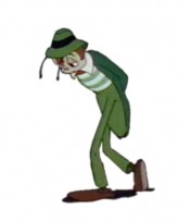
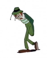
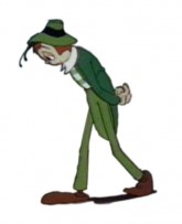
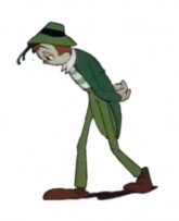
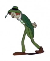
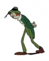
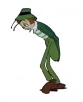
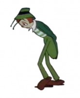
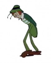
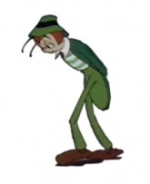
Hoppity walk
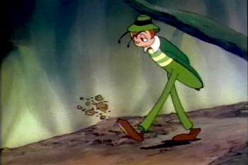 - Hoppity Goes To Town is a feature I’ll always love. The second and last feature from the Fleischer brothers’ studio is a bit limited in its animation, but I like the story and the way it’s told. Admittedly, this film is something of a personal favorite because I first saw the film in my formative years, age around 10. Today, I recognize some of the problems it has, yet I find it a completely charming and entertaining animated film.
The Fleischer studio had figured out how to make a cartoon, and this one was arguably ahead of its time. It’s the first animated feature based on an original story. The character of Hoppity, obviously built on the personality of Gary Cooper, is endearing to me, and I think the movement of this character not bad. There’s some distortion and bad drawing throughout the film, I don’t really mind.
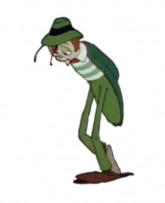
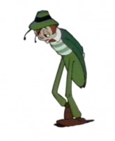
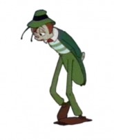
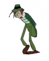
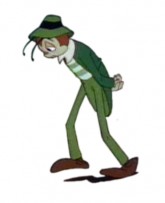
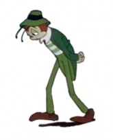
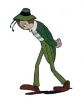
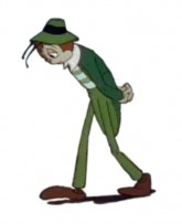
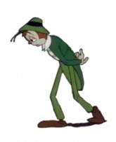
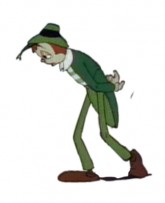
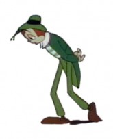
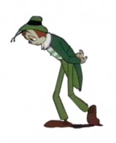
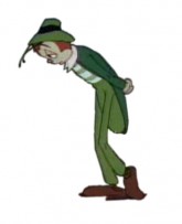
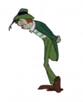
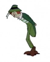
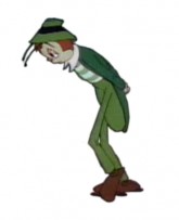
I’ve chosen a walk that was not quite a cycle, and I’ve made it one. It starts with a kick of dirt – Hoppity is disappointed and frustrated – and quickly moves into this section. It’s a slow walk – 52 frames, on ones – and is a complex one. He pulls both legs in a subtle and circular arc as they move forward, lumbering from left to right to left. His legs almost look like matchsticks split at the knees. It makes for an interesting walk (though they do change size a bit as they move.)
Here’s Hoppity:
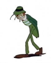 1
1 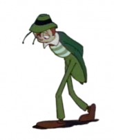 2
2 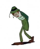 3
3(Click any image to enlarge.)
Hoppity’s sad walk on ones
Click left side of the black bar to play.
Right side to watch single frame.
Animation &Animation Artifacts &Story & Storyboards 02 Nov 2009 08:25 am
Medical Dilemma
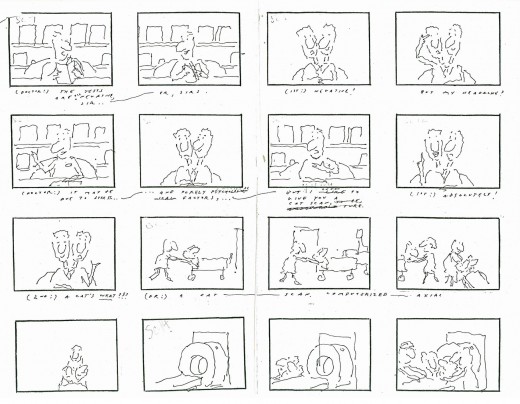
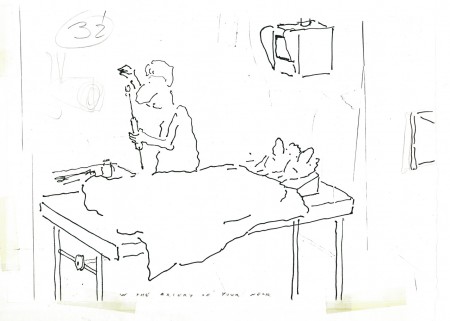
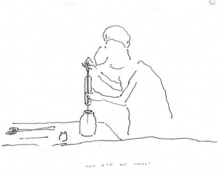
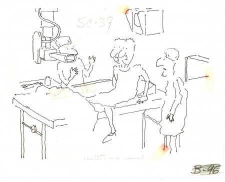
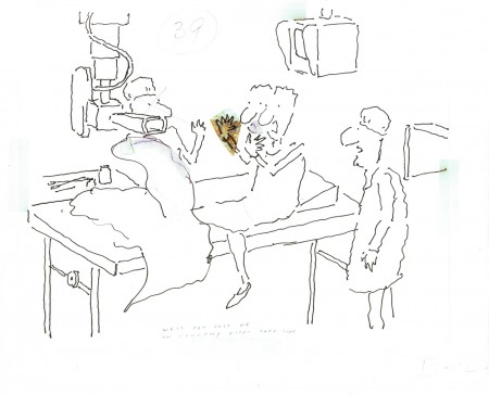
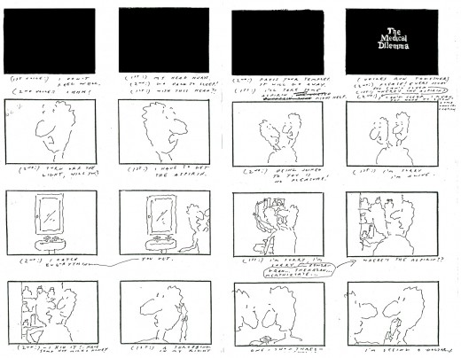
- One of the best, most intelligent films I worked on was a short film R.O.Blechman made for NBC television. The network was doing a three hour evening dedicated to the state of health care and hospitals in America. They wanted Bob to make a film about over-testing to find things to resolve a patient’s complaints.
Bob and I made numerous trips to Columbia Presbyterian Hospital to get information about procedures for testing the brain. This was back in 1977. CATscan tests were just then starting to come into their own. It wasn’t as frequently used as it is now. Other tests were demonstrated for us, and we spent several days watching these exams being done. Dyes being injected into the brain, machines that turned the patient upside-down, lots of big-named procedures
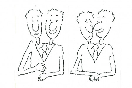
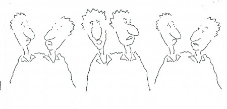
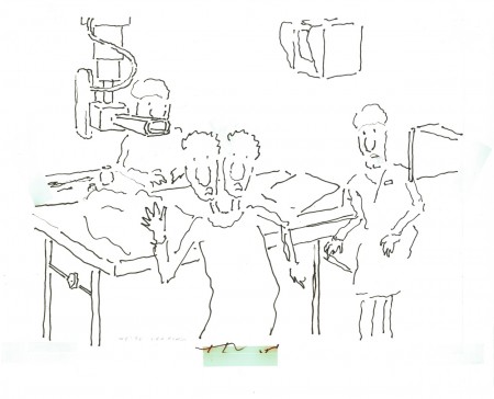
Bob wrote a piece about a set of siamese twins – a man with two heads. The two heads kept a running discussion about a headache one of them had. They went to a doctor who decided to do some basic tests. They discovered nothing. More tests – nothing. Finally, the doctor wants to try one more test. The twins see the needle and get off the table. They refuse this final test. The two heads join into one.
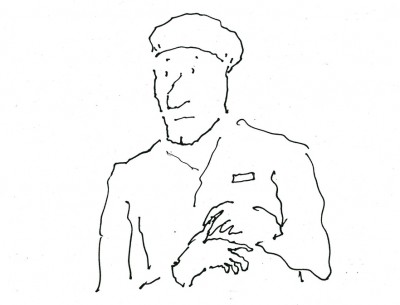
The doctor, in cu, starts to talk to himself, aloud. His head splits into four different opinions discussing the situation, and the film ends.
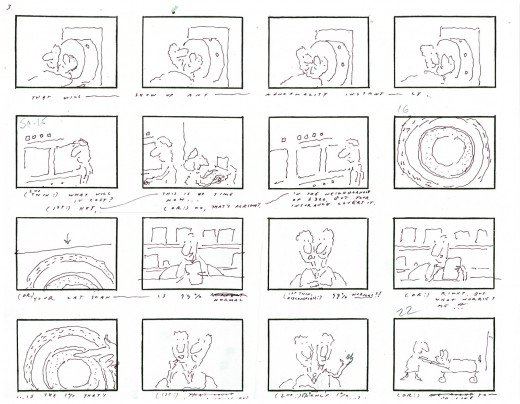
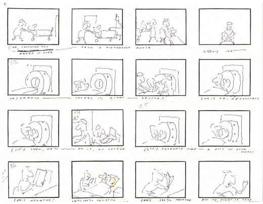
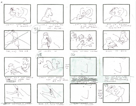
Here’s Bob Blechman’s storyboard for the film.
 1
1(Click any image to enlarge.)
The whole film, about four minutes, had fewer than four months from beginning to end. The board went through lots of changes on the fly as the animators worked. Tissa David and Ed Smith were the primary animators on this film, although Ed did the scene I most think about within the film. The third and last animator on was Cosmo Anzilotti. I assisted all of them in whatever their needs – clean-up, inbetween or inking.
There was at least one scene of genius in this movie.
That final cu at the end of the board where you see the face of the doctor fill the screen – it animates in on him – all lines, just lines, that completely told that doctor’s thoughts and mindset. Lines on the screen that you completely bought as a face. A face with multiple voices and personalities arguing with itself. It was brilliant and remains one of my all time favorite bits of animation.
The voice of the twins was done brilliantly by the late, great Anthony Edwards. He was the perfect voice for the Blechman character, and he did quite a few of them over the years. This was one of his finest performances for Bob.
Here are some of Tissa’s drawings and layouts:
 1
1This collection of drawings stood over Tissa’s desk while she animated.
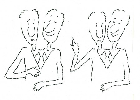 a
a
Here, I’ve broken that long piece into three smaller.
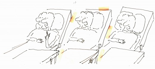 2
2
This is another drawing from above her desk.
The yellowing is the tape that held the drawings together.
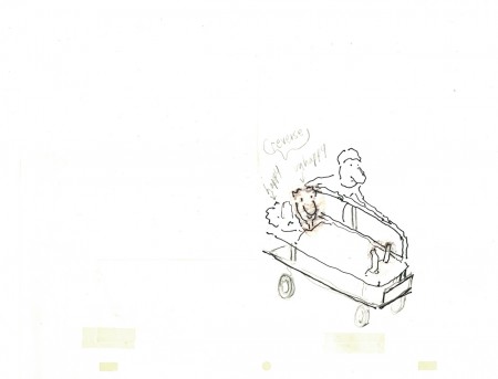 3
3
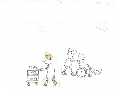
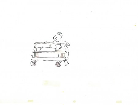
The twins being wheeled to their exam.
 4
4
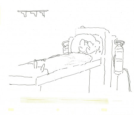
Passing gurneys in the hospital hall.
 6
6
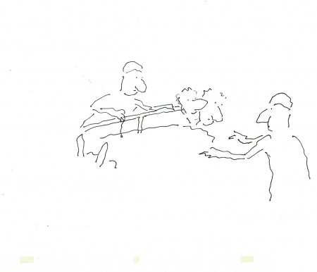
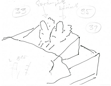
Here the twins are about to face a CATscan.
 8
8
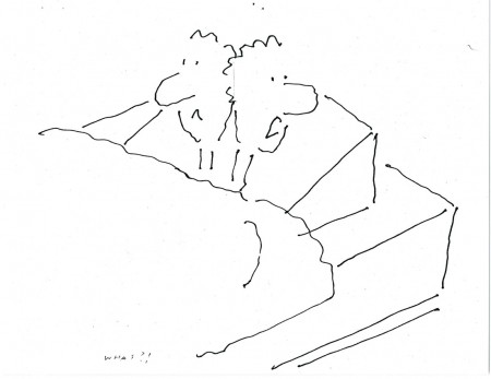
The patients questioning the final test.
I don’t know how you’d get to see this film, but I hope it shows up sometime. I have a 16mm copy, but I haven’t transferred it. Maybe I’ll ask Bob for a copy of it.
Animation &Tissa David 29 Oct 2009 08:00 am
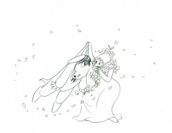
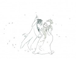
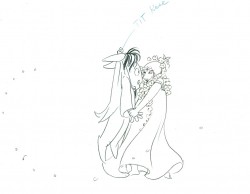
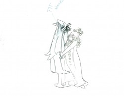
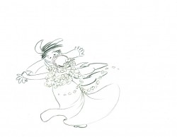
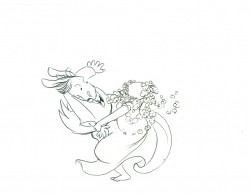
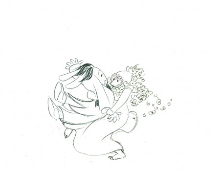
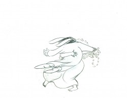
Titania & Bottom 2
- Continuing with yesterday’s piece, I’m completing the posting of all the Tissa David‘s drawings for this scene from The Midsummer’s Night Dream that she directed and animated with a few other Dutch animation friends.
I’ve backtracked a bit and include a couple of the drawings from yesterday so that the full movement is on display here.
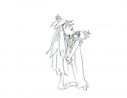
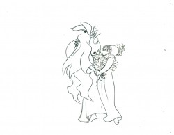
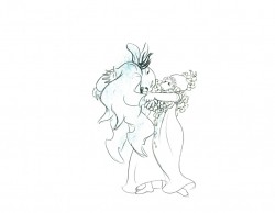
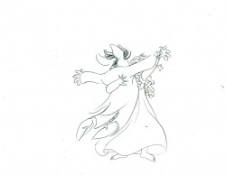
 40
40
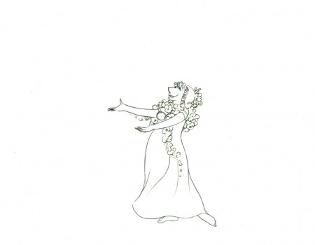
Titania Dances with Bottom
I took a guess at the timing of this putting the
action on three’s and adding two short holds.
All drawings from this scene (both posts) are included in the QT.
Click left side of the black bar to play.
Right side to watch single frame.
