Category ArchiveAnimation
Animation &Disney 22 Feb 2010 09:14 am
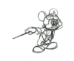
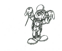
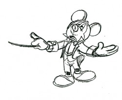
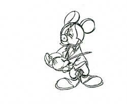
Thomas’ Little Tailor – 1
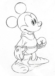
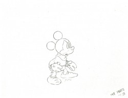
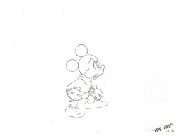
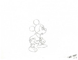
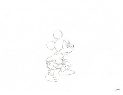
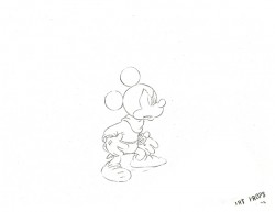
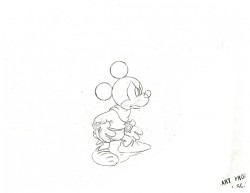
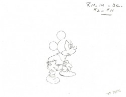
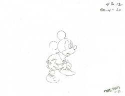
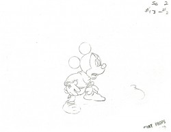
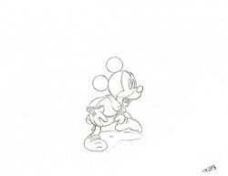
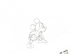
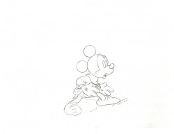
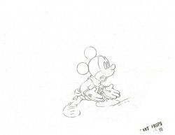
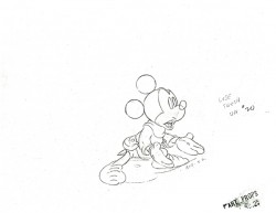
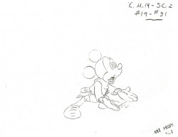
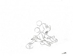
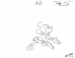
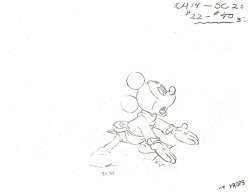
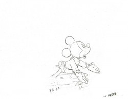
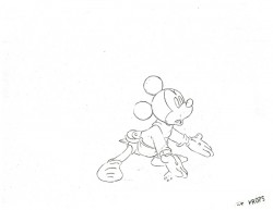
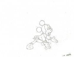
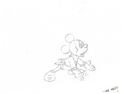
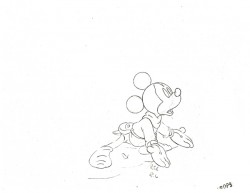
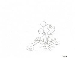
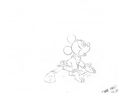
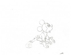
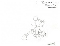
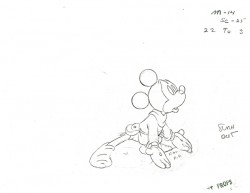
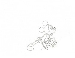
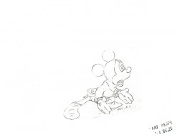
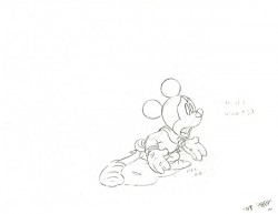
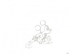
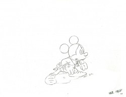
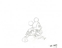
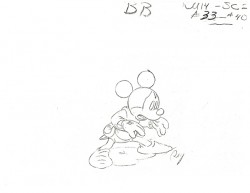
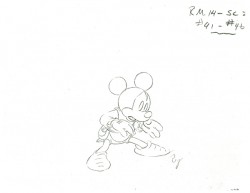
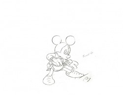
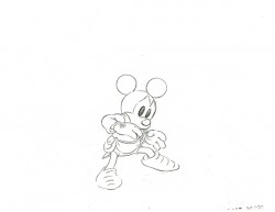
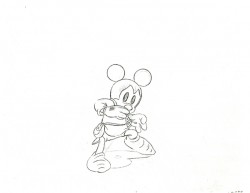
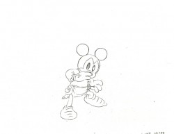
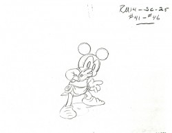
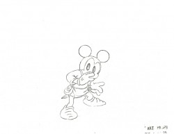
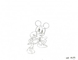
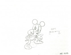
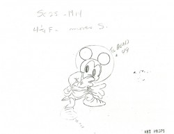
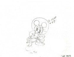
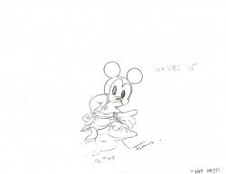
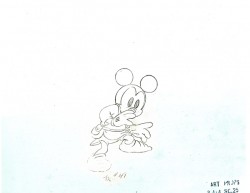
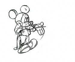
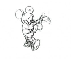
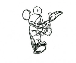
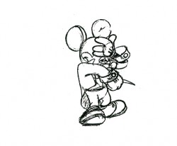
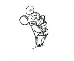
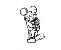
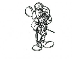
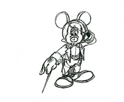
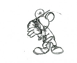
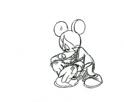
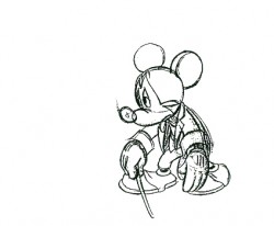
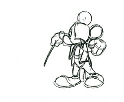
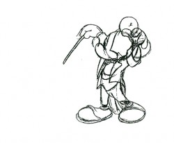
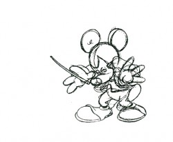
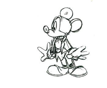
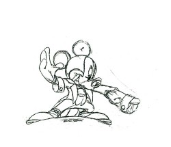
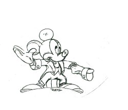
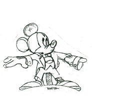
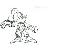
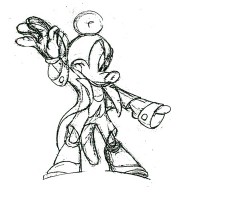
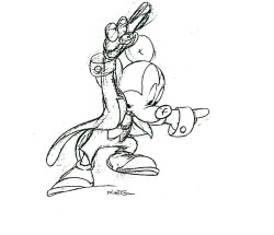
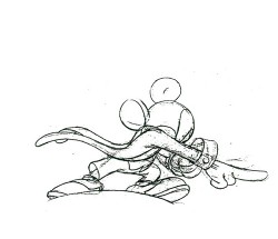
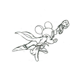
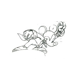
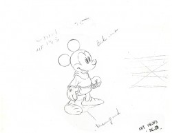
- I’m pleased to post this scene by Frank Thomas from the brilliant Mickey short, The Brave Little Tailor. This scene is one of the highlights of the short.
In its entirety the scene’s about 250 drawings long, and I’ll never be able to get it up in fewer than four or five posts. Many thanks to my friend, Lou Scarborough, for the generous loan of his xeroxed copies.
So, here are the first fifty drawings.
.
.
 1
1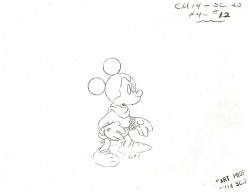 2
2
The following QT movie represents the first three posts.
As more of the film is posted, I’ll also post more of the scene.
Right side to watch single frame.
Animation &Frame Grabs &Independent Animation 19 Feb 2010 08:52 am
Fox’s Enemies
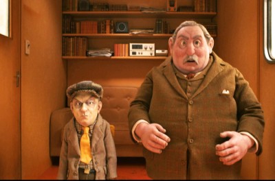
 – I’ve made no bones of the fact that The Fantastic Mr. Fox is my favorite animated feature of the last year. (Though I probably put it in a tie with Ponyo – the forgotten feature.)
The film includes a lot of violent scenes, though that violence is never felt by the on-screen action. Fox’s tail is shot off, but we only know this when we see Farmer Bean pick it up from the ground, and we feel it internally when we see Mrs. Fox trying to attend to her husband’s wound.
The actual violent scenes on-screen are few, indeed.
One of my favorite animated bits in the film is probably the most actively violent. After being foiled by Mr. Fox several times, Bean sits boiling for a second, then wordlessly gets up and tears up the decor of the camper.
I’ve seen the film four times now (three in a theater and once on DVD). It hasn’t lost any of its lustre, for me, and this scene was one I had to go back and view frame-by-frame. I thought it a good one to look at in frame grabs, and I post them here. The scene doesn’t last more than a few seconds.

After seething for a moment, farmer Bean gets up
and quietly, wordlessly decimates the camper interior.

He throws everything atop the table off of it.

Then he reaches down and overturns the table, and
he moves back in perspective into the camper.

I love the way this film plays with the perspective as the
characters constantly move from foreground to background
to foreground to middle ground. It’s expertly handled.

To the left is my favorite frame of the sequence.
It’s only one frame as he rips down this curtain, but
it noticeably stands out within the animated scene.
Excellent job extending the length of the curtain here.

Then he rips off the other curtain.

He throws down shelving on the back wall . . .

. . . and he clears the table in the back of the room.

He throws the chair to the ground.
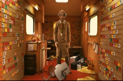
. . . and stands still, breathing heavily.

. . . making sure we see the
fox tail hung around his neck as a tie.

He walks through and past the other farmers.

He rips apart everything on the back wall.

The other farmers just stand in shock . . .
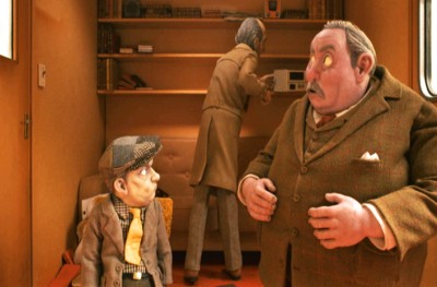
. . . as he wildly rips down the wall.
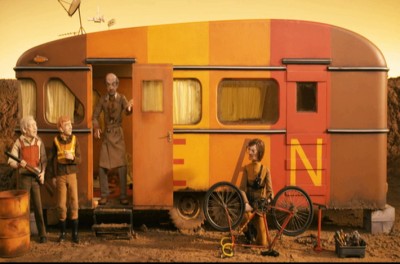
Then without a word he opens the camper door and looks out.
End of the short sequence.
.
Indian Paintbrush Productions LLC and Regency Entertainment, Inc.
Animation &Art Art &Norshtein 17 Feb 2010 09:20 am
Norshtein & The Overcoat
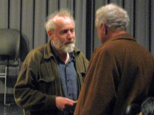 - I was pretty proud of the New York animation community. There was a full turnout for the Yurij Norshtein show on Monday night. All of the key people one hoped would show up, did show up. I was surprised at the many familiar faces in attendance: Amid Amidi, Richard O’Connor, John Dilworth, John Canemaker, Emily Hubley, the Rauch brothers, the Kraus brothers, Biljana Labovic, Jeremiah Dickey, Howard Beckerman, Matt Clinton, David Levy . . . the list goes on.
Norshtein and Reeves Lehman, dean of animation at SVA
And it was appropriate for him to
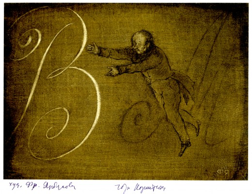
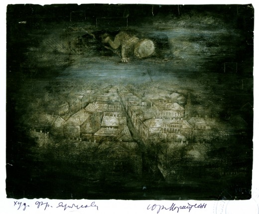
have a good turnout. Norshtein is the height of “Art” in animation, and he’s a beacon for us all. If ever one gave everything to the creation and forward movement of the artform, this guy is it. He’s been working on his film adaptation of Gogol’s The Overcoat for the past 25 years or so. He screened roughly 13 minutes of the film broken into two parts. Both were screened in silent B&W.
The first part was the opening 10 mins of the film. Throngs of shoppers and passersby in the snow on a crowded Moscow street. All I could think of was the enormous number of cutout parts for all these people, just to assemble one image of the film. Yet they were animated and the sequence was long. One guy did all the construction of those characters, all the animation, all the movement. How in hell did he keep each of those many people and parts of people in his head so that he knew how they moved? No computer assistance to help, only his brain. And to top it off the camera, with all those planes, is moving as well. It’s an extraordinary feat.
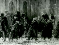
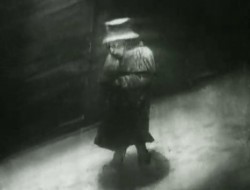
Then the lead character enters and we see what he sees – not the crowds but the writing in his head. He’s a lowly scrivener, a copyist; someone who spends his day copying documents. Obviously, he can’t remove the work and the words from his mind, though the world he walks in is filled with distraction.
From these street scenes he goes home to an extended sequence of warming himself up and eating a small bowl of soup. The character motion and development is all open to us in this incredible scene wherein we enter the tiny physical, introverted world of this man.
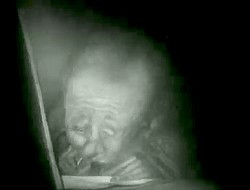
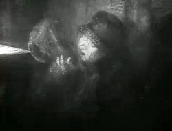
The final three minutes show him realizing how worn his overcoat has become. Threadbare doesn’t begin to describe it as his fingers easily poke through the fabric again, and again. When he puts the coat over his head, fibers end up in his mouth.
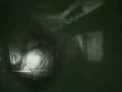
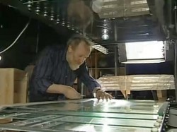
A long, very long display of character. All B&W and silent. It’s going to be another masterpiece from this brilliant artist. All done by hand by him on a complex and large camera set up. One person controlling all the pieces.
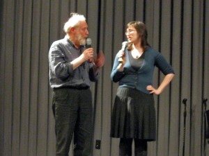 The Heron and the Crane and Hedgehog in the Fog were screened from the Jove dvd. Most of the evening was Norshtein answering questions. (There was a bit of an onstage struggle between two interpreters, during the opening segments, with the stronger interpreter doing duty for most of the event.) He took the dumbest of questions and turned them into answers we always wanted to hear. A question from a young girl about what his favorite animated films turned into a list of expected films that I was not surprised to hear: Night on Bald Mountain Disney, Crac Back, There Once Was a Dog Nazarov, and he admitted that it’s a list that’s constantly changing. He also spoke of recently watching a print of Bambi frame-by-frame on an editing machine. He said it was a film that has enormous beauty in every frame, in it’s backgrounds and layout, as well as in its whole as a film.
During his answering questions he spoke articulately to us about everything from animation to great painters to great authors. I have to say that I can’t remember any other ASIFA meeting where the “young” Michelangelo or Velazquez were discussed, nevermind Chekhov and Proust. In the past week, I’ve attended a number of Oscar parties – one for James Cameron, one for Quentin Tarantino, one for Sandra Bullock. If there’s a celebrity in New York, I’ve had a chance to meet them. I’d trade them all for that evening with Norshtein at that little SVA theater.
After the screening, they were selling photo prints in the lobby, signed by Norshtein. I bought two hoping in some small way to support him on this trip. They also serve as souvenir reminders to me that I have to be more of an artist in my own work.
(As always, click any image you’d like to enlarge.)
You can read more details by Dayna Gonzalez about the event at the ASIFAEast newsletter.
And Richard O’Connor offers a collection of notes and quotes from the evening to his blog for Asterisk Animation.
Animation &Commentary &Events &Independent Animation 13 Feb 2010 09:16 am
Anti-Valentine
 - On Sunday night, Valentine’s Day, Debra Solomon‘s show, Getting Over Him In 8 Songs or Less, premieres on HBO 2 at 7:30pm. The film offers a musical trip through the last couple of years of Debbie’s life as she regroups from a divorce with her husband. (Animation as therapy.)
On her site, she writes this synopsis:
- In my new film, I animated myself out of heartbreak. The animated journey was also my emotional journey. In GETTING OVER HIM IN 8 SONGS OR LESS the main character is caught in a
 woman’s worst nightmare, wandering around the neighborhood undressed and exposed after being left by her husband. Through the use of brightly colored patterns that wash away section after section of the film, mimicking the ebb and flow of feelings, the viewer passes through the crisis with the main character.
 I know firsthand how intensely Debbie worked to pull this show together. She singlehandedly animated the entire show in Flash in a sort of stream-of-conscious linear style that pulsates with a nervous energy (not unlike her own). The entire story is told through a pastiche of funny songs that she wrote, performed and produced. In short she bares her soul via a quick moving, funny animated film. It’s an animated diary of Debbie’s life in the year after her marriage. She lived through it as she animated it.
It’s brilliant that HBO helped finance this animated and personal film. This is a bittersweet bon bon of a tv show. Tune in.
Here are a couple of other images from the show:
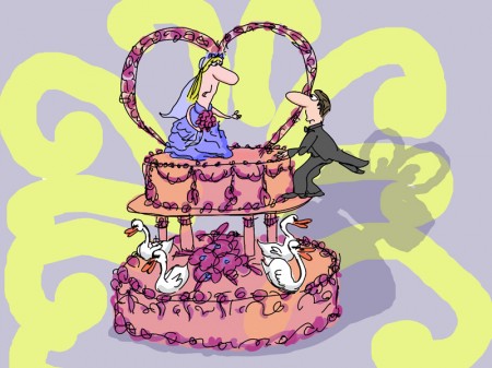
(Click any picture to enlarge.)
There’s a short interview with Debra in MovieMaker Magazine.
This is the complete show schedule for the rest of this month:
7:30pm Sunday Feb 14th HBO2
9:30am Tuesday Feb 16th HBO Signature
6:00am Friday Feb 19th HBO2
10:00am Sunday Feb 21st HBO Signature
Animation &Commentary 12 Feb 2010 08:54 am
VISA Grand Central
- VISA has taken over Grand Central Station with an enormous display focussing on the Winter Olympics, the centerpiece of which is a number of 3D ads, one of which is animated. You can get a good idea of how all-encompassing this display is with the following video:
Initially they handed out 3D glasses, but many of the people took the glasses and didn’t stay for the films. When I went through there were no glasses, but it didn’t seem to hurt the appearance of the movies (although they weren’t noticeably 3D anymore.)

Heading from the street to the subway
you’re hit with Visa’s name everywhere.
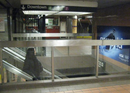
You can’t avoid the stairway signs.
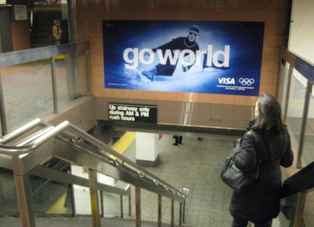
If you head off to the Shuttle train
you run into the film in the connecting tunnel.
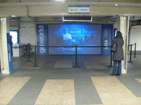
This is what the exhibit looked like. Stuck within a tunnel between
the IRT subway and the Grand Central Shuttle it’s not quite conducive
to good film watching. A lot of buildup for a couple of commercials.
Most people passed it by at 11pm on Friday night.
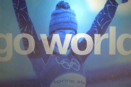
Here’s a still from one of one of the live action spots.
The guys handing out the 3D glasses didn’t have any;
they just stood about talking to each other.
The animated piece was done in the style of children’s drawings.
I haven’t been able to locate who produced the animation, so if you
know please leave a comment. Here are a couple of stills taken with
my small camera – bad lighting=bad pictures. Sorry.
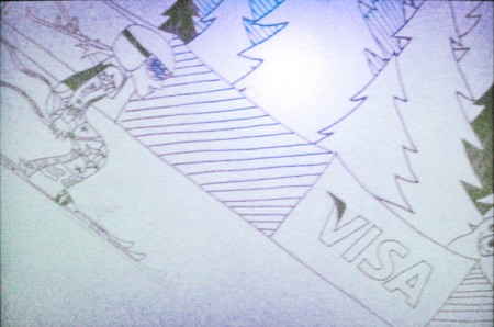
Here are a couple of frames from the animated piece.
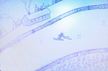
I’m curious to know how THIS worked in 3D.
It seems a bit flat. Not quite AVATAR.
The animated graphics, above, appears designed for maximum 3D effect.
This was produced by a company called Superfad.
Animation &Books 06 Feb 2010 09:15 am
WTFoster’s other book – 2
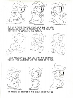
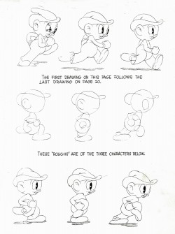
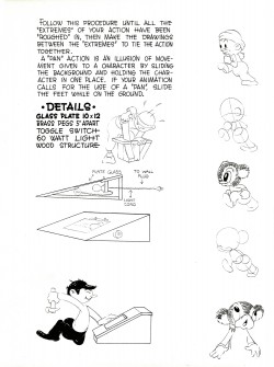
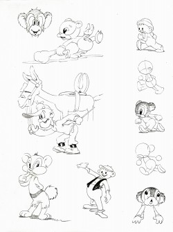
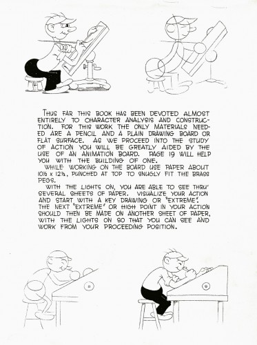
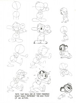
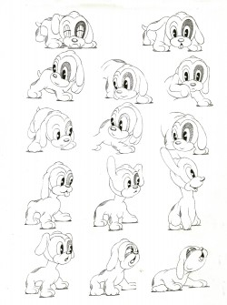
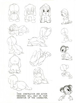
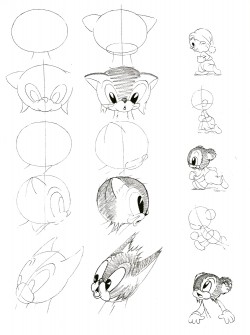
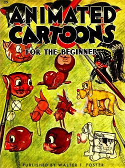 - – Last week I posted the first part of this Walter T. Foster art book: Animated Cartoons for the Beginner. Here’s the second half of the book done in a very retro style. I’m surprised it survived the 1960s, when I first got a copy of it. The artwork looks like it comes from the 1930s and could hardly have survived the War (never mind been drawn after it.) The book was first published in 1946.
The animation in the book is certainly odd, not least because the pages are out of order and the flip book imagery doesn’t properly flip. I’ve placed the images in the correct order and have made a small QT movie of the piece for your entertainment if not your edification.
Here are the pages of remaining:
 16
16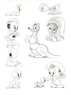 17
17
Here is the flipbook that rests on the outer edge of every other page.
I’ve maneuvered them a bit to make it work properly. Registration is
impossible given the size shifts and placement of the drawings on the pages.
i’ve done what I could.
Right side to watch single frame.
Animation &SpornFilms 04 Feb 2010 08:47 am
Moving feet – using it
- The other day I’d written about a pet peeve of mine. This is when animators take the poor layouts they’re given and simply inbetween them. As a result, the feet on two related layouts slide from one position to another. This is not something real people could or would do, yet animators do it out of laziness. It’s a sure sign that the animator isn’t thinking of the character as a living/breathing organism. It’s just a bunch of drawings to that guy.
How to fix the problem; it’s easy.
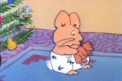
On an early short film of mine, I worked with an illustrator, Rosemary Wells. It was her first time seeing her characters animated. Consequently, she had a lot of involvement in the process. I ended up having to take drawing lessons from her – how to draw her characters. I travelled upstate at least half a dozen times to watch her at work.
In the end, she gave me a bunch of drawings that she hoped I would follow. In one key scene, she drew her character, Max, with feet facing one direction. Then in the next layout, his feet are facing another direction.
 1
1 2
2 I could have just inbetweened his feet, or even let them pop from one position to another (as Elmer does in that GEICO spot). It would have looked horrible. Instead, I chose to treat the positions as animation moving from one foot to the other. I added a stop position in the middle for a reaction – pause.
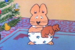
Then I let the scene play out.
Right side to watch single frame.
The end result gave a bit of character to Morris, and worked within the needs of the scene. A few extra drawings paid off. (This, of course, is not something you’d see in Flash – it’d just pop.) The way I handled the move made Rosemary Wells happy, and it made me happy. It took the monkeywrench she’d thrown at me to make something more alive, and I was happy for it.
Note that I’m not patting myself on the back. I’m just saying that this is something that should be second nature to anyone out there that considers themself an animator. If a layout you have to follow indicates feet moving, either change them or make them work.
Animation &Commentary 02 Feb 2010 09:10 am
Moving Feet
- One of my pet peeves in animation – 2D animation (it’s something you rarely see in cgi) – is, what I call, the moving feet syndrome.
In this, layout artists create dynamic poses/drawings for animators to animate. Their drawings don’t always offer the best path to good animation, yet doggedly faithful animators obligingly follow the images at hand without questioning the logical sense of the drawings handed them. The feet positions end up moving without reason, yet the animator chugs ahead giving without noticing the needs of the character being drawn.
 I plan to start showcasing a bunch of examples of this in both current and historic animation scenes. I’ve noticed this bad animation in two recent slick spots on television. Both look like decent animation, but both fail the moving feet test.
Here’s a recent GEICO spot which cleverly uses Elmer Fudd in what almost looks like a classic scene. It’s not animation that Ken Harris or Bobe Cannon would have done, because they’re not layouts that would have come from Chuck Jones or Fritz Freleng, and Bobe and Ken would have questioned the layouts.
Here’s the spot, as seen on YouTube.
A 30 sec spot including live action intro.
Let’s look at some frame grabs:
 fr 410
Every time Elmer comes to a stop his feet move.
As he goes into action, they either pop or
quickly inbtween to the next pos.
 fr 418
You’ll notice in the spot during the first 1/2 of the
animated segment he keeps repositioning in every hold position.

Here’s a closeup of the feet blown up.
They move imperceptibly, but they move.
 fr 600
In the last half of the spot he gets into a good postion.
 fr 655
Two seconds later he moves to another postion.
 fr 668
1/2 second later they’re in a new postion.
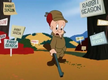 fr 707
One second later back to the previous position
before Elmer walks out of the scene.
Here’s a CU of those feet moving like crazy:
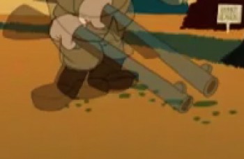
From this –
Let’s turn to look at a Flash animated spot, the “Switch and Save” spot for Esurance.
Look at the guy painting the wall on the right, 8 secs into the spot.
Unlike Elmer, in the GEICO spot, this painter is more active so there is a bit more justification for some of the moves. But there are too many for too short a bit of screen time.
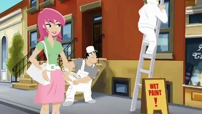 fr 261
He starts here and . . .
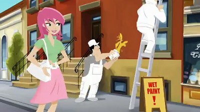 fr 267
. . . throws paint on the wall.
The foot movement is certainly justified.
 fr 287
But then he goes to this hold position
only 1/2 second later.
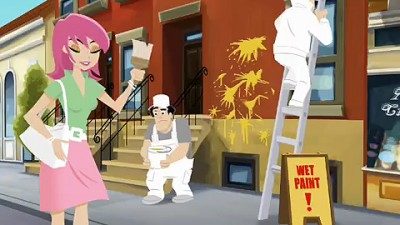 fr 292
. . . then to this hold postion 5 frames later.
The animator’s trying to make two very different
foot positions work within such a short time.
 fr 374
Two seconds later we’re into a new position.
More action might justify it, but why did you
go into pos fr 292 in the first place?
Here’s a closer look in case you missed it (sorry for the bad copy of the blowups.)
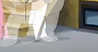 fr 261
Go from here . . .
And it’s not even a dance move.
Remember animators, if you’re moving those feet have a reason.
Animation &Animation Artifacts &Bill Peckmann &Disney 01 Feb 2010 08:59 am
Symphony Hour – sc 48
- Last week I posted the model sheet for scene 22 of The Symphony Hour. This week I have scene 48. I’ve also broken down the drawings and made a QT comparison between the final film and these extremes from scene animated by Marvin Woodward. I hope it’s useful to some of you.
The model sheets come from the gracious courtesy of Bill Peckmann. Many thanks to him.
As with last week’s post, first the full model sheet then a breakdown.
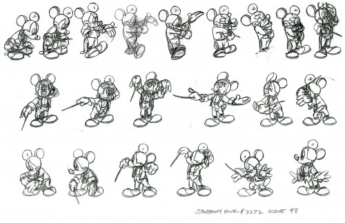
(Click any image to enlarge.)
The following QT movie was timed to match the extremes in the
animation. Until any pose appeared in color, I held the image just
prior for the number of frames to cover the missing inbtws.
It’s a large QT so may take time to load.
Right side to watch single frame.
For further study take a look at Mark Mayerson‘s Mosaic and comments on this film.
Animation &Animation Artifacts &Bill Peckmann &Disney &Models 25 Jan 2010 08:32 am
The Symphony Hour – scene 22
- Last week I posted the model sheet for scene 10 of The Symphony Hour. This week I have scene 22. I’ve also broken down the drawings and made a QT comparison between the final film and these extremes by Les Clark. It’s a short scene, but there’re a lot of dynamics in it.
The model sheets come from the gracious courtesy of Bill Peckmann. Many thanks to him.
As with last week’s post, first the full model sheet then a breakdown.
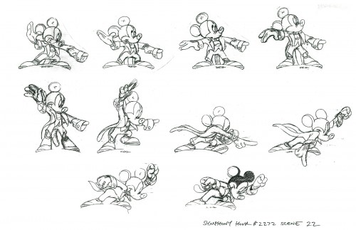
(Click any image to enlarge.)
The QT shows that the first images of the scene have change
a bit. Mickey’s right hand is different. It changed to something
more dynamic. The scene feels as though it cuts short, except
that it’s matching the track and works with sound. Since the
sound comes in with the head of the next scene, I left it out and
held the last drawing a beat longer than called for. Click left side of the black bar to play.
Right side to watch single frame.
For further study take a look at Mark Mayerson‘s Mosaic and comments on this film.
