Category ArchiveAnimation
Animation &Animation Artifacts &Articles on Animation &Commentary &commercial animation &Independent Animation &Layout & Design 22 Jun 2013 05:13 am
John Wilson 1920 – 2013
A number of years ago I’d made a short trip to LA. During that visit, a man came up to introduce himself. It was John Wilson. He told me that he had just nominated me for an ASIFA Hollywood Award because he’d loved my work. I’d learned so much from watching Mr. Wilson’s films that it was wonderful to see that the mutual admiration society ran both ways.
John Wilson died yesterday. His son, Andrew, wrote to tell me of it. My feelings go out to the family and am enormously sorry that animation loses another one of its masters.
He was a director, designer and animator about whom I’d done a series of posts on his career. Out of respect for Mr. Wilson, I’d like to post all of those articles together (and hold them there for the entire weekend.)
Hope you’ll enjoy.
1.
Let me start by sharing some bio information about John Wilson and his company Fine Arts Films.
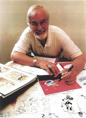 - John Wilson was born in Wimbledon in 1920. He attended the Royal College of Art and was working by age 18 as a commercial artist with Willings Press Service. In WWII he served with the London Rifle Brigade in African where he was seriously wounded. Recuperating in hospital, he drew many cartoons of which several were printed. Eventually he would recover and get work at Pinewood Studios in the art department where he worked on GREAT EXPECTATIONS and THE THIEF OF BAGHDAD, among other films.
- By the time he was 25, he was working in animation at Gaumont-British Animation, a newly formed division of J. Arthur Rank’s studio, working under the direction of David Hand on the “Animaland” series starring “Ginger Nut.”
- In 1950 he moved to the United States working in layout and animation at UPA. He found himself working with Bobe Cannon, Pete Burness, Jules Engel, and Paul Julian. Eventually he left for the Disney studio working in Les Clark’s ‘Tinkerbell’ unit on PETER PAN and with Ward Kimball on TOOT WHISTLE PLUNK & BOOM.
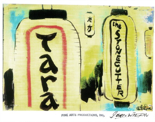
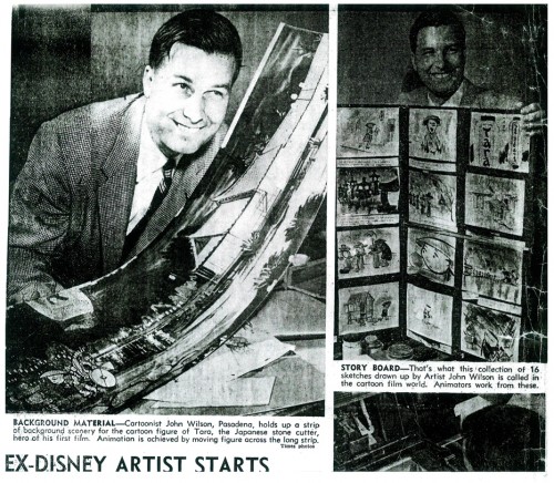
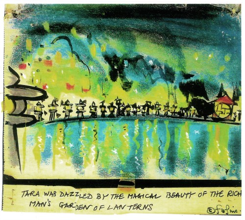
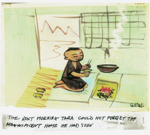
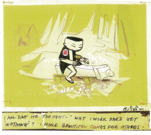
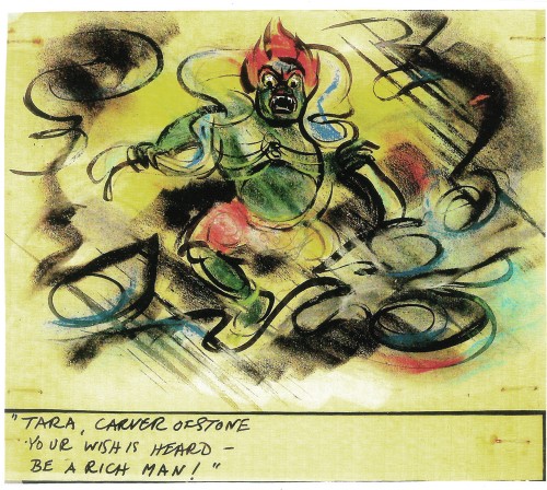
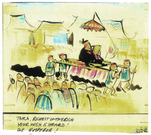
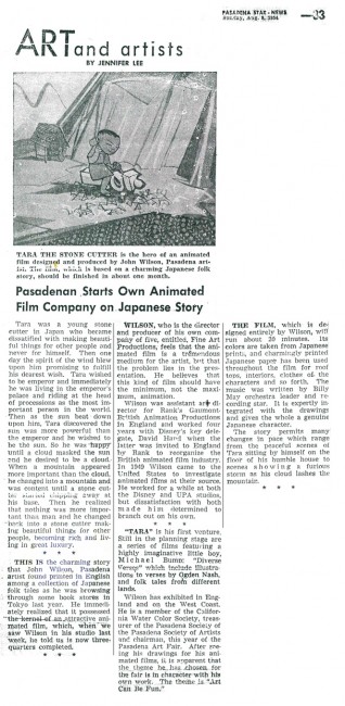
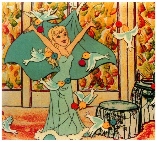
- He tried to sell Disney on the film Tara, the Stonecutter, but they weren’t interested. He completed it himself in 1955 using a Japanese style to tell the story. Wilson was impressed with the UPA style of modern art in animation, and that’s the route he took for his personal film. Thus his studio was born, called Fine Arts Films, in 1955. Tara had some success playing theatrically with the successful Japanese feature film, GATE OF HELL by Kinugasa (which had won the Oscar for Best Foreign Film.)
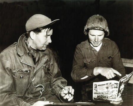
Wilson in Korea with the Bob Hope Tour to entertain the troops.
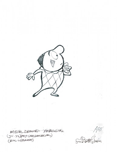
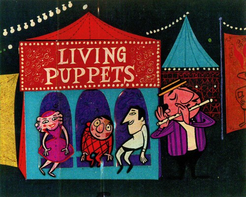
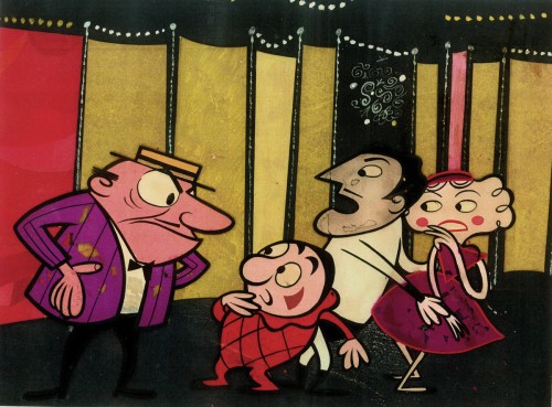
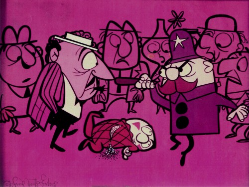
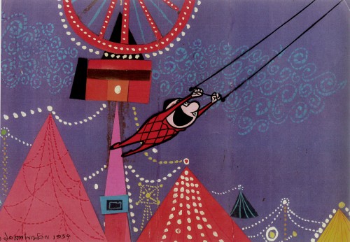
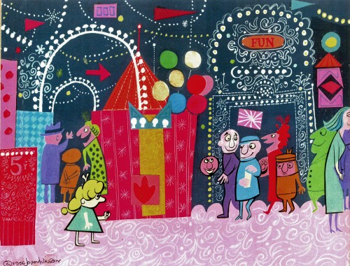
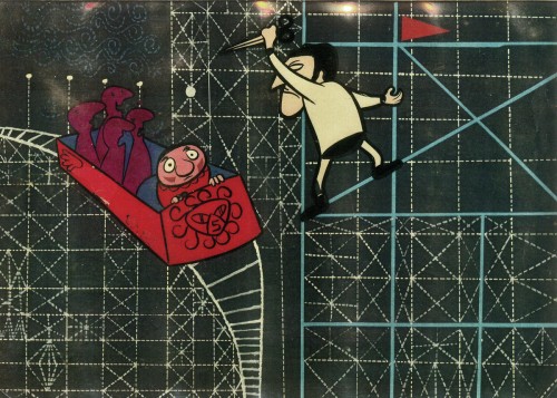
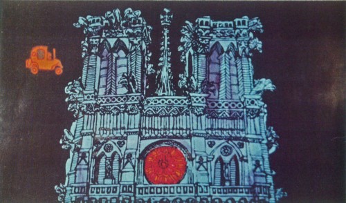
- This film led to his producing a verion of Stravinsky’s Petroushka for NBC which aired in 1956 as part of The Sol Hurok Music Hour. Notably, Stravinsky, himself, arranged and conducted the shortened version of the score suing the LA Philharmonic Orchestra. The film was designed by John Wilson and Dean Spille with anmation by Bill Littlejohn, Art Davis, and Phil Monroe. Chris Jenkyns, Dean Spille and Ed DeMattia designed the 16 minute show from Wilson’s storyboard.
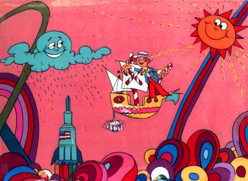
- Fine Arts Films had produced ‘Journey to the Stars’, a project for the 1961 World’s Fair, an animated voyage through space for NASA, which was seen in 70 mm Cinerama by ten million visitors to Seattle.
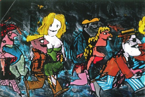
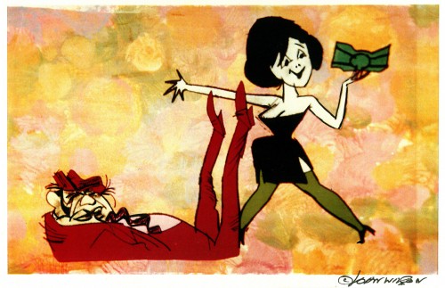
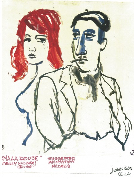
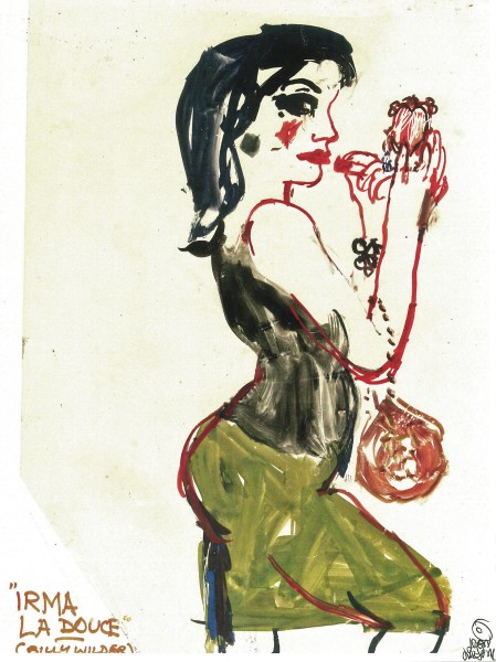
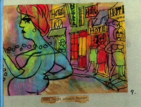
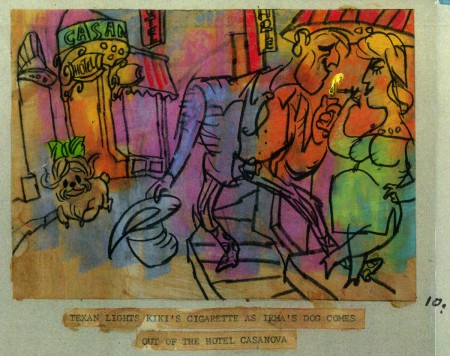
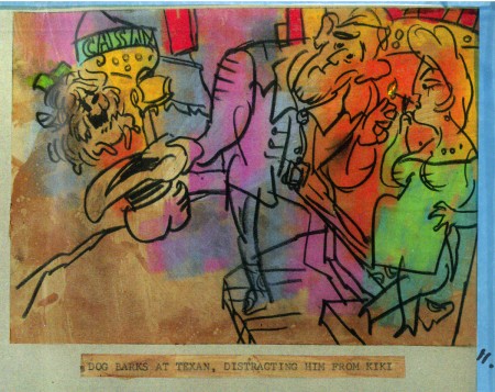
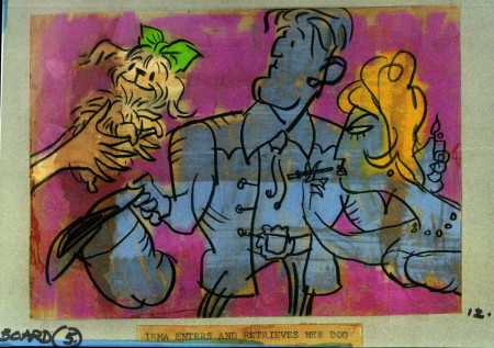
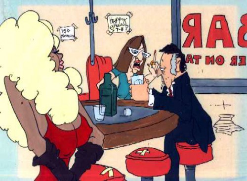
- Billy Wilder employed Wilson to do the titles for Irma La Douce after which they did a six-minute trailer for this Jack Lemmon, Shirley McLaine feature. It was all about Parisian prostitutes romping about in Montmartre, and animation could apparently make it acceptable. Artists Ron Maidenberg, Sam Weiss, Sam Cornell and Bob Curtis caught the vivid nightlife of Paris in a sexually charged animated short. It was a huge success in promoting the feature.
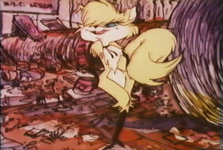
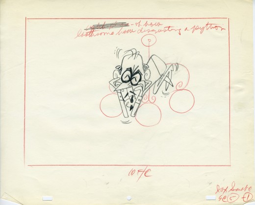
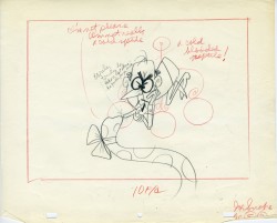
- In 1970 Wilson flew to Chicago to see Carol Channing and Eddie Bracken appearing in “archy and mehitabel in Shinbone Alleyâ€. On the basis of this theatrical musical, Wilson bought the screen rights to the book “archy and mehitabel” by George Herriman and began work on an animated feature which was released by Allied Artists in 1971.
- Fine Arts Films was also responsible for many animated commercials as well as weekly music video segments for the weekly CBS-TV series “The Sonny and Cher Show.†The songs included Joni Mitchell’s “Big Yellow Taxi†and Jim Croce’s “Leroy Brown.â€
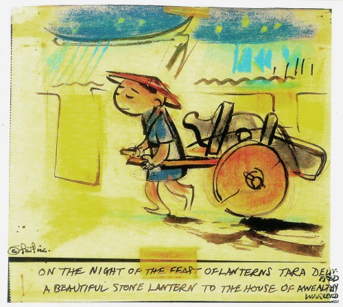
Here are some storyboard sketches by John Wilson for his initial short film, Tara, the Stonecutter. This film started it all for Wilson.
 1
1
I haven’t seen the finished film, but I understand that Japanese decorative papers were used in the backgrounds and costumes of the characters.
Here are two press clippings for this film from California papers.
(Click any image to enlarge.)
2.
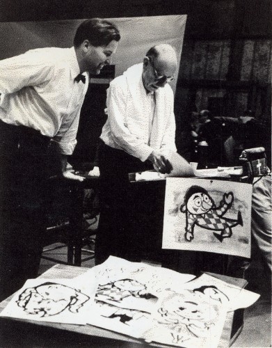
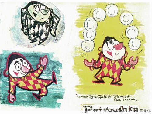
- After completing the film, Tara the Stone Cutter in 1955, John Wilson and his newly formed company,Fine Arts Films, was able to sell the idea of an animated version of Stravinsky’s Petroushka to NBC. They aired the 16 min. film in 1956 as part of The Sol Hurok Music Hour. Stravinsky, himself, arranged and conducted the shortened version of the score using the LA Philharmonic Orchestra.
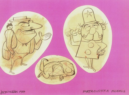
The film was designed by John Wilson and Dean Spille; animation was done by Bill Littlejohn, Art Davis, and Phil Monroe. Chris Jenkyns, Dean Spille and Ed DeMattia designed the show from Wilson’s storyboard. This is considered the first animated Special ever to air on TV.
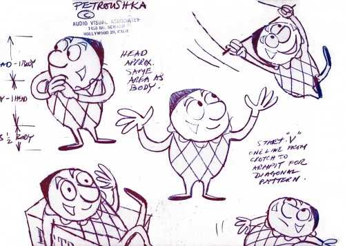
Here are some stills from that film and its artwork.
 1
1Petroushka – model 1
 11
11
John Wilson and Igor Stravinsky preparing for recording of Petroushka
with the Los Angeles Philharmonic Orchestra (1955).
Here are copies of two reviews:
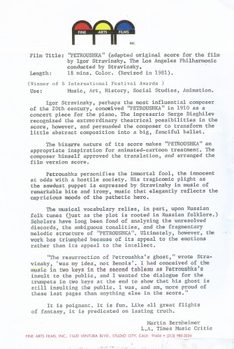
Los Angeles Time review (1956)
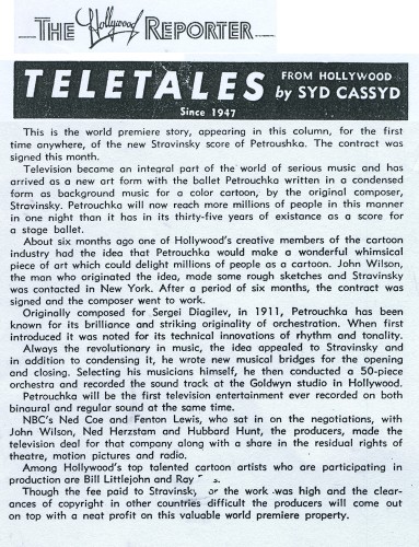
Hollywood Reporter review )1956)
(Click any image to enlarge.)
Petroushka was released on VHS tape combined with a number of the song pieces he did for the Sonny and Cher program. This tape, John Wilson’s Fantastic All Electric Music Movie, can still be found on Amazon but is pricey.
Thanks to Amid Amidi for the loan of this material.
3.
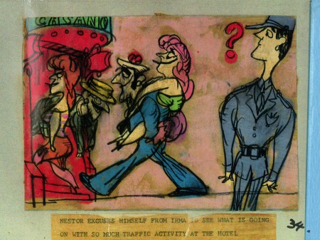
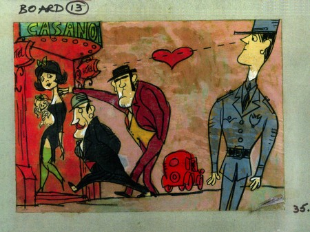
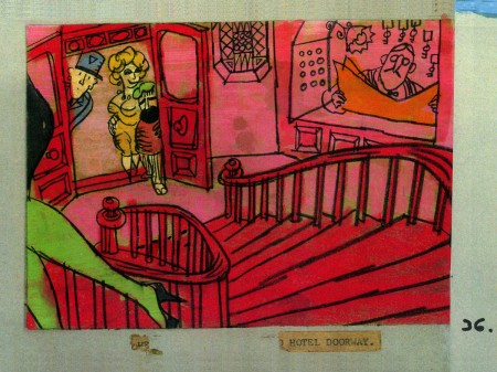
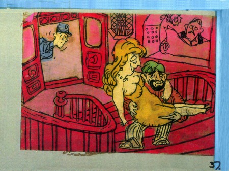
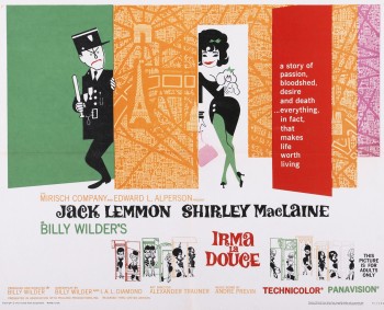 Irma La Douce was a racy film written and directed by Billy Wilder that starred Shirley MacLaine as a Parisian prostitute and Jack Lemmon as a French policeman who falls in love with Irma (Shirley MacLaine.) The film, for its time was daring, and came up with (heaven forbid) a “C” for Condemned rating from the Catholic church. This made it off limits for anyone under the age of 18. I was determined to go see the film, so I ignored the ban and went by myself. Naturally enough, no one tried to stop me. I wasn’t jaded by the movie anymore than I had been disturbed by the violence in all the Warner Bros. cartoons I’d seen. Looking back on Irma La Douce, it really is an innocent film, hardly risqué in any way shape or form.
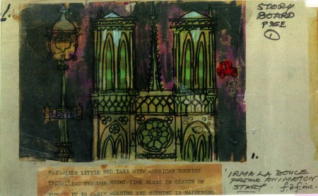
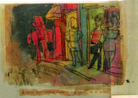
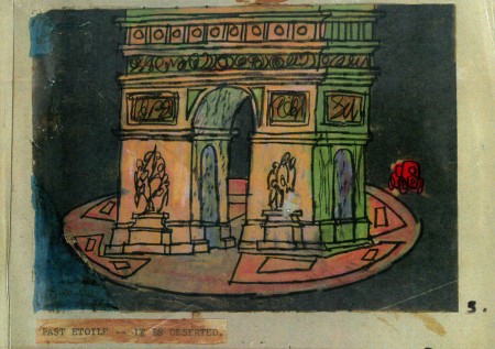
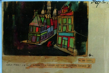
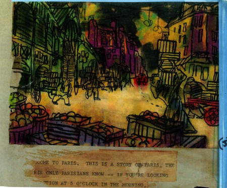
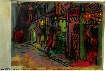
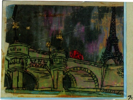
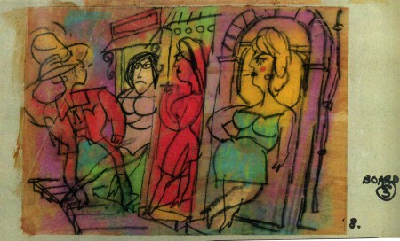
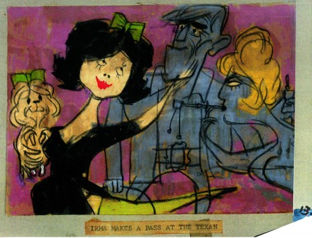
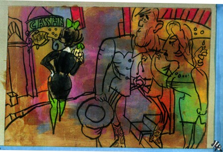
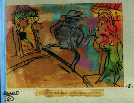
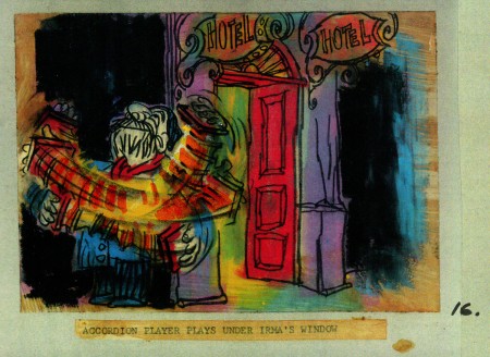
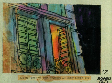
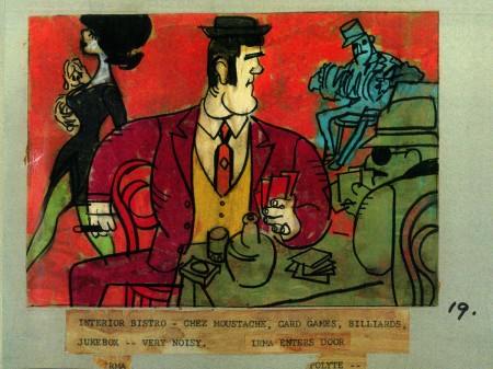
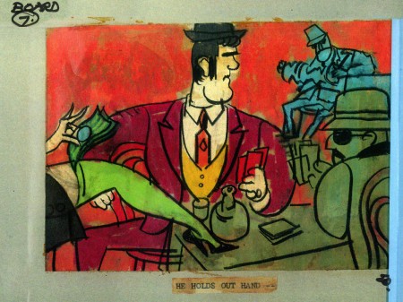
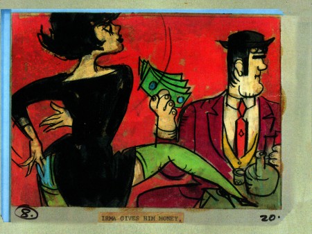
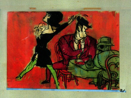
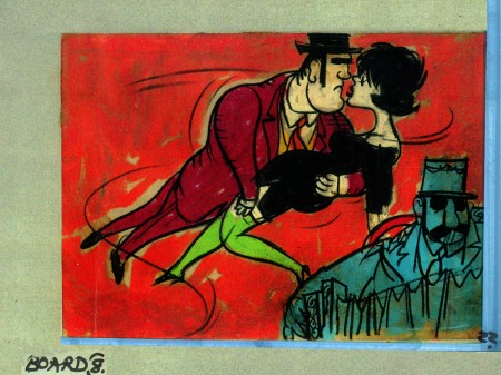
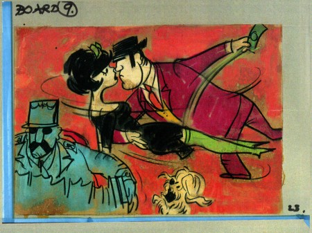
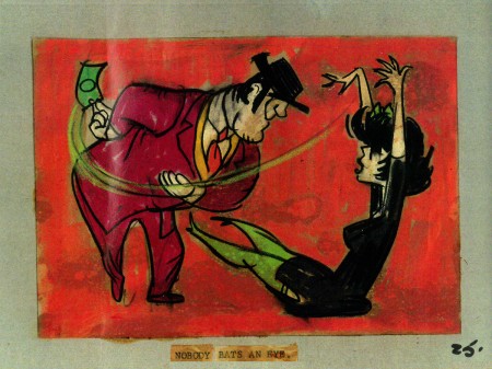
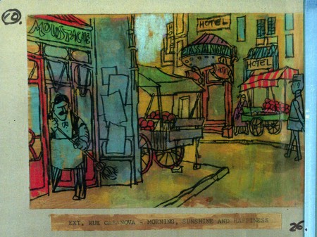
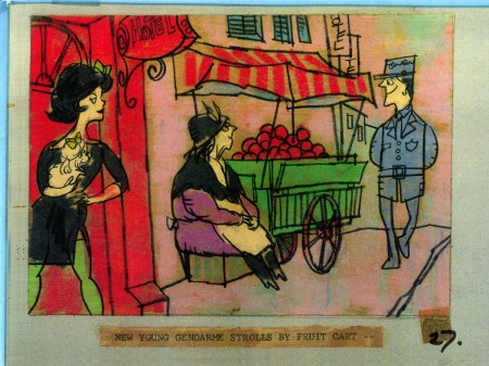
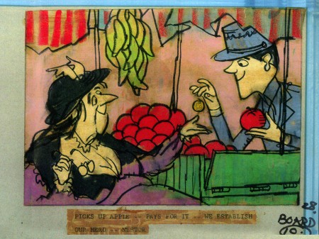
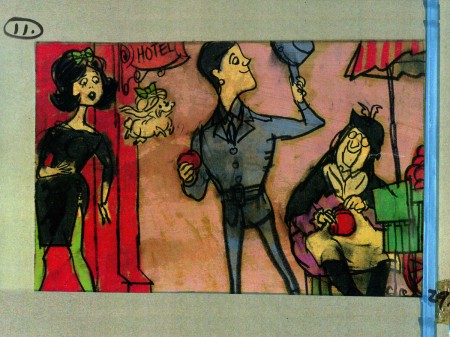
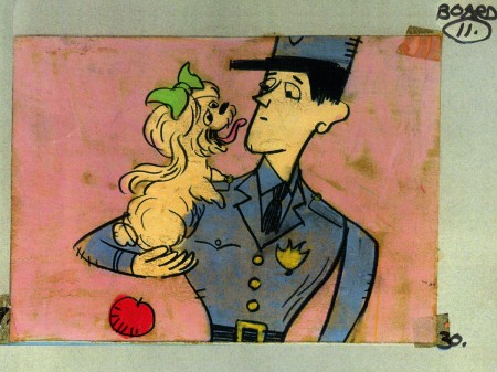
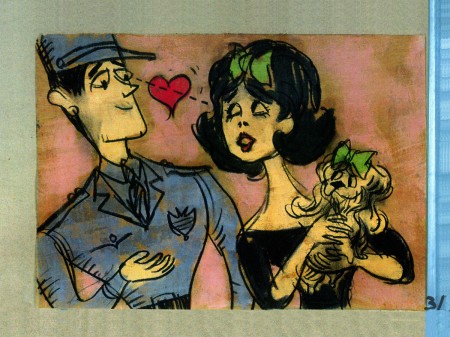
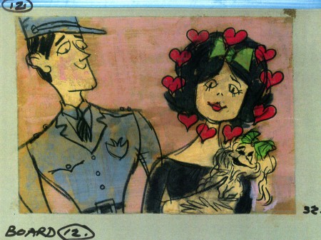
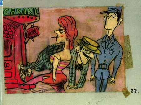
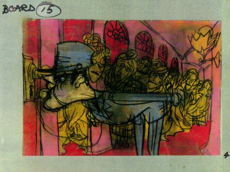
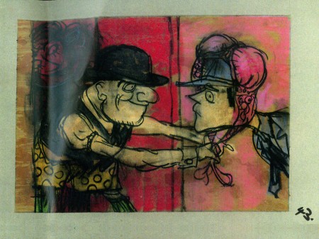
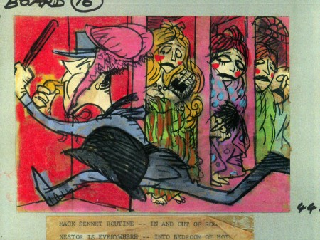
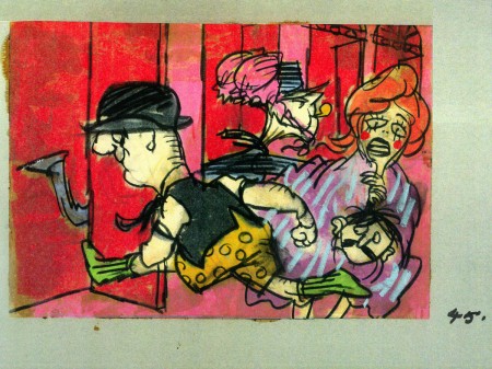
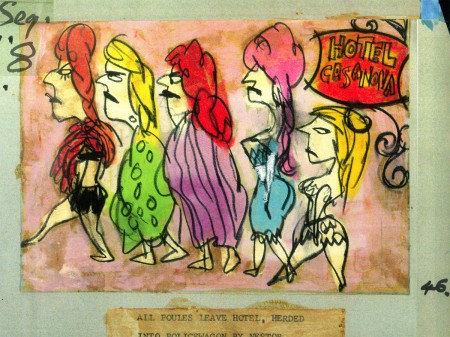
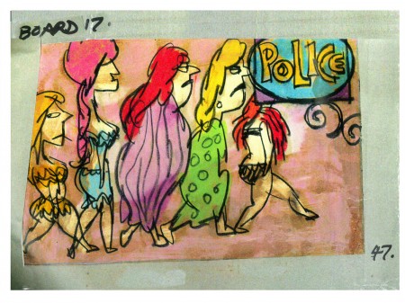
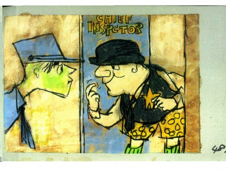
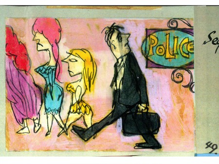
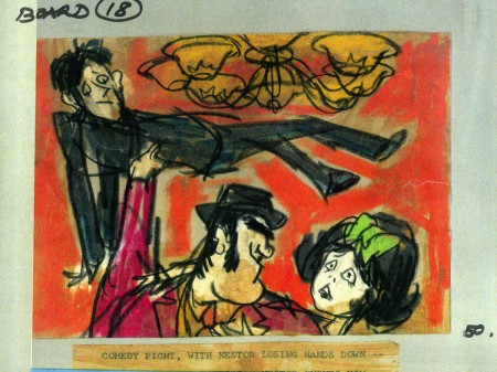
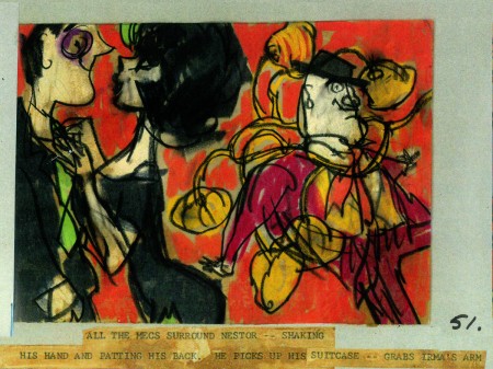
The film started with some nicely drawn animated credits which were done by John Wilson’s studio. Until recently I hadn’t known that Wilson also produced an animated short promoting the feature for the Mirisch Company. I have some preproduction art from that short as well as the color storyboard. The board is large enough that I’ve decided to break it into two parts. We’ll see part one today and the second part next week.
Each section of three images is long enough that unless I post one drawing at a time, it’ll be too tiny to see unless enlarged. I’d like to post each storyboard sketch a nice viewing size and still give you the option of enlarging it.
Let’s start with some production and post production stills so you can see what it looked like.
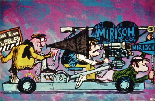 1
1
A couple of pre-production drawings:
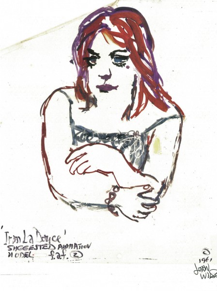 1
1
Then, there’s the storyboard. I’ll give an example of the three panel pull out and follow that with each individual image.

You can see why I’ve decided to enlarge the images.
4.
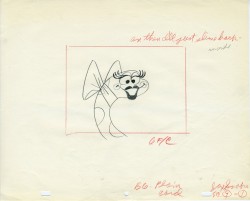
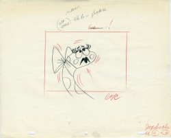
John Wilson created this storyboard for the Mirisch Corp. It was an animated trailer to promote Billy Wilder‘s coming film, Irma La Douce. The board comes in 18 pages of three storyboard drawings. Rather than post the sets of three images (and only being able to show them at a smallish size) I’ve taken each individual drawing and have blown them up to see them better on this blog.
Again, these were for a lengthy trailer for the film not the opening credits. The film’s credits do not use animation.
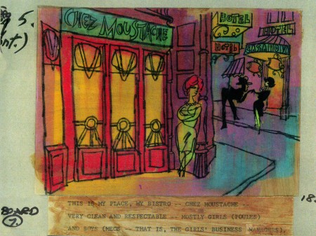 7a
7a
___________________________
Here’s a YouTube version of the trailer. Not the brightest quality, but you can see it.
5.
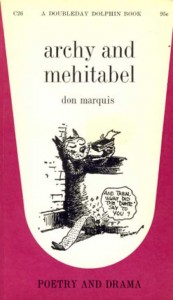 - Don Marquis‘ book, Archy and Mehitabel, garnered fame quickly and not least because of the extraordinary illustrations of George Herriman, the creator of Krazy Kat.
The first book was published in 1927 and others followed in 1933 and 1935. It wasn’t until the third book that Herriman took over the characters created by Marquis in his book of short stories, developed mostly, in poetry. An on-again off-again love affair, the story had two principal characters: a cat, Mehitabel, and Archy, cockroach. (You can read these poems on line here.)
In 1953, writer Joe Darion along with composer George Kleinsinger (the creator of Tubby the Tuba) wrote a musical theater piece. Tenor Jonathan Anderson played Archy and soprano Mignon Dunn was Mehitabel. At about the same time a recording of the showtunes was recorded with Carol Channing as Mehitabel and Eddie Bracken as Archy. The record was a success.
With the help of the young writer, Mel Brooks, they were able to get their show to Broadway in 1957, but it was now named Shinbone Alley. After 49 performances, the show closed, but the original cast album was recorded that same year. The songs stayed in the permanent repetoire of Carol Channing and Eartha Kitt.
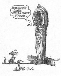 In 1971, John Wilson directed an animated feature starring the voices of Channing and Brackett and using the songs from the musical. The love affair between Archy and Mehitabel was penned by Archy, the cockroach; his poems tell their story.
The film suffers from its music. The songs are simple and sound as if they’re written for children, but the lyrics pull from the poems which are definitely designed for adults. It gets a bit confusing, as a result, and is a bit picaresque; the poems are short and illustrating them in animation would take more adaptation than seen here.
 John Wilson had developed his studio, Fine Arts Films, on the back of the weekly, animated, music videos he did for The Sonny and Cher Show, an enormous hit in the early 70s.
These music videos were loose designs animated quickly and lively around the songs Sonny & Cher would schedule each week. There would always be one or two of these pieces, and they were highlights in the weekly one-hour musical/variety program.
 The graphics of Shinbone Alley aren’t too far from these Sonny & Cher videos. Loose design and animation with a design style not too far from the Fred Wolf’s made-for-ABC feature, The Point. This was the first feature made for television and featured the songs and story of Harry Nilsson, although Shinbone Alley featured a wilder color pallette.
Jules Engel, Corny Cole and Sam Cornell all worked in design on the film. The long list of  animators included Barrie Nelson, John Sparey, Spencer Peel, Eddie Rehberg and Jim Hiltz. Mark Kausler was an assistant on the show.
The film wasn’t an enormous success, but that was probably explained much by the limited distribution and the poor marketing of the film. I saw the film when it came out; I was living in Washington DC at the time (in the Navy). I was very disappointed. The animation is very limited and the style was a real let-down having known the George Herriman illustrations from the Don Marquis book. We’d already seen those limited animation Krazy Kat cartoons from King Features, so I knew the style could be done adequately – even on a budget. The style in this film just seemed a little too Hollywood cute, at the time, and it felt dated when it came out. I don’t feel too differently about it watching the VHS copy I own.
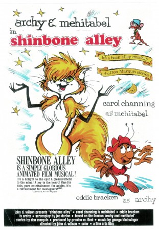
the film’s poster
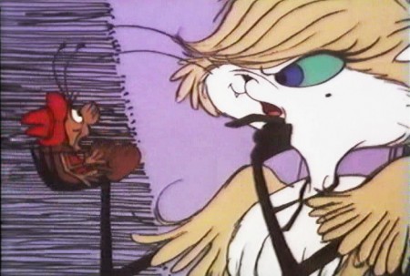
Here are some frame grabs from the first 1/4 of the film:
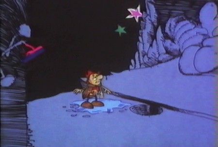
We’re introduced to Archy right off the bat as he
flies out of the river onto the dock. He realizes that he,
the poet, tried to kill himself and was sent back as a cockroach.
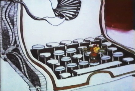
He soon finds a typewriter and goes straight back to work.
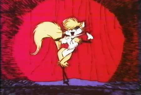
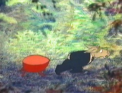
Mehitabel is a performer – with Carol Channing’s voice.
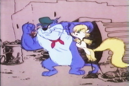
She has another boyfriend, voiced by Alan Reed,
who is also the voice of Fred Flintstone.
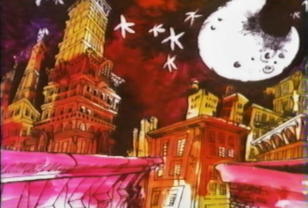
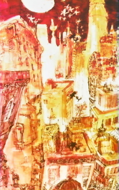
A song video takes us outside.
6.
- This final post featuring the work of John Wilson and his company, Fine Art Films, covers many varied film projects. Unfortunately, I found relatively few images available for posting especially considering the amount of film done.
The Sonny and Cher Show was a long running Variety program on television in the 70s. Most weeks featured an animated music video as done by John Wilson. Some examples of this include:
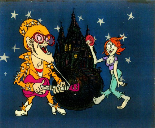
Helen Reddy’s song “Angie Baby”
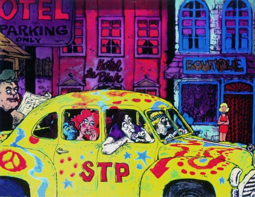
Joni Mitchell’s “Big Yellow Taxi”
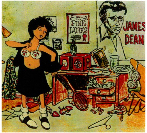
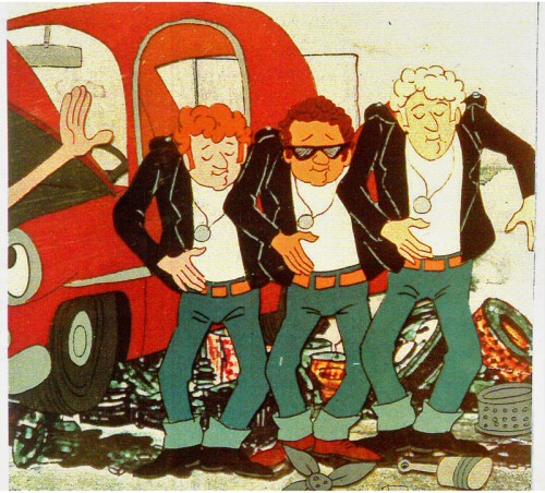
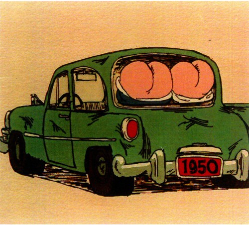
Fine Arts Films also did some movie titles and trailers. We saw, recently, the long theatrical trailer done for Irma La Douce. Here are a few stills done for the main title sequence for the 1978 musical, Grease.
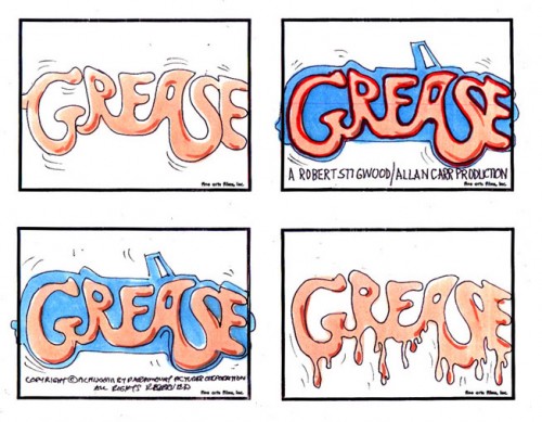
storyboard sketch for Grease.
Produced and Directed by John Wilson
Story and Layout by Chris Jenkyns
Music by Barry Gibb
John Wilson also directed a number of short films which appeared on television on the NBC program, “Exploring” between 1964-1966.
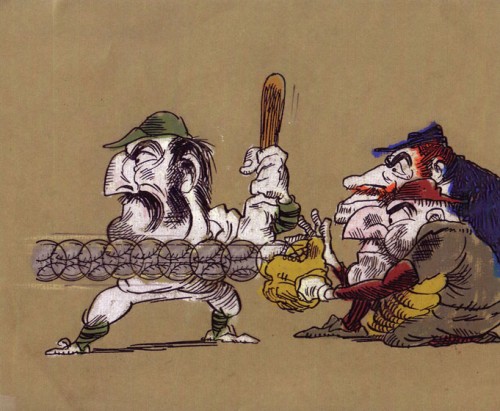
“Casey At the Bat”
Narrated by Paul Frees
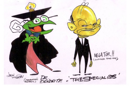
Finally, for MTV’s “Liquid Television” in 1992 John Wilson directed some of the 10 episodes of a series called “The Specialists.”
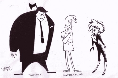 1
1
Go here to see other episodes.
Action Analysis &Animation &Animation Artifacts &Commentary &Fleischer &repeated posts 18 Jun 2013 07:41 am
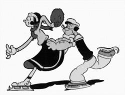
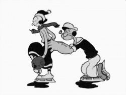
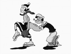
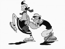
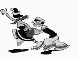
Popeye and Olive Cycle – repost
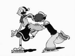
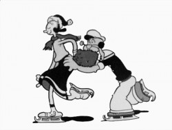
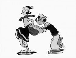
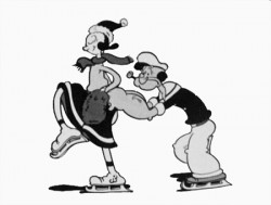
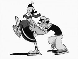
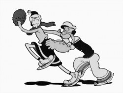
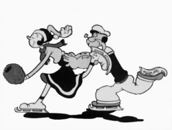
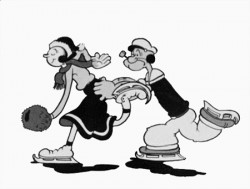
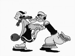
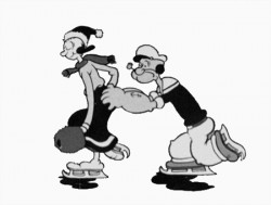
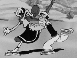 – Here’s a good example of something you won’t see animated in cgi. This is an ice skating cycle out of a Popeye cartoon, Seasin’s Greetinks!. It’s, of course, on the Popeye dvd, and is animated by Roland Crandall and Seymour Kneitel.
These Fleischer cartoons are so original in their jokes that there’s always a surprise or ten in every scene. The twists and turns are designed only to get laughs; I can give you a dozen examples from this short alone, but I’ll just recommend you watch the film.
It’s not just the stories that take odd spins, it’s the animation as well. There are bits that move in their own idiosyncratic way that are designed purely for laughs. Eccentric movements that would rarely show up in a Disney film dominate these Fleischer shorts.
Check out this cycle. Every eighth drawing is completely off the book. It gives the cycle a hilarious turn and completely dominates the move. It’s probably not the best way to build 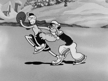 character (unless, perhaps, only one character moves like this), but it sure makes for some funny animation.
The thing about these Fleischer films is that it moves this way all the time. There’s always something about to take you for an odd turn, and while you’re looking for the big move, you’re just buying these small ones. The effect is cumulative, and the animation in these Fleischer films is just plain wacky.
A cgi animator doesn’t look for the odd twist in every frame. They can, but it wouldn’t make sense to be doing it that way, especially when the goal is to make the animation fluid in the final. The animation is too based on real life, as the computer sees it, and the individual frames don’t exist in the same way they do in 2D paper animation. There’s more risk in the 2D mode, but the reward can also be more ingenious and gratifying.
But what do I know? I don’t animate with cgi, and I’m just making a supposition based on what I’ve seen so far. Everything’s possible, but it sure doesn’t seem probable from my seat.
Having said that, let me also say that there aren’t too many animators doing 2D animation like this anymore. Maybe that’s the complaint I really have. Invention and daring in our medium seems to be a thing of the past.
 1
1 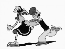 2
2
(Click any image to enlarge.)
Animation &Animation Artifacts &Commentary &commercial animation &Models &repeated posts 13 Jun 2013 09:07 am
Jax Beer – recap
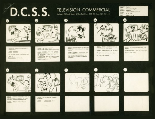
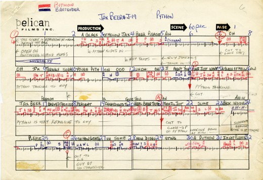
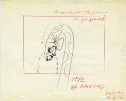
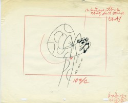
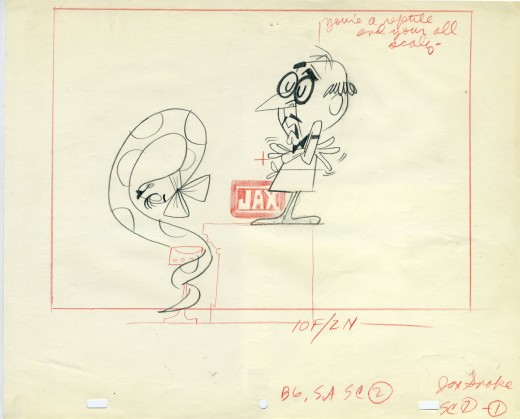
- In November 2006 I posted the storyboard, workbook and final layouts for a Jax Beer spot which was directed by Mordicai Gerstein. I thought it interesting enough to recap the two posts, so here they are.
- This is the material for a Jax Beer commercial. It was done by a NY studio named Pelican in 1962. There were about 75 people on staff at Pelican back then.
This spot was directed by Mordi (Mordicai) Gerstein. He left animation in th 70′s to write & illustrate children’s books. (He won the Caldecott Medal for his book, The Man Who Walked Between The Towers. This was the book I adapted to animation in 2005.)
What follows is the storyboard and the director’s workbook. (It appears to be an agency board, though it’s drawn in a style that looks to be Mordi Gerstein‘s. Perhaps boards from the agency were drawn by the studios back in 1964; I’m not sure. The layouts were drawn by the same artist.)
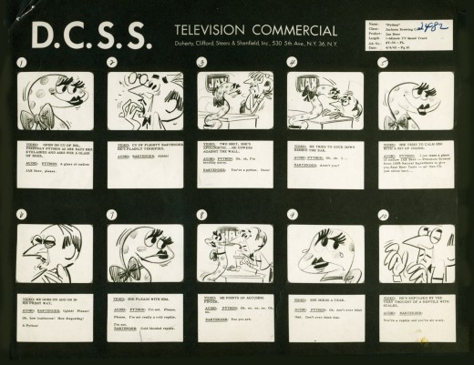
_____(Click any image to enlarge.)
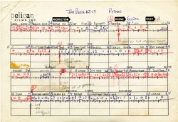
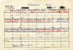
The workbook has several flaps on it that indicate changes in timings. There are also glue stains where I assume other flaps fell off. (See page one, last row, first column.) Each column represents 16 frames/one foot of film. Odd numbers are marked off.
Each row contains 8 feet of film/128 frames. Each page represents 32 feet/512 frames. It would have been smarter to keep to even numbers.
More modern exposure sheets generally have 80 frames/five feet per page. This also divides into two feet of 16mm film. (Handy.) The numbers add and divide smartly and easily. But then most people don’t use exposure sheets anymore.
 - Continuing with the above post, a Jax Beer commercial, I present some of the film’s layouts. This represents about 2/3 of them.
The art was done by Mordi (Mordicai) Gerstein, who also directed the spot. Grim Natwick animated the spot and Tissa David assisted him. Of course, this was in the days before auido tapes could be handed out, so the animator would get a phonograph of the soundtrack. They could mark it with a white pencil to indicate key spots.
I thought that this in conjunction with yesterday’s prep material gave a good indication of the preproduction that went into making a commercial back in 1962.
That said, here are the layouts:
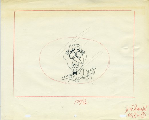
(Click on any image to enlarge.)
Animation &Books &Disney &repeated posts 11 Jun 2013 03:42 am
Retta Scott and Cinderella – repost
– Retta Scott‘s name was always an intriguing one for me.
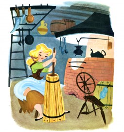
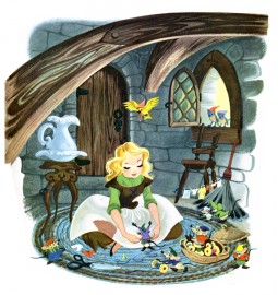
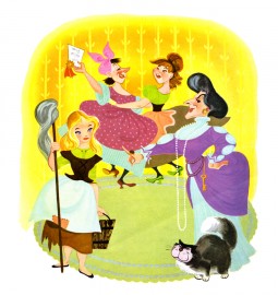
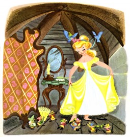
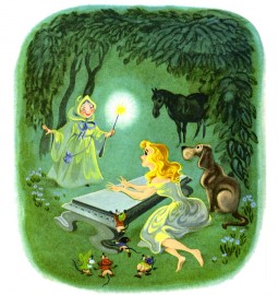
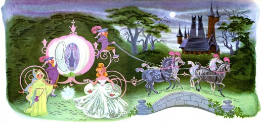
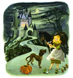
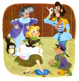
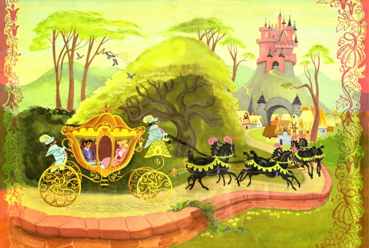
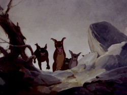 She was an animator on Bambi, Dumbo and Plague Dogs. She was layed off at Disney’s when they hit a slump in 1941 but came back to do a number of Little Golden Books for Disney. The most famous of her books was her version of Cinderella, one which was so successful that it remains in print today as a big Little Golden Book.
When asked why females weren’t animators at the studio, the Nine Old Men who traveled the circuit, back in the 1970′s, often mentioned her. They usually also said that she was one of the
.
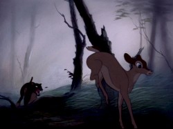
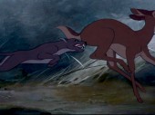
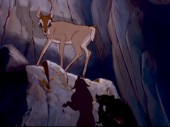
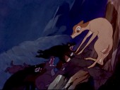
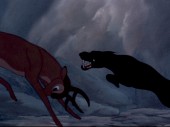
most forceful artists at the studio, but her timing always needed some help (meaning from a man.) Ms. Scott was known predominantly for her animation in Bambi. Specifically, she’s credited with the sequence where the hunter’s dogs chase Faline to the cliff wall and Bambi is forced to fight them off.
The scene is beautifully staged and, indeed, is forceful in its violent, yet smooth, movement. I was a young student of animation, so this sequence had a long and lasting impression on me.
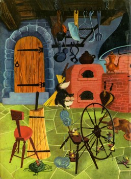
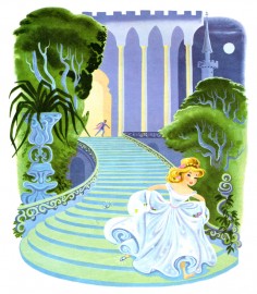
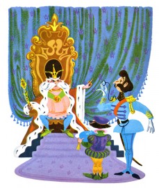
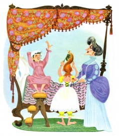
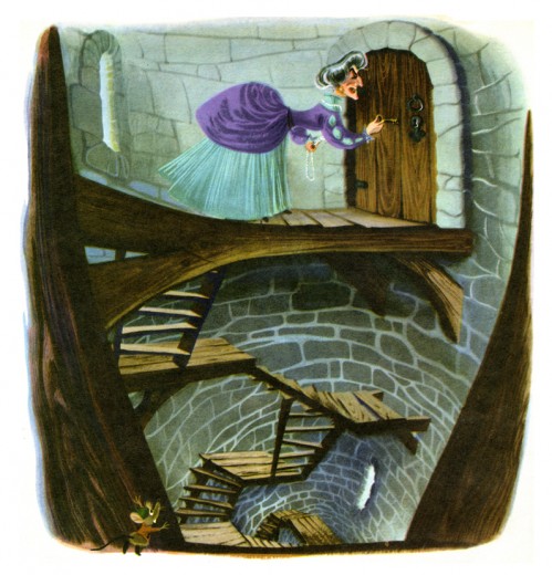
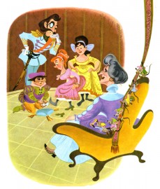
Here are some of her illustrations for Cinderella published in 1950 to tie in with the Disney film. Oddly, the illustrations don’t completely look like the film’s characters. The cat and mice are close, but Cinderella, herself, is very different, less realistic. She looks more like a Mary Blair creation. When I was young, I was convinced that these were preproduction illustrations done for the film. If only.
I won’t post all the illustrations of the book; I want to give an indication of her work, and I think this should be enough to do that.
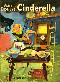
(Click any image to enlarge.)
Action Analysis &Animation &Articles on Animation &Books &Commentary &Disney &Illustration &Richard Williams &Rowland B. Wilson &SpornFilms &Story & Storyboards &Tissa David 10 Jun 2013 03:31 am
Illusions – 3
I’ve written two posts about Frank Thomas and Ollie Johnston‘s book, The Illusion of Life the last couple of weeks. I came to the book only recently and realizing that I’d never really read the book, I thought it was time. So in doing so, I’ve found that I have a lot to write about. The book has come to be accepted almost as gospel, and I decided to give my thoughts.
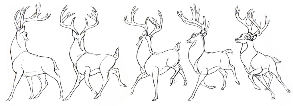
There were two major complaints I’ve had with what I’ve read in their book so far, and I spent quite a bit of time reviewing those.
- First out of the box, I was stunned to read that these two of Disney’s “nine old men” said that they’d originally believed that each prime animator should control one, maybe two characters in the film. Then, later in life they decided that an animator should do an entire scene with all of the characters within it. This is not what I’d seen the two (or the nine) do in actual practice. post 1
Secondly, they argue for animating in a rough format, and they give solid reasons for this. As a matter of fact, it was Disney, himself, in the Thirties who demanded the animators work rough and solid assistants who could draw well back them up. Then much later in the book the two author/animators suggest that it’s better for an animator to work as clean as possible with assistants just doing touch-up. This helped out the Xerox process, but didn’t necessarily help for good animation. post 2
The book starts out sounding like it’s going to be a history of Disney animation, but then starts getting into the rules of animation (squash and stretch, overlapping action and anticipation and all those other goodies) exploiting Disney animation art in demonstration. Soon the book moved into storytelling and how to try to keep the material fresh and interesting. It all becomes a bit obvious, but you keep hoping that some great secret will be revealed by the two masterful oldsters.
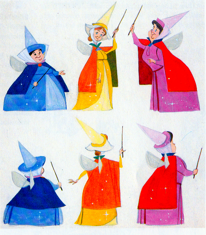 They do go into depth about how to develop characters when making animated films. They offer lots of examples from Orville, the albatross in The Rescuers to the three fairies in Sleeping Beauty, but their greatest attention goes to Baloo the Bear in The Jungle Book. They were having a hard time with this guy; they had been trying to do an Ed Wynn type character, until Walt Disney, himself, suggested Phil Harris. Once they auditioned Harris, they knew they were on the right track, and the character kept grabbing more screen time and grew ever larger. In the end, audiences just loved him.
Personally, I’ve always hated Phil Harris’ performance in this film. What was it doing in Rudyard Kipling’s book? When I was a kid, Harris and Louis Prima were the perfect examples of my father’s entertainers. He loved these guys and spent a lot of time in front of the family TV watching the Dinah Shore Show______Tom Oreb designs for Sleeping Beauty.
and other such entertaining Variety Shows with
lots of little 50′s big-band jazz-type acts. I hated it; this was my parent’s kind of music and humor and had nothing to do with me. I was the kid who paid his quarter to see the Walt Disney movies (that was the children’s price of admission in 1959.)
In their book they say they knew he was perfect because generations of kids later (who have no idea who Phil Harris was) still take joy from Baloo. What they forgot is what I knew all along. This was The Jungle Book. If they had been truly creative, they would have developed a character in line with Kipling’s material that would have been an original, not an impersonation of Doobey Doobey Doo, Phil Harris. The same is true of Louis Prima as a monkey. (There was a time when Disney said that they should never animate monkeys because monkeys are funny on their own, in real life. Animation wouldn’t make them funnier.) Sebastian Cabot, as Bagheera, works as does George Sanders as Shere Khan.
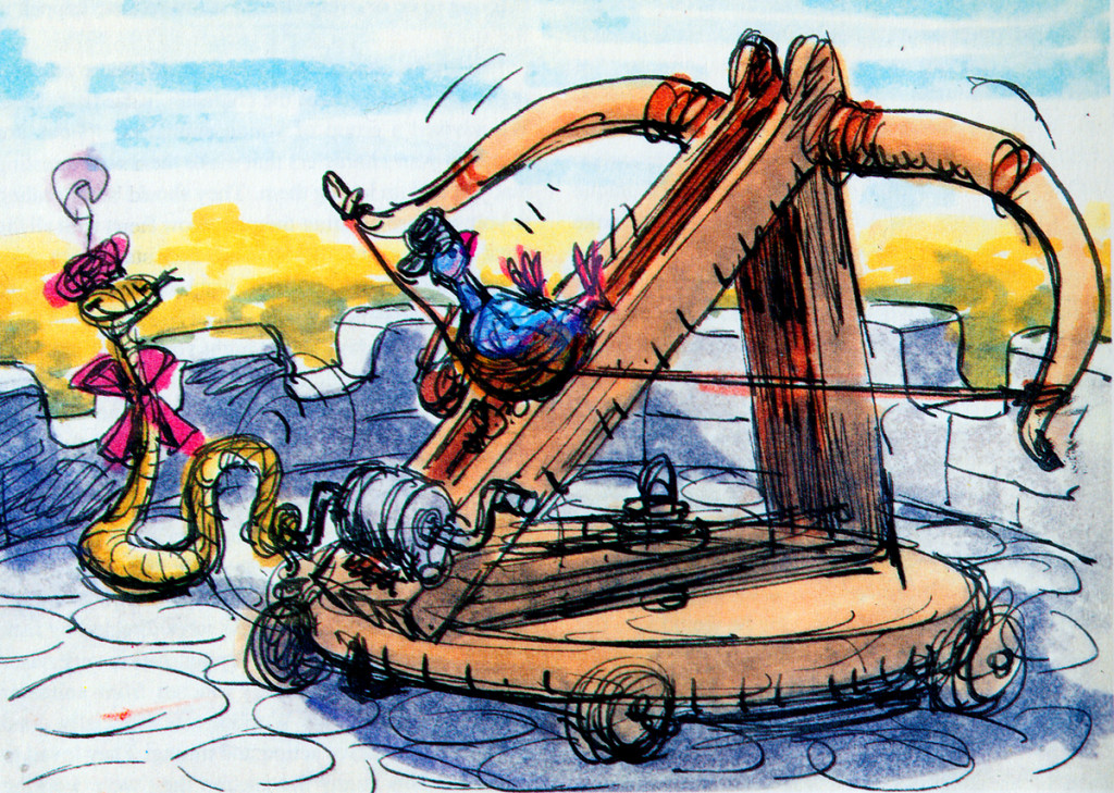
- Right: A discarded sequence from Robin Hood showed a messenger pigeon so fat and heavy he had to be shot into the air. This gave the animators the beginnings of The Albatross Air Lines in The Rescuers.
Phil Harris was so successful, they dragged him into Robin Hood as well. Robin Hood. The very same character from The Jungle Book is now Little John! All those cowboy voices in Robin Hood don’t work either, especially when you mix them up with Brits like Peter Ustinov and Brian Bedford. When these two thespians work against Pat Buttram, Andy Devine and George Lindsey, it’s one thing. Throw in a Phil Harris, and you have something else again. Where are we, the audience, supposed to be? Is it “Merry Ol’ England”? Or is it the lazy take on character development by a few senior animators who have taken license to jump away from the story writers for the sake of easy characters of the generation they’re familiar with. Robin Hood is a mess of a story – even though it’s a solid original they’re working from, and I find it hard to take written advice from these fine old animation pros who take an easy way out for the sake of their animation; shape shifting classic tales to fit their wrinkles.
At least, that’s how I see it – saw it. And perhaps that’s why it’s taken me so long to read this book. I felt (at the age of 14 when these films came out) that the Disney factory had turned into something other than the people who’d made Snow White and Bambi and Lady and the Tramp.
They had, in fact, become the nine old men.
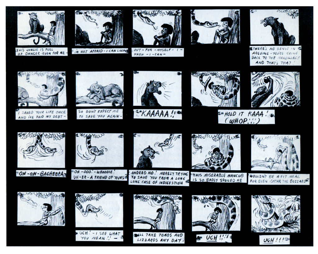
The Jungle Book was the last film Bill Peet worked on. He left
before the film was done. He’d had a long, contentious relationship
with Disney. He never felt he’d gotten the respect he deserved.
They were incredibly talented animators, and they certainly knew how to do their jobs. The animation, itself, was first rate (sometimes even brilliant as Shere Khan demonstrates), but try comparing the stories to earlier features. Even Peter Pan and Cinderella are marvelously developed. Artists like Bill Peet and Vance Gerry knew how to do their jobs, and they did them well. When Peet quit the studio, because he felt disrespected, Disney’s solid story development walked out the door.
The animators were taking the easy route rather than properly developing their stories. The stories had lost all dynamic tension and had become back-room yarns. Good enough, but not good.
Today was Nik Ranieri‘s last day at Disney’s studio. He’s definitive proof, in the eyes of Disney, that 2D animation is dead as an art form. This is the end result of some of the changes Thomas and Johnston suggest in their book. The medium took a hit back then; it just took this long for the suits to catch up. Good luck to Nik and the other Disney artists who no longer work steadily in what is still a vitally strong medium.
Animation &Commentary 06 Jun 2013 06:24 am
Modern Animation
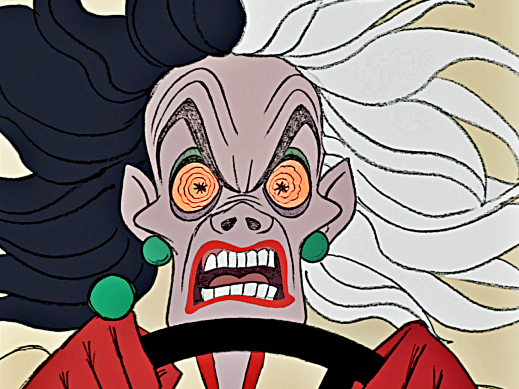
Andreas Deja has a recent post which begins with Cruella de Vil in bed, in curlers, reading the newspaper. She is annoyed by a phone call from Jasper, one of her henchman. Andreas reports her half of the conversation, “‘Jasper!’ she pauses in anger, then ‘Jasper, you idiot!’”
Andreas, finishing up his comment on Marc Davis‘ beautiful animation, writes,”Everything is top notch here, her body composition, wonderful grotesque expressions – those cheekbones are priceless – and of course subtle, controlled animation.
Modern animation as good as it gets.”
That last phrase really got me thinking, “Modern animation as good as it gets.” How astute of him. It’s something I’d thought about before, but here it’s actually articulated by Mr. Deja, one of the most important of the 2D feature film animators. (To me, he’s probably the finest of all current animators.)
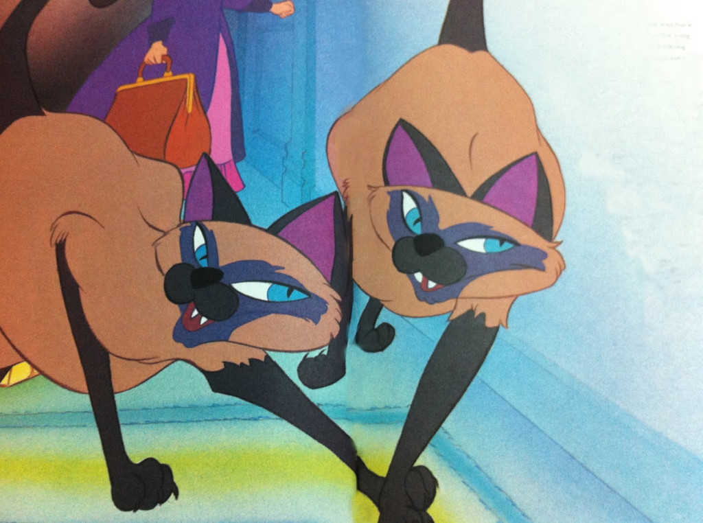 I’d placed the break in animation from Richard Williams onward. Dick had studied all the masters, imitated and reworked many of their best moves. He turned his thriving studio in the seventies and eighties into the pinnacle of the medium, teaching animation to many gifted artists and producing commercials, predominantly, had trained a small army to go out into the world and make good, strong theatrical style animation of the highest caliber. Rules were reworked and made to work to get the richest form of the medium.
Animation was reborn in the style of Richard Williams and his influences such as Art Babbitt, Ken Harris. and Milt Kahl.
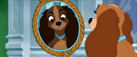
Hans Perk on his blog, A Film LA, publishes the drafts of the animators working on the Disney features allowing us to know who did what scenes. These are usually very informative. Hans recently completed posting the drafts to Lady and the Tramp. In among these drafts, Hans made this comment:
- Again, very serviceable animators, no masterpieces…
I like the CinemaScope note for sc. 28: “Lady will have to be alive throughout scene.”
Then if you notice other scenes on this page there are some that dictate “held cels” of other characters to the left or right of screen. They were certainly trying to control the animation for the wide, Cinemascope screen. See if you can find a note like that on any feature done today. See if you can find ANYTHING held on any feature done today.
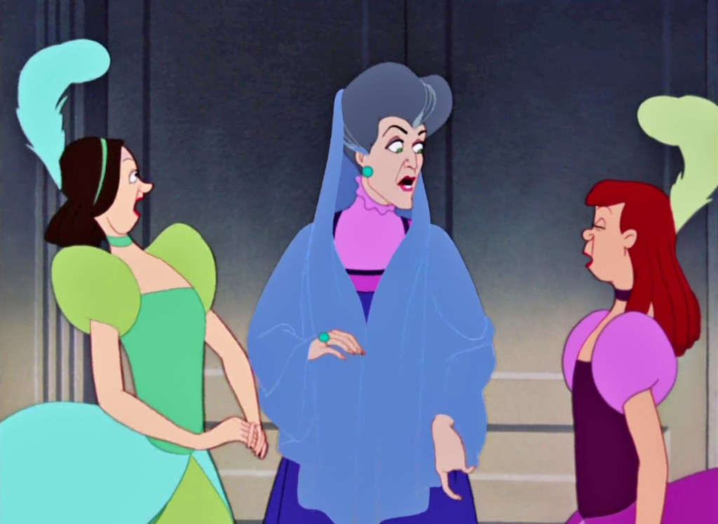 Of course, I’m talking principally of 2D animation – Disney (or Dreamworks) 2D features.
Andreas is writing about animation features done from Cinderella forward. I believe he’s considering the changes that the live action reference work to make Cinderella, Alice and Peter Pan led to Sleeping Beauty and later films. 101 Dalmatians was the big change with the human animation, led by Milt Kahl, Marc Davis, and to a great extent Frank Thomas.
This was the big change. This was the model followed by animators that came after the “Nine old men.” With a couple of films, such as Beauty and the Beast and Aladdin, a cartooning style entered the work and stayed there. The genie in Aladdin almost turns that film into a reworked Warner Bros cartoon. But a couple of the animators: Andreas Deja, Glen Keane, Mark Henn, Duncan Marjoribanks, Ruben Aquino and several other prominent among this generation went directly to the Milt Kahl model. Interestingly, this is also Dick Williams‘ model.
Of course, Milt Kahl is perfect to place at the center as an ideal.
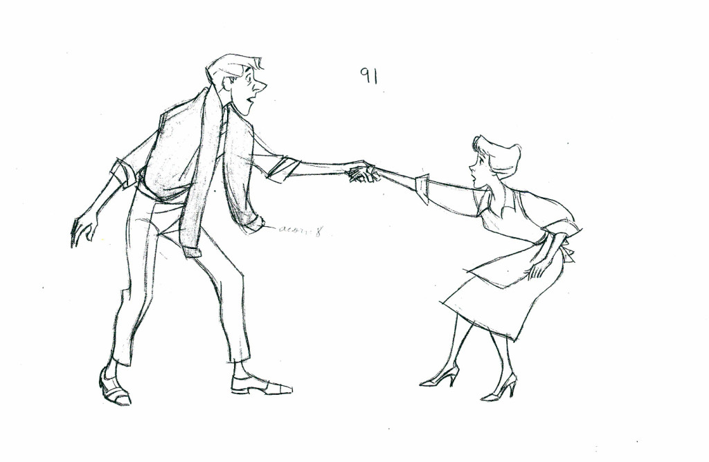 Just as Snow White and Pinocchio were a step up from the Silly Symphonies, so too, 101 Dalmatians and Sword In The Stone were a step up from Cinderella and Peter Pan. Tarzan, The Lion King, and The Prince of Egypt were remarkable changes from The Little Mermaid, Beauty and the Beast, and Aladdin.
Given the work on Lilo and Stitch, Mulan, Spirit and several of the later features, it seems like a major change – a new growth period was due. Yet it was cut short by the financial success of some of the cgi features. 2D animation stopped.
Modern animation was stilled for the moment.
Animation &Animation Artifacts &Disney &Layout & Design &repeated posts 05 Jun 2013 03:29 am
The Story of the Dogs – repost
To keep in accord with Hans Perk‘s recent posting of the drafts to Lady and the Tramp, I am reposting a couple of these valuable past posts. Here’s one I like a lot.
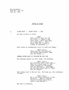
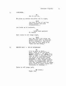
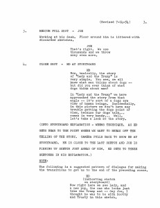
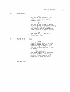
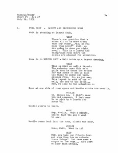
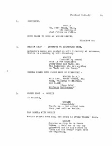
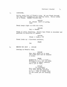
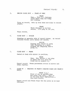
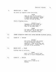
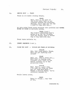
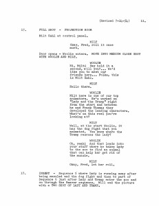
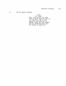
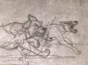
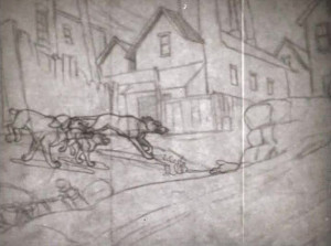
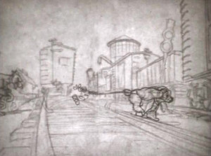
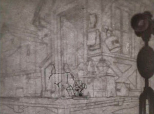
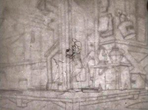
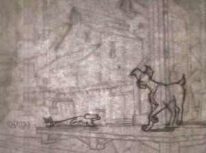
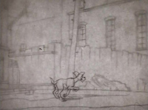
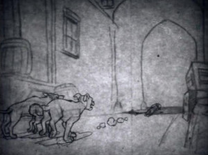
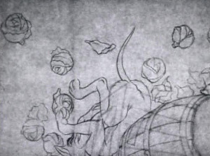
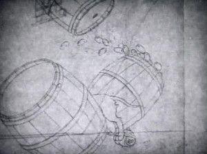
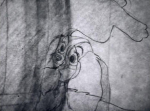
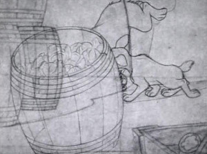
- A friend (who asked to remain anonymous) sent a copy of this script of “The Story of Pluto,” an early episode of the Disneyland TV show. This document obviously follows the show very closely, but I think a lot of the on screen dialogue is actually missing. Regardless, I thought it a good opportunity to go back to the show (which when it hit TV was called “The Story of Dogs.” (At least, the video on the Lady and the Tramp DVD, which has the same date listed is longer.)
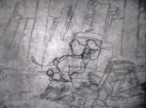
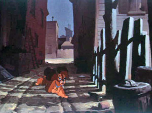
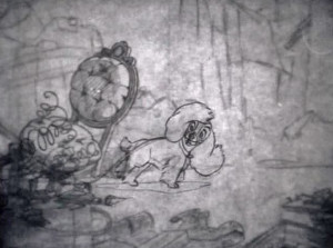
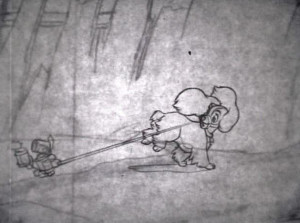
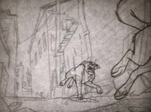
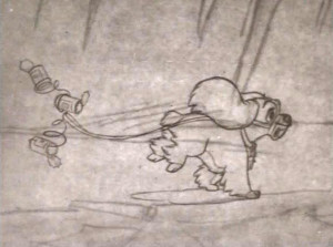
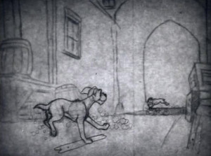
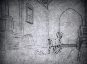
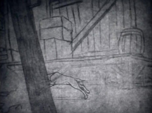
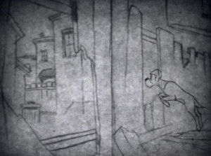
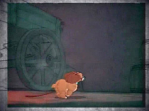
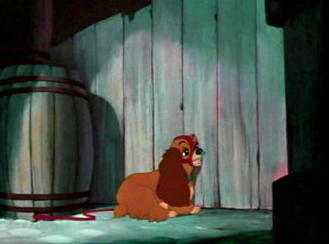
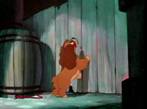
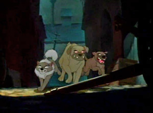
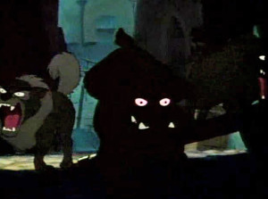
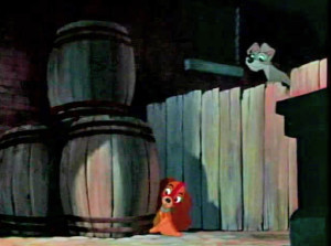
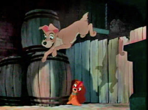
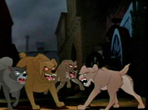
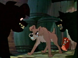
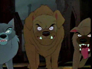
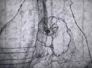
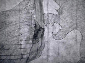
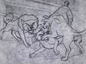
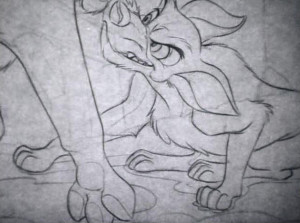
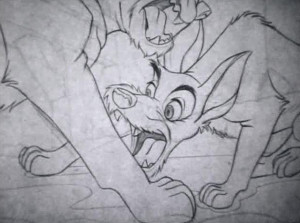
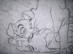
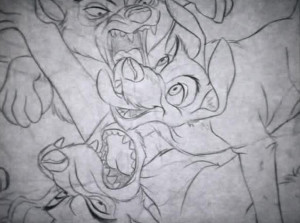
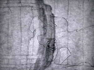
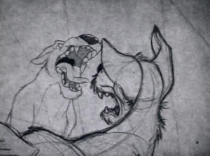
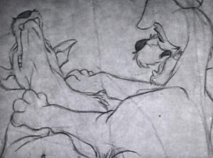
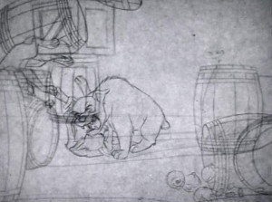
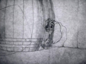
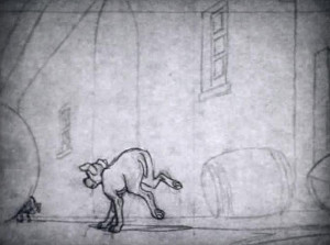
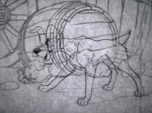
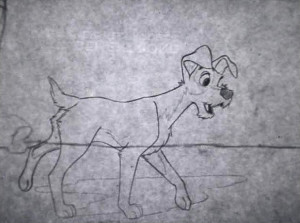
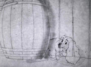
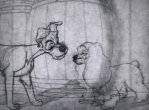
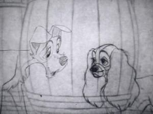
I’ll first post the “script” and then will follow with frame grabs from the TV program wherein Lady runs from some rough dogs who are chasing her, and Tramp comes to her rescue. The original show aired in B&W, but this version mixes B&W PT to color ruff-cut. It’s one of my favorite sections of the film with a lot of animation by Woolie Reitherman. (It comes on page 11 of the script.)
Here are the script pages:
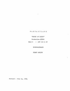
Script Cover
This sequence is followed immediately by Milt Kahl‘s sequence where Lady and the Tramp go to the zoo. They seek the help of the beaver to remove her muzzle.
Animation &Disney &Frame Grabs &repeated posts 28 May 2013 05:38 am
Whoopee
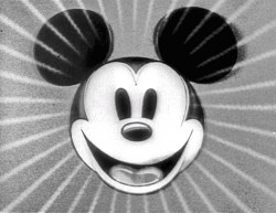 - Before there was video tape (which means before there were dvds), there was only 16mm film that you could project in your own home. I had (and still have) a nice collection of decaying movies and used to show these often. One of the regulars to show and watch and laugh at was the great Mickey short, The Whoopee Party. Everyone loved this short, no matter how many times we watched it. It’s a great film!
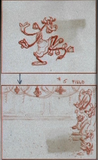
This encouraged me to watch it again on the B&W Mickey dvd I have. So I couldn’t help but jump for joy over the story sketches they include in the extras. Why not post them? So here they are – sketches from the limited storyboard they produced. I’ve also interspersed frame grabs from the film so you can compare images.
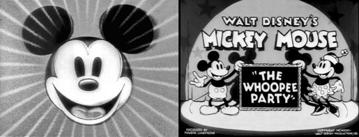
________________________(Click any image to enlarge.)

____________(Click any image to enlarge.)
 13
13
Animation &Animation Artifacts &Commentary &Independent Animation 21 May 2013 05:11 am
Tissa’s Nidsummer Night Dream
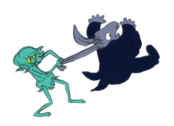 - From 1983-85, Tissa David teamed with three other friends in Holland to begin work on an animated version of Mendelssohn’s Midsummer’s Night Dream.
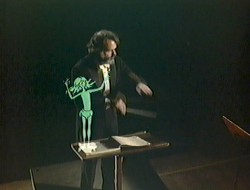
This film would introduce several animated characters from Shakespeare’s play over a live action orchestral performance of Mendolssohn’s music. These characters chased each other around the orchestra until, eventually, the animation took over, and the orchestra melted away. The tympanist, himself, melded into Bottom.
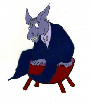 This film was completely animated by Tissa, including all inbetweens and layouts. She was the film’s director, though in all the time she worked on this film, she never once described her role to me as such. She was just making a film she loved with several extraordinarily talented friends.
Kalman Kozelka was a brilliant cameraman who shot the entire film in a home built multiplane camera. It’s unjust to call it simply photography, because every scene involved seven to ten exposures with mattes and special lighting. Half of the scenes combined live action with the animation, and all of the scenes involved multiple levels with back and front lighting.
Ida Kozelka-Mocsary, Kalman’s wife, designed all the character coloring and colored all the cels . She worked closely in helping Kalman to prepare everything for the photography including mattes.
Richard Fehsl was the brilliant designer who colored and, in many cases, animated the Bg’s. All of these Bg’s were painted with dyes on frosted cels under rather delicate inking.
All four took story credit.
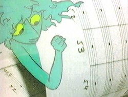
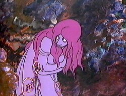
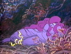
I have a good handful of the overlarge cels and artwork from the film. Here are a few of those cels along with a number of representative frame grabs from the film.
 __
__
__________________(Click any image to enlarge.)
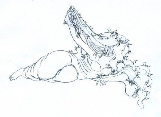
__________________Titania, the drawing and the cel.
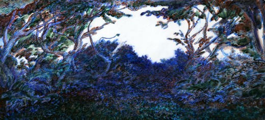
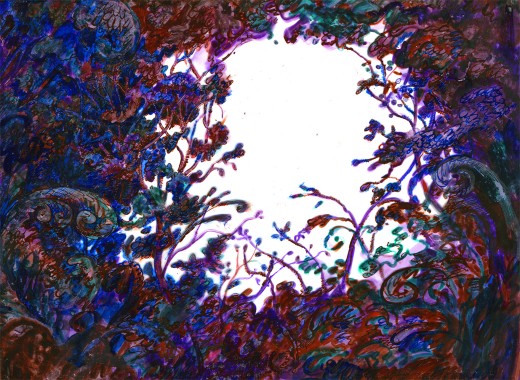
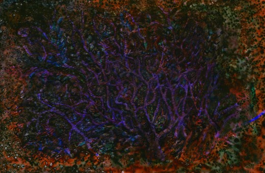
__________________Three of Richard Fehsl’s Bg elements. These were back lit
__________________and front lit and combined with other Bg levels.
 __
__
At times, Fehsl’s Backgrounds animated.
___I have so much more art from this film, that there’ll surely be more posts to come.
This video (vhs) can still be located – used copies – on Amazon here.
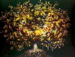
The film features a live-action orchestra with Shakespeare’s characters running wild over the footage. Eventually, the picture opens to an animated woods. It was photographed by Kalman Kozelka, color styled by Ida Kozelka-Mocsary, and Bg designs by Richard Fehsl.
The film aired on the BBC in 1983 and was released on VHS by Goodtimes Video.
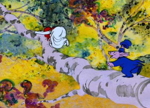
(click any image to enlarge.)
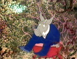
Bottom chases Titania in the woods.
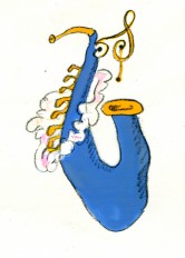
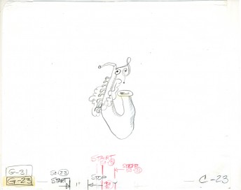
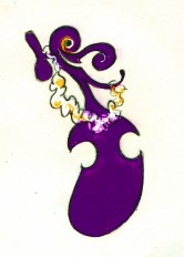
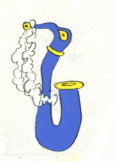
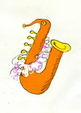
At one point the instruments of the orchestra take on an animated life of their own.
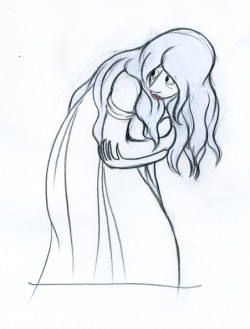
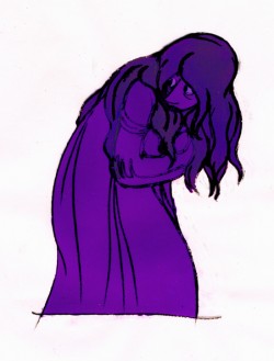
The dark coloring loses some of the emotional delicacy of the drawing,
but is appropriate within the context of the film.
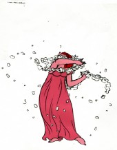
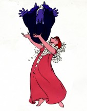
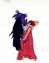
Titania catches Bottom in her arms.
Three cels from a sequence.
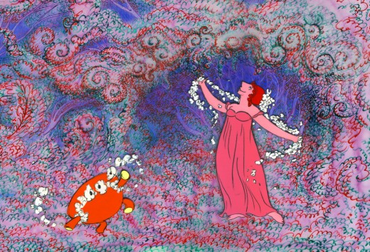
Titania dances with Bottom’s stool. (He’s brought it into the woods
when he transformed from the tympanist to the animated character.)
Action Analysis &Animation &Books &Commentary &Disney 20 May 2013 05:54 am
Illusions – of Life
I started discussing some of the thoughts put forward in The Illusion of Life, the book by Frank Thomas and Ollie Johnston. I had some major problems with some of the discrepancies in that book. Here’s the second, a continuation of that post.
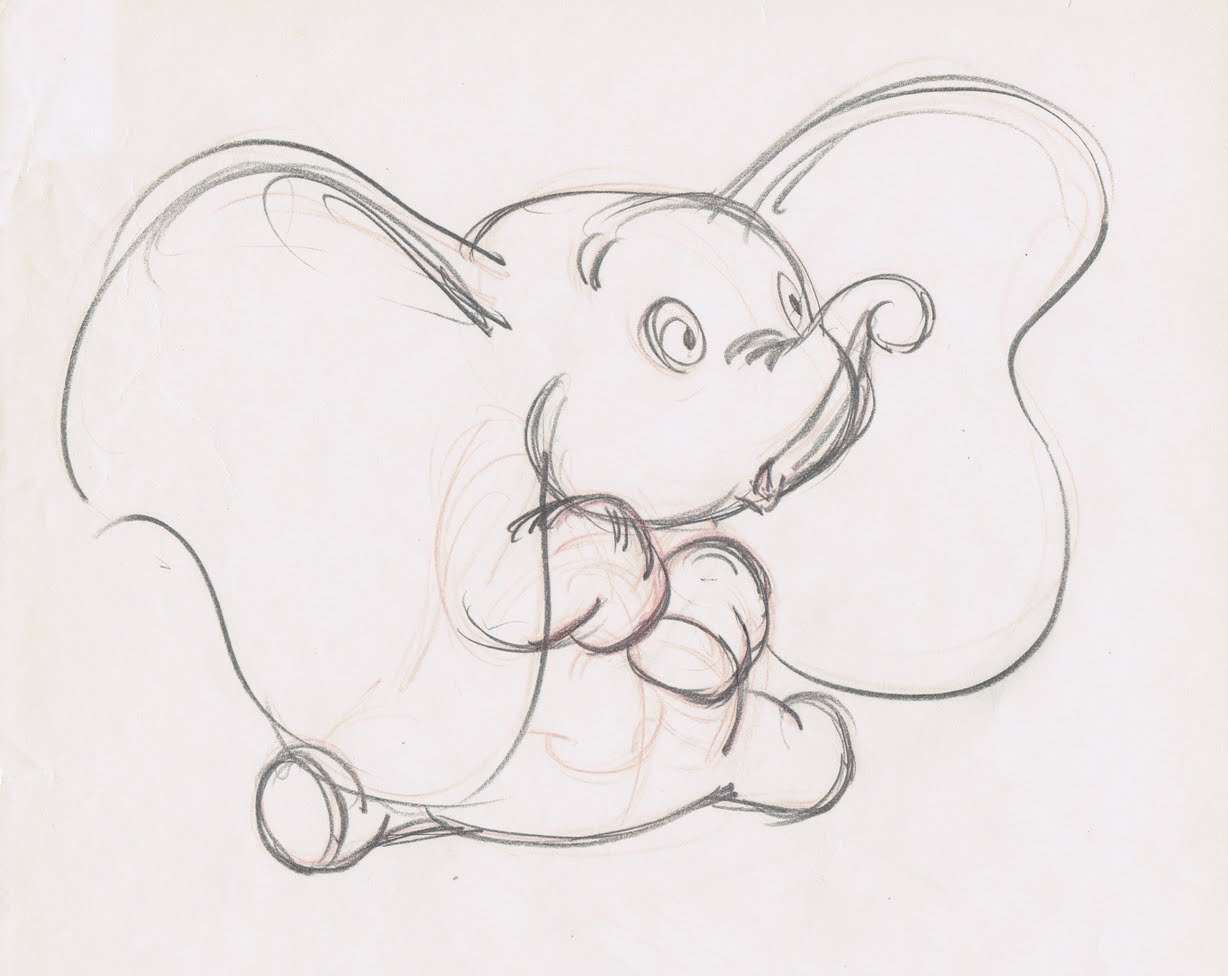
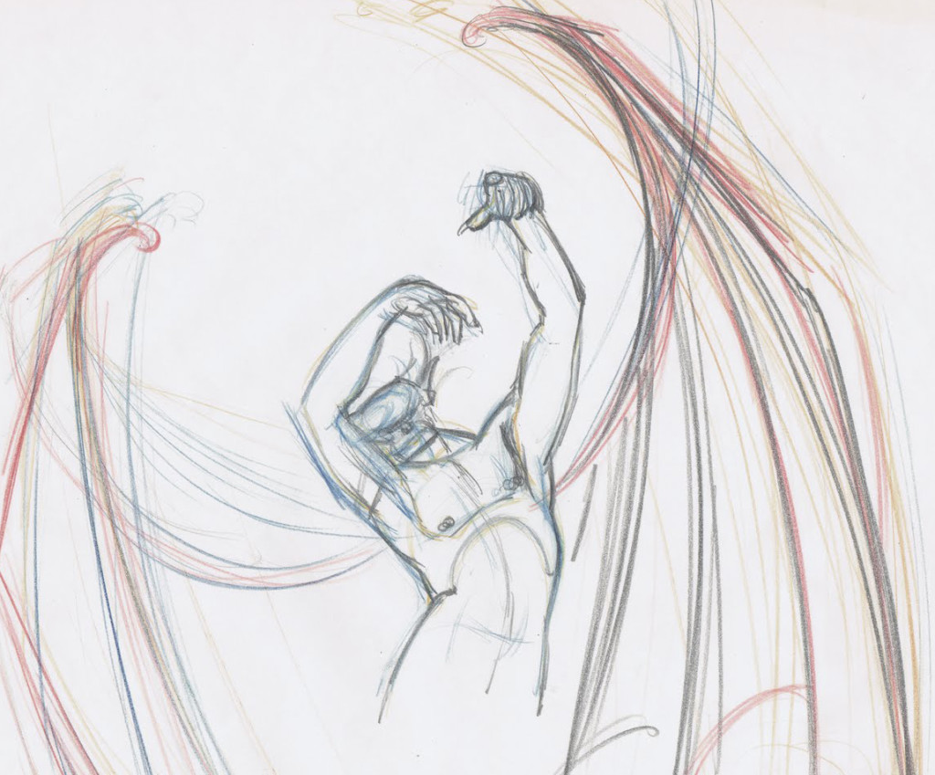
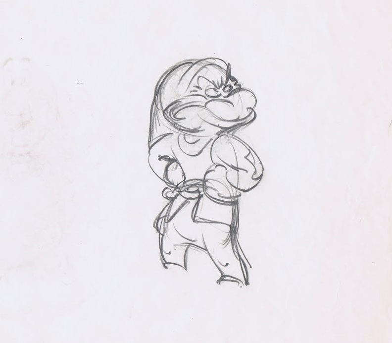 It cannot be doubted that without the speedy roughs, there would never have been the brilliance of Tytla‘s best work or Ferguson’s great comic animation.
- On page 39 of the book, we read, “Walt introduced two procedures that enabled the animators to begin improving. First, they could freely shoot tests of their drawings and quickly see film of what they had drawn, and, second, they each had an assistant learning the business who was expected to finish off the detail in each drawing. Walt was quick to recognize that there was more vitality and imagination and strength in scenes animated in a rough fashion, and he asked all animators to work more loosely. The assistant would ‘clean up’ these drawings that looked so sloppy, refining
 them to a single line that could be traced by the inkers onto celluloid. The assistants became known as ‘clean-up men,’ and the animators developed one innovation after the other, achieving effects on the screen that no one had thought possible. In some cases, the drawings were so rough it was difficult to find any cartoon figure inside the tangled swirl of lines, and the men who made a duck or a dog out of smudges and scratches had to have a very special type of knowledge.
Shooting tests of scenes while they were still in the rough enabled the animators to check what they had done before showing it to anyone. Any part that was way off could be corrected quickly and
 shot again. This encouraged experimentation, exploration, and imagination, quickly promoting a closer bond among the animators.
- Yet on page 229 the authors turn to side with management when they suggest that “. . . a new procedure called ‘Touch-up’ was instigated. It asked that the animator draw slowly and carefully enough so that the assistant need only touch up the drawings here and there to make them ready for the Ink and Paint Department. By this time all of our animators had become more skillful and were able to adjust to the new idea without noticeable damage to the product. Top quality clean up work is needed on only a handful of scenes in any sequence, and a great variety_____________Three Tytla ruffs
of shortcuts can be used on the balance
to make them acceptable.”
 In short, this means that the older nine men and some of the other more seasoned veterans could work clean because they were already brilliant at the animation thing. Whereas Walt had demanded that animators, in the 1930s, work rough so as to keep the animation as loose and free and alive as possible.
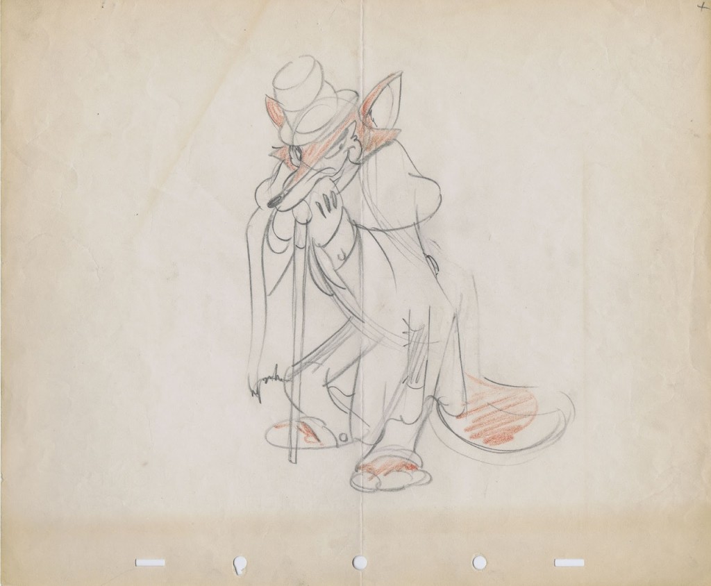
It also veered toward Milt Kahl’s pleasure at seeing hos own lines used in the newly developed Xerox outline in the final ink & paint. If the assistants would indiscriminately erase only some of the animators’ lines leaving many other key lines (including, at times, construction lines for the face and body parts). Kahl’s ego wanting to see his own beautiful line meant superseding color inking – as had been done in the past._______A relatively clean drawing by Norm Ferguson
Using this new procedure would mean a need for fewer clean-up artists who could work faster and with fewer problems, thus speeding up the footage rates. It also depended on the animators, such as Thomas and Johnston who worked fast enough, that the footage rates were now closer to what they could turn out.
One wonders if this new found speed would also cut into the imagination of the scenes these men animated. (By they way, I use the term “men” because Johnston and Thomas do not once in this book consider the possibility of a female animator. It’s always”men” or “he” or “him”. Old prejudices die hard; though I suspect the two had no problem with the idea of a female animator. In fact they always bowed low in front of Tissa and her abilities. And I’m certain they were not patronizing her in any way.
One wonders if a chink in the armor hadn’t developed then and there in the animation production. Younger people would do all they could to work clean, thus handicaping the animation they turned out.
As a long-time assistant, I know that my animation has been tight to the extreme, annd more than once Jack Shnerk advised me to start working rough when I animated. However, as management (I am the boss of my own company and controller of my own films), I sought to turn out the largest output and eliminated any assistant or inbetween working on my material. I sacrificed good animation for speed and production. It has not only hurt my work but my films, and I know it.
 1
1

 2
2
 3
3
 4
4
 5
5

 6
6
 7
7
 8
8 9
9
 10
10
 11
11
 12
12

 14
14
 15
15
 16
16
 17
17

