Category ArchiveAnimation
Animation &Articles on Animation &Books &Independent Animation 20 May 2010 09:35 am
Zagreb’s Start
- Recently, I’ve tried to put a bit of focus on some International world leaders in animated film and give some attention to the heroes of the past. Naturally, Zagreb Film would be a source of many important names. This was a Yugoslavian studio that had limited resources and budget and they did the most with what they had. When their film, Ersatz, won the Oscar in 1961, it put this small studio on the map. Dusan Vukotic, the director of that film, led the studio.
Here’s a couple of small excerpts from a book, Z is for Zagreb by Ronald Holloway, that gives a good overall view of the start of the studio and a bit about Vukotic’ biography.
In the early Fifties, the Yugoslav economy was getting off the ground and business advertisements began to appear in the newspapers. The possibility arose again of producing publicity films, as the Maar Brothers had done successfully before the war. Besides, a staff of trained Duga personnel was becoming bored with comic strips and illustrations for books and magazines, and itched to get back into animation. When an English book store opened in Zagreb and news poured across Kostelac’s desk of UPA and Bob Cannon’s Gerald McBoing Boing, the itch became a torture. How were these beautifully designed cartoons made? There were no clues, but everyone was sure it was something for them.
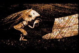
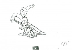
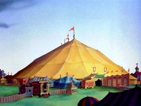
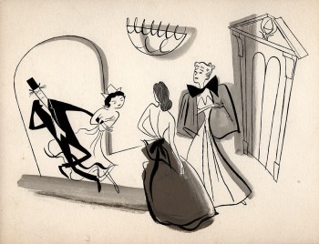 Another break came in the least expected fashion. American films were being bought for Yugoslav consumption, and among those screened for selection was Irving Reis’s The Four Poster (1952). The film itself was not so important, but the animation bridges between sequences were. A sparking, tongue-in-cheek design by John and Faith Hubley graced the antics of Rex Harrison and Lili Palmer in the two-role film: it was the first UPA “cartoon” to enter the country. The film was screened by an excited small audience over and over, and then sent back to the source from which it came—unbought! Harrison and Palmer were never to know how important they were to the growth of Zagreb animation.
With these innovations in mind a veteran group of cartoonists gathered around Kostelac and Vukotic to make advertising films on their own. Production manager was Kostelac, script and direction flowed from Vukotic, Marks (already an acknowledged graphic artist) did the designs, Jutrisa and Kostanjsek animated, and Bourek and Kolar painted the backgrounds. The money came out of their own pockets, but they were able to secure from Zagreb Film production and distribution help. Vukotic and Kostelac toured the country, and with the help of a fellow Montenegran Vukotic secured the necessary commissions from factories and business concerns. Then he and Kostelac retired to a hotel room with typewriter and drawing board to come up with a suitable idea. Thirteen advertising films, ranging in length from thirty seconds to one minute, were produced in the period 1954—55, eleven of them in colour.
Since material resources and particularly the availability of cels (transparent celluloids containing the drawings to be photographed) were limited, the process of “reduced animation” was discovered. Some films took an unbelievable eight cels to make, without losing any of the expressive movement a large number of eels usually required. Drawings were reduced to the barest minimum, and in many cases the visual effect was stronger than with twice the number of drawings. Marks and Bourek went out of their way to round up a number of artist friends to help solve complicated problems. Writers, architects, sculptors lent a creative hand whenever needed. The cartoons took on a daring, avant-garde surface, a strange character for a business enterprise. But not one of their commercial customers complained or rejected a film.
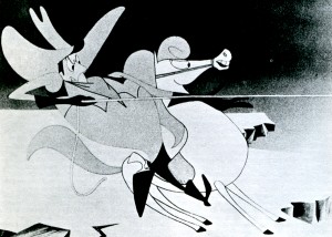 The freed drawings brought about by “reduced animation” cannot be underestimated. These were the forerunners of modern experimental television commercials, and although they appear commonplace today they were highly revolutionary in the Fifties. For the young Zagreb cartoonists the process provided a school of freedom, originality and invention. Every phase of the cartoon was broken down to its basic parts and tested and retested: script, design, background, musical accompaniment, editing, factors of rhythm and timing. By limiting the drawings the characters were freed from realistic movement and given a characteristic life of their own, thereby increasing the film’s tempo and enriching scenes with new forms of expression. Shades of meaning entered into the cartoon’s movements, details began to determine the action, and the preciseness of an expression drew its force from duration of time minutely calculated. A cartoon done at Duga Film normally required 12,000 to 15,000 drawings; reduced, it came down to 4,000 to 5,000 drawings. Further experiments uncovered new ways to compose a scene, paint a background, add a sound effect, construct a bold graphic, build a proper atmosphere, and finally edit tensions into the action to reach a satisfying whole. The only phase left untouched from the Duga days was the general direction of movement; everything else had somehow changed. And, most important of all, the character was no longer an anthropomorphic imitation.
When they appeared in the cinemas, the fantastic, dynamic feeling inside these cartoons charmed the public. Former staff members couldn’t match the finished product with the number of cels used. More commissions began to roll in, and Zagreb Film took another look at the young innovators within the company. As the way opened for new production standards in 1956 (due to a new law separating Zagreb Film from its film distribution branch), it was decided to give story animation another try. The resourceful Kostelac pulled out of a sleeve a card file of former Duga employees, and rounded them up with a taxi and a knock on the door. Enough responded to begin work immediately on a story cartoon for the Pula Festival (another scheme of Fadil Hadzic to promote the growth of Yugoslav cinema), and they worked day and night on The Playful Robot. Script was by Andre Lusicic, direction by Vukotic, design by Marks and Kolar, animation by Jutrisa and Kostanjsek, backgrounds by Bourek—and mistakes by all. There was something basically Disneyish about this effort, and it was admittedly inferior to the high-powered antics of the characters in the ad films.
Nevertheless, Vukotic won a prize at Pula for pioneering Yugoslav animation, and Zagreb Film found itself with an animation studio.
Dusan Vukotic
(Born 1927 in Bileca).
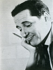 The most important name in Yugoslav animation. It was through his drive and determination that the cartoon won respectability at home and recognition abroad. He has won over fifty prizes and citations for his sixteen major cartoons. He studied architecture and worked as cartoonist on Fadil Hadzic’s Kerempuh, moving up to head of his own unit under Hadzic at Duga Film in 1951—52. As director, designer and animator he created the national figure of Kico, a little government official on inspection tours about the country. How Kico was Born (1951) and The Haunted Castle at Dudinci (1952) represent the best work done at Duga Film, and drew their inspiration from Trnka’s Czech cartoons instead of Disney. After the collapse of Duga Film, Vukotic and Kostelac produced on their own homemade advertising films, and with Marks, Kolar and Bourek he discovered the principles of “reduced animation” (sharply limiting the number of drawings for a short cartoon). He made eleven advertising films as scriptwriter and director, distributed through Zagreb Film, and one publicity film. The Magic Catalogue (1956), for Dragutin Vunak at Interpublic. When Zagreb Film turned to the feature cartoon, Vukotic created The Playful Robot (1956) with the combined talents of Marks, Kolar, Kostanjsek, Jutrisa and Bourek, and was given the Golden Arena at the Pula Festival for pioneering animation in Yugoslavia. He fostered the satire in animation, aiming Cowboy Jimmie (1957), Concerto for Sub-Machine Gun (1958) and The Great Fear (1958) at the American Western, the gangster film, and the horror film. In the beginning he preferred to work with another designer, employing Marks on The Playful Robot, Cowboy Jimmie, and Magic Sounds (1957), and Kolar on Abra Kadabra (1957). The Great Fear, Revenger (1958), Concerto for Sub-Machine Gun, and My Tail is My Ticket (1959), and Grgic on Cow on the Moon (1959). He was the first in the studio to direct, design and animate independently, winning a number of awards for Piccolo (1959) and establishing his characteristic theme of feuding neighbours. His next two
 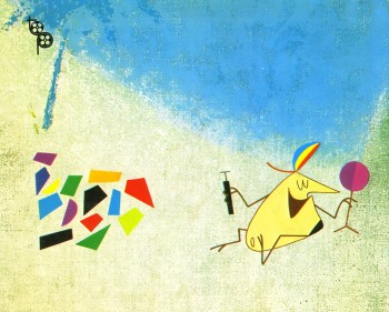 independent cartoons were also highly awarded: Ersatz (1961), winning the first Academy Award for animation outside the United States, and Play (1962), voted the best short film of the year at Mannheim. Turning to the feature film, his The Seventh Continent for children in 1966 was not successful but it encouraged him in the cartoon to continue the mixture of live action and animation begun in Play. Stain on the Conscience (1968) employed animation drawing on documentary footage and proved him capable of directing actors ; in a psychological atmosphere. Opera Cordis (1968) restored his eminent position in animation with a salty commentary on Dr. Barnard’s heart transplants, and Ars Gratia Art/s (1 969) more than effectively spoofed the amateur who will do anything for the sake of art and applause. He also wrote the scripts for Vrbanic’s All the Drawings of the Town (1959) (with Vrbanic), Gospodnetic’s The Lion Tamer (1961), Dovnikovic’s The Doll (1961), Grgic’s A Visit from Space (1961), and Blazekovic’s Gorilla’s Dance (1968), and had a hand in supervising most of these films as well as Grgic’s The Devil’s Work (1965). His gifts as a leader are evident every step of the way, but particularly in the first phase of Zagreb Film (1956— 62) when his unit competed for honours with Mimica’s and Kristl’s. He is best in the cool domains of satire and caricature.
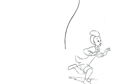
Images:
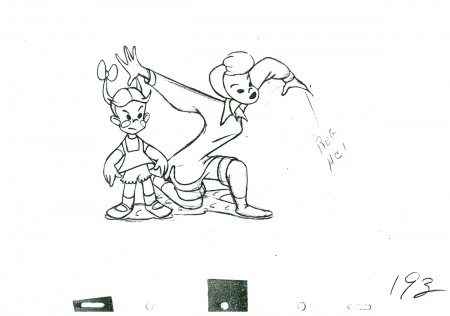
1. The Four Poster – from Amid Amidi‘s Cartoon Modern
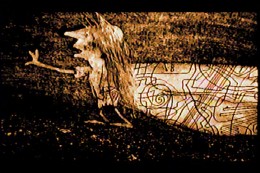
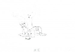
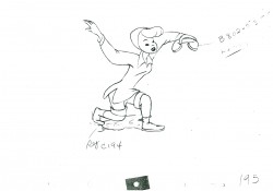
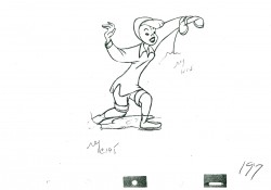
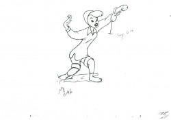
2. Cowboy Jimmie
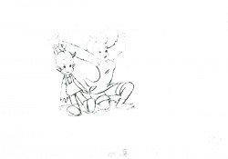
3. Dusan Vukotic
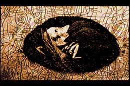
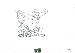
4. Ersatz
Animation &Disney 18 May 2010 10:29 am
Roustabouts – 2
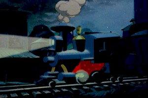 - As stated yesterday, the Roustabout sequence of Dumbo is one of my favorite sequcences in any Disney feature. I love the fact that it is blatantly political in its scope while completely servicing the feature.
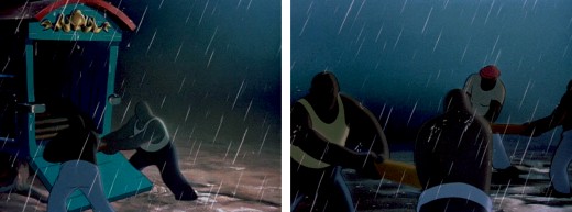
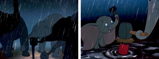
The bold and dramatic artwork represents nothing so much as Russian poster art of the 20s and 30s. Whether this is accidental or not is open to question, but given the political nature of many of the workers (pre-strike) I think they knew what they were doing. You can see that in the strong chalk drawings, done as preliminary art, and you can see it in the final.
The men’s chorus singing the piece just underscores that theme, and is entirely supportive. (Go to AFilm LA to hear the original recording of this with the King’s Men singing.)
Hans Perk has been posting the drafts for Dumbo, and Mark Mayerson has been posting his excellent Mosaics he creates for the film.
Here, are frame grabs detailing the sequence.
__________________(Click any image to enlarge.)
From A Film LA:
Seq. 04.0 “Roustabouts”
Directed by Sam Armstrong, assistant directors Lloyd Richardson and W. Hays, layout Dick Kelsey.
Jack Campbell seems to have animated most of the Roustabouts. Then we find Hugh Fraser, Edwin Fourcher, Jerome Brown, Karl Van Leuven, Russ Dyson, Frank Grundeen, Jim Escalante, Vern Witt, Claude Smith, Sandy Strother, Cornett Wood, Ed Aardal, Miles Pike, George Rowley, Josh Meador and John Reed, most of whom are effects animators.
Animation &Independent Animation 14 May 2010 07:57 am
Witold Giersz Interview
Here’s an interview with another International Independent master of animation. Again, many of you may not have heard of him, but let me assure you that his work bordered on genius. His film, Pojar, kept me inspired for years after I saw it in Annecy in 1976. Just check out the body of work done prior to 1980; by 2007 he’d done about 60 short films. He was prolific and smart. If you can find his films, watch them.
This interview comes from Animafilm #5, March 1980.
Marcin Gizycki talks with
Witold Giersz
MARCIN GIZYCKI: How many films have you made?
WITOLD GIERSZ: I have never compiled statistic, but they said once at the Studio of Film Miniatures that there were about forty.
M.G.: The fruit of the twenty odd years of your activity.
W.G.: I started to work with the film illustry as early as 1950, at the Cooperative of Animated Cartoons in Bielsko.
M.G.: You were among the pioneers of the animated film in Poland.
W.G.: That was long ago.
M.G.: You made your debut in 1956 when you did “The Mystery of the Old Castle”. But the turning point in your career was “The Neon Trifle” and “The Little Western”.
W.G.: Indeed. “The Neon Trifle” was my first, very timid, attempt to abandon conventional drawing, i.e. contours filled with colour. I did my drawings with a brush, which created the impression that the characters were made of neon tubes. In “The Little Western” I made use only of patches of colour which 1 put with a brush straight onto the celluloid.
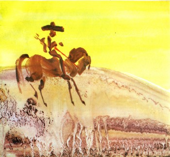 M.G.: You were the first film-maker in Poland and, if I am not mistaken, in the world, to use this technique, namely, painting on the celluloid without a whole staff of assistants.
W.G.: I tought so, too, but, to my surprise, when I showed “The Little Western” at the Festival in Annecy, George Dunning presented his “Flying Man”, made in a very similar way. We arrived at similar results independently and it does not really matter who was the first. Let’s be quite clear about it: both films used the traditional celluloid technique; the only innovatory thing was the form of drawings: contours were by patches of colour.
M.G.: It seems that you have tried all possible forms of animation, you gave even made a puppet film, “Expectation”. However, your name evokes associations primarily with “dynamic painting”, i.e. the gradual transformation, through the addition and erasure of painted elements, of a single picture done in a thick layer of wet paint. Do you agree that this is the most characteristic undercurrent in your art?
W.G.: People call it the most characteristic because, apart from Piotr Szpakowicz, no one uses this technique in Poland. Naturally, our methods are somewhat different. Szpakowicz deals, on the main, with static painted surfaces that evolve as a result of interpenetration. When he introduces animation, it is less complex than with me. But to be quite frank, I have used this method in three films only: “The Horse”, “The intellectualist” and “The Fire”. Nevertheless the story goes that this is my technique. Generally, I have worked quite traditionally. I am especially fond of animation on the celluloid if it is in “The Little Western”.
M.G.: What I particularly appreciate in your films such as “The Little Western” or “The Red and the Black” is the wit based on purely visual efffects. For instance, a clash of two figures, yellow and blue, which leads to the emergence of single huge green figure. This gag could only be born as a result of thinking in terms of pictures, and only in an animated film.
W.G.: This sort of ideas came to me when I was already working on the film and that is why they could not be the starting point for the script. I regret that they did not occur to me earlier, then I could have subordinated the entire plot to them. I think that the starting point should lie in the material. I tried to follow this path in “Expectation”. There, from the very beginning I kept thinking about a plot in which to involve the figures made of tissue paper made by Ludwik Perski. What drama, what tragedy can be designed for a tissue ballerina? Crumpling, tearing or, in the worst case, burning? What can her sensations be? Light, banal, for she is only a paper dancer. This gave rise to the whole plot.
M.G.: You have once said: “I made myself all my films that I find fairly satisfactory (…) all those made in collaboration have turned out mediocre. How do you explain it?
W.G.: Group work hinders one’s approach in the visual sphere. If Lenica had had to work with a group, he would have never made “New Janko the Musician” or the “Labyrinth”. If we work with a dozen, however talented designers, and we do not want to come up with a conglomerate of a dozen, however good, diverse works, we must restrain ourselves and fall into line. One’s own individuality must be given up in favour of a homogeneous final effect. One’s individual mark may be imprinted only in the way we develop the plot, on the dramatic quality, but visually, there is no room for shining out.
M.G.: And yet, you have made films in collaboration with others.
 W.G.: Let me explain. In Bielsko. I went through a good traditional school of classical animated cartoons, cultivated there until today. I thought that I had become quite skilful at this technique and originally I planned no other methods. However, as time went by, I ceased to be satisfied, I came to the conclusion that all I knew about workmanship did not mean much, that what really counted in animation and was pleasing to the eye was novelty. After a good deal of research, I finally arrived at something that gave me some satisfaction. I mean the series of films from “The Little Western” to “The Fire”. But from time to time I go back to traditional cartoons, which I regard as my duty towards the company. Certain films are commissioned and I have to carry them into effect. However, I have not made a film with a group of animators for a very long time now. “Please, Elephant” is no exception, as this full-length film uses the material shot for a serial eleven years ago, with only junctions and some other little things done now. I did all the alternationas practically myself, assisted by one animator.
M.G.: Animated film lies on the borderline of two disciplines: the visual art and feature film. Do you agree that an animated film d’auteur has more of the former, whereas an animated film produced by a team is more like the latter?
W.G.: There are films that can obviously pass as works of the visual arts, like for instance, all Szpakowicz has done. Nevertheless, I think that animation has worked out means of expression original enough to be distinguished as an autonomous discipline. Anyway, it is so unique among the multifarious film genres that a maker of animated films finds it easier to communicate with a representative of the fine arts who does not make films than with someone who makes feature films or documentaries. For that reason it may be better to opt for the term “animated visual art”, i.e. produced not solely by means of a brush and canvas but also a cine-camera, a projector, and a screen.
M.G.: You have designed settings for all your films. Does it make you feel an artist?
W.G.: Quite a blunt question. All my artistic experience is subordinated to the film. I do not practice art in any other form. Hence I feel at once an artist and a film maker, one inseparable from the other. I would have no time for painting, graphic art or drawing. Film making is very timeconsuming. Maybe I am not very well organized, but it takes all my time.
Illustrations:
1. The Old Cowboy
2. Footprints
WITOLD GIERSZ: FILMOGRAPHY
1956: TAJEMNICA STAREGO ZAMKU (The Mystery of the Old Castle),
1957: W DZUNGLI (In the Jungle),
1958: PRZYGODY MARYNARZA (A Sailor’s Adventures),
1959: WIOSENNE PRZYGODY KRASNALA (A Dwarf’s Spring Adventures), NEONOWA FRASZKA (The Neon Trifle),
1960: MALY WESTERN (The Little Western-prizes: Turin, Leipzig, Cracow; honorary mentions: Cork, Necochea; diplomas: San Francisco, Melbourne, Oberhausen),
1961: SKARB CZARNEGO JACKA (Black Jack’s Treasure,
1962: OCZEKIWANIE (Expectation — prizes: Cannes, Moscow; diploma: Edinburgh), PODARTA KSIA.ZKA (A Torn Book), DI-NOZA UR Y (Dinosaurs – prizes: Cracow, Alexandria),
1963: W PIASKACH PUSTYN1 (In the Sands of the Desert), CZERWONE I CZARNE (The Red and the Black – prizes: Oberhausen, Cracow, Cannes, Bratislava, Santa Barbara; honorary mention: Montevideo; diplomas: London, Turin, Edinburgh, Cork, Melbourne, Oberhausen; the prize of the “Film” weekly), MADAME SOPRANI,
1964: KLOPOTY Z CIEPLEM (Troubles with Heat – prizes: Lodz, Cracow), LADIES AND GENTLEMEN (an honorary mention La Felguera),
1965: KORZEN (The Root),
1966: KARTOTEKA (The Card-Index),
1967: KON (The Horse -prizes: Cracow, Mamaia, Adelaide, Honolulu; diplomas: Melbourne, Edinburgh),
1968: ADMIRAL (The Admiral), WYCIECZKA ZA MIASTO (The Journey out of the City – prize: Poznah), PRZE-PROWADZKA DOMINIKA (The Removal of Dominik),
1969: INTELEKTUALISTA (The Intcllc-ctualist – prize: Paris, diploma: Venice), ROZBIT-KOWIE (The Castaways), OTO ZYCIE (That is Life -both films done in Yugoslavia with Milan Ljubic),
1970: WSPANIAtY MARS7 (The Maenificent March – prize: foznanj, iy/i: (The Perfect Driver), 1972: KASKADER (The Stunt-man – diploma: Cracow),
1973: RODZINA IN-DONEZYJSKA (An Indonesian Family – commissioned in Norway), STARY KOWBOJ (The Old Cowboy – prizes: Poznan, Cork),
1974: SLADY (Footprints),
1975: POZAR (The Fire – prizes: Cork, Poznan, Teheran; honorary mention: Jelenia Gora; diploma: Oberhausen; the special prize of the President of the Board of Culture),
1976: WIELKIE KOTY (The Big Cats – commissioned in the USA),
1978: SKANSEN (Ethnographical Museum), PROSZE SLONIA (Please, Elephant; full-length – prizes: Poznan, Varna; the Zenon Wasilewski prize).
Animation &Animation Artifacts &Bill Peckmann &Illustration 12 May 2010 08:38 am
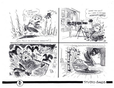
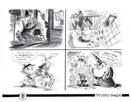
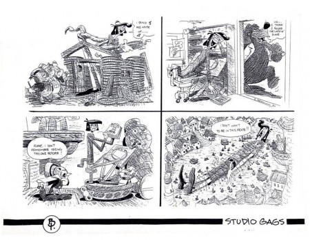
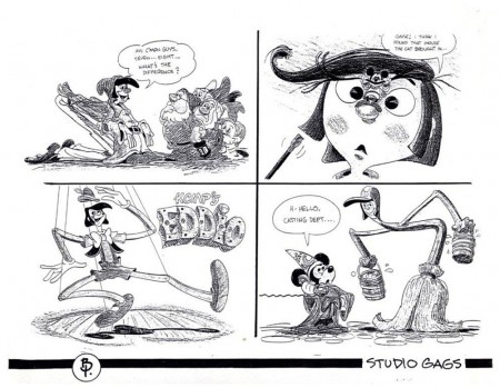
PK&A Studio Gags
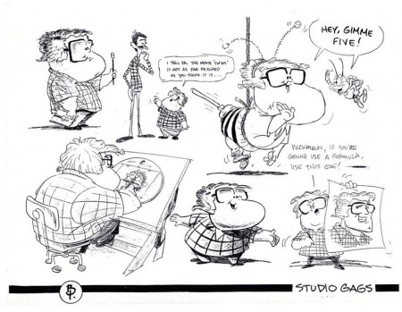
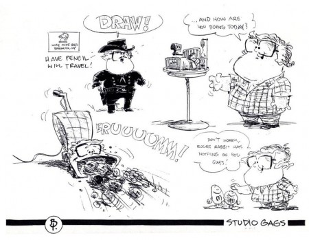
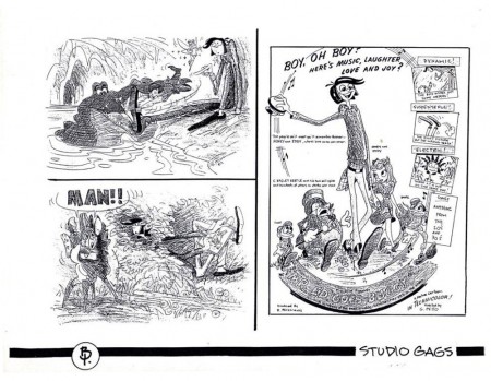
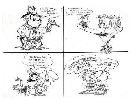
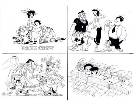
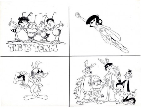
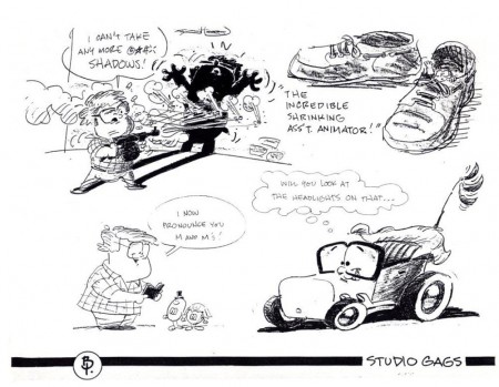
- Bill Peckmann sent me this group of Gag Drawings from his days of working with Phil Kimmelman and Ass. I thought the drawings had so much life and interest, that I wanted to share them. The unfortunate part of studio gags is that the life behind the gag is usually something that we can’t even understand – outside of that studio’s atmosphere. However, at times the drawing is so much fun, it makes up for it. That’s true here, I think.
 1
1(Click any image to enlarge.)
Animation &Animation Artifacts &Disney 11 May 2010 08:09 am
Dumbo’s Bath
Hans Perk has been posting the drafts for Dumbo, and this has led Mark Mayerson to start posting the brilliant Mosaics he creates for the film.
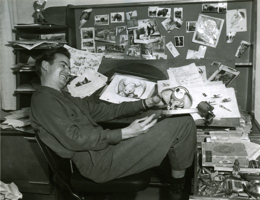
I want to join in celebrating this feature, which is one of my very favorite animated films , and I’ve decided – since I’ve already done a lot of behind the scenes posts – I’ll recap a number of those posts in the next week or so.
I start with this one of Dumbo’s bath animated by Bill Tytla and boarded by Bill Peet.
.
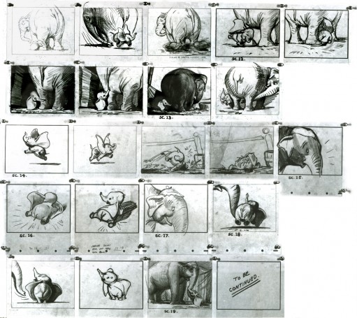
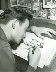 - Thanks to a loan from John Canemaker, I can continue posting some of the brilliant storyboard work of Bill Peet. The guy was a masterful artist. Every panel gives so much inspiration and information to the animators, directors and artists who’ll follow up on his work.
This is the sequence from Dumbo wherein baby Dumbo plays around the feet of his mother. Brilliantly animated by Bill Tytla, this sequence is one of the greatest ever animated. No rotoscoping, no MoCap. Just brilliant artists collaborating with perfect timing, perfect structure, perfect everything. Tytla said he watched his young son at home to learn how to animate Dumbo. Bill Peet told Mike Barrier that he was a big fan of circuses, so he was delighted to be working on this piece. Both used their excitement and enthusiasm to bring something brilliant to the screen, and it stands as a masterpiece of the medium.
Of this sequence and Tytla’s animation, Mike Barrier says in Hollywood Cartoons, “What might otherwise be mere cuteness acquires poignance because it is always shaded by a parent’s knowledge of pain and risk. If Dumbo “acted” more, he would almost certainly be a less successful character—’cuter,’ probably, in the cookie-cutter manner of so many other animated characters, but far more superficial.”
I had to take the one very long photstat and reconfigure it in photoshop so that you could enlarge these frames to see them well. I tried to keep the feel of these drawings pinned to that board in tact.
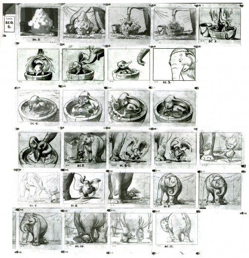
(Click any image to enlarge.)
Here are frame grabs from the very same sequence of the film showing how closely the cuts were followed. Even in stills the sequence is stunning.

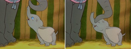
(Click any image to enlarge.)
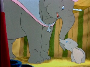 .
.This film is a gem.
The dvd also has one of my favorite commentary tracks throughout.
John Canemaker, by himself, talking about the film. It’s great!
From Hans Perk’s A Film LA:
Seq. 06.0 “Menagerie – Mrs. Jumbo Goes Berserk”
Directed by Wilfred Jackson, assistant director Jacques [Roberts?], layout Terrell Stapp.
Dumbo being washed by Mrs. Jumbo, animated by Bill Tytla, with effects by Art Palmer, Cornett Wood and Sandy Strother.
Animation &Animation Artifacts &Disney 10 May 2010 07:56 am
All the Cats – part 4
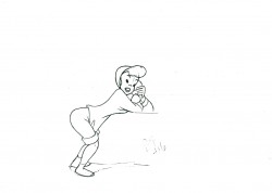
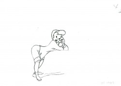
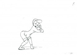
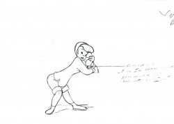
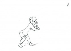
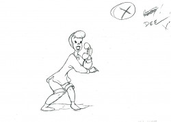
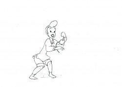
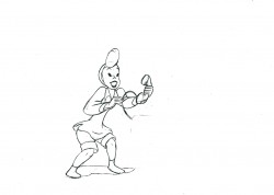
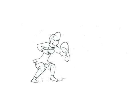
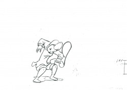
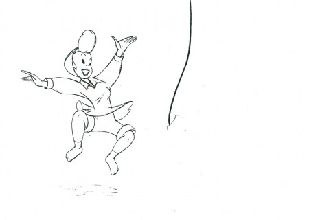
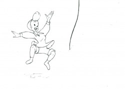
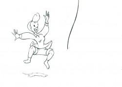
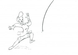
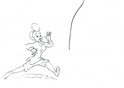
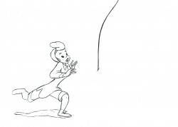
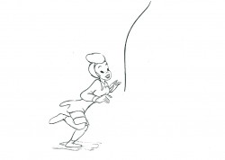
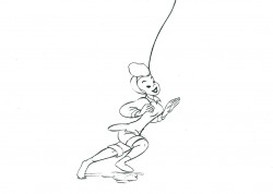
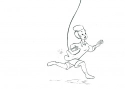
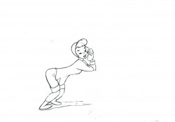
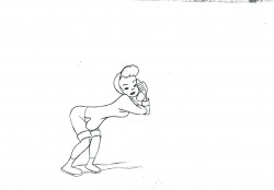
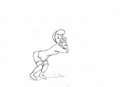
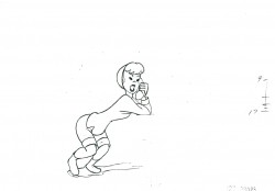
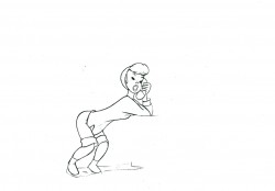
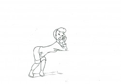
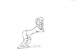
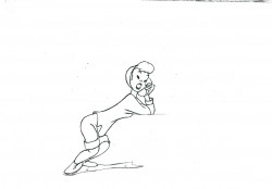
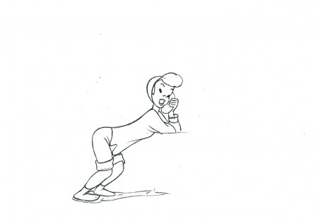
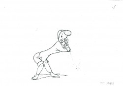
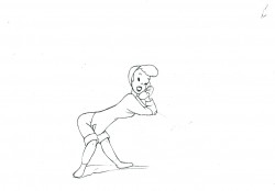
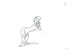
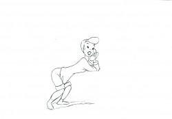
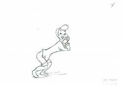
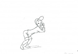
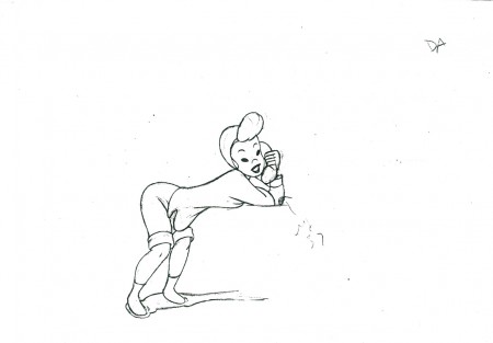
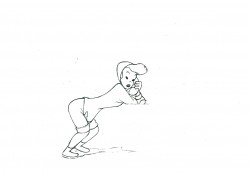
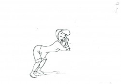
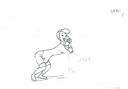
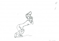
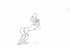
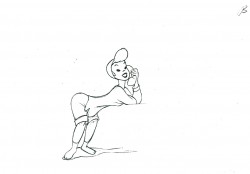
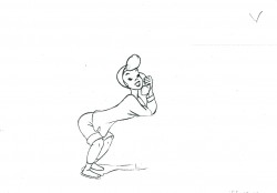
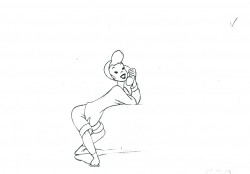
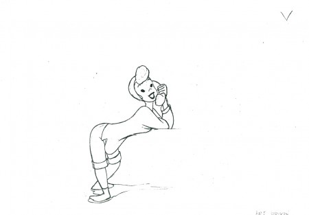
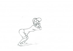
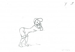
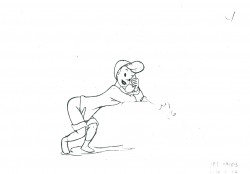
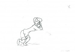
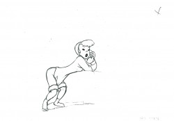
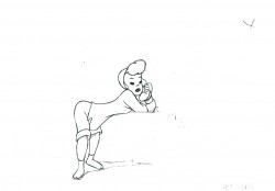
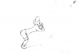
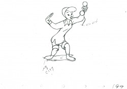
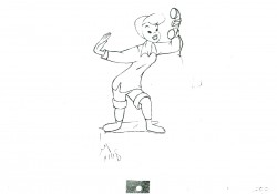
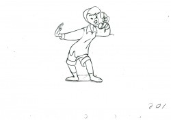
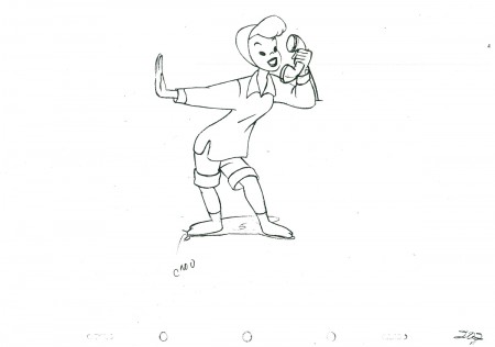
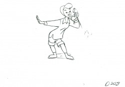
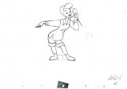
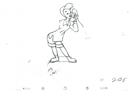
- This scene is a continuation of animation from All the Cats Join In from Make Mine Music. It’s another scene by Fred Moore and is, to me, one of the highlights of the film. The girl keeps jitterbugging even though she’s rapt in conversation on the phone.
The problem I had with this artwork was that the xerox copies offered no registration marks, and there were no visible numbers on most of the drawings. Consequently, I did the best I could to register them.
As in the past we start with the last drawing from the last post.
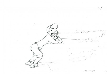 41
41
The following QT movie represents all the drawings in the scene.
Since I had no numbers to go by, I exposed all drawings on twos.
Right side to watch single frame.
Animation &Articles on Animation &Commentary 06 May 2010 07:21 am
Dragons & Fanny
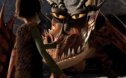 - For the past few weeks, Michael Barrier’s review of How to Train Your Dragon has been on my mind. Actually, not most of the review, just the last two paragraphs. Most of the review talks about the Dreamworks film, and, I must say, it doesn’t encourage me to see it (which I eventually will most certainly do – once they screen it in 2D in New York).
I haven’t yet seen it , but the film, from the ads I’ve seen, looks like the generic Dreamworks product. All of the characters are supposed to be Vikings living in the First Century, but they act and sound like generic animated characters in the 21st Century. It’s just about a given for such current product. The stock facial expressions, the overarching eyebrows, the attitude. In all of the ads and clips I’ve seen, America Ferrara screams every one of her lines. That’s what poses for acting today in most animated films – a direct influence of TV.
Perhaps I’m wrong, but I somehow doubt it. I’ll find out for myself when I do see it. (After all I put down Kung Fu Panda, and I now think pretty highly of that film.) Regardless, this isn’t the part of the commentary that Mike’s written that has my thoughts rambling about.
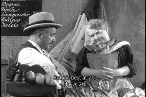 He jumps in his review to Marcel Pagnol’s Fanny Trilogy. Seeing these three films is perhaps one of my all time favorite movie experiences. They played in NY in the 70’s on three consecutive Mondays. I got so hooked into it, I looked forward enormously to those Monday showings. Mike describes them beautifully. All character development and a simple straightforward story that just about breaks your heart. It’s a wonderful film experience despite the fact that it’s a crusty old 1930’s film with lots of soft grays and soft focus. They’re obviously sets built around the Marseilles they’re pretending to create, but you buy it all. At least I did; it’s so wonderfully Romantic.
(Perhaps, that’s a generational thing. I talked an intern in my studio into watching Citizen Kane, and she couldn’t get through it. The B&W was too distracting for her, and she found the film boring. What can you say?)
Mike Barrier rightfully makes the leap to Snow White and the Seven Dwarfs, a natural link – animation wise – to Pagnol’s trilogy. The approach is very similar. Somehow I’d never have seen the link to these films, but it works. Despite the enormous difference in story, the dependence on character development and motivation are alike. A sweet, simple, direct story with very strong character personality holds you tightly throughout.
A lot of this approach stayed with the Disney features right through Sleeping Beauty. I love the first 10 or 15 minutes of all those films; nothing but character setup, and they’re all wonderful. Things started to change with 101 Dalmatians and had been just about abandoned by the time they got to The Aristocats. Character suddenly became reliant on celebrity voices. Thanks to the star turns such as Phil Harris’ Baloo the Bear in Jungle Book, it became easier for animators to pull their characters together. Let the voices do the heavywork, and in The Aristocrats, they ran with it to the film’s detriment.
Now we get unidentifiable celebrities, like America Ferrara, shouting their lines but adding nothing to the character’s personality. I’m not even sure if her name will help sell a DVD. Given these flat voices, the animators turn to their stock poses and facial expressions, and the end result is a sad lot.
I’d like to think that Chris Sanders and Dean DeBlois have surpassed the Dreamworks formula and taken their film to another level. I have been a big fan of Lilo and Stitch, although I think much of the story is hackneyed nonsense. (Whenever we have to see aliens fighting from their spaceship, it’s hard to reconcile that with the wonderful character traits between Lilo and Stitch, themselves.) The beautiful artwork choices help carry you through that film. Mike suggests that the end of Dragon may have as big a problem, and he offers to blame that on the executives above Sanders and DeBlois. Perhaps, but Lilo and Stitch had similar problems.
Mike Barrier suggests that that isn’t the entire case with How to Train Your Dragon, and I do hope he’s right. But nothing I’ve seen to date lets me expect it. I do want to be pleasantly surprised, and I’ll let you know if I am.
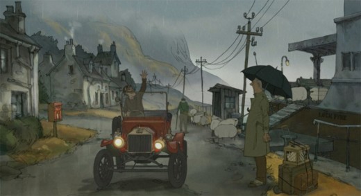
The film I’m really waiting to see is Sylvan Chomet’s The Illusionist. The story in Triplettes of Belleville fell apart, but the execution and development of the principal personalities was so fine, that the film offered me plenty – and plenty of hope. I do hope and almost expect to see that he has taken this approach to another level. What little I’ve seen leads me to believe I may not be disappointed.
Animation &Animation Artifacts &Disney 03 May 2010 08:01 am
All the Cats – pt 3
- This scene is a continuation of animation from All the Cats Join In. It’s another scene by Fred Moore and is, to me, one of the highlights of the film. The girl keeps jitterbugging even though shes rapt in conversation on the phone.
The problem I had was twofold. The xerox copies offered no registration and there were no visible numbers on most of the drawings. Hence, I did the best I could to register them, even though I couldn’t use the ever-moving feet as an achor.
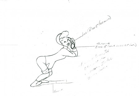 1
1
I’ll post the remainder of this scene next week.
The following QT movie represents all the drawings in the scene.
Since I had no numbers to go by, I exposed all drawings on twos.
Right side to watch single frame.
Many thanks for the loan of this scene by Lou Scarborough.
Animation &SpornFilms 29 Apr 2010 08:54 am
Matt Clinton
- The bulk of this piece was written in May 2006. I only feel stronger about anything I’ve said in it and have done some minor additions to the whole.
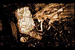
Matthew Clinton came to my studio in 2003. After a years worth of correspondence between us and my viewing his senior film dozens of times in multiple versions – all of which I found totally enticing and absolutely compelling to watch , I offered Matt a job and did what little I could to support his arrival.
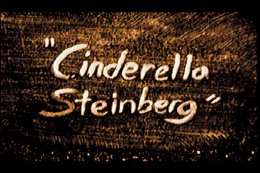 He came quietly into my studio and immediately took hold with his innate gift for masterful animation. What follows are hi-contrast frame grabs from his thesis film, Cinderella Steinberg. I interpret the film as an examination of the overwhelming power of art on the recipient, in this case poor Cinderella. Tomorrow, we’ll look at some of Matt’s work in the past three years. I urge you to enlarge some of the images; each frame of his film is a multimedia construction in itself. Leaves and dirt and straw and a Steingberg painting.
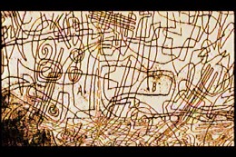
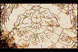
(Click on any image to enlarge.)
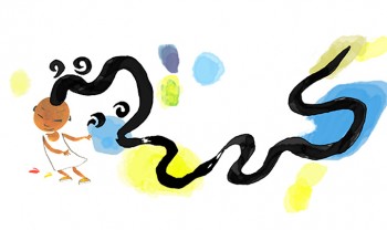 One of the first pieces he worked on was animation for an HBO special entitled HAPPY TO BE NAPPY AND OTHER TALES OF ME. As a new guy, Matt was supposed to be plugging in some animation bits to fill out the show. I gave him lots of pieces that ended up dancing around my less poetic animation. He helped define the art style to match illustrator Chris Raschka‘s beautiful, loose watercolors.
Then, for the same show, I gave him a number of more limited short films to animate, himself. In the end, the two of us did all of the animation for the half-hour show (about 17 mins) in 2½ months.
Things got quiet for a bit, and he helped define the style of my in-progress feature, POE. We wanted it to match the daring graphics Jason McDonald was putting into his storyboard pages. Matt found a solution once I defined the problem.
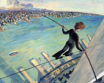 With The Man Who Walked Between The Towers, I dove into the meat & potatoes animation for the 10 min film and gave all the poetic pieces to Matt and Tissa David. By this time, I was aware of the talent I had working for me.
The scenes where Philippe Petit first steps onto the highwire were those done by Matt. Of course, I directed and coaxed elements I wanted from the scenes, but it was magic finding someone who so easily and quietly was able to give me what I sought and do it with such sublime grace and ease and so little fanfare.
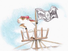 There were three films for PBS’s Between The Lions.
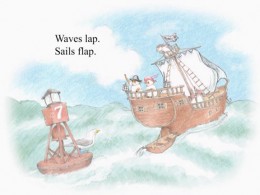
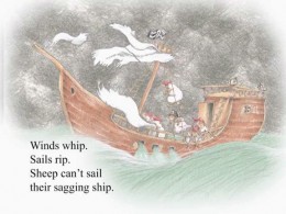
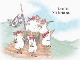
Sheep On A Ship is almost completely Matt’s. It was a delicate watercolor style from a best selling book that we had to match exactly. Needless to say, it did.
Here are stills from the PBS show,
Between the Lions:
Sheep On A Ship
(Click any image on this page to enlarge.)
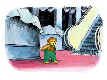 There were also five DVD’s we did for Scholastic & Fisher-Price. Each featured a world class, famous children’s book and included about 60 minutes of animation to illustrate the book and games included. Jumping over five different illustration styles in a few months and animating emotionally and delicately, Matt was able to always rise to the occasion and perform as a first rate actor with delicacy, grace and charm.
Corduroy for Scholastic/Fisher-Price
I obviously love this guy’s work. No doubt he brought a lot of knowledge away from CalArts, but he also brings an inherent world of taste dignity and charm to everything he does; that wasn’t learned in school. Matthew Clinton’s a rare talent.
By now, Matt just about runs the animation end of my studio and he’s earned my full trust and support. It’s gotten to the oint where I wonder how I could operate without him.
Animation &Disney 26 Apr 2010 06:53 am
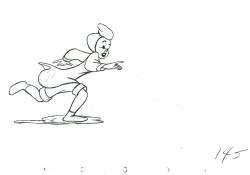
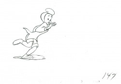
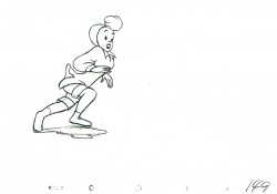
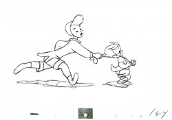
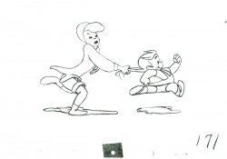
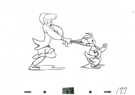
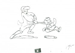
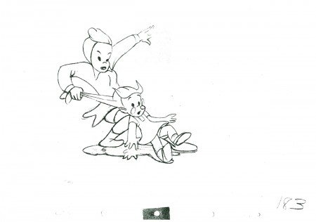
All the Cats – pt 2
- This is the second half of this scene which is one of several connecting scenes I have from All the Cats Join In. Animated by Ollie Johnston in his very cute style, with panache.
As usual we start with the last image from last week’s half.
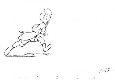 143
.
143
.
The following QT movie represents all the drawings of the scene,
including the drawings that were displayed last week.
It’s exposed as per the drawing numbers would indicate.
Right side to watch single frame.
Many thanks for the loan of this scene by Lou Scarborough.


