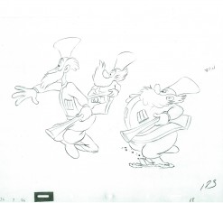
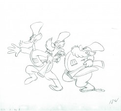
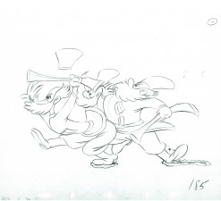
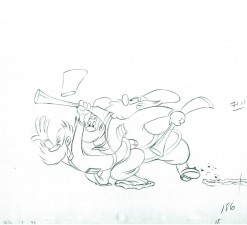
Category ArchiveAnimation
Animation &Frame Grabs &Layout & Design 24 Aug 2010 08:04 am
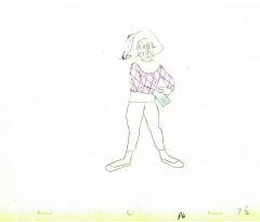
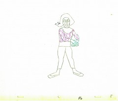
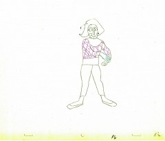
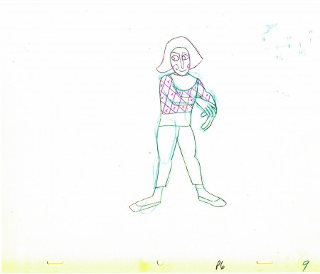
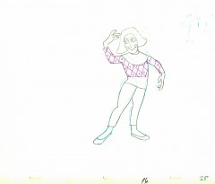
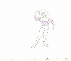
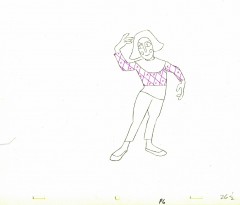
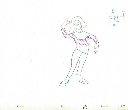
Conrad
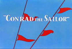 - Regulars to my blog know that I’m a big fan of the work of John McGrew. He was a designer/Layout Artist working in Chuck Jones’ crew at Warner Bros. in the late Thirties/early Forties. His work was daring beyond compare, and, I think, with support from Jones, he changed the look of modern animation backgrounds.
He designed the seminal film The Dover Boys as well as amazing pieces like Aristo-Cat, Inki and the Lion and Conrad the Sailor.
In an interview conducted by Greg Ford and RIchard Thompson, Chuck Jones was asked about McGrew’s style: 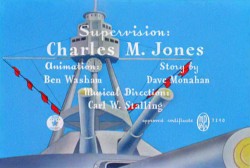
- Q: What about John McGrew’s style and approach, as compared with Noble’s?
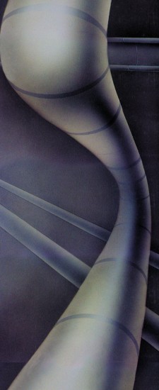
A: John McGrew didn’t really have a style; he was experimenting all the time. Maurice does have a style. John McGrew, you might say, was more of an intellectual. You could be intellectual, and get away with it— but if you’re solely intellectual as a director, you weren’t going to get away with it. The result was, however, that he goosed me into thinking that it might be worthwhile to try some different things with backgrounds and so forth. And later on, I would find this kind of thing very useful, in that often it would make your gag work, and sometimes you wouldn’t even know why. Like that little abstract background at the end of Duck Amuck, with the sharply angled lines going off.
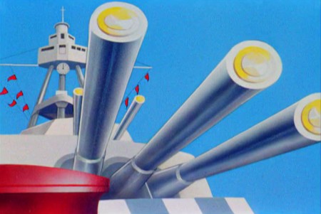
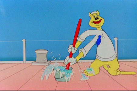
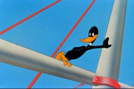
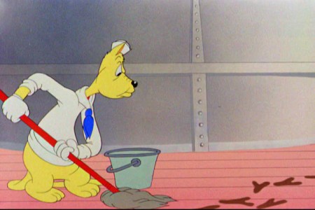
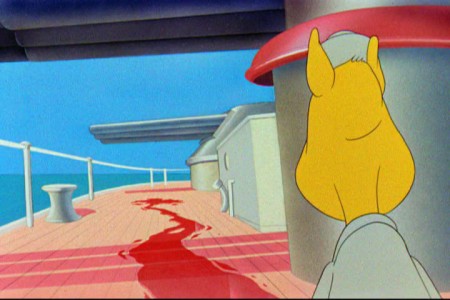
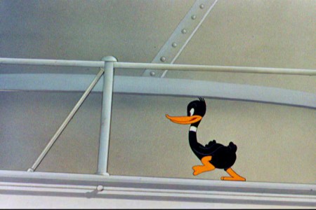
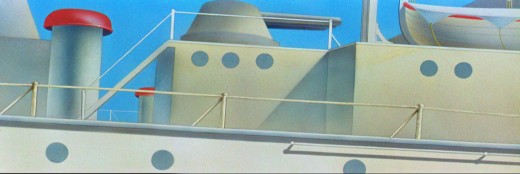
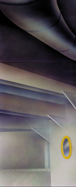
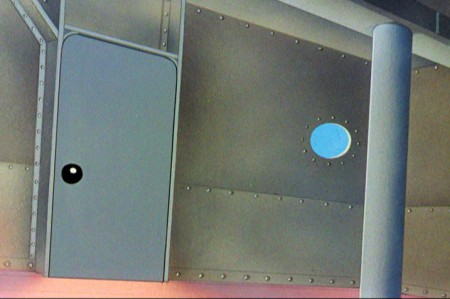
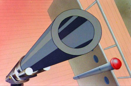
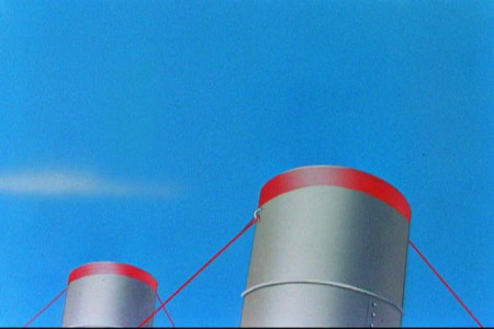
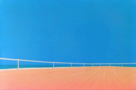
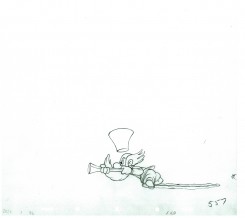
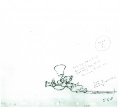
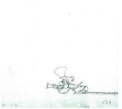
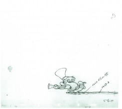
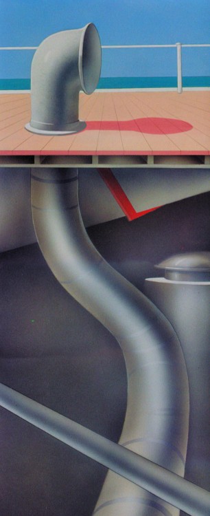
Today I’d like to feature some frame grabs from Conrad the Sailor. Where I could, I separated the characters from the backgrounds to just feature the Bgs. My guess is that the Bgs were painted by Paul Julian, but they were planned by McGrew.
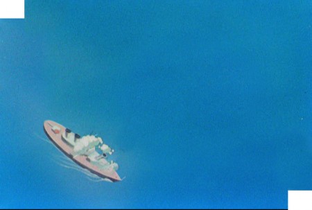
The one scene I don’t illustrate is the most original in the film. Daffy is shot into the air with a bullet. (illus #18) The camera does a 360° turn to head back to the ship. The Bgs don’t hold up on their own. Lots of blue sky and wisps of cloud. It works in motion.
Of this short & McGrew, Jones says:
- . . . we used a lot of overlapping graphics on that particular cartoon so that one scene would have the same graphic shape as an earlier scene, even though it would be a different object: first we’d show a gun pointing up in the air, then in the next shot, there’d be a cloud in exactly the same shape. It gave a certain stability which we used in many of the cartoons after that. John McGrew was the artist responsible for that sort of thing. Conrad was also the one where we used the first complete 360° turn, when the characters went up through the air.
For more information read Mike Barrier’s excellent interview with John McGrew.
 1
1(Click any image to enlarge.)
The following BG pan can be seen in full to the left. I’ve broken it into three parts for a closer look.

 12a
12a .
.
———-(Continue scrolling down.)
.
.
.
.
.
.
.
.
.
.
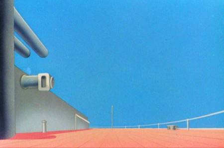 13
13
 15
15
A bicycle pan that keeps moving to the left.
Animation &Chuck Jones &Frame Grabs &Layout & Design 19 Aug 2010 07:48 am
Feed the Kitty
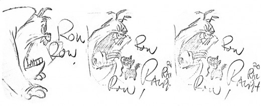
- I’ve always loved this sequence of layout poses Chuck Jones did for his short, Feed the Kitty. This, to me, was when Jones was at his greatest. All those Claude Cat shorts were just spectacular animation/layout/design. Here, Marc Antony falls in love with a kitty.
 1
1
This is how it looked in the final film as animated by the great Ken Harris. They broke it into a couple of scenes.
 1
1
Animation &Animation Artifacts &Hubley 18 Aug 2010 07:22 am
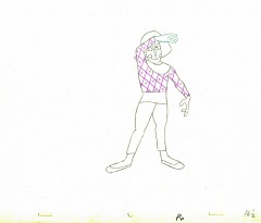
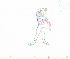
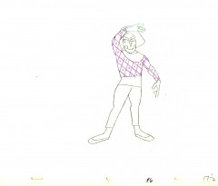
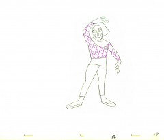
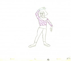
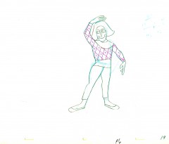
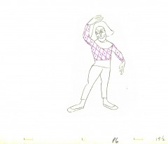
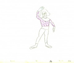
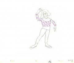
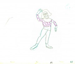
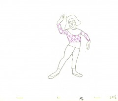
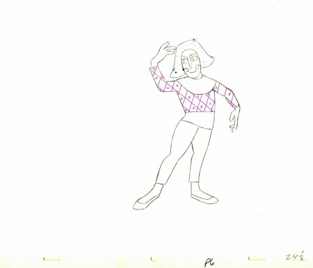
Babbitt’s Carousel Mime – 1
- John Hubley‘s feature film, Everybody Rides the Carousel, was adapted from Erik Eriksons’ Eight Stages of Man, a Psychosocial Theory of Human Development.
The Hubleys designed the feature (which started out as three half hours for CBS and then was rushed to fill it to 90 min feature length in the final 3 months of production) around a carousel. 8 horsees represented different stages of life. The narrator was a mime we see throughout at the carousel. Art Babbitt was hired to animate him, and things got bad pretty quickly and he left after animating a couple of early scenes. Barrie Nelson completed the character in the show.
John took one look at the pencil test of this scene on a movieola and proclaimed it the greatest animation he had ever seen. It wasn’t long that he took the scene – basically exposed on twos throughout – and asked me to change it exposing it on four frame dissolves throughout. This would extend the scenes and the character and would milk the scenes for everything possible. Art Babbitt was furious and never spoke to John again. For the full story go to this past post.
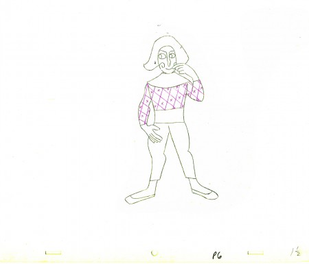
The scene is about 200 drawings long. I’ll break it into parts and post each part here in about 4 or 5 segments. Here’s the first part. As you can see there are a lot of ½ drawings. Animation extender – it’s a very slow moving character. A lot of poetry.
The QT will be done using Art’s exposure on twos.
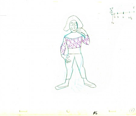 1
1(Click any image to enlarge.
 E1
E1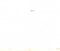 E5
E5
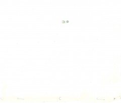
There are five pair of eyes; I give you the first and last.
 1½
1½
Lots of half drawings in the scene.
______________________
The following QT movie represents the drawings above
exposed as Babbitt wanted them, on twos.
Right side to watch single frame.
Animation &Bill Peckmann &Illustration &Layout & Design &Models 17 Aug 2010 07:23 am
Jack Sidebotham 1927-2010
- Jack Sidebotham passed away on Sunday. Bill Peckmann received the following message from George Newall, the co-creator of Schoolhouse Rock:
- Sad news. Jack died last night. Evidently he and Dick Lord were having lunch when Jack complained that he thought he was having a heart attack. As it turned out, it was an aneurism. The good news is that he was in no pain and conversing with the doctor when suddenly he just wasn’t “there” anymore.
Yesterday, Jack’s niece, Kimberly Sidebotham Lennert, left this comment on my blog: “My uncle was a terrific cartoonist and had a great wit about him. I kept a box of all the little notes and drawings he sent to me. He could say a lot with a few lines and a few words. ”
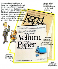
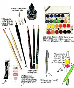
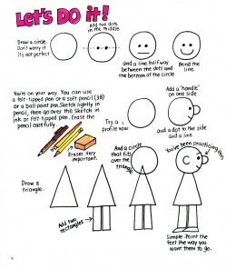
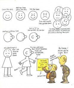
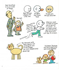
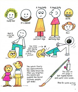
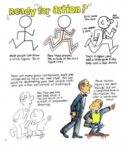
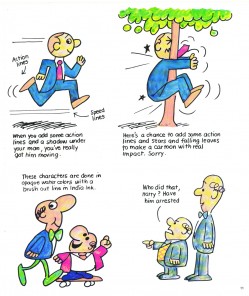
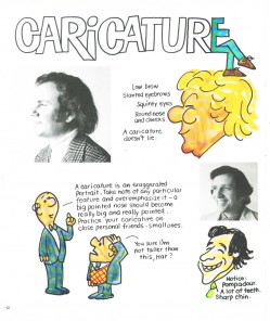
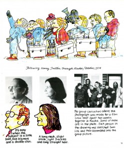
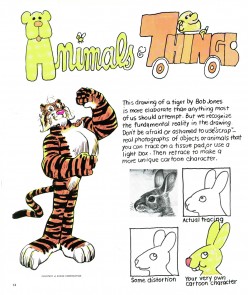
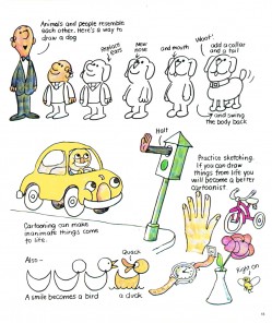
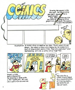
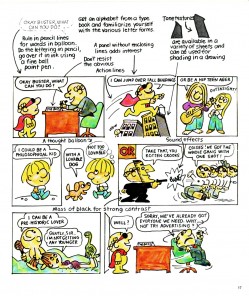
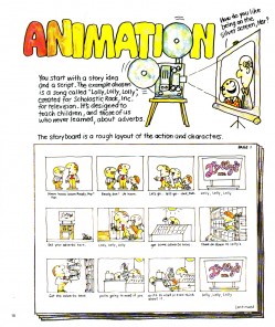
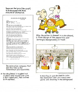
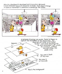
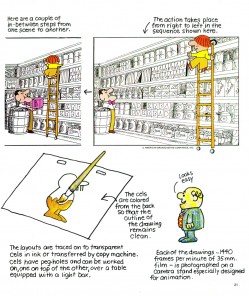
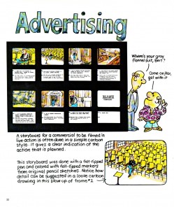
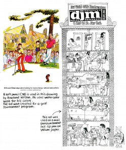
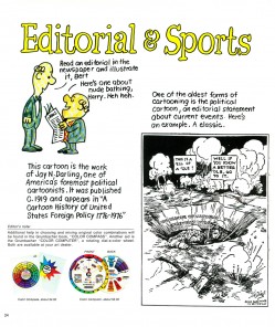
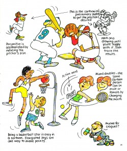
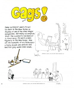
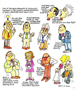
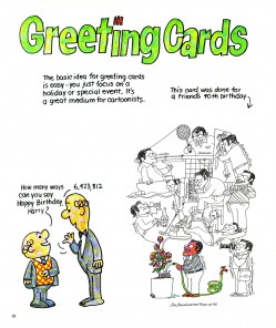
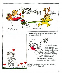
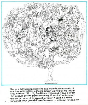
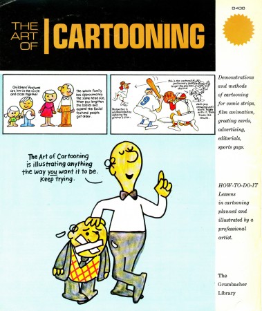
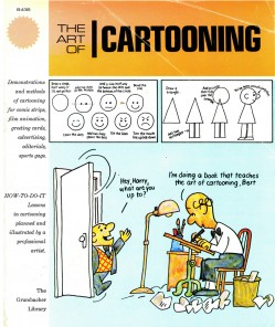 In his memory, I’ve chosen to repeat his book on Cartooning done in the 70s. Jack worked at a number of advertising agencies and had a lot to do with the Piels Brothers campaign and Scholastic Rock. He also was the agency producer for the famous Jello Chinese Baby ad done by Ray Patin Prods.
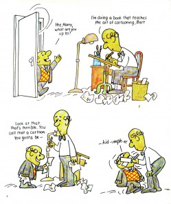
For this “Art of” book, he brings back the Piels Brothers without their great voices, comedians Bob and Ray, to escort the reader through a few lessons in cartooning and a sample of a number of different jobs in the field.
I think the book was originally published by Grumbacher, along with several others on art and painting techniques, to compete with the cheap and successful books published Walter T. Foster. They were all sold in art stores for very little money, and if you hit on a Preston Blair book, you’d found gold.
 1
1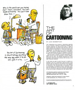 2
2(Click any image to enlarge.)
.
Animation &Bill Peckmann &Commentary &Independent Animation &Layout & Design 07 Aug 2010 08:00 am
Leftover Bits & Pieces
- Here are some bits and pieces left over from the week.
Bill Peckmann sent me some beautiful art this week, and though the pieces have nothing in common, I still thought it’s worth showing the quality of the great art done in the 60s & 70s whether for spot cartoons or animated spots.
These are Bill’s comments from his email:
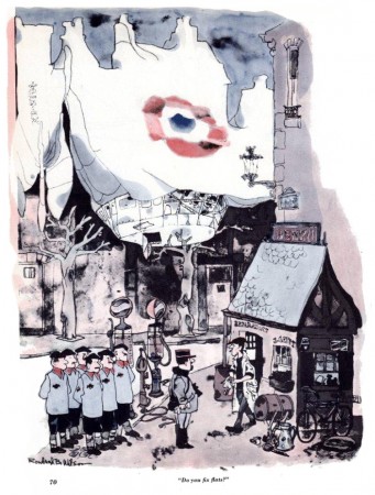
- “I thought you’d get a kick out of this, here’s RBW’s gag in the Dec. ’61 issue of Esguire and the next will be the same gag as it appeared in 2 colors in his book. You can see how much was lost.”
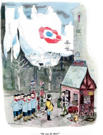
(Click any image to enlarge.)
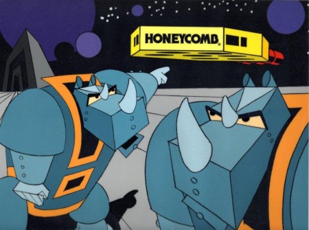
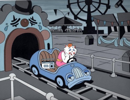
Then on another post Bill sent me these treasures from Phil Kimmelman & Associates (PK&A).
Again, Bill’s words:
- “Thought you might have an interest in seeing these. They are 3 cel set ups from the days at PK&A in the ’70′s. Two I designed for Honeycomb Cereal, the third a Mexican spot for Eveready Batteries. The BG’s were also done with Cel Paint. Sadly the color reproduction never looked so good as it does now with scanning, remember those 16mm Answer Prints of yore, made for TV viewing, the original colors never came close to what we had in mind.
These set ups were made for “Studio” ads.”
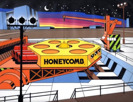 1
1
_________________
Greg Kelly and I have been exchanging emails for quite some time now. He’s done many short films and sends them for comment. His latest film is now posted on Vimeo, and I thought I’d like to commend you to take a look. He’s working hard at his animation, and I can only encourage him wholeheartedly. It isn’t easy to make a film, and he keeps doing it.
He wrote of this piece:
- “It is frame-by-frame, hand drawn in Flash and on twos with a lot of hand adjustments. It isn’t typical for what I do though it is another cartoon in an 8 year long series of shorts featuring one or both of these characters.”
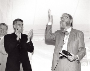
- John Canemaker has another post up at the Print Magazine site. This month it’s a good piece about Chuck Jones at the MacDowell Colony. It tells of Jones winning the MacDowell Medal in 1997.
Canemaker, who led the advisory panel in selecting Jones, prints his introductory speech to Jones and includes links to several WB shorts by the Master. It’s worth checking out if you have any allegiance to Jones’ work.
I’m sure anyone who is interested has already read this, but Michael Barrier has his review of Toy Story 3 up at his site. Since I’m in total agreement with what he has to say, I can only direct you to the link.
Animation &Animation Artifacts &Disney 04 Aug 2010 06:21 am
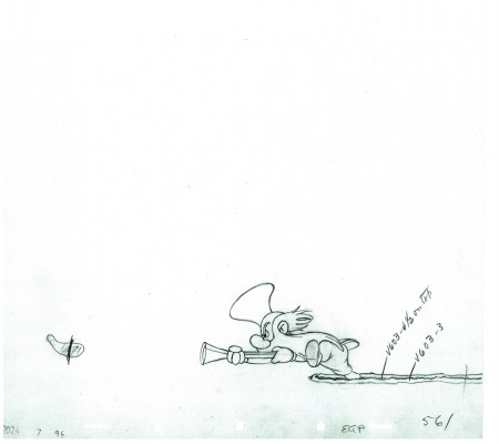
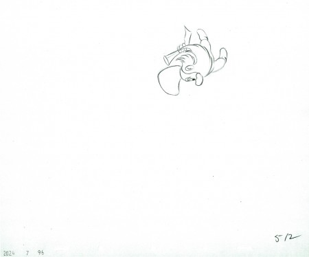
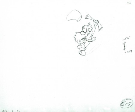
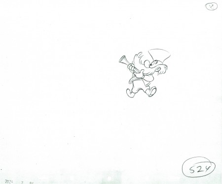
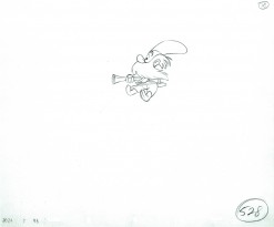
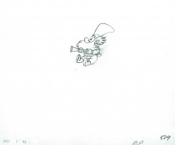
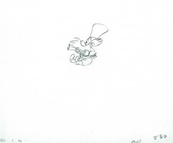
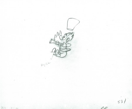
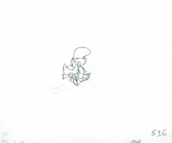
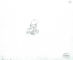
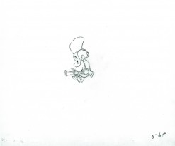
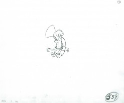
P&W-Kimball Scene – 8
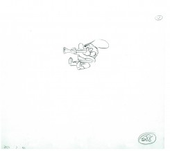
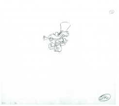
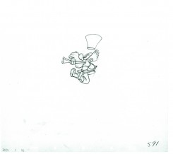
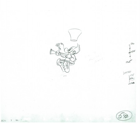
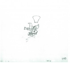
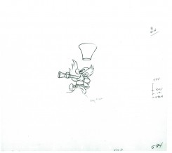
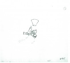
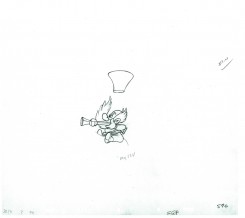
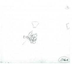
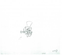
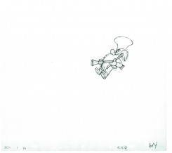
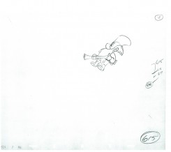
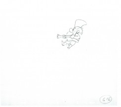
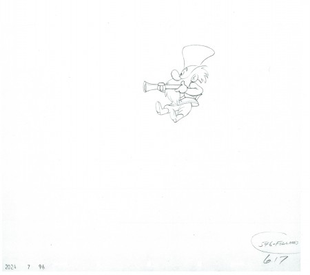
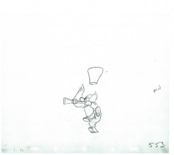
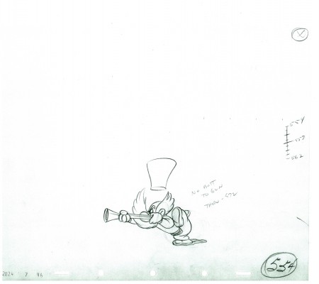
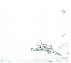
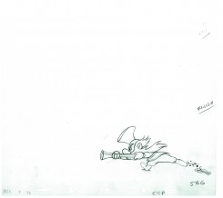
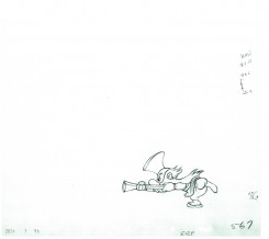
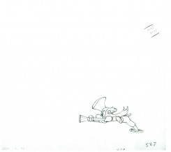
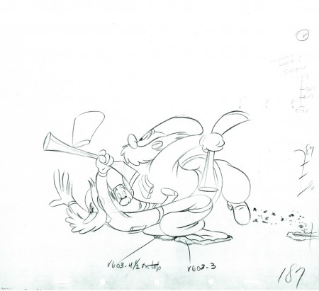
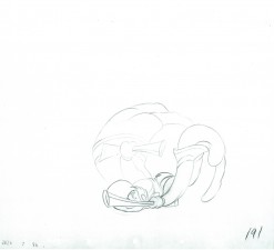
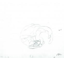
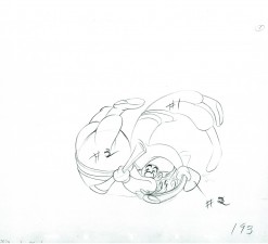
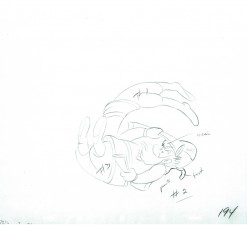
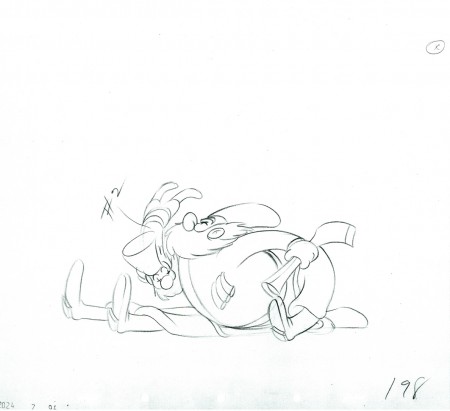
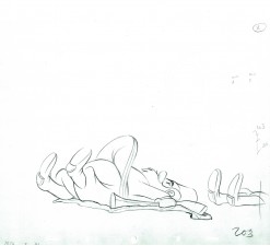
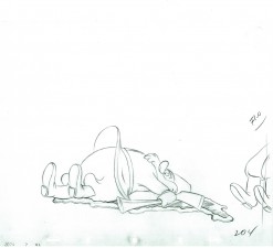
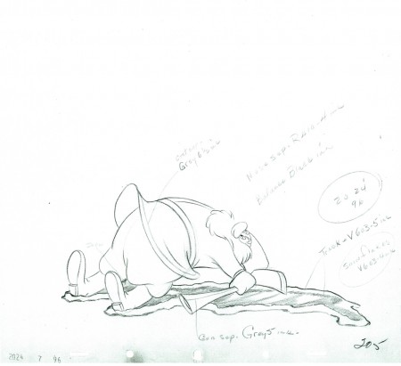
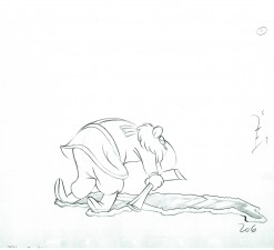
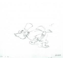
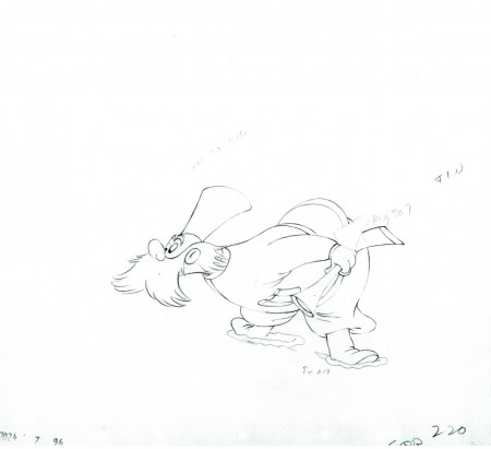
- Production #2024, MAKE MINE MUSIC, “Peter and the Wolf”. Sequence 7, Scene 96. Animator: Ward Kimball.
Completing the post of the little guy on the separate level, here are the final drawings of the scene. There are other levels of snow animation and footprint animation, but I won’t post those. This scene was large enough.
As usual, we start with the last drawing from last week’s post.
Enjoy.
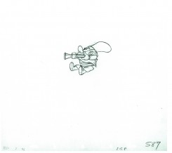
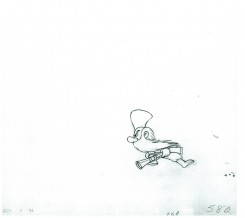
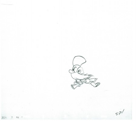 581
581
The following QT movie represents all the drawings of the bottom level
as well as the drawings of the Little Guy, on another level,
who comes in and out where he should.
I exposed all drawings on ones.
Right side to watch single frame.
To see the past five parts of the scene go to:
Part 1, Part 2, Part 3, Part 4, Part 5, Part 6, and Part 7.
My thoughts on this scene – just my opinion
I’m pretty disappointed in what I’ve seen here. The work has the obvious flair and panache of a typical Ward Kimball scene. The movement is funny and creative. Kimball did his work. The assistants were out to lunch.
The drawing in the scene is not the top notch material I’d expect of a Disney team. Seeing it drawing by drawing I get to see what I don’t like from a lot of the work in this period. The drawing just changes and doesn’t live up to the originals. Just looking at the fingers you get to see them turn into, what we in NY call, “Banana fingers” – they flatten out. This is part and parcel of the work at Terrytoons or Paramount, but we’re talking Disney here. You wouldn’t catch that in Sleeping Beauty or Bambi or Dumbo or Snow White or 101 Dalmatians. But it’s there in these compilation features.
Now going through the many drawings I’ve posted by Bill Tytla, I notice a distinct tie to Terrytoons. In the dwarves and especially in Stromboli a soft roundness comes into his drawings (and the assistant keeps it) at times. It’s probably the influence of Connie Rasinski while Tytla was there. It isn’t a bad thing, it’s certainly part of the style Tytla brought to his work. He took something good from Terry (the bottom) and brought it to Disney (the top), and he made it work into something glorious. If anyone was an artist in animation, it was Bill Tytla. But that isn’t what I’m talking about with the work in this Kimball scene.
All right the schedule was probably ridiculously tight – it was – and the budget was probably underbudgeted – it was. But I remember Jack Schnerk (who assisted at Disney) telling me about the last six months of work on Bambi when work went into overdrive. Everyone was forced to work seven days a week and most slept on their desks to get it done. The work was so heavy he quit after the film was finished. But then that was pre-IATSE and the compilation features were not. That was also when Walt was intimately involved in the films and he was not so involved in the compilation films.
Something different: for some reason WordPress will not let me save the word “‘O’nion” (replace a “U” for the “O” and you’ll have the word I mean.) If I try to save a piece with that word in it, it erases the material. I’ve used IATSE in its place for this piece. This has gone on for the last year. Anyone with a suggestion?
Animation &Animation Artifacts &Disney 28 Jul 2010 05:56 am
P&W-Kimball Scene – 7
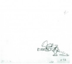
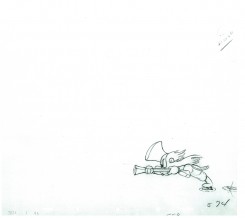
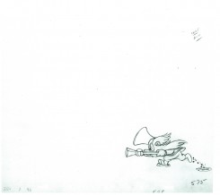
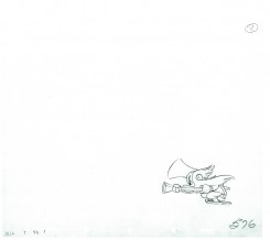
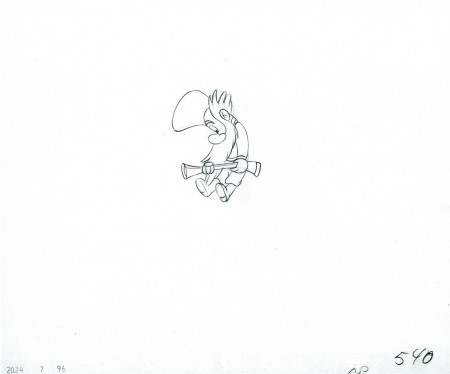
- Production #2024, MAKE MINE MUSIC, “Peter and the Wolf”. Sequence 7, Scene 96. Animator: Ward Kimball.
Continuing the post of the little guy on the separate level, here are the next 40 drawings. This scene should be done next week when I post the last of these drawings.
As usual, we start with the last drawing from last week’s post.
Enjoy.
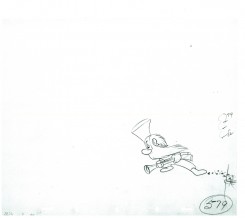
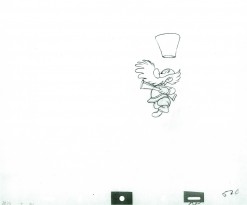
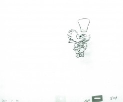
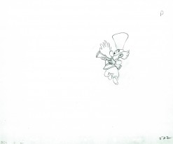
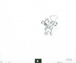
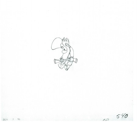 540
540
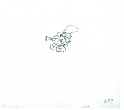
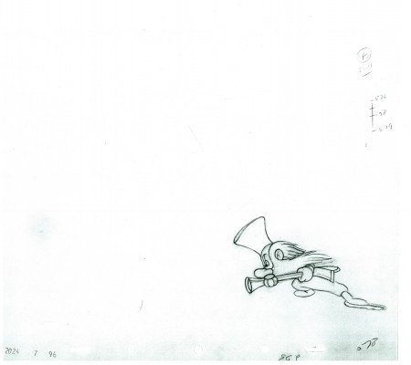 578
578
(Note there is no number 577.)
The following QT movie represents all the drawings of the bottom level
as well as the first 40 drawings of the Little Guy who comes in where he should.
I exposed all drawings on ones.
Right side to watch single frame.
To see the past five parts of the scene go to:
Part 1, Part 2, Part 3, Part 4, Part 5, Part 6
Animation &Animation Artifacts &Disney 21 Jul 2010 07:21 am
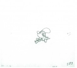
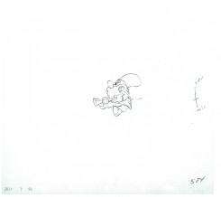
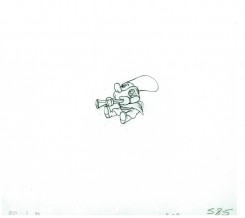
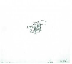
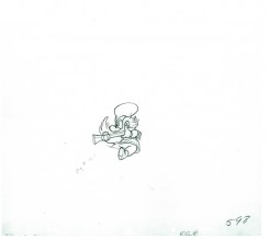
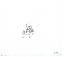
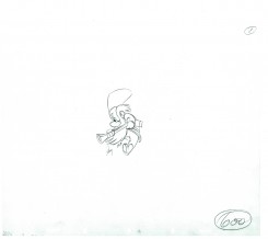
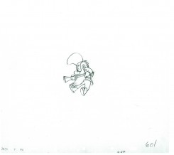
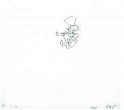
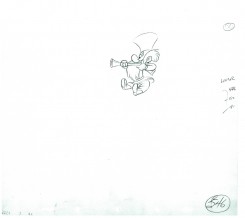
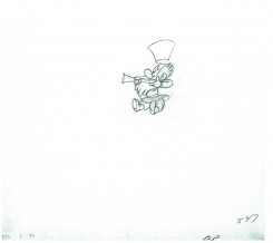
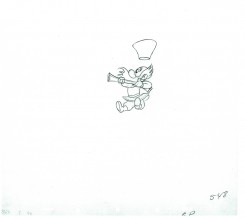
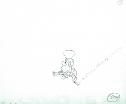
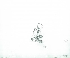
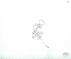
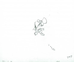
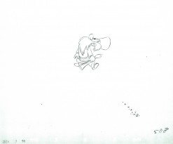
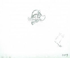
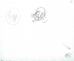
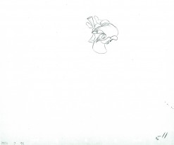
P&W-Kimball Scene – 6
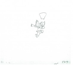
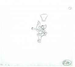
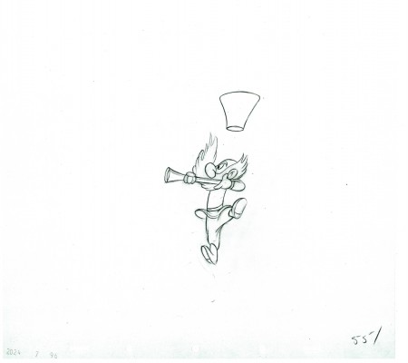
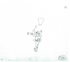
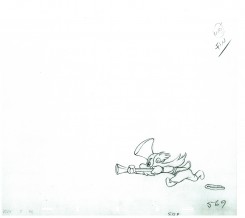
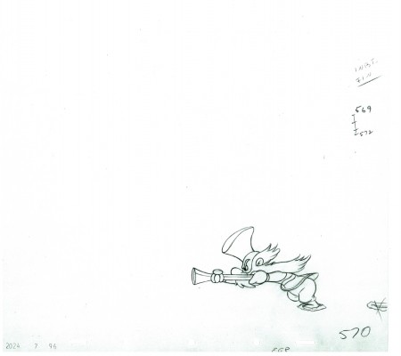
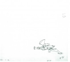
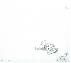
- I’ve posted the principal level of the three hunters from this scene out of Peter and the Wolf. It was animated by Ward Kimball.
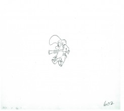
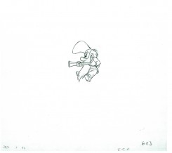
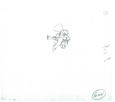
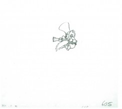
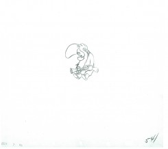
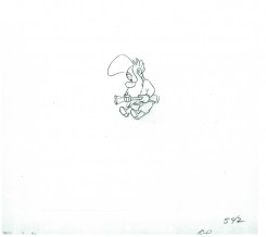
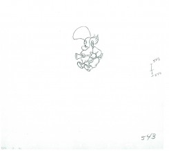
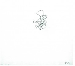
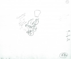
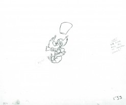
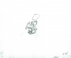
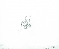
At one point the little guy pops onto his own level, and as Mark Mayerson astutely noted in a recent comment on this blog, he’s the animation that makes the scene work. The curve against the straights. It’s all goofy animation, and works in a very funny way.
Here, I start posting the 117 drawings of the little guy (roughly 40 at a shot) and will combine him with the others in the PT below.
The scene is on loan from John Canemaker and my thanks couldn’t be greater.
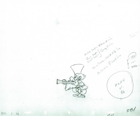 501
501
The following QT movie represents all the drawings of the bottom level
as well as the first 40 drawings of the Little Guy who comes in where he should.
I exposed all drawings on ones.
Right side to watch single frame.
To see the past five parts of the scene go to: Part 1, Part 2, Part 3,
Part 4, Part 5
Animation &Frame Grabs &SpornFilms 15 Jul 2010 07:08 am
Child Development
- I want to give some attention to a series of films we did for UNICEF back in the 90′s. There were four films which focussed on Child Development, trying to teach parents in the Third World how to take care of their children in the first eight years of development.
These films were brought to me by one, Cassie Landers. A well trained educator and an employee of Unicef where she promoted child development training and was hoping to use film to get the message across to the Third World.
Primary to these films was to get the point across that females deserved as much attention, including education, as the boys did. This is a major problem throughout the world, and UNICEF has done an entire series specifically for India about it.
Our aim was to encourage good diet, good behavioral practices and, again, the importance of a good education. The four films were ultimately combined with some live action footage of T. Berry Brazelton talking with children and introducing each of the four segments.
Hillary Rodham Clinton, as First Lady, introduced the entire 1/2 hr. show.
Here are some frame grabs from about 2/3 the scenes of the first film, Off To A Good Start.
 1
1
 2
2
After the UNICEF logo, the film started with a montage of children’s faces.
 3
3
I’ve compiled about a third of the faces.
 4
4
The camera continually moves in on the faces while …
 5
5
… constantly dissolving to the next setup.
 6
6
This was the opening to all four of the films.
 7
7
It was accompanied by narration by Celeste Holme describing the films about to be seen.
 8
8
The narration was written by UNICEF Producer/educator, Cassie Landers.
Sue Perotto drew all of the children’s faces for the opening. She had the right sweet look for the children and the many faces we’d be seeing in a very short amount of time. I knew Sue could keep it interesting and I depended on her – with good reason.
 10
10
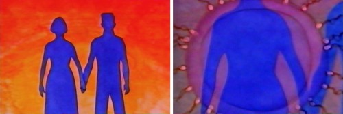
The first film started with prenatal care.
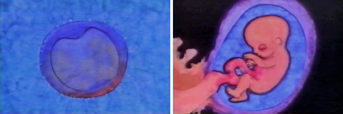 11
11
Giving a very short the child in the womb.
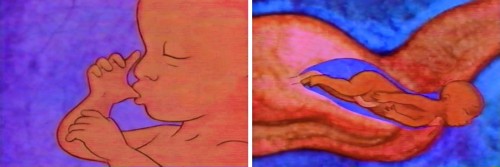 12
12
Right through to the actual birth.
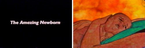 13
13
Then it jumps to the first year of development.
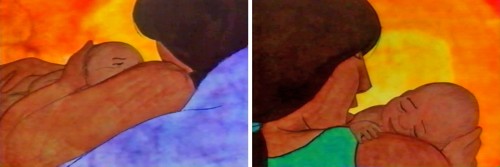 14
14
The art style was designed after Matisse’s Moroccan paintings.
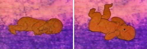 15
15
He had a very primitive set up, colors with
earth-toned characters dominating their paintings.
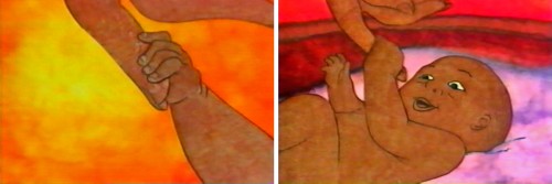 16
16
We tried to reproduce the feel of these paintings
allowing the texture of the paintings to run and bleed.
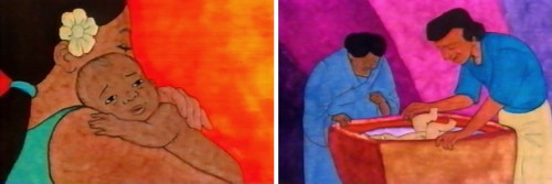 18
18
This was all done pre-computer days, so all art was
painted on paper, then cut out and pasted to cels.
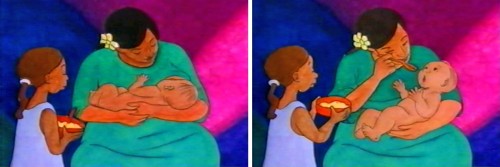 19
19
It was all shot on camera by Gary Becker at his FStop Studios.
Masako Kanayama and Stephen MacQuignon were able to bring a smooth look to the wildly varing colors.
It was designed to look like Matisse’s African period, and I think it did.
 20
20
The first year continues with similar setup.
 21
21
After showing some advanced activity . . .
 22
22
. . . we show how the brain has started to . . .
 23
23
develop enormously in this first year.
 24
24
The child learns to get up and crawl.
 25
25
From here she learns to walk.
 27
27
Then he learns to play more sophisticated games . . .
 28
28
. . .utilizing tools that require more dexterity and thought.
Directed by Michael Sporn
Produced and Written by Cassie Landers EdD, MPH
Narrated by Celeste Holme
Music by David Evans
Production Coordinated by Masako Kanayama
Backgrounds by Jason McDonald
Edited by Ed Askinazi
Photography by FStop Studio – Gary Becker & Bob Bushell
Technical Consultant Marc Borstein Nat’l Inst of Health, Bethesda MD.
Office Manager Marilyn Rosado
Animation by Rodolfo Damaggio, Sue Perotto, Michael Sporn
Rendering by Christine O’Neill, Matt Sheridan, Stephen MacQuignon, Masako Kanayama
Special Thanks to Nigel Fisher, Deputy Regional Director,
UNICEF Regional Office for the Middle East and Africa
Animation &Disney 14 Jul 2010 07:00 am
P&W-Kimball Scene – 5
- This is the final part of this level of animation. We’re posting the scene from Peter and the Wolf animated by Ward Kimball of the three hunters after the wolf. There are a lot of drawings, so posting them has had to be in five segments.
Next week, the level where the littlest hunter separates from these two bigger guys.
As with past posts, I start with the last drawing from last week.
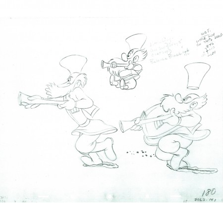 180
180
The following QT movie represents all the drawings posted to date.
I exposed all drawings on ones.
Right side to watch single frame.
To see the past four parts of the scene go to: Part 1, Part 2, Part 3, http://www.michaelspornanimation.com/splog/?p=2298>Part 4, Part 5http://www.michaelspornanimation.com/splog/?p=2298>Part 5.
Many thanks go out to John Canemaker for the loan of the scene to share.

