Category ArchiveAnimation
Animation &Animation Artifacts &Disney 20 Oct 2010 07:40 am
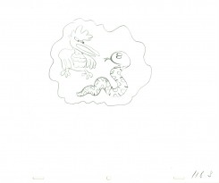
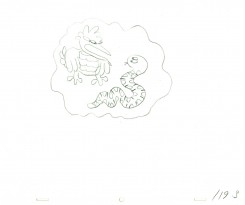
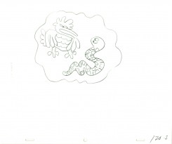
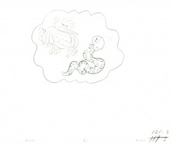
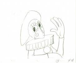
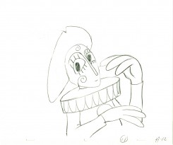
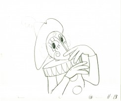
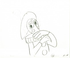
Woodland Cafe – 1
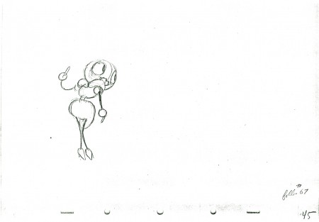
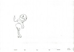
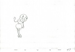
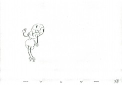
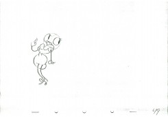
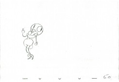
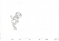
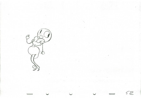
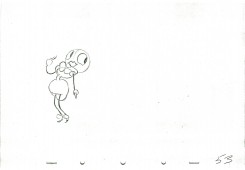
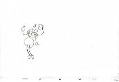
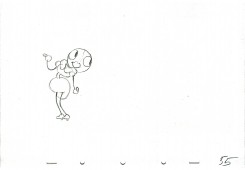
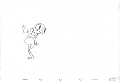
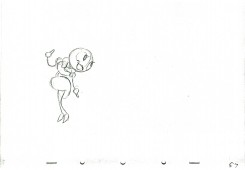
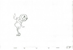
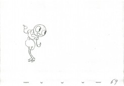
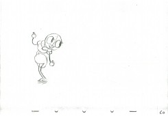
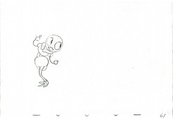
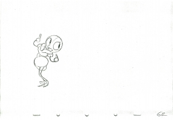
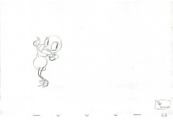
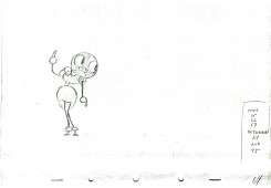
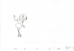
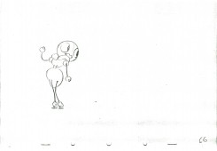
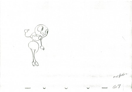
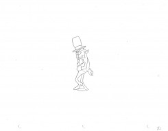
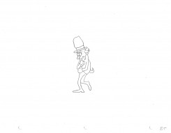
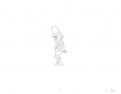
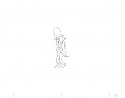
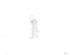
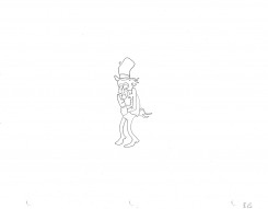
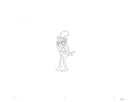
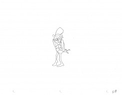
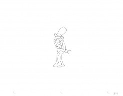
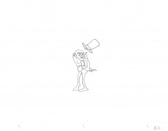
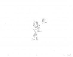
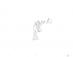
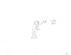
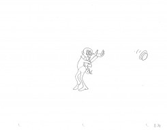
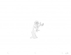
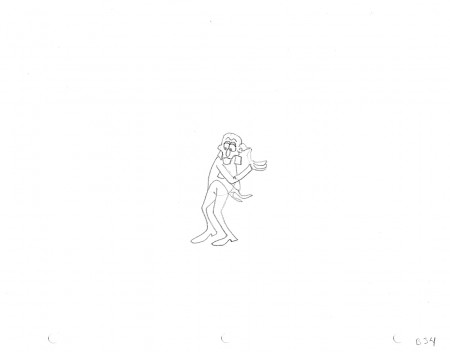
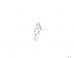
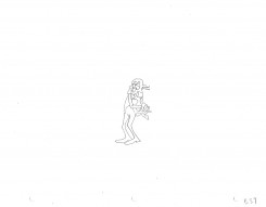
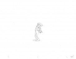
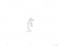
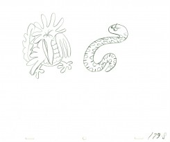
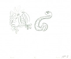
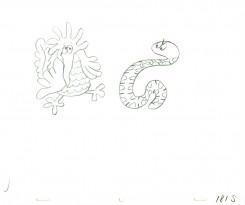
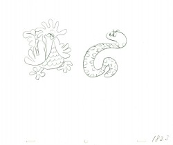
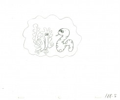
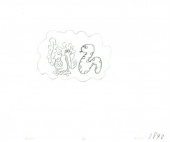
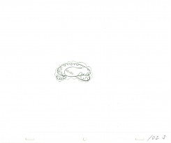
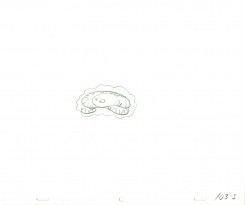
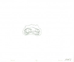
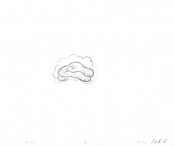
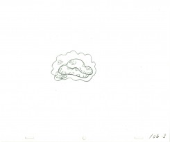
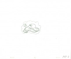
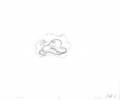
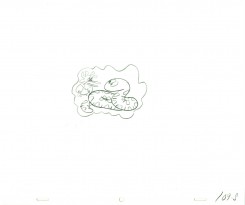
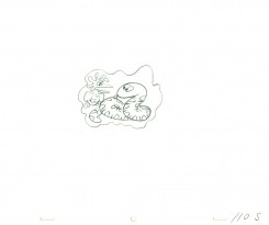
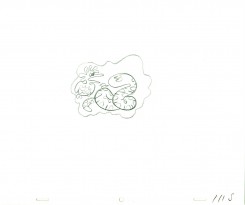
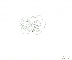
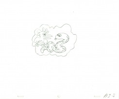
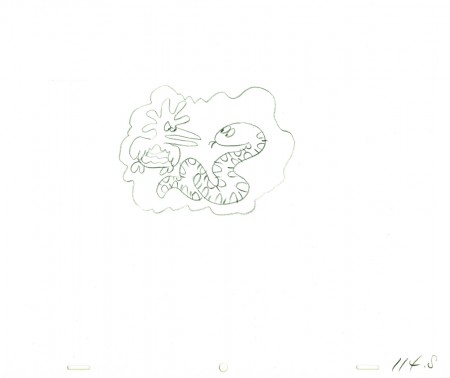
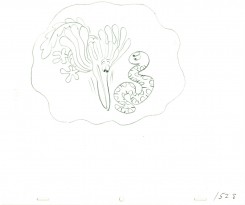
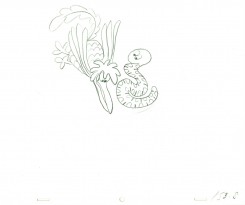
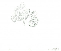
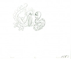
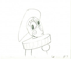
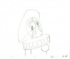
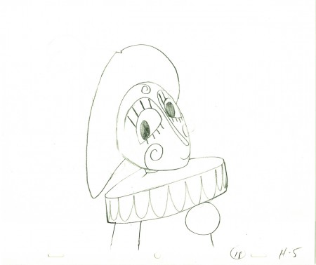
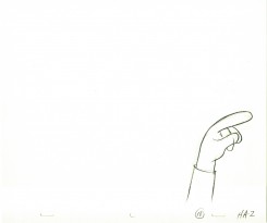
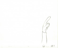
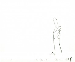
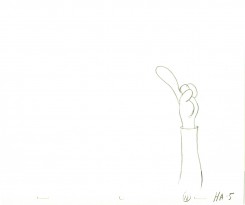
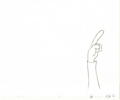
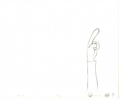
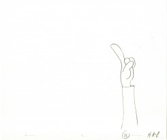
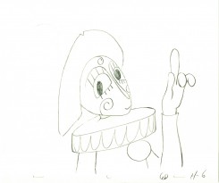
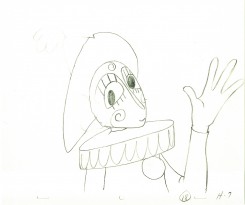
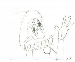
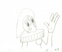
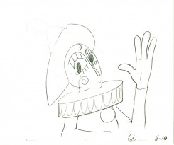
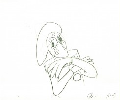
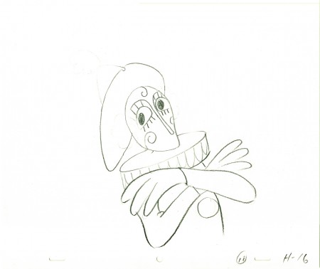
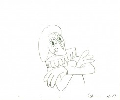
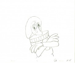
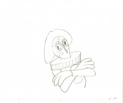
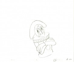
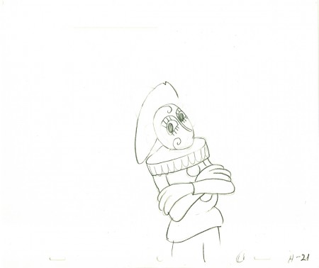
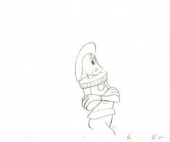
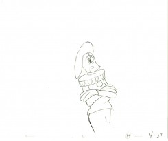
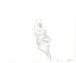
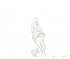
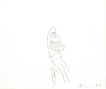
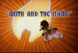 - Here’s a piece of animation (ruffs) from Izzy Klein for the Disney Silly Symphony, The Moth and the Flame. It obviously was eliminated from the film. There are three dances the girl does in the film, and this is not one of them – it’s a bit low key for the other dances.
UPDATE
Thanks to 2 comments from Mark Mayerson and Peter Hale, we can see that this animation is from Woodland Cafe, not the Moth and the Flame (as Izzy Klein had told me.) It still is a piece of animation that was eliminated from the short.
Here are a couple of images from that film:
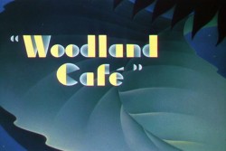
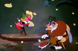
There are about a hundred drawings so I’m breaking it into a couple of parts.
This first part is a cycle that Izzy calls for. I don’t have the sheets but I cycled it three times.
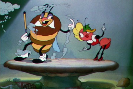
(Click any image to enlarge.)
______________________
Click left side of the bar to play.Right side to watch single frame.
Animation &Bill Peckmann &Books &Disney &Models 15 Oct 2010 07:27 am
Hovarth – 4
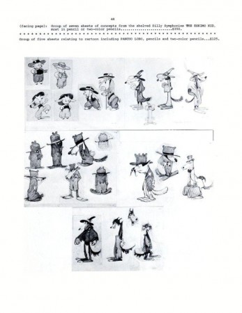
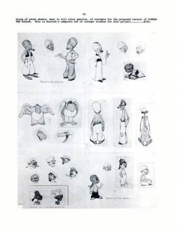
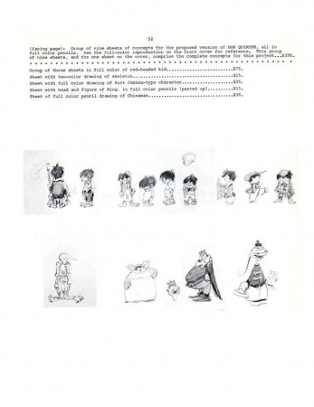
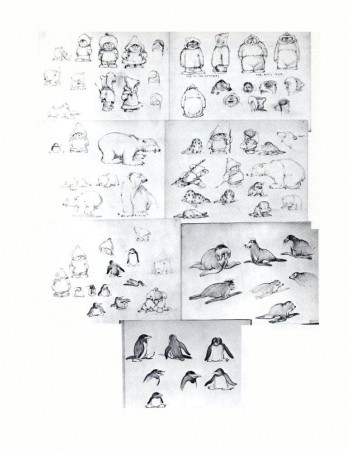
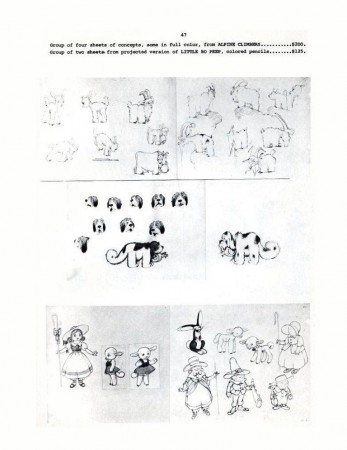
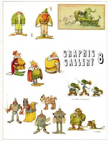 - Here is the final post of the Ferdinand Horvath catalogue of drawings. From 1934-1937, Horvath worked at the Disney Studios painting backgrounds, creating layouts, constructing three dimensional models, and designing characters and gags for over fifty Silly Symphonies and Mickey Mouse shorts.
He was one of those European illustrators, including Albert Hurter or Gustaf Tenggren and himself that Disney found in Europe and brought to America to inspire his staff artists.
Horvath also worked at Paul Terry’s studio on the “Aesop’s Fables” series. Leaving Disney, he designed models and layouts for Columbia/Screen Gems’ shorts. In 1940, he sculpted puppets for George Pal’s Puppetoons.
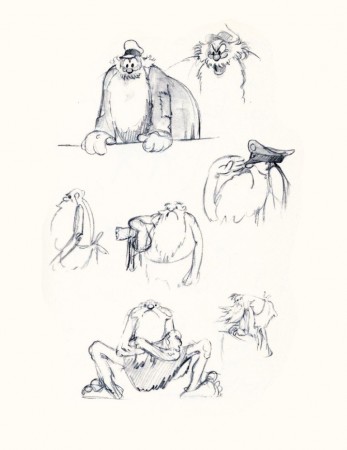
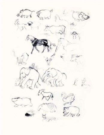
He was a versatile artist whose work was an inspiration for many Disney artists. The following booklet was published by Graphis Gallery and put together by Bruce Hamilton. The opening material explains itself.
Bill Peckmann sent me the pages of this booklet, and I thank him for keeping Horvath alive.
 48
48(Click any image to enlarge.)
Animation &Animation Artifacts &SpornFilms 13 Oct 2010 07:55 am
Soiled Linen
- Here’s something I found the other day. My soiled linen. I did this piece of animation some 49 years ago. I was 15 years old and was trying to do an adaptation of Poe’s short story, “The Black Cat”. I didn’t get too far; as a matter of fact, this is probably all that I did. There’s a painted BG and a storyboard somewhere, but it wasn’t with these drawings.
When I was a kid, I started filming my animation at age 13. By the time I was 17 and starting college, I had shot 2½ hours of 8mm animation. I don’t know what happened to all the other drawings I did, but this scene is all I have. I do have the snippets of 8mm film that I’ll someday transfer to DVD.
Note that I worked on three hole looseleaf for my registration. I don’t think I ever did the missing inbetweens for this scene; if I did, I don’t have them. I don’t ever think I pencil tested this before.
Here’s a smile, some children’s art.
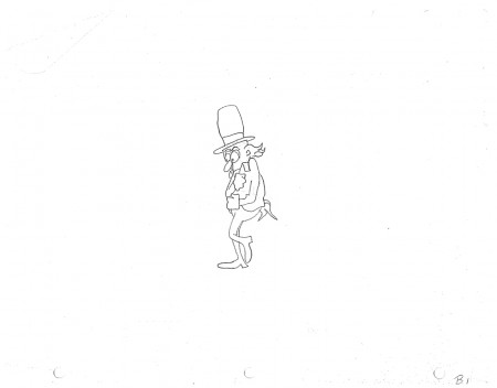 B1
B1
______________________
Here’s a QT movie of the piece.
Remember to take it with a pound of salt.
These are the scribbles of a 15 year old.
Right side to watch single frame.
Animation &Animation Artifacts &Independent Animation 12 Oct 2010 07:37 am
Animal Farm cast
I had some communication with Chris Rushworthy, an enormous fan of Halas and Batchelor’s Animal Farm. I had just watched the DVD again and wondered if Chris, who has an large collection of art from the film and has a website to showcase it – AnimalFarmWorld, had ever seen a set of drafts for the film. Which animator animated which scenes?
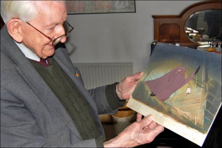
He didn’t have one, but that didn’t stop him from contacting Harold Whitaker, who was a key animator – not only on Animal Farm but for Halas & Batchelor – to ask if he had one. Whitaker responded with a signed card of people who had worked on the film. Interestingly enough, only three people who signed the card actually got screen credit, so I guess that many of the signers were from the Ink & Paint department. Whitaker is the only animator I recognize, to have signed the document.
Here’s the card, and alongside it I tried to identify the names – however, it isn’t easy reading all the signatures. Those that I’m sure I’ve got wrong, I’ve added question marks (????) to the names. If you’re confident of any of the names, please feel free to let me know.
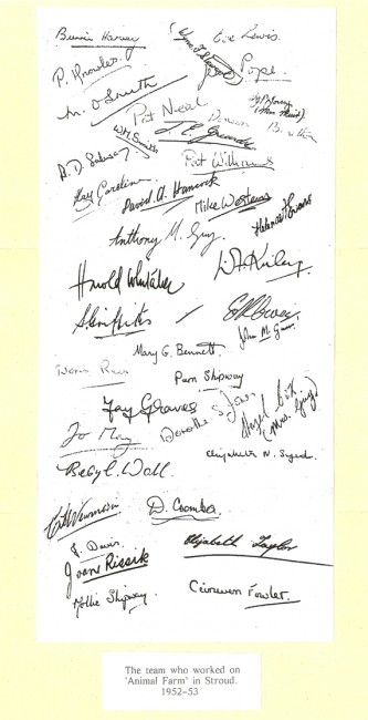
.
Bunnie Harvey
Wynn F. Stewart
Eve Lewis
P. Knowles
Jay Pope
M. O. Smith
Pat Neal
W. M. Smith
J.E.Grundy ???
Ty F. Young (Mrs. Muir)
Kay Coroline
Pat Williams
David A. Hancock
Mike Western
Helena F. Evans
Anthony M. Gray
B.D.Salway ???
Harold Whitaker - animator
D.F.Kniley ???
Sid Griffiths - camera
Mary G. Bennett
John M. Gurr – Camera
Doris Reis
Pam Shipway
Jay Graves
Jo May
Dorothy S. Jones
Hazel Box – (Mrs. Gray)
Beryl Wall
Elizabeth N. Syed
C. L. Newman
D. Coombes
J. Davis
Joan Rissik
Elizabeth Taylor
Mollie Shipway
Ceinwen Fowler
.
The film’s credits don’t offer a hell of a lot more. The names are few and they’re written in script. No first names – just a letter. H. Whittaker – yes, two “t”s even though the card above has just the one “t”. IMDB offers a few additional credits.
One not on IMDB is Gerald Potterton; he told me it was his first position as an inbetweener.
Chris Rushworthy also gave me a preview of a beautiful new setup he recently bought to add to the collection. This is it.
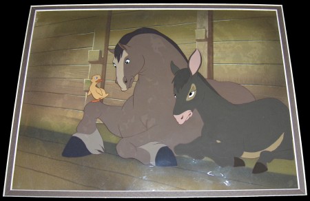
Boxer, Benjamin and duckling
Check out his site to see plenty of other cel setups and drawings.
Animation &Animation Artifacts &Hubley &Independent Animation 06 Oct 2010 07:45 am
Littlejohn’s Snake – 2
- As I wrote last week, I feel that Bill Littlejohn, was one of THE GREAT animators. I worked on many of the scenes that he animated for John Hubley. At first, I was inking his work (and I always did it with the exposure sheets right in front of me so I could see how he was animating.) Then I had to assist some small bits of his animation.
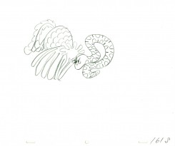
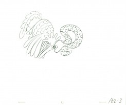
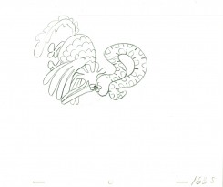
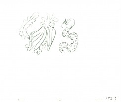
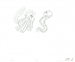
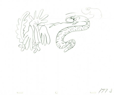
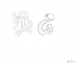
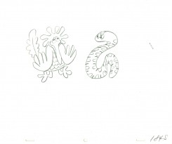
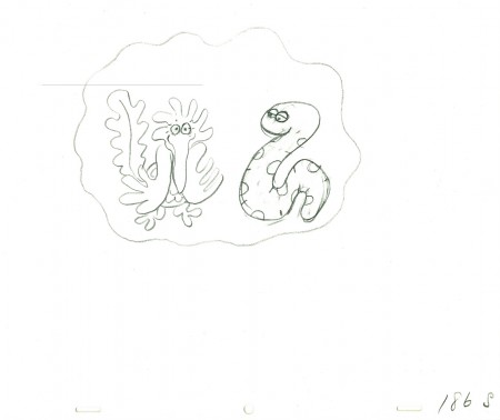
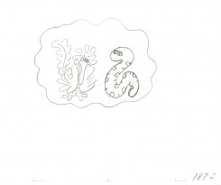
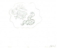
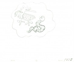
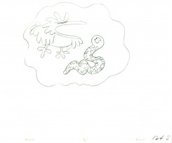
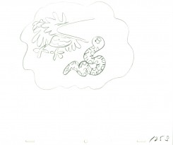
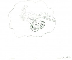
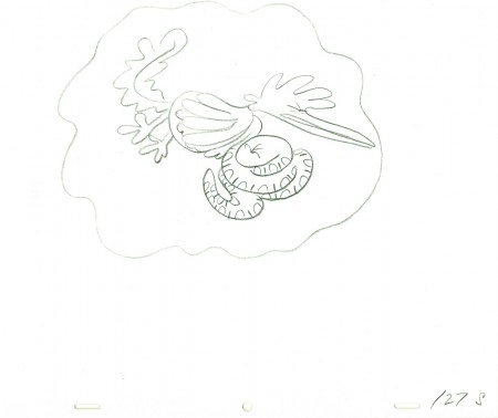
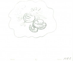
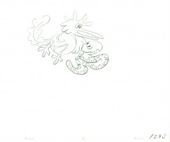
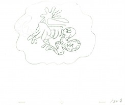
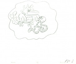
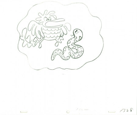
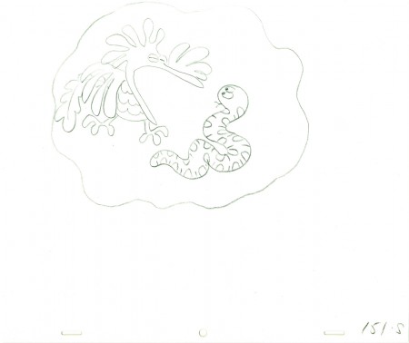
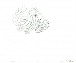
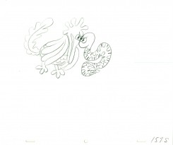
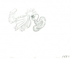
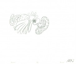
After learning of Bill’s death, last week, I immediately went searching for a scene I could post. This one, from Hubley’s Everybody Rides the Carousel, is not a great scene, but it’s typical of Bill’s work. A beautiful free-flowing style, the scene showcases the almost calligraphic style Bill used for Hubley. The animation drawings just flowed out of his pencil.
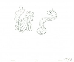
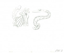
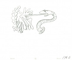
The scene represents the animal figures that constantly fight in the heads of the characters. For this stage there was a snake and a phoenix; one representing positive, the other representing negative.
We start with the last drawing from last week’s blog post.
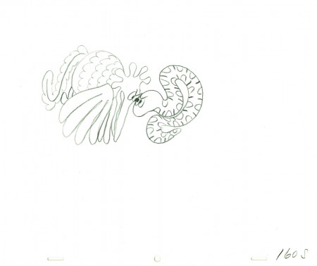 160
160
______________________
The following QT movie represents the drawings above
from Bill Littlejohn.
I don’t have the X-Sheets, so I exposed on two’s
except where there were gaps in the numbers.
There I treated part of it as a cycle – which is what it was.
I suspect the scene actually was exposed to last longer
using three’s and a couple of very short holds.
Right side to watch single frame.
Animation &Commentary &Independent Animation 05 Oct 2010 07:28 am
Idiots & Angels – 3 reviews
- Tomorrow, Oct. 6th, Bill Plympton’s most recent feature, Idiots and Angels opens officially in New York. The IFC Center will screen the film for a limited run. However, if people turn out that could be extended. Bill needs your support; take the family and see the film.
As we did with Paul & Sandra Fierlinger‘s film, My Dog Tulip, we’re posting three short reviews of Idiots and Angels. These are by the three animators in my studio, Matthew Clinton, Katrina Gregorius, and me. In doing that, the hope is that we’d have a wider scope in the review and one that would focus on the craft of the animation. We all agreed that we had problems with the film, yet I’m not sure whether we got that point across in the reviews. You’ll have to decide.
Katrina Gregorius
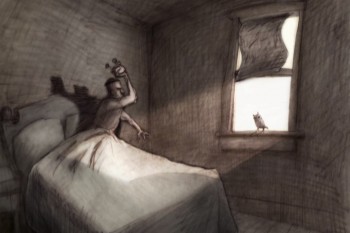 Bill Plympton’s latest feature Idiots & Angels has taken me through a journey within myself in the same way the main character is transformed within the film.
Idiots & Angels is about a guy who is inherently angry and is a jerk to everyone around him. One day, he mysteriously starts to grow wings that eventually try to prevent him from doing any harmful deeds. The rest of the film explore his reaction as well as other character’s reaction to these wings.
Initially I am left without a lot of positive feelings about the film regarding character and story development, but a closer look reveals a film that is an in-depth study of human nature. What I originally thought of as a lack in character development is actually a disturbingly accurate and genuine portrayal of human nature.
Bill Plympton uses color to create the perfect mood for the film. He also creates some playful transitions that are really fun to watch.
Matthew Clinton
Idiots & Angels is mysterious right from the start. It’s almost like you’ve landed on one of the dark planets in “A Wrinkle in Time“, where you don’t know who is controlling things or what the truth is. You can feel that things are off, and it’s unsettling. Angel, a devious man who kind of just blends in, wakes up and heads off to his favorite bar. The city is busy with cars and Angel’s awful ways become clear when he blows up a similar suit-wearer who has taken his parking space. He lights the car’s gas tank on fire. Strangely, the city seems totally empty of people – nobody is there to notice the horrific crime, and it is daylight. Maybe nobody is allowed to see? Angel walks into the bar and doesn’t give the murder a second thought.
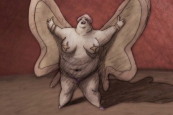 The bar is the center of this decrepit planet. It gives power to the few poor souls who haunt the place: a suit-wearing barkeeper, his barmaid wife, a large card-playing lady, and Angel himself. It’s a motley group. The barmaid shines among the rest of the creepy cast and even manages to penetrate all the septic cigarette smoke and noir shadows. The animation of this character is very nice too. She loves to dance with her broom, and those light scenes are quite necessary to relieve the stifling atmosphere. Of course Angel has to attack her.
The next morning Angel wakes up to discover that small, feathery wings have grown out of his back. He cuts them off with a razor blade, spraying blood everywhere. However, with boney remnants still lodged in his back, I wonder why he didn’t see a doctor at this point – the very first time it happens. (Eventually he does see a doctor…) But he heads back to the bar. Soon he is consumed by hallucinations of birds and wings, a motif that is used cleverly throughout the film.
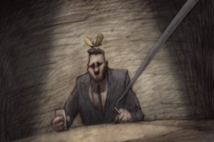 The wings grow back, and will not be stopped. Soon the film becomes a battle to control the wings. The wings want to be an angel, and Angel want to be an idiot. This idea is very full of possibilities, and it’s a good one. There are some stylish scenes that explore that. It becomes increasingly outlandish, though, as the barkeeper and the insane doctor lust after the power of the wings. It gets very crazy now – is it really happening or is it a metaphor? The drastic motives are hard to understand. I guess anything goes in their world, where being a monster is normal. It all makes you want to turn the light on.
Michael Sporn
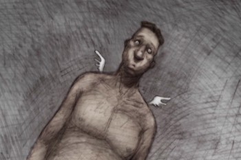 Idiots and Angels is Bill Plympton‘s sixth animated feature. Fifth if you don’t count the one that’s made up of a shorts collection. Still, it’s amazing that an individual can so doggedly, and singlehandedly turn out so much work with with so little. Of course, he doesn’t do it alone – ask all the interns -, but still the animation is his. And we’re talking about films longer than 90 minutes apiece!
At first these features were done by hand on cel with an animation camera, yet none of the features cost more than $500,000. Today computer assistance makes it a mite easier, but not much. There are some secrets here that would be valuable to learn. There’s also a lot of respect that we have to give someone who pulls this feat off.
I’ve seen all of the films, and Idiots and Angels is, by far, my favorite. The story attempts something intelligent, and the graphics are far-and-away my favorite of all the films. It’s still not 100% for me, but it’s getting closer.
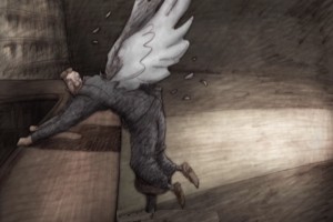 The film, for the first 2/3 of the way, follows a character who is unlikable. (This seems to be something Bill likes to do, have an insufferable protagonist.) Somehow he is gifted with a pair of wings. Every time the character does something nasty, the wings force him to correct the situation and be courteous to his neighbor. Needless to say, there’s an inner-struggle going on. Our hero does everything he can to remove the wings – cutting them off, going to a doctor to have them removed, having others pluck them from his back. The wings don’t go away very easily. Our hero dies at the 2/3 point in the film, and a bartender and dermatologist take center screen – each trying to exploit the wings for themselves.
This is the part of the film where I faded out. The story went off course, and I had a hard time following things. I would have preferred a more developed story about the hero – with a possible character development for him. But instead, he was killed-off and two other greedy folks took center stage.
The graphics, as I said, are, to my mind, the best we’ve seen from the Plymptoon factory. There’s an Eastern European feel to the limited colors and the use of dark grays and umbers employed in most of the coloring. The graphite feel is part and parcel of the Plympton style, and it’s used strongly in Idiots and Angels. In this film. there’s strong control of the textures, and I was pleased to see that. It took some hard work and loving care to pull off.
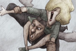 Anyone who makes a feature film with such a small crew and with his own finances, deserves my attention. I think he also deserves your attention. Bill is what I consider a natural animator. He hasn’t studiously studied the work of the masters, yet he seems to have absorbed all of the rules just by watching. Right from his first film, he had it down. I wish that he’d use a few more inbetweens at times, but I can’t argue with the extremes. I also wish so much of it weren’t on Fours – but then this is what passes for full animation these days. Budgets are the excuse, but sometimes I wonder if it doesn’t go deeper.
Saying all that, Bill’s a self-made master of the medium. I doubt he had to study Preston Blair or Frank Thomas; he just got it. See the film at the IFC Center (starting tomorrow, Oct. 6th in New York) and support it.
Idiots and Angels opens at the Laemmle Sunset 5 Theater in LA on October 29. Bill will make appearances at the opening night screenings.
While in LA ASIFA-Hollywood will present “Tom Sito’s Evening with Bill Plympton” on Oct. 27 at Woodbury College. He will also do a signings at Amoeba in Hollywood on Oct. 28, 8 pm, and at Dark Delicacies Bookstore in Burbank on October 31, 2-4 pm.
Animation &Independent Animation &SpornFilms 03 Oct 2010 08:00 am
PhotoSunday Recap – Woman of the Year
- Back in Jan 2007, I posted these photos from the animation production of Woman of the Year. I think these are interesting enough that they’re worth revisiting. So here, again, is that post:
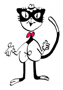 – To recap:
Woman of the Year was a project that came to me in the very start of my studio’s life – 1981.
Tony Walton, the enormously talented and fine designer, had gone to Richard Williams in search of a potential animator for WOTY (as we got to call the name of the show.) Dick recommended me. But before doing WOTY, there were some title segments needed for Prince of the City, a Sidney Lumet film. (I’ll discuss that film work some other day.)
Tony Walton designed the character, Katz, which would be the alter-ego of the show’s cartoonist hero, played by Harry Guardino. Through Katz, we’d learn about the problems of a relationship with a media star, played by Lauren Bacall.
It turned out to be a very intense production. Three minutes of animation turned into twelve as each segment was more successful than the last. ___________(All images enlarge by clicking.)
There was no time for pencil tests. I had to run
to Boston weekly, where the show was in try-outs, to project different segments; 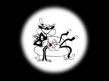 these went into the show that night – usually Wednesdays. I’d rush to the lab to get the dailies, speed to the editor, Sy Fried, to synch them up to a click track that was pre-recorded, then race to the airport to fly to the show for my first screening. Any animation blips would have to be corrected on Thursdays.
There was a small crew working out of a tiny east 32nd Street apartment. This was Dick Williams’ apartment in NY. He was rarely here, and when he did stay in NY, he didn’t stay at the apartment. He asked me to use it as my studio and to make sure the rent was paid on time and the mail was collected. Since we had to work crazy hours, it was a surprise one Saturday morning to find that I’d awakened elderly Jazz great, Max Kaminsky, who Dick had also loaned the apartment. Embarrassed, I ultimately moved to a larger studio – my own – shortly thereafter.
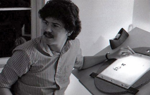
Here are a couple of photos of some of us working:
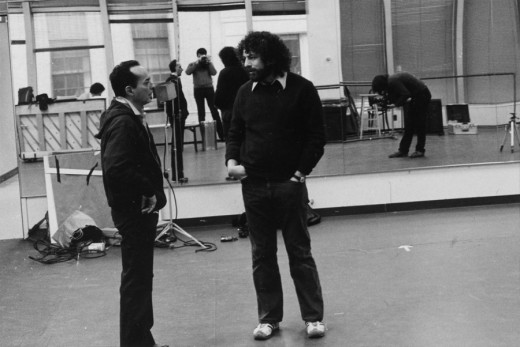
Tony Charmoli was the show’s choreographer. He worked with me in plotting out the big dance number – a duet between Harry Guardino and our cartoon character. I think this is the only time on Broadway that a cartoon character spoke and sang with a live actor on stage. John Canemaker is taking this photograph and Phillip Schopper is setting up the 16mm camera.
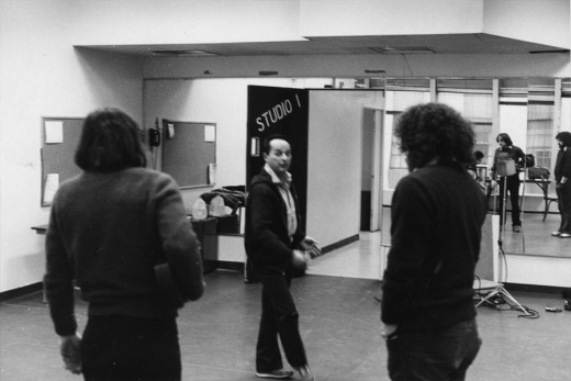
Here Tony Charmoli shows us how to do a dance step. Phillip Schopper, who is filming Tony, figures out how to set up his camera. We used Tony’s dancing as reference, but our animation moves were too broad for anyone to have thought they might have been rotoscoped.
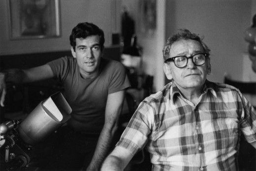
John Canemaker is working with Sy Fried, our editor. John did principal animation with me on the big number. Here they’re working with the click track and the live footage of Tony Charmoli to plot out the moves.
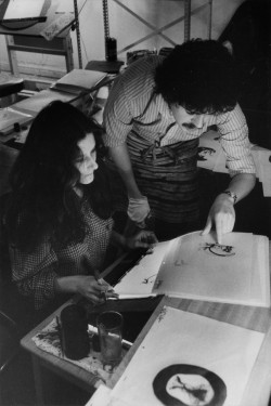
Steve Parton supervised the ink and paint. To get the sharpest lines, we inked on cels and didn’t color the drawings. It was B&W with a bright red bowtie. A spotlight matte over the character, bottom-lit on camera by Gary Becker.
 5
5 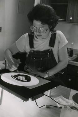 6
6
5. Steve Parton works with painter Barbara Samuels
6. Joey Epstein paints with fire in her eyes.
 8
8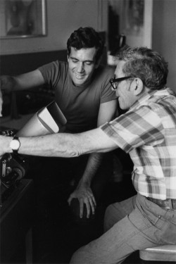 9
9
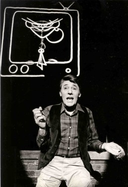
8. Harry Guardino on stage with the creation of “Tessie Kat” developing on screen behind him. This was Harry’s first big solo.
9. John Canemaker gets to see some of his animation with Sy Fried, editor.
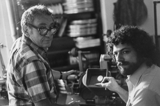
One of my quick stops from the lab on the way to Boston? No, I think this is a posed photo.
The success of the animation (including good reviews) posed a small problem for me. The rest of the show was ripped over the coals. When I started using some quotes about me in industrial ads, the producers came down on me for gloating over the others who’d gotten negative reviews.
All the same, it was a real learning experience in a big Broadway kinda way.
Animation &Animation Artifacts &Hubley &Independent Animation 29 Sep 2010 07:48 am
Littlejohn’s Snake – 1
- Bill Littlejohn, to me, was one of THE GREAT animators. It took years of my working on his animation for John Hubley before I finally met him. We’d spoken often enough on the phone since I was the production manager, Assistant, Animator and Layout guy for Hubley for about 6 years. I did any assisting needed on Bill’s work – and there was rarely much to do. He and his wife, Fini, were so amiable, affectionate and cordial in person; exactly the people I expected after all the phone conversations.
His animation seemed to be done in a straight-ahead style, and he did everything needed for the scene.
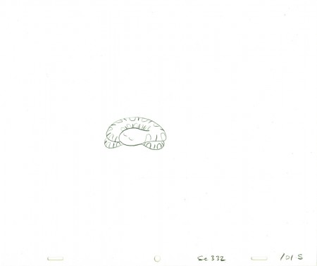
As promised I found a scene animated by him from Hubley’s Everybody Rides the Carousel. It’s not the best scene, but it showcases the almost calligraphic style Bill used for Hubley. The animation drawings just flowed out of his pencil (though he usually animated in pen for Hubley.) The only assisting I did on the following drawings were some of the outer balloons for the characters.
The scene represents the animal figures that constantly fight in the heads of the characters. For this stage there was a snake and a phoenix; one representing positive, the other representing negative.
 101
______________________
The following QT movie represents the drawings above
from Bill Littlejohn.
I don’t have the X-Sheets, so I exposed on two’s
except where there were gaps in the numbers.
There I treated part of it as a cycle – which is what it was.
I suspect the scene actually was exposed to last longer
using three’s and a couple of very short holds.
Right side to watch single frame.
Animation &Animation Artifacts &Hubley &Independent Animation 27 Sep 2010 07:27 am
Barrie Nelson’s Mime
- I’d posted a large scene from Everybody Rides the Carousel which was animated by Art Babbitt. The scene was the first one handed out when the film was scheduled to air as 3 half hour shows on consecutive nights. Babbitt did a stunning job, and John Hubley loved it. (He’d pulled me into the editing room to show it to me. “I want you to see the greatest piece of animation ever done,” were the words he greeted me with.
Hubley did some changes after the film was extended to a 90 minute TV special. It meant we needed an additional 10 mins of animation done within the same 6 month schedule. Hubley extended Babbitt’s scene putting it on four frame dissolves. Babbitt quit the project.
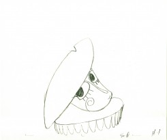
At the very end of production, John Hubley sent the rest of the mime to the brilliant animator, Barrie Nelson. The voice had changed, and the schedule offered little time to do the work. Barrie followed the voice rather than Art Babbitt’s mime. It came back a different character. True to Hubley’s style, schedule and budget, it was used regardless.
Here’s one of those Barrie Nelson scenes. I don’t have the exposure sheets, so I guessed at it.
 1
1 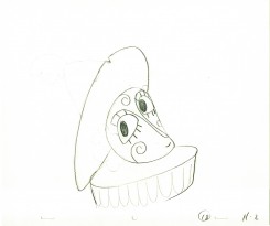 2
______________________
The following QT movie represents the drawings above
from Barrie Nelson.
I don’t have the X-Sheets, so I exposed straight ahead on two’s.
Right side to watch single frame.
Animation &Bill Peckmann &Books &Disney &Illustration &Layout & Design &Models 24 Sep 2010 10:14 am
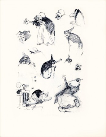
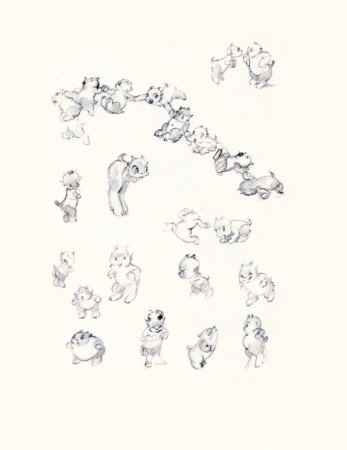
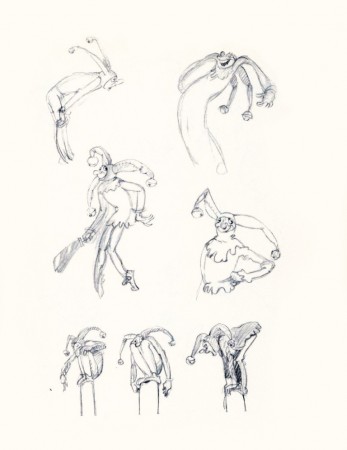
He Drew As He Pleased – 2
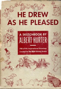 - Last week I posted the first of the displays from this beautiful book, He Drew As He Pleased. This, of course, is the work of Albert Hurter who was a key designer for the Disney studio during the mid thirties, particularly in the making of Snow White.
Interesting that this film showed up with commercials on ABC Family Channel last Saturday evening. It was a happenstance that got me to watch the film again, and then I watched it uncut and uninterrupted the next day in my studio.
For all the shaking lines and animation problems the earliest feature had, it’s still a gorgeous testament to brilliant animation. There are no cliches floating in the eyes of the characters. No hard edges right out of Cartoon Network or CalArts. It has its cliches of the period – which existed in live action as well – but the acting is brilliant, particularly in the dwarfs. I was also very impressed, this time, with the old hag. The witch is overplayed by Norm Ferguson, yet it’s done with imagination and resourcefulness. She comes right out of an opera – or do I mean a melodrama – and she’s loveable in her grotesque way.
The film has an innocence we’ll never see again, and it’s too bad.
Hurter had his part in that innocence, and the drawings are a fine display of all that’s good in the film.
Many thanks to Bill Peckmann for scanning his copy of the book for me to post. This is the first time I get to see the entire thing.
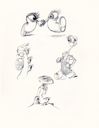 20
20“Optics . . .”
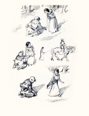 22
22
“Preliminary Sketch of Snow White.”
 24
24
“The Witch . . . Hansel and Gretel.”
 26
26
“And Some Demons in the Making.”
 27
27
“Tyll the Jester and . . . ”
