Category ArchiveAnimation
Animation &Commentary &Disney 30 Nov 2010 08:26 am
Keane Posing
- Before posting this, let me tell you that I have all the respect in the world for Glen Keane. He’s one of the finest animators out there who consistently does original animation.
 Last night I saw Tangled at a screening in 2D. I would have liked to have seen it in 3D, though EVERY review I’ve seen has put down the 3D experience saying that the glasses darken the movie to less than 60% of the brilliance on film. I doubt I’ll see it again for the 3D; if I do see it again it’ll be on DVD.
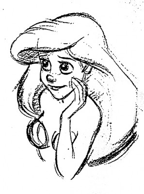
The history of the Disney studio. The film, itself, is basically a reworking of Beauty and the Beast (the magic flower, the bad male who has to be transformed into a good guy), Snow White (the wicked queen and the magic mirrors – two of them have to be broken), Cinderella (she cleans the tower for her wicked stepmother – or is this more of Snow White?), Sleeping Beauty (the horse with his own mind, the Princess awakens the sleeping Prince – or is this Snow White again?), The Little Mermaid (She looks like Ariel, the Little Mermaid with the hair that she just has to keep pushing back), Tarzan (the two lead characters skateboard over water and some paving, yet they don’t have skateboards). I could go on through some other films, but what’s the point?
Several of these female characters showed their spunk and advanced their Independence. In Tangled, Rapunzel goes after what she wants but doesn’t create her own fate, in the end. The male does. One expected it would be the wicked stepmother, but no, it’s the Prince … er Robber/Thief/Scoundrel. Inadequate. This is a film for 14 year old girls, and we see that they’ve seen it this past weekend, but they’re given the wrong version of the story.
The story in Tangled is smooth flowing, but crudely formed. It’s a mass of unbelievable material that rips apart one of the darker and great stories from the Brothers Grimm first published in 1812. The story is a nasty one which begins with a king, personally, stealing a plant from the witch’s garden to help his wife. She catches him on the spot and makes him promise his first born in payment.The king is RESPONSIBLE for his theft. Rapunzel moves to the tower and is protected from sex with her caging in the tower.
The film doesn’t use the hair very well. It is the sex that isn’t otherwise stated, and some symbolism should have entered the animation; it didn’t have to be obvious – it just had to be there. The incidental characters – all male seem to have bonded well, but we have no idea who they are or what their sexual preferences are. Again, the film seems unwilling to deal with the main subject of this great fairy tale. A stepmother trying to protect her daughter from the evils of the world. (Men!) Instead, this film is about ripping off Disney past. Yet we did see in Jeff Kurti‘s book on The Art of . . . that Rembrant was a major source of inspiration in the earlier days. Too bad too little of Rembrandt made it to the screen.
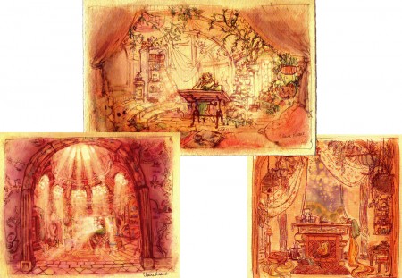
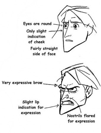
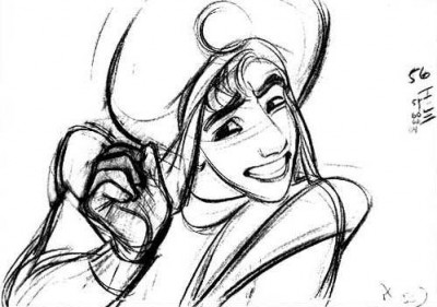
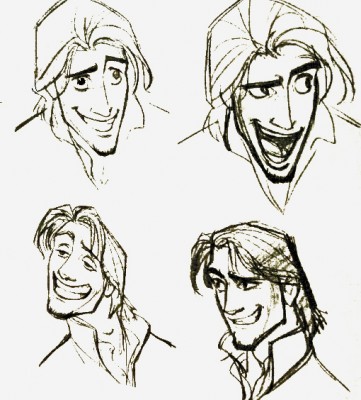
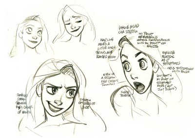
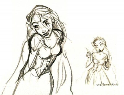
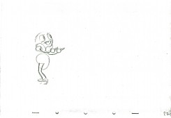
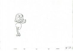
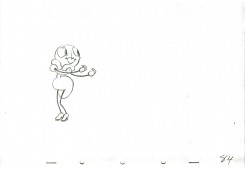
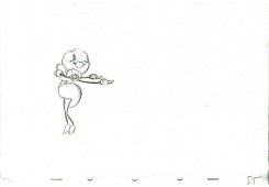
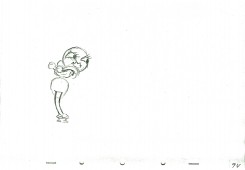
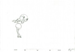
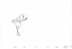
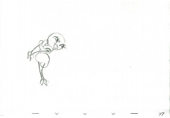
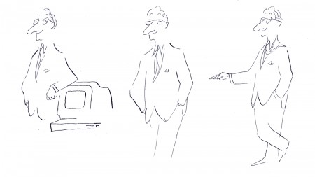
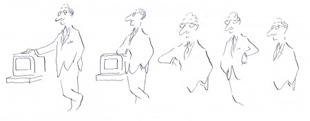
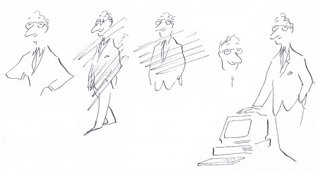
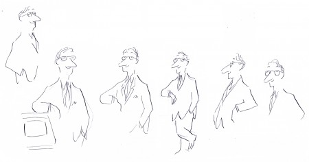
Just prior to going to this screening, I watched the first half of Tarzan on tv. Below, I’m going to post a number of drawings showing some clichéd poses by Glen Keane, but these poses don’t represent the animation he does on screen. He’s too good and sensitive an animator to show any clichés in the actual animation on screen. In fact, some of what he does is quite inspired. (Not the idea of Tarzan skateboarding through the trees without a skateboard. I expect the soles of his feet would be bloodied and damaged after trying it once, and I don’t think there’s scar tissue for it. It’s a small reality issue for me.) It’s just that these model sheet poses inspire clichés from lesser animators when they’re the poses.
Tangled is totally watchable (despite a couple of children running around the screening room, bored and loud). It’s just not good; story is everything.
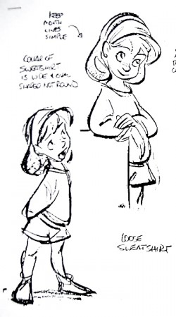
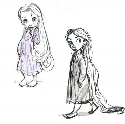
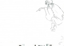
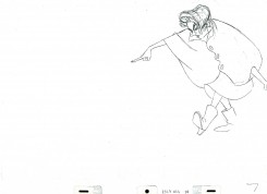
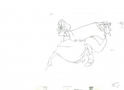
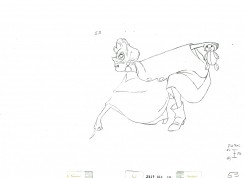
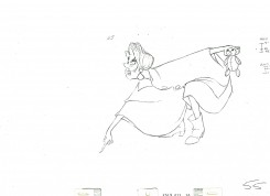
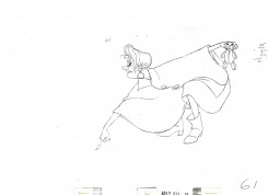
Here are a bunch of drawings I culled from Raul Andres‘ blog, The Art of Glen Keane. I have to admit my purpose isn’t to showcase the art of Mr. Keane, but to express my disappointment with what I’ve found. It first became obvious to me with many of the drawings and models of his that were printed in the book, The Art of Tangled. Many of the poses he’s done since Beauty and the Beast have gone to the clichéd pose, and it’s disconcerting to me. Characters look like each other, and their facial postitions repeat the past. It’s a laziness in the drawing.
Look and compare drawings with this small sample. It took only minutes for me to compile them, and I could easily have kept going.
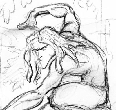
Tarzan 1
The problem, to me, is that Glen Keane has grown into this phase of reworking the same godawful poses. He has to come to grips with what he’s doing, and pay more attention it. There’s no excuse. It isn’t so obvious in his animation, just in his model sheets.
You wouldn’t be able to catch two poses from Frank Thomas, Milt Kahl or Ward Kimball that were so alike. There were no obvious clichés in their work.
Glen Keane is a remarkable artist and a brilliant animator. That is exactly why I have to take notice. There are many others aping what he’s doing in animation, and the kingdom is beset with endless clichéd poses. Let’s get it together, folks. Time to bring animation to a higher level.
Attitude has got to be a thing of the past. It’s rampant in Tangled, Toy Story 3 and to a lesser degree in Kung Fu Panda; it’s not obvious in How To Train Your Dragon. The independent films, The Illusionist and My Dog Tulip don’t settle into this type of posing. Strong, clear thinking artists dominate these two films.
Animation &Disney &Frame Grabs 29 Nov 2010 08:23 am
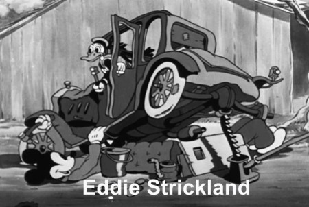
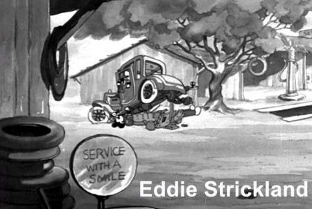
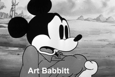
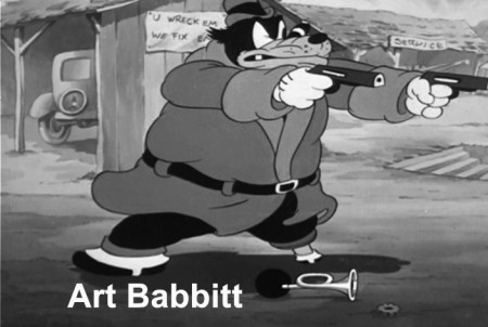
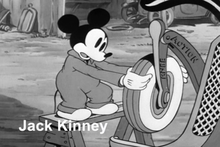
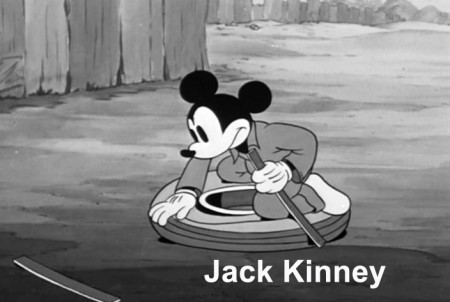
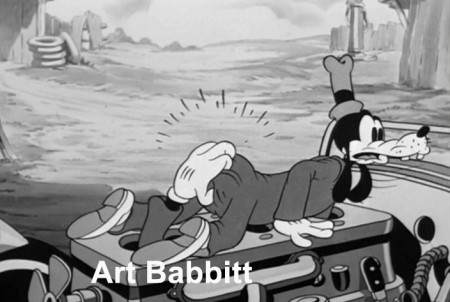
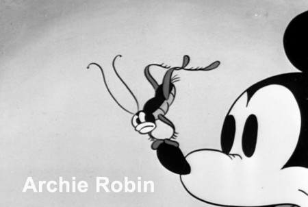
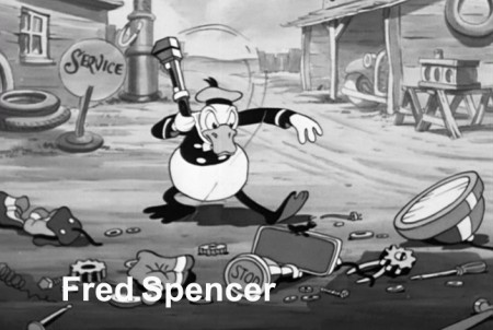
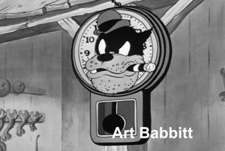
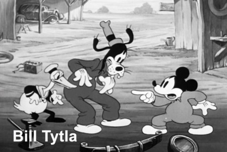
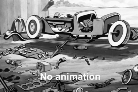
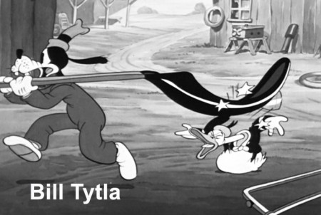
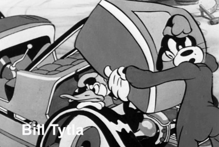
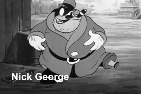
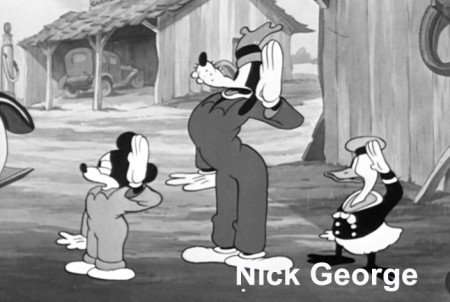
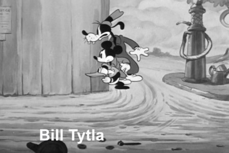
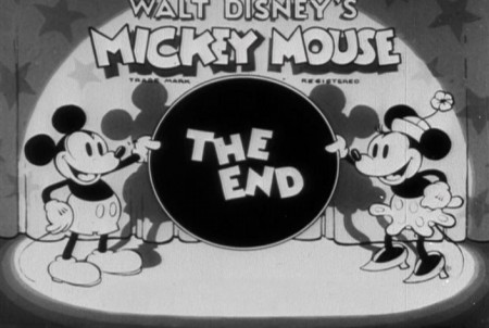
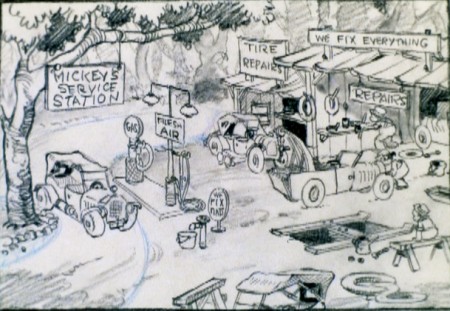
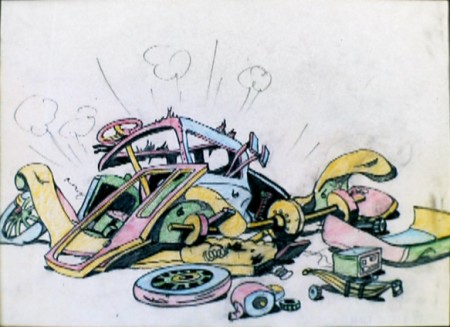
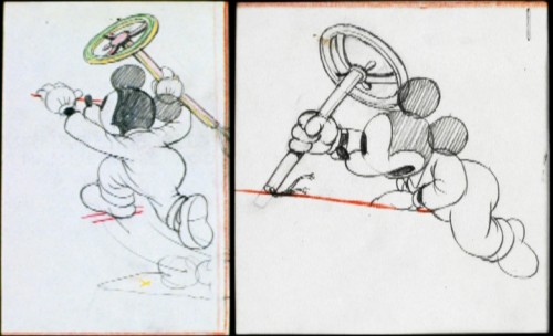
Mickey’s Service Station Grabs
- Having posted sketches from Mickey’s Service Station, the brilliant 1935 short, the last B&W Mickey film, the next thing for me to do, logically, is post frame grabs from the final film – for comparison.
Since Hans Perk has made available the film’s draft on his incredibly resourceful site, AFilmLA, I’ve also added the animators’ names to the frame grabs. What an assortment it is, too. Art Babbitt, Eric Larsen, Bill Tytla, Jack Kinney, Don Towsley, Fred Spencer, Milt Kahl, Ferdinand Hovarth, Archie Robins among others.
Here, then, are the scenes from the film:
 1
1(Click any image to enlarge.)
Animation &Animation Artifacts &Disney 24 Nov 2010 08:32 am
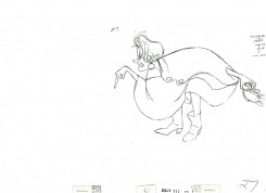
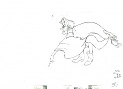
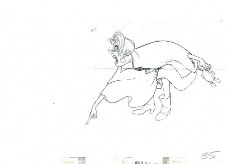
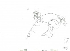
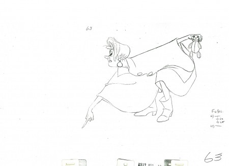
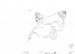
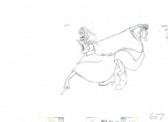
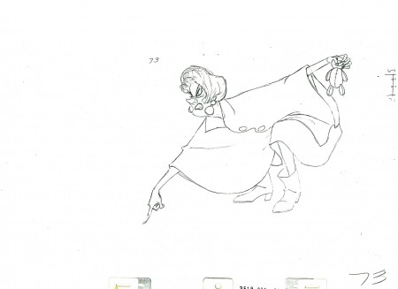
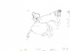
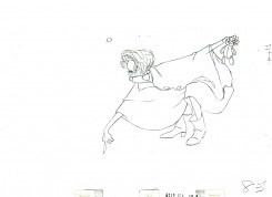
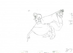
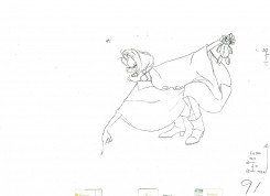
Medusa – 1
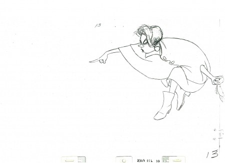
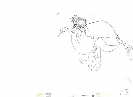
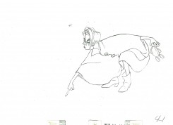
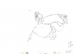
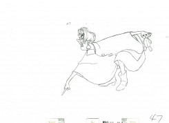
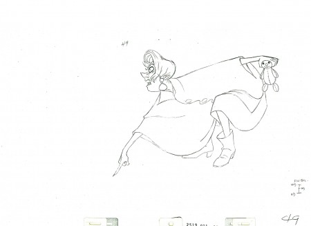
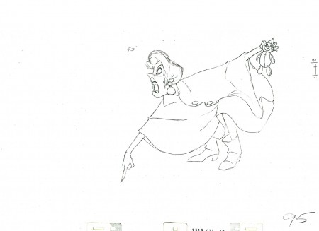
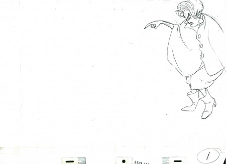
- Here’s Medusa. She’s the bad guy at the center of The Rescuers. Milt Kahl, wanted a shot at creating his own version of Creuella DeVille, and he came pretty close.
The animation has the little girl, Penny, down a hole, and Medusa walks up to the hole and shouts down to Penny to find a gem down there. (Shades of Aladdin in the cave.)
The second half of the scene will follow next week.
The scene comes courtesy of a loan from Louis Scarborough Jr.‘s collection, and I thank him enormously for it.
 1
1
_____________________________
Here’s a QT movie of the action layed out above. Since the scene has been inbetweened, it’s exposed, for the most part, on ones.
Animation &Disney &Frame Grabs 23 Nov 2010 08:41 am
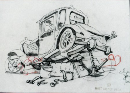
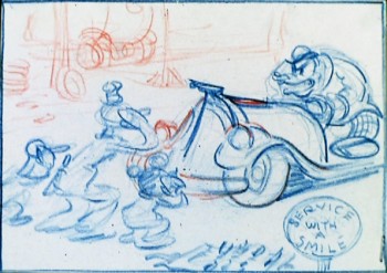
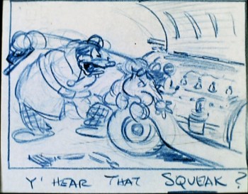
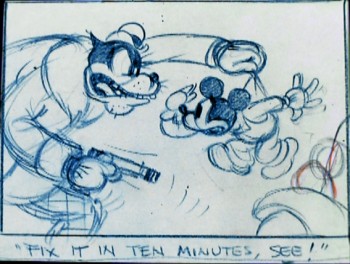
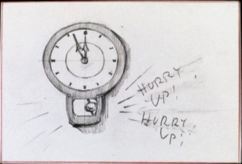
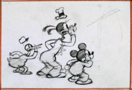
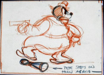
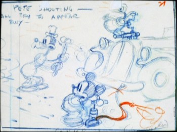
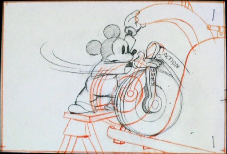
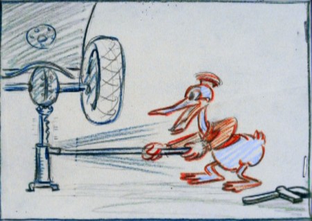
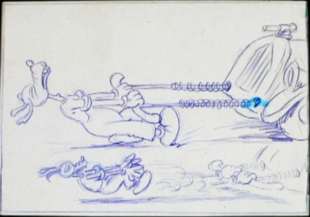
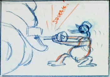
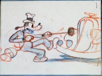
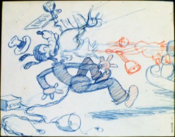
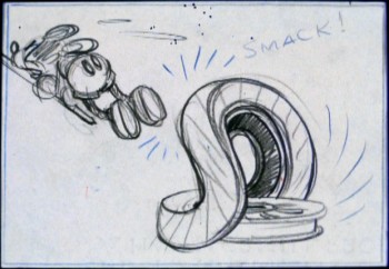
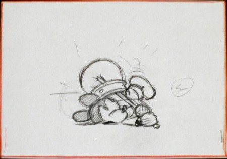
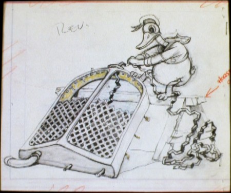
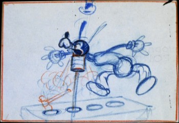
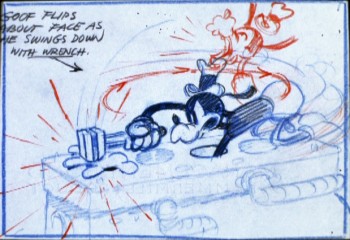
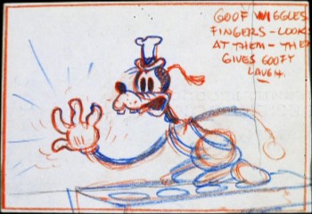
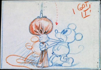
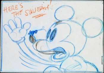
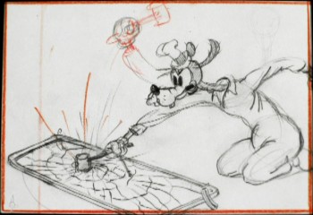
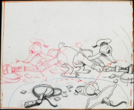
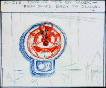
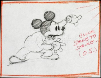
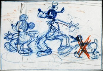
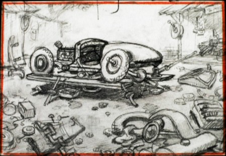
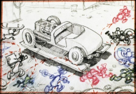
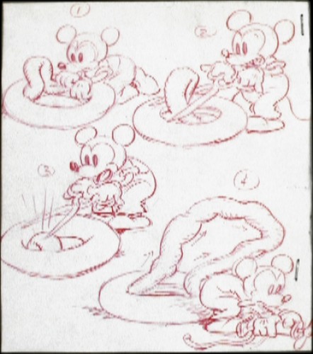
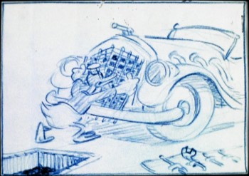
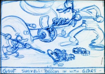
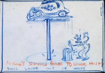
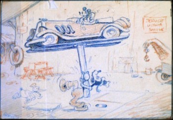
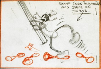
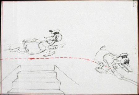
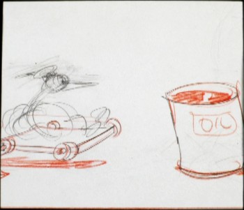
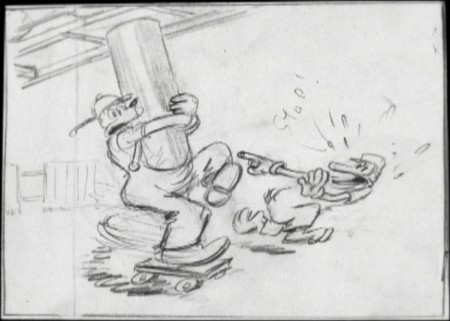
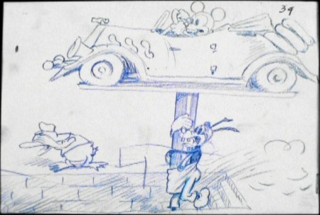
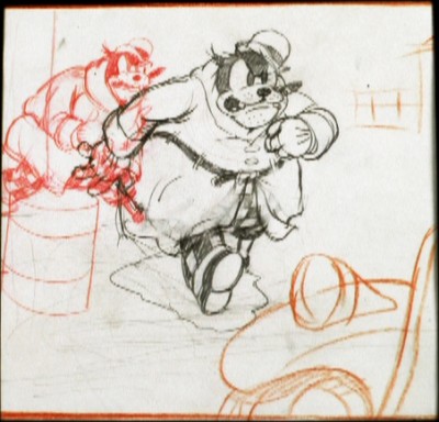
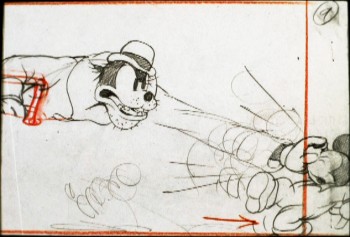
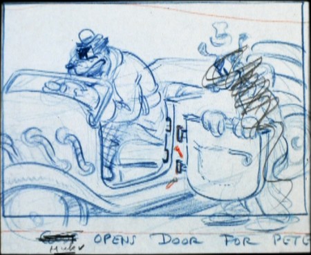
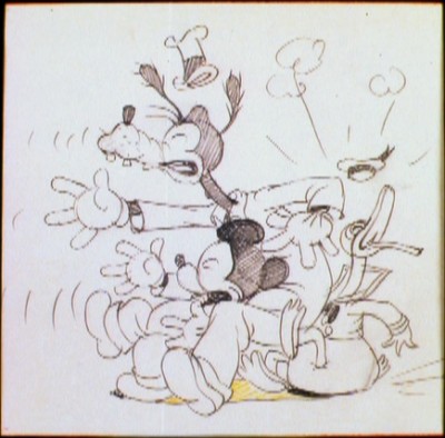
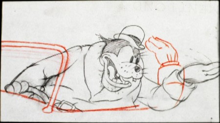
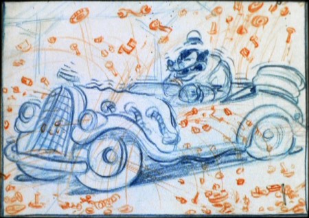
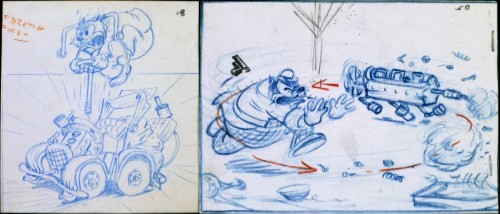
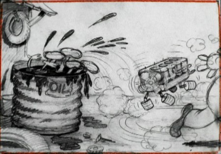
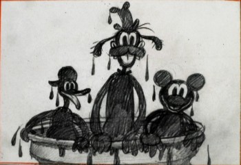
Mickey’s Service Station Sketches
-After watching all the earnest animated shorts entered into the Oscar competition, I decided to treat myself by watching some of my favorite Mickey shorts. I particularly like a lot of the B&W films of the early period.
Mickey’s Service Station is featured on Mark Sonntag ‘s TagToonz blog with some interesting material, so I started with that one.
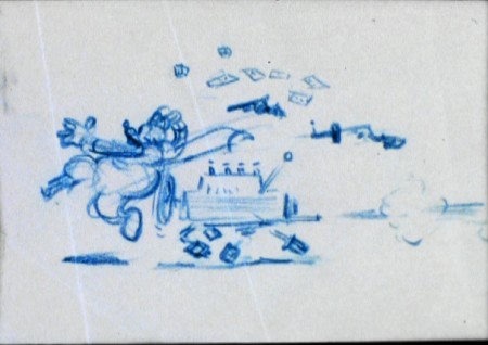
It’s way up there in my Pantheon of great shorts. The DVD features a rough animatic of story sketches from the vault. So I’ve pulled some frame grabs and am posting them here. There are some beautiful drawings here.
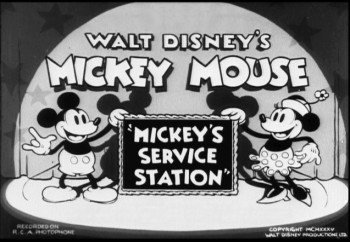
(Click any image you’d like to enlarge.)
Animation &Animation Artifacts &Disney 17 Nov 2010 08:13 am
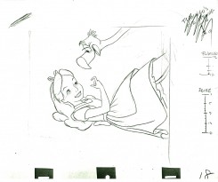
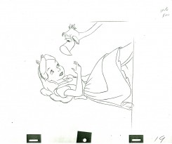
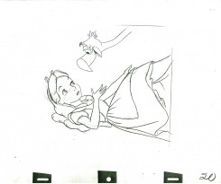
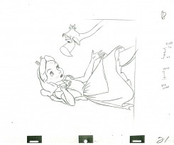
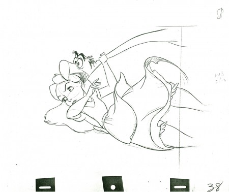
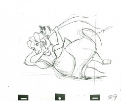
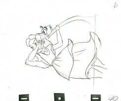
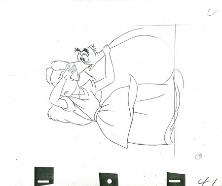
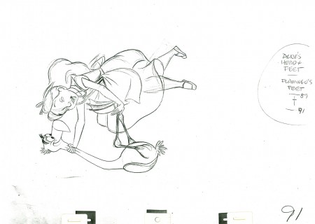
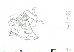
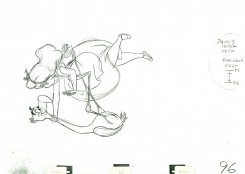
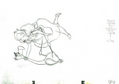
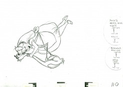
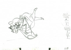
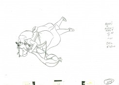
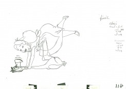
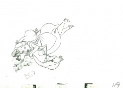
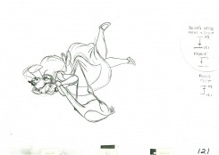
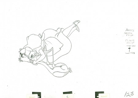
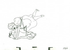
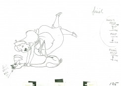
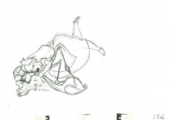
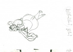
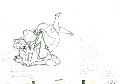
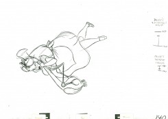
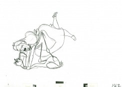
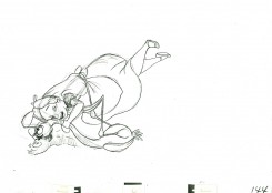
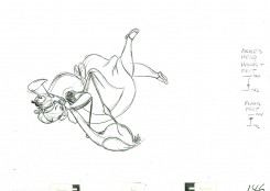
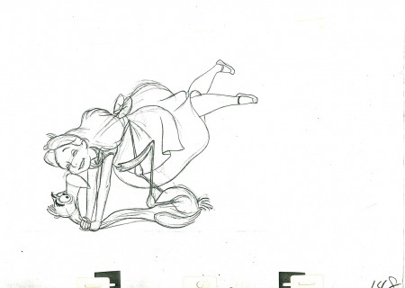
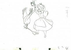
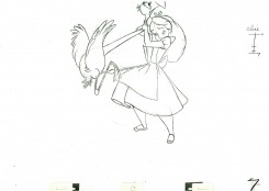
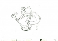
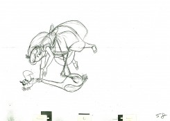
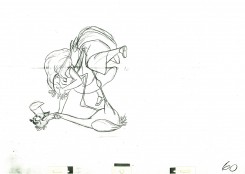
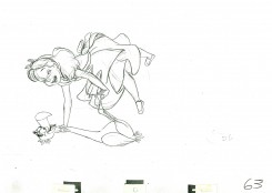
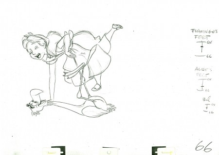
Milt’s Alice – 3
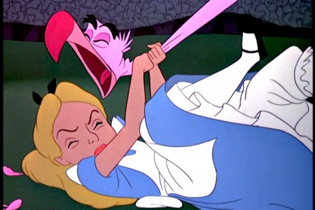
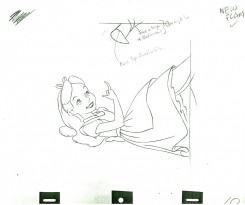
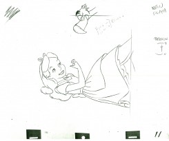
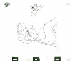
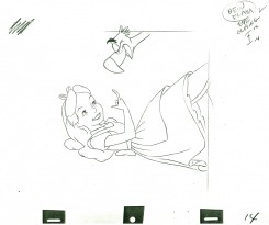
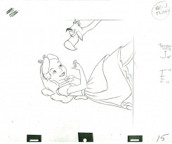
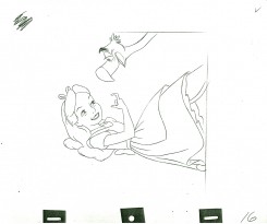
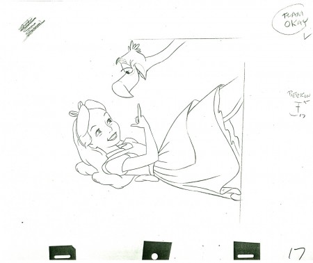
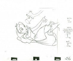
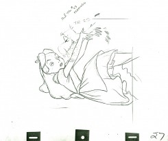
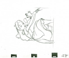
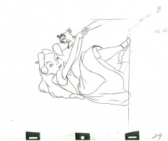
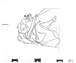
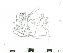
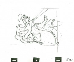
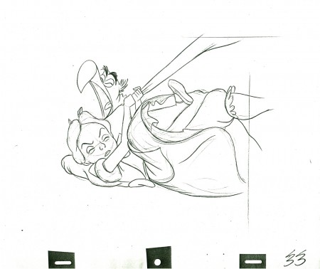
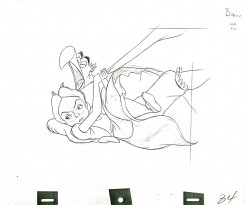
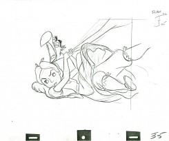
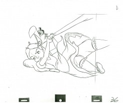
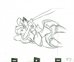
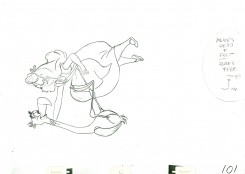
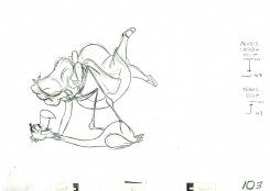
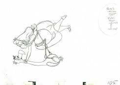
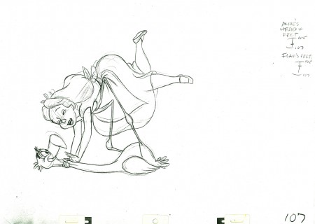
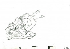
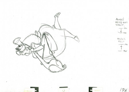
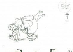
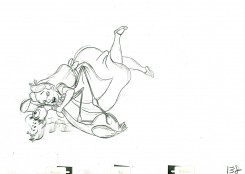
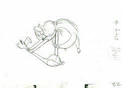
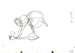
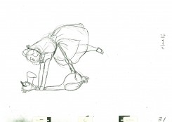
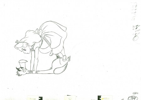
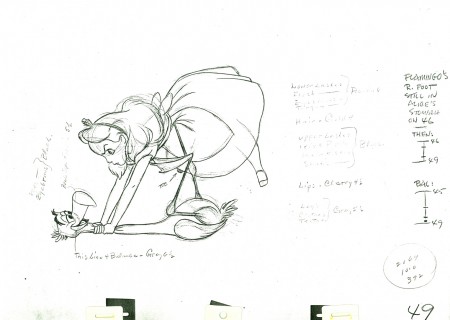
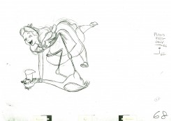
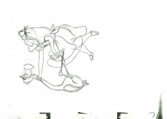
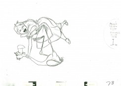
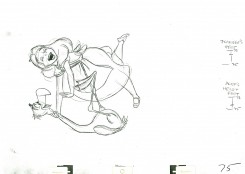
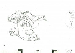
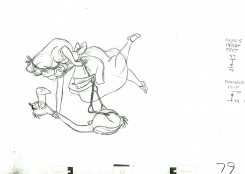
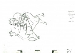
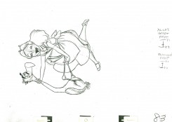
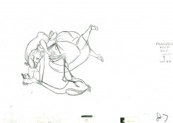
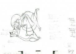
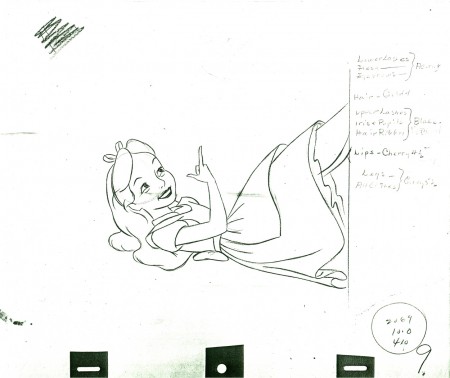
- Here’s another scene animated by Milt Kahl for Alice In Wonderland. Alice’s tangled up with the flamingo trying to play croquet with the Red Queen. Sticky wicket.
The scene was loaned to me by Lou Scarborough. Many thanks are in order.
 9
9(Click any image to enlarge.)
________________________
Here’s a QT movie of the action layed out above. Since the scene has been inbetweened, it’s exposed, for the most part, on ones.
Animation &Animation Artifacts &Disney 10 Nov 2010 08:43 am
Milt Kahl’s Alice – 2
- This is a continuation of Scene 392 from Alice in Wonderland as animated by the brilliant Milt Kahl. The animation seems to play a bit fast in the PT, but works well in color (albeit still fast.) Yet the exposure is the same. Definitely, the missing inbetweens make the difference.
As always, we start with the last drawing from last week.
_________________________
Here’s a QT movie of the action layed out above. Since there are no inbetweens contained within the scene, each drawing is exposed in the QT for the dial number on the sheet.
Animation &Animation Artifacts &Disney 03 Nov 2010 07:22 am
Milt Kahl’s Alice – 1
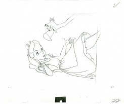
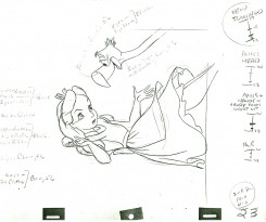
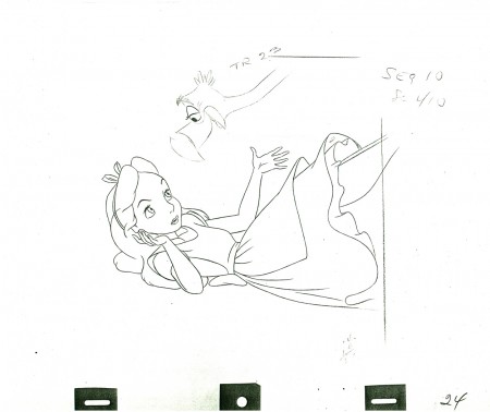
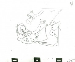
- Here’s a scene from Alice in Wonderland that was animated bit Milt Kahl. I’ll post the first half of the scene here, and will follow with the rest next week. I also have a scene that follows, and I’ll post that, as well.
Thanks to Lou Scarborough Jr. for the loan of the art work.
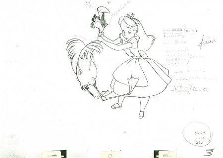 3
3(Click any image to enlarge.)
The remaining drawings will be added next week.
_________________________
Here’s a QT movie of the action layed out above.
Animation &Animation Artifacts &Disney 27 Oct 2010 06:22 am
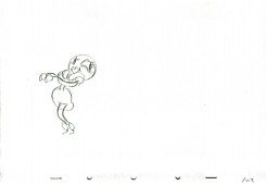
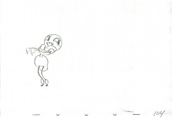
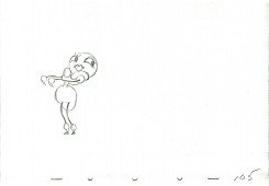
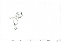
Woodland Cafe – 2
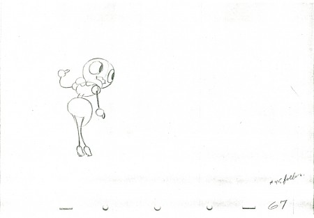
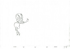
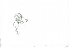
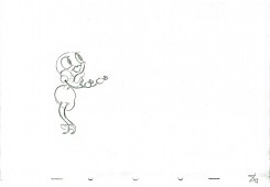
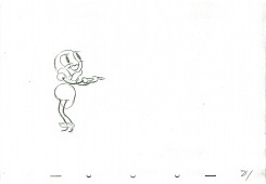
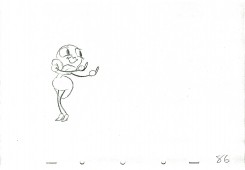
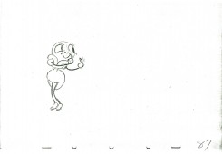
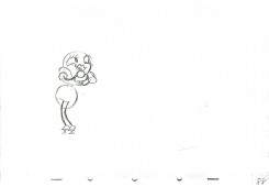
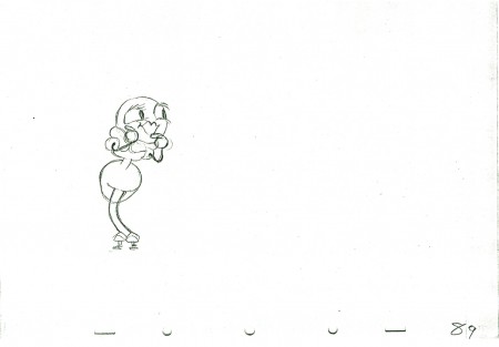
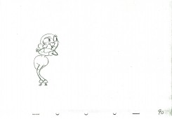
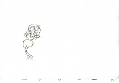
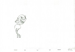
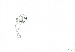
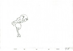
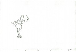
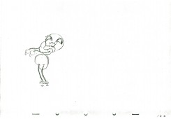
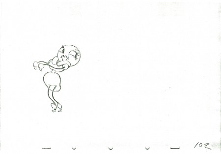
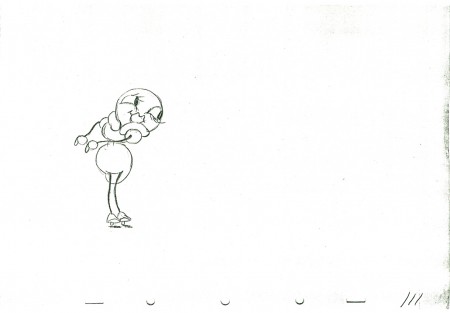
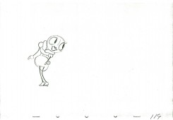
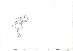
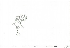
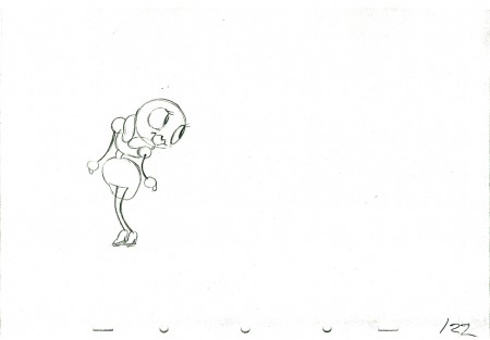
 – I continue with Izzy Klein‘s ruffs for a bit of animation eliminated from the Disney Silly Symphony, Woodland Cafe. The animation in the film is more active as she dances around the table.
I had mistakenly said that this was part of The Moth and the Flame but was quickly corrected by Mark Mayerson. I’d called it that because Izzy Klein had said it came from that film, and I never questioned it.
The short is beautiful, but it always reminded me of Hoppity Goes To Town (even though Hoppity came years later.) The animation isn’t the “A” level that was being done by the Snow White team, but it still stands out.
This is the second part of this post which continues after cycling the first bit three times (done last week.)
As with all of these animation drawing posts, I start with the last drawing from last week.
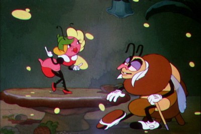
Here’s what the final character looks like in the film.
______________________
Here’s a QT movie of the piece.
It’s exposed on two’s as was the final film.
Right side to watch single frame.
Animation &Articles on Animation &Disney 22 Oct 2010 07:46 am
Oskar Fischinger at Disney
The following article appeared in the 1977 Anmation Issue of MILLIMETER MAGAZINE as edited by John Canemaker. (Some of those commercial magazines were just excellent back then, and we never seemed to notice or properly appreciate them.)
or, Oskar in the Mousetrap
by William Moritz
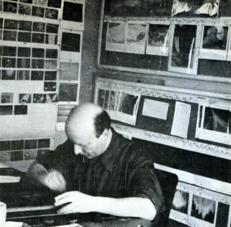
Oskar Fischinger at work at the Walt Disney Studio in 1939
Courtesy of Mrs. Elfriede Fischinger, all rights reserved
The official Disney account of the origin and making of FANTASIA has been told many times — from the early press releases, programs, and Feild’s wide-eyed, idolatrous book from 1942, THE ART OF WALT DISNEY (all united by the “official studio policy”/ mannerism of discussing primarily Walt Disney himself as if he had conceived and designed the films almost single-handedly), down to the more reasonable, carefully-researched materials published recently, such as the article by Disney archivist David R. Smith for MILLIMETER’S 1976 animation issue, and Bob Thomas’ new biography, WALT DISNEY, AN AMERICAN ORIGINAL.
I have already given an outline of another side to this story in my bio-filmo-graphy of Oskar Fischinger (FILM CULTURE 58-59-60-, 1974, pp. 61-65), but Fischinger’s tale bears re-telling since clearly a full understanding of the matter lies in discovering all that went on behind the scenes and in Fischinger’s heart-of-hearts.
Oskar Fischinger, who was a year older than Walt Disney, devoted his major energies throughout his life to abstract animation. In the early Twenties, while the Disney brothers assembled Ub Iwerks and a remarkable collection of talents to form an animation studio for production of Alice and Oswald cartoons, Fischinger, working on his own, struggled with radical experiments in non-objective imagery — from sliced wax to multiple-projector light shows. Even before sound film became available, Fischinger synchronized his abstract films to phonograph records and live musical accompaniments, because he found that the analogy with music (i.e., abstract noise well-developed and widely-accepted non-objective art form) helped audiences to grasp and accept the nature and meaning of his “universal”, absolute imagery. Oskar never meant to illustrate music, and often screened his “sound” films silently for already sympathetic audiences.
At the same time Iwerks/Disney’s Mickey Mouse and SILLY SYMPHONIES (and clever mass-marketing techniques) began to gain world-wide acclaim for the Disney Studios, Fischinger also enjoyed a moderate international renown as well, with his black-and-white STUDIES playing as novelty shorts with features from Uruguay to Japan. And while Disney began to win Academy Awards for his shorts, Fischinger also won grand prizes at film festivals in Brussels and Venice.
By 1935, Fischinger had made at least 35 abstract animated shorts, and stated as his New Year’s wish in the Berlin trade paper FILM KURIER that he wanted most to create an animated feature composed entirely of non-objective imagery and diverse music (he had used jazz, toyed with experimental electronic music and his own synthetic drawn soundtracks as well as classical music).
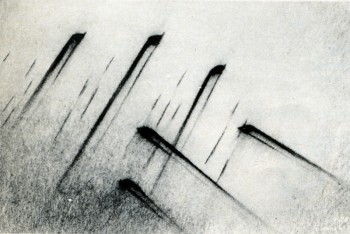
A scene from Walt Disney’s FANTASIA (1940)
Unfortunately for Fischinger, political events militated against him for much of his life, but he still produced a body of work that plays increasingly in theatres and museums as several full-evening programs.
The Nazi government had banned abstract art as degenerate, and was officially outraged that Fischinger’s COMPOSITION IN BLUE won festival prizes. Oskar in turn happily accepted a contract with Paramount and sailed for Hollywood in February, 1936, never to return to Germany. Unfortunately he spoke no English and encountered tremendous, frustrating difficulties in his early studio jobs. He assumed Paramount wanted him to pursue the style of his prize-winning COMPOSITION IN BLUE, but instead they wanted more representation and cuter work like his Muratti cigarette commercials. After he had completely painted and photographed a color abstract sequence (later called ALLEGRETTO), the director Mitchell Leisen insisted the piece be re-done in black-and-white with representational images of musical instruments and other pop trick effects overlayed. The resulting studio version disgusted Fischinger and he quit Paramount only half-a-year after he started there.
His second American film, AN OPTICAL POEM, made for MGM under William Dieterle’s aegis, proved one of Oskar’s finest works, and though not exactly a box-office sensation, played prestige bookings with first-run features, and was mentioned by one critic as a likely Oscar nominee (which caused Fischinger to quip, “Why bother giving me Oscar? I am Oskar!”).
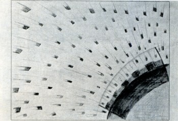
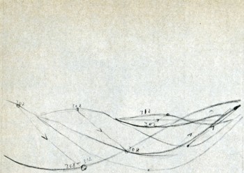
A Fischinger pencil sketch (with numerical
motion-phase breakdowns) for “Toccata and
Fugue” section of Disney’s FANTASIA.
After his MGM option was not picked up, Fischinger drove to Detroit and New York seeking backing for a feature-length animated film based on Dvorak’s “NEW WORLD” SYMPHONY, which he hoped to be able to present at the World’s Fair. Although this project never materialized, Oskar dallied in New York because he discovered a new ambiance there: unlike Hollywood, he was treated as a major artist in New York, invited to screen his films and exhibit paintings, dine with leading filmmakers, critics and painters, spend weekends at the country estate of Guggenheim Foundation curator Hilla Rebay. He returned to Hollywood only when his agent cabled that he had a job for him at Disney.
What a rude shock Fischinger received upon his return! Already in Berlin, Oskar had been attracted to Leopold Stokow-ski’s grand orchestral arrangements of Bach and had tried to get music rights to some of his pieces. When Fischinger found that Stokowski was his co-worker at Paramount, he once again proposed a series of shorts or an anthology feature. Stokowski was initially quite receptive and wrote Fischinger (October 9, 1936, on Paramount stationery), “I should be very happy if we could work together — you doing what is seen, I doing what is heard.” And he received from Fischinger such elaborate ideas as (November 15, 1936, in German):
“If you are here at Christmas, I’d like to make a full-length shot of you in such a way that the visual part of the film could begin with you conducting the first few bars of the music, and then the eyes of the viewer would glide with a movement of your hands off into endless space where the rest of the visuals would unfold. ”
Nevertheless, after several conferences, Stokowski decided that the project would be too expensive and complex for Oskar to animate alone, and suggested that they seek support from a major studio, perhaps Disney. Fischinger held little hope for satisfactory help from Hollywood, especially after his experiences, and furthermore he knew from gossip that Disney, despite his successes, was under severe strain, borrowed and mortgaged to the hilt. And Oskar’s worst fears were seemingly confirmed when he returned to Hollywood in November, 1938, to find that while Stokowski was being honored as Disney’s major collaborator on “The Concert Feature”, Fischinger was being hired for $60-per-week (Paramount had paid him $250) as a “Motion picture cartoon effects animator”.
Fischinger accepted the job since work was scarce and he had four children to support, but for him the Disney episode proved a nightmare which so angered him that he conspicuously avoided talking about it in later years. Only once did he write a note on his Disney adventure (in a letter to a friend), and it expressed well his chagrin:
“I worked on this film for nine months; then through some “behind the back” talks and intrigue (something very big at the Disney Studios) I was demoted to an entirely different department, and three months later I left Disney again, agreeing to call off the contract. The film “Toccata and Fugue by Bach” is really not my work, though my work may be present at some points; rather it is the most inartistic product of a factory. Many people worked on it, and whenever I put out an idea or suggestion for this film, it was immediately cut to pieces and killed, or often it took two, three or more months until a suggestion took hold in the minds of some people connected with it who had their say. One thing I definitely found out: that no true work of art can be made with that procedure used in the Disney Studio.”
At first, Fischinger threw himself whole-heartedly and good-naturedly into the project. He gave prints of his films to be screened weekly for the entire Disney staff, so his influence was pervasive (spilling over onto other films like DUMBO, the South American films, and PINOCCHIO, for which Oskar actually animated the magic wand of the Blue Fairy). In the mimeographed transcript of the story meeting for February 28, 1939, Walt Disney says (p. 1): “Everything that has been done in the past on this kind of stuff has been cubes, and different shapes moving around to the music. It has been fascinating. From the experience we have had here with our crowd — they went crazy about it. If we can go a little further here and get some clever designs, the thing will be a great hit. I would like to see it sort of near-abstract, as they call it — not pure. And new.”
Fischinger’s numerical motion-phase breakdown
for “the Wave” scene in “Toccata and Fugue”
section of FANTASIA.
© Fischinger Trust, all rights reserved.
Perhaps because of the uneasy proximity of Fischinger, Walt exhibits a certain suspiciousness about abstraction, accompanied by a rather defensive attitude towards the prospective audience.
January 24, 1939, p. 2:
Walt Disney: You should give something that the audience will recognize. I don’t think the average audience will fully appreciate the abstract; but I may all be wrong —
Stokowski: Yes, they may be way ahead of us.
or, January 24, 1939, p. 7:
Walt Disney: What will Bach lovers think of this?
Stokowski: They will be against it, I think; but the public will love it.
Walt Disney: Well, the general idea here looks good to me. I only wonder if we’re going a little too gypsy in the color—
or, February 28, 1939, p. 5:
Walt Disney: If we can get a little connection behind this, the public will take to it. It would be better than some wild abstraction that you can’t get anything out of at all. Right there is where the music sounds most like an organ, so the public decides it represents an organ.
or, February 28, 1939, p. 8:
Walt Disney: Do you think we ought to have pictures in mind through this thing? Then we won’t get a conglomerate mess — an abstraction.
or, JuneS, 1939, p. 1:
Walt Disney: There’s a theory I go on that an audience is always thrilled with something new, but fire too many new things at them and they become restless.
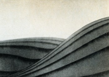
The “wave” scene as it appears in FANTASIA.
©Walt Disney Productions.
Fischinger’s assertions about the unhealthy competitive committee work at Disney would seem to be borne out by the conference notes in which we see during nine month’s of work on the “story” incredible floundering, dreary discussions and re-discussions of each scene, groping and pushing without any controlling factor besides making an entertaining film.
Because he knew little English, Fischinger never spoke up during these story conferences (neither did Kay Nielsen), and further became the butt of endless practical jokes on the part of his jealous co-workers. Some fun-loving boys of the Disney staff, unwilling to deal maturely with the plight of a refugee artist, pinned a swastika on Oskar’s office door September 1, 1939, the day the Nazi armies invaded Poland. Fischinger applied for a release from his contract and after two months of red tape, terminated his employment at Disney, October 31, 1939, Halloween.
Fischinger kept about 100 of his sketches and drawings for the Bach “Fugue”, including some lovely pastels showing melting meanders and supple lozenges much as they appear in the final FANTASIA, as well as half-a-dozen beautiful images that were probably never realized on film. The most extensive unit involves twelve poster-color and 60 pencil drawings (with numerical motion-phase breakdowns) that detail the sequence in which alternating left-and-right-hand “waves” surge toward the viewer. While this turned out to be one of the more impressive moments in the Disney film, a comparison with Oskar’s original sketches shows how much more powerful, subtle and imaginative the sequence might have been if Fischinger’s intentions had been honored — with his choice of monochromatic turquoise and celadon hues for the (somewhat flatter) wave motion overlayed with scintillating geometric figures in browns, Chinese red, and graduated yellow/oranges, all of the elements flowing cogently and vigorously out of each other, as opposed to the simplified Disney image of fat, melon-ribbed waves slightly off-balance in shades of flagrant purple distractingly at constrast in “realism” to the (needlessly) clouded sky behind. All in all, the Disney version of the “Fugue” seems painfully close to the Paramount adulteration of ALLEGRETTO.
Much of Fischinger’s work seems entirely lost. After looking at some of Oskar’s sketches (August 21, 1939, p. 3), Walt Disney comments, “I think the contrast of black and white, and then a little color coming in, would stand out. ” but I don’t think such an effect reached the final version of FANTASIA. Evidently some of Fischinger’s own animation was filmed at least in the pencil test stage, since after viewing some material on a moviola Disney comments (August 21, 1939, p. 7) “Oskarhas a pulsing effect in his test.”
To me, Disney was actually the loser in the matter. Each year Fischinger’s genius and the sincere consistencly of his films becomes more widely acknowledged, while every year the moments of unbearable kitsch, lapses of taste, questionable values, and hodge-podge of stylistics that mar most of the Disney Studio product are becoming more obvious to everyone. For all its considerable virtues of self-parody, rich color and design, etc., FANTASIA falls easily victim to its own shortsightedness so that the burlesque of Bozetto’s ALLEGRO NON TROPPO carries devastating bite.
At least Fischinger had a few of the last laughs in the matter. After leaving the Disney Studios, he devised a set of seven superb collages, among his most charming and highly prized works, showing Mickey and Minnie Mouse (cut from comic books) “reacting” to reproductions of abstract paintings by Kandinsky and Bauer (cut from a 1938 Guggenheim Museum catalogue). And years later, when Disney made the documentary TOMORROW THE MOON, they inadvertantly honored Oskar by using a clip of his pioneer special effects of the rocket launching from Fritz Lang’s FRAU IM MOND, made a quarter of a century earlier.
Animation &Illustration &Independent Animation &Models 21 Oct 2010 07:58 am
Sempé Spot
- Sempé is one of the great living cartoonist/designers. Tissa David recently gave me this poster-sized collection of original drawings that he did for her when designing a commercial which she animated. She kept the piece of artwork over her drawing board until the spot was finished; then she rolled it up and put it away in her closet. It’s my good fortune that she cleaned out that closet.
The spot was done for R.O.Blechman‘s THE INK TANK in New York, when they were still in business.
Here’s the full poster of models:
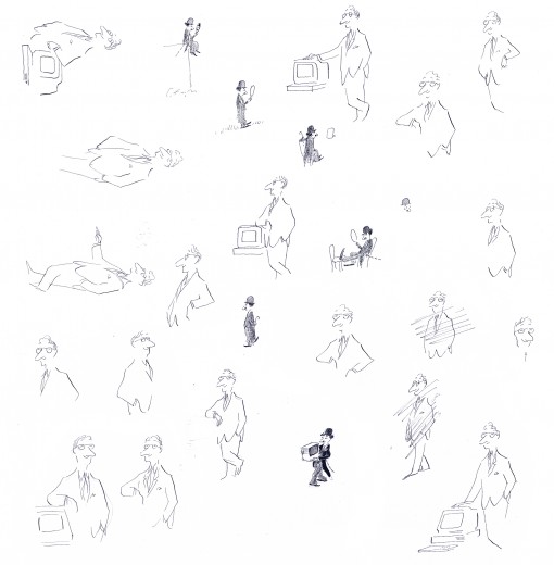
The inks have faded a bit, and I’ve tried to make up for
that in photoshop without damaging the delicacy of his lines.
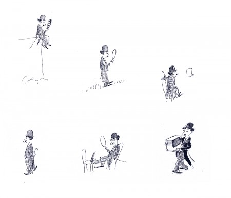
Here are some reconstructions of some of the models so you can have a closer look:
 1
1The Charlie Chaplin character – used as the mascot for the commercial series.
Here are two QT ads done at the studio in Sempe’s style during this
time (1986-87) sent to me courtesy of J.J. Sedelmeir. Many thanks.
TIGHTROPE
MARTIN MARIETTA
