Category ArchiveAnimation
Animation &Books 21 May 2011 07:18 am
Drawings From The Left
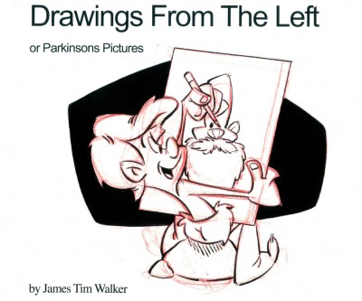
The book’s cover.
- Many years ago – I think I was 12 or 14 – I was consumed with animation and drawing. My parents took us ice skating. Of the brood of five children, I was the only one who refused to get on the ice. I purposefully brought my 8mm camera along. It was more important for me to record the event than to participate in it.
When I got home, I questioned my inactions. Why was it that I wouldn’t ice skate? I realized it was a deep fear that I would fall and someone would skate over my right hand, and I wouldn’t be able to draw again. That was when I religiously started trying to teach myself to draw left-handed. Every chance I got I put into that ice-skating fear by practicing left-handed drawing. It didn’t take long for me to stop trying. I could see some small progress in what I was trying to draw and left it at that.
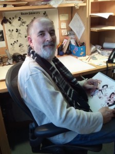 This psycho-memory of mine flashed across my brain recently when I discovered James Tim Walker‘s book, Drawings From The Left or Parkinsons Pictures. I received a call from Tim and a copy of his book soon thereafter.
The book really looks like a sketch book. In fact, when I took it from the envelope I actually wondered if it was an original or had it actually been printed. The textures on the cover made the pen and ink over red pencil drawings look real. After running my finger over it, I realized that it was published.
I’d read about Tim’s story on Cartoon Brew and The Blackwing Diaries, and I was curious to see the book. I’d looked around a couple of shops in NY but hadn’t seen a copy to peruse. I knew it was for sale on Amazon, but I like thumbing through books before I buy one.
Tim had been an artist, animator and director for many of the LA studios and had a rich and solid career. Then Parkinson’s disease hit him. (Since my father died of complications from Parkinson’s, I’m all too familiar with the debilitating disease.) Tim has Lateral Parkinson’s, meaning only one side of his body was affected. Naturally, this was the right side, and the right-handed Tim had to face up to the fact that he wouldn’t be able to draw again – unless he taught himself to draw left-handed.
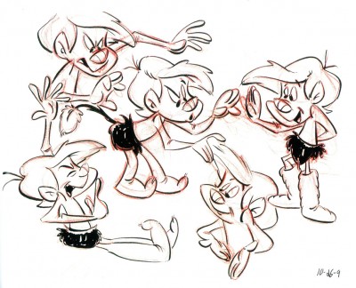
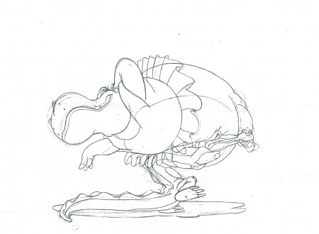
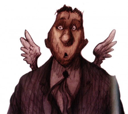
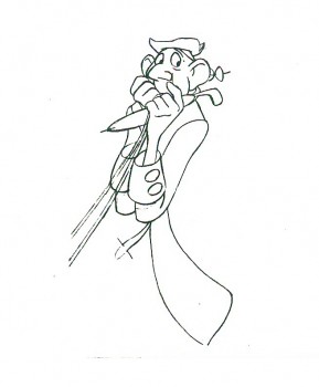
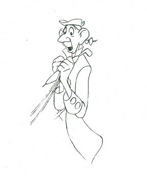
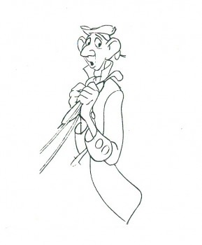
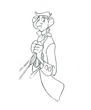
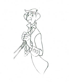
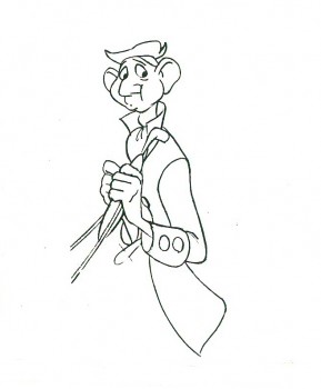
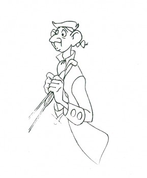
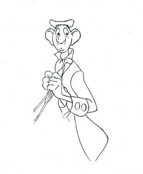
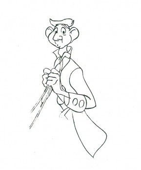
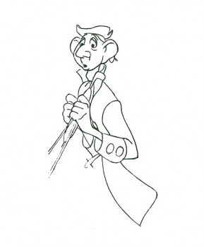
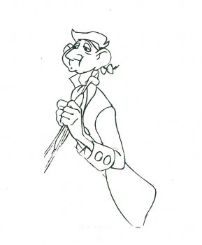
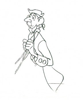
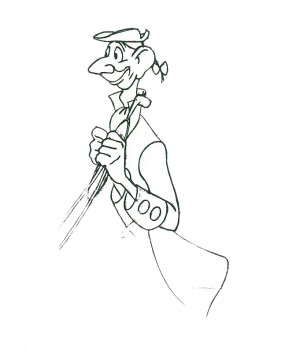
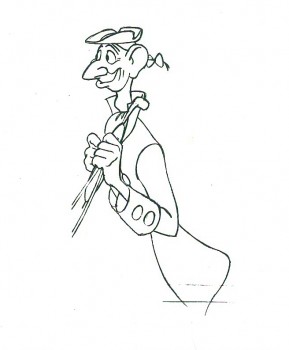
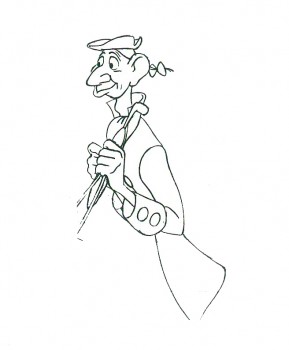
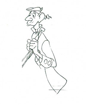
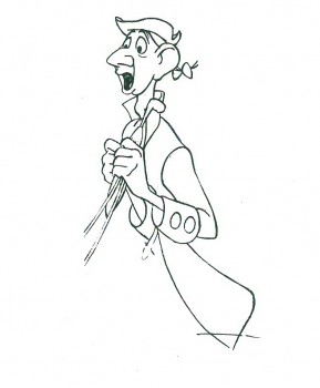
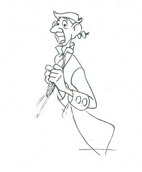
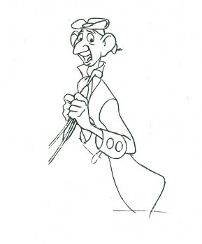
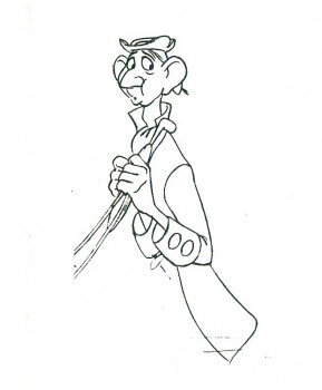
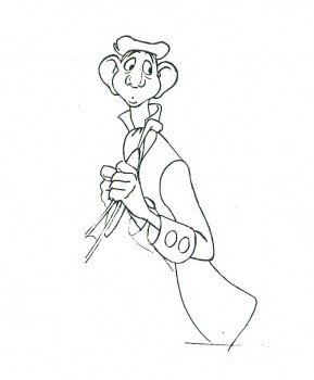
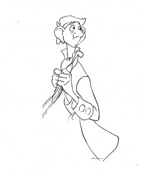
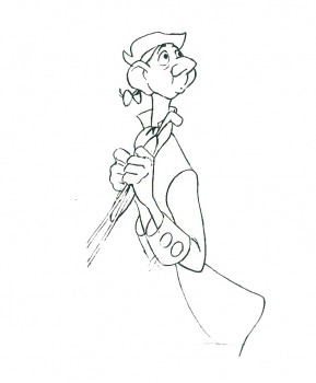
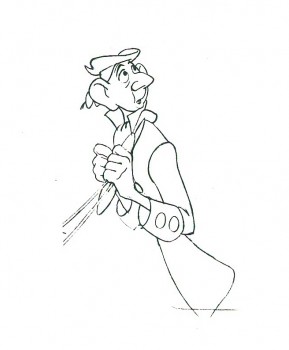
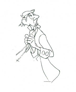
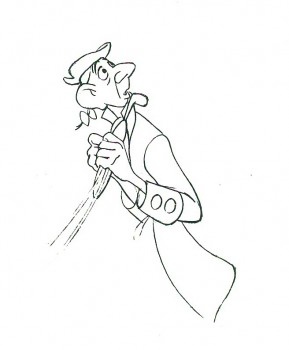
A good example of the many drawings by Tim in his book.
Four years later, and this book of Tim’s “Left-handed drawings” was published. The drawings are all bouyant and lively cartoons of a series of original characters. They’re all posed in many positions, like model sheets, showing the versatility of an animator at work. There’s as much life here as in any of Fred Moore’s drawings. As a matter of fact, I learned from Jenny Lerew’s site The Blackwing Diaries, that Tim is a fan of Fred Moore’s work and has a collection of Moore art.
It’s a testament to the strength and endurance of a solid artist to be able to overcome the difficulties life has dumped on him. As a matter of fact, I think in some way that anyone who has made a career out of animation is practising this same endurance, albeit on a smaller level, to overcome the odds of a changeable industry.
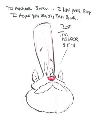
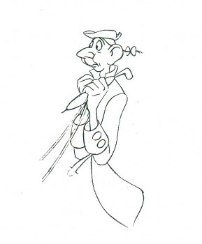
The page that Tim drew and autographed for me.
Animation 09 May 2011 06:57 am
Bad Animation
- Let’s just ramble on about animation. I don’t mean animated films, I mean animation. I don’t much like watching animated films these days. I haven’t seen much that I like among recent films. All those YouTube videos and student films on Cartoon Brew. There’s so much more chaff than wheat. I get enormously impatient and dismiss films quickly. I sat through the ASIFA East animation festival award winners and got to see a number of bad films, regardless of the fact that they’d won awards. (Despite all the unknowing comments on Cartoon Brew recently, there were quite a few films among the winners. The shortage was in the Independently produced films, which is not a problem with ASIFA East’s festival but with Independent film. There were two fine films among the winners – both had problems as well – and a lot of bad films. I don’t include Student films in this discussion.)
I saw a lot of problems with these films that had won. Let’s talk about a couple of these problems without naming the films. I don’t mean to pick on ASIFA East award winners; it’s just that some bad habits showed up among some of the winners. There was lots of bad writing, but that’s not going to be my main focus. I’m concerned about the animation.
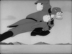
Below are the frames from John Kricfalusi‘s site of one of his favorite run cycles:
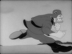 1
1 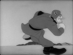 2
2
 11
11 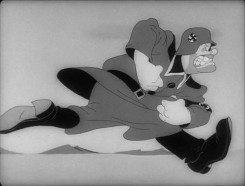 12
12
Though the original scene is and should be on ones,
I’ve exposed it on twos for the sake of my blog points.
The drawings above in a QT movie.
- I don’t think most people animating these days think of their drawings as characters – not really. How else could you explain the preponderance of half-walks? That is when you animate one leg crossing in front of the other, and you keep repeating this instead of then animating the back leg crossing. You’re doing half the number of drawings, but you’re showing your lack of interest in a character, rather than a graphic motion. This isn’t limited animation, it’s bad animation! It’s surprising that even in the silent days of animation, they didn’t take this crappy short cut. They didn’t really know what character animation was, back then, yet they had more concern for the characters than do the “animators” of today. It’s pathetic. Yet, I can count three times, in three different films, noticing this lousy stunt among the award winners. And you see it in so many of the new on-line films.
as it would be animated by today’s animator.
Students: ANIMATE BOTH LEGS! “Professionals,” you should be ashamed of yourselves.
- I’ve also noticed that there are a lot of films that are animated on fours. It’s not just that the animation is on fours (and believe me when I say that I can see every one of the frames on fours!), it’s that the animators don’t make the choice. They work in flash or some other program where they choose to animate solely on fours. This means they can’t go to threes, twos or, heaven forbid, ones when they have to. It also means they don’t properly know how to animate. Since all animation is about TIMING, and since you choose not to properly time your motions, you’ve given up the most important attribute in animation. It’s not good, and it’s a real disservice to your own learning abilities. You’ve chosen to stunt your growth.
There were many films done this way. One of them also included a lot of camera moves – also on fours. It was like a staccato zoom in or out. I felt like I was jumping in and out in stages and wanted to run out of the theater – or at least stop watching these award winners.
exposed on fours.
There was a Disney Action Analysis class where they discussed when things should be on ones, twos, threes or fours. The decision was, originally made, that animation should be NEVER exposed on fours. That is until it was shown that very slow moving animation, animation that required MANY drawings – when lines touched lines – could get away with fours. Of course, this has to do with full animation, and the limited type of animation done today can find many uses for fours, but there has to be a choice to go in and out of that choice. Limiting yourself to ONLY animating on fours means you choose to handicap your animation, and you’re not really developing character. You can’t be.
You’re, again, animating a graphic symbol not a living thing.
- Then there were the films that treated the characters with complete hostility by pulling insufferably nasty and inhuman stunts on the characters. This IS a fault of the writing and the directing more than the animation. I do have a complaint about scripts. Why do I, as an audience member, have to sit through these terrible actions and business on the screen? This was the case with at least three of the films. The younger generation seems to delight in rotten behaviour to their “characters” indicating more of a psychological problem in the filmmaker than a choice in service of the film. Believe me this wasn’t the case ten years ago. Terribe things might happen to Daffy or Elmer, but they weren’t as vile and in your face as they are today.
One film showed a lot of promise as far as the animation – the movement – was concerned, but the principal character lived through some horrible torture. And then the happy ending had big, bright, bubbly and cute Disneyesque drawing that was equally repugnant. The film was just so easy to dismiss – yet the animation, itself, moved fairly well and showed real knowledge on the part of the animator/director/writer. The film was tedious to sit through.
This is what we have today. Violence is the last bastion of the young filmmaker. Viva la freedom! Too bad it makes for horrible filmmaking! Impossible to sit through.
Unfortunately, I can’t make an example of this from the drawings John K posted above. Also unfortunately, the violence in his films has unwittingly helped to lead to this direction, albeit the cartoon violence in his films IS character driven and works. In the best spirit of Clampett or Avery. The superviolent activity in these newer films is just repulsive and has nothing to do with character. It isn’t necessarily John K’s fault, it’s just the way it is. We all affect each other, and that’s the society we have nowadays. Too bad.
Animation &Animation Artifacts &Disney 04 May 2011 07:48 am
Hicks’ Hippo – Part 2
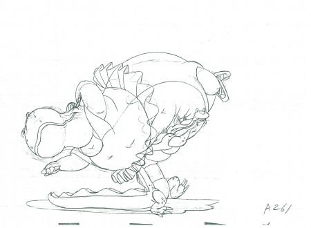
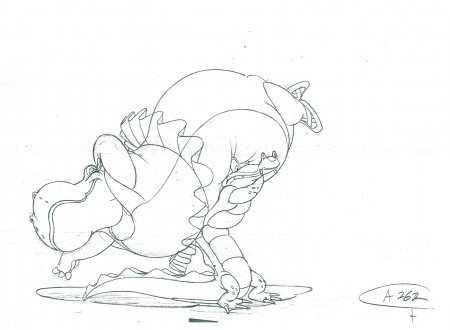
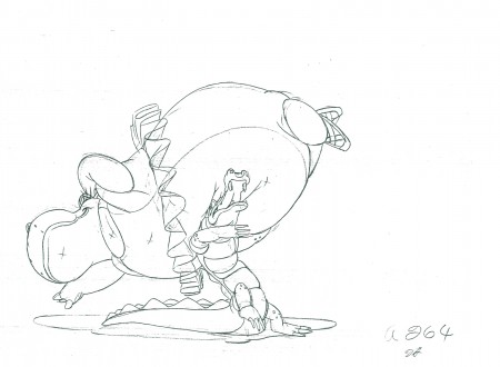
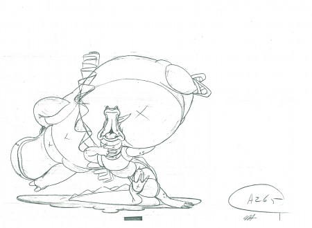
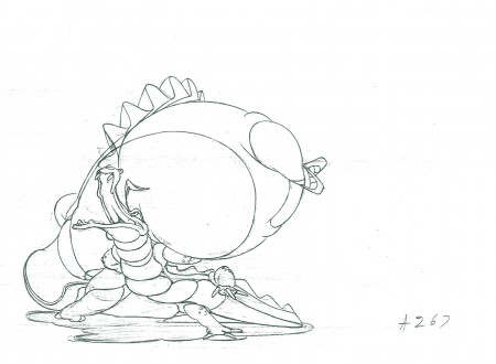
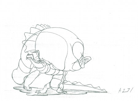
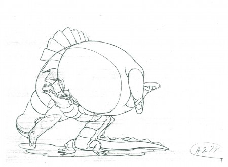
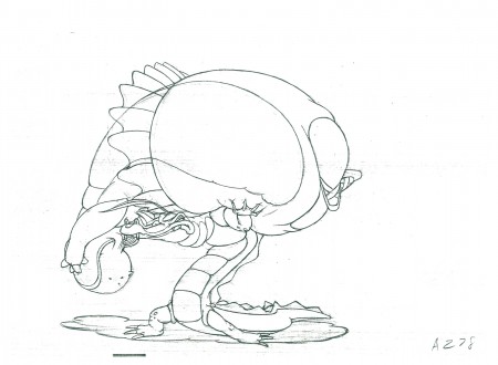
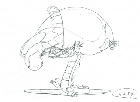
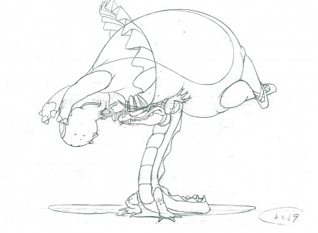
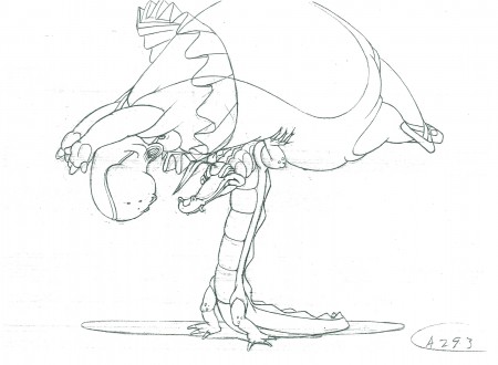
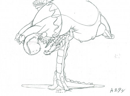
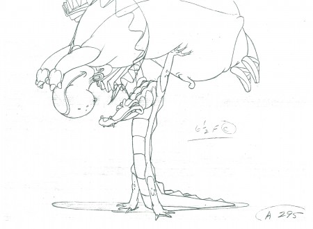
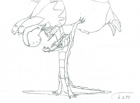
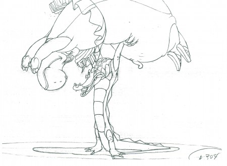
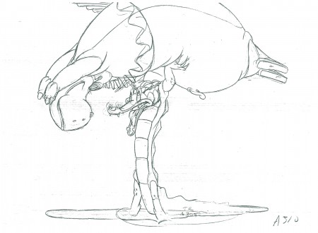
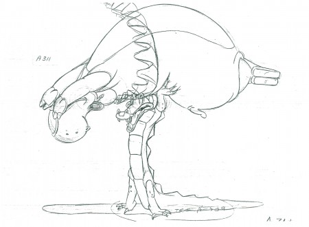
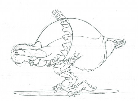
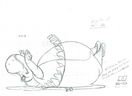
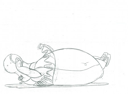
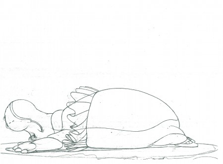
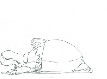
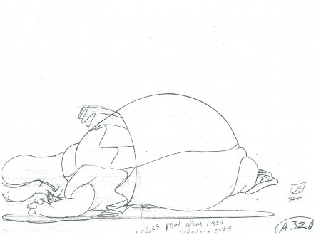
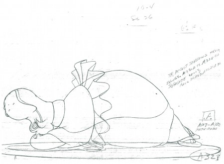
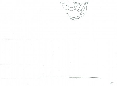
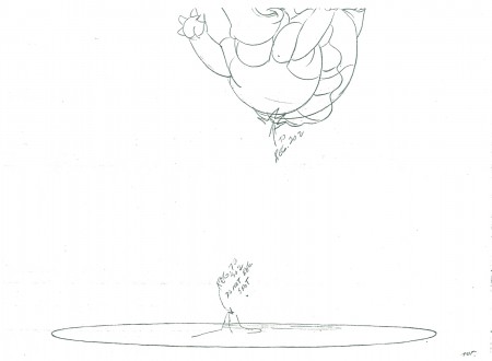
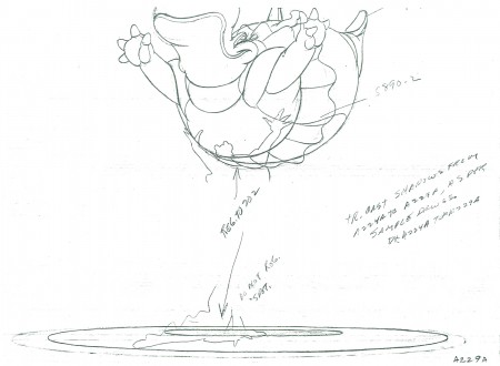
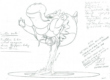
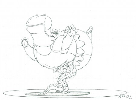
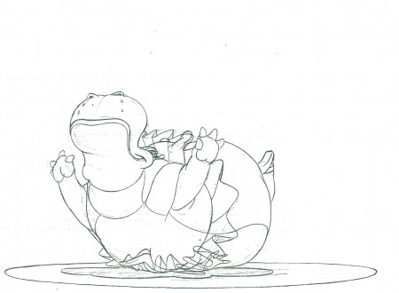
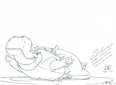
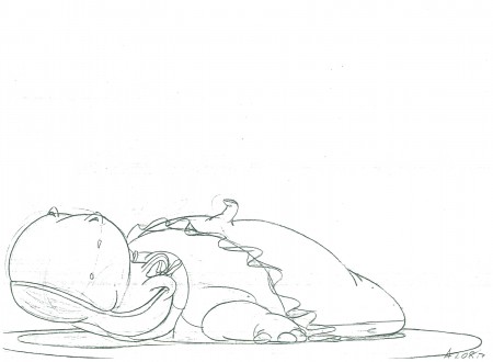
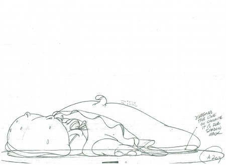
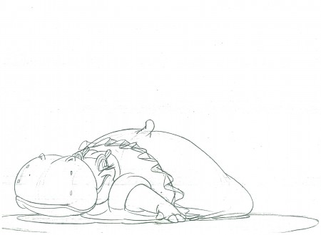
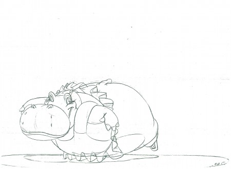
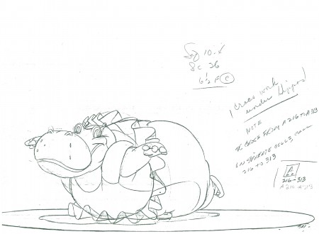
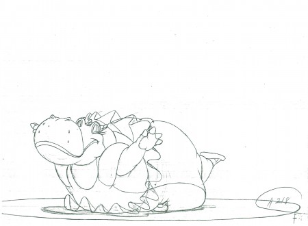
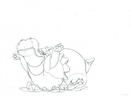
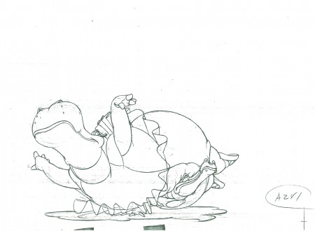
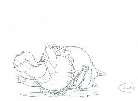
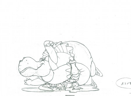
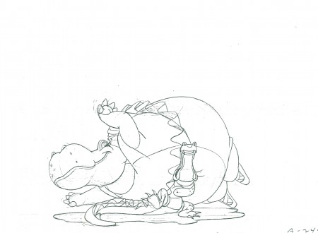
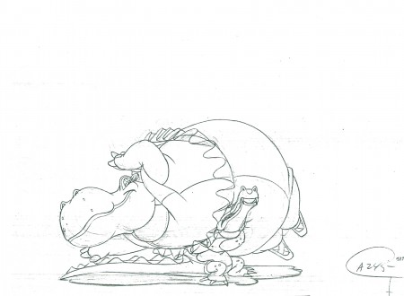
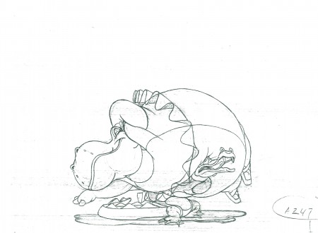
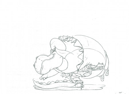
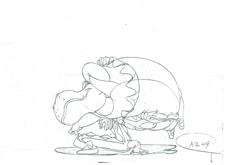
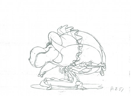
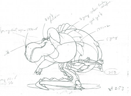
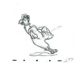
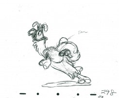
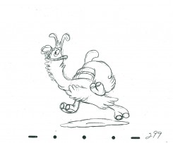
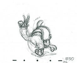
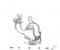
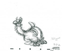
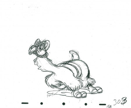
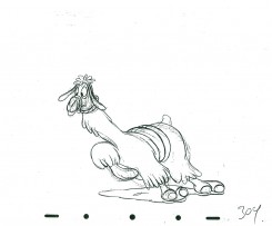
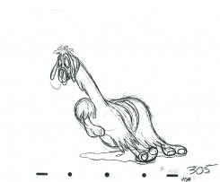
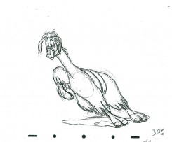
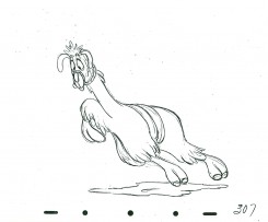
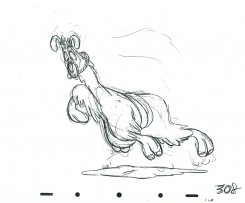
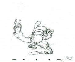
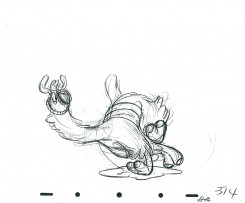
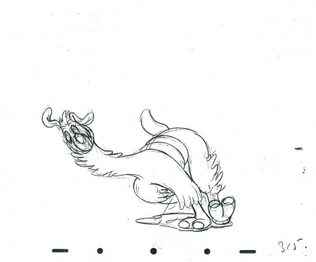
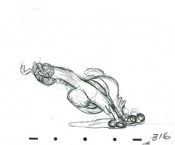
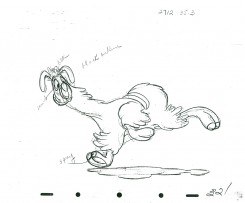
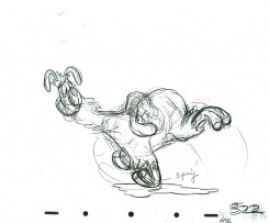
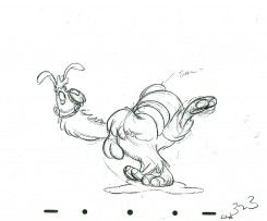
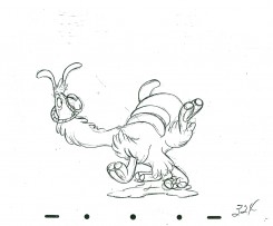
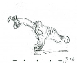
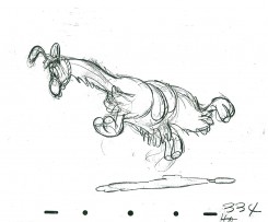
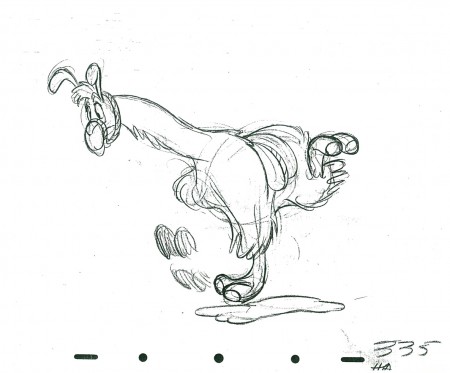
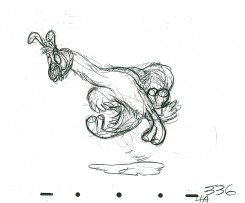
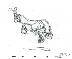
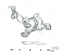
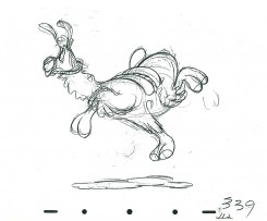
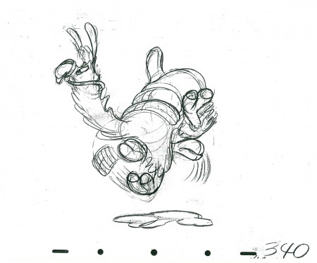
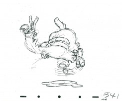
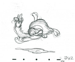
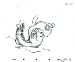
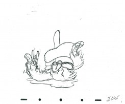
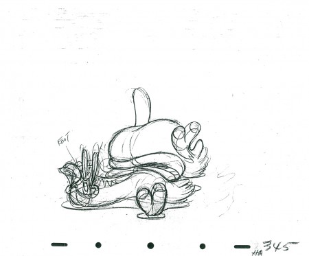
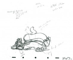
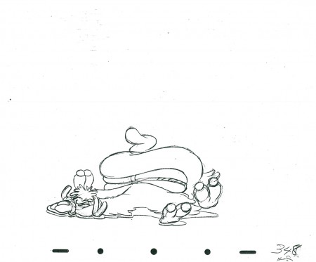
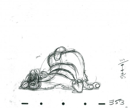
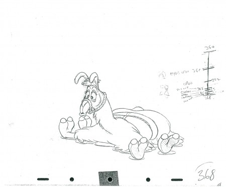
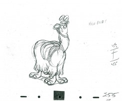
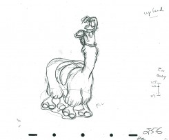
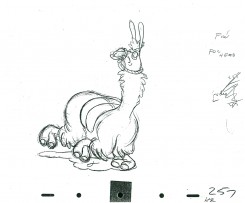
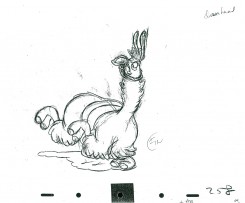
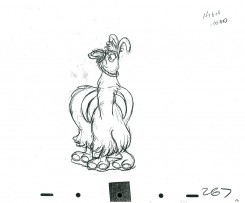
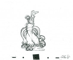
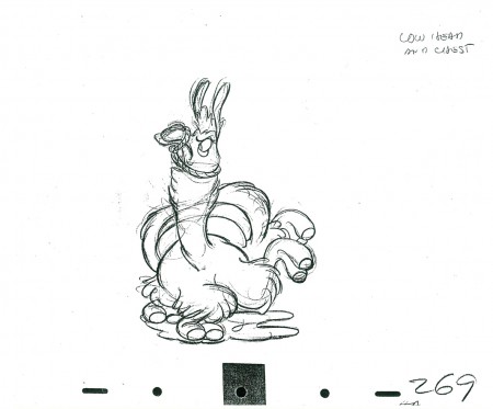
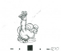
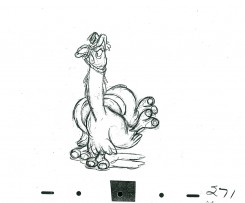
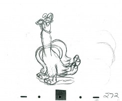
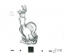
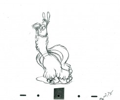
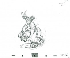
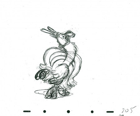
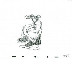
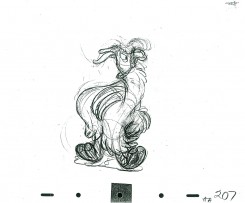
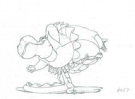
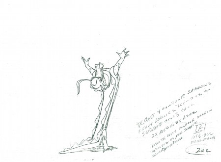
- Here are the remainder of the drawings from Hicks Lokey‘s Seq 10.4 Scene 26 from Fantasia. It represents the meeting between alligator and hippo from the Dance of the Hours section of the film. Jim Will did the effects animation in the scene.
Steven Hartley is posting a mosaic of this film on his blog, Blabbing On Arts and Culture!
As usual, I start Part 2 with the last drawing posted last week in Part 1:
 257
________________________
257
________________________.
The following is a QT of the entire scene with all the drawings (Parts 1 & 2) included.
Animation &Animation Artifacts &Disney 27 Apr 2011 06:49 am
Hicks’ Hippo – Part 1
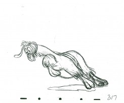
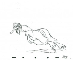
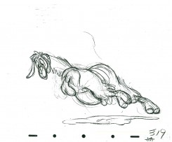
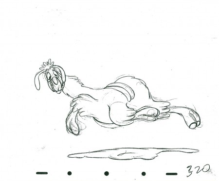
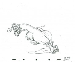
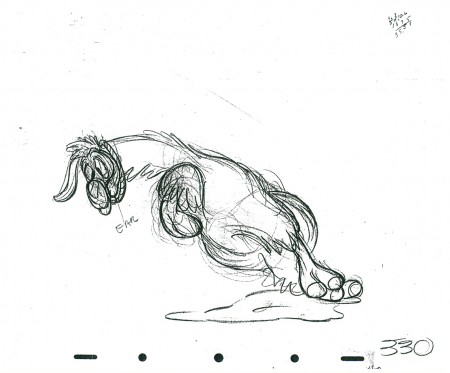
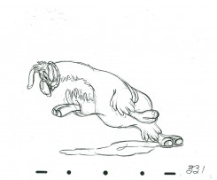
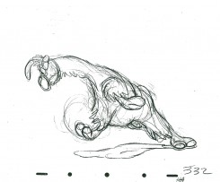
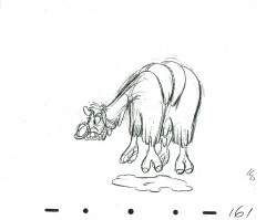
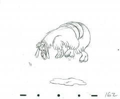
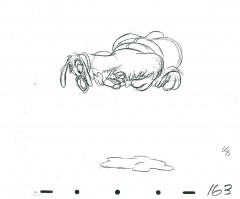
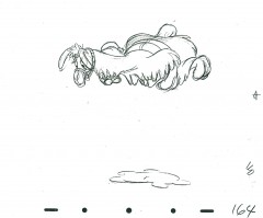
- Last week we had Milt Kahl‘s hilarious Llama. So this week, keeping up the comedy, here’s part 1 (of 2) of Hicks Lokey‘s hippopotamus & alligator from Fantasia. (Jim Will is also credited for doing the effects animation in this scene.) This is actually the last half of the scene. It starts with the hippo on the couch with the alligator making a dive for her. She runs far into the bg, then leaps forward where the alligator catches her at the start of our drawings. It’s all about weight.
The practical problem for me came down to registration. There are no registration marks or punched holes evident on these xeroxed copies. It’s like a big flipbook (14×17) that I had to try to register. There’s also the problem that at lest 1/3 of the drawings have no numbers. This made it hard to guess how long the drawings would stay on screen (since I obviously also didn’t have exposure sheets).
Nevertheless, it seems to work as is, here. I also had a lot of cleaning up to do. The drawings had a lot of xerox markings on the pages. Hence, although there are about 60 drawings, I had to break it into two. The second half will follow next week. The QT movie, below, includes all drawings for the entire scene.
The real fun here is in looking at the individual drawings. They’re all a great laugh.
 202
________________________
202
________________________.
The following is a QT of the entire scene with all the drawings (Parts 1 & 2) included.
Animation &Books &Independent Animation 25 Apr 2011 06:57 am
Plympton Book: Independently Animated
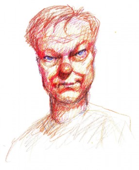 - Back in 1983, I received a call out of the blue from a cartoonist whose strip in the Soho Weekly News was one that I enjoyed. Bill Plympton was interested in making an animated short and asked to meet with me to get some advice. As it turns out, we met several times, always at a pub/bar in NY that I love, The Cedar Tavern (this was the hangout of the Abstract Expressionists back in the 40s/50s). Bill was about to make his first animated short, and I suggested he contact a woman I thought could help him put it together, Connie D’Antuono. Connie was working out of R.O.Blechman’s Ink Tank, and she worked with Bill outside of her 9-5 job.
Here it is some 28 years later, and I’ve received a copy of Bill’s golden artbook, Independently Animated: Bill Plympton, The Life and Art of the King of Indie Animation, for review.
I don’t know why, but this book has taken me by surprise. It’s so much more than the expected bio of an animator. It really smacks of a genuine amalgam of the guy who made all these films and the cartoonist who did the strip in the Soho Weekly News. The book boils over with artwork, not only from the films but from many many cartoons and illustrations done previous to the animation career. It all suipports a strong graphic sense found after the animation has begun. It also becomes obvious that there is a direct connection between those early strips and the animated films. This is a real gem of a book, and I’d encourage everyone to buy a copy to see how it’s done. It’s the best “Art of …..” book of the year, and it’s much more.
The text is quite informative, and despite the fact that it’s written both by Bill Plympton, himself, and David Levy, it has a casual and friendly tone that comes across as genuinely first person singular. It feels as though Bill, himself, were telling the story. We learn where the ideas for some of the films come from (the one for Guard Dog is difficult reading if you’re a dog lover), and this text is matched with plenty of drawn material, both art from the films as well as pre-production material.
It’s a fine book, and I suggest you look into it. It’s an original – a truly Independent animation Art book!
 1
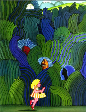
1Bill’s early illustration influences are obvious.
He hoped to study under Milton Glaser in attending
the School of Visual Arts. It didn’t happen.
 2
2
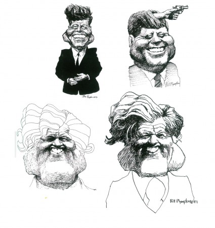
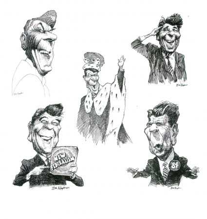
By the time he was doing his strip for the Soho Weekly News
it was obvious that Bill was a brilliant caricaturist.
(Reagan above / some Kennedys below)
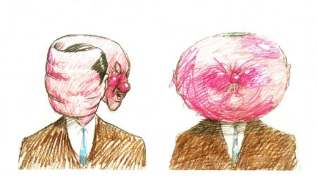 4
4
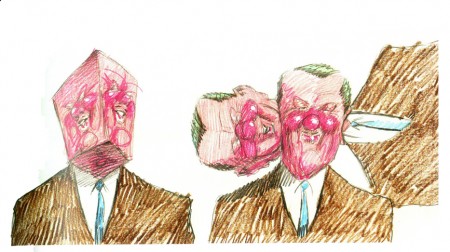
The art of caricature influenced the animation
as evident in these frames from Your Face.
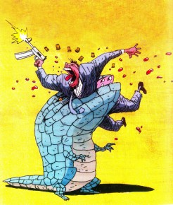 6
6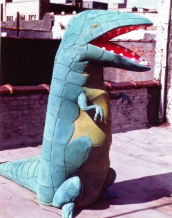 7
7
At one point, trying to generate publicity for Mutant Aliens,
Bill constructed a costume someone wore parading in front of the
Cinema Village, in NYC, where the film was playing.
 8
8
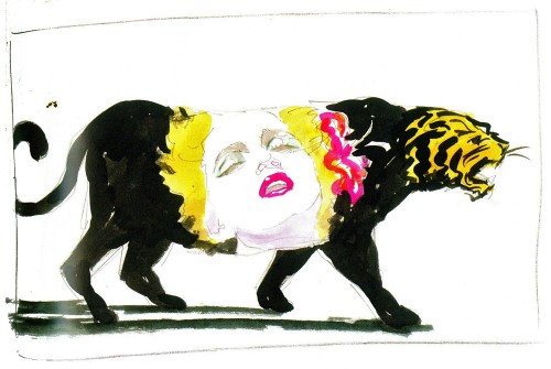
A music video proposal for Madonna’s Who’s That Girl?
 9
9
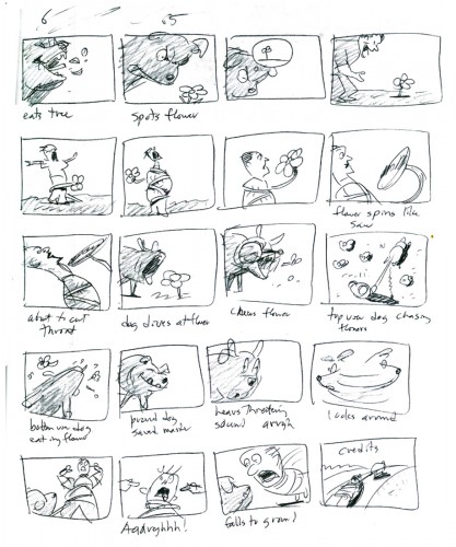
The complete storyboard for Guard Dog is in the book.
Animation &Animation Artifacts &Disney 20 Apr 2011 06:28 am
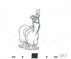
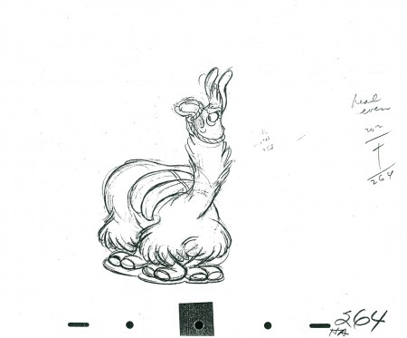
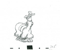
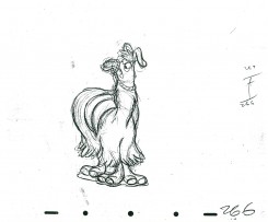
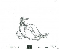
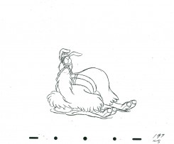
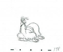
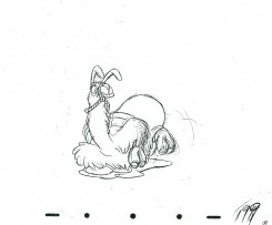
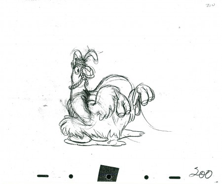
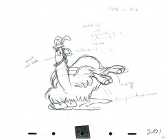
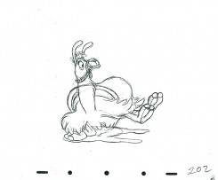
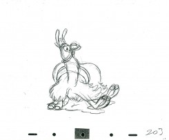
Milt Kahl’s Llama – part 6
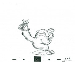
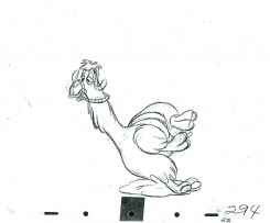
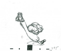
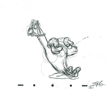
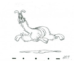
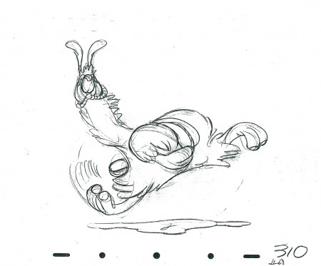
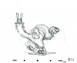
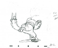
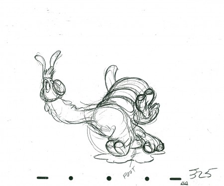
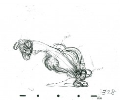
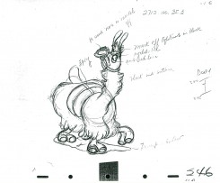
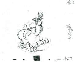
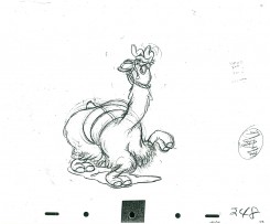
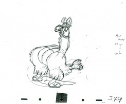
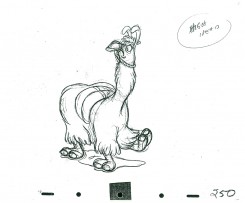
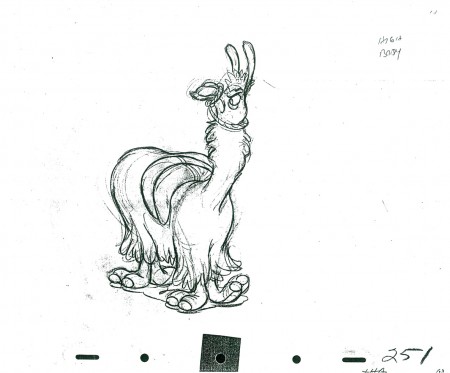
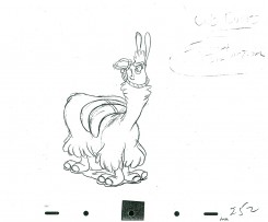
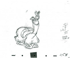
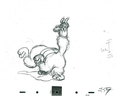
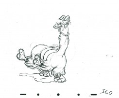
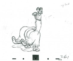
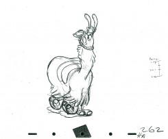
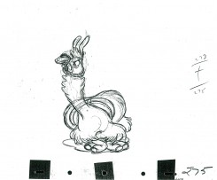
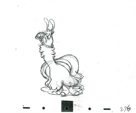
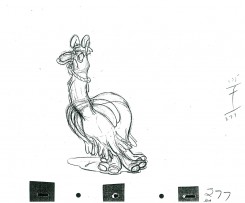
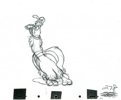
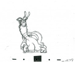
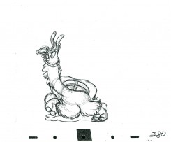
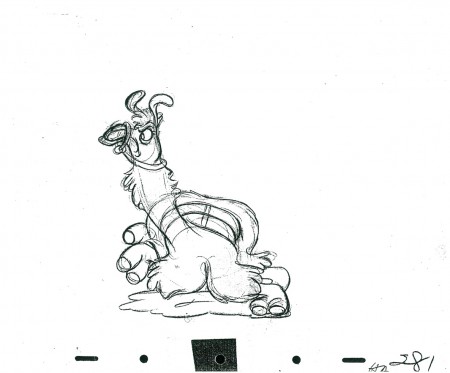
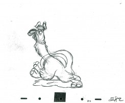
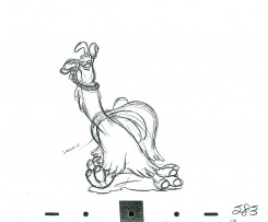
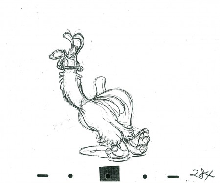
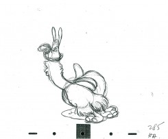
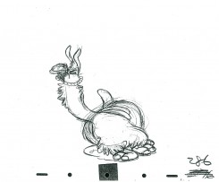
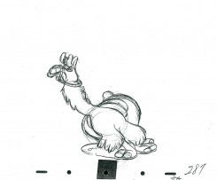
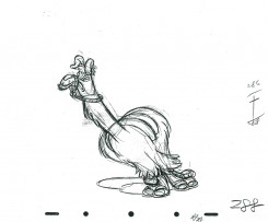
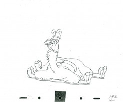
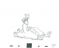
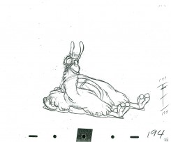
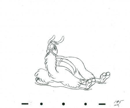
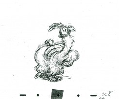
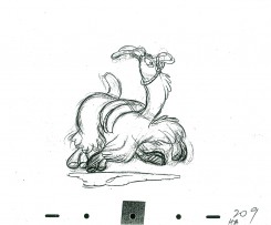
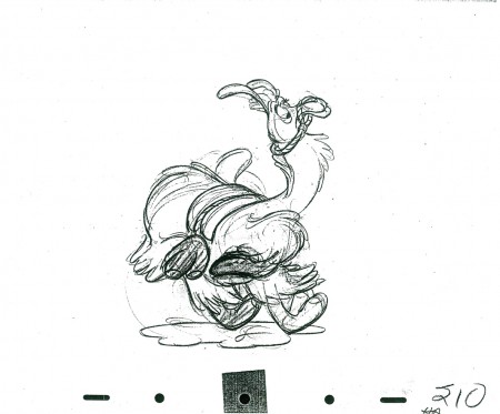
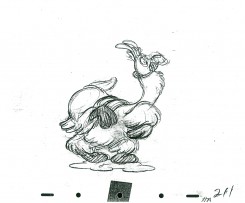
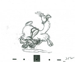
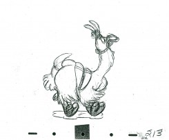
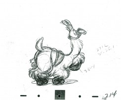
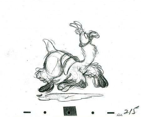
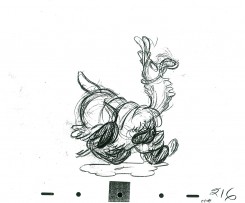
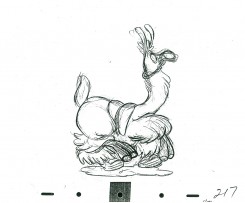
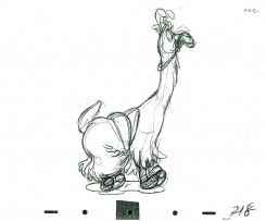
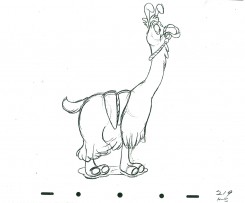
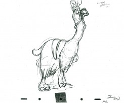
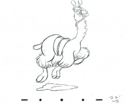
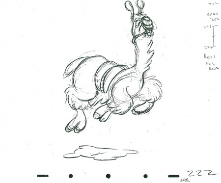
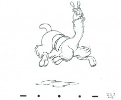
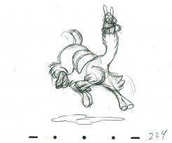
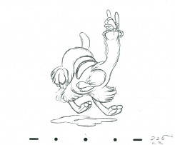
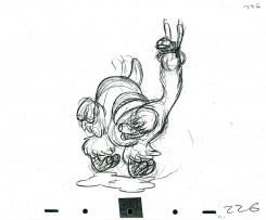
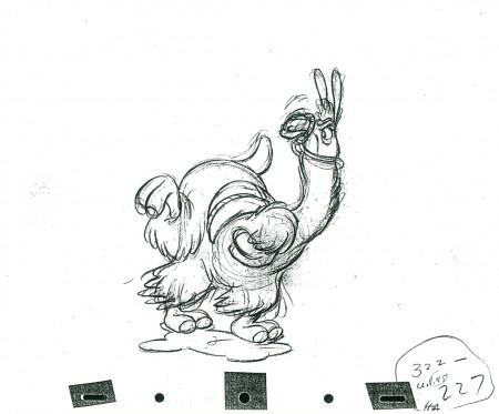
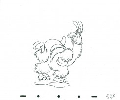
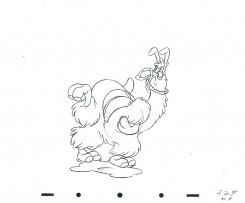
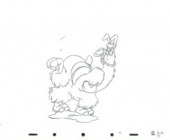
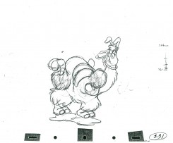
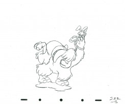
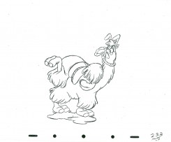
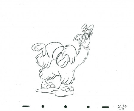
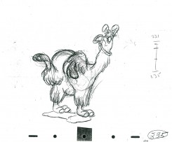
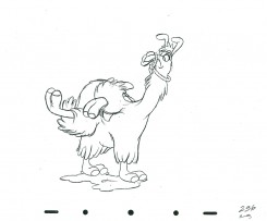
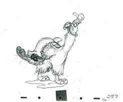
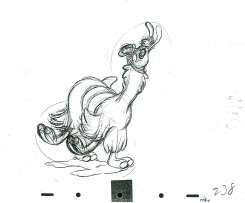
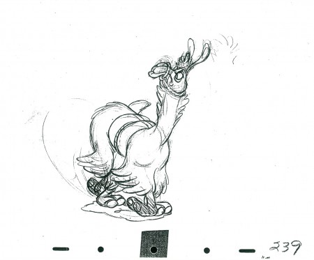
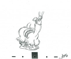
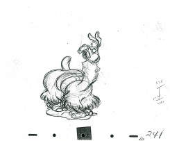
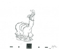
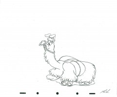
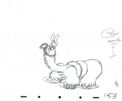
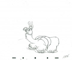
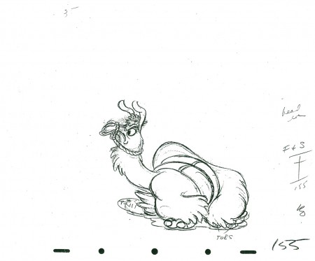
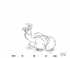
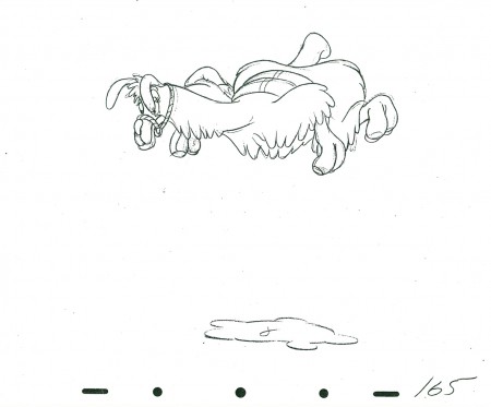
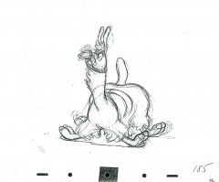
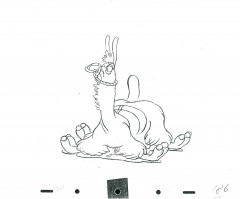
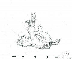
- Last of the llamas. This is the end of the scene animated by Milt Kahl for Saludos Amigos. It’s hilarious, beautiful, flowing and funny animation. The beat moves on and on despite the fact that there is no soundtrack on this QT movie.
Next week a scene by Hicks Lokey from Fantasia. Hippo and alligator. Another very funny scene.
As with all of these continued posts, we start with the last drawing from last week’s scene.
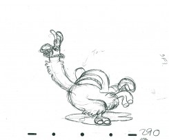
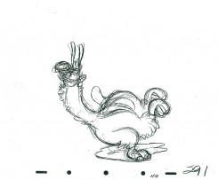
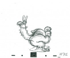
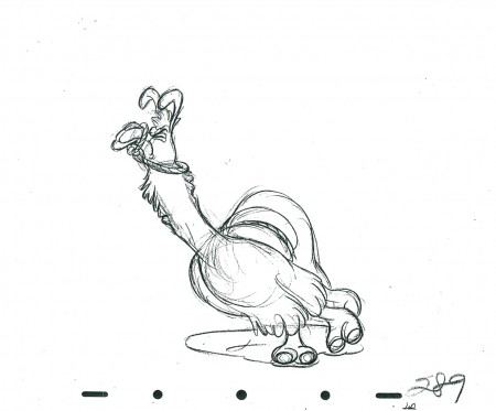 289
________________________
The following is a QT of this part of the scene with all the drawings posted to date.
Past posts can be found here:
Part 1, Part 2, Part 3, Part 4, Part 5
Thanks to John Canemaker for the loan of the scene to post.
Animation &Animation Artifacts &Disney 14 Apr 2011 06:15 am
Kahl’s Llama – part 5
- Here is the next installment of the epic scene by Milt Kahl from Saludos Amigos. The dancing Llama obviously was fun for Kahl to animate, in the same vein as the wonderful work he did for Song of the South. The rhythm just sings out through the animation, even without the music track.
There are still another hundred drawings to go, so it’ll probably be broken into two more parts.
We start this post with the last drawing from last week’s entry.
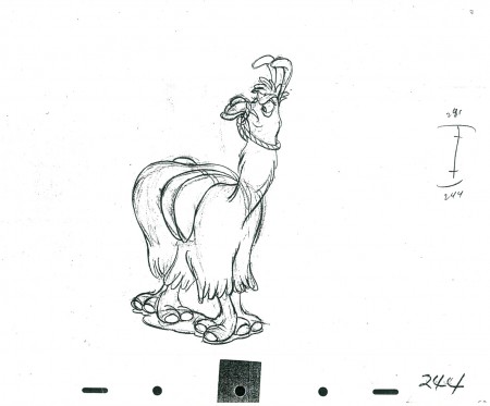 244
________________________
The following is a QT of this part of the scene with all the drawings posted to date.
Past posts can be found here:
Part 1, Part 2, Part 3, Part 4
Thanks to John Canemaker for the loan of the scene to post.
Animation &Animation Artifacts &Disney 11 Apr 2011 06:10 am
Ichabod’s Ride
- Frank Thomas did the brilliant ride of Ichabod Crane about to meet the Headless Horseman. Here’s a flip book that was prepared by Disney which was published in The Illusion of Life, Frank Thomas and Ollie Johnston’s book (pg. 467-521). I have a photographic copy of the images and can post them significantly larger than the book offers. I’ve also done a QT for them.
The registration isn’t all it could be. I know the N/S is correct, but have no guidance for the E/W so took a stab at it. I’m also assuming that many of the drawings are not included, so I just exposed it on threes.
The assisting on this scene is beautiful (as is the animation.)
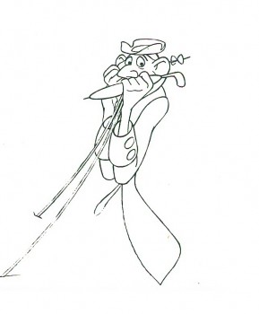 1
________________________
Here’s a QT of the scene with drawings exposed on threes to accomodate some missing drawings.
There have also been published a few other images from a continuation of this scene by Thomas. I’ve scanned those and post them below.
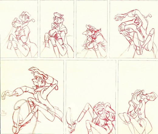
This page is from John Canemaker’s book The Nine Old Men and
the Art of Animation, with the Frank Thomas chapter.
They look like they immediately follow the images chosen for the flip book.
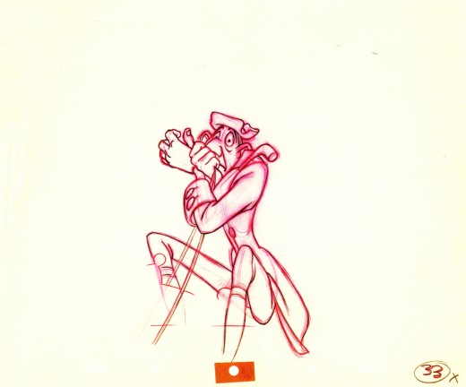
This image comes from the Walt Disney Archive series: Animation.
Animation &Animation Artifacts &Disney 06 Apr 2011 06:54 am
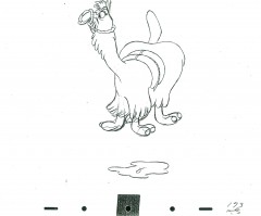
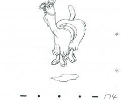
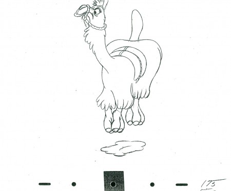
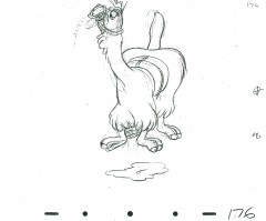
Kahl’s Llama – part 4
- On to the next section of the Dancing Llama animated by Milt Kahl for Saludos Amigos. Much has been made of this comedic scene by Milt Kahl, who was known for his animation of dramatic characters (Prince Philip, Peter Pan, Alice etc.). Kahl says in the recently posted interview with Mike Barrier that he was “outmaneuvered”.
- Barrier: In your own animation, you frequently were given difficult human characters, as opposed to the funnier characters …
Kahl: Yes, I was. I got stuck with Pinocchio—well, I don’t feel I got stuck with Pinocchio, because it was an opportunity for me. But on Alice in Wonderland, who did Alice; on Peter Pan, who did Peter Pan and Wendy and John and Michael. I don’t think it was because I was better at doing that sort of thing, I think it was because I was outmaneuvered. I would have given my eye teeth to do the Cheshire Cat or the Queen of Hearts …
Barrier: … the mad tea party …
Kahl: Well, yes. But some of these things were more fun, let’s put it that way. I didn’t mind Alice—I wouldn’t have minded Alice so much if I could have done all of Alice. But I didn’t, and there’s so much terrible stuff in the picture, where live-action was used and it wasn’t used well. Some of these people weren’t even up to doing stuff from live action.
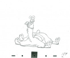
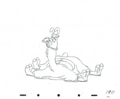
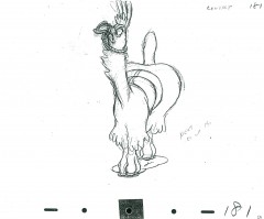
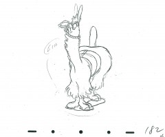
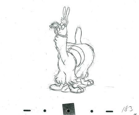
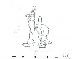
It’s obvious Kahl was having fun when he did this character. The first drawing here is the last drawing given on Part 3.
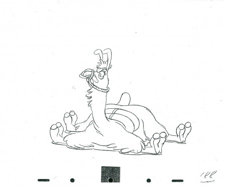 188
________________________
The following is a QT of this part of the scene with all the drawings posted here.
Thanks to John Canemaker for the loan of the scene to post.
Animation &Animation Artifacts &Disney 30 Mar 2011 07:04 am
Kahl’s Llama – part 3
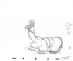
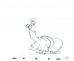
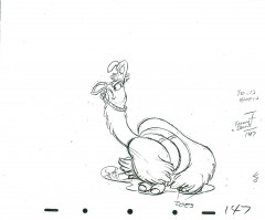
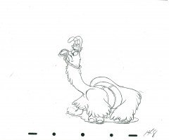
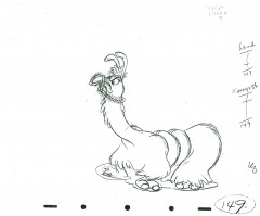
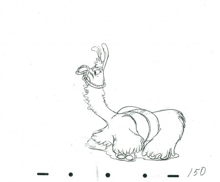
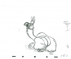
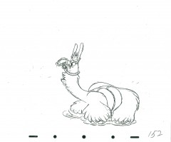
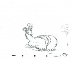
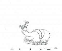
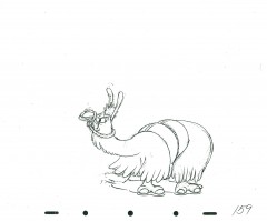
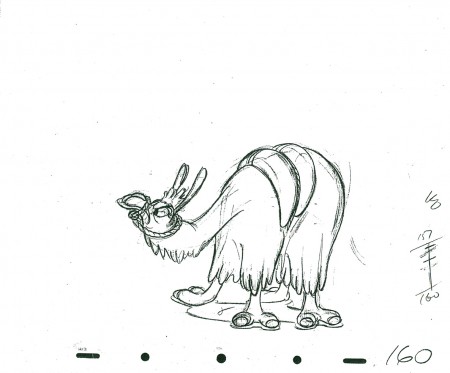
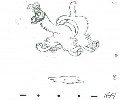
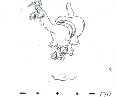
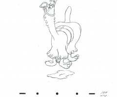
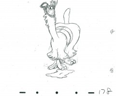
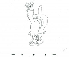
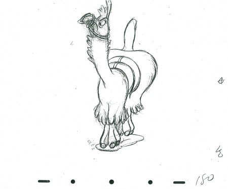
- Well, I don’t have the music, but you can almost hear it in this wonderful piece of animation by Milt Kahl. It, of course, is part of Saludos Amigos; the dancing Llama. It’s yet another tour de force of animation done by Kahl. Donald Duck plays the panpipes as the Llama tries to dance to the bad rhythms. A complex piece of humor by the diverse animator.
This is part three with another couple to come. It’s a long scene. Many thanks to John Canemaker for allowing me to scan it.
As in the past, we start with the last drawing from last week’s post:
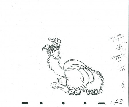 143
________________________
The following is a QT of this part of the scene with all the drawings posted here.
