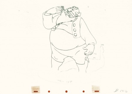
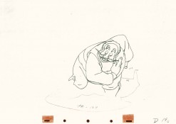
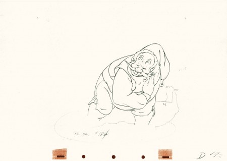
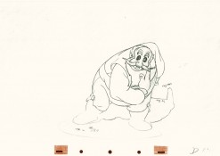
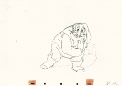
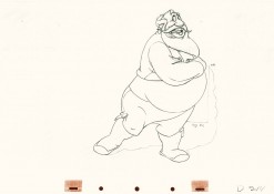
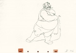
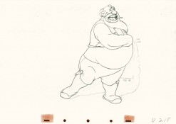
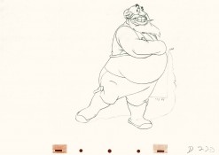
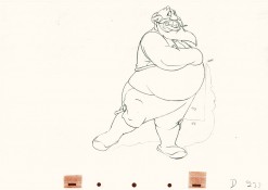
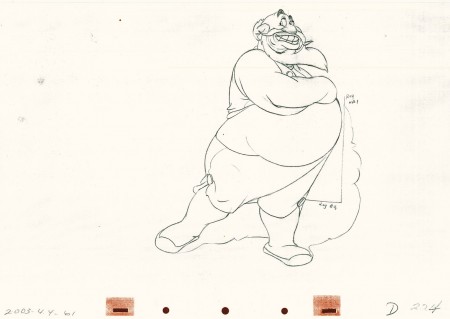
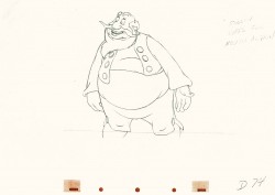
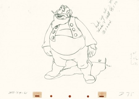
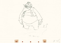
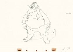
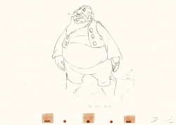
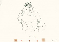
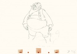
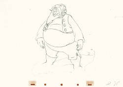
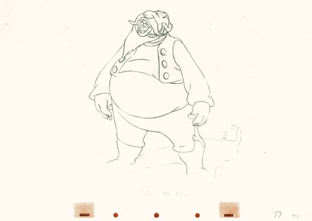
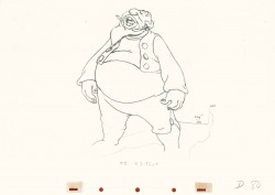
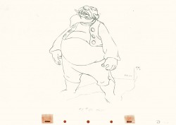
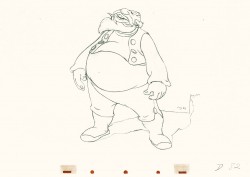
Category ArchiveAnimation
Action Analysis &Animation &Disney 23 Aug 2011 08:06 am
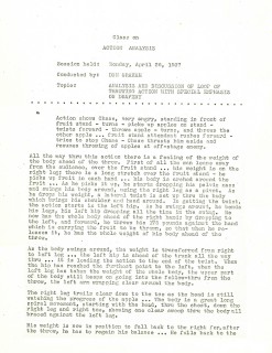
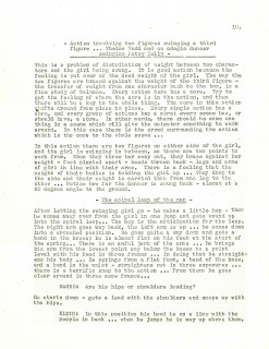
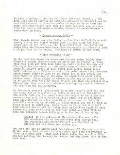
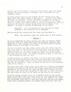
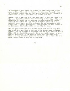
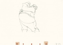
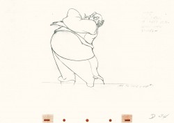
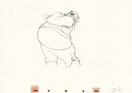
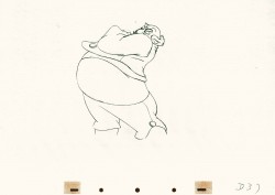
Action Analyisis – April 26, 1937
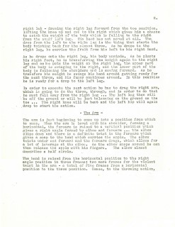
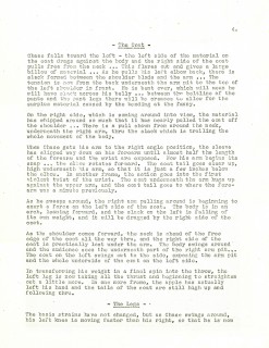
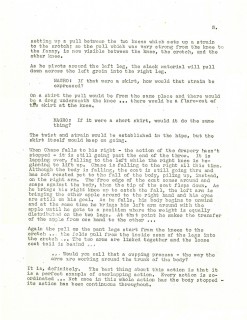
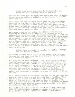
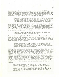
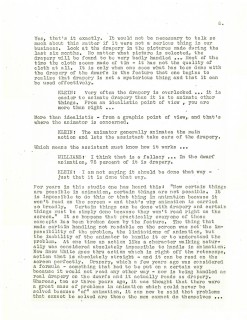
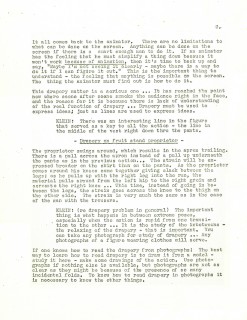
- These are the notes for the Disney studios after hours classes on Action Analysis give on April 26, 1937.
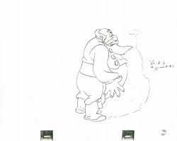
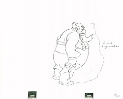
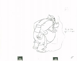
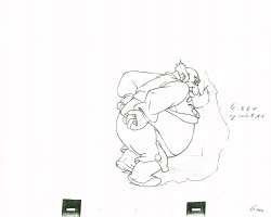
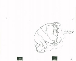
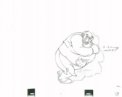
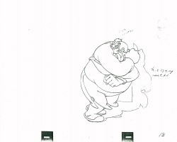
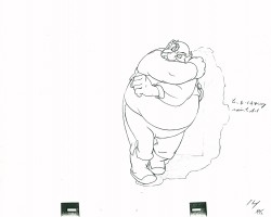
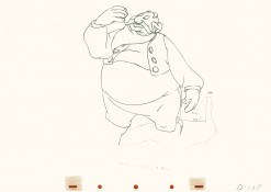
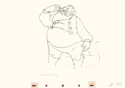
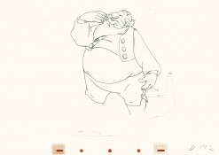
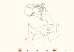
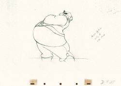
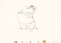
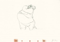
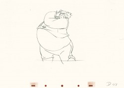
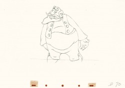
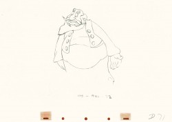
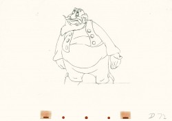
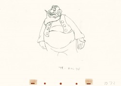
The action they studied was a loop from a Charlie Chase film wherein he throws apples from a fruit stand while the attendant tries to stop him. They are particularly studying the drapery involved. Don Graham, as usual, conducts the class with involvement from: Roy Williams, Milt Neil, Joe Magro, Rose, (Ray?) Patin, and Izzie Klein.
Cover sheet
Just a reminder that there are many more Action Analysis class notes on Hans Perk’s invaluable site, A Film LA.
Animation &commercial animation 22 Aug 2011 07:26 am
The Multiplane Camera of Hans Fischerköesen
- Hans Fischerköesen was an animation pioneer in Germany. Because of his asthma, he could not fight in World War I but was sent to work in Army hospitals. Having produced a very popular ad for a shoe company, he established his Fischerköesen Studio in Leipzig to specialize in advertising films. By 1937, he’d won both first and second prizes at a Dutch-sponsored competition for commercials with the runners up including George Pal and Alexander Alexeieff. By this time, Fischerköesen had made around 1,000 publicity films.
When World War II broke out, German cinemas lost the distribution of Disney and other animated shorts. Goebbels sought someone to fill the bill for a German animation studio. Fisherkösen got the job, but received the mandate to work with Horst von Möllendorf, a popular Berlin newspaper cartoonist, as a gag writer-storyman. He was also required to compete with Disney and Fleischer using multiplane effects.
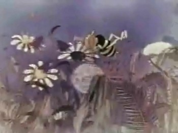
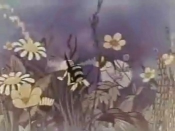
The first film they did, Weather-beaten Melody (1942) almost shows off the technique with a bravura sequence using both the multiplane and stereo-optical processes. It’s this opening sequence that I’m featuring in this post; this is far beyond anything done even in subsequent films. Unfortunately, these frame grabs come from a streaming video, so the quality leaves a lot to be desired.
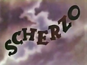 1
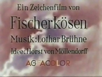
1The opening title – Scherzo
 3
3
When the credits fade off, the sky opens up.
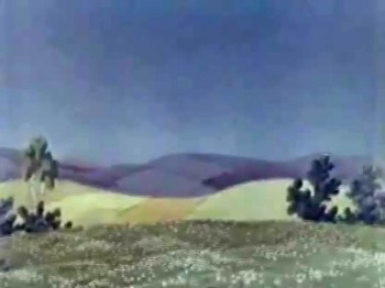 4
4
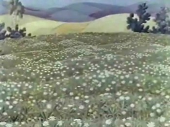
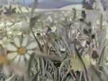
The camera pans down to a field of flowers.
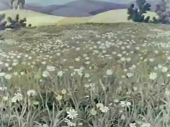 6
6
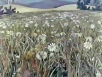
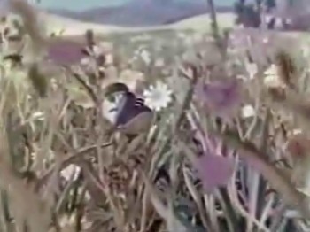
The camera moves right into those flowers.
This is obviously a stereo-scopic set, much like the Fleischer camera.
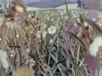 8
8
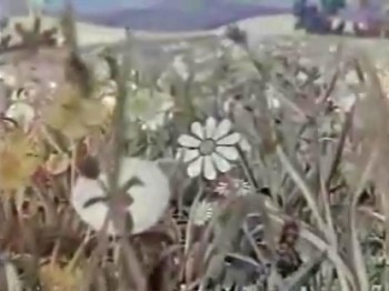
The camera moves in among the flowers.
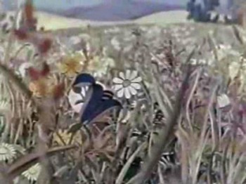 12
12
It reaches a point, and stops.
 13
13
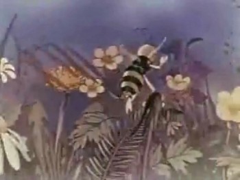
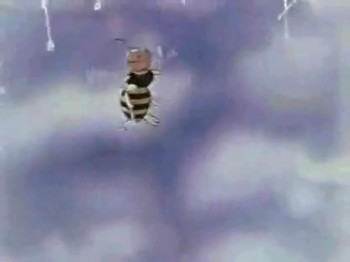
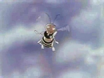
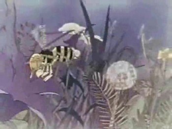
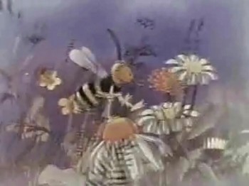
Cut to our main character, a bumble bee.
 14
14
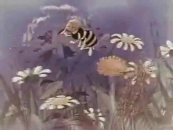
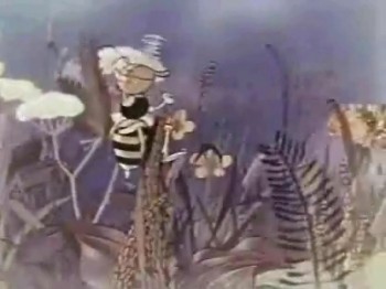
The bee seems to float in the air rather than fly.
Very odd animation, very attractive multiplane setup.
 15
15
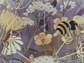
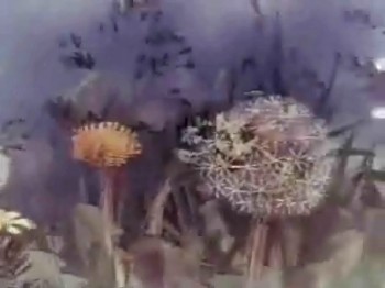
This is a very long pan, with many multiplane levels.
 20
20
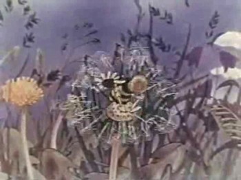
The bee flies INTO a dandelion.
 21
21
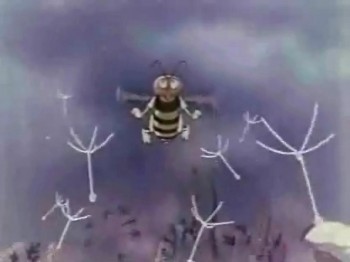
He sneezes breaking up the dandelion.
 22
22
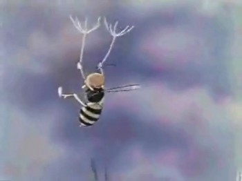
The bee flies up toward the sky with
dandelion bits all about him.
 24
24
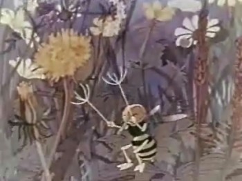
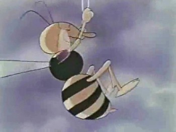
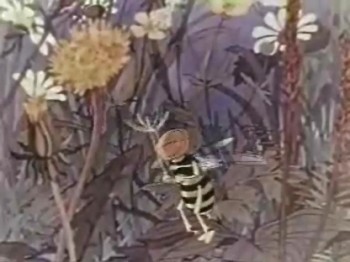
The bee grabs two fronds of the dandelion
to slow his descent to the ground.
 26
26
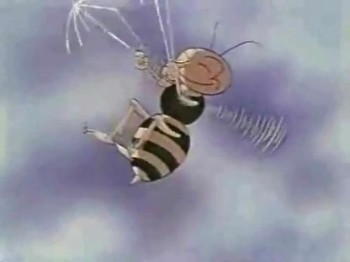
It folds up the dandelion buds as if
they were umbrellas.
 28
28
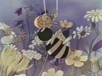
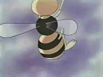
Again the bee uses the “umbrellas” to float mid-air.
 29
29
The bee moves toward the camera in a forced perspective.
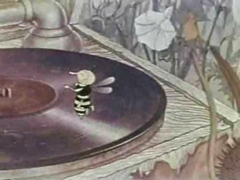
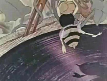
The film moves on to follow the bee who finds a gramophone in the grass. With its stinger the bee is able to play the music on the record for the other bugs.
 1
1At first the record doesn’t move.
It’s the bee who runs in circles.
 2
2
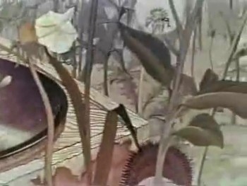
We pan from the bee in a multiplane shot
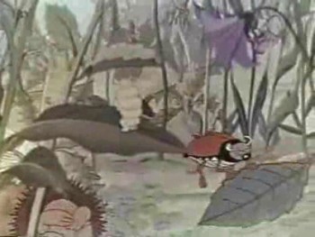
toward some other bugs . . .
 3
3
. . . who are dancing to the jazz music.
 4
4
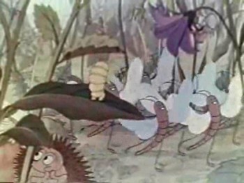
There’s a group of “June Taylor” type dancers.
The animation is probably rotoscoped, though it’s well done.
 5
5
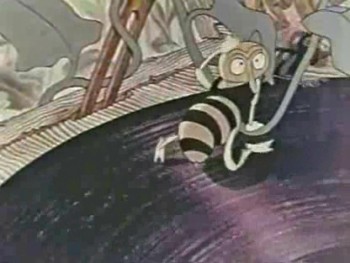
The bee was exhausted from running in place,
so other bugs and a frog turn the record.
 6
6
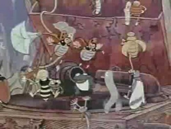
The bee still falls into exhaustion.
 7
7
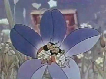
The final shot shows an overview of the gramophone
and all the bugs getting the music to play and dancing.
 9
9
. . . in another beautiful multiplane shot.
 10
10
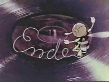
We end on the bug writing “Ende” with his stinger.
Here is a QT of the movie:
You can find an excellent biography of Fischerköesen by William Moritz here.
He also did several other films during the War. The Snowman (1943) and The Silly Goose (1944). Both use the multiplane, though The Silly Goose uses it in a rather unorthodox way. It’s truly daring.
Fischerköesen continued to make advertising films until 1969, and died in 1973.
The Snowman is part of the DVD The Golden Age of Cartoons: Cartoons for Victory! This is part of the excellent product produced by Steve Stanchfield of Thunderbean Animation.
As I mentioned earlier, the quality of the frame grabs has a lot to be desired. You can find better ones on Hans Bacher’s wonderful site, One1More2Time3′s Weblog. Also there are other films including some of the advertising films.
There is also a letter in the comment section of Hans’ site. I thought it interesting enough that I copied it here:
- from MariaElena Kadala
This were my grandfather’s films … I’m trying to get these pictures into Wikipedia articles about the films, without success. Perhpas you can do it?
While he was imprisoned by the Russians after the war (having been accused of being a Nazi) they asked his workers to provide the secrets of his techniques. They made a duplicate copy of all information, which I inherited, being the lone “techie†among many artistic heirs.
Animation &Animation Artifacts &Disney &repeated posts 17 Aug 2011 06:38 am
Dumbo’s Bath – recap
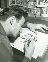
Continuing the celebration of Bill Tytla’s magnificent artrwork, I’m reposting this piece on Dumbo’s bath.
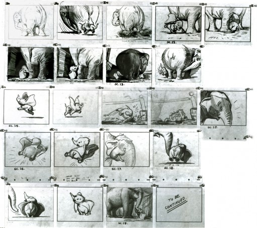
 - Thanks to a loan from John Canemaker, I can continue posting some of the brilliant storyboard work of Bill Peet. The guy was a masterful artist. Every panel gives so much inspiration and information to the animators, directors and artists who’ll follow up on his work.
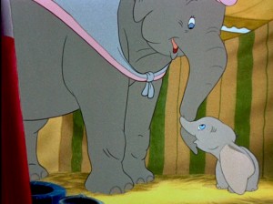
This is the sequence from Dumbo wherein baby Dumbo plays around the feet of his mother. Brilliantly animated by Bill Tytla, this sequence is one of the greatest ever animated. No rotoscoping, no MoCap. Just brilliant artists collaborating with perfect timing, perfect structure, perfect everything. Tytla said he watched his young son at home to learn how to animate Dumbo. Bill Peet told Mike Barrier that he was a big fan of circuses, so he was delighted to be working on this piece. Both used their excitement and enthusiasm to bring something brilliant to the screen, and it stands as a masterpiece of the medium.
Of this sequence and Tytla’s animation, Mike Barrier says in Hollywood Cartoons, “What might otherwise be mere cuteness acquires poignance because it is always shaded by a parent’s knowledge of pain and risk. If Dumbo “acted” more, he would almost certainly be a less successful character—’cuter,’ probably, in the cookie-cutter manner of so many other animated characters, but far more superficial.”
I had to take the one very long photstat and reconfigure it in photoshop so that you could enlarge these frames to see them well. I tried to keep the feel of these drawings pinned to that board in tact.
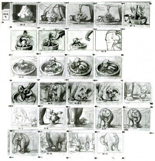
(Click any image to enlarge.)
Here are frame grabs from the very same sequence of the film showing how closely the cuts were followed. Even in stills the sequence is stunning.

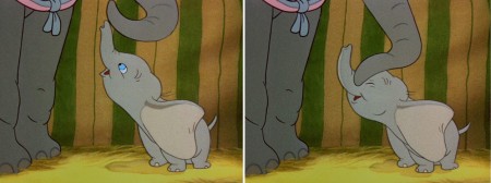
(Click any image to enlarge.)
 .
.This film is a gem.
The dvd also has one of my favorite commentary tracks throughout.
John Canemaker, by himself, talking about the film. It’s great!
From Hans Perk’s A Film LA:
Seq. 06.0 “Menagerie – Mrs. Jumbo Goes Berserk”
Directed by Wilfred Jackson, assistant director Jacques [Roberts?], layout Terrell Stapp.
Dumbo being washed by Mrs. Jumbo, animated by Bill Tytla, with effects by Art Palmer, Cornett Wood and Sandy Strother.
Animation &Commentary &Independent Animation 14 Aug 2011 03:08 am
Robert Breer (1926-2011)
- This note came from George Griiffin today:
- Some of you may already know Bob died yesterday. The beautiful film by his youngest daughter Sally, posted on Vimeo, made it clear but I don’t know if there has been an official announcement yet.
Unfortunately, I did not receive a link to the video
but Janet Benn located it. Thanks, Janet – M.S.
He had an enormous influence on 2 generations of animation artists, constantly pushing and pulling his practice with wit and ingenuity. It was a privilege to have known him, and to have learned so much from him. A huge force in our field has left.
There is this excellent bio on AWN.
See some of his films Here.
The only obituary I’ve found thus far is an Italian one, in Italian. Here. It says that he died peacefully on August 12th.
Animation &Animation Artifacts 12 Aug 2011 07:10 am
Corny’s Cartoon
Since Corny Cole died on Monday, there have been quite a few comments on various blogs. To me, the most valuable of those I’d seen was the one posted late yesterday by Michael Barrier. It is an interview done with Milton Gray and Corny in 1991. They talk primarily about the days Corny worked under Chuck Jones at Warner Bros. and the days working at UPA on Gay Purr-ee, under the recommendation of Jones. Amid Amidi also posted a fine memorial to Corny on Cartoon Brew this morning.
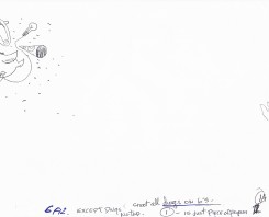
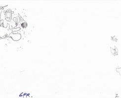
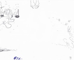
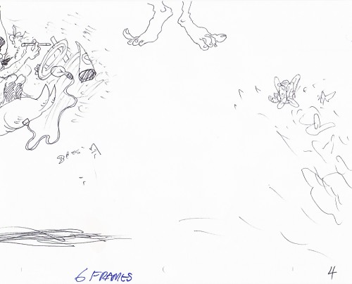
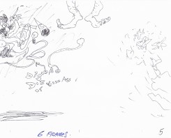
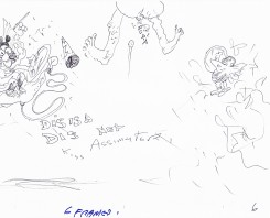
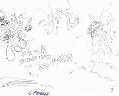
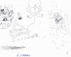
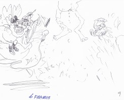
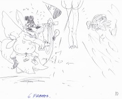
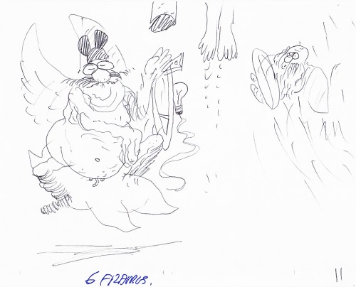
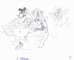
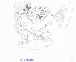
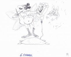
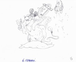
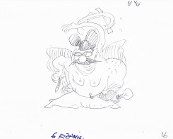
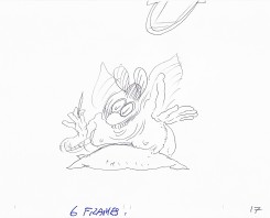
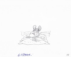
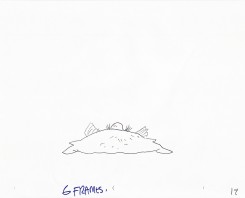
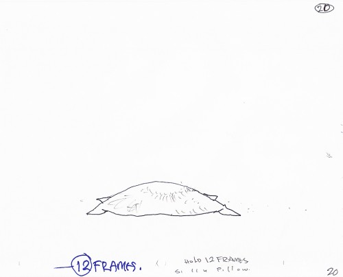
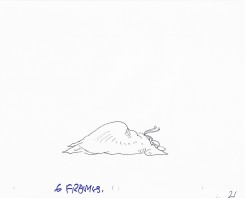
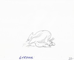
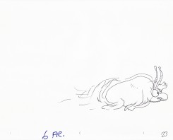
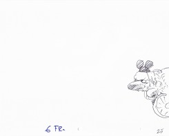
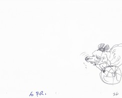
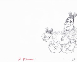
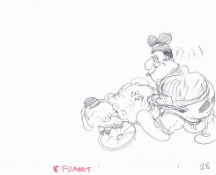
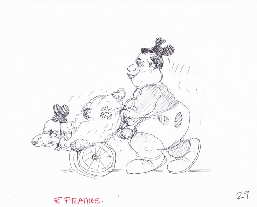
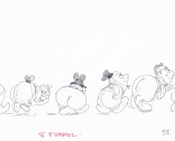
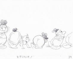
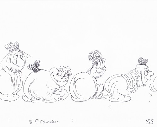
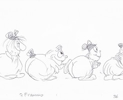
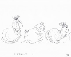
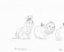
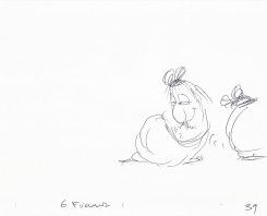
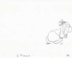
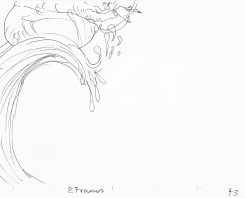
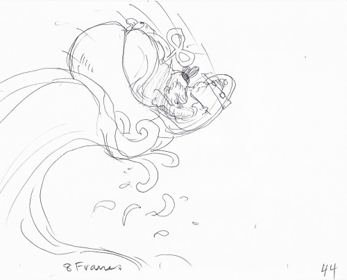
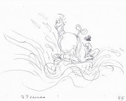
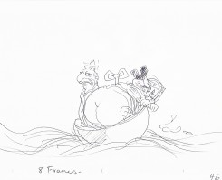
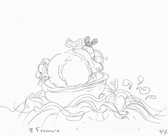
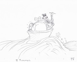
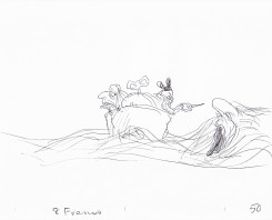
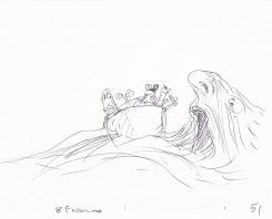
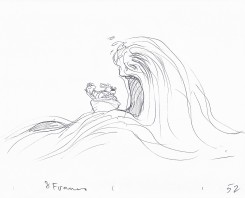
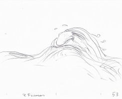
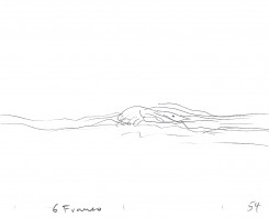
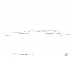
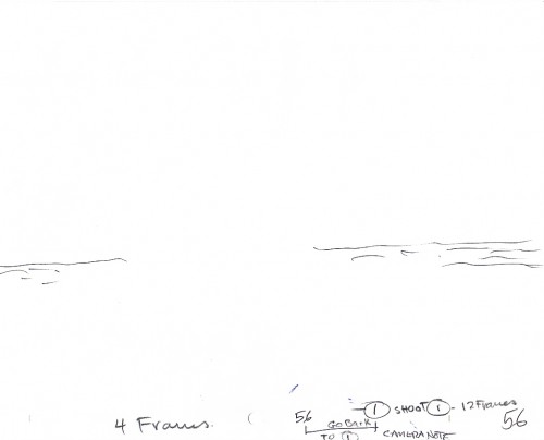
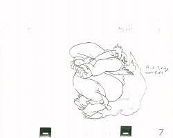
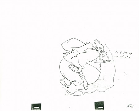
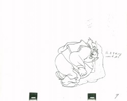
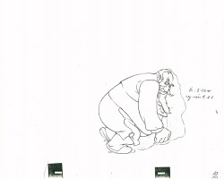
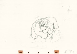
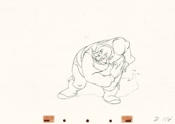
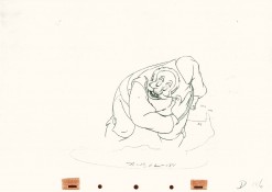
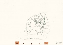
I have a few scenes done by Corny Cole from Raggedy Ann and Andy, and I hope to post some of his art. However, animator, Matthew Clinton sent me the following scene and offered it for posting. Matt had a close relationship with Corny and I thought the scene somehow special. Somehow, to me, it captures the essence of Corny’s animation, so I thought it appropriate to post this week. Here’s the comment Matt sent along with the artwork:
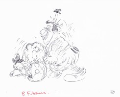
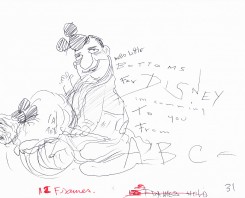
- Corny Cole gave this scene to me as a gift when I graduated. I’m guessing that it was something he worked on in his “Animation as Art” class while the students were busy drawing one day. Maybe it was for a demonstration. I included scans of all the drawings.
Corny talks, in the Barrier interview, of animating just by flipping without a bottom light. It’s easy to imagine him sitting in the front of the classroom flipping away with this artwork on his lap. It’s obviously stream of conscience. There are elements of some of Corny’s last big jobs in there: the taffy pit from Raggedy Ann and the clockwork mouse (a Disney/Mickey bastardization) from The Mouse & His Child, both features designed by Corny.
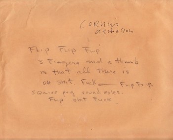
Cover sheet
. . . . . . . . . . . . . . . . . . . . . . . . . . . . .
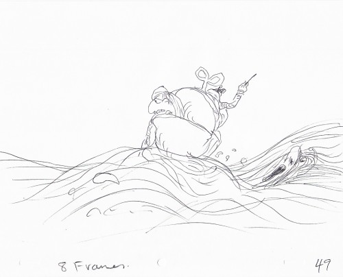 49
49
The clockwork mouse about to be swallowed by the Taffy Pit.
.
This is a QT of Corny’s piece. Since most drawings were exposed on 6′s,
I put one frame dissolves between each to soften the extremes.
Action Analysis &Animation &Books &Disney &repeated posts 10 Aug 2011 07:07 am
Tytla’s Willie – recap
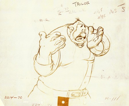
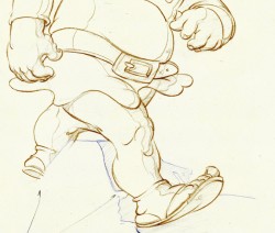
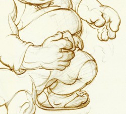
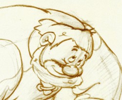
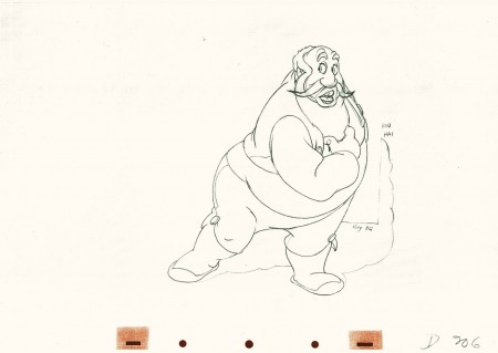
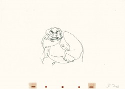
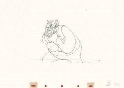
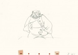
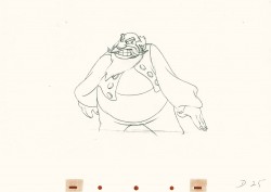
Continuing with my recap of all things Tytla, here’s a post I did on Tytla’s work on The Brave Little Tailor.
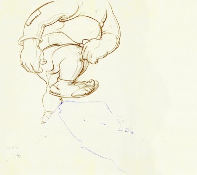
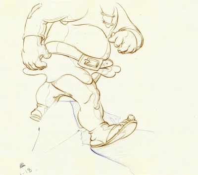
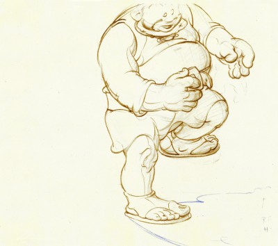
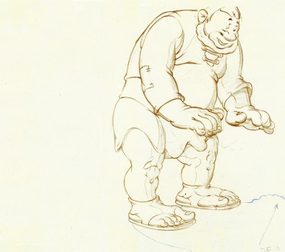
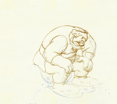
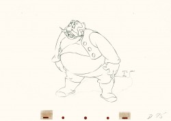
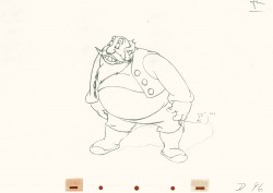
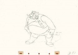
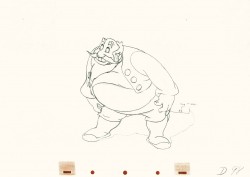
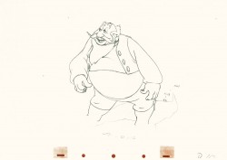
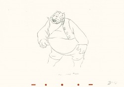
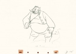
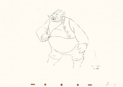
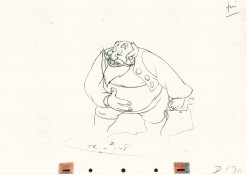
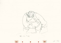
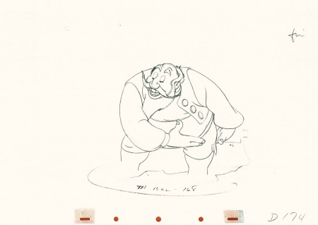
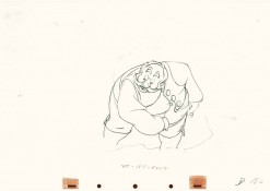
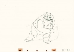
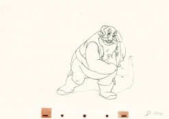
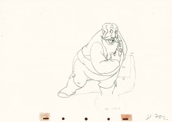
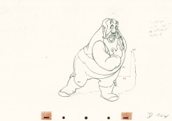
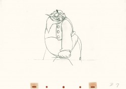
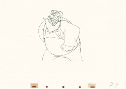
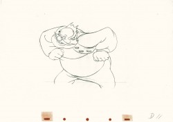
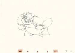
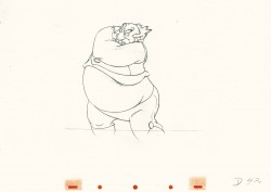
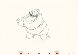
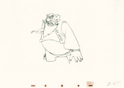
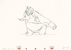
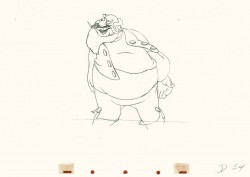
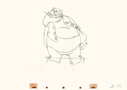
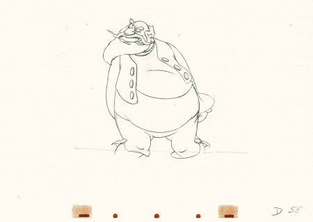
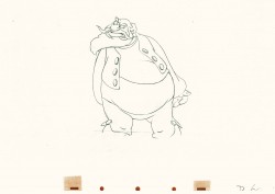
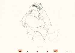
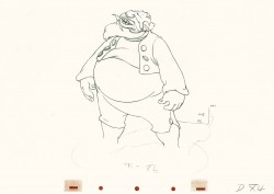
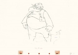
- When I was a kid, I was never a big fan of the “Willie” character, the giant in Mickey & the Beanstalk. It seemed that every fourth or fifth Disneyland tv show would have this character in it (or else Donald and Chip & Dale). As I got older and grew a more educated eye for animation, I came to realize how well the character was drawn and animated.
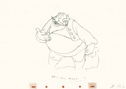
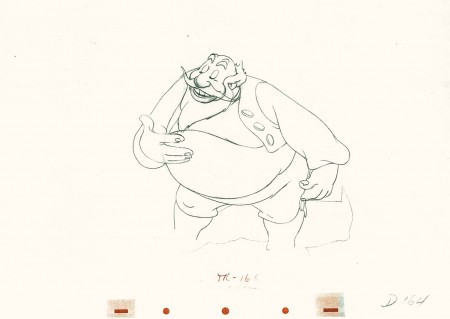
Willie first appeared in the classic Mickey short, The Brave Little Tailor, and he appeared fully formed. Bill Tytla was the animator, and he appeared to have fun doing it.
In John Canemaker‘s excellent book, Treasury of Disney Animation Art, there are some beautiful drawings worth looking at. Here they are:
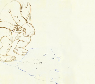 1
1(Click any image to enlarge.)
So let’s take a closer look at some of these drawings.
.
Drawing #3 features this weight shift. As the right foot hits the ground it pronates – twists ever so slightly inward. The hands do just the opposite. The left hand reaches in while the right hand holds back, completely at rest.
It’s a great drawing.
.
.
.
Drawing #4 shows Willie landing on that right foot, and his entire body tilts to the right. The hands twist completely to the left trying to maintain balance. The left foot up in the air is also twisting to the left before it lands twisting to the right.
.
.
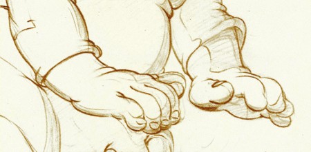
I love how drawing #5 features the two hands flattened out to
make his final stand before sitting down. It’s all about gaining balance.
.
.
.
.
Just take a look at this beautiful head in drawing #6. He’s seated, his head has come forward and tilted forward. The distortion is so beautiful it almost doesn’t look distorted.
What a fabulous artist! This guy just did this naturally.
.
.
.
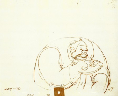
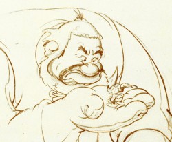
This scene begins with the seated giant eyeing the tiny Mickey Mouse in his hand. The characters are drawn beautifully almost at a rest waiting to get into the scene. The intensity of Willie’s glare is strong, and it’s obvous Mickey is in trouble.
.
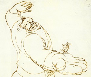 Here’s the drawing of the sequence.
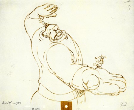
The major problem with drawing a giant is his proportion to all the other characters. The screen is more oblong and horizontalal than it is square. (Fortunately, when this film was done it was closer to a square but still not one.) Throughout the film, Tytla had to deal with a BIG Giant and little Mickey. The landscape is also small.
An obvious way of handling it – and one that would be done today, no doubt – would be to force perspective showing it from the ground up – most of the time. In the 30′s and 40′s they stuck to the traditional rule of film and editing, and they would NOT have done this.
Tytla plays with scale as the giant steps over a house and ultimately sits on it.
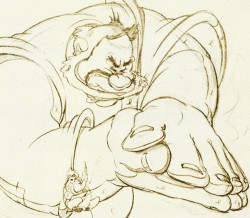
In this drawing, he does a brilliant drawing forcing the perspective with Mickey in the foreground and Willie’s left hand in the distance. The giant draws into this forceful perspective without calling attention to itself. Today it would be more exaggerated, but Tytla doesn’t want it to be noticed – just felt.
A real bit of art!
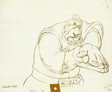
Here, Willie moves through that perspective of the last extreme, and he gets larger as he slams his hands to flatten Mickey. To exaggerate that flattening, Willie’s hands flatten for this key drawing. His head flattens as well in grimace.
The giant’s head will move in toward the hands to see the results, and the audience has a front row seat seeing Mickey escape up the giant’s sleeve. There’s a lot going on in this drawing.
.
.
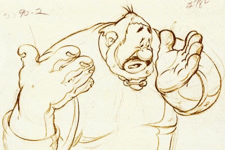
Finally, Willie tries to figure out what’s happened.
The drawing loses most of its distortion and comes to rest.
(Note that there’s still perspective distancing between the two hands.)
Mark Mayerson has done a mosaic breakdown of this cartoon and adds his excellent commentary.
Hans Perk on his site, A Film LA, has just posted the drafts to the earlier Disney short, Giantland. The draft for The Brave Little Tailor was posted a while back on this great site.
Animation &Animation Artifacts &John Canemaker 03 Aug 2011 05:36 am
Tytla Devil Recaps
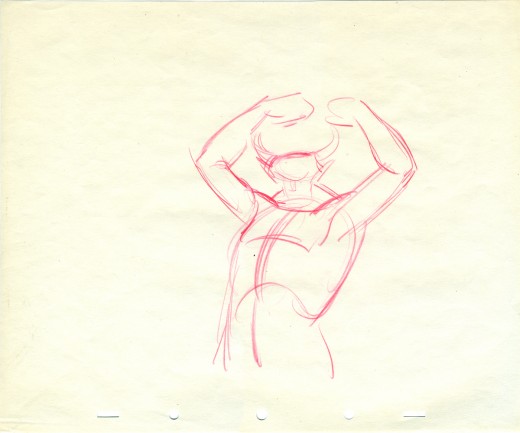
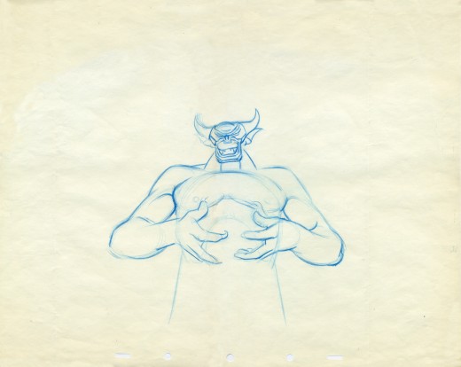
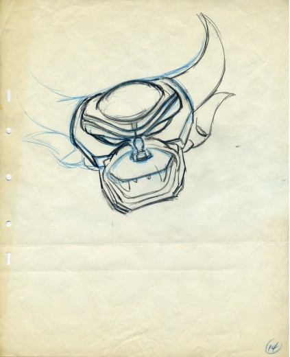
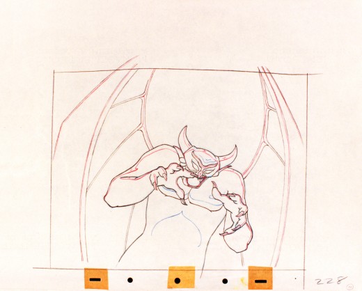
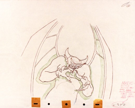
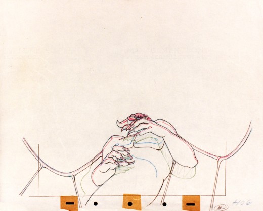
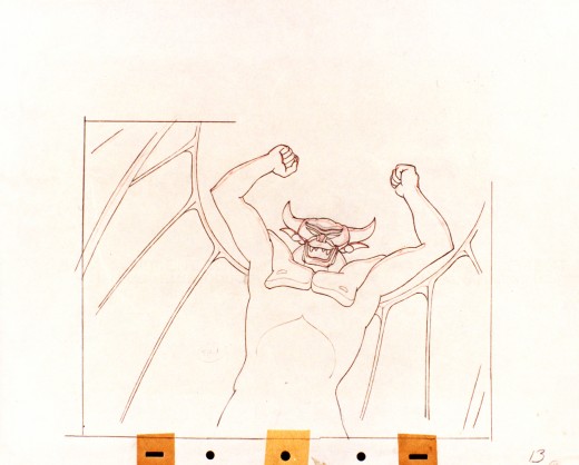
Continuing with my recaps of Bill Tytla’s Disney animation, I’ve put together a couple of past posts to show you some of the beautiful drawing Tytla did on Fantasia‘s Night On Bald Mountain sequence.
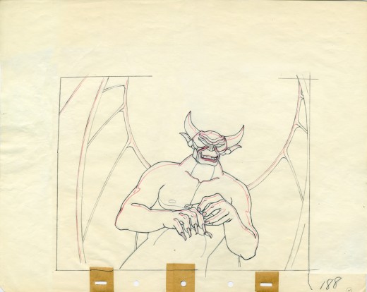
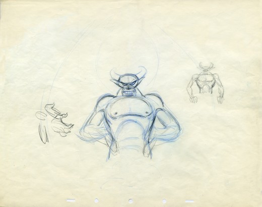
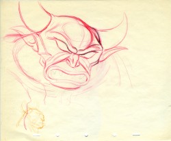
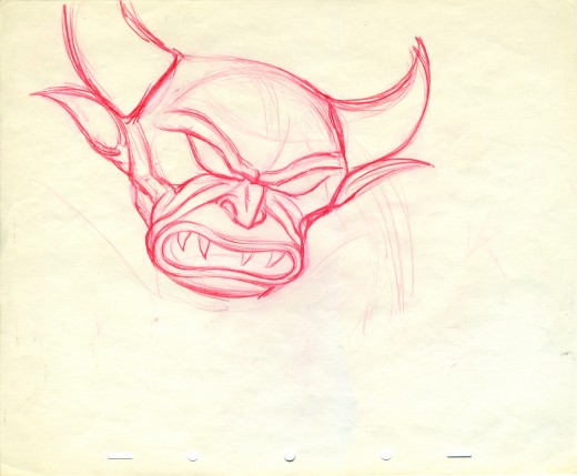
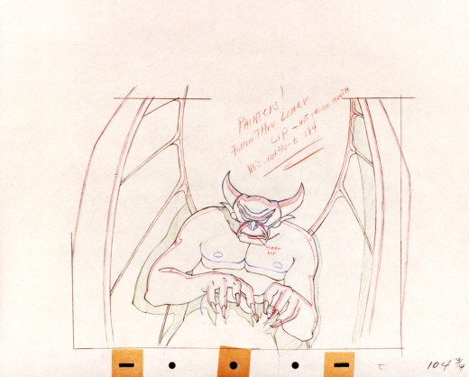
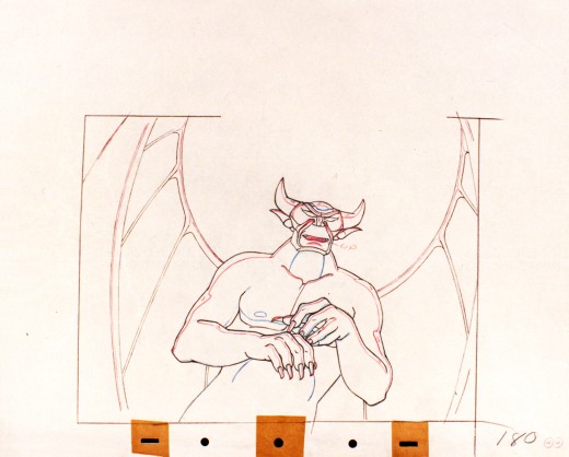
- Here’s what for me was a real treat to scan and post. I had some limited access to actual drawings by Bill Tytla of the Devil from Fantasia. The drawings are mostly roughs by Tytla, and they give a good sample of what his actual work looked like.
I don’t need to write about it; let me just give you these mages.
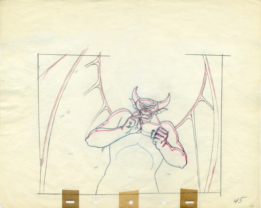
A good example of a Tytla drawing.
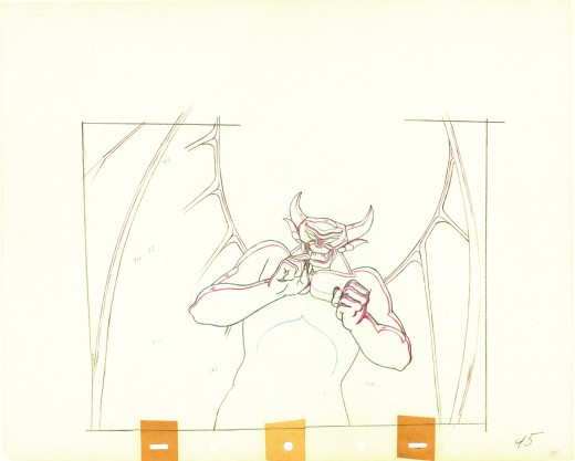
Here’s the clean up of the same drawing.
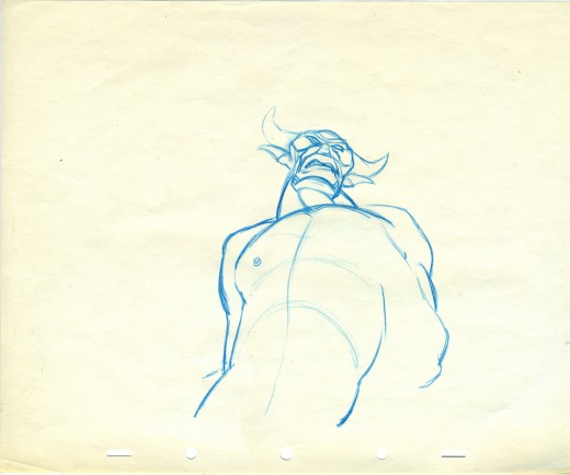
Animation roughs don’t get any more beautiful than this.
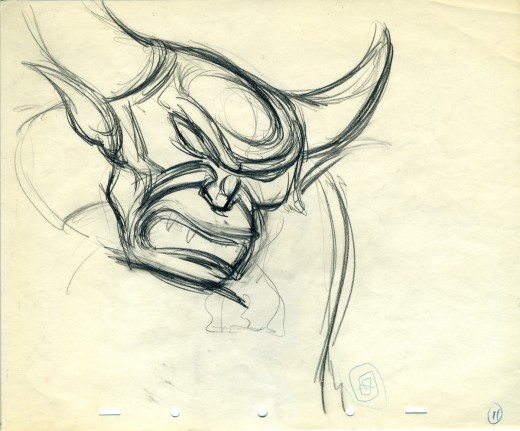
Art. What else need be said?
The individual drawings are stunning, and they’re
in service to a brilliantly acted sequence.
It will never get better.
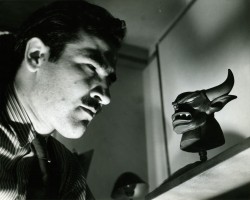 - Going under the assumption that there never are enough of Tytla’s Devils on the internet, I’ve got a few drawings to show here.
These were photographs of drawings taken (rather dark exposure that I lightened a bit) of what appears to be some cleanups. Most of them are from one scene; one drawing is from another. They’re all treasures.
How do you go from delicate Dumbo’s bath to this? That’s acting!
(Click any image to enlarge.)
Animation &Animation Artifacts &Disney 27 Jul 2011 07:16 am
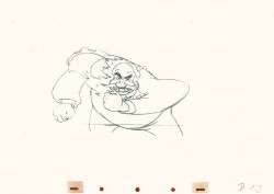
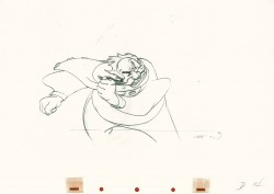
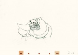
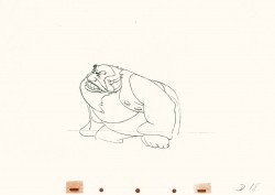
Stromboli Jump Recap
As I pointed out a couple of weeks back, I’m going forward with recap posts of the Tytla scenes I’d previously posted. They should be seen and studied often. They’re too good.
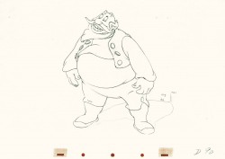
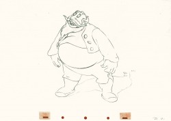
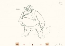
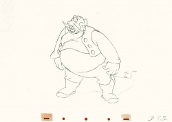
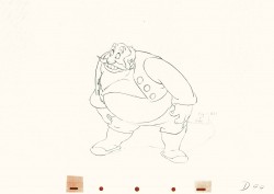
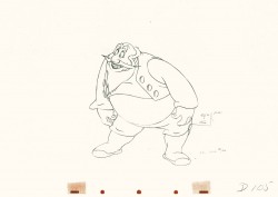
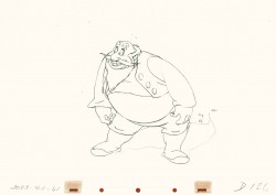
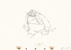
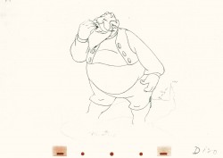
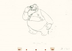
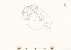
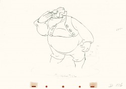
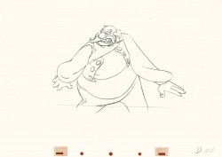
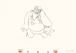
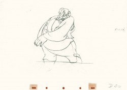
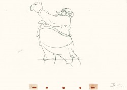
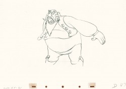
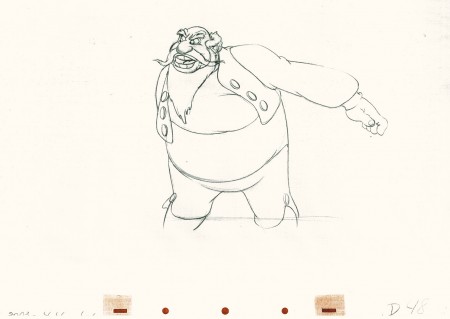
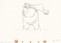
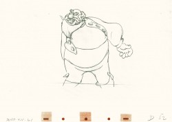
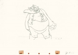
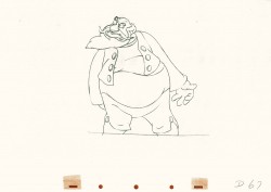
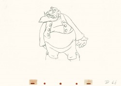
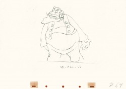
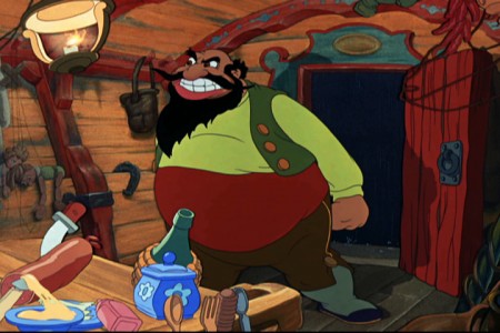
- Here’s a scene all of 29 drawings in length, but if you check it out in the film it’s enormous. Everything’s moving – the wagon they’re standing in, the pots & pans, things on the table and most definitely Stromboli who in one enormous drawing changes the scene, Pinocchio’s world and the mood in the audience. “Quiet!” is all the dialogue shouted in the scene. It”s frightening.
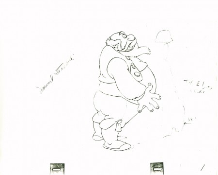
(Make sure you click to enlarge every drawing here.)
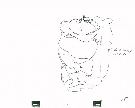 15
15
Closed position starting to open his body – legs first.
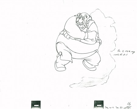 16
16
Pulling it all into a ball,
he shouts, “QUIET” – the dialogue for the scene
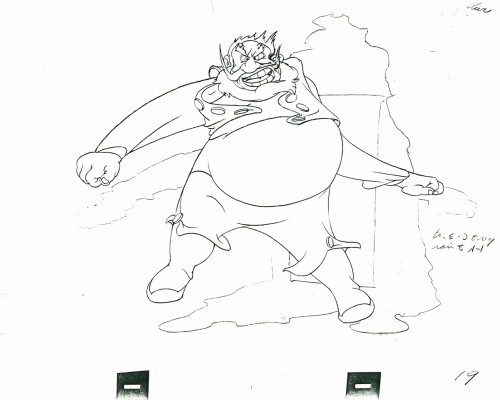 19
19
Couldn’t open up more than this.
Just look at the distortion in this drawing. Magnificent.
Open, loud, ready to burst. One frame only.
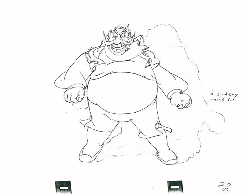 20
20
Next frame he’s landed and gathered himself.
Only the secondary action – vest, pants, beard –
echo the outburst.
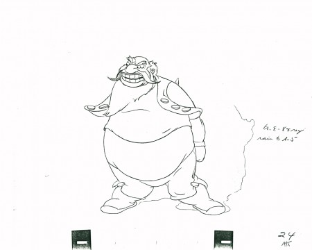 24
24
His clothes lag behind in pulling themselves together.
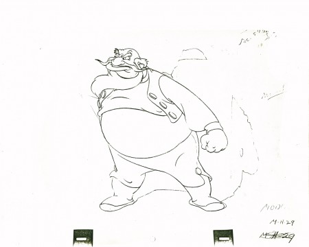 29
29
He’s set to give the demand and end the scene.
The following QT movie represents the entire scene from Pinocchio.
Click left side of the black bar to play.Right side to watch single frame.
Here are frames from the actual scene:
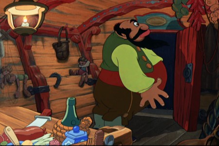 1
1.
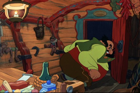 8
8.
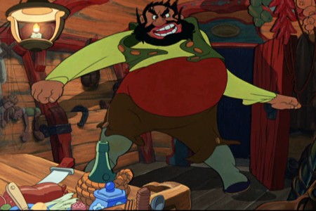 19
19.
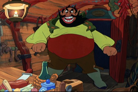 20
20.
 26
26
What a difference the shake of the coach and the
bounce of the hanging utensils make to the scene.
There’s danger everywhere, here.
It’s scary.
Many thanks to my friend, Lou Scarborough, for the loan of this scene.
Animation &Animation Artifacts &Disney &John Canemaker &Tytla 21 Jul 2011 06:30 am
Tytla’s Stromboli – the Second half
This is a continuation of yeserday’s recap post. Tytla was a genius and this scene is proof. Originally in five parts, here are the final three.
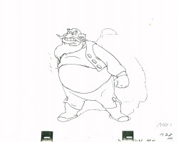
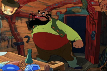
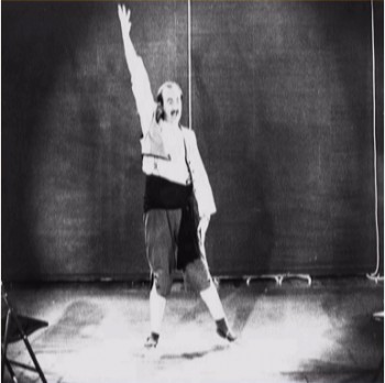
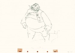
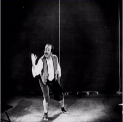
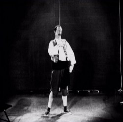
Nancy Beiman brought to my attention that T.Hee did some live action reference for Tytla as Stromboli. Here are some stills I located:
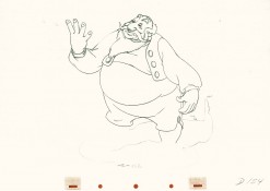
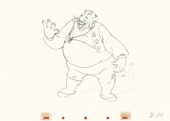
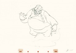
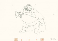
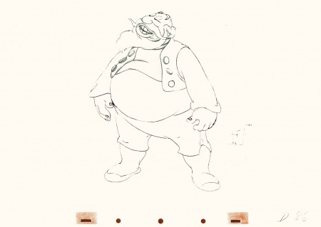
- This is part 3 of this large scene by Bill Tytla of Stromboli. The scene started in Part 1 with thoroughly frenetic anger from Stromboli. In Part 2 he tries to catch himself and get a grip on his emotions. Here in Part 3 he moves slowly and takes a 180° turn from where he started. The line against the curve. All this while playing out the lines from the scene. The drawing is stunning, the motion is brilliant, and the acting is the best animation has to offer. Those hands are just great; look at 126.
I pick up with the last drawing from Part 2.
 86
86(Click any image to enlarge.)
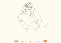 87
87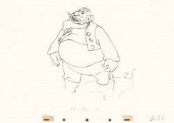 88
88
Tytla made sure he firmly planted Stromboli’s feet (in part 2)
before he attempted this firm bow.
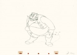
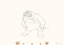 101
101
He’s made a solid line of the back, the strength of this move,
by using the left arm held firmly in place.
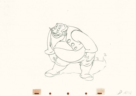 102
102
This is the bottom of the bow, now he goes back up.
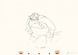
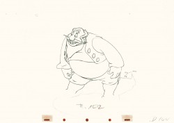 104
104
All of the shapes change naturally in the bow, though it looks
as if it remains a solid. No noticeable change. Solid weight.
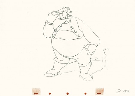 122
122
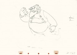
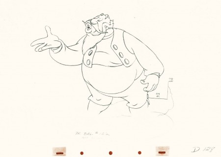
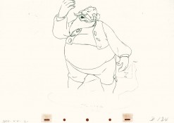
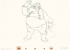
Watch the timing on the hand from here to #128
as Stromboli blows a kiss.
Many an animator today would pop it and call it animation.
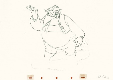 130
130
(Click any image to enlarge.)
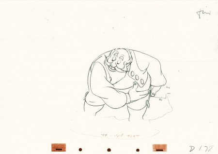 178
178
(Click any image to enlarge.)
Here’s the final QT of it all together:
Stromboli
Click left side of the black bar to play.
Right side to watch single frame.
David Nethery had taken my drawings posted and synched them up to the sound track here.
Animation &Animation Artifacts &Disney &John Canemaker &repeated posts &Tytla 20 Jul 2011 07:31 am
Tytla’s Stromboli – the First half
As stated last week, I’m recapping some of my Tytla posts from the past. This very long scene was originally in five parts. Today and tomorrow all five parts will be posted.
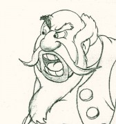 - Bill Tytla‘s work has to be studied and studied and studied for any student of animation. He was the best, and it’s pretty doubtful his work will be superceded. He brought beautiful distortion to many of the drawings he did, using it as a way to hammer home some of the emotions in the elasticity he was creating. Yet, the casual observer watching this sequence in motion doesn’t ever notice that distortion yet can feel it in the strength of the motion.
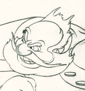
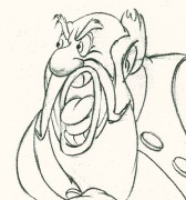
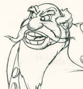
Four drawings (#1, 11, 22, & 48) that shift so enormously but call no attention to itself.
Brilliant draftsmanship and use of the forms.
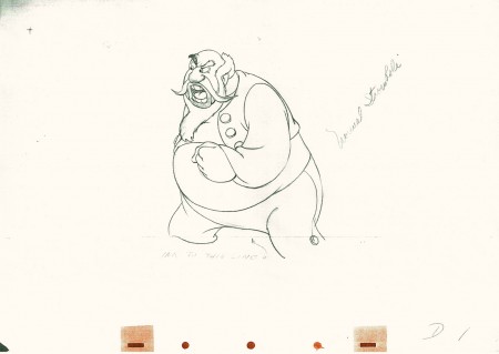
Here we have the beginning: drawings 1-48. More will come in the future.
 1
1(Click any image to enlarge.)
This note arrived from Borge Ring after my first post Bill Tytla’s scene featuring Stromboli’s mood swing:
- The Arch devotees of Milt Kahl have tearfull misgivings about Wladimir Tytla’s magnificent language of distortions. ‘”Yes, he IS good. But he has made SO many ugly drawings”
Musicologists will know that Beethoven abhorred the music of Johan Sebastian Bach.
yukyuk
Børge
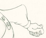
My first post spoke a bit about the distortion Tytla would use to his advantage to get an emotional gesture across. It’s part of the “animating forces instead of forms†method that Tytla used. This is found in Stromboli’s face in the first post. In this one look for this arm in drawing #50. It barely registers but gives strength to the arm move before it as his blouse follows through in extreme.
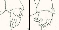 There’s also some beautiful and simple drawing throughout this piece. Stromboli is, basically, a cartoon character that caricatures reality beautifully. A predecessor to Cruella de Vil. In drawings 76 to 80 there’s a simple turn of the hand that is nicely done by some assistant. A little thing among so much bravura animation.
Many people don’t like the exaggerated motion of Stromboli. However, I think it’s perfectly right for the character. He’s Italian – prone to big movements. He’s a performer who, like many actors in real life, goes for the big gesture. In short his character is all there – garlic breath and all. It’s not cliched and it’s well felt and thought out. Think of the Devil in “Night on Bald Mountain” that would follow, then the simply wonderful and understated Dumbo who would follow that. Tytla was a versatile master.
Here’s part 2 of the scene:
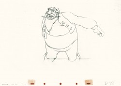 48
48 49
49(Click any image to enlarge.) The full scene with all drawings.
Click left side of the black bar to play.
Right side to watch single frame.
David Nethery had taken my drawings posted and synched them up to the sound track here.
