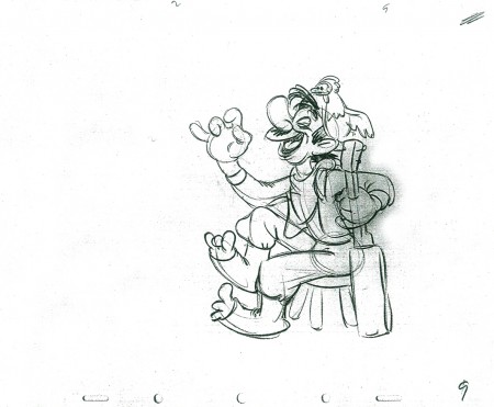
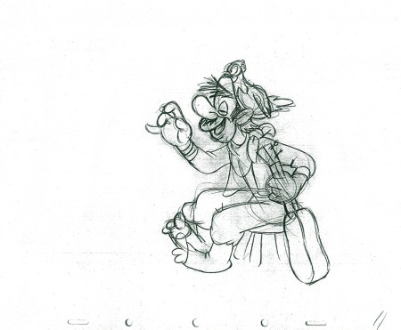
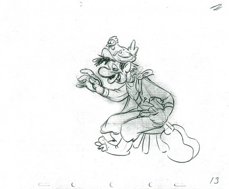
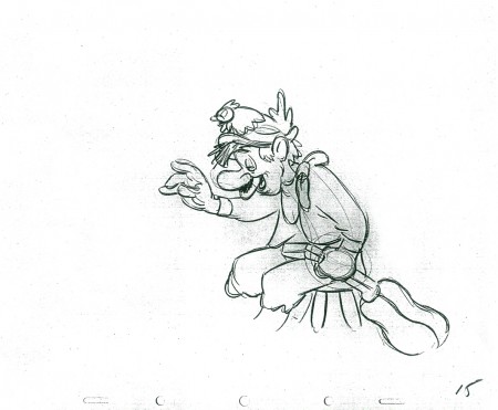
Category ArchiveAnimation
Animation &Independent Animation &SpornFilms &T.Hachtman 16 Oct 2011 06:29 am
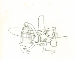
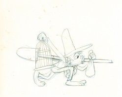
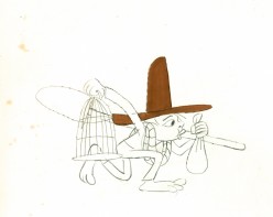
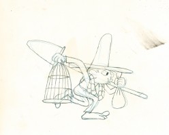
Pabs’ First Burger
With the opening of the Gertrude show in Washington D.C. at the National Portrait Gallery, I thought it worth celebrating our relationship with Tom Hachtman, the cartoonist who has developed the strip Gertrude and Alice and who has some pieces in this D.C. exhibit. Hence, I’m re-posting the tale of our animated journey.
- Back in the late ’70s, there was a local newspaper that competed with the Village Voice for the alternative audience. The Soho News was smaller and thinner, but had its own treasures. Some good writing and listings, and many excellent alternative comic strips. (Bill Plympton had a weekly strip in this paper before he started animating.)
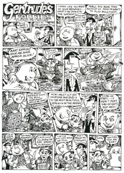
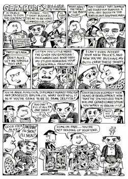
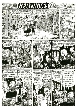
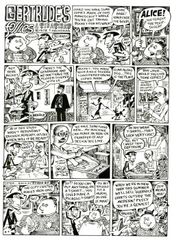
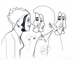
I fell in love with one comic strip called Gertrude’s Follies to the point where I waited 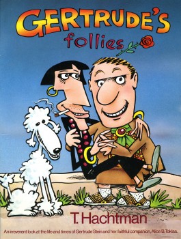 each week for the new issue and the new strip to hit to market. It was about Gertrude Stein and Alice B. Toklas and all the crazies that came into their lives – particularly Picasso, Hemingway and other iconic art types. It didn’t matter that Matisse and Capote didn’t meet; they were both available for the strip – as was everyone else.
Finally, after enjoying it for so long, I decided to locate the cartoonist behind it, and see whether he was interested in developing a storyboard and script for a feature. Maybe we could get some low-budget financing.
Tom Hachtman was the cartoonist, and he was a brilliant artist. His wife, Joey Epstein, was another fine artist. The two entered my life at this point, and some interesting things developed.
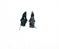
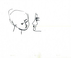
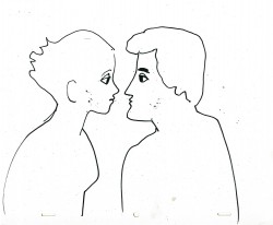
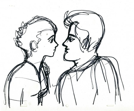
Gertrude’s Follies was an ongoing project. Tom worked with Maxine Fisher, who has been my writing partner through all the years of my studio. The two of them developed a couple of themes from the mass of strips that had been done and started to weave a storyboard. Tom left 4 or 5 panels of each 6 panel page empty, and I constructed and reconstructed story around them. Sometimes I would draw more material, sometimes I would take some away. It was real fun.
The Soho News folded, and no one really picked up the strip. It ran for a short time in The Advocate. Tom was able to publish a collected book (see the cover above.) You can still locate a rare copy on line.
Some newer, color copies of the strip can be found on line here.
Tom also does some political cartoons for the site here.
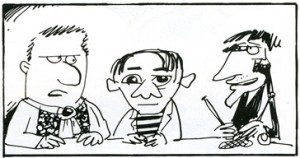 The movie never went into production. I couldn’t raise the funds – my inexperience. We did make one short segment – a two minute piece that was the most hilarious strip. Sheldon Cohen, an animator I met at the Ottawa 76 festival, came to NY when I offered him a job on Raggedy Ann. Sheldon, ultimately, did a number of films for the National Film Board which you can watch on-line if you click on his name.
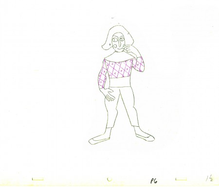
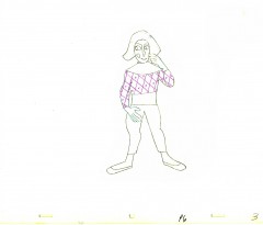
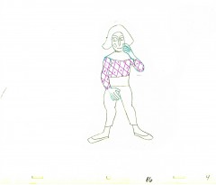
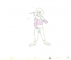
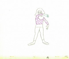
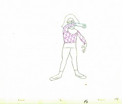
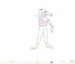
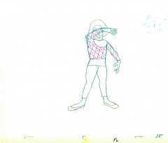
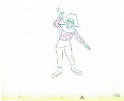
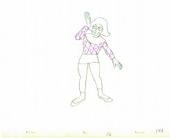
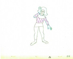
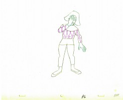
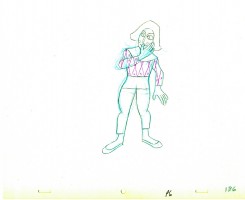
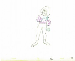
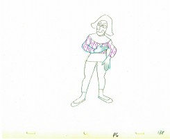
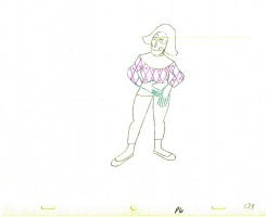
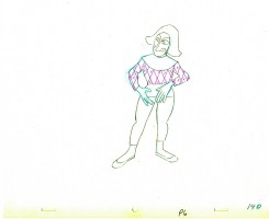
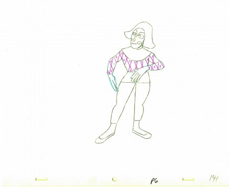
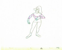
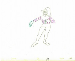
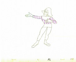
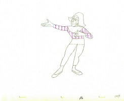
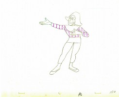
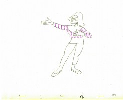
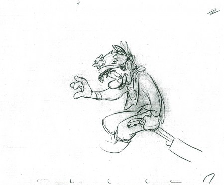
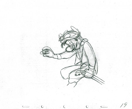
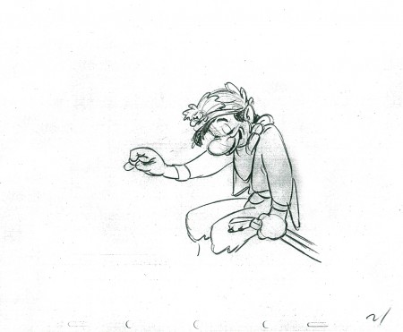
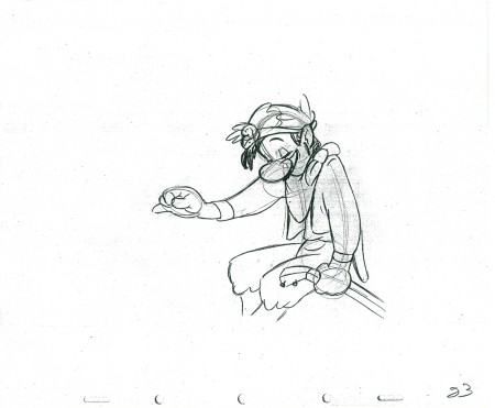
Sheldon animated this particularly funny strip. It took a while for him to animate it, and by the time he was finished, the feature had died and I had lost some interest. Years later I inked and painted it and had it shot. The short piece was never finished, though I still think about doing that.
Tom also recently gave me a funny strip about Pablo Picasso sculpture for which I’ve finished a storyboard and animatic. Hopefully, I’ll get the energy to animate it.
Aside from Gertrude, both Tom & Joey worked on a number of my films and still infrequently do. The two have painted many murals on the Jersey Coast, where they currently live. Tom has been a political cartoonist for the NY Daily News, has done lots of airbrush work for Bob Blechman when the Ink Tank was in operation. He also has done quite a few cartoons for The New Yorker magazine.
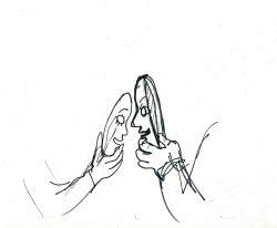
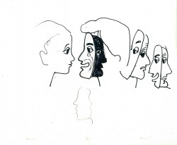
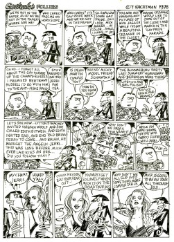
Here are a few of the strips to give you the flavor. Perhaps next week I’ll give a sample of our storyboard, comparing it with some of the actual strips. Enjoy.
 1
1 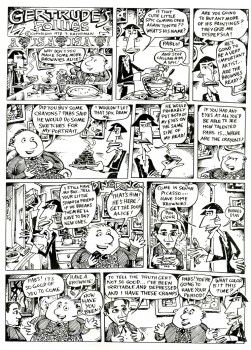 2
2
(Click on any image to enlarge so that you can read the strips.)
.
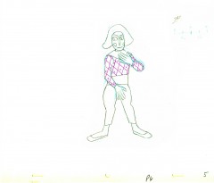
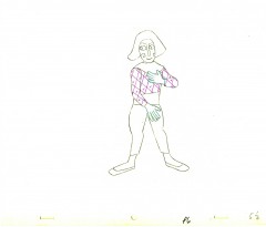
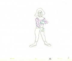
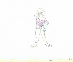
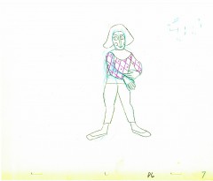
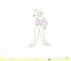
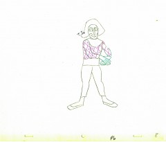
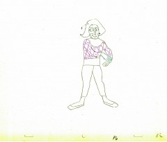
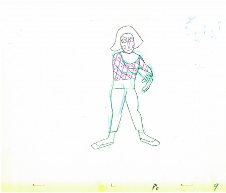
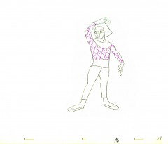
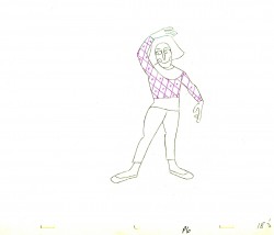
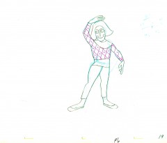
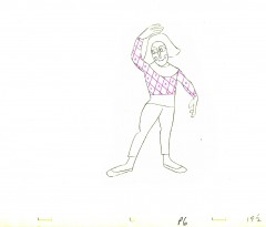
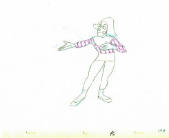
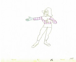
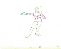
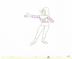
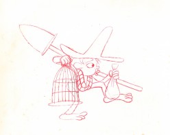
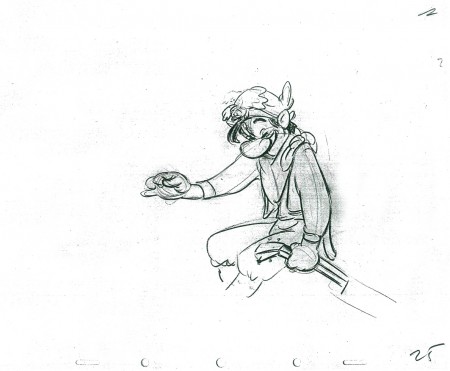
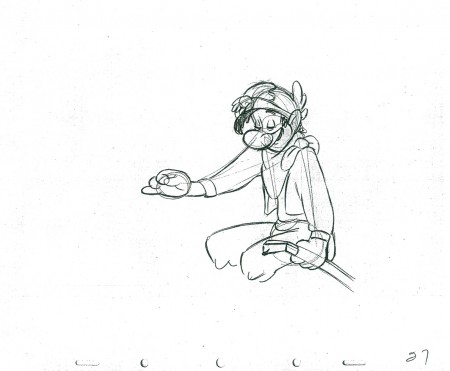
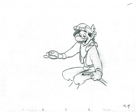
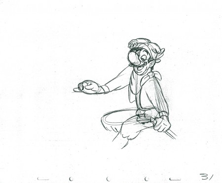
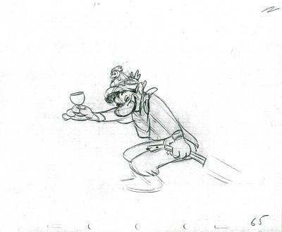
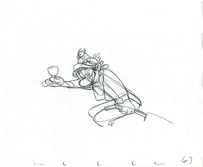
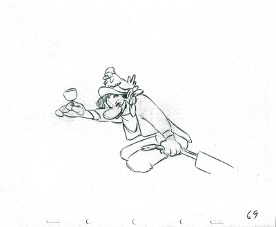
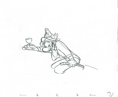
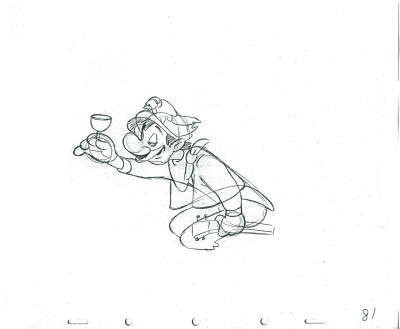
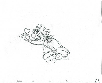
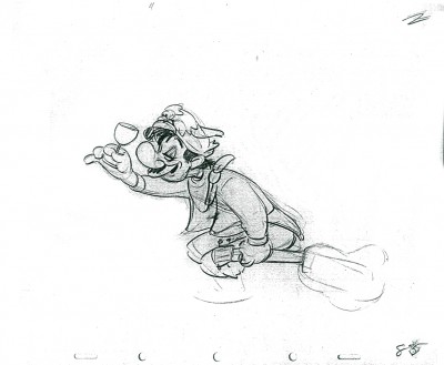
We did ultimately complete the short film, called “Pabs’ First Burger.”
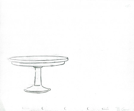
Tom Hachtman did the backgrounds and Matthew Clinton did the animation.
Here’s a small QT view of that short:
Animation &Animation Artifacts &Hubley 06 Oct 2011 06:46 am
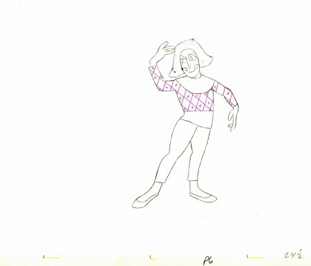
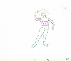
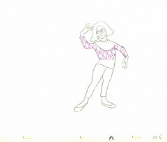
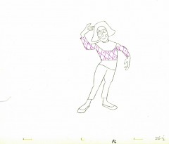
Babbitt’s Carousel Mime – revisited
- John Hubley appreciated great animation, and consequently hired only the best of animators to work for him. During his commercial heyday in the ’50s Emery Hawkins, Art Babbitt and Bobe Cannon were regulars animating his spots. When he moved to the short subjects, Bill Littlejohn, Babbitt, Tissa David, Bobe Cannon, Barrie Nelson and Phil Duncan did a lot of the work with others such as Ed Smith and Gary Mooney filling the bills.
On Everybody Rides the Carousel, Art Babbitt animated the introductory scene and was displeased with what happened to the very long scene. He left the film and Barrie Nelson took over the character he was animating, the Mime/Narrator of the film.
In five past posts (Sept. 2010) I put up all the drawings of the scene and added a QT movie. Rather than post all those drawings again, I offer the first and the fifth parts of the piece and give you links to the other three if you want to study the drawings more closely.
- John Hubley‘s feature film, Everybody Rides the Carousel, was adapted from Erik Eriksons’ Eight Stages of Man, a Psychosocial Theory of Human Development.
The Hubleys designed the feature (which started out as three half hours for CBS and then was rushed to fill it to 90 min feature length in the final 3 months of production) around a carousel. 8 horsees represented different stages of life. The narrator was a mime we see throughout at the carousel. Art Babbitt was hired to animate him, and things got bad pretty quickly and he left after animating a couple of early scenes. Barrie Nelson completed the character in the show.
John took one look at the pencil test of this scene on a movieola and proclaimed it to me as the greatest animation he had ever seen. It wasn’t long that he took the scene – basically exposed on twos throughout – and asked me to change it exposing it on four frame dissolves throughout. This would extend the scenes and the character and would milk the scenes for everything possible. Art Babbitt was furious and never spoke to John again. For the full story go to this past post.
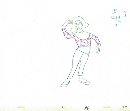
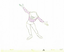
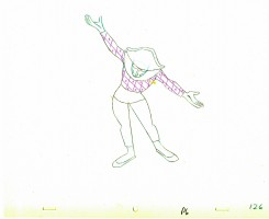
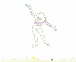
The scene is about 200 drawings long. I’ll break it into parts and post each part here in about 4 or 5 segments. Here’s the first part. As you can see there are a lot of ½ drawings. Animation extender – it’s a very slow moving character. A lot of poetry.
The QT will be done using Art’s exposure on twos.
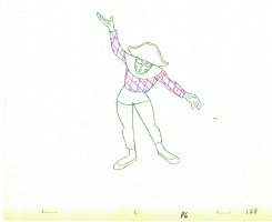
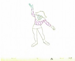
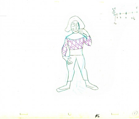 1
1(Click any image to enlarge.
 E1
E1 E5
E5
There are five pair of eyes; I give you the first and last.
______________________
Part 4
Part 5 follows:
- The Hubley feature film, Everybody Rides the Carousel, was adapted from Erik Erikson‘s Eight Stages of Man, a Psychosocial Theory of Human Development.
The Hubley conceit was to make the 8 stages of life as a carousel with 8 horses representing those different stages. The narrator was a mime and was animated, at first, by Art Babbitt, with Dave Palmer as his personal assistant. After animating a couple of early scenes, Babbitt left annoyed. Barrie Nelson completed the character in the show.
For the full story behind the rift between Hubley and Babbitt go to this past post.
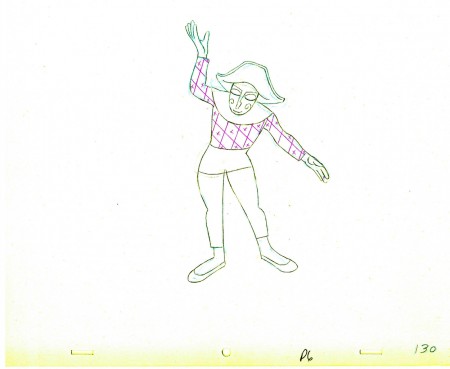
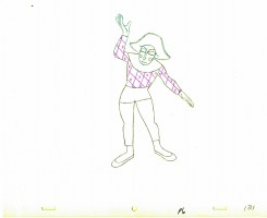
The scene is 152 drawings long. This is the final section as the mime comes to rest. It’s a very slow moving character with short quick spurts of movement.
We begin with the last drawing from last week, #123.
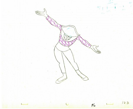 123
123(Click any image to enlarge.) ______________________
The following QT movie represents all of the drawings in the scene
exposed as Babbitt wanted them, on twos.
Right side to watch single frame.
You can watch this scene from the final film here.
Animation &Animation Artifacts &Hubley &repeated posts 05 Oct 2011 06:55 am
Seeding revisited
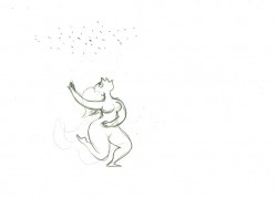
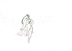
- Tissa David did a lot of animation for the Hubleys from about 1958 through 1977. She did whole films on her own and EGGS is one of them. I posted this cycle a few years back and to tie it in with my piece on Monday and leading up to the Hubley retrospective, I’m posting it again, today. I think it’s wonderful.
-Tissa David animated the entire film for John & Faith Hubley. This short, as I said in previous posts, was done for PBS’ Great American Dream Machine for producer, Elinor Bunin. As Bob Blechman verified, they were given very little money and time to do an 8 min. short. The Hubleys gave life to the short by putting it on the theatrical and festival circuit.
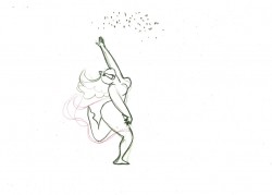
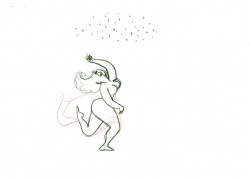
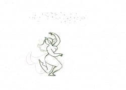
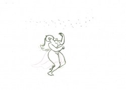
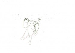
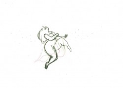
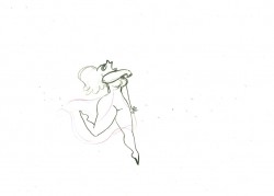
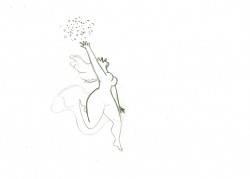
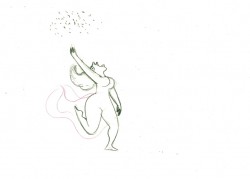
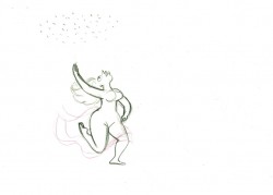
Here’s a rough run cycle Tissa did for the Goddess of Fertility, who goes about inseminating the world with her seed. Tissa adds to its eccentricity with having the low point in the cycle the passing drawing. She comes up as each leg hits the ground.
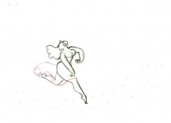 1
1 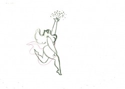 2
a “Goddess” run cycle from Eggs
2
a “Goddess” run cycle from EggsOn threes at 24FPS
Click left side of the black bar to play.
Right side to watch single frame.
Animation &Animation Artifacts &Hubley &Independent Animation 21 Sep 2011 06:48 am
Marky’s walk – recap
After posting a large piece about Moonbird last Monday, I felt inclined to recap this Bobe Cannon walk from the film. I love it. Originally posted March, 2009
 - If I had to choose who was my favorite animator, I’d have a tough time. Equal credit would probably have to go to three different people: Bobe Cannon, Tissa David and Bill Tytla. Ed Smith and Jim Tyer would fall just a smidgen below these three, for me. But there are none like them all, as far as I’m concerned.
I’ve posted a lot of drawings from Tissa and Bill Tytla, but have very few drawings by Bobe Cannon (nor have I seen many published anywhere.)
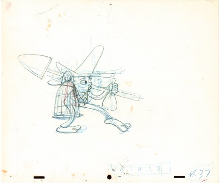
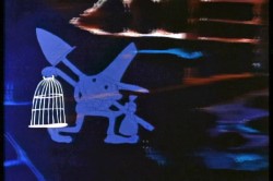 Here is a walk cycle from the beginning of Hubley’s monumental short, Moonbird. The odd numbers are extremes by Cannon, and the inbetweens (even numbers) were done by Ed Smith. Three different sized papers were used for this, and you can view them full sized if you click the thumbnails.
You’ll notice there’s paint all over the drawings. The ink & paint involved tracing the drawing, then using oil paints to cover all of the clear area in black. Some of that paint seeped onto the originals. In one drawing even to coloring the hat accidentally.
 37
37(Click any image to enlarge.) “Marky” walk cycle from Moonbird
On twos at 24FPS
Click left side of the black bar to play.
Right side to watch single frame.
There’s a lot more to this scene including several variants on the walk.
At some future time, I’ll add the other drawings to show off the entire scene.
Animation &Animation Artifacts &Hubley &Tissa David 14 Sep 2011 06:51 am
Carousel’s Lovers – recap
This is one of my favorite sequences in the Hubley canon. Animated by Tissa David.
It’s worth a repost: the original appeared here in June, 2009.
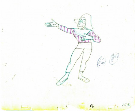
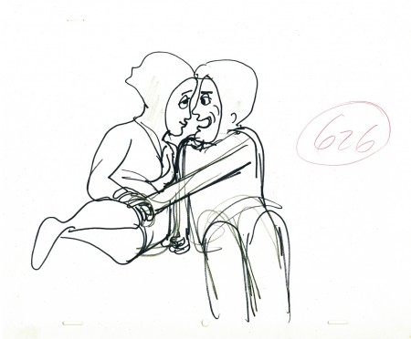
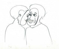
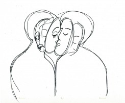
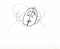
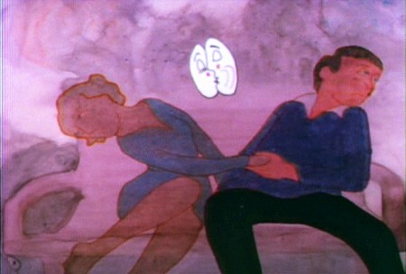
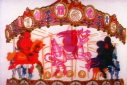 - Let’s take a look at the scene in Hubley’s Everybody Rides the Carouselwherein the young lovers have had a spat and try to have a romantic scene despite the fact that neither of them wants to do that.
They’ve argued over the girl having cut her hair without telling the boy. He’s annoyed and she laughs at him. They push on to a frothy conversation. Both put on masks to continue the conversation while the inner characters
 are annoyed and have an inner monologue. They get to the point where they can’t take the masks off and end pulling away from each other.
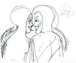
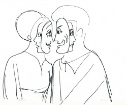
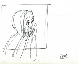
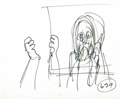
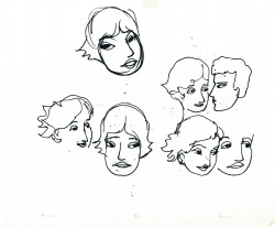
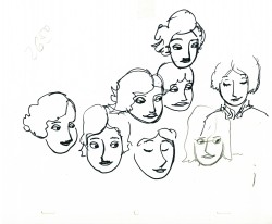
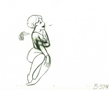
I’ve gathered John Hubley‘s layouts for this sequence. Tissa David animated them. You’ll note that the pencil numbers are a scene breakdown done in Tissa’s handwriting. The very loose drawings were done with a sharpie or pencil. The pencils would have been done while in handing it to Tissa during the conversation. They’re to delineate some point in greater detail for her.
I’ve also pulled some frame grabs so you can see how it was finally rendered. The coloring was done on vellum and shot bottom light. No more than 3 levels were used (including the background.) Tissa, aside from concerning herself with the dramatics of the scene, had to watch that the characters didn’t overlap. More complication for her.
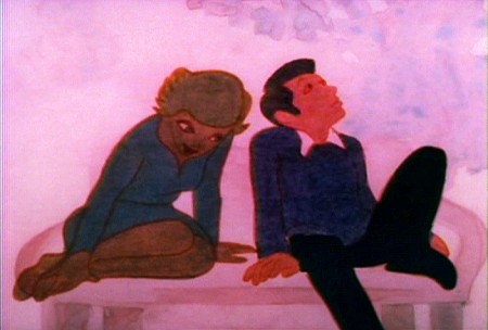
(Click any image to enlarge.)
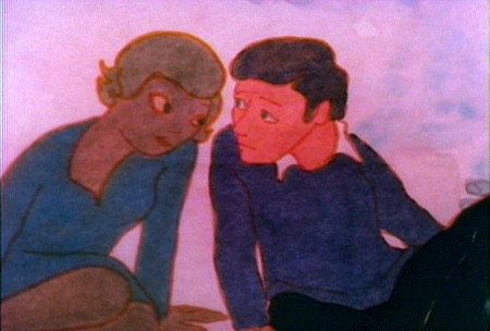
By the way, this was Meryl Streep’s first screen performance.
Charles Levin, another NY character actor, played the boy.
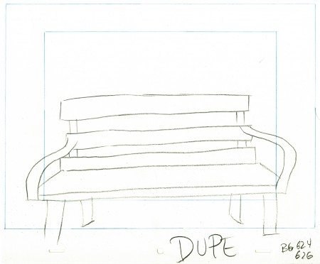
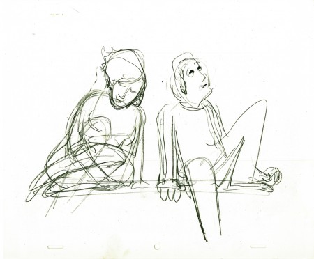
Here’s the park bench.
A quick rough copy by me to Tissa of John’s Bg LO.
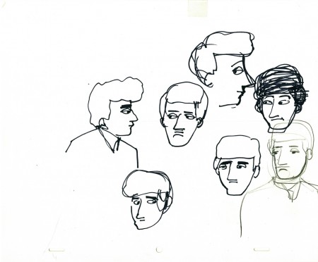
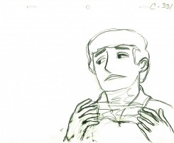
John’s model of the boy’s head for Tissa.
Animation &Disney &Frame Grabs 12 Sep 2011 06:34 am
Giantland
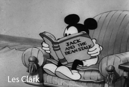
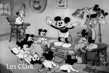
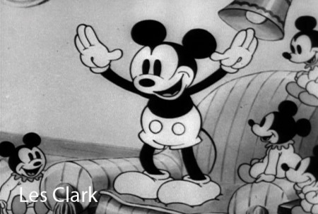
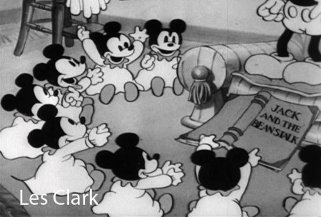
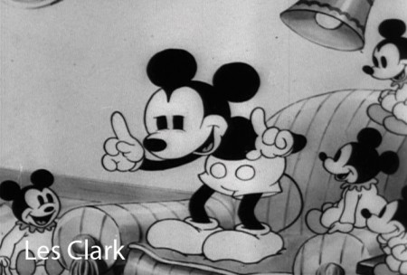
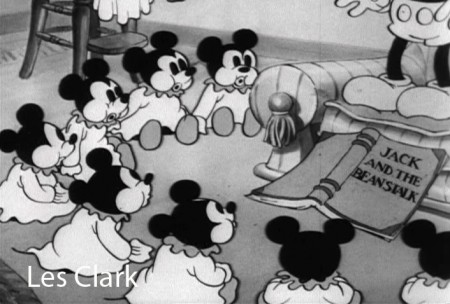
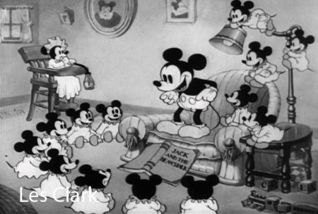
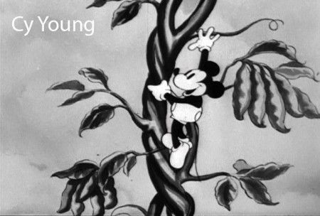
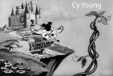
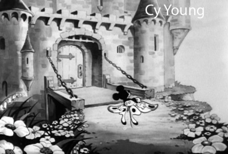
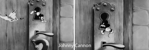
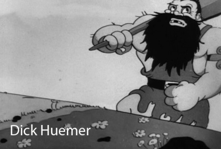
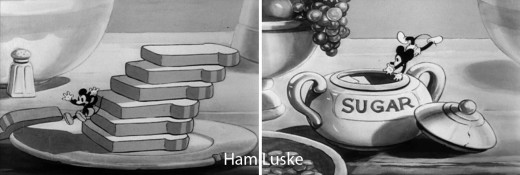
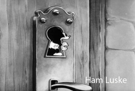
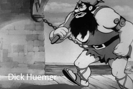
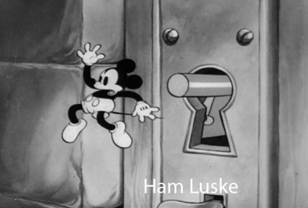
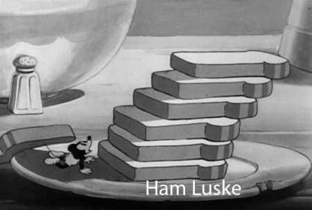
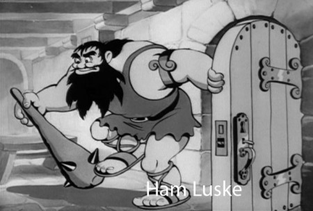
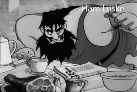
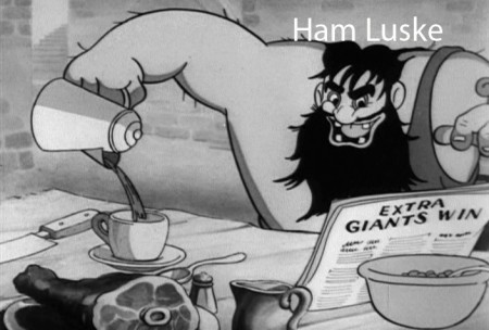
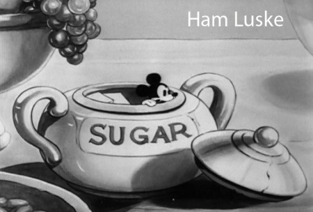
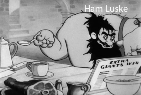
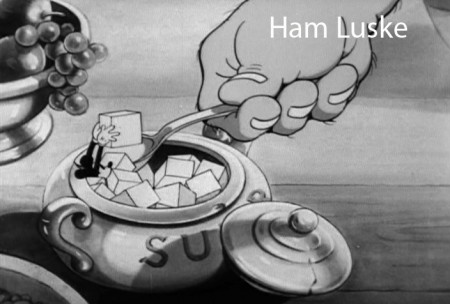
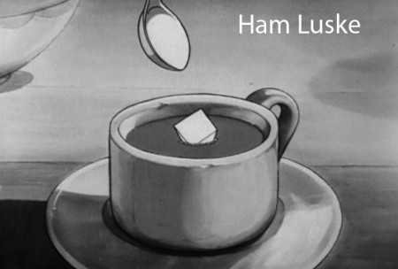
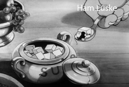
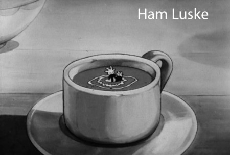
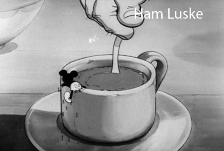
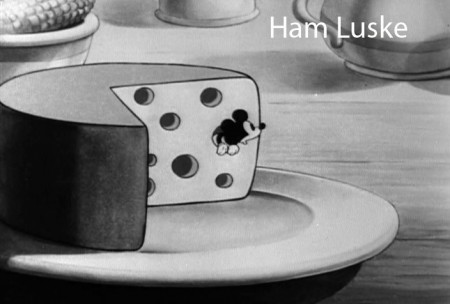
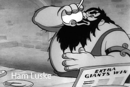
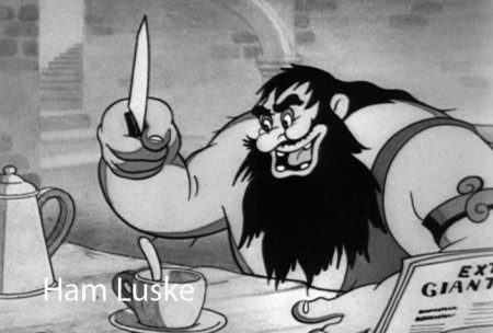
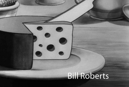
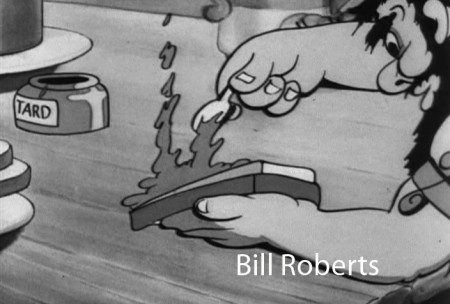
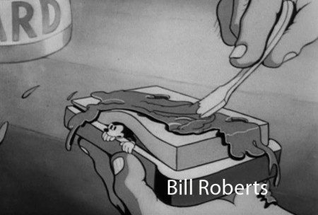
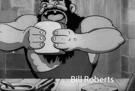
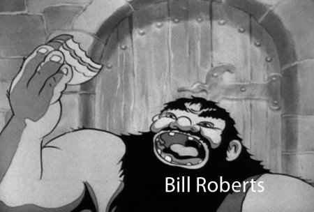
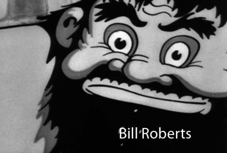
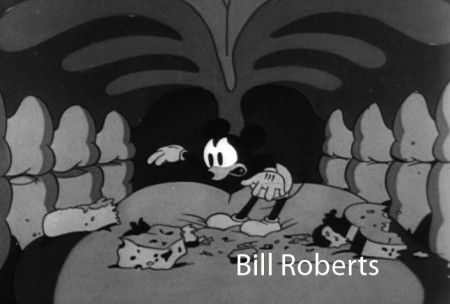
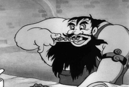
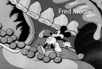
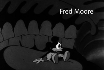
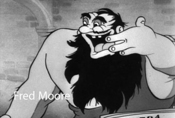
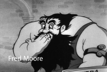
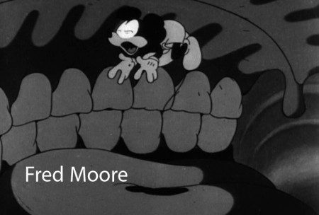
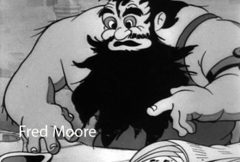
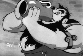
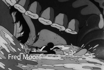
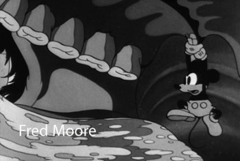
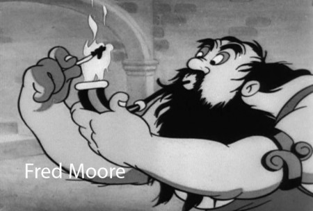
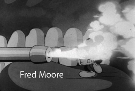
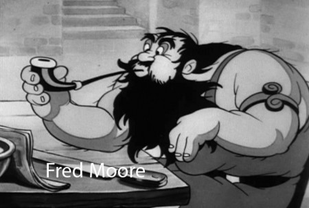
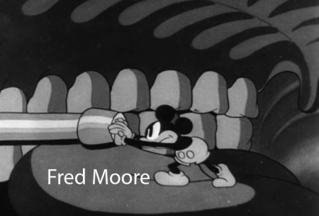
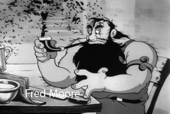
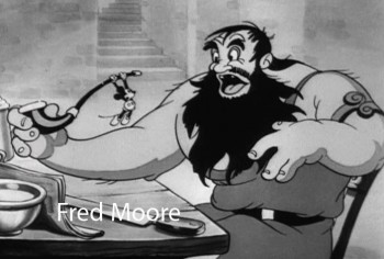
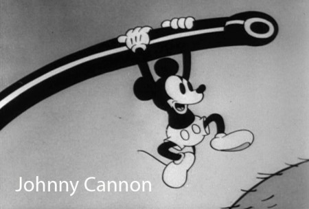
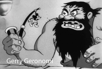
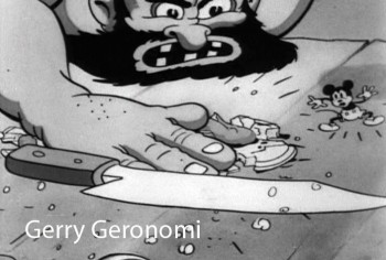
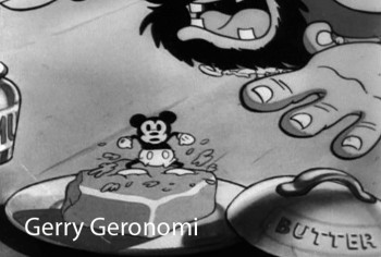
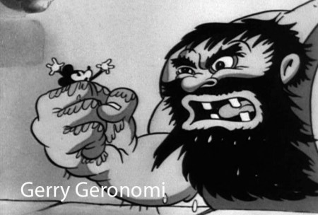
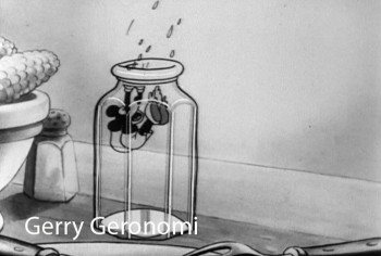
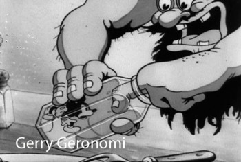
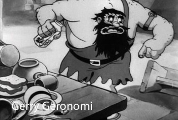
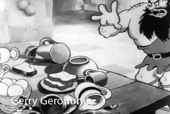
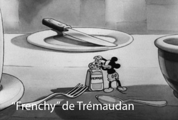
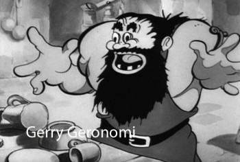
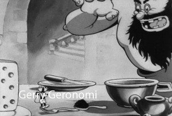
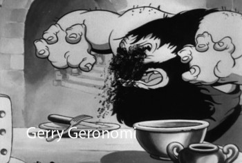
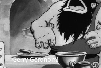
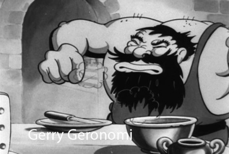
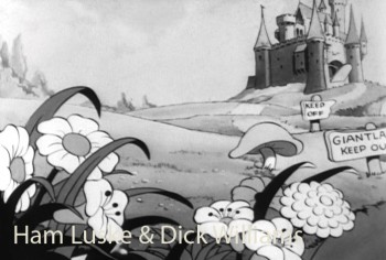
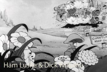
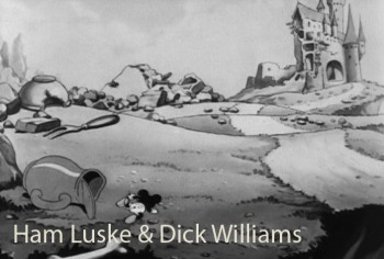
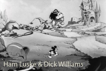
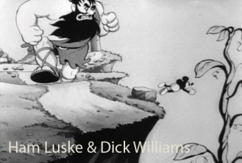
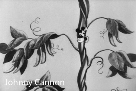
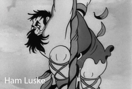
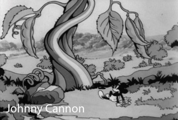
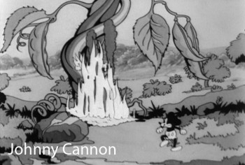
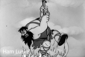
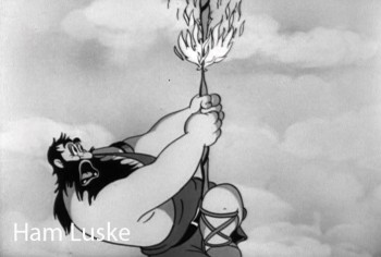
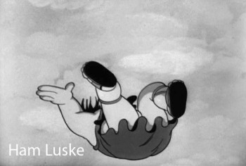
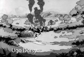
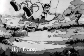
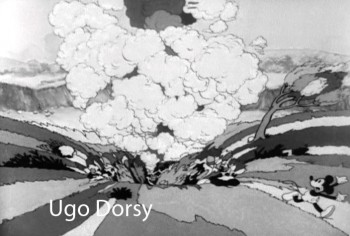
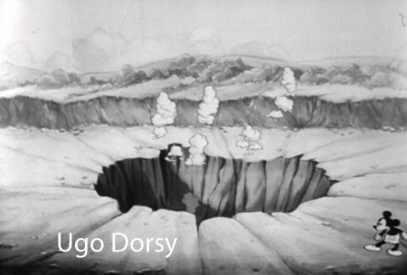
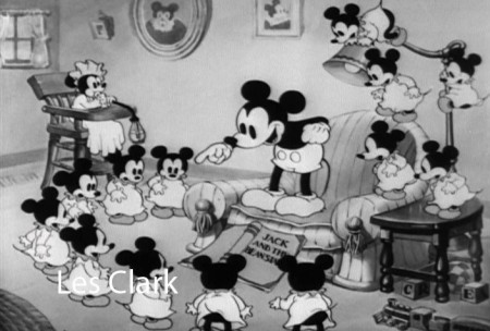
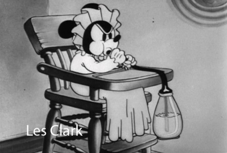
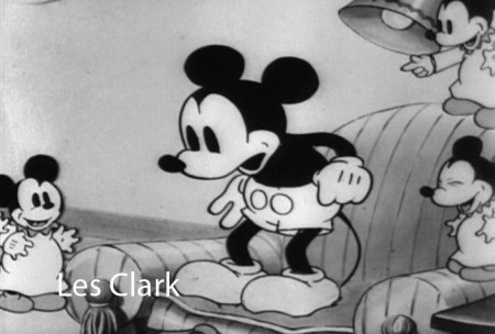
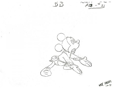
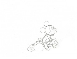
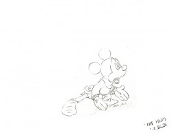
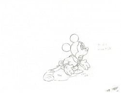
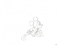
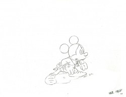
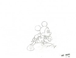
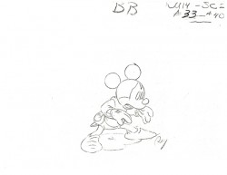
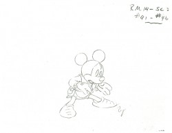
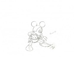
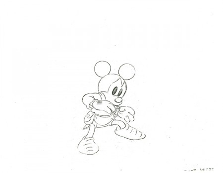
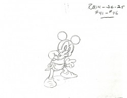
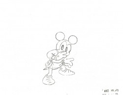
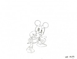
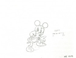
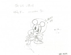
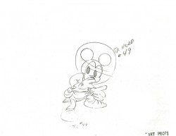
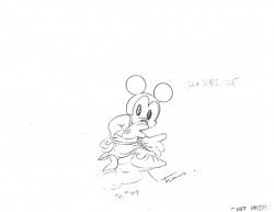
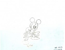
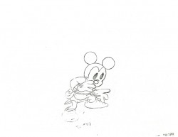
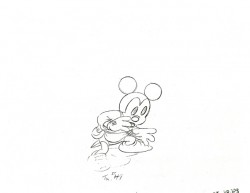
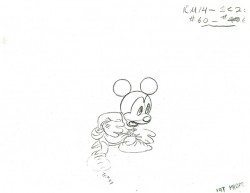
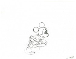
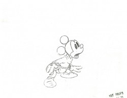
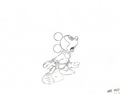
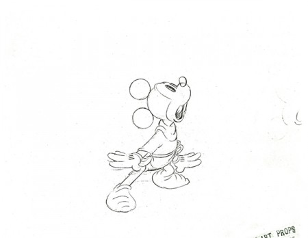
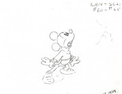
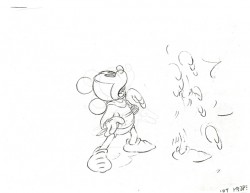
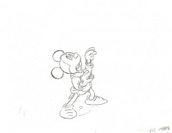
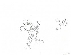
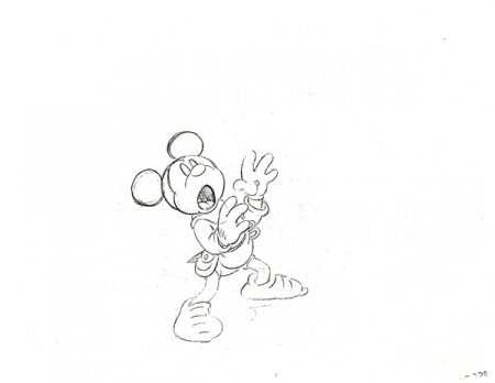
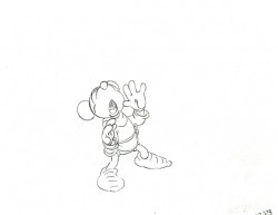
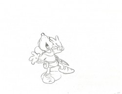
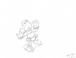
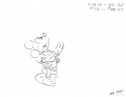
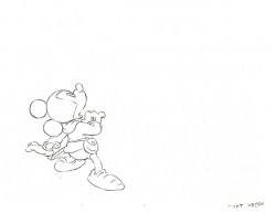
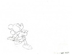
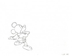
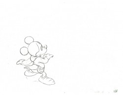
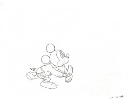
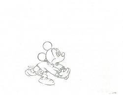
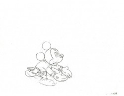
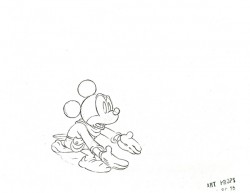
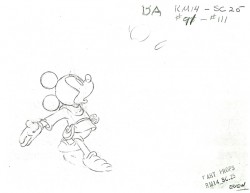
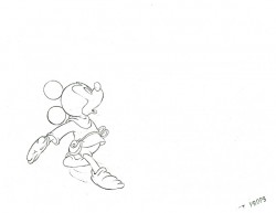
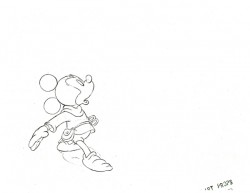
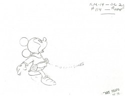
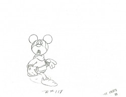
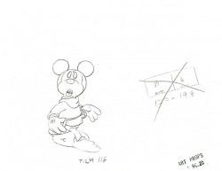
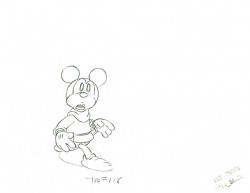
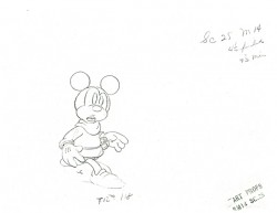
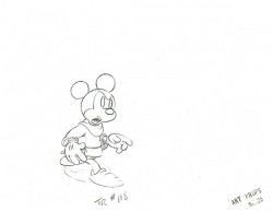
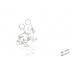
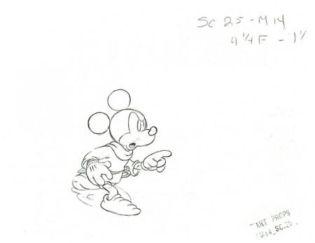
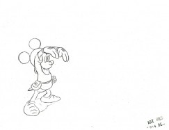
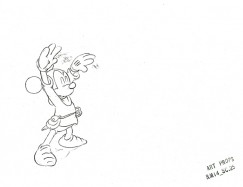
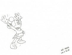
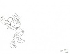
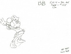
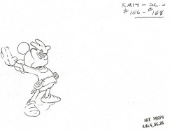
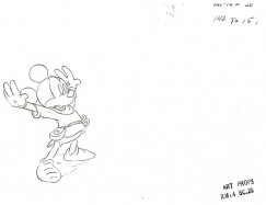
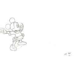
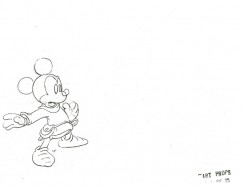
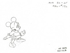
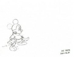
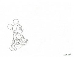
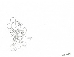
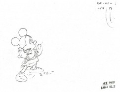
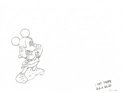
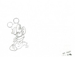
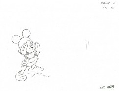
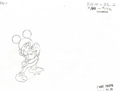
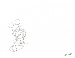
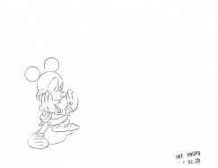
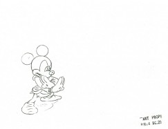
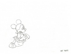
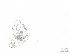
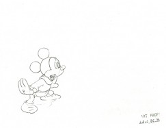
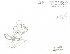
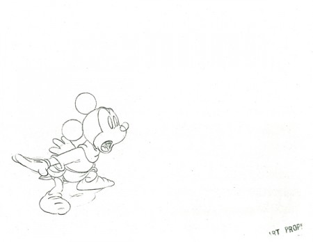
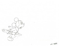
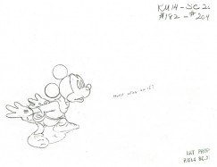
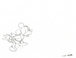
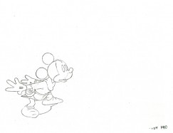
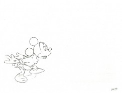
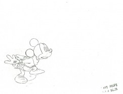
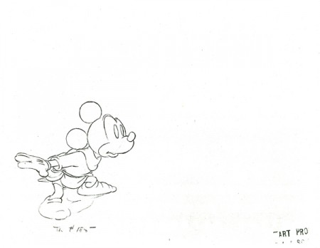
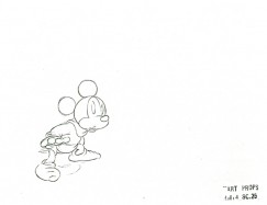
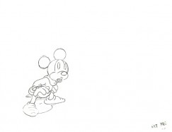
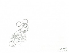
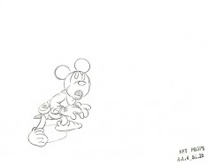
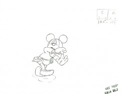
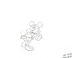
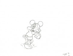
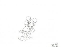
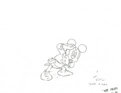
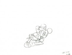
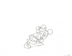
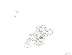
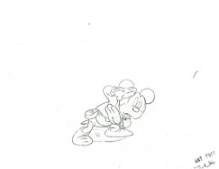
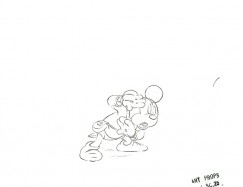
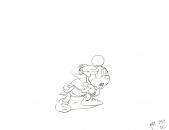
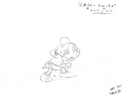
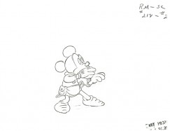
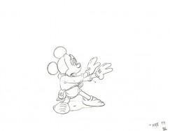
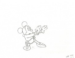
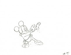
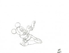
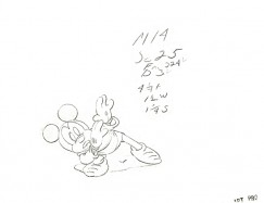
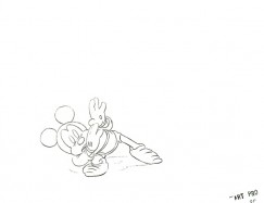
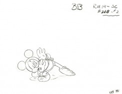
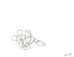
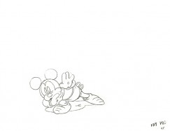
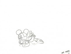
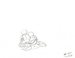
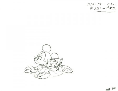
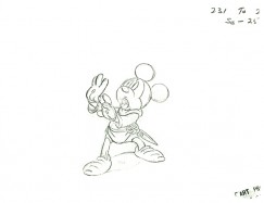
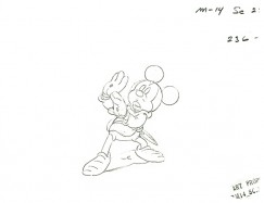
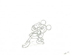
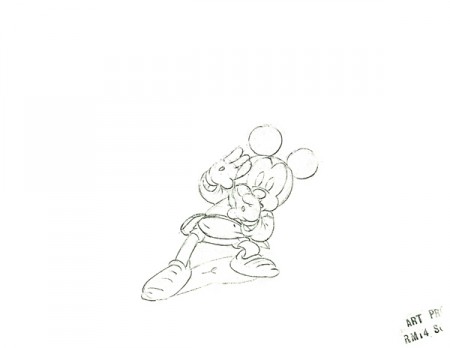
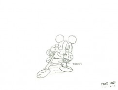
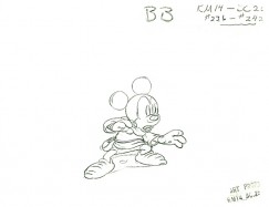
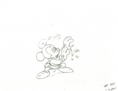
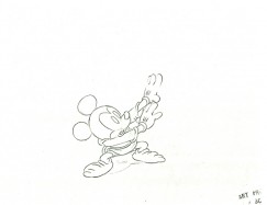
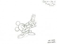
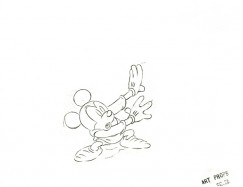
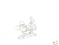
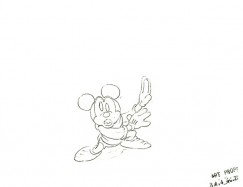
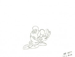
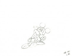
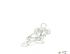
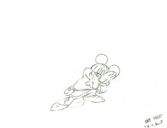
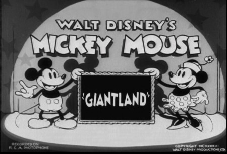
 - For the past couple of weeks, Hans Perk at A Film LA has featured the animator drafts for the Disney short, Giantland. I’ve taken the opportunity to pull some frame grabs and label the animator for each particular scene. The original drafts have the film titled at “Mickey and the Giant.”
The film was directed by Burt Gillett and released on 11/25/1933.
The animation was by Les Clark, Cy Young, Johnny Cannon, Dick Huemer, Ham Luske (one scene with Dick W[illiams]), Bill Roberts, Fred Moore, Gerry Geronimi, Gilles Armand “Frenchy” de Trémaudan, Ben Sharpsteen, and Ugo D’Orsy.
Here’s the YouTube version:
_________________
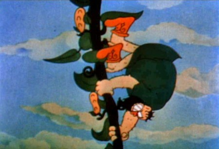
The Ub Iwerks short, “Jack and the Beanstalk” is interesting in that Castle Films distributed the 8mm & 16mm home movie versions of the short duriing the 50s and 60s. This allowed the Iwerks film to be more familiar to many people today. I actually studied the film frame-by-frame dozens of times when I was a kid. I got to tell Grim Natwick that his was the first animation I ever really studied.
The film had many similarities, but the approach was very different. By this time, the Disney studio was trying to improve themselves. Cartoon fantasy such as buzzing saws, representing sleep, and the tips of shoes opening to reveal smelly toes, would not be part of the Disney approach. There was more realism, hence better acting, in the Disney shorts. Iwerks hung fast to the fantasy, just as the Fleischer films did so into the late 30s.
The Iwerks film was in color (albeit Cinecolor.)
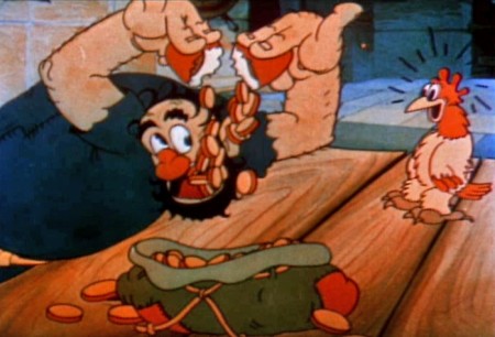
It’s amazing how similar yet very different the Iwerks short,
Jack & the Beanstalk is. The Disney studio seems to have
gone for a more realistic approach, while the Iwerks’ team
delved more into the cartoon fantasy of the animation.
Animation &Animation Artifacts &Disney 07 Sep 2011 07:16 am
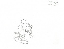
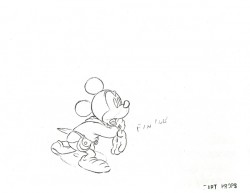
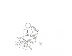
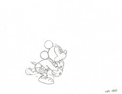
Thomas’ Mickey’s Tailor – recap
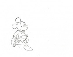
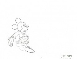
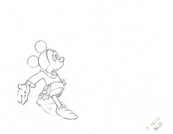
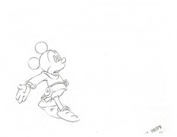
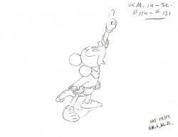
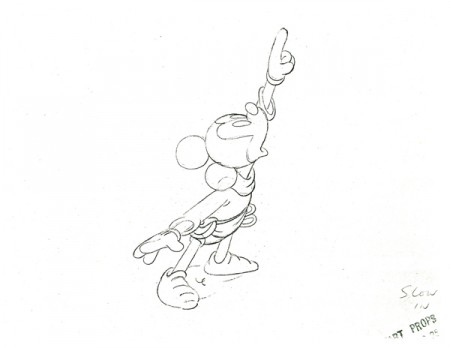
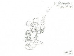
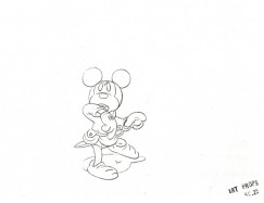
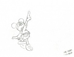
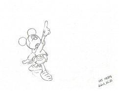
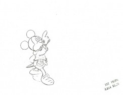
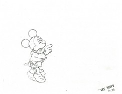
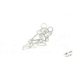
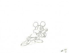
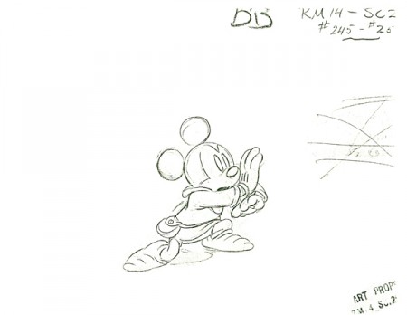
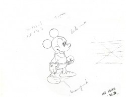
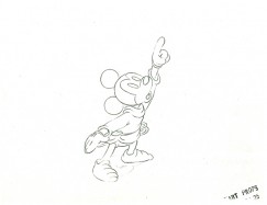
- This is the brilliant scene by Frank Thomas from the excellent Mickey short, The Brave Little Tailor. This scene is one of the highlights of that film. This scene made me realize how great an animator was Frank Thomas. For too many years I took his work for granted; this scene changed it all for me. I had to reevaluate everything he’d done.
In its entirety the scene’s about 250 drawings long, a long one. Many thanks to my friend, Lou Scarborough, for the generous loan of his xeroxed copies.
.
 1
1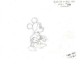 2
2
 130
130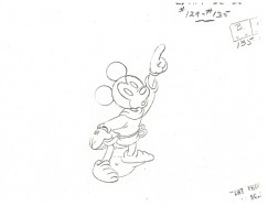 131
131
(Click any drawing to enlarge.)
The following QT movie represents all 246 drawings of the scene.
Click left side of the black bar to play.Right side to watch single frame.
Animation &Animation Artifacts &Disney &Tytla 31 Aug 2011 06:55 am
Tytla’s Laughing Gauchito – a recap
- In the past few weeks, I’ve been recapping all of the Bill Tytla scenes I’d posted in the past. This is the last of those done for Disney, and I’m pleased to have it back up again. I’ve taken both parts of the original post and have incorporated them into this one.
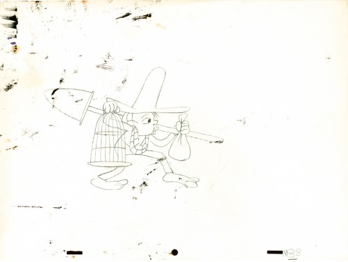
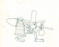
- In March of this year, I posted, in three parts, Frank Thomas‘ animation on the short that never went to completion, The Laughing Gauchito. John Canemaker brought me Bill Tytla‘s scene from this very film, and I’m posting all of the drawings here. As I’ve said, Frank Thomas animated his beautiful and emotional scene and Tytla did this one for a film that Disney, himself, cancelled. He felt it was too much a one gag story.
This one came with the exposure sheets!
You should look into J.B. Kaufman’s excellent book, South of the Border; it gives a full accounting of this film.
Here’s the artwork.
The Background
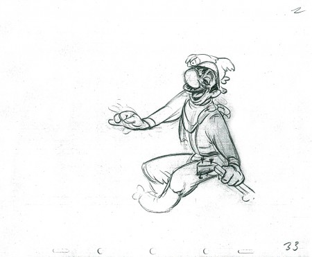
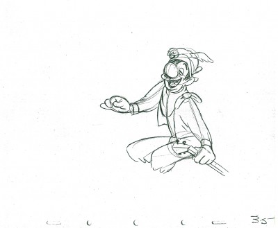
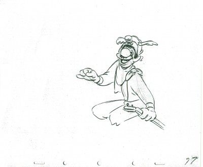
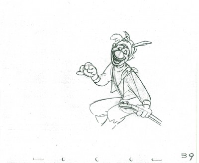
 1
1 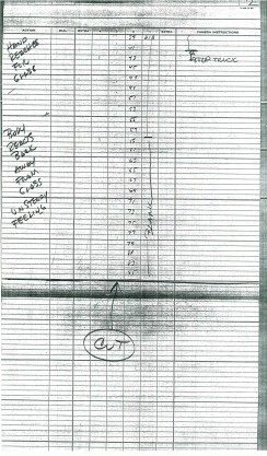 2
2
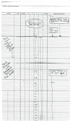
These are the X Sheets for the scene.
Here’s a QT of the scene with all the drawings included.
These are the links to the Frank Thomas scene: Part 1, Part 2, Part 3
Many thanks to John Canemaker for the loan of the scene.
Animation &Independent Animation 25 Aug 2011 07:26 am
Note from Borge
- Mike Barrier had posted a great letter from Borge Ring about David Hand and animation timing. I responded with a short note. I thought I’d written that I wish Hand, who had an enormous knowledge of animation, had said more about the subject in his autobiography. Instead, the book was about his life not about the work he did for his life. Borge Ring misunderstood my badly worded comment on the site, and wrote a letter to me about it. A couple of letters later, things were straightened out, and Borge had written even more wonderful stuff about David Hand’s knowledge. I asked to print that note, and Borge gave permission.
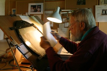 Dave (Hand) was good at rages. They say -When Walt toppled Dave’s well planned day schedule in midmorning, Dave stood at Walt’s office gripping the table with white knuckled hands.blasting Walt.
Disney later reminisced, “He didn’t know that I never loved him more than at those moments because he cared”
John Canemaker is bound to have Dave’s Cookham lectures – One of them deals specifically with exposure lengths.
I remember a remark:
“6 frames is a hold – 4 frames is neither hay nor grass.”
He never mentions 3 frames.
Preston Blair puts in 3s in the endscene of “Dance of the Hour ” – Croc twirling Hippo, but you don’t notice they are threes.
On request Dave talked about timing to a beat. (the old Jaxon gambit):
“Disney uses many beats but mostly 12 and 8 – because they are easy to break down into inbtws -”
An 8 beat (metronome on 180) with keys 1 – 9 – gets inbtw 5 in the middle and later 2 and 4 -
A 12 beat (metronome on 120) has 1 – 13 -with 7 in the middle
But Duncan and Littlejohn knew all of this and could have told you if you did not already know.
Dave was not very conversant with music and his musician told him to think in (numbered) bars of four beats each, and gave the following rule of thumb, “Place all strong accents on 1 and on 3 in the bar and you will never get me into trouble”
Dave added “You can place your strong accents wherever you choose as long as it makes sense musically.”
“When lengthening or shortening a passage on your barsheet, never add or subtract less than one beat.”
When adding a foot to the timing he did not rewrite the barsheet.
He cut out one line of a virginal barsheet wrote on it and stuck it on to the rim of the sheet. Therefore you got barsheets with “whimpers” sticking out or empty lanes if you had deleted some beats to shorten a passage.
When the barsheet was final he rewrote the numbers of all bars.
Dave animated a little film one afternoon – working to an 8-beat. He drew 1-9-17 -25-etc in very thin grey lines then added all inbtws thinly, flipped and went over the whole scene straight ahead with a fat black line.
He was fast like lightning though he had not animated since 1934
“How do you choose a director?” I asked
“You take a very good animator who is known for getting along with people.”
The new director doesn’t animate, and after awhile they begin to miss his good footage. “Animation developed by leaps and bounds and
after a year the other animators have passed him in quality.”
“Have any of you any experience in story?”
“Oh yes – Jensen and I storyboarded this guy’s script for a feature.”
“But that isn’t story. That is only continuity And that is easy – that is eh if.
Hand and Geronimi stuck to their pleasant style of timing when shorts directors like Jack Hannah sharpened theirs under influence from certain other studios.
Michael,
All this is memory debris that YOU no longer need – But I know It is a warm feeling to hear the “sound” of Old Gold from someone who was in Walt Disney’s studio when “the things” happened.
Kaj Pindal and Kimball were railway pals
“Ward give me the magic feather on animation.”
“Timing is everything,” was the answer.
greetz
Botge
A three stagger 123 -234 – 345 – when shot on twos makes the character look VERY heavy There is one such in “Robin Hood”
By the way, there’s also a wealth of information in Mike Barrier’s interview with David Hand on Mike’s site.
Animation &Animation Artifacts &Disney &repeated posts &Tytla 24 Aug 2011 07:09 am
Baby Mine recap
To continue with all things Tytla, here’s a representation of the “Baby Mine” sequence from Dumbo. This is one of my very favorite sequences in one of my favorite animated films. The newish Blue Ray version of this film is excellent except for one thing. The commentary on this disc pales in comparison to the 60th Anniversary DVD. The original was done solely by John Canemaker and is enormously informative. I wish John would just turn that track into a book.
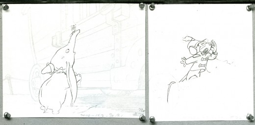
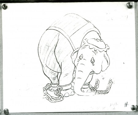
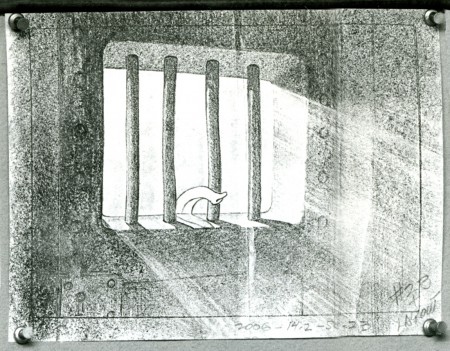
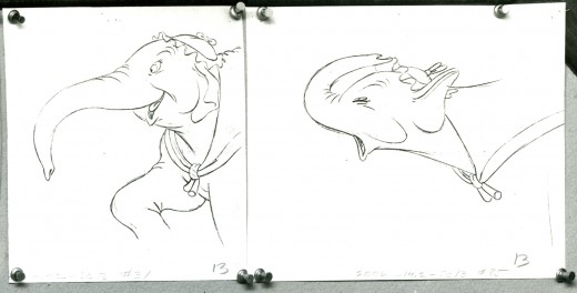
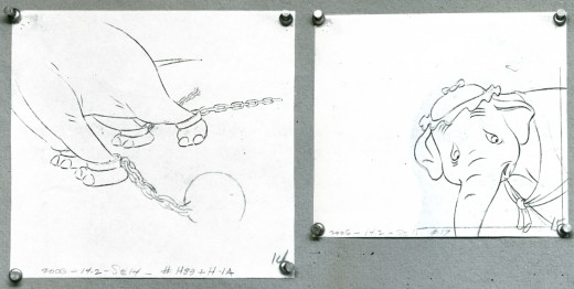
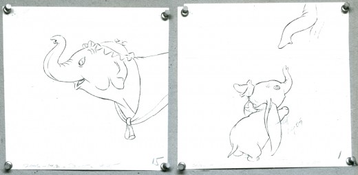
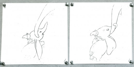
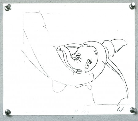
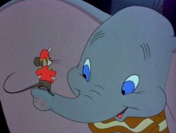 - Dumbo is certainly one of my favorite Disney features if not THE favorite. Naturally, the “Baby Mine” sequence is a highlight. The sequence is so tender and fine-tuned to appear straightforward and simple. This, of course, is the heart of excellence. It seems simple and doesn’t call attention to itself.
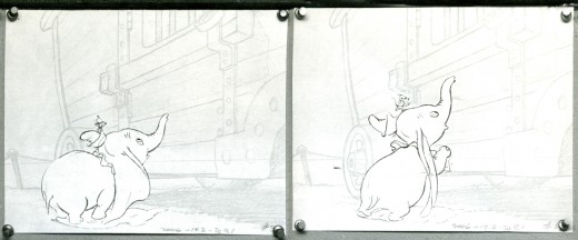
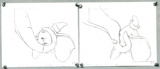
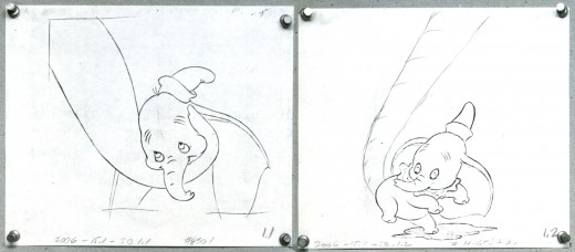
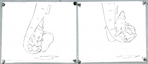
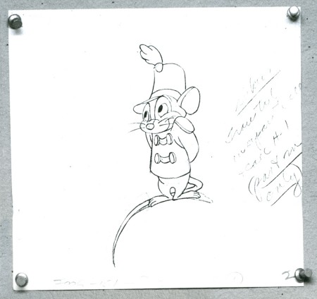
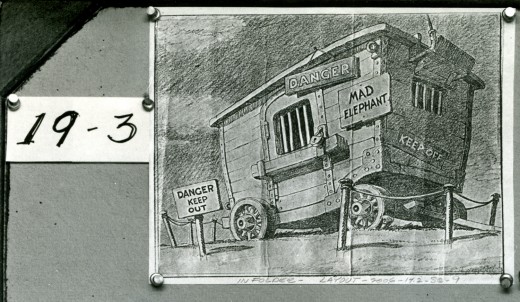
This is a storyboard composed of LO drawings from the opening of that sequence. They appear to be BG layouts with drawings of the characters cut out and pasted in place.
It’s not really a storyboard, and I’ve always wondered what purpose such boards served to the Disney machine back in the Golden Age.
Below is the board as it stands in the photograph.

_____________(Click any image to enlarge.)
Here is the same photographed board, split up so that I can post it in larger size. I’ve also interspersed frame grabs from the actual sequence for comparison.
Thanks to Steve MacQuignon for locating this video.
Info from Hans Perk at A Film LA:
Directed by Bill Roberts and John/Jack Elliotte, assistant director Earl Bench, layout Al Zinnen.
Animation by Bill Tytla (Dumbo & Mrs. Jumbo’s trunk), Fred Moore (Timothy) and assorted animals by Bob Youngquist, Harvey Toombs, Ed Aardal and John Sewell.
Hans Perk has posted the drafts for Dumbo, and this has led Mark Mayerson to post the brilliant Mosaics he’s created for the film.
