Category ArchiveAnimation
Animation &Books &Independent Animation 13 Mar 2012 07:59 am
This Sweater Is For You!
- Back in 1976, we were full of spunk and excitement. I attended the first Ottawa Animation Festival, that Summer, and watched Caroline Leaf become a superstar with her two brilliant films, The Street and How The Owl That Married the Goose.
At the time, I had fallen into the position of supervisor of Assistant Animators and Inbetweeners on the newly begun, Richard Williams feature, Raggedy Ann and Andy. While up in Ottawa, I never forgot that we needed help in NY.

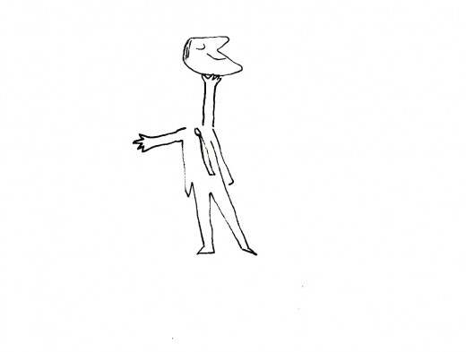
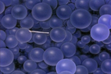
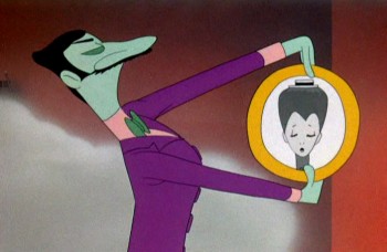
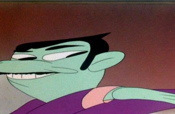
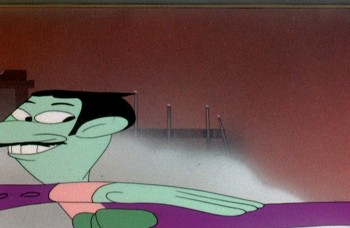
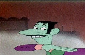
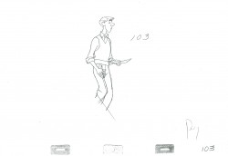
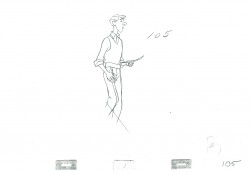
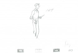
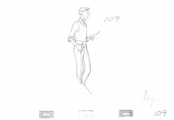
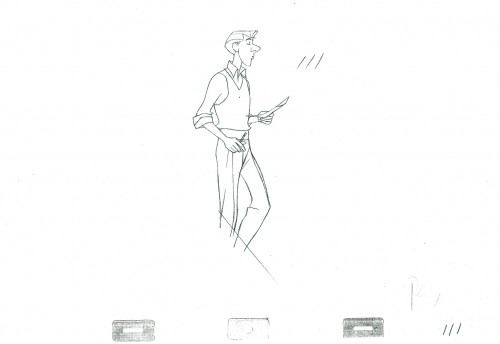
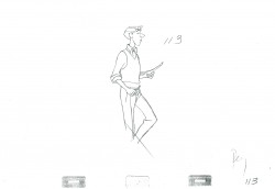
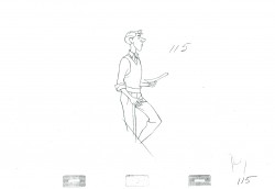
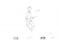
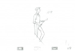
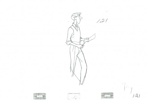
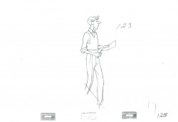
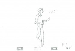
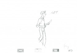
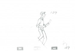
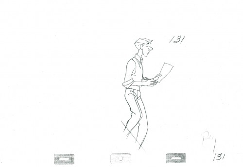
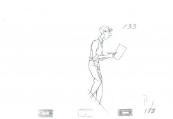
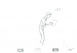
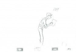
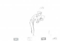
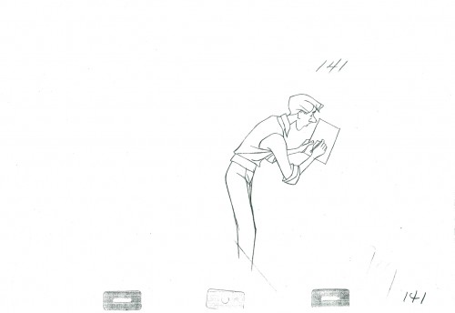
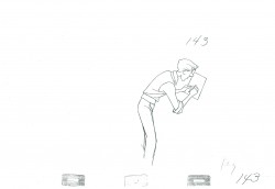
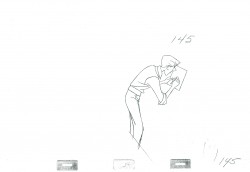
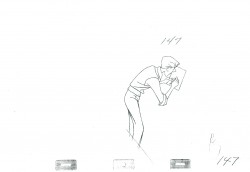
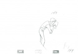
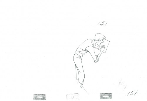
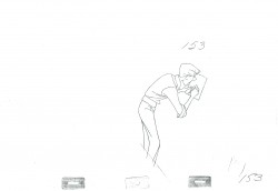
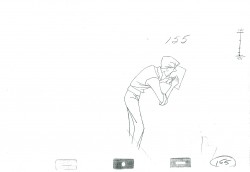
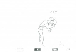
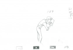
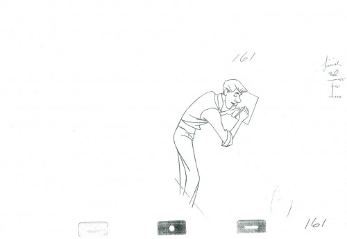
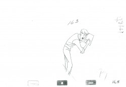
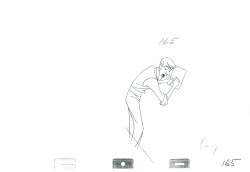
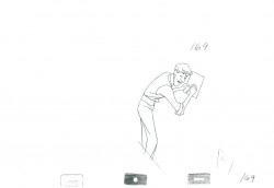
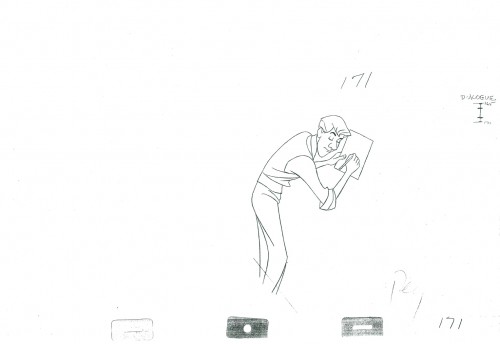
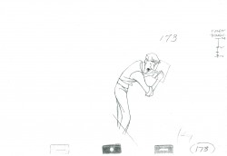
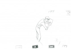
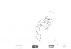
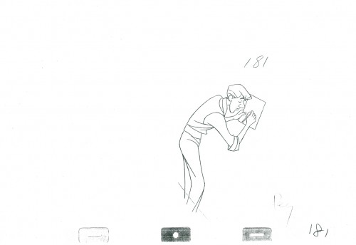
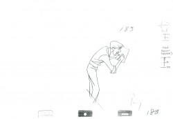
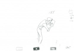
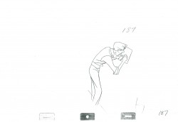
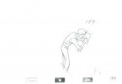
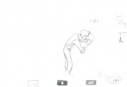
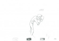
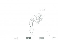
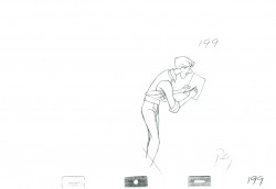
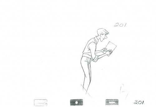
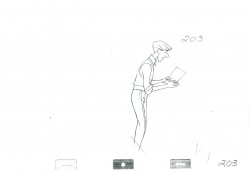
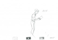
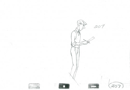
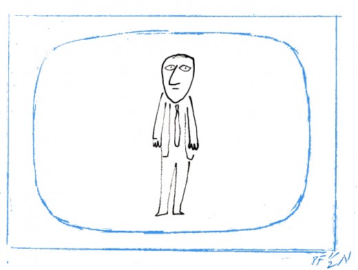
Drawings from an animated piece by Sheldon Cohen that impressed me.
It so happens that I found two great artists at that Festival, offered them work and made two new friends, John Gaug (who was very commercially trained in an Ottawa studio) and Sheldon Cohen (a new artist working at NFB who had a lot of talent and “Art” to offer.)
After Raggedy Ann, John went his commercial way, and Sheldon went back to work at the Film Board, and immediately created a brilliant short film called, The Sweater. In subsequent festivals, I got to see The Sweater about a dozen times, and always enjoyed the experience. It was a rich film about the cultural hero’s effect on the young fan; it was about a society at large. It had an innocence and a hidden and charming sophistication of its own. The film was clearly a success.
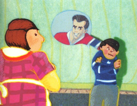
Roch Carrier’s story creates a delightful short that
crosses all cultural boundaries for Canadians.
Of course, from the regions of the US, it’s hard to quantify how popular a film about Hockey would be in Canada. Believe me this film was much larger than I could ever realize. In short, it seems to have been almost a national treasure. (I’m not even sure the same story about a football or baseball star would do in the US.)
Sheldon had hit his high water mark, and the crosses all aligned. He had made a beautiful and artful film, and it had touched a nerve of the Canadian populace. This film had crossed over to the big side.
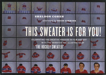
This Sweater Is For You! is a beautiful memoir of a book with the film, The Sweater, at the heart of the book, followed by other wonderful pieces about follow-up films, the illustration of the book, The Hockey Sweater, and Sheldon’s art in general. It’s
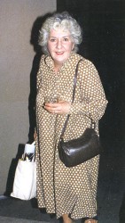 This memoir contains many personable and great stories. There’s a delightful recounting of Sheldon’s direction of Maureen Stapleton for the voice track of his film, Snow Cat. The star who doesn’t act like a star performs at the top of her game for Sheldon’s film. Having worked with Ms. Stapleton on Voyage to Next with the Hubleys, I understood everything that Sheldon had written. And then I met her over a dozen times on a cross-town bus, she with her shopping bags, me with my awe.
This book is a delightful and eccentric piece, and you’d be well advised to keep it close to hand on your animation book shelf. Wonderful to see such material in print.
You can see a number of Sheldon’s films on the NFB site. I’ve linked to some of those films below.
The Sweater is an adaptation of a Roch Carrier story of childhood remembrance.
I Want a Dog is based on the book by Dayal Kaur Khalsa.
Snow Cat starts out with the feel of the book Goodnight Moon
but soon turns to a very graphic and textured look.
It’s a 23 minute film with wonderful narration by Maureen Stapleton.
Pies, a film about blind prejudice, is based
on a short story by Canadian author Wilma Riley.
Animation &Frame Grabs &Independent Animation &SpornFilms 08 Mar 2012 05:48 am
Fritz BGs & Set Pieces
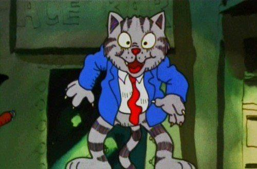
- For some reason I was inspired to watch some of Bakshi‘s Fritz the Cat, this past week. I remember posting in the past on a couple of the sequences.
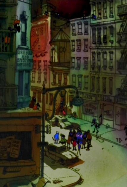
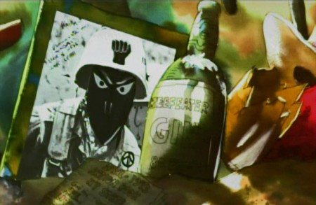
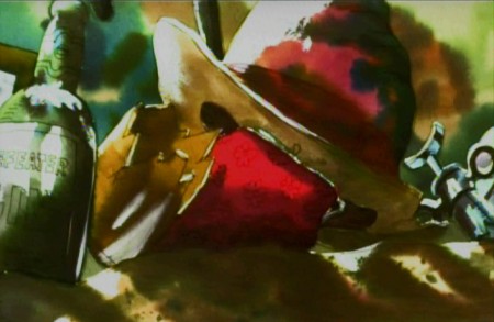
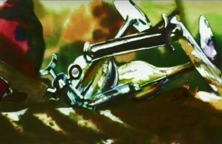
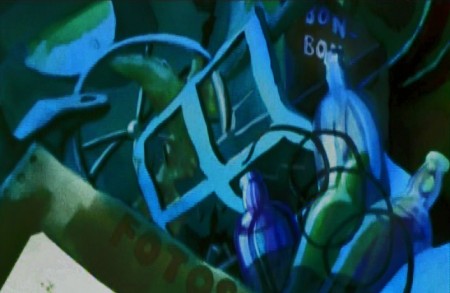
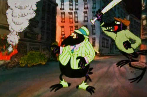
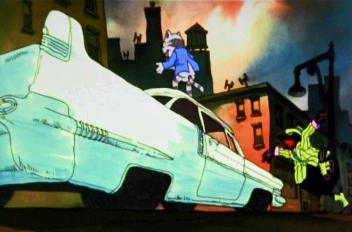
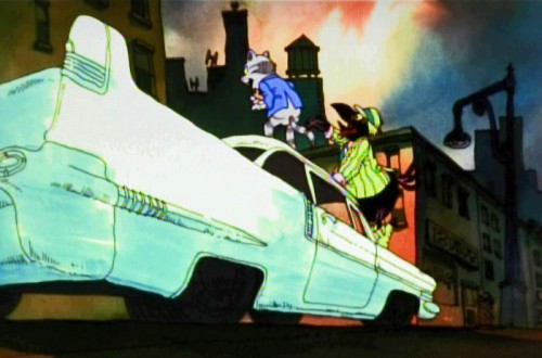
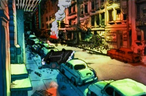
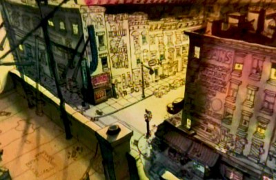 There was one on Johnny Vita‘s dynamic BGs at the time. They were a bit revolutionary for what they were. Johnny had gone through Greenwich Village with Bakshi photographing the environs. He then did a line drawing over the photos and painted the art under the lines, using Luma dyes. Bright shiny colors that he sometimes was able to mute. (It’s hard to tell the real colors from the DVD which all look like mud. I enhanced everything in photoshop to try to get colors that I remembered from 1972.) These were almost ragged versions of what Ken Andersen had done on 101 Dalmatians, but they were done on the fly. No time or money. Here’s that original post.
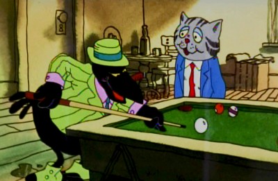 Then I did one on a scene in a bar where Fritz meets Duke, the crow, who will not only save his life but will take a bullet at Fritz’ sheer stupidity. Here are some drawings from Marty Taras of that scene.
Then, I also did a post on some storyboard drawings of the bathtub orgy at the film’s beginning. You can find those drawings here.
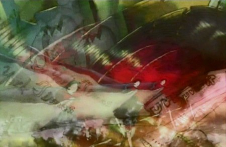
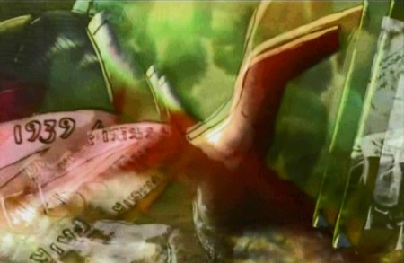
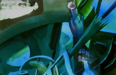
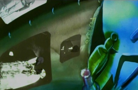
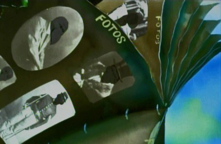
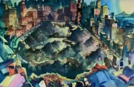
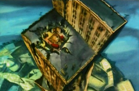
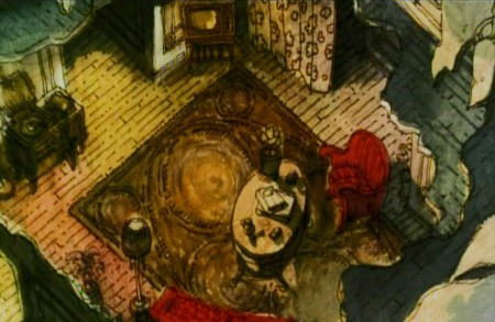
Here’s another set piece, a series of pans. I’ve hooked a couple of the pans together, but have kept many as single frame elements to be better seen. A whole melange of styles mixed in here, and no doubt Bakshi had seen what Hubley was doing to pan through screen time.

Opening part of a multiple exposure pan.
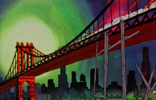
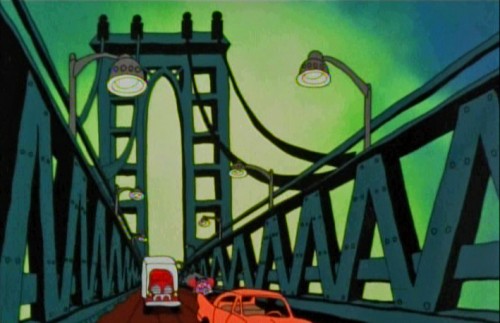
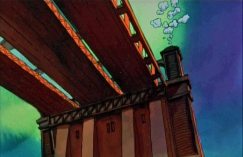
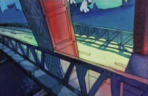
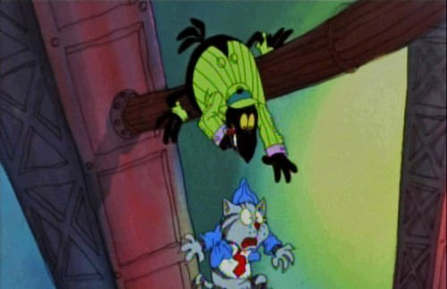
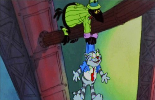
Then there’s the flight over the Brooklyn Bridge where Fritz crashes the car and the Duke saves Fritz’ life.
 1
1
And finally, we have the best set piece of the movie. The climax that falls in the middle of the film, and the rest of the film can’t get over it.
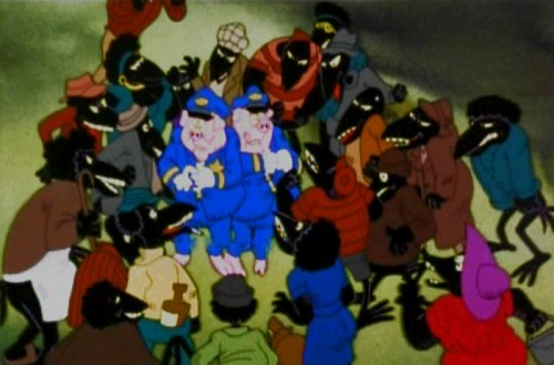
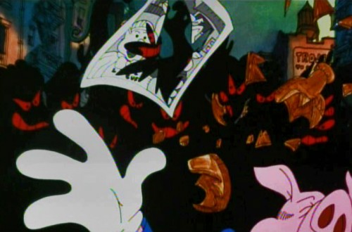
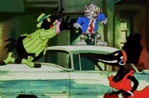
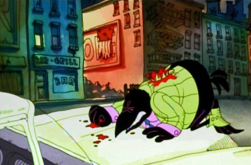
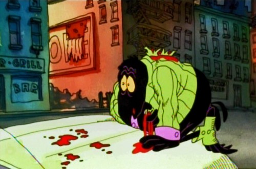
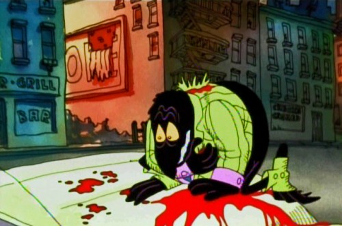
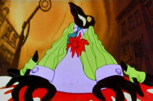
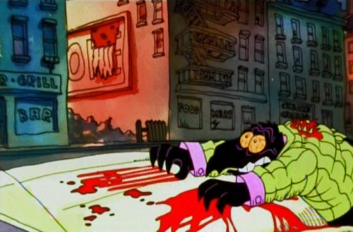
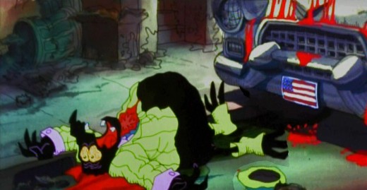
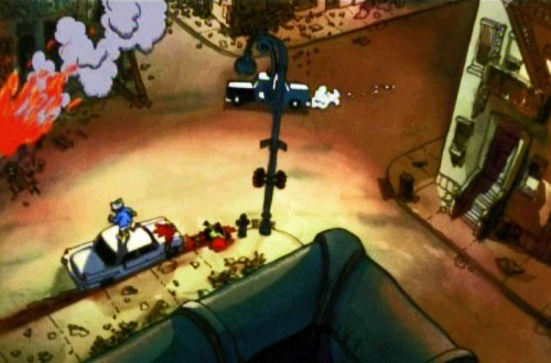
Minor mayhem breaks out in Harlem, Duke gets killed, accidentally, and a riot breaks out. It’s all Fritz’ fault, of course, and he naturally runs from the scene at the end of the sequence.
Cosmo Anzilotti, the AD told me that this was Jim Tyer‘s scene. It doesn’t quite look like his work – rock steady and beautiful. I can and do believe that it is his work. Some great great poses.
Supposedly, Tyer hated working on the film. He was a die-hard Catholic who hated the cursed animation being done. Bakshi loved Tyer, as well he should have.
 1
1
 2
2
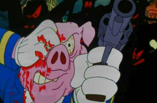
The cops are pushed into a corner.
 4
4
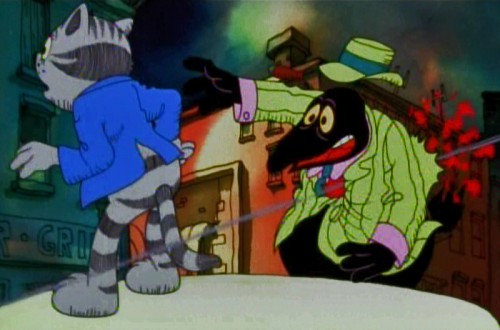
. . . who pulls out a gun and fires.
 15
15
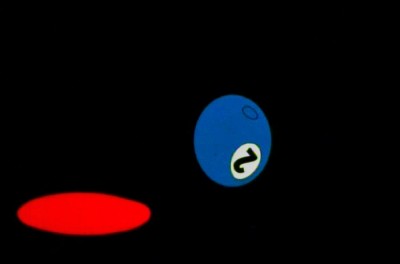
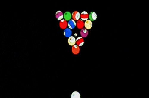
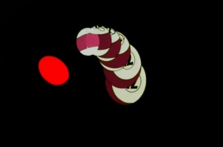
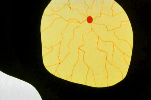
The metaphor of pool balls sinking into their holes
represents Duke’s last breaths on earth.
The most important piece of writing on Fritz the Cat is an older piece done by Mike Barrier and readily available on his site. Read it if you have any interest in the film. Part 1 – Part 2 – Part 3 -Part 4 – Part 5
- Ah you didn’t think I’d forget the HARD SELL, did you? Unfortunately, I can’t. I am trying to get my little epic into the production hard line.
POE is a telling of Edgar Allan Poe’s short life story, and we’ve done a lot of art and preparation. Now we want a couple of minutes of good final product to show how great it’ll be.
Kickstart POE is the project in the works, and I need your help. Please take a look at the page, give any small support you can, even if it’s just to tell your friends about it.
Many thanks.
Animation &Independent Animation &SpornFilms 07 Mar 2012 12:15 am
Kickstarting Poe
Many of you know that I have been working hard developing an animated feature built to tell the biography of Edgar Allan Poe. Lots of artwork has been drawn, storyboards developed and shot as animatics, voices recorded, test animation done.

Well it can’t be held down anymore. The art is literally bursting out of the box ready to go forward, and I’ve made the decision to use a Kickstarter Campaign to raise a small and reasonable amount of money to complete a few minutes of Final animation.
We want that opening two minute teaser done, wherein young Edgar is dragged from theater to theater by his squabbling actor parents as they perform up and down the 1820s East Coast. They fight, perform, separate and ultimately Poe’s mother dies as the three year old sits watching the last theater, in Richmond, VA., burn to the ground, leaving him an orphan at the film’s start.
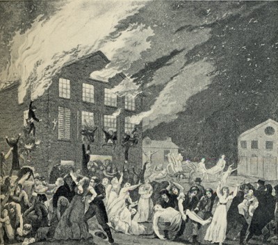
The Burning of the Theater in Richmond, VA.
This was the theater in which Elizabeth Arnold Poe,
mother of Edgar Allan Poe, was acting shortly
before her death in December 1811.
Then we have over 20 minutes of animatic that Master Aimator, TIssa David (age 91) has produced for us. We want to turn a couple of these sequences into the final animated version, rather than loose animatic.
In short we want the film moving forward, and this seems the most honest way of progressing.
I hope we will get support of the industry and our friends and those out there who will see a good investment.
We’re offering many perks from Posters, to DVDs to T-Shirts to actually getting your caricature in our animated feature. It’s all in good fun, and it’s a strong attempt to get a movie started.
Please take the time to check out the Kickstarter page, and if you can contribute anything, thank you. If not, tell your friends. It’s the friends and the friends of friends who will help us move forward.
And.please forgive me, I’m going to be raising this post until we finish up the campaign. I’m desperate to get POE in motion. Pure hard sell to come.
Animation &Animation Artifacts &Art Art &commercial animation &Independent Animation &SpornFilms 05 Mar 2012 06:22 am
Steig Alka Seltzer Drawings
 I thought today I’d post anew some layout drawings done by William Steig for an Alka Seltzer commercial produced in the early 60′s.
Obviously, for the purpose of viewing, I’ve reconfigured the poses so that several of them are on each set-up. There are actually 15 drawings to the commercial, all on separate sheets of rice paper.
 The commercial was done by Elektra Studios. Steig worked with a bamboo reed cut to form a point. He dipped that in ink and drew. The paper is particularly thick and is designed to absorb the ink. They’re punched with Oxberry peg holes top and bottom. I have one of the bamboo “pens” he used to draw these layouts. The final commercial was basically an ink line drawing against a white field.
 I’ve been a big fan of Steig‘s since my earliest days when I first discovered him in the New Yorker Magazine. By the time I’d made it to college, I’d already seen two art exhibits of his artwork.
 By the time I saw my third exhibit of his work, I was able to barely afford one of the New Yorker drawings. It’s done on rice paper with the same type of “pen”. Years later, when I told Steig that I’d bought it, he said that it was the only drawing to have sold at that exhibit.
It was real luck for me to have been able to adapt a couple of his children’s books to animation. I not only got to meet him and his wife, Jeanne, but worked with his flutist son, Jeremy, on a number of projects.
I’m rather partial to Abel’s Island as a film. There were only about two dozen B&W pen and ink illustrations in the book, so we had to do quite a bit of designing in the style of Steig Bridget Thorne, who art directed the film, did some of her finest work ever on the backgrounds – beautiful pieces that I still treasure. I think this is one of Steig‘s best books, and I think we more than did it justice. Too bad negative feelings developed toward the end of that film as Jeremy sought some kind of financial greed, and I had to move on past him to protect the film, itself. - I still wonder what Shrek might have looked like if they’d followed Steig‘s book illustrations.

The original one minute spot.
These are some of the layout drawings done by William Steig for an Alka Seltzer commercial produced in the early 60′s.
The commercial was done by Elektra Studios. Steig worked with a bamboo reed cut to form a point. He dipped that in ink and drew. The paper is particularly thick and is designed to absorb the ink. They’re punched with Oxberry peg holes top and bottom. I have one of the “pens” he used to draw these layouts. The final comercial was basically an ink line drawing against a white field.
I’ve been a big fan of Steig‘s since my earliest days when I first discovered him in the New Yorker Magazine. By the time I’d made it to college, I’d already seen two art exhibits of his artwork.
By the time I saw my third exhibit of his work, I was able to barely afford one of the New Yorker drawings. It’s done on rice paper with the same type of “pen”. Years later, when I told Steig that I’d bought it, he said that it was the only drawing to have sold at that exhibit.
It was real luck for me to have been able to adapt a couple of his children’s books to animation. I not only got to meet him and his wife, Jeanne, but worked with his flutist son, Jeremy, on a number of projects.
Bridget Thorne, who art directed the film, did some of her finest work ever on the backgrounds – beautiful pieces that I still treasure. I think this is one of Steig‘s best books, and I think we did it justice. 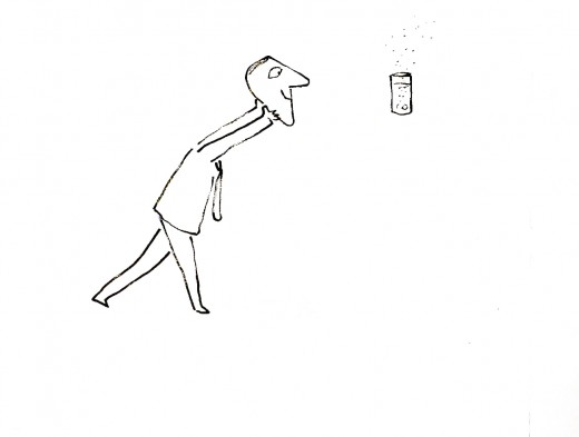
I’m rather partial to Abel’s Island as a film. There were only about two dozen B&W pen and ink illustrations in the book, so we had to do quite a bit of designing in the style of Steig
Animation &Animation Artifacts &Disney 29 Feb 2012 07:33 am
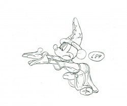
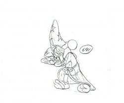
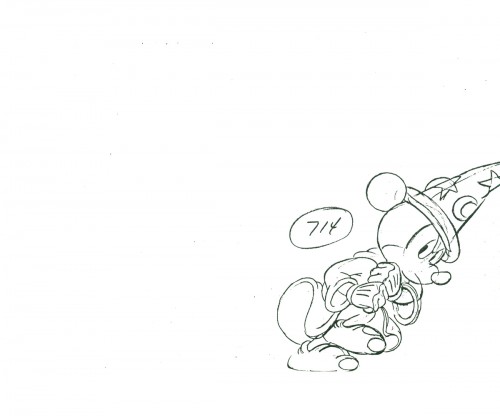
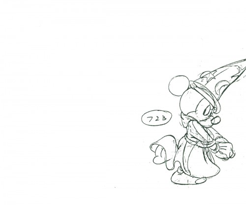
Mickey Flutters Fingers
- It’s animation drawing Wednesday, and I have a few more scenes by Milt Kahl of Roger from 101 Dalmatians. However, I want to take a short break from those scenes which are large and difficult to scan in.
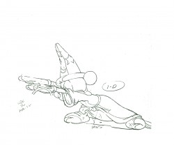
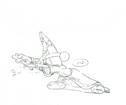
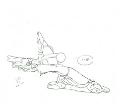
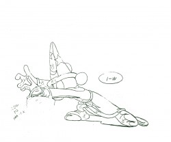
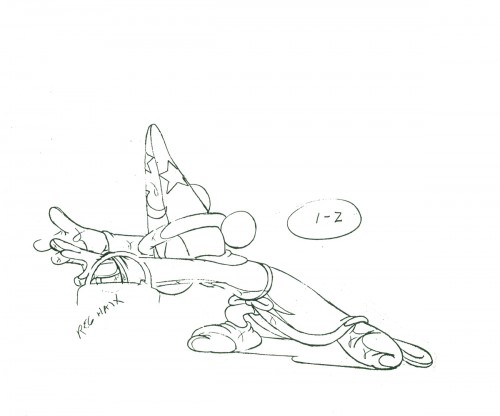
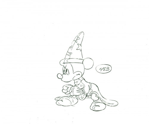
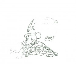
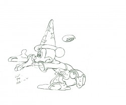
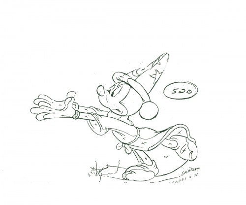
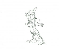
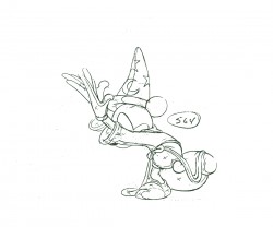
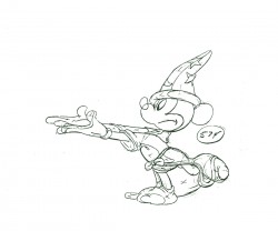
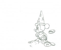
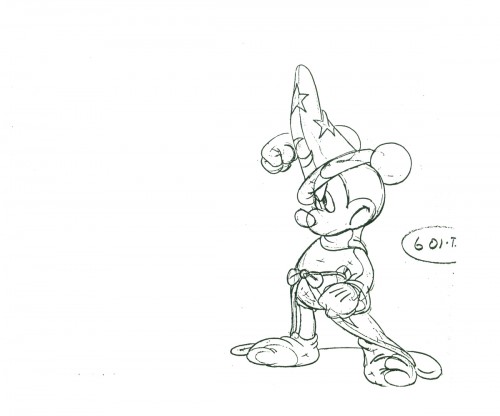
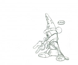
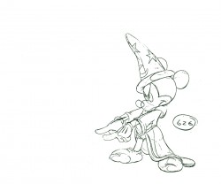
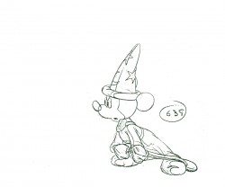
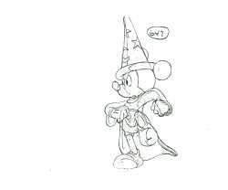
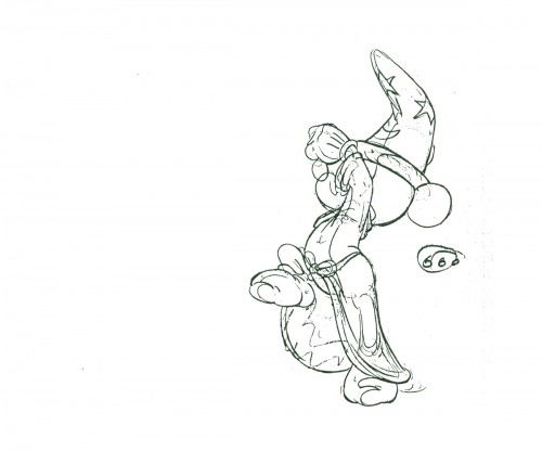
I have a number of scenes of Mickey from The Sorcerer’s Apprentice. They all came with nothing. No exposure sheets, no registration marks or pegs, no anything, So, basically, I’m just showing off some drawings, trying to register them as best I can and then giving a guess of an exposure to hint at their motion. But I think there’s something to be gained, or I wouldn’t be doing it.
Since there’s no indication of a repeated step from Mickey, and knowing it’s in the scene, I doubled it in the QT movie to see how it works. It’s all fun and variations for me here.
This is Seq 7 Scene 4 animated by Les Clark. Mickey is instructing the newly livened broom to march step and follow him.
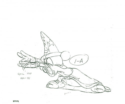 1A
1A
______________________
The following QT includes all the drawings posted above.
The registration is a bit loose. Sorry but, these are obviously
copies of copies and there’s plenty of shrinkage and distortion.
Action Analysis &Animation &Animation Artifacts &Disney 28 Feb 2012 06:09 am
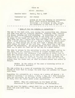
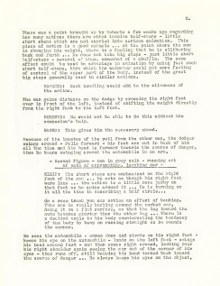
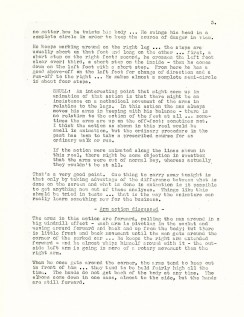
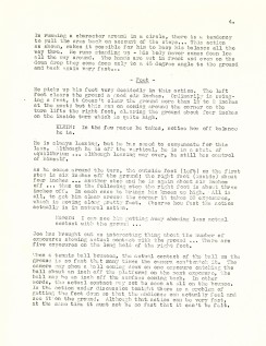
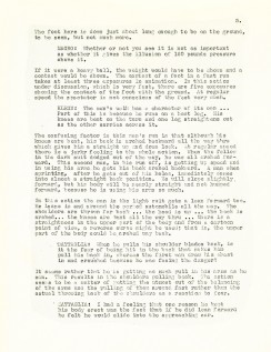
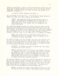
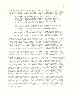
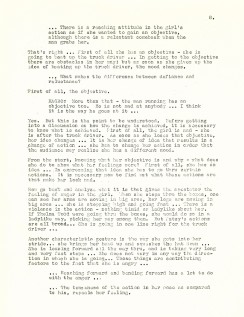
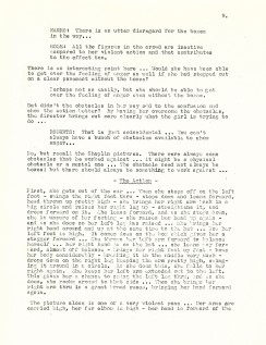
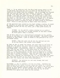
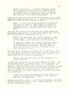
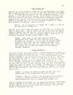
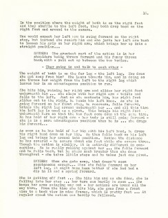
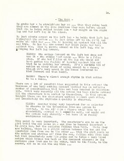
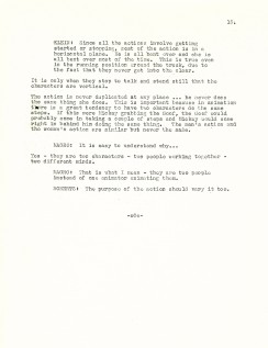
Action Analysis – May 3, 1937
- For a while I was posting the Action Analysis Notes from the Disney Studio’s after/hours classes back in 1937. For some reason I was distracted from that mission and stopped with the April of ’37 notes. Well, I’m back with more and will continue with what notes I have.
The following lecture took place on May 3, 1937.
It’s an analysis of a film clip starring Patsy Kelly as she angrily strides over obstacles and is finally stopped by a man and calmed down.
The participants of the class include: Joe Magro, Bill Shull, Jacques Roberts, Izzie Klein, Aurelius Battaglia, David Rose, Ken Petersen, and Robert Carlson.
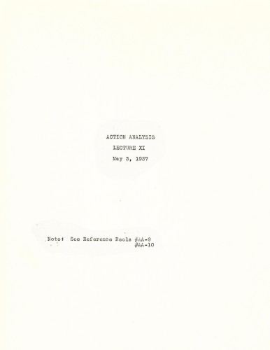
Cover page
.
- You’ll find past posted notes here if you’re looking for them, but you’ll also have to scroll through some animation art to get to them.
Animation &Disney &Frame Grabs 27 Feb 2012 08:22 am
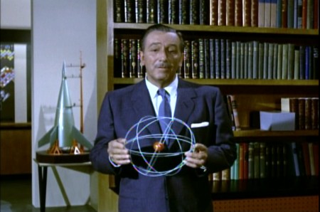
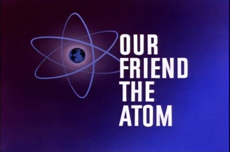
Our Friend the Atom
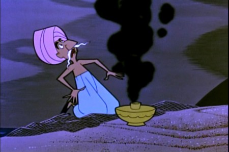
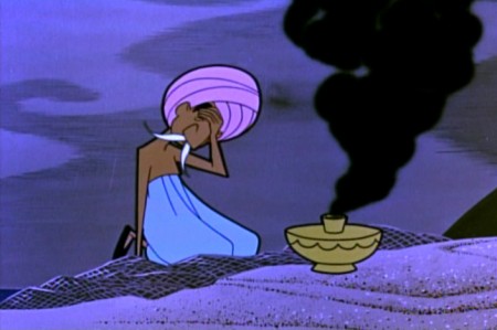
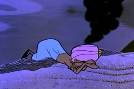
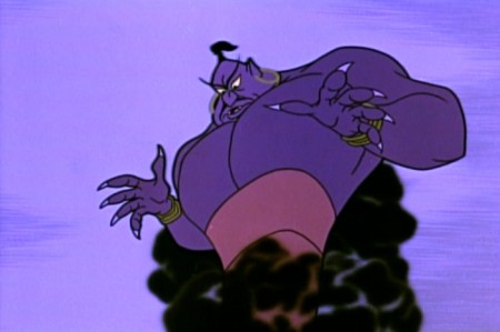
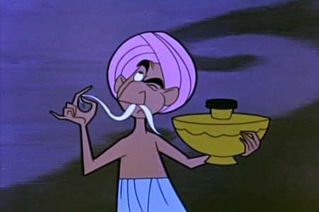
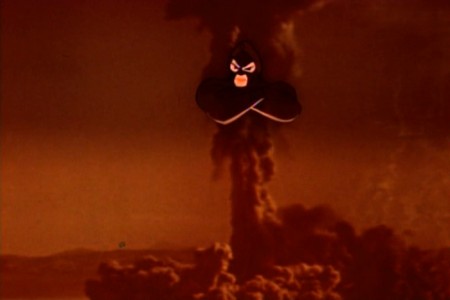
 - When Disney released 20,000 Leagues Under the Sea, there was a curious and opportune time for some cross promotion with Disney doing a “Tomorrowland” show for his Disneyland program. Our Friend the Atom talks about atomic energy driving the Nautilus submarine in the Jules Verne film that Disney was pushing. (Of course, Verne wrote of an “electric ship,” but Disney in the mid-fifties had to be thinking nuclear.)
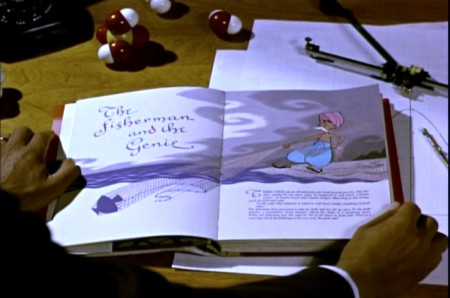
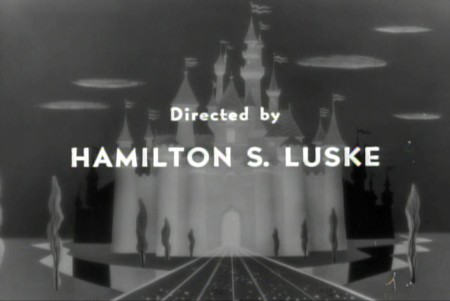
 Ham Luske directed the
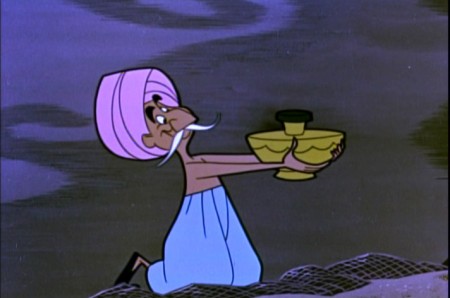
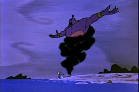
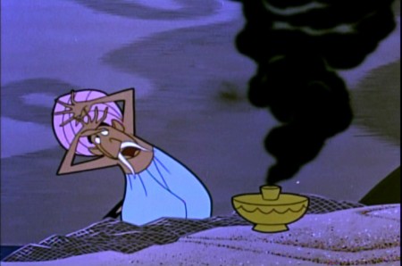
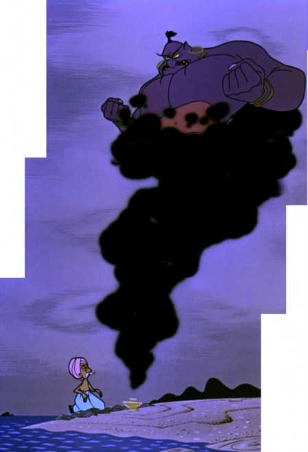
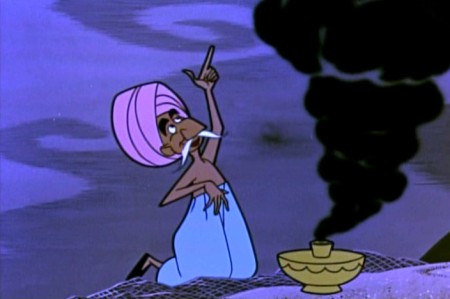
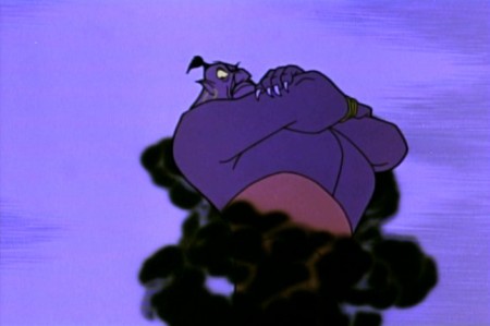
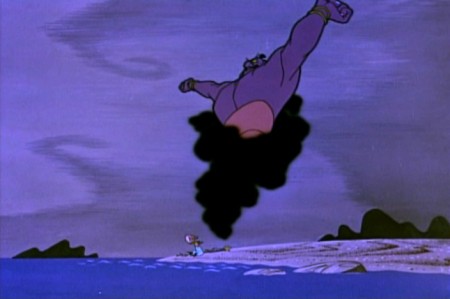
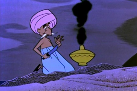
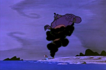
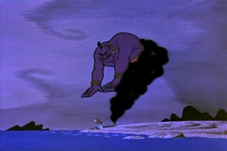
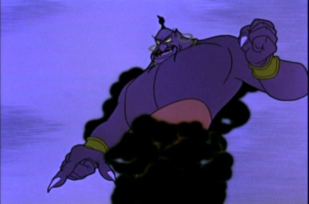
show, and I have to say some of the animation is spectacular. I really love the look of this stuff. I feel like the representation of the Genie is magnificent. There’s a feeling that they capture which really invokes the Arabian Nights figure that I read. (I was a bit turned off by the WB feel of the Robin Williams Genie in Aladdin, though I am in awe with what Eric Goldberg did with it. I guess I’m too much of a purist with some of these folk/fairy tales.)
I had always given Ward Kimball credit for the show until looking at it again. Whereas all the shows Kimball did had a light approach toward the science, trying to make it as much fun as possible, Our Friend the Atom is dead serious with very little humor underneath it. Somehow, I loved this show more and was very impressed with the strength of that Genie.
I’ve taken some frame grabs of the first segment to give an idea of it. The show is available in one of those Walt Disney Treasures – Tomorrow Land: Disney in Space and Beyond
 1
1
 4
4
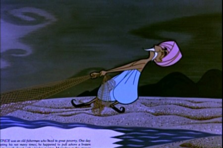
Note how they keep the type in the book illustration as they did
in the Winnie the Pooh adaptations which were done years later.
 6
6
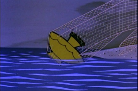
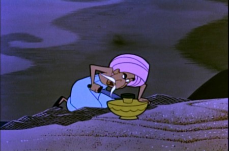
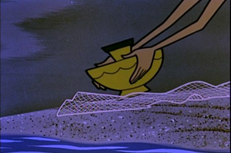
Just pure fine visual storytelling in this section.
It really is very well done in its conservative editing.
 11
11
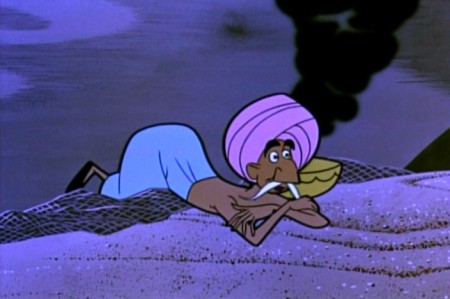
The Genie is going to take advantage of the fisherman
who has released the demon into the world.
 16
16
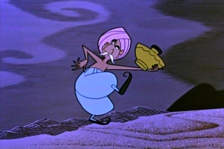
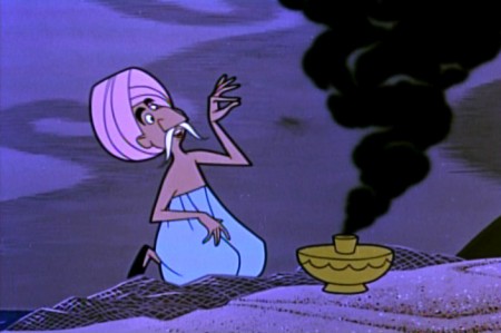
But the fisherman gets an idea.
 19
19
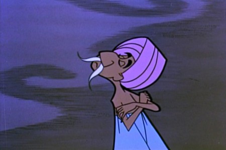
He says he doesn’t believe that the Genie
could not have fit into so tiny a lamp.
 21
21
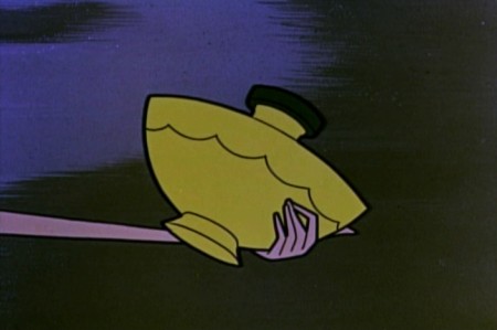
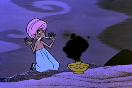
He challenges the Genie to prove that he can fit into the lamp.
 23
23
The Genie goes back in . . .
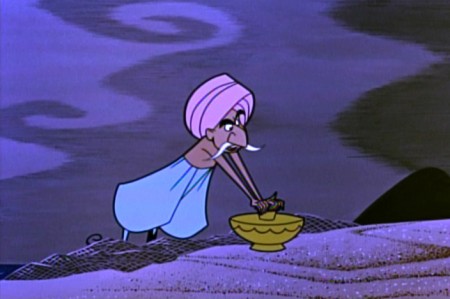 24
24
. . . the fisherman stops him in there.
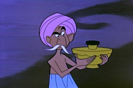 27
27
The Genie makes a magnificent deal
if the fisherman will let him out again.
.
The program then goes into the history of the discovery of radiation and the atom and control of atomic energy.
.
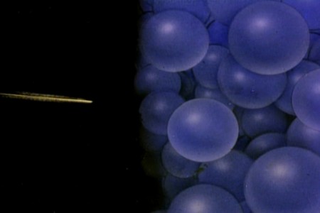 32
32We pick things up with the splitting of the atom.
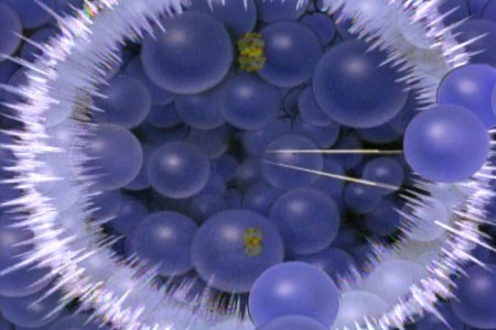 34
34
A chain reaction gets things going.
Animation &Commentary 24 Feb 2012 07:51 am
Pops and Smears
- In reviewing The Secret World of Arrietty, the brilliant new Ghibli film, I wrote about the fluidity of their animation and its basis in a real rather, than a cartoon world. Unfortunately, most of the animation done in features coming from the Western world (specifically the US world) is done in a cartoon way using pops and smears. This affect creates cartoon characters and clichéd ones at that. It’s not a type of animation I love for feature films.
Of course, if you’re designing an Aladdin, where the Robins Williams/Eric Goldberg Genie is a hyper cartoon character, that’s the only way to go – stylized cartoon. That was its natural design. But for 101 Dalmatians/Peter Pan/Beauty and the Beast – no. That’s not what you should be doing. However, it seems to be the only way to go in the films coming out of Hollywood.
I thought, over the course of a couple of posts, I’d give a couple of good examples of these pops and smears I’ve been bothered with in the recent past. Let’s start with “smears” 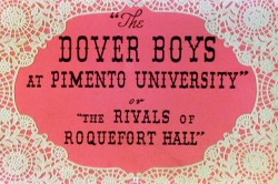 something I find particularly egregious in animation pretending to create a “real” world.
To show what I’m talking about, here’s an example from the first real – and I might say brilliant – use of this technique.
Animator, Bobe Cannon, together with director, Chuck Jones, came up with the technique for the outstanding Dover Boys film.
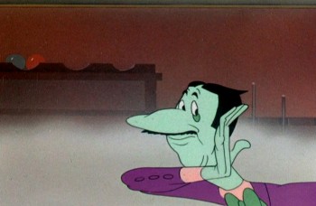
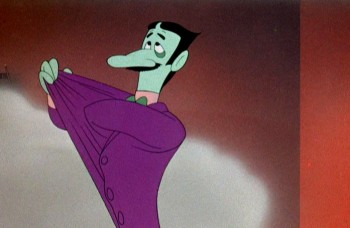
Here’s our villain, the main target of the smeared frames:
 1
1It’s the villain that moves in exaggerated smears.
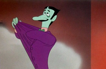 2
2
He moves slowly at start and stop of moves.
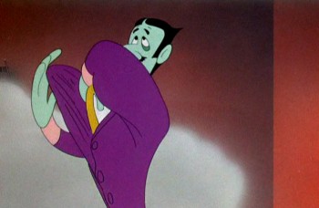 3
3
But moves wildly in between phrases of dialogue.
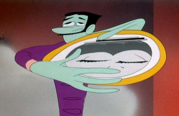 4
4
The middle poses couldn’t be wilder or faster.
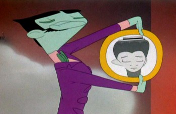 5
5
And comes to quick halting stops with small patches of dialogue.
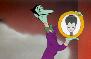 7
7
Then, if anything, we’re going wilder.
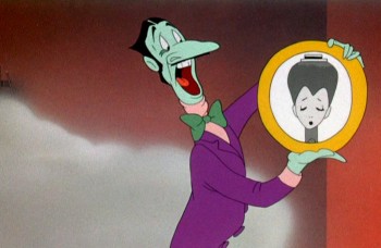 8
8
Slowly out of quiet hard pose . . .
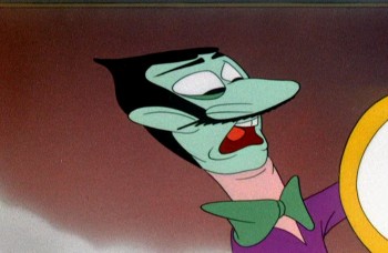 9
9
WILD as Jones backs the animation move with a tighter cut . . .
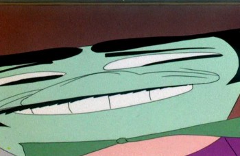 10
10
. . . and a wild camera move.
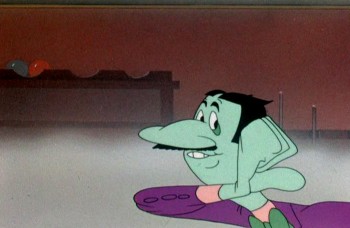 14
14
Come down to another solid, hard pose and move dialogue.
Here’s a later sequence as the villain kidnaps our heroine.
All cartoon, all comedy, all arch, all on purpose.

He moves wildly via smears inbetween phrases of dialogue.

Line of dialogue – move – dialogue – move.

Every action comes off the exaggerated speech by the arch ( and I do mean arch) villain.
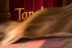
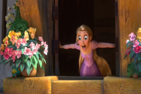
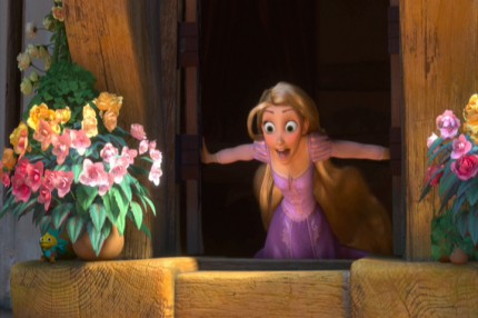
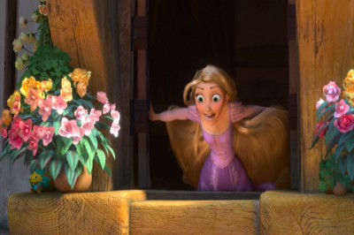
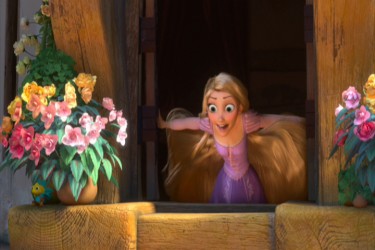
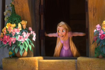
 Tangled is a tangled version of the brilliant fairy tale, Rapunzel. The makers have completely distorted the tale to a mish-mash point where it makes no sense, but that’s irrelevant to this post. What is relevant is that they continually rob the characters of a reality by pushing, rubbing and smearing them throughout.
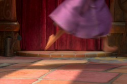
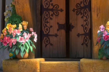
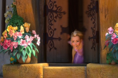
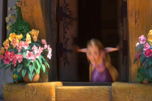
The first example of this technique shows up as Rapunzel opens her window. Technically, you start slow, you compress the middle to one or two images, and you slow out over a long beat. The inbetween chart would look something like this:

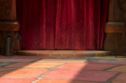
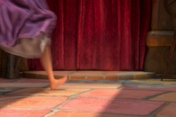
Here’s Rapunzel opening her window:
It’s not really a human motion; it’s a cartoon motion. But it’s subtle enough this first time, that we can get away with it. Let’s just call it fast. However, too often the animation falls into this mode, and by midway through the film, there are no real characters left; just cartoon characters.
I take that back. Mother Goethels is always true to a human animation style. She is a real character, and Donna Murphy’s performance grounds it behind the fine animation by Jamaal Bradley, Nik Ranieri and others.
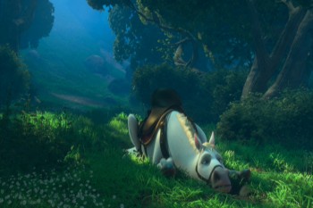
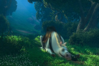
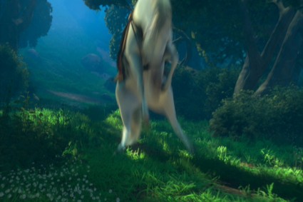
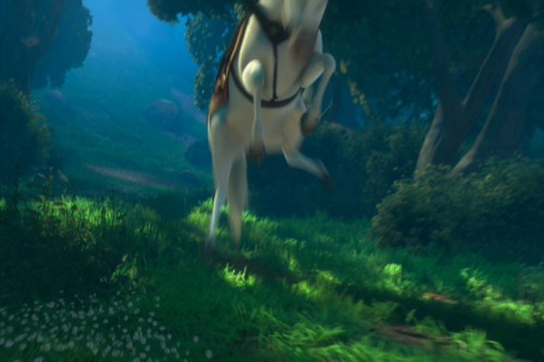
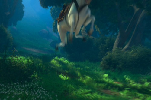
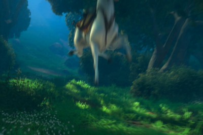
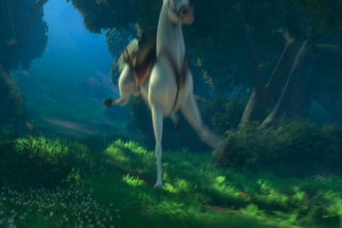
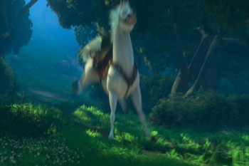
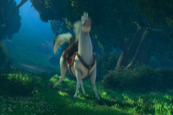
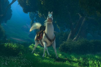
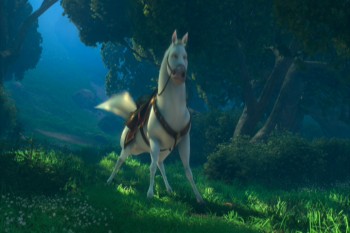
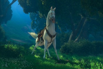
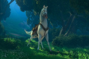
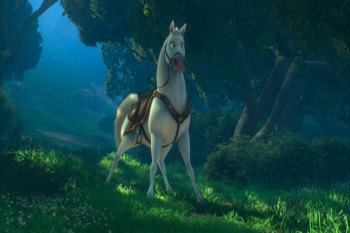
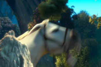
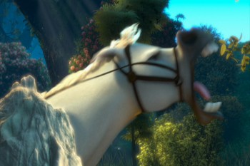
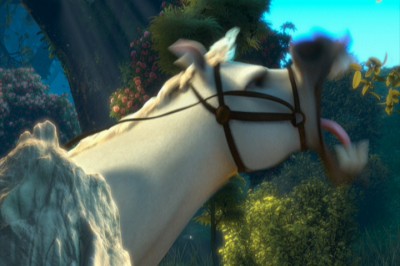
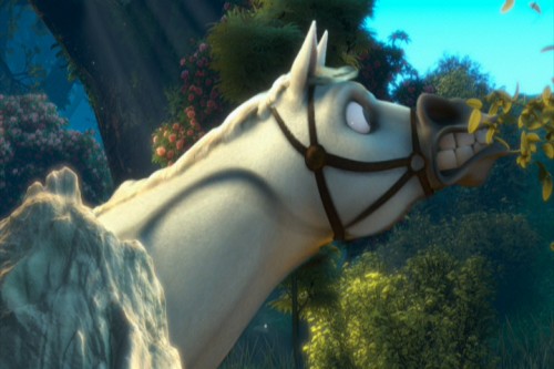
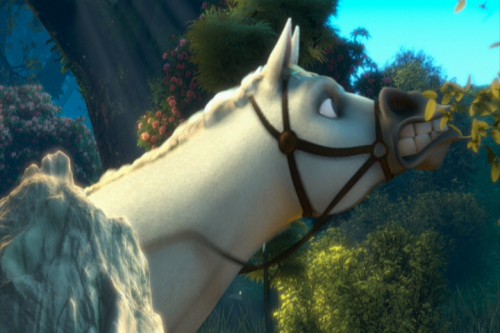
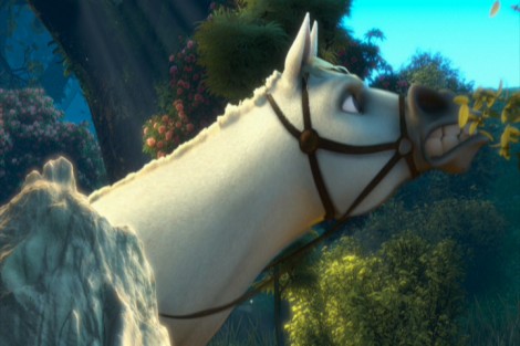
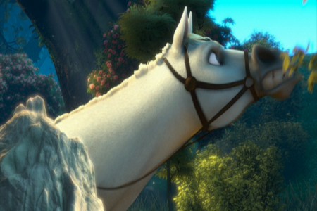
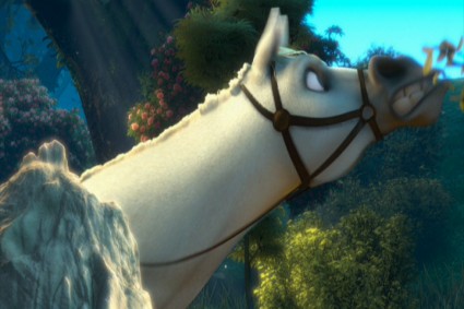
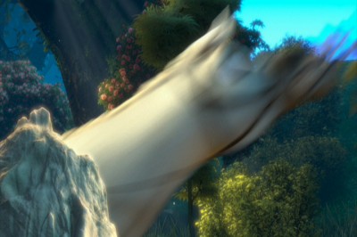
The most egregious in using these smears is the horse character, but if it were only that one, it would work. The horse is a stand-alone. It’s personality IS a cartoon. The horse, after all, isn’t a horse in this film. It’s shaped like another Disney horse, but it moves more like a dog. And it’s ALL pops and smears.
Look at these frames of it getting up from the ground, lickety-split:
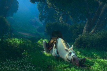 1
1
The move above is funny, not based in reality. What we have is a cartoon horse. This is not the horse Prince Phillip rides in Sleeping Beauty. It’s not even a good caricature of it.
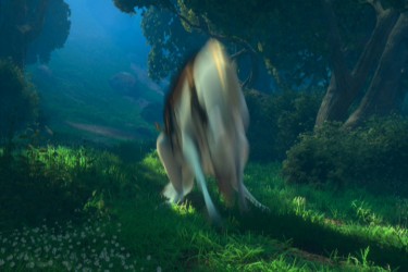
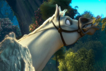
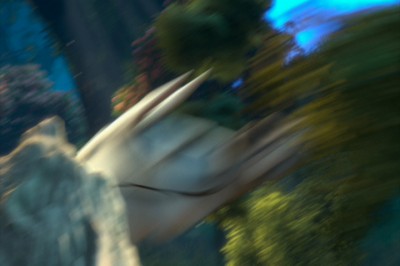
The unfortunate part is that what Bobe Cannon did in the Dover Boys can’t easily be done in cgi. The Dover Bioys employed the brilliant cartooning of Cannon; cgi is really just a playing with computerized puppetry. You can stretch and squash somewhat, but distorting as desired isn’t always possible. So they stretch and squash and do very fast motions and hide it all under a veneer of out-of-focus. It ends up looking like just fast motion and not a true distortion – as they probably desired. The best you can hope for is image #3 just above. Now compare that to image #10 in the Dover Boys group. Not quite the same are they.
God forbid someone in cgi wants to do what Jim Tyer did. It’s impossible.
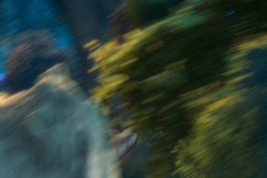
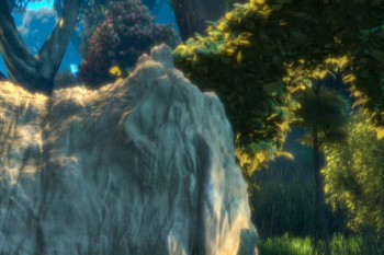
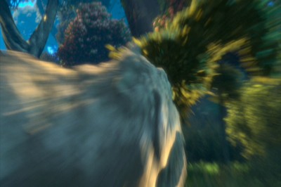
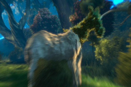
Here’s one last horse. We start rock steady – then zip, blur, stream. Ease in and race back out – zip, blur, stream. To be honest, I’m not sure what’s even happening in this scene (the horse is somehow changing into rock and vegetation?), but I let it go past as cartoon.
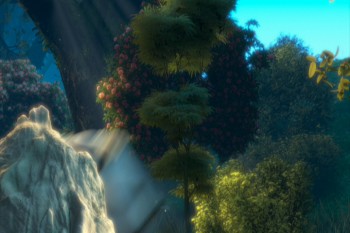 1
1
To sum up what I’m trying to say. Animated features have sunk their heads into the ground. Everything has become arch and stupid. We’re not trying to develop characters but, instead, trying to do some wild movement. Movement that has nothing to do with character development. That’s a problem, if you ask me.
If you want to imitate Tex Avery or Bob Clampett, fine. If you want a seriously developed non-cartoon character, then stay away from pops and smears. It works for Aladdin, but it also limits feature films. I think Tangled is a good example of that. Outside of a few characters, I see little believable animation there. It’s all just tricks and stunts that pulls away from true, honest animation. It’s a comment on a character rather than a development of the character.
Of course, that’s my opinion. It’s so obvious to me when you see a Ghibli product like The Secret World of Arrietty or anything Mayazaki does. Their animation grows more and more subtle while Hollywood moves in the opposite direction – gags and clichéd actions. I don’t understand why Disney product approves of this. Thank god for animators like Andreas Deja who refuses to go this route, and is in absolute control of the characters he animates. There are others like him, and I applaud those artists. I wish they were all of that shape and belief.
Animation &Animation Artifacts &Disney 22 Feb 2012 07:19 am
Roger’s Song – Part 2
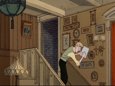
- Here I complete Seq. 02 Sc. 15, animated by Milt Kahl for 101 Dalmatians. This is the song Roger has just completed and playfully sings as Cruella de Vil exits. I have several more scenes from this sequence and will probably continue on with them next week.
They’ve all been animated, for the most part, on twos by Kahl, and it shows that not every drawing has to be on ones, which is the current fashion. Kahl knew what he was doing mechanically.
We start with the last drawing from Part 1.
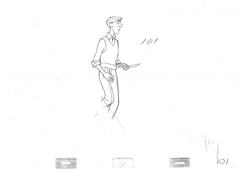 101
101
______________________
The following QT includes all the drawings from the scene.
Including Part 1.
The registration is a bit loose. Sorry but, these are copies of
copies and there’s plenty of shrinkage.
If you click on the right side of the lower bar
you can watch it one frame at a time.
You can find the drafts for this film on Hans Perk‘s invaluable site, A Film LA. You’ll find this particular scene on page 30.
Mark Mayerson has also devised a helpful mosaic for this film and written some extraordinary commentary about the scenes. You’ll find this mosaic page here.
Animation &Commentary &Independent Animation &Richard Williams 18 Feb 2012 08:56 am
Sheldon Cohen & John Gaug and Arrietty and NAACP Image Award
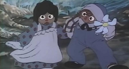
Tissa David‘s enormous seminal Raggedy Ann scene.
The rest of the film was built on the back of this one.
- Back in 1976, I was lucky enough to get hired onto Raggedy Ann and Andy, a feature film Bobbs Merrill was financing with Richard Williams as the newly employed director. I was the first non-animator hired (three animators were hired before me: Tissa David, Art Babbitt, and Emery Hawkins. Corny Cole was designing and doing the storyboard; Gerry Potterton was the assistant director.
When the studio was set up, with its headquarter in New York, they chose a space in a building that had entrances on 45th and 44th Streets just off 5th Ave. The space was enormous and dark. Many of the lights were usually left off. Sometimes the office manager, Bruce , would be there. but for the most part, while the voices were being recorded, I was alone in the space.
I decided to start buying animation desks and discs and other equipment. I did this and worked with someone to get holes cut and lighting set up in the desks. We started prepping partitions and just setting up everything. Once bits of animation started coming in Assistant Animators were hired. Jim Logan was the first, and he and I worked together for several months with little to do but laugh and do bits of inbetweening for animation tests.
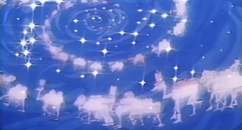 Dick Williams gave me a scene of a mirage the Camel with the Wrinkled Knees would have. 97 dancing camels spiraling into the distance would be superimposed over the Camel’s head. I worked for about six weeks on this one scene, and until I had to be taken off it. The scene near completion went to the newly hired John Kimball who was going to do a number of other similar scenes, and he’d build them all into the film. I moved to head of Assistants and Inbetweeners and definitely had a lot of work to do.
Hiring lots of people in New York and training many of the new faces was foremost. We ended up with seven rooms with about 15 Assistants and Inbetweeners in each room. Finding new people wasn’t always easy, and they didn’t all work out.
In 1976, the Ottawa Animation Festival had its inauguration year. (That was when Caroline Leaf took over the animation world, becoming a star with her film, The Street.) It was here that I went to look for talent, and I found it in several people. John Gaug came down from Atkinson Film Arts in Ottawa. He was a gifted talent and a very tight style. Sheldon Cohen was closer to my heart. His sensitive drawings and warm approach to the artwork made him a definite person to hire. After getting back to New York I let the powers-to-be know that I was hiring the two and made the calls. Both moved dpwn to the City.
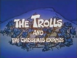 Both continued on after Raggedy Ann ended.
John Gaug moved on to the Williams studio in London where he became an animator, moved back to Ottawa to direct Trolls and the Christmas Express (where I animated freelance for him). Then he moved back to New York working in the commercial studios (I got to hire him again at R. O. Blechman’s studio) until he died in 1984.
.
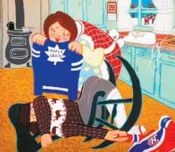 Sheldon Cohen moved back to Montreal where he became a unique artist for the National Film Board. He directed and animated a number of strong films. His most famous, The Sweater, showed an artist in full bloom seemingly right out of the box. He continues doing a number of children’s books and recently has written a oersonal memoir called This Sweater Is For You! published by ECW Press in Toronto. The book will soon be on the market, I’ll get a copy and will definitely review it. I’d also like to interview Sheldon about his 40 year career of making art.
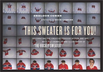
In the meantime, you can see a number of Sheldon’s films on the NFB site. I’ve linked those films below.
The Sweater is an adaptation of a Mordecai Richler short story.
I Want a Dog is based on the book by Dayal Kaur Khalsa.
Snow Cat starts out with the feel of the book Goodnight Moon
but soon turns to a very graphic and textured look.
It’s a 23 minute film with wonderful narration by Maureen Stapleton.
Pies, a film about blind prejudice, is based
on a short story by Canadian author Wilma Riley.
_______________________________________________________
Ghibli’s The Secret World of Arrietty opened yesterday to generally positive reviews.
- Manohla Dargis in the NYTimes praised the Ghibli approach to female characters, who often are the leads, but was bothered by some of the elements lost in adapting the original novel, however
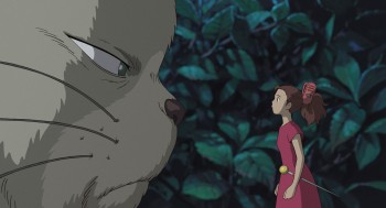 “. . . it’s initially a letdown that Arrietty and Shawn aren’t just friends, as in the book, but also something like impossible romantic foils. Yet this disappointment proves mostly premature because Studio Ghibli and Arrietty have a way of taking you where you may not expect, whether you’re scrambling through rooms as large as canyons or clambering into the safety of an outstretched hand, a simple gesture that says it all.”
 - Lou Leminick in his 3 star review in the NYPost writes:
- Studio Ghibli is at the forefront of keeping traditional hand-drawn animation alive — and it works well even for a story that’s less fantastical than Miyazaki’s signature works.
- Many animated and live-action films have dealt with miniature humans, but few have depicted a sheer sense of scale as effectively as this one.
“The Secret World of Arrietty’’ is a feast for the eyes that will engage the entire family.
- Phillip French in The Observer writes a very positive review:
- At the heart of the film, is the tender, trusting friendship between Shawn, the boy of the house, and Arrietty. Theirs is a beautiful, perfect love, but ultimately doomed like so many relationships in myths and fairytales. This moving, amusing and resonant tale also touches on environmental and ecological concerns, on xenophobia and the fear of the threatening other. And it has taken on new meanings about the respect and preservation of disappearing species and the need to treasure and recycle valuable resources.
.
- Finally, the good news, last night, I won the NAACP IMAGE Award for Outstanding Children’s Program. I’m proud of this one, thankyou very much.
Outstanding Children’s Program
“A.N.T. Farm”
“Dora the Explorer”
“Go, Diego! Go! ”
WINNER: “I Can Be President: A Kid’s-Eye View”
“My Family Tree”
.
 2
2 3
3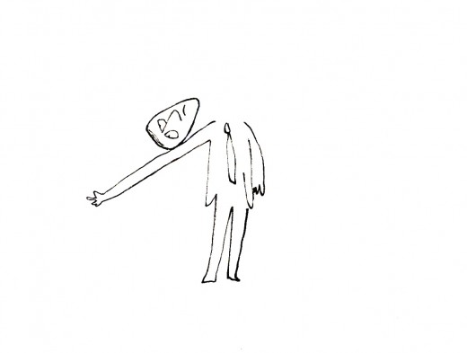
 7
7 9
9 12
12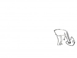 13
13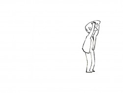 15
15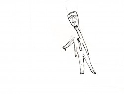 17
17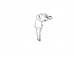 24
24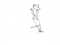 27
27