Category ArchiveHubley
Animation &Animation Artifacts &Hubley 06 Apr 2009 07:31 am
Phil Duncan’s Carousel
 - There’s an odd conversation going on at the Animation Guild Blog. It started out with the traditional CG vs hand drawn argument, then it morphed into who get the better salaries and the greater recognition.
Quite a few brilliant animators passed under the limelight and never got quite the credit they deserved for their long and dedicated work in the medium.
Phil Duncan certainly belongs in this
 category. I never got to meet him while working at the Hubley studio, but I assisted many of his scenes, spoke with him and came to know his style well.
He worked for many years animating at the Disney studio, starting on Pinocchio and working his way up into the early 60s. He animated on Magoo’s 1001 Arabian Nights and Gay Purr-ee for UPA.
His work for Hubley began with The Cruise in
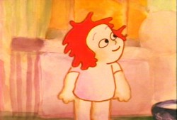 1966 and continued through many of the important films right up to John’s death in 1977. Phil’s work on Watership Down began with John Hubley and continued with Martin Rosen.
I got to assist many a scene Phil animated for shorts, commercials, Electric Company spots etc. I also followed him through many scenes on the feature, Everybody Rides The Carousel.
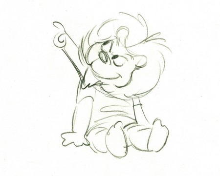
His style was so different from all the other animators I mentioned that it was a delight for me to work behind him. His line was always this great feminine stroke that featured plenty of arcs and curves. He usually left only one inbetween between drawings, and he knew that often enough John Hubley would say to put the scene on fours and not inbetween it. I remember breaking the news to Phil the first time I saw this happen. There was an ever-so-slight downturn in his voice, but it was obvious that he expected this to happen.
Believe me, he wasn’t the only animator who heard me break this news. The films were done on such a tight budget that every penny counted. It did give me some power, because I would judge the scenes to see if I felt there was any point that we couldn’t get away with it, and if that were the case I would inbetween it while inking the drawings. John didn’t need to know, and I worked quickly enough so that it didn’t cost him much more of my salary.
 57A
57A(Click any image to enlarge.)
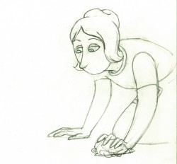
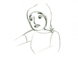
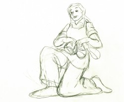
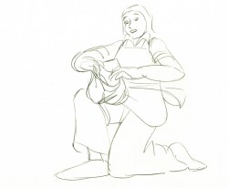
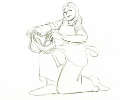
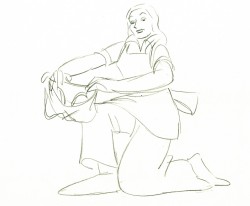
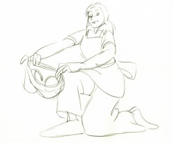
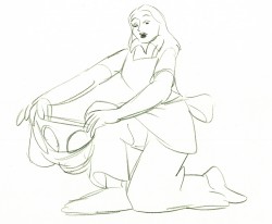
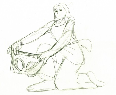
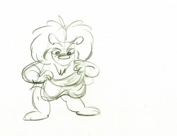
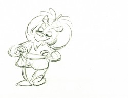
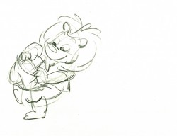
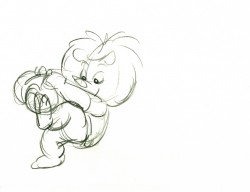
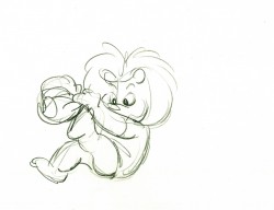
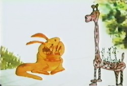
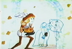
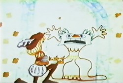
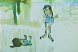
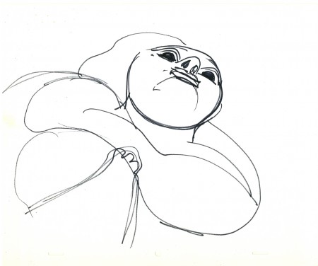
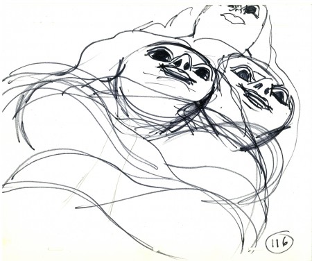
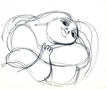
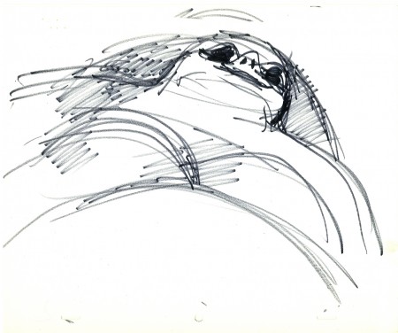
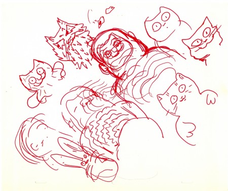
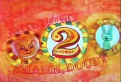
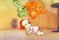
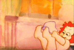
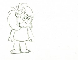
Here are some drawings Phil did for the Toddler sequence from Everybody Rides the Carousel. Horse #2. The toddler can turn into a rabbit (meek) or a lion (daring.) Here she turns into a lion as she tries to dress herself with some help from her mother.
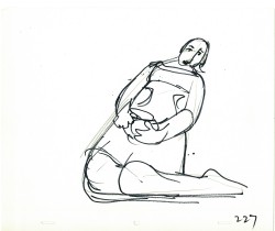
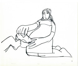
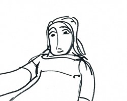
These are a couple of layouts by John Hubley.
Below, is a clean up that he sent to Phil Duncan of the mother’s head.
Here’s the next scene’s animation before it underwent some changes.
 13
13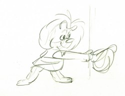 17
17
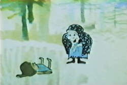
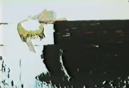
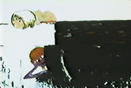
As you’ll notice from the frame grabs above, this sequence changed.
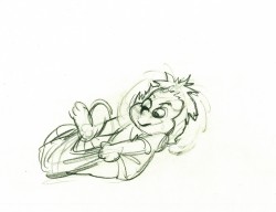
John wanted to go with the girl whose head, for a brief moment,
turns into the lion’s head. (Doubt) I did the change using most of
what Phil had on his original drawings.
 35
35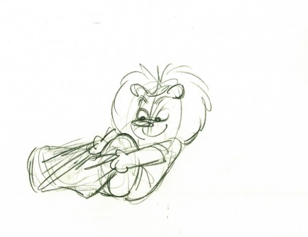 37
37
Note that on her hit down onto the floor #35, she turns back
into the toddler child before going back to the aggressive lion.
Animation &Animation Artifacts &Hubley &walk cycle 30 Mar 2009 07:56 am
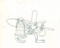
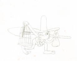
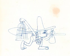
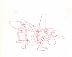
Marky’s Walk
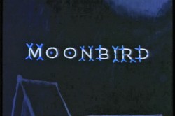 - If I had to choose who was my favorite animator, I’d have a tough time. Equal credit would probably have to go to three different people: Bobe Cannon, Tissa David and Bill Tytla. Jim Tyer and Ed Smith would fall just a smidgen below these three, for me. But there are none like them all, as far as I’m concerned.
I’ve posted a lot of drawings from Tissa and Bill Tytla, but have very few drawings by Bobe Cannon (nor have I seen many published anywhere.)
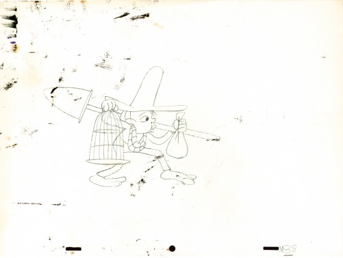
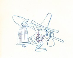
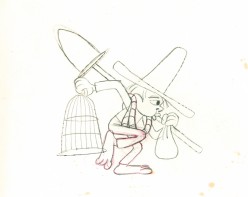
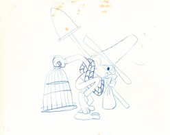
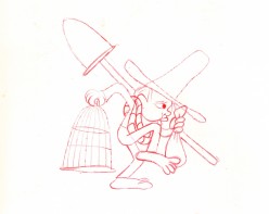
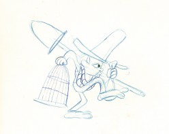
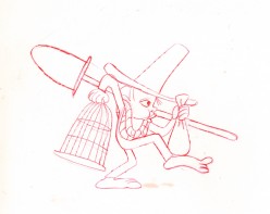
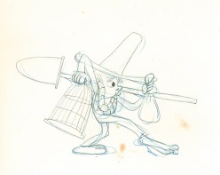
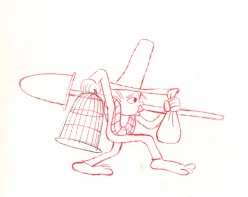
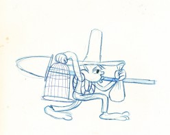
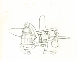
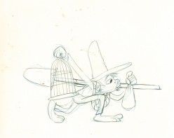
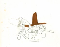
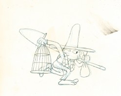
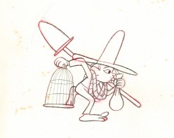
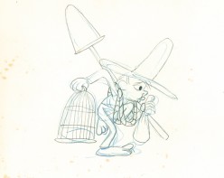
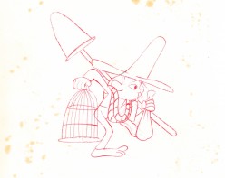
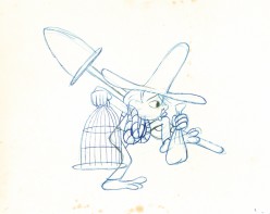
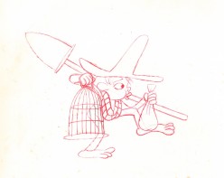
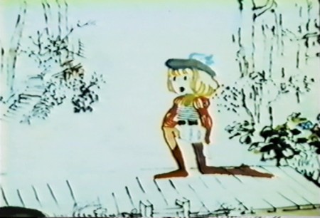
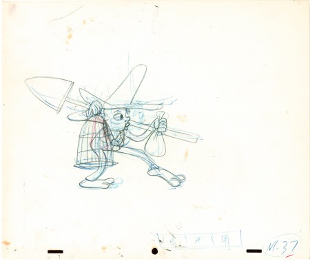
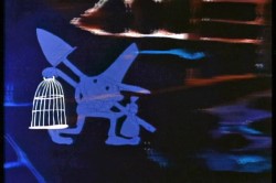 Here is a walk cycle from the beginning of Hubley’s monumental short, Moonbird. The odd numbers are extremes by Cannon, and the inbetweens (even numbers) were done by Ed Smith. Three different sized papers were used for this, and you can view them full sized if you click the thumbnails.
You’ll notice there’s paint all over the drawings. The ink & paint involved tracing the drawing, then using oil paints to cover all of the clear area in black. Some of that paint seeped onto the originals. In one drawing even to coloring the hat accidentally.
 37
37(Click any image to enlarge.) “Marky” walk cycle from Moonbird
On twos at 24FPS
Click left side of the black bar to play.
Right side to watch single frame.
There’s a lot more to this scene including several variants on the walk.
At some future time, I’ll add the other drawings to show off the entire scene.
Commentary &Frame Grabs &Hubley 19 Feb 2009 09:01 am
Windy Day 2
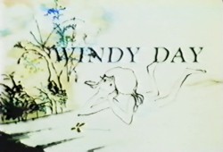 - Here we continue with some frame grabs from the brilliant Hubley short, Windy Day.
I wish there were a good copy of the film available. As a matter of fact, ALL of the Hubley films are in bad versions on the dvds available. They all look soft and dark, they weave and show added scratches. It’s too bad since so many of these films are gems. Wouldn’t it be great to have an extras track or three? Emily and Ray Hubley know everything about these films and could tell us so much. As a matter of fact, Ray helped supervise production of the 35mm print of The Cosmic Eye, and that was a stunningly beautiful print. Yet, the dvd image of it is a paltry and distant relation.
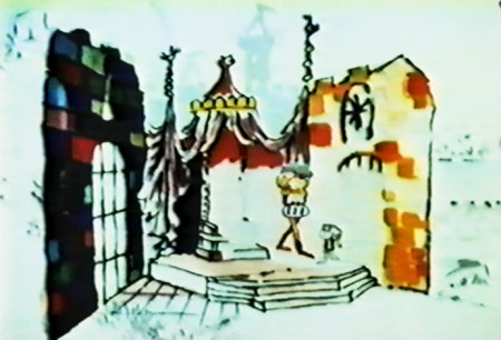
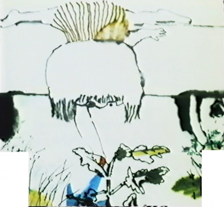
I want to start out here by noting that this film’s technique features bottom lit art (done like a pencil test). The grain of the paper can be seen and was somewhat controlled by the type of paper used for the coloring. It’s architect’s vellum. The paper’s thinner, more transparent and allows some slight watercolor without buckling. Several points in this second half are done with top light and mattes or double expposures. I’ll point those out.
Two other sites that recently featured articulate pieces on this film include Ian Lumsden’s Animation Blog and Richard O’Connor’s Asterisk Pictures blog. Richard gives a lot of deserved attention to Sarah Calogero who did some beautiful rendering on the short. I’d like to give attention to Nina di Gangi who did I&P work for the Hubleys on a number of their key shorts.
Continued from yesterday’s post.
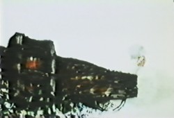

(Click any image to enlarge.)
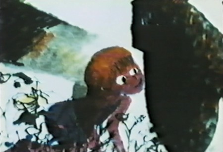
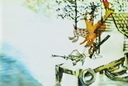
Note that John isn’t afraid to use the bot lit technique despite
the black wheel seen behind and through the character.
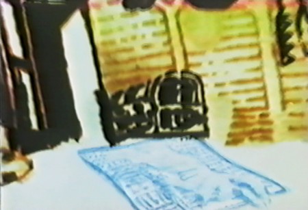
This image starts a scene which isn’t bottom lit.
The newspaper/dead rabbit is matted into the picture then . . .

. . . becomes a double exposure as it floats over the pan.
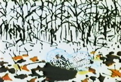
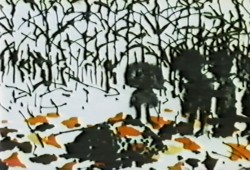
. . . and goes into the grave.
Dissolve on the top lit silhouetted people.
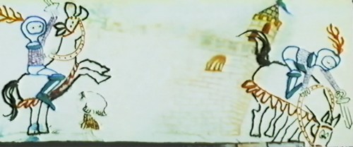
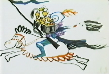
Back to the bottom lit knight riding across the pan.
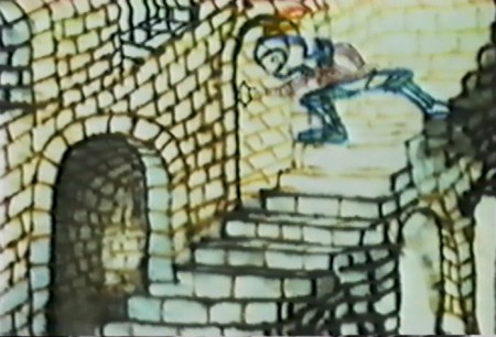
This is a complicated bottom lit scene.
At the top of the pan, the knight is lit in yellow.
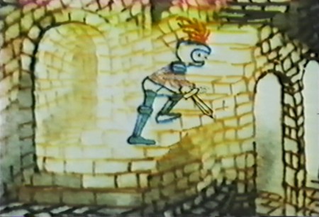
He goes through a portal, and the light moves to the
bottom of the pan as the knight enters a level down.
It took some careful thought and a creative cameraman to pull it off.

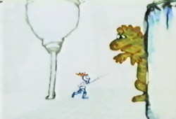
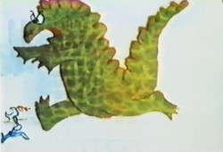
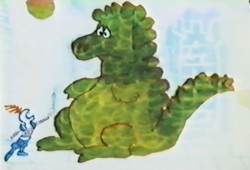
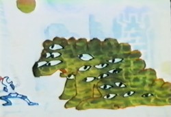
A bottom-lit dragon moves across the pan.

This bot-lit BG looks to have stepped out of Adventures of an *.
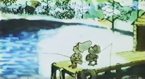
The effect on the water is matted into a bot-lit BG.
The effect, itself, is top-lit.

The subject of the film slides quickly between marriage, and birth . . .
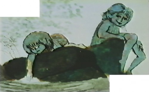
Yet, the conversatioin is done gently and quietly
without the obvious self-imortance it could have had.
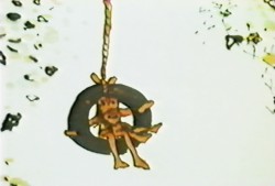
This is one of the more beautiful scenes in the film.
Very complex animation and layout, yet done so simply.
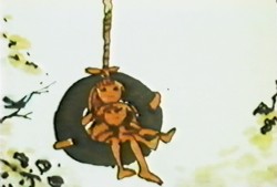
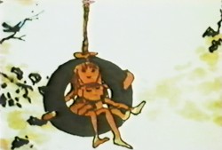
A beautiful N>S then S>N pan while the art animates in and out.
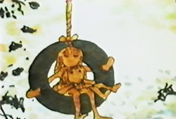
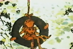
Both sides of the pans N&S&N and both sides of
the zoom in & out ease at perfect speeds.
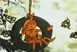
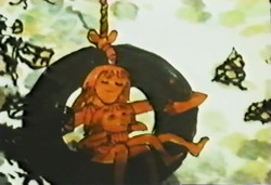
This is something that could be tested easily on a computer, but in the days before computer you could only film the piece in a Pencil Test.
However, the Hubleys couldn’t afford a PT. They just did it.

A beautiful, bot lit, multiple run pan. This is experimentation at the service of Art.
I can’t think of many such scenes in all the features or shorts I see today.
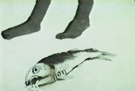
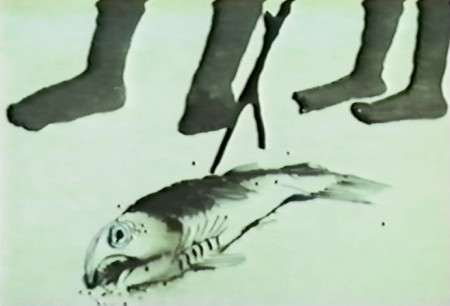
Again, death enters the picture.
The kids are talking about Life & birth.
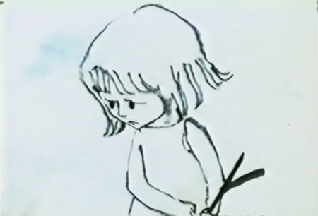
These two scenes, to me, are the heart of the film.
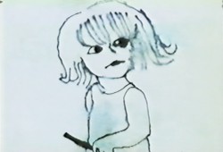
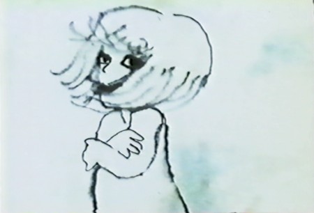
Beautiful animation, beautiful rendering, beautiful soundtrack.
Hubley 18 Feb 2009 08:50 am
Windy Day 1
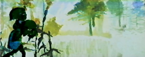
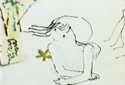 - In some ways, Windy Day is my favorite Hubley short. Several shots couldn’t be more perfect to me. The problem is all the white that yellows or grays in later prints and transfers. It’s hard to view the film as it was intended.
Barrie Nelson’s animation is superb and blends excellently with the wispy style used. They washed the ink lines and lit the art from below so that the style is quite delicate. This
 probably limited them to three levels including the background. John Hubley built his backgrounds around the animation of the characters, so that they’d be in the clear. However, there are many points where the animation crosses over and is blotted out by the background, but that is accepted as part of the design. There are also a couple of points where double exposures were used for effect or distortion.
Richard O’Connor writes nicely about Sara Calogero‘s watercolor rendering. I suspect that Faith Hubley probably did all the actual inking herself. She’d done that often and sometimes didn’t have the most sensitive hand just the fastest.
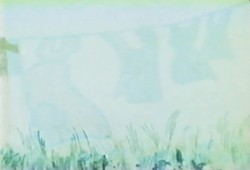
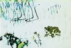
(Click any image to enlarge.)
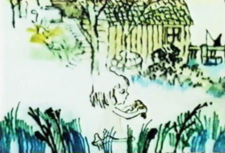
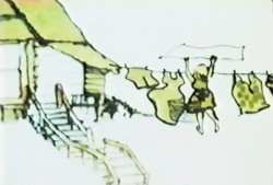
The style is bottom lit, so there has to be a hole open
in the Bg drawings so that the character won’t be obscured.
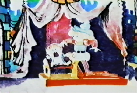
In this scene, the characters are double exposed into the BG
so that the black areas can be behind them.
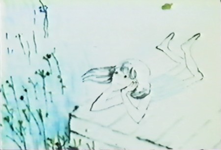
This is one of the most beautiful shots in the film.
A character thinking.
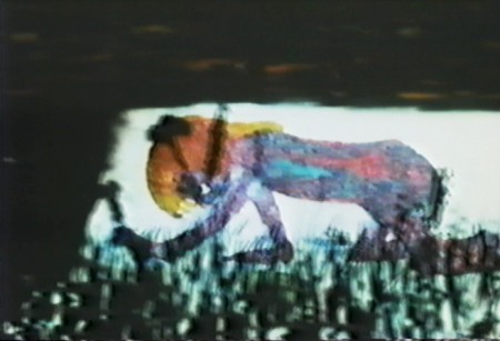
The character’s marker coloring is well served with the bottom lit art.
The style is used to its full potential here.
.
This will be completed tomorrow.
Art Art &Hubley 14 Feb 2009 09:14 am
Ounce
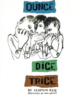 - I love Ben Shahn’s work and have since I first saw it in NY at a show at the Jewish Museum when I was in college. Shahn was enormously successful during the 50s, 60s & 70s; he was politically unpopular in the 80s and 90s. Now his work is considered passé by a lot of art critics since so much of it is politically motivated.
Shahn had an enormous influence on the NY crowd of the 50s, particularly those connected with the Art Student’s League. This included John and Faith Hubley, who studied painting there under Joseph Hirsch, and became closely associated with Gregorio Prestopino (who looks to have been an acolyte of Ben Shahn’s.) One can see the heavy influence of Shahn on a lot of John’s backgrounds in Adventures of an * or Moonbird.
In fact, all graphics of the 50′s and early 60s
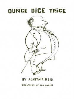 flew off the back of Ben Shahn’s work, and it wasn’t until Peter Max and The Yellow Submarine that art, illustration and, by association, animation seriously moved away from his beautiful line work.
Recently, John Canemaker showed me a book he had in his collection which Shahn had illustrated. I have a number of them, and they all look similar. Lots of white space, careful and poised compositions, textural lines with blacks and dark greys. They’re beautiful.
I thank John for lending me the book to post. It’s large, and I won’t post all of the pages, but I will have to break it into a couple of posts if I want to display it nicely. So this is the first. Usually, I don’t post the text of the book pages, but here the type and text is as much a part of the composition as the linework.
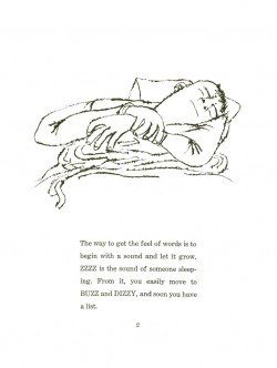
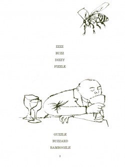
(Click any image to enlarge.)
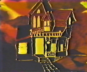
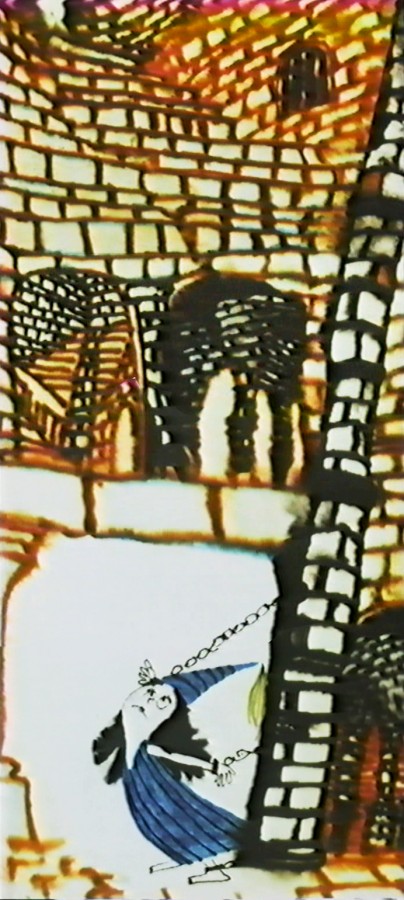
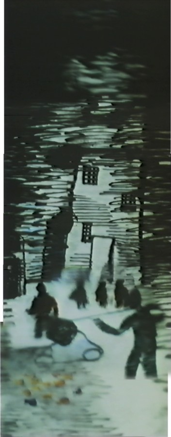
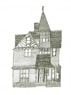
Here’s the house that ends Hubley’s Moonbird.
It’s part of the long pan that appears below.
Animation Artifacts &Hubley &Layout & Design &Tissa David 24 Dec 2008 08:59 am
More Hubley Babies
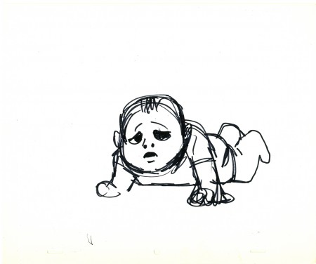
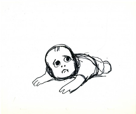
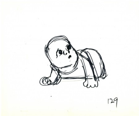
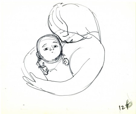
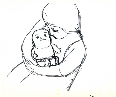
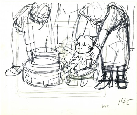
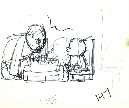
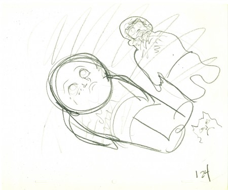
 - Continuing last week’s posts of the babies of The Carousel (Everybody Rides the Carousel), I have more drawings by John Hubley to offer. The baby is getting older, and visitors want to pick him up. The sequence is shown from the baby’s POV.
The final three drawings are from the sequence wherein the baby turns one year old and is being propped up to celebrate his first birthday cake.
These drawings were given to Tissa David to animated the sequence. They accompanied a long conversation over the soundtrack. Tissa returned with her first samplings of what the final babies would look like, and then they were altered in the I&P room. Soemtimes for the good.
(Click any image to enlarge.)
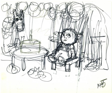
These three drawings with the birthday cake look as though they might
have been done by Tissa. The writing is hers.
Articles on Animation &Hubley &UPA 19 Dec 2008 09:07 am
Retreads – Rooty Toot Toot
(Click any image to enlarge to a readable size.)
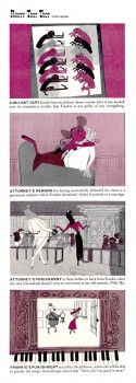
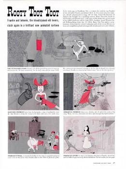
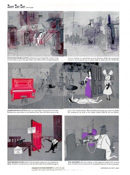
- In 2006 I posted this LIFE Magazine story on Rooty Toot Toot from a March, 1952 issue. They obviously enjoyed the UPA films back then, and luckily for us they posted it on something concrete – like paper.
My reason for posting it, originally, was a UPA celebration that was being screened at the Egyptian Theater in Hollywood. That’s long past, now, but Rooty Toot Toot lives on. I think of this as one of THE greatest animated films of all time. I doubt a month goes by without my watching it anew for inspiration.
The story goes that Stephen Bosustow was furious with John Hubley for taking so long on the storyboard and development of this short. Hubley eventually locked himself in his office and finished the prep to his own satisfaction. That’s how they finished the film. Needless to say, it went over budget.
The 1951 film obviously had world wide resonance. The story of a murder as told from different perspectives took the idea from the 1950 Kurosawa film Rashomon, wherein several people around a campfire tell different versions of a story. Of course, the premise dates all the way back to Chaucer, but there weren’t many film makers doing it at the time. Interestingly enough, Rooty Toot Toot was nominated for an Oscar the same year that Rashomon won a special award for Best Foreign Language film.
After seeing the short for the first time at a special UPA program in 1974, when I was working for the Hubley Studio, I told John that I’d just seen it and was blown away. He gave a short smile, turned and walked out of the room. He obviously didn’t want to talk about it. I guess the thorny years of the McCarthy era forced him to deny his own work of genius from a hellish period.
Just prior to the Egyptian screening, Amid Amidi posted some UPA crew photos on the Cartoon Modern site.
Amid has also posted some great art from the film on that same Cartoon Modern site.
part 1 part 2 part 3 part 4
Animation &Animation Artifacts &Hubley &Tissa David 17 Dec 2008 09:10 am
Tissa Babies
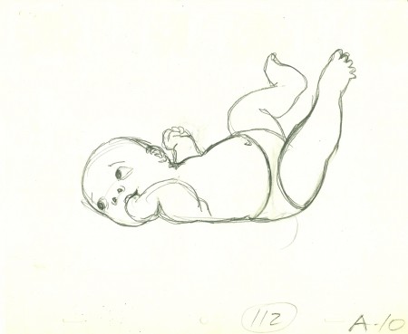
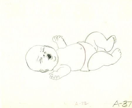
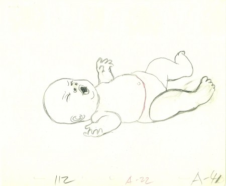
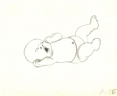
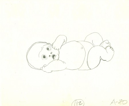
 - Yesterday I gave you a look at John Hubley LOs for some of the babies in the key scene, 112, from the Hubley feature, Everybody Rides the Carousel.
Tissa David did the lion’s share of this sequence which totaled about 10 mins of screen time. Barrie Nelson did some of the later scenes. (Tissa also did a second sequence occurring later in the film – ride #6. Barrie also completed that one.)
Tissa didn’t get any footage to study or even still photos (though she probably did her own research at the library.) She said she based her baby on her sister’s child.
These are her drawings from the same scene – 112.
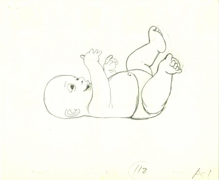
(Click any image to enlarge.)
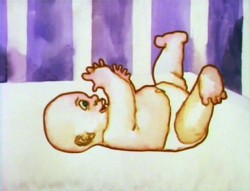

These frame grabs give an indication of how it was colored.
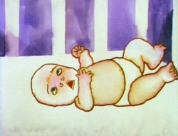
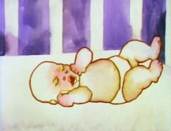
The style was to use a watercolor marker to ink the baby.
Then water was applied to the marker to loosen the color into the body.
This coloring style was used throughout the film.
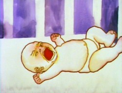
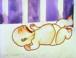
The image of the baby above right was a big deal for John Hubley.
Tissa didn’t want to do a cut mouth because it read as too two-dimensional
for her. She fought John several tries, but ended up
giving in and holding that head for a couple of frames.
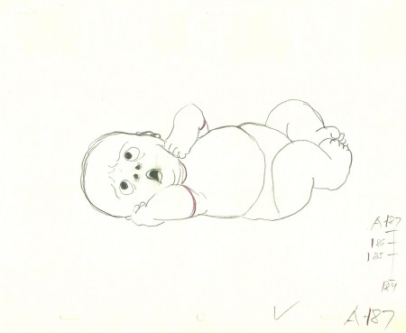
Lots of small cycles went on in this baby shot.
Tissa masterfully worked in and out of and back into these cycles
throughout the entire sequence. The baby was always in motion.
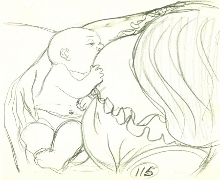
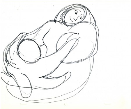
This last drawing is from Sc 115 where the mother
picks up the crying infant and nurses her.
I’ll offer more of these drawings next week.
Animation &Animation Artifacts &Hubley &Layout & Design 16 Dec 2008 09:00 am
Hubley Babies
 - John & Faith Hubley‘s feature film, Everybody Rides the Carousel was a great project to work on. The story was top notch, the art was flying left and right. (The entire production had a six month schedule and a budget of $450,000 when it was planned as three half-hour shows for CBS. Another month and $50,000 was added to extend it into a 90 min program.)
Great, talented people, as expected, worked on it.
Animators included: Tissa David, Barrie Nelson, Bill Littlejohn, Art Babbitt, Fred Burns, Adam Beckett, Lu Guarnier, Jack Schnerk, Don Patterson, Ruth Kissane, Phil Duncan and Earl James.
The excellent score was written by the rising classical/jazz composer, William Russo. (I was amazed at this in that I was addicted to his Three Pieces for Blues Band and Symphony Orchestra and hadn’t realized that the Hubleys knew his work.
The vocal talent included old reliables such as Lane Smith, Jack Gilford, Juanita moore, Dinah Manoff and Lou Jacobi and introduced new, young talent Meryl Streep and Jenny Lumet.
 For someone my age, it was a dream production. I coordinated the animation, assisted all of the animators who required help and animated some 85 scenes.
The film was an adaptation of the writings of psychoanalyst Erik Erikson, specifically his book Childhood and Society (1950). Eight Stages of Development were adapted into eight horses on a carousel, each representing a different stage in human development.
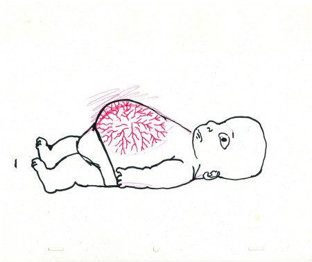
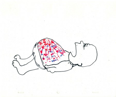
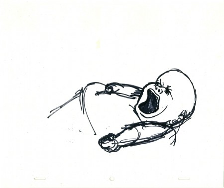
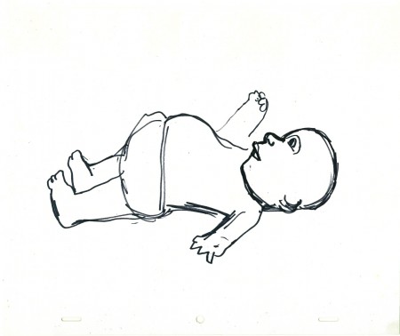
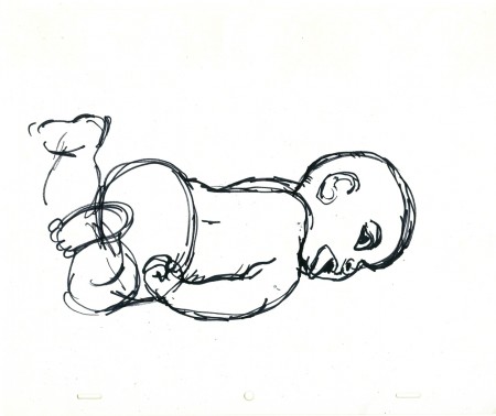
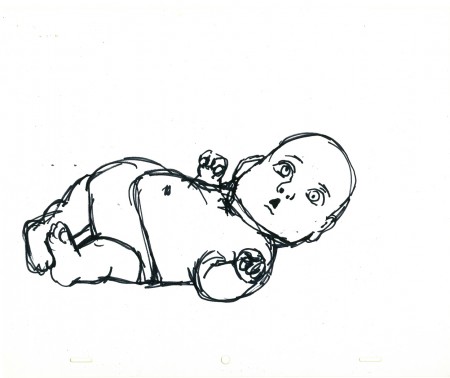
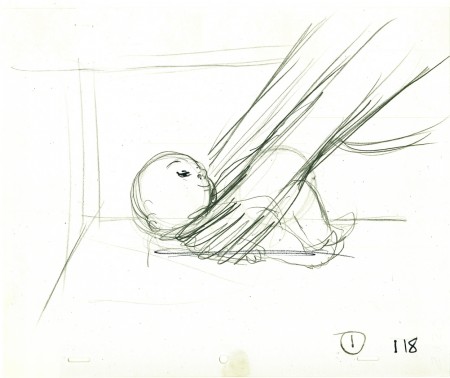
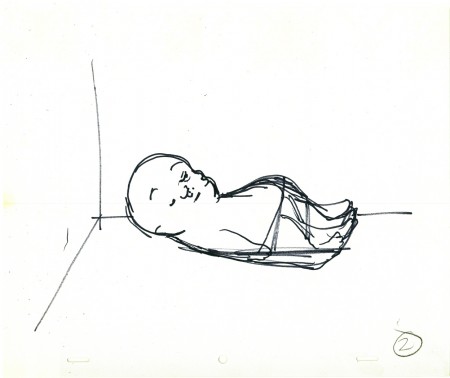
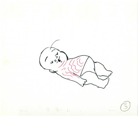
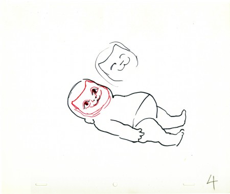
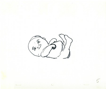
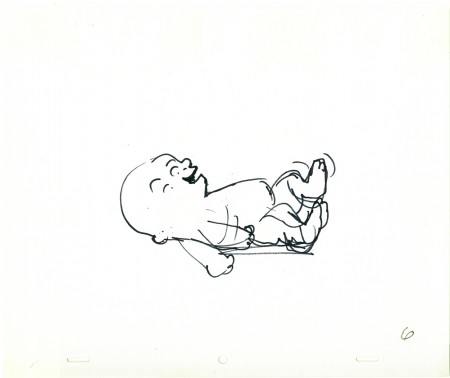
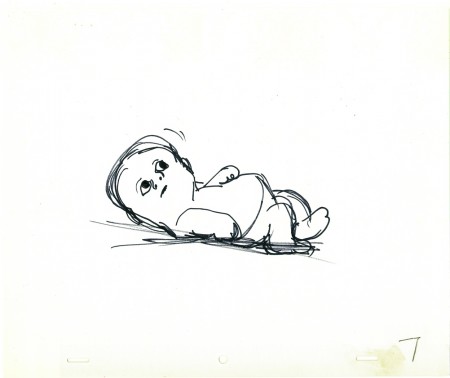
Today I’d like to post some of John Hubley’s drawings of the baby in the opening sequence. These were all animated by Tissa David, and I’ll post her drawings of the same poses tomorrow. They’re very different.
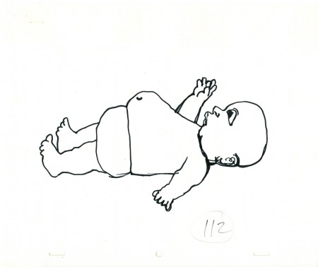
(Click any image to enlarge.)
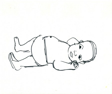
All of John’s drawings were done with a Sharpie pen,
which was his weapon of choice, most of the time.
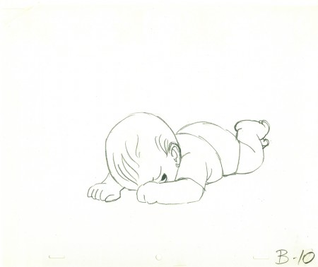
This last drawing (done in pencil) is Tissa David’s interpretation of
John Hubley’s last image. She did a bunch of these sketches and
worked with John in solidifing what the final look of the baby would be.
Tomorrow I’ll post Tissa’s drawings.
Animation &Animation Artifacts &Hubley &Models 31 Oct 2008 08:12 am
Halloween Eggs
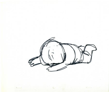
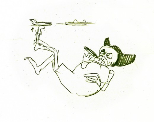
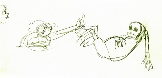
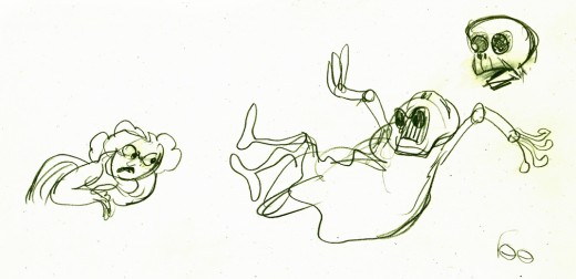
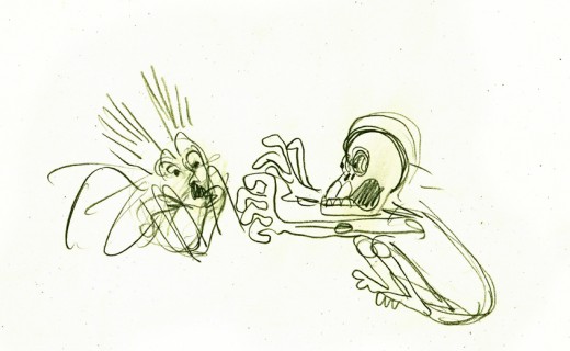
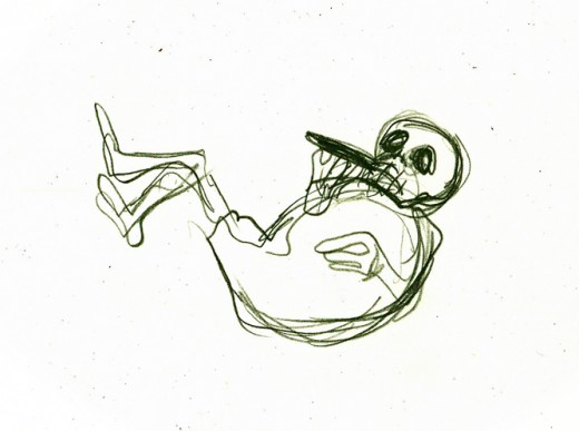
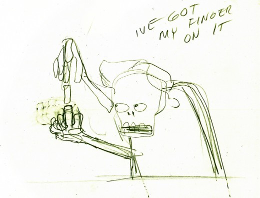
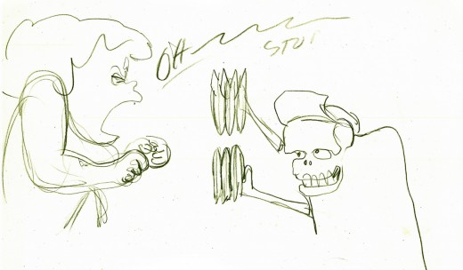
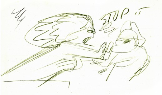
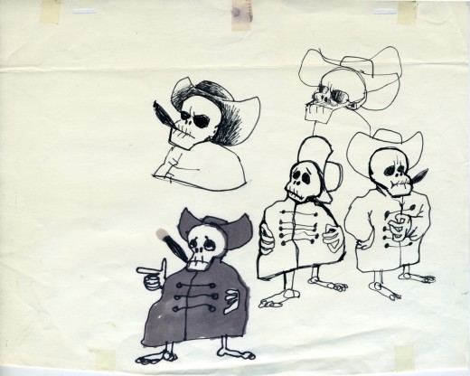
- For Halloween, we’re all posting relevant material to the “holiday.” I have a lot of artwork from the Hubley short, EGGS, which was wholly animated by Tissa David.
One of the two characters starring in the short is a skeleton, symbolic of death and destruction. The other is a nymph, who represents fertility. The show is basically about the complications overpopulation has presented to the world.
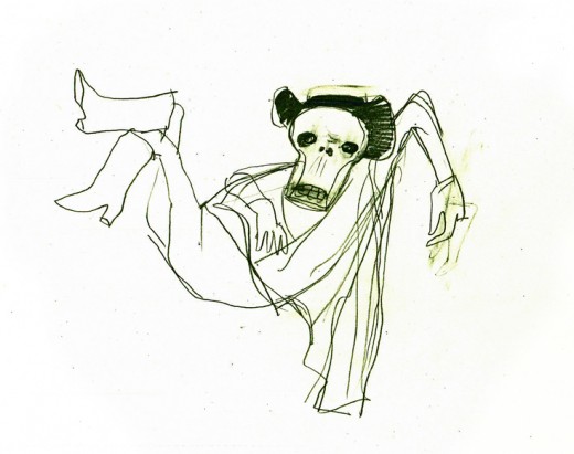
I thought it appropriate for today to post some of the drawings and models for the death character. The images displayed are cropped from the full animation sheets; when you click these displayed it’ll enlarge to the full page. Here they are.
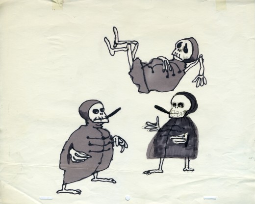
The first model of the character came close to the final.
This is a drawing by John Hubley.
He soon solidified in this model by Hubley.
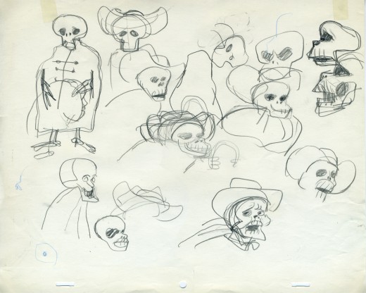
Tissa David finally worked out some of the problems for herself
and created this working model sheet.
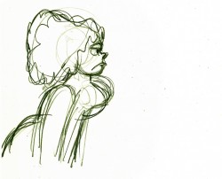
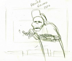
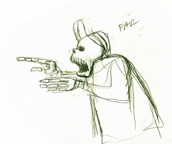
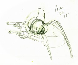
Here’s a beautiful working drawing by Tissa as
she started to pose out the scenes.
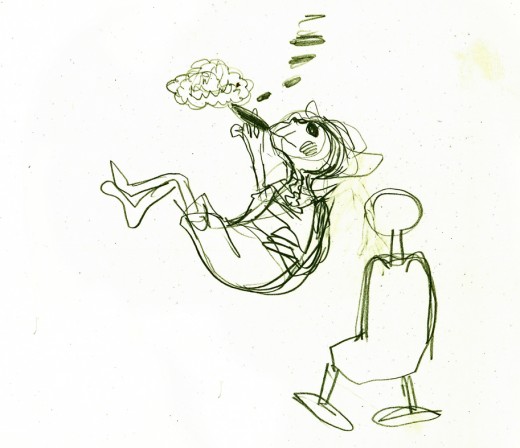
Tissa’s roughs are deceptively simple but convey so much. These drawings
are for her eyes only, usually, she’ll clean it up somewhat for animation.
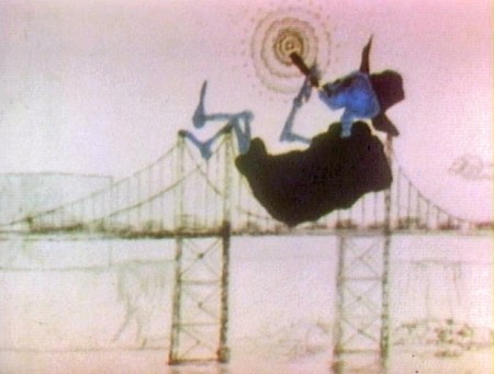
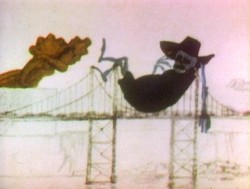
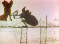
Unfortunately the dvd is a bit soft partially because of the nature of the
underlit final artwork. Perhaps someday there’ll be a better digital transfer.
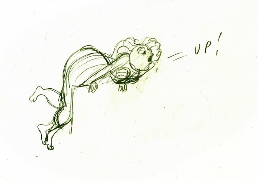
Fertility is oozing sexuality in every drawing. This is part of the
same scene as she converses with death about the human race.
Here’s a YouTube interview with John & Faith Hubley done in 1973. They discuss Eggs and Voyage to Next.
Here’s EGGS on YouTube in a contrasty but sharp copy.

