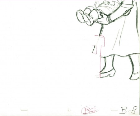
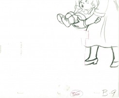
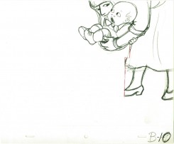
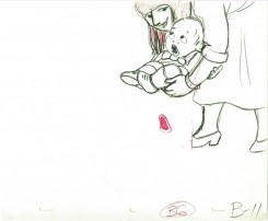
Category ArchiveHubley
Animation &Animation Artifacts &Hubley &Independent Animation 21 Sep 2011 06:48 am
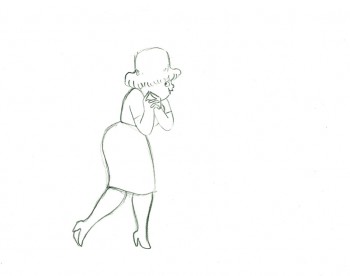
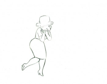
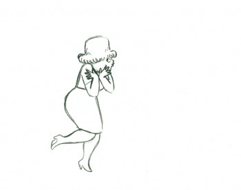
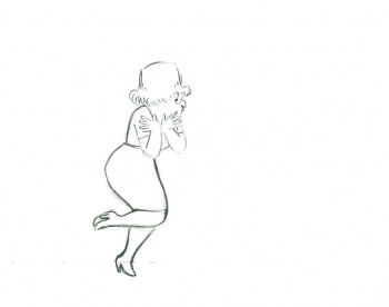
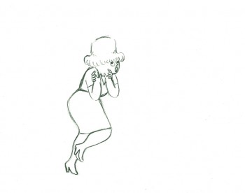
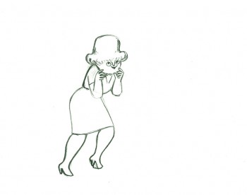
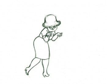
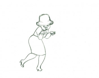
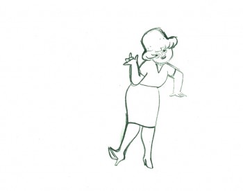
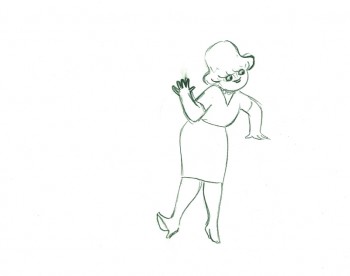
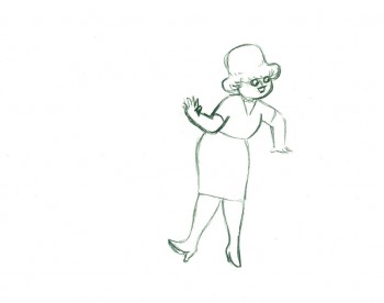
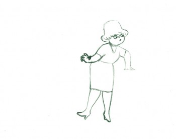
Marky’s walk – recap
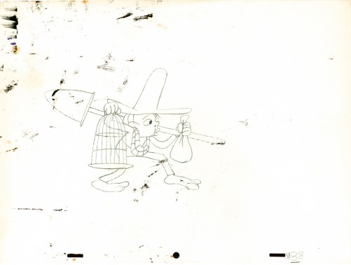
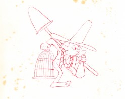
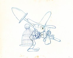
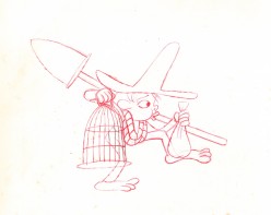
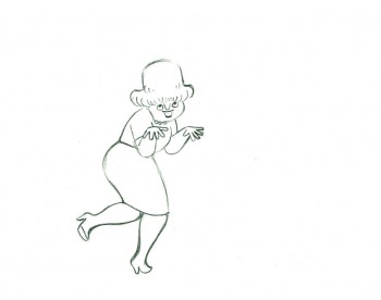
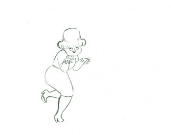
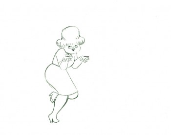
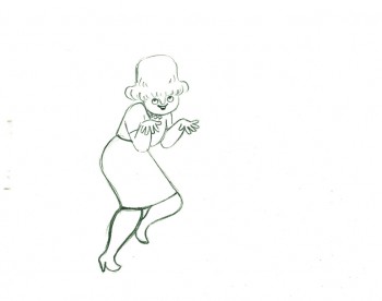
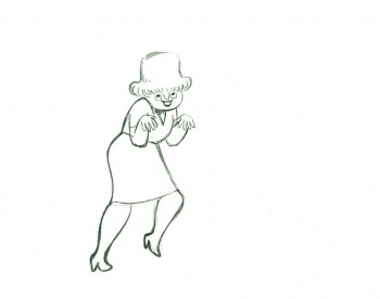
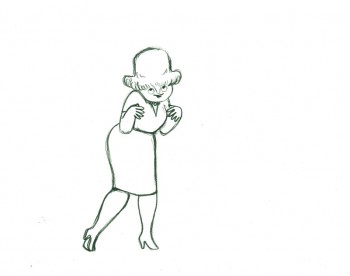
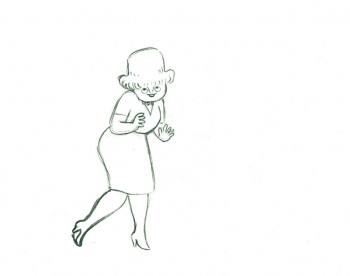
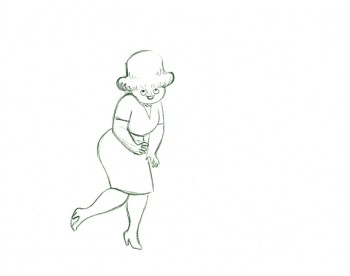
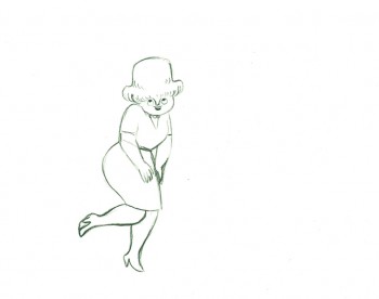
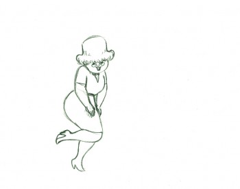
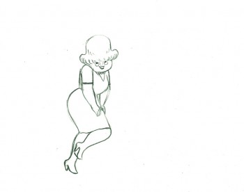
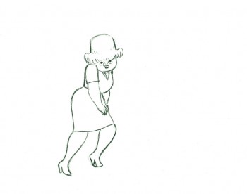
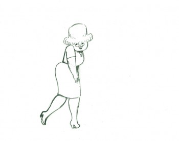
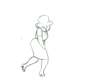
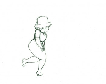
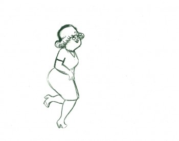
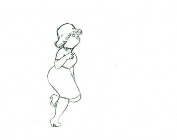
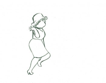
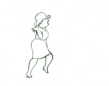
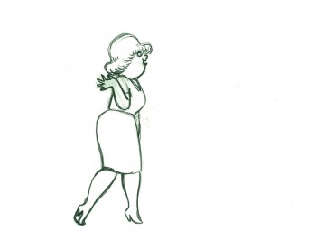
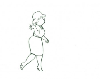
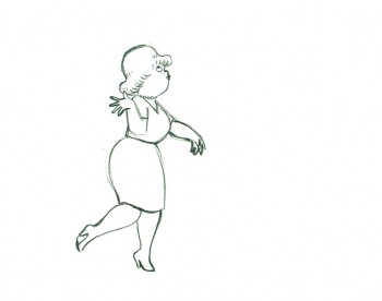
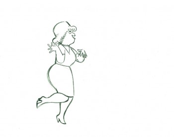
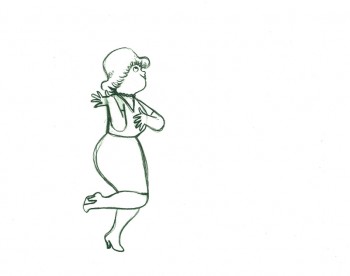
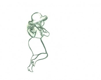
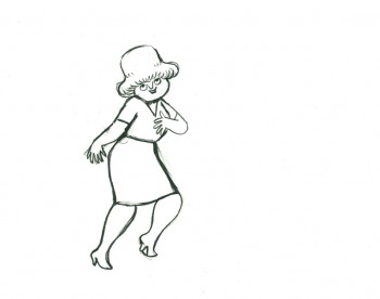
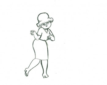
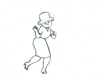
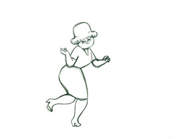
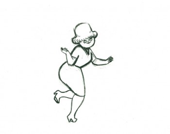
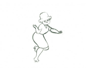
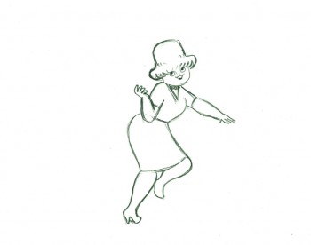
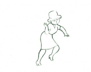
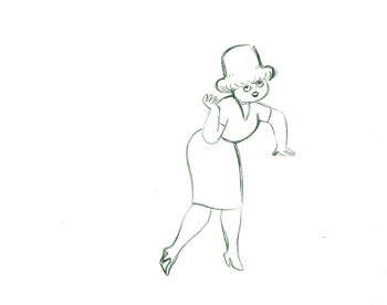
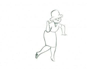
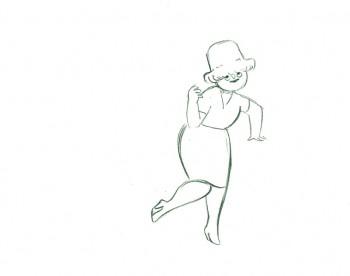
After posting a large piece about Moonbird last Monday, I felt inclined to recap this Bobe Cannon walk from the film. I love it. Originally posted March, 2009
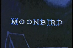 - If I had to choose who was my favorite animator, I’d have a tough time. Equal credit would probably have to go to three different people: Bobe Cannon, Tissa David and Bill Tytla. Ed Smith and Jim Tyer would fall just a smidgen below these three, for me. But there are none like them all, as far as I’m concerned.
I’ve posted a lot of drawings from Tissa and Bill Tytla, but have very few drawings by Bobe Cannon (nor have I seen many published anywhere.)
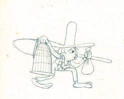
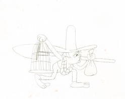
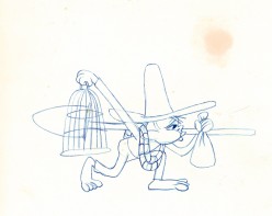
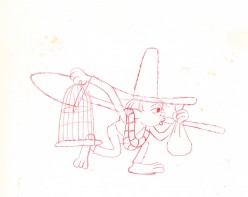
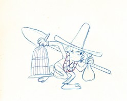
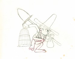
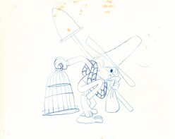
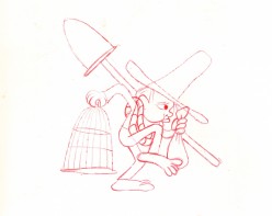
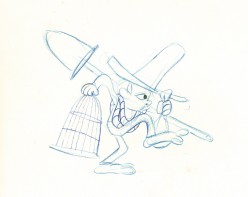
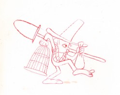
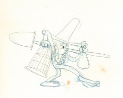
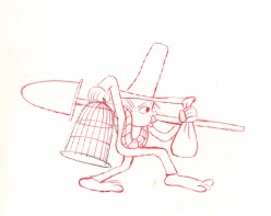
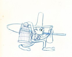
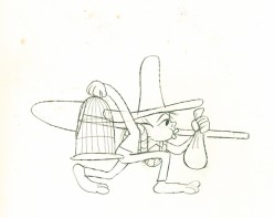
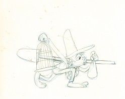
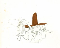
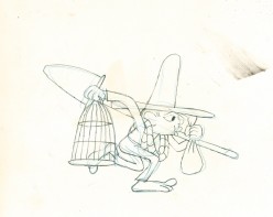
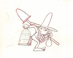
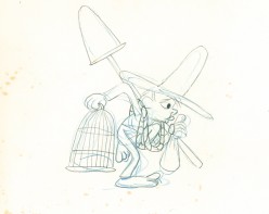
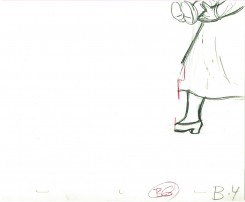
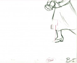
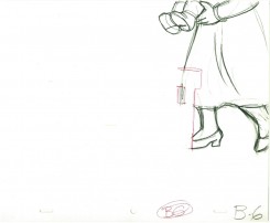
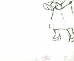
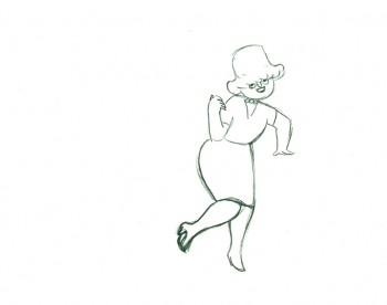
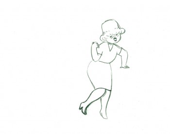
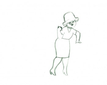
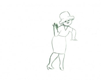
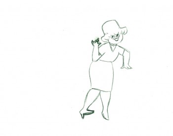
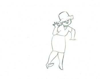
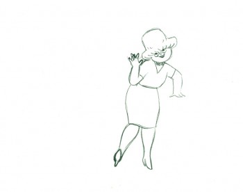
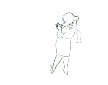
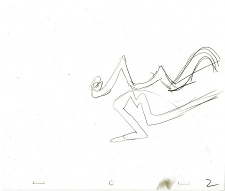
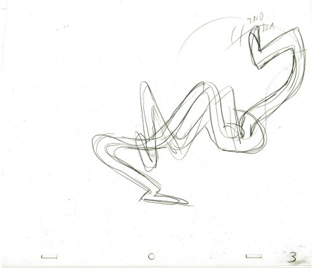
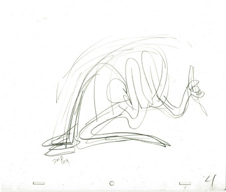
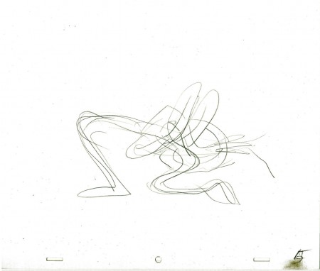
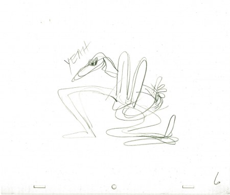
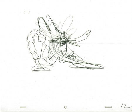
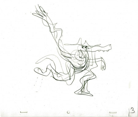
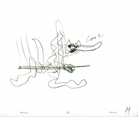
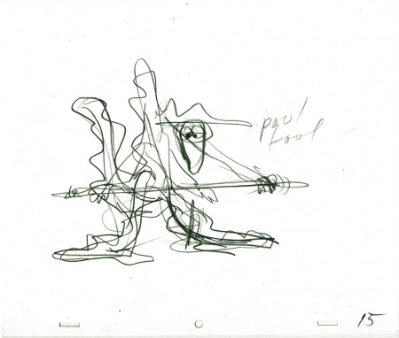
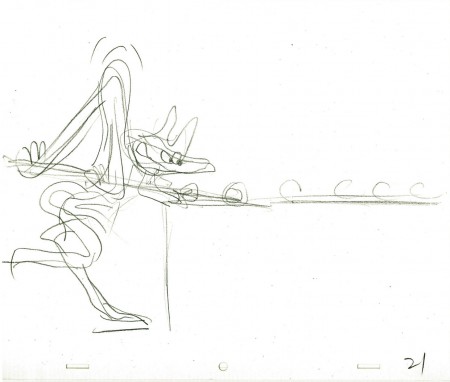
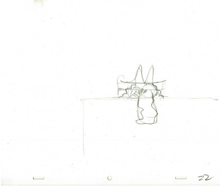
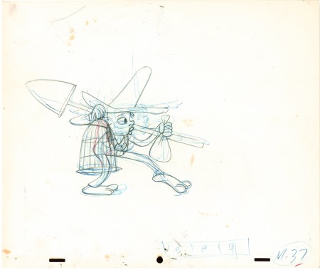
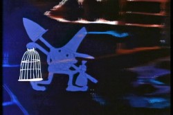 Here is a walk cycle from the beginning of Hubley’s monumental short, Moonbird. The odd numbers are extremes by Cannon, and the inbetweens (even numbers) were done by Ed Smith. Three different sized papers were used for this, and you can view them full sized if you click the thumbnails.
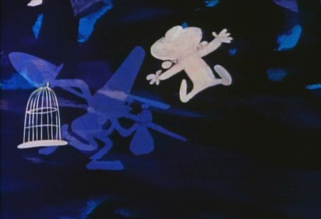
You’ll notice there’s paint all over the drawings. The ink & paint involved tracing the drawing, then using oil paints to cover all of the clear area in black. Some of that paint seeped onto the originals. In one drawing even to coloring the hat accidentally.
 37
37(Click any image to enlarge.) “Marky” walk cycle from Moonbird
On twos at 24FPS
Click left side of the black bar to play.
Right side to watch single frame.
There’s a lot more to this scene including several variants on the walk.
At some future time, I’ll add the other drawings to show off the entire scene.
Commentary &Frame Grabs &Hubley 19 Sep 2011 07:23 am
Moonbird
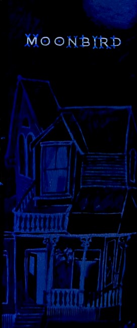
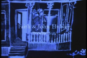
Opening title pan down- Moonbird
- In 1964, John and Faith Hubley‘s film, Of Stars and Men opened at the Beekman Theater in Manhattan. This was their first feature; it was accompanied by a number of their short films. I was in High School, and this is the first time I saw any of the Hubley films, and my life had changed at that screening.
 The flat colors of the Disney and Warner Bros cartoons were suddenly replaced with textures. It wasn’t only the backgrounds that had a texture; it was the characters as well. I’d already taught myself quite a bit about animation, but this was something new for me. I sat with saucer eyes watching every element and filmic device John Hubley came up with in creating these flms.
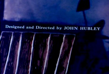 It was so clear that Hubley was using a system of double exposures, doubling the characters in at an exposure of about 60% so that the white paper would be somewhat translucent over the dark backgrounds. The rough pencil lines of the animators clearly delineated the characters in this technique, though they picked up some of color of the Bgs. Obviously, the white paper of the character had been painted black – up to the animator’s lines so that the extraneous parts of the paper was matted out. What a brilliant idea!
I explain this process in depth in this post from the past.
.
This enabled us, the audience, to see the rough lines of the animators and brought the same life the Xerox line had brought to 101 Dalmatians. It was thrilling for me.
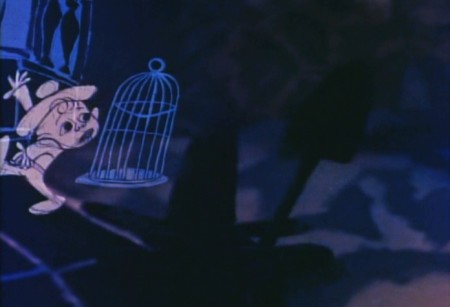
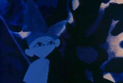
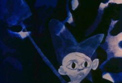
The sing-song muttering of a child introduces us to “Hampy”.
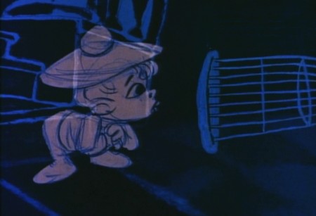
The rough lines of animator, Bobe Cannon, are a treat on the screen.

Every oil painting background beautiful, alive and modern.
The other amazing thing was that the films used real dialogue.
It didn’t sound like a script. It was obviously, somehow, improvised.
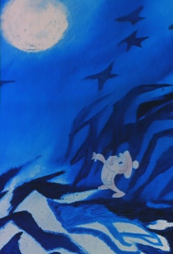
It took me a while to learn how this was done
and what a wonderful way they had of doing it.
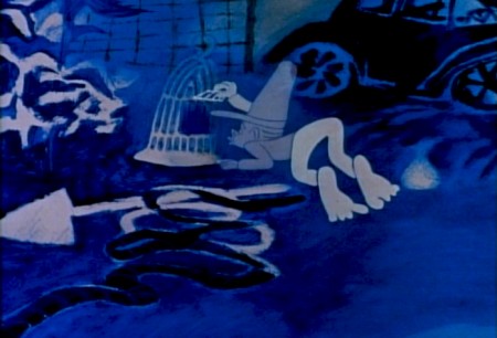
Moonbird was different from the other shorts of that period.
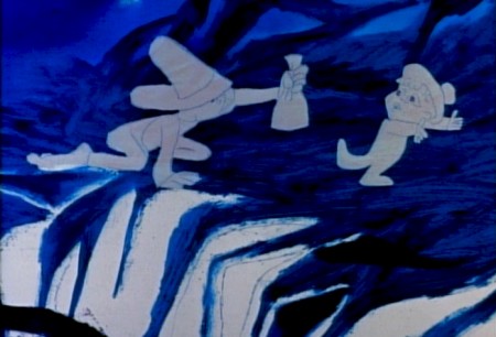
Its soundtrack was completely improvised by the
two boys of the Hubleys, Mark and Ray.
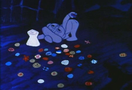
. . . but it also used NO music track.
This is very different for the Hubley films that had
such a devotion to the use of jazz on the soundtrack.
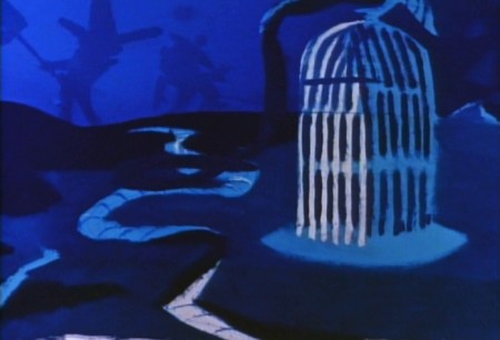
The film not only looked different for the time, 1959,
but it sounded different.

This film had clearly been the results of years of experimentation.
After all those brilliant UPA shorts, particularly Rooty Toot Toot.
The original Hubley produced shorts took a new, brilliant turn.
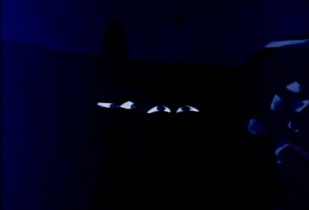
Adventures of an * moved animation forward
in its pursuit of 20th Century Art.
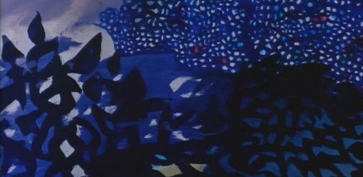
Picasso and Steinberg had been mimicked in the UPA films.
With Adventures of an * the Abstract Expressionists
came under the magnifying glass as John Hubley used
the New York school as his inspiration.
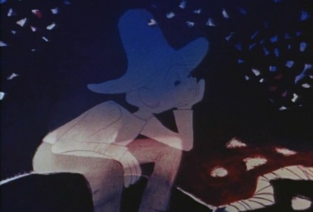
With Tender Game they moved that style into a more emotional
character animation, and by the time they did Moonbird, they
had settled into a very rich style that animation hadn’t noticed.
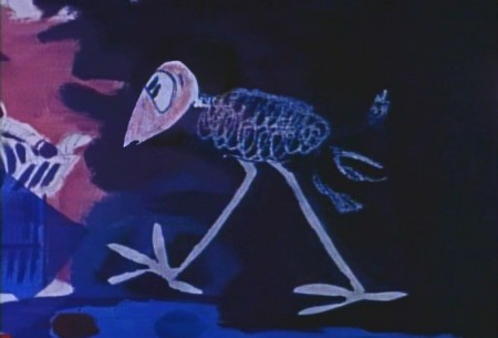
Two of animation’s finest animators delivered
the brilliant lyricism in this film.
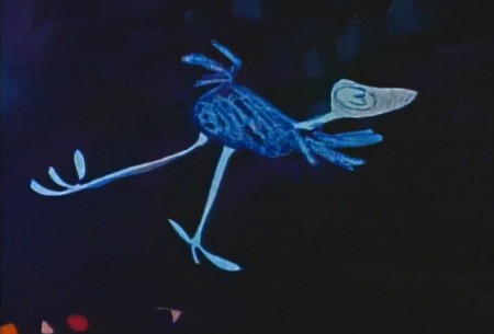
Bobe Cannon, for years, had delivered great animation.
His work with Chuck Jones had produced new and rich
experimental heights particularly in the 1942 short, The Dover Boys.
Hubley had stated that this film was an inspiration
in the move to 20th Century graphics in animation.
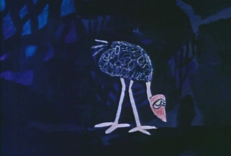
Cannon’s work with UPA, both directing and animating,
brought a new sense of poetry to the medium that finally
plays out in this film, Moonbird.
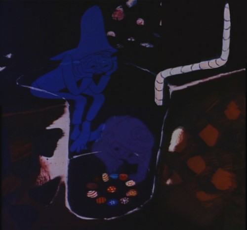
The young Ed Smith rose to great heights
while working for Hubley. His work on Tender Game
showed a natural warmth that spills over in this film.
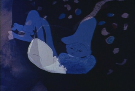
Animation, double exposures, oil painted Bgs,
improvised voices, no music all pushed this film
to the forefront of animation at the time.
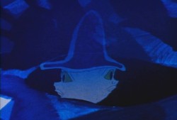
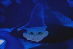
Despite the looseness of the style, it all blends
together as if it had been done by the one artist.
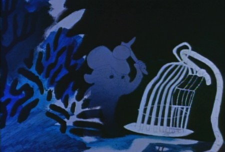
I love the soft airbrushed look Hubley was able
to pull off with much of this double-exposed artwork.
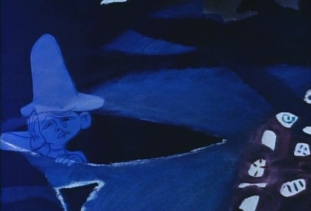
And yet the characters always remain front and center.
A tribute to the two animators and the directoral staging.
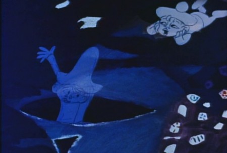
This delicate and lyrical film was followed by an anmiated
discussion of nuclear warfare and armament. The Hole
was twice the length and had a political point to make.
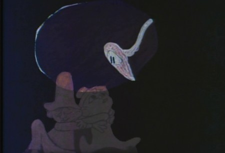
The characters’ colors change and fluctuate and sparkle
even as scenes progress, but this all becomes part of
the style which the Hubleys pursued for
the rest of their filmmaking life.
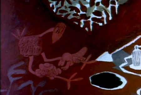
As in Moonbird, the voices in The Hole were improvised
. . . but this time by adults, Dizzy Gillespie and George Mathews.
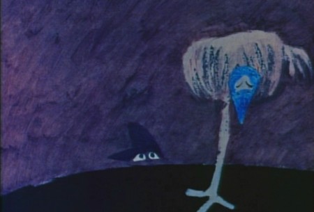
The Hubleys took their process of improvisation to a new level.
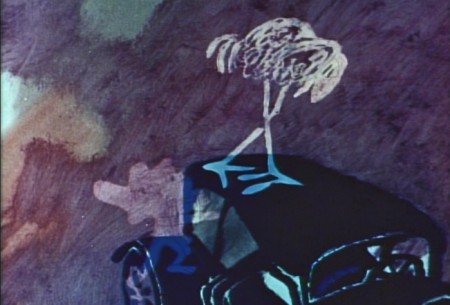
In the end, animation grew up, once upon a time.

The question is whether we’ve squandered that development
and have retrogressed to the 19th Century illustration styles
that Disney pursued. Recently, we seem to have had only
bad drawing or cgi puppets to choose from.
Time to step up, ladies and gentlemen.
Animation &Animation Artifacts &Hubley &Tissa David 14 Sep 2011 06:51 am
Carousel’s Lovers – recap
This is one of my favorite sequences in the Hubley canon. Animated by Tissa David.
It’s worth a repost: the original appeared here in June, 2009.
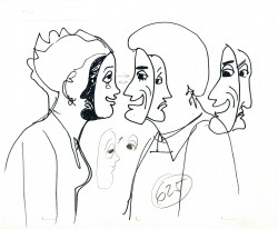
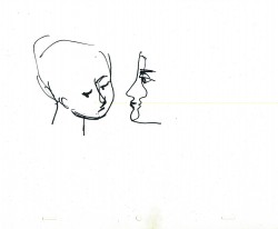
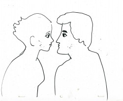
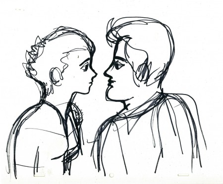
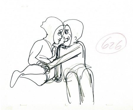
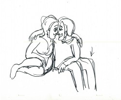
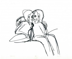
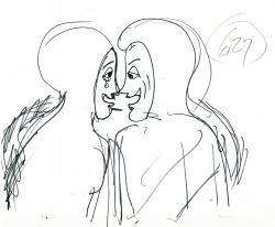
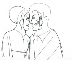
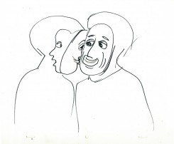
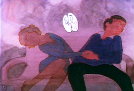
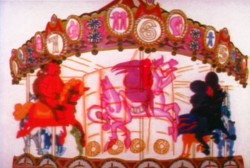 - Let’s take a look at the scene in Hubley’s Everybody Rides the Carouselwherein the young lovers have had a spat and try to have a romantic scene despite the fact that neither of them wants to do that.
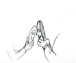
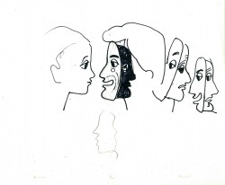
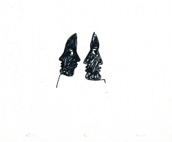
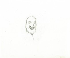
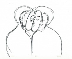
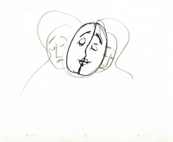
They’ve argued over the girl having cut her hair without telling the boy. He’s annoyed and she laughs at him. They push on to a frothy conversation. Both put on masks to continue the conversation while the inner characters
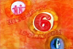 are annoyed and have an inner monologue. They get to the point where they can’t take the masks off and end pulling away from each other.
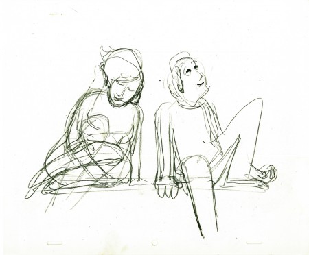
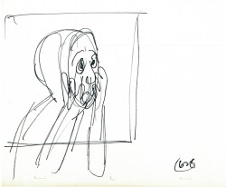
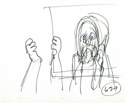
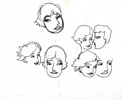
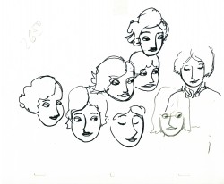
I’ve gathered John Hubley‘s layouts for this sequence. Tissa David animated them. You’ll note that the pencil numbers are a scene breakdown done in Tissa’s handwriting. The very loose drawings were done with a sharpie or pencil. The pencils would have been done while in handing it to Tissa during the conversation. They’re to delineate some point in greater detail for her.
I’ve also pulled some frame grabs so you can see how it was finally rendered. The coloring was done on vellum and shot bottom light. No more than 3 levels were used (including the background.) Tissa, aside from concerning herself with the dramatics of the scene, had to watch that the characters didn’t overlap. More complication for her.
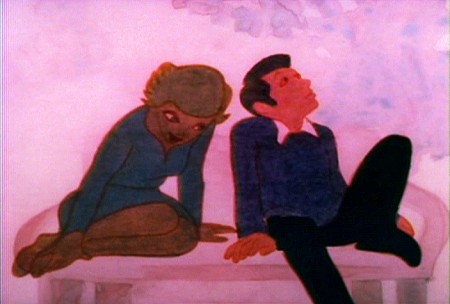
(Click any image to enlarge.)
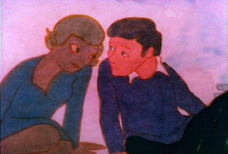
By the way, this was Meryl Streep’s first screen performance.
Charles Levin, another NY character actor, played the boy.
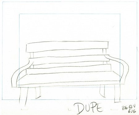
Here’s the park bench.
A quick rough copy by me to Tissa of John’s Bg LO.
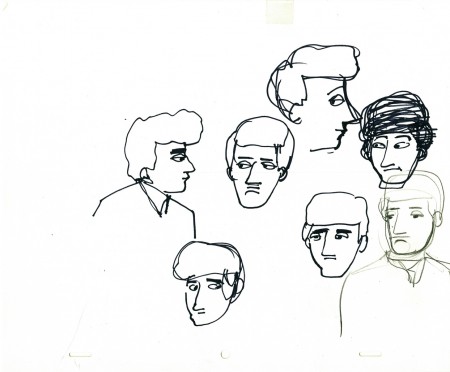
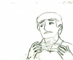
John’s model of the boy’s head for Tissa.
Animation &Animation Artifacts &Hubley &Tissa David 22 Jun 2011 07:22 am
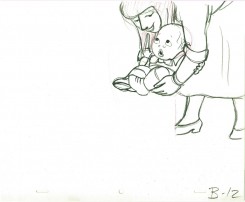
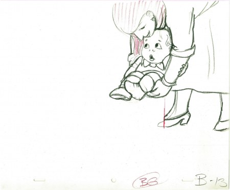
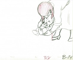
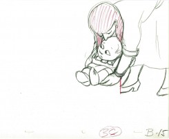
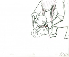
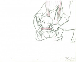
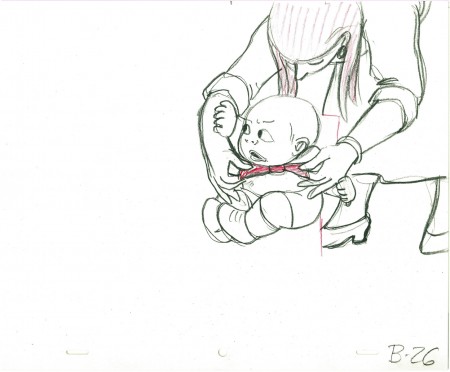
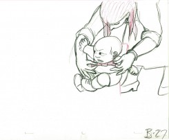
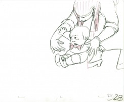
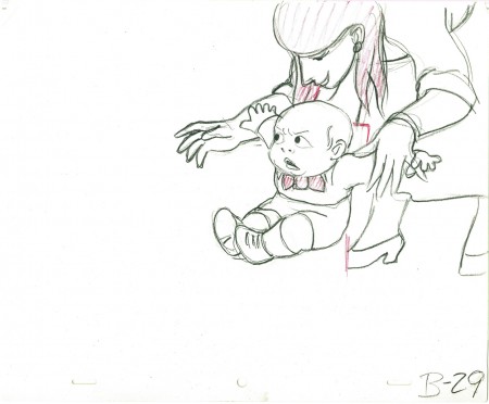
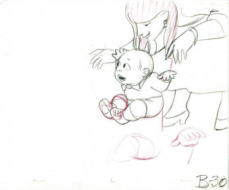
Tissa’s Baby
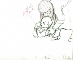
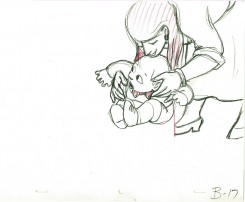
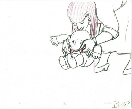
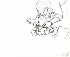
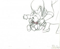
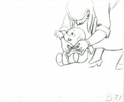
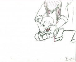
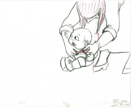
- Here’s the first part of a scene Tissa David animated for the Hubley feature EVERYBODY RIDES THE CAROUSEL. The baby is one year old and mother puts him down in front of the lit birthday cake. She tries to fix his tie, but he’ll have none of it. I have the mother drawings that follow this, but I’m missing the baby. So I’ll let it end at this point.
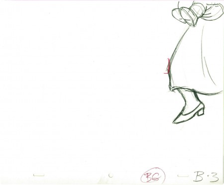 3
3
________________________
.
The following is a QT of the entire scene with all the drawings included.
Since I didn’t have exposure sheets, I calculated everything on threes
since Tissa did a lot of her Hubley work on threes.
I don’t know if there were any holds, but I doubt it.
Animation &Hubley &Tissa David 01 Jun 2011 08:18 am
Tissa’s VIVA
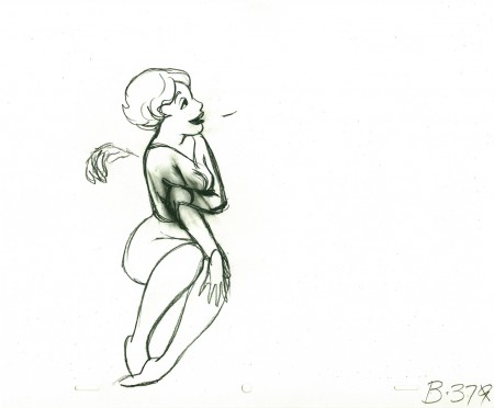
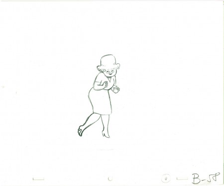
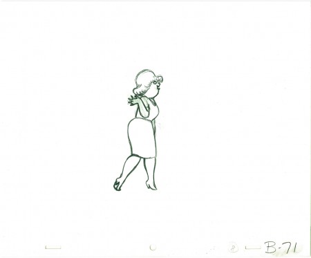
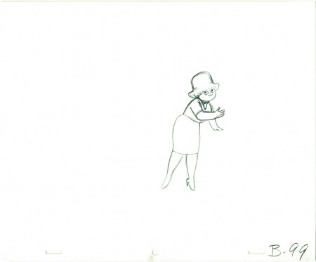
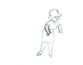
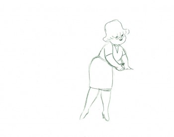
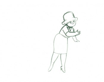
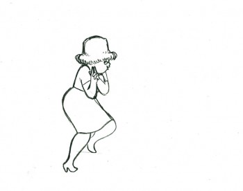
- Tissa David animated a VIVA paper towel spot for the John Hubley. I have most of the drawings for the commercial. Here’s a scene wherein the lead, a woman, walks through (Bg pans behind her at .25 per drawing) toward the kitchen, where she stops.
Instead of giving you the entire page of animation paper, I’ve trimmed it down to just include the character and her walk. Here are four examples of what the entire drawing looks like, untrimmed.
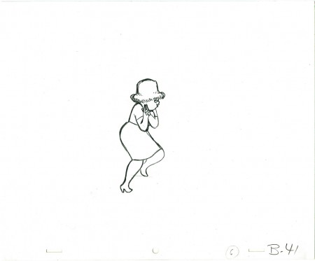 B41
B41
And here are all the drawings for the scene cropped:
 41
41
________________________
.
The following is a QT of the entire scene with all the drawings included.
Since I didn’t have exposure sheets, I put everything on two’s straight ahead.
Animation &Frame Grabs &Hubley &Independent Animation 14 Mar 2011 07:22 am
The Hat – bigger
- The recently posted interview Mike Barrier conducted with John Hubley has me thinking about Hubley and my years back there and then. You might say, I’m in a Hubley frame of mind these past few days, so I’m into reminiscing. I posted part of this back in March, 2008; here, I’ve extended the article a bit.
 New York’s local PBS station, WNDT – that’s what it was called in the old days – used to have a talk show hosted by film critic, Stanley Kaufman.
(It turns out that this show was produced by the late Edith Zornow, who I once considered my guardian angel at CTW.)
This talk show was quite interesting to me, a young art student. I remember one show featured Elmer Bernstein talking about music for film. He gave as his example the score for The Magnificent Seven. He demonstrated that the primary purpose of the score, he felt, was to keep the action moving, make the audience feel that things were driving forward relentlessly. I still think of that show whenver I see a rerun of the film on tv.
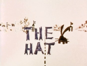
The surprise and exciting program for me came when John and Faith Hubley turned up on the show to demonstrate how animation was done. They were using as an example a film they had currently in production, The Hat. This film was about the siliness of border lines. One of two guards, protecting their individual borders, loses his hat on the other side of the line. Of course, all he needs do is to step over and pick up the hat, but he can’t. The other guard won’t allow him to cross the border illegally – even to pick up his hat.
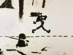
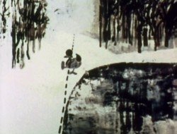
The voices were improvised by Dudley Moore and Dizzy Gillespie (much as the earlier Hubley film, The Hole, had been done.) The two actor/musicians also improvised a brilliant jazz score.
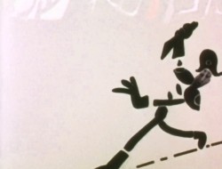
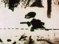
John’s design was quite original. The characters were a mass of shapes that were held to-gether by negative space on the white on white backgrounds.
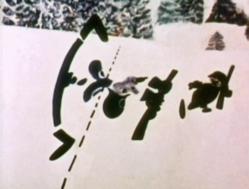 The animation of the two soldiers was beautifully done by Shamus Culhane, Bill Littlejohn, Gary Mooney and “the Tower 12 Group“.
Culhane animated on a number of Hubley films during this period, most notably Eggs and a couple of commercials.
Bill Littlejohn animated on many of the Hubley films from Of Stars and Men up to Faith’s last film.
Gary Mooney animated on The Hole and Of Stars and Men. He was an Asst. Animator at Disney, animated for Hubley then moved on to some of the Jay Ward shows before moving to Canada where he continues to animate.
Tower 12 was the company formed by Les Goldman and Chuck Jones at MGM. Apparently they were between jobs when Hubley was finishing this film, and Chuck offered help.
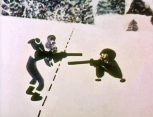
Of course, the colors of the film as represented by the dvd are pathetically poor. It’s hard
to even imagine what the actual film looks like, and it’d be great to see a new transfer of
all the Hubley films.
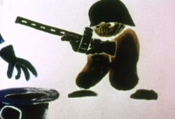 The design style of the film was an original one for 1963. It’s one that would often be copied by other animators afterwards. The characters were searated at their joints. No reel ankles, just open space. They were also broken at the wrists and belts. The taller man seems to have a collection of ribs and shoulders for his torso. Like the dotted line they walked but could not cross, these people were also a gathering of parts.
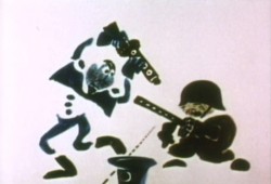 This was one step removed from the earlier film, The Hole, which had just won the Oscar and went on to enormous success for the Hubleys. That film used what they called the “resistance” technique. They first colored the characters with a clear crayon. Ten painted watercolors on top of that. The crayon would resist the watercolor and a splotchy painterly style developed. The Hat literally broke those splotches into parts of the characters and put some of the control in the animators’ hands.
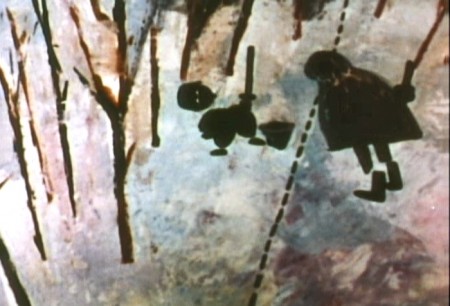
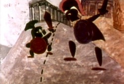 The film was obviously political. Anti-nuclear politics played strongly in the story. This was a step just beyond The Hole. In that film, two sewer workers converse on what violent things might be happening above ground. The film ends with an accident, or possibly a nuclear crash.
In The Hat, the two partisan soldiers discuss a history of man’s aggression all within their reach. At one point, it would seem, each of
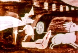 them is ready to press the red button calling for nuclear assistance – or, at the very least, a buildup of military force.
While walking up and down that line, they comment on how we reached the point of no return. All the while, bugs and small animals cross the line, indeed, walk on or over the “hat” lying on the ground.
The backgrounds for this history of War grow more violent, more expressionist. John’s painterly style comes to the fore, and the brush strokes take on a force we haven’t seen to this point.
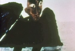
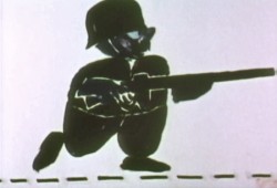
When we return to the two leads, we find that they’ve changed. They’re darker, and they both have lines scratched into the paint of their bodies. Not as much emphasis is placed on their disjointed body parts.
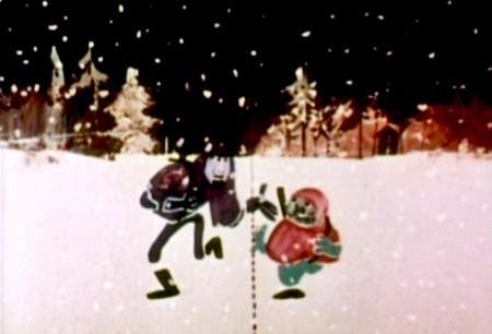
We leave them as we found them, walking that line. At this point, both of their hats lay on the ground and they’re deep into conversation. They don’t seem to notice anymore.
It has started to snow.
Animation &Books &Hubley &Illustration 16 Jan 2011 08:52 am
Recap – Art Director Awards ’57
Here’s a recap of one of my favorite pieces. For some reason, I get turned on by every one of these stills. Perhaps because they were printed in the Halas book which was seminal to my education about animation when I was a child – I think I had the book on permanent loan from my local library. Whatever the reason, I love looking at these pictures.
.
- I enjoy thumbing through the Art Director’s Annuals. There’s a lot of amazing illustration to view with plenty of ideas and sharp graphics on display. I have, as a good example of these hard-covered catalogues, the 1957 issue. 90% of the book is composed of illustration in the different advertising fields. A small section is devoted to TV spots and illustration. Naturally, I have a strong interest in this section.
Editorial Art, Advertising Art and Television Art all get their chapters.
Here is a pictoral list of the winners in animation for the TV commercials awards in 1957. A number of these spots have remained familiar (at least as images in old animation books – like Halas’ Technique of Film Animation.)
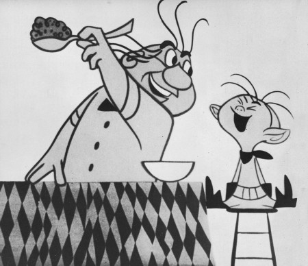
The biggest prize went to John Hubley’s Maypo commercial.
Storyboard Inc. – producer
John Hubley – Director & Art Director
Emery Hawkins – animator
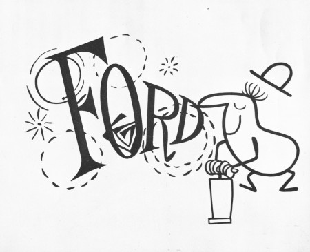
Ford commercial
Playhouse Pictures – producer
Bill Melendez – director
Sterling Sturtevant – Art Director
Bill Littlejohn – animator
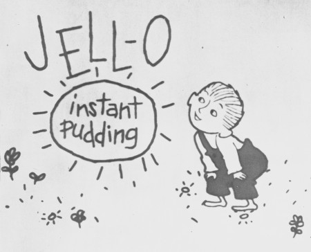
Jello
Ray Patin Productions – producer
Sonia Linker – Art Director
Maurice Sendak – artist
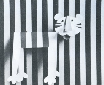
Maxwell House
Audio Productions Inc. – producer
Jerome Kuhl – artist
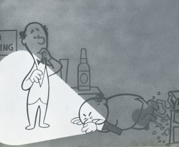
Piels Brothers Beer
UPA – producer
Jack Sidebotham – art director
Chris Ishii – designer
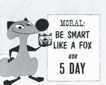
5 Day Deoderant
Storyboard Inc – producer
John Hubley – art director
Art Babbitt – animator
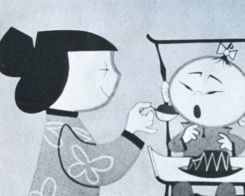
Jello Baby
Ray Patin Productions – producer
Ruchard Vab Benthem – artist
Ken Champin – photographer
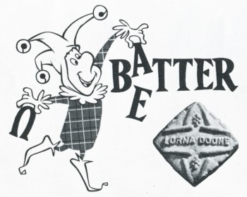
Lorna Doone
Bill Sturm Studio
Frank Broadhurst – art director
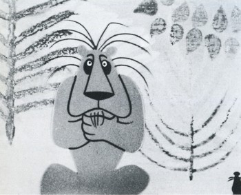
The Lion and the Mouse – Prudential
Storyboard Inc. – producer
John Hubley – director
Art Babbitt & Emery Hawkins – animation
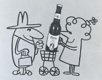
Coors Beer
UPA – producer
Jules Engel – director
Fred Crippen – art director
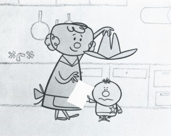
Scott Paper Co.
UPA – producer
Jack Goodford – art director
Grim Natwick, Sam Wiggenhorn – animators
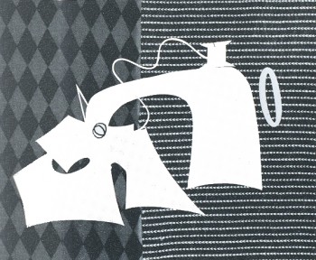
Donahue Sales Corp.
UPA – producer
Jack Goodford, Chris Ishii – art directors
Cliff Roberts – animator
Animation &Animation Artifacts &Hubley &Layout & Design 12 Jan 2011 08:22 am
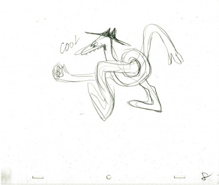
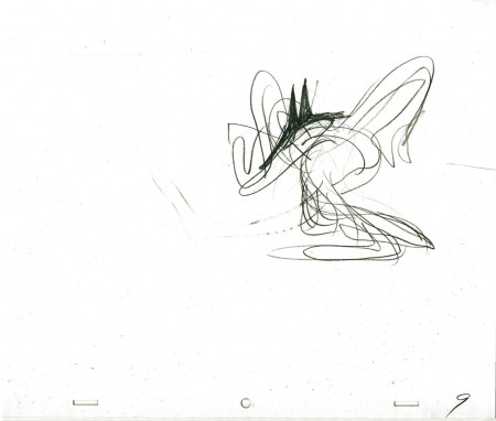
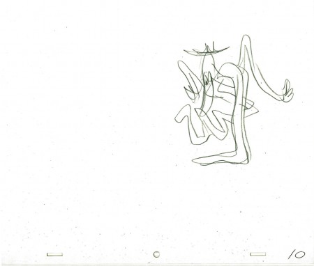
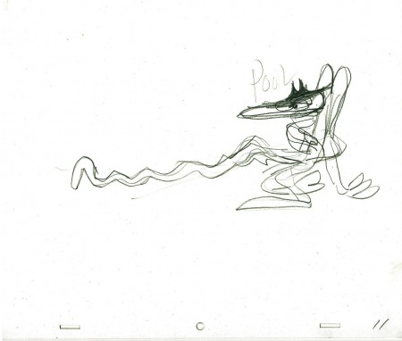
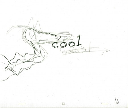
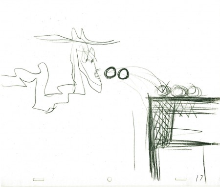
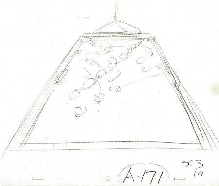
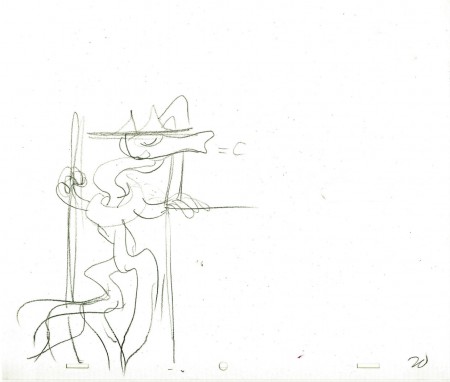
LOs Cool Pool Fool
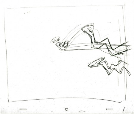
- Here are the LayOuts by John Hubley for the Electric Company piece, Cool Pool Fool. Tissa David animated from these layouts and the verbal instructions from John.
A couple of drawings are missing #7 and #18
 1
1
Here are some frame grabs from the spot. They’ve been severely touched up in photoshop since the video has lost all color and is almost unwatchable except as a silhouette film. I’ve reconstructed the colors as near as I can remember them. At any rate, the purpose of these grabs is for you to see what Tissa has done with John’s layouts.
 1
1
Animation &Animation Artifacts &Hubley &Independent Animation 06 Oct 2010 07:45 am
Littlejohn’s Snake – 2
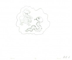
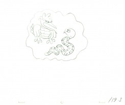
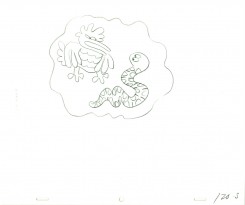
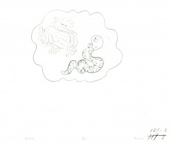
- As I wrote last week, I feel that Bill Littlejohn, was one of THE GREAT animators. I worked on many of the scenes that he animated for John Hubley. At first, I was inking his work (and I always did it with the exposure sheets right in front of me so I could see how he was animating.) Then I had to assist some small bits of his animation.
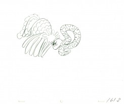
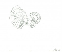
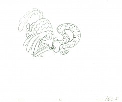
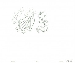
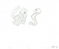
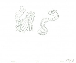
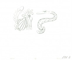
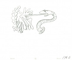
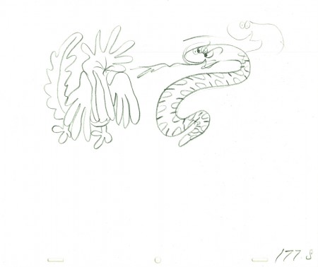
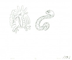
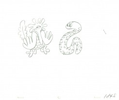
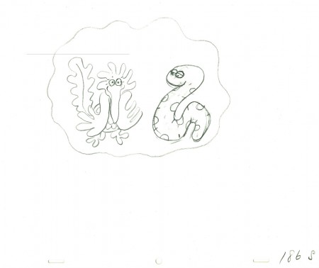
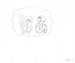
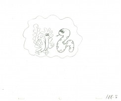
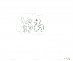
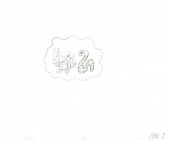
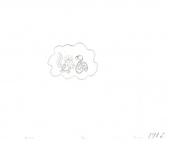
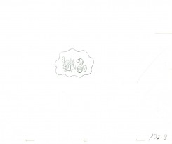
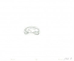
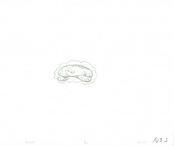
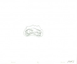
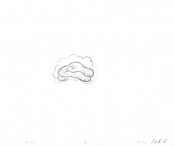
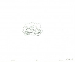
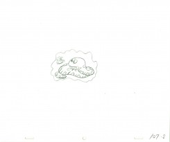
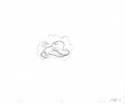
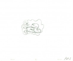
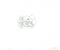
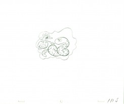
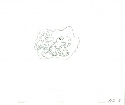
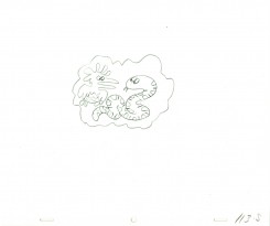
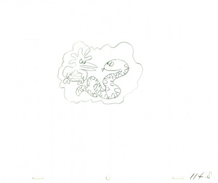
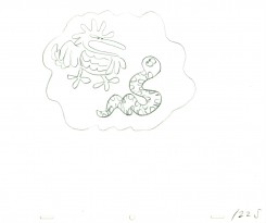
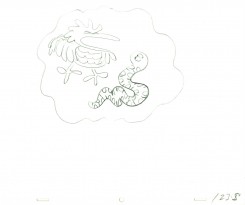
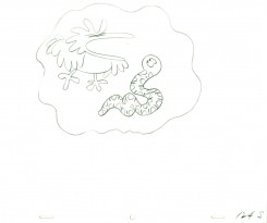
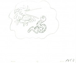
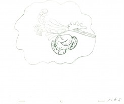
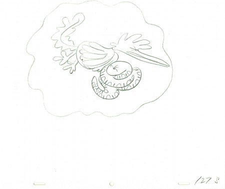
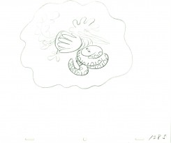
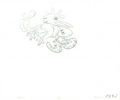
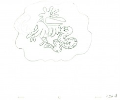
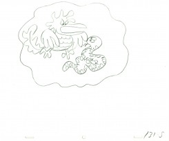
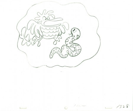
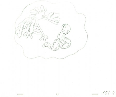
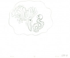
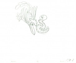
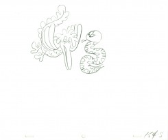
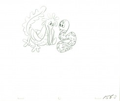
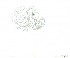
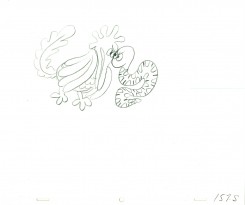
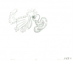
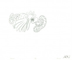
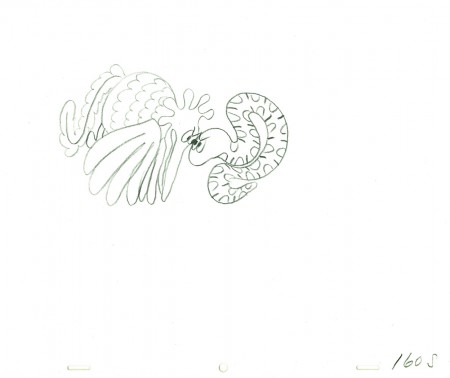
After learning of Bill’s death, last week, I immediately went searching for a scene I could post. This one, from Hubley’s Everybody Rides the Carousel, is not a great scene, but it’s typical of Bill’s work. A beautiful free-flowing style, the scene showcases the almost calligraphic style Bill used for Hubley. The animation drawings just flowed out of his pencil.
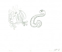
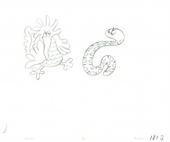
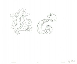
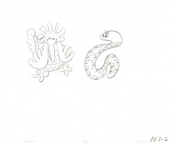
The scene represents the animal figures that constantly fight in the heads of the characters. For this stage there was a snake and a phoenix; one representing positive, the other representing negative.
We start with the last drawing from last week’s blog post.
 160
160
______________________
The following QT movie represents the drawings above
from Bill Littlejohn.
I don’t have the X-Sheets, so I exposed on two’s
except where there were gaps in the numbers.
There I treated part of it as a cycle – which is what it was.
I suspect the scene actually was exposed to last longer
using three’s and a couple of very short holds.
Right side to watch single frame.
Animation &Animation Artifacts &Hubley &Independent Animation 29 Sep 2010 07:48 am
Littlejohn’s Snake – 1
- Bill Littlejohn, to me, was one of THE GREAT animators. It took years of my working on his animation for John Hubley before I finally met him. We’d spoken often enough on the phone since I was the production manager, Assistant, Animator and Layout guy for Hubley for about 6 years. I did any assisting needed on Bill’s work – and there was rarely much to do. He and his wife, Fini, were so amiable, affectionate and cordial in person; exactly the people I expected after all the phone conversations.
His animation seemed to be done in a straight-ahead style, and he did everything needed for the scene.
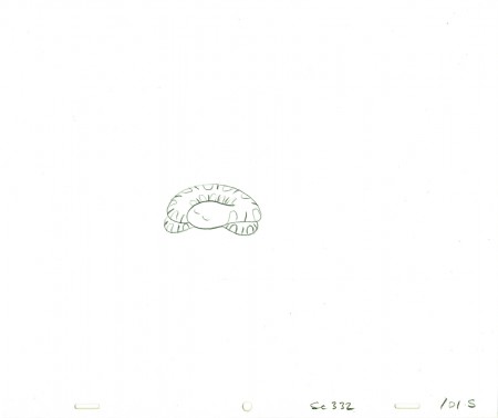
As promised I found a scene animated by him from Hubley’s Everybody Rides the Carousel. It’s not the best scene, but it showcases the almost calligraphic style Bill used for Hubley. The animation drawings just flowed out of his pencil (though he usually animated in pen for Hubley.) The only assisting I did on the following drawings were some of the outer balloons for the characters.
The scene represents the animal figures that constantly fight in the heads of the characters. For this stage there was a snake and a phoenix; one representing positive, the other representing negative.
 101
______________________
The following QT movie represents the drawings above
from Bill Littlejohn.
I don’t have the X-Sheets, so I exposed on two’s
except where there were gaps in the numbers.
There I treated part of it as a cycle – which is what it was.
I suspect the scene actually was exposed to last longer
using three’s and a couple of very short holds.
Right side to watch single frame.
