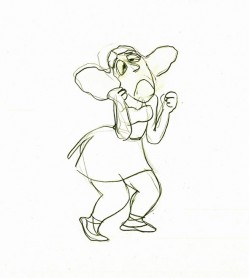
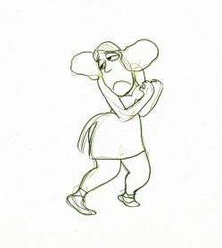
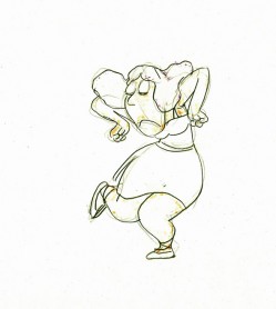
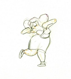
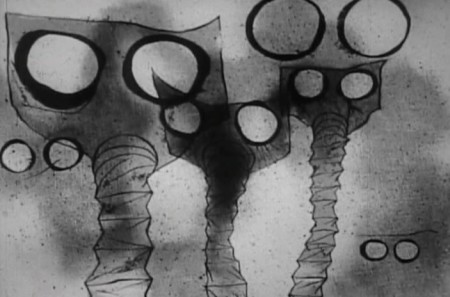
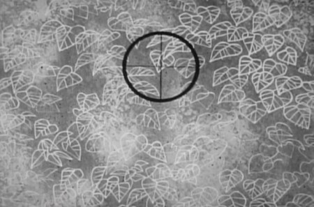
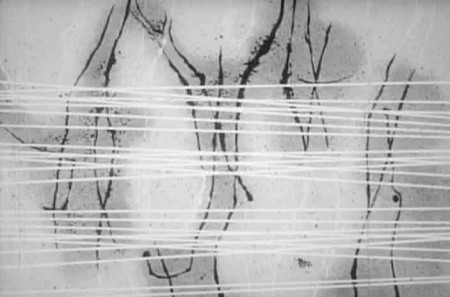
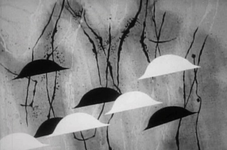
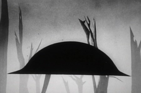
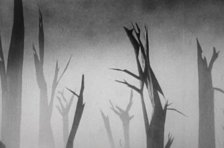
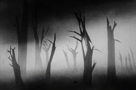
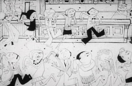
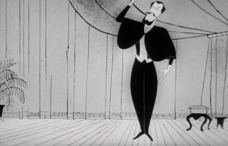
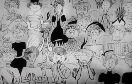
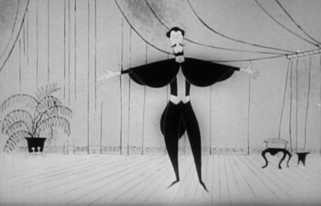
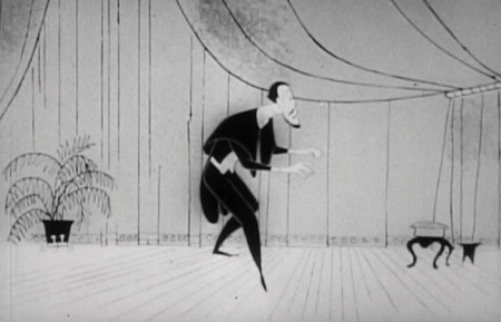
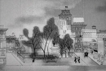
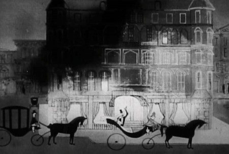
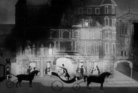
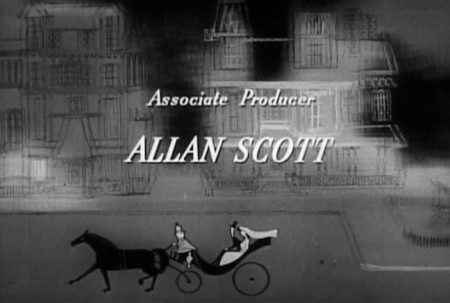
Category ArchiveHubley
Animation &commercial animation &Frame Grabs &Hubley 13 Aug 2012 05:28 am
Hubley Bumper – recap
- Last week, Emily Hubley told me that some people up at WNET (previously WNDT), the local PBS chapter, saw this piece on my blog. They were hoping to get copies of the Hubley spots to show in celebration of their upcoming 50th anniversary. It’ll be great to see these films alive again.
Here’s my post on a couple of the films.
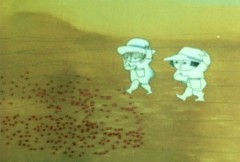
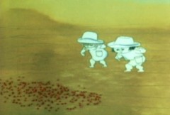
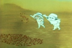
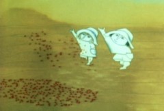
 - One of my all time favorite pieces of Hubley animation was a station ID for WNDT-TV, New York’s public service station back in the 60′s. I thought of this spot last week when I posted the piece about Stanley Kaufman’s Art of Film for that station. It ultimately became WNET, NY’s PBS channel 13.
This spot was undoubtedly animated by Bill Littlejohn, and I think it’s one of his finest pieces. The timing is excellent. He obviously animated straight ahead; the characters distort and morph to the needs of the animation. It’s a full 2mins: 40 secs, so it would qualify as a short film these days,
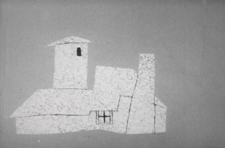
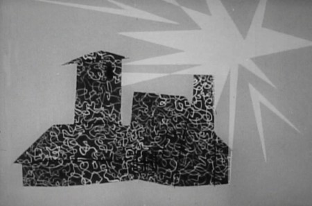
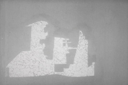
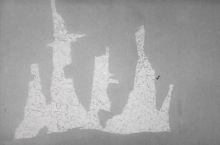
The piece ran in B&W. It employed the multiple exposure technique. The characters had black paint filling everything but the animation drawing. This was double exposed over the BG, hence a see-through quality to the characters. This technique was used on Moonbird, The Hole, Of Stars and Men and several other Hubley shorts.
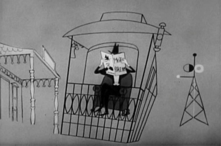
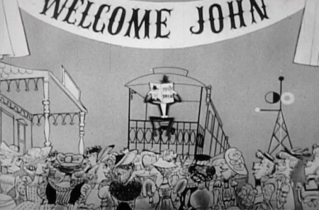
Here are some frame grabs of the spot.
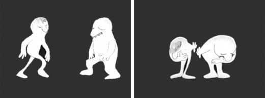
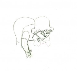
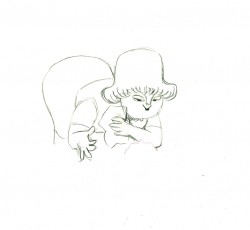
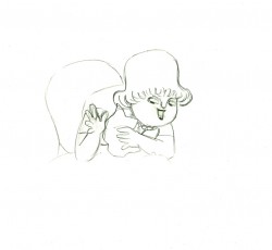
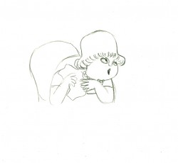
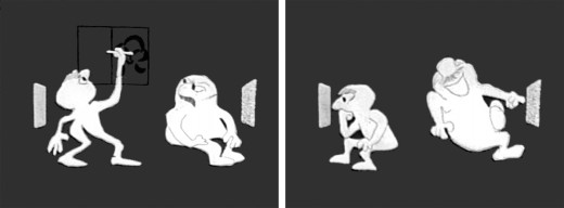
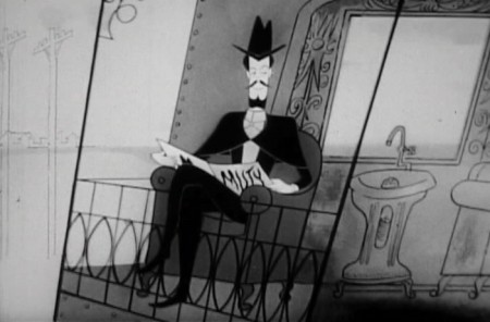
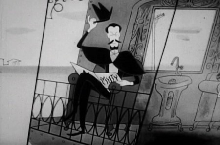
The two guys come out on to the stage and take a bow.
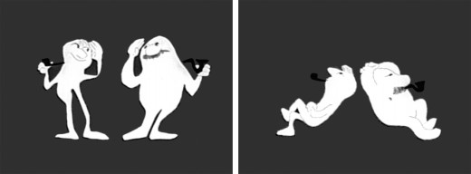
They greet each other, light up and sit down.
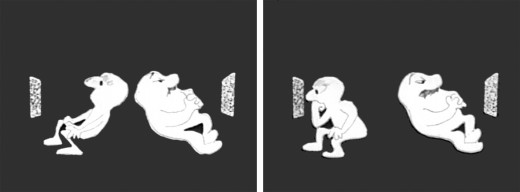
A little bored, they both turn on TV’s. The little guy gets involved.
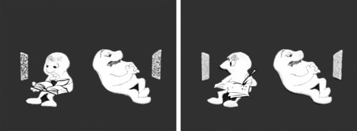
He takes out a book and takes notes comparing it with what’s going on his TV.
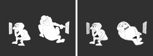
He goes back to watching. The big guy laughs at something until he gets bored again.
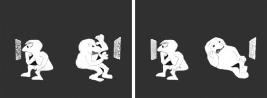
The big guy practices some wrestling moves until that gets dull.
Little guy does some brush painting. Big guy laughs again.
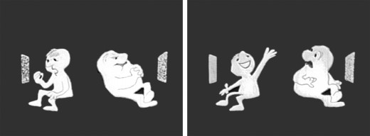
Little guy practices Russian. The big guy gets annoyed.
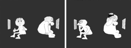
The big guy takes out a comb and starts combing until . . .
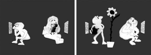
.. he has grease all over his head. The little guy grows a plant.
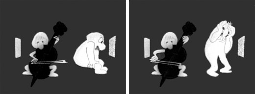
The little guy takes out a cello and starts to play. This annoys the big guy.
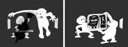
He pulls up the little guys screen. Public Television !
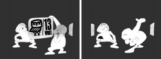
Embarrassed, he bows to the “Arts” station.
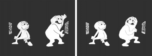
He turns to it on his own TV. He’s planning for something great.
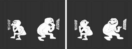
They watch intently until the big guy makes sure little guy knows he’s still watching.
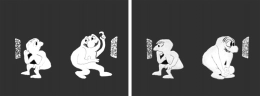
“Brain food” They watch intently.
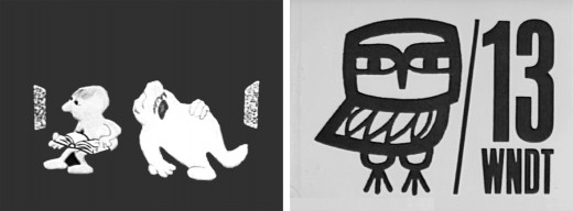
The big guy falls asleep while the little guy goes back to his book. Dissolve to station card.
I love how the shapes of the characters shift and distort and change throughout the piece always coming back to the original models. This is a sure sign of straight ahead animation, and it almost makes the acting feel like an improvisation exercise by two actors. It supercedes animation and becomes acting.
The obviously loose time of the piece shows that the animator was probably given a lot of leeway with his timing, and he took it. As I said, I have no proof that Bill Littlejohn animated it, but I’ve never doubted it for a moment. It’s certainly as much his style as it is Hubley’s.
That is the odd thing about working for a director with a strong personality. I remember the day that I looked at one of my drawings and realized that it looked like one of my drawings, but there was no doubt it was a Hubley. Something happens, and you just end up drawing in their style.
Animation &Animation Artifacts &Hubley &repeated posts 30 Jul 2012 04:55 am
Tissa’s Glad Gladys – revisited
-Tissa David animated a lot of the Electric Company pieces for John Hubley. Hubley would design and write the spots, and he would get some real pros to do the tracks. In the case of this film, I believe it was the jazz legend, Billy Taylor, who wrote the music and did so for a number of Hubley’s Electric Co. films.
I’d like to post John Hubley’s LO drawings and follow it up with a few of Tissa’s animation drawings. John would usually do the loosest of layout drawings – usually in the presence of the animator as part of a discussion – and then hand it off to this person he trusted. Of course, the more he trusted the animator, the less he had to do in the LO.
In the case of this spot, Tissa received the following drawing. (That’s right ONE drawing.)
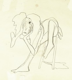
(If you click any the image, you’ll
reveal the full sized animation drawing.)
Enlarge the image, and you’ll notice tape marks and pin holes where Tissa attached it to her wall.
Here’s a short sequence of drawings done by Tissa. The missing mouths are on a separate level. This piece is built on reuse done artfully.
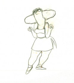 48
48 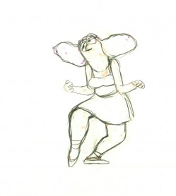 49
49
Here’s how the drawings looked when they were colored. They were colored on heavier paper. Sharpie outlines and marker coloring. The white background was all they used for the final. The animation carried the piece.
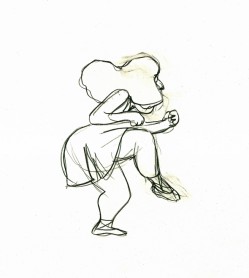 73
73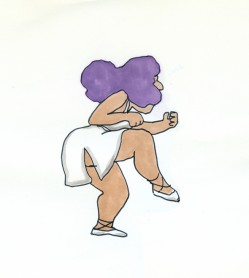 73
73Finally, here’s a copy of the film found on YouTube:
Action Analysis &Animation &Animation Artifacts &commercial animation &Hubley &Tissa David 26 Jul 2012 07:22 am
A Simple Move – recap
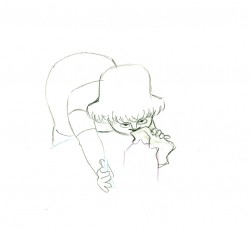
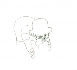
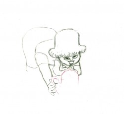
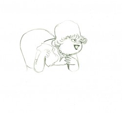
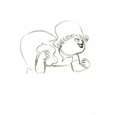
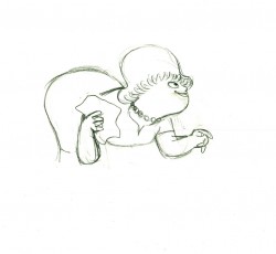
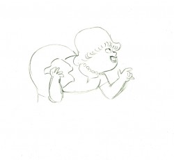
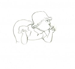
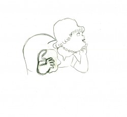
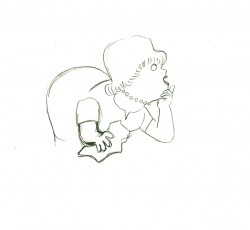
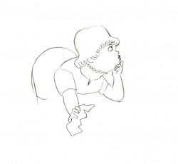
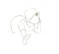
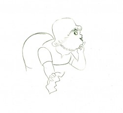
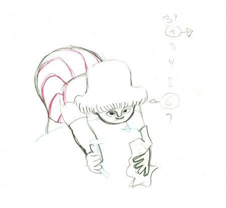
- Here’s what looks like a simple move done by Tissa David when she animated this Viva, paper towel commercial. It was produced, directed and designed by John Hubley. A very simple and beautiful character.
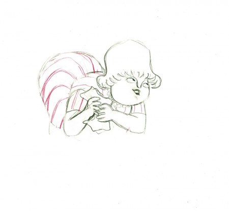
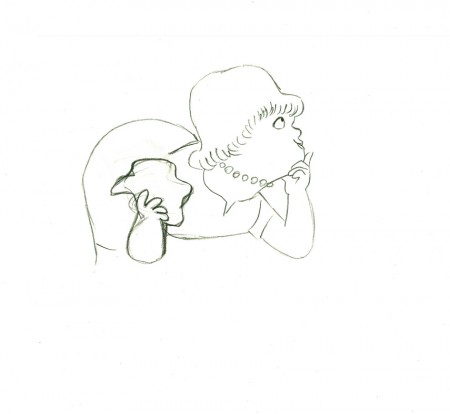
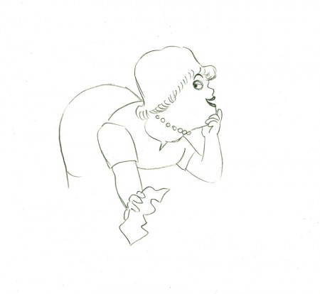
The character’s move in this scene is a complicated one done simply. She has been bent over, cleaning with her paper towel, and she moves up. You can follow the overlapping action as her eyes pull her up, head turn, and body follows.
The stripes will come and go. Tissa depends on someone else to concentrate on this material when she’s working on a commercial.
 e37
e37(Click any image to enlarge.)
 e44
e44
Her eyes point in the direction she wants to go,
and the rest of the scene moves her up and into profile.
This key move is hidden under the exchange of the
paper towel from one hand to the other.
 e51
e51
She stops to think (accenting her monologue.)
 e58
e58
And she slyly looks back to camera to respond with her thought.
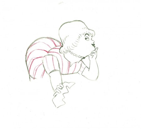 e59
e59
She continues, all through this move, talking.
She’s pitching the product.
Here’s a QT of the piece:
Cleaning for VivaClick left side of the black bar to play.
Right side to watch single frame.
Action Analysis &Animation &Animation Artifacts &Frame Grabs &Hubley &Independent Animation &Layout & Design &Tissa David 09 Jul 2012 05:24 am
Of Men & Demons – Redux
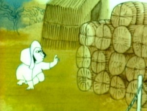 – Since first seeing the Hubley short, Of Men & Demons, back in 1967, I’ve been a fan. The artwork was stunningly different and original. It had a rich tone to it and some beautiful Hubley Bgs. The music by Quincy Jones was as original as the film, itself.
The short was actually an industrial film done for IBM to explain the binary code to its employees. The Hubleys, however, built on that story to make something of a personal film that received an Oscar nomination.
(Click any image on the page to enlarge.)
Art Babbitt was one of the first animators hired. At some point, Tissa David was brought on to rework some of Babbitt’s beautiful animation. Unfortunately, it was on about fourteen levels and had to be combined and reconstructed and shortened. (Today, of course, there are no limits to levels, but in the days of the camera you kept things to 4 cel levels, as a rule, and never more than 5.) It was complicated by the fact that John Hubley had decided to shorten the piece, and Quincy Jones’ score was shorter than Babbitt’s animation. This chore took some effort and involved dissolve animation. Tissa then continued on the sequence animating the little protagonist and his female companion through the remainder of the film.
About 25 years ago, Tissa David gave me an envelope full of art from this film, and going through a lot of my old material recently, I came upon that envelope.
 3
3 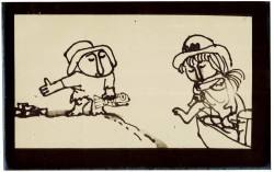 4
4
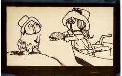
These are storyboard drawings for a short sequence. Tissa got these drawings and prepared Layouts for the sequence. You can see how much is actually in John’s drawings so it’s easy to build on what he’s given you.
 1
1The following are key drawings Tissa prepared for the sequence in laying it out.
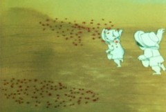
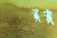
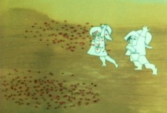
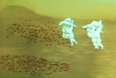
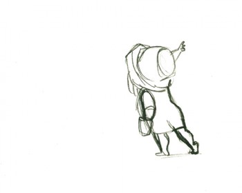
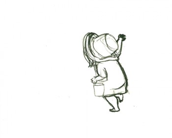
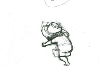
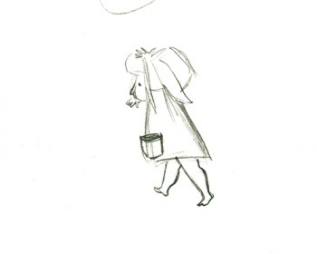
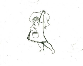
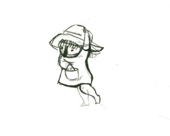
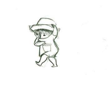
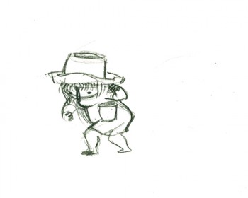
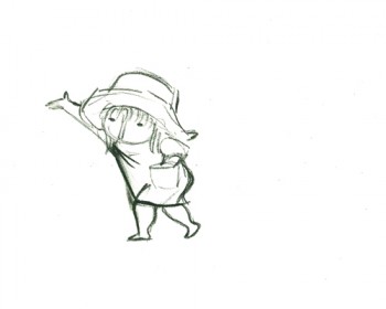
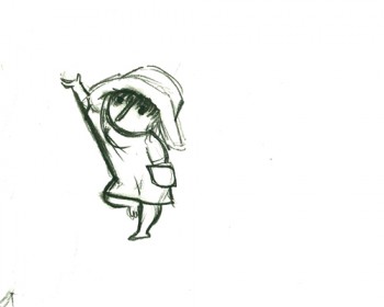
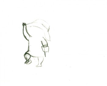
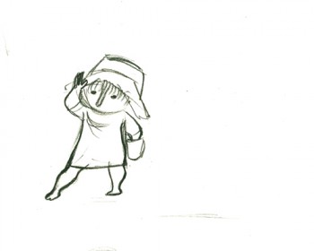
Here is a short piece that Tissa did of the little woman character seeding her front yard. There’s so much grace in every one of these drawings and enormous information in the walk, itself.
 G47
G47(Click any image to enlarge to full animation sheet.)
.
 G49
G49.
 G51
G51.
 G53
G53.
 G55
G55.
 G57
G57.
 G59
G59.
 G61
G61.
 G63
G63.
 G65
G65.
 G67
G67.
 G69
G69
And here are the matching frame grabs from the film.
Seeding crops PT & Final Color
Animation &Commentary &Hubley &Independent Animation &Layout & Design &repeated posts 25 Jun 2012 06:29 am
Everybody Rides – repost
I posted this in the summer of 2008. I’ve ganged two parts together to make one read.
 - Back in 1976, I was working on John Hubley‘s Bicentennial flm, PEOPLE PEOPLE PEOPLE. This was a short film, four minutes long, that had about a million scenes. It told the history of the US (from the standpoint of populating and overpopulating) beginning 17760 BC and ending in 1976 AD.
It started with some lengthy scenes. As the film moved on, the cuts came faster, until they hit about 6 frames apiece toward the film’s end. The final scene, from space, was the longest in the film.
There were no characters that appeared in any more than one scene. That meant that with each scene, there were new setups, new characters, new colors, new everything. As a result, it took much longer than other films and was a difficult one to pull off. But like all other Hubley efforts, it was fun. Tissa David, Jack Schnerk, Lu Guarnier, Phil Duncan and Bill Littlejohn animated it. I colored about 2/3 of the film and animated at least a dozen or two scenes (some really were only 6 frames – like that auto shot posted). I also assisted/inbetweened all of the animators.
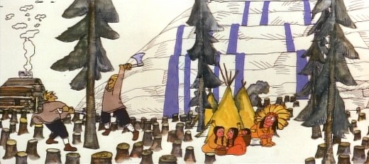
Swedes cut down all the trees in PEOPLE PEOPLE PEOPLE.
The studio, at the time, was buzzing because John and Faith had just sold a dream project to CBS. EVERYBODY RIDES THE CCAROUSEL was an adaptation of Erik Erikson‘ 1956 book, Eight Stages of Development. Erikson was a psychologist who theorized that man goes through eight stages of development from birth to death, and he proceeds to break them down. The Hubleys took this book and broke these eight stages into horses on a carousel.
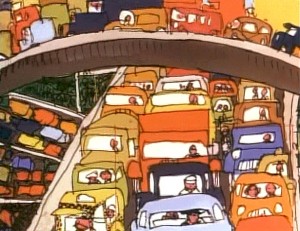 The three half hour Special shows for CBS would be about these carousel horses and the ride.
Each of the stages would be broken into two different subsets, and these would be depicted through stories which were roughly developed visually by John and Faith. Once the funding started to tricle in (about $450,000 for all three shows) they would cast their many actors and have them improvise in the recording studios to the storyboarded set pieces.
While those recordings progressed, the small studio staff was busied in completing animation, artwork and rendering of PEOPLE PEOPLE PEOPLE.
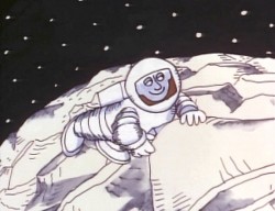
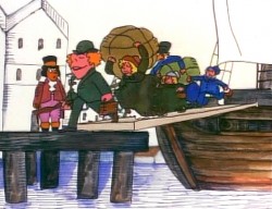
The man on the moon and the Irish immigrants.
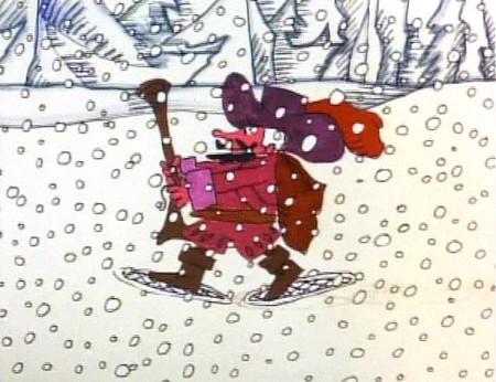
Jack Schnerk animated the French trapper sequence. There was such a rush
on the scene that I remember Jack bringing it in saying he hoped it would work.
He’d done two drawings of snow for the blizzard. Both wildly different from each other.
He asked me to ink them, then flop the drawings and ink them again.
He’d exposed the four drawings on fours. He also had the trapper with
snowshoes walking on fours. He felt it would help us feel a struggle in his
walking through the snowstorm. He felt the fours might add weight.
The scene worked beautifully, and was excellent the first time out.
Not quite the way they’d have done it at Disney. Tricks of the trade.
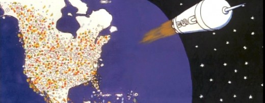
Tissa animated a majority of the film. The ending, the man going to the moon to escape
the overpopulated earth was hers. I have the drawings somewhere and will post some of them soon.
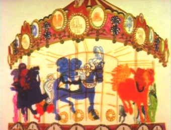 – We started slowly on Everybody Rides the Carousel. There was a six month schedule for about 72 mins of animation. Three half-hour original tv shows for CBS about 24 mins each. They’d air in the late summer of 1975 just prior to the start of the new tv season. Each show would air a day apart from the others – three nights in a row.
John and Faith spent a lot of time – a lot of time – at RCA studios on 45th Street. (It’s
____ The carousel was bottom lit & became soft focus.____-_ now an IRS office.) They recorded many of the voices playing the numerous parts in their show. I tried to time meeting them there a couple of times hoping to meet some of the actors (I particularly wanted to see Jack Gilford in action. He was doing an hilarious part with his wife, playing a couple of cranky old people in a diner.) It didn’t work out that way, but I did see the facility and heard parts in process.
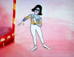 The key staff working IN the studio (not counting animators who would, for the most part, work freelance) included Ida Greenberg. Ida was a brilliant checker / coordinator who’d started back in the Florida days of the Fleischer studio. (She told me a few great stories about Gulliver’s Travels.) Ida was a great woman, with the thickest New Yowk accent, who never seemed to buckle under pressure. I grew very close to her. I tried after that to have Ida everywhere I worked. She led Raggedy Ann’s I&Pt and R.O.Blechman’s special.
Kate Wodell was a student of the Hubleys at Yale. She was a talented artist who’d moved into production during the making of Cockaboody and continued on staff there. Sometimes she colored, sometimes she animated, sometimes she did whatever was necessary. This was exactly how I moved into the studio and loved the experience. She worked with Faith for many years after John died.
Earl James was an animator who’d worked in the backroom of many NY studios from Paramount to Terrytoons to NY Institute of Technology. He also had done some comic strip work.
Earl was given the carousel to animate. This came from a couple of elaborate drawings John did. Earl worked 16 fld. using a 96 drawing cycle. It gave us a lot of opportunity to move in tight or stay wide. However, it was a nightmare that took forever. Joe Gray was hired to assist Earl. (Joe started during the Terrytoons strike and never left. Many of those who knew him as a “scab” never forgave him and had only horrid things to say about him to me some thirty years later. He was a lifetime assistant like a handful of other noted names in NY.)
This scene moved so slowly through production that I kept jumping in to assist as well. I was a fast assistant, but that carousel slowed even me down. 8 horses moved in perspective in a circle; there were 96 different rotating views of all the horses. I’d guess the scene took about 10 weeks to complete.
I was also doing layout and animation of a lot of connecting scenes throughout the production. These were scenes that would have to blend from one animator to another, or John had decided to go in tight for a closeup. In one case with Art Babbitt’s mime character, I was asked to change it from two’s to four’s with a dissolve technique John taught me (he said they’d used it on Fantasia.)
There were four people in my room, Earl, Joe, me and Mark Hubley. He worked alongside me for most of the film. He colored artwork given him by Ida, who was working in the larger room next door. Mark and I had a good releationship going back the many years I worked there. He joined the studio once he completed college. Emily Hubley worked alongside Kate and Ida.
Two younger, more experimental animators were brought in by John. Adam Beckett had made a name for himself with the films he was doing at CalArts.
Fred Burns was doing some incredible work at UCLA. They both were very different and added their unique touch.
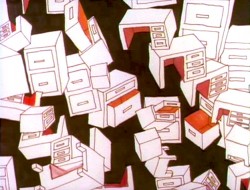
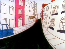
___________ Adam Beckett’s scenes included these two surreal images.
Adam did a scene a couple of scenes wherein office furniture floated about in a very complicated surreal cycle. Fred did this amazing scene of a roller coaster from the POV of the rider. He and I worked together a number of times after that, and we’ve stayed friends.
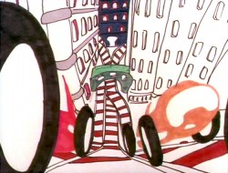
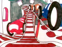
______________ Fred did this very elaborate sexual roller coaster.
I hope to have more to say about some of these films I worked on.
Frame Grabs &Hubley &UPA 18 Jun 2012 06:40 am
The Four Poster – part 4
- This is the fourth part of the animated segments from the live feature, The Four Poster, with animated segments from UPA directed by John Hubley with animation directed by Art Babbitt and design supervised by Paul Julian.
As I wrote with each of the past posts, the film is an adaptation of the play by Jan de Hartog which takes place wholly in one room – the bedroom – around a fourposter bed. We see scenes wherein the couple marries young and grows old together. The only time we stray from the room, in the film, we do it via the enormously creative UPA animation. The film starred real husband and wife, Rex Harrison and Lilli Palmer.
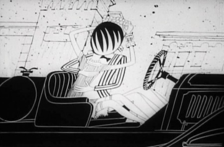
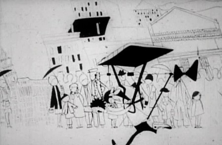
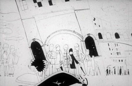
This sequence represents an attempt for the couple to come together again after a difficult period. They take a vacation to Paris, France.
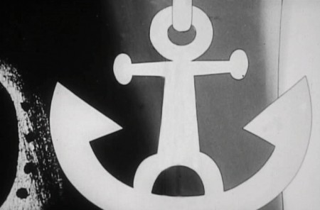 1
1Cut to an anchor being lifted.
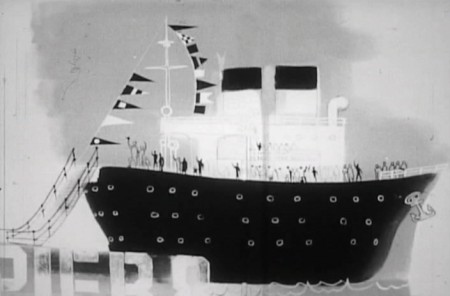 2
2
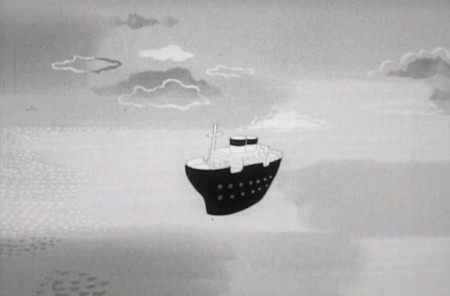
The cruise ship is set to take off.
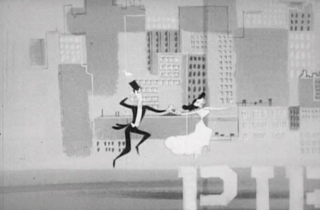 3
3
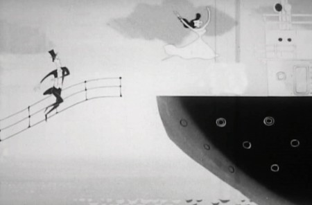
Our couple races to the ship, they’re late.
 5
5
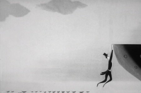
As the ship pulls away she jumps on board.
 6
6
He tries and misses, hanging at the edge.
 7
7
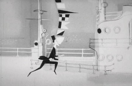
He lifts himself on board . . .

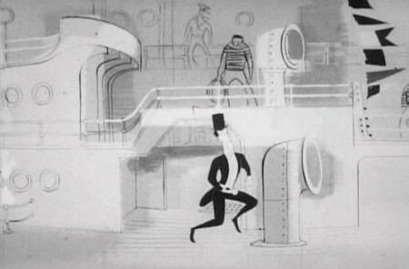
. . . but has to search for his wife.
 11
11
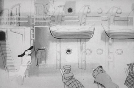
He continues to dance in search of his wife.
 12
12
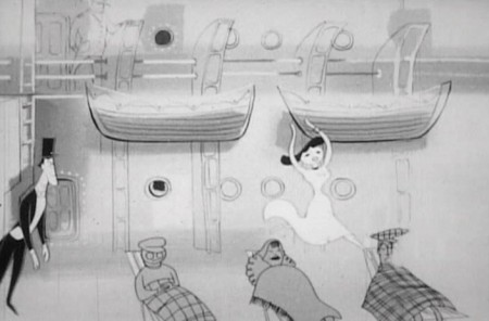
She’s just a bit forward of him.
 13
13
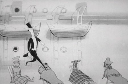
She dances over some resting passengers.
 14
14
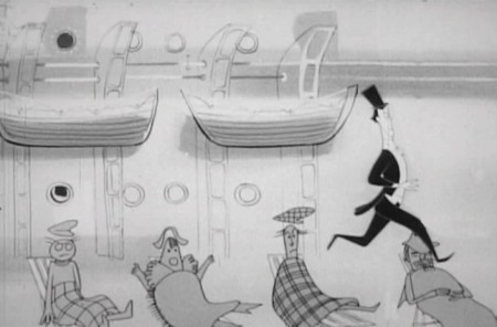
He tries to do the same, but ends up . . .
 15
15
. . . stepping on each of the people in deck chairs.
 16
16
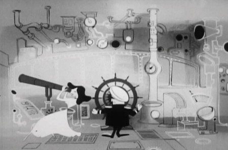
She’s in the captain’s chair looking through a telescope.
 17
17
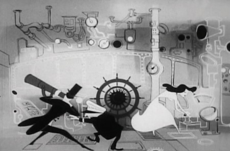
He joins her to see what she’s been looking at.
 18
18
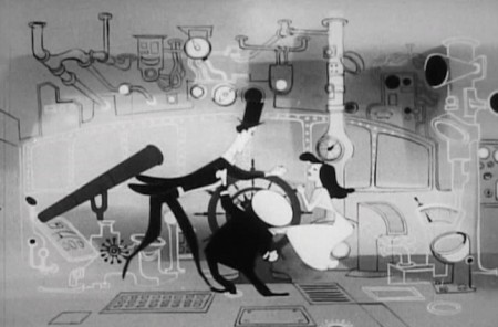
The two of them scrabble over the steering wheel.
 19
19
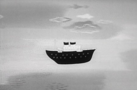
The ship spins about at sea.
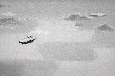 21
21
It goes spinning into the horizon.
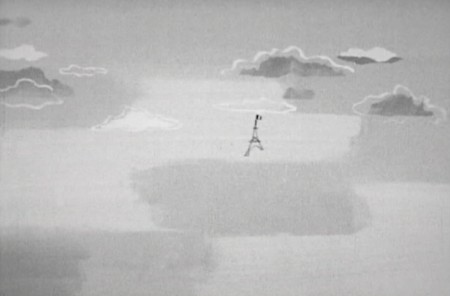 22
22
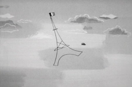
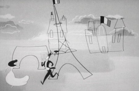
The Eiffel Tower dances forward.
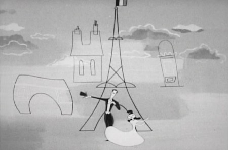 24
24
They finally join in front of the landmark.
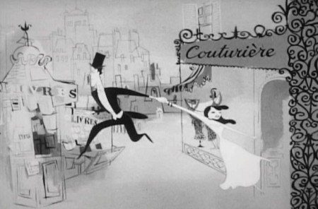 26
26
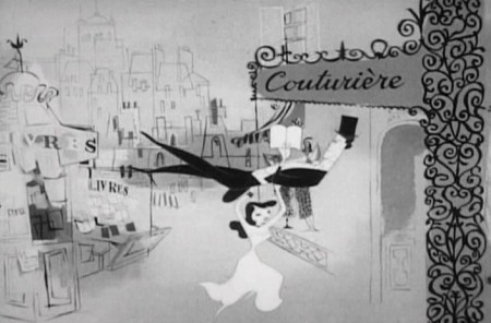
He tries to pull her away from a Couturier (dress maker).
 27
27
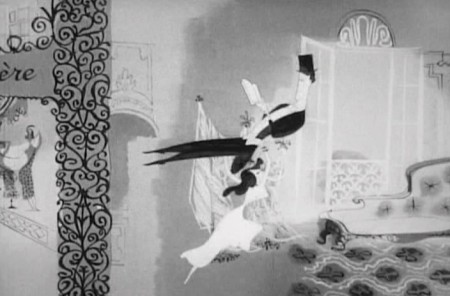
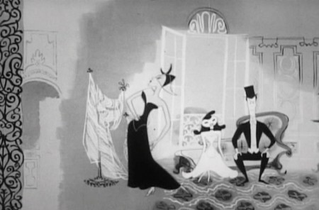
She ends up literally carrying him into it.
 29
29
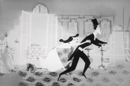
He’s seated on a devon to watch the fashion show.
 30
30
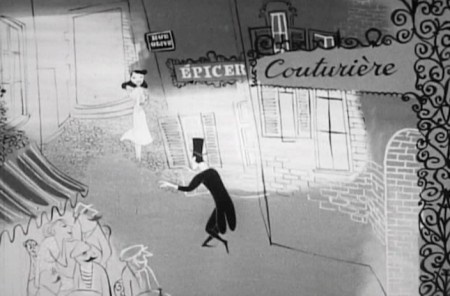
Finally, he pulls her further in . . .
 31
31
. . . and she leads him outside.
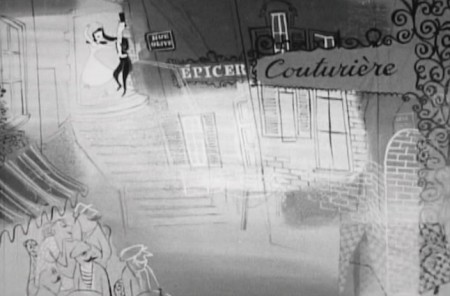 32
32
They pause at the top of a stairway.
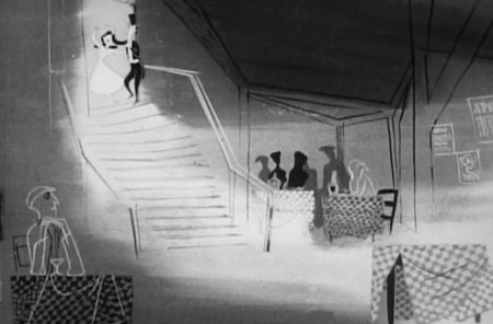 33
33
The background dissolves to a cabaret.
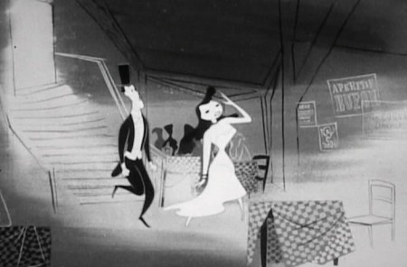 34
34
The couple enters and seats themselves at a table.
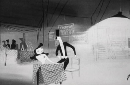 35
35
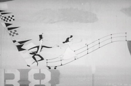
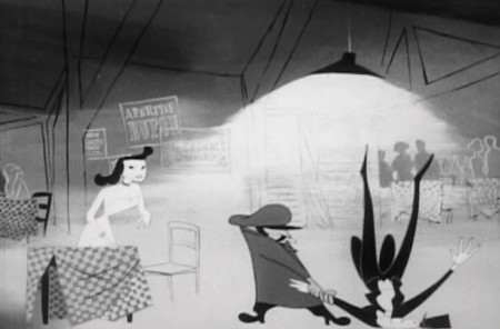
There’s no doubt that Art Babbitt animated this “Apache Dance.”
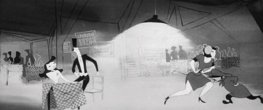
Pan across as an “Apache Dance” is in progress as the floor show.
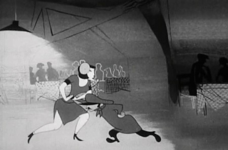 37
37
The male pushes the female back toward the couple’s table.
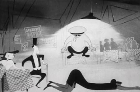 38
38
He jumps on top of her, in rhythm to the music.
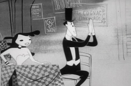 39
39
2 shot – He applauds the dance.
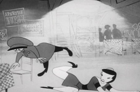 40
40
She knocks the male dancer off his feet.
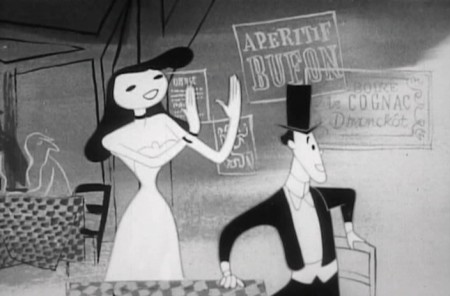 41
41
2 shot – she applauds the female.
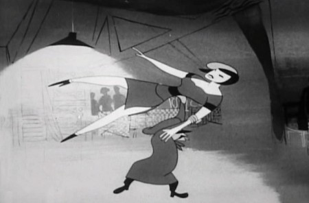 42
42
The guy lift the female over his head
and off the screen.
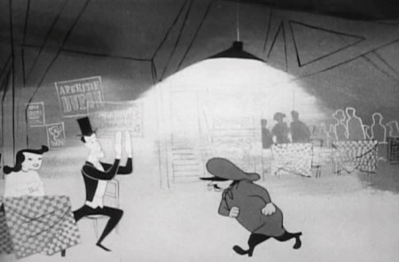 43
43
He then goes to our male and . . .
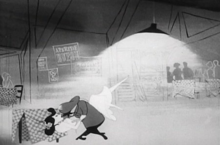 45
45
The male then dances with her.
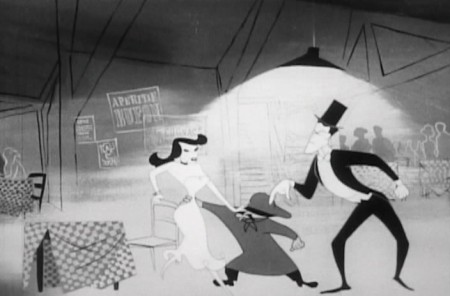 46
46
Our hero enters, and taps the dancer on the shoulder,
as if it’s his turn to cut in to the dance.
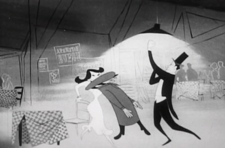 47
47
Instead, he knocks out the male dancer.
All to the rhythm of the song.
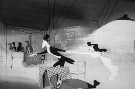 48
48
Our couple dances toward the door.
Exit Paris.

. . . and the camera pans back . . .
The final sequence begins with the couple elderly and close.
It becomes obvious that she dies as we move to him writing at his desk.
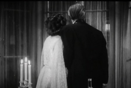 1
1
We see a beautiful Paul Julian painted sequence which shows
their house as it grows old in a series of dissolves.
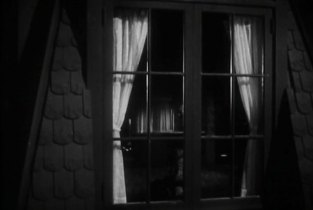 12
12
Back in through the Live Action window.
We see him with his head at rest on his desk.
It seems obvious to me, after all the time I’ve recently spent studying the UPA Å“uvre, that there were a lot of forward thinking individuals who were quite adept at creating modern designs, quite like new textiles or illustrations. However, it would seem to me that only a small few were actually artists. John Hubley and Paul Julian were certainly in this latter character. Hubley was incapable of drawing a cartoon, and Julian was painting his backgrounds in the same, serious style as his own Art. Together, they were brilliant. It’s only unfortunate that they didn’t have the assist of animation by Bobe Cannon. He is one who took the animator’s job to a higher order. We’d have to wait a decade to see Hubley and Cannon together, but, by then, Julian wasn’t available to them, and Hubley painted his own Backgrounds. See Adventures of an * or Tender Game, and try to see one of the stunning, newly reconstructed prints from MoMA.
Articles on Animation &Hubley &repeated posts &Story & Storyboards 17 Jun 2012 05:15 am
Hub Boards – repost
Yesterday, I posted some comments about a recent piece on Signe Baumane‘s blog. This made me think about this piece I wrote back in 2007. I think it’s worth a repeat.
- The conversation on storyboard use goes way back – before the internet. If you check out the 1969 book by John Halas, Techniques of Film Animation, there’s a Q&A session wherein a number of animation greats were asked several questions, and the answers are given by question.
Here’s one question about storyboards and the answers given:
To what extent to you think a storyboard should be developed prior to production?
- GENE DEITCH: I believe in complete scene and shot breakdown in story-board or a thumbnail board form before production begins. I use a thumbnail storyboard as a sort of bar-sheet, indicating all effects, dialogue and music cues, scene transitions, etc. Great savings in cost, and an overall perspective of the film in advance are to be gained.
JOY BATCHELOR : As fully as possible without detriment to the following phases of production.
STEHPEN BOSUSTOW: If time and money allow, the storyboard should include as many details as possible, particularly if it is to be assigned to a large production unit. However, if only a few people are to be working on the picture, the storyboard can be quite sketchy, with the details being developed during production by the key people who have an overall feeling for and knowledge of the story.
ADRIAN WOOLERY: The storyboard is the first step, after the idea. Every problem must be solved and the story completely resolved on the board prior to consideration of any production.
 JOHN HUBLEY: It has been my experience that the more detailed a story-board and the more carefully it is designed to reflect the appearance of the finished production, the more successful the film.
GEOFFREY SUMNER: The storyboard, or breakdown of the film, has as many different forms as there are ways of putting actions in relation to one another.
The classic storyboard is the set of working drawings of the sequence of a film used in large studios on the Disney model where numbers of subsidiary workers must conform to a total pattern they can almost never see.
It is used in conjunction with model sheets. It could be called the “model sheet” of the sequence of the film.
It is strictly for use within a studio and should not be shown to dangerous people like sponsors.
An earlier stage is the treatment, which can be specifically directed at sponsors. If the basic idea of the film is simple, the treatment need be no more than half a dozen drawings and a brief synopsis to convey a ten minute film.
A storyboard must necessarily be constructed after the music has been done. The musician and the director can work together from a stage following the treatment. From the finished recorded track the storyboard is made.
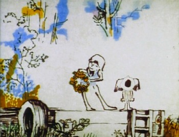 For years prior to even meeting Hubley, I had remembered his response to this question. It impressed me. His storyboard development was pretty intense. The scripts generally were done visually and tacked to the wall.
I don’t remember ever seeing text up there. John would present the board to key people, and he would give an indication of dialogue verbally. We all knew this would ultimately be ad-libbed by actors.
With the Carousel feature, sections were boarded but then developed in greater  length through improvised sessions. The boards then grew out of the edited tracks. The voices often came first, here.
I suspect this is probably also true of the films like Cockaboody, Windy Day and Moonbird which were dependent on the children’s verbal play at the microphone. Something like The Hole or Voyage To Next were boarded visually, then recorded improv sessions which were adapted in newer boards.
Of course it has to be remembered that the two features done within this studio, Everybody Rides The Carousel and Of Stars and Men, both started out as text. Both were heavy-duty books that were adapted for film. In the case of Of Stars and Men, the author, mathematician Harlow Shapely had major involvement in the film’s script and narrated it as well. The concepts for both films were fully worked out before anyone started boarding. So essentially a script – of sorts – existed. Since CBS financed Everybody Rides The Carousel, you know they had to approve a script.
I, of course, only remember the board.
Frame Grabs &Hubley &UPA 11 Jun 2012 07:01 am
The Four Poster – part 3
- I’ve located a better copy of The Four Poster, so my posts will be more in focus henceforth. I’ve gone back and replaced the images in Part 1 and will do the same for Part 2 in the next week.
The Four Poster, in case I have to remind you, is a live action feature adaptation of a play by Jan de Hartog. It was produced by Stanley Kramer and directed by Irving Reis. The film takes place entirely within the bedroom of a married couple as they grow old together. To open up the film, they turned to animation working with the Columbia studio, UPA. John Hubley supervised all of the animation following his recently completed film, Rooty Toot Toot.
Part 3 starts as the couple’s child has grown up and gone off to War. World War I. The sequence was supervised by Paul Julian, and like most of his other directorial efforts it’s about beautiful paintings and graphic movement.
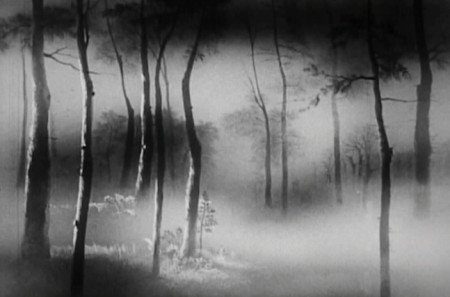 1
1
_______________________________
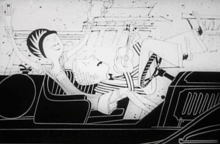
From the death of their son, the film takes us forward into the Roaring Twenties.
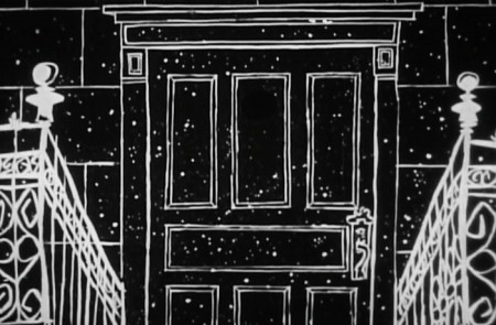 1
1
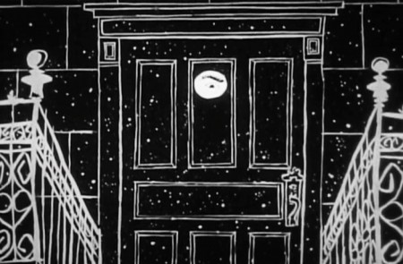 2
2
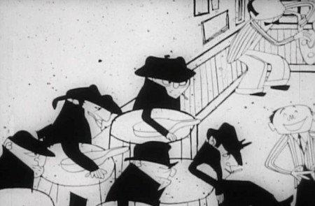
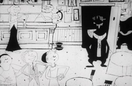
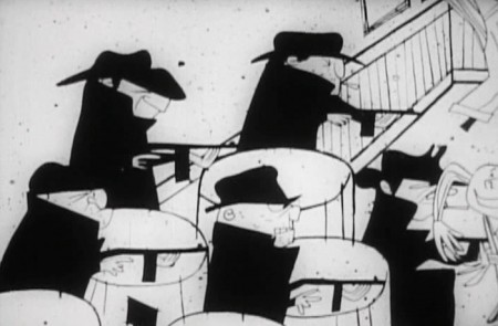
It’s a world of speakeasies.
Frame Grabs &Hubley &UPA 04 Jun 2012 06:54 am
The Four Poster – part 2
I’ve recently purchased what, I think, is a much better copy of this film. When it arrives, I’ll replace this and the last post with better images and continue on from there. In the meantime, I’ve done this post.
- Last week we bit into the UPA animated sequences from The Four Poster. These were directed by John Hubley, with Paul Julian credited as designer and Art Babbitt and Lew Keller credited as animators. Of course, more people were involved in that they broke the film up into segments with different teams doing individual segments.
The animation, naturally is in B&W (to match the live action film they were designed to interecede.) The boring live action film is an unimaginative adaptation of the Broadway play by Jan de Hartog. It became a travelling show that was often performed by husband and wife teams. In fact this film stars a husband and wife: Rex Harrison and Lilli Palmer. It was produced by Stanley Kramer and directed by Irving Reis. Kramer, who was very political in his film making (High Noon, Guess Who’s Coming to Dinner, Judgement at Nuremberg) no doubt stayed away from the set rather than deal with the volatile actors on the set. He had an easier time of it hiring the animation studio; he just stayed on the Columbia lot.
The film never strays from the bedroom of this couple, and we get the life story of the couple from the vantage point of the bedroom, which features the titular fourposter bed. Quite claustrophobic. They expand on it using the animation, and one almost wishes they had done the entire film in animation. It was later adapted into a musical called, I DO, I DO, and starred Robert Preston and Mary Martin on Broadway. It was written by Tom Jones and Harvey Schmidt (who also wrote THE FANTASTICKS.) That’s a much better show; the songs make it tolerable.
Here are frame grabs from the next two sequences: 3 & 4.
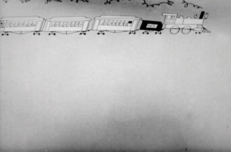 1
1A train enters and the camera moves in on it.

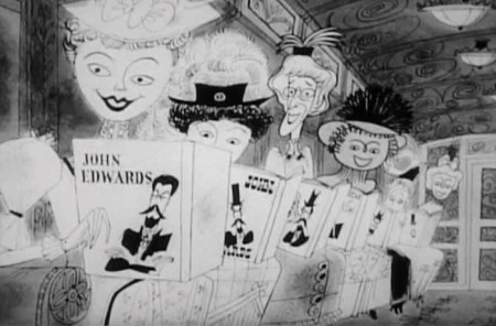
A pan (right to left) shows a lot of women reading
books by our lead character John Edwards (Rex Harrison).
 4
4
The pan ends on Edwards seeing
the full car of women staring at him.
 6
6
He acknowledges them as . . .
 7a
7a
. . . the train moves on, and . . .
 7b
7b
. . .there’s a slow transition . . .
 10
10
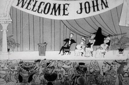
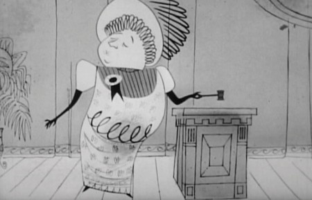
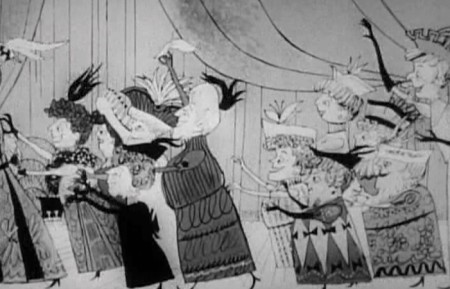
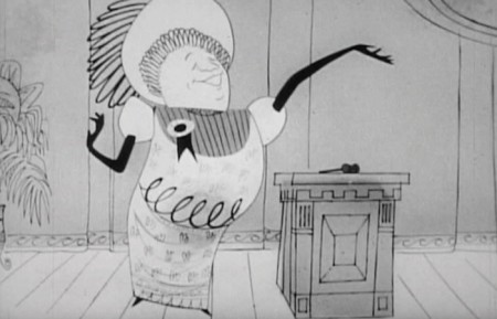
A woman speaker introduces him.
 11
11
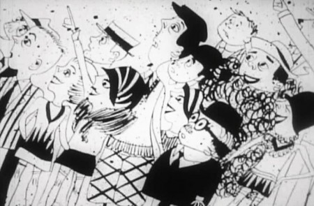
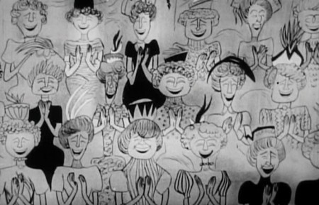
The female audience applauds enthusiastically.
 12
12
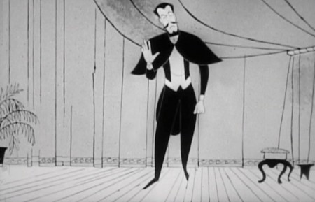
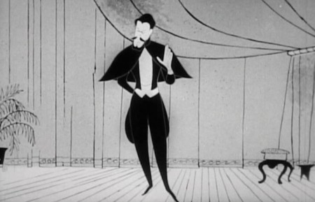
He stands to speak and . . .
 13
13
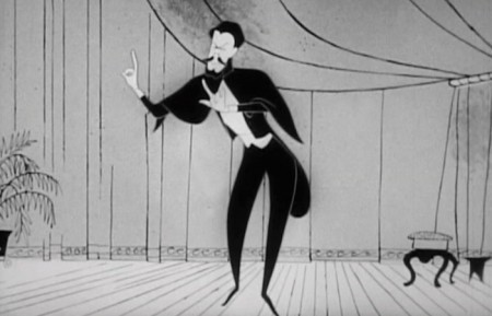
. . . gives his speech in mime. We don’t hear his words.
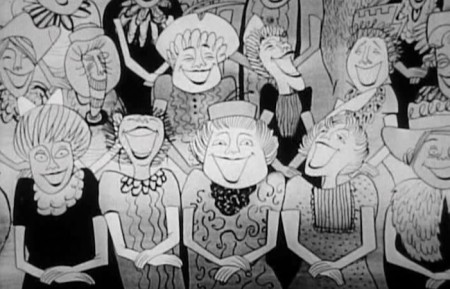 14
14
The woman laugh enthusiastically at his joke.
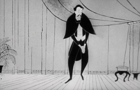 16
16
I can only wonder whether this had any influence
on Hubley’s later film, Zuckerkandl.
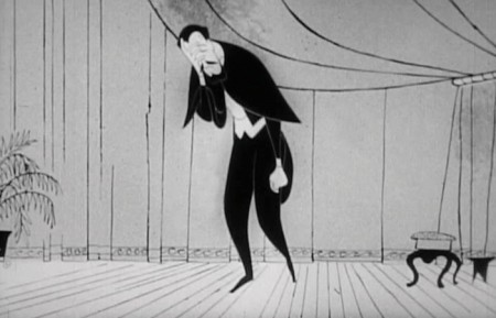
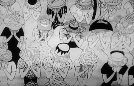 18
18
The women are in hands. They’re crying.
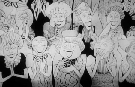 22
22
They audience is overwhelmed.
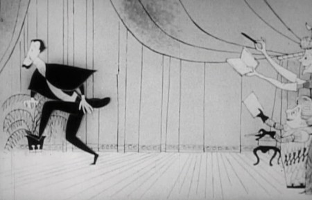 24
24
He’s chased from the stage.
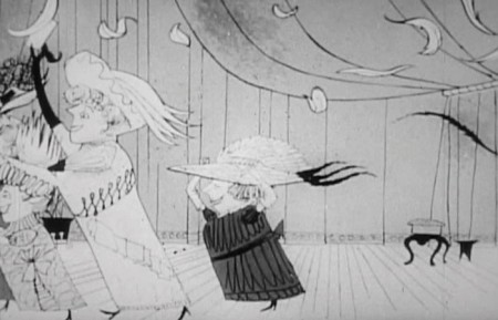 26
26
They rush him leaving feathers flying from their hats.
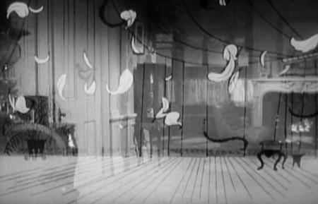 27
27
There’s a transition back to the live action bedroom.
.
__________________________
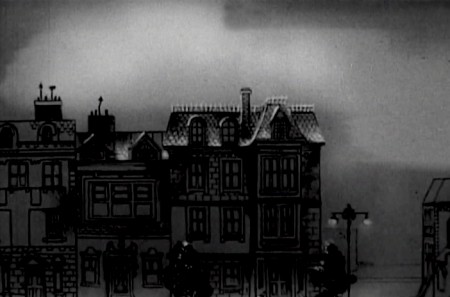
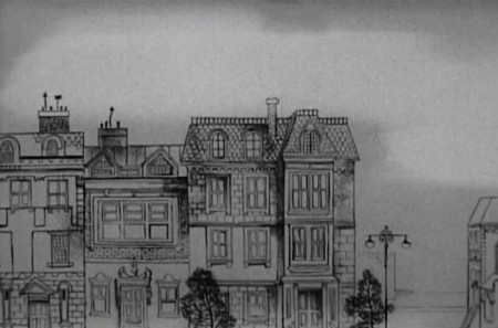
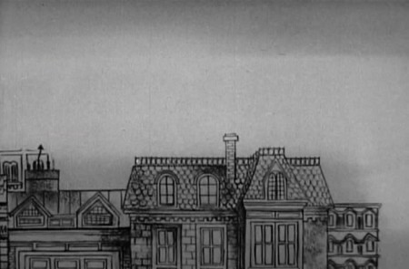
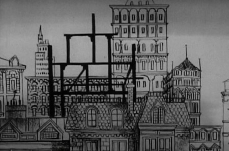
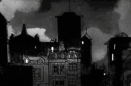
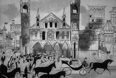
The fourth section is designed only to show us that time has passed and the city is growing up around their ears. They remain in the same house the went to after first getting married (obviously, or the film’s title would be pointless.)
.
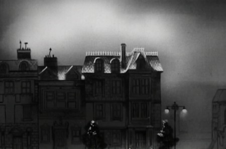 1
1

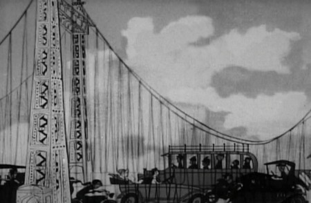
As we pan from left to right, the city builds up for the camera.
The bridge, on the far right, is the last structure to be constructed.
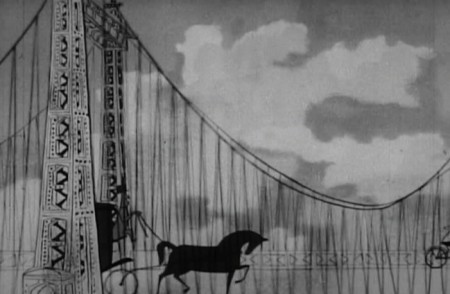 8
8
Cut in to the bridge as a horse drawn carriage enters . . .
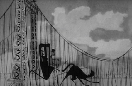 9
9
. . . and before our eyes , , ,
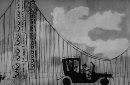 10
10
. . . turns into an automobile.
Animation Artifacts &Frame Grabs &Hubley &UPA 28 May 2012 06:21 am
The Four Poster
- One of the real neglects in animation history is the availability of The Four Poster in VHS, DVD or any other format. For some reason, this title has eluded marketers who’d want to cash in on the name of Rex Harrison or his wife, Lilli Palmer. Where’s TCM when you need them.
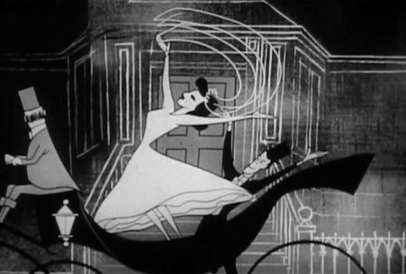
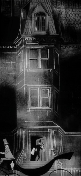
 This film was a Stanley Kramer production directed by Irving Reis in 1952 of a play by Jan de Hartog. It tells the life story of a marriage between the husband and his wife. In fact, the film is so insular that it never leaves the bedroom, and it revolves around the “four poster” bed in that room. For the film, they chose to open it up by leaving the bedroom via animated inserts done by John Hubley at UPA. There are some 20 minutes of the film done by Hubley/UPA, and it’s extraordinarily progressive animation for the time.
 I own a good 16mm copy of the whole film, and cut the animation segments separate from the feature, I allowed a friend to make a video copy but was very disappointed with the results – out of focus and almost unwatchable. In the past couple of weeks, another friend led me to a second DVD copy which is also out of focus but not as bad as the first.
I’ve wanted to focus on this film for some time, hence I decided not to wait any longer and am sharing frame grabs with you of this muddy, soft focus version. You can still get the idea. If another, better copy turns up in the future, I’ll rework these images and repost it.
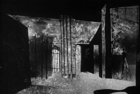
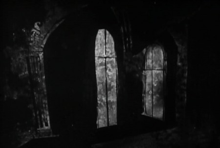
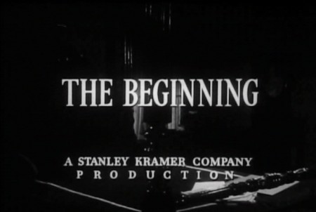
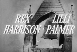
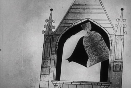
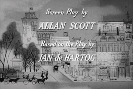
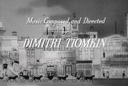
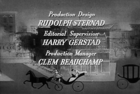
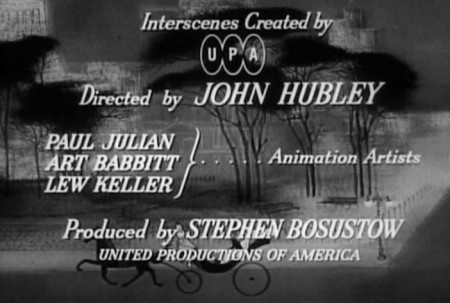
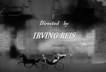
Here are bits from the opening credits. Lots of traveling right and then left and then right again.
 3
3The film does get very claustrophobic staying in the one bedroom set
for the entire film, with just the two characters, husband & wife, to talk
us through most of the movie. It’s exhausting.
This makes the animation more welcome than it would ordinarily be.
You’re dying for any excuse to change scenery and move the story forward.
 4
4
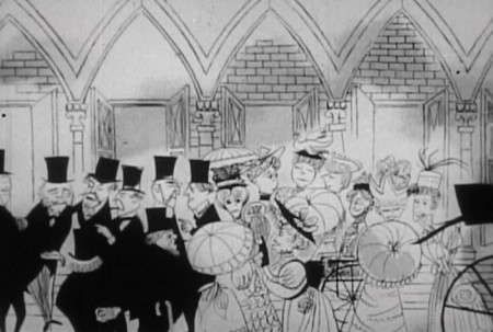
On top of this, the live action is very theatrical
whereas the animation is full of life and quite lyrical.
 5
5
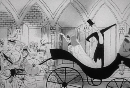
The animation does reveal a good part of the story from the
birth of their boy to his death in WWI on the front lines.
(Hubley designs one of his greatest sequences for this one.)
 8
8
Supposedly, the film was sent to Yugoslavia for a run.
Some of the people in Zagreb were able to kidnap the film
and hold onto it for a number of additional weeks. They
studied it closely and copied it.
 9
9
When they were finished the print was returned to
the States, and they started up Zagreb animation with their
new-found knowledge and inspiration. A bit more than inspired,
shall we say. How very 21st Century of them
 12
12
In his book, When Magoo Flew, Adam Abraham doesn’t give a lot of
space to the work on this feature. However, every small comment
seems valuable since so little has been written about this film.
 13
13
Abraham says that Hubley and crew went onto this directly after
finishing Rooty Toot Toot. They were broken into small groups
with each group doing one of the interecenes in the feature.
 15
15
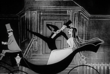
Paul Julian oversaw the stylistic representation of the War
and Art Babbitt animated the sequence showing the effect
of the war on the soldiers coming home.
 16
16
In total, it’s an enormous accomplishment.
____________________
.
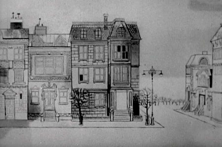
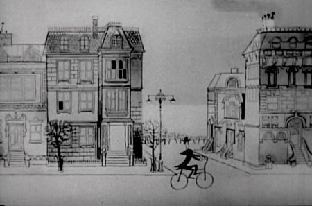
The first animated intersection shows the Rex Harrison character going off to work as a teacher in a boys’ school.
 1
1
 2
2
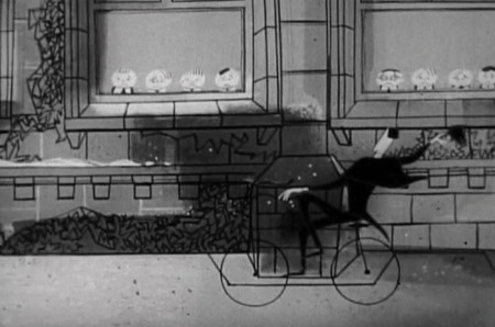
Out of the home, Rex Harrison’s character
comes cycling on his way . . .

. . . to school. Like many other sequences in this animation,
he rides a long pan to the school where he enters on bike.

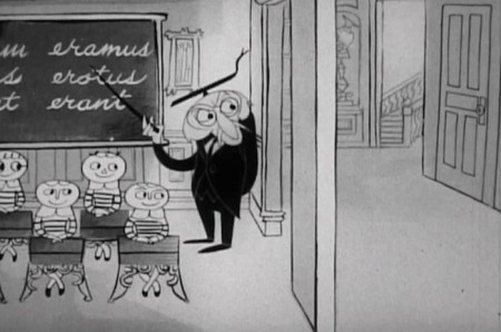
Inside the school, we echo the first scene with another pan.
This time we pan from class to class ending with . . .
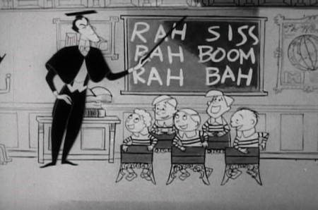 5
5
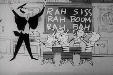
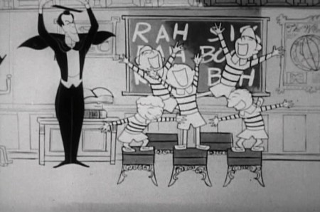
. . . Rex Harrison’s very unethical class, where the kids are having fun.
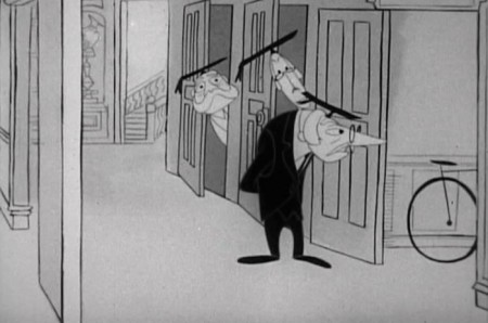 8
8
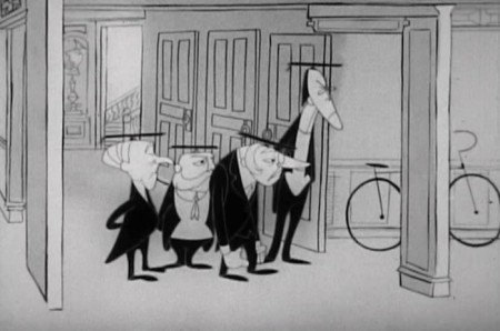
The raucus noise of his class is disturbing other teachers.
They don’t like the students having fun.
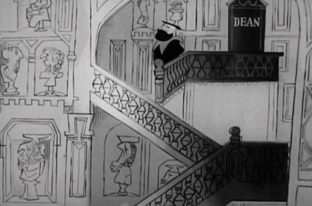
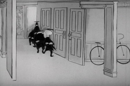 11
11
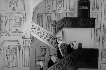
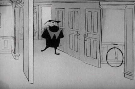
Off to the Dean’s office to complain.
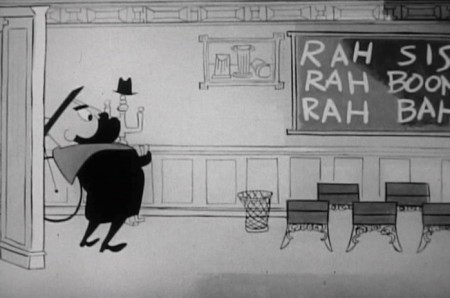 16
16
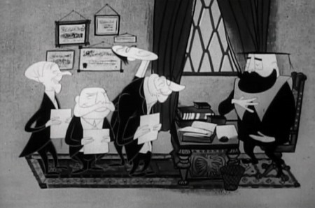
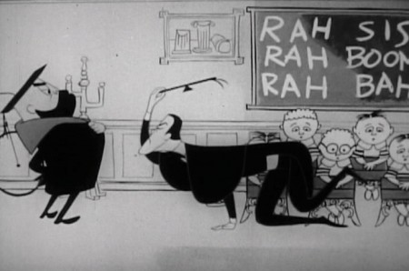
The Dean breaks in to something too much fun.
 17
17
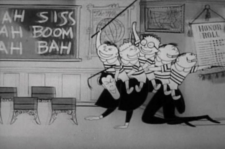
Even with the soft focus, you can see
that the character design is great.
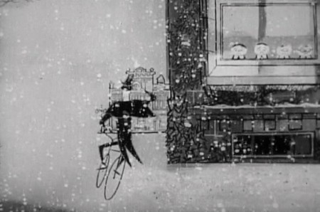 20
20
He goes off into the sunset of a
snow fall.
Back to live action
