Category ArchiveHubley
Animation &Commentary &Frame Grabs &Hubley 18 Mar 2008 08:16 am
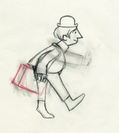
The Hat
- Forgive me, I’ve been in a Hubley frame of mind these past few days, so I’m into reminiscing.
 New York’s local PBS station, WNDT – that’s what it was called in the old days – used to have a talk show hosted by film critic, Stanley Kaufman.
(It turns out that this show was produced by the late Edith Zornow, who I once considered my guardian angel at CTW.)
This talk show was quite interesting to me, a young art student. I remember one show featured Elmer Bernstein talking about music for film. He gave as his example the score for The Magnificent Seven. He demonstrated that the primary purpose of the score, he felt, was to keep the action moving, make the audience feel that things were driving forward relentlessly. I still think of that show whenver I see a rerun of the film on tv.
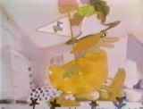
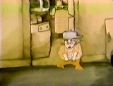
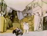
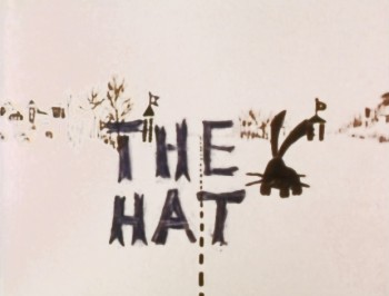
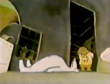
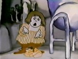
The surprise and exciting program for me came when John and Faith Hubley turned up on the show to demonstrate how animation was done. They were using as an example a film they had currently in production, The Hat. This film was about the siliness of border lines. One of two guards, protecting their individual borders, loses his hat on the other side of the line. Of course, all he needs do is to step over and pick up the hat, but he can’t. The other guard won’t allow him to cross the border illegally – even to pick up his hat.
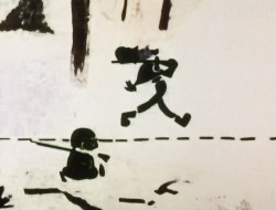
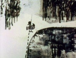
The voices were improvised by Dudley Moore and Dizzy Gillespie (much as the earlier Hubley film, The Hole, had been done.) The two actor/musicians also improvised a brilliant jazz score.
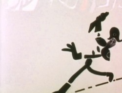
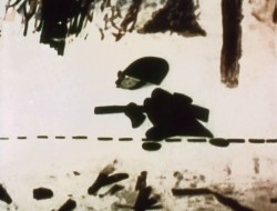
John’s design was quite original. The characters were a mass of shapes that were held to-gether by negative space on the white on white backgrounds.
 The animation of the two soldiers was beautifully done by Shamus Culhane, Bill Littlejohn, Gary Mooney and “the Tower 12 Group“.
Shamus animated on a number of Hubley films during this period, most notably Eggs and a couple of commercials.
Bill Littlejohn animated on many of the Hubley films from Of Stars and Men up to Faith’s last film.
Gary Mooney animated on The Hole and Of Stars and Men. He was an Asst. Animator at Disney, animated for Hubley then moved on to some of the Jay Ward shows before moving to Canada where he continues to animate.
Tower 12 was the company formed by Les Goldman and Chuck Jones at MGM. Apparently they were between jobs when Hubley was finishing this film, and Chuck offered help.
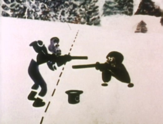
Of course, the colors of the film as represented by the dvd are pathetically poor. It’s hard
to even imagine what the actual film looks like, and it’d be great to see a new transfer of
all the Hubley films.
Animation &Animation Artifacts &Hubley &Story & Storyboards &Tissa David 17 Mar 2008 07:46 am
Upkeep Board
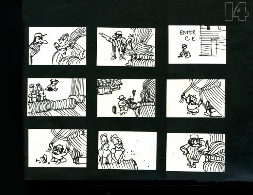
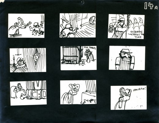
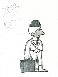 - I spoke a little too quickly last week when I promised to post the storyboard for UPKEEP, Hubley’s short film for IBM. I seem only to have three pages of the board, and I’m posting them here.
The story tells the history of the maintenance guy, for this client, IBM. When the first stone-wheeled cart breaks down (square wheels don’t work), the mainenance man comes in and cuts off the edges to give the world the first round wheel. When the loom goes crazy, the maintenance guy enters to fix the macinery, making it easier and smoother to weave. (Love blossoms in this sequence.)
The entire film is told without dialogue. Its soundtrack is a score by jazz great Benny Carter, and it was prerecorded. The film was animated to
___Xerox Model of lead character_______ it and the animation was edited by Faith Hubley.
___drawn by John Hubley______________The animation was done by Phil Duncan, Tissa
___________________________________David, Jack Schnerk and Lu Guarnier.
Again, I have only these three pages. They’re photostats made from the storyboard drawings pasted to black flint paper and reduced to 9×12 size. Originally, John did the drawings on pads of paper (4×5) cut to size. The drawings he chose to include were tacked to the wall in his room. This is where he’d present the board to his client.
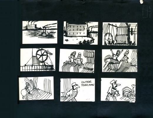
_________________(Click any image to enlarge.)
Here are a couple of the Layouts for this sequence.
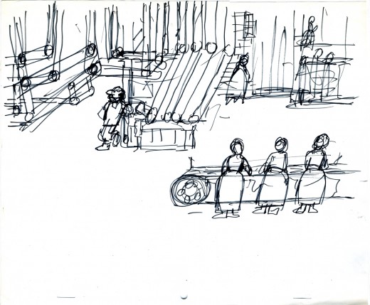
_________A drawing by John Hubley of the assembly line BG.
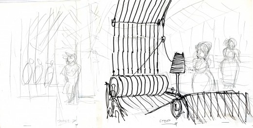
_________Tissa turned this shot into a pan so that we’d end on the lead girl.
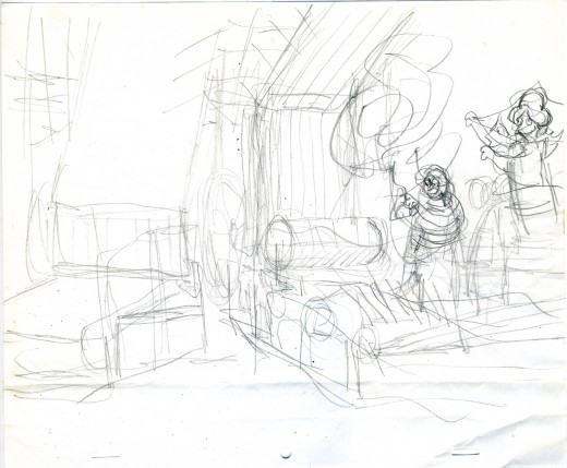
_________The loom goes haywire as Tissa blocks out the scene.
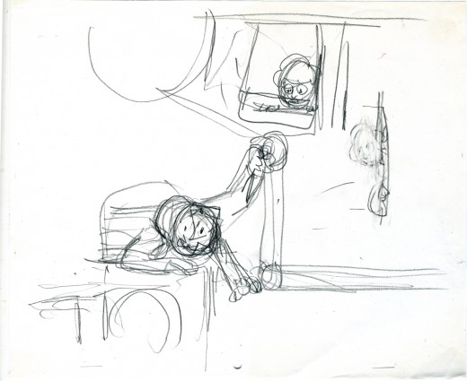
_________Tissa shows the girl watching the guy at work.
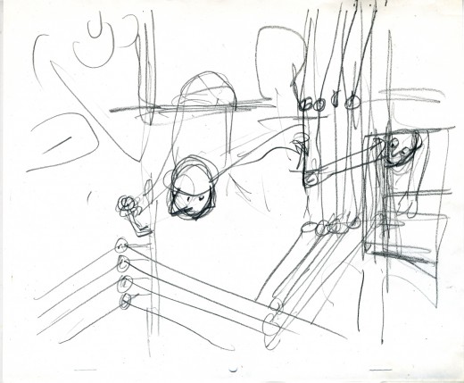
_________John’s drawing of the serviceman repairing the loom with Tissa’s touchups.
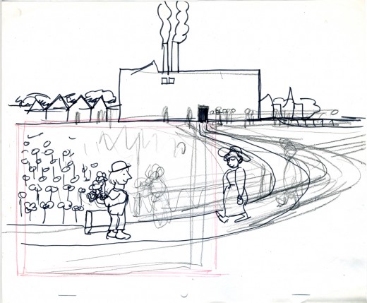
__John draws the serviceman waiting for the girl at the end of the day – with flowers.
Animation &Hubley &repeated posts &walk cycle 14 Mar 2008 08:33 am
Recap Friday – Upkeep Cycles
- Back in October 2006, I posted this piece about John & Faith Hubley‘s short film Upkeep which includes an excellent walk cycle by Tissa David. I’ll try to post the storyboard for this film next week, if I can locate it.
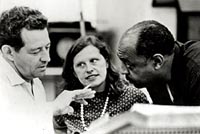 – Back in 1973, the Hubleys produced Upkeep, a short film for IBM. It chronicled the history of the service repairman in a light hearted way. Actually an industrial, it was treated like a personal film. (There’s a thin line between some of their industrials and their personal films.) Of Men and Demons was done for IBM though they considered it a personal film; it instructed in the positive aspects of the binary code and was nominated for an Oscar.
___ (John & Faith Hubley with
___composer, Benny Carter)
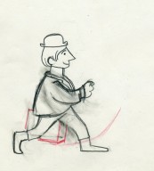
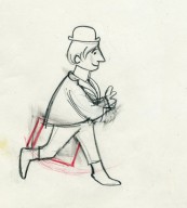
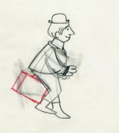
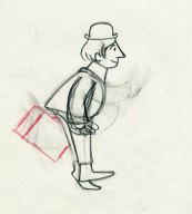
Tissa David did the lion’s share of the animation for Upkeep. Phil Duncan, Lu Guarnier and Jack Schnerk were the other key animators on it. Helen Komar and I assisted all of them, and I inked the whole film. Gen Hirsch and I colored it. John did all the Bg’s.
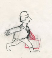
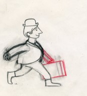
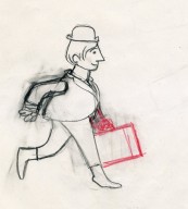
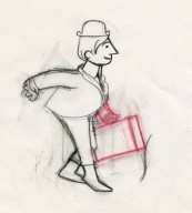
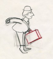
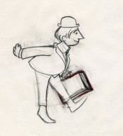
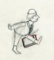
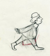
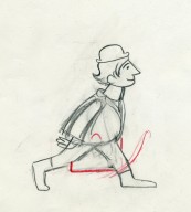
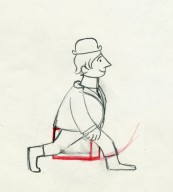
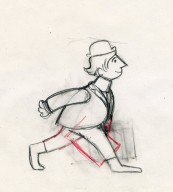
The initial animation on the service man was done by Phil Duncan. Tissa had to pick up the character, and she found the walk Phil had done so funny that she kept it throughout the film adding shades and tones to it as she thought appropriate.
The art was inked with a sharpie, bled with thinner, then colored with magic markers. Each drawing was then cut out and pasted to cels. Hubley’s Bg’s followed the same style: sharpie on board, washed & bled with thinner, added watercolor washes.
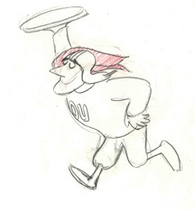
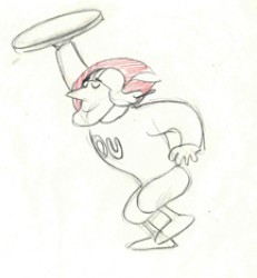
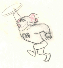
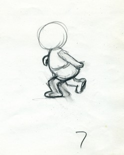
Posted below are the drawings for that 18 drawing walk cycle.
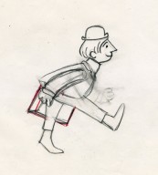
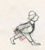
___(Click any image to enlarge them.)
Walk cycle on twos.
Animation Artifacts &Hubley &repeated posts &Tissa David 29 Feb 2008 08:46 am
Recap Friday: Letterman I, II & III
The following was a post that first appeared March 25, 2006.
I’ve added slightly to it:
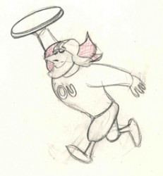
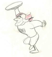
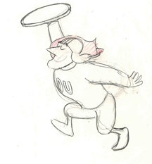
- One of the first jobs I had in animation was working for John Hubley in 1972 on Letterman series for The Electric Company. I enjoyed writing the several posts that I’ve combined for this recap:
- There were three seasons of Letterman episodes we did at the Hubley Studio. All 60 episodes were 2 1/2 mins. apiece including the reused wrap-around: “It’s a bird! It’s a plan! It’s Letterman!” They were all directed by John Hubley. The first 40 episodes were all done in-house. The last 20 episodes were split with 10 done in the NY studio and 10 farmed out to Fred Wolf‘s studio in LA. The boards and layouts in NY for those sent out. Fred and Chuck Swenson animated all 10. (These are also the only episodes to use cel vinyl. All the others had the characters colored with marker on paper and cut & pasted onto cels.) The audio was done in NY, and editing was done in the studio by Faith Hubley.
In the first season of the show the primary voices were: Gene Wilder as Letterman, Zero Mostel as Spellbinder, Joan Rivers as the Narrator, and Jack Gilford doing incidental voices. Billy Taylor did the music.
animated by Tissa David for the first season of the show. Letterman runs on two’s.
II
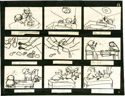
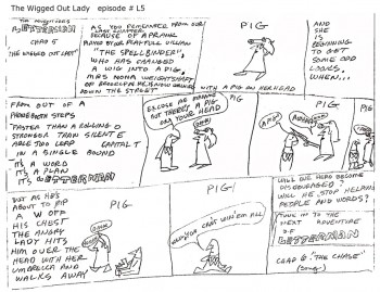 Christopher Cerf wrote all 60 episodes of Letterman, probably in collaboration with John Hubley. The storyboard posted here for episode #5 was by Chris Cerf; that’s pretty much how he did the scripts.
It’s undeniable that the wacky “naive” drawings undoubtedly inspired the models for the characters in the films.
(Click on any image to enlarge to a readable size.)
No doubt also affecting the models was an acccident that John Hubley had had at the start of production on this first series. At a dinner party, John tried to stop a falling 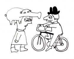 fondue pot filled with melted cheese. Horrible burns over both hands somewhat hampered his artwork. I would make several visits a day to his nearby apartment to have art approved. To have John draw, we’d prop a felt-tip pen into the mass of gauze and cotton and bandages wrapped around both hands. He’d move his wrapped fist around a sheet of paper and end up with a model like the one posted here. This went on for about three weeks (roughly half of the production time.) When he returned, backgrounds were done at a super speed.
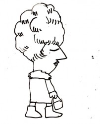
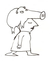 Everything was modeled on Krazy Kat. Lots of white space with sparkling color sprinkled about. The lines were dressed up with a ragged cross-hatching. The characters were colored with magic marker. (John’s favorite color was Eberhard Faber’s “Shock Pink”. Letterman’s skin color took this tone. It showed up in almost everything John did with markers.) The backgrounds were inked with a pentel felt-tip. John would throw a light wash of water over some of these lines to get them to bleed.
We’d race daily to get at least half a dozen scenes ink, painted and colored on paper. Then it’d be packaged and sent out via Fed Ex. (Celine Miles in LA cut & pasted the colored drawwings to cels; the art was shot at Animcam by Jack Buehre.) The FedEx guy arrived daily at 5:30pm, so that was my deadline. I found myself coming in at 7am to add more time to the day. I’d watch the clock which ticked furiously; I averaged 30secs to ink a drawing – any more, and I wouldn’t make Faith’s deadline.
III
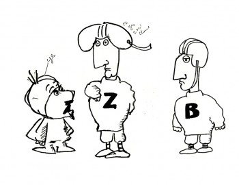 – These scrappy examples are not the best to give an indication of Letterman. But they were the ones I saved, so they’ll have to do. John Hubley drew these very early in the production, and they undoubtedly owe something to Chris Cerf‘s hilarious storyboards.
The animators involved in season one included: Tissa David, Johnny Gentilella, Vinnie Bell, Lu Guarnier and Jack Schnerk.
Helen Komar, a veteran Asst. Animator in NY, was the coordinator of the production and Gen Hirsch also colored. Gen and I got really close over the couple of years we worked together. She was the wife of Joseph Hirsch, the brilliant artist and mother of Paul Hirsch (editor of Star Wars and other incredible films) .
It was my first real job in an animation studio. Probably for this reason, I remember a lot of what happened – it was indelibly etched in my memory. I was the inker, colorist (we used markers, remember), animator of miscellaneous scenes (I think I animated some 40 scenes that first season), hole puncher, and Assistant Animator.
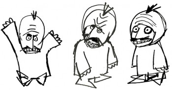 It was in the capacity as Assistant Animator that I found trouble. I hadn’t done it before, except for myself, so was horribly untrained. Because the schedule was so ridiculously tight, I had to assist in ink (Sharpie pens – the fat ones that dribbled ink and bled through multiple sheets of paper) and correctly put some of the animation – I won’t say on model, but closer to model.
Johnny Gentilella, an absolutely wonderful guy, was the farthest astream. He was THE Popeye animator at Paramount. His characters looked like Paramount characters, and I had to get them closer to John’s style. This meant assisting (in ink), inbetweening and basically redrawing everything he’d done – in a rush – without proper training. The guilt of what I was doing to Johnny’s drawings weighed heavily on me, and I eventually apologized to him for what I’d done. He laughed and told me that he had no problem with it. This was standard for NY production in those days and he was used to it. (As a matter of fact, he hired me for another job he directed months later. So I guess he wasn’t too upset. I was.)
The race against the clock was always on; my career had started, and it couldn’t have been more fun. And I was working for John Hubley.
Animation &Articles on Animation &Hubley 30 Aug 2007 07:49 am
Littlejohn & Tyer
- Bill Littlejohn is an animation “God” who doesn’t get the attention he deserves. Let me call your attention to an excellent and extensive interview Tom Sito conducted with Bill which is posted on AWN.
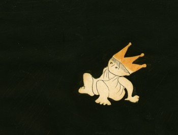 Bill was one of the first animators whose work I could identify opn screen. I studied the Hubley films in my early years, and I watched The Hole and Of Stars and Men every chance I could in the days before vhs tapes when you had to go to a theater to see these films.
Bill’s work on Of Stars and Men has completely entered my vocabulary of great animation. The walk cycles for the many animals are just so magestic and regal that I watch them over and over.
That film employed the Hubley technique in which the animation drawings were painted black (using oil paint so that the paper wouldn’t buckle) all about the exterior of the character and were then double-exposed over the backgrounds. A lot of hit and miss was part of the process as characters had to avoid each other or create a multiple exposure; you could see through each of the levels. With each run through the camera, the density of the image kept thinning out, as well. It’s amazing how stunning this film is given the inherent problems in the technique. And it was made for a budget of $90,000 – a feature film!
I have a lot of Bill’s animation drawings I saved while working at Hubley’s. I’ll try to scan some soon.
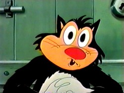 - There’s an enormous Jim Tyer post which celebrated his brithday back in February. there’s not much new information here, just a lot – and I mean lots – of links to videos and other writings. If you’ve a mania for Jim Tyer, this is the first stop.
There are quite a few sites which break down Tyer films in a frame by frame analysis. His animation is good for this; the distortions are so entertaining. However, I sometimes wish there were more of a critical analysis by someone who is truly knowledgeable about animation. It’d be fun to see an informative comparison between some of Rod Scribner and Jim Tyer, but truly discuss their work in relation to animation technique. Less show-and-tell and more commentary with illustrations supporting the thesis. Maybe someday when I’m in a ponderous state, I’ll offer my thoughts. However, until then, it’s still fun to look at the wacky drawings.
A couple of these sites are:
Animation I.D. Tyer-How Does It Work
Classic Cartoons “How To Relax”
Classic Cartoons “Foiling the Fox”
Inspiration GrabBag More Jim Tyer
Animation &Animation Artifacts &Hubley &Tissa David &walk cycle 14 Aug 2007 07:56 am
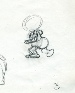
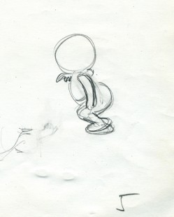
Georgia walk
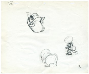 – Finishing up posts featuring artwork from John & Faith Hubley’s Cockaboody, I have this walk cycle from Tissa David.
Tissa is careful not to use too much paper. Hence she reuses old paper for her very rough preliminaries as she figures out her animation.
It’s frequent, when visiting her work space, to see lots of pages featuring char-acters on both sides of the paper upside down as well as sideways. She doesn’t often let these rough roughs out of her hands before she throws them out. I guess I was there at the right time and talked her into giving me these drawings.
She animates the walk, here, on top pegs bacause that’s all she has left of space. Tissa nomally works on bottom pegs. Actually, since this is going to be a sliding cel, it would have been done top pegs anyway.
Georgia, the younger girl, leaves the bathroom and moves to the floor to play with a doll (whose head she accidentally pulls off).
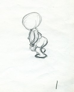 1
1 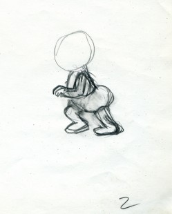 2
2
(click any image to enlarge.)
 3
3 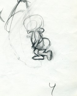 4
4
The walk is heavy and a bit flatfooted. She doesn’t come down on her toes but plants the entire foot.
 5
5 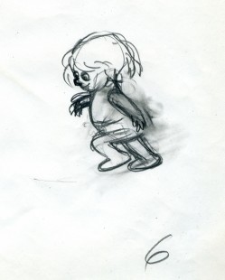 6
6
Her arms are high because, a baby, she’s still a bit off balance.
Animation &Animation Artifacts &Hubley &Story & Storyboards &Tissa David 10 Aug 2007 07:21 am
Cockaboody Layouts
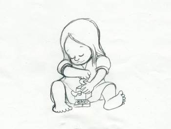 – To hook up with the Cockaboody storyboard I’ve posted in three parts (Part 1, Part 2, Part 3)
I thought I’d post some of the key drawings done by Tissa David.
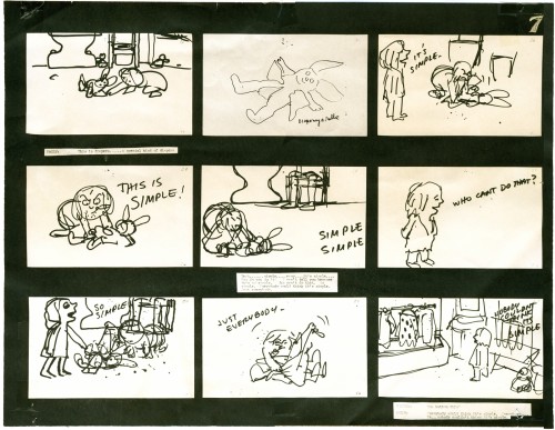
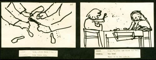
To make them a bit more meaningful, to see what a really sensitive animator adds to a film, with the help from her director, I’m also posting the storyboard drawings that relate to these animation keys.
(Click any image to enlarge in a different view.)
If you watch the film with the storyboard in front of you, you’ll find a lot of discrepancies. The film grew as the animation began.
While working for Phil Kimmelman & Ass. for a short period (which just so happens to have been the exact time the Hubleys were making Cockaboody – I came back to their studio and joined their film in the very last stages) I learned an interesting saying that was the credo at Kimmelman’s. At every stage the film should get bigger. By this, they meant that the animator should take the storyboard and build on it. The Assistants should add whatever they could to the animator’s work, etc. I liked the sound of that and remind myself of it often and try to plan my films so that will be likely to happen.
I certainly think that Cockaboody does this.
If you want to see the film, it’s currently on YouTube.
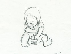
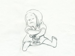
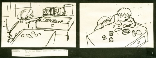
Tissa takes this play with the blocks and places it on the floor. This keeps all of the action down at the girls’ level and allows the blocks to be used throughout the film. They show up
a bit later as part of the background art.
The blocking also puts more attention onto the character of the girls instead of having to have them climb up the chairs to get in place at the table.
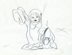
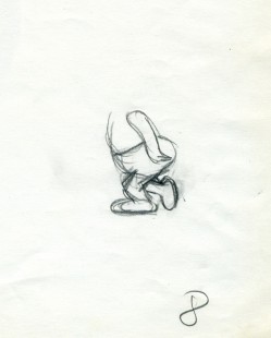
The storyboard drawing above left (with the “goosey”) is the only representation of the girl wearing her father’s shoes. Tissa took this small bit and ran with it.
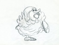
Obviously the action in the boards has nothing to do with the action in the film.
Tissa moved the girl to the closet quietly getting us into the next sequence with this girl
still in grownup shoes.
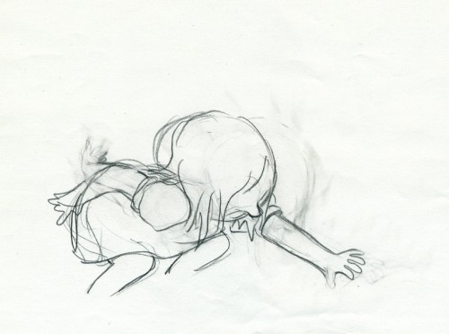
Both of these drawings (above and below) use the father’s shoes on another level.
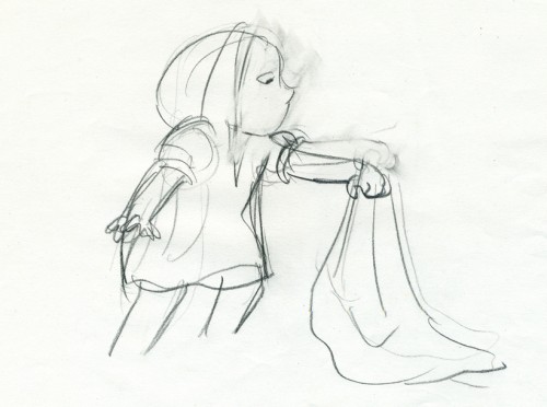
It forces the girl to bend far to pick up the “blankey.”
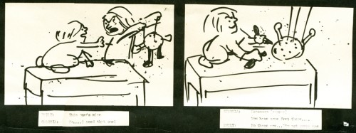
Again we’re off the table on the floor, and this sequence now builds out of what came
in the past. There’s a lot of definition in the two kids at this point.
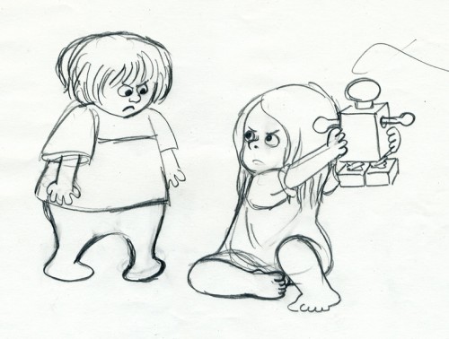
Even the toy has more definition in Tissa’s hands. I’m sure there was some discussion
of this with John. The film takes a solid shape, built on the storyboard drawings and developed with another voice.
Animation Artifacts &Hubley &Story & Storyboards 09 Aug 2007 07:43 am
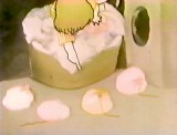
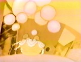
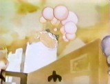
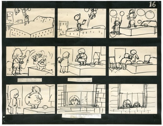
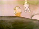
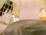
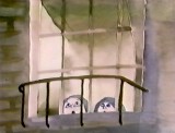
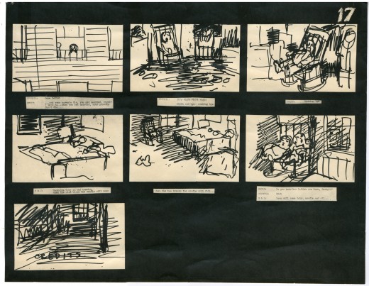
Cockaboody Board Part 3
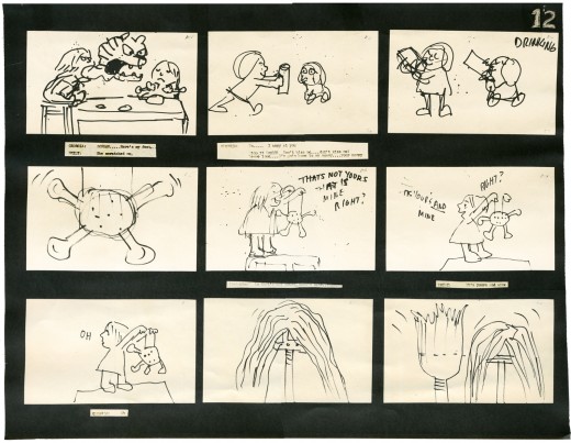
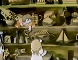
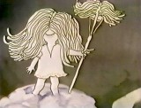
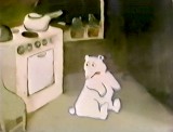
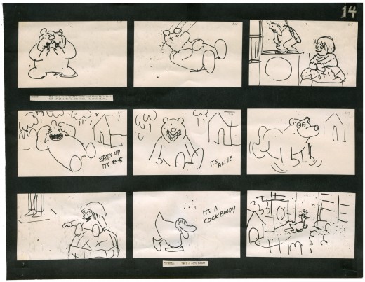
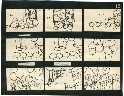
 – Here we have the conclusion of the storyboard John Hubley drafted for the short film, Cockaboody.
These are the direct links to
Part 1 and Part 2.
The film was an outgrowth of an early recording John and Faith made of their two daughters, Emily and Georgia. While teaching at Yale the Hubleys worked with the students in their class to help develop this storyboard. One of the students, Kate Wodell, came to work in the studio and was a mainstay there for many years and continued for a while helping Faith on many of her shorts after John died.
__
__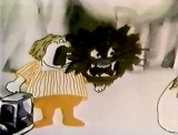 _
_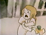 _
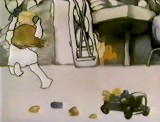
_
__
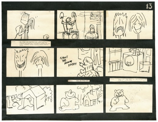
__
__ _
_ _
_
_
__
__ _
_ _
_
__
__
__ _
_ _
_
__
__
__ _
_ _
_
__
__
__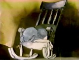 _
_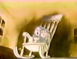 _
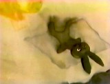
_
Articles on Animation &Hubley 06 Aug 2007 08:12 am
Cockaboody NYTimes
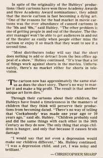
- Since I’ve been posting the storyboards for John & Faith Hubley‘s short, Cockaboody. I thought it might be a good time to post this short article featured in the NYTimes at the time the film was made.
By the way, if you haven’t seen it, you can watch Cockaboody on YouTube.
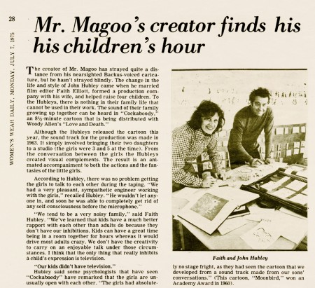
__________________________________ (Click images to enlarge.)
_____________________________
 _____________________________
Animation Artifacts &Hubley &Story & Storyboards 03 Aug 2007 07:32 am
Cockaboody Board 2
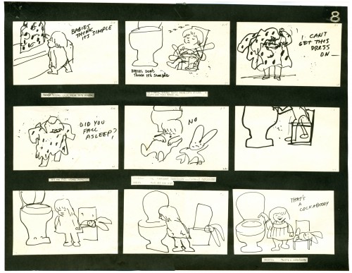
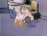
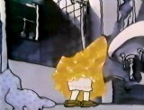
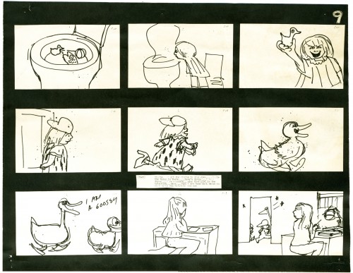
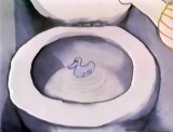
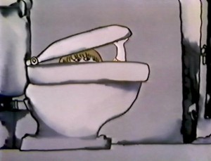 - When we last left the storyboard for Cockaboody, the girls were in the bathroom about to diaper their bunny doll. The story is about toilet training for children.
Here’s the direct link to Part 1.
Cockaboody, of course, is the film by John and Faith Hubley. The storyboard, with all of the drawings done by John, was developed in conjunction with the Hubley’s class at Yale. The students actively discussed the board and offered their participation in the growth of the film’s origin. A documentary was also produced showing the production of the animated short.
The film grew out of some early tapes recorded by the Hubley daughters, Georgia and Emily, who were recorded at play in a studio. The conversations by the children were all improvised. This is not unlike the prior Hubley films, Moonbird and Windy Day.
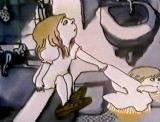
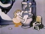
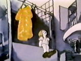
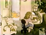
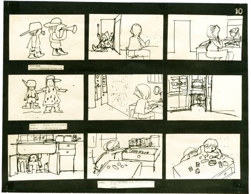
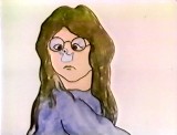
As with the previous post, I’m including some frame grabs of the actual film underneath the appropriate storyboard sections. Tissa David animated the film completely, herself. No assistants worked with her. Faith inked the entire film.
You’ll notice that the action in the film varies from the setups in the storyboard. This undobted had to do with Tissa’s involvement. She would often rework things with John and alter the filmmaking. John, and most of the directors Tissa works with, was open to this. She has a masterful sense of camera placement and uses it throughout this film.
_
________________________________________________________ To be continued.
