Category ArchiveDaily post
Daily post &Frame Grabs &repeated posts 26 Dec 2011 06:37 am
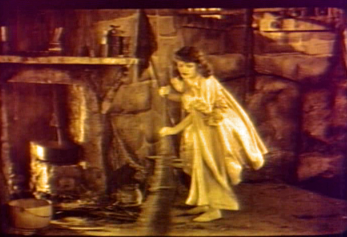
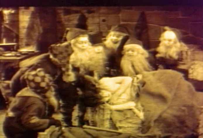
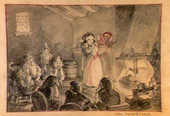
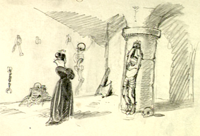
Making Snow White
- On the Snow White dvd, there’s a documentary about the history and making of the film. Some of the images on the disc are just too precious for me to allow them to slip by without my singling them out and writing about them.
.
Here are frame grabs from this documentary.
.
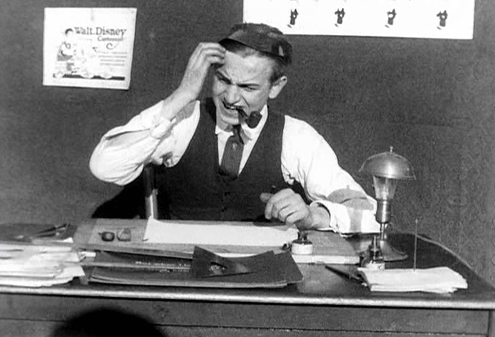
Walt is presented as a bumpkin in the early days.
I suppose he was directing if not filming this material,
so that’s the image he sought to create as well.
This has got to be one of the wackiest pictures in their archives.
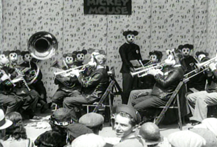
The popularity of Mickey Mouse in the early 30′s.
Snow White brings a change to the studio,
which you can well understand.
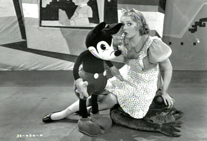
Though there’s still the problem about what to do with Mickey.
Disney was supposedly inspired by a silent filmed version
of Snow White he saw in his younger days.
One wonders if there was also an eerie creepiness to the performance
that Walt gave to all of his animators one night as he acted out the film.
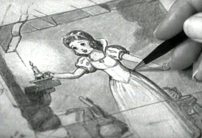
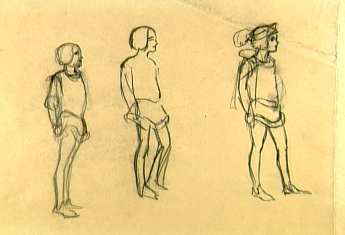
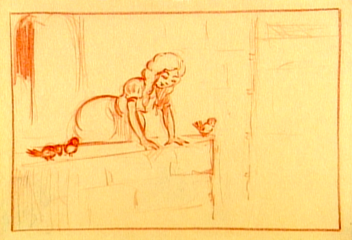
I’m curious about the pose of Snow White with her head back
and her hands behind the head.
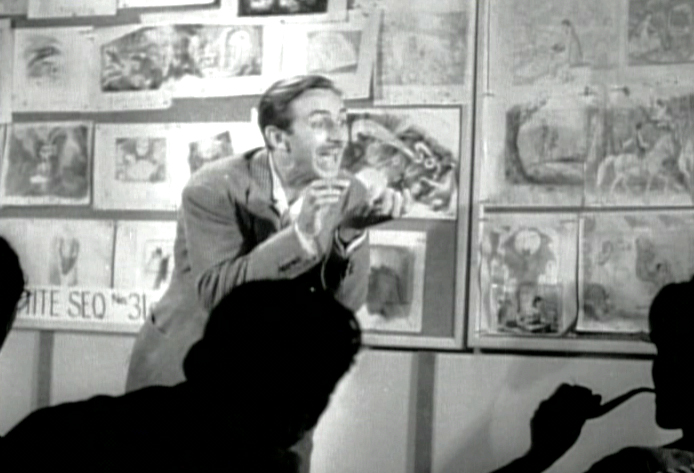
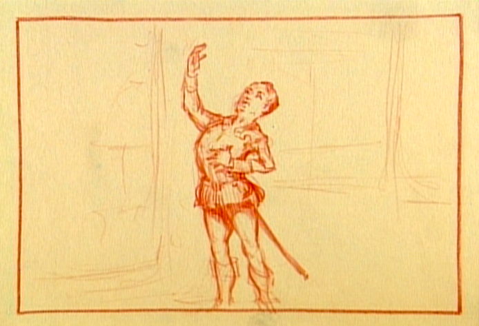
Here, Walt tries to get his animators to bite into an invisible apple -
the future of animation – as they thoughtfully smoke their pipes.
The bed building and the soup eating scenes weren’t the only ones that were
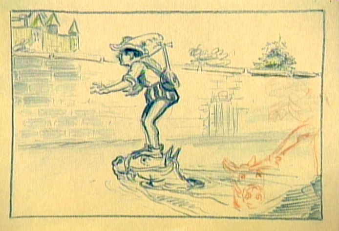
excised from the finished film. It seems the prince, initially had a larger role.
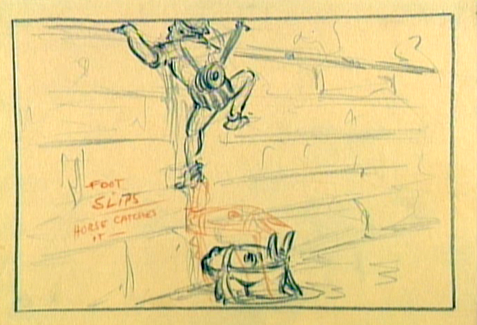
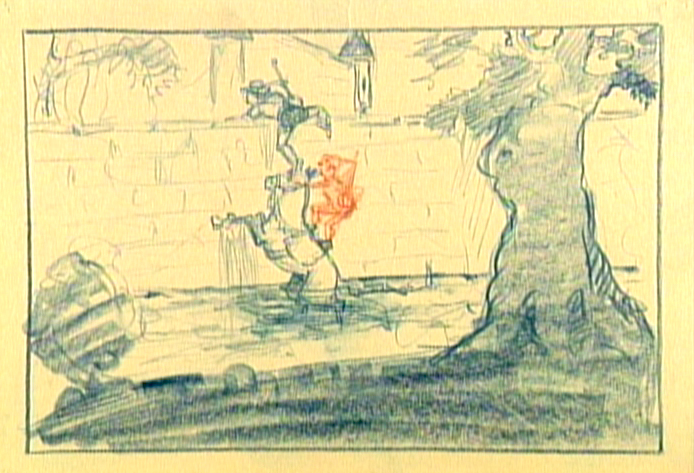
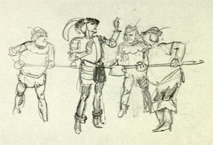
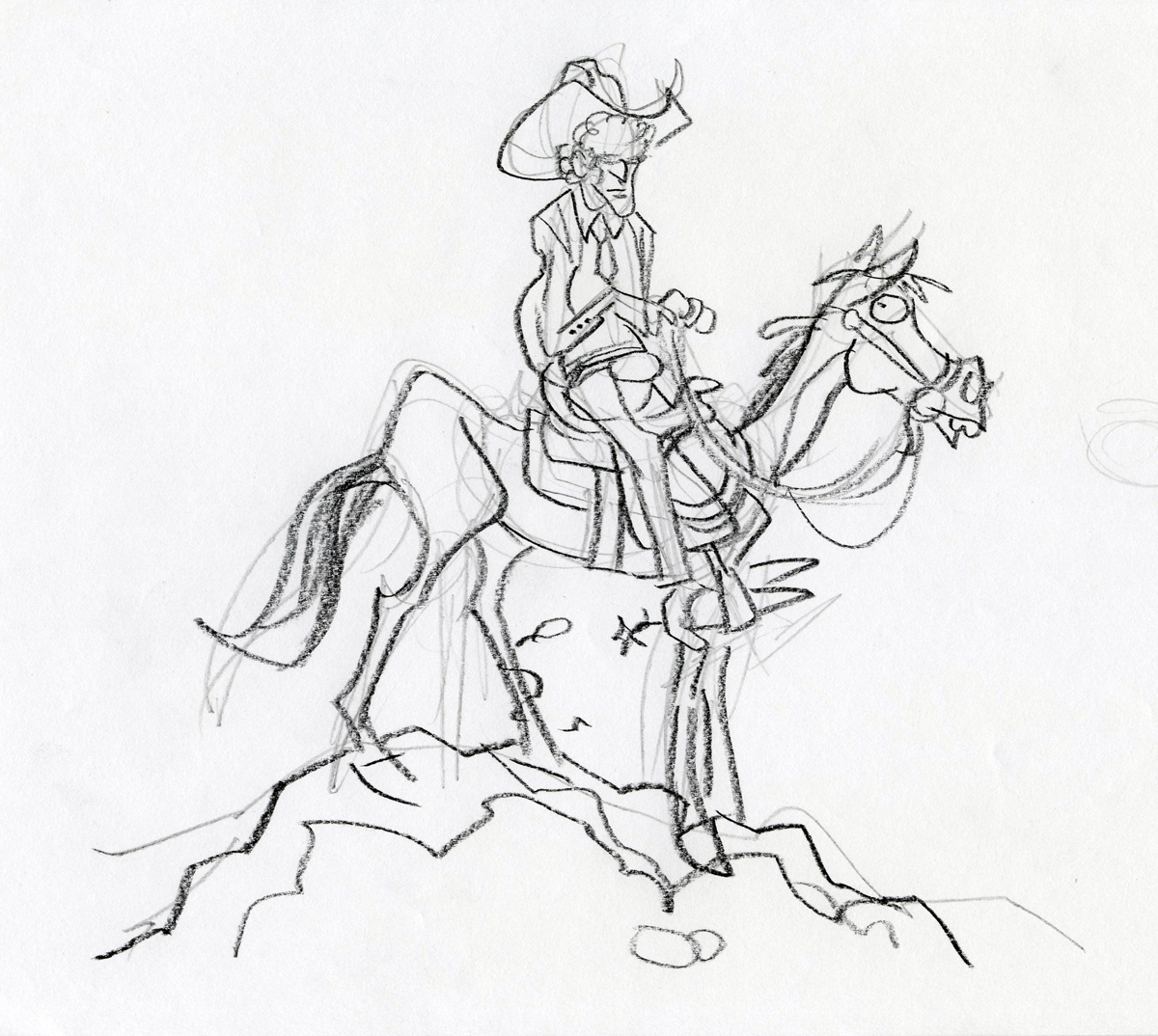
The path into the castle was a bit more difficult. First you had to
get past the moat with the help of your horse. Here the prince looks
a bit like Robert Benchley.
“Romeo, Romeo, Wherefore art thou, Romeo?”
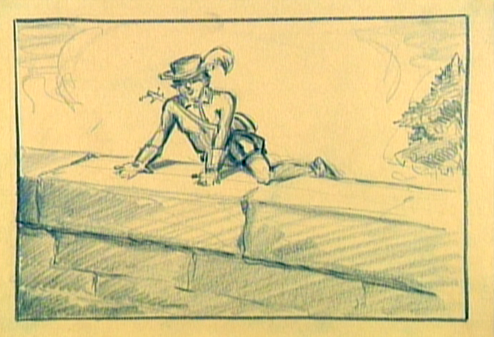
Getting caught. Obviously, the Queen and Snow White didn’t live in that
castle by themselves. There were henchmen we didn’t know about.
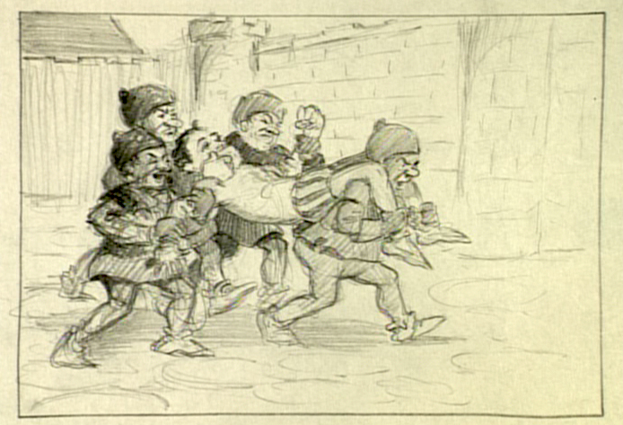
This almost looks like an early version of the seven dwarfs
carried the prince to prison.
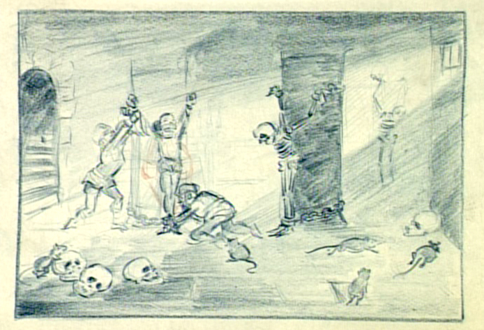
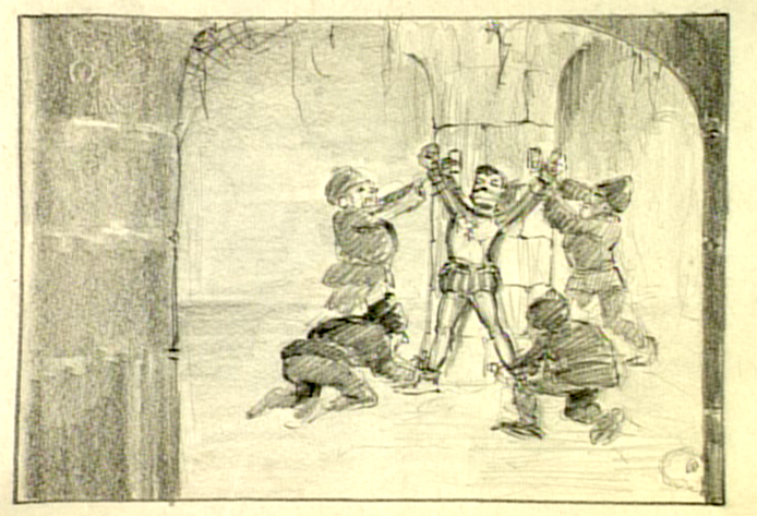
They had big rats in that prison. Scary.
This is an obvious precursor of Malificent going to visit Prince Phillip some
20 years later in Sleeping Beauty. Both wicked Queens got more attractive.
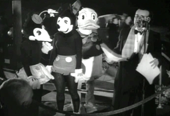
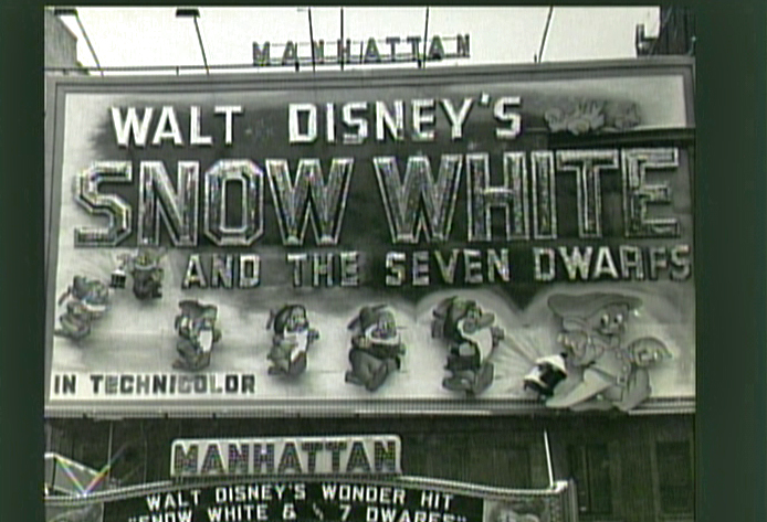
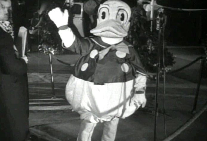
Lots of stars showed up to the grand premiere.
These actors in costume were there, too.
In all seriousness, the film was a masterpiece. I’m still studying it some
74 years later. Walt had reason to be proud and happy. He also had enough
money to move onto other challenging films, and he took the challenge as
opposed to making Snow White 2 or 3 (as they probably would do today.)
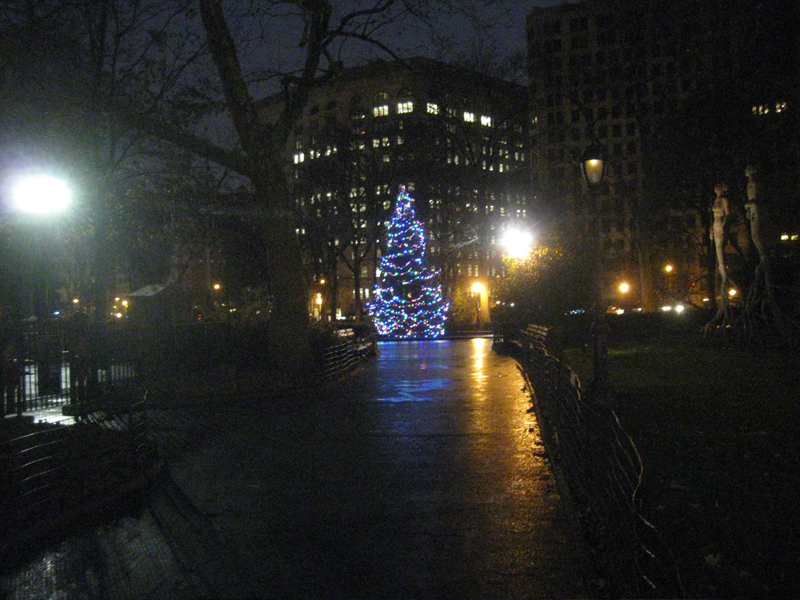
Daily post &Photos 25 Dec 2011 06:49 am
Merry Christmas
- Walking to the studio this morning (Robbie has to be fed before I can start my Christmas)
I passed through my favorite park, Madison Square Park. There was my Christmas tree.
 1
1Coming up on the entrance at 26th Street, you can see the tree.
 2
2
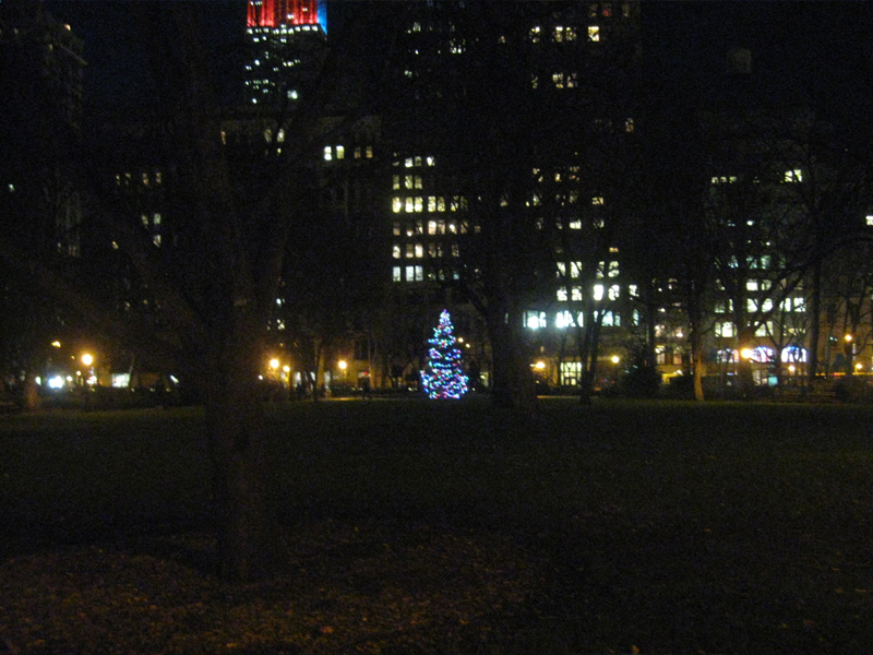
It sits in the empty reflecting pool. In past years,
they’ve had smaller trees surrounding it. I guess
the recession has hit the Christmas decorations.
 3
3
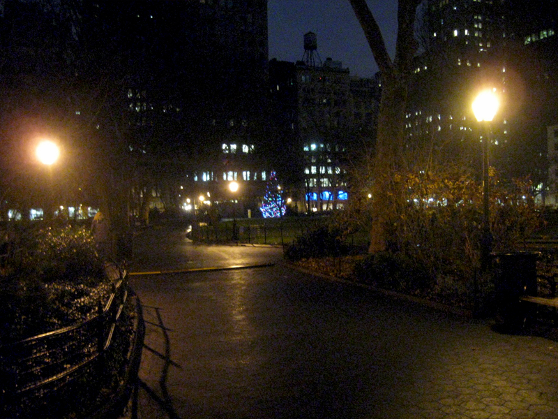
Walking beyond the tree on the way downtown to 23rd Street.
 4
4
Just before exiting the park at 23rd Street, you can still see the tree.
 5
5
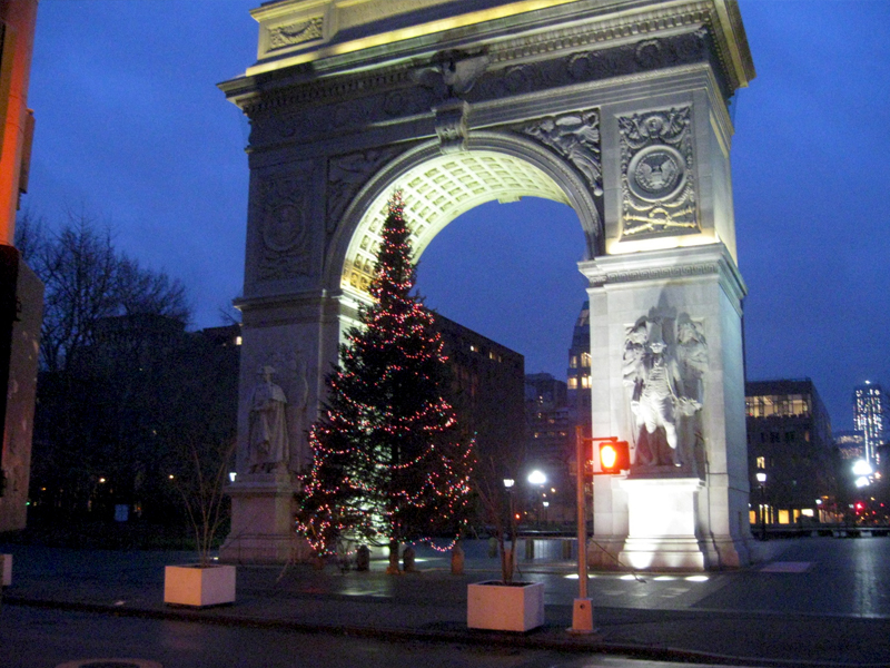
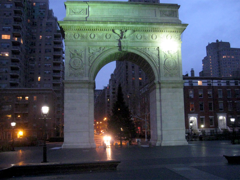
20 minutes later, heading into NYU’s Washington Square Park,
the sunlight’s beginning to rise and the colors are more alive.
 6
6
From the other side of the arch, you can see that the back of
the tree is not decorated. More recession or just lazy?
Have a Merry Christmas everyone.
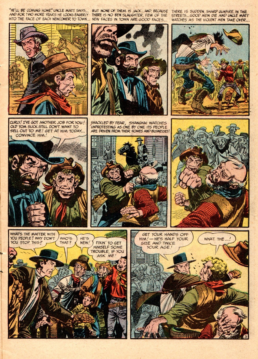
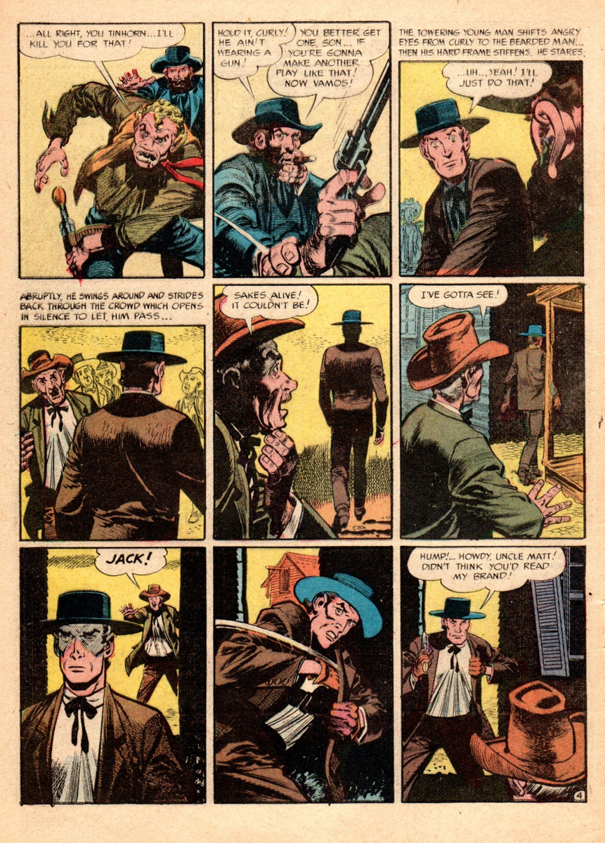
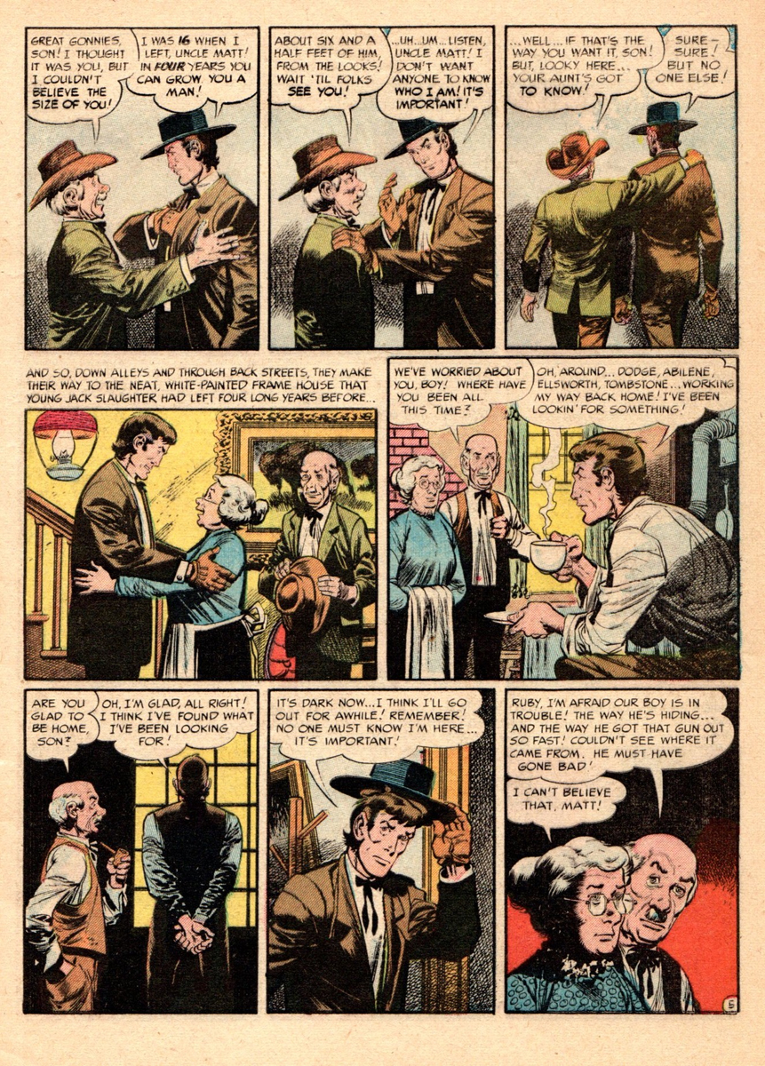
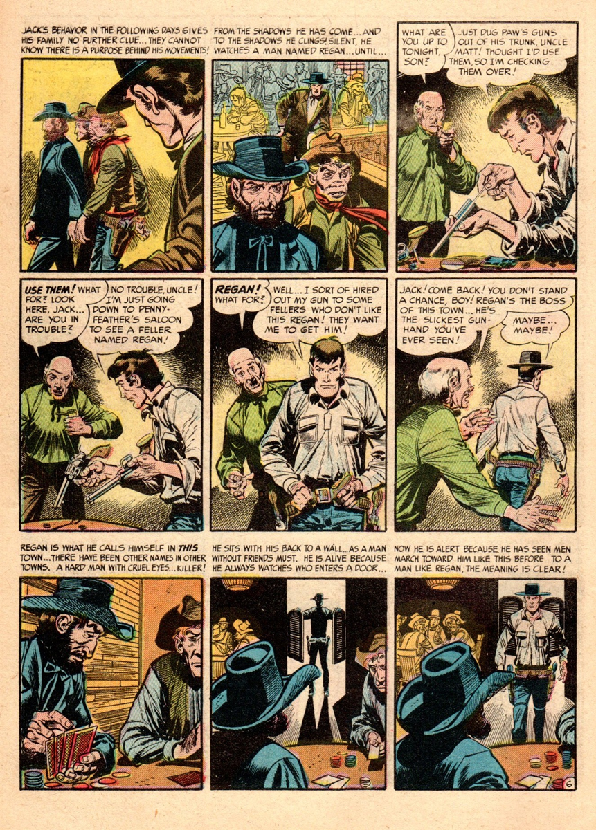
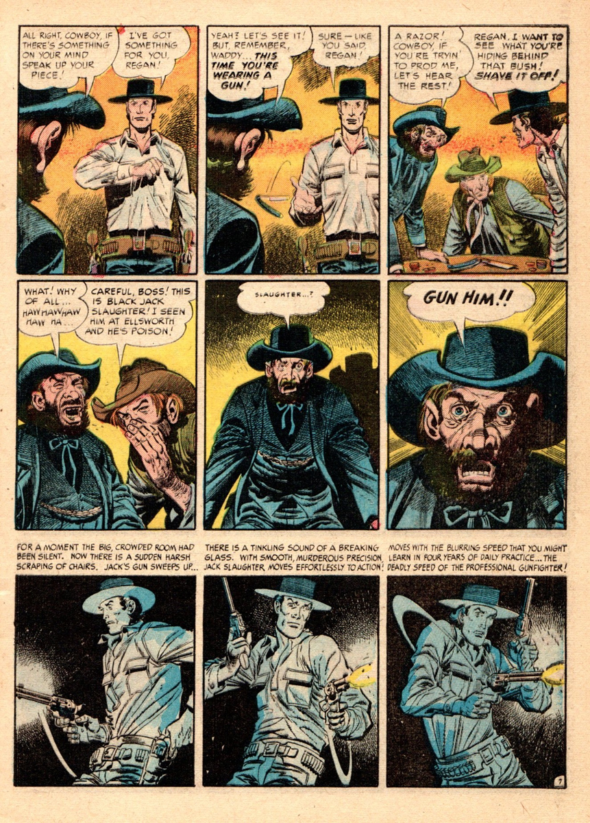
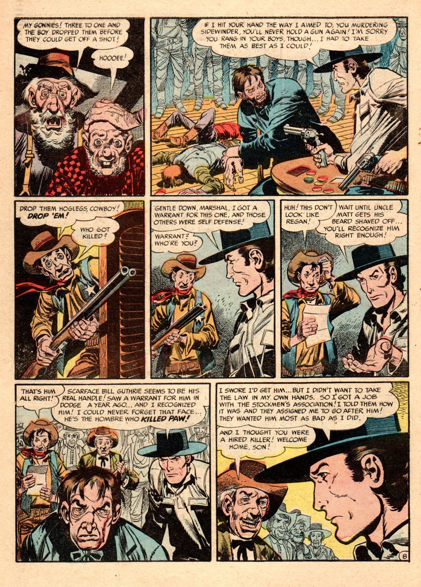
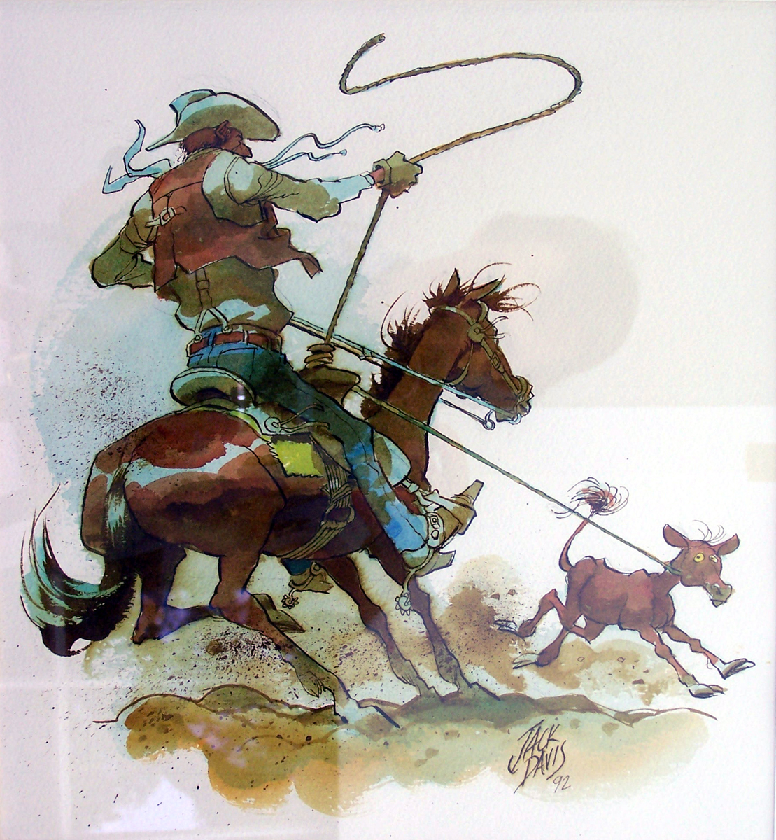
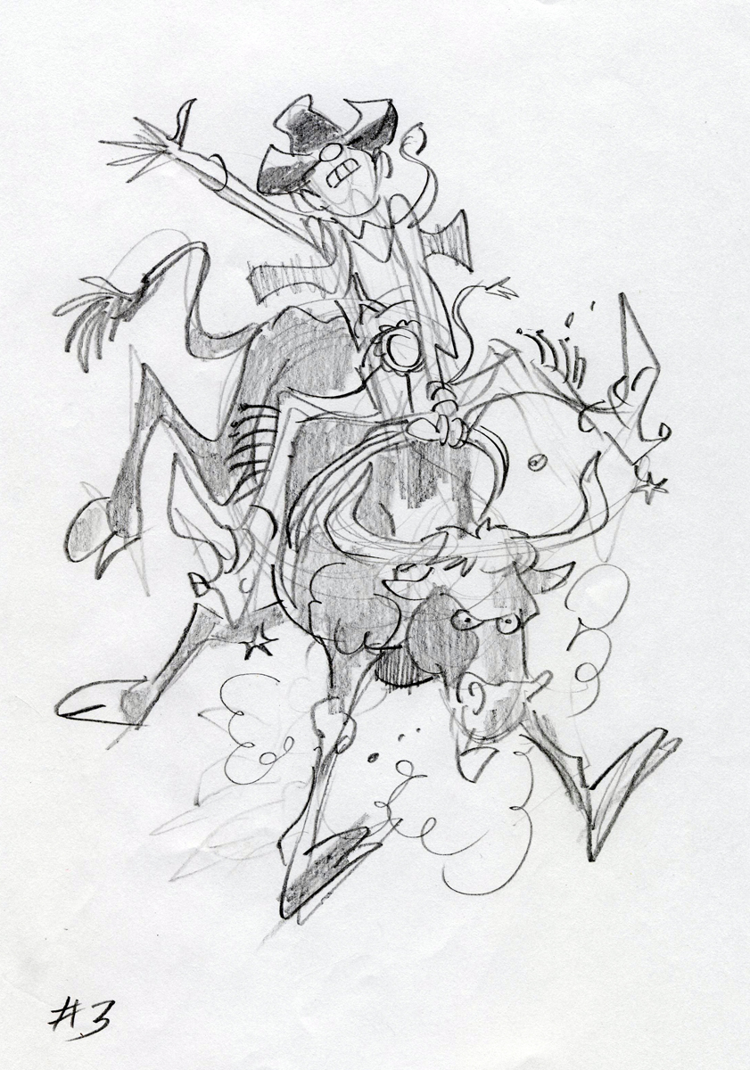
Bill Peckmann &Comic Art &Daily post 16 Dec 2011 07:16 am
King of the Cowpokes
Another excellent post from the collection of Bill Peckmann. Here, I turn it over to Bill:
 “King of the Cowboy Cartoonists”. If there was ever such a title, Jack Davis would garner my vote!
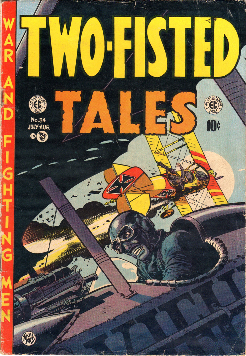
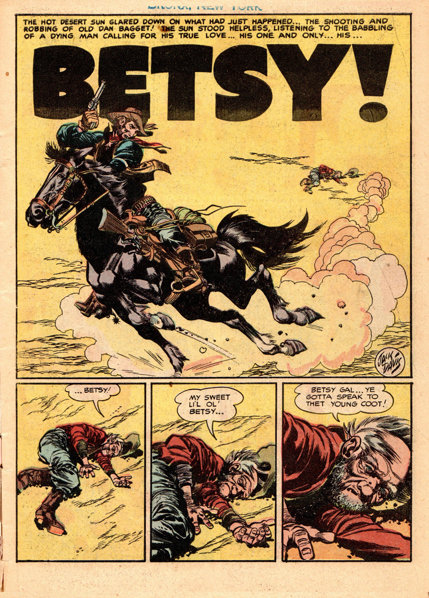
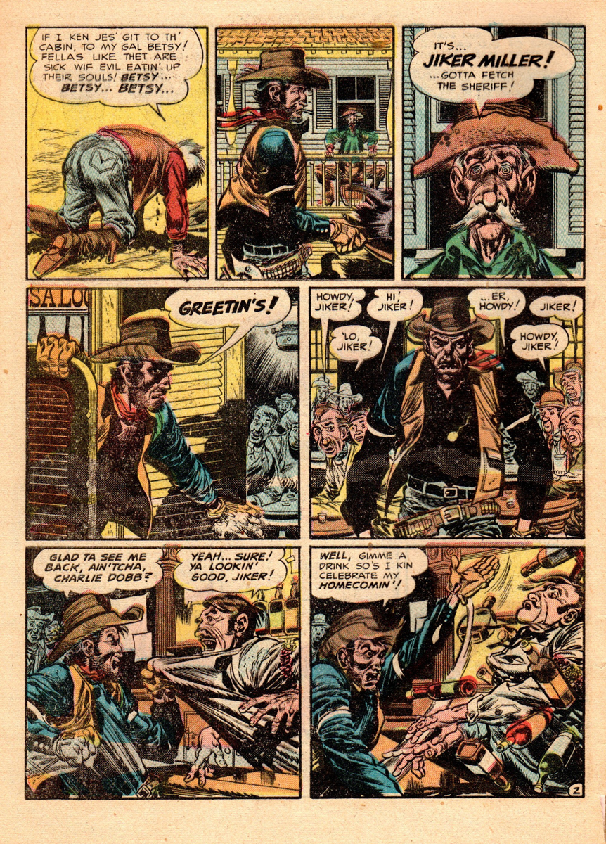
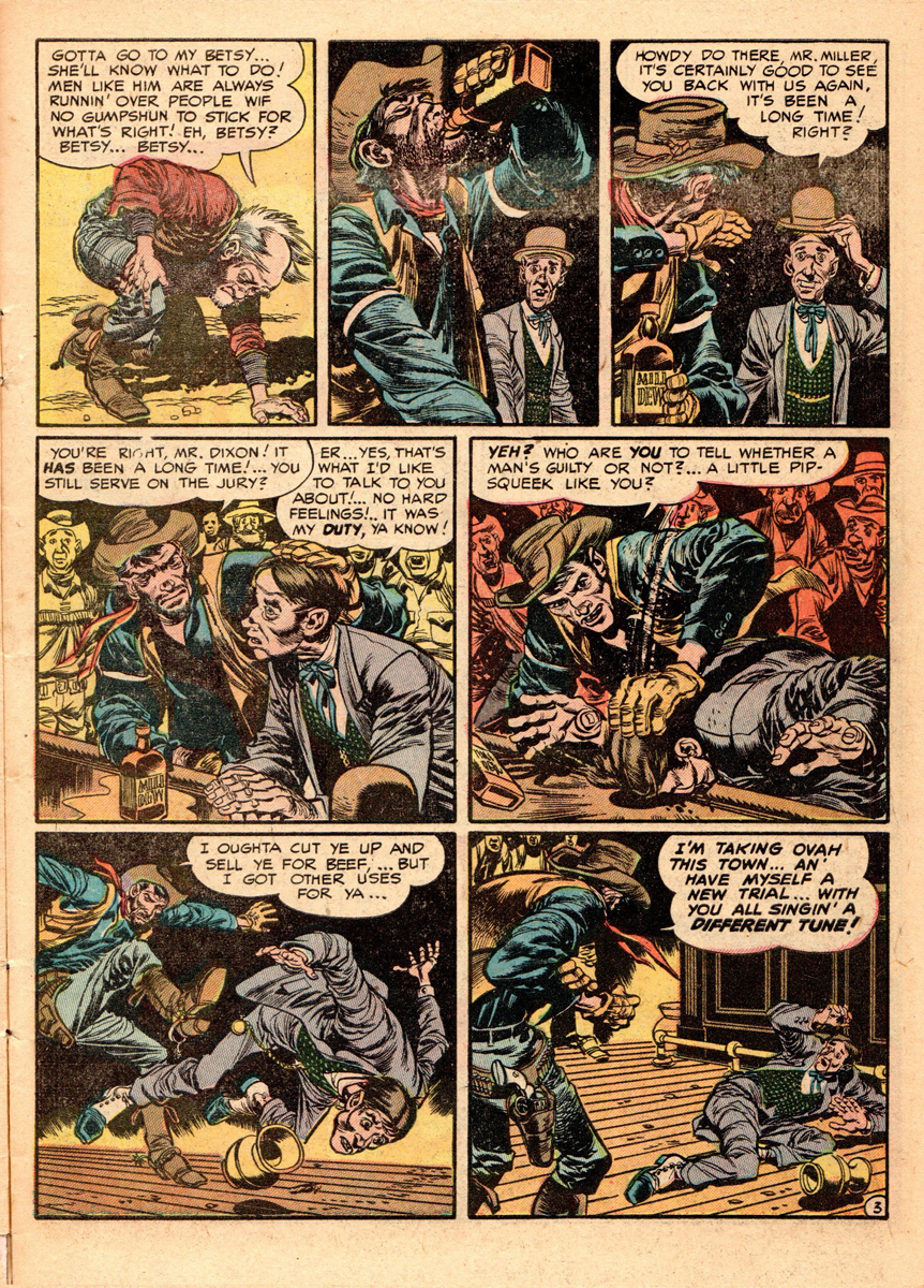
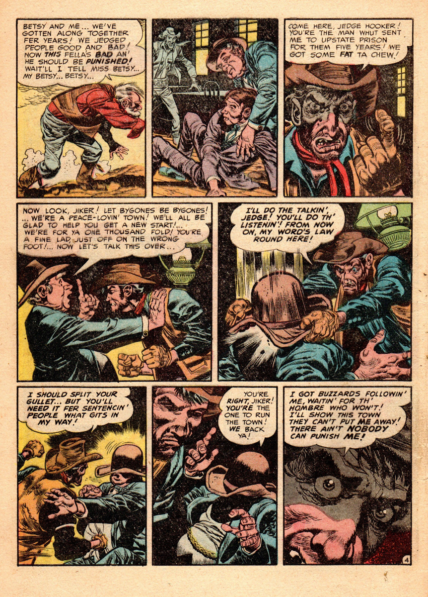
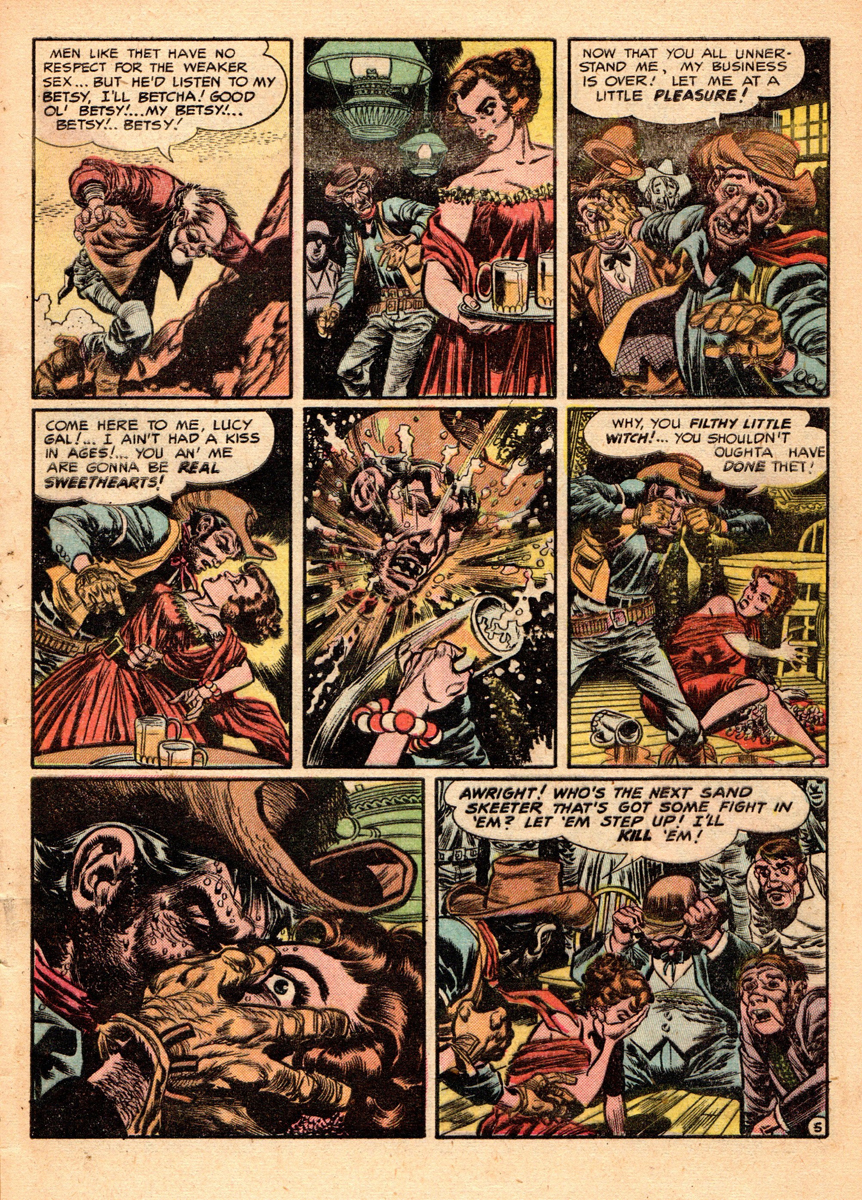
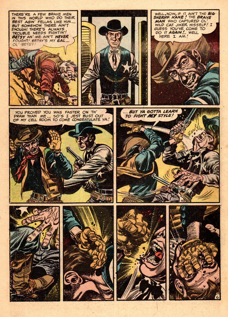
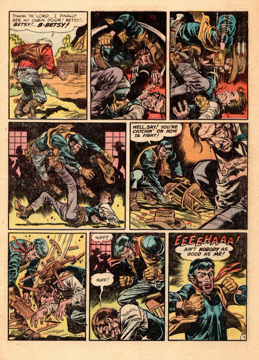
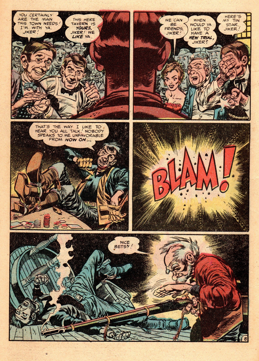
Here are two westerns by Jack that ran in EC Comics’ title “Two-Fisted Tales”.
In “TFT” No. 34, July-Aug 1953, the first story “Betsy”, was not only drawn by Jack but also written by him. The usual editor/writer of the comic book Harvey Kurtzman, was laid up with a serious illness, so Jack and the rest of the cartoon crew jumped in and wrote their own tales.
Jack’s story “Betsy” is a riff on “High Noon”, a very popular movie of its’ day. (Gary Cooper even makes a cameo appearance in the story. More on that in a later post.) It’s a labor of love for Jack and it shows. It’s laid out by him in that wonderful Kurtzman lay-out style and the coloring by Marie Severin is really exceptional.
Jack also seems to be ahead of his time with this story because it’s done quite a few years before the gritty, gnarly noir western movies of Clint Eastwood, but it certainly has the feel of one those films.
(Here’s the cover of the comic, which we’ve posted already, but you might want to run it at smaller size, ala “Ben and Me” today. I hope your readers enjoyed “Ben” as much as we did.)
 1
1
 2
2
 3
3
 4
4
 5
5
 6
6
 7
7
 8
8
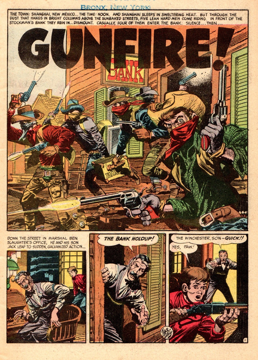
Here’s Jack’s second western story titled “Gunfire”. This appeared in “The New Two-Fisted Tales”, No. 36, Jan. 1954. With this issue, Harvey Kurtzman was not at the writer/editorship helm of the comic any more, the success of Mad comics took up all of Harvey’s time, and the running of “The New TFT” went to John Severin and writer Colin Dawkins.
“Gunfire” was written by Dawkins and illustrated by Jack, and Jack’s in his best Kurtzman type lay-out mode, beautifully constructed pages and panels.
(Even though Clint Eastwood was only 23 years old at the time when this story came out, and not a movie star yet, somehow Jack was able to come up with the perfect prototype of a Clint Eastwood western hero. It’s all there, looks and costume and action! It makes ya wonder.)
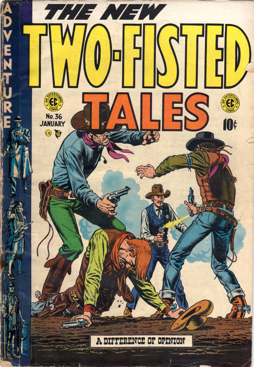
Here’s the cover of #36.
This cover of “The New Two-Fisted Tales” no. 36
was penciled by John Severin and inked by Bill Elder.
It’s not a Jack Davis cover.
 21
21
 22
22
 23
23
 24
24
 25
25
 26
26
 27
27
 28
28
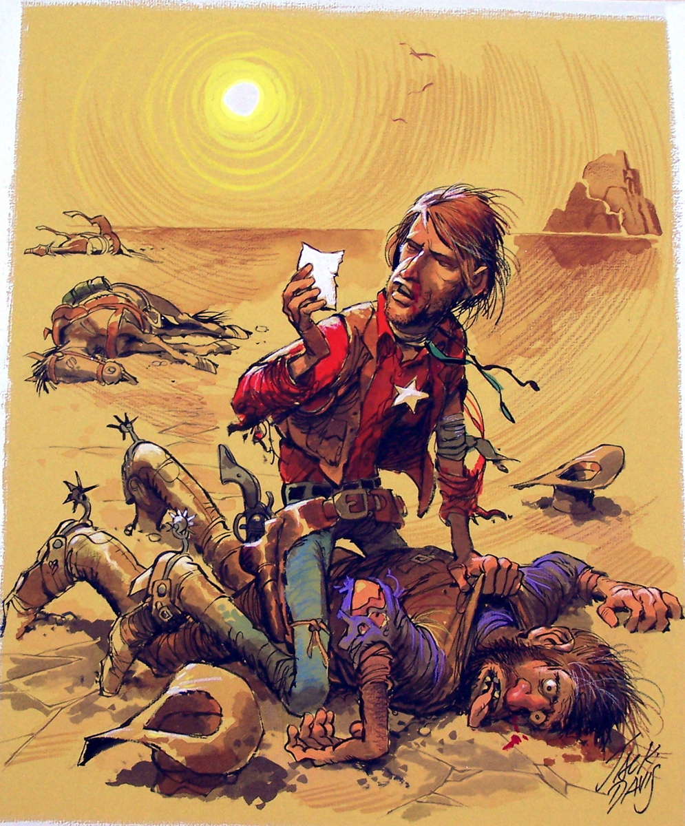
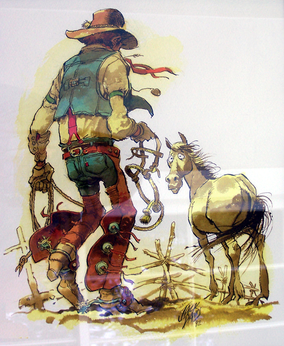
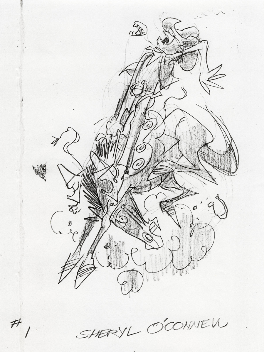
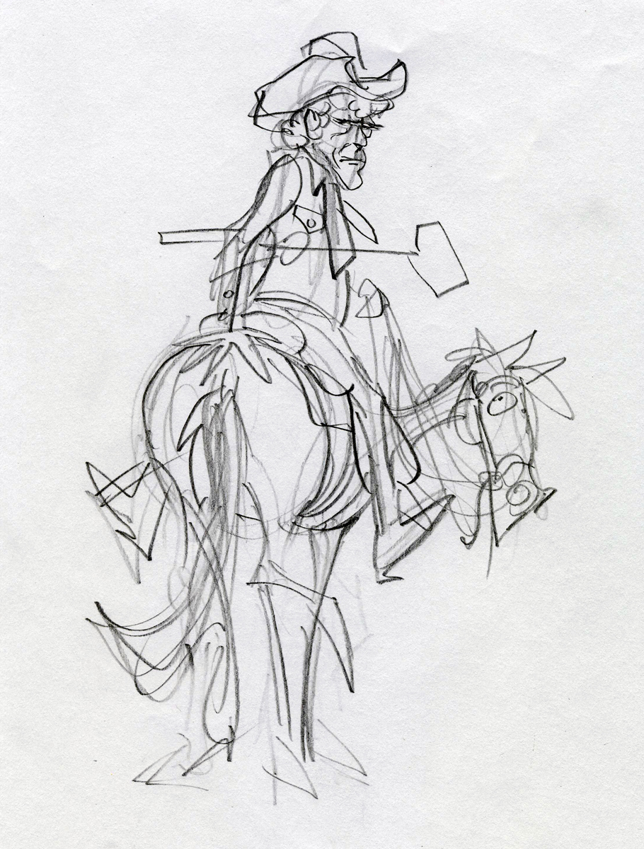
Here are a couple of ruffs Jack did for Western illustrations.
 1
1
 2
2
 3
3
 4
4
 5
5
 6
6
 7
7
Many thanks to Bill Peckmann for sharing his collection with us.
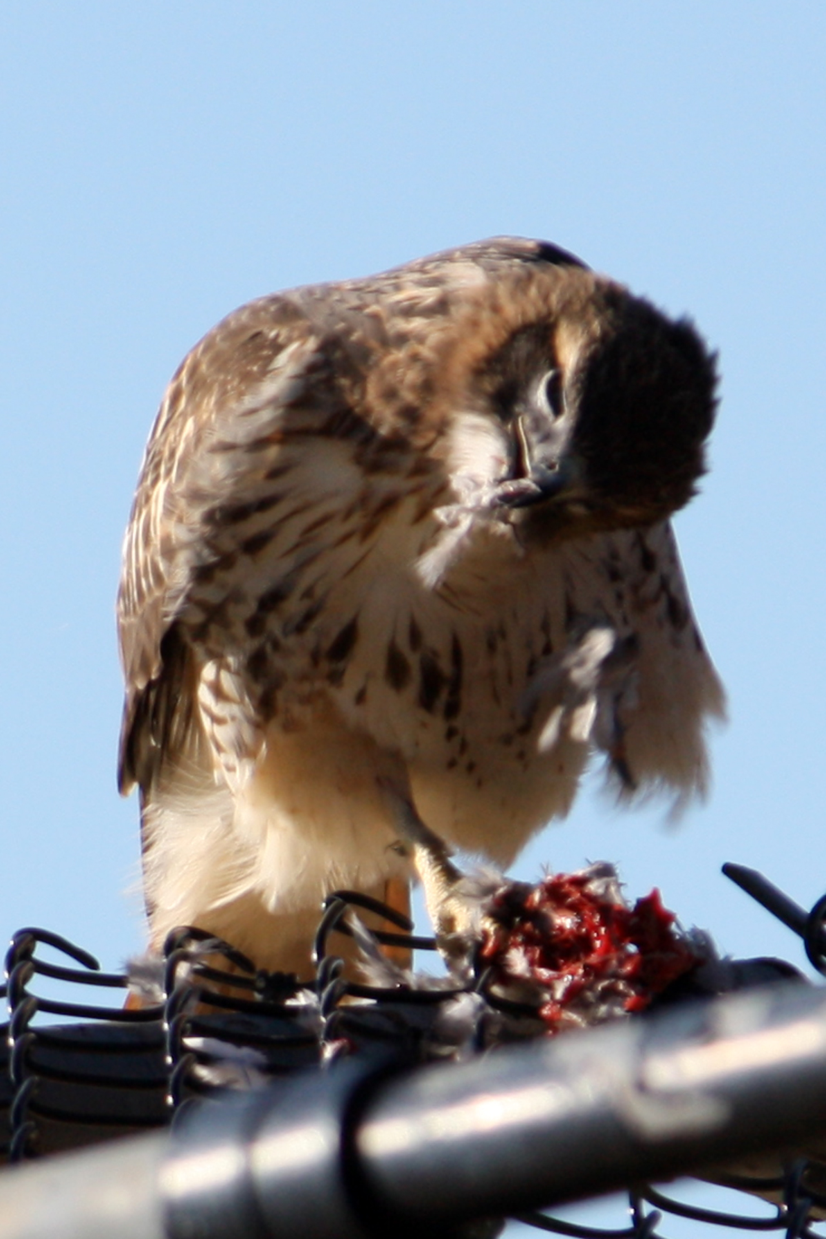
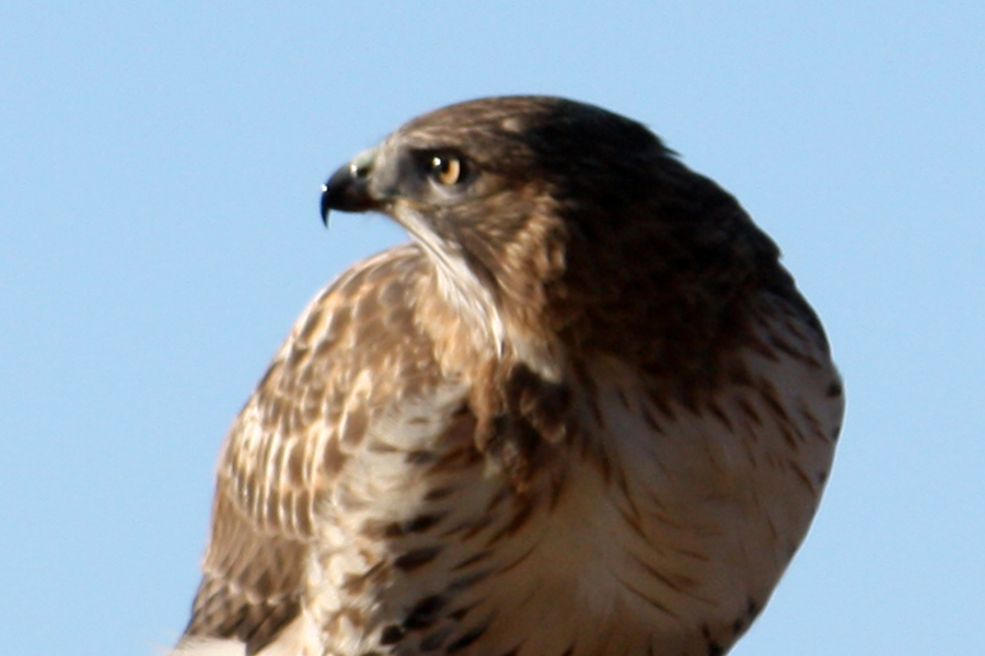
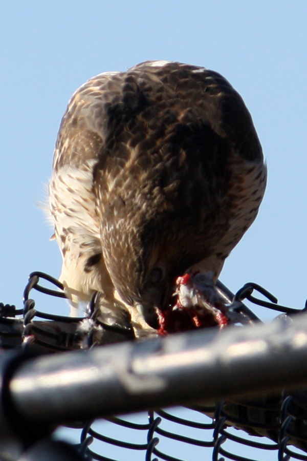
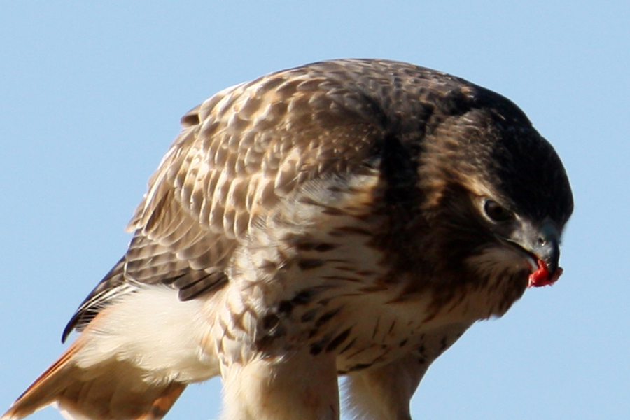
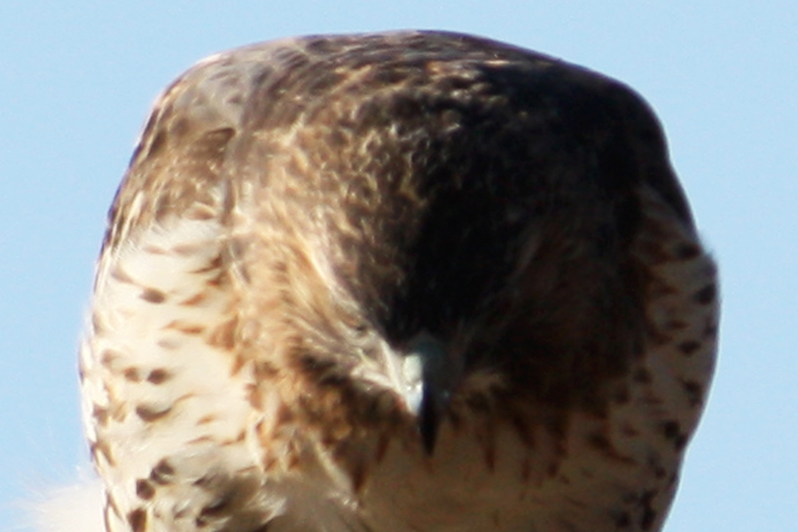
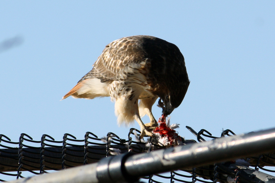
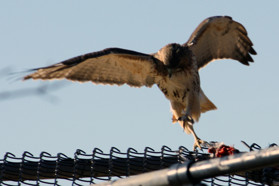
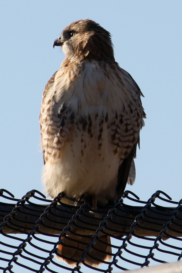
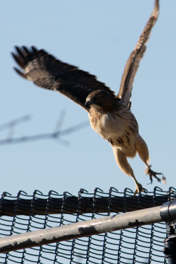
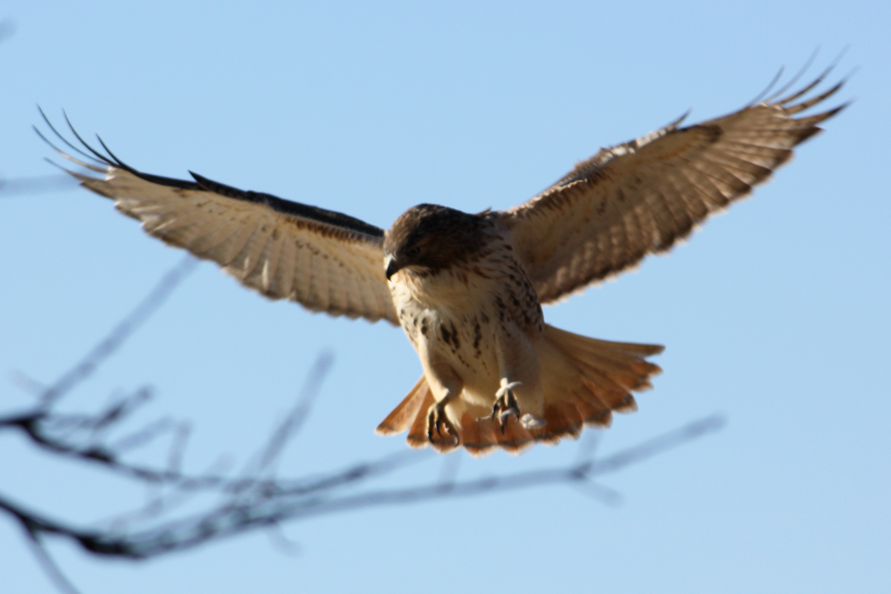
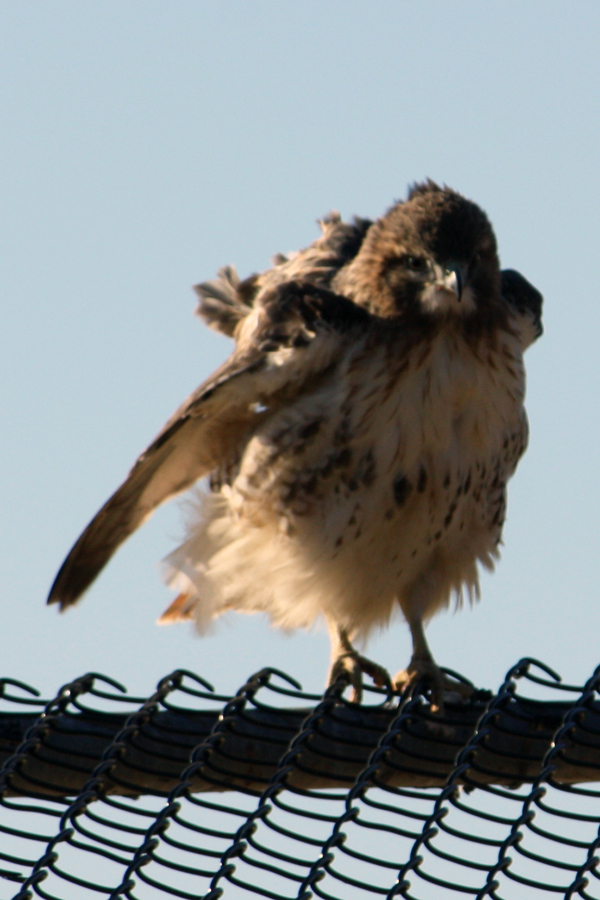
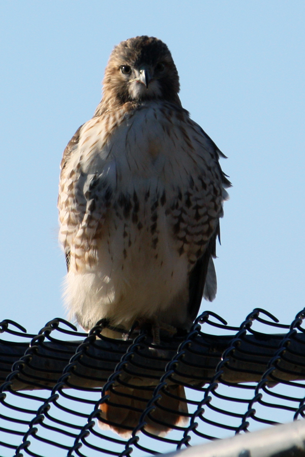
Daily post &Photos &Steve Fisher 11 Dec 2011 07:48 am
Wild in NYC
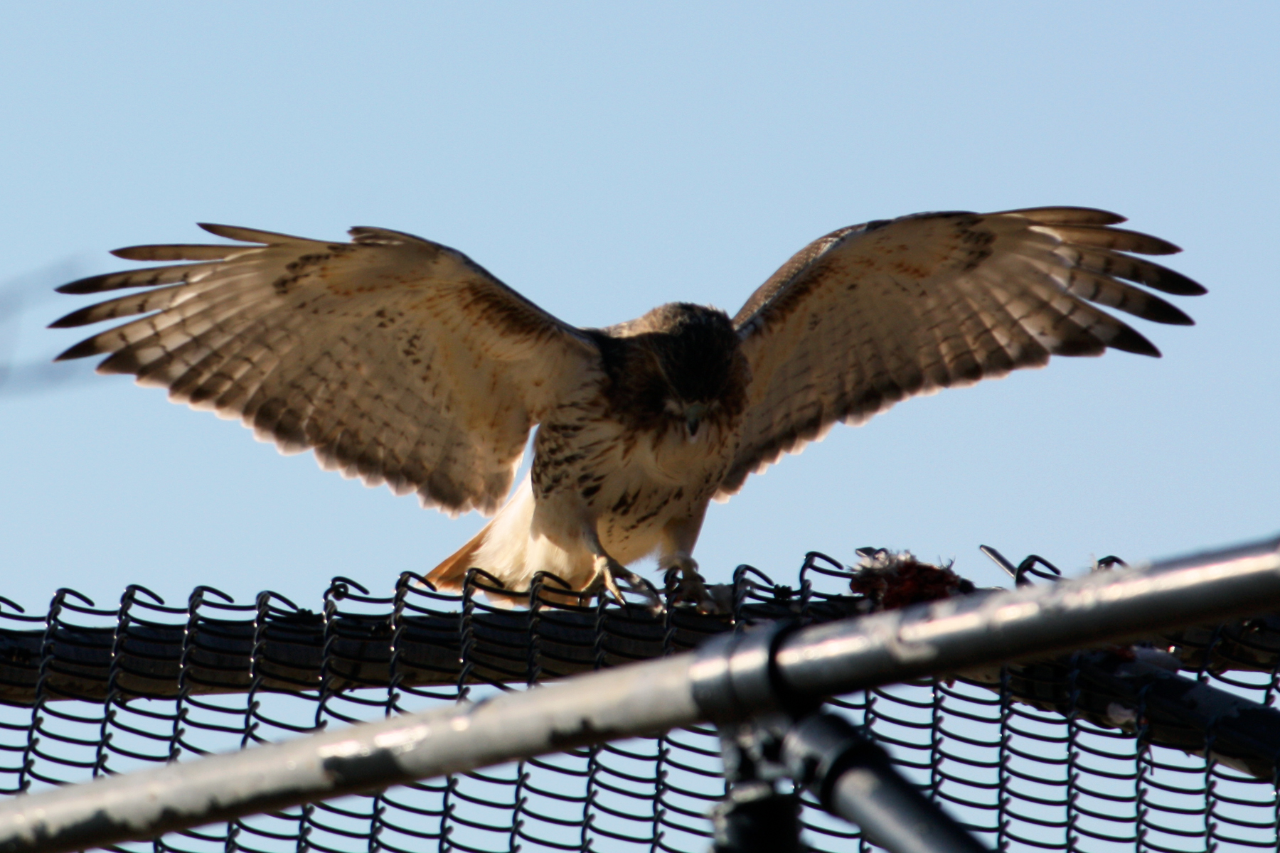
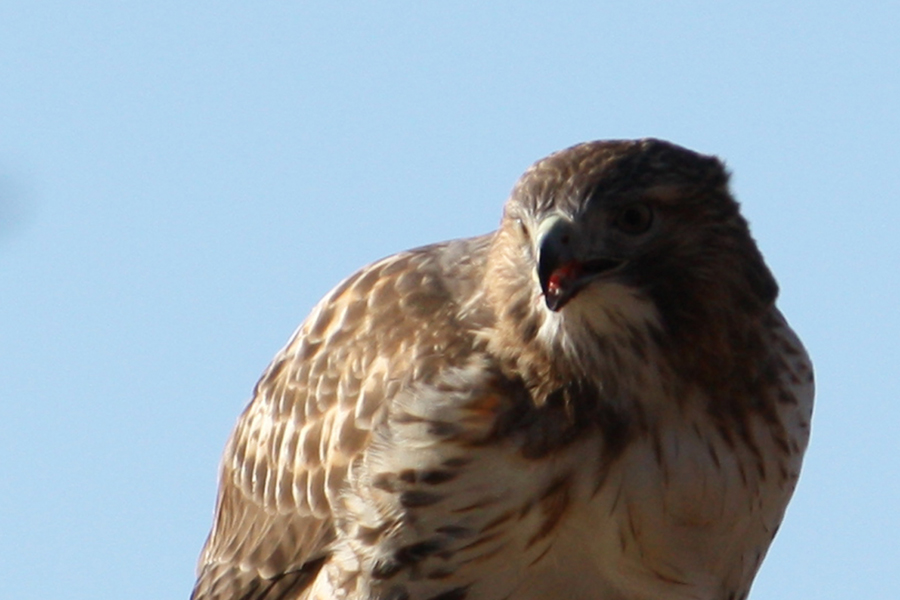
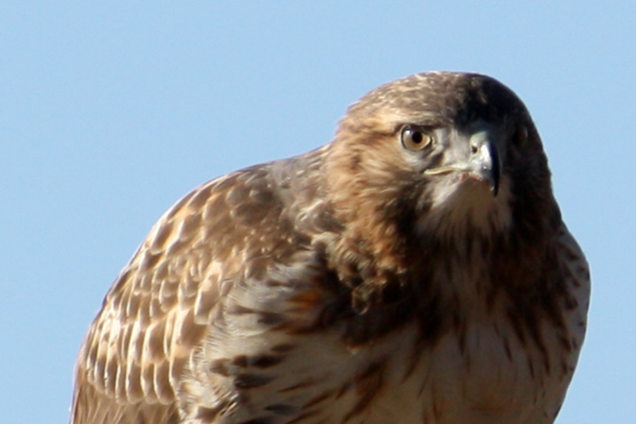
- Steven Fisher caught the following photos in the back yards of Queens, NY.
Wildlife remains wild, even in the City. This is a hawk feeding on a small animal it’s caught.
 1
1
 2
2
 3
3
 4
4
 5
5
 6
6
 7
7
 8
8
 9
9
 10
10
 11
11
 12
12
 13
13
 14
14
 15
15
Many thanks to Steve for sharing the photos.
Bill Peckmann &Comic Art &Daily post &Illustration 17 Nov 2011 07:58 am
Kurtzman’s “Lucky” and “Cagney”
- We seem to have run out of pieces that Kurtzman and Davis have worked together in creating. So this week, Bill Peckmann has supplied me with two pieces. Today we have one on Harvey and tomorrow we have a special one from Jack.
- Here’s a story by Harvey Kurtzman that Bill Peckmann recently contributed. Bill writes:
- Here’s a Kurtzman collection that could be called, “10 years, what a difference time makes”. The first piece of work was done in 1949 and the second piece was done in 1959.
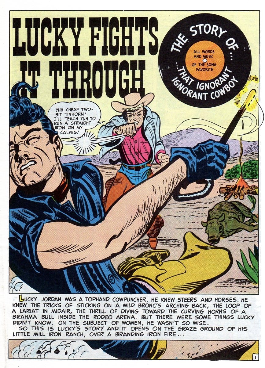 1
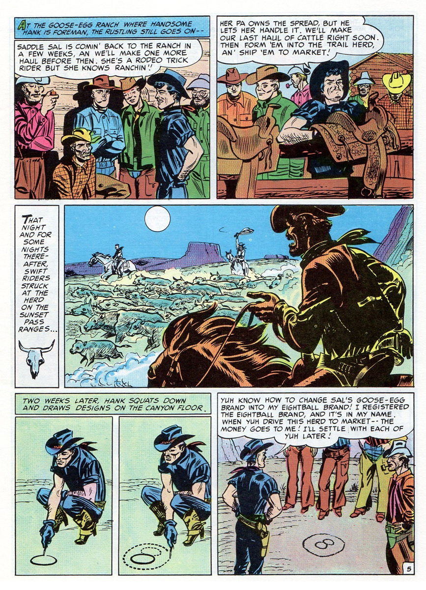
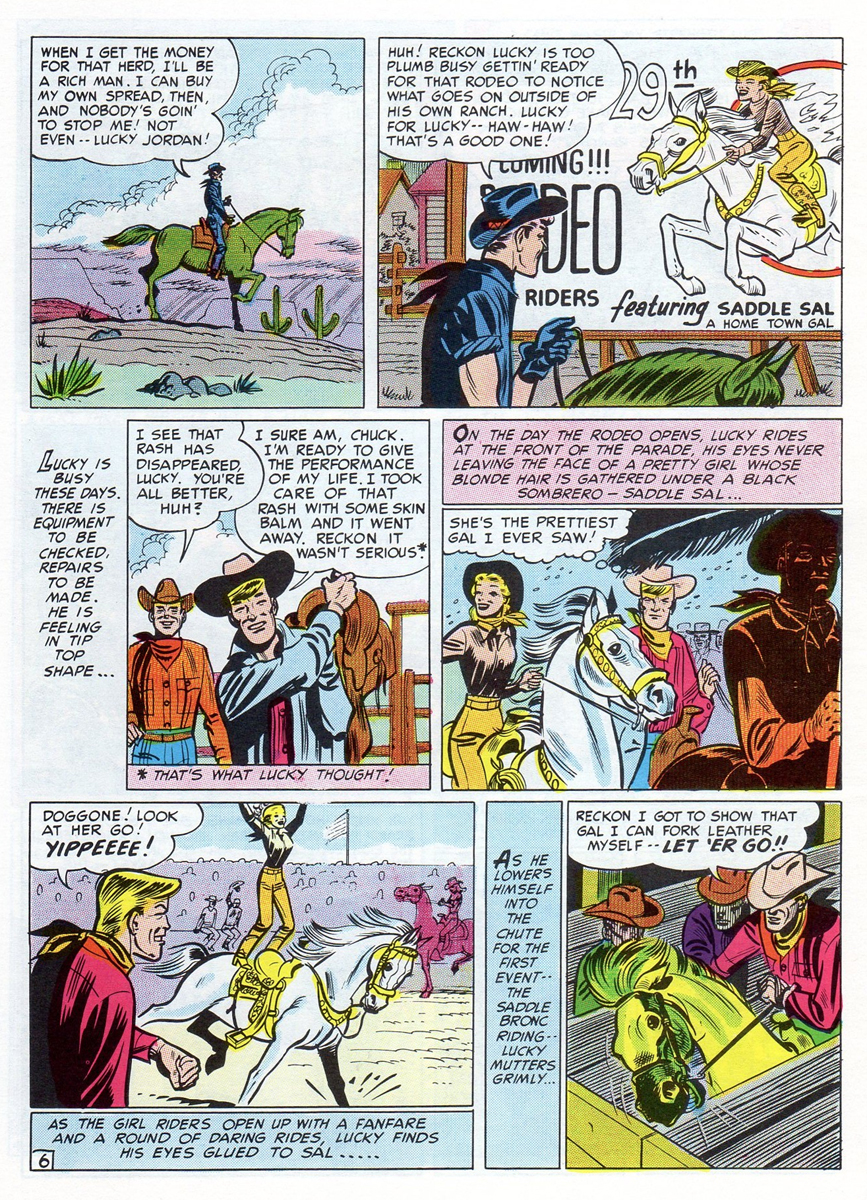
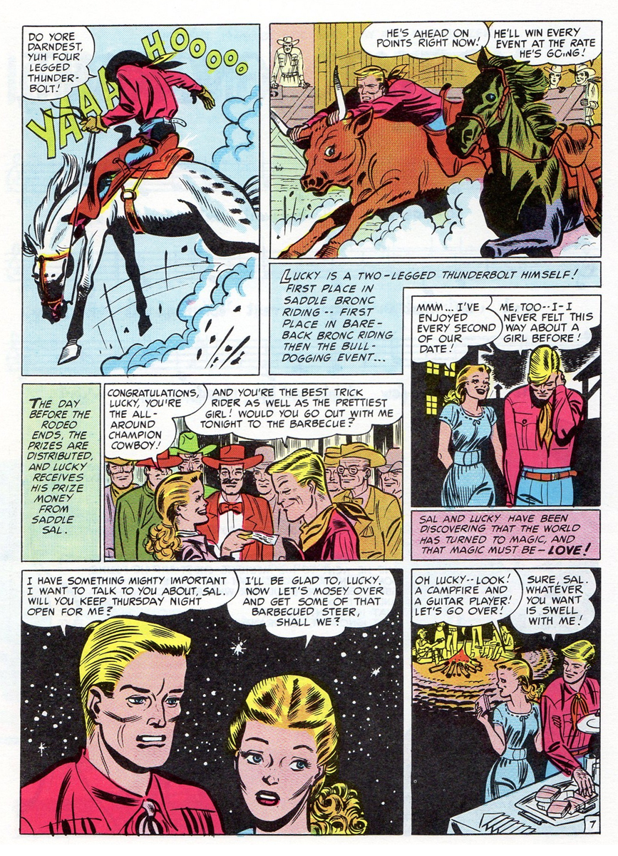
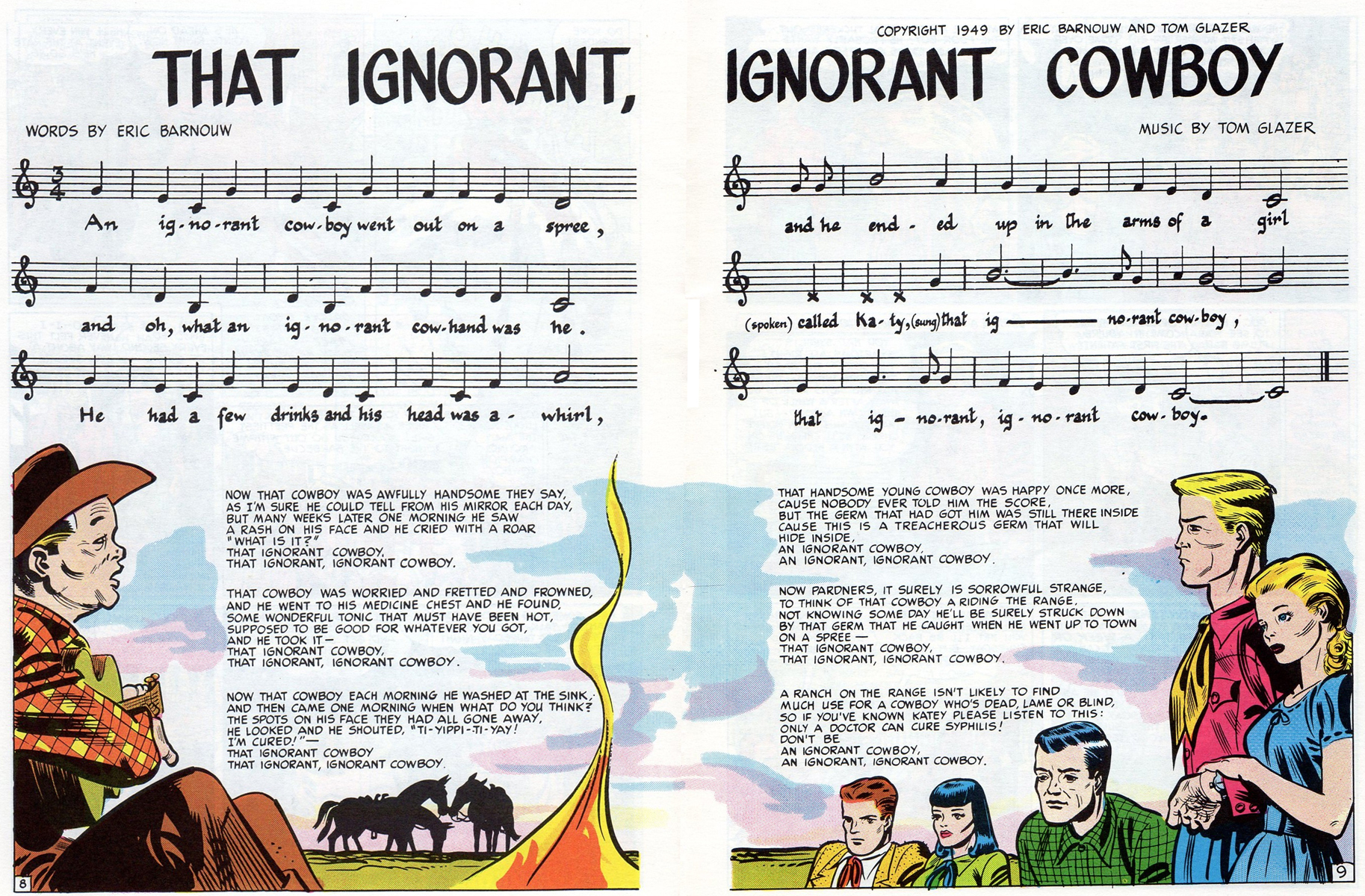
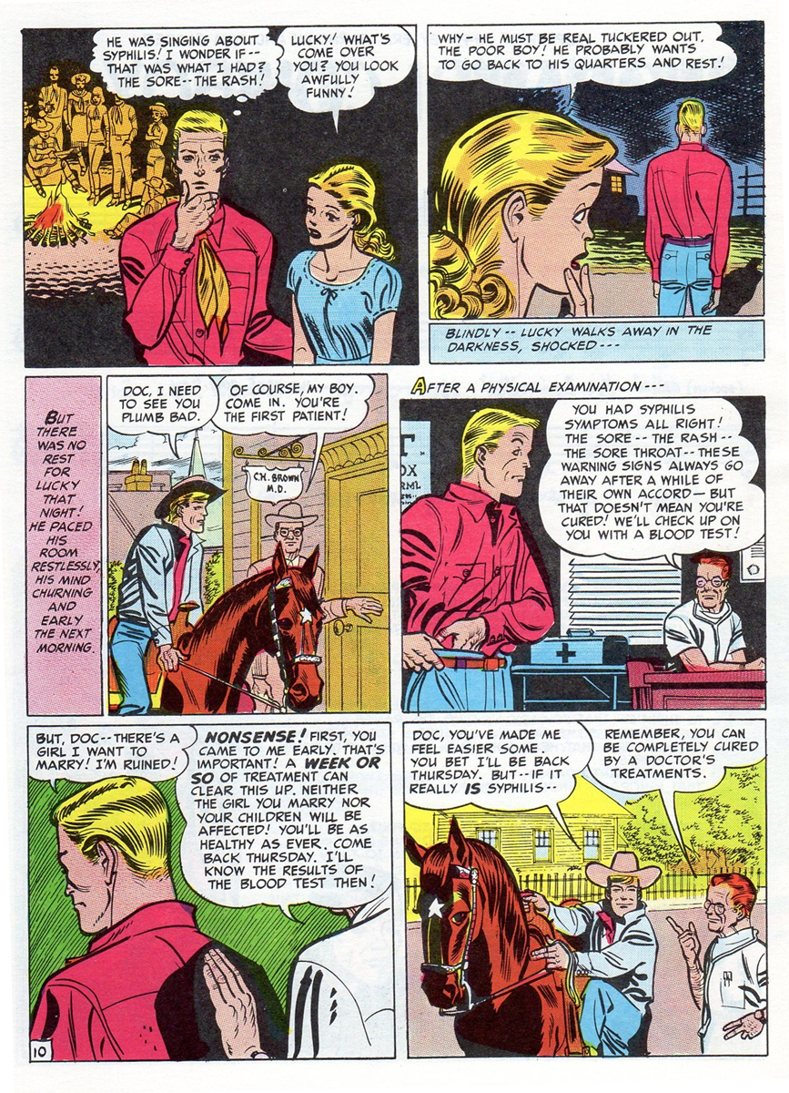
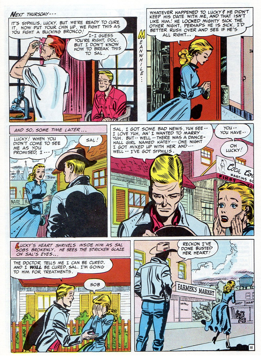
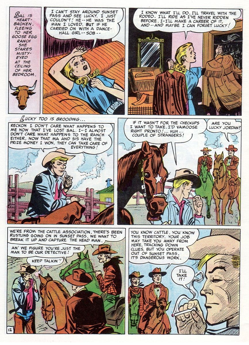
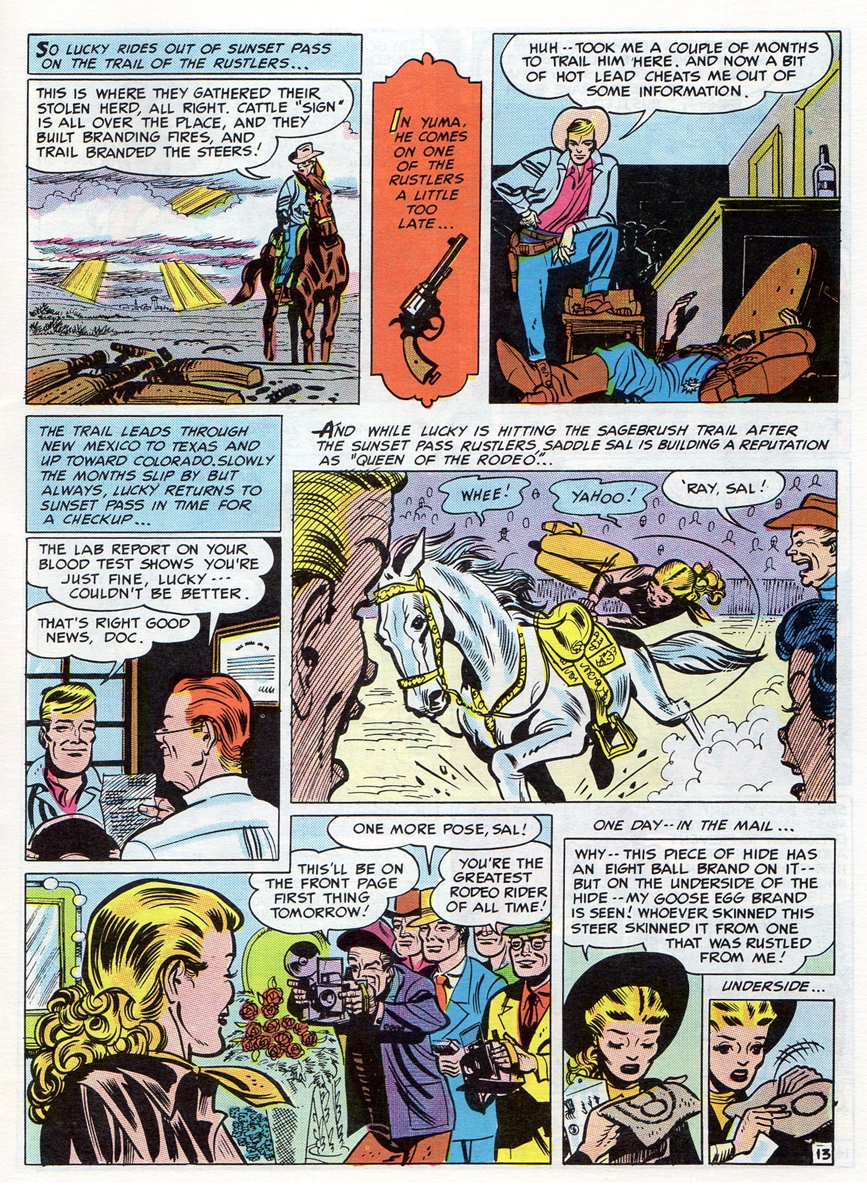
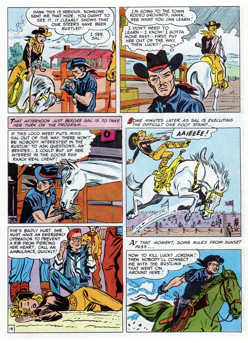
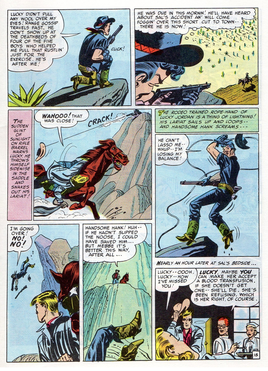
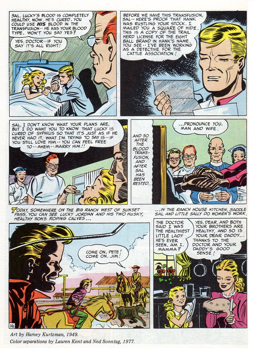
1In 1949 Harvey did a comic book story titled “Lucky Fights It Through”.
It was the first piece of work he did for EC. It was a 16 page educational
comic done for the public by EC Comics when they were in the process of
transitioning from “Educational” to “Entertaining” comics.
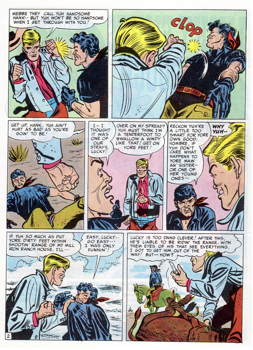 2
2
Even though it wasn’t done for one of EC’s main titles, it did get Harvey
through the door, he was able to show his prowess, the editors noticed
and the rest is history.
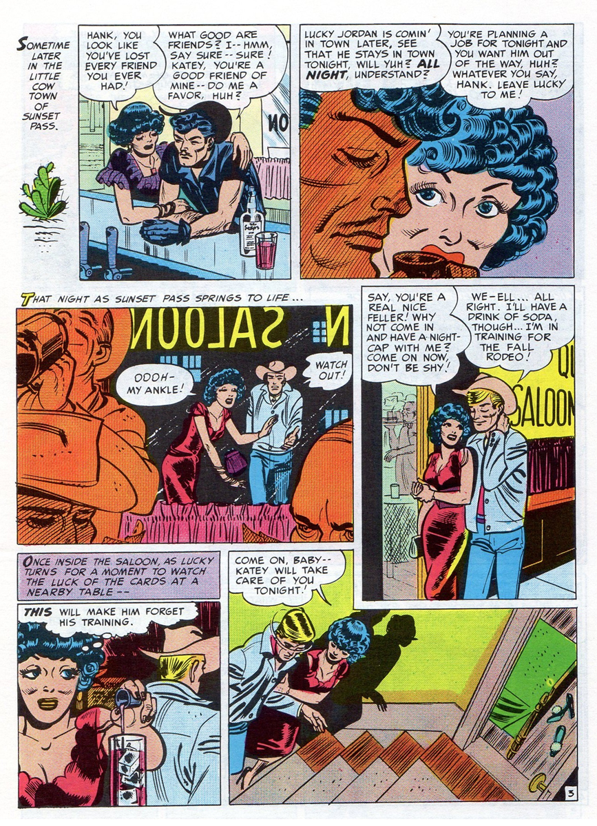 3
3
The scans are from a reprinted version that appeared in
John Benson’s fanzine “Squa Tront”, issue No. 7.
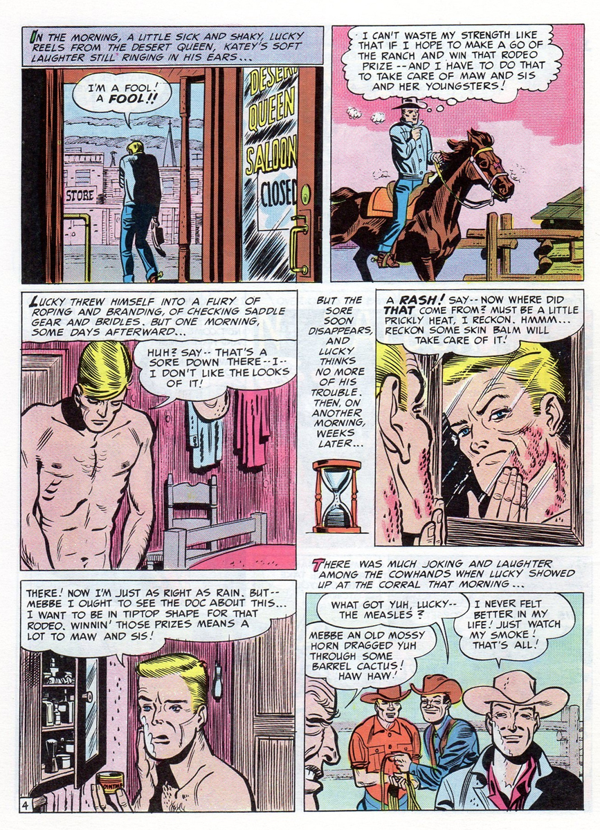 4
4
 5
5
 6
6
 7
7
 8-9
8-9
 10
10
 11
11
 12
12
 13
13
 14
14
 15
15
 16
16
The End
 1
1
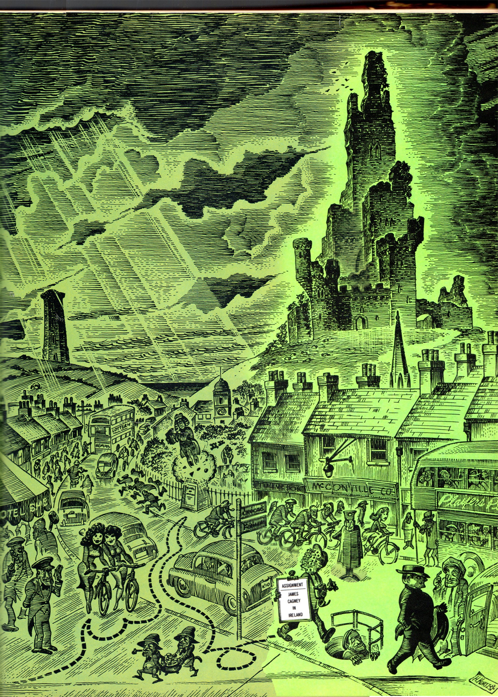
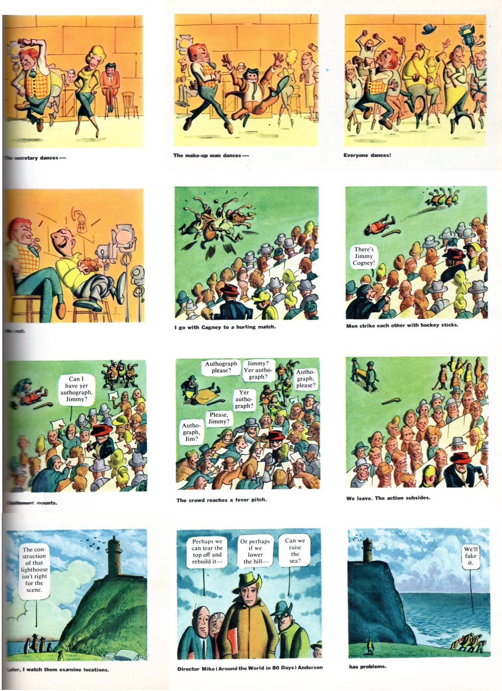
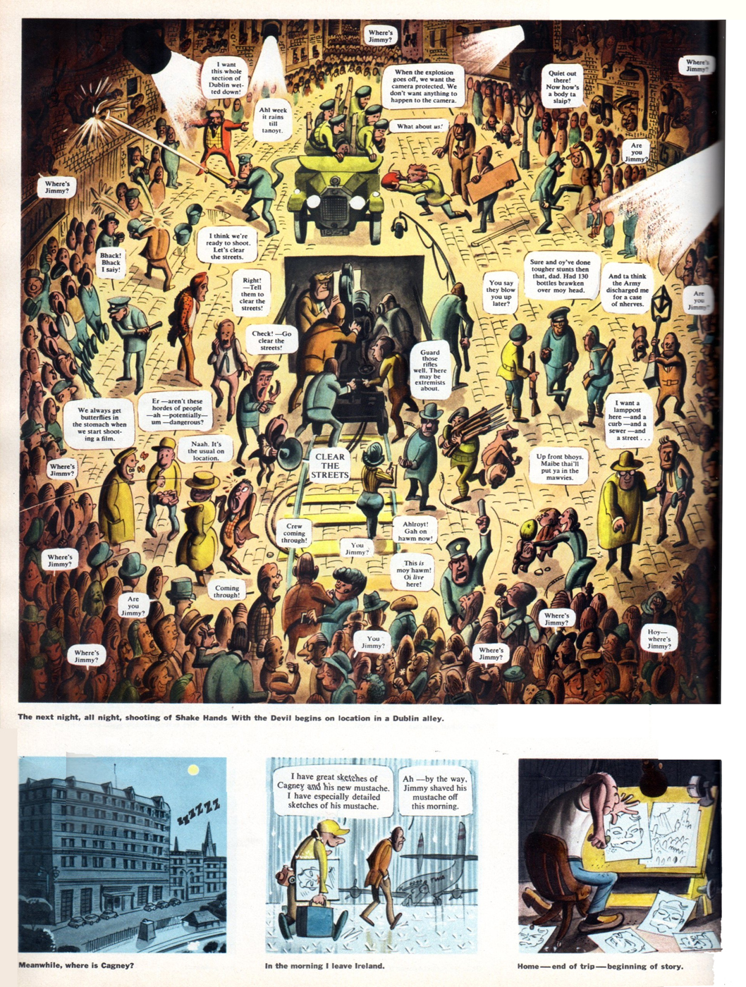
The year is 1959. MAD magazine, TRUMP magazine and HUMBUG
are all history for Harvey Kurtzman. He had to turn to free lance work.
Fortunately at that time, Harold Hayes editor of Esquire magazine was
a big Kurtzman fan and gave Harvey this story,
“Assignment: James Cagney In Ireland”, to do.
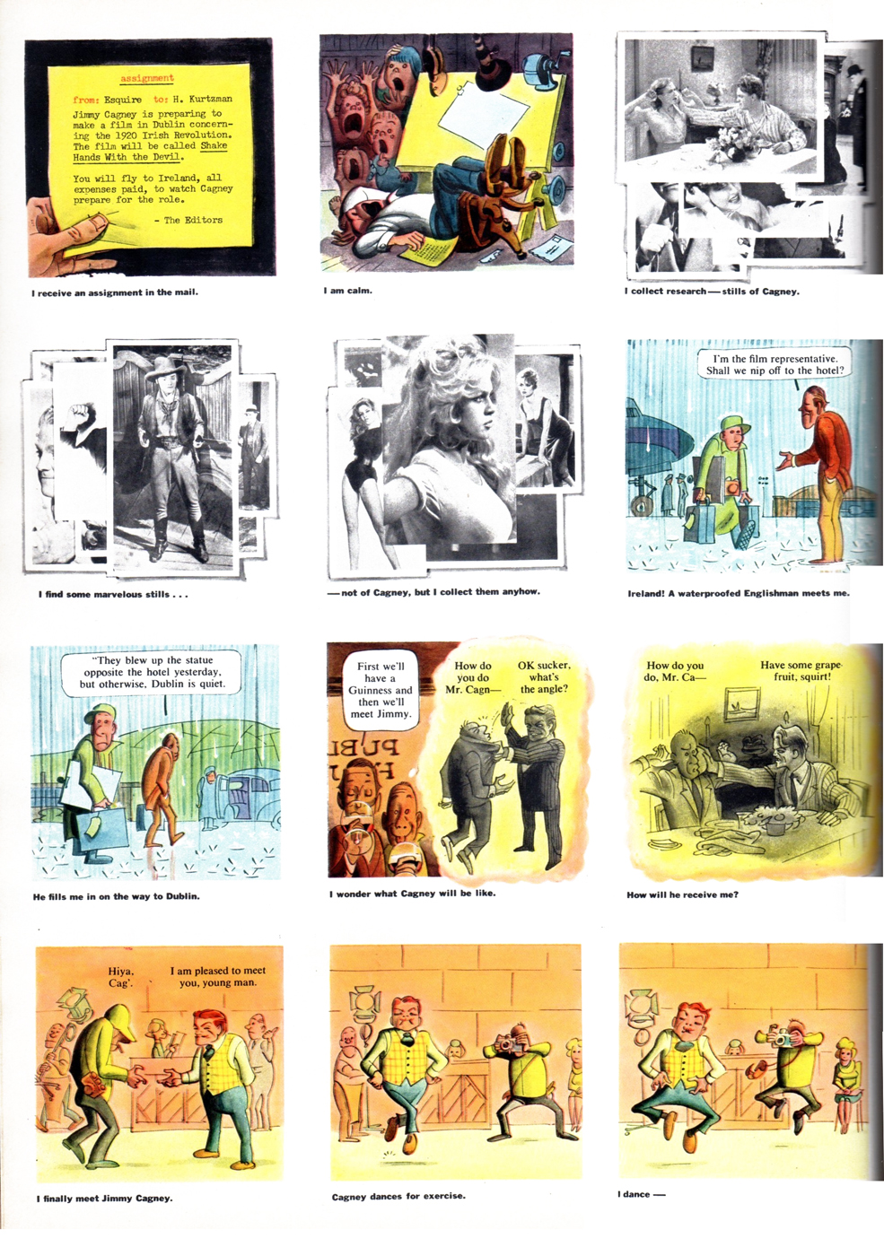 2
2
Hayes sent Harvey to cover the shooting of Cagney’s “Shake Hands With The Devil” movie. The film set was in Dublin and this is Harvey’s take on the whole experience. It’s one of the best things he ever did.
 3
3
 4
4
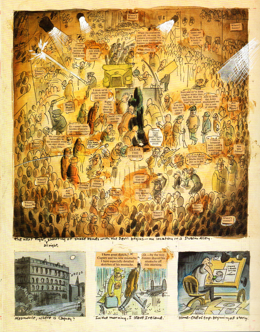
Here’s Harvey’s rough for the last page of the Esquire story.
It’s taken from “The Art of Harvey Kurtzman, The Mad Genius
Of Comics” by Denis Kitchen and Paul Buhle.
The book contains the whole Esquire Cagney story plus all of
Harvey’s roughs for the story. This alone is worth the cover price
of this excellent/outstanding book on Harvey and his work.
Many thanks to Bill Peckmann for assembling this post.
Bill Peckmann &Comic Art &Daily post 11 Nov 2011 07:02 am
Harvey and Jack – Part 6
- Today is Veteran’s Day, and what a way to celebrate than to let Harvey Kurtzman and Jack Davis supply us with a few good War Stories. To that end, Bill Peckmann contributes #6 in this series of a collaboration between the two. Over to Bill:
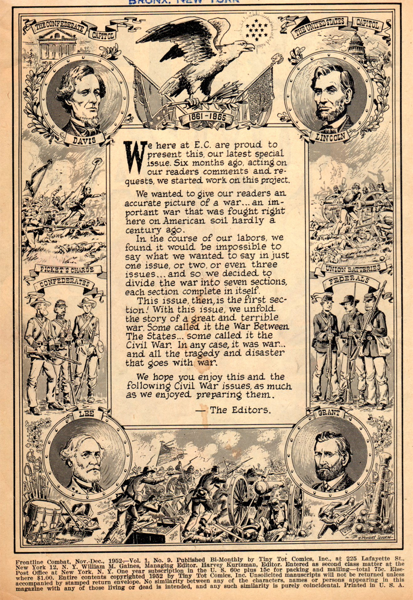
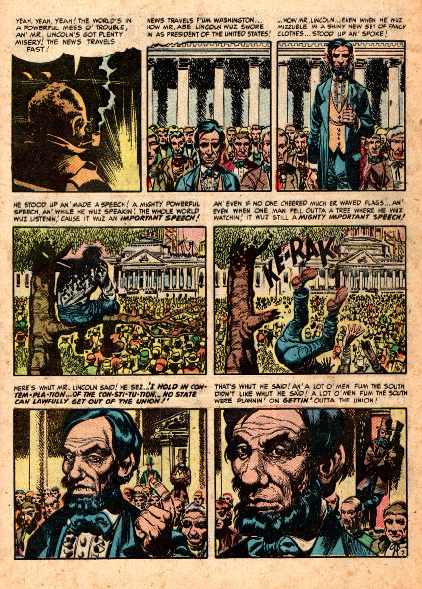
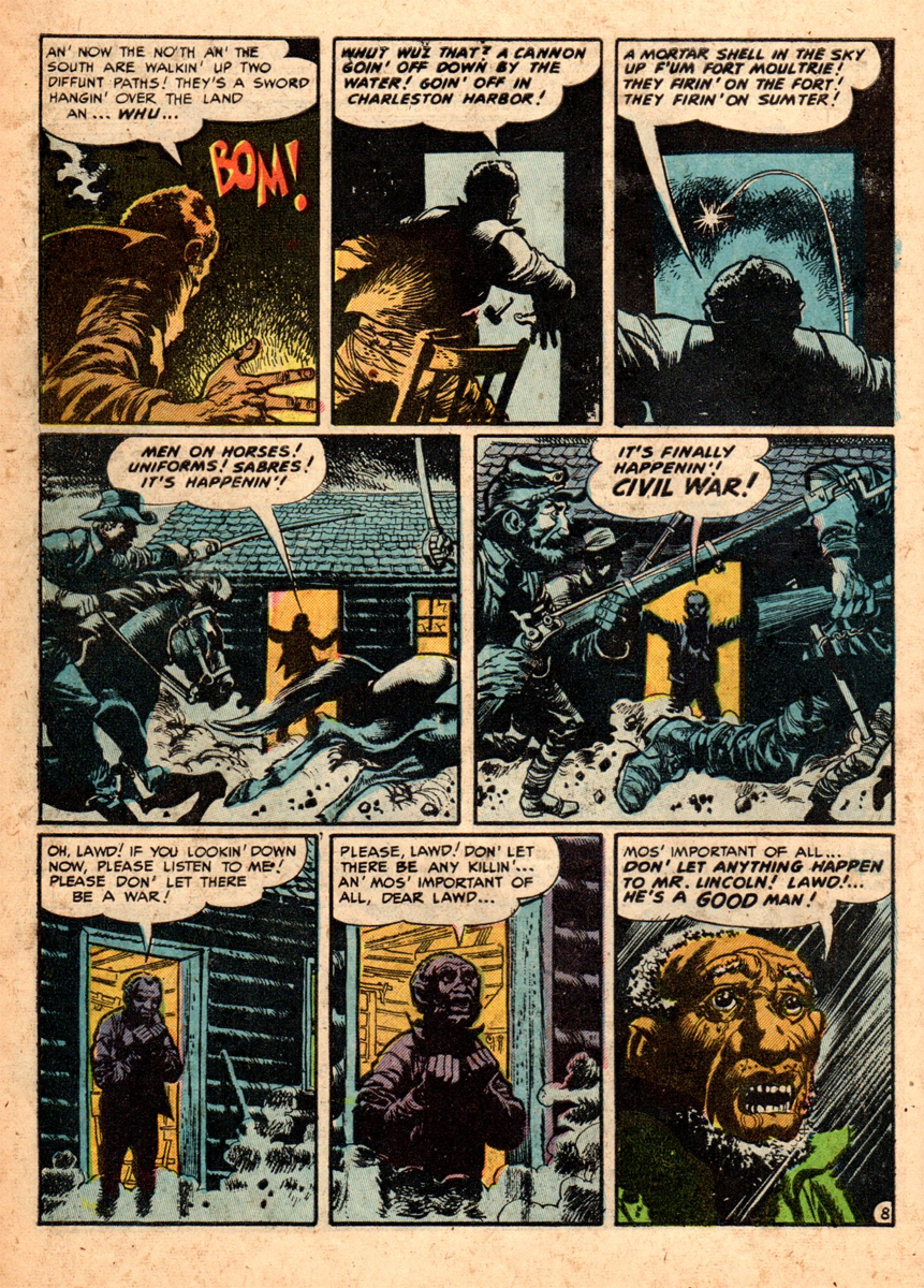
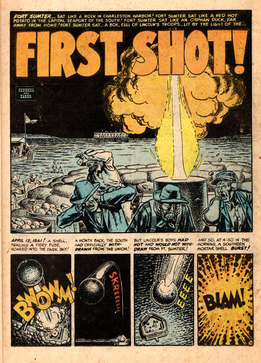
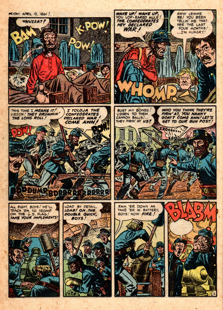
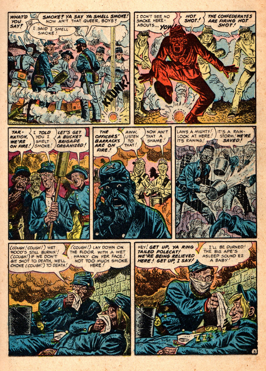
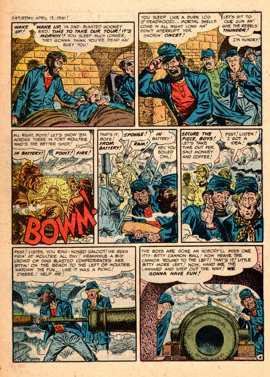
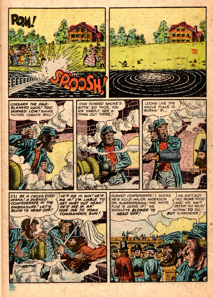
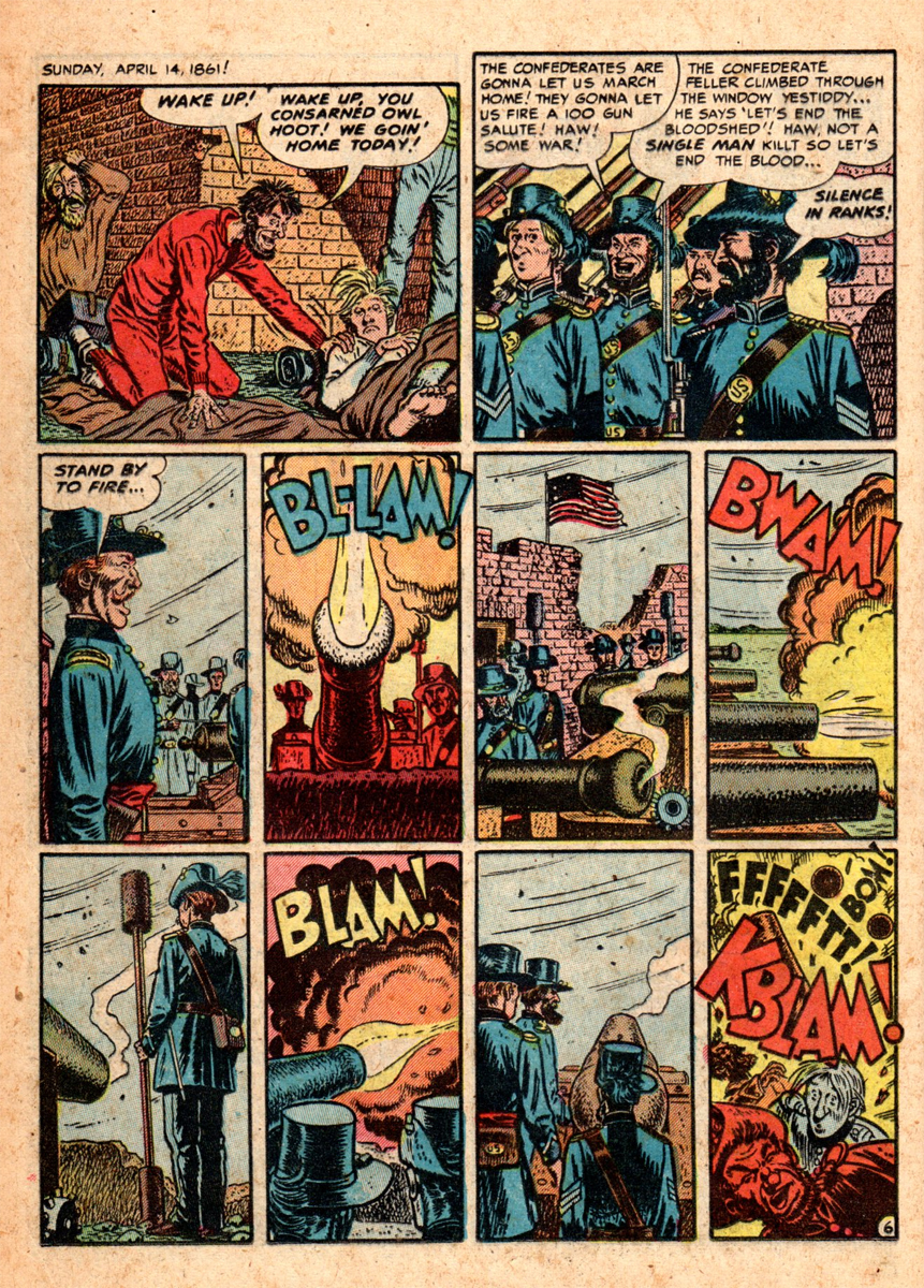
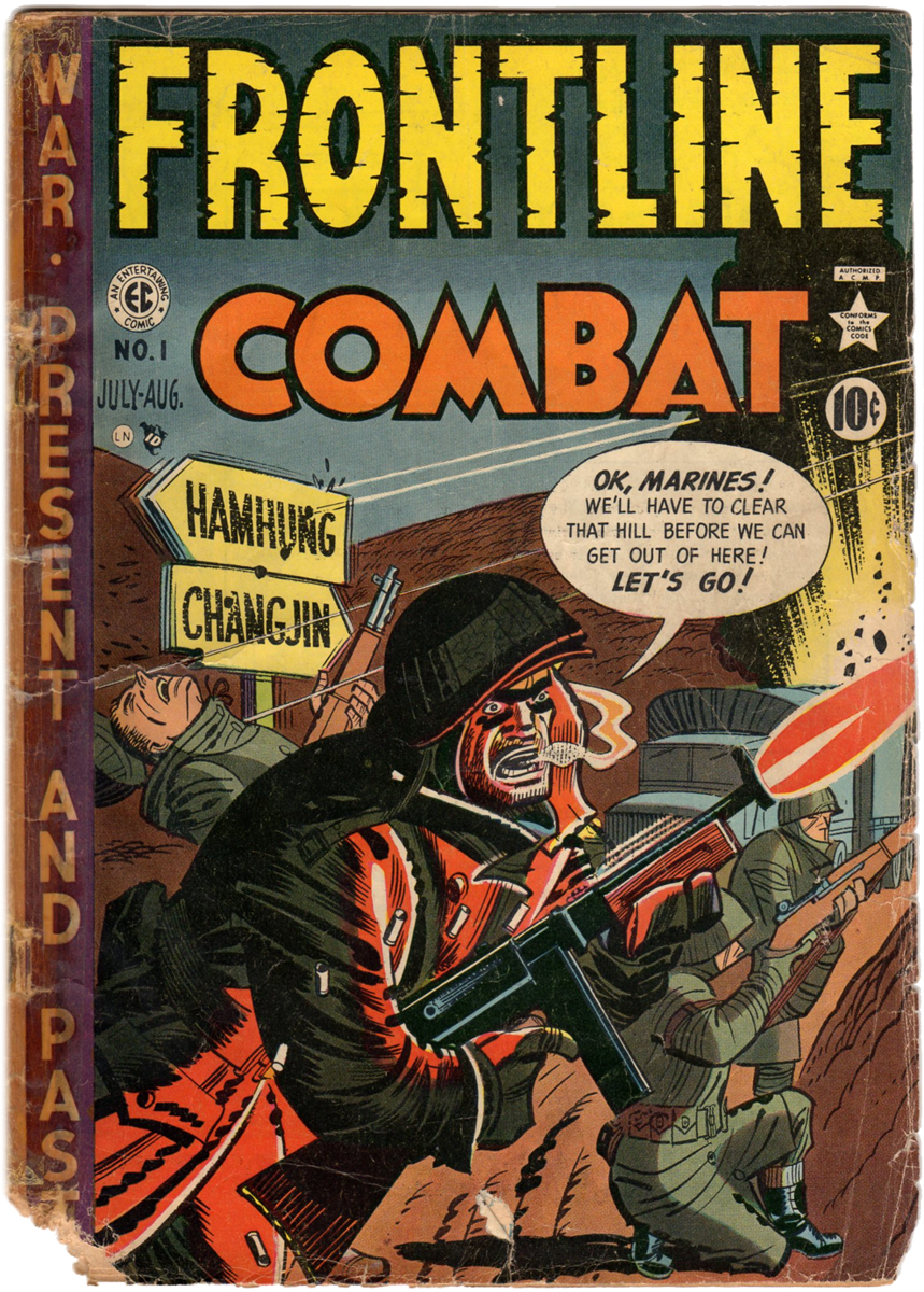
- Here is the first Harvey Kurtzman cover for his very ambitious “Civil War” series that was supposed to run in EC’s FRONTLINE COMBAT and TWO-FISTED TALES titles. In 1952, Harvey’s creative juices knew no bounds, this war series debuted just before MAD No. 1 came out some months later. As kids in those days, way before there was colored TV with the History Cable Channel, we were very lucky to have Harvey at the helm of his war comics to give us a slice of history that wasn’t as dry or dusty as it seemed to be in our school books. The series was to run seven issues to cover the whole Civil War. Sadly, only three issues were completed before both FRONTLINE and TWO-FISTED titles folded.
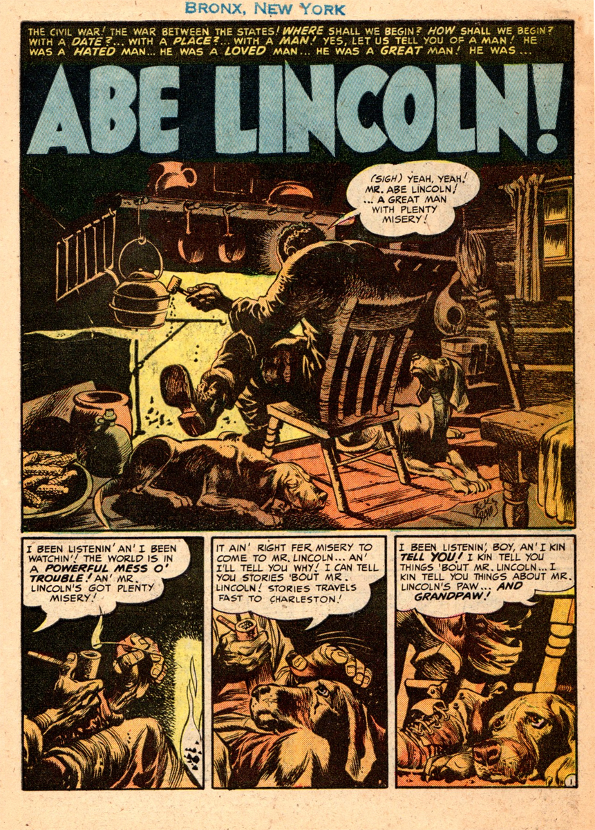
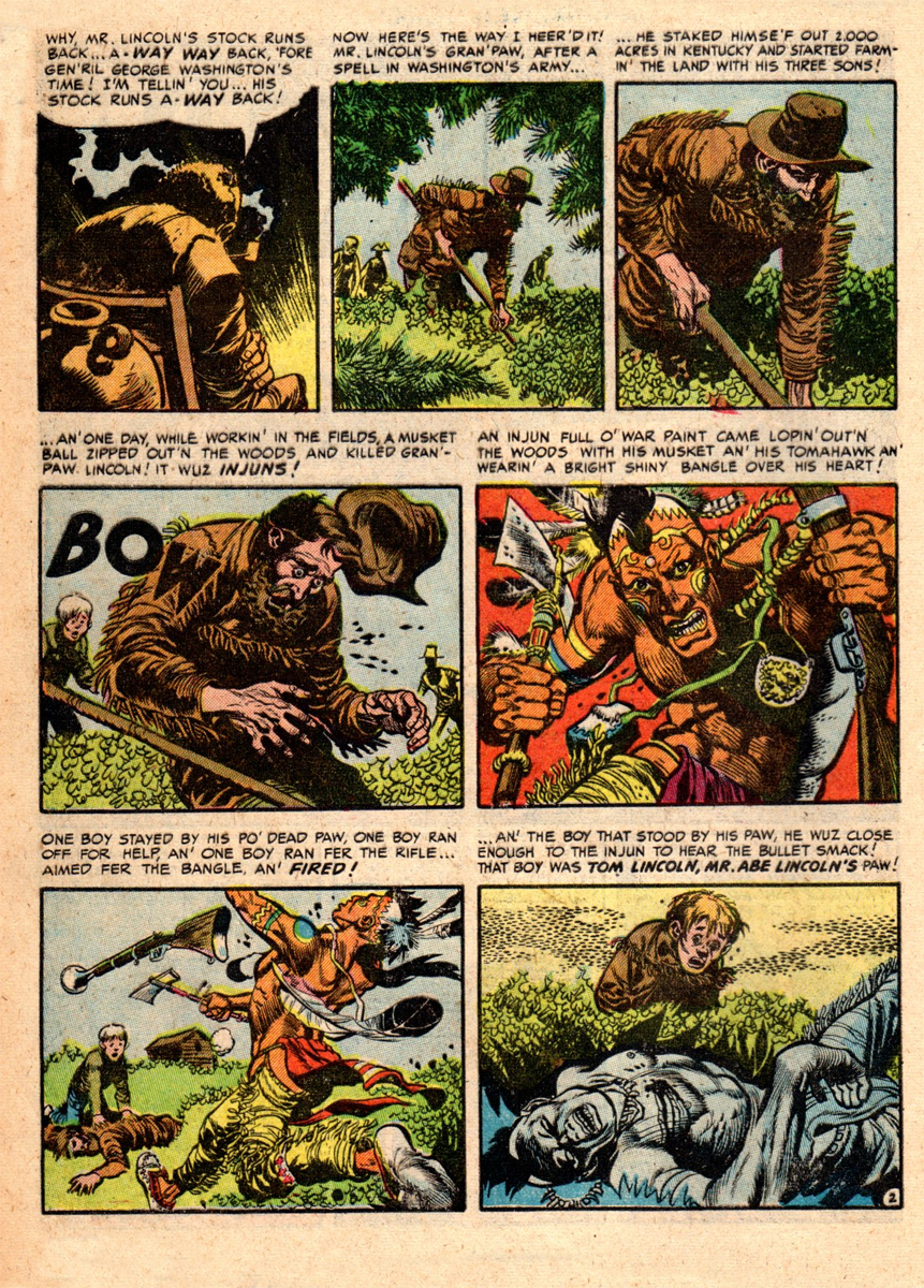
Just as Jack Davis did the very first story in MAD No. 1, he also did the first story in the first “Civil War” issue. Jack was a great opening act, what better way to get someone to buy the comic book than to see his first page, splash page, grabber.
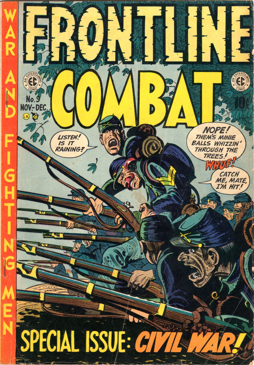
Magazine Cover
.
 1
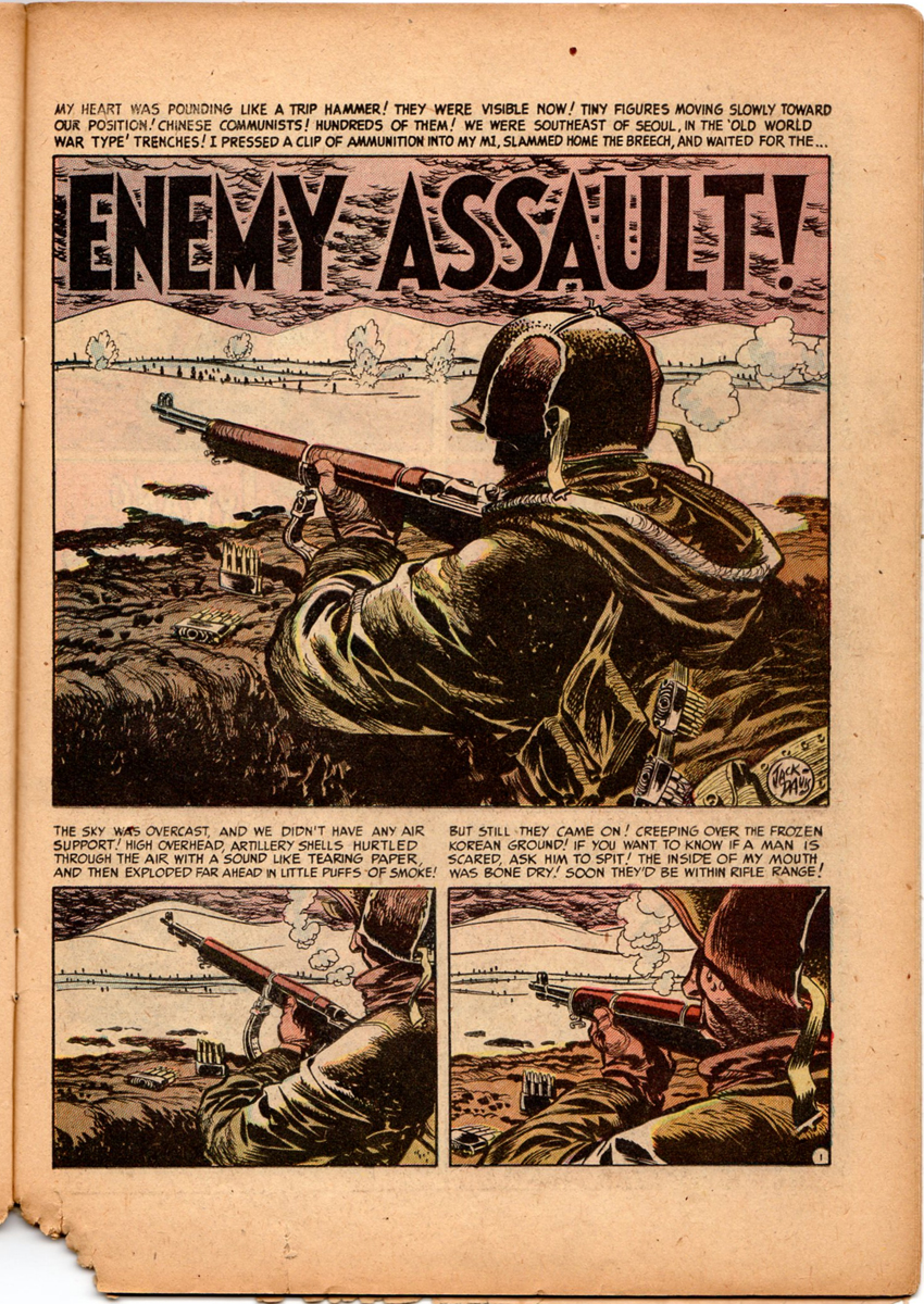
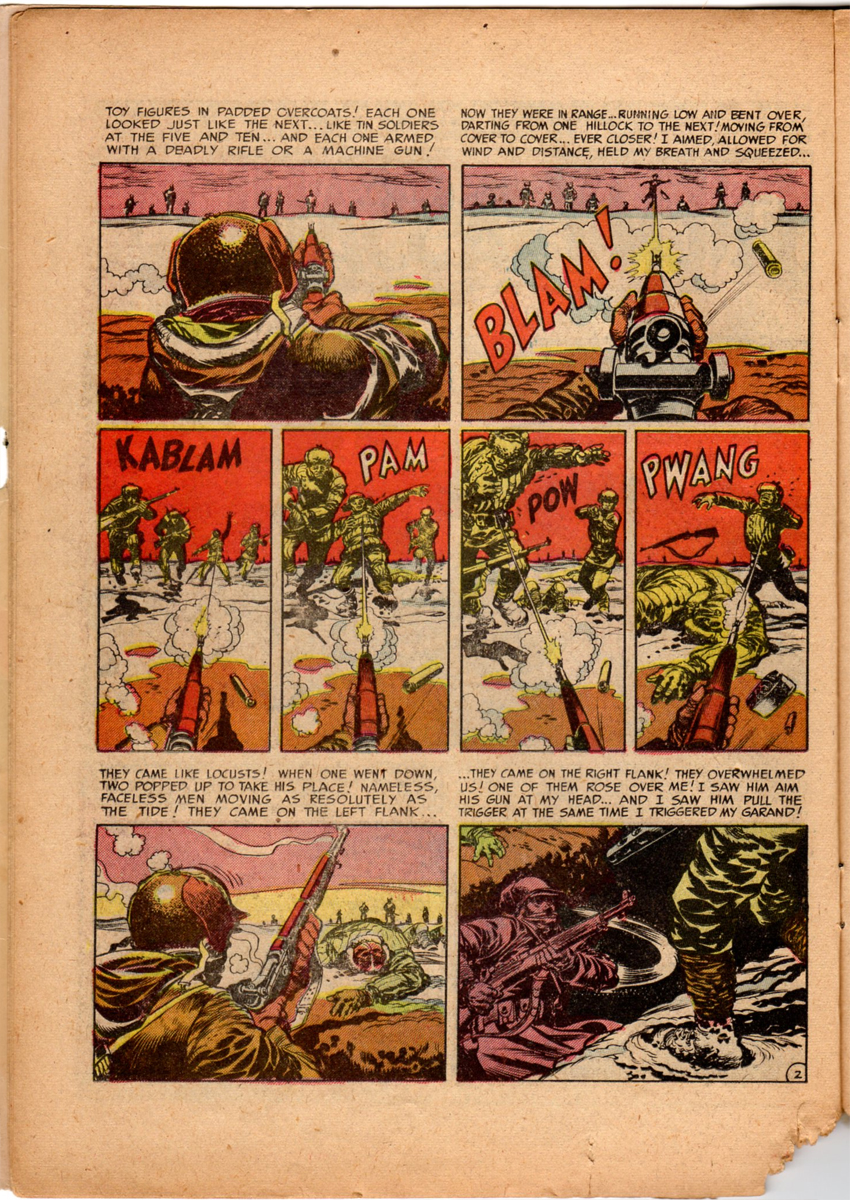
1Intro art by John Severin. His love for the subject matter shows!
.
 2
2.
 3
3hite”>.
 4
4.
 5
5.
 6
6.
 7
7.
 8
8.
 9
9.
 10
10The first Davis story also flows perfectly into the second Severin and
Elder story. The terrific art is done by John Severin (penciler) and
Bill Elder (inker). As with Jack Davis, the strength of Kurtzman’s writing
and rough laying out comes roaring through.
Kudos again to Marie Severin’s coloring!
.
 11
11.
 12
12.
 13
13.
 14
14.
 15
15.
 16
16.
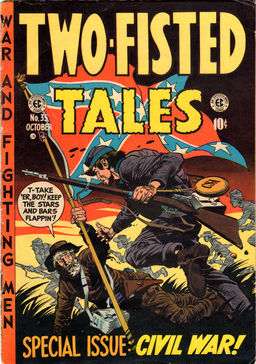
Here’s Jack’s cover for the third and last issue of Harvey’s “Civil War” series.
It was TWO-FISTED TALES No. 35. A little more than a year and a half after
it had started, the planned seven issue series was over and never completed.
(Us old EC fans always dreamt of what those last four issues would have looked like.)
 17
17
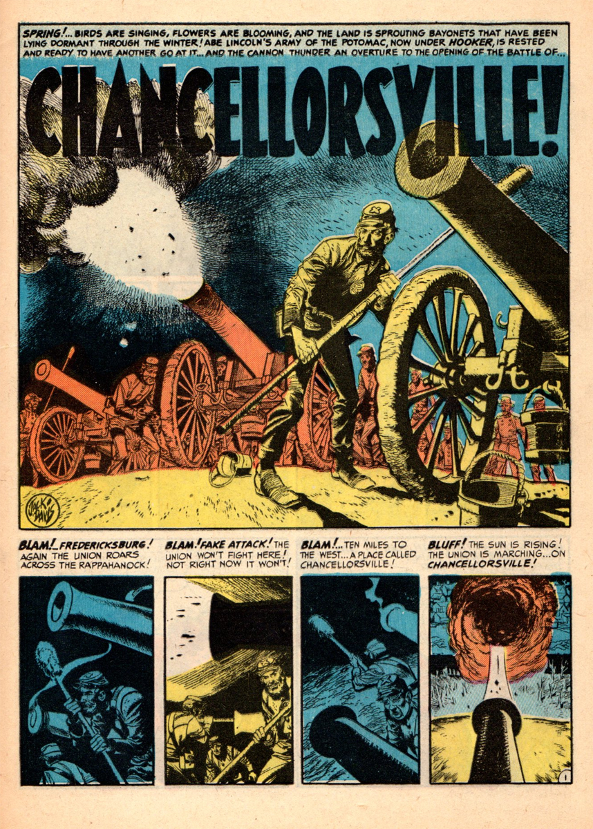
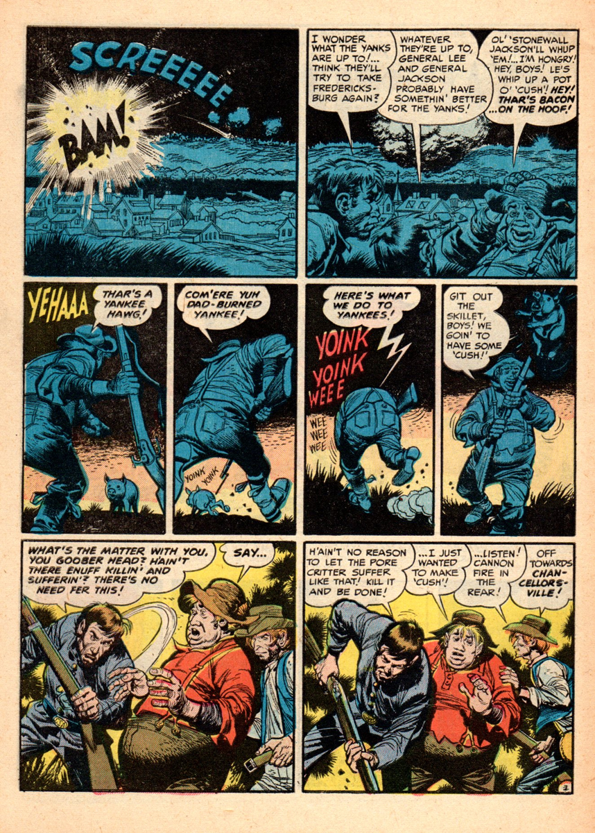
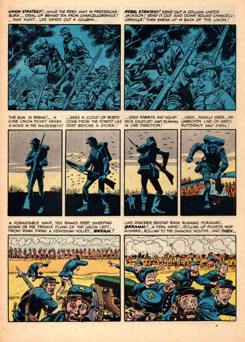
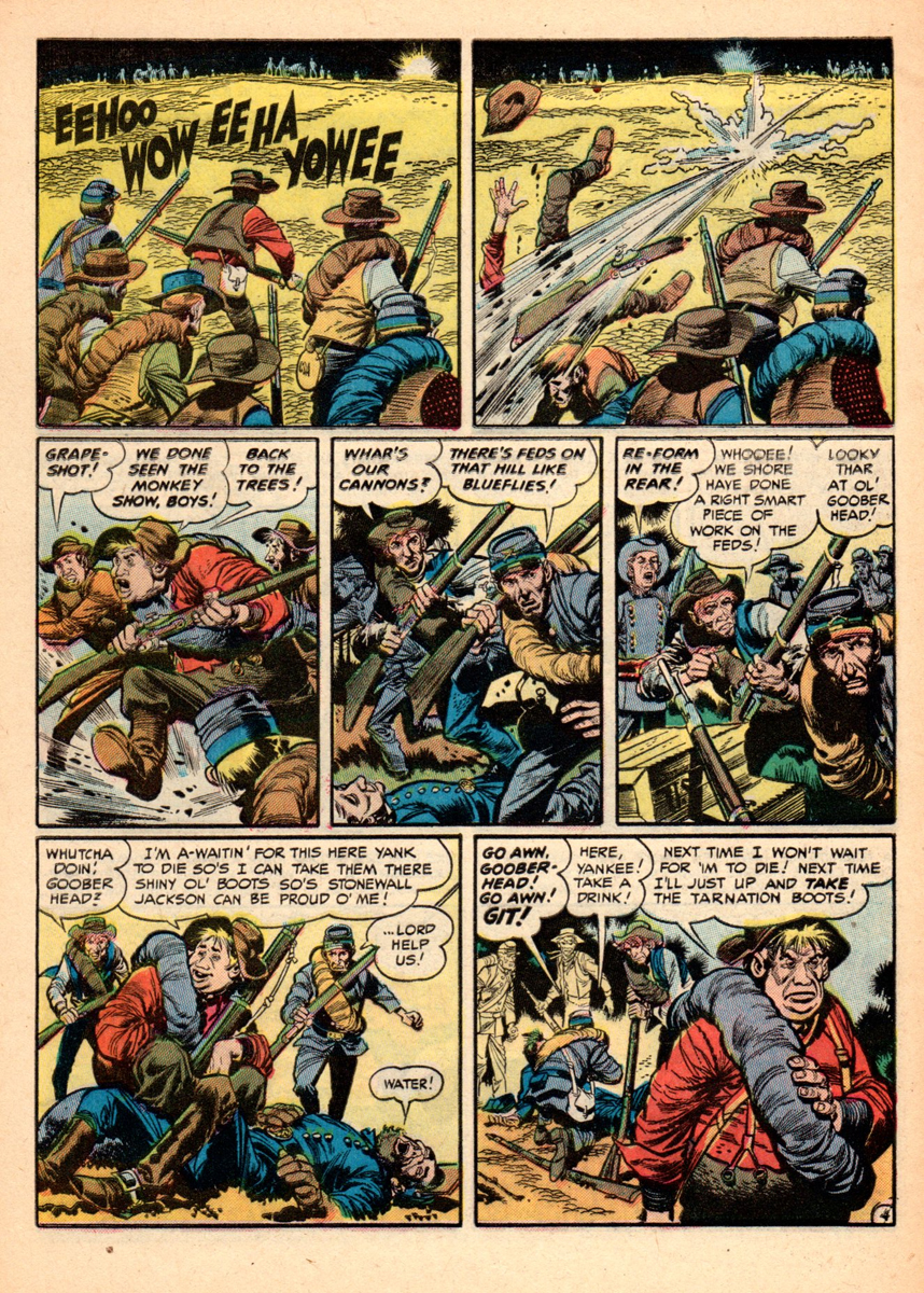
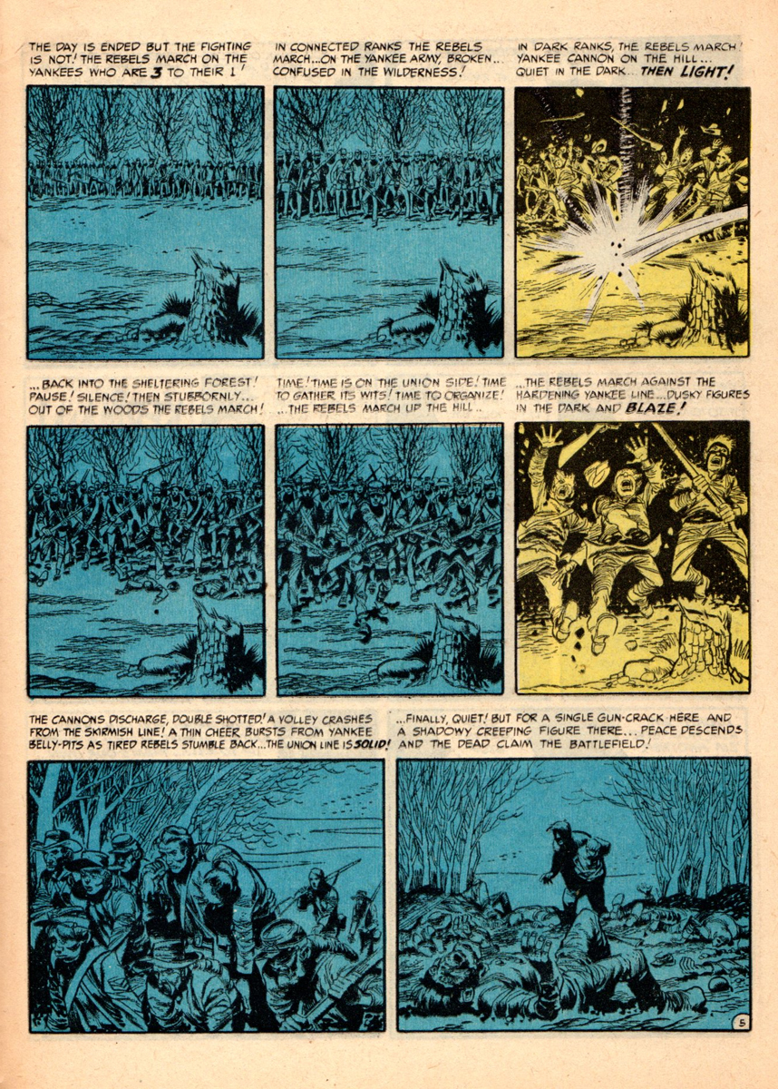
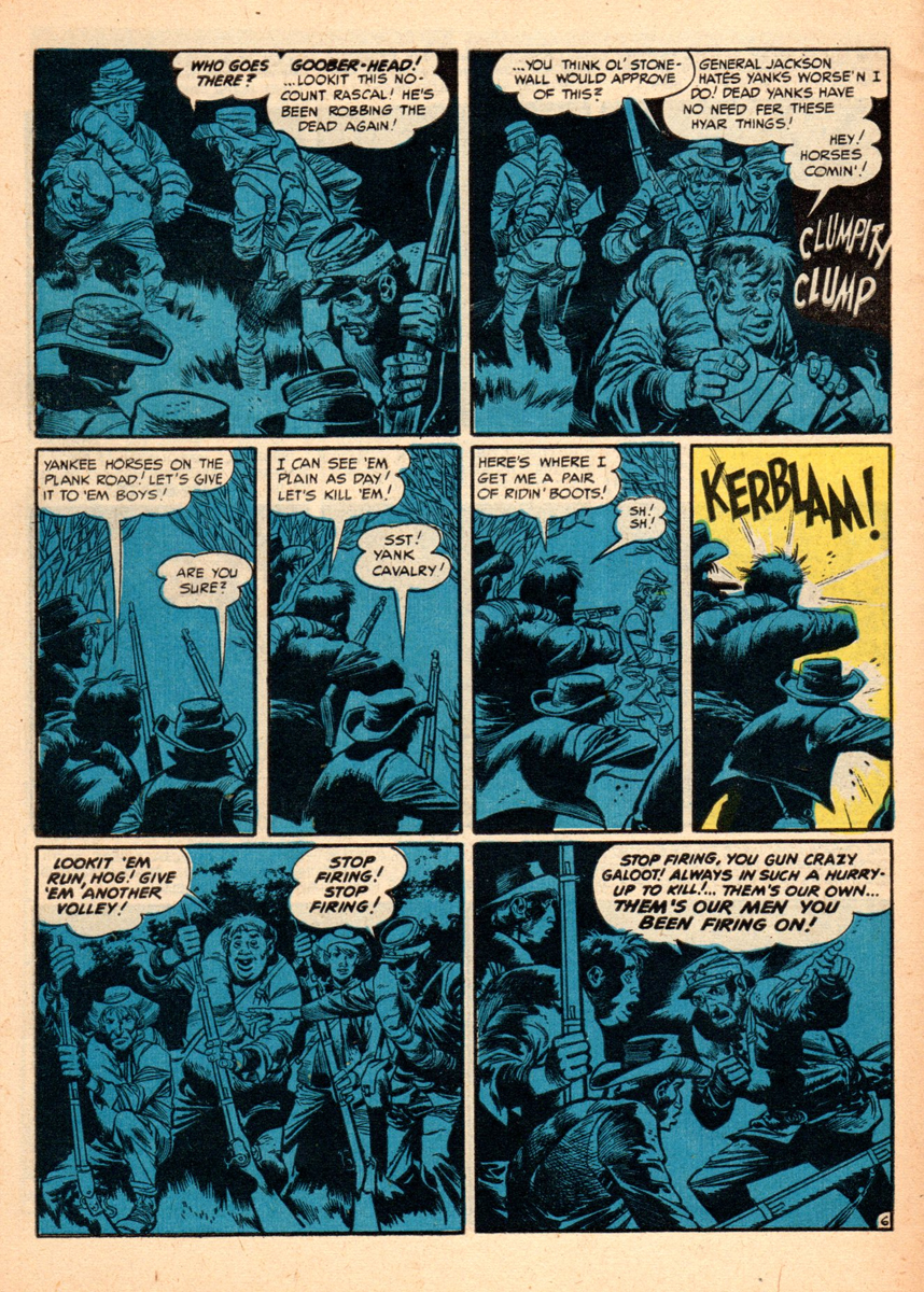
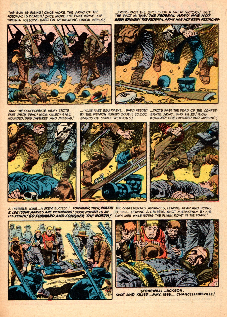
This is Jack’s rendering of the battle of “Chancellorsville”. It’s the last story in the
last issue of the “Civil War”series. Quite a visual high point for everyone working on it,
especially the dramatic coloring.
 18
18
 19
19
 20
20
 21
21
 22
22
 23
23
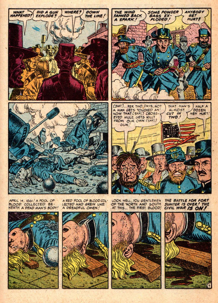
It’s a bit ironic that in the last panel, of the last story, of the last issue in the series,
that Harvey would miss one of the very few typos that ever graced his books.
“1893″ should read “1863″, go figure…
Many thanks to Bill Peckmann for sharing this artwork with us.
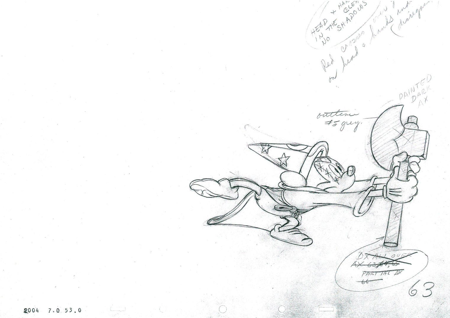
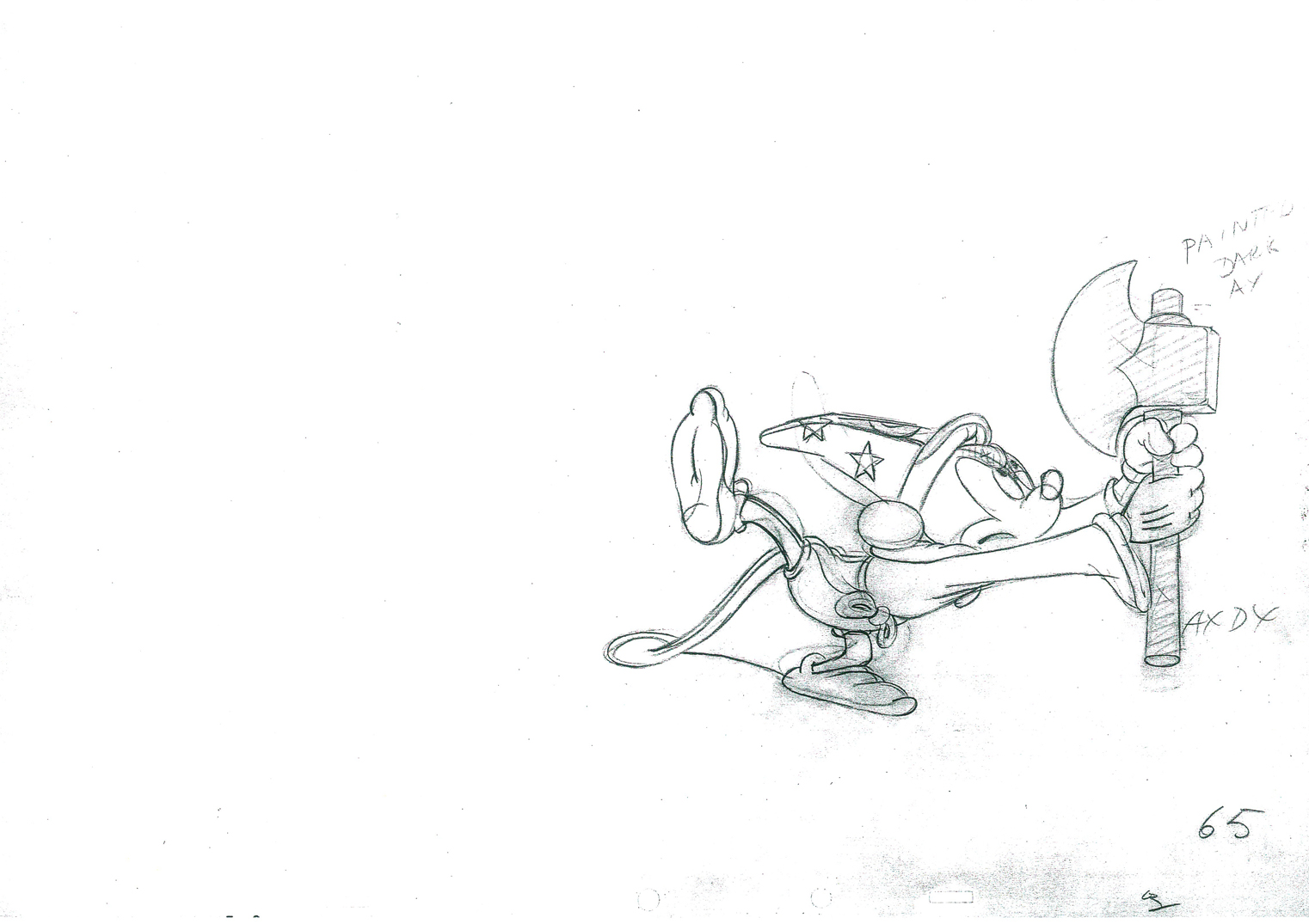
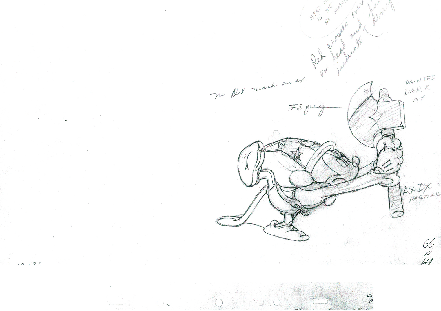
Daily post 09 Nov 2011 10:19 am
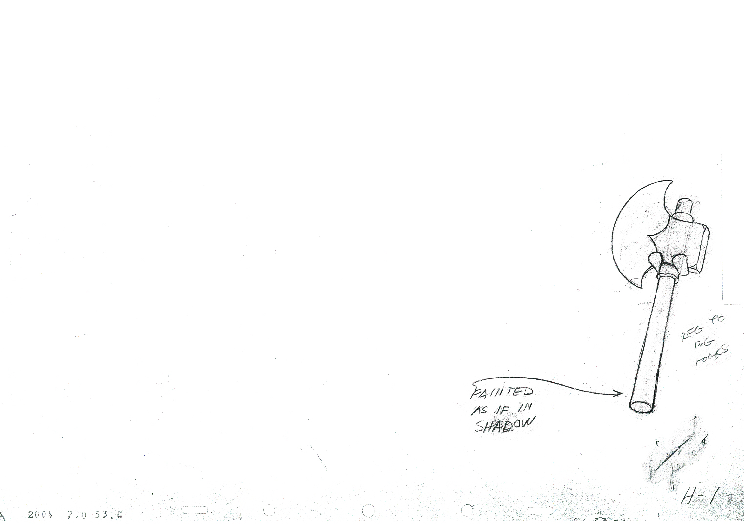
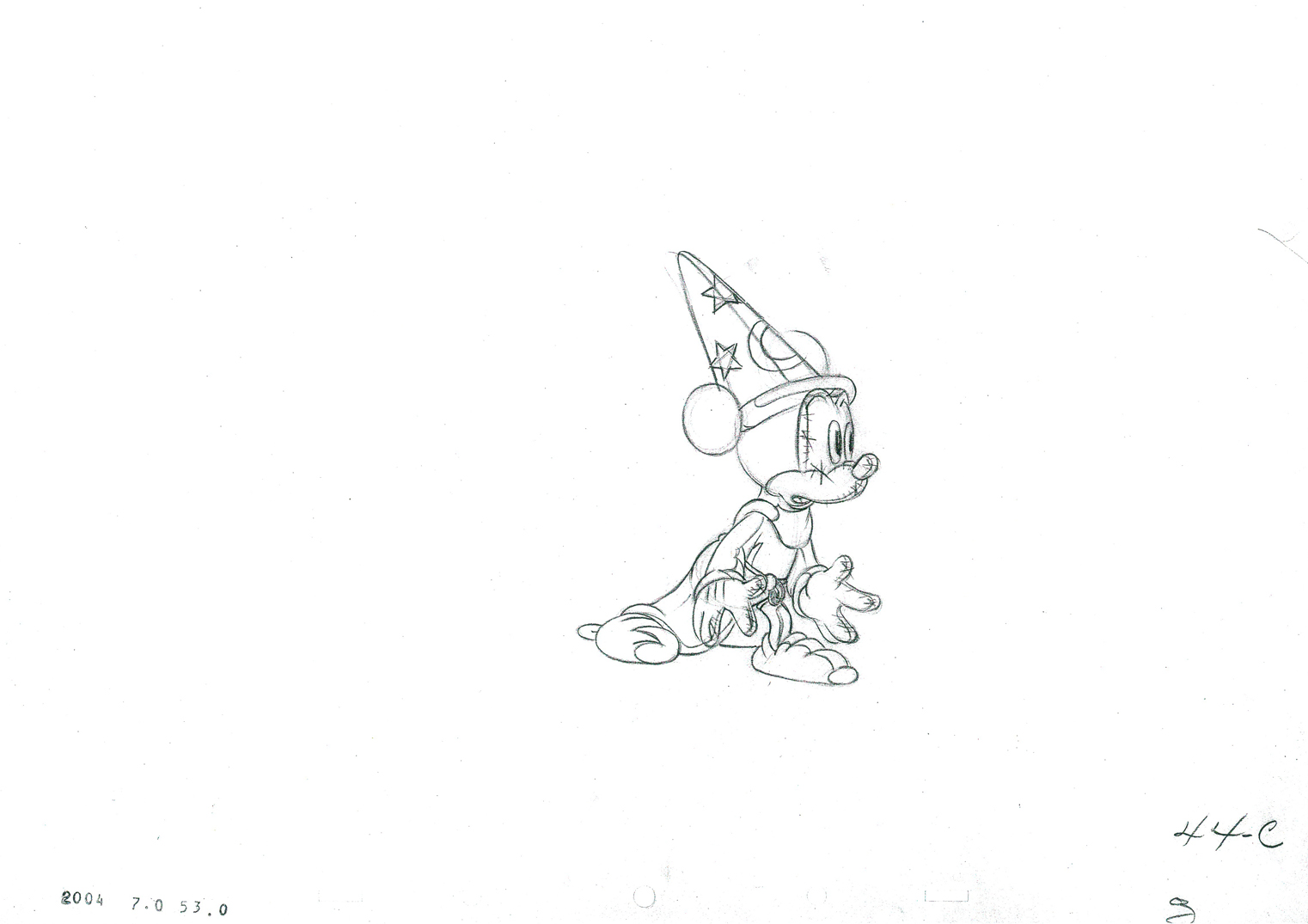
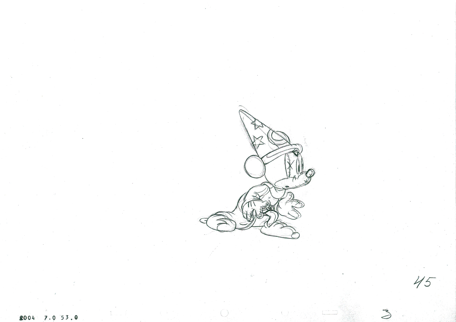
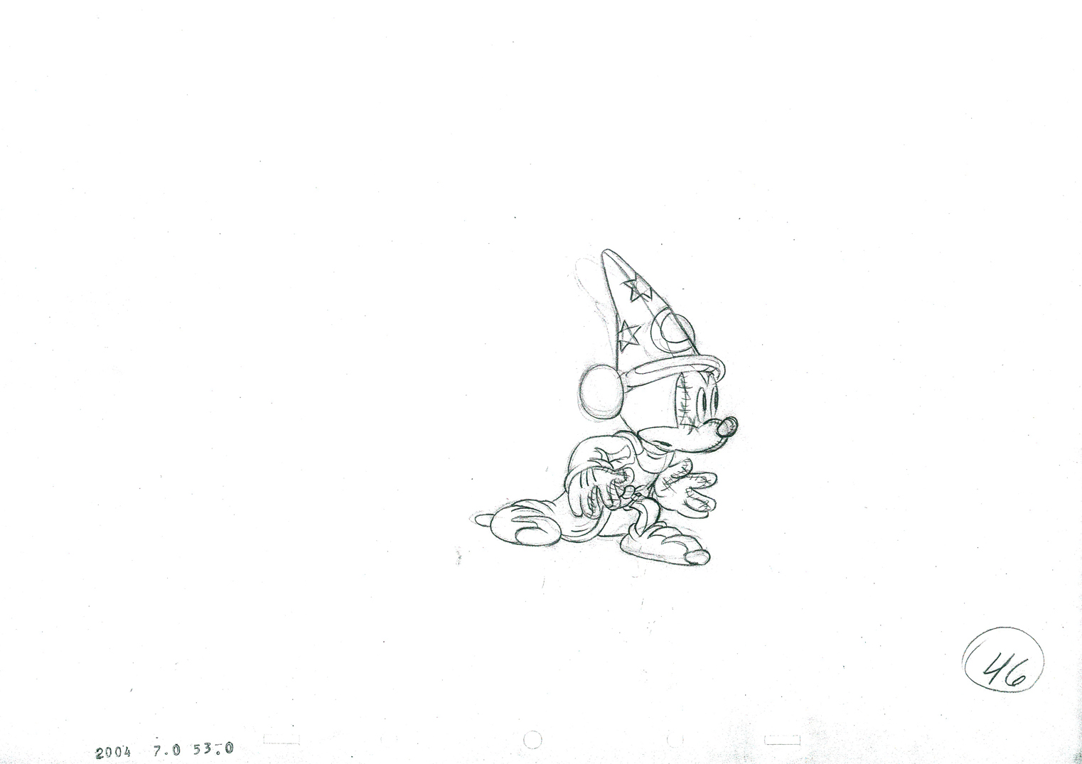
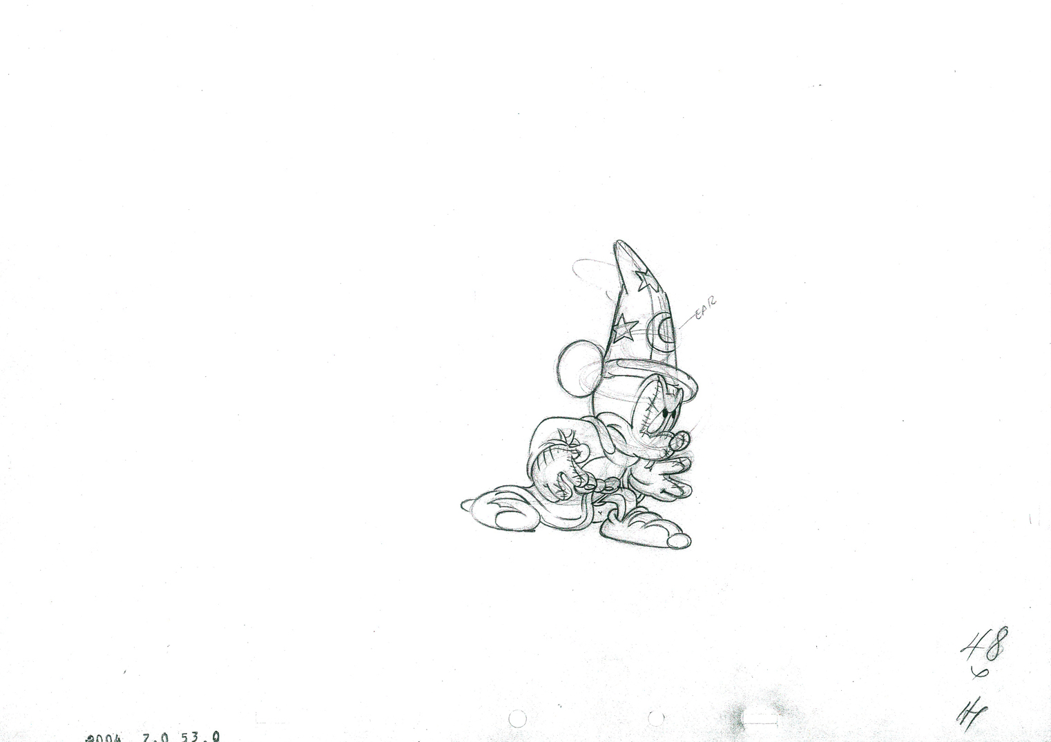
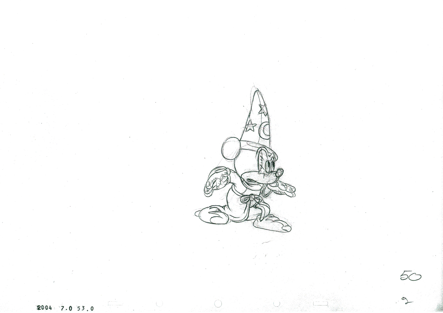
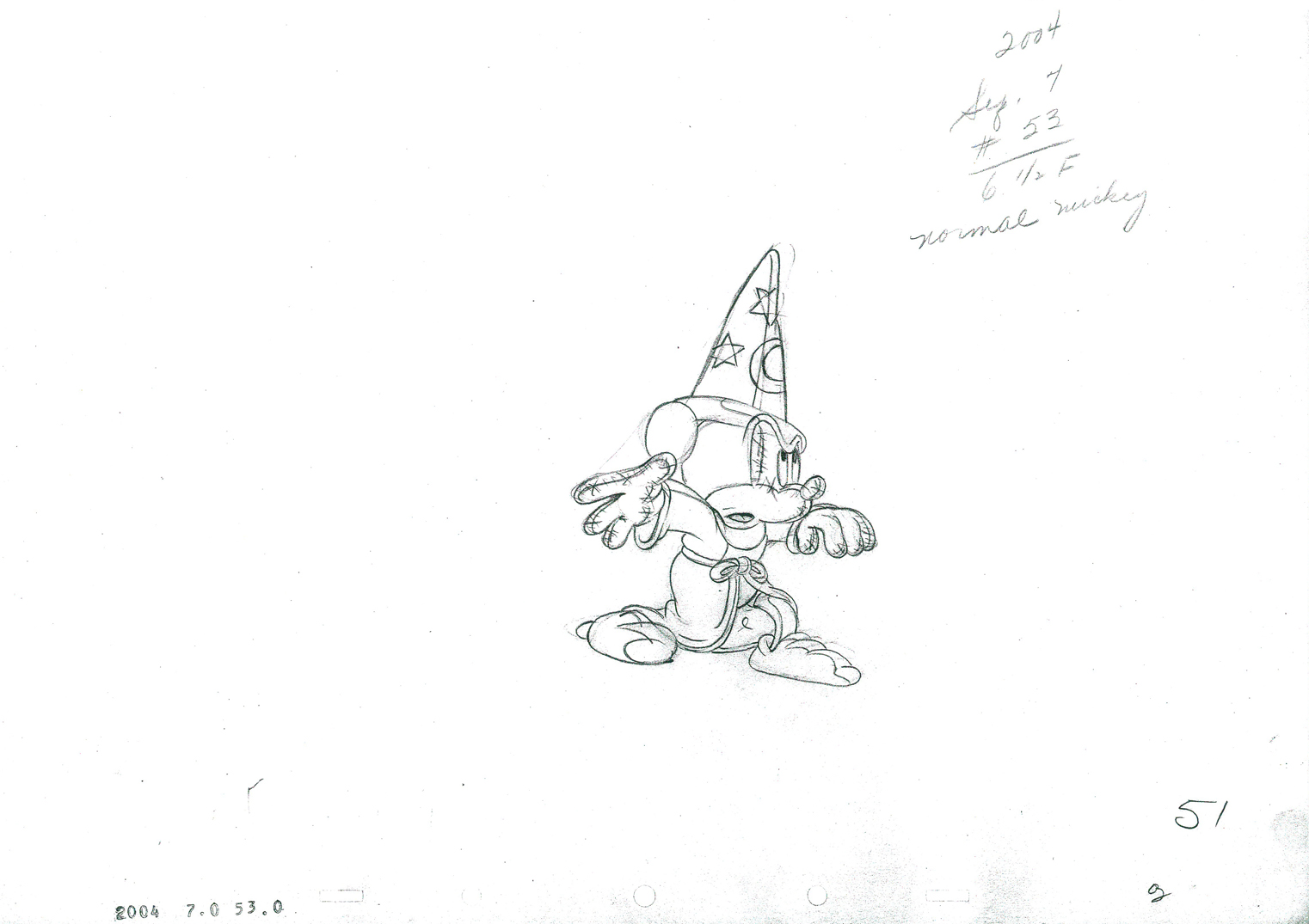
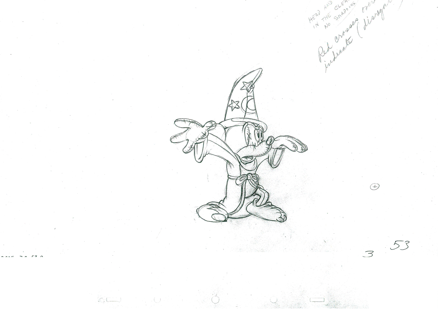
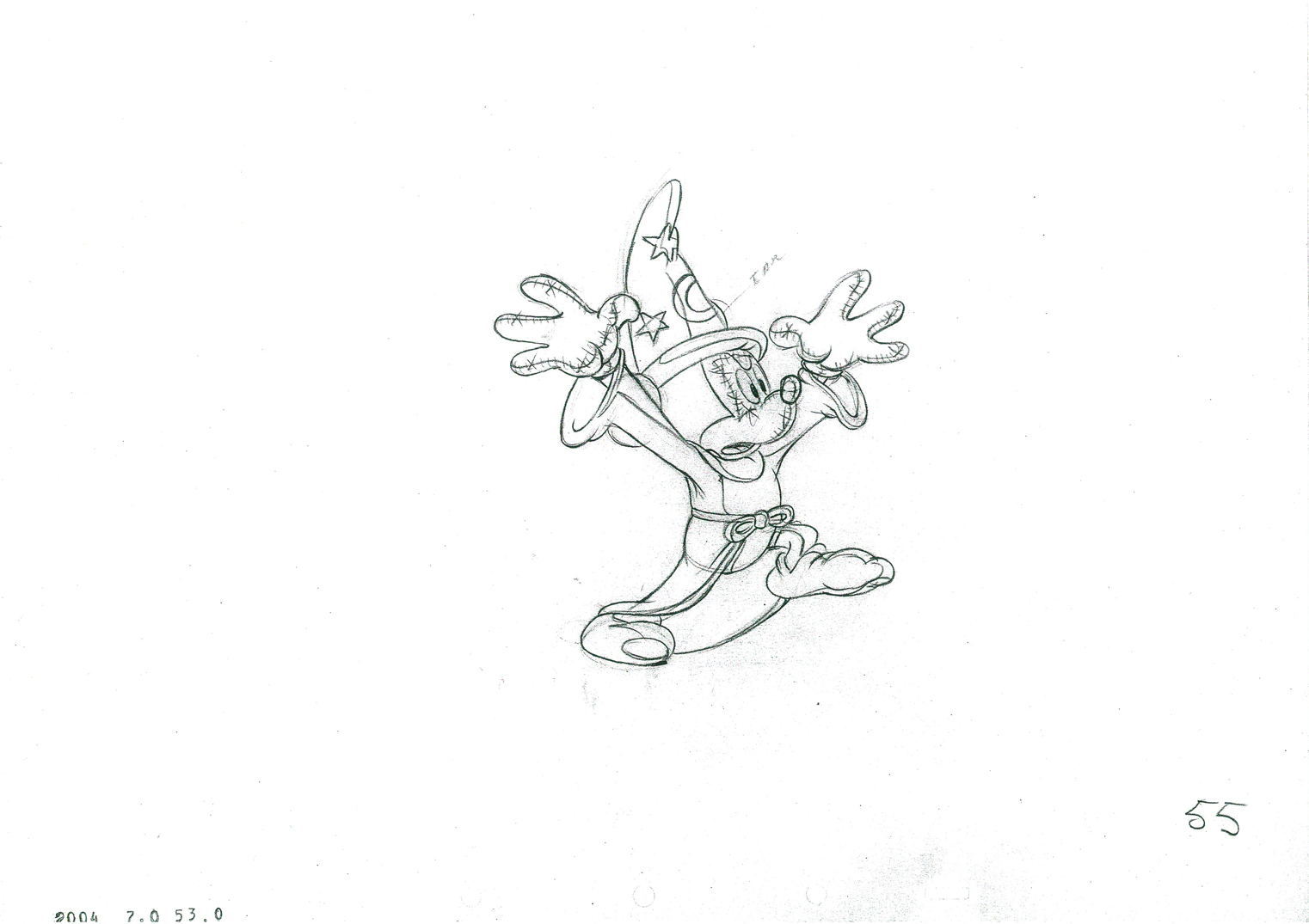
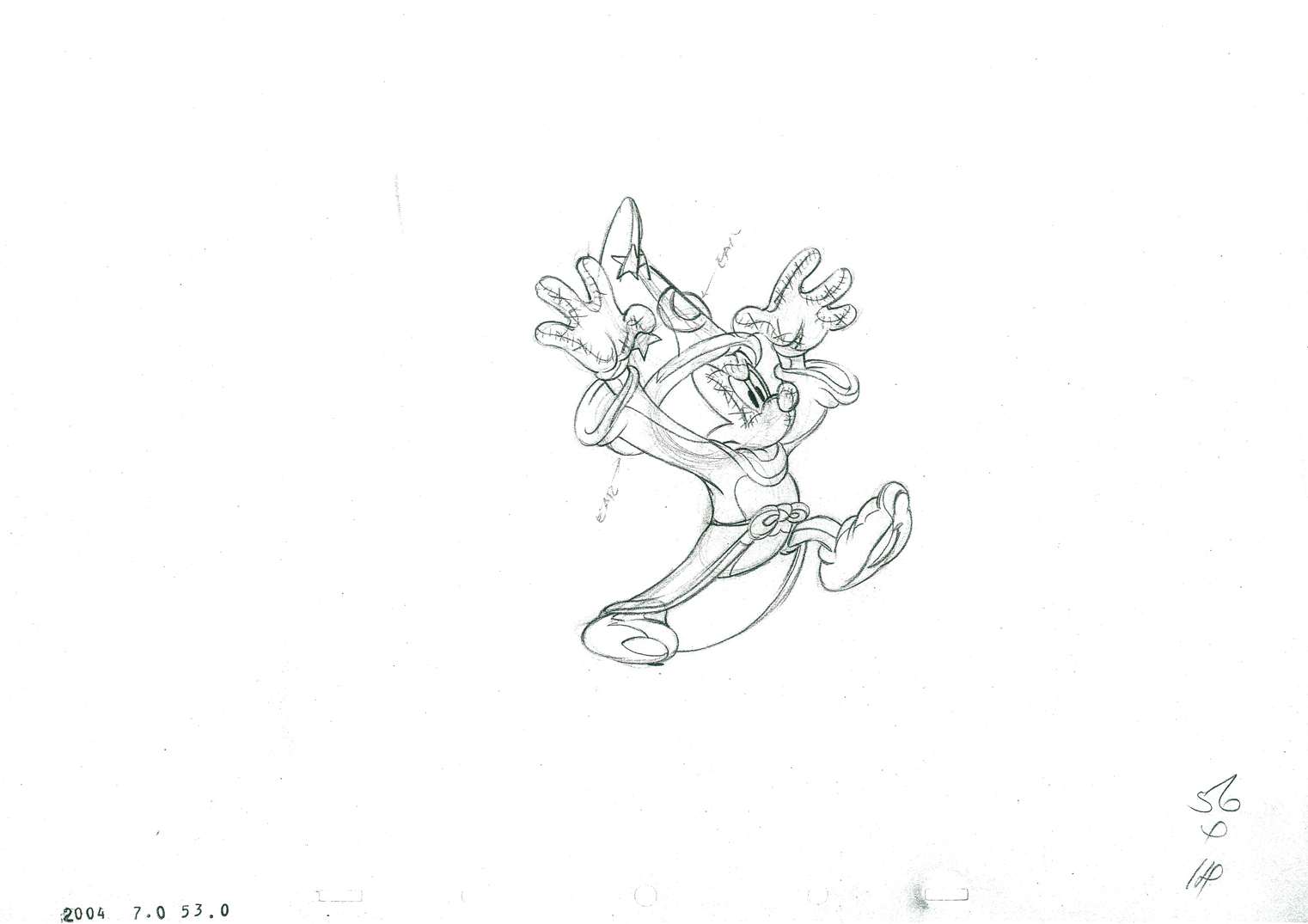
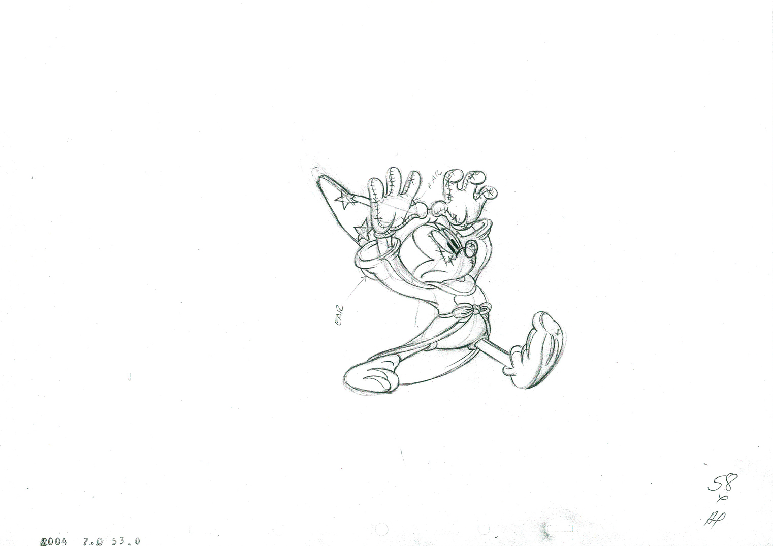
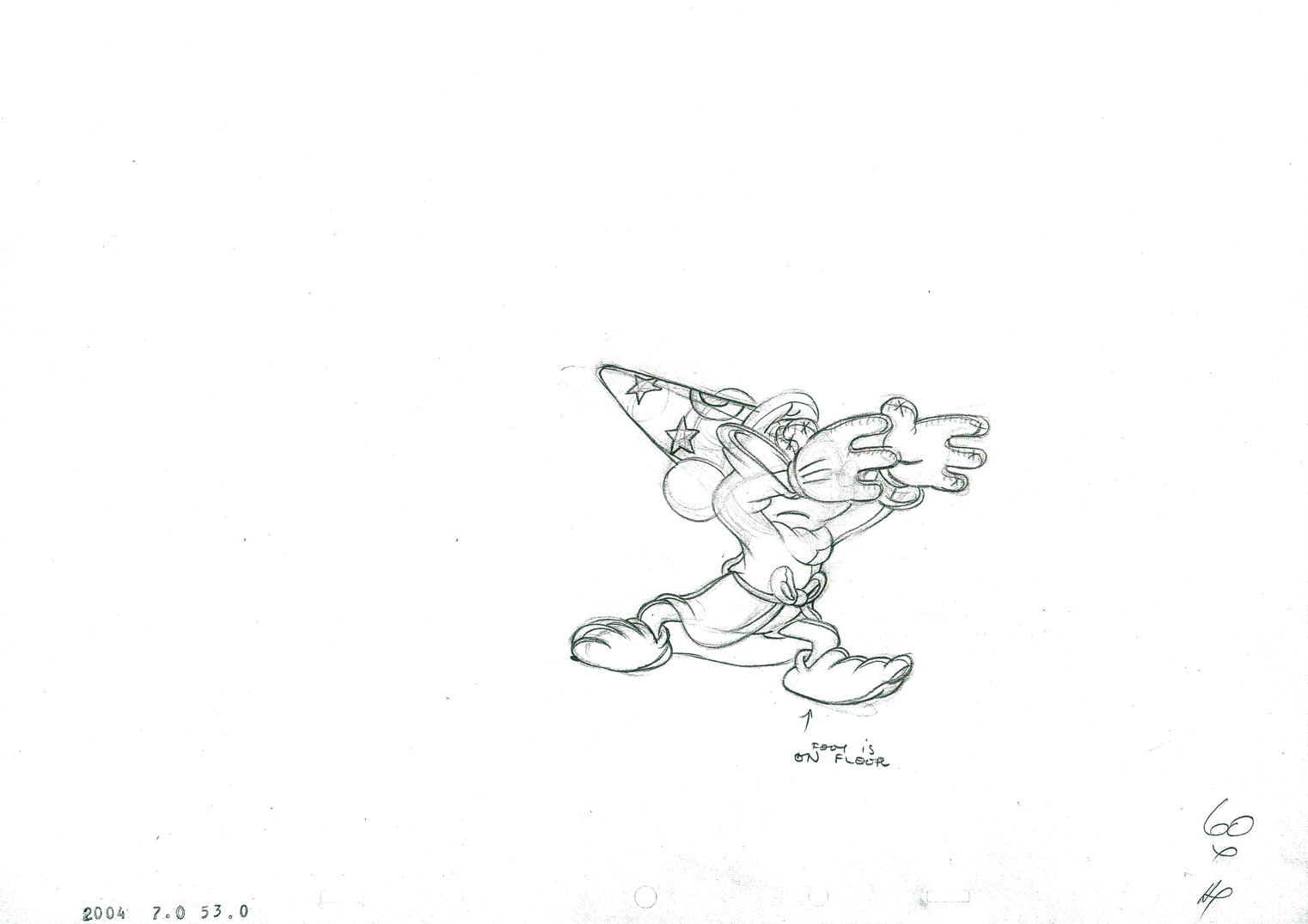
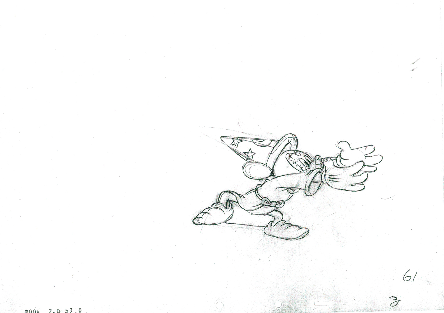
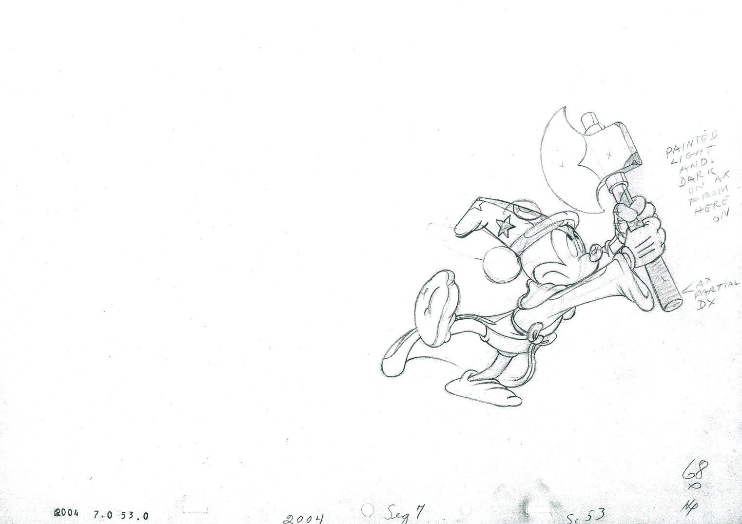
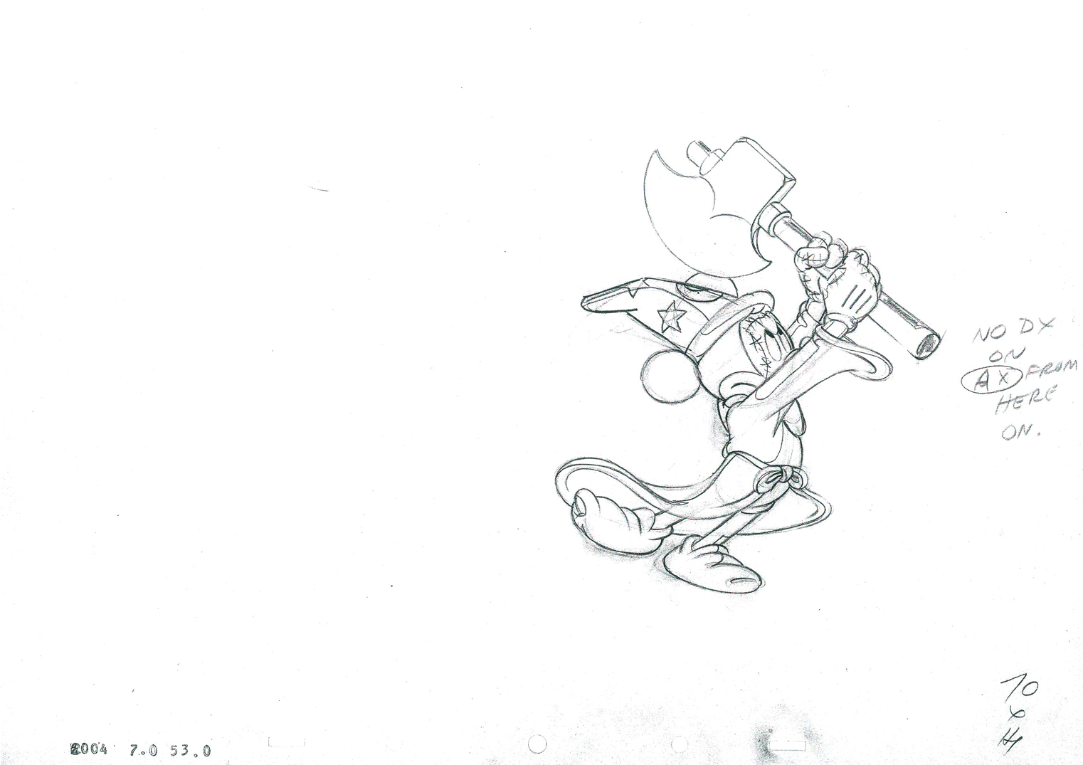
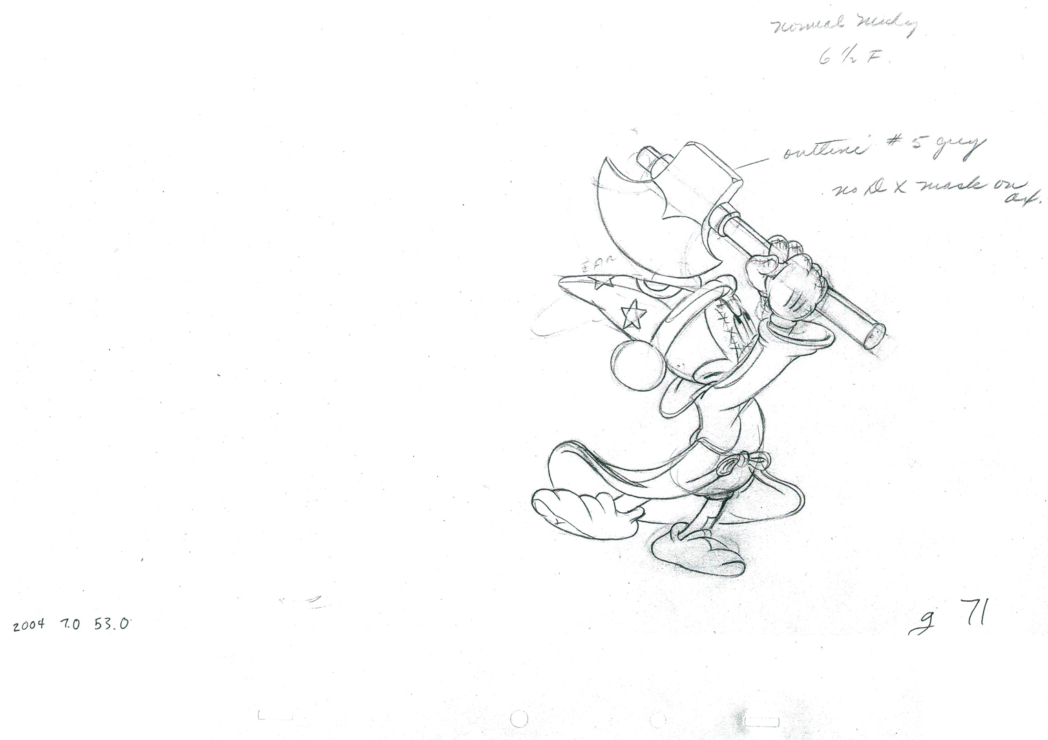
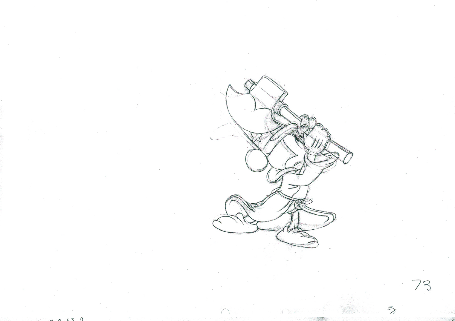
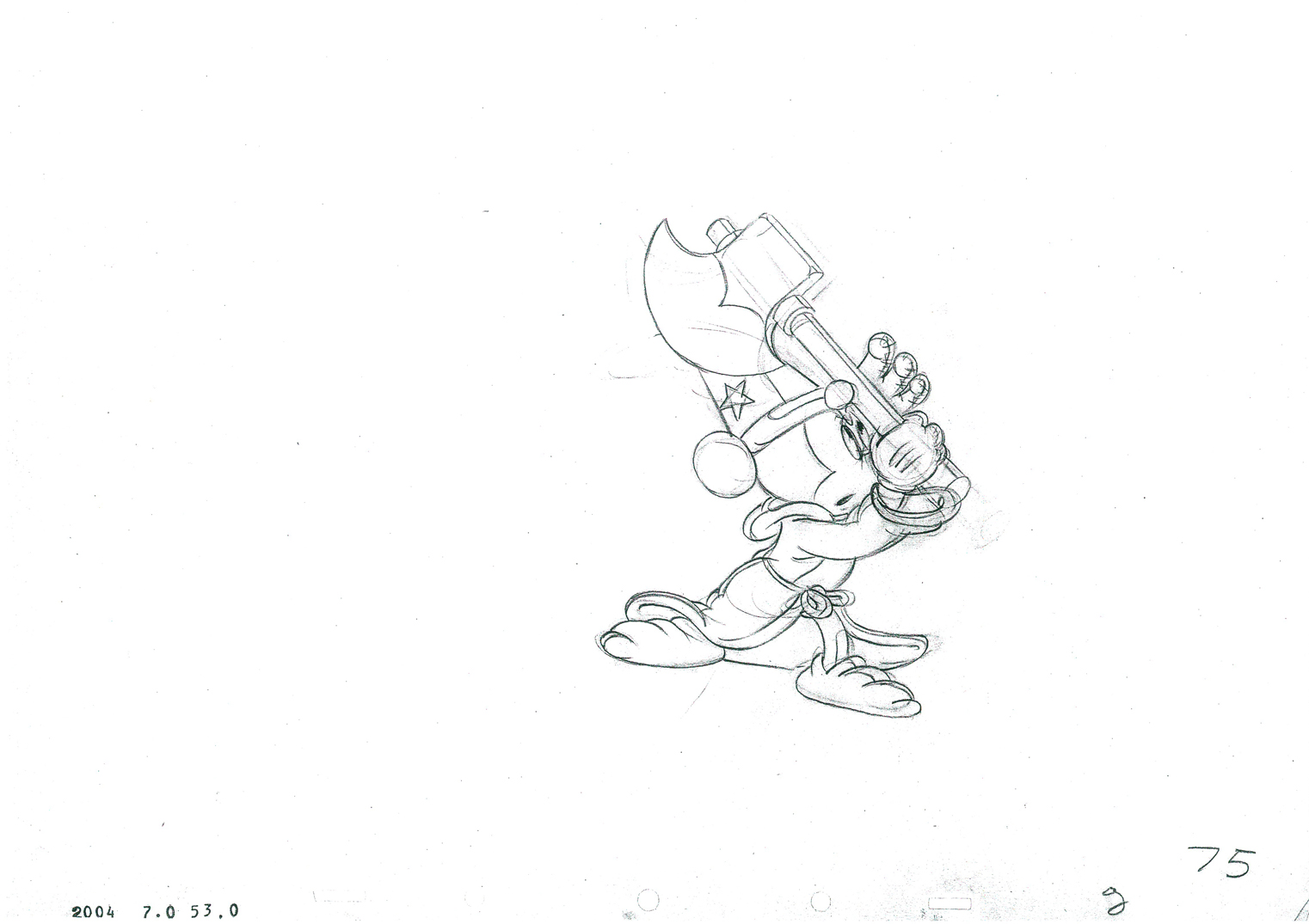
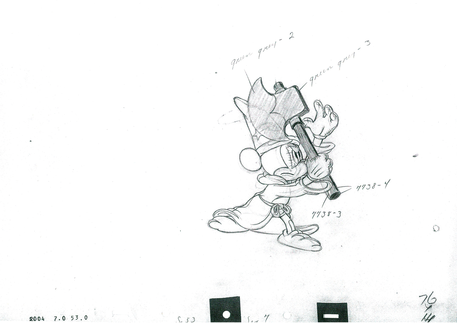
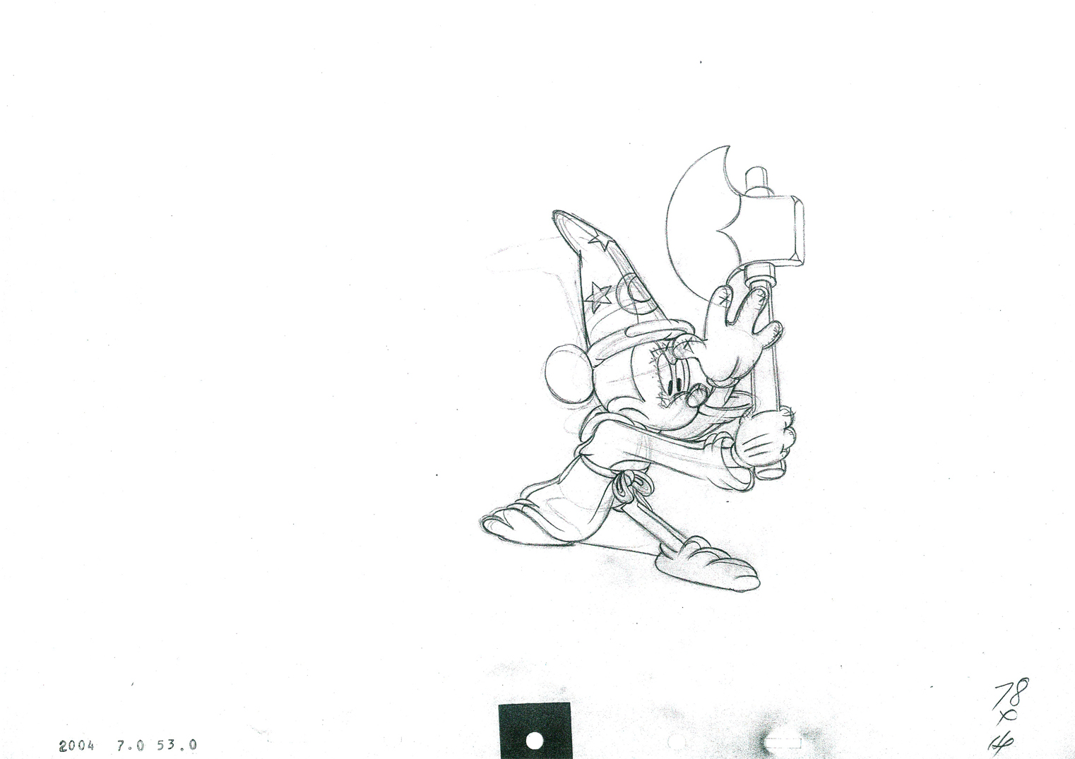
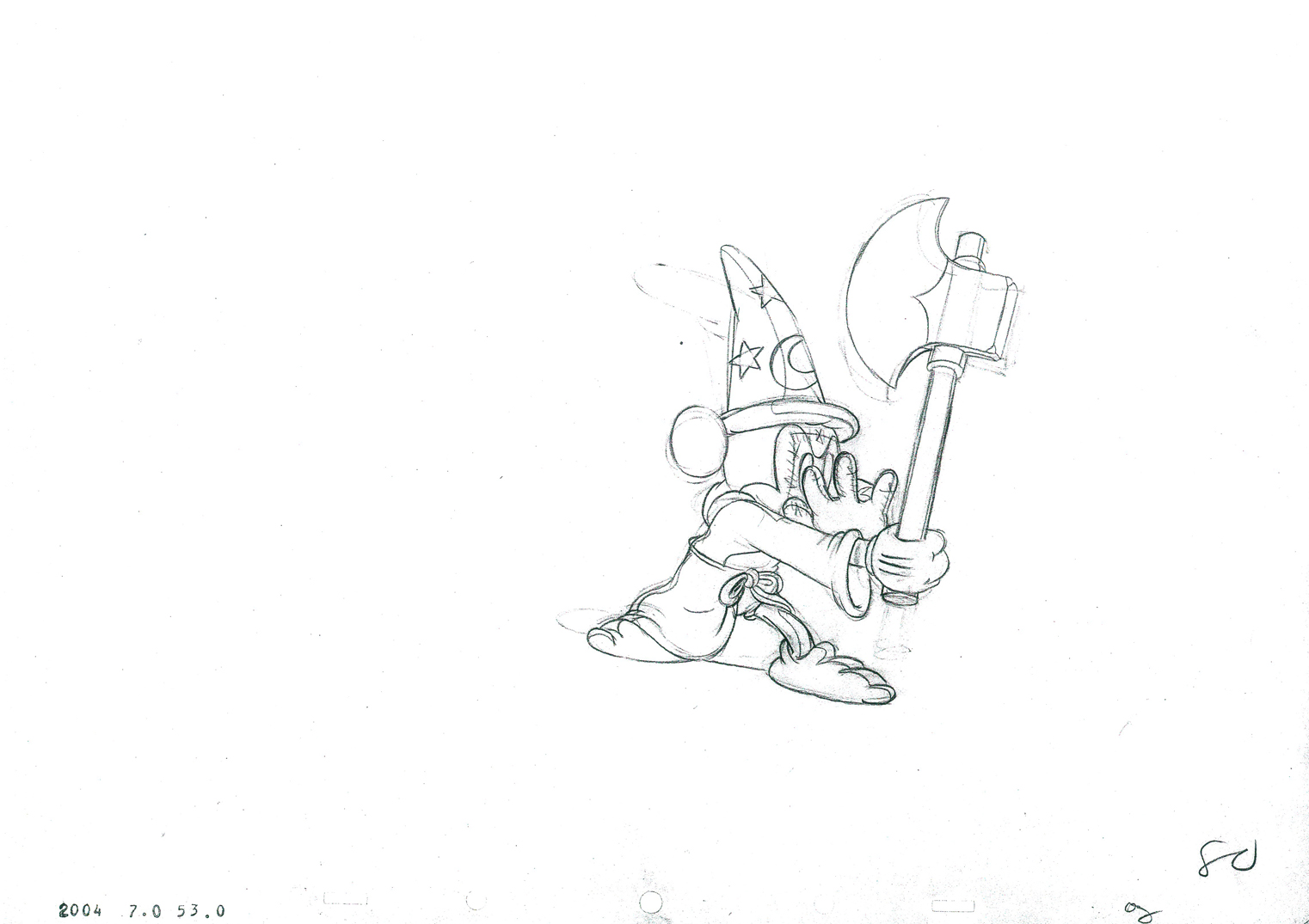
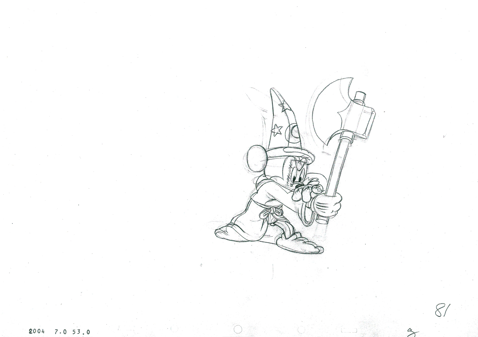
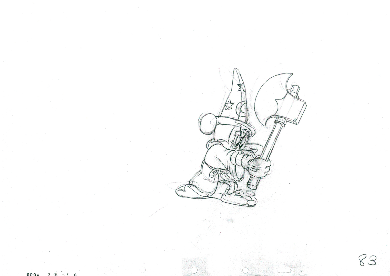
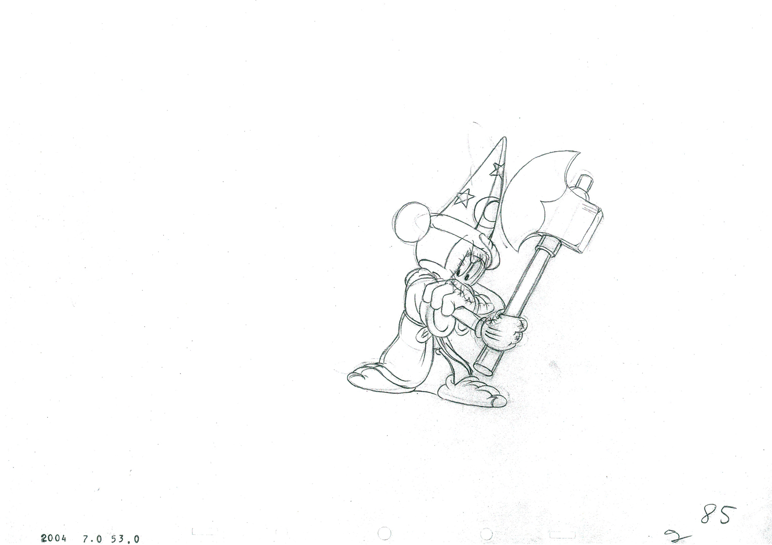
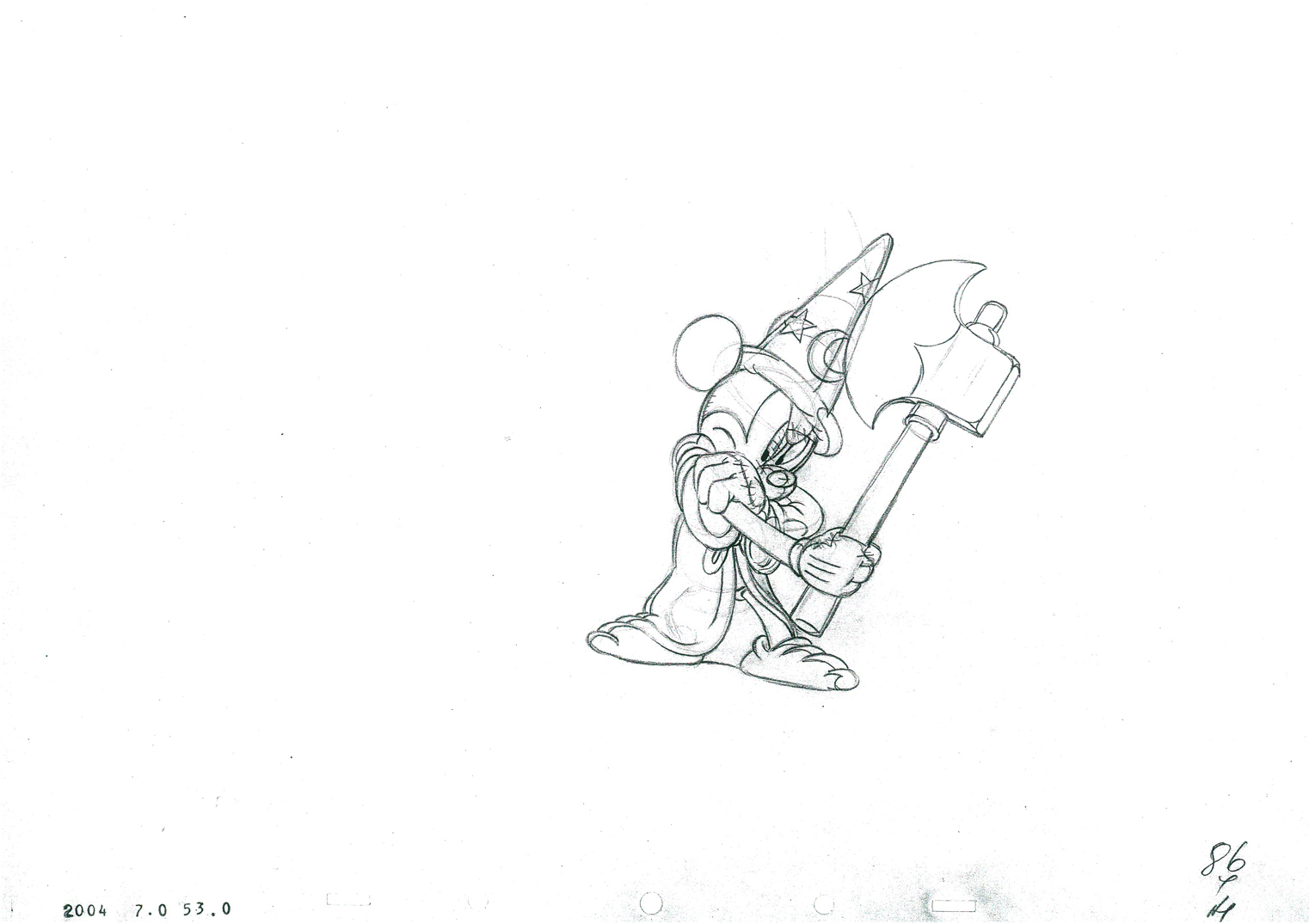
Mickey and the Brooms – 2
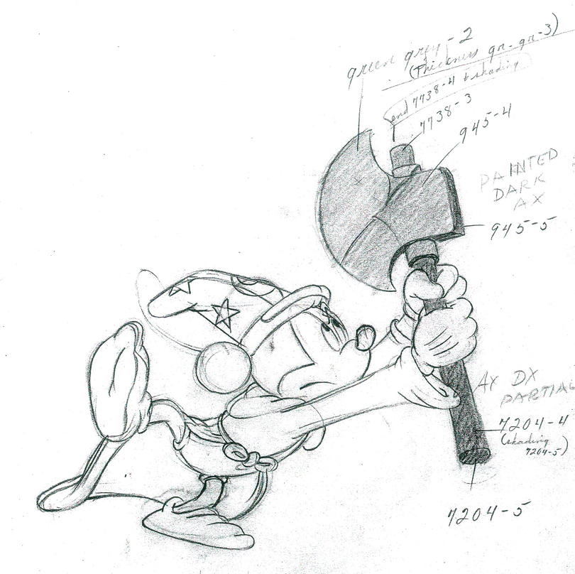
- Here I continue with the second part of Mickey’s action in this scene from Fantasia. Mickey and the brooms. The Mickey section of the scene will probably finish up next week, then on to the broom chopping shadows. There are a lot of those. We’ll keep it going until we’re done.
Riley Thomson animated this scene with an assist from Harvey Toombs.
Jim Algar directed this sequence.
This is production #2004- Seq. 7 – Scene 53. It runs 28 ft. 3 frs.
You can find out about all the scenes from Fantasia by studying the animator drafts posted in 2007 by Hans Perk on his site A Film LA, a great resource for animation study.
 H1
H1
 44a
44a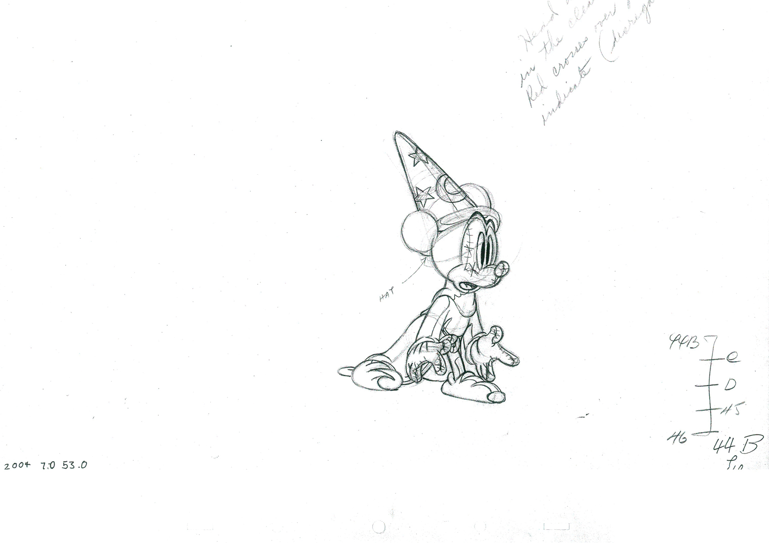 b
b
 44c
44c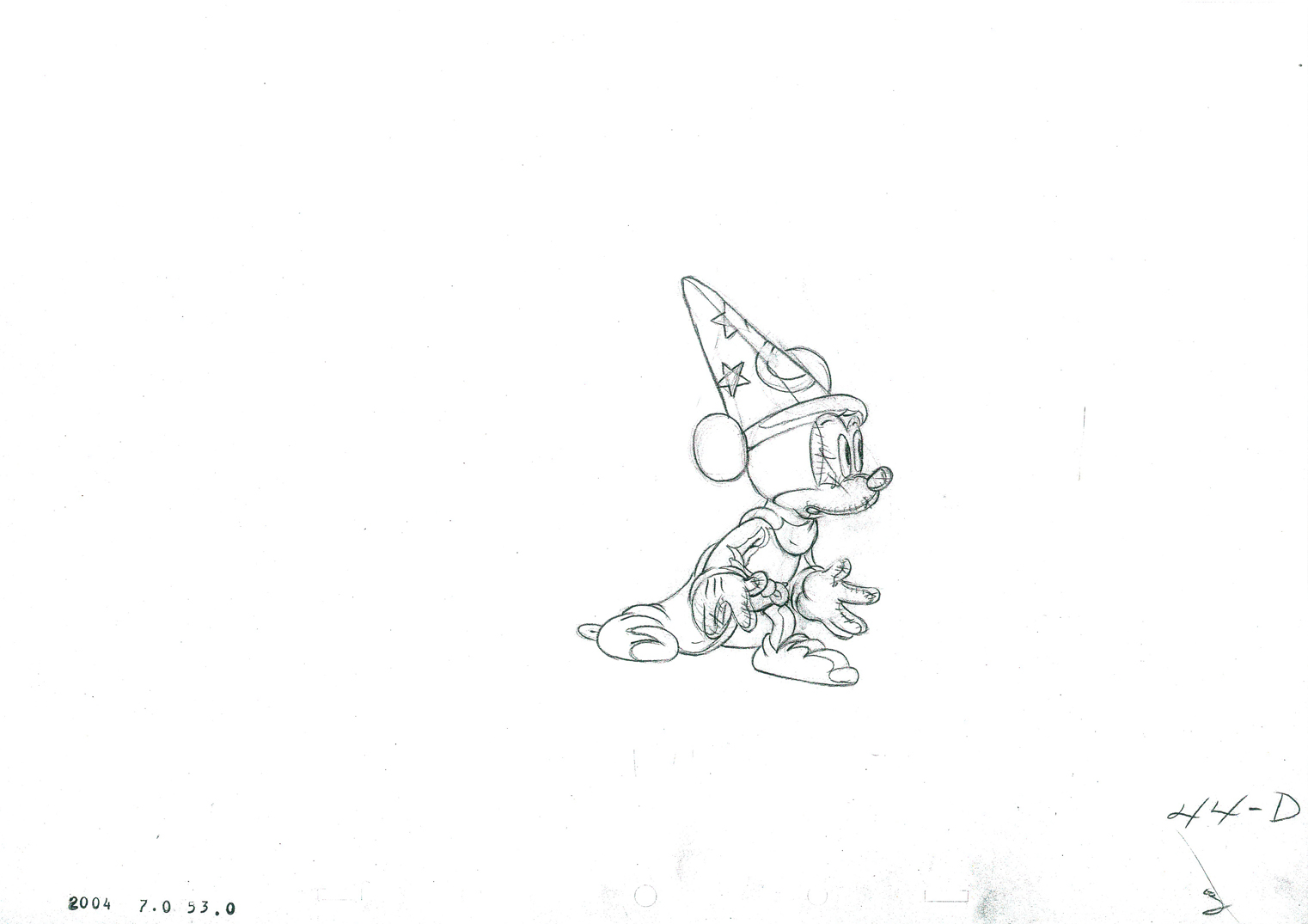 d
d
 45
45
 46
46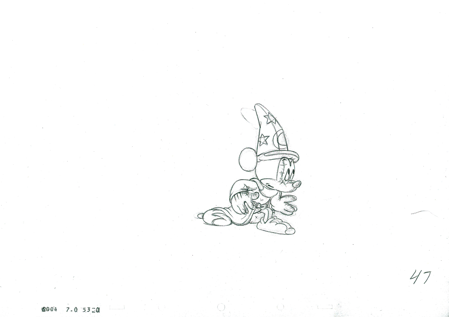 47
47
 48
48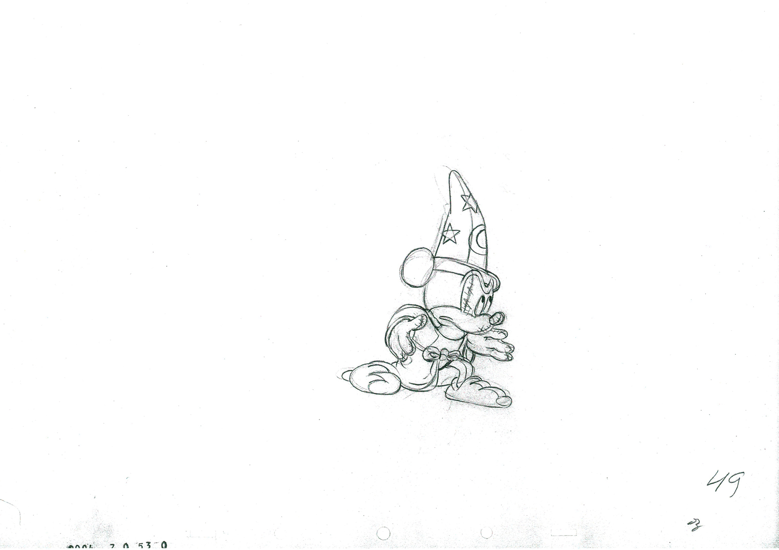 49
49
 50
50
 51
51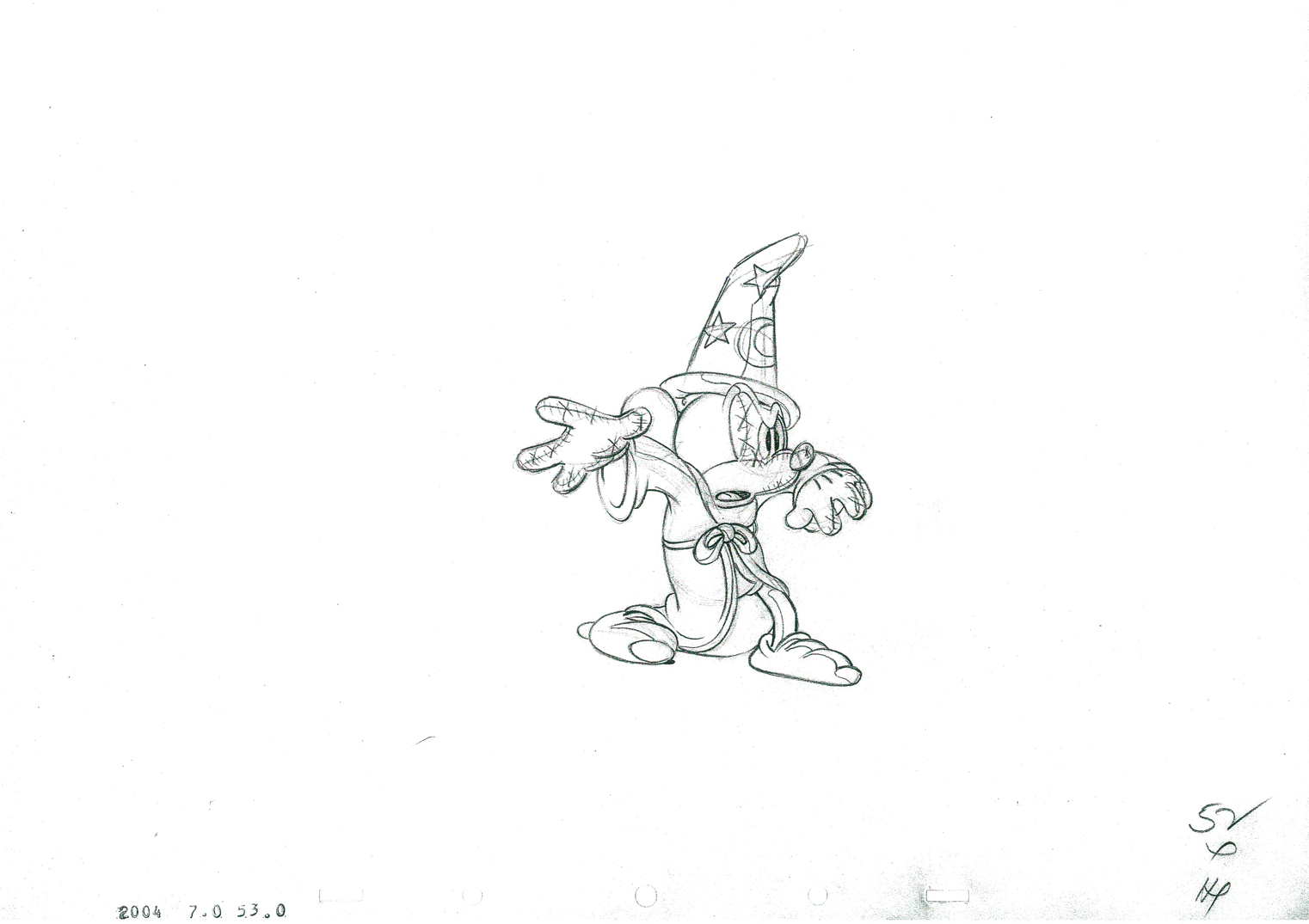 52
52
 53
53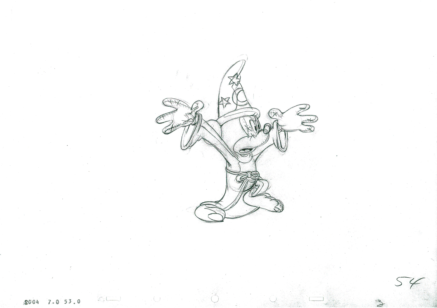 54
54
 55
55
 56
56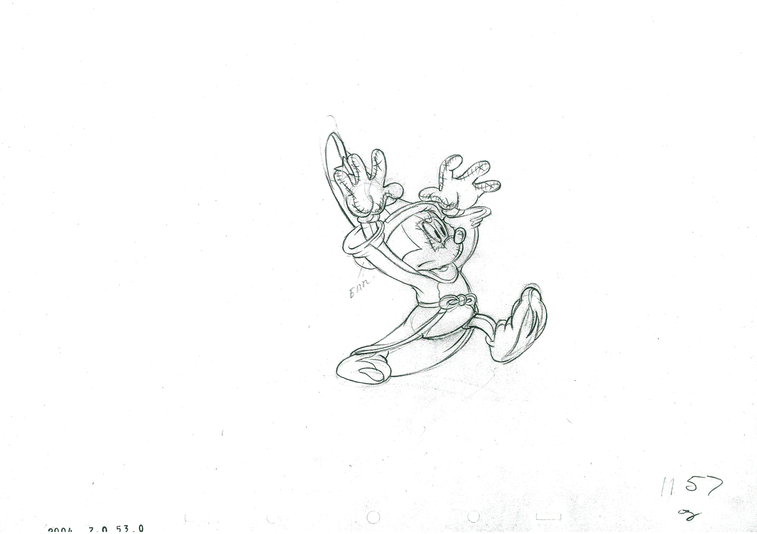 57
57
 58
58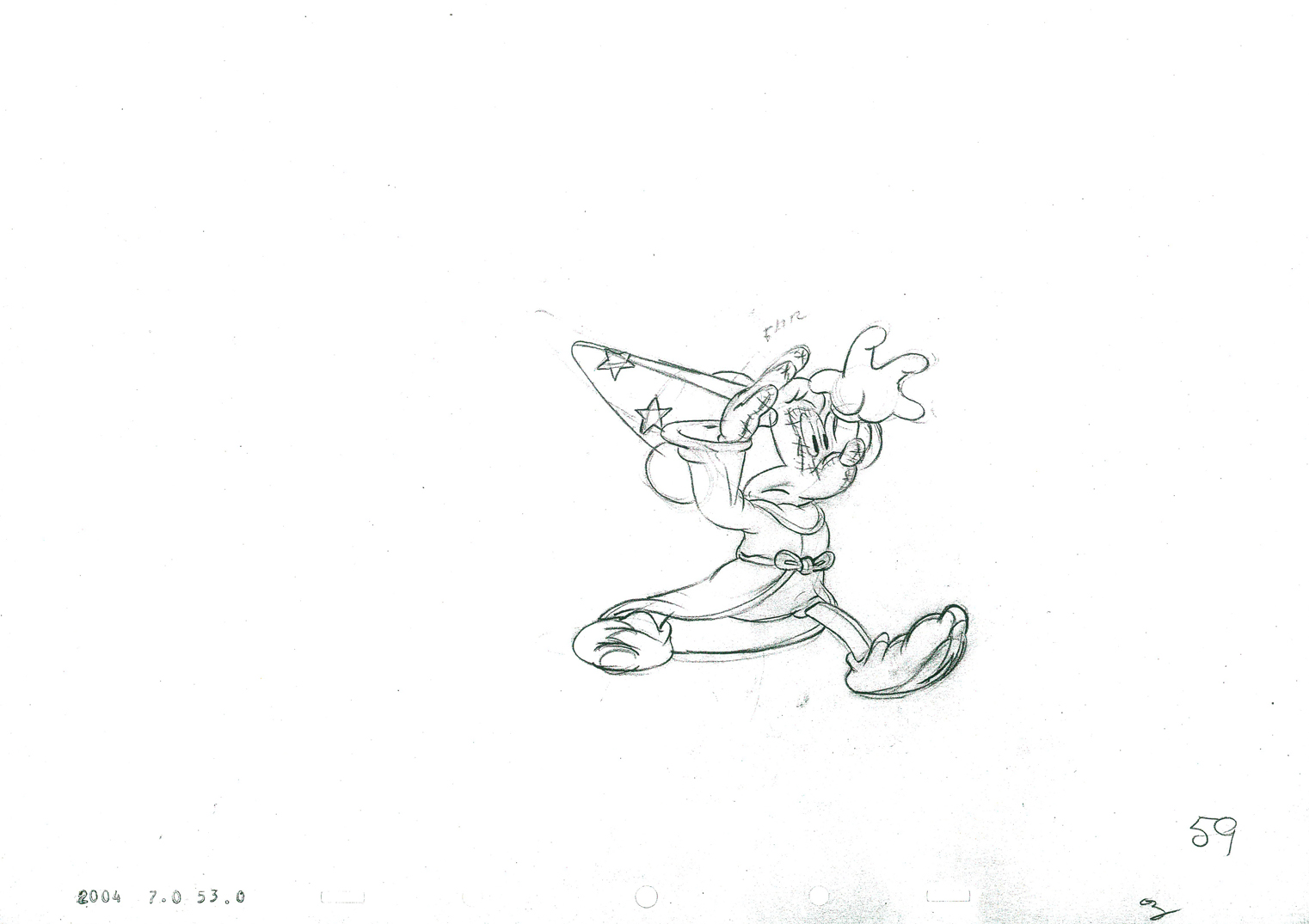 59
59
 60
60
 61
61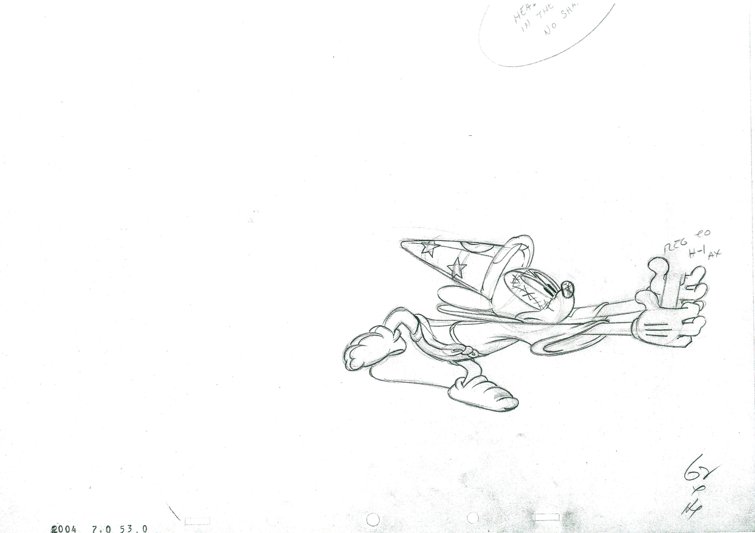 62
62
 63
63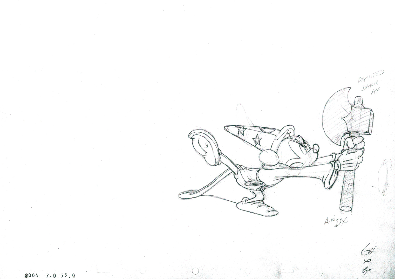 64
64
 65
65
 66
66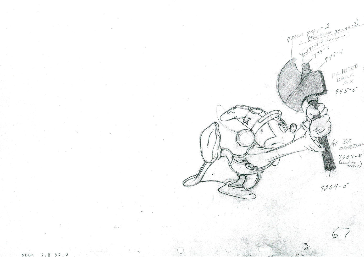 67
67
 68
68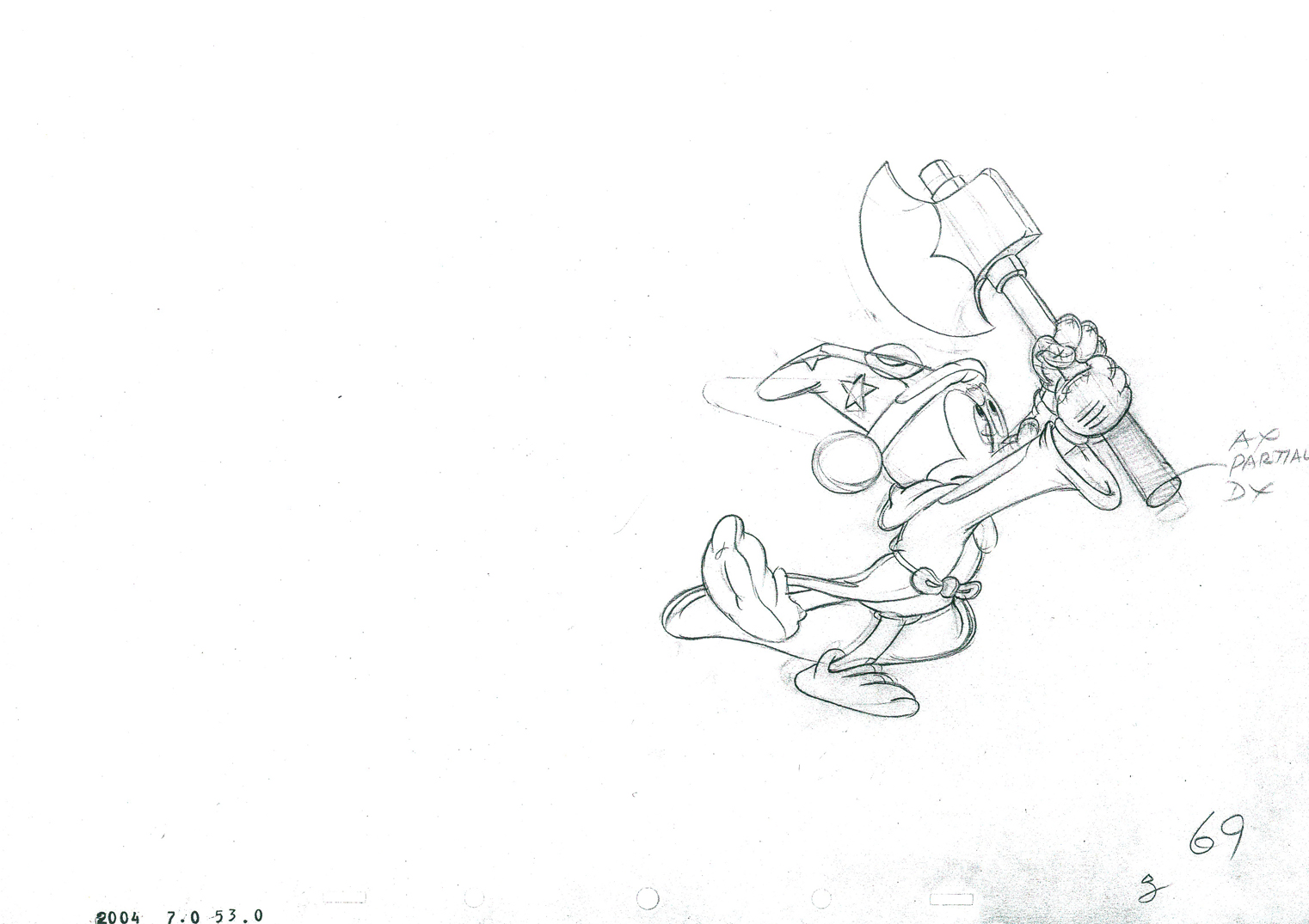 69
69
 70
70
 71
71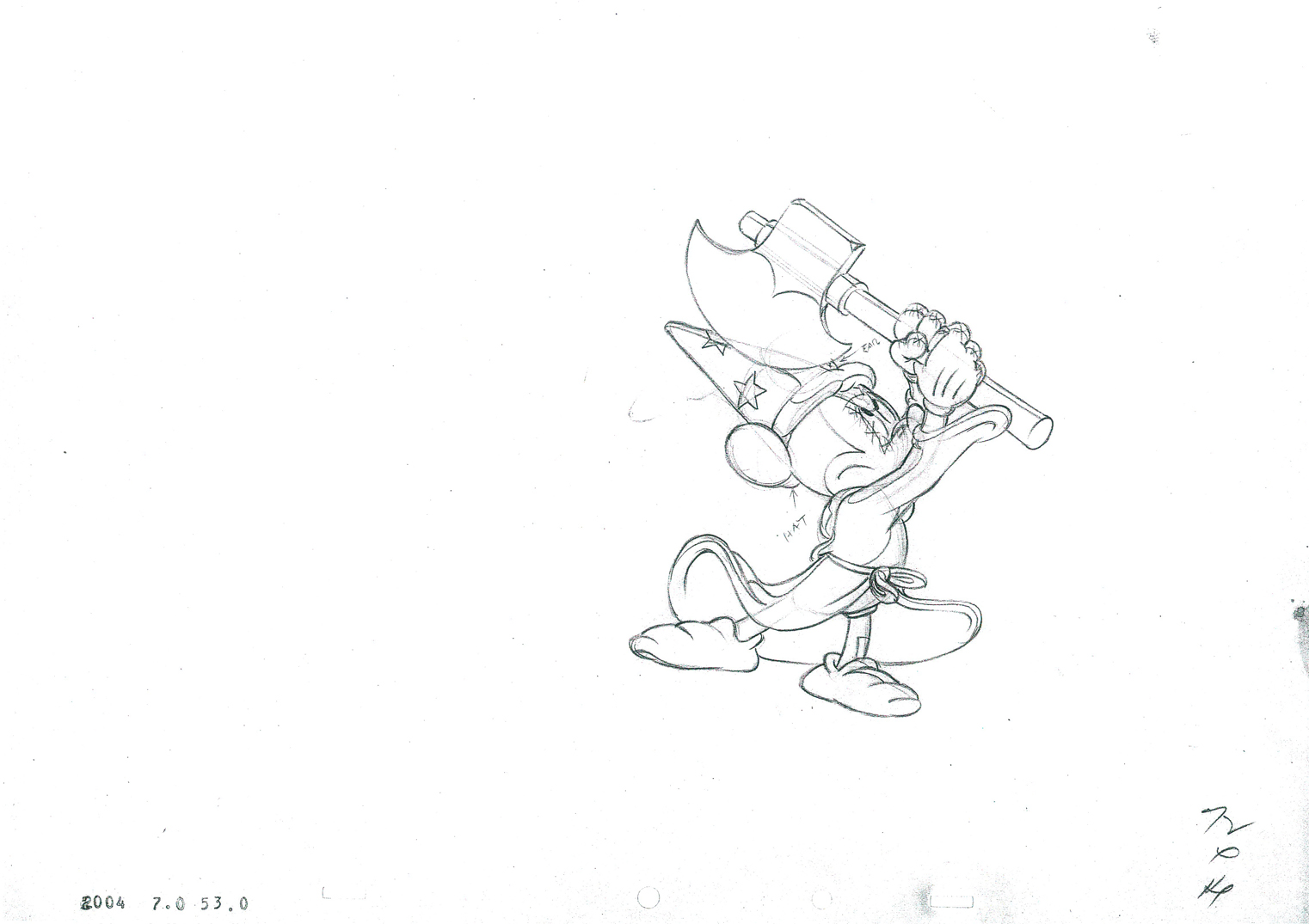 72
72
 73
73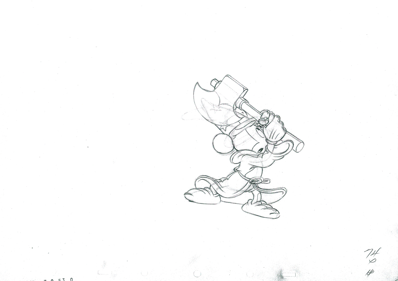 74
74
 75
75
 76
76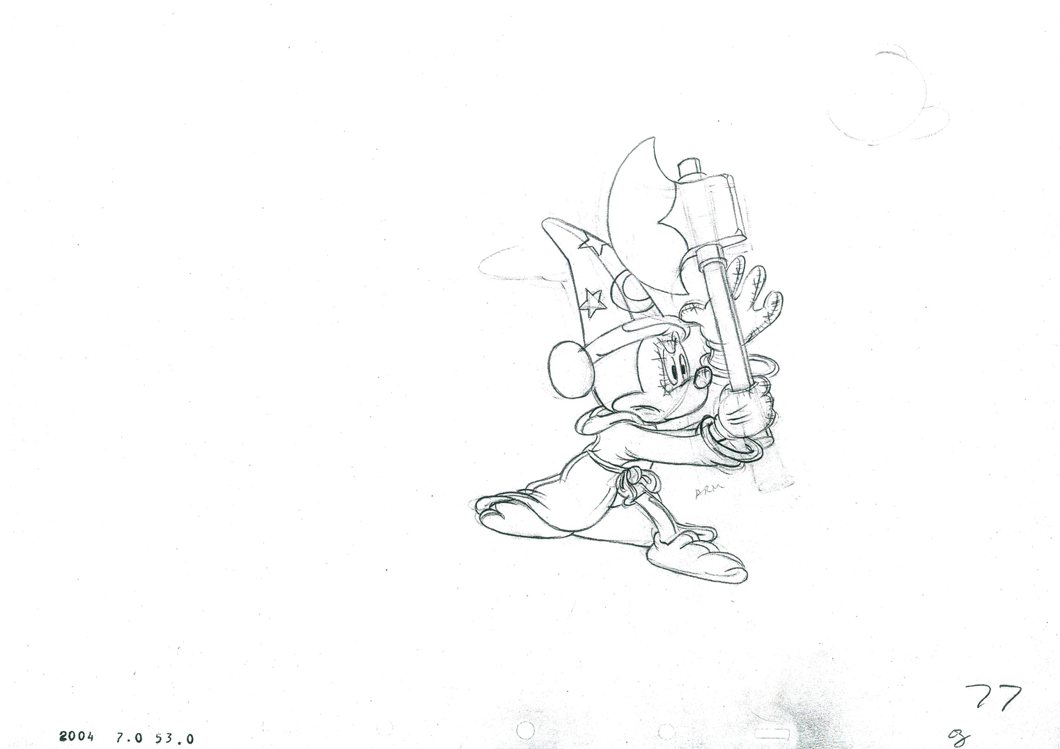 77
77
 78
78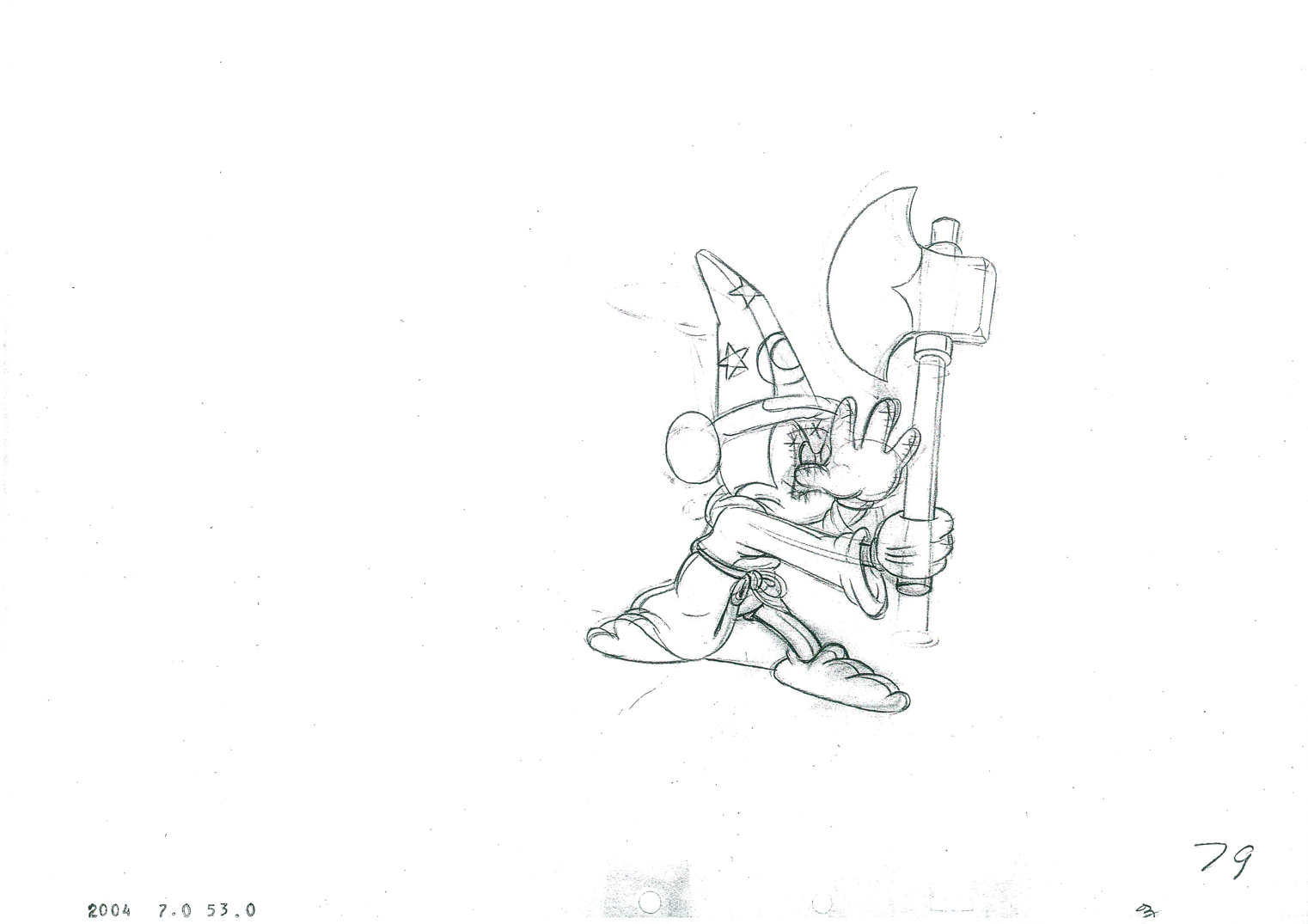 79
79
 80
80
 81
81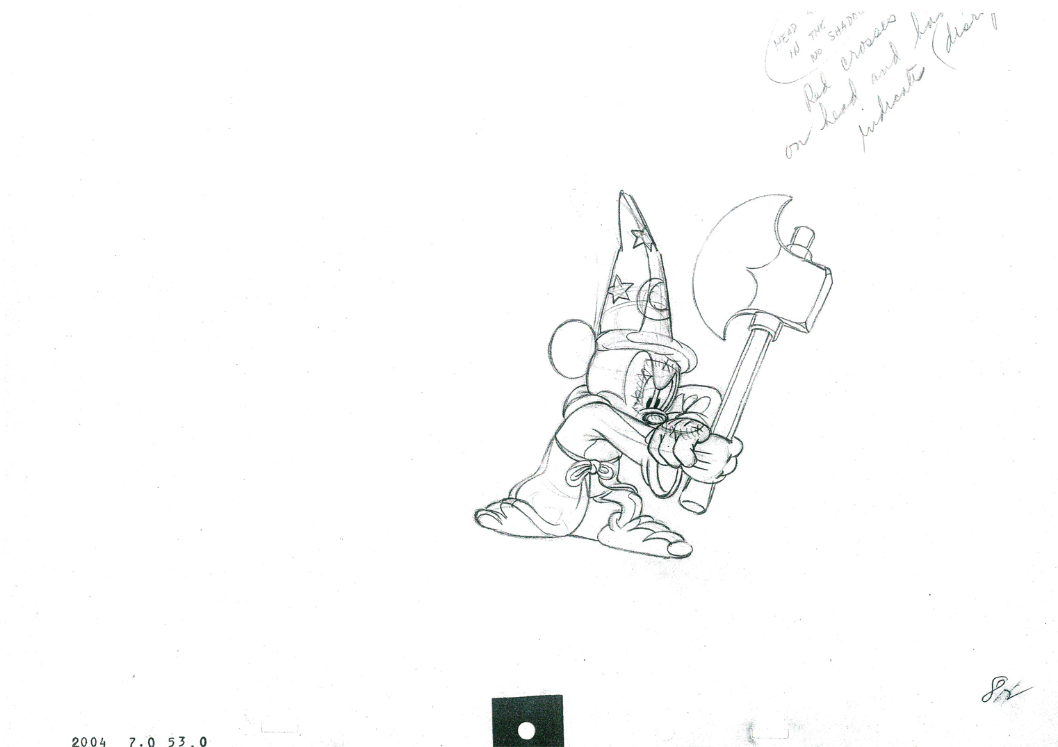 82
82
 83
83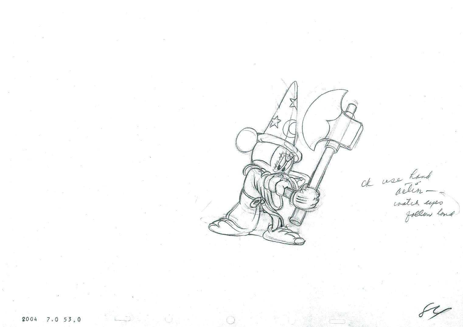 84
84
 85
85
 86
86
____________________________
The following QT incorporates all the drawings from this post
as well as the previous post, Part 1.
All drawings were exposed per the Exposure Sheets.
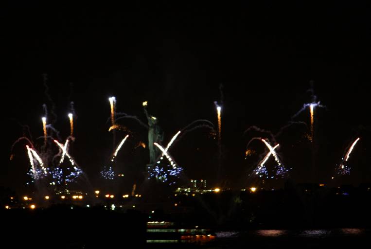
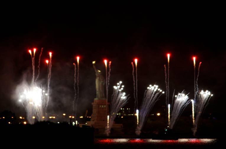
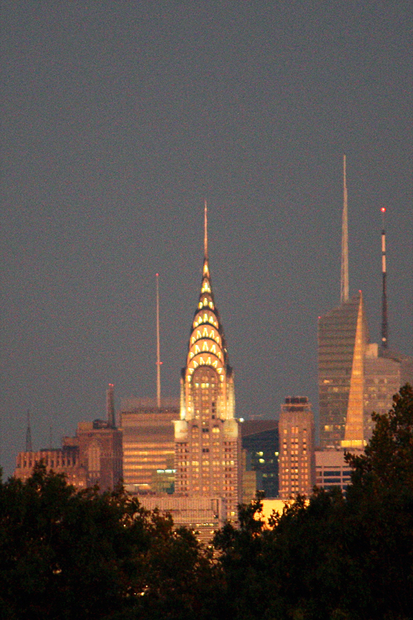
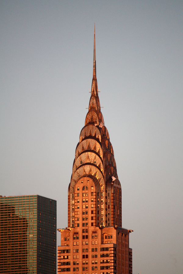
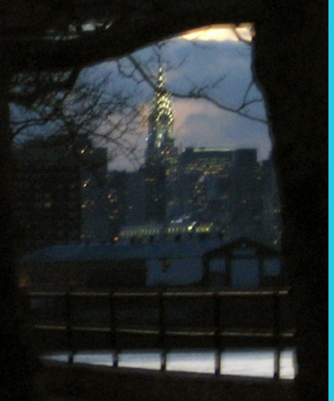
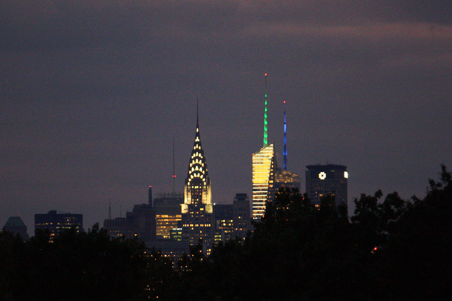
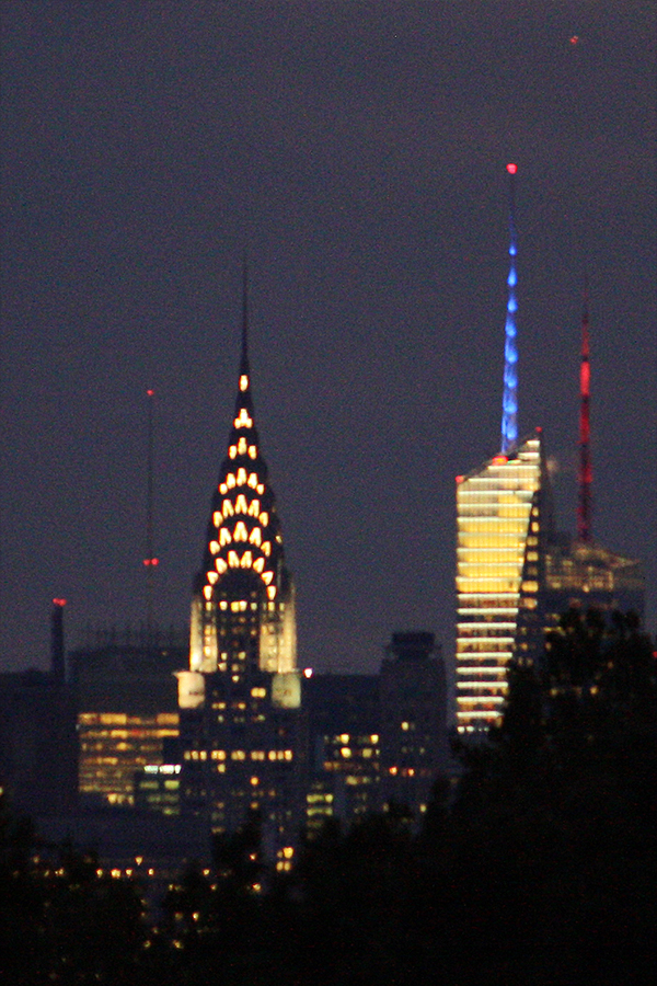
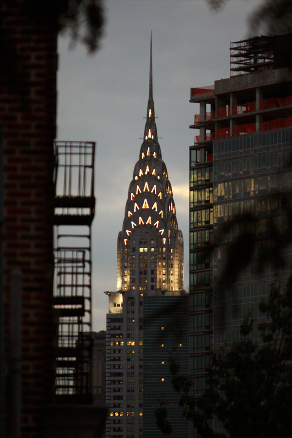
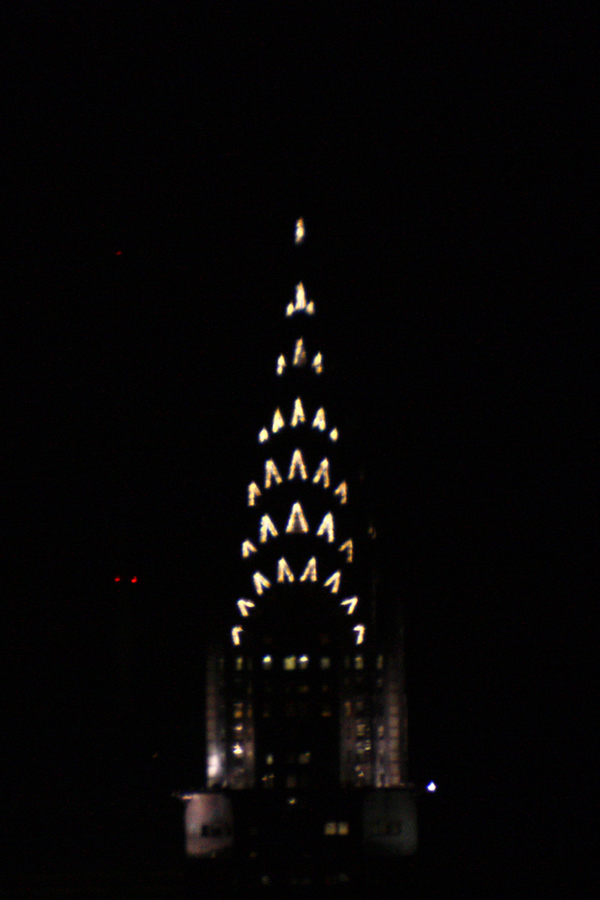
Daily post &Photos &Steve Fisher 30 Oct 2011 07:13 am
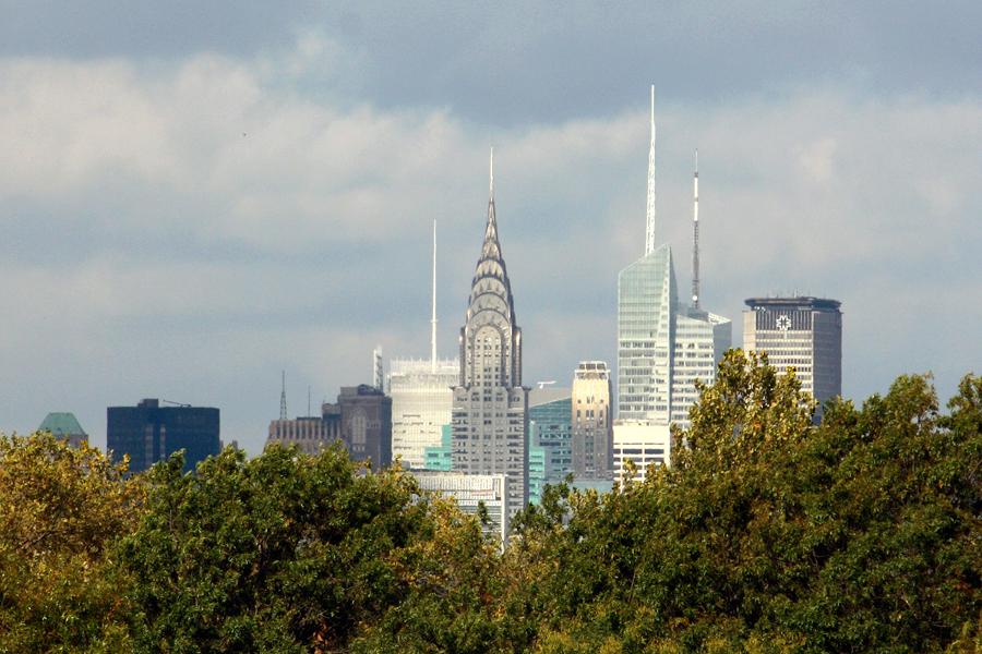
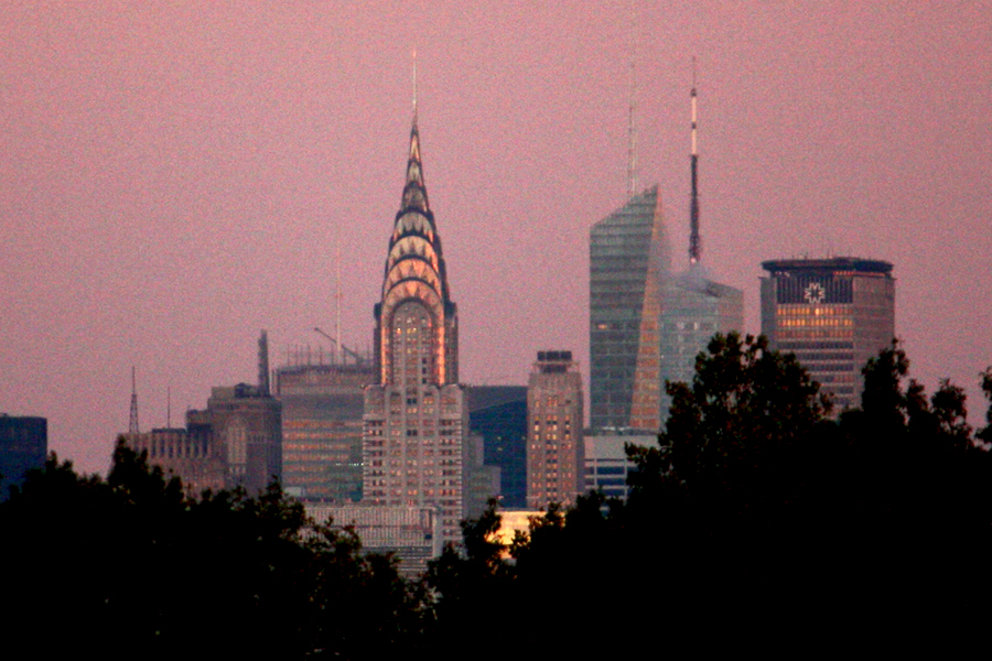
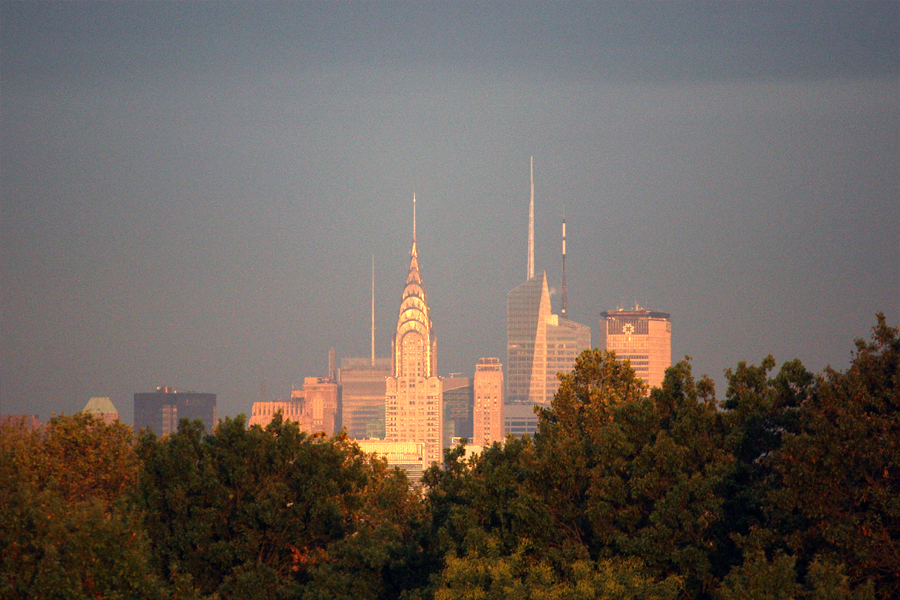
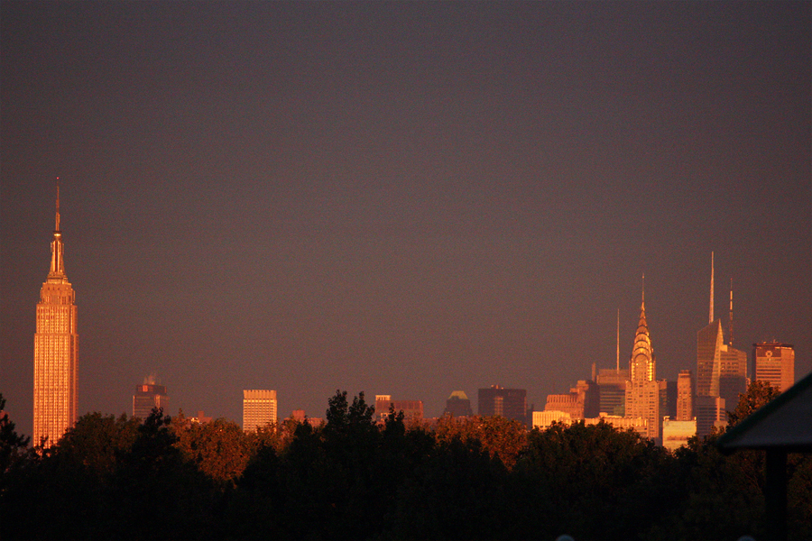
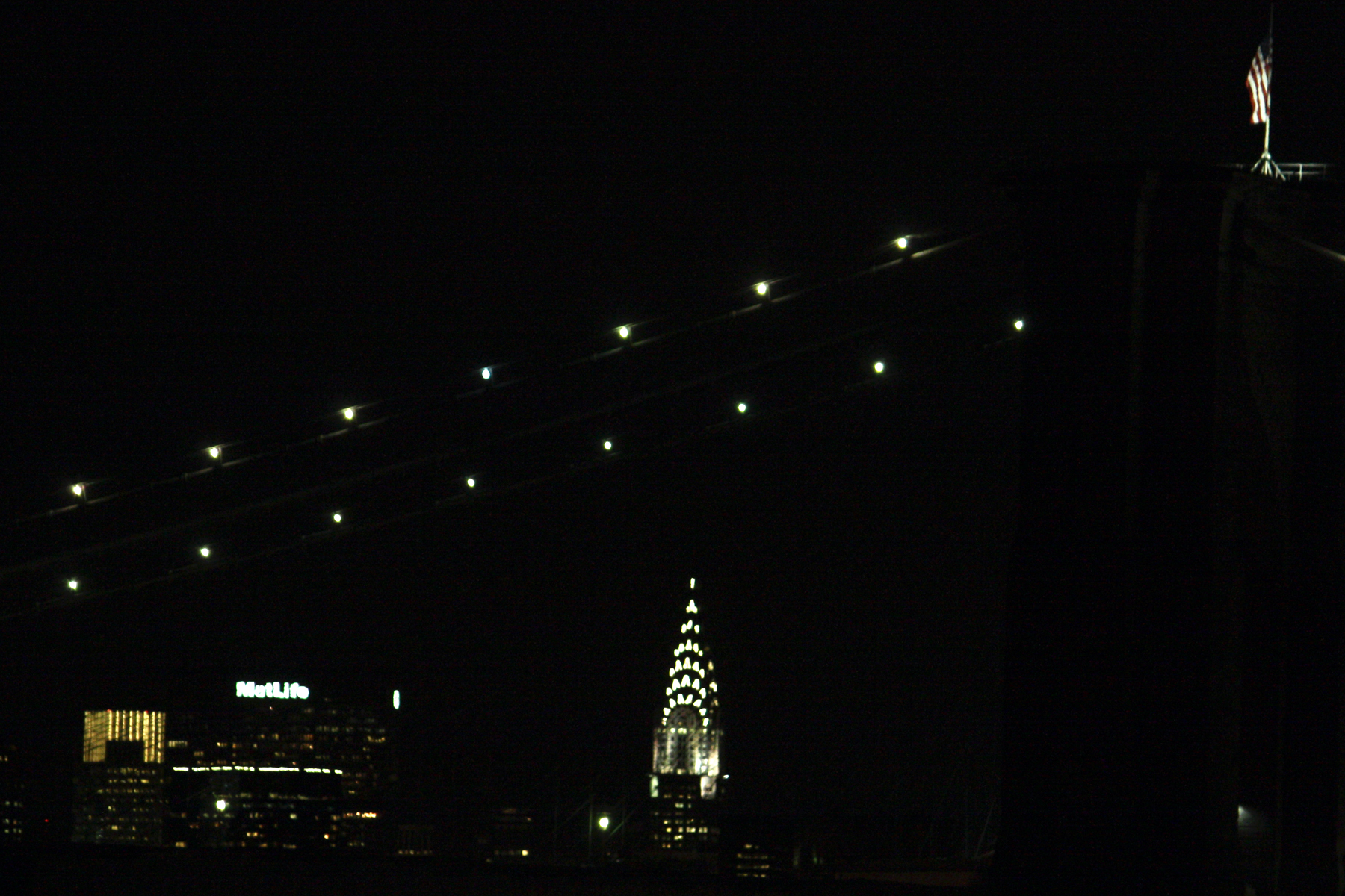
Chrysler Building
- My friend, Steve Fisher, went to the celebration for the Statue of Liberty’s 125th anniversary. Here are a couple of photos he took:

.
.
.
.
- A view from the other side of the bridge.
.
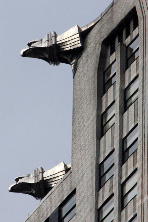
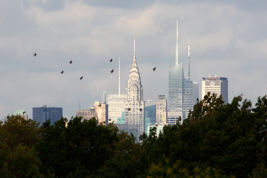
The Chrylser Building is probably my favorite building. I find it extraordinarily attractive. I was even able to endure The Bonfire of the Vanities for the wonderful shots of the gargoyles within the film. There have been some great pictures made of this outstanding bit of architecture. Steve Fisher has a collection of pictures he’s taken of the building from Queens. I asked him to send me an assortment of these pictures and I’m happy to post them today. These are they:
.
 1
1.
 2
2.
 3
3.
 4
4.
 5
5.
 6
6.
 7
7.
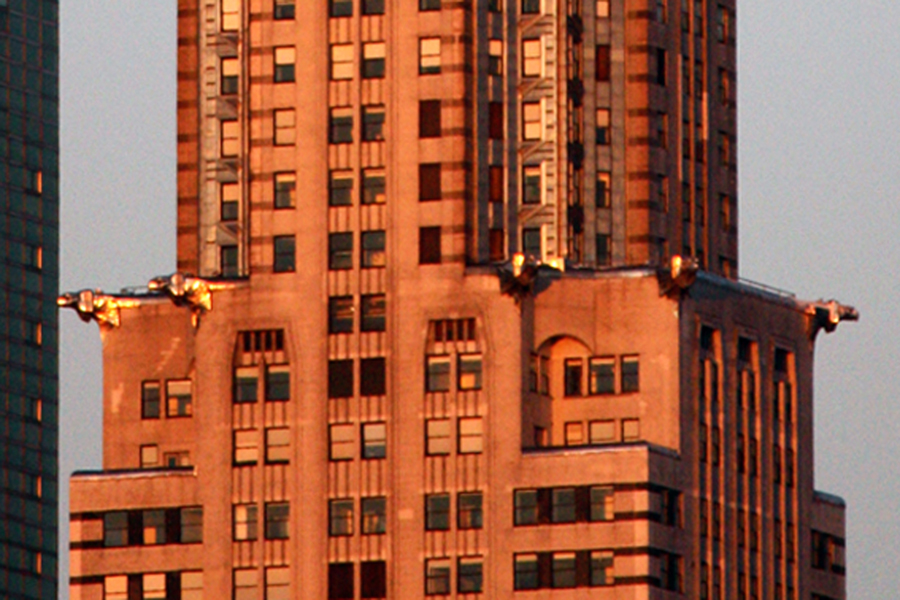 8
8Golden gargoyles
.
 9
9.
 10
10.
 11
11.
 12
12You couldn’t get a better shot.
.
 13
13And here’s one from Brooklyn:
Daily post 18 Oct 2011 05:47 am
The Grounded House
- Yesterday, I received the following comment from “Doug”:
- “Michael – are you aware of and if so, would you opine on Bill Plympton’s “restoration†of Winsor McCay’s Flying House?”
The short answer is, yes I am aware of this “restoration,” and on several blogs I curtly gave my opinion of this project. Unfortunately, I have not been kind about it. Bill, even called once and asked me to be in a documentary about the film and tell the camera what I thought about it. I declined, ultimately. Especially, after I saw the finished product and compared it to the original.
So, let me go into it a bit. The longer version.
The first thing that caught my eye is that it no longer is a “Winsor McCay Film;” it’s a “Winsor McCay – Bill Plympton Film.” The restorer gets equal credit with the filmmaker. Cheeky.
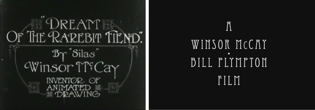
The name above the title.
The balloons of McCay’s film reflect his comic strip sensibilities; this is the natural way for him to create a dialogue. Bill Plympton employed two excellent actors, Matthew Modine and Patricia Clarkson to voice the balloons which were eliminated in the “new” version of the film. They’re terrific actors, but I prefer seeing those balloons, especially since all action freezes when you’re supposed to be reading. Now with the new voices, it feels as if the screen dies whenever they speak. It doesn’t work visually, anymore.
.
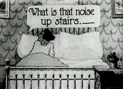
The ugly balloons
We went through a long period where colorizing films was often well discussed. The comments were overwhelmingly negative just prior to CITIZEN KANE getting a new set of garish colors ingrained over the beautiful black and white cinematography of Greg Toland. Fortunately, that hasn’t happened – as yet.
Animation enthusiasts have long cried out over the colorization of the black and white WB and Popeye cartoons. To this day, Cartoon Network is showing the colorized Fleischer Popeye cartoons instead of the beautiful B&W ones. These were done the same way Plympton’s people did their handiwork. Frames were traced off and painted and put back into the whole. Along the way timing and shuffling of the artwork was done so that the new is not the same as the old.
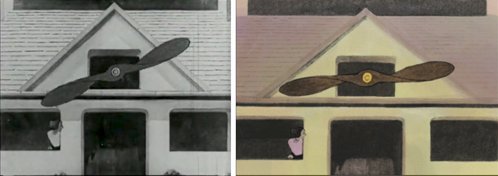
In The Flying House, if you look at the scene of the engine room where the male of the house operates the giant propeller. The machinery acts in a very funny way in the McCay version of the film; in the Plympton version the timing is completely different and wholly unfunny. They made the task easier by only doing a portion of the job and cycling it. McCay’s scene is much longer, and the timing is constantly changing.
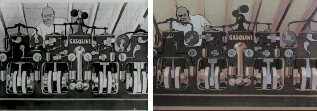
One can see this scene, in this late McCay animation, as an answer to what has become of the medium he originally designed, if not invented. The factory made animated films had turned to labor saving, cost-cutting devices to rush production. Cycles were a big part of the silent animated films. Paul Terry’s studio reworked cycles ad infinitum to hurry their work lode. McCay uses cycles but gives many different variations on the cycle, and shows animators how to do it. He turns the cycle into a gag. Unfortunately, the newer version of this film misses the gag entirely and obviously missed the insider’s reference that McCay was making. I’m sure animators of the day didn’t miss it. The “restoration” is a bust for this scene, alone. .
If you look closely at the images in the new version, you’ll see that there are some small changes going on in the artwork. Things have been tidied up a bit by the Plympton crew to the detriment of the McCay artists. Something is lost here; McCay’s hand.
.
The colors chosen by Bill Plympton aren’t bad – even respectful, but my preference is to see the colors chosen by McCay, in this case B&W with grays. I’m more interested in what McCay thought in making this film than I am in Plympton’s thinking.
.
In fact, the most egregious problem with “modernizing” McCay’s work is that you’re undoing decisions McCay made years ago. What if I thought that Plympton’s feature IDIOTS AND ANGELS was too morose. The colors are grayed out, and it’s all just too dark. So if I were to take a copy of his film and add brilliant colors, a laugh track to make sure people can recognize where the funny parts are, and some more pop songs throughout the film. Would that make the film better, or would I be desecrating the film? The answer is obvious, and it goes for McCay’s film as well. I don’t have the right to second guess Bill Plympton’s decisions on his film; he doesn’t the have the right to second guess McCay’s decisions – especially since McCay’s original film is considered one of the animation treasures.
.
was square has now become more of a rectangular shape.
The screen proportions have changed, and distortion has entered.
There are laws protecting certain preserved buildings in New York City, and there should also be laws protecting rare films. This is one that should have been protected.
Bill Peckmann &Comic Art &Daily post &Illustration 07 Oct 2011 06:47 am
Harvey and Jack – part 1
- Bill Peckmann sent me a couple of comics that demonstrated a great collaboration between Harvey Kurtzman and Jack Davis. With that small bit of information, let me turn it over to Bill:
- I thought it would be fun to give your readers some milestones in the collaborating efforts of Harvey Kurtzman and Jack Davis. It will be done in the form of showing #1 issues of certain comic book and magazine titles. I’ve always felt that the relationship of Harvey, and Jack was not that dissimilar from that of John Ford and John Wayne. All men were very successful in their own right but when they teamed up there was that extra spark in their art. Ford and Kurtzman would lay these wonderful creative foundations and then Davis and Wayne came in to add the finishing touches. For both teams, the final product always seemed so effortless and seamless.
Part 1 – FRONTLINE COMBAT (comic book) and MAD (comic book)
Part 2 – MAD (magazine) and TRUMP (magazine)
Part 3 – Humbug (magazine) and HELP ( magazine)
Here are those pages, with Bill’s comments:
 1
1
 2
2
 3
3
 4
4
 5
5
 6
6
 7
7
 8
8
 9
9
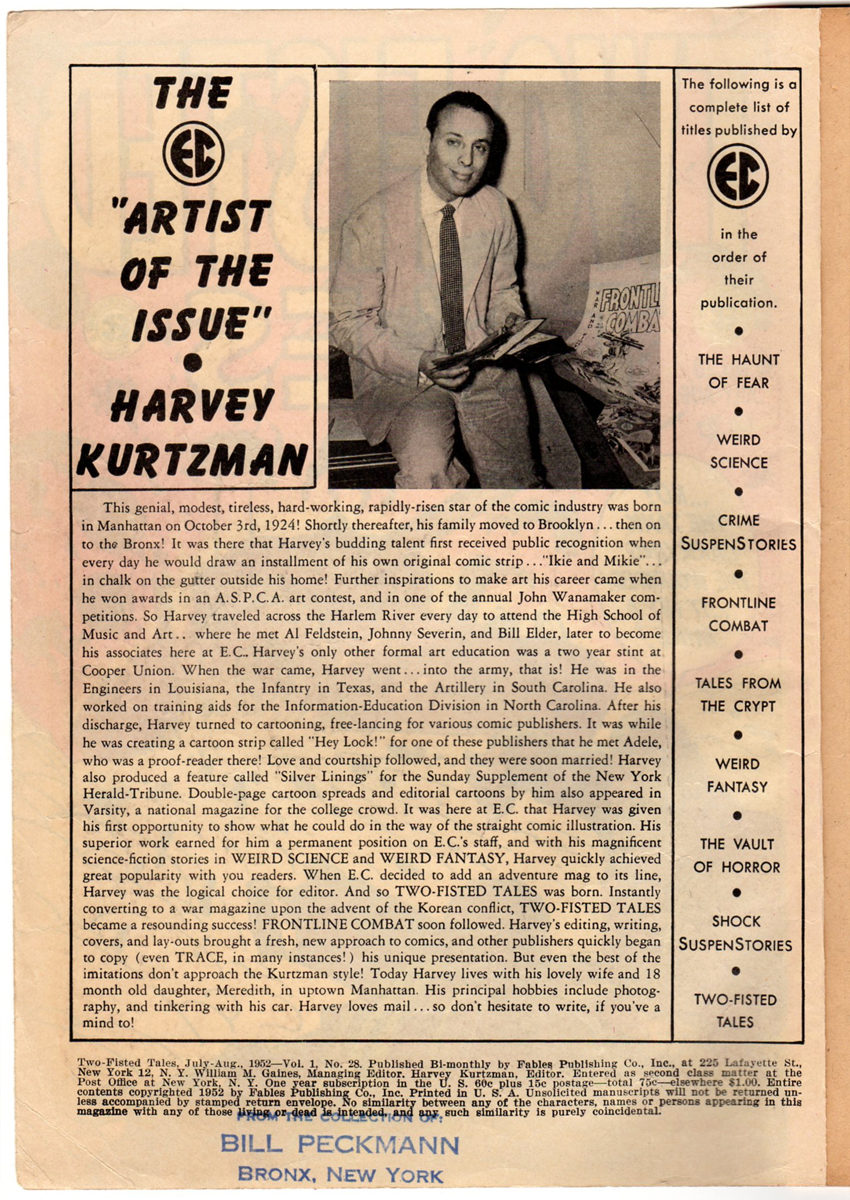
Harvey’s bio that ran in EC Comics
during the publication of the war comcs.
 10
10
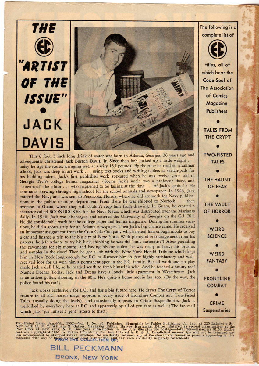
Jack’s bio.
 11
11
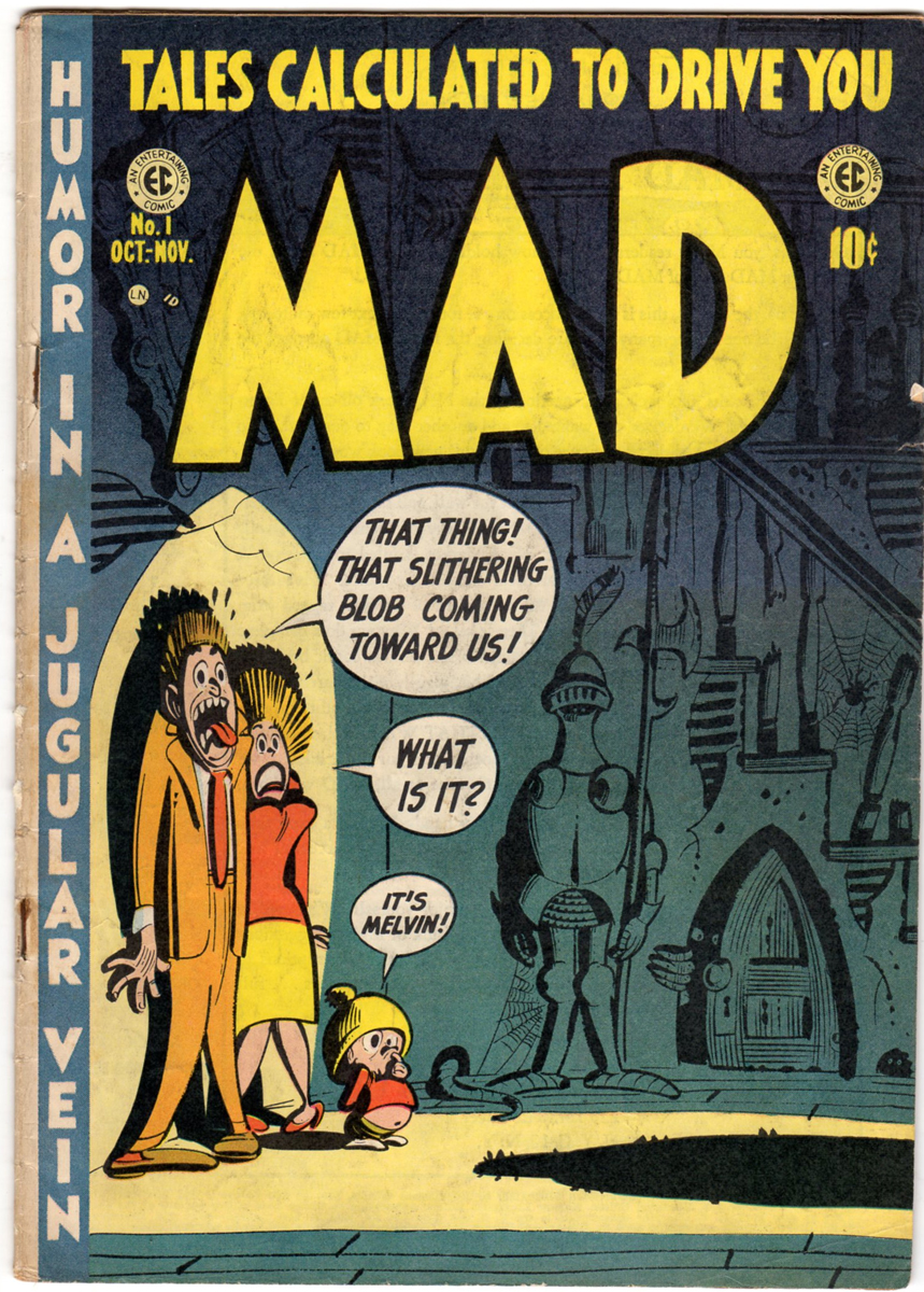
A little over a year after FRONTLINE COMBAT came out in 1951, MAD started in 1952.
 12
12
This is the first page of the first comic book that started
an institution that is still with us almost 60 years later.
 13
13
 14
14
 15
15
 16
16
 17
17
 18
18
 19
19
It’s easy to forget, but up until this time, there had never been
quite a story like this in comic books.
